
Merriweather pairs great with Open Sans, Raleway and Special Elite. All 15 pairings are shown below in real rendered specimens, with the reason each one works.
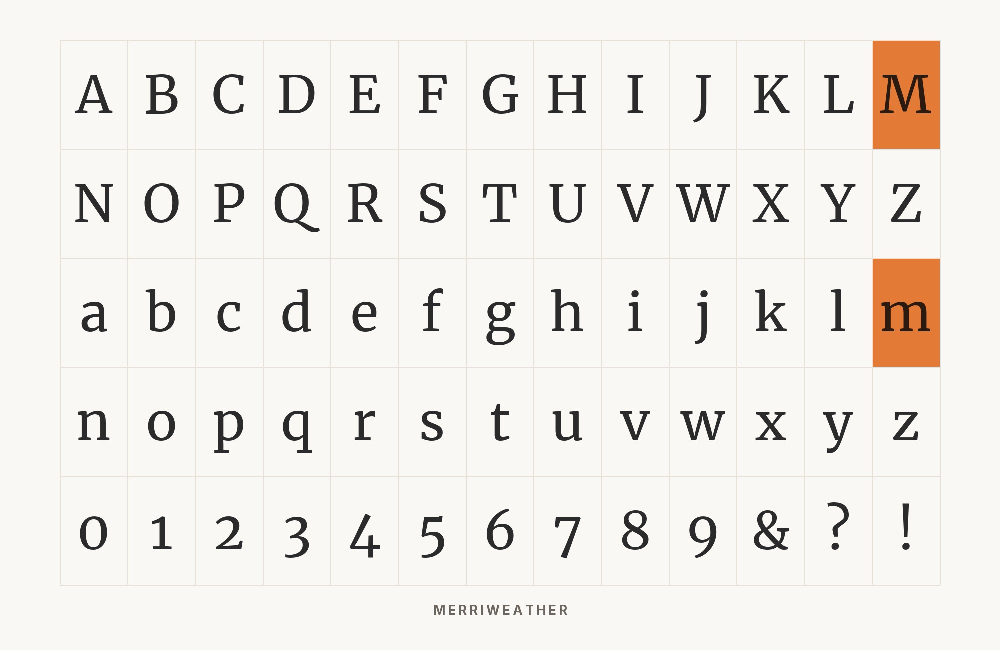
What fonts go with Merriweather? This screen-optimized serif with generous proportions needs companions that can match its friendly authority without competing for attention.
Merriweather, designed by Eben Sorkin, was made to be pleasant to read on screens. Its large x-height, open forms, and sturdy serifs support that goal. The result is a font that feels both traditional and thoroughly modern, with enough personality to be interesting but enough restraint to disappear into comfortable reading. Its bold weights have particular impact, making it versatile enough for both body text and headlines.
The consideration with Merriweather pairings is its substantial presence. It’s not a delicate font; it commands attention through its robust proportions. This means sans-serif companions need enough weight and character to hold their own alongside it, and other serifs need clear stylistic differentiation to avoid muddy hierarchy. The fonts below offer different ways to balance this confident workhorse.
1. Open Sans

A screen-focused serif paired with the humanist Open Sans. Eben Sorkin designed Merriweather’s tall x-height and sturdy serifs specifically for comfortable on-screen reading, while Steve Matteson’s Open Sans brings friendly neutrality to headlines or supporting text. This pairing has become a modern classic because both fonts prioritize readability without sacrificing personality. Deploy confidently for blogs, news sites, documentation, and any content platform prioritizing extended reading comfort.

2. Raleway

An archived designer’s guide pairs Merriweather with Raleway. Raleway‘s elegant thin strokes and geometric sensibility create refined contrast with Merriweather’s sturdy screen serifs. The distinctive ‘W’ and sophisticated proportions of Raleway handle headlines beautifully while Merriweather’s tall x-height ensures body text remains comfortable for extended reading. This combination suits design portfolios, fashion editorials, and creative publications seeking elegance without sacrificing accessibility.

3. Special Elite

Set Merriweather in the headline and Special Elite in short supporting text for a deliberate shift from polished serif to typewriter texture. An archived Canva guide uses Merriweather for headlines and Special Elite for body text. Special Elite evokes vintage correspondence and analog nostalgia; keep its expressive texture to brief passages, captions, or pull quotes. This combination suits memoir projects and brands cultivating a handcrafted feel.

4. Montserrat

Montserrat‘s geometric confidence provides modern headlines above Merriweather’s literary body text. The Buenos Aires-inspired sans-serif brings urban energy while Merriweather’s traditional serifs ground content in readable familiarity. The contrast between geometric precision and organic serif forms creates visual interest without conflict. This pairing excels for magazines, cultural publications, and editorial platforms seeking contemporary headlines with classic readability.

Taking it to the next level means cinematic visuals, faster turnarounds, and work that wins clients. Create with unlimited downloads of creative stock assets, and access to powerful AI tools to fast-track your workflow!
Subscribe5. Lato

Typewolf’s Merriweather page records Lato alongside Merriweather in a Dickson Fong design. Lato‘s rounded details and humanist warmth harmonize naturally with Merriweather’s friendly serifs. Both fonts have approachable personalities, making the transition between headlines and body text feel seamless. Łukasz Dziedzic first designed Lato for a corporate identity; its semi-rounded details bring warmth to Merriweather’s editorial presence. Perfect for professional blogs, wellness brands, and content platforms prioritizing reader comfort.

6. Source Sans Pro

Fonts In Use records Merriweather and Source Sans together on whitehouse.gov. Adobe’s first open-source font brings systematic clarity to headlines above Merriweather’s literary body text. Source Sans Pro‘s clean geometry and excellent UI credentials handle navigation and headers while Merriweather’s screen-optimized serifs carry extended prose. The pairing bridges interface design and editorial content, making it ideal for publications, documentation platforms, and content-rich applications.

7. Roboto

Roboto‘s mechanical skeleton with organic curves provides familiar headline presence while Merriweather’s tall x-height and sturdy serifs ensure comfortable reading. Both fonts emerged from screen-first thinking, making their combination practical and reliable. Use this pairing for app interfaces, documents, and content platforms that need a familiar reading rhythm.

“AI builds anything, so what do I sell?”
Taste is the answer. Own your stack and automate your own CMS.
Find Out How8. Oswald

An archived Vandelay Design guide presents Oswald and Merriweather together. Oswald‘s bold condensed presence creates dramatic headlines above Merriweather’s comfortable body text. Based on Alternate Gothic, Oswald commands attention with its narrow proportions and heavy weight. Below, Merriweather’s generous x-height and open counters ensure readers can settle into extended content. This high-contrast pairing suits news sites, sports publications, and editorial platforms needing impactful headlines.

9. Poppins

Poppins brings geometric precision and circular forms to headlines above Merriweather’s organic serifs. Poppins’s even strokes provide modern clarity while Merriweather’s traditional personality grounds the page in readable prose. The contrast between Poppins’s contemporary geometry and Merriweather’s literary warmth creates dynamic layouts. Use for lifestyle publications, creative platforms, and brands balancing modernity with substance.

10. Inter

Inter‘s UI-first engineering pairs well with Merriweather’s reading-first design. Cookies by Design’s brand guidelines assign Merriweather to headers and Inter to general text. Rasmus Andersson’s Inter brings clear interface text beneath Merriweather’s editorial headlines, a useful structure for applications mixing UI and reading experiences.

11. Work Sans

Work Sans‘s screen-optimized clarity handles interface elements and navigation while Merriweather’s literary presence carries body text. Both fonts emerged from digital-first thinking, making their combination reliable across devices and sizes. The contrast between Work Sans’s neutral efficiency and Merriweather’s personality creates hierarchy without conflict. Perfect for content platforms, documentation sites, and editorial applications.

12. PT Sans

In an archived typography exploration, OddBird considered Merriweather and PT Sans together for website design. PT Sans from the Public Types project offers humanist clarity for headlines while Merriweather’s sturdy serifs handle extended reading. PT Sans includes Western, Central European, and Cyrillic characters, making this combination useful for multilingual publications.

13. Nunito Sans

Nunito Sans, the non-rounded companion to Vernon Adams’s Nunito, brings a calm sans-serif voice beneath Merriweather headlines. Greenhouse’s visual guidelines use Merriweather and Nunito Sans as their document equivalents for a serif headline and sans-serif utility text. The result feels warm and approachable, a useful direction for educational material and community brands.

14. Karla

An archived type-system tutorial uses Karla and Merriweather together. Karla‘s quirky grotesque personality adds distinctive character to headlines above Merriweather’s reliable body text. Jonny Pinhorn’s design includes subtle details that reward close attention, while Merriweather’s tall x-height ensures comfortable reading at length. The combination suits creative publications, independent magazines, and platforms seeking personality without sacrificing accessibility.

15. Fira Sans

A Fonts In Use case study documents Merriweather headlines with Fira Sans in subheads, navigation, and body copy on the January 6 committee website. Designed for Firefox OS interfaces, Fira Sans adds a clear sans-serif layer beneath Merriweather’s literary headlines. This pairing suits documentation, technical publications, and sites that combine reading with navigation.

Conclusion
There are no absolute rules for font pairing, just principles to guide you. Merriweather is versatile enough to play well with many different typefaces.
Trust your eye, experiment freely, and remember that the best pairing is the one that serves your content and audience. Typography should enhance communication, not complicate it.
Sources
- Typewolf
- Typ.io
- FontPair.co
- Fonts In Use
- Designerly
- Garett (Wayback 2021)
- Canva (Wayback 2021)
- Vandelay Design (Wayback 2022)
- Cookies by Design
- OddBird (Wayback 2020)
- Greenhouse
- Highbrow (Wayback 2017)
- Fonts In Use
- Fonts In Use
