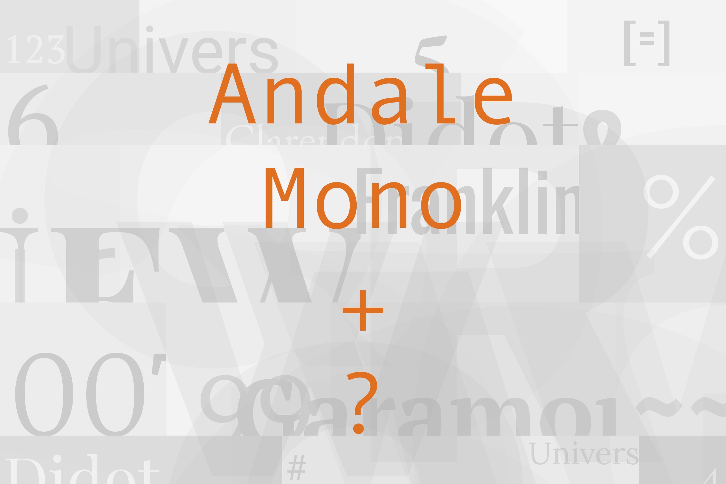
Andale Mono pairs great with DIN, Inter and Univers. All 11 pairings are shown below in real rendered specimens, with the reason each one works.

What fonts go with Andale Mono? Start with what it is: a monospaced sans, where every letter takes the same width. That one fact decides almost every pairing.
Steve Matteson designed Andale Mono for terminal emulation and software development. It started life as a custom font for Taligent, a joint project of Apple and IBM. Its dotted zero seems to come from IBM 3270 displays.
Microsoft first gave it away as an Internet Explorer 4.0 add-on, under the odd name Monotype.com. Windows later replaced it with Lucida Console, but macOS still ships it. Microsoft calls it a highly legible monospaced font.
That legibility comes from plain, open letters with no flourish at all. A monospace makes a poor heading face and a tiring text face. It makes an excellent second voice.
So the partners below do the heavy work: headlines, paragraphs, hierarchy. Andale Mono takes the labels, captions, dates, prices and code.
The fixed-width rhythm then tells the reader, without words, that this line is a different kind of information. Here are 11 fonts that pair with Andale Mono, each backed by a documented use or a named recommendation.
1. DIN
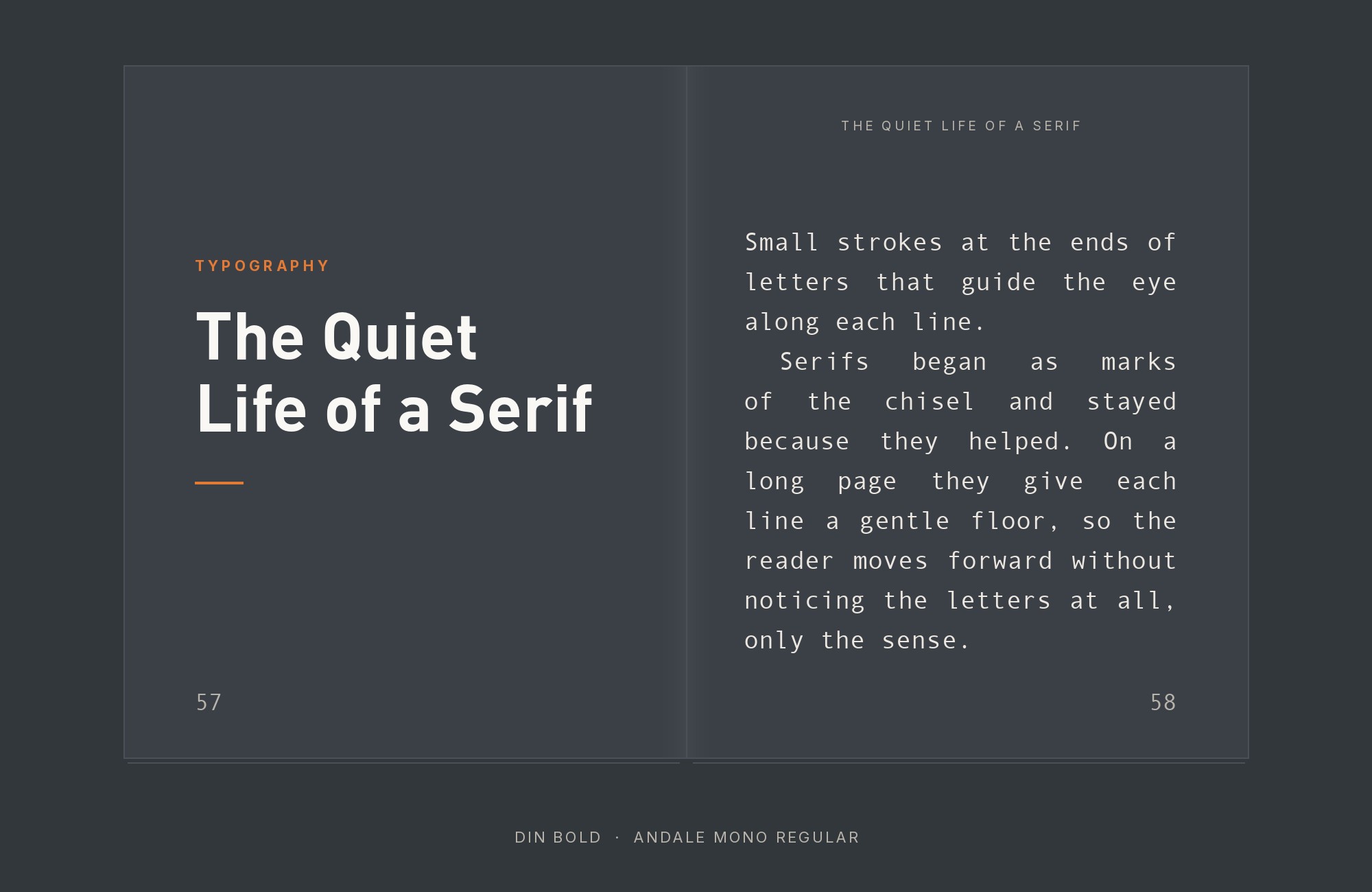
Typewolf lists Kerem Suer’s site under its Andale Mono pairings, set in DIN and Andale Mono. It was a Typewolf Site of the Day in June 2014. DIN began as a German standard typeface, defined by the standards body DIN in 1931.
That origin shows. DIN letters look engineered, with straight sides and squared-off curves. Andale Mono looks engineered too, but on a fixed grid.
So the two share a technical attitude while they differ in rhythm.
Let DIN take the headings and the navigation.
Let Andale Mono set dates, labels and small project notes.
This is a natural pair for portfolios, product pages and anything with a spec sheet.
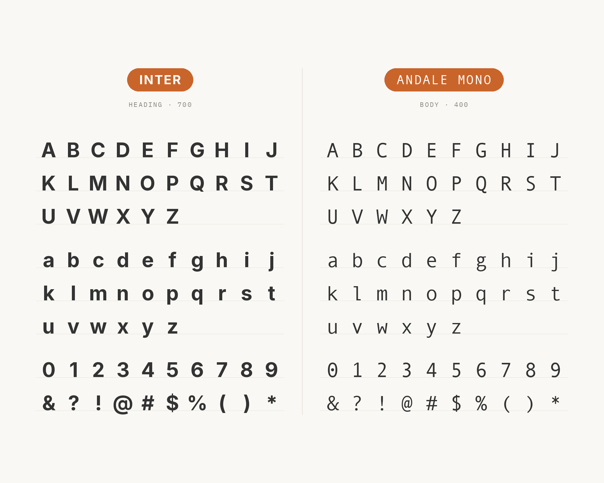
2. Inter
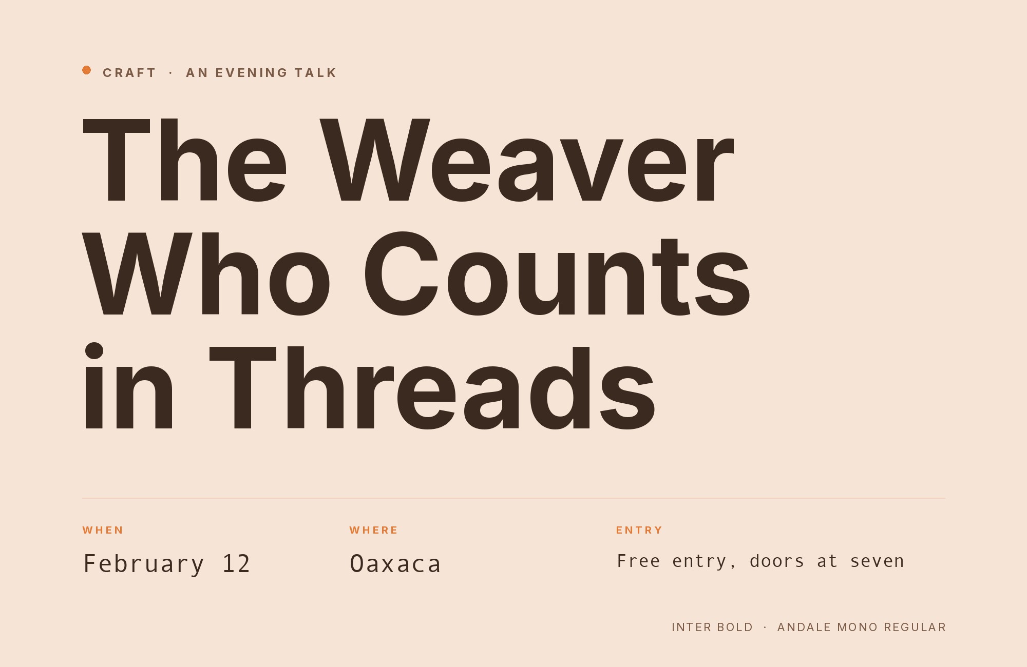
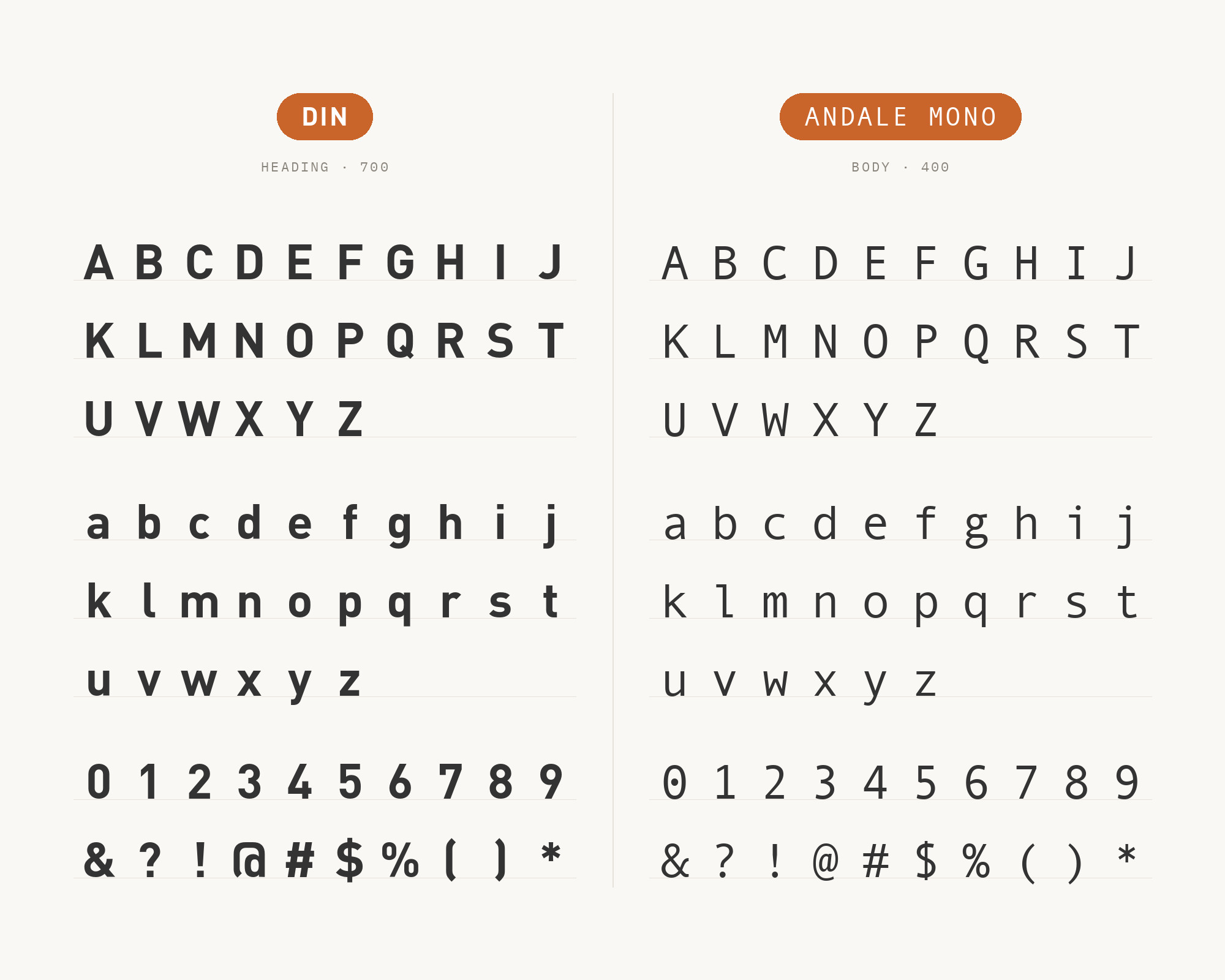
Type designer Jen Wagner puts Andale Mono first in her list of five fonts to pair with Inter. Wagner calls it a font for code, editorial design and tech-forward branding.
Rasmus Andersson designed Inter. In Wagner’s sample, Inter sets the big heading and the paragraph. Andale Mono sets the spaced capital subhead, the small accents and the button.
That is the right split.
Inter has a full weight range; Andale Mono does not, so Inter builds the hierarchy. The monospace then reads as interface detail, like a label printed on a machine. Track Andale Mono capitals open, as Wagner does, so they hold their own beside Inter’s large sizes.
Use this pair for apps, dashboards and tech brands.
3. Univers
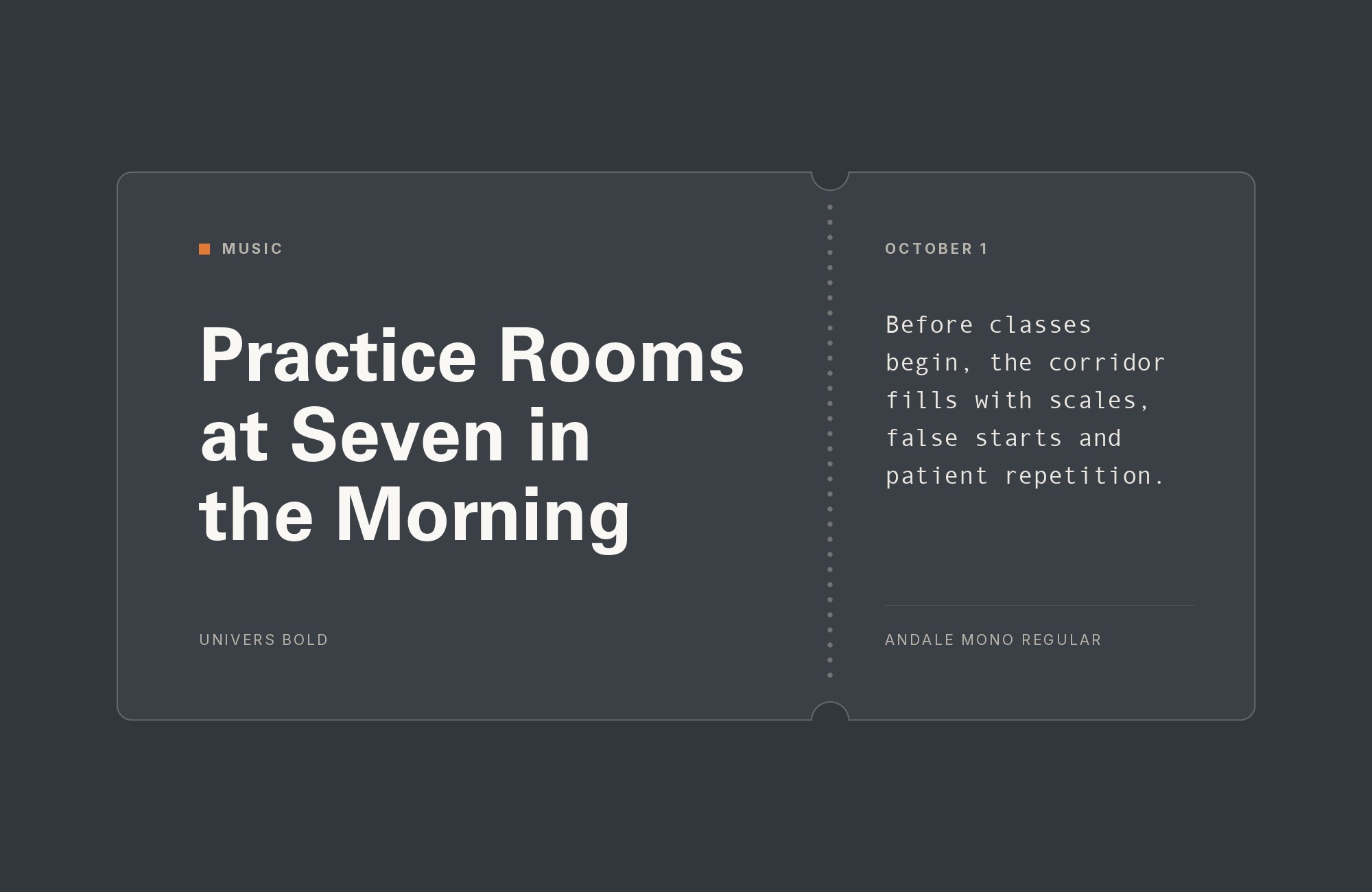
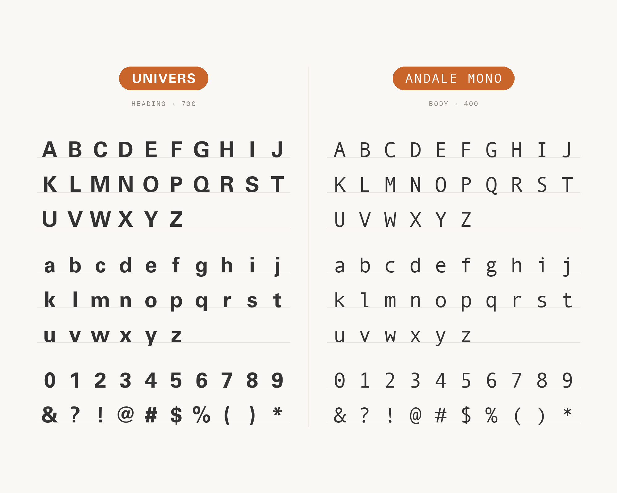
Fonts In Use records Univers with Andale Mono in the Enablis report.
That report is the Enablis 2010 annual report, designed by Montréal studio Cossette. Univers also appears in the SUR typeface list.
SUR is a review of Latin American photobooks designed by Ricardo Báez. No other partner on this page turns up in both projects.
Adrian Frutiger designed Univers, and Deberny & Peignot released it in 1957. Univers is a systematic family, with many weights and widths that match.
That system gives you every heading level Andale Mono cannot. Its even, quiet texture also keeps the page calm.
Use Univers for headings and running text. Save Andale Mono for tables, figures and captions, where fixed widths line up in columns.
“AI builds anything, so what do I sell?”
Taste is the answer. Own your stack and automate your own CMS.
Find Out How4. Helvetica
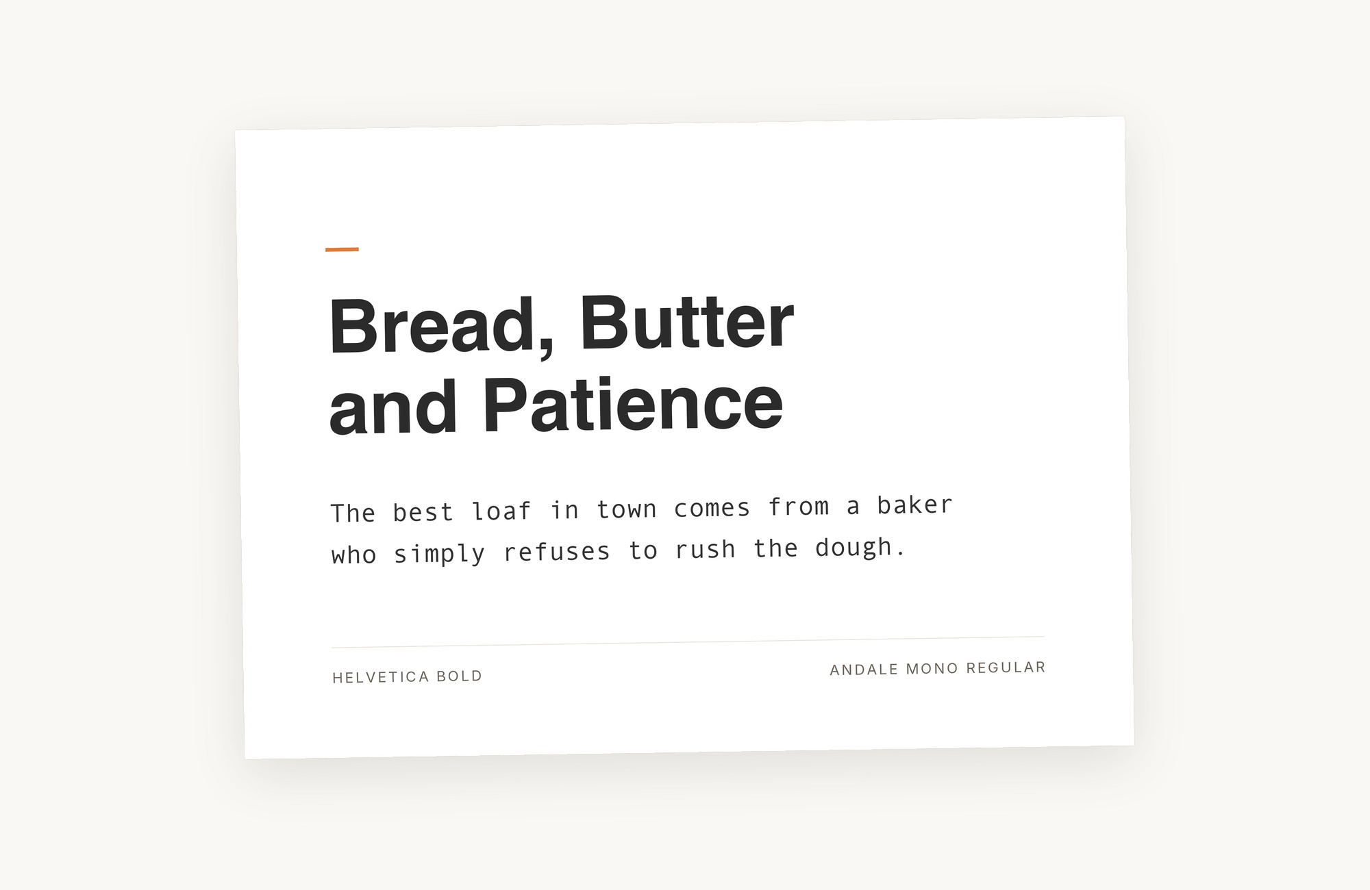
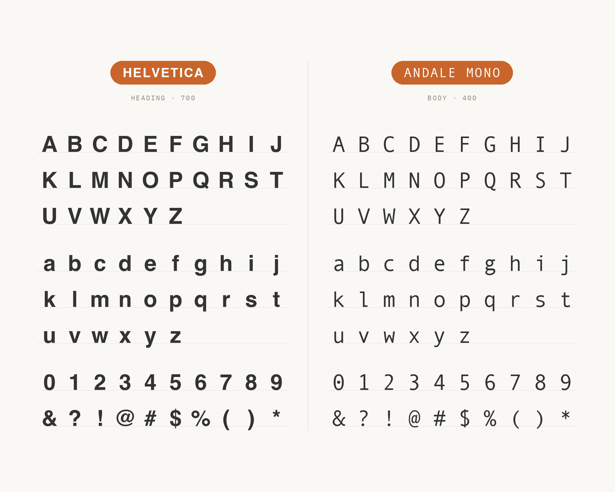
MaxiBestOf records Thibault Priou’s website using Andale Mono with Helvetica. Max Miedinger designed Helvetica in 1956–1957. Helvetica is compact and tightly spaced, with horizontal stroke ends.
Andale Mono is loose by nature, because each narrow letter sits in a wide cell. That difference in spacing is the contrast. Set the name, headings and main text in Helvetica.
Use Andale Mono for metadata: years, client names, small navigation. Keep the monospace slightly smaller, so it reads as a note and not a rival. This is a classic designer-portfolio look.
5. Times New Roman
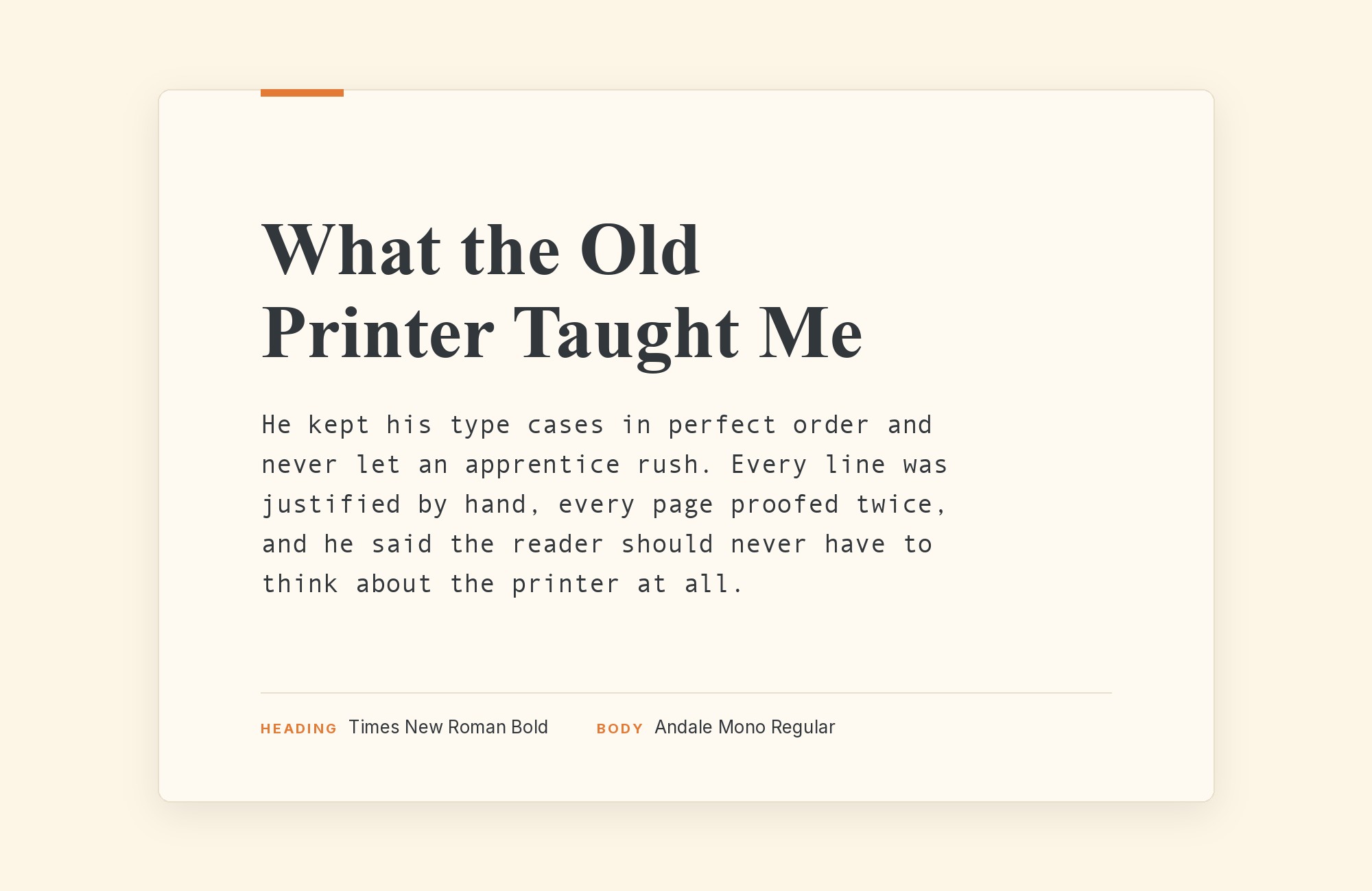
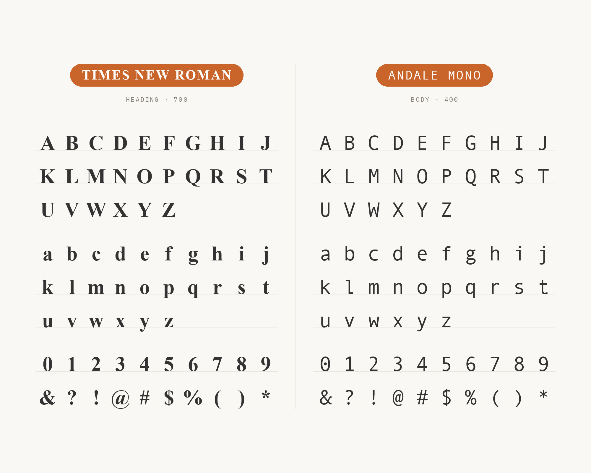
Fonts In Use lists Times New Roman with Andale Mono in SUR, the photobook review. Times New Roman was commissioned by the British newspaper The Times in 1931.
Times New Roman is a compact serif, made to fit many words into a narrow column. Andale Mono is the opposite: wide, even and slow. So the serif takes the reading, and the mono takes the notes.
The pair also has a quiet joke inside it. Both faces came to most people as default system fonts. Used with intent, that plain history looks deliberate and literary, not lazy.
Try it for zines, essays, catalogues and small-press books.
Webflow. Framer. Squarespace. Wix. Lovable. Not your future.
Your own AI CMS agent is.
Find Out More6. Optima
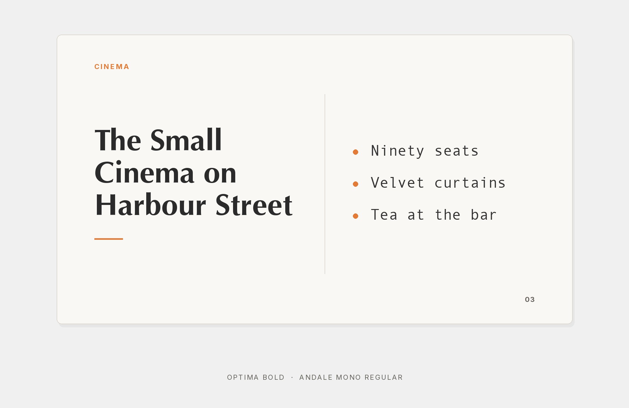
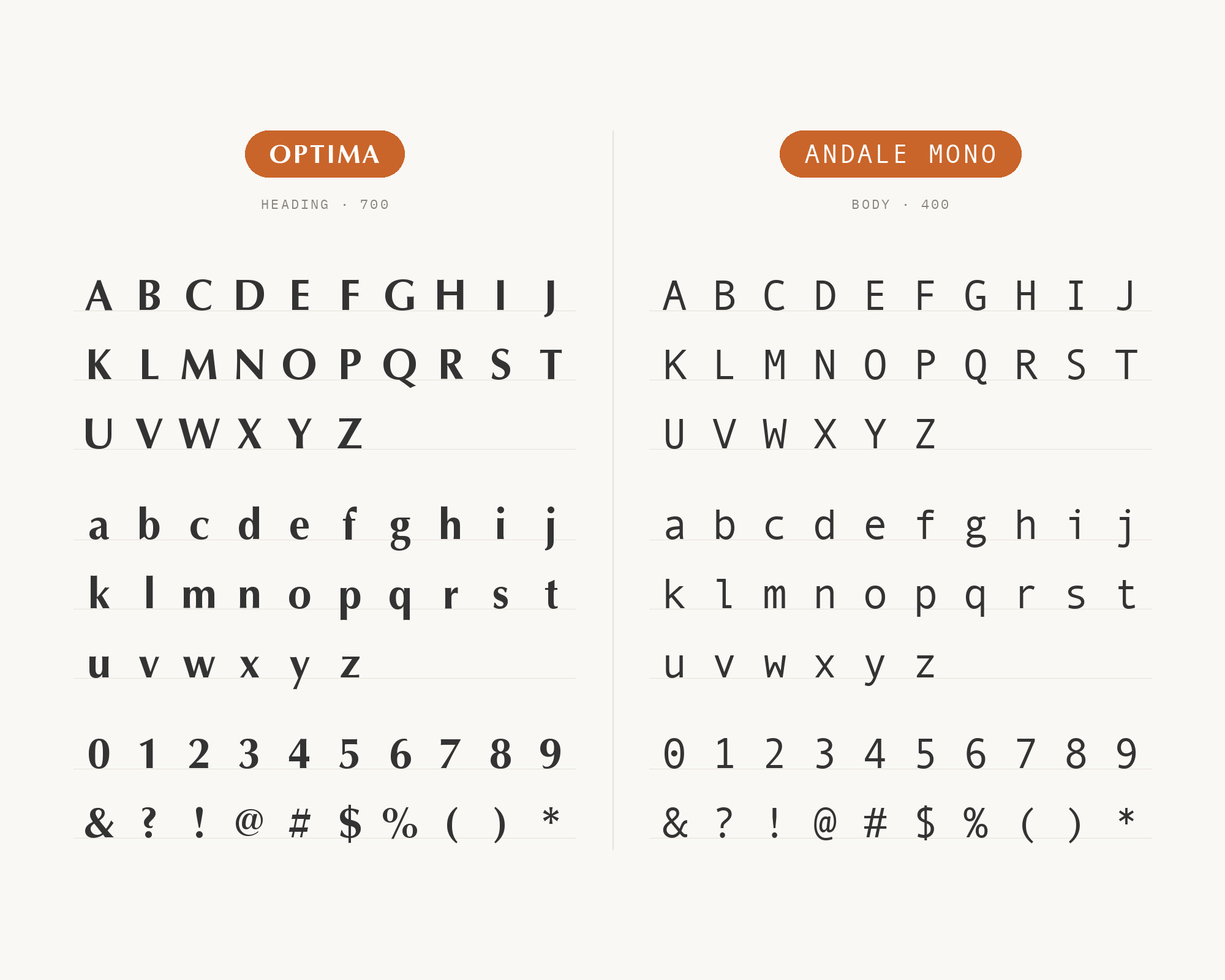
Optima is also in the SUR typeface list. Hermann Zapf designed Optima, and the Stempel foundry released it in 1958.
Optima has a subtle swelling at its stroke ends. That flare gives Optima a carved, classical feel without serifs. Andale Mono has no stroke modulation at all.
The contrast is between a hand-shaped line and a machine-shaped one. Give Optima the titles and pull quotes.
Use Andale Mono for credits, dates and captions. This pair suits art books, galleries and cultural programs.
7. Minion
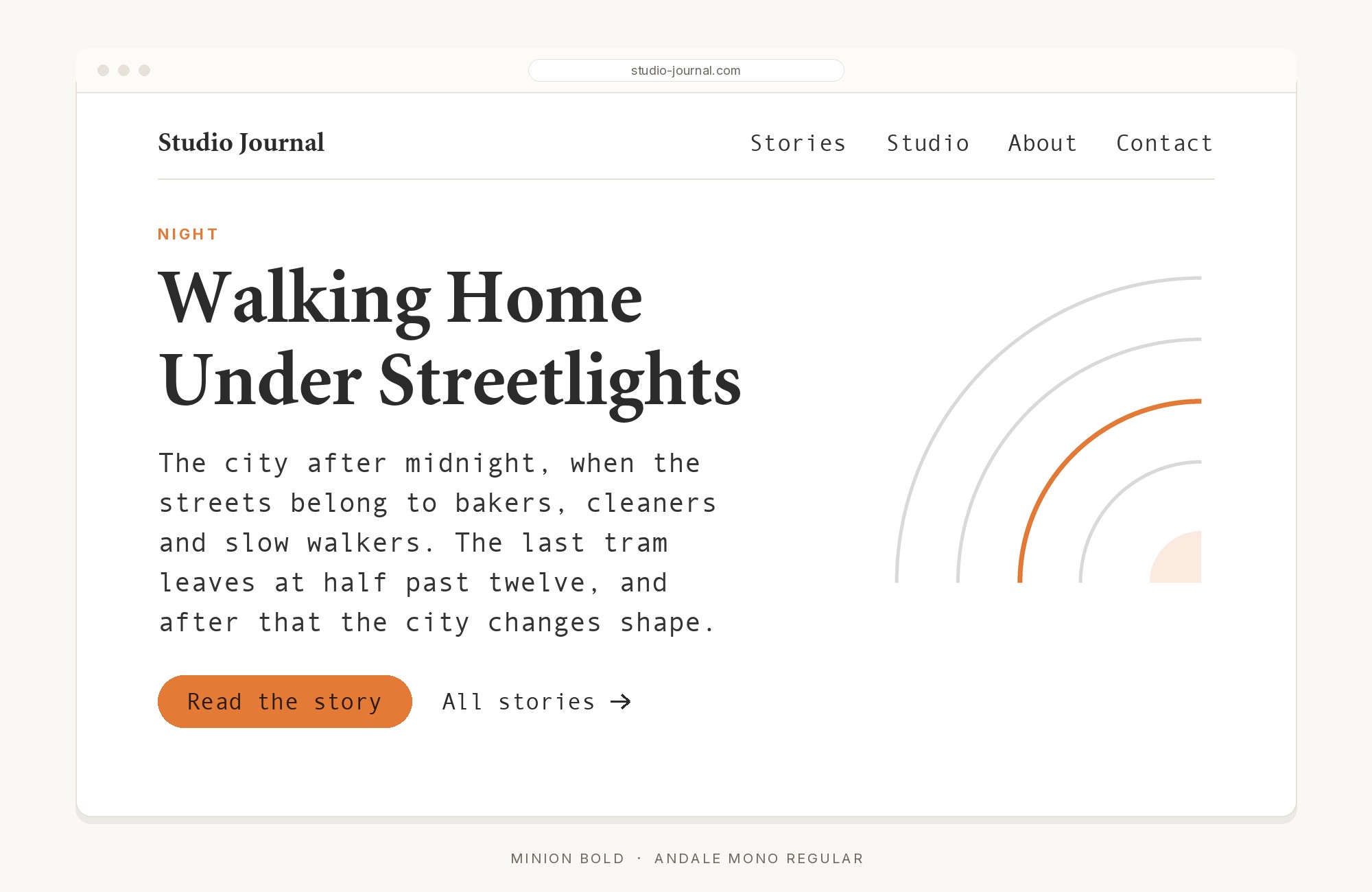
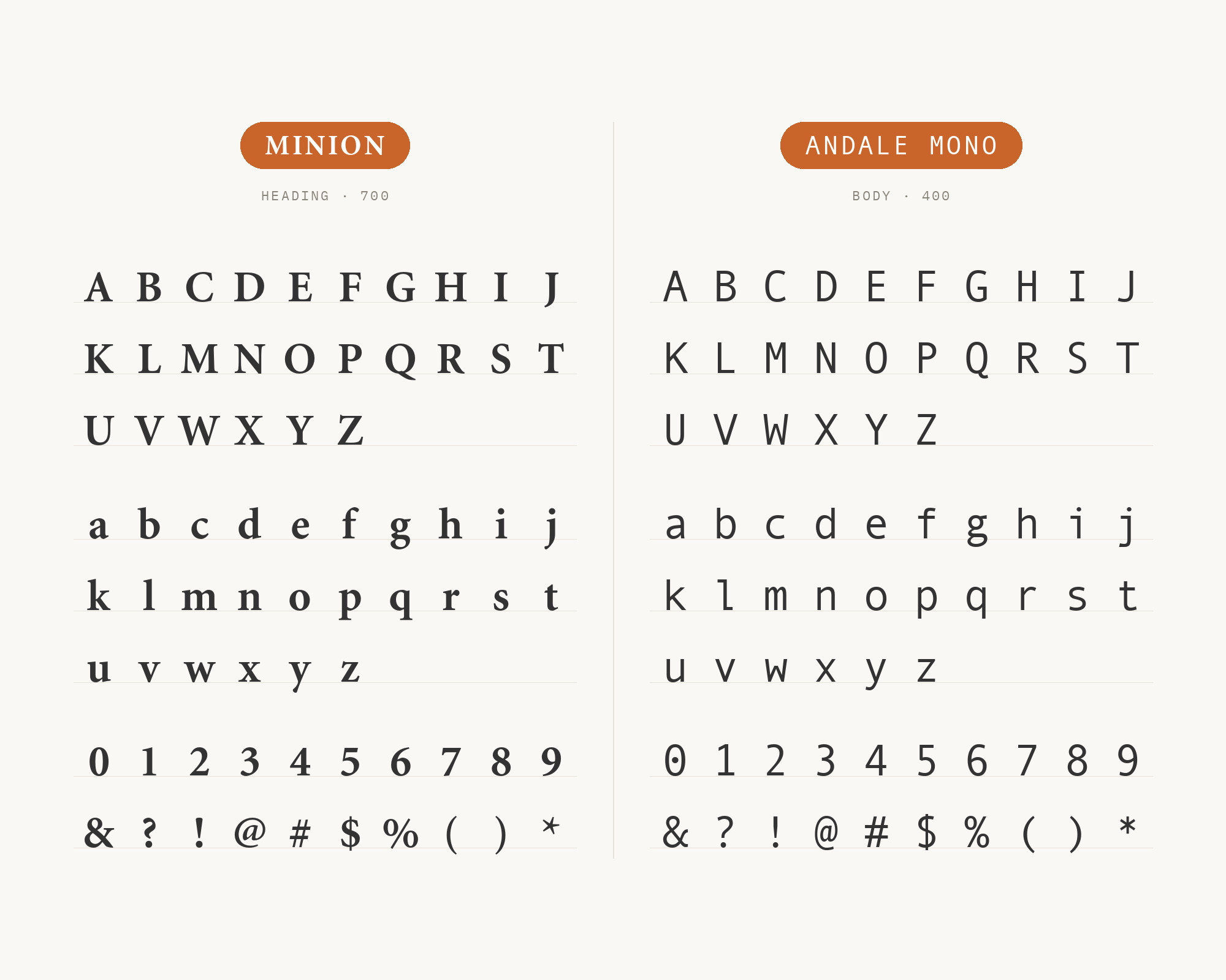
Minion completes the serif side of the SUR list. Robert Slimbach designed Minion for Adobe in 1990, for body text and extended reading. Minion is a Renaissance-style book face, calm and even on the page.
It is the best partner here for long reading. Andale Mono should not try to compete with it. Instead, use the mono for apparatus: footnote numbers, image credits, page references.
The fixed width marks these as data, separate from the text. Set Minion’s headings in its semibold or bold, so the serif also carries the top of the hierarchy. This works for books, journals and long-form web essays.
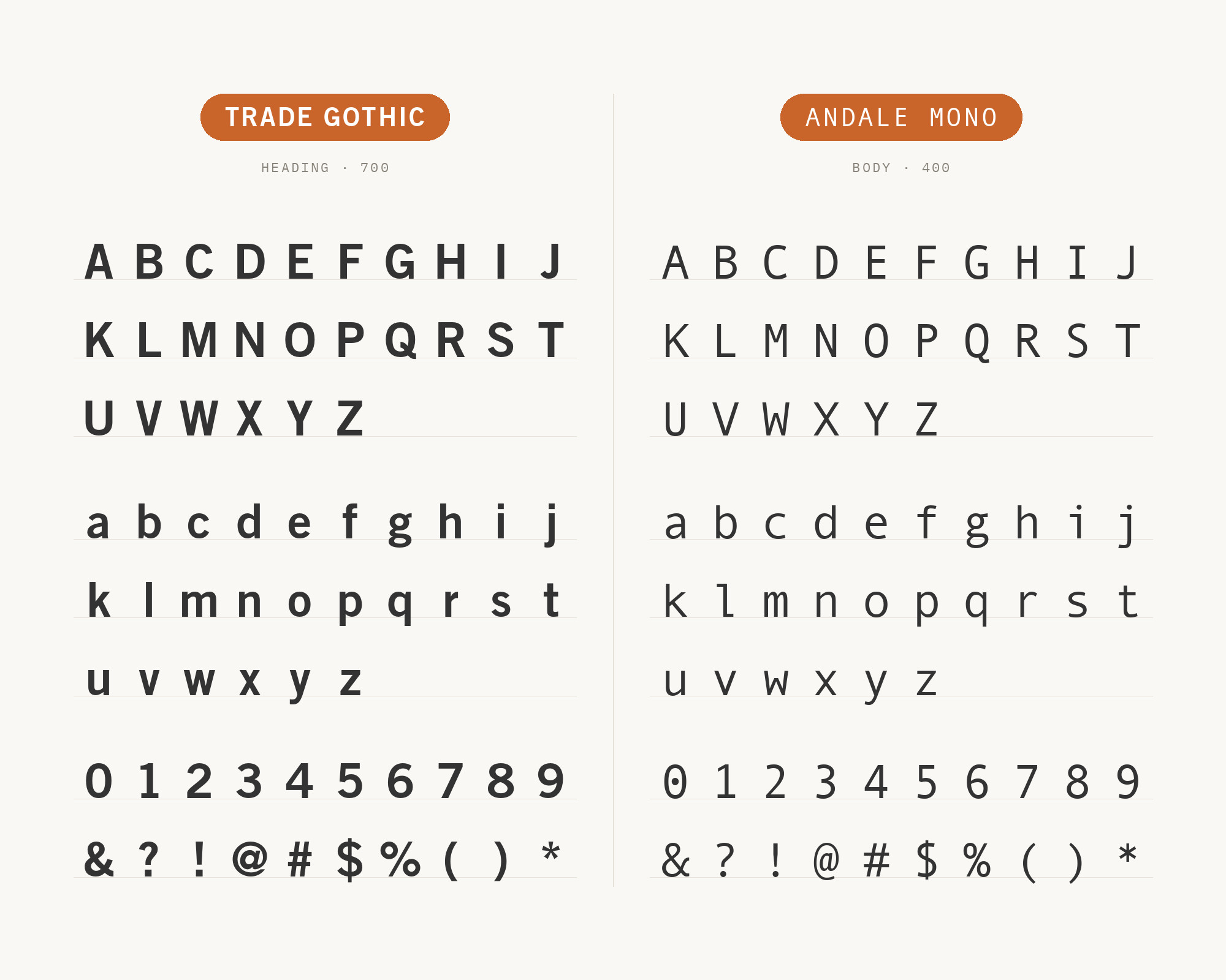
8. Trade Gothic
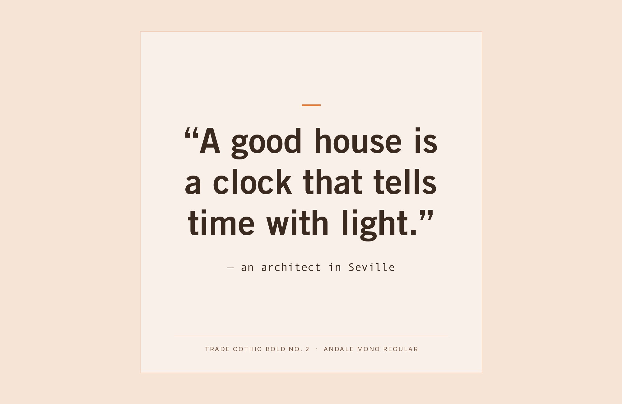
Fonts In Use lists Trade Gothic with Andale Mono in the Enablis report. Jackson Burke designed Trade Gothic in 1948, while he directed type development for Linotype in the US.
Trade Gothic is a workmanlike grotesque, a little irregular and very direct. Its condensed and bold styles make strong headlines.
Andale Mono then supplies the numbers and fine print of a report. Both faces feel practical rather than fashionable.
Use Trade Gothic Bold Condensed for the headings.
Use Andale Mono for figures, tables and side notes. This pair suits annual reports, posters and information design.
9. Linotype Didot
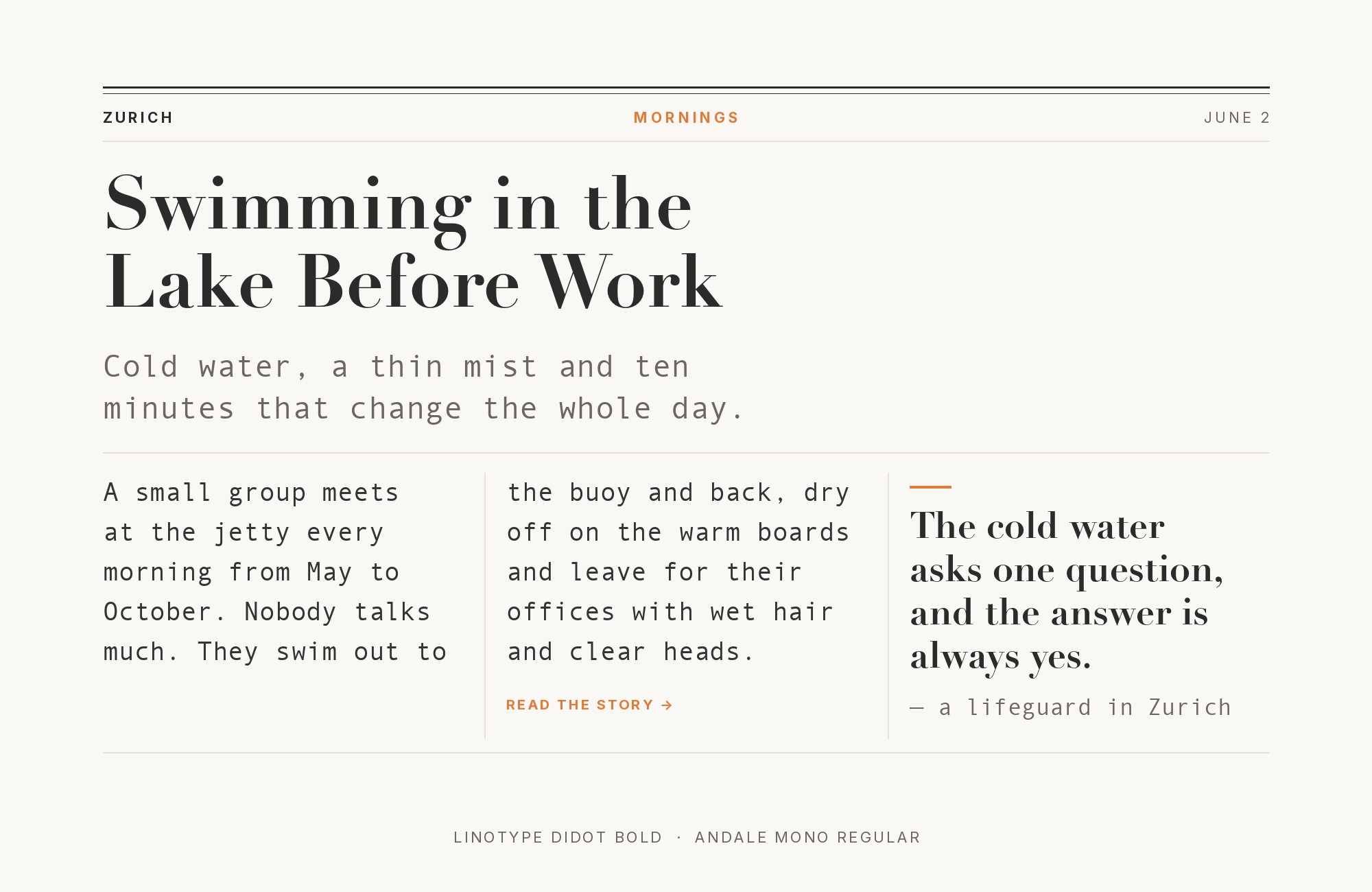
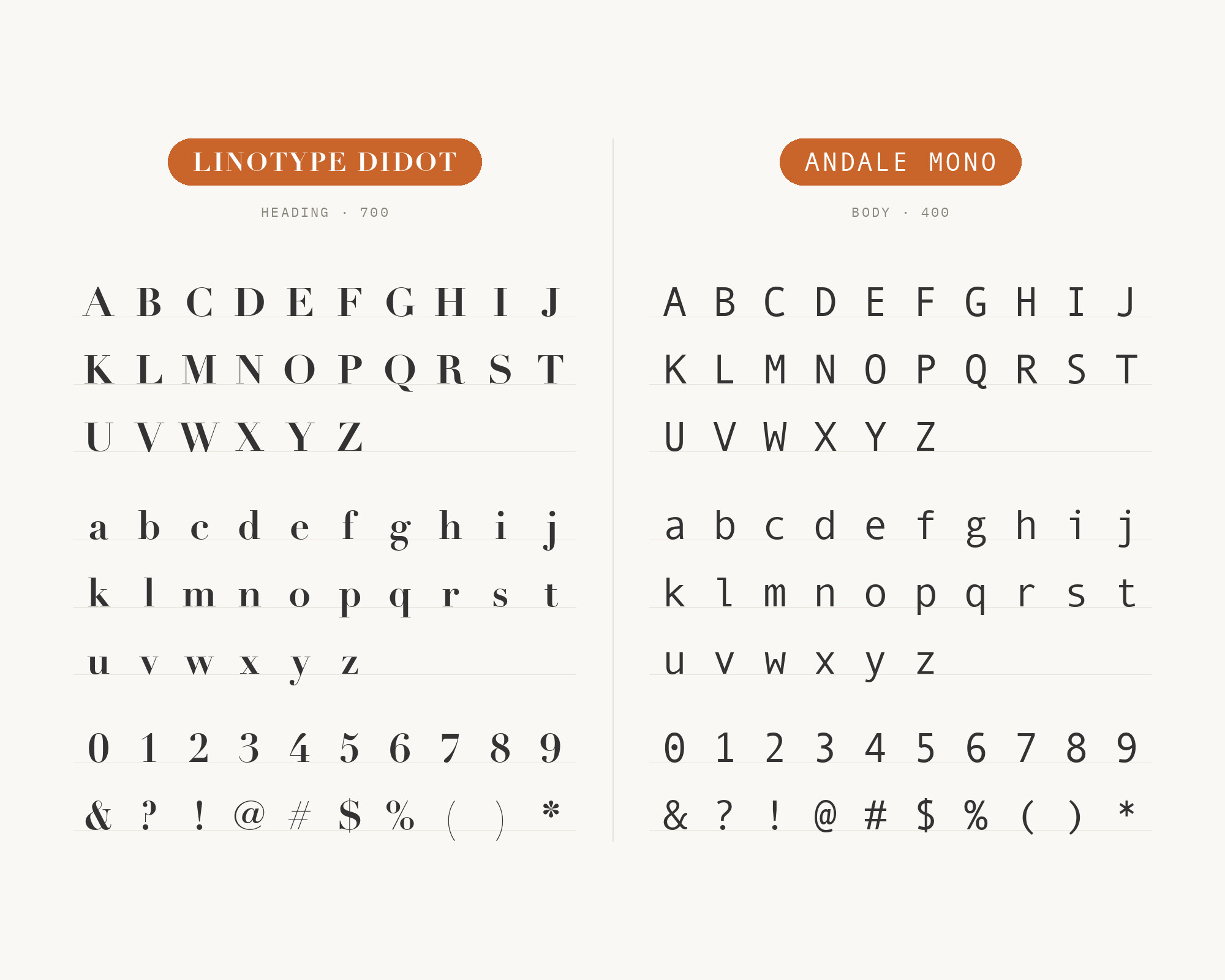
Linotype Didot is in the same Enablis typeface list. The most famous Didot typefaces were developed in 1784–1811.
Linotype Didot is Adrian Frutiger’s version. Didot has extreme contrast: heavy vertical stems and hairline serifs. Andale Mono has almost no contrast.
That makes this the most dramatic pair in the list.
Didot must take the display role, at a large size where its hairlines survive. Andale Mono sits below it in small, plain lines.
The effect is fashion-meets-terminal, elegant and a little cold. Do not set Didot small, and do not set Andale Mono large.
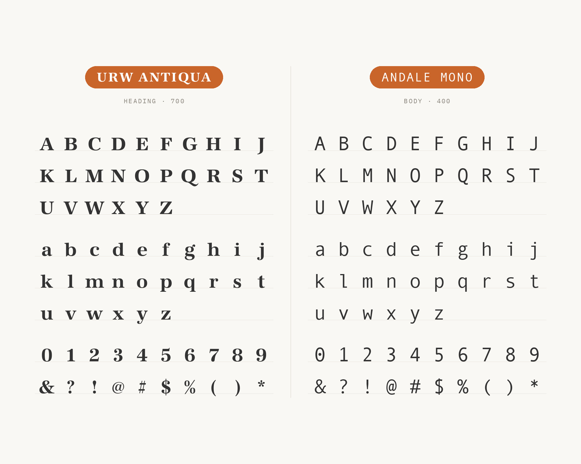
10. URW Antiqua
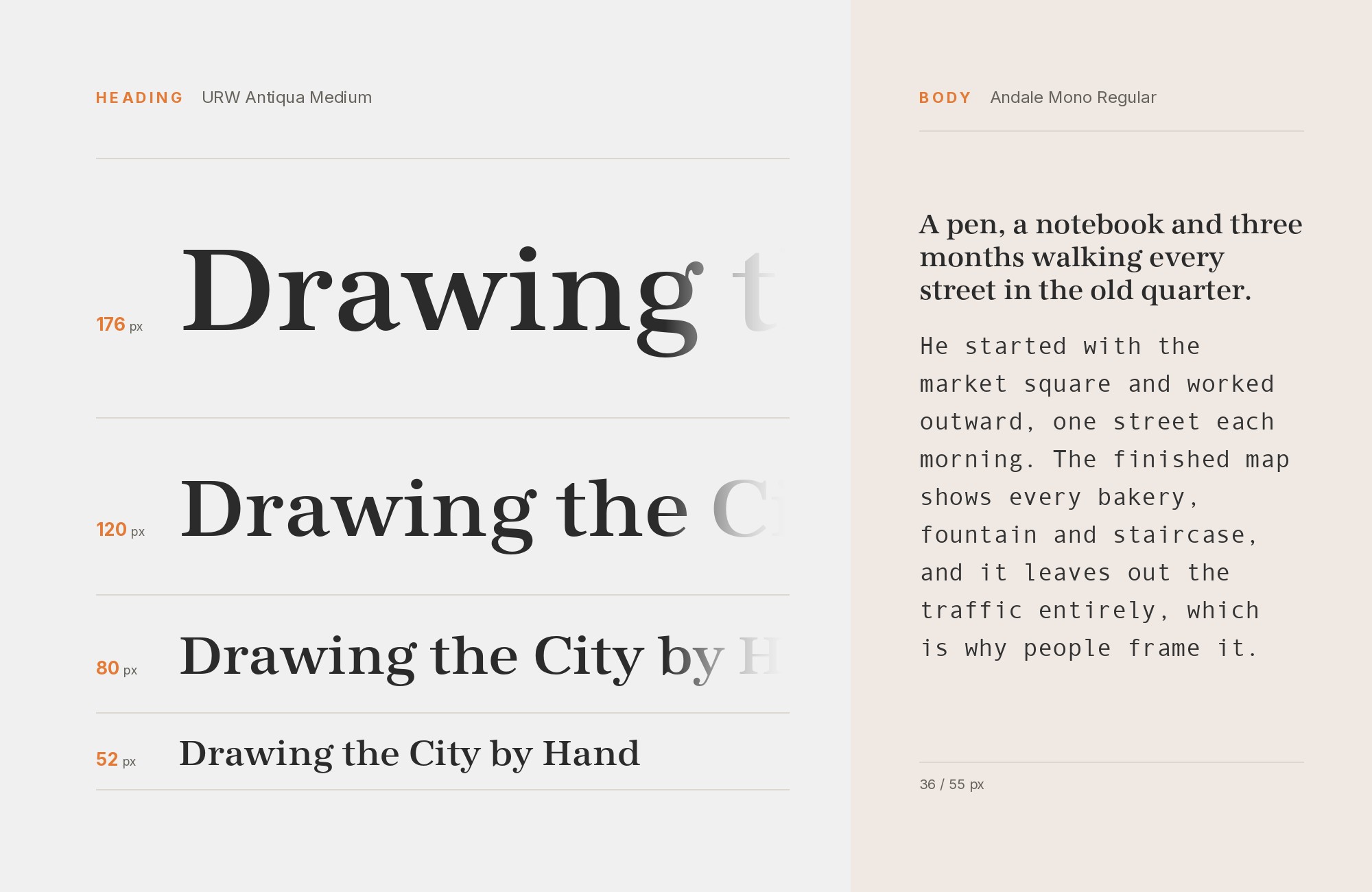
URW Antiqua is one more serif in the Enablis typeface list. It brings modulated strokes and a literary, book-like tone.
Against it, Andale Mono reads as a typewritten insert. That document feeling is the point of this pair.
Set URW Antiqua for headings and the main text.
Use Andale Mono for quoted records, form fields, dates and file references. The result looks like a well-made archive or case file.
11. Snell Roundhand
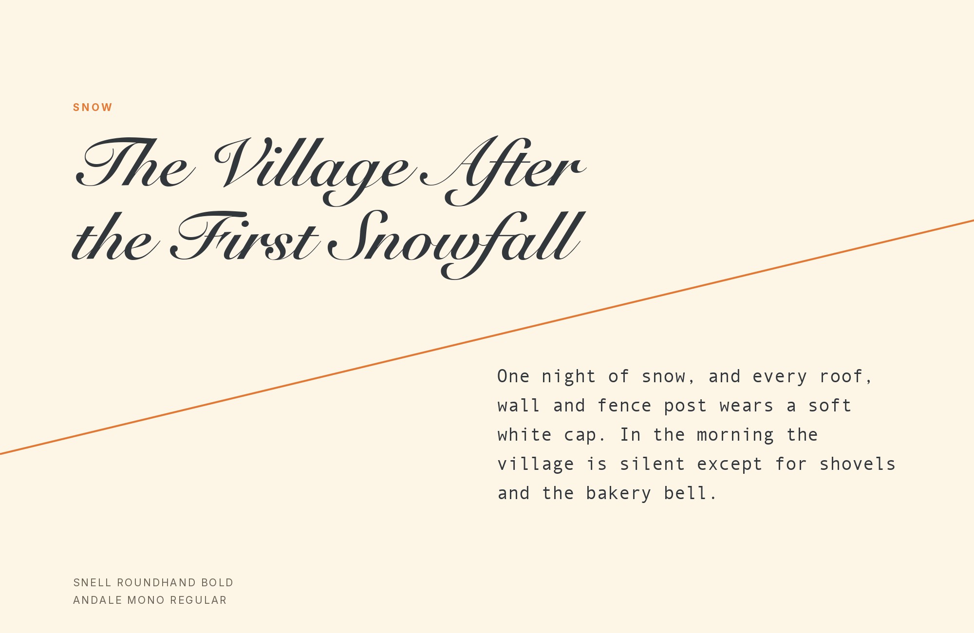
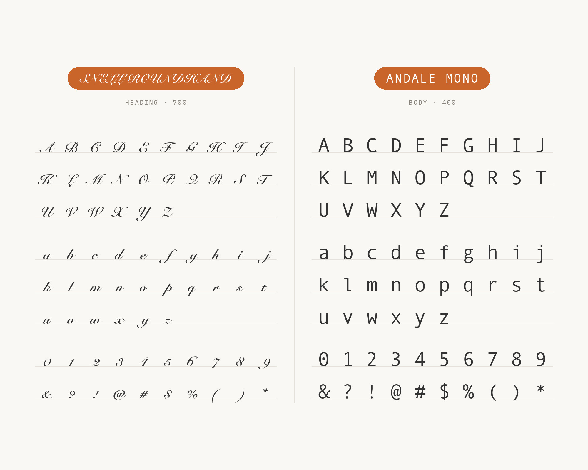
Snell Roundhand is the script in the Enablis typeface list. The English-born type designer Matthew Carter created Snell Roundhand at Linotype.
It is a formal connected script, with sloping, looping capitals. Andale Mono is its exact opposite: upright, separate and mechanical.
That opposition only works with strict roles. Snell Roundhand takes a single display word or name, set large.
Andale Mono takes every line of factual text around it. Never set the script in more than a few words. This pair suits invitations, menus and labels that mix ceremony with plain information.
Conclusion
Andale Mono pairs best when it does not try to lead. Every pairing above gives the heading and the reading to the partner. Andale Mono keeps the labels, numbers, captions and code.
The strongest evidence is for DIN and Univers. Inter has the clearest role guidance, from a type designer’s own sample.
For a quiet page, choose a neutral sans like Univers or Helvetica. For long reading, choose a book serif like Minion or Times New Roman. For drama, choose Didot or Snell Roundhand, and keep the mono small.
Test the pair at your real sizes before you commit. A monospace that looks charming in small text can look heavy and wide in a headline. For more tested combinations, see The Big Book of Font Combinations.
Sources
- Typewolf (Andale Mono, live)
- Typewolf (Andale Mono, Wayback 2020-12-05)
- Typewolf Site of the Day: Kerem Suer
- Jen Wagner Co.
- Fonts In Use (Andalé Mono typeface page)
- Fonts In Use (SUR #1)
- Fonts In Use (SUR #1, Wayback 2019-10-21)
- Fonts In Use (Enablis 2010)
- Wikipedia (Andalé Mono)
- Microsoft Learn (Andale Mono)
