Utopia pairs great with Miller, Letter Gothic and Futura. All 14 pairings are shown below in real rendered specimens, with the reason each one works.
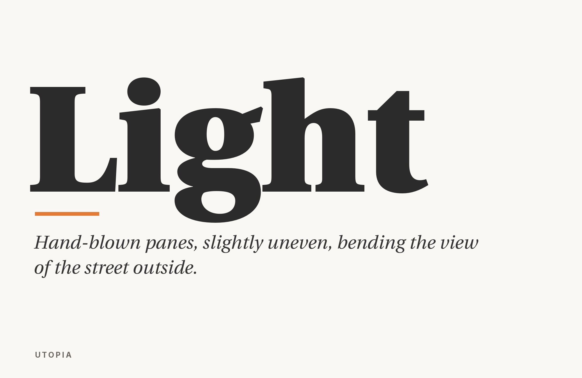
What fonts go with Utopia? Start with the job it was hired for: a sturdy transitional serif with optical sizes ranging from Caption through Display, and a range of use that Adobe says runs from corporate communications and advertising to book and newspaper publishing.
Robert Slimbach designed Utopia for Adobe Originals in 1989, in the first wave of that in-house foundry. Adobe’s own release notes cite Baskerville and Walbaum as the eighteenth-century models; Sumner Stone later compared the drawing to Hermann Zapf’s Melior. What Slimbach actually shipped is a high-waisted, vertically stressed roman with enough stroke contrast to read as neoclassical and enough weight in the thins to survive small sizes and newsprint. Current versions come in four optical variants, for display, headline, regular and caption sizes, each in regular, semibold and bold; a black weight is available in the headline size. On October 11, 2006, Adobe donated the Type 1 version to the TeX Users Group; the commercial family remains available through Adobe Fonts.
Because Utopia already covers caption through display, the pairing question is less “what can this serif not do” and more “what voice should sit next to a workhorse.” The projects and identity guides show sans and serif companions. In this guide, I generally assign sans partners to short display or navigation roles and Utopia to longer text. Miller and Lora stay inside the serif register, splitting optical duty or warmth rather than leaving serifs behind. Here are 14 fonts that pair well with Utopia, all documented in real use, institutional guidance, or named typographic commentary.
1. Miller

Matthew Carter drew Miller with collaborators for Font Bureau, which released the Scotch roman in 1997. Pairing it with Utopia is a same-register conversation: two late-twentieth-century text serifs splitting duties by optical role instead of by temperament. Typewolf records the combination on New York on ICE, where Miller sits in the same system as Utopia; Fonts In Use documents Miller beside it on a ProPublica investigative story. Use Miller for long-form reading and captions, and let Utopia Display or Subhead take the headlines. The pairing suits investigative journalism, magazines, and any editorial system that wants two workhorse serifs rather than a serif/sans split. Do not set both at the same size and weight — the kinship that makes the pair work will read as a duplicate if the hierarchy is not obvious.

Try Semrush free. No credit card.
Start on the $0 plan. Paid plans from $117/mo billed annually.
Try for free2. Letter Gothic

Roger Roberson designed Letter Gothic for IBM sometime between 1956 and 1962 as a monospaced sans for the IBM Selectric typewriter. Against Utopia’s proportional, high-waisted transitional roman it supplies a completely different texture: even character widths, a typewriter grid, and no serifs at all. Typewolf documents the pair on Sabrina Öttl’s site. That is the technical or portfolio use case — captions, metadata, image credits, code-adjacent labels — not a second reading face. Keep Letter Gothic small and in short runs, where its fixed pitch reads as precision rather than as a typesetting error, and let Utopia Regular or Caption carry every paragraph. Designer portfolios, architecture sites, and editorial layouts that want one monospace voice for the apparatus around the text are the natural home for this. If the project also needs a proportional sans, do not ask Letter Gothic to impersonate one; add a proportional gothic for that job and keep the mono in its grid.

3. Futura

Paul Renner began sketching Futura in 1924, and it was released in 1927 as a geometric sans based on geometric shapes, especially the circle. That compass-and-straightedge logic is the structural opposite of Utopia’s vertical stress, bracketed serifs, and neoclassical contrast, which is exactly why the two work as a display/text split rather than as a clash. Typewolf records Gather Journal running Futura with Utopia; Fonts In Use confirms the same project. Give Futura the display role — section titles, cover lines, uppercase labels — where its geometry is crisp, and keep Utopia for the reading matter the journal actually exists to hold. Cultural magazines, food and lifestyle editorial, and any brand that wants a modernist headline over an eighteenth-century-derived text face will get this split for free. At small sizes Futura’s single-story a and tight apertures can pinch; do not ask it to do Utopia’s caption job.

4. Gotham

Tobias Frere-Jones designed Gotham in 2000, basing it on the lettering of older New York buildings, with a relatively broad design, wide apertures, and a vernacular geometric stance that is American rather than Bauhaus. That is the voice Utopia’s European transitional structure does not have: painted, public, civic. Typewolf documents Elm Coffee Roasters pairing Gotham with Utopia (Apercu also appears on that site). Run Gotham for the wordmark, navigation, and short packaging lines, where its sign-painter geometry holds, and let Utopia take menus, about-pages, and any paragraph longer than a headline. Food, hospitality, and civic brands that want a contemporary American sans over a serious reading serif are the obvious market for it. Gotham is a retail face; if the license is not available, the documented logic still holds with another wide geometric, but the specimen here is Gotham because that is the face the live site actually used.

5. DIN

DIN descends from DIN 1451, the German industrial standard for lettering on technical drawings and road signage, later adapted into digital families such as FF DIN. Its counters are narrow, its stroke weight is close to uniform, and its proportions were optimized for legibility at a glance rather than comfort over a paragraph — the opposite brief from Utopia’s newspaper roman. Typ.io lists DIN as a font that goes well with Utopia and links the combination to lukas-schweizer.ch; the source provides co-use and recommendation evidence, not a frequency count. Use DIN for headlines, wayfinding, data, and interface chrome; keep Utopia for running text, captions, and anything meant to be read rather than scanned. Photography portfolios, product sites, and technical or sports identities get an engineered sans over a sturdy serif, which is usually the brief. DIN’s condensed rhythm will fight Utopia’s relatively wide capitals if you set both at the same size — keep a clear size gap.

6. Lora

Lora came out of the Cyreal studio in 2011: a contemporary serif with roots in calligraphy, brushed curves, moderate contrast, and drawing optimised for the screen. Pairing it with Utopia is a serif-on-serif split by temperament: Lora’s brush-derived curves and warmer italic supply the handwritten quality Slimbach’s transitional roman deliberately withholds. Fonts In Use records both faces on the Pioneering Women of American Architecture website. Give Lora the supporting or secondary reading role — pull quotes, biographical asides, captions that should feel personal — and keep Utopia for the primary text and display cuts, where its optical sizes and high-waisted structure do the institutional work. Cultural institutions, biographies, and editorial features can add a second serif voice here without leaving the serif register. Because Lora is free on Google Fonts, it is also the practical screen companion when Utopia is licensed for print and a webfont stand-in is needed.

Turn your ideas into repeatable creative workflows - no code required. Create with ready-made templates and AI-powered tools in Picsart Flow.
See details7. Vectora

Adrian Frutiger designed Vectora for Linotype-Hell in 1991 as a contemporary sans. Fonts In Use documents Vectora and Utopia in the Berliner Missionswerk project. Their co-use makes Vectora a defensible sans option here; test the two at the intended sizes instead of assuming equal point sizes will produce equal apparent scale. Use Vectora for headlines, navigation, and short informational text; let Utopia hold the long reading, reports, and anything that benefits from optical sizes. Nonprofit, religious, and institutional publications need a serious sans next to a serious serif; this one arrives without Futura’s geometry or Gotham’s vernacular American stance. Test the pairing in real copy rather than assigning shared metrics or lineage that the source does not establish.

8. Trade Gothic

Jackson Burke designed Trade Gothic in 1948 and kept adding style-weight combinations until 1960 while he directed type development for Linotype. The family includes three weights and three widths, and it is more irregular than later sans faces such as Helvetica, with the slightly battered texture of mid-century jobbing type. That condensation is the contrast: Utopia’s capitals are relatively wide and high-waisted; Trade Gothic squeezes the headline into a banner, a lower-third, or a lockup. Fonts In Use records the pair on La Effe TV’s branding. Run Trade Gothic Bold Condensed for titles, channel IDs, and any line that has to fit a tight horizontal; keep Utopia for programme notes, long-form web copy, and credits. Broadcast, media, and event identities want a louder sans than DIN and a less geometric one than Futura; this is it. At text sizes Trade Gothic’s irregularities show; do not use it as a substitute for Utopia Caption.

9. News Gothic

Morris Fuller Benton designed News Gothic for American Type Founders in 1908, similar in proportion and structure to his Franklin Gothic but lighter, with a clean, newspaper-grade American grotesque structure. In a 2005 `comp.fonts` thread about sans faces for Utopia — the question came from a LaTeX user setting reports and a dissertation in Slimbach’s roman — Walter Schmidt and Michael Zedler both named News Gothic. Zedler wrote that its width and blackness fit the stiff look of Utopia. Schmidt found neutral sans faces such as Helvetica or Univers boring beside Utopia; News Gothic does not. Use News Gothic for chapter titles, section heads, running headers, and any sans line in a document whose body is Utopia. Reports, theses, journals, and institutional publications are the home ground, which is where Utopia’s open-source cuts still live. Keep a size gap so Benton’s gothic does not compete with Slimbach’s roman at the same apparent weight.

10. Roboto

New Orleans Baptist Theological Seminary’s official brand guide states that Roboto can combine with any of the Utopia fonts, and adds that all of the Utopia italics blend well with Roboto and Roboto Condensed. That is unusually direct institutional evidence. Use Roboto for schedules, navigation, and explanatory copy while Utopia handles titles, quotations, or longer editorial passages. Roboto’s open counters and steady screen color keep the information layer plain without turning anonymous. Match apparent size rather than point size: Roboto’s large lowercase can overpower Utopia Regular. A smaller Roboto setting beneath Utopia Display makes the division of labor clear before color or weight enters the layout.

11. Roboto Condensed

The same NOBTS guide explicitly approves Roboto Condensed with any of the Utopia fonts. The narrow sans earns a separate place because it solves a different layout problem from standard Roboto: dates, program listings, sidebars, and navigation can fit into tight measures without shrinking into illegibility. Keep Utopia on the main reading column or a generous headline and use Roboto Condensed for the narrow information track. Its vertical rhythm can look severe beside the serif’s broader forms, so avoid matching weights too closely. A semibold condensed label above a regular Utopia paragraph creates structure without asking either family to impersonate the other.

12. Source Sans Pro

HELCOM’s official visual identity guide says Utopia works well with Source Sans Pro and assigns Source Sans to primary body text, with Utopia used for secondary body text and quotations. That role split reverses the common serif-body assumption and makes this pairing useful for reports and institutional sites. Source Sans’s open apertures and modest condensation keep dense information moving, while Utopia marks reflection, emphasis, or editorial voice. Test quotation size carefully: Utopia’s contrast can look fragile if it is reduced to the sans’s smallest caption setting. Let the serif sit slightly larger, and use spacing rather than bold weight to distinguish the two reading layers.

13. Libre Franklin

Endicott College’s branding guidelines make Utopia the primary typeface for headlines and use Libre Franklin as the secondary face for subheads and supporting copy. That documented hierarchy gives the pairing a clear starting point: the serif carries institutional character, while the sans organizes the practical information below it. Libre Franklin’s open grotesque forms feel contemporary without importing Futura’s geometry or DIN’s industrial narrowness. Use a firm size step between headline and subhead, then set longer supporting text in a regular sans weight. If Libre Franklin grows too bold, it competes with Utopia’s dark verticals; lighter weights preserve the intended primary-secondary relationship.

14. Univers

The OPERAS design manual explicitly combines Utopia and Univers in its corporate identity, setting the wordmark in a modified semibold Utopia and the subline in a light Univers. Univers supplies coordinated weights and widths for captions, diagrams, and navigation while Utopia holds the page’s literary or editorial register. The two families differ enough in construction to establish hierarchy without decoration. Use Univers’s width range to solve space, not to create a second display event: a compact supporting line beneath Utopia Display is more convincing than two large headlines. Keep the sans tracking natural, and choose Utopia’s optical cut for the actual size so both textures remain controlled.

Conclusion
Utopia is a workhorse transitional serif whose optical-size family includes dedicated text and display cuts. The documented projects include sans and serif companions. In this guide, I generally assign the sans partners — Futura, Gotham, DIN, Vectora, Trade Gothic, News Gothic, and Letter Gothic — to short display or navigation roles and Utopia to longer text. Miller and Lora stay inside the serif register.
The thread did not reach consensus. Walter Schmidt and Michael Zedler favored News Gothic; others preferred Myriad Bold or found News Gothic too narrow. One participant called Helvetica and Univers boring. Treat each as attributed opinion. Set real copy at the sizes you intend to publish, use Utopia’s caption and display cuts for the jobs they were drawn for, and judge each partner by whether Slimbach’s high-waisted text voice still reads as the reading face once the headlines are in place.
