BonFX

Typography & Graphic Design Blog

  • Blog
  • Font Combinations
  • Books
    • The Preposterously Huge Book of Google Font Combinations
    • The Big Book of Font Combinations (Classic Fonts Edition)
  • Contact
You are here: Home / Graphic Design / What Fonts Go With Raleway?

The BonFX Letter

One good pairing.
Every Tuesday.

2-minute read · free

This week — no. 14

Quiet authority

Merriweather sets the tone in one line. Lato stays out of the way and lets it.

MERRIWEATHER 700  +  LATO 400

A font specimen, a pairing that works, and one line on why it works. That is the whole email.

Free. One click to unsubscribe. No sharing, ever.

What Fonts Go With Raleway?

What Fonts Go With Raleway?

August 17, 2026 by Douglas Bonneville

Raleway pairs great with Merriweather, Open Sans and Lato. All 15 pairings are shown below in real rendered specimens, with the reason each one works. Every pairing below is checked against 9 published typography sources.

What fonts go with Raleway? This elegant geometric sans-serif with distinctive character details requires partners that can complement its fashionable aesthetic without creating visual redundancy.

Raleway began as a single thin weight by Matt McInerney before being expanded into a comprehensive family by Pablo Impallari and Rodrigo Fuenzalida. Its design features distinctive alternates, including a beautiful single-story ‘a’ that gives headlines a sophisticated feel. The typeface straddles the line between geometric structure and humanist warmth, with elegant proportions that have made it popular in fashion, beauty, and lifestyle branding. Its lighter weights are particularly graceful, while heavier weights maintain refinement without becoming clunky.

Pairing Raleway means understanding its fashion-forward character. It reads as elegant and contemporary, which can clash with overly traditional or utilitarian companions. The best pairings either share its sophisticated sensibility or provide enough contrast to create intentional tension. Body text companions need enough personality to support Raleway’s elegance without overwhelming readers. Here are 15 fonts that pair well with Raleway, each chosen for how they engage with its distinctive aesthetic.

Font Pairings for Raleway

  1. Merriweather
  2. Open Sans
  3. Lato
  4. Roboto Condensed
  5. Bitter
  6. Cabin
  7. PT Sans
  8. Playfair Display
  9. Droid Serif
  10. Alice
  11. Avenir
  12. TeX Gyre Adventor
  13. Geo Sans
  14. Roboto
  15. Source Sans Pro

1. Merriweather

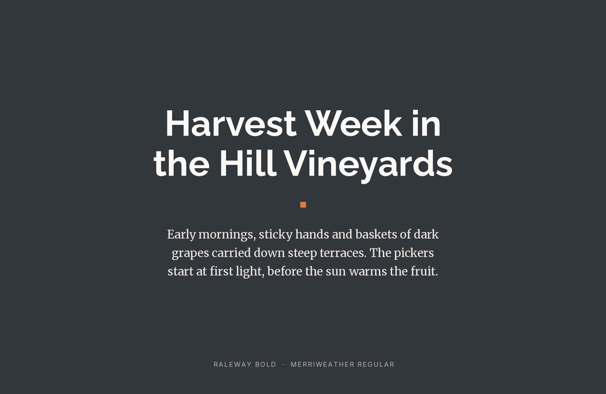
Raleway paired with Merriweather - Style A showing headline and body text

Raleway’s elegant thin strokes find their perfect counterweight in Merriweather‘s substantial serif presence. The distinctive Raleway ‘W’ brings geometric flair to headlines while Merriweather’s tall x-height ensures comfortable extended reading. This pairing whispers sophistication without pretension, making it ideal for boutique hotels, lifestyle magazines, or fashion editorials that prioritize refined aesthetics.
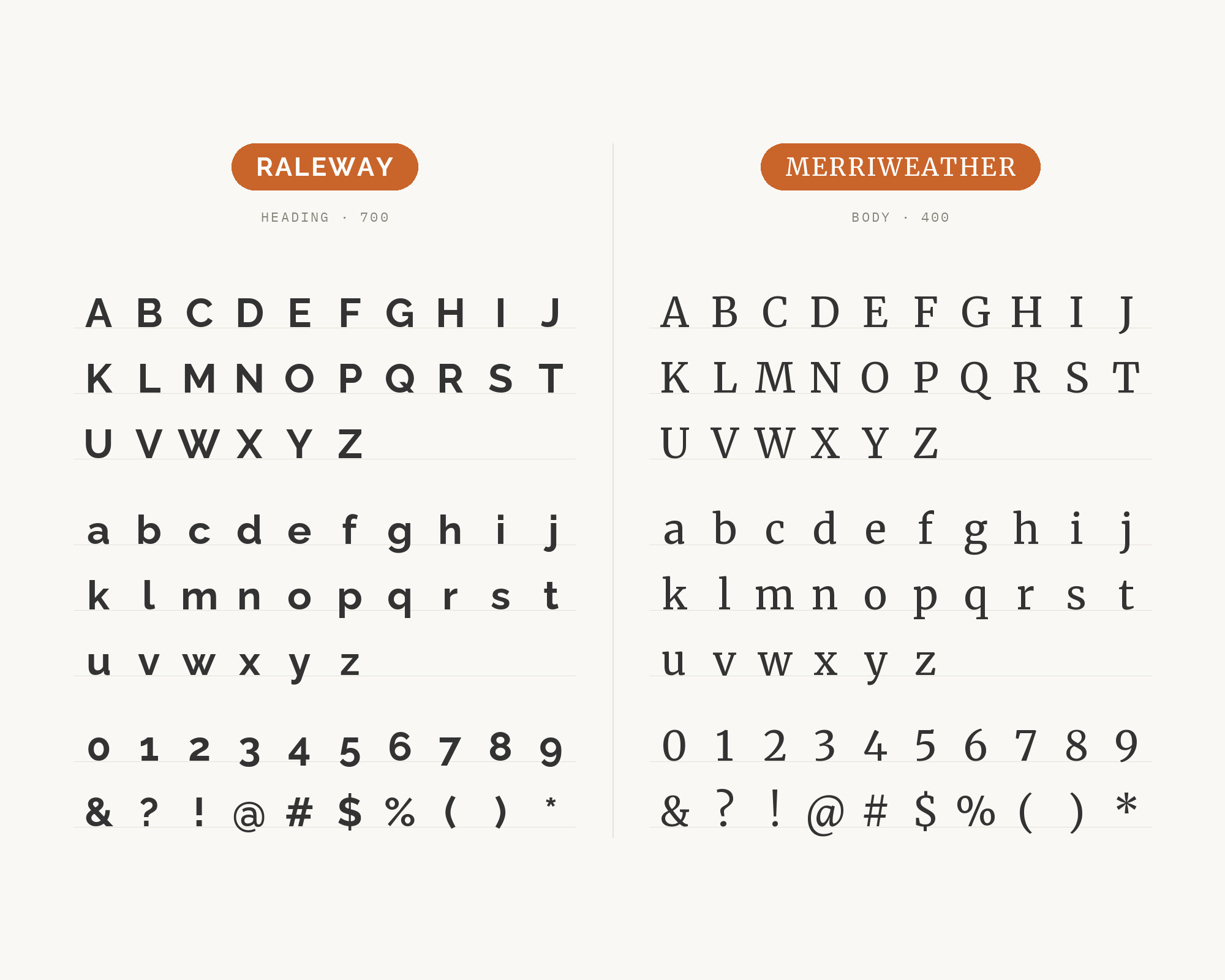
Raleway and Merriweather - Style B layout Character specimen showing Raleway and Merriweather alphabets

2. Open Sans

Raleway paired with Open Sans - Style A showing headline and body text

Sometimes simplicity wins. Open Sans provides the neutral, readable foundation that lets Raleway’s subtle personality shine in headlines. Both fonts share generous letter-spacing sensibilities and clean geometry, creating visual cohesion without redundancy. This versatile pairing works across contexts from corporate communications to personal blogs, adapting to whatever tone your content requires.
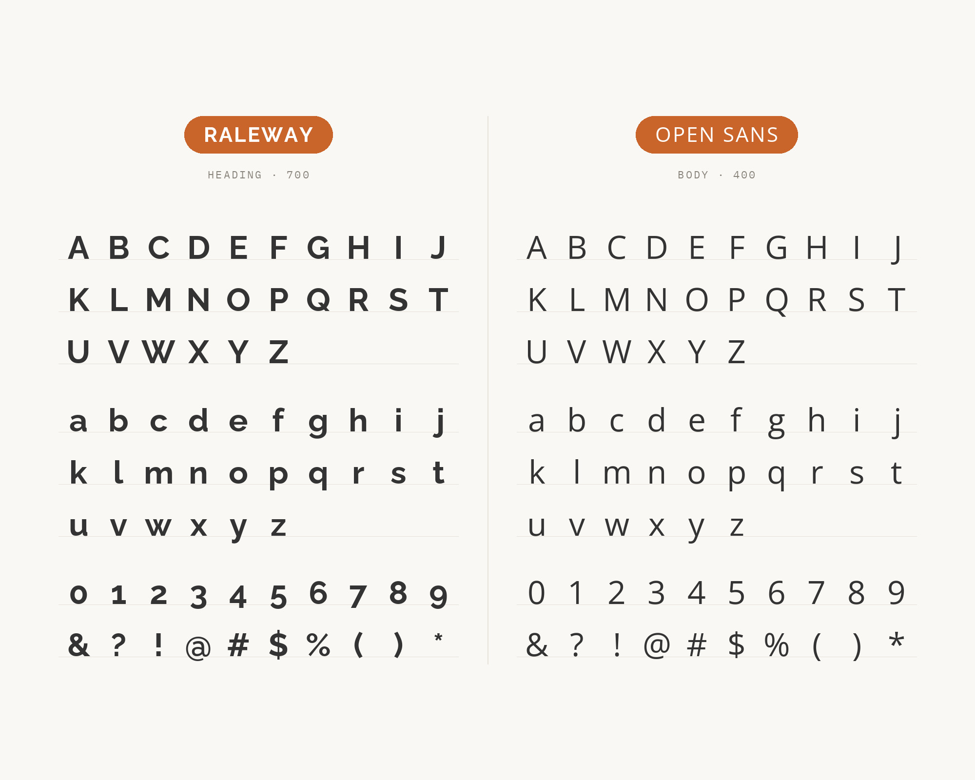
Raleway and Open Sans - Style B layout Character specimen showing Raleway and Open Sans alphabets

3. Lato

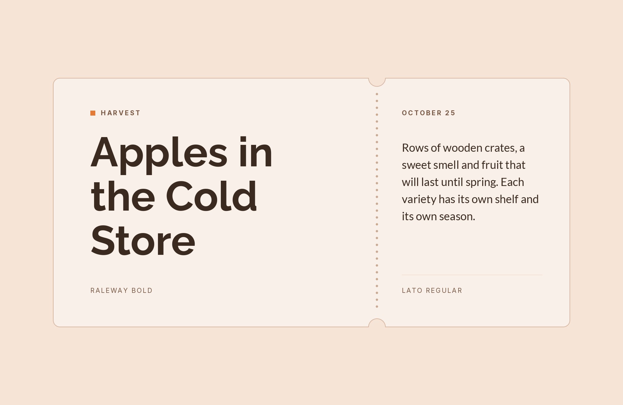
Raleway paired with Lato - Style A showing headline and body text

Two humanist sans-serifs with distinct voices create nuanced hierarchy. Lato‘s semi-rounded letterforms and warm personality complement Raleway’s cooler elegance. The weight differences between these fonts allow for flexible headline-to-body relationships. Use this for contemporary portfolios, startup websites, or anywhere modern sophistication needs approachable warmth.
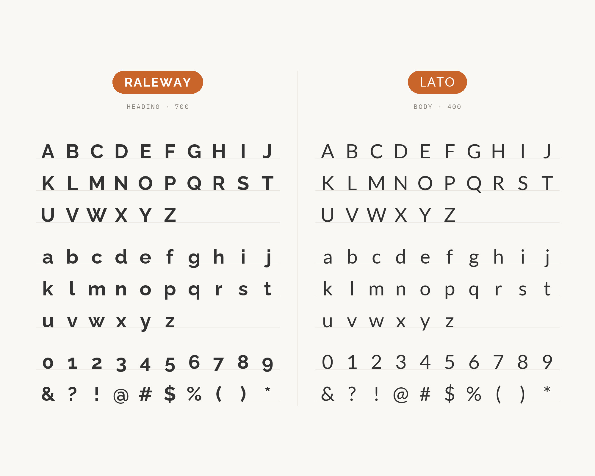
Raleway and Lato - Style B layout Character specimen showing Raleway and Lato alphabets
What Fonts Go With Raleway - the book from BonFX, coming soon

4. Roboto Condensed

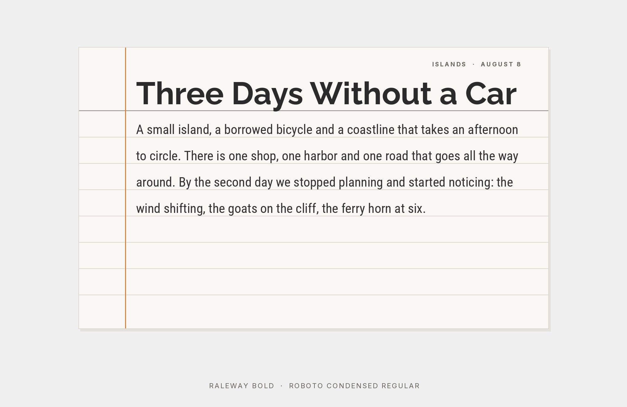
Raleway paired with Roboto Condensed - Style A showing headline and body text

Width contrast creates instant visual interest. Roboto Condensed‘s narrow efficiency contrasts with Raleway’s more generous proportions, establishing clear hierarchy through letterform width alone. The geometric foundations of both fonts ensure harmony despite their differences. This pairing excels in space-constrained layouts, mobile interfaces, or any design requiring compact headlines with readable body text.
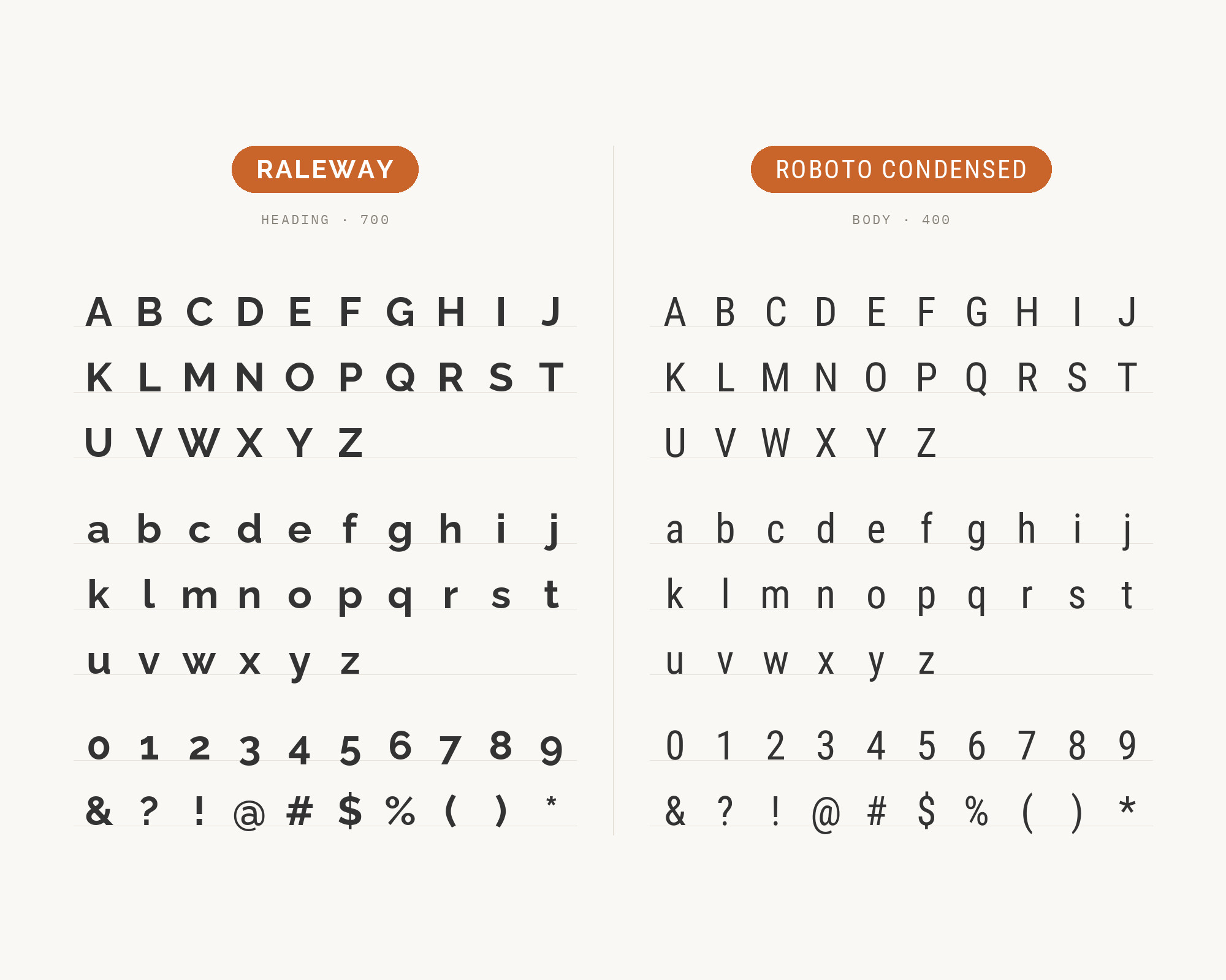
Raleway and Roboto Condensed - Style B layout Character specimen showing Raleway and Roboto Condensed alphabets

5. Bitter

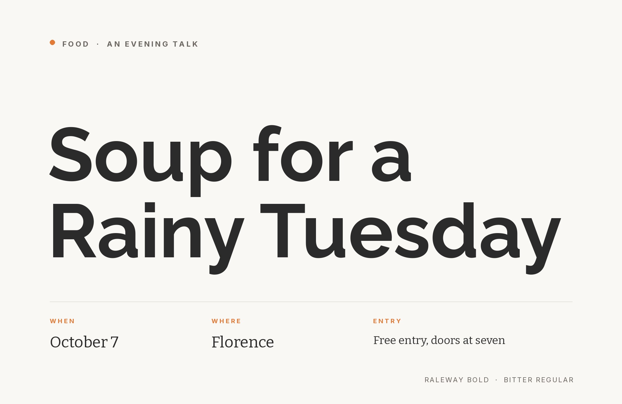
Raleway paired with Bitter - Style A showing headline and body text

Slab serif substance grounds Raleway’s ethereal lightness. Bitter brings weight and solidity to body text, its sturdy serifs providing visual anchors that prevent layouts from feeling too airy. The contrast between Raleway’s thin elegance and Bitter’s chunky presence creates engaging tension. Perfect for creative studios, artisanal brands, or editorial designs that need both finesse and foundation.
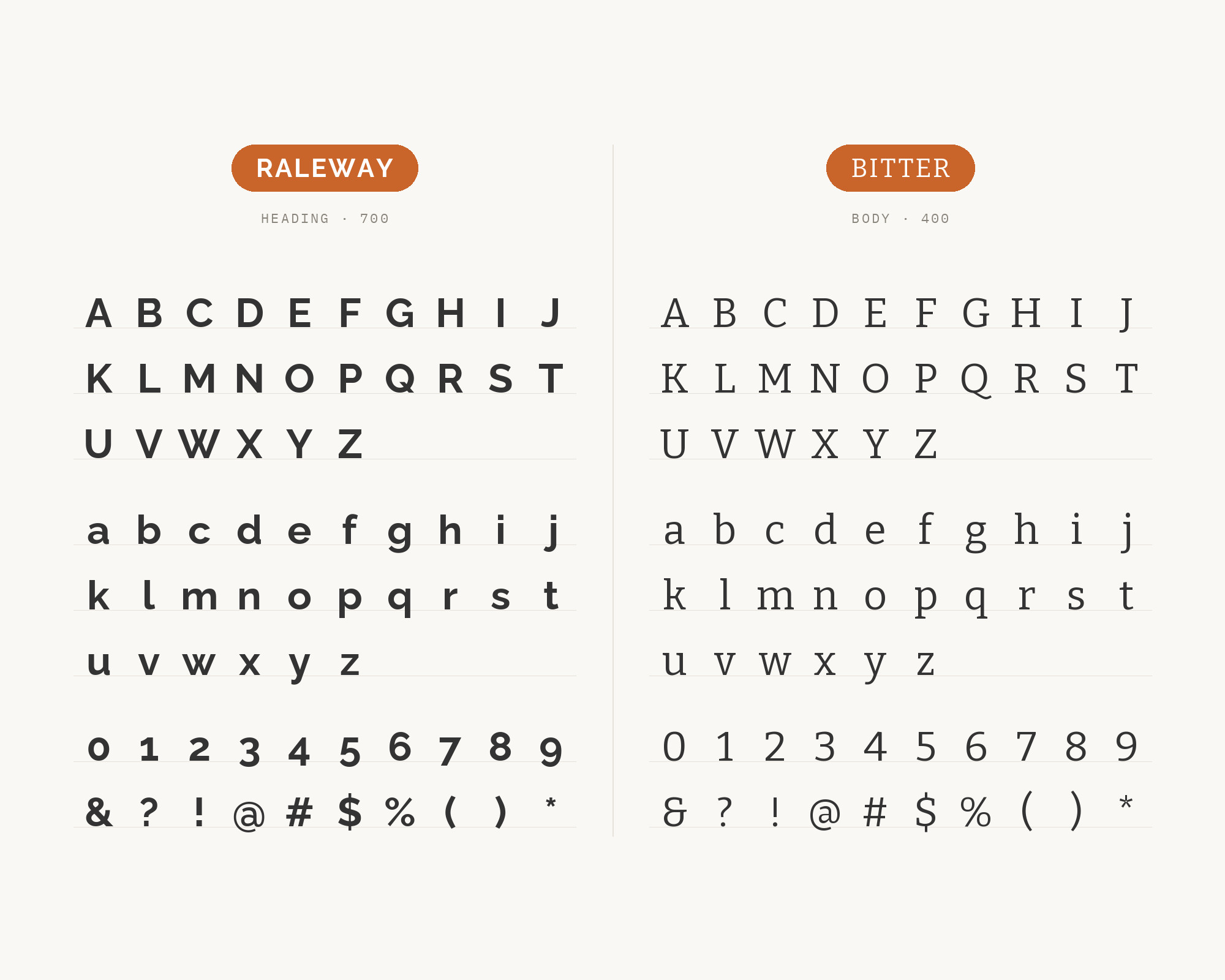
Raleway and Bitter - Style B layout Character specimen showing Raleway and Bitter alphabets

6. Cabin

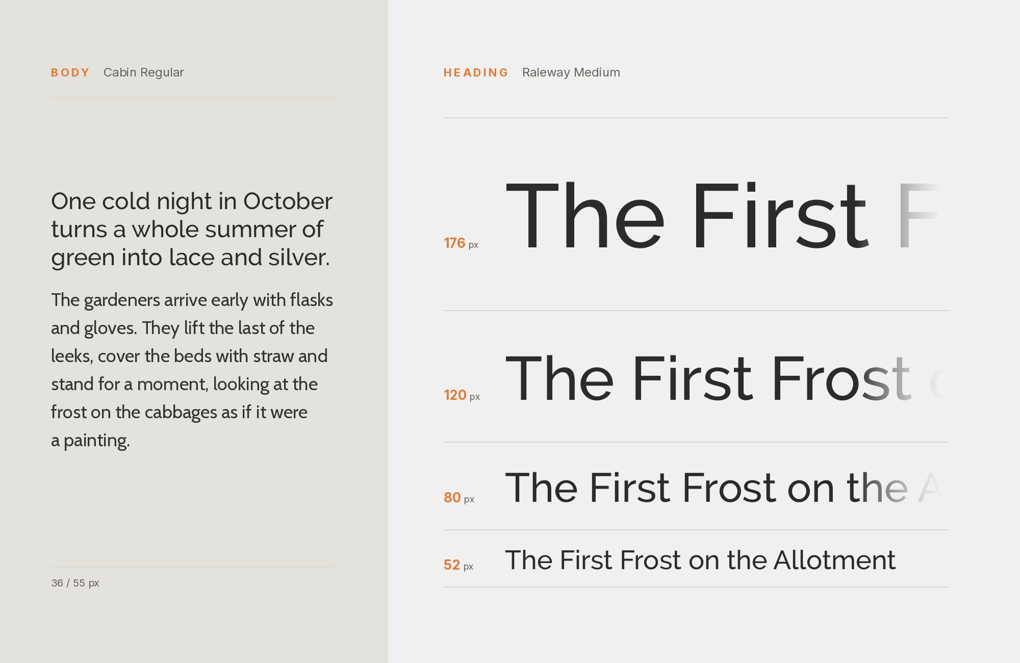
Raleway paired with Cabin - Style A showing headline and body text

Two fonts that share contemporary sensibilities without competing for attention. Cabin‘s rounded-geometric hybrid approach complements Raleway’s cleaner geometry while adding subtle warmth. Both fonts have extensive weight ranges allowing flexible hierarchies. Deploy this combination for tech-forward brands, mobile apps, or modern web experiences that prioritize clarity.
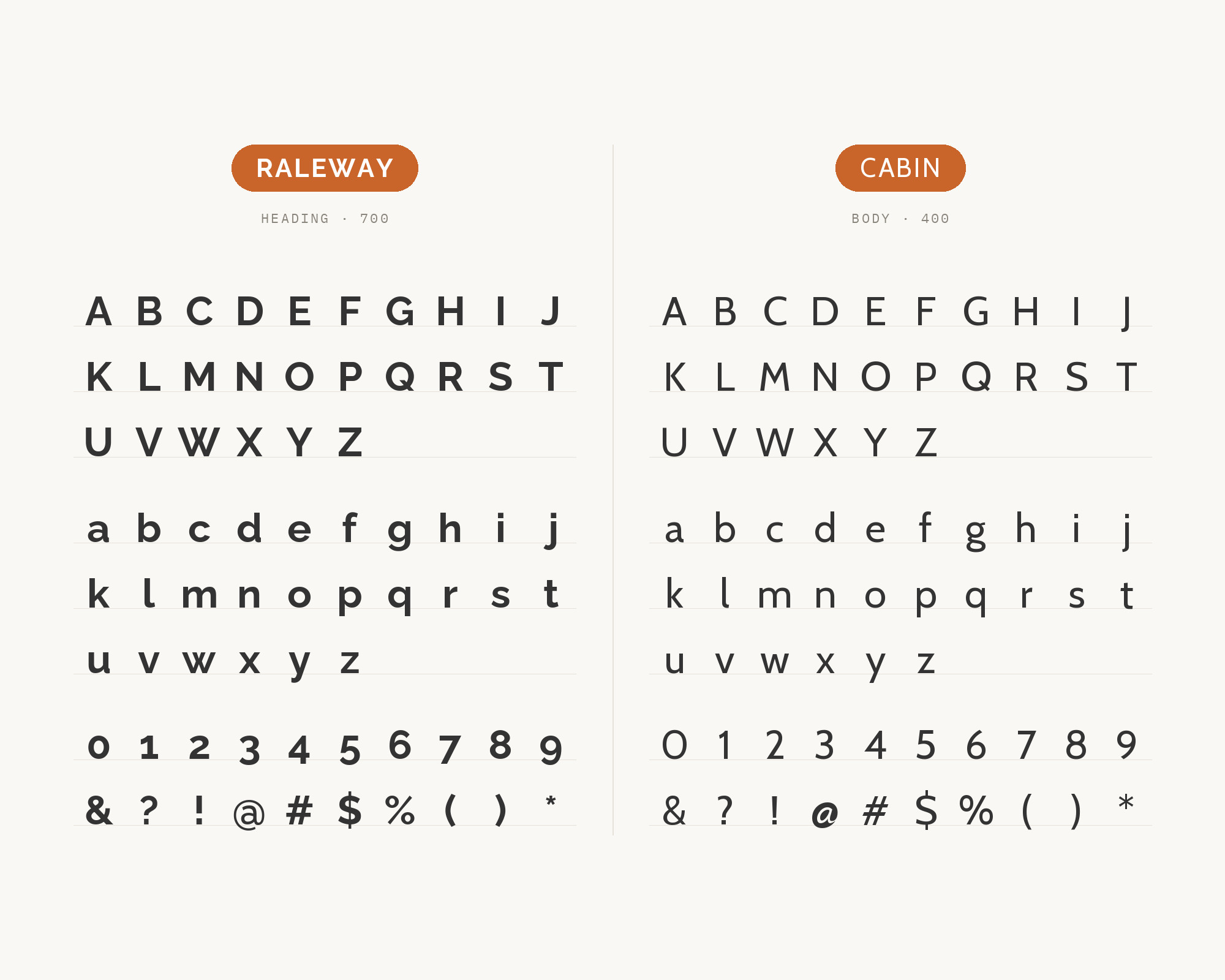
Raleway and Cabin - Style B layout Character specimen showing Raleway and Cabin alphabets

Free download

The Typography Primer.
Yours, right now.

Adobe's classic · PDF · free

The Typography Primer — book cover

The guide to type that everyone learned from. Subscribe and it is yours instantly. The BonFX Letter follows.

Free. One click to unsubscribe. No sharing, ever.

UX for Cats book cover
Love typography?
You'll love this article!
50 UX terms. Illustrated beautifully.
A visual guide for designers.
Read the Visual Guide

7. PT Sans

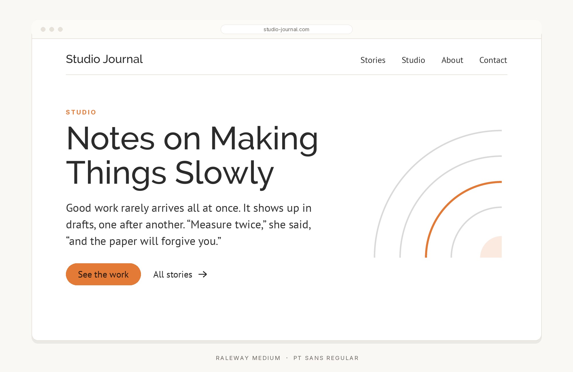
Raleway paired with PT Sans - Style A showing headline and body text

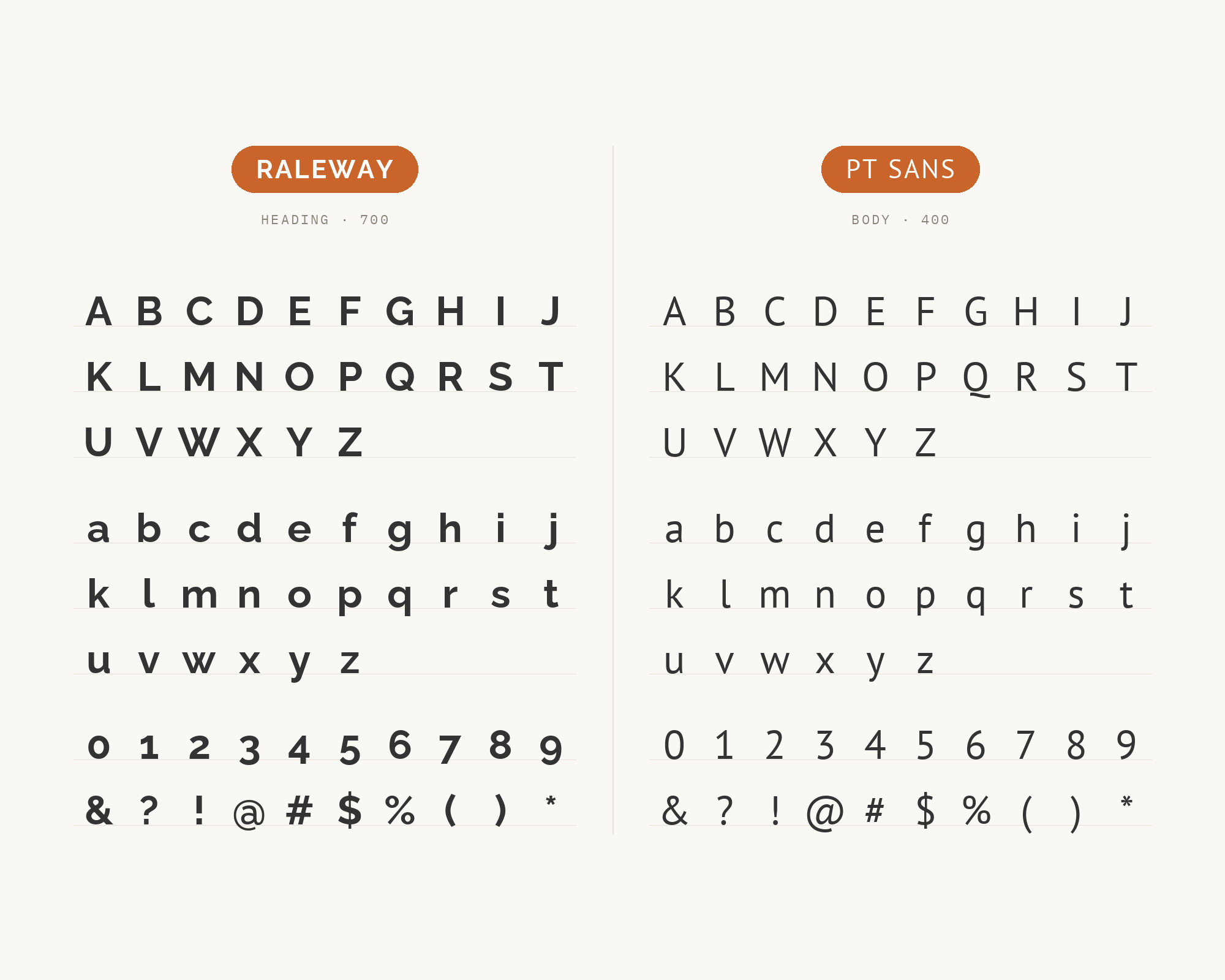
Clean lines and shared proportional logic unite these two sans-serifs. PT Sans brings Russian typographic heritage with its sturdy, practical letterforms, while Raleway contributes elegant headline presence. The pairing offers excellent multilingual support with consistent aesthetic tone. Ideal for international organizations, educational institutions, or any project spanning language barriers.

Raleway and PT Sans - Style B layout Character specimen showing Raleway and PT Sans alphabets

8. Playfair Display

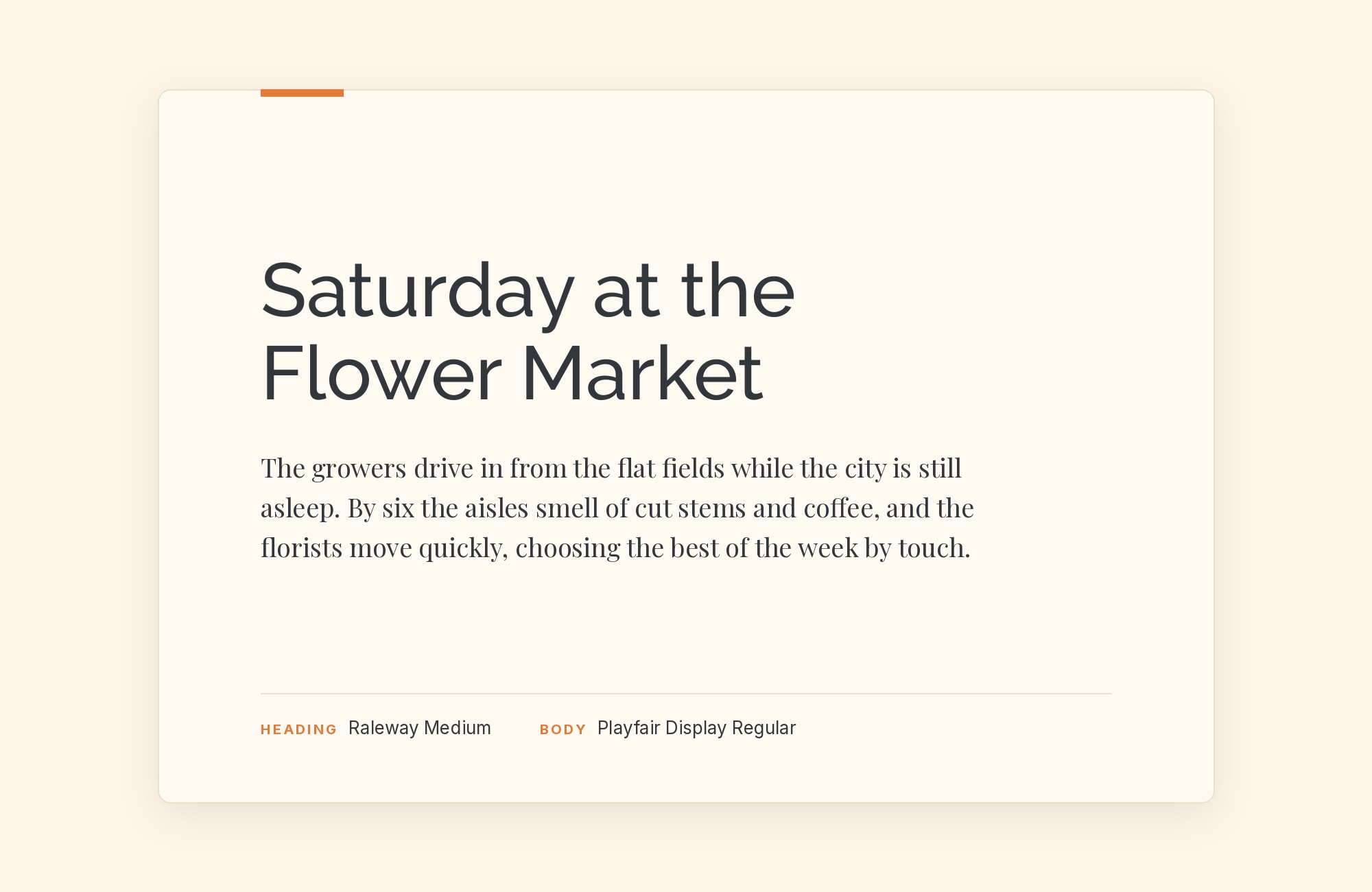
Raleway paired with Playfair Display - Style A showing headline and body text

High drama meets understated elegance. Playfair Display‘s theatrical stroke contrast and hairline serifs create headlines that demand attention, while Raleway’s measured sophistication grounds body text in contemporary clarity. This pairing suggests luxury without excess, perfect for high-end retail, wedding stationery, or lifestyle content aimed at discerning audiences.
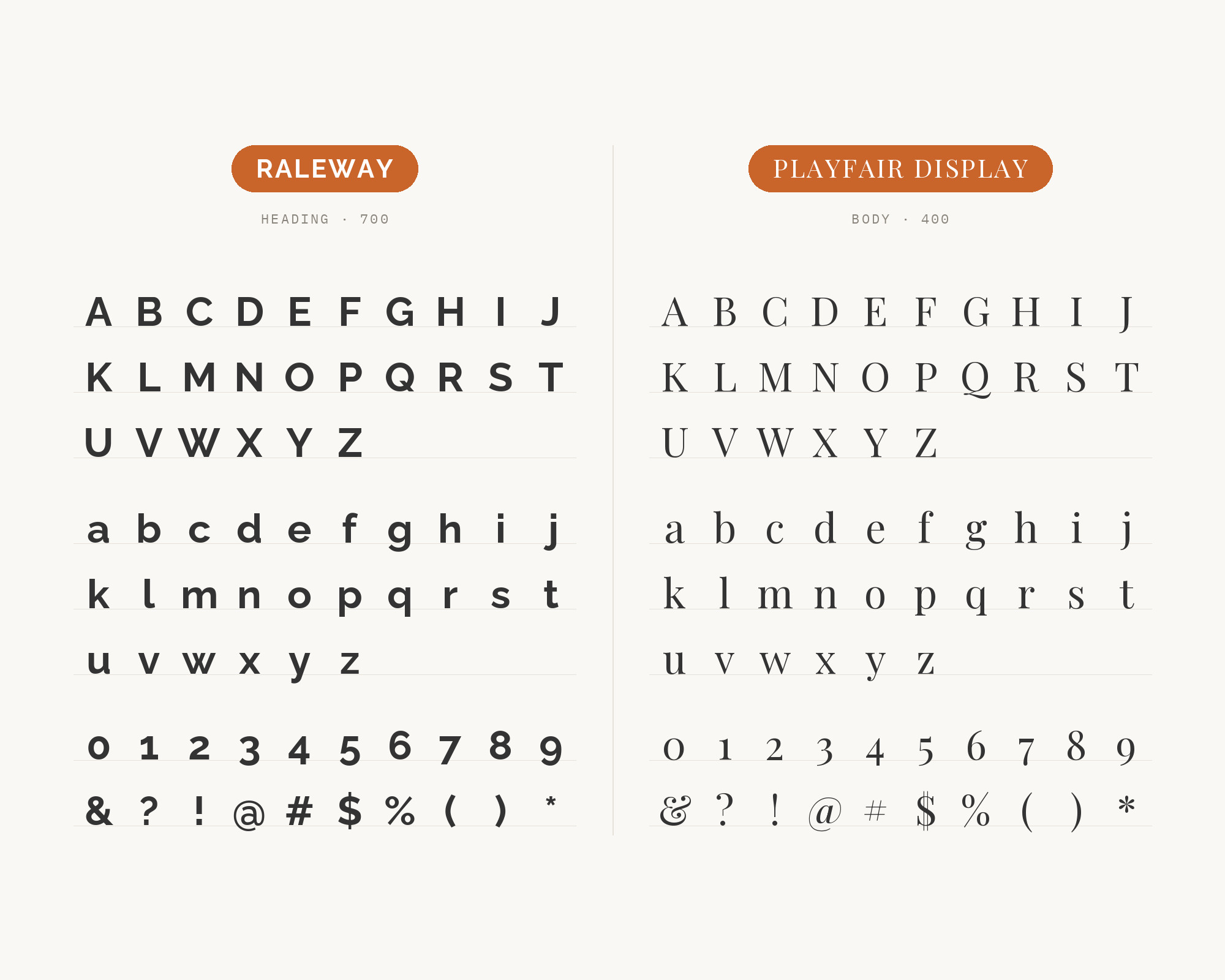
Raleway and Playfair Display - Style B layout Character specimen showing Raleway and Playfair Display alphabets

9. Droid Serif

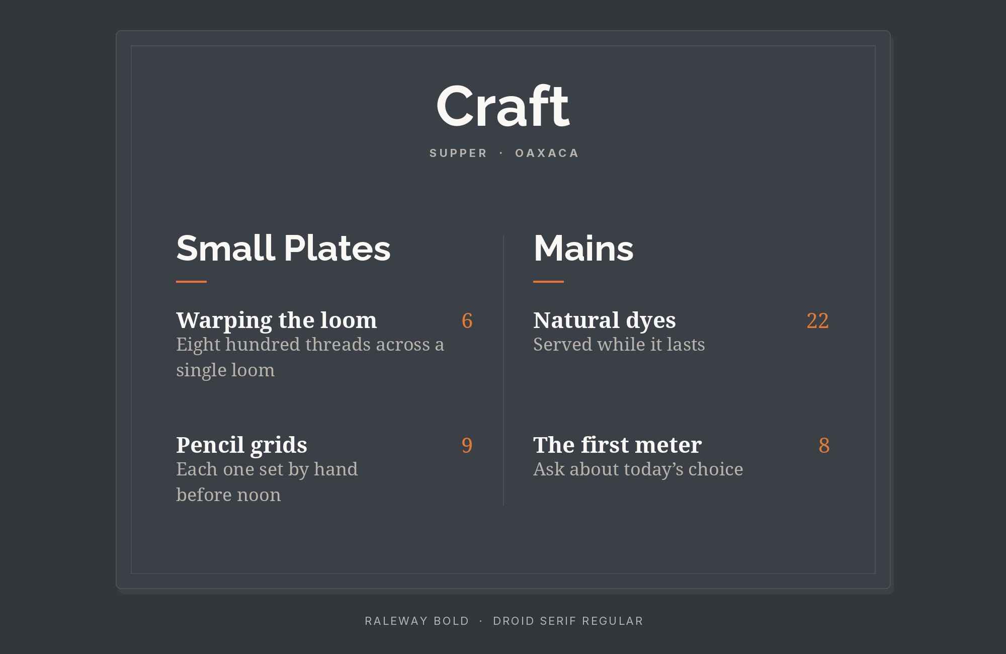
Raleway paired with Droid Serif - Style A showing headline and body text

Google’s screen-optimized serif brings readable warmth beneath Raleway’s cool headline elegance. Droid Serif‘s slightly condensed proportions and sturdy serifs ensure excellent legibility at small sizes, while its traditional character provides textural contrast against Raleway’s modern lines. This reliable pairing serves content-heavy sites, news platforms, and reading-focused applications.
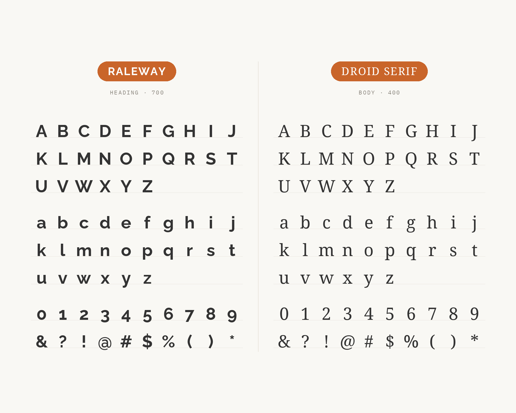
Raleway and Droid Serif - Style B layout Character specimen showing Raleway and Droid Serif alphabets

10. Alice

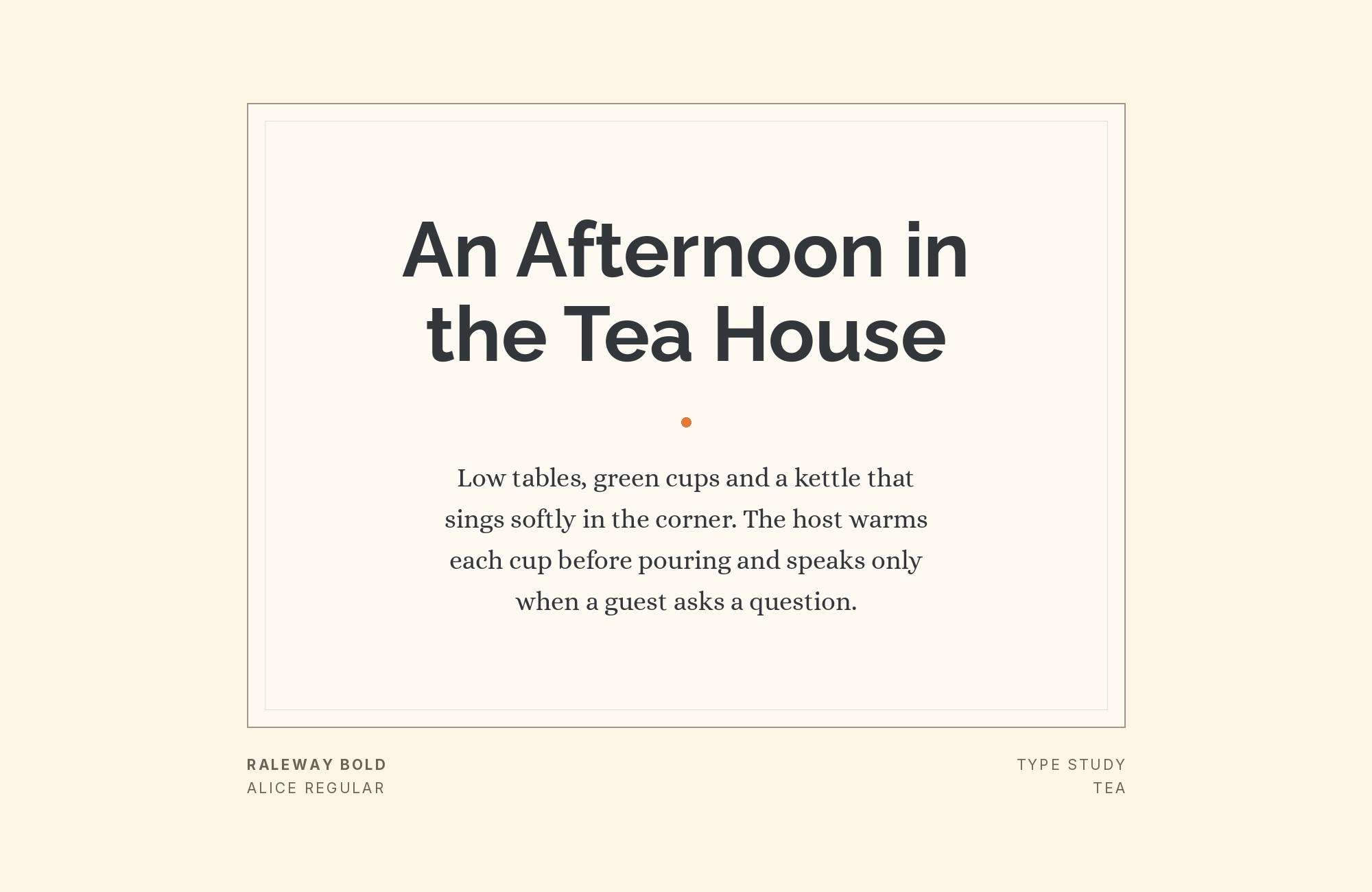
Raleway paired with Alice - Style A showing headline and body text

Decorative charm meets geometric precision. Alice‘s quirky serifs and distinctive personality add character beneath Raleway’s more restrained headlines. The pairing creates whimsical yet sophisticated layouts, perfect for children’s book publishers, creative agencies, or lifestyle brands that embrace personality without sacrificing professionalism.
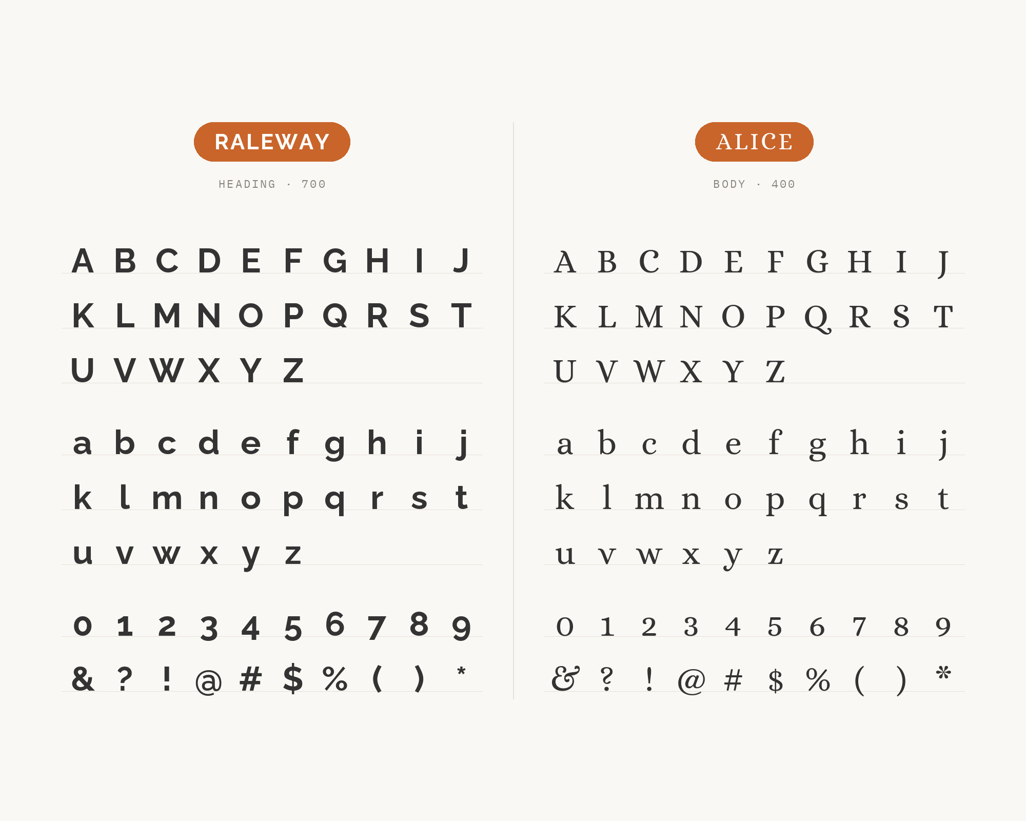
Raleway and Alice - Style B layout Character specimen showing Raleway and Alice alphabets

Still Googling UX terms?

Stop. They're all right here.

UX for Cats book cover

50 terms. Illustrated.
So simple your cat gets it.

Get the Book →

Print & ePub on Amazon

11. Avenir

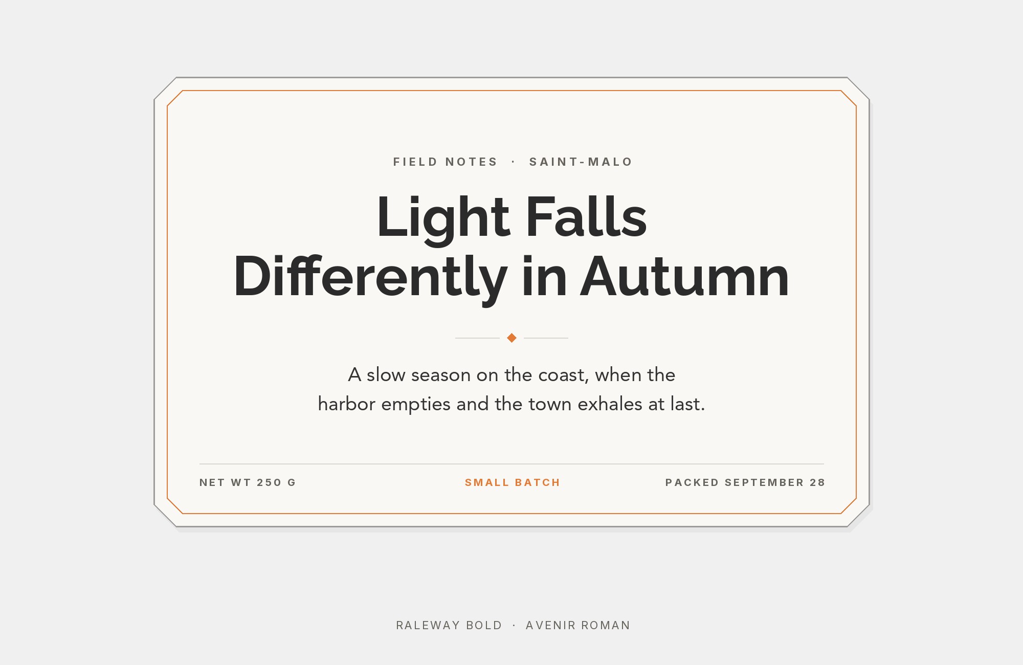
Raleway paired with Avenir - Style A showing headline and body text

Two geometric sans-serifs with complementary voices. Avenir‘s humanist touches and balanced proportions provide subtle contrast against Raleway’s cleaner geometry. Both fonts share midcentury modern sensibilities, creating cohesive layouts that feel timeless. Use this for architecture firms, design agencies, or any context where modernist aesthetics define the brand.
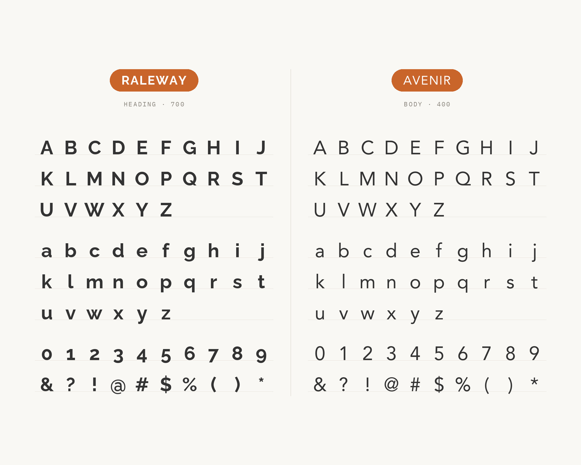
Raleway and Avenir - Style B layout Character specimen showing Raleway and Avenir alphabets

12. TeX Gyre Adventor

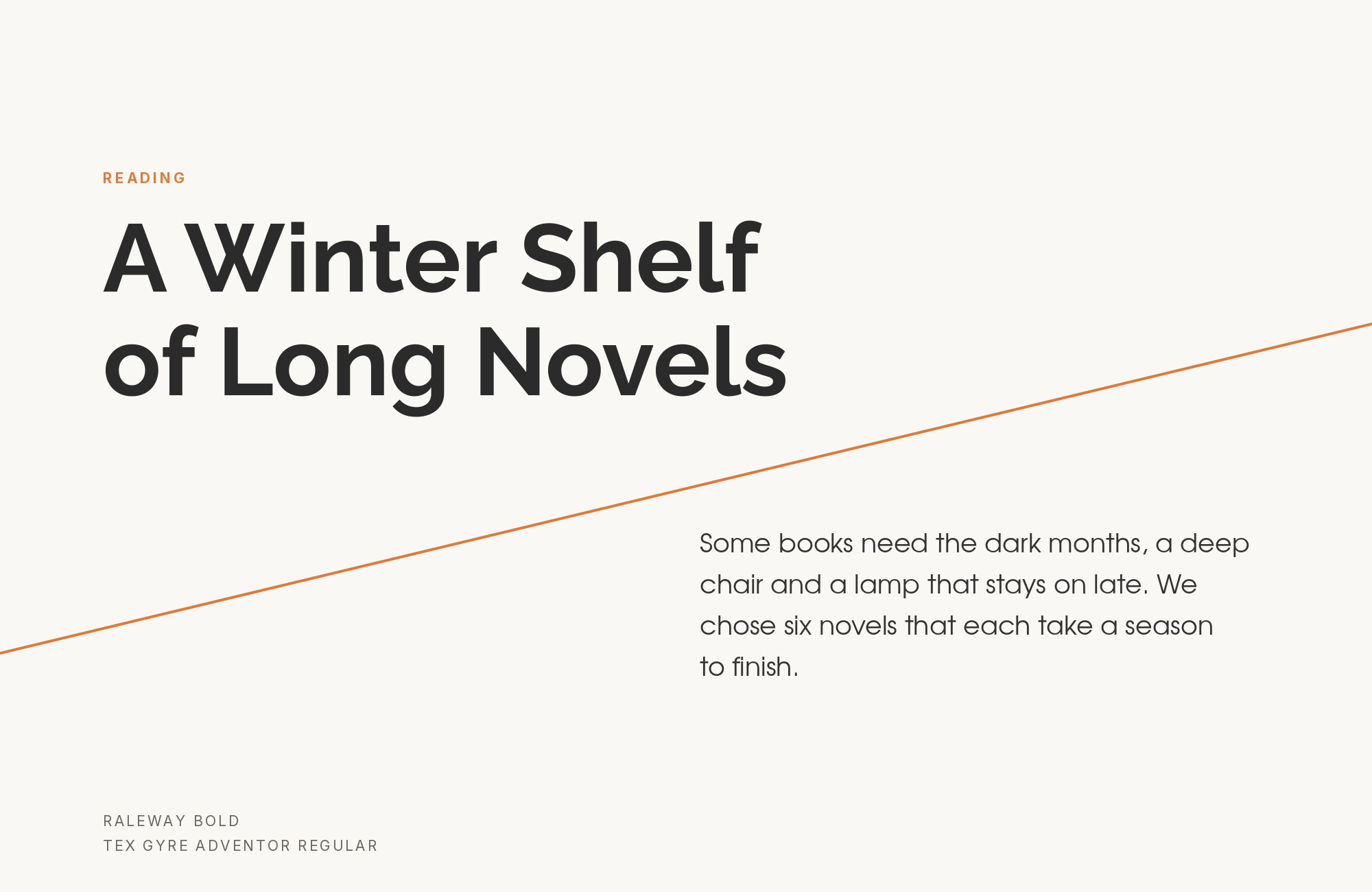
Raleway paired with TeX Gyre Adventor - Style A showing headline and body text

Clean geometric alignment between two fonts that prioritize precision. TeX Gyre Adventor‘s mathematical origins and consistent stroke weights complement Raleway’s own geometric foundations. The pairing reads as intellectual without being cold. Perfect for scientific publications, data visualization platforms, or academic contexts requiring contemporary clarity.
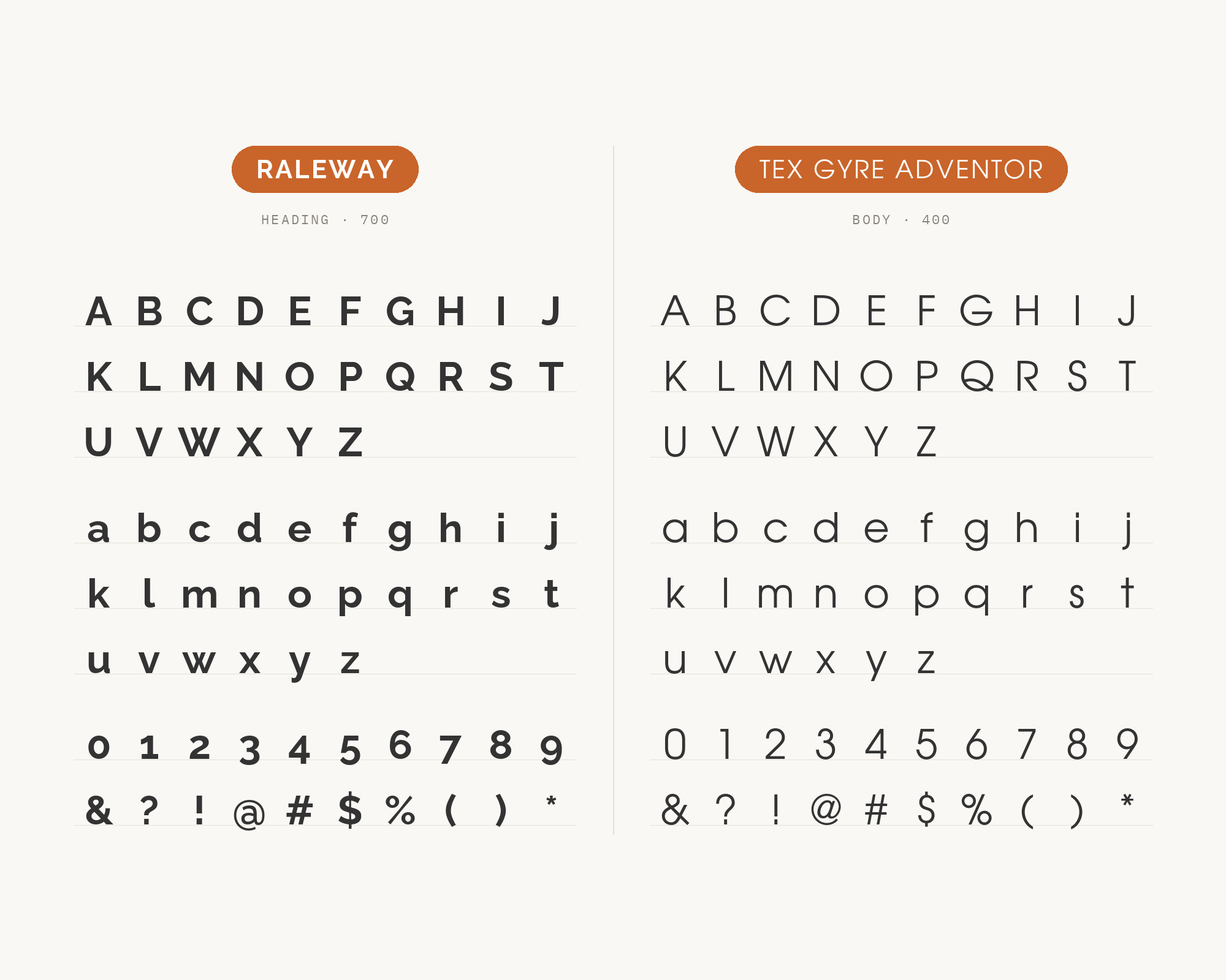
Raleway and TeX Gyre Adventor - Style B layout Character specimen showing Raleway and TeX Gyre Adventor alphabets

13. Geo Sans

Raleway paired with Geo Sans - Style A showing headline and body text

Minimalism amplified through careful font selection. Geo Sans‘s stripped-down letterforms echo Raleway’s own preference for essential geometry over ornament. Together they create ultra-clean layouts that let content breathe. This pairing works for gallery websites, architectural portfolios, or any design where negative space matters as much as typography.
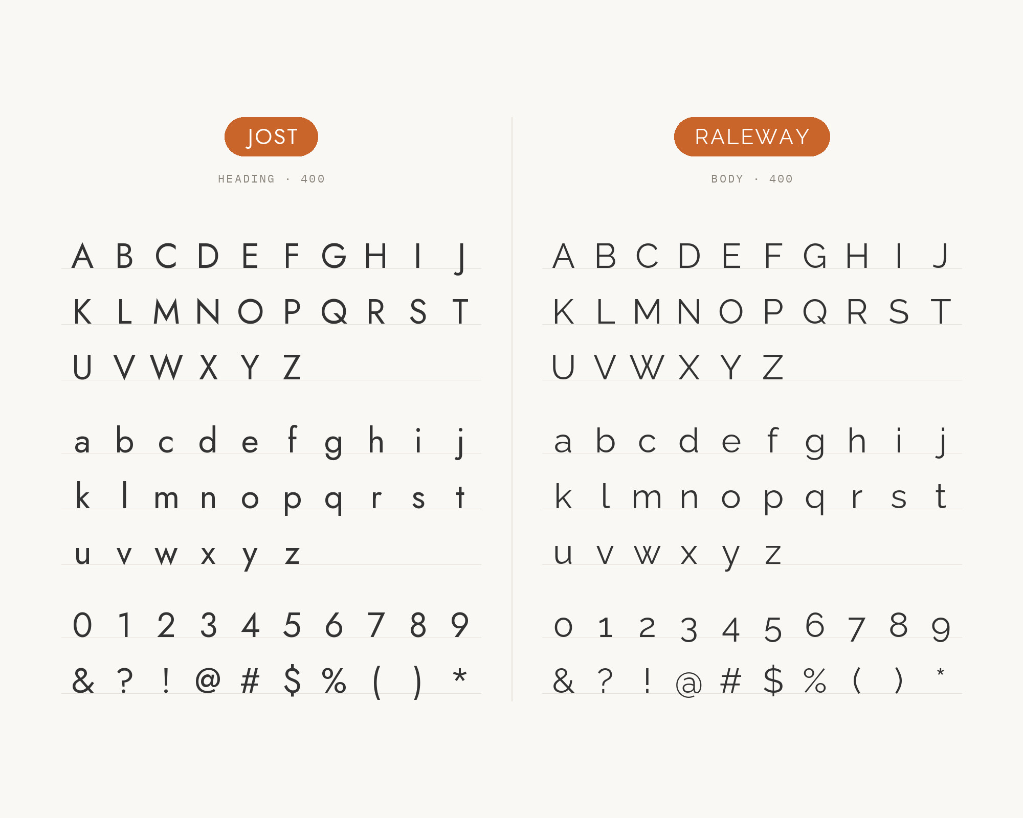
Raleway and Geo Sans - Style B layout Character specimen showing Raleway and Geo Sans alphabets

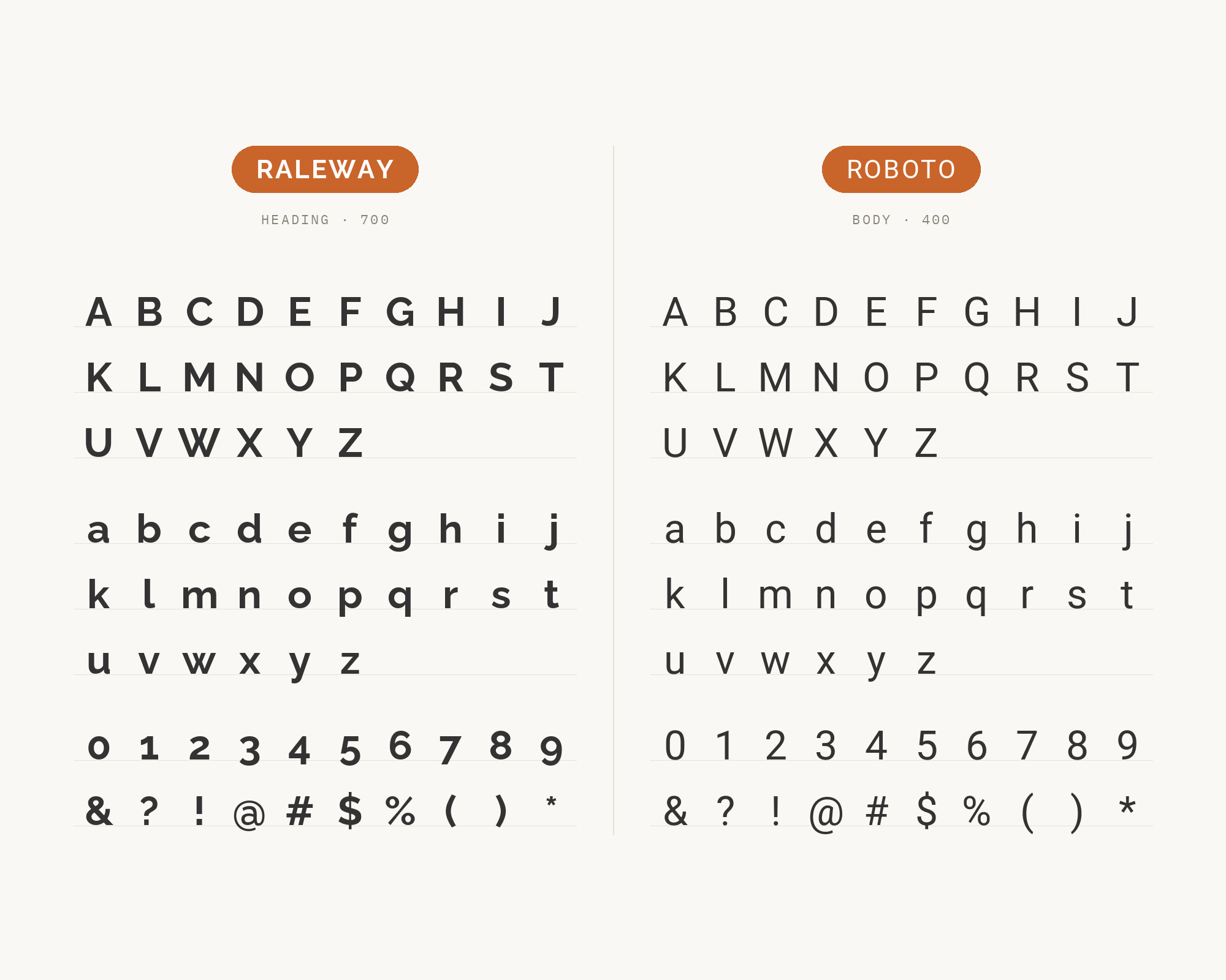
14. Roboto

Raleway paired with Roboto - Style A showing headline and body text

Google’s ubiquitous workhorse provides stable ground for Raleway’s elegant headlines. Roboto‘s neutral character and optimized screen rendering ensure body text never competes with Raleway’s distinctive personality. The width contrast between these fonts creates natural hierarchy. Deploy for web applications, material design implementations, or any project requiring proven readability.

Raleway and Roboto - Style B layout Character specimen showing Raleway and Roboto alphabets

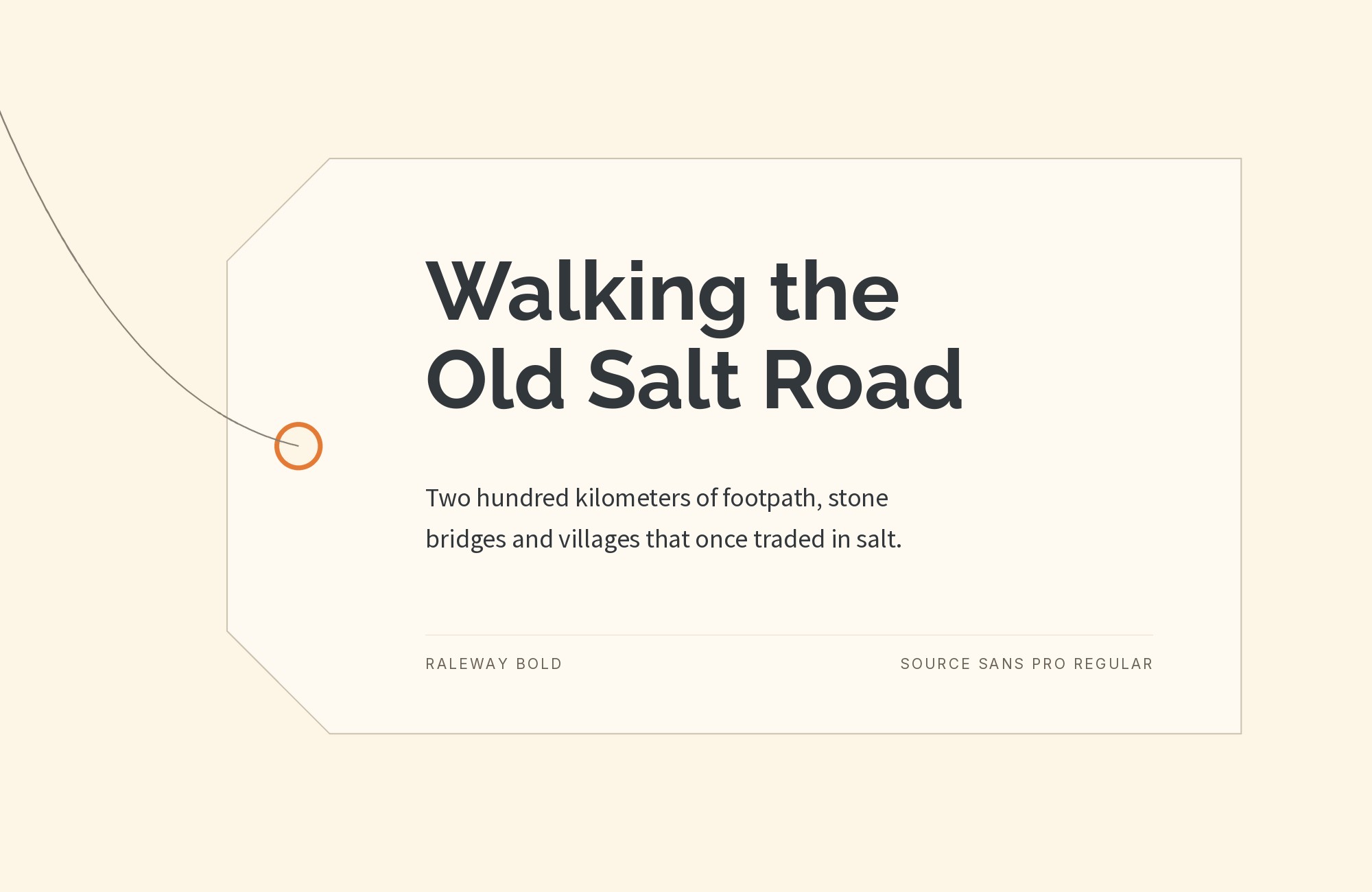
15. Source Sans Pro

Raleway paired with Source Sans Pro - Style A showing headline and body text

Adobe’s humanist contribution to open-source typography complements Raleway’s cooler elegance. Source Sans Pro‘s friendly letterforms and exceptional hinting provide accessible body text beneath sophisticated headlines. Both fonts share professional clarity without corporate coldness. Ideal for documentation, product sites, or interfaces requiring warmth within minimalist frameworks.
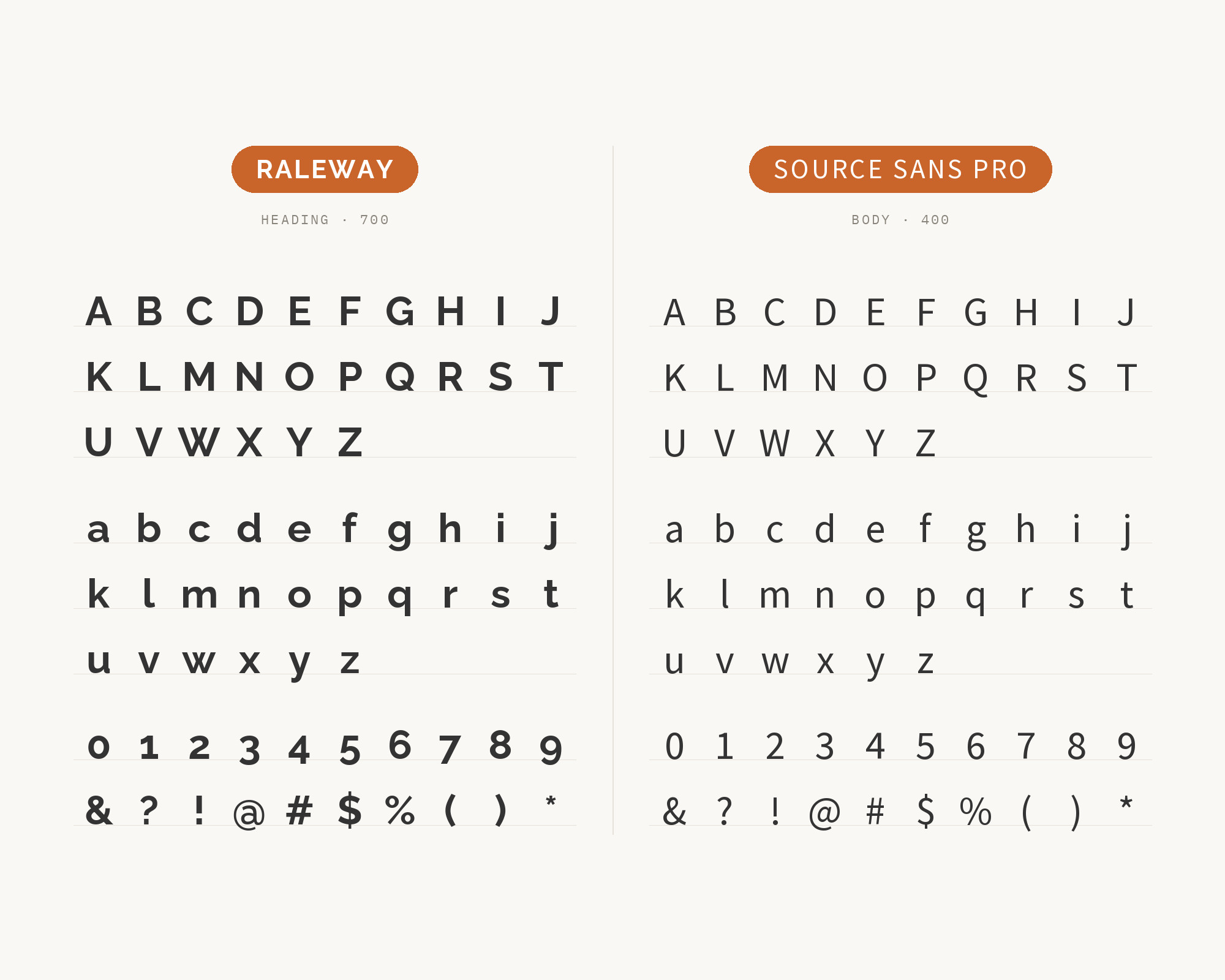
Raleway and Source Sans Pro - Style B layout Character specimen showing Raleway and Source Sans Pro alphabets
What Fonts Go With Raleway - the book from BonFX, coming soon

Conclusion

There are no absolute rules for font pairing, just principles to guide you. The key is contrast—in weight, in style (serif vs. sans-serif), or in personality. Raleway is versatile enough to play well with many different typefaces.

Trust your eye, experiment freely, and remember that the best pairing is the one that serves your content and audience. Typography should enhance communication, not complicate it.

More Font Resources

  • Font Combinations: The Complete Guide to Font Pairings
  • Types of Fonts
  • Best Fonts for Designers
  • Google Font Combinations
  • Fonts That Pair With Futura

About the Author

Douglas Bonneville is a graphic designer and typographer since 1992. He is the author of The Big Book of Font Combinations and has contributed to numerous design publications. His work focuses on making typography accessible and practical for designers at all levels.

Sources Consulted

The Raleway pairings on this page were researched against published recommendations from typography sites, type foundries and working designers. Where sources disagreed, the disagreement is noted in the text above.

  • Figma Google Fonts pairings
  • FontPair.co
  • Typ.io
  • Vandelay Design
  • The Brief (Amalia Madalina Pop)
  • Envato Tuts+
  • Google Fonts specimen
  • canva.com
  • weandthecolor.com

Frequently asked questions

What fonts go with Raleway?

Raleway pairs great with Merriweather, Open Sans and Lato. All 15 pairings are shown in real rendered specimens with the reason each one works. Checked against 9 published typography sources.

Does Merriweather go with Raleway?

Raleway's elegant thin strokes find their perfect counterweight in Merriweather's substantial serif presence. The distinctive Raleway 'W' brings geometric flair to headlines while Merriweather's tall x-height ensures comfortable extended reading. This pairing whispers sophistication without pretension, making it ideal for boutique hotels, lifestyle magazines, or fashion editorials that prioritize refined aesthetics.

Does Open Sans go with Raleway?

Sometimes simplicity wins. Open Sans provides the neutral, readable foundation that lets Raleway's subtle personality shine in headlines. Both fonts share generous letter-spacing sensibilities and clean geometry, creating visual cohesion without redundancy. This versatile pairing works across contexts from corporate communications to personal blogs, adapting to whatever tone your content requires.

Does Lato go with Raleway?

Two humanist sans-serifs with distinct voices create nuanced hierarchy. Lato's semi-rounded letterforms and warm personality complement Raleway's cooler elegance. The weight differences between these fonts allow for flexible headline-to-body relationships. Use this for contemporary portfolios, startup websites, or anywhere modern sophistication needs approachable warmth.

Does Roboto Condensed go with Raleway?

Width contrast creates instant visual interest. Roboto Condensed's narrow efficiency contrasts with Raleway's more generous proportions, establishing clear hierarchy through letterform width alone. The geometric foundations of both fonts ensure harmony despite their differences. This pairing excels in space-constrained layouts, mobile interfaces, or any design requiring compact headlines with readable body text.

Does Bitter go with Raleway?

Slab serif substance grounds Raleway's ethereal lightness. Bitter brings weight and solidity to body text, its sturdy serifs providing visual anchors that prevent layouts from feeling too airy. The contrast between Raleway's thin elegance and Bitter's chunky presence creates engaging tension. Perfect for creative studios, artisanal brands, or editorial designs that need both finesse and foundation.

Does Cabin go with Raleway?

Two fonts that share contemporary sensibilities without competing for attention. Cabin's rounded-geometric hybrid approach complements Raleway's cleaner geometry while adding subtle warmth. Both fonts have extensive weight ranges allowing flexible hierarchies. Deploy this combination for tech-forward brands, mobile apps, or modern web experiences that prioritize clarity.

Does PT Sans go with Raleway?

Clean lines and shared proportional logic unite these two sans-serifs. PT Sans brings Russian typographic heritage with its sturdy, practical letterforms, while Raleway contributes elegant headline presence. The pairing offers excellent multilingual support with consistent aesthetic tone. Ideal for international organizations, educational institutions, or any project spanning language barriers.

Does Playfair Display go with Raleway?

High drama meets understated elegance. Playfair Display's theatrical stroke contrast and hairline serifs create headlines that demand attention, while Raleway's measured sophistication grounds body text in contemporary clarity. This pairing suggests luxury without excess, perfect for high-end retail, wedding stationery, or lifestyle content aimed at discerning audiences.

Does Droid Serif go with Raleway?

Google's screen-optimized serif brings readable warmth beneath Raleway's cool headline elegance. Droid Serif's slightly condensed proportions and sturdy serifs ensure excellent legibility at small sizes, while its traditional character provides textural contrast against Raleway's modern lines. This reliable pairing serves content-heavy sites, news platforms, and reading-focused applications.

Does Alice go with Raleway?

Decorative charm meets geometric precision. Alice's quirky serifs and distinctive personality add character beneath Raleway's more restrained headlines. The pairing creates whimsical yet sophisticated layouts, perfect for children's book publishers, creative agencies, or lifestyle brands that embrace personality without sacrificing professionalism.

Related font pairings

  • What Fonts Go With Merriweather?
  • What Fonts Go With Open Sans?
  • What Fonts Go With Rubik?
  • What Fonts Go With Neuton?

More font pairing guides

  • Font Combinations: The Complete Guide to Font Pairings
  • What Fonts Go With Garamond?
  • What Fonts Go With Inconsolata?
  • What Fonts Go With Times New Roman?
  • What Fonts Go With DIN?

About Douglas Bonneville

Douglas has been a graphic designer since 1992, in addition to software developer and author. He is a member of Smashing Magazine's "Panel of Experts" and has contributed to over 100 articles. He is the author of "The Big Book of Font Combinations", loves cats, and plays guitar.

The BonFX Letter

One good pairing.
Every Tuesday.

2-minute read · free

This week — no. 14

Quiet authority

Merriweather sets the tone in one line. Lato stays out of the way and lets it.

MERRIWEATHER 700  +  LATO 400

A font specimen, a pairing that works, and one line on why it works. That is the whole email.

Free. One click to unsubscribe. No sharing, ever.

Free download

The Typography Primer.
Yours, right now.

Adobe's classic · PDF · free

The Typography Primer — book cover

The guide to type that everyone learned from. Subscribe and it is yours instantly. The BonFX Letter follows.

Free. One click to unsubscribe. No sharing, ever.

What Fonts Go With Raleway - the book from BonFX, coming soon

Still Googling UX terms?

Stop. They're all right here.

UX for Cats book cover

50 terms. Illustrated.
So simple your cat gets it.

Get the Book →

Print & ePub on Amazon

350 font combinations you can steal.

The Big Book of Font Combinations

Every pairing shown in context — web, print, headings, body. Open it, find one that works, use it.

That's it. That's the book.

In print or ePub 40% OFF on Gumroad

Scrolling Google Fonts for "the right one"?

You've been at it for 20 minutes. You'll be at it for 20 more. There are 1,500 fonts in there.

Pocket Handbook of Google Fonts Combinations

We paired every useful Google Font.
7,500 pages. Done.

Get the PDF →

Instant download on Gumroad

Recent Inspirations

  • What Fonts Go With Verdana? September 13, 2026
  • What Fonts Go With Trajan? September 12, 2026
  • What Fonts Go With Minion? September 11, 2026
  • What Fonts Go With Myriad? September 10, 2026
  • What Fonts Go With Sabon? September 9, 2026
  • What Fonts Go With Kabel? September 8, 2026
  • What Fonts Go With Gilroy? September 7, 2026
  • What Fonts Go With Segoe UI? September 6, 2026
  • What Fonts Go With Bembo? September 5, 2026
  • What Fonts Go With Abril Fatface? September 4, 2026
  • What Fonts Go With Cinzel? September 4, 2026
  • What Fonts Go With Cormorant Garamond? September 4, 2026
  • What Fonts Go With Anton? September 4, 2026
  • What Fonts Go With Quicksand? September 4, 2026
  • What Fonts Go With Vollkorn? September 4, 2026

About BonFX

Douglas Bonneville has been a graphic designer since 1992 and has written about type here since 2009. BonFX is a blog about typography and design, and the books that came out of it.

  • The Big Book of Font Combinations
  • The Preposterously Huge Book of Google Font Combinations
  • UX for Cats

More about BonFX →

Start Here

  • Font Combinations: The Complete Guide
  • The 100 Best Fonts
  • 17 Types of Fonts
  • 29 Principles for Great Font Combinations
  • 23 Really Bad Font Choices
  • 20 Free Google Wedding Font Combinations

Contact

Questions about the books or the site? Contact us.

Follow @dbonneville on X.

The BonFX Letter: one good pairing every Tuesday, free. The signup is in the sidebar of every page.

Copyright © 2026 · BonFX

  • Blog
  • Font Combinations
  • Books
    • The Preposterously Huge Book of Google Font Combinations
    • The Big Book of Font Combinations (Classic Fonts Edition)
  • Contact