BonFX · Similar fonts
Every font below is an alternative to Century Gothic, plotted by how closely it matches. The number is its rank. Pick a name to jump to its sample, its one difference, and where to get it.
The closest fonts to Century Gothic are ITC Avant Garde Gothic, URW Gothic and TeX Gyre Adventor. All 22 similar fonts are shown below, ranked by how closely each one matches, with where to get it.
Century Gothic may not be installed on every computer, and a web page cannot count on it. Loading one more font file also slows things down, so you want a close stand-in.
This page compares 21 fonts that look like Century Gothic, and 16 of them are free. Match scores run from 72% to 86%, and the best free match reaches 86%.
Yes, Century Gothic became the default geometric choice because it shipped with office software, and that familiarity is part of why people look elsewhere. It is also wide, with a low x-height, so long paragraphs get tiring to read at small sizes.
Junior work is now a prompt. The biggest profit center in your studio is vanishing.
How to fix this?
Find Out HowThe font you are matching
Century Gothic

Background
Century Gothic is a digital sans-serif typeface in the geometric style, released by Monotype Imaging in 1990. It is a redrawn version of Monotype's own Twentieth Century, a copy of Bauer's Futura, to match the widths of ITC Avant Garde Gothic. It is an exclusively digital typeface that has never been manufactured as metal type.
The match map
20 fonts. Click a name.
1.ITC Avant Garde Gothic
86% matchclose

Character differences

The ITC Avant Garde Gothic Font Family was designed by Tom Carnase, Erich Gschwind, Christian Mengelt, Edward Benguiat, André Gürtler, Herb Lubalin and published by ITC.
Same geometric build and x-height as Century Gothic, but slightly narrower. The w, Y, R and M differ most, and the A is more pointed.
PaidMyFonts from $42.99 USD per style; family of 20 fonts $329.98 USD · Free clone: URW Gothic, TeX Gyre Adventor
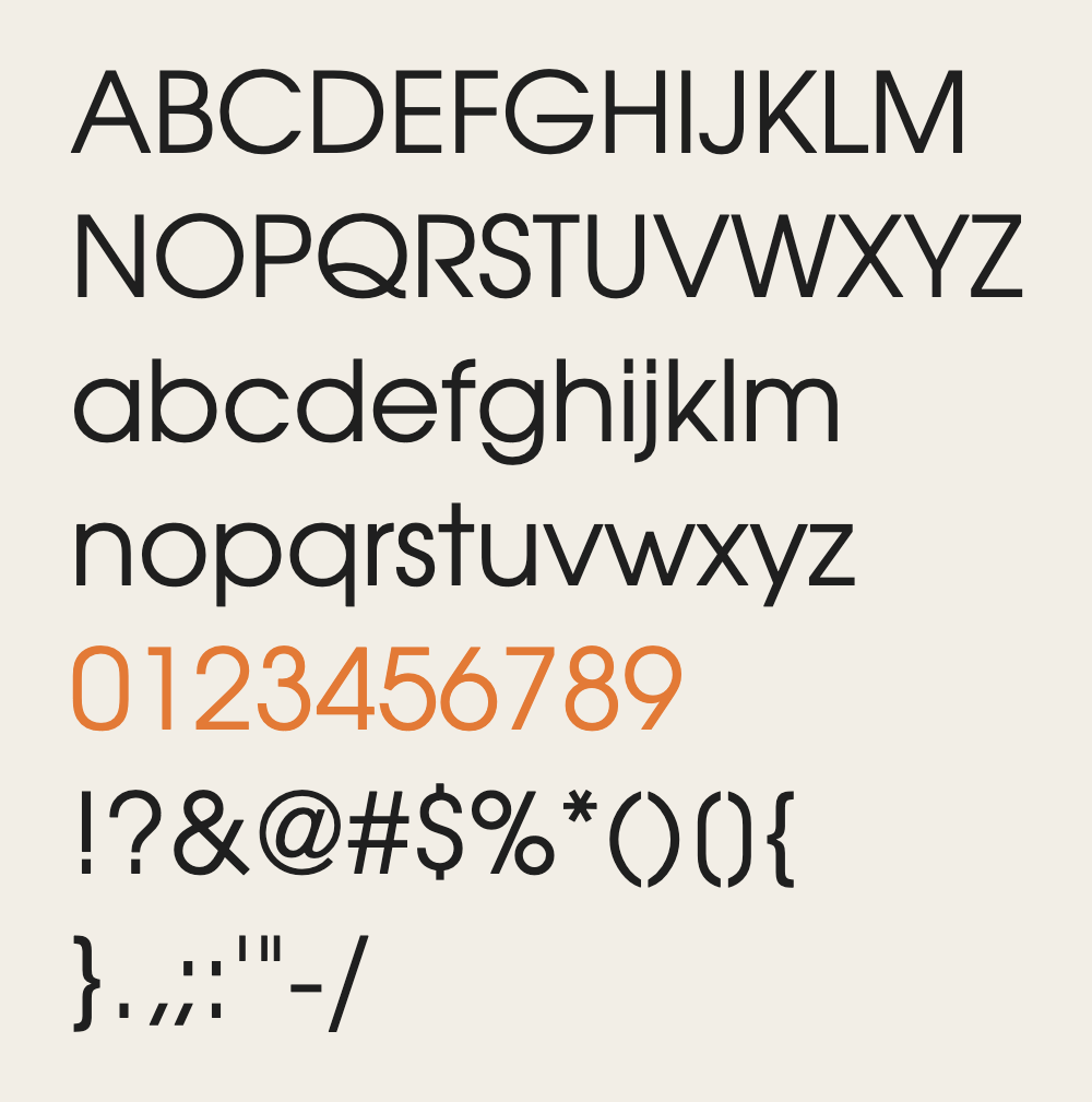
↑ map2.URW Gothic
86% matchclose
Character differences

Nearly the same round geometric build and x-height as Century Gothic, but a little narrower. The Y, K, W and R legs differ most.
FreeArtifexSoftware urw-base35-fonts
↑ map3.TeX Gyre Adventor
86% matchclose

Character differences

Same Avant Garde design as Century Gothic, with the same x-height but slightly narrower. The Y, K, W and R show small differences.
FreeCTAN
↑ map4.Manrope
78% matchnear

Character differences

Manrope is an open-source modern sans-serif font family, designed by Mikhail Sharanda in 2018. In 2019, Mirko Velimirovic worked with Mikhail Sharanda to convert Manrope into a variable font.
Geometric sans with a similar x-height, but narrower and with a heavier, more modern feel. The S, R, a and G differ clearly from Century Gothic.
FreeGoogle Fonts
↑ map5.Maven Pro
78% matchnear

Character differences

Maven Pro is a sans serif family by Joe Prince. It was added to Google Fonts on 2011-05-25.
Similar width and x-height to Century Gothic, but with softer, rounded terminals. The M, a, Q and W differ, and the q and p are less circular.
FreeGoogle Fonts
↑ map6.Open Sans
78% matchnear

Character differences

Open Sans is an open source humanist sans-serif typeface that was designed by Steve Matteson under commission from Google. It was released in 2011 and is based on his earlier design called Droid Sans, which was specifically created for Android mobile devices but with slight modifications to its width.
Same geometric build, but Open Sans has a double story g and a more humanist a. Its J, Q and K differ from Century Gothic, and it is slightly narrower.
FreeGoogle Fonts
↑ map7.Questrial
78% matchclose

Character differences

Questrial is a sans serif family by Joe Prince, Laura Meseguer. It was added to Google Fonts on 2011-08-10.
Very close to Century Gothic in width, x height and round shapes. The K, R and M are a little different, and the strokes are slightly heavier.
FreeGoogle Fonts
↑ map8.Urbanist
78% matchnear

Character differences

Urbanist is a low-contrast, geometric sans-serif inspired by Modernist typography and design. The project was launched by Corey Hu in 2020 with 9 weights and accompanying italics. Conceived from elementary shapes, Urbanist's neutrality makes it a versatile display font for print and digital mediums.
Round geometric build like Century Gothic, but with a lower x height and narrower letters. The M, S and g differ, and the strokes look a little tighter.
FreeGoogle Fonts
↑ map9.Chalet LondonNineteenSixty
77% matchnear

Character differences

Similar x height, but the R, K and a are more grotesque than Century Gothic. The letters are slightly narrower, and the s is less round.
PaidHouse Industries sold; price not read
↑ map10.SF Pro
77% matchnear

Character differences

San Francisco is a neo-grotesque sans-serif typeface made by Apple Inc. It was first released to developers on November 18, 2014. It is the first new typeface designed at Apple in nearly twenty years, and was inspired by Helvetica and FF DIN.
Same x height, but SF Pro is a neutral sans with a double story a. Its g, S and Q differ from the round Century Gothic forms.
↑ map11.Candara
77% matchloose

Character differences

Candara is a humanist sans-serif typeface designed by Gary Munch and commissioned by Microsoft.
A humanist sans with a flared stroke, unlike the pure circles of Century Gothic. The single-story g, a, Q and G differ clearly.
↑ map12.Raleway
76% matchnear

Character differences

Raleway is an elegant sans-serif typeface family. Initially designed by Matt McInerney as a single thin weight, it was expanded into a 9 weight family by Pablo Impallari and Rodrigo Fuenzalida in 2012 and iKerned by Igino Marini.
Geometric and light like Century Gothic, but the W and w are crossed and pointed. The K, R and a also differ in small ways.
FreeGoogle Fonts
↑ map13.Gotham
75% matchnear
Character differences

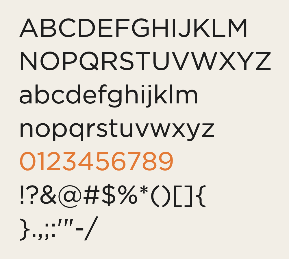
Gotham is a geometric sans-serif typeface family designed in 2000 by American type designer Tobias Frere-Jones with Jesse Ragan and released through the Hoefler & Frere-Jones foundry in 2002.
Round geometric build, but Gotham is clearly wider and sturdier than Century Gothic. The K, R and M differ, and the strokes are heavier.
PaidMyFonts licenses from $200.00 USD; family of 120 fonts $1,200.00 USD
↑ mapBuild free, plus 500 AI credits.
Design and publish a site at no cost. Paid plans double your credits the first month.
Start free14.Quicksand
75% matchnear

Character differences

Quicksand is a display sans serif with rounded terminals. The project was initiated by Andrew Paglinawan in 2008 using geometric shapes as a core foundation. It is designed for display purposes but kept legible enough to use in small sizes as well.
Rounded stroke ends and a thin, soft look set it apart from Century Gothic. The y, M, K and W also differ, though the width is similar.
FreeGoogle Fonts
↑ map15.Proxima Nova
75% matchnear

Character differences
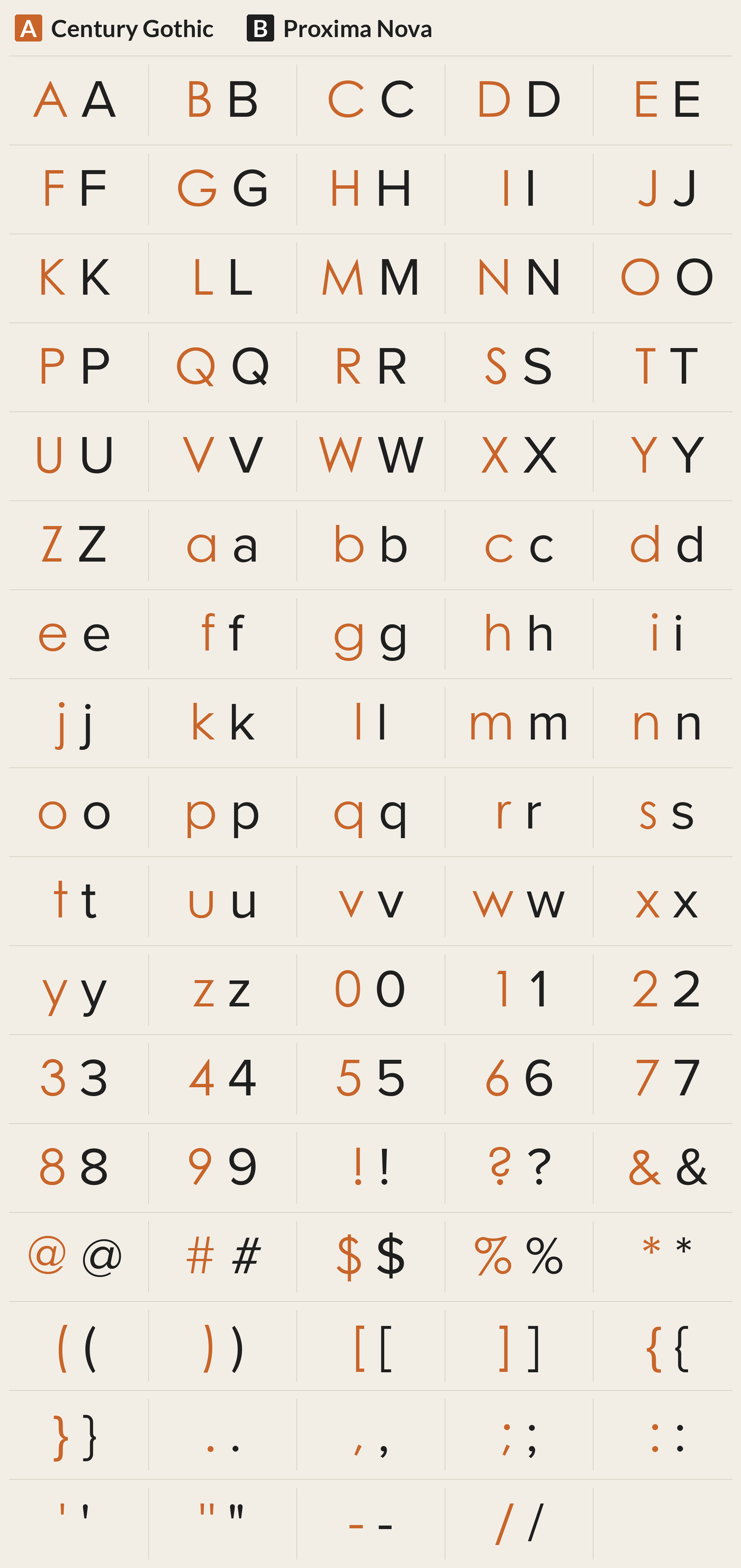
The Proxima Nova Font Family was designed by Mark Simonson and published by Mark Simonson Studio.
Geometric sans with a lower x height than Century Gothic. It has a double story a, and the U, S and M are more grotesque.
PaidMark Simonson Studio $39.99 per style; 16-style family $359.99; 80-style superfamily $975.99
↑ map16.Verdana
75% matchloose

Character differences

Verdana is a humanist sans-serif typeface designed by Matthew Carter for Microsoft, with hand-hinting done by Thomas Rickner, then at Monotype. Demand for such a typeface was recognized by Virginia Howlett of Microsoft's typography group and commissioned by Steve Ballmer.
Wider and sturdier than Century Gothic, with a humanist build and larger letter spacing. The M, S, K, a and Q differ clearly.
↑ map17.Myriad
73% matchloose

Character differences

Myriad is a humanist sans-serif typeface designed by Robert Slimbach and Carol Twombly for Adobe Systems. Myriad was intended as a neutral, general-purpose typeface that could fulfill a range of uses and have a form easily expandable by computer-aided design to a large range of weights and widths.
A narrower humanist sans with a double-story a, unlike Century Gothic's round single-story a. The m, O, g and c also look less geometric.
FreeAdobe Fonts
↑ map18.Montserrat
73% matchloose

Character differences

Montserrat is a geometric sans-serif typeface designed by Argentine graphic designer Julieta Ulanovsky and released in 2011. It was inspired by posters, signs and painted windows from the first half of the twentieth century, seen in the historic Montserrat neighbourhood of Buenos Aires.
Same geometric class, but Montserrat is much wider and heavier than Century Gothic. The W, Y, K and R look different.
FreeGoogle Fonts
↑ map19.Poppins
73% matchloose

Character differences

Geometric sans serif typefaces have always been popular, and with support for both the Devanagari and Latin writing systems, Poppins is an internationalist addition to the genre. Many of the Latin glyphs (such as the ampersand) are more constructed and rationalist than is typical. The Devanagari design was particularly novel when it was first published in 2015, and was the first ever Devanagari typeface with a range of weights in this genre.
Geometric like Century Gothic, but wider with a taller x height. The s, m, A and g look different, and the strokes are heavier.
FreeGoogle Fonts
↑ map20.Lexend
72% matchloose

Character differences

Lexend fonts are intended to reduce visual stress and so improve reading performance. Initially they were designed with dyslexia and struggling readers in mind, but Bonnie Shaver-Troup, creator of the Lexend project, soon found out that these fonts are also great for everyone else.
Wide, open letters with a clear geometric feel, but wider than Century Gothic. The M, K, I and Z look different.
FreeGoogle Fonts
↑ map21.Futura PT
Font file missing: no match score

22.Twentieth Century
Font file missing: no match score
PaidMyFonts from $29.99 per style; family of 16 $519.99
↑ mapQuestions
What fonts are similar to Century Gothic?
The closest fonts to Century Gothic are ITC Avant Garde Gothic, URW Gothic and TeX Gyre Adventor. All 22 similar fonts are shown below, ranked by how closely each one matches, with where to get it.
What is a free font like Century Gothic?
Free fonts like Century Gothic include URW Gothic, TeX Gyre Adventor and Manrope. Each one is shown below with a link to where to get it.
What are the best Century Gothic alternatives?
By measured letter shape, the best Century Gothic alternatives are ITC Avant Garde Gothic, URW Gothic and TeX Gyre Adventor. Which one is best for you depends on whether you need a free font or a paid one.
Keep reading
- Fonts that go with Century Gothic Pairings that work with Fonts that go with Century Gothic.
- Font Combinations: The Complete Guide to Font Pairings Every pairing, with examples.
- The Big Book of Font Combinations
- 29 Principles for Making Great Font Combinations
