Bodoni Moda pairs great with Poppins, Montserrat and Inter. All 12 pairings are shown below in real rendered specimens, with the reason each one works.

What fonts go with Bodoni Moda, Owen Earl’s free Bodoni for the digital age? The short answer: a calm partner that lets its hairlines do the talking. Almost every real system below puts Bodoni Moda on the headlines and gives the reading to someone else.
Bodoni Moda is designed by Owen Earl, the creator of the font foundry indestructible type*. He calls it a no-compromises Bodoni family, built for the digital age.
It is inspired by the designs of Giambattista Bodoni. Fonts In Use dates its release to Feb 2019. The version made available via Google Fonts is named Bodoni Moda.
Google Fonts added it in 2020. The full family has a range of weights, italics and optical sizes, totalling 64 font files. Bodoni typefaces use flat, unbracketed serifs and extreme contrast between thick and thin strokes.
That contrast is the whole story when you pair it. At large sizes the hairlines sparkle. At small sizes they can thin out, so most designers keep Bodoni Moda for titles.
So a partner needs to be steady where Bodoni Moda is dramatic: even strokes, open shapes and a calm texture. Geometric sans faces are the most common answer, but a few systems add a second serif. Here are 12 fonts that pair with Bodoni Moda.
1. Poppins
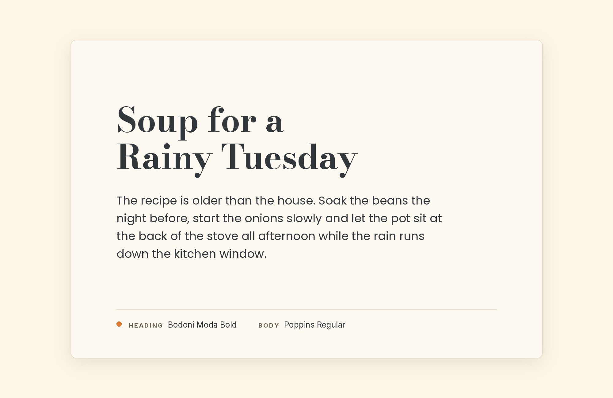
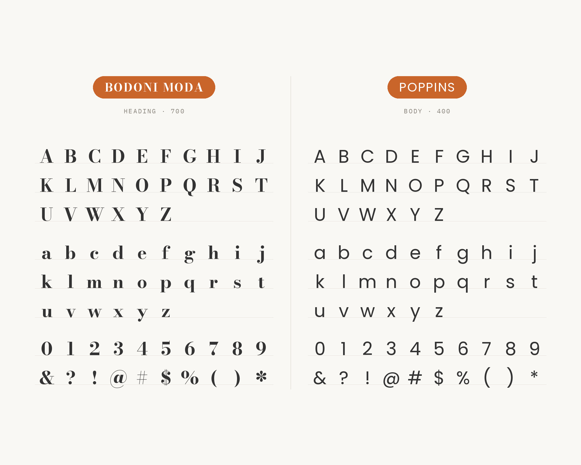
Colorado State University suggests Bodoni Moda for the “Energy” font on the web, and the Poppins font for body copy. The AARE brand guide also pairs them. AARE makes Poppins its primary font for both headline and body text.
Bodoni Moda is its secondary font, used for headlines. Poppins is a geometric sans with support for both the Devanagari and Latin writing systems.
Each letterform is nearly monolinear. Those even strokes are the exact opposite of Bodoni Moda’s contrast, which is why the pair reads so clearly.
Turn your ideas into repeatable creative workflows - no code required. Create with ready-made templates and AI-powered tools in Picsart Flow.
See details2. Montserrat
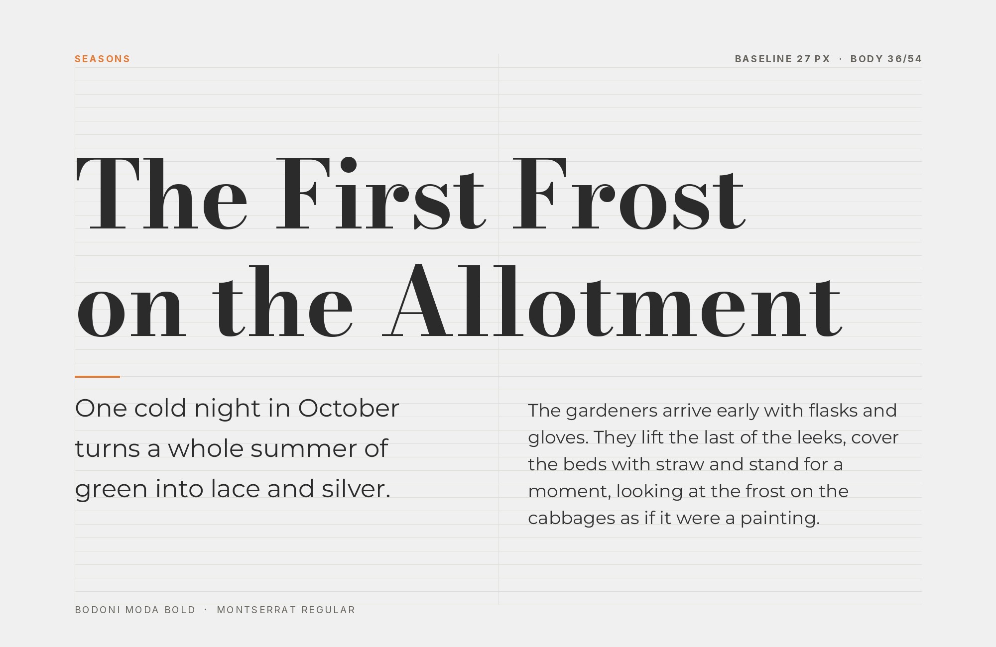
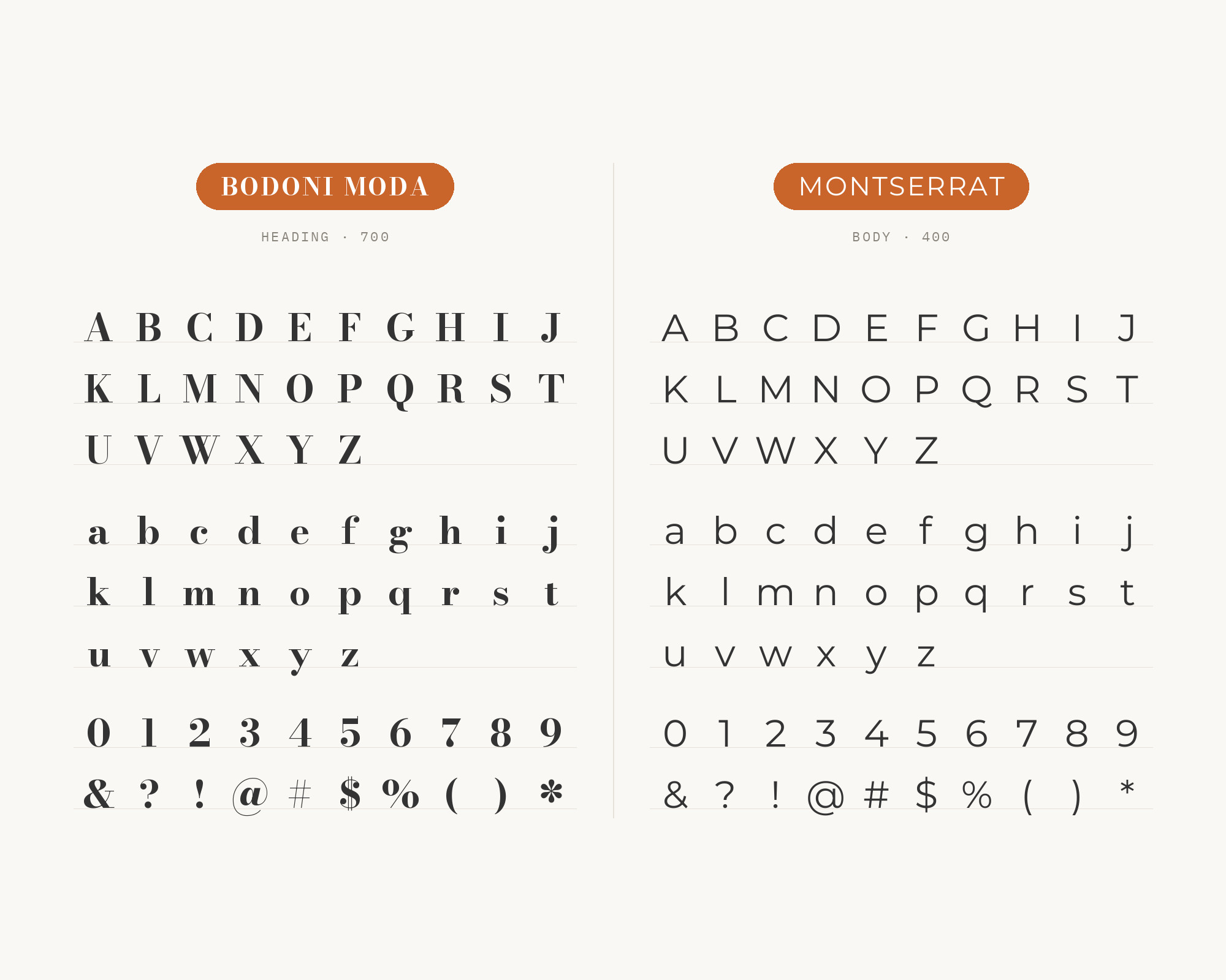
The brand guide for Tony Schwartz: Wedding MC & DJ uses Bodoni Moda for impactful headlines and titles. Montserrat is used for subheadlines and is the typeface most frequently used for body copy. Northeastern Oklahoma A&M College names Montserrat its primary sans serif typeface.
It uses Bodoni Moda as a secondary serif typeface in the NEO Update magazine. Old posters and signs in the Montserrat neighborhood of Buenos Aires inspired Julieta Ulanovsky to design Montserrat. Its wide, sturdy capitals make strong all-caps subheads under a Bodoni title.
Use Montserrat for subheads and body, and keep Bodoni Moda for the big lines.
3. Inter
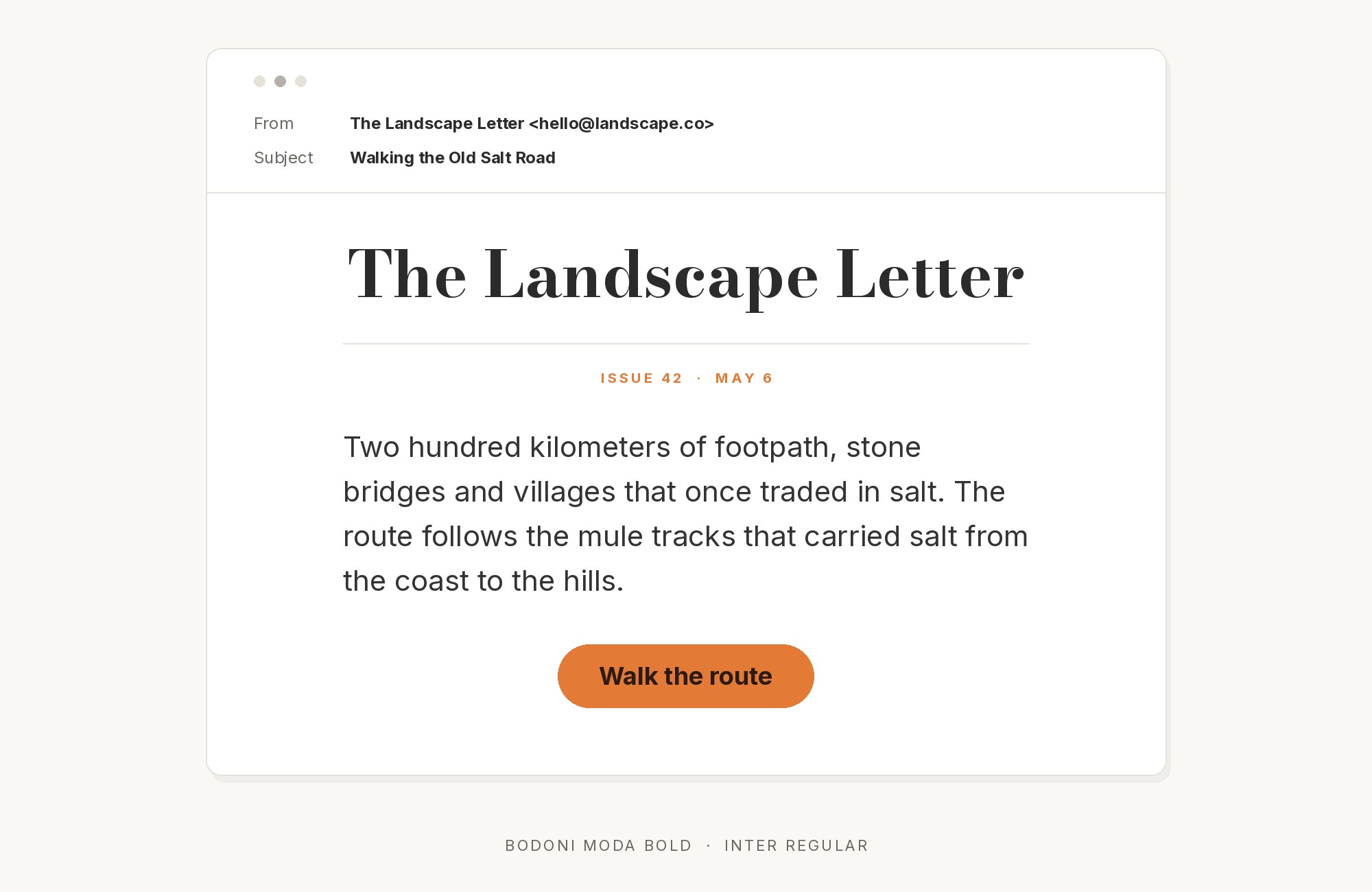
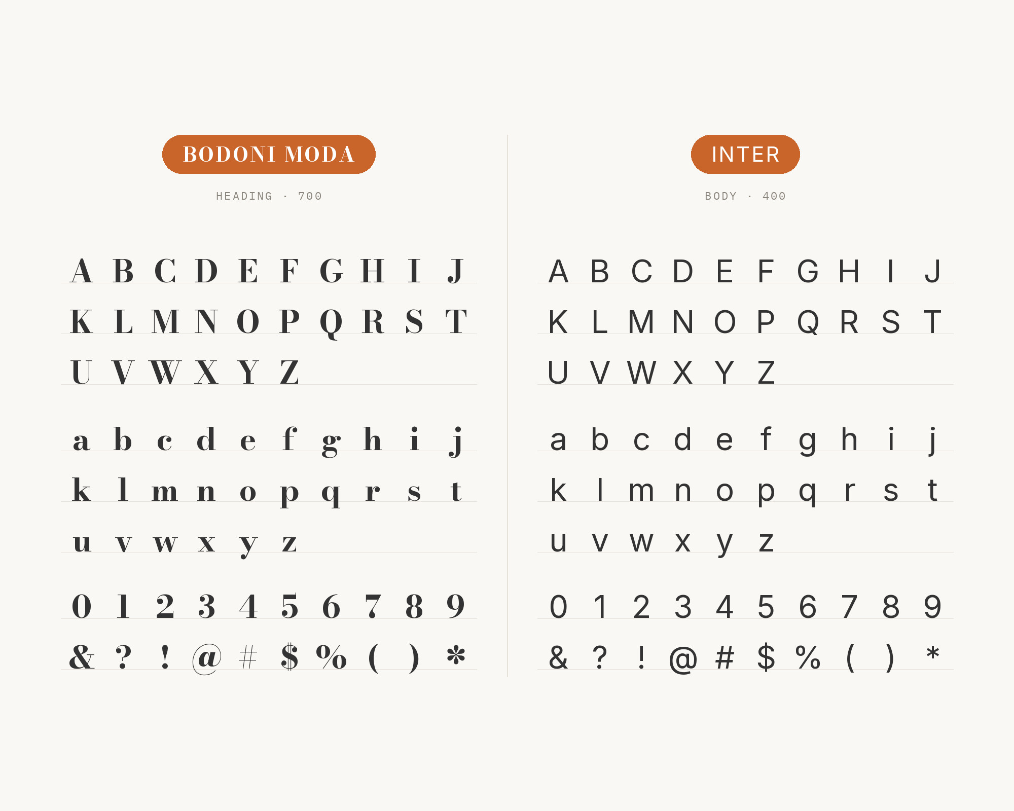
The Trend Interior Home Builders brand kit reserves Bodoni Moda for the wordmark and editorial H1s. It says never to set body copy in this face.
Inter is its workhorse sans for body copy, navigation, captions and button labels. Inter is a variable font family carefully crafted and designed for computer screens.
This is a clean luxury-plus-utility split.
Bodoni Moda brings the drama, and Inter does the work.
Don't start with a blank page. Shutterstock Unlimited: endless downloads of premium human-made assets plus powerful AI tools.
Sign Up4. Fraunces
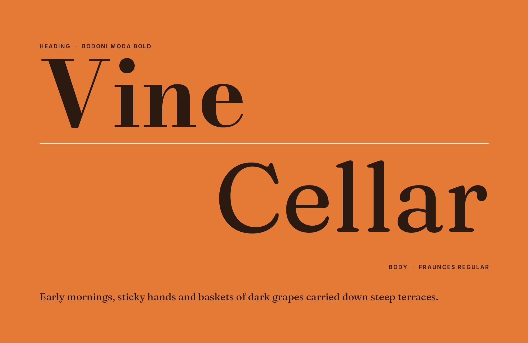
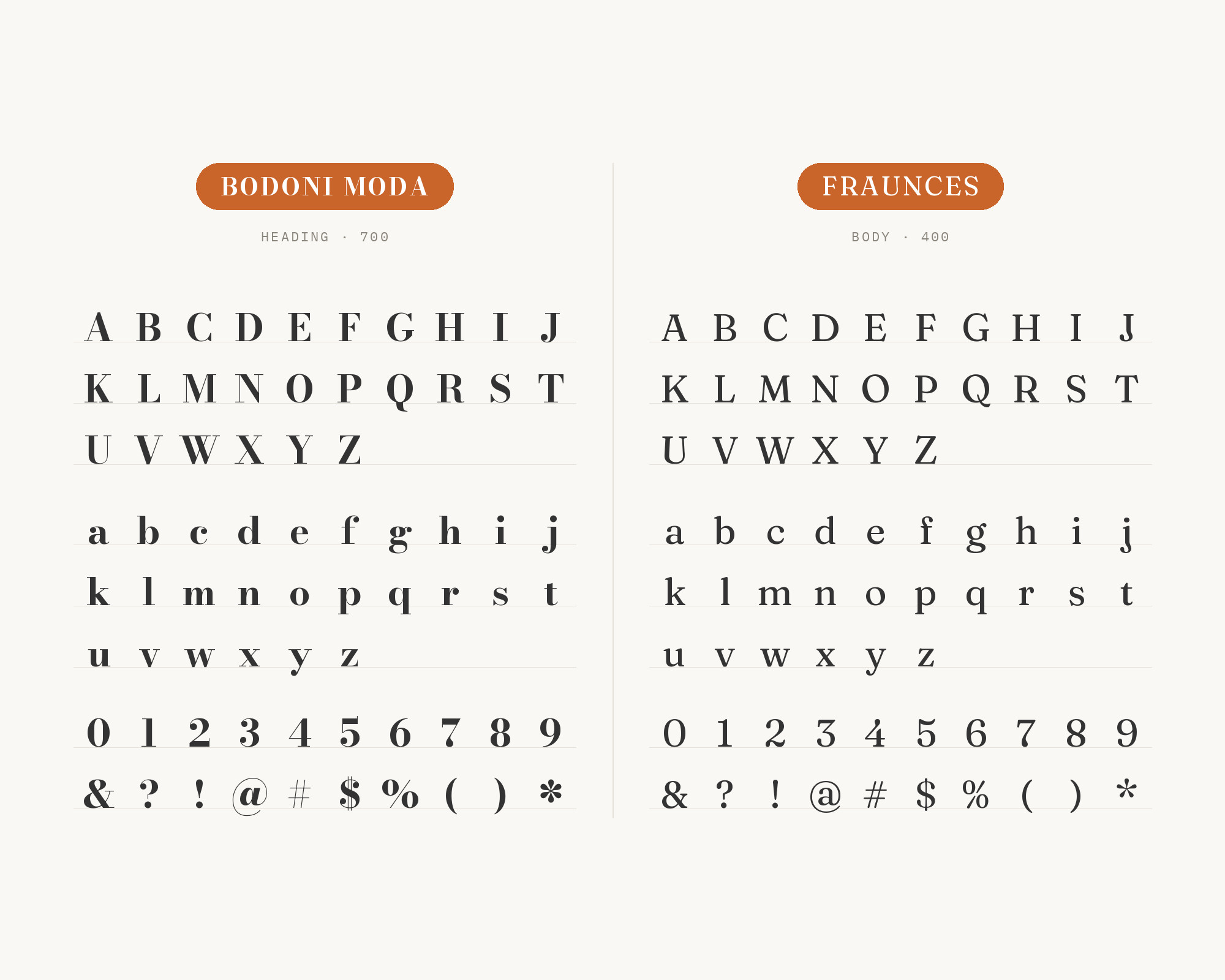
Fraunces is the third family in the same Trend Interior system. Trend Interior uses Fraunces italic for strap lines and captions. It is paired with Bodoni for editorial gravitas without a single font carrying all the weight.
Fraunces is a display, “Old Style” soft-serif typeface inspired by early 20th century typefaces such as Windsor, Souvenir and the Cooper Series. Its soft, warm shapes are a complete change of mood from Bodoni Moda’s sharp hairlines. Use Bodoni Moda for the title, and Fraunces italic for a short line beneath it.
5. Lato
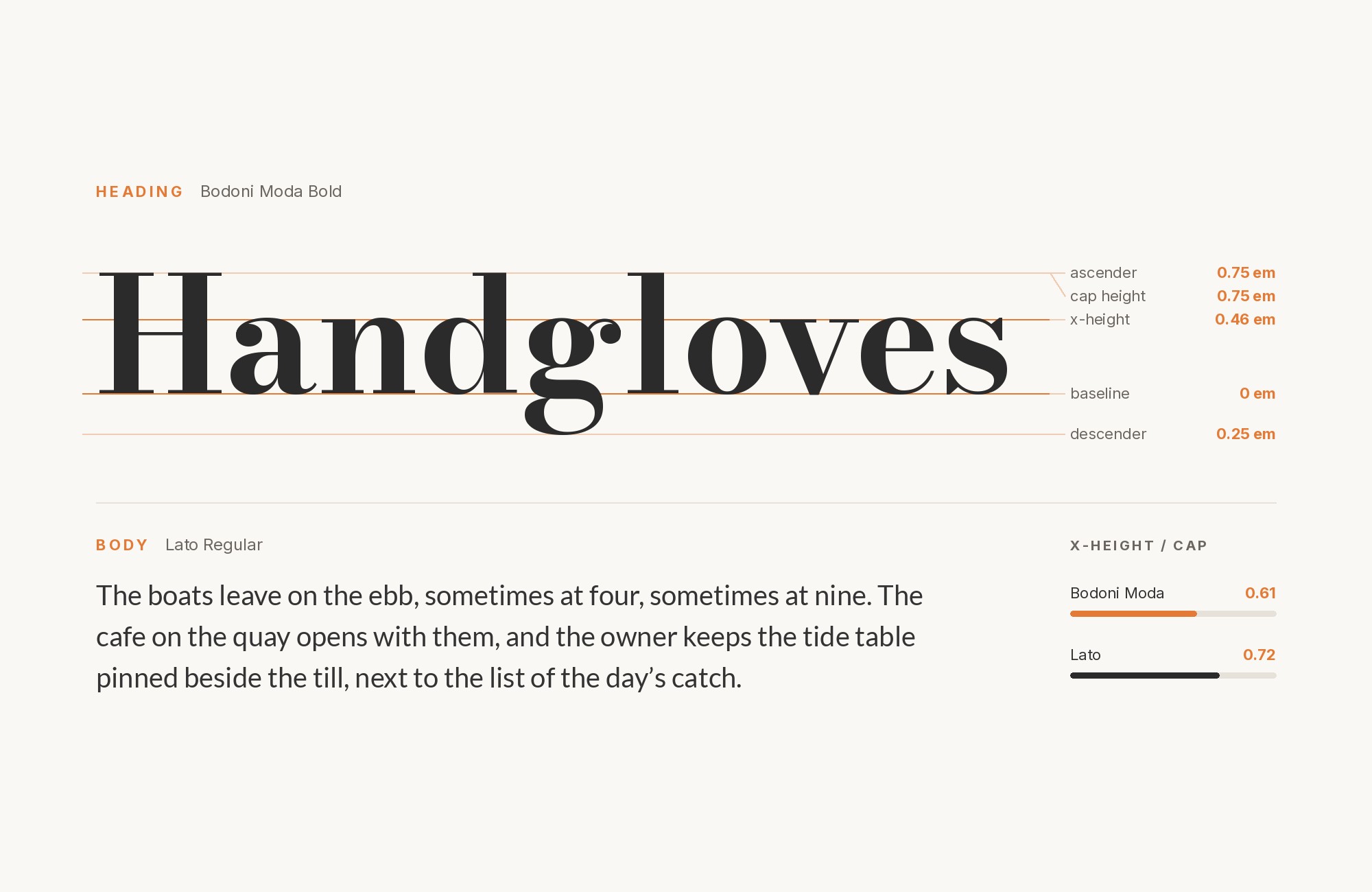
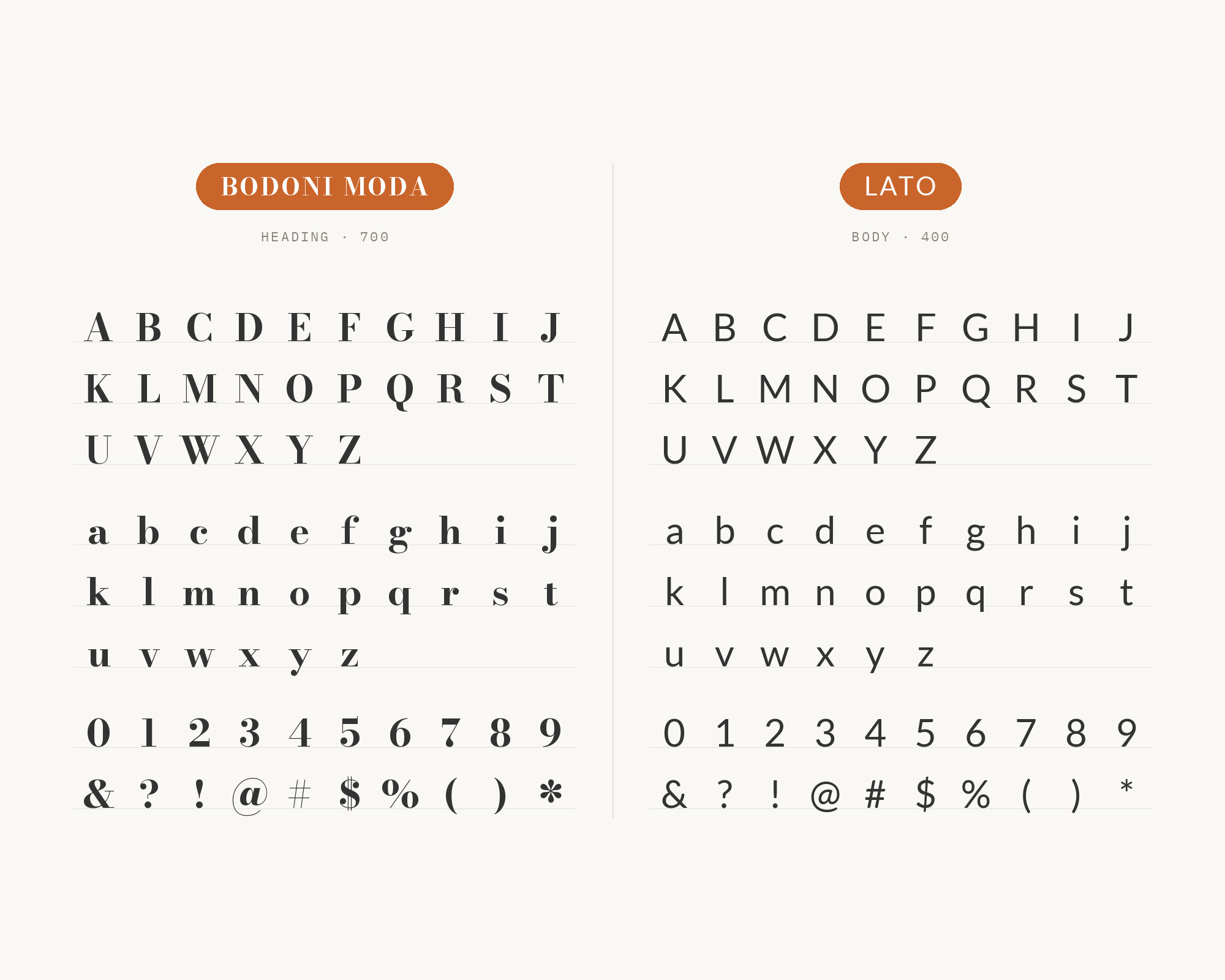
The Younique brand site reserves Bodoni Moda exclusively for headlines.
It says Lato should strictly be relegated to body text and must never be used as a headline. Łukasz Dziedzic designed Lato, a humanist sans released in December 2010.
Its semi-rounded details soften the cool contrast of a Bodoni headline. Lato stays even and readable in long text, so it is a safe body face for beauty and lifestyle brands.
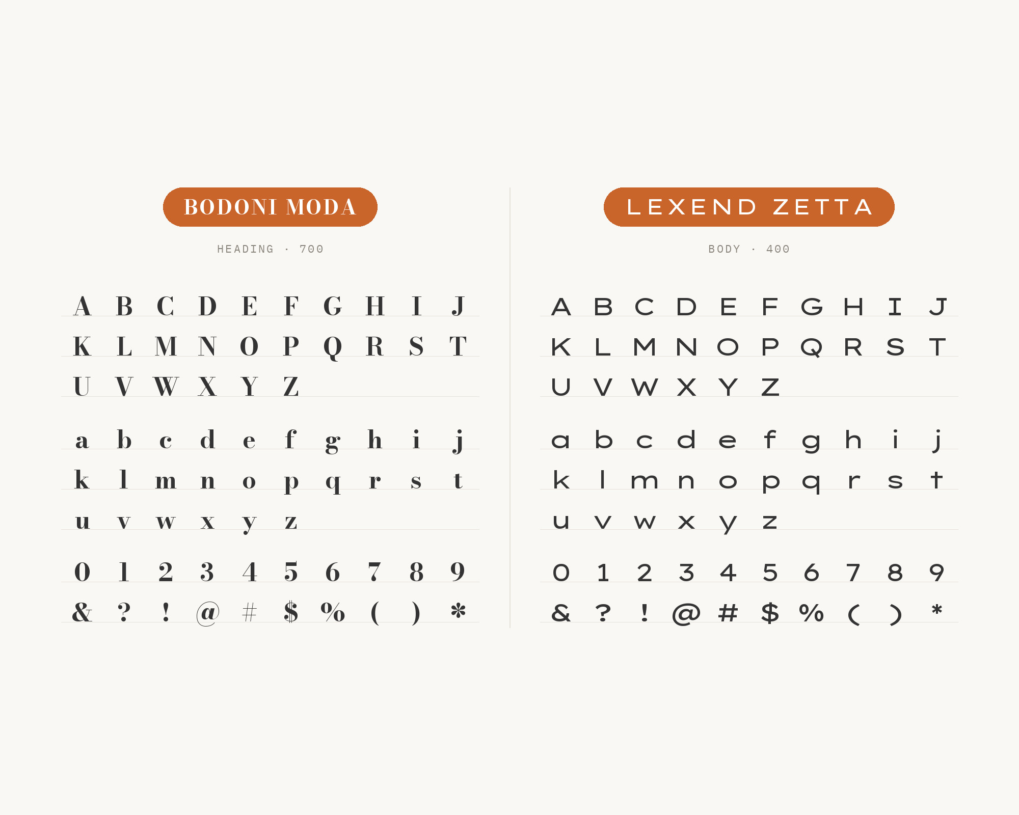
6. Lexend Zetta
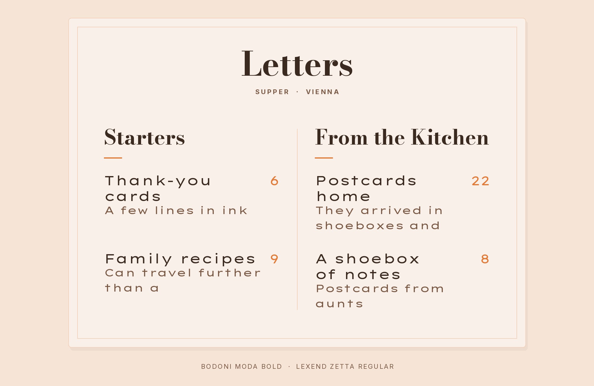
Lexend Zetta is the secondary typeface in the same Younique system. Younique uses it exclusively for headlines, always in all caps.
Lexend Zetta belongs to the first set of Lexend fonts by Thomas Jockin. The set becomes wider and more openly spaced, from Deca to Zetta. That very wide, tracked-out caps style is the opposite of Bodoni Moda’s narrow, vertical stress.
Use it for short labels, kickers or small all-caps titles next to a Bodoni headline.
7. Atkinson Hyperlegible
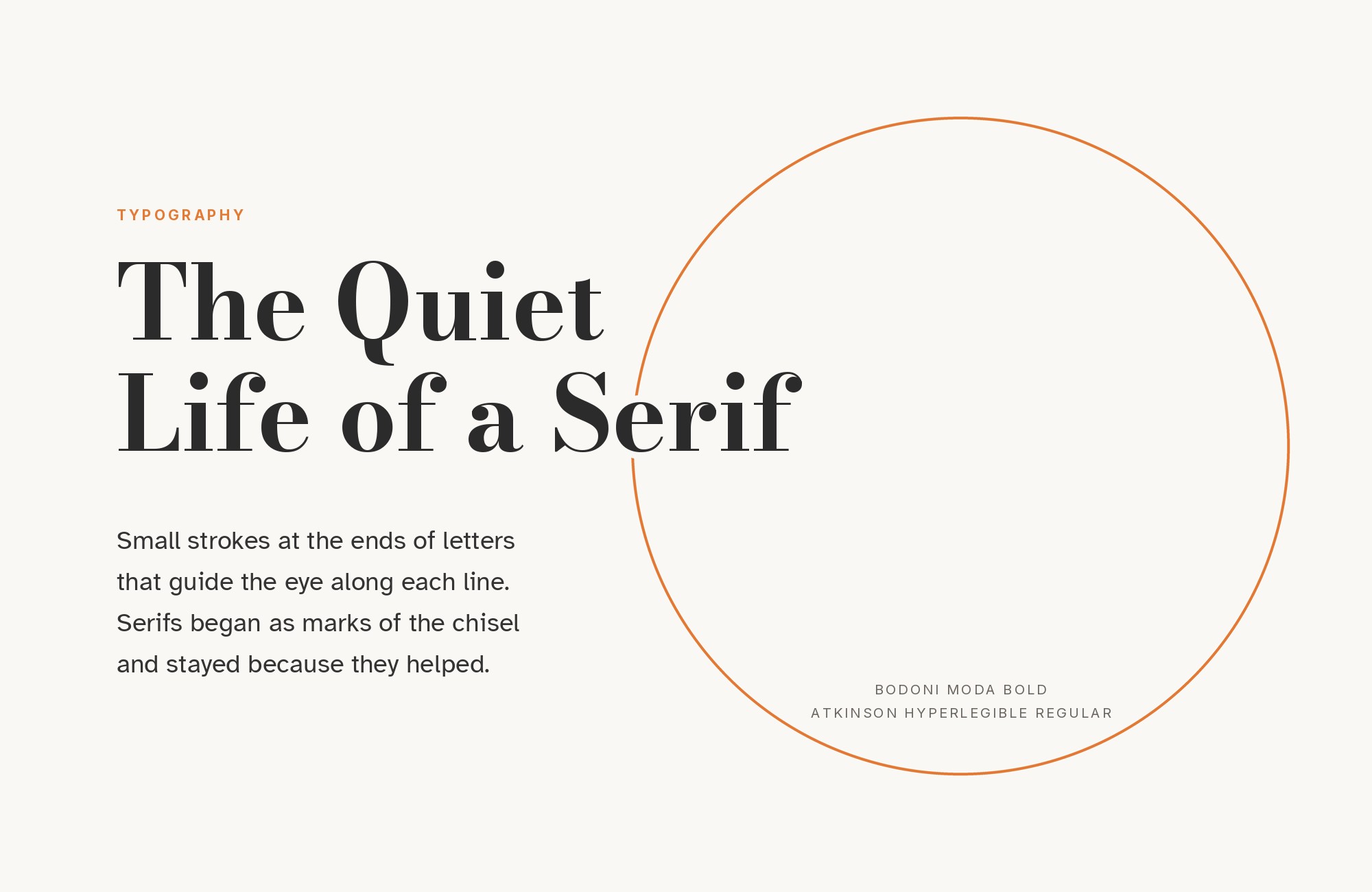
The TACENZA brand page uses two families: a high-contrast Didone for identity, and a typeface designed for legibility. Bodoni Moda is the display face for the wordmark and headings, and never for body text or buttons.
Atkinson Hyperlegible is the text face. It is named after the founder of the Braille Institute and was developed to increase legibility for readers with low vision. Its distinct, unambiguous letters are the most practical answer to Bodoni Moda’s delicate details.
This is a strong choice for apps and accessible interfaces.
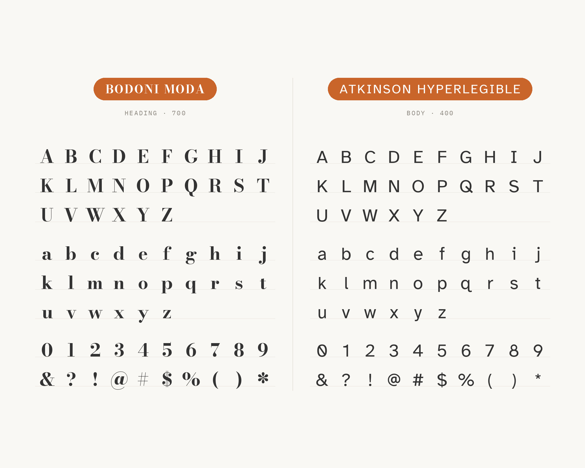
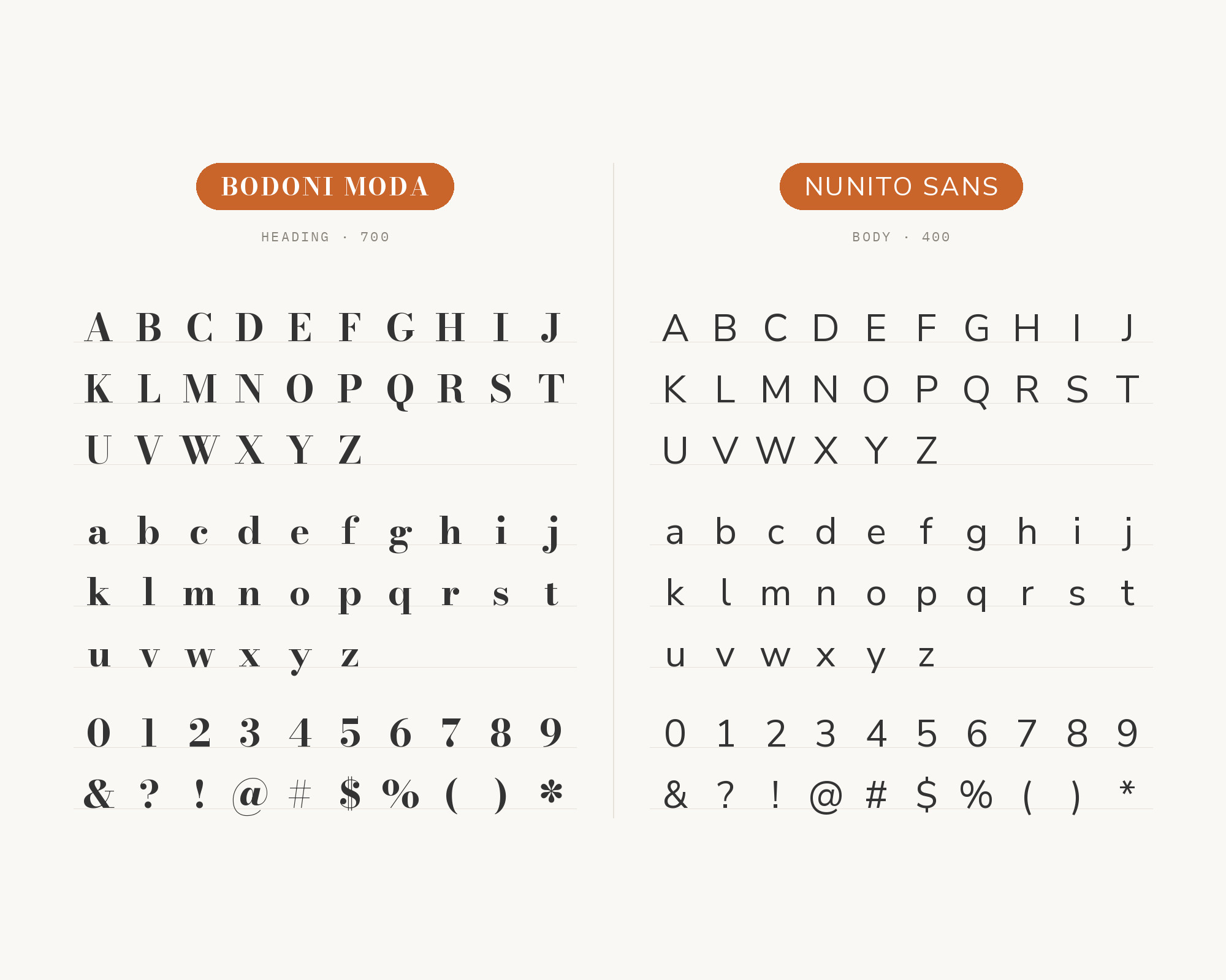
8. Nunito Sans
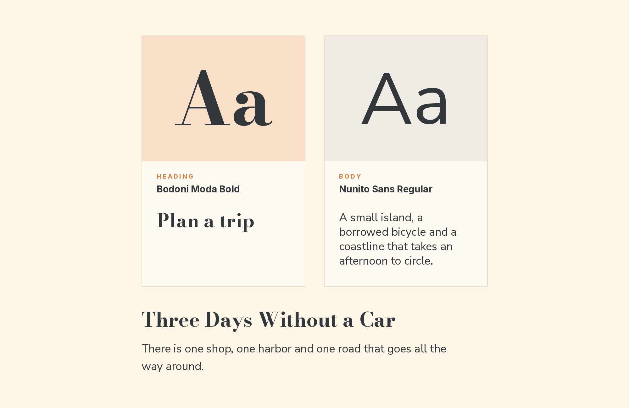
Wild Mind Studios paired Bodoni Moda with Nunito Sans for the Moss & Ember brand identity. Nunito Sans handles clean, legible body copy. Nunito Sans began with Nunito, which Vernon Adams created as a rounded terminal sans.
Jacques Le Bailly extended it into a regular non-rounded terminal version, Nunito Sans. Its gentle curves keep a premium Bodoni title from feeling cold.
Use it for wellness and lifestyle brands that want warmth and polish together.
9. Lexend
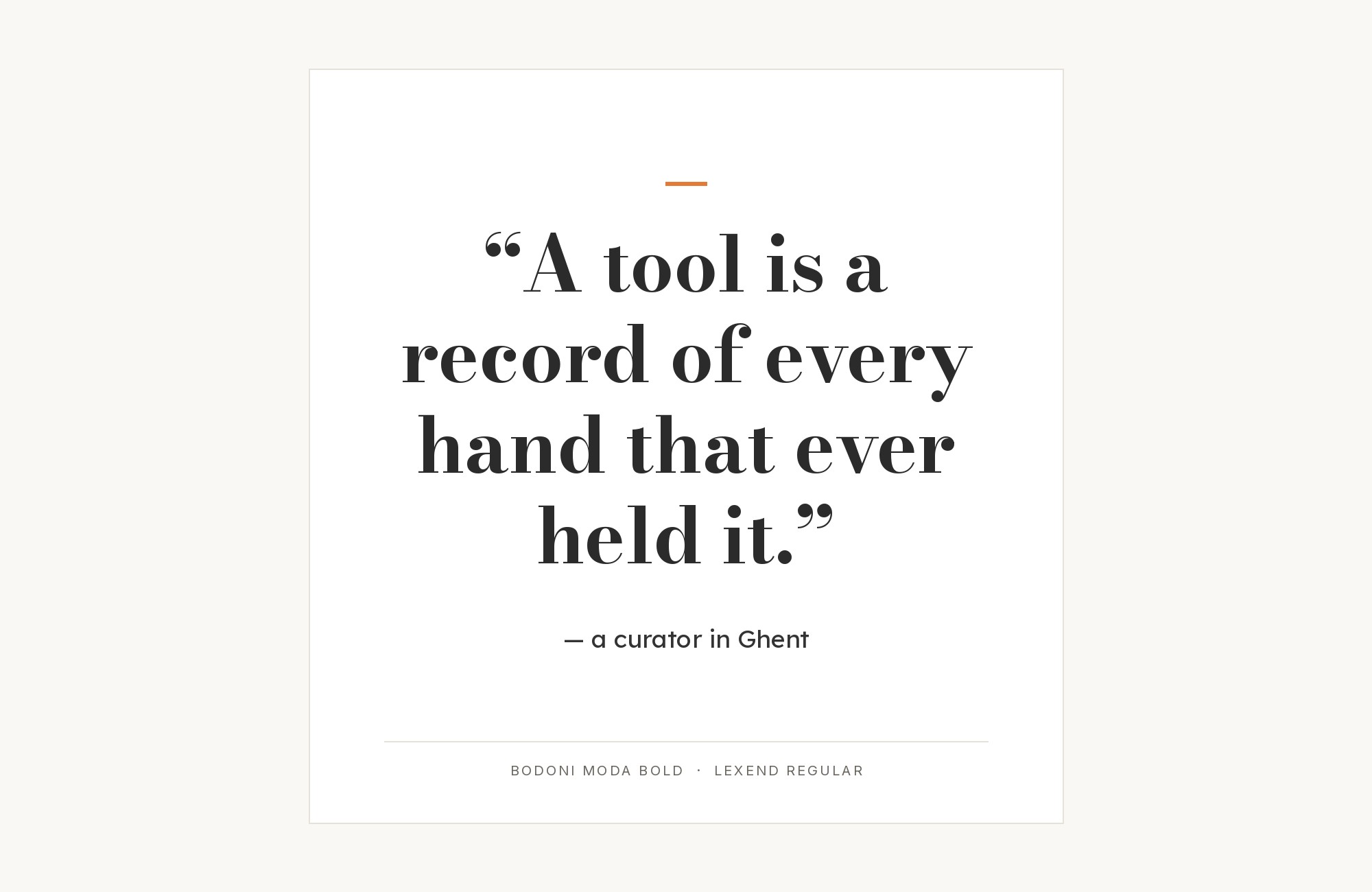
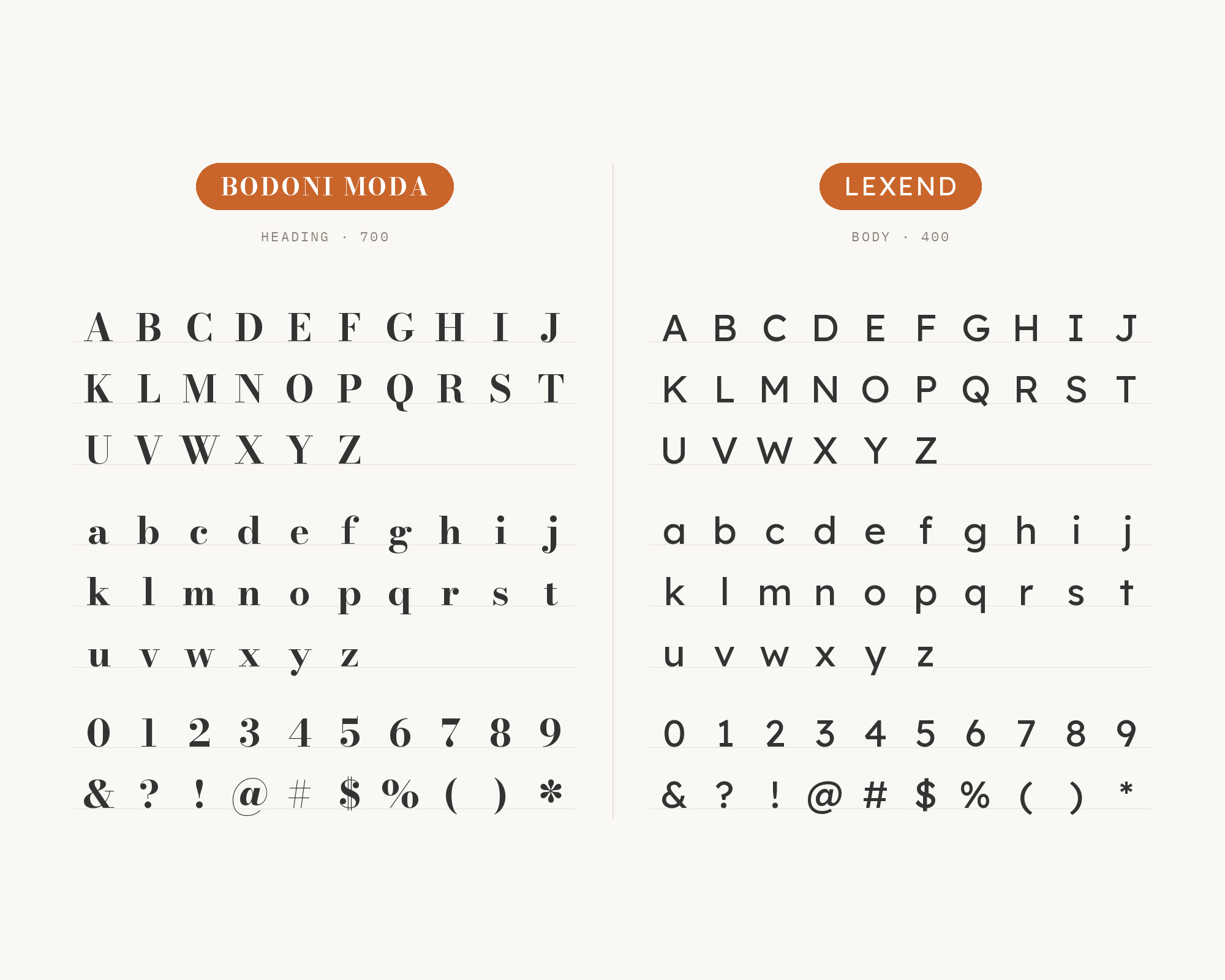
Typ.io records the magdalenerhof.it hotel website with Bodoni Moda and Lexend. Lexend fonts are intended to reduce visual stress and so improve reading performance.
Bonnie Shaver-Troup is the creator of the Lexend project. Lexend’s open, evenly spaced letters make easy reading text under a dramatic hotel headline.
Set Bodoni Moda large, and keep Lexend at comfortable text sizes.
10. DM Sans
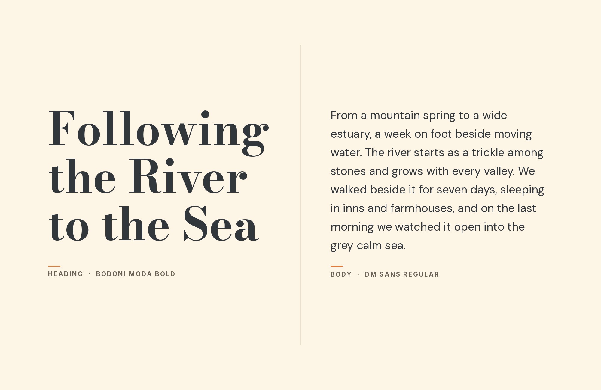
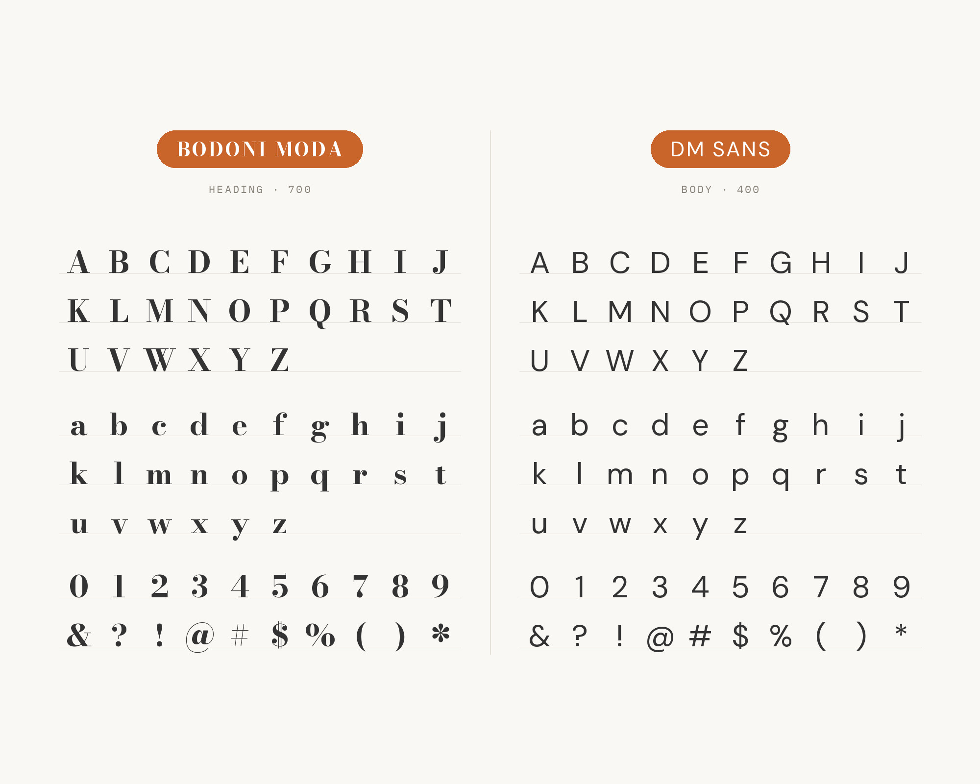
K Design Co. suggests Bodoni Moda with Playfair Display Italic and DM Sans for websites. In that system, Bodoni Moda brings editorial-magazine energy to the titles and DM Sans keeps the body copy clean. Colophon Foundry designed DM Sans.
DM Sans is a low-contrast geometric sans serif design, intended for use at smaller text sizes. That low contrast is the point: it gives the eye a rest after the Bodoni title.
11. Playfair Display
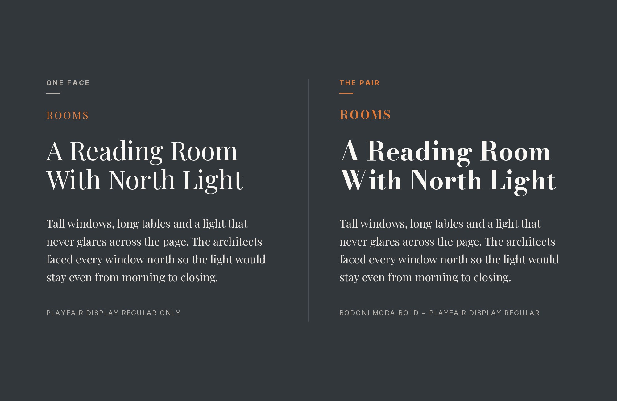
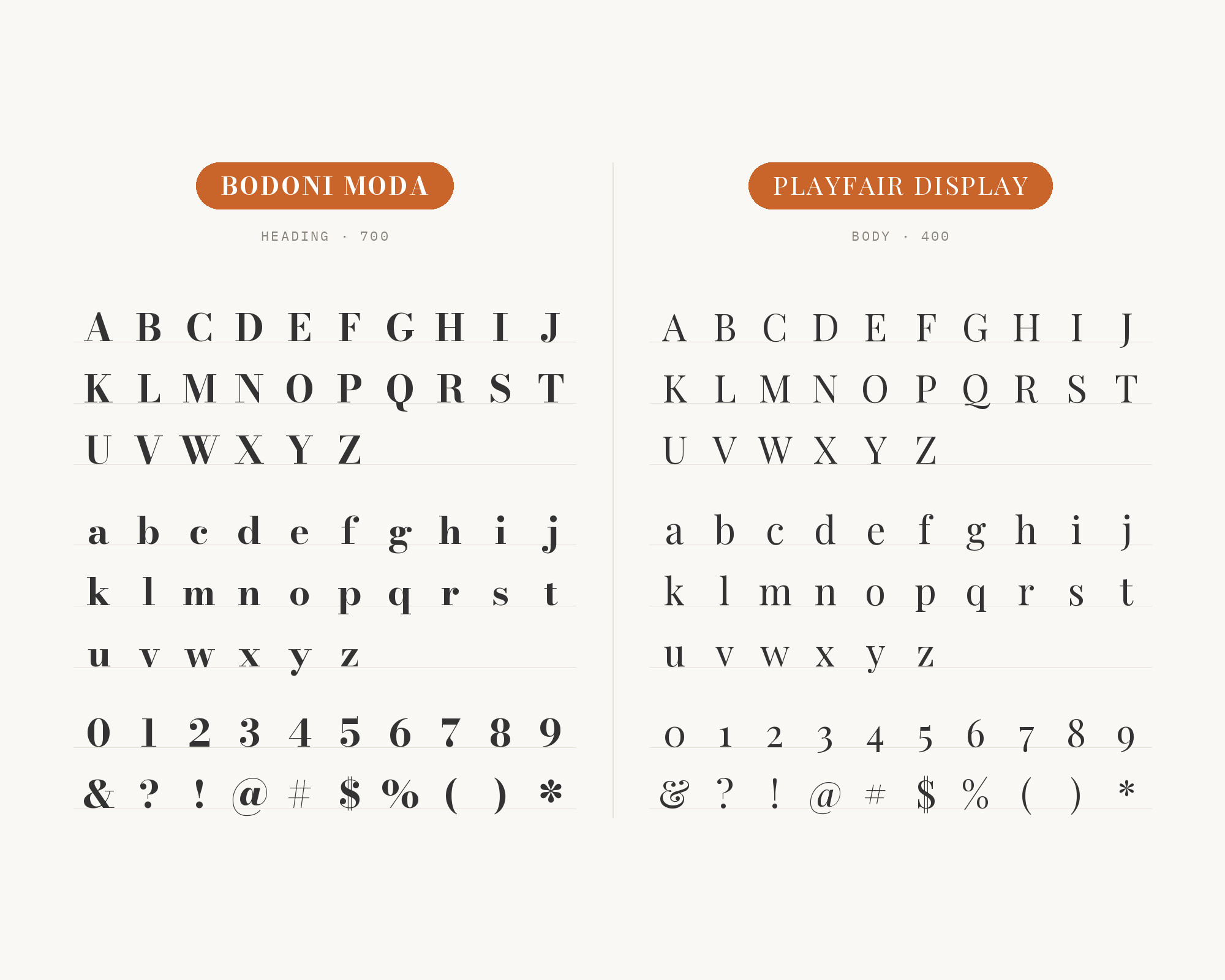
Playfair Display is the middle voice in the same K Design Co. system. There, Playfair Display Italic softens the Bodoni titles with a little movement and elegance in the subheadings. Playfair Display draws on the late 18th century, when broad nib quills were replaced by pointed steel pens.
So both faces share high contrast and delicate hairlines.
The split has to come from style: Bodoni Moda roman for the title, Playfair italic for the subheading. Add a plain sans for the body text, as K Design Co. does.
12. Georgia
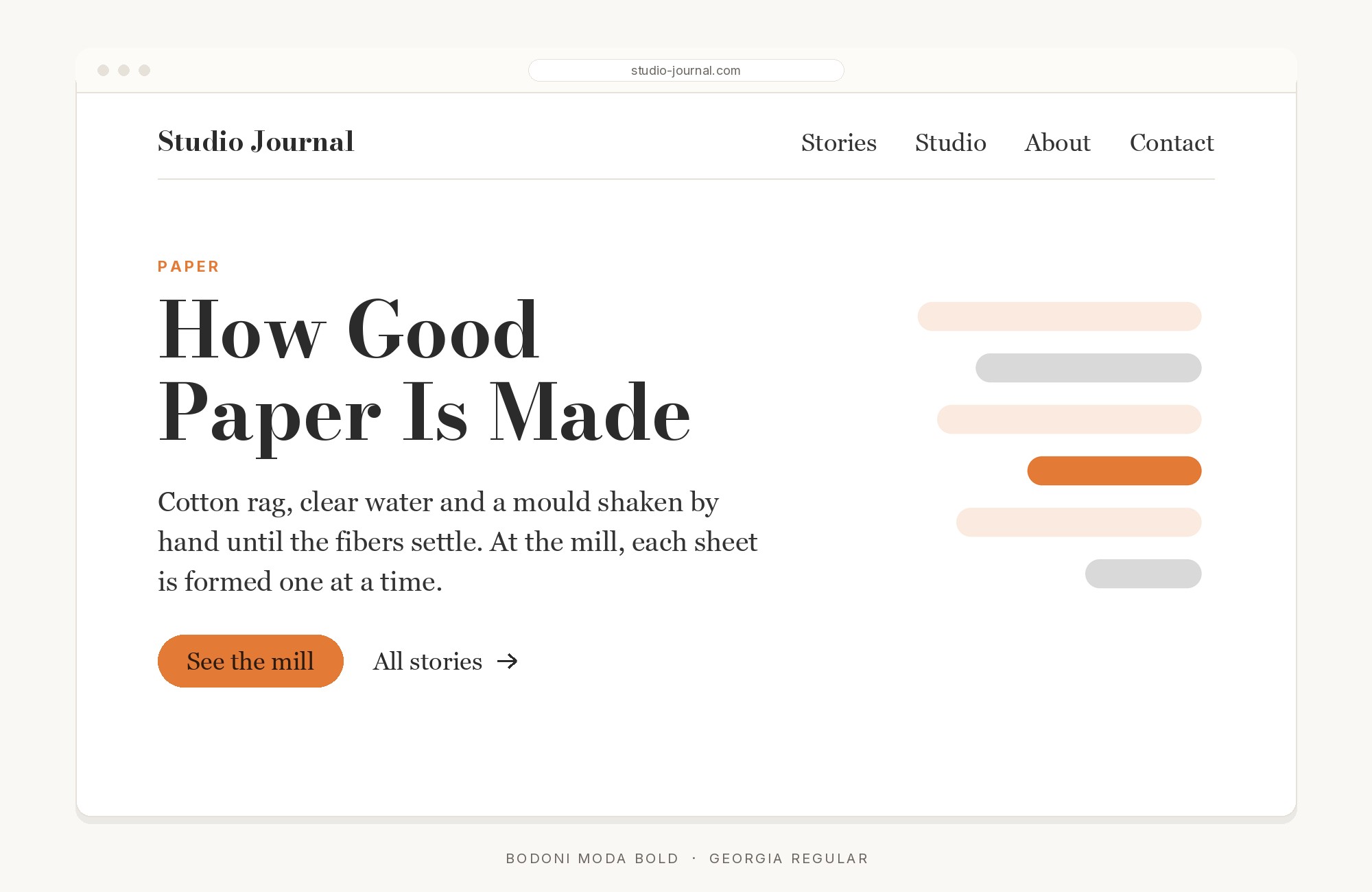
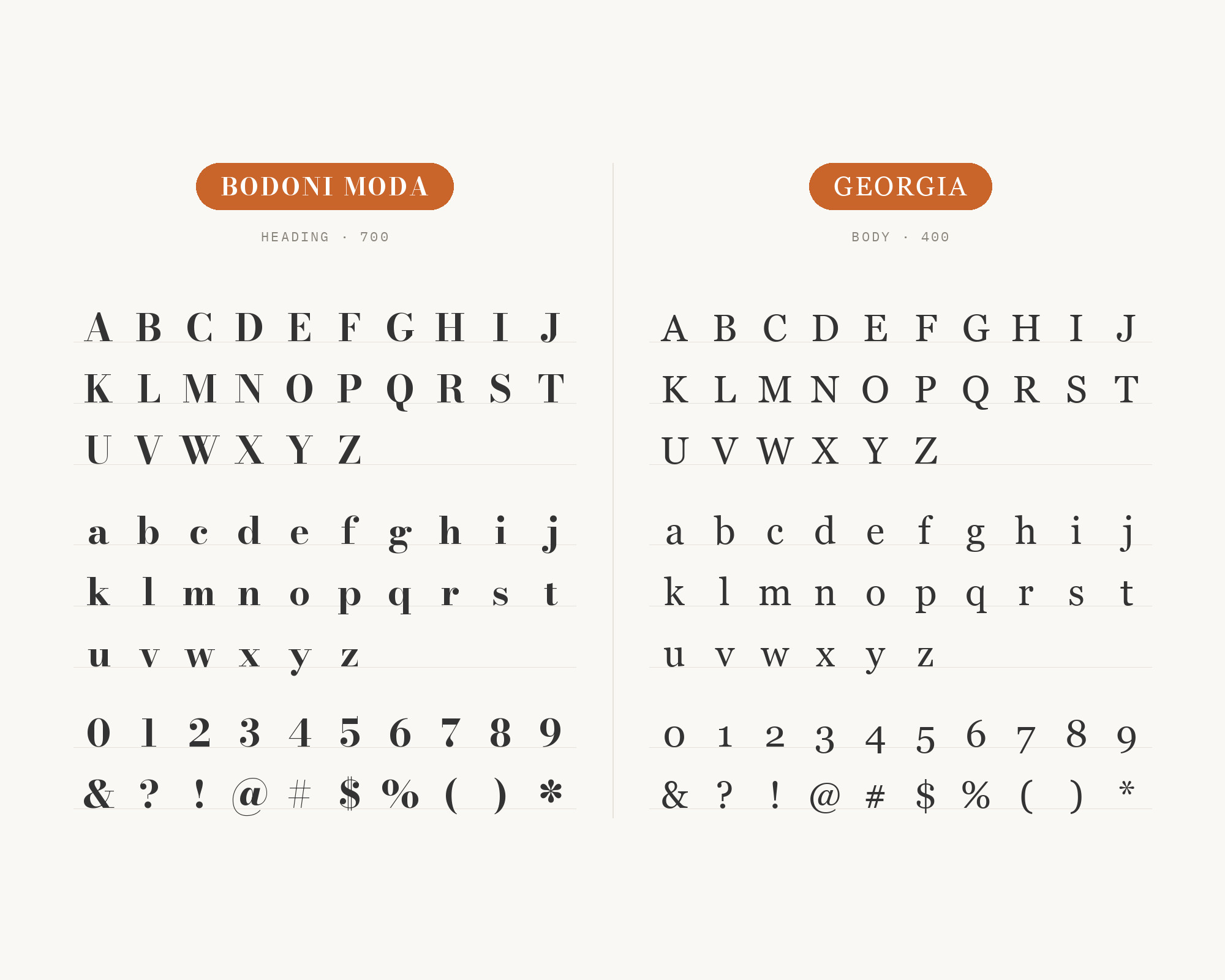
The Vignelli theme for Obsidian sets Bodoni (Moda → Didot → Bodoni MT) for headings and Georgia for reading. Matthew Carter designed Georgia, released in 1996. Georgia’s sturdy, open serifs are made for the screen, so they hold up where Bodoni Moda’s hairlines would not.
This is the classic all-serif pairing: a Didone title over a calm reading serif.
Conclusion
Bodoni Moda is a headline font first. Almost every real system on this list says so in writing.
For the reading, pick a calm sans: Poppins, Montserrat, Inter, Lato, Nunito Sans, Lexend, DM Sans or Atkinson Hyperlegible. For a second voice, try Fraunces italic, Playfair Display italic or Lexend Zetta caps. For an all-serif page, Georgia is the steady partner.
Use the optical sizes, test at real sizes, and give each font one clear role.
Sources
- Fonts In Use (Bodoni* typeface page)
- Fonts In Use (Unleash the Fashion)
- Typ.io (Lexend)
- Colorado State University web guidelines
- AARE brand standards 2023
- Tony Schwartz: Wedding MC & DJ brand assets
- NEO A&M College branding guide
- Trend Interior Home Builders brand kit
- Younique brand
- TACENZA branding
- Wild Mind Studios, Moss & Ember
- K Design Co.
- Obsidian Vignelli theme
- University of Virginia fonts
- Bright Horizon Creative
- Webflow modern fonts
