Urbanist pairs great with Inter, Barlow and Red Hat Display. All 13 pairings are shown below in real rendered specimens, with the reason each one works.

What fonts go with Urbanist, the low-contrast geometric sans by Corey Hu? The best partners give Urbanist’s round, even letters a job to share. Some take the headline, some take the reading, and a few add a technical edge.
Corey Hu launched the Urbanist project in 2020 with 9 weights and accompanying italics. Google Fonts added it in 2021.
It is a low-contrast geometric sans, inspired by Modernist typography and design. Its letters are conceived from elementary shapes.
Today it is available as a variable font with weight and italic axes. Sessions College says the face is strongly reminiscent of ITC Avant Garde. Pimp my Type also lists Urbanist as a free alternative similar to Avant Garde.
So what does Urbanist need from a partner? Its strokes are almost even, so a serif or a script brings texture and contrast. Its wide, round shapes look calm, so a heavy display face can add energy on top.
And it is clean on screens, so a plain text sans or a mono often takes the small print. The pairings below come from a video game, real brand guides, design studios and curated website galleries. Here are 13 fonts that pair with Urbanist.
1. Inter
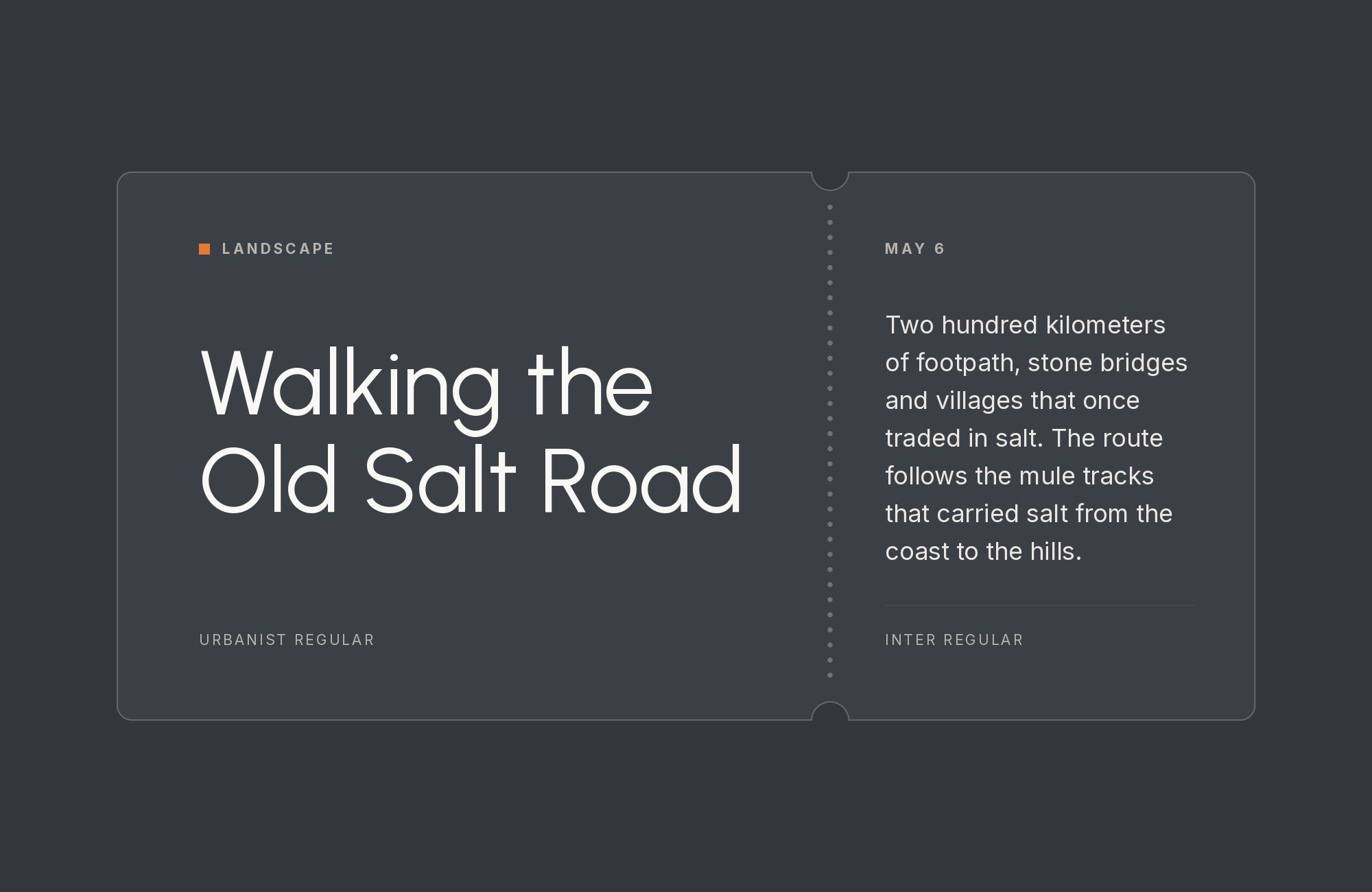
ZayZoon chose Urbanist in its rebrand as a variable font with a wider range of thicknesses than its old fonts. The company also says Urbanist can’t do all the heavy lifting alone.
So it introduced Vollkorn and Inter as companions. The devdays media kit is more direct: Urbanist for headings and display, Inter for body and UI. TodayMade also paired Urbanist with Inter in the emails for its Ship Angel project.
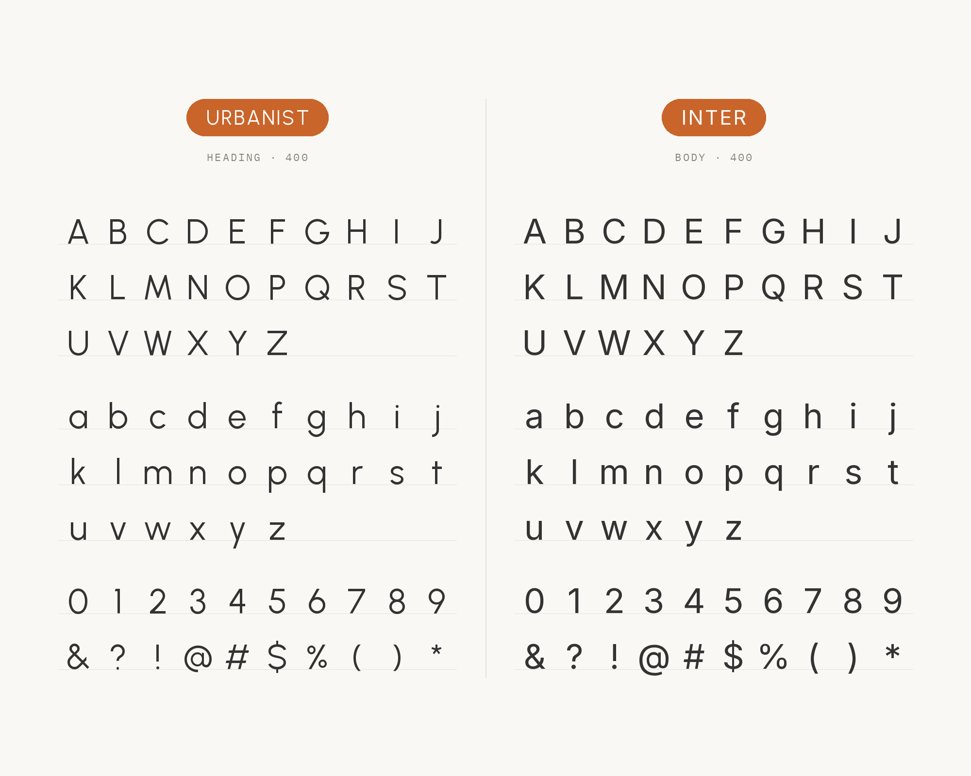
Inter is a variable font family designed for computer screens. Its neutral shapes make long interface text compact and steady under Urbanist’s rounder headings.
This is the most documented pairing on the list.
“My clients will build their own sites with their own AI.”
How are you supposed to navigate this?
Find Out How2. Barlow
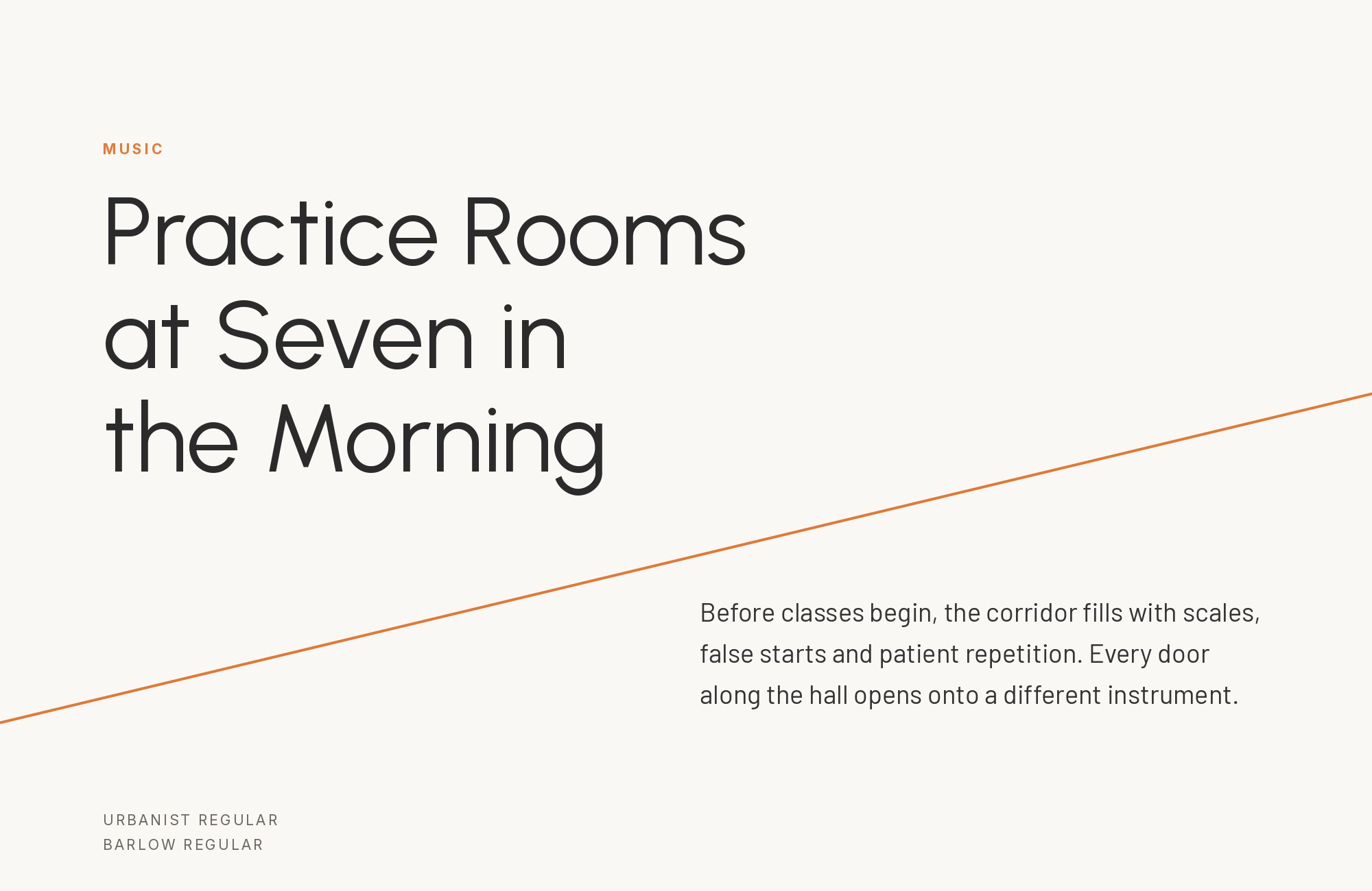
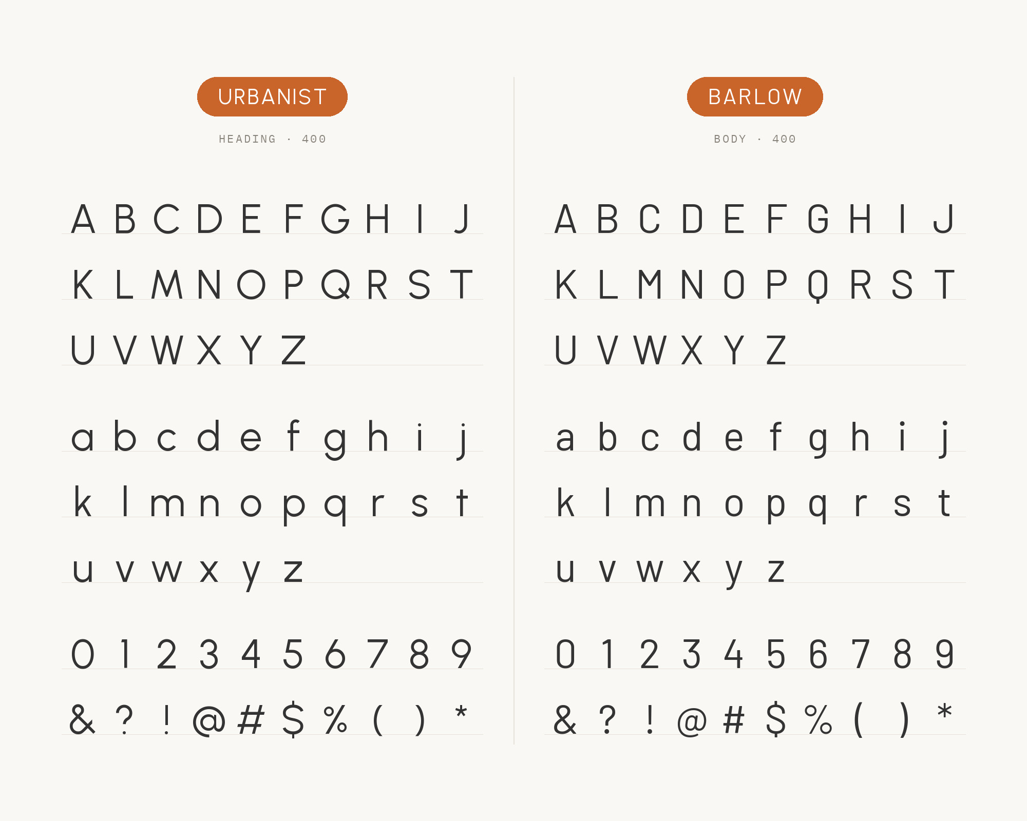
Fonts In Use documents the ARC Raiders video game with Urbanist, Barlow, Prompt, ITC Avant Garde Gothic and JetBrains Mono. In the game, Barlow Light, Regular and Bold are heavily used for body text.
Barlow is a slightly rounded, low-contrast grotesk. It draws on the visual style of the California public: car plates, highway signs, busses and trains. Barlow is narrower than Urbanist, so text packs tighter under the round headings.
Use bold Urbanist for titles and Barlow for menus, labels and paragraphs.
3. Red Hat Display
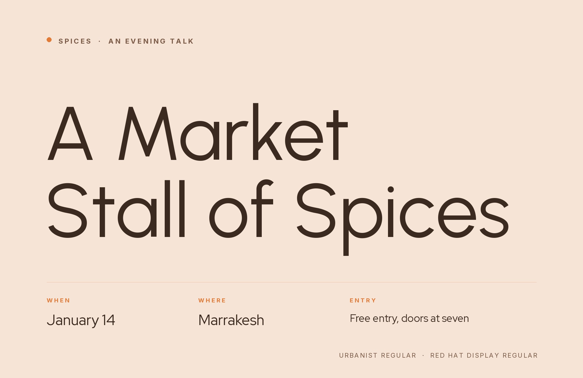
The Golden Software brand and style guide sets H1 to H5 in Urbanist.
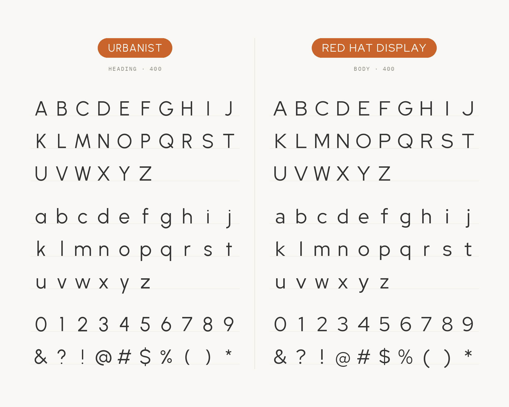
Its body text is Red Hat Display Regular, between 13pt and 17pt. Red Hat Display belongs to a family created for Red Hat with type designer Jeremy Mickel.
That family launched in 2019 as part of the Open Brand Project.
Both faces are geometric, so the split has to come from weight and size. Bold Urbanist headings over regular Red Hat Display text keep the roles clear.
“AI builds anything, so what do I sell?”
Taste is the answer. Own your stack and automate your own CMS.
Find Out How4. Manrope
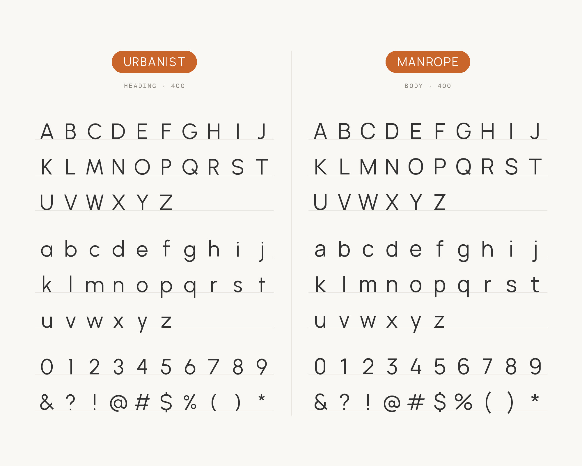
The Enlivex brand kit names Urbanist as its primary font.
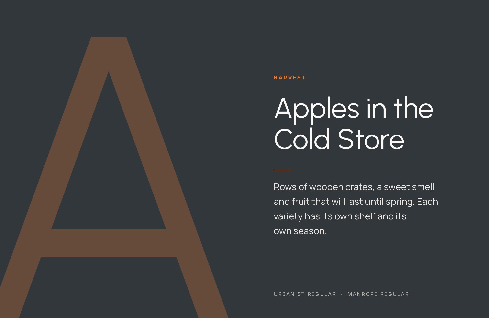
Its secondary font is Manrope. Manrope is an open-source modern sans-serif font family, designed by Mikhail Sharanda in 2018. Its slightly narrower, more mechanical shapes sit well under Urbanist’s round geometry.
Use Urbanist for titles and Manrope for body and interface text.
5. Vollkorn
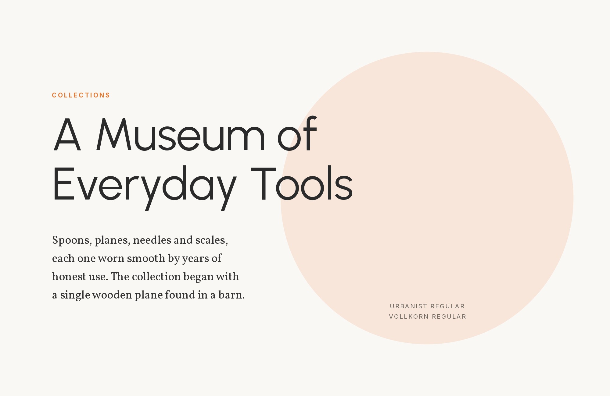
Vollkorn is the serif in the same ZayZoon system. ZayZoon says serif fonts lend credibility, stability and a human touch.
Vollkorn was the first typeface design by Friedrich Althausen, first published in 2005. Its dark, sturdy serifs are the opposite of Urbanist’s even, open strokes.
That gives the page a warm reading voice beside a modern brand voice.
Use Vollkorn for longer reading and quotes, and Urbanist for headings and buttons.
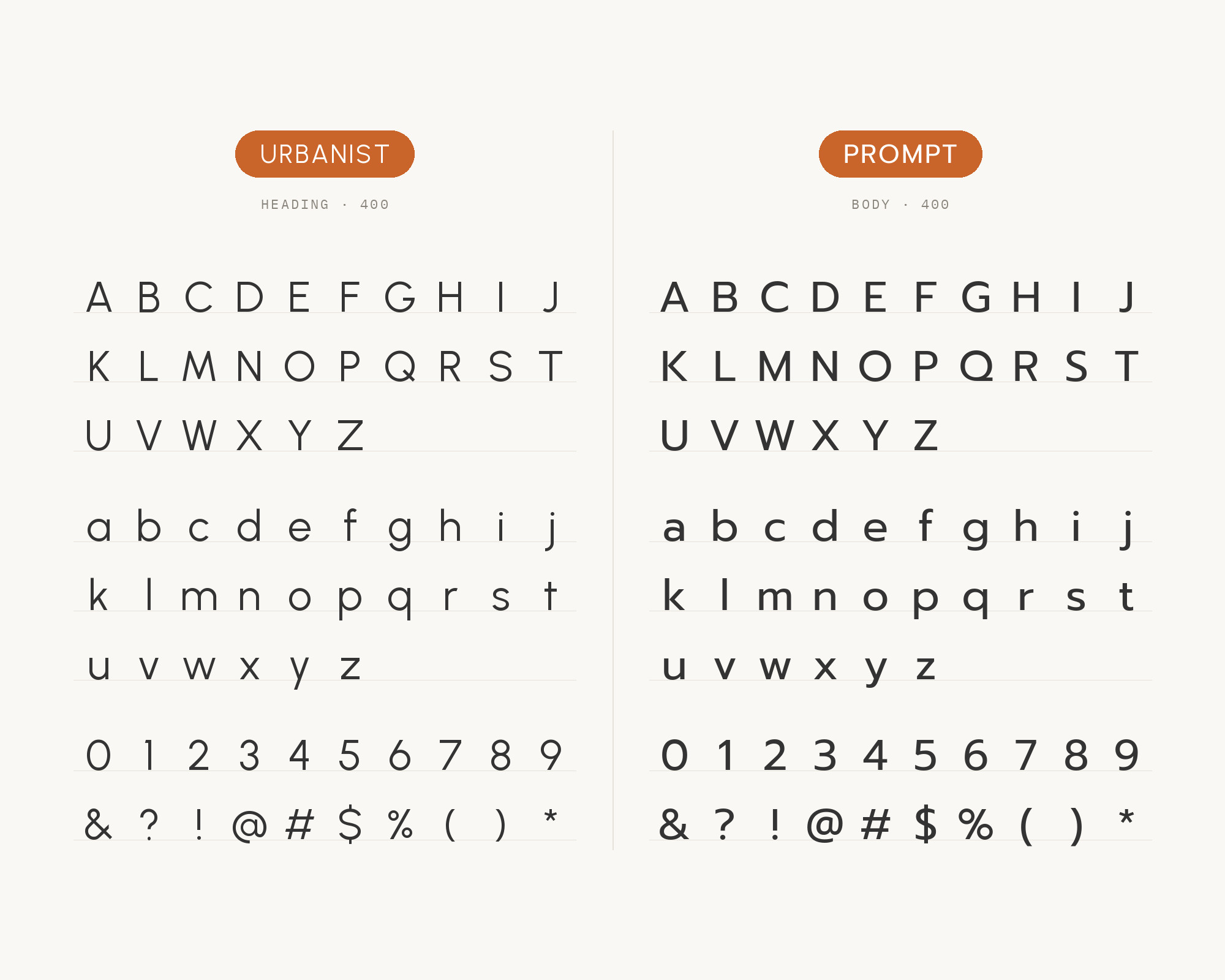
6. Prompt
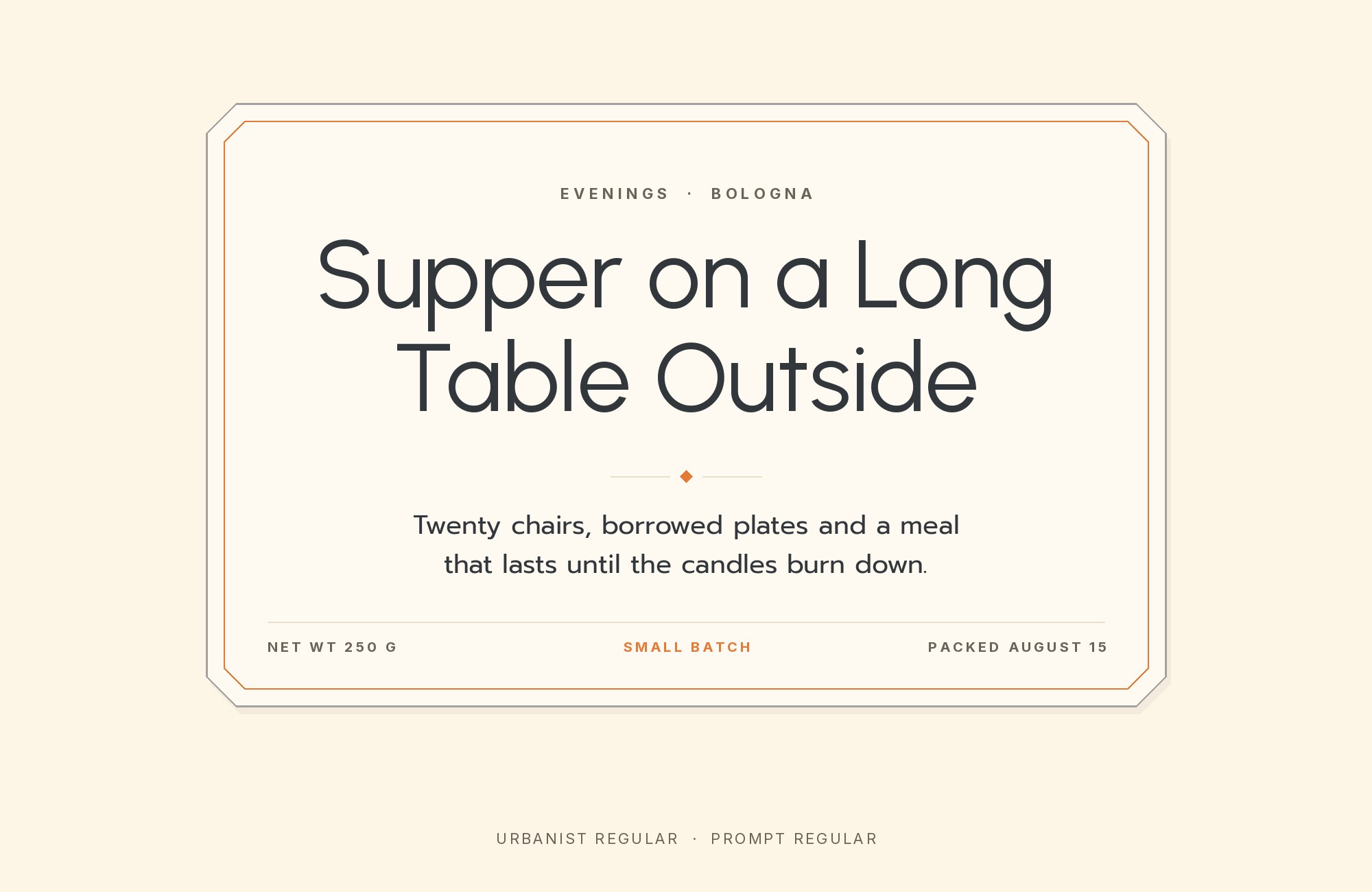
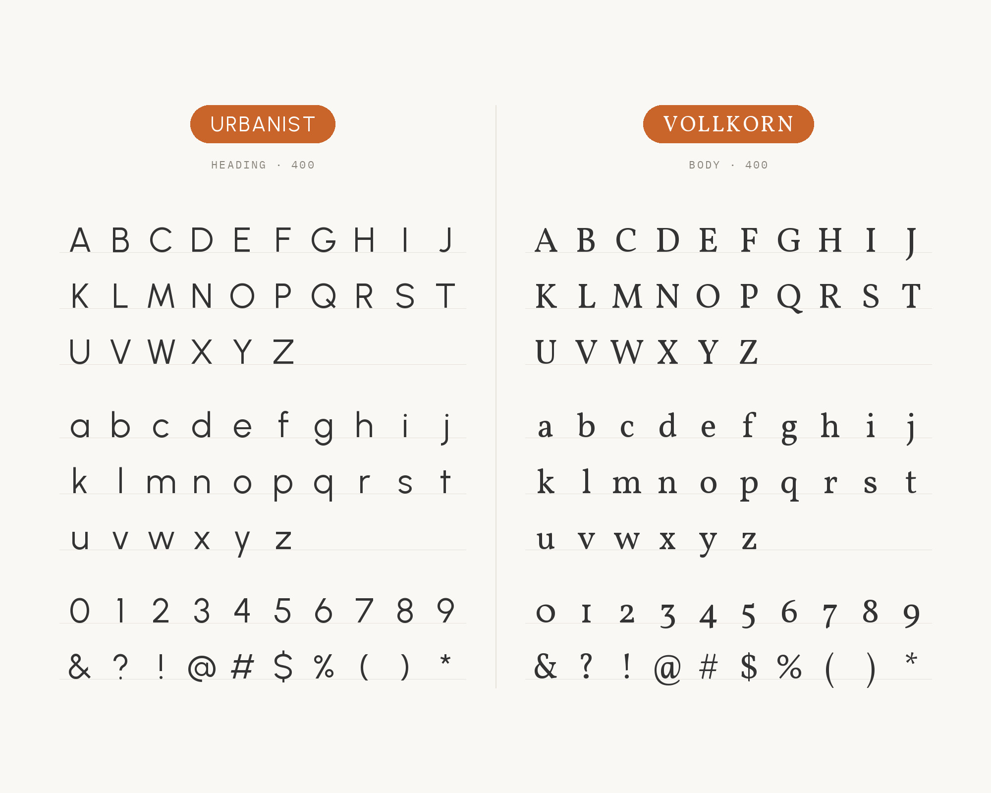
In ARC Raiders, Urbanist and Prompt share the heading role, although Urbanist is used more regularly. Prompt is a loopless Thai and sans Latin typeface.
Its Latin is simple and geometric. The Prompt project is led by Cadson Demak, a type foundry in Thailand. Because the two are close in spirit, give one of them the main titles and the other the smaller headings.
Keep a clear weight step between them so the page still has one leader.
Webflow. Framer. Squarespace. Wix. Lovable. Not your future.
Your own AI CMS agent is.
Find Out More7. JetBrains Mono
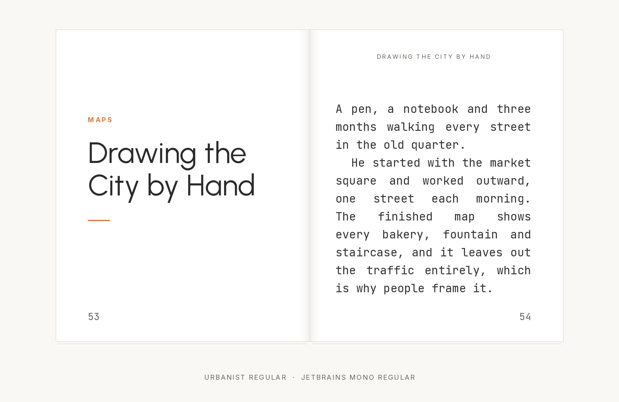
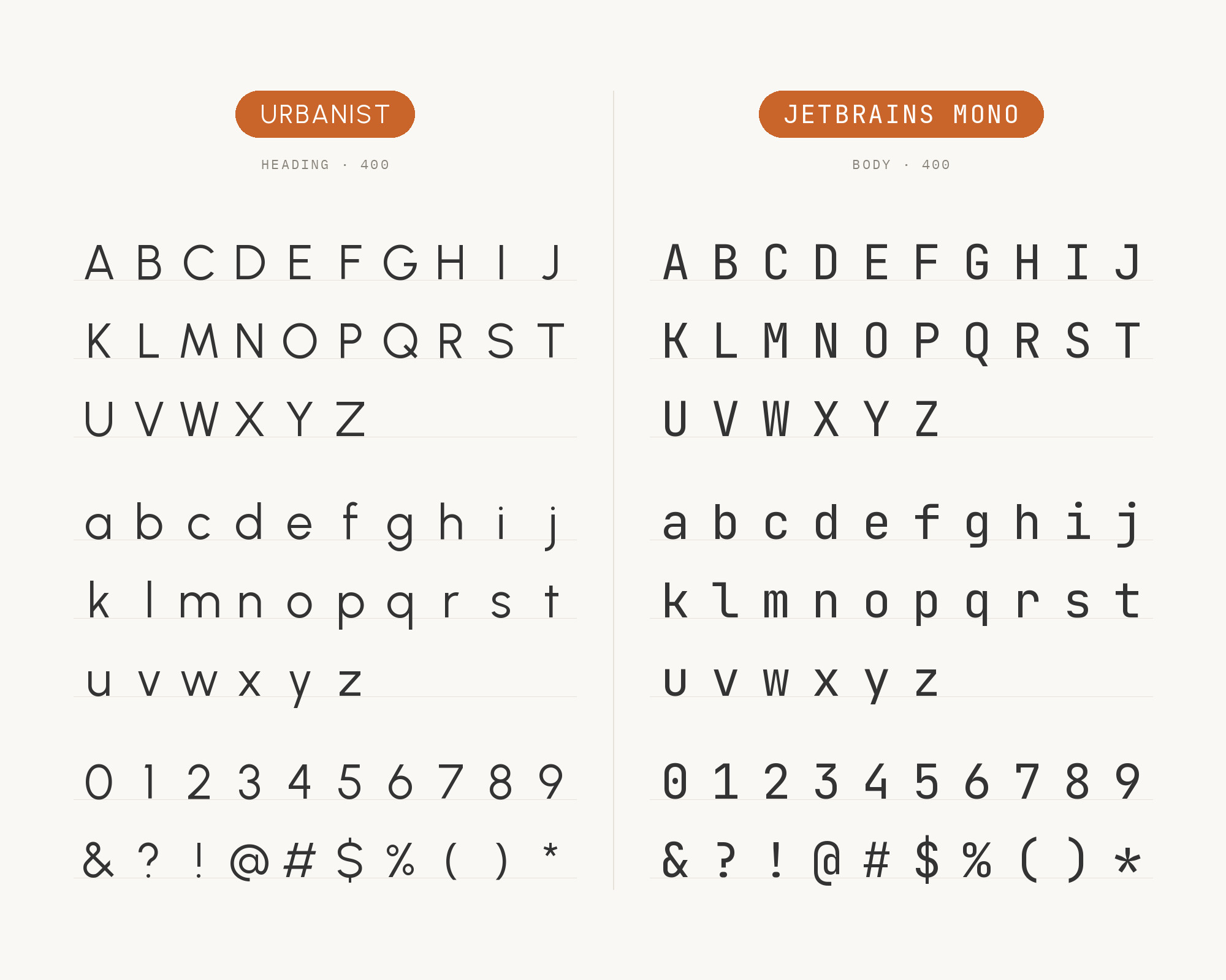
ARC Raiders also uses JetBrains Mono as extra decorative flavor, mainly in the HUD. JetBrains Mono keeps its characters standard in width, but the height of the lowercase is maximized.
That tall lowercase sits well next to Urbanist’s open, round letters.
Use the mono for data, codes, labels and small status text. Urbanist keeps the headings, so the monospace reads as a technical accent.
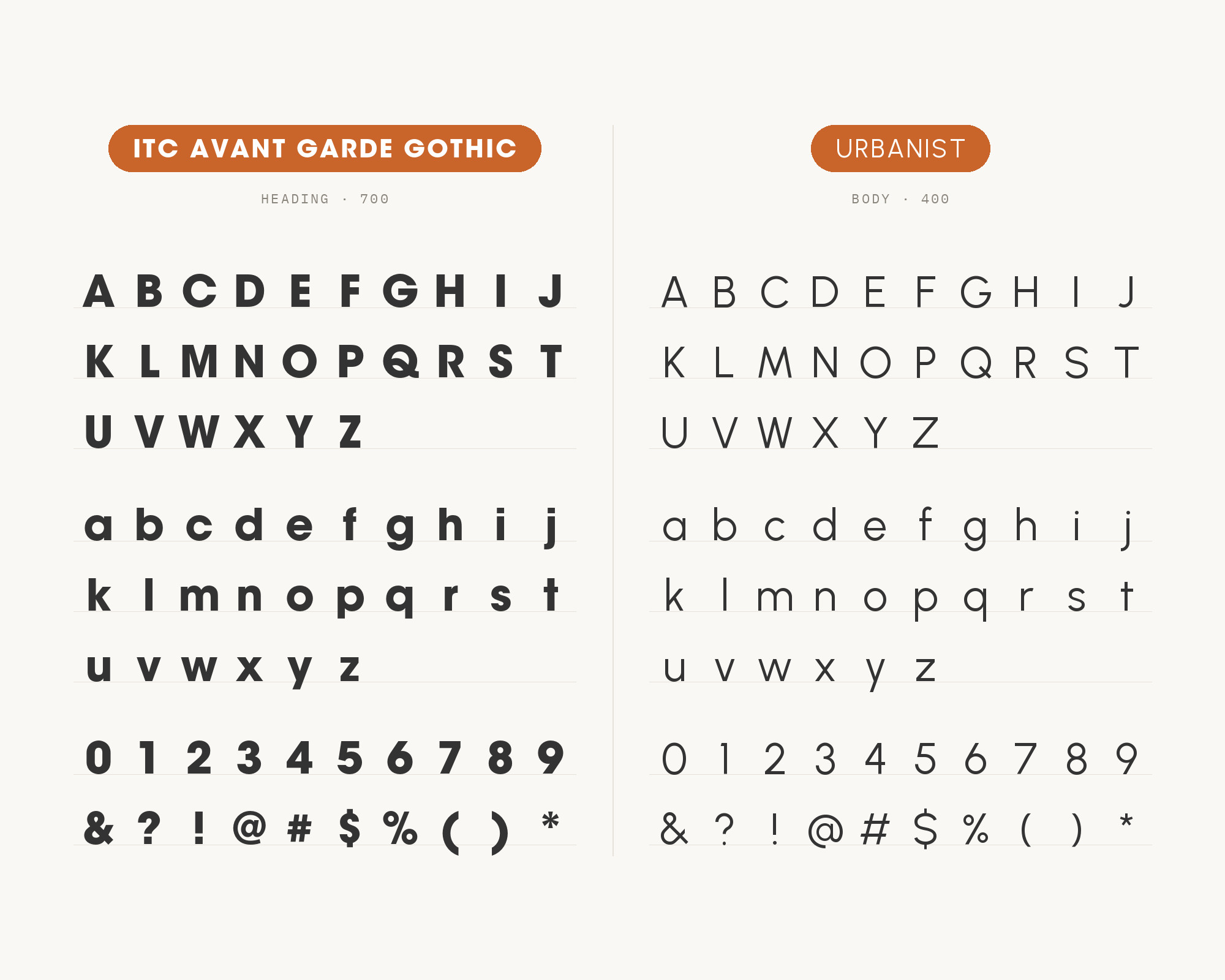
8. ITC Avant Garde Gothic
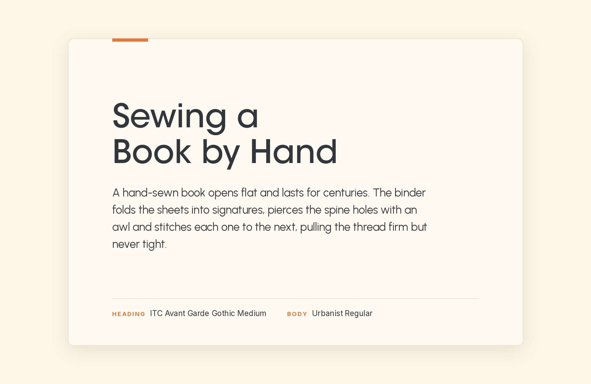
ARC Raiders uses ITC Avant Garde Gothic Bold for its logo.
So in this pairing, Avant Garde takes the title and Urbanist takes the rest.
Adobe Fonts credits Herb Lubalin among the designers of ITC Avant Garde Gothic, from Monotype. Urbanist is often compared to it, so this is a family-resemblance pairing. The contrast must come from weight: a heavy Avant Garde title over lighter Urbanist text.
9. DM Sans
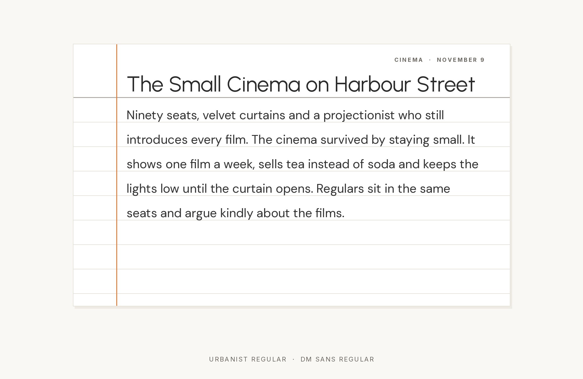
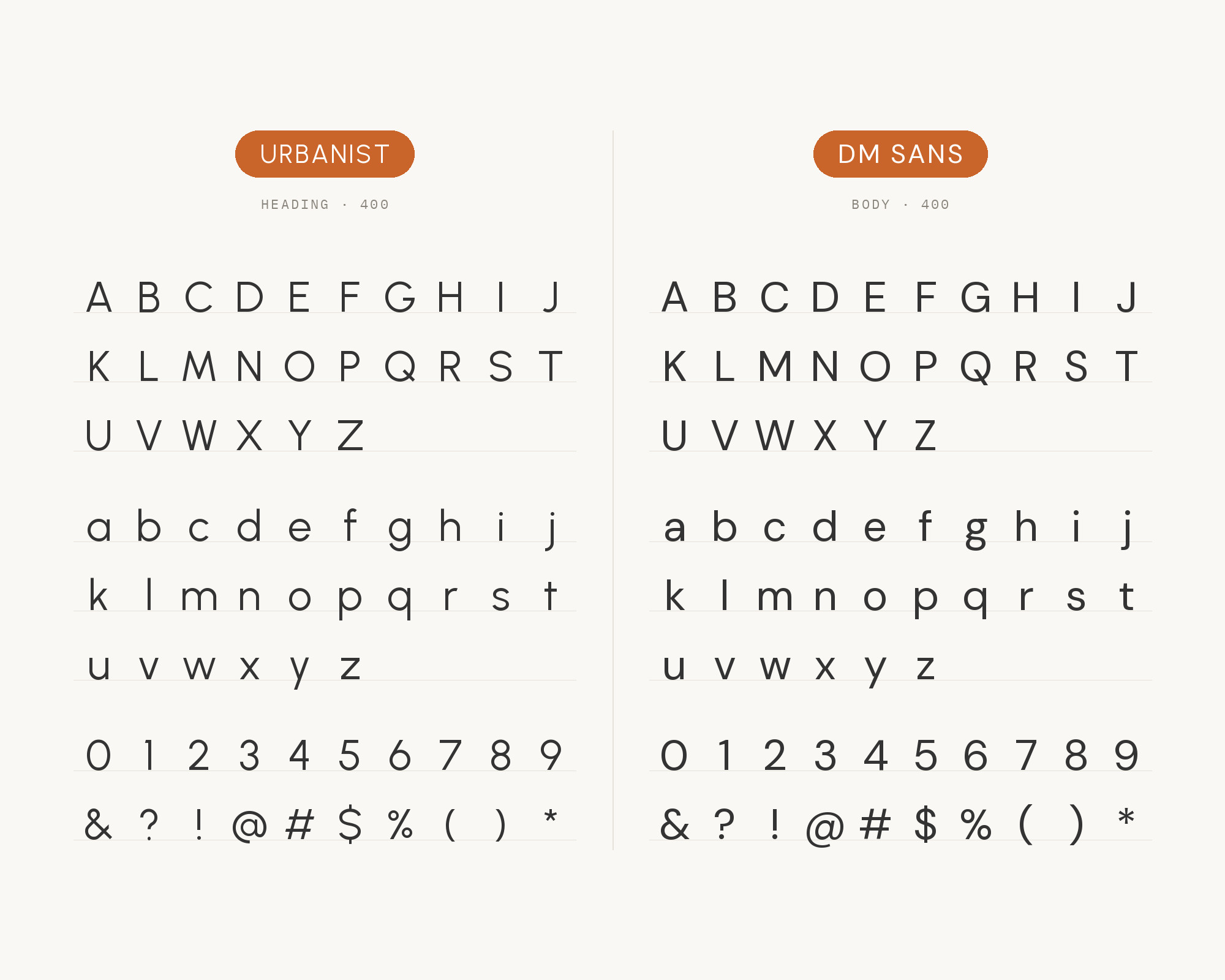
The Riteflow Framer template lists DM Sans as its primary font and Urbanist as its secondary font. Colophon Foundry designed DM Sans.
DM Sans is a low-contrast geometric sans serif design, intended for use at smaller text sizes. That makes it a natural text partner for Urbanist’s display lines. Use DM Sans for running text and Urbanist for headlines, with a clear size step between them.
10. EB Garamond
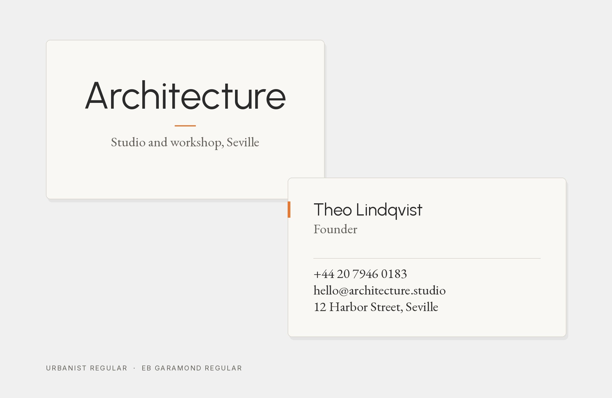
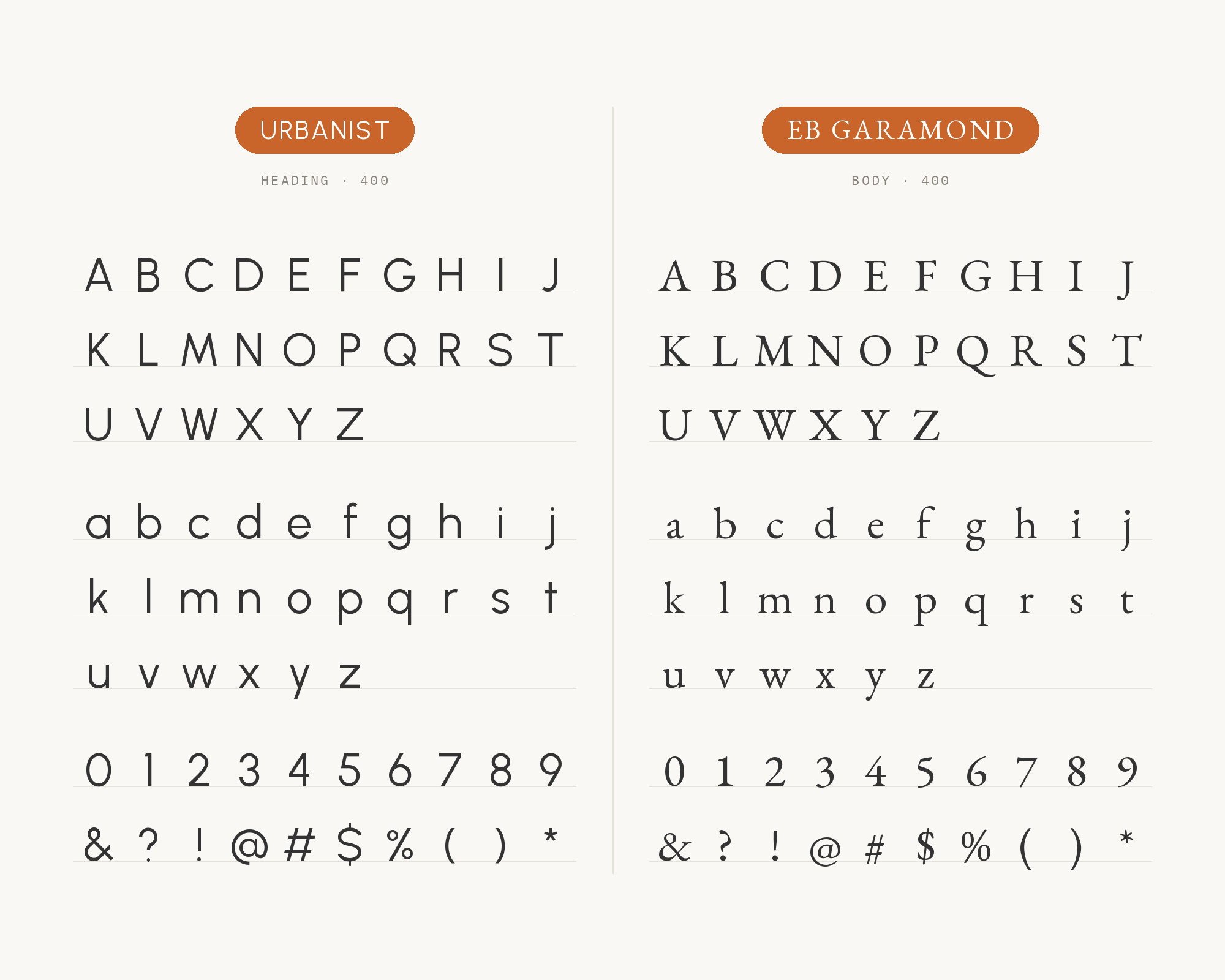
MaxiBestOf records the Jackie Visuals website with EB Garamond and Urbanist.
EB Garamond is a free Garamond released by Georg Duffner in 2011. Its Renaissance proportions and fine detail give text a bookish rhythm.
Against it, Urbanist reads as the clean, modern interface layer. Use Urbanist for navigation and short headings, and EB Garamond for longer copy or elegant titles.
11. Literata
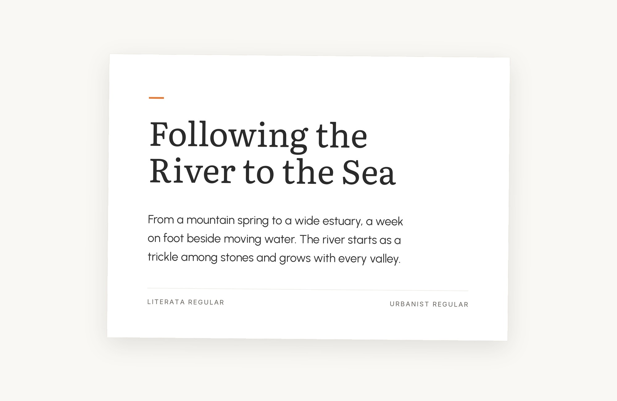
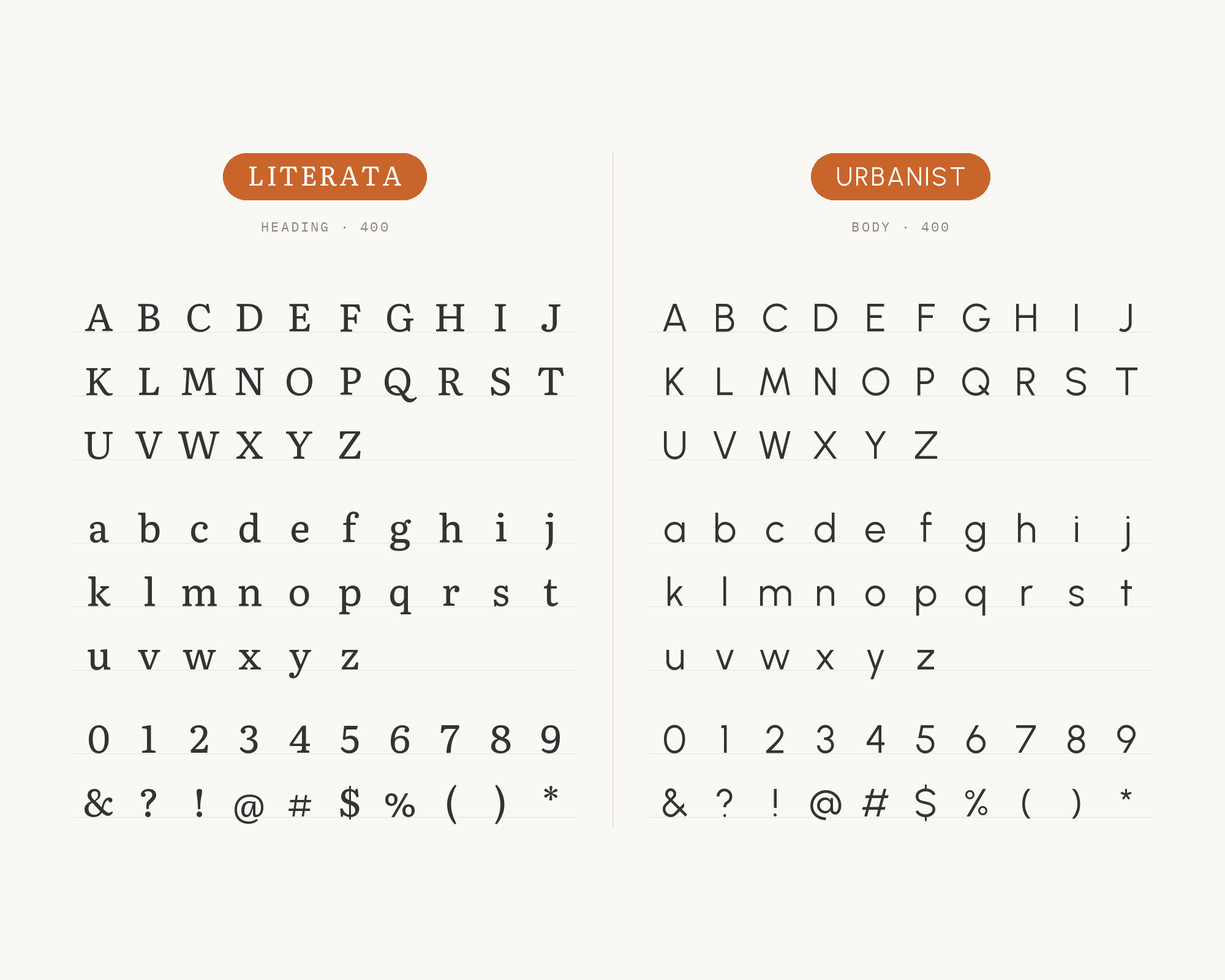
The Lara Elsie Design blog pairs Literata Regular with Urbanist. The post says the clean and simple sans serif allows Literata to take centre stage as a headline. So in this pairing, Literata takes the heading.
Literata was designed by TypeTogether. It was originally created as the brand typeface for Google Play Books. Its bookish serifs give the title weight, and Urbanist keeps the text clean.
12. Sacramento
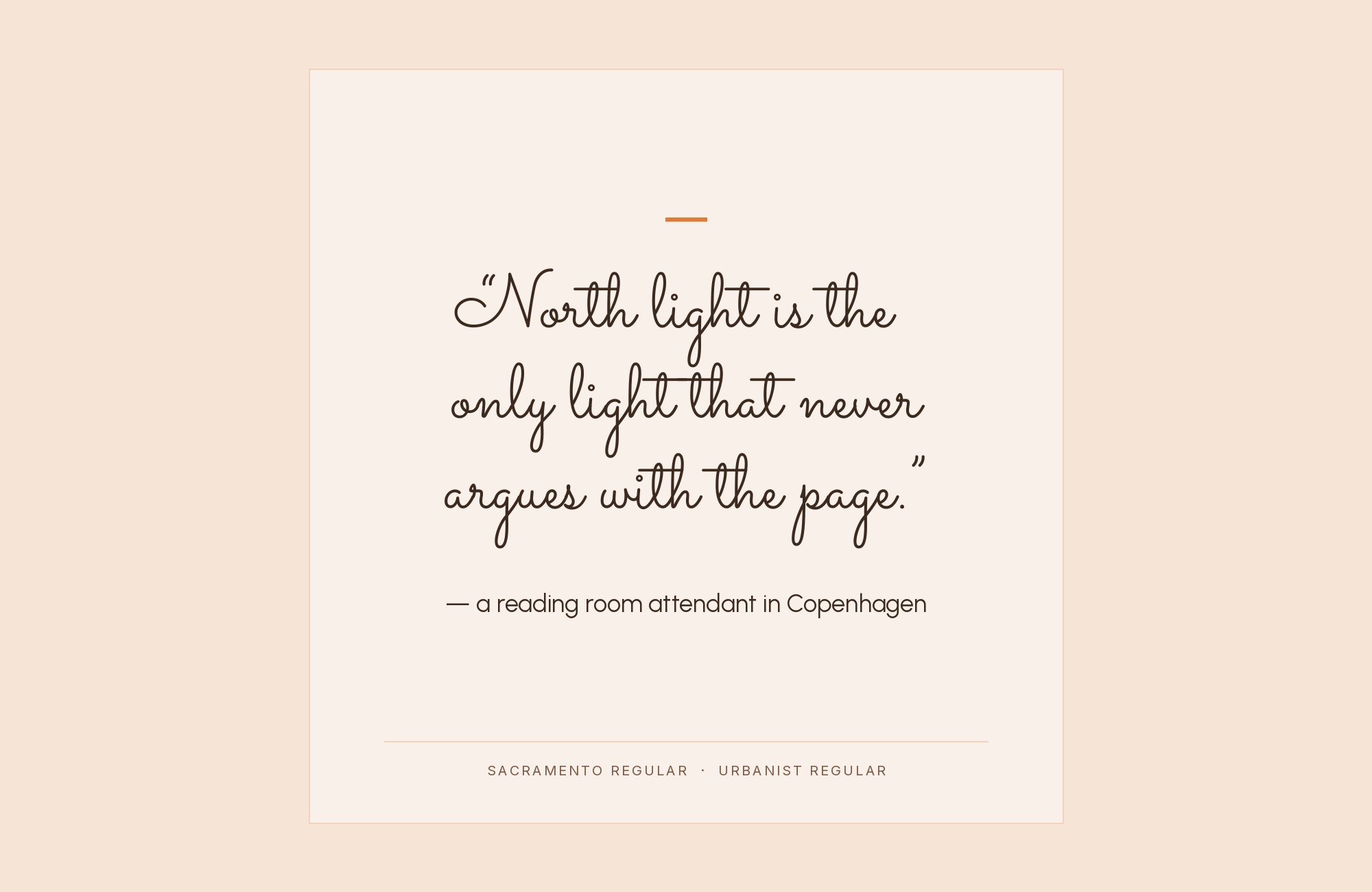
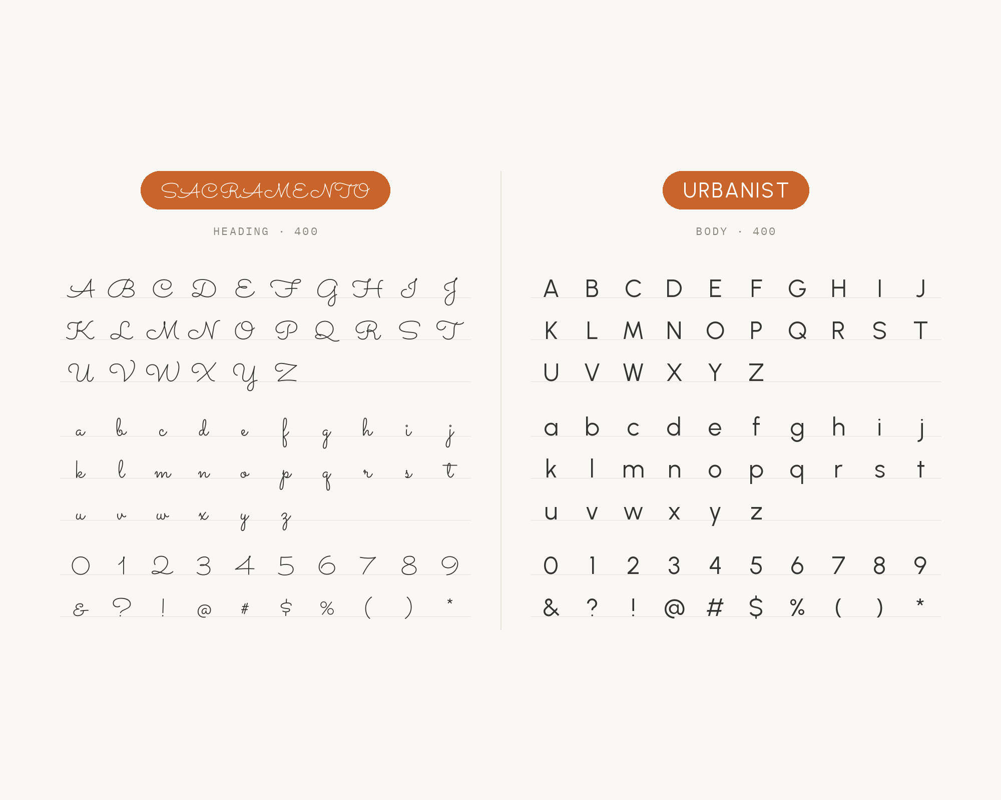
Stimulus Advertising pairs Sacramento with Urbanist. It lets Sacramento shine as a heading and uses Urbanist as body text. Sacramento is a monoline, semi-connected script inspired by hand-lettering brochure work of the 1950’s and 1960’s.
Astigmatic is the designer listed by Google Fonts. A flowing script title over a clean geometric text face is a classic contrast.
Keep Sacramento large and short, and let Urbanist do all the reading work.
13. Bowlby One SC
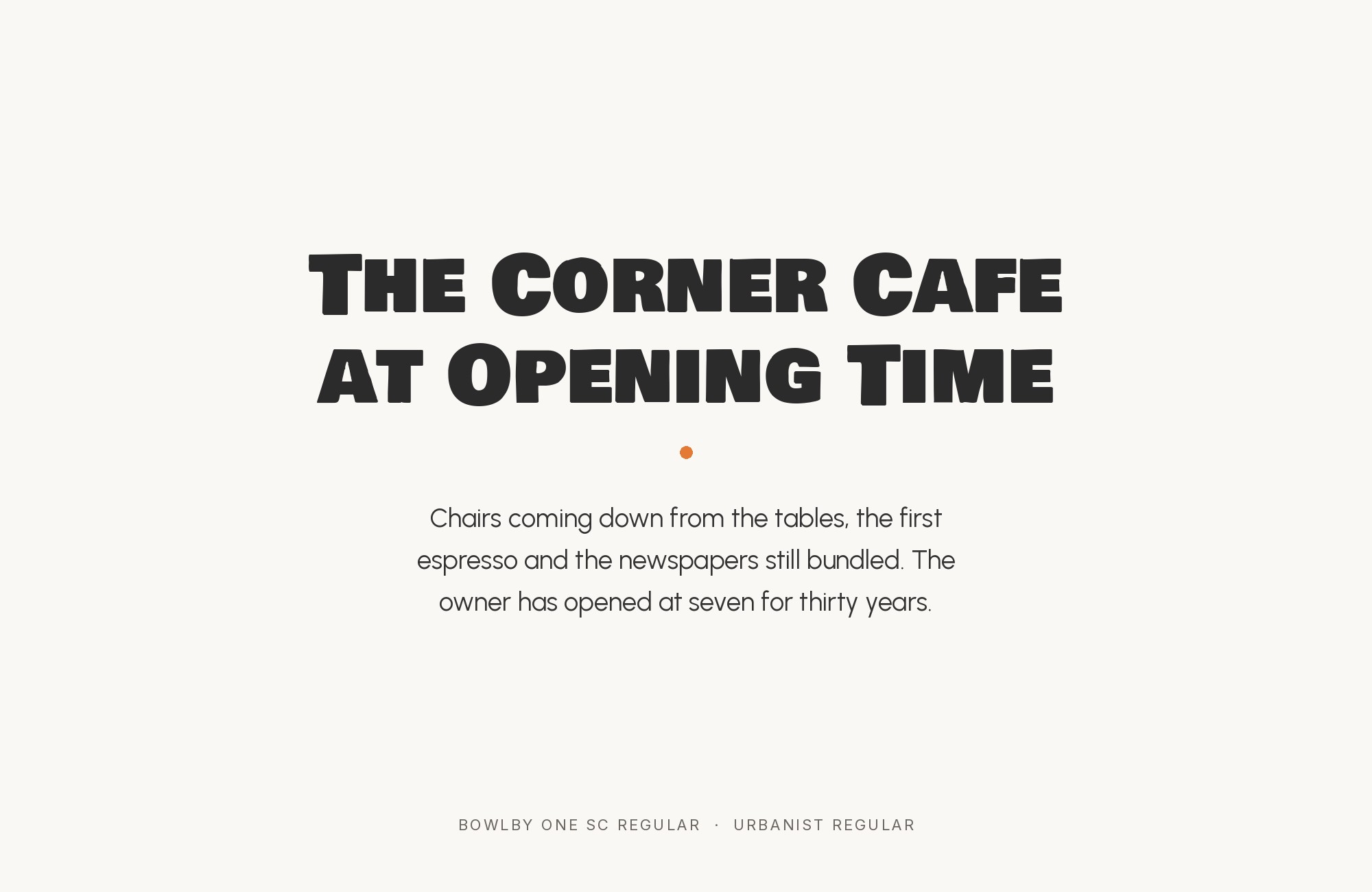
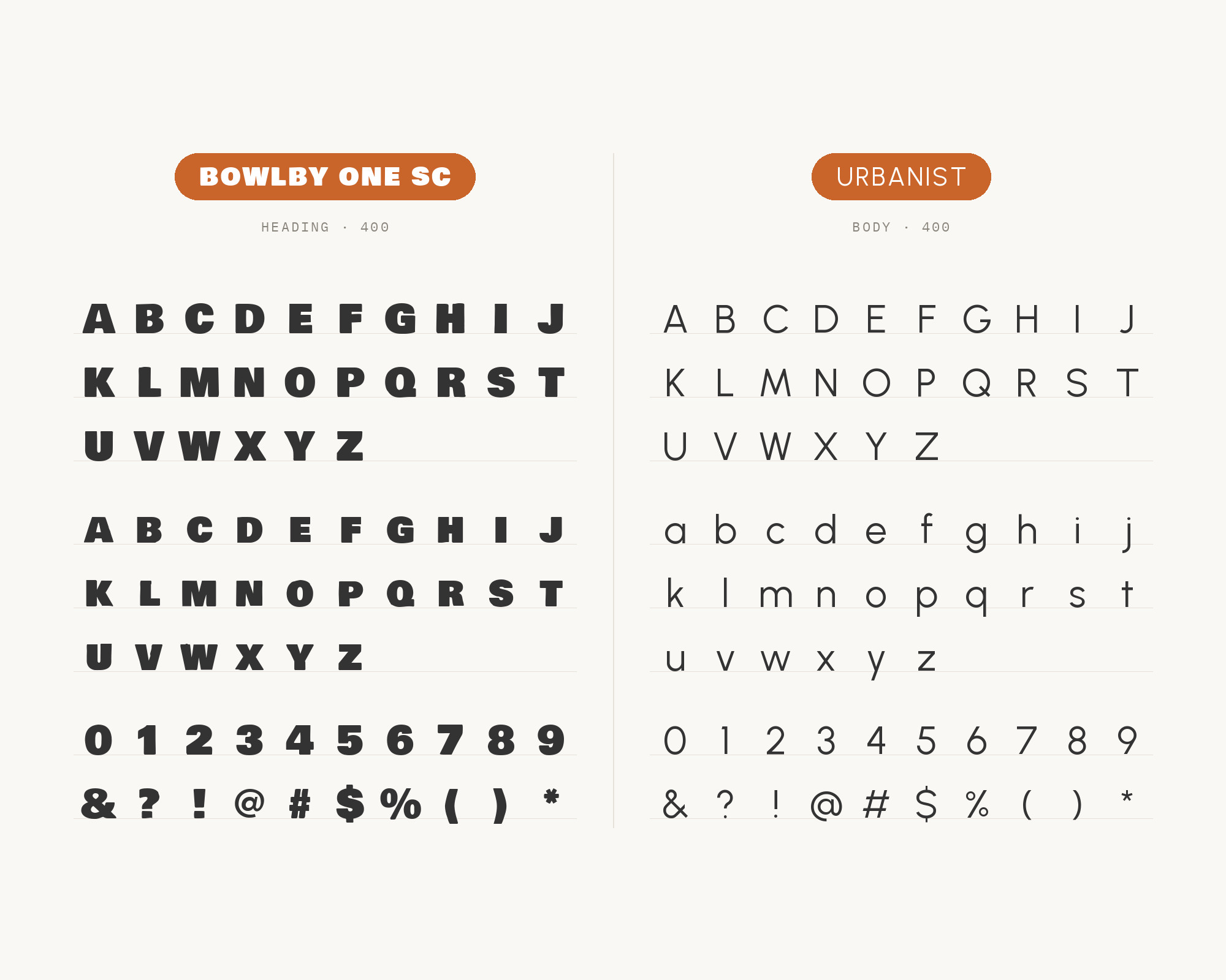
MaxiBestOf records the Surella website with Bowlby One SC and Urbanist. Bowlby One SC is a utilitarian, All Caps and Small Caps display font.
Vernon Adams is its designer. Google Fonts calls it perfect for big bold headlines that need a slightly roughened look.
So Bowlby One SC takes the heading here. Its heavy caps shout, and Urbanist answers with calm, light text below.
Conclusion
Urbanist is easy to live with. It asks a partner for one thing it does not have: texture, weight or a technical voice. For interface text, take Inter, Barlow, Red Hat Display, Manrope or DM Sans.
For reading, take a serif such as Vollkorn, EB Garamond or Literata. For a louder title, let ITC Avant Garde Gothic, Sacramento or Bowlby One SC take the top line. Test the pair with real copy at real sizes, and give each font one clear role.
Sources
- Fonts In Use (Urbanist typeface page)
- Fonts In Use (ARC Raiders)
- ZayZoon rebrand post
- Golden Software brand and style guide
- Enlivex brand kit
- devdays media kit
- COP31 Türkiye resources
- PennWest typography
- Alaska Community Foundation brand kit
- Marlo Studios journal
- nsnstudio Leeuwburg Beef
- Zoë Power Design
- cua.ai branding
- Wild Kind font pairings
- Jukebox Print (Urbanist + Libre Caslon Text)
- FontPair (Urbanist)
- NeuronThemes 2021 list
- Medium, 10 Google font pairings (2021)
- Sessions College, Free Font Friday
- Pimp my Type (Outfit)
