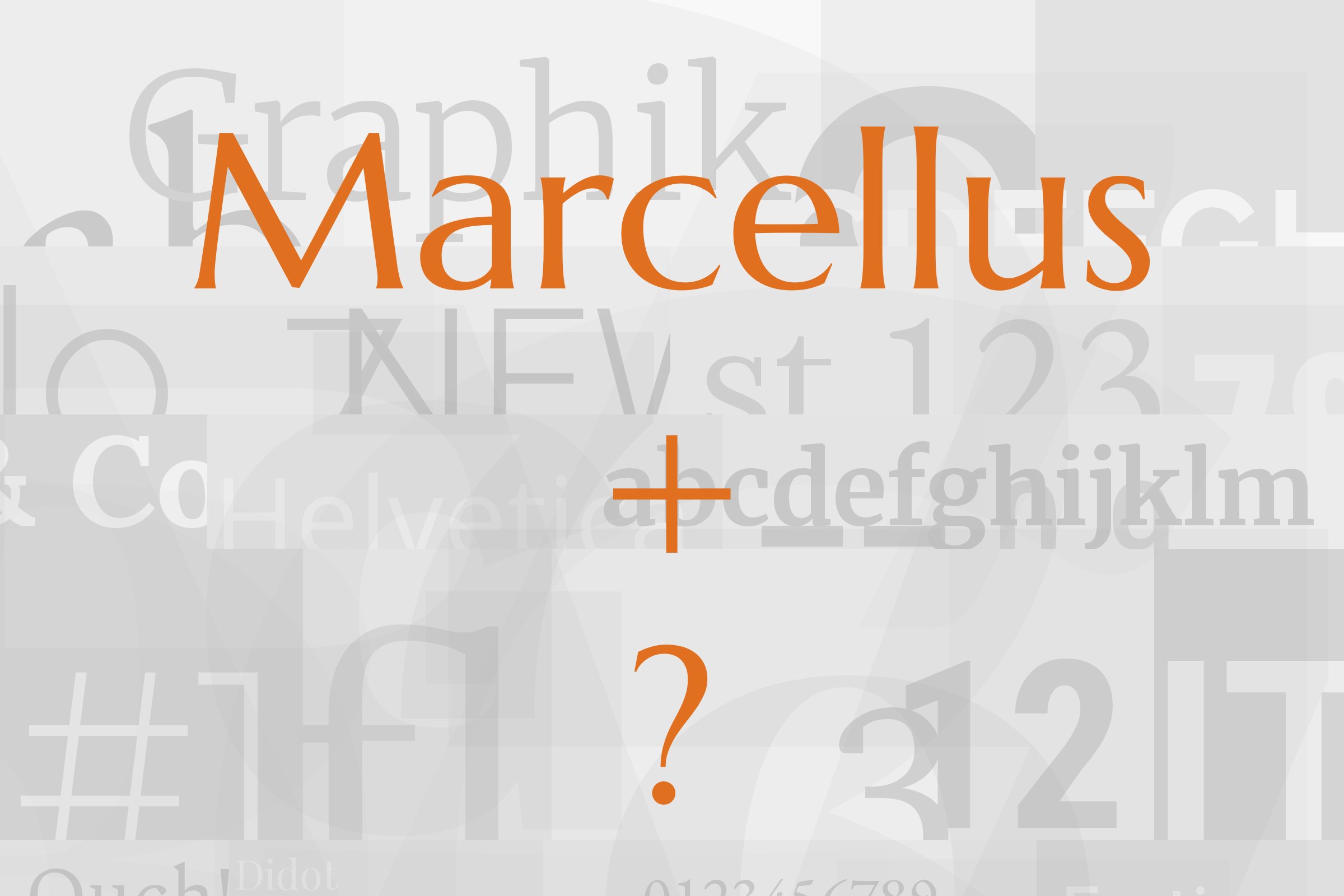
Marcellus pairs great with DM Sans, Inter and Manrope. All 10 pairings are shown below in real rendered specimens, with the reason each one works.

What fonts go with Marcellus, the flared serif with Roman roots? The short answer is a clean sans serif that lets its capitals speak.
Marcellus is a flared serif inspired by classic Roman inscription letterforms. Google Fonts lists Astigmatic as the designer and added it on 9 May 2012.
Astigmatic is the studio name of designer Brian Bonislawsky. Its small caps sibling, Marcellus SC, leans more toward the titling style of Trajan, while the regular version suits a wider range of use.
The free family has one Regular style. Fonts In Use lists Stiggy & Sands as the foundry, with Brian Bonislawsky and Jim Lyles as designers and a 2013 release.
So what does that mean for pairing? Marcellus has no bold, so it cannot build a hierarchy by itself. It looks best large, where the flared stroke endings and chiselled capitals show.
A partner should bring weight, a calm texture for paragraphs, and plain shapes that stay out of the way. Nearly every documented pairing below does exactly that with a sans serif. Here are 10 fonts that pair with Marcellus.
1. DM Sans
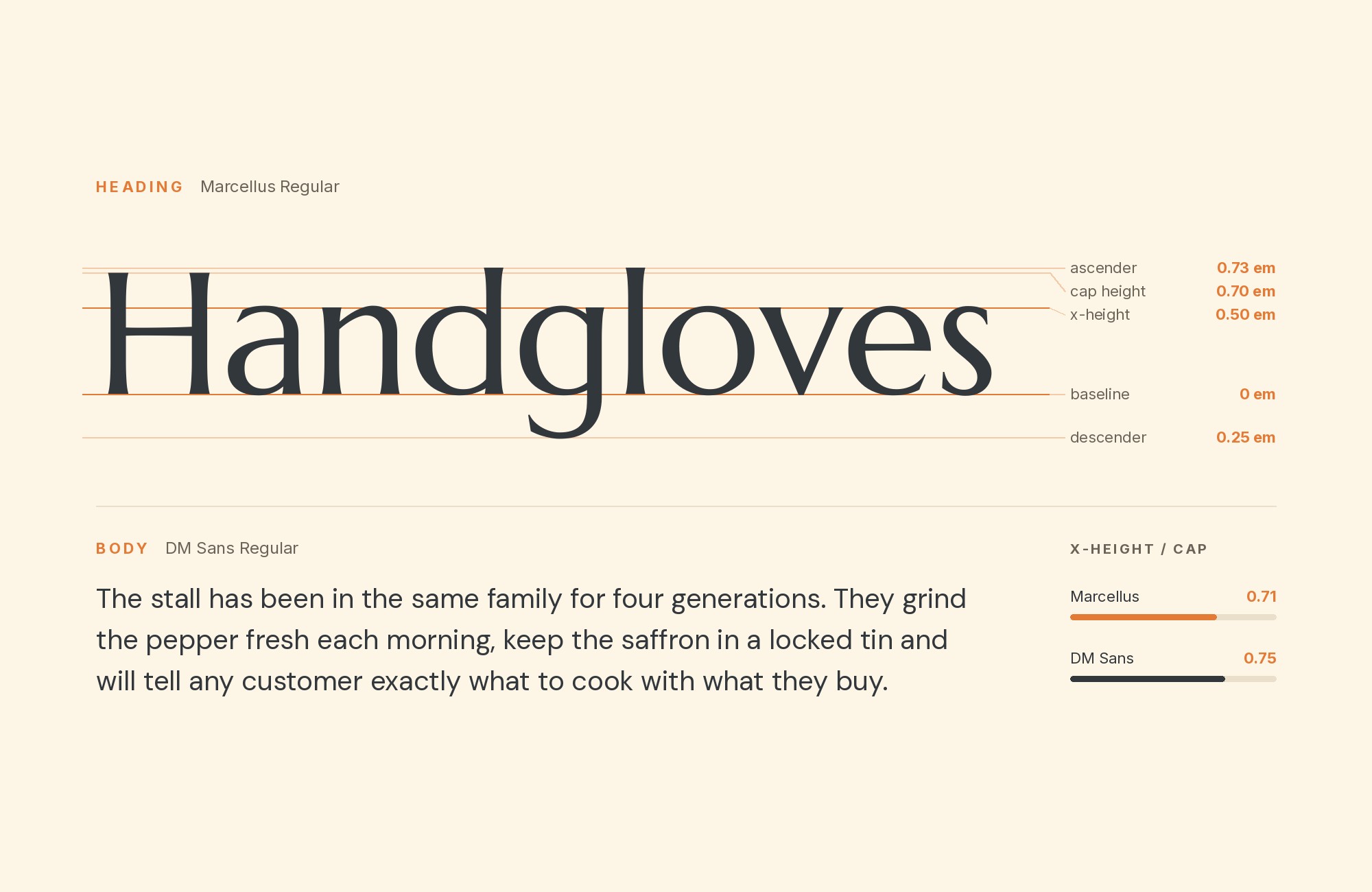
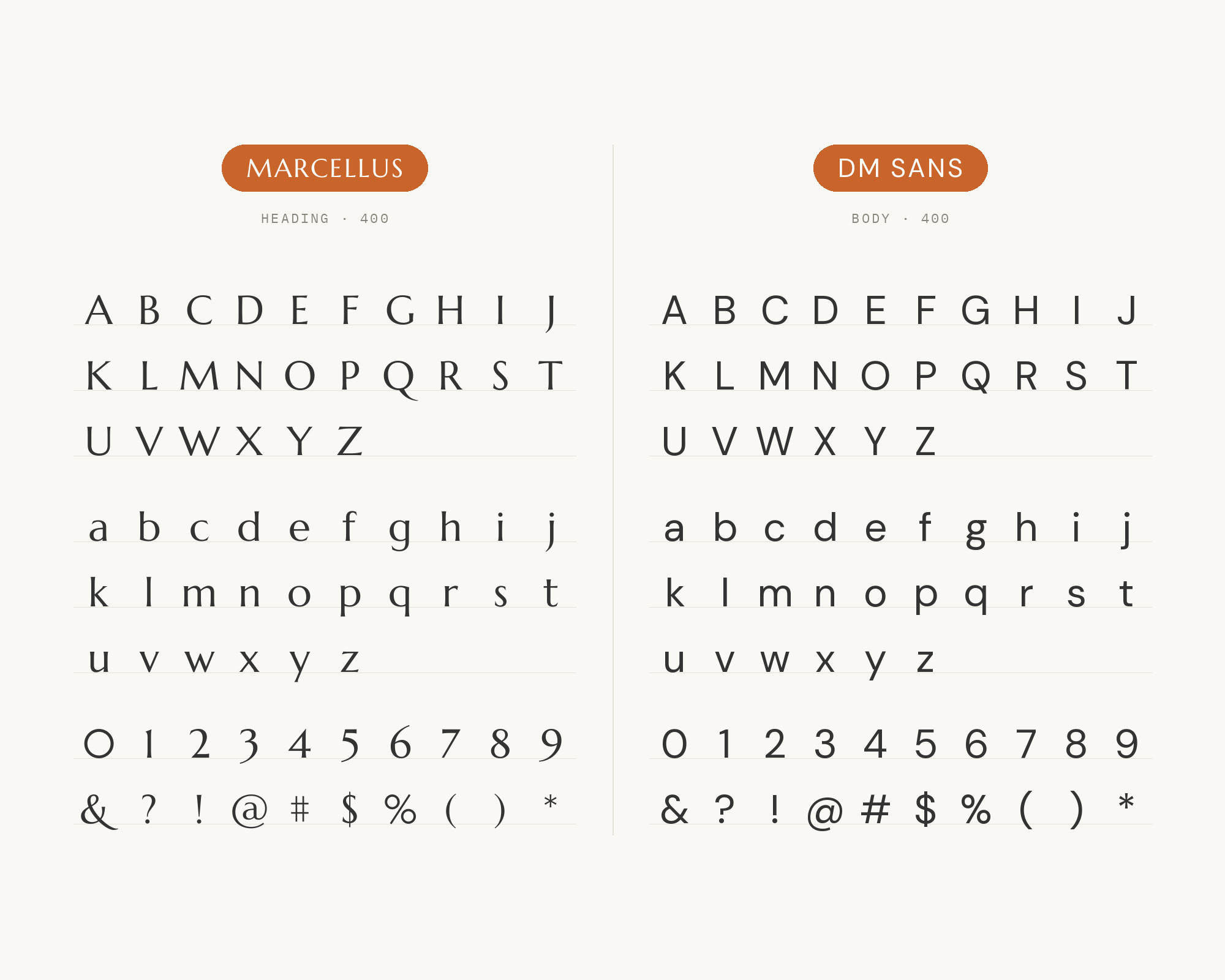
This is the best documented Marcellus pairing. Carissa A. of Hearten Made listed Marcellus and DM Sans as the first of her 4 modern Google Font pairings in 2022.
Leadpages also lists Marcellus as the headline font and DM Sans as the paragraph font. DM Sans is a low-contrast geometric sans with simple, open forms.
It has the weight range Marcellus lacks, so bold labels and buttons come from the partner. Marcellus brings the elegance to the headline.
Use it for boutique brands, wellness sites and blogs that want polish without stiffness.
Junior work is now a prompt. The biggest profit center in your studio is vanishing.
How to fix this?
Find Out How2. Inter
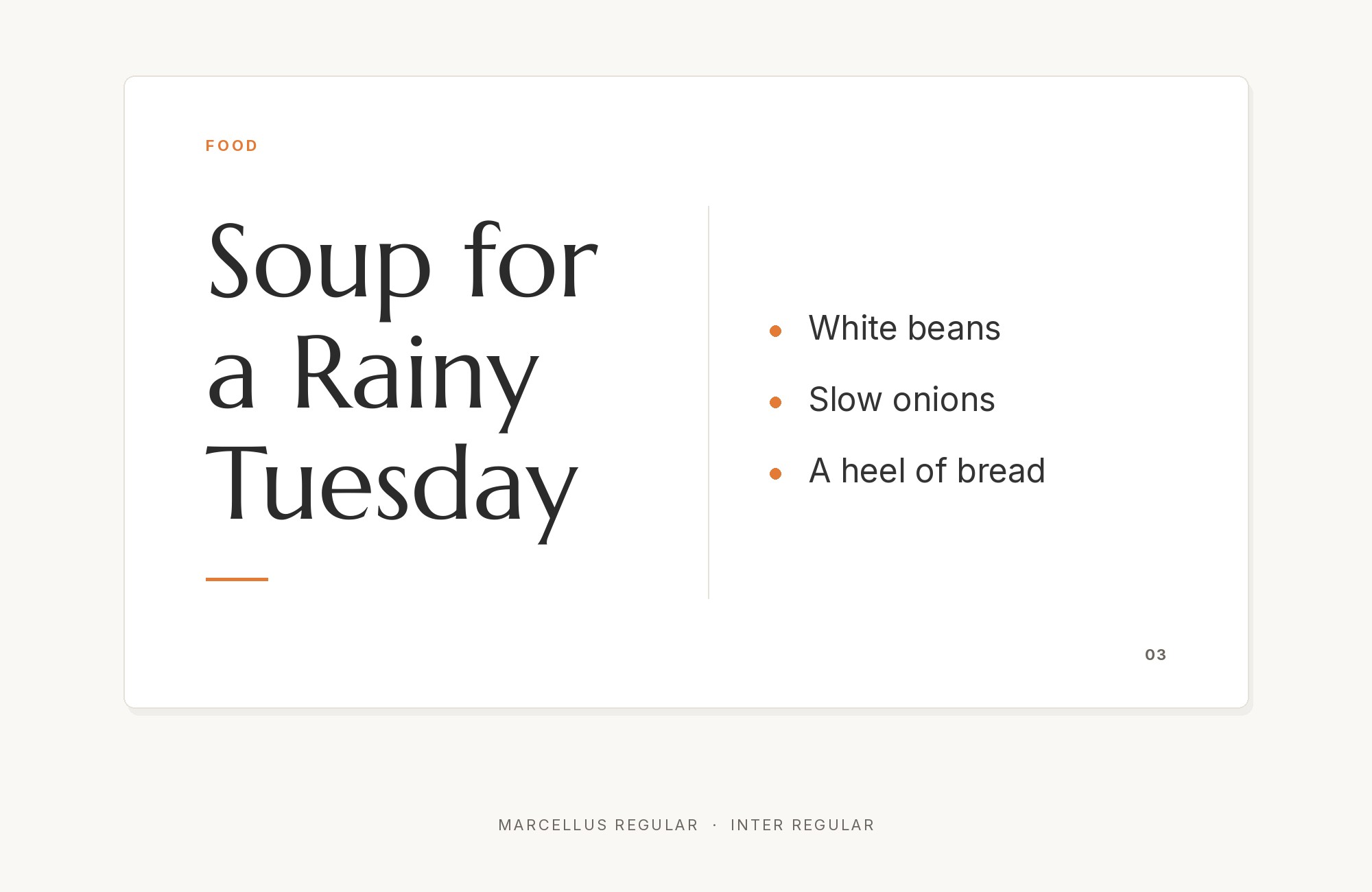
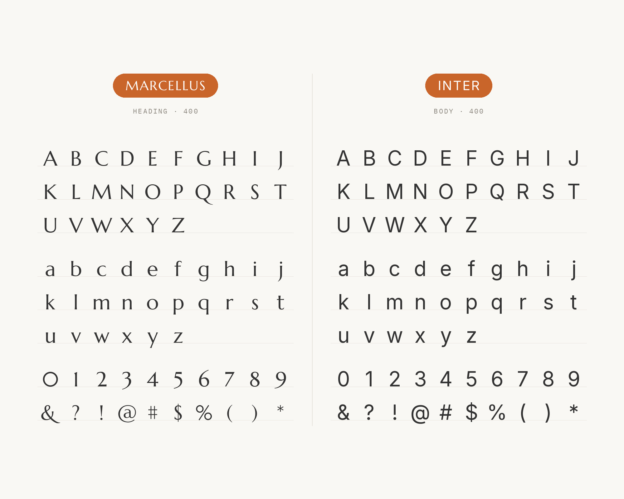
MaxiBestOf records the Lefty website using Inter and Marcellus.
Inter is a neutral interface sans with a tall x-height. It handles menus, forms and long text with no fuss.
Marcellus gives the page one classical voice at the top. The contrast is wide: carved Roman capitals against clean screen type.
Keep Marcellus for headlines and let Inter carry everything else.
Webflow. Framer. Squarespace. Wix. Lovable. Not your future.
Your own AI CMS agent is.
Find Out More3. Manrope
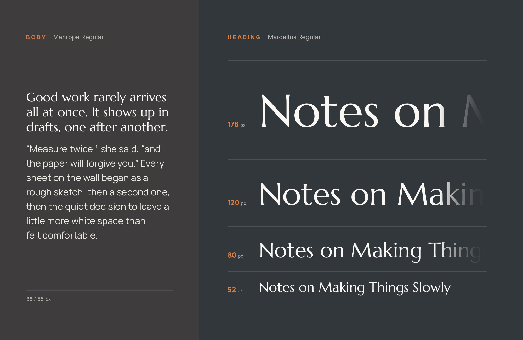
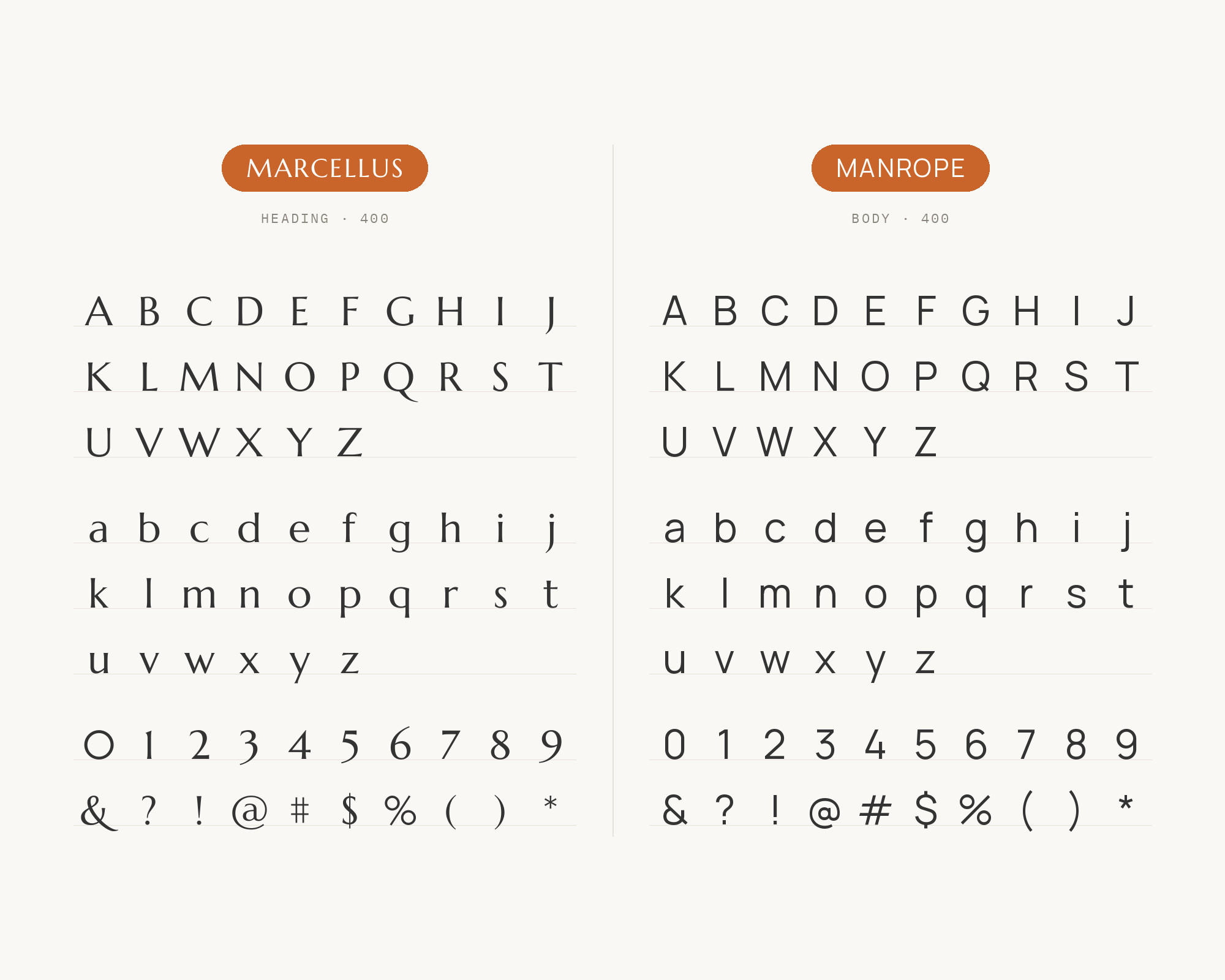
MaxiBestOf records the Deeponde website using Manrope with Marcellus.
Manrope is a modern geometric sans with slightly rounded details. It feels technical but friendly. Next to it, Marcellus reads as timeless, so the page gets both old and new at once.
Use Marcellus for the large headings and Manrope for body text, buttons and navigation. It suits studios, architecture and modern product brands that want a touch of heritage.
4. Montserrat
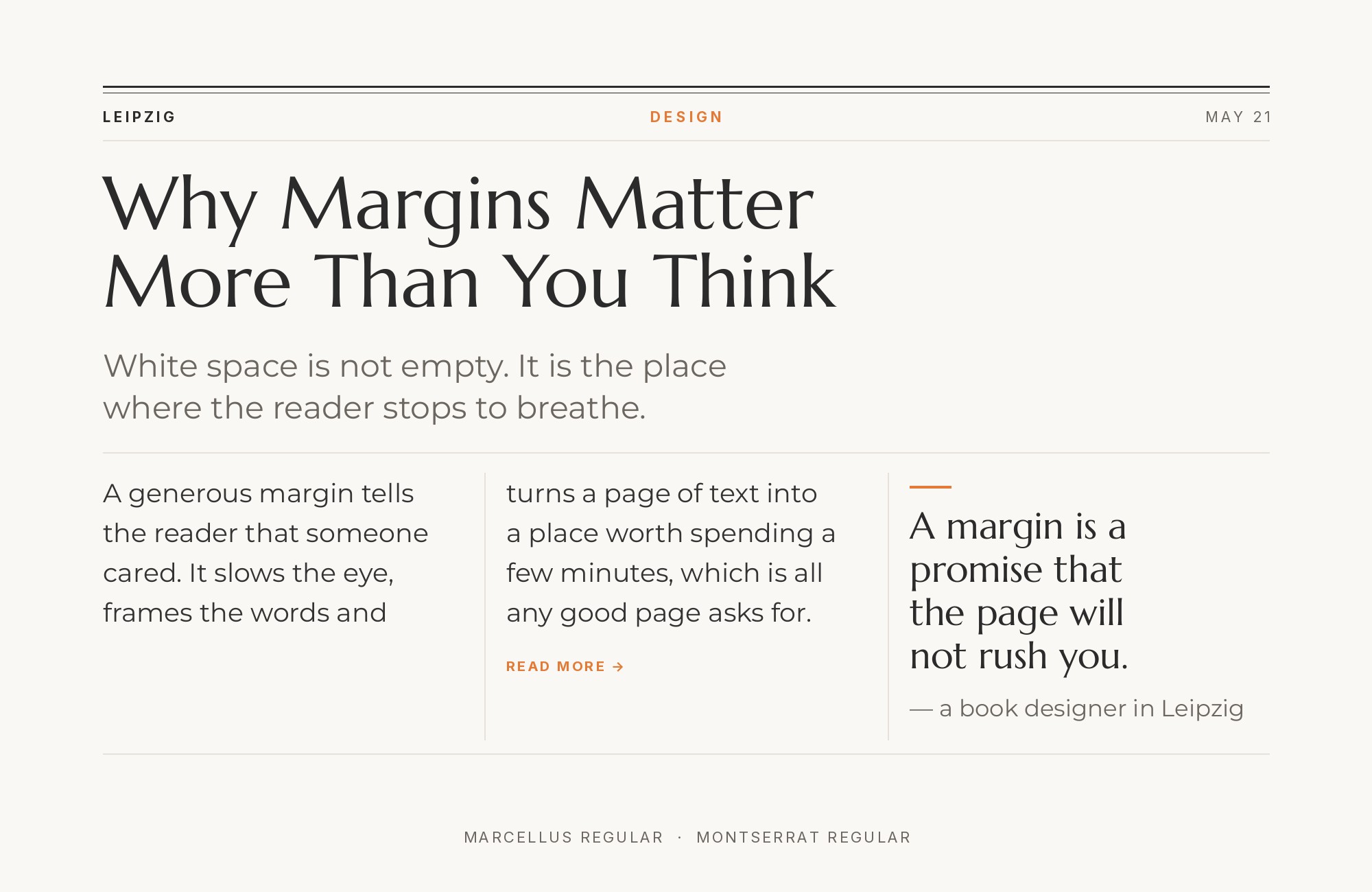
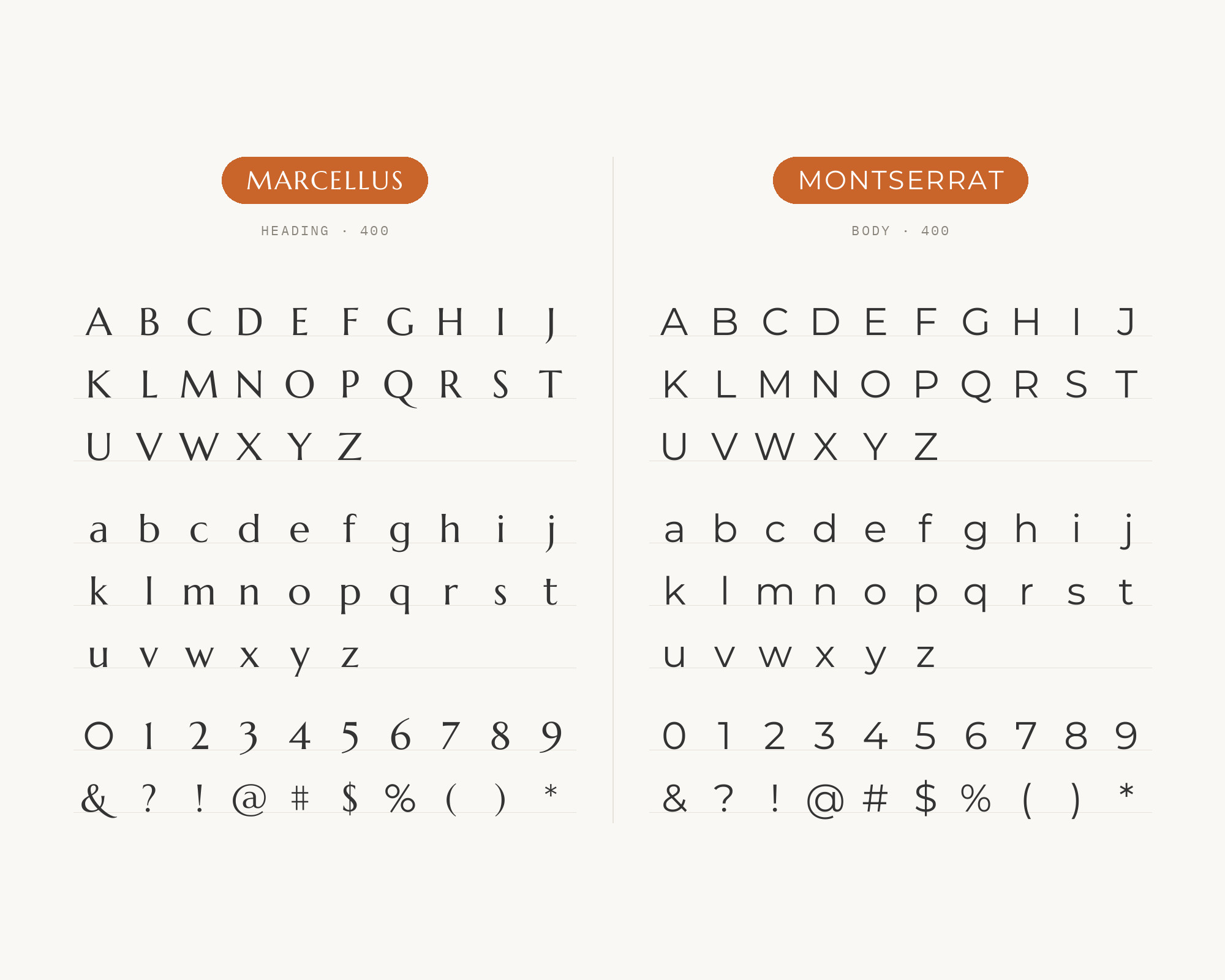
SlidesCarnival’s font guide suggests Marcellus for headings and Montserrat for body on wedding and luxury pages. Montserrat is a wide geometric sans with broad, round capitals. Its width balances the narrower, more formal Marcellus forms.
The result feels elegant but still modern.
Use Montserrat in a light or regular weight for the text so it does not overpower the headline. It works for invitations, event pages and luxury brands.
5. Lato
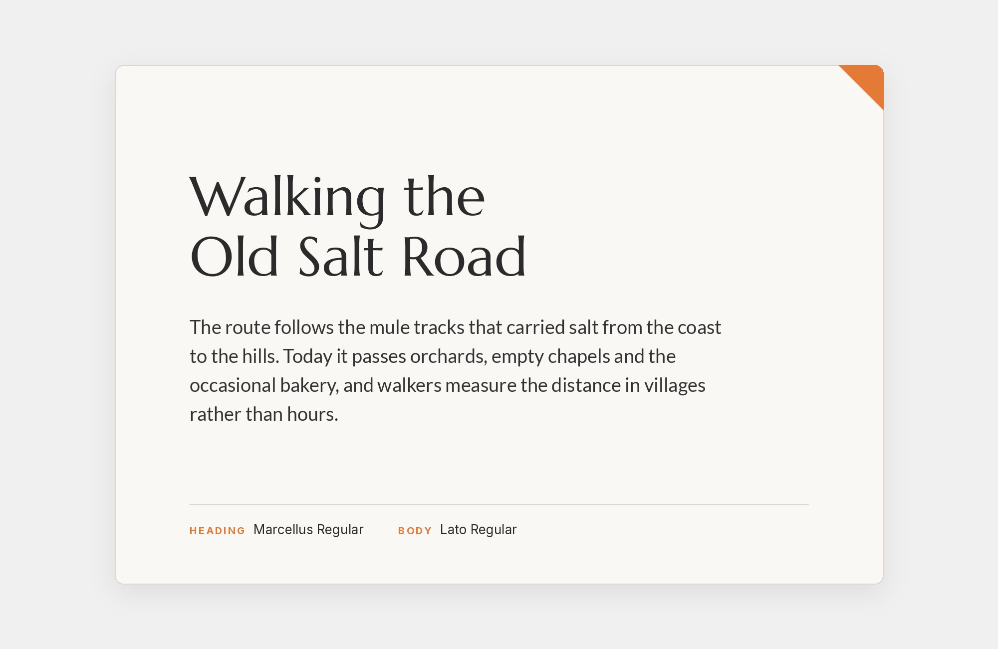
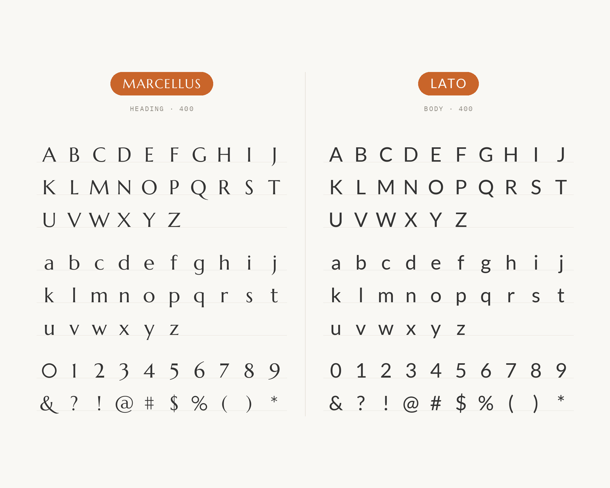
SlidesCarnival’s font guide also suggests keeping Marcellus for headlines and letting Lato’s warm humanist body carry the text. Lato has semi-rounded details and an even, calm texture.
That warmth matches the gentle flare in Marcellus. The serif and sans split keeps the roles clear.
Use it for invitations, hospitality and brand sites that want to feel welcoming.
Try Semrush free. No credit card.
Start on the $0 plan. Paid plans from $117/mo billed annually.
Try for free6. Source Sans 3
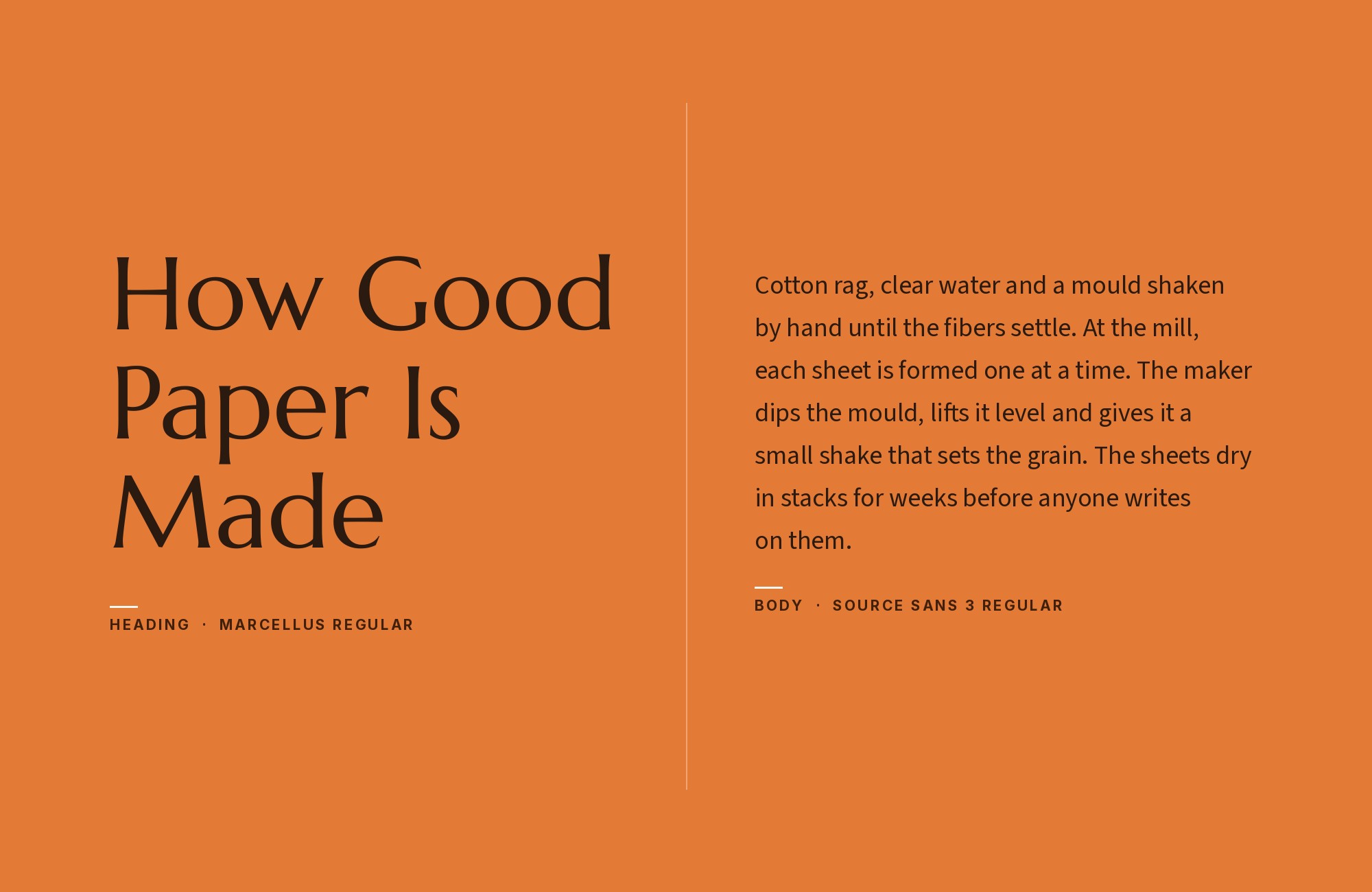
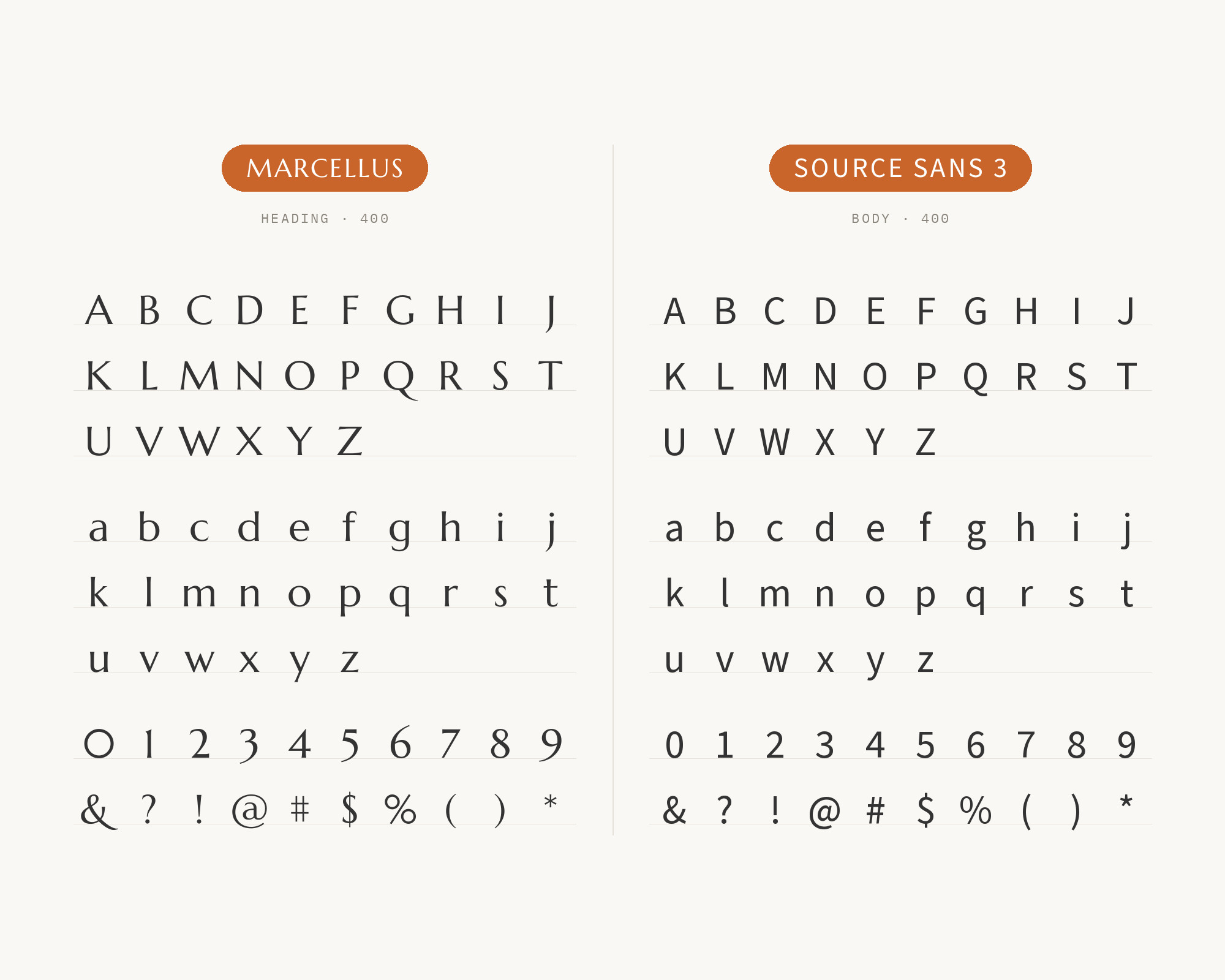
SlidesCarnival’s font guide recommends headlines in Marcellus and body in Source Sans for editorial and luxury layouts. Source Sans 3 is a plain, highly readable humanist sans.
It reads well in long passages and small sizes. Marcellus adds formality to the headlines without slowing the reader down below.
This is a strong choice for magazines, reports and long articles.
7. Poppins
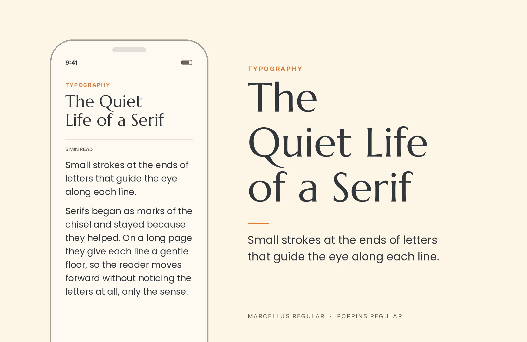
SlidesCarnival’s Pastel Floral Product Launch template is set in Marcellus and Poppins.
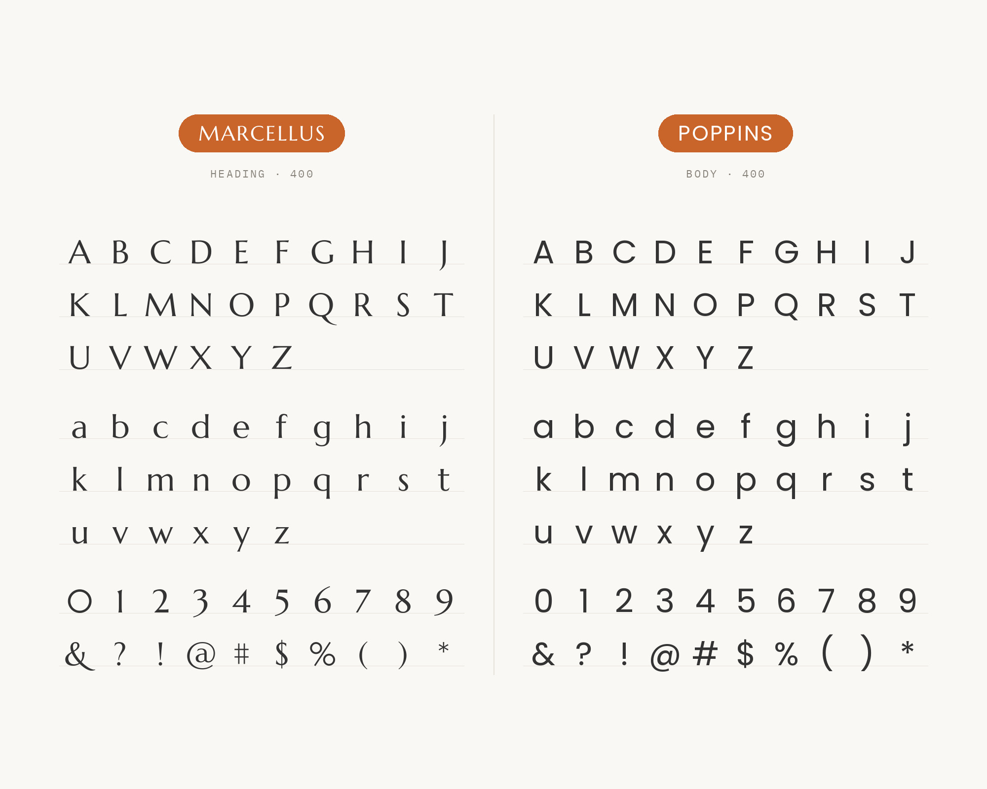
Poppins is a geometric sans built on near-perfect circles. Its round, even shapes contrast with the flared strokes of Marcellus. The mix feels fresh and a little playful.
Use Marcellus for titles and Poppins for short text, labels and calls to action.
It suits product launches, beauty brands and social graphics.
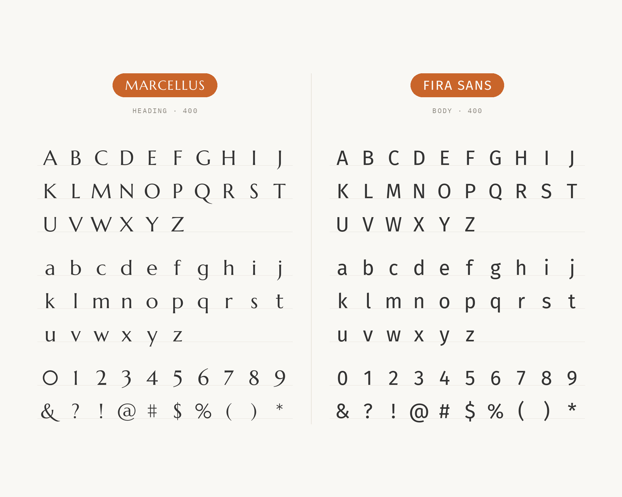
8. Fira Sans
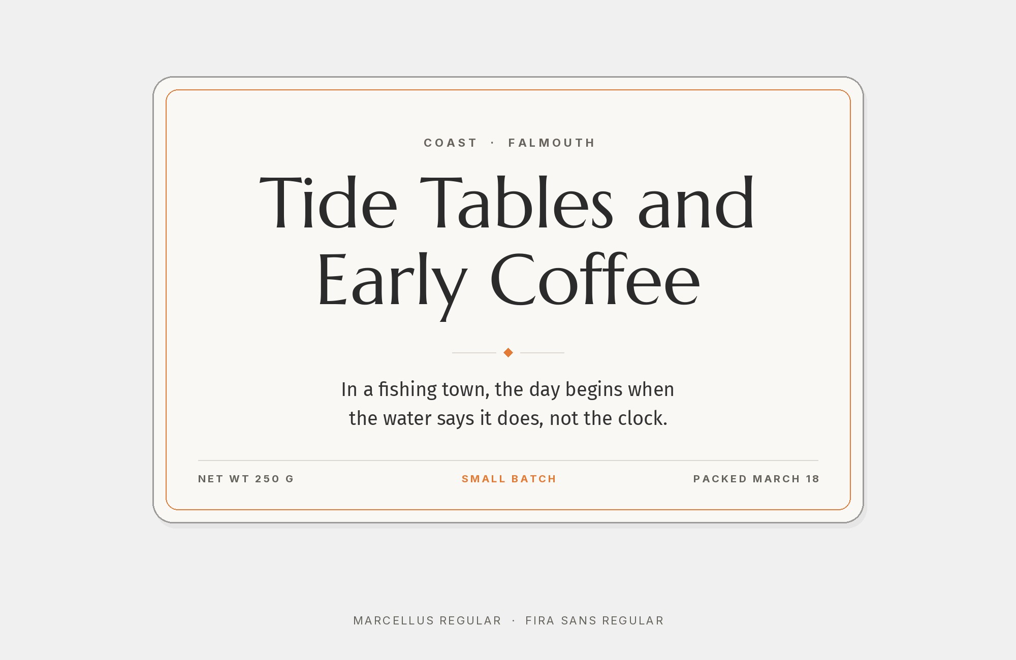
SlidesCarnival’s Company Internal Deck template is set in Fira Sans and Marcellus. Fira Sans is a clear, slightly narrow humanist sans made for screens.
It has many weights, so it can carry charts, notes and small print. Marcellus gives the deck a classical title voice.
The pair suits business decks, internal reports and documentation.
Keep Marcellus big and Fira Sans for the working text.
9. Asap
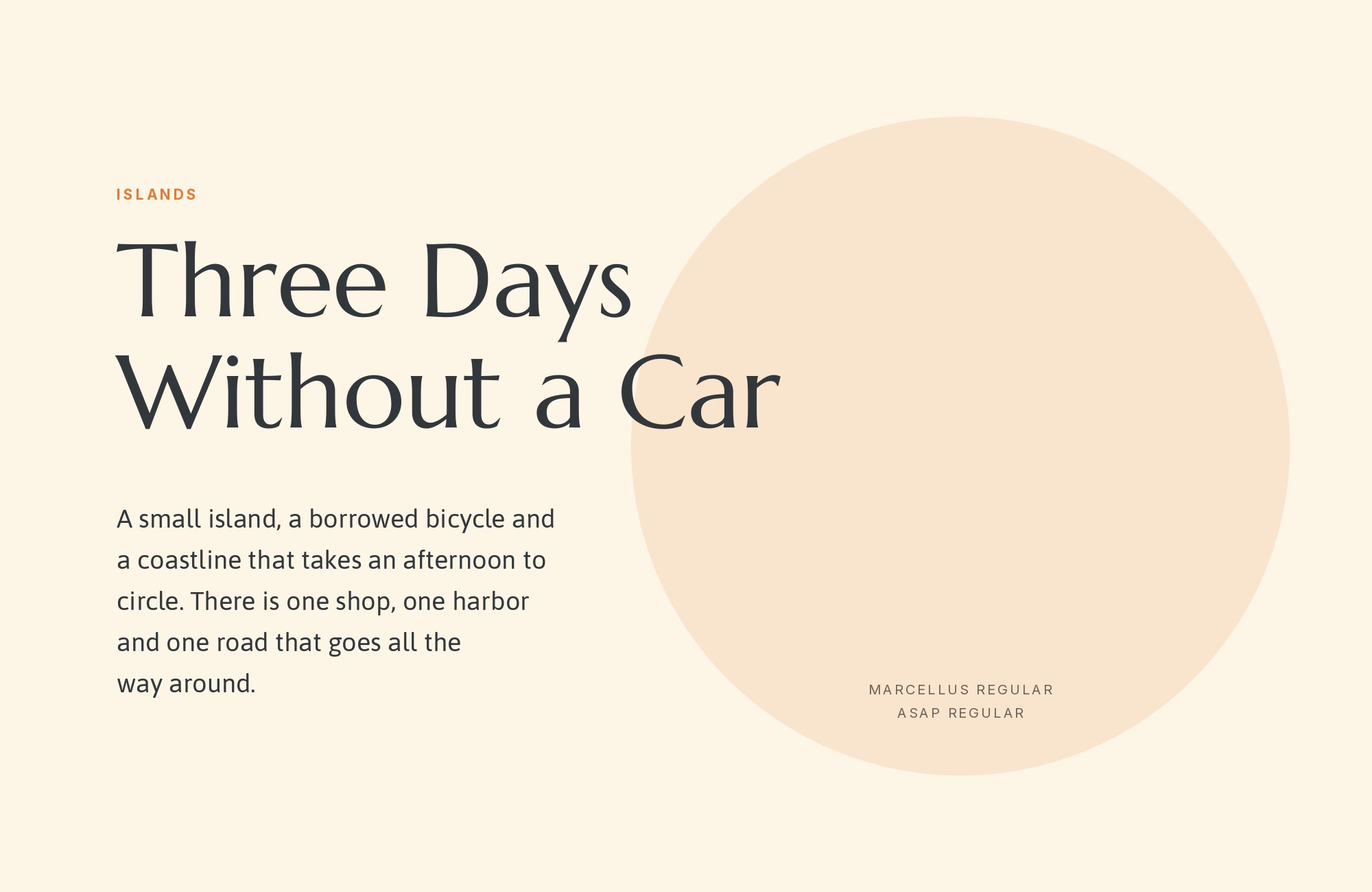
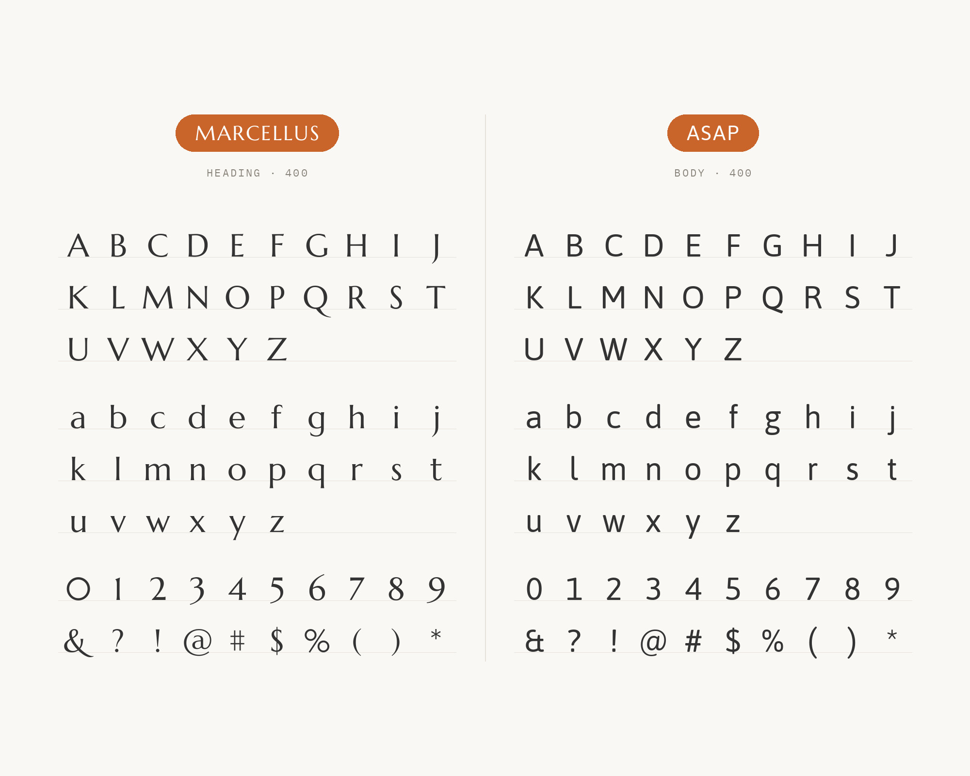
SlidesCarnival’s Trip Planning Infographic template is set in Asap and Marcellus.
Asap is a compact sans with softly rounded corners. It stays readable in tight spaces like infographics and tables. Marcellus adds a touch of travel-poster class to the headings.
Use Asap for labels, numbers and short notes, and Marcellus for the main titles.
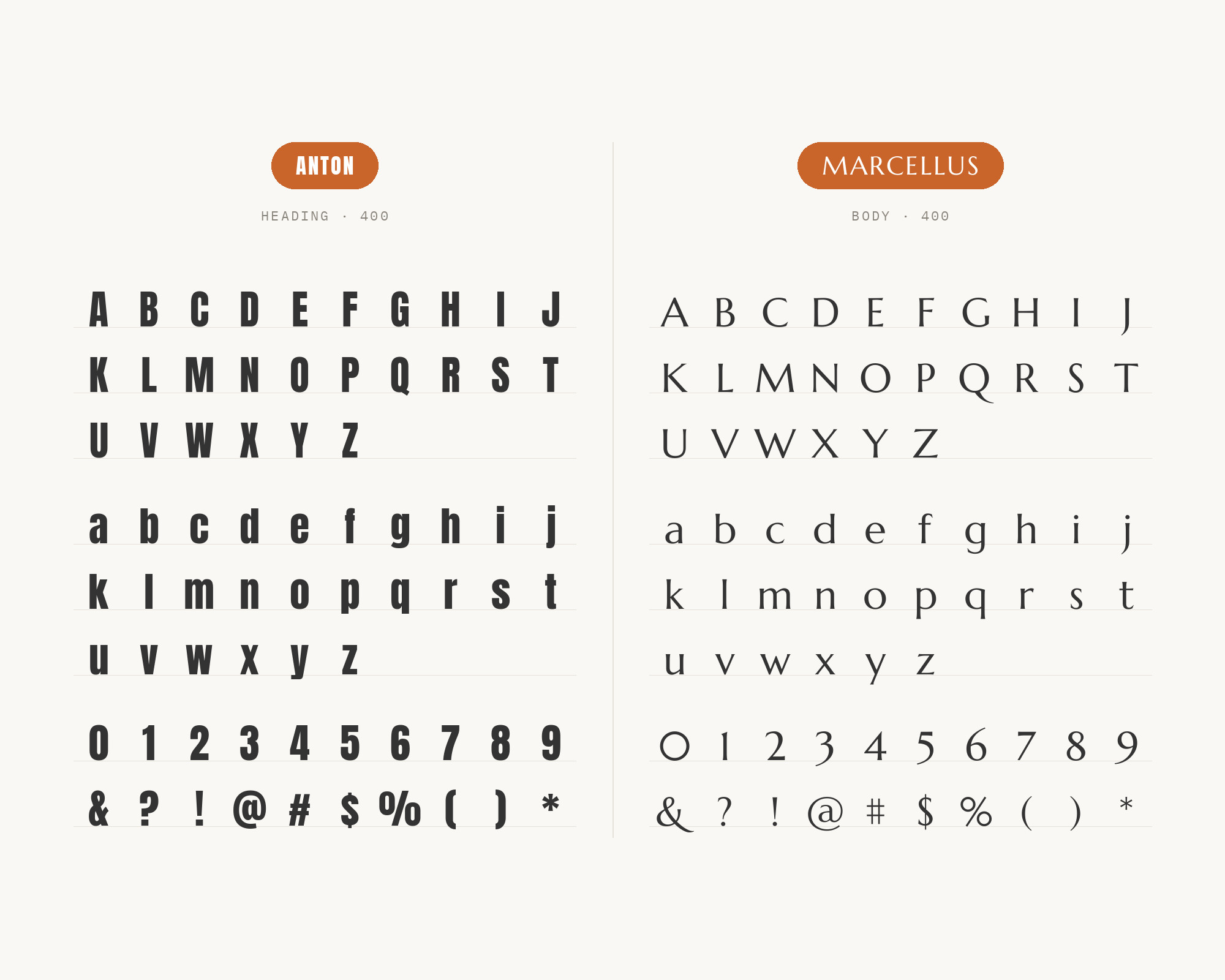
10. Anton
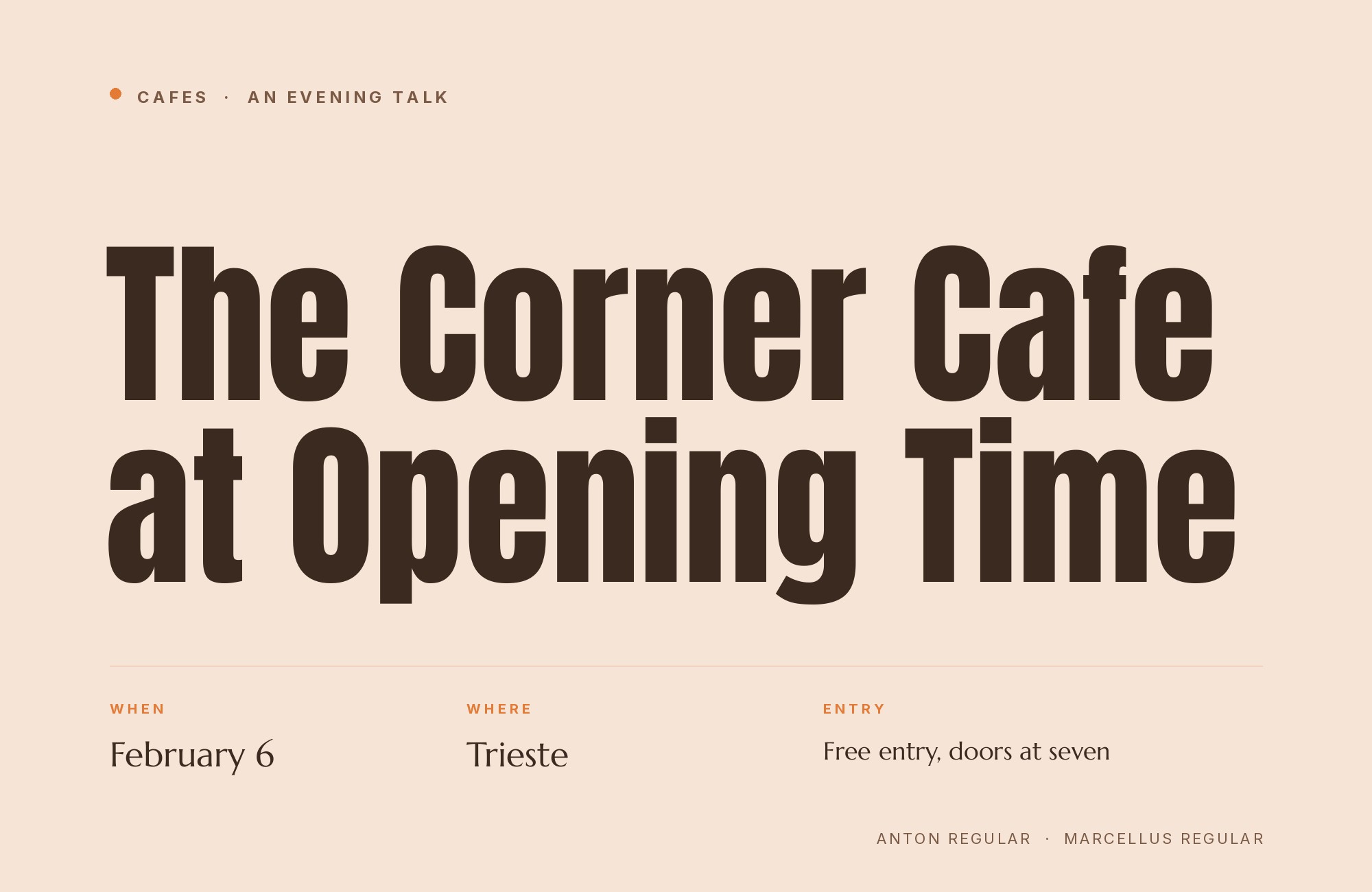
SlidesCarnival’s Art Nouveau Style Backgrounds template is set in Anton and Marcellus. This pairing works best when the partner takes the title. Anton is a tall, heavy condensed sans built for big headlines.
Its weight gives the page a loud opening line. Marcellus then sets the subtitle and short text with refined Roman forms. Keep Anton short and huge, and never use it for paragraphs.
Conclusion
Marcellus is a headline face with Roman manners and only one weight.
The pairing with the most support is DM Sans, picked by two separate writers. Real websites add Inter and Manrope to the list. The other sans serifs here follow the same plan: Marcellus on top, a clean sans below.
Anton is the one reversal, where a heavy condensed sans takes the title and Marcellus speaks second. So pick a sans with the weights Marcellus lacks. Then set your real headline large and check that the flared strokes still lead the page.
