Plus Jakarta Sans pairs great with Inter, Public Sans and Sora. All 13 pairings are shown below in real rendered specimens, with the reason each one works.

What fonts go with Plus Jakarta Sans? If you build websites for startups, you have probably met it already. It shows up on product pages, dashboards and pitch decks, usually doing a little of everything. That is the real question with this face. It can carry a whole brand by itself, so a partner has to earn its place by doing something Jakarta does not.
Plus Jakarta Sans is a geometric sans designed by Gumpita Rahayu from Tokotype. The fonts were originally commissioned by 6616 Studio for the +Jakarta City of Collaboration identity of the Jakarta Provincial Government in 2020. The drawing takes cues from Neuzeit Grotesk, Futura and 1930s grotesques, with almost monolinear strokes and pointy curves. The x-height is slightly taller than a classic geometric, with open counters, so it stays readable over a wide range of sizes. Three stylistic sets change its mood: Lancip (Sharp), Lurus (Straight) and Lingkar (Swirl). The family is under the SIL Open Font License and runs from ExtraLight to ExtraBold, with matching italics. It has been in the Google Fonts library since 2022.
So what does it lack? Contrast, mostly. Jakarta is clean, even and friendly, and it sits in the same crowded space as Inter, DM Sans and Manrope. The supported pairings fall into three groups: a plainer sans that takes the body while Jakarta keeps the headings, a serif that adds warmth or a classical note, and a distinct display or monospace face that gives the system a second voice. Here are 13 fonts that pair with Plus Jakarta Sans.
1. Inter
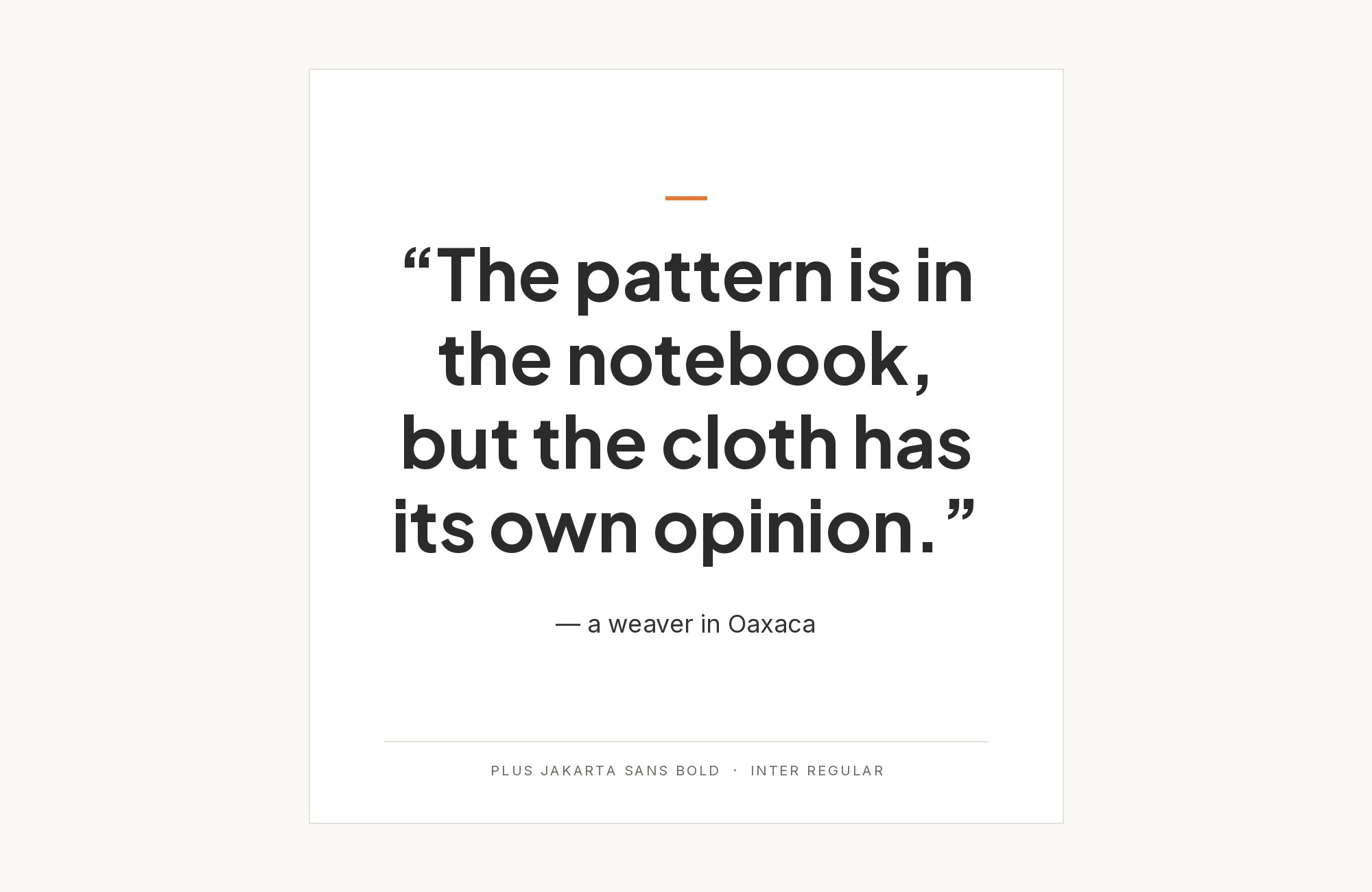
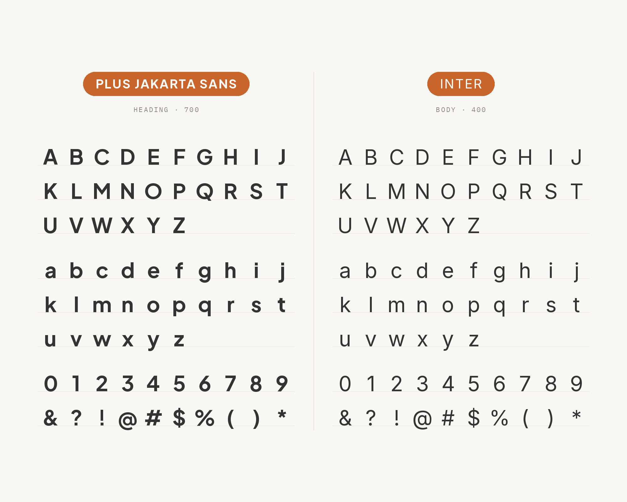
Ragam Collective’s identity for Secret Project, documented on Fonts In Use, sets the logotype in Inter and uses Plus Jakarta Sans across all brand deliverables and communication. A pairing tool at getillustrations.com flips the roles, with Plus Jakarta Sans for warm, personable headings and Inter for crisp body text. Both directions work, which says a lot about how close these two are. Inter is a neo-grotesque tuned for screens, with tall proportions, tight apertures and a very neutral voice. Jakarta is rounder and a little more expressive, especially in its bold weights. Put Jakarta on headlines and hero lines, and give Inter the paragraphs, forms, tables and UI labels. Keep the size jump between them generous. At similar sizes the two blur together and the pairing loses its point.
Paid prompt-to-site tools are going to lock you in.
How can your studio escape this?
Find Out How2. Public Sans
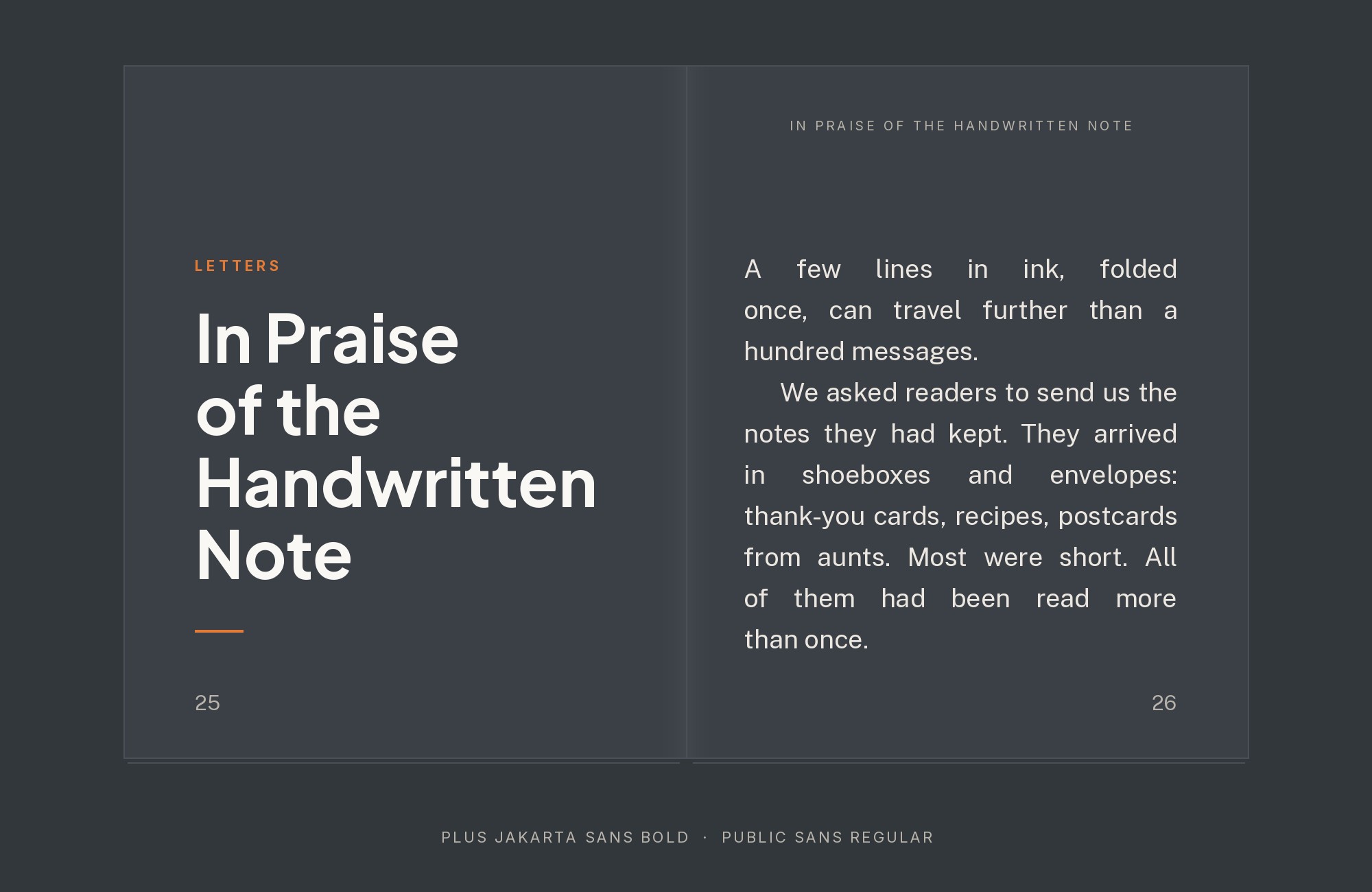
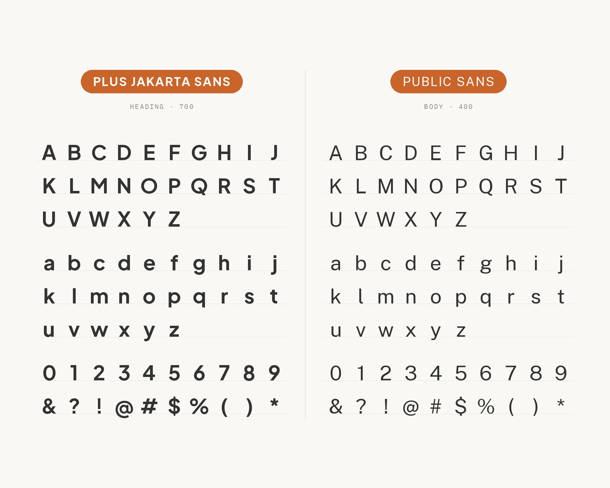
Grove, a design system from the State of New Jersey, uses Plus Jakarta Sans in its branding and treats it as a display font for large headings only. Public Sans is the default and recommended typeface for Grove, especially for body copy. A pairing list from the design studio Todaymade reaches the same split, with Jakarta for headlines and UI elements and Public Sans for body text. It is a sensible division of labor. Public Sans is a plain, sturdy grotesque with a strong civic, utilitarian tone. It reads like infrastructure. Plus Jakarta Sans adds the brand character above it. Set Jakarta SemiBold or Bold at display sizes and keep Public Sans Regular at 16 to 18 px for anything a reader has to finish.
3. Sora
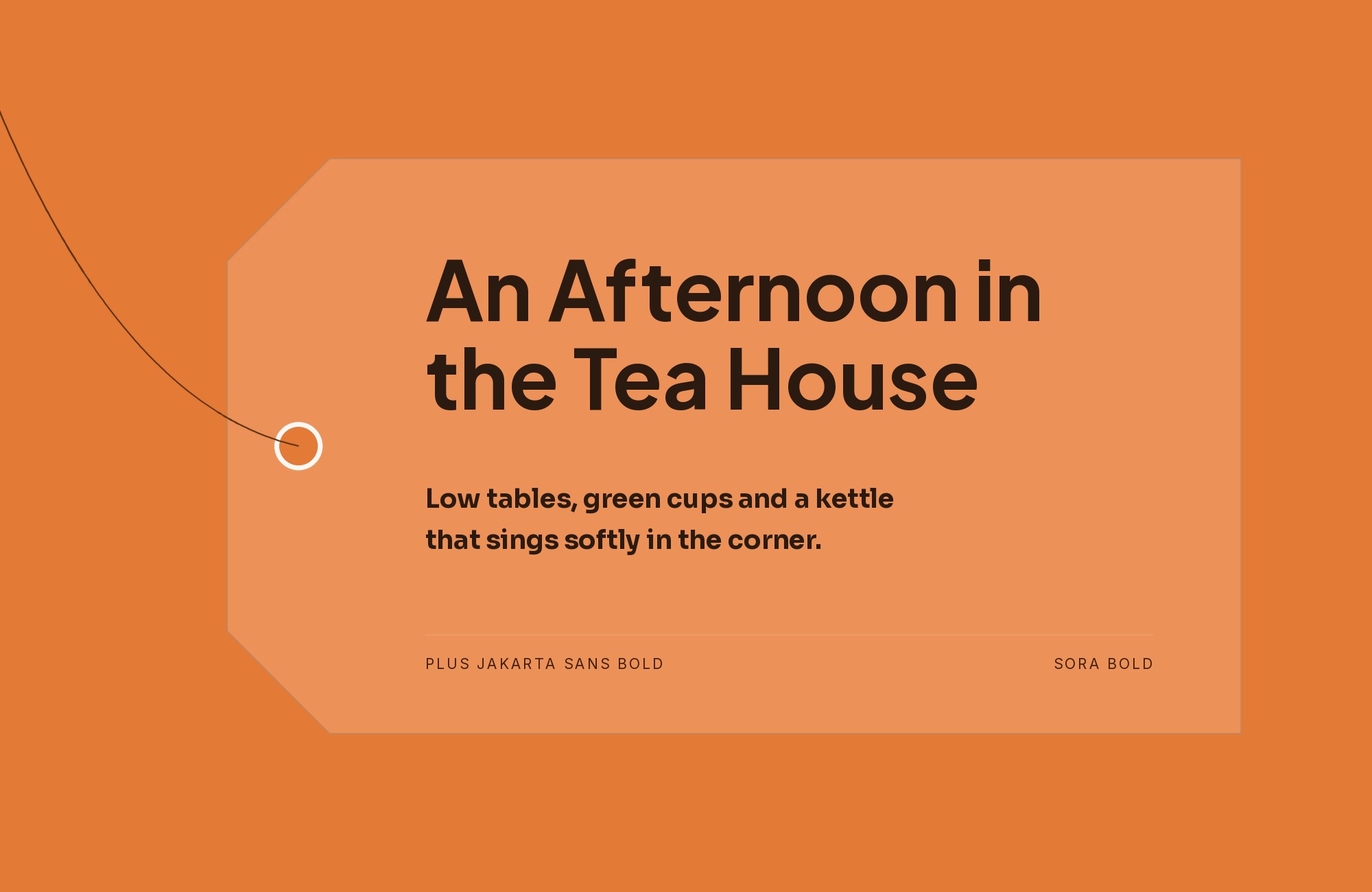
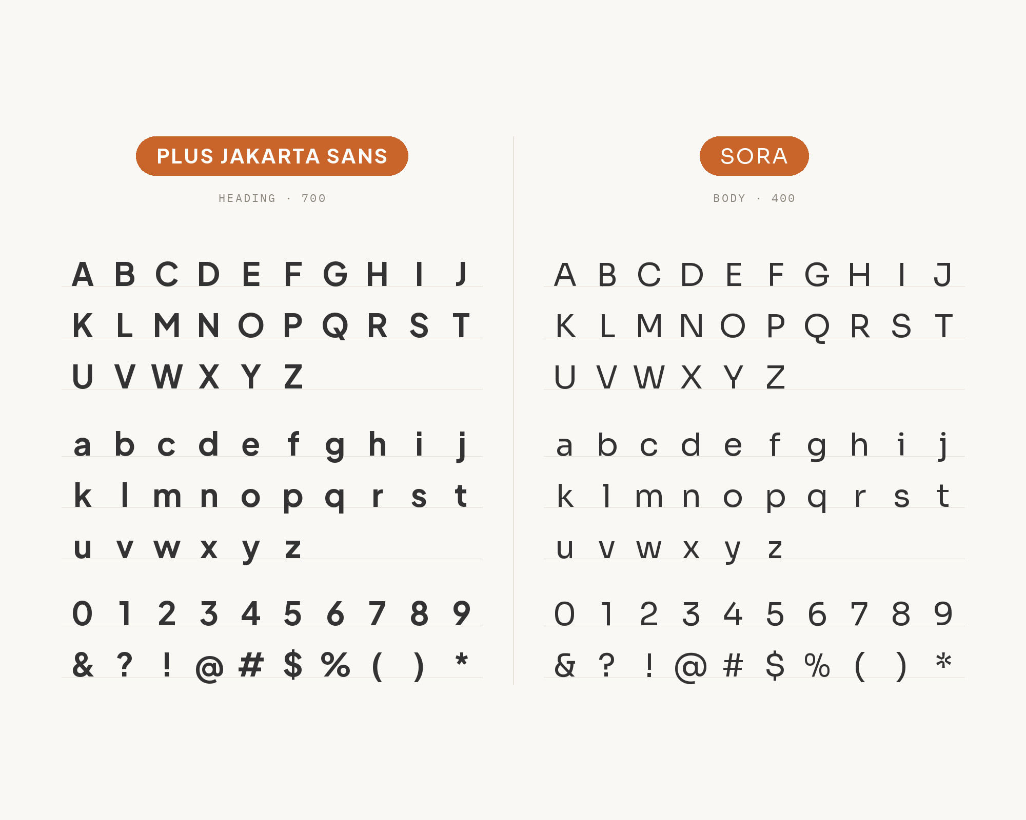
The Fyva brand guidelines make Plus Jakarta Sans the primary typeface and Sora the secondary one. The guide notes Sora’s large x-height and generous counters, and says the pair creates a harmonious and playful balance. Sora also appears in the École Nationale d’Ingénieurs de Metz identity on Fonts In Use, where it sets the tagline next to Plus Jakarta Sans and Roboto Mono. Sora is wider and more squared than Jakarta, with a faintly digital, low-resolution flavor. That gives the pair a small but clear contrast in width and texture. Use Sora for short, punchy headings, numbers and app labels. Let Plus Jakarta Sans carry longer text. It is a good fit for fintech, apps and tech brands that want to feel friendly.
4. Lora
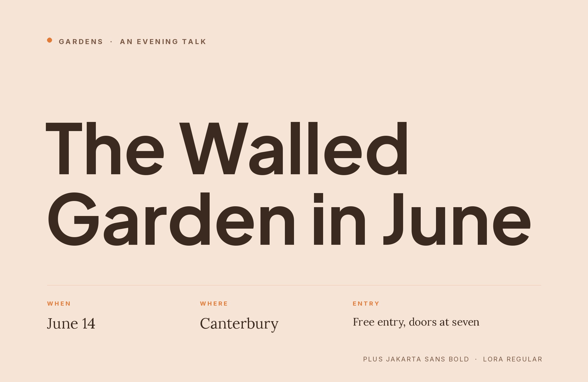
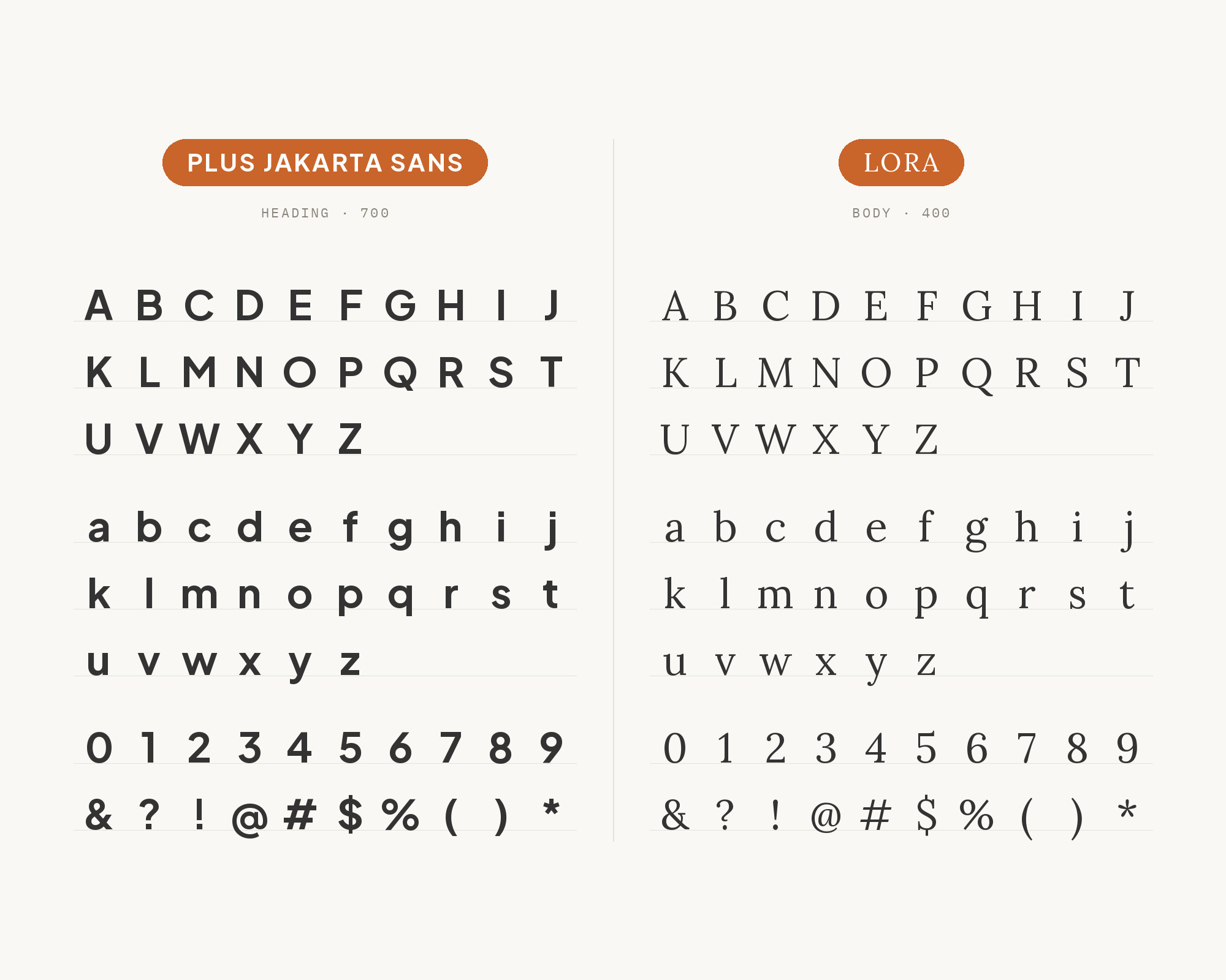
Gbatteries’ website, as documented on Fonts In Use, sets its text in Lora and Plus Jakarta Sans. This is the classic sans and serif split, and it works well here. Lora has brushed, calligraphic curves and moderate contrast, so it brings warmth and a sense of story to a page that could otherwise feel like a product interface. Jakarta’s clean, monolinear forms give it a modern frame. The simplest way to use them: Plus Jakarta Sans for navigation, headings, buttons and captions, Lora for article text and longer explanations. It also works the other way, with Lora italic for a pull quote over Jakarta body text. Good for tech companies with a content program, science brands and editorial blogs.
5. Arvo
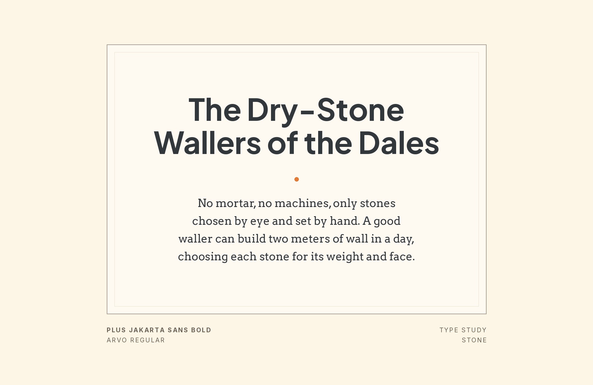
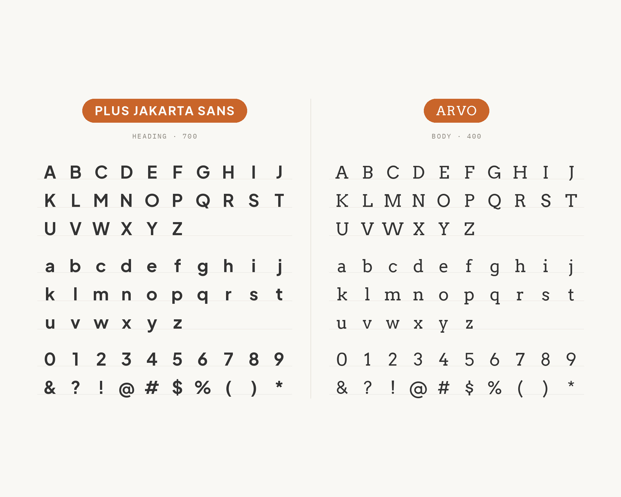
JCI’s brand guidelines name Plus Jakarta Sans as the brand typeface and Arvo as the secondary typeface, a geometric slab serif that pairs well with the primary. The guide limits Arvo to large quotes and callouts in editorial layouts, like press releases or the JCI magazine. That restraint is the right call. Arvo has heavy, square slab serifs and geometric bowls, so it shares Jakarta’s geometric skeleton but adds a firm, typewriter-like weight. In small doses it gives a quote real presence. In long paragraphs it gets heavy. Follow the guide: Plus Jakarta Sans for almost everything, Arvo only where the page needs one strong, quotable moment.
6. Roboto Mono
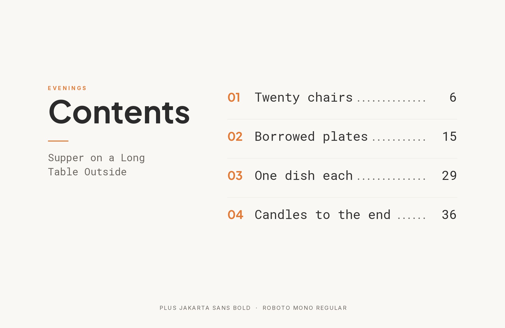
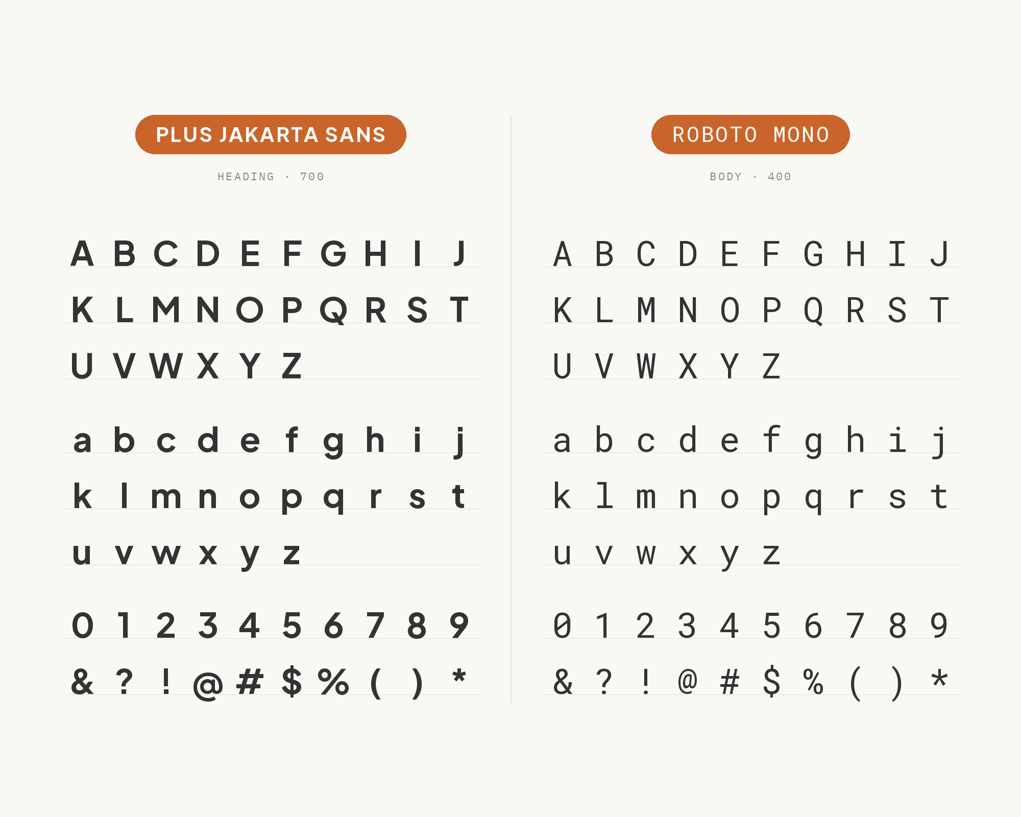
The École Nationale d’Ingénieurs de Metz identity on Fonts In Use lists Roboto Mono among its additional typefaces, beside Plus Jakarta Sans. A monospace partner is a practical choice for a geometric sans that often lives in product interfaces. Fixed widths keep numbers aligned in tables and give code, IDs and timestamps a clear technical texture. Roboto Mono is calm and rational, so it does not fight with Jakarta’s rounder forms. Use it sparingly: data tables, code samples, labels on charts, small eyebrow text above headings. Plus Jakarta Sans handles everything else. The contrast is functional first, but it also gives the page a quiet engineering accent that suits schools, developer tools and technical brands.
Junior work is now a prompt. The biggest profit center in your studio is vanishing.
How to fix this?
Find Out How7. Helvetica Now
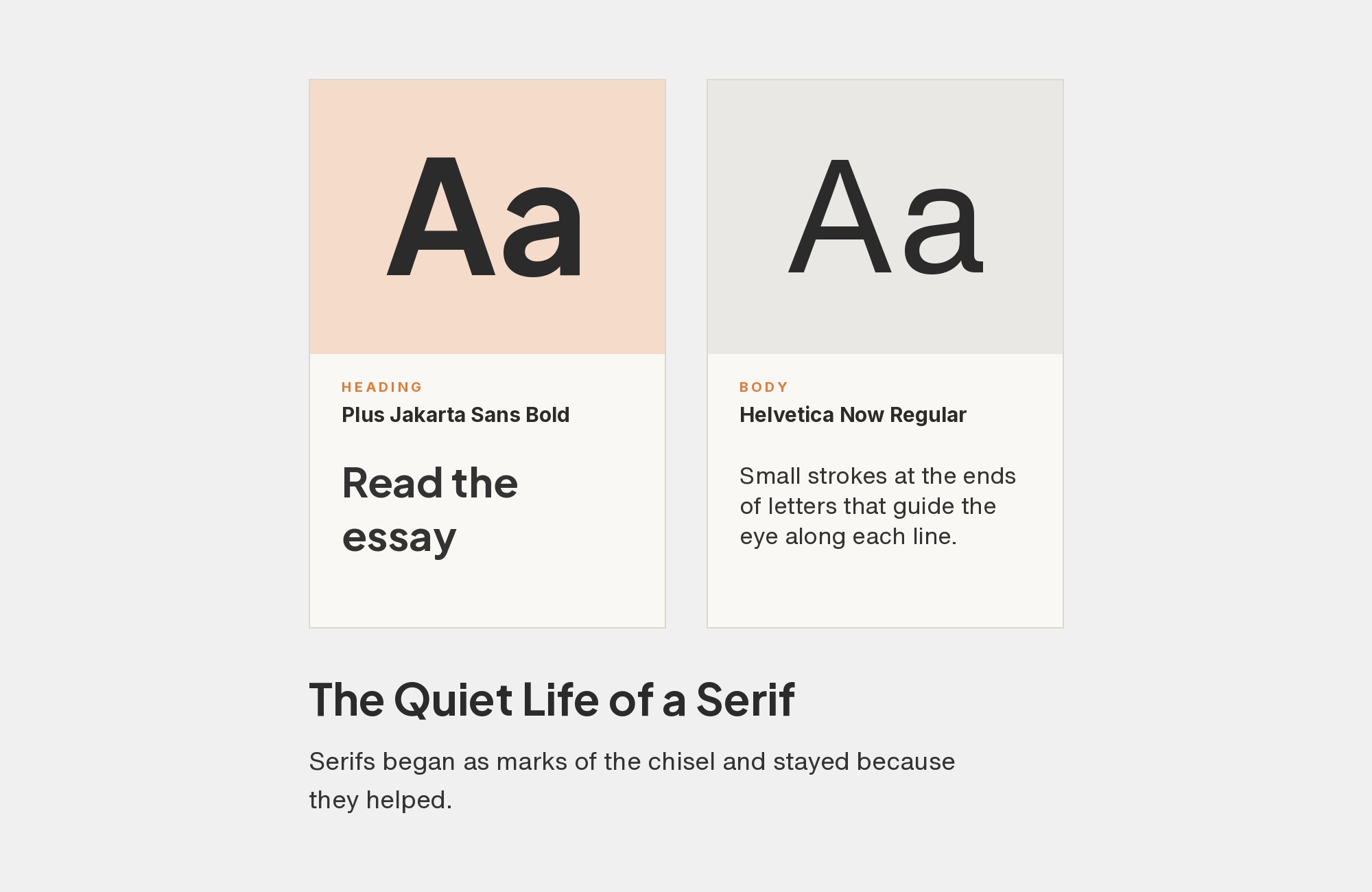
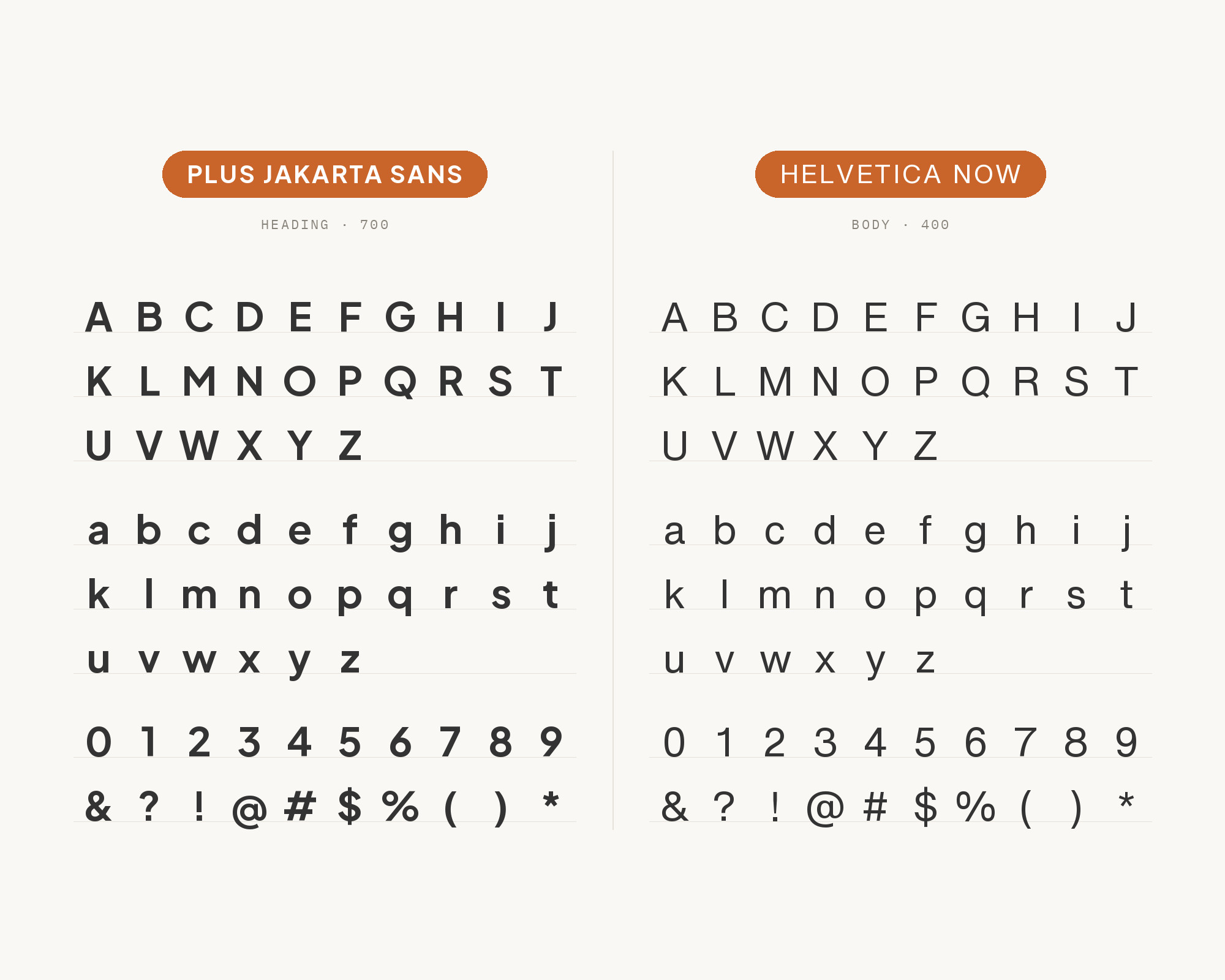
The cmlabs brand typography page lists Plus Jakarta Sans Bold alongside Helvetica Now Display. MaxiBestOf also lists the Kurate Music website using Helvetica Now with Plus Jakarta Sans. Helvetica Now has tight, neutral grotesque forms and a firm, corporate rhythm. Next to it, Jakarta looks warmer and more open, with rounder bowls and a slightly taller x-height. That makes a quiet but workable contrast. Let one face lead. For a bold, confident brand, put Helvetica Now Display on large headlines and Jakarta on body copy and UI. For a friendlier brand, reverse it. In both cases, keep the weights clearly apart.
8. Space Mono
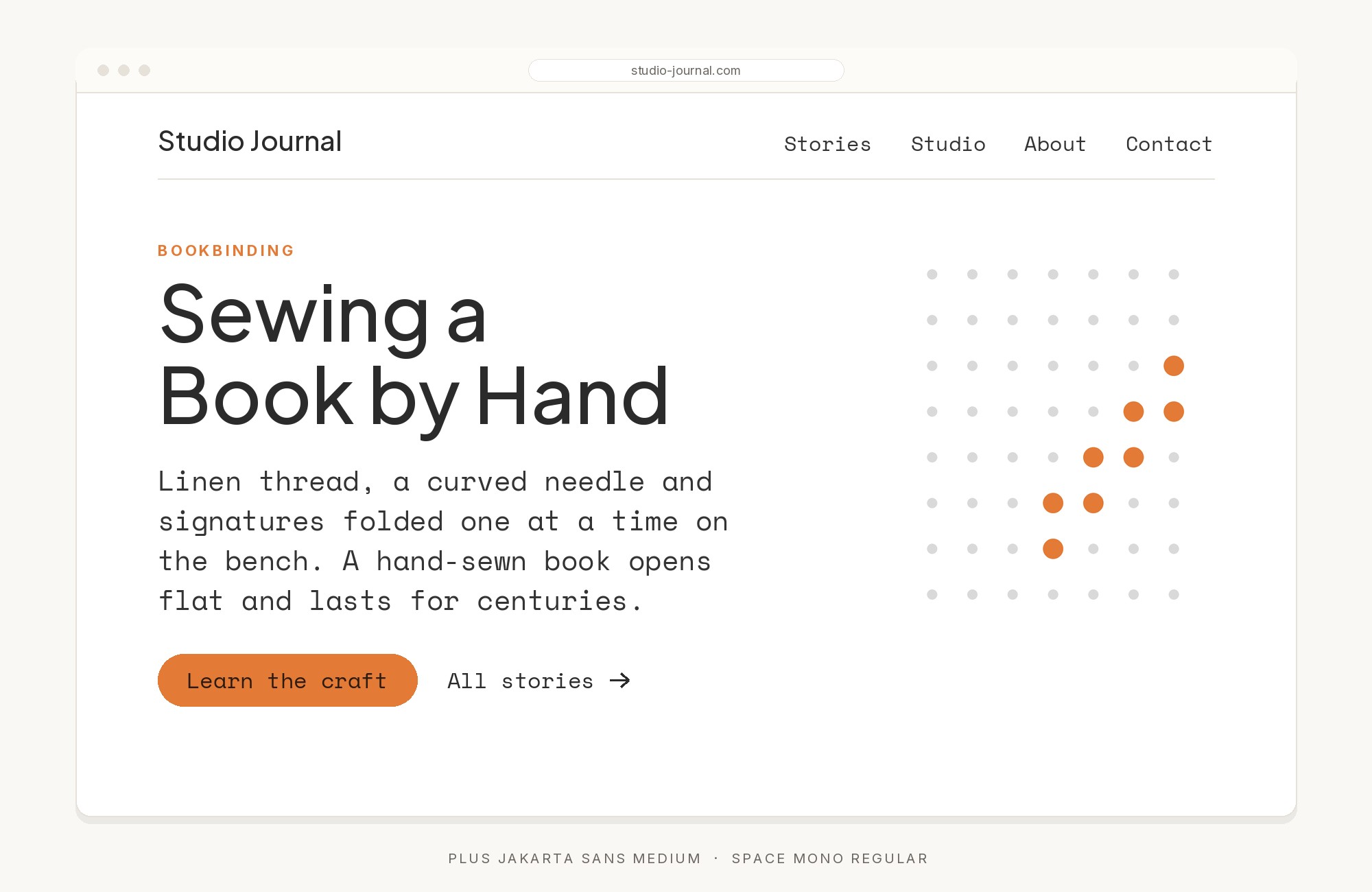
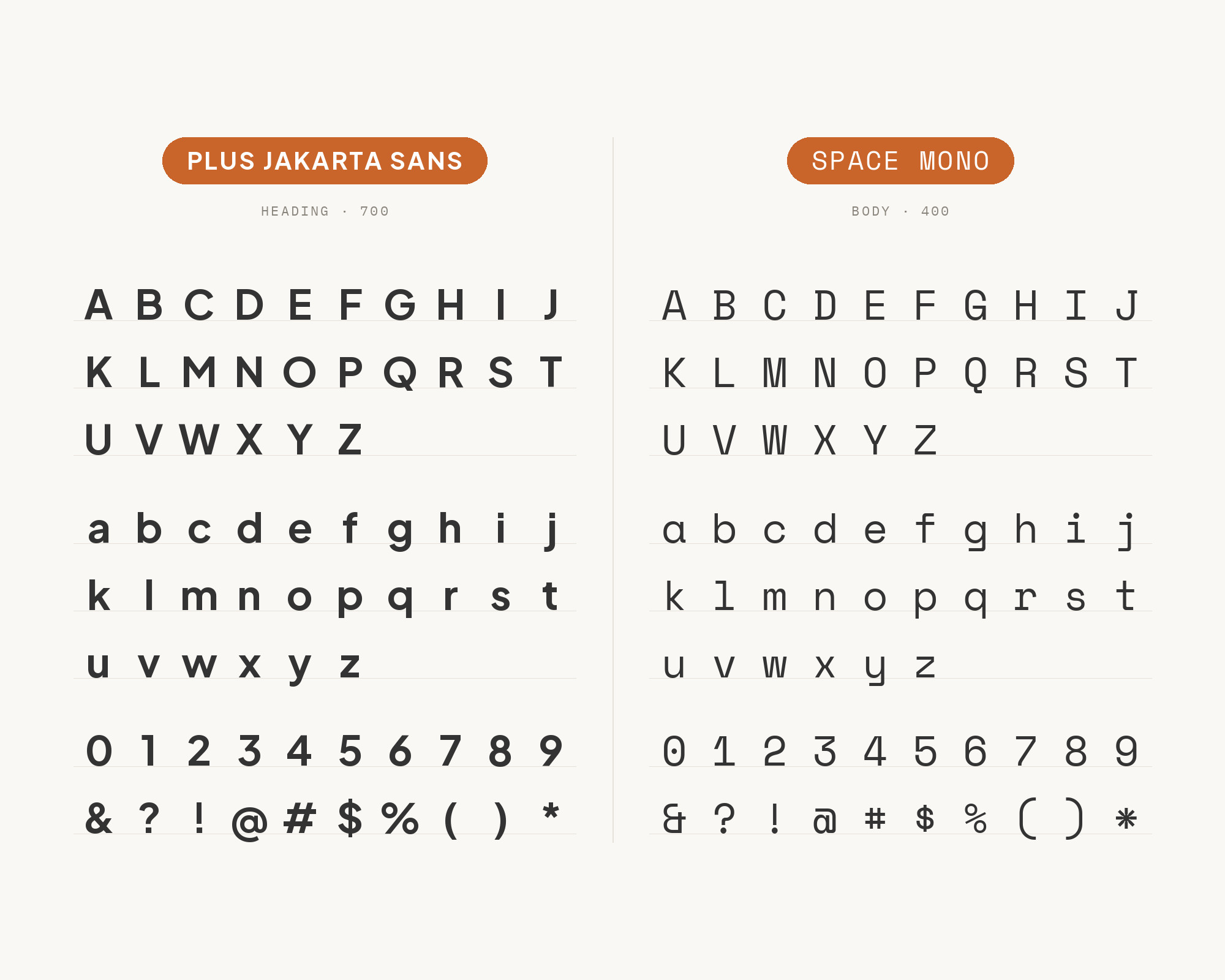
Figma’s collection of font pairings says Space Mono’s retro-tech feel pairs well with Plus Jakarta Sans’ friendly and professional vibe. Space Mono is a monospace with a strong geometric, retro character, much louder than Roboto Mono. So here the monospace is not just for code. It can be a headline or label voice in its own right. Set short headings, stats, tags and navigation in Space Mono, and keep paragraphs and interface copy in Plus Jakarta Sans for readability. Watch line length. Monospaced text runs wide and gets tiring fast in anything longer than a sentence or two. It suits developer brands, design portfolios and product launches.
9. Syne
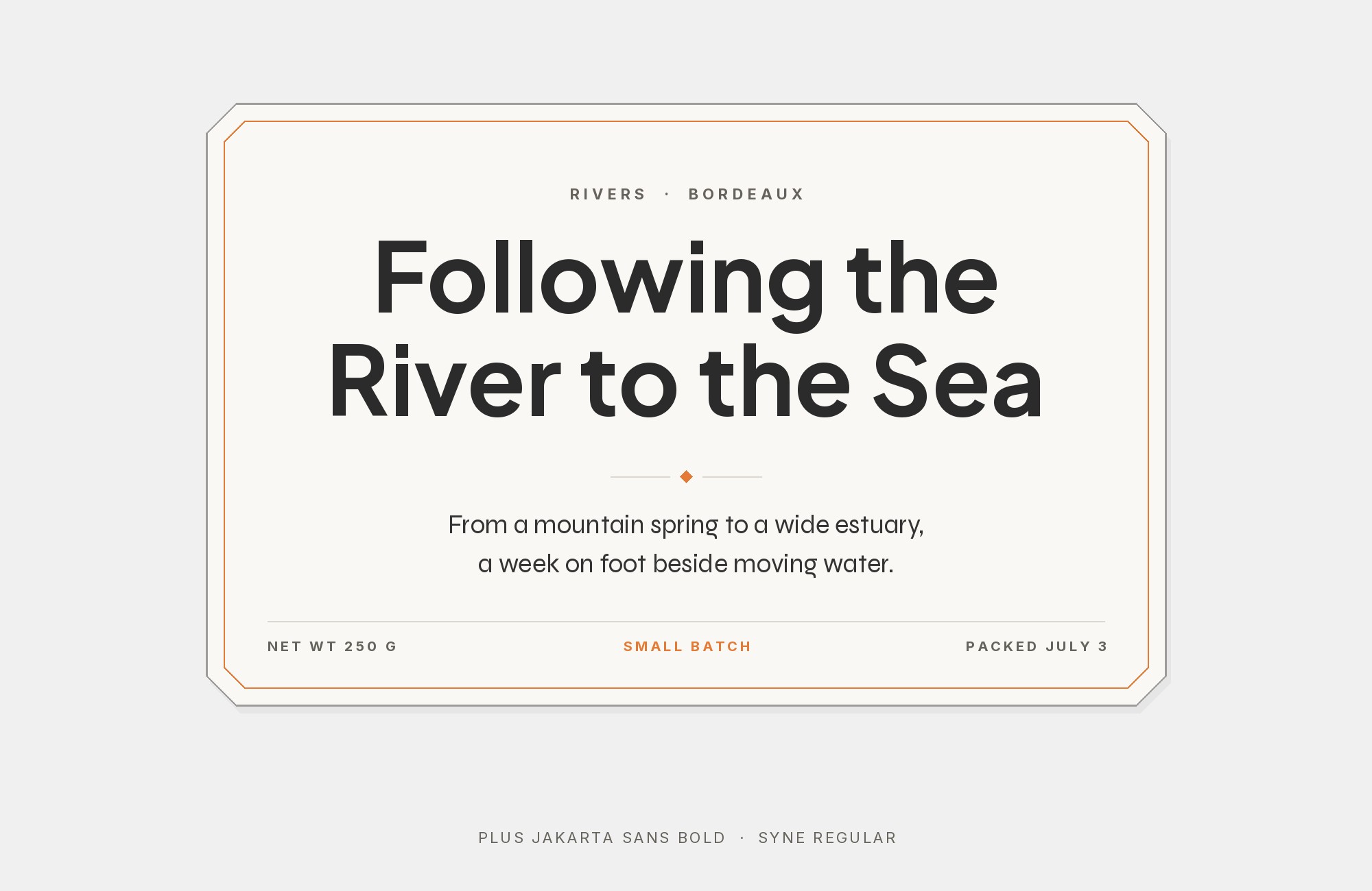
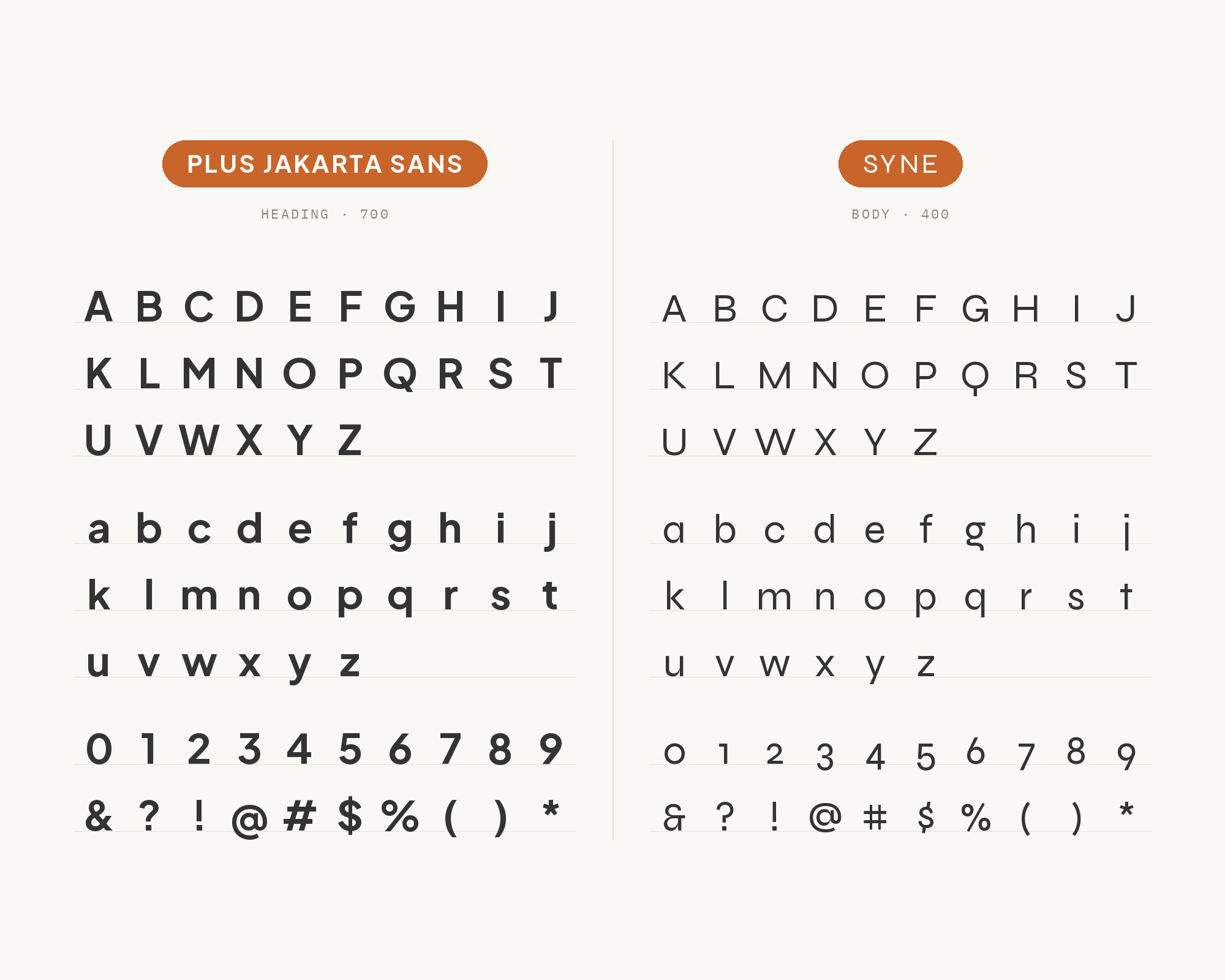
Ollie’s WordPress font series pairs Syne headings with Plus Jakarta Sans paragraphs, saying they complement each other’s geometry. Syne is an unusual sans. The same article notes that it looks fairly standard at lighter weights but becomes super wide as you go up to bold and extra bold. That width is what makes the pairing work. A bold Syne headline takes a lot of horizontal space and a lot of attention, and Plus Jakarta Sans underneath brings the page back to calm, even reading. Use Syne large, for one or two words or a short title, and never for body text. It fits art spaces, creative studios and event sites that want a bold top line with a clean system below it.
10. Cormorant Garamond
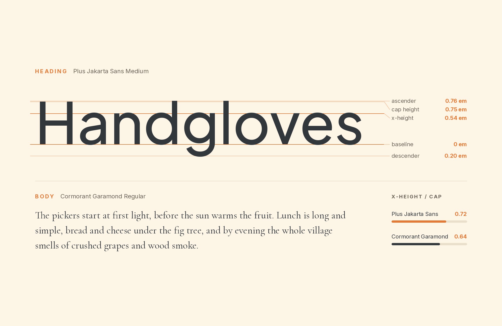
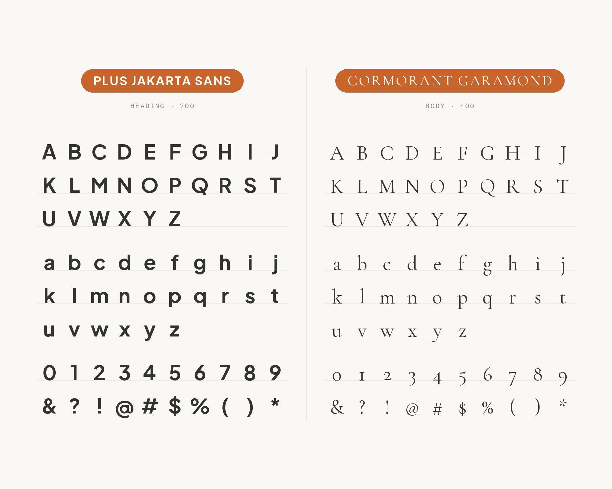
DiverseKit’s list of Google font pairings sets Plus Jakarta Sans as the heading and Cormorant Garamond as the body, for architecture and interior design sites. Cormorant Garamond is a delicate Garamond-style serif with small x-height, long ascenders and high contrast. Next to Jakarta’s clean geometry it looks classical and refined. The main risk is size. Cormorant’s thin strokes and small lowercase need more room than most text faces, so set it larger than you would set a normal serif, with generous leading. Or move it up the hierarchy and use it for pull quotes and subheads, with Jakarta for the running text. Good for portfolios, interiors, hospitality and quiet luxury brands.
11. Helvetica
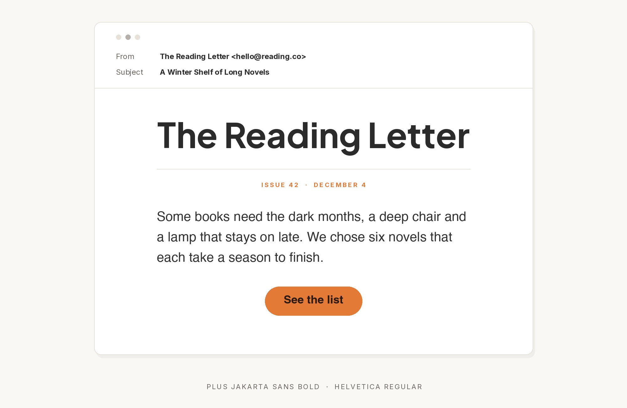
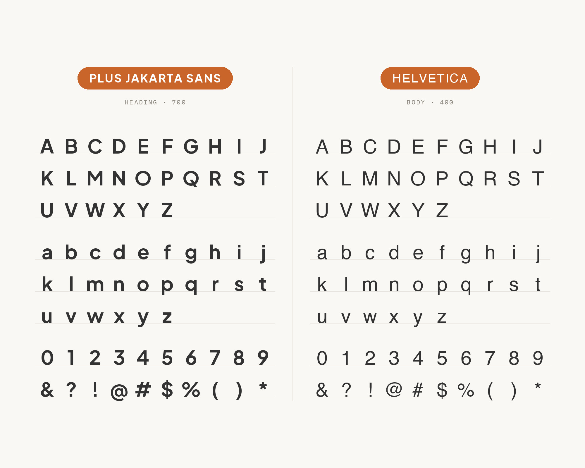
MaxiBestOf lists the Zerezes Masp website using Helvetica with Plus Jakarta Sans. Helvetica is the classic neutral grotesque, with closed apertures, uniform strokes and a very regular rhythm. Plus Jakarta Sans is more open and geometric, with rounder bowls. In a layout, Helvetica can give a stark, gallery-like frame (navigation, credits, small text) while Jakarta takes the friendlier headings and body. Because the two are both clean sans serifs, the difference must come from role, size and weight. Keep it simple: one face for headings, the other for text, and no third family. It suits retail, culture and fashion sites that want a neutral, almost institutional look with a little warmth.
12. Barlow
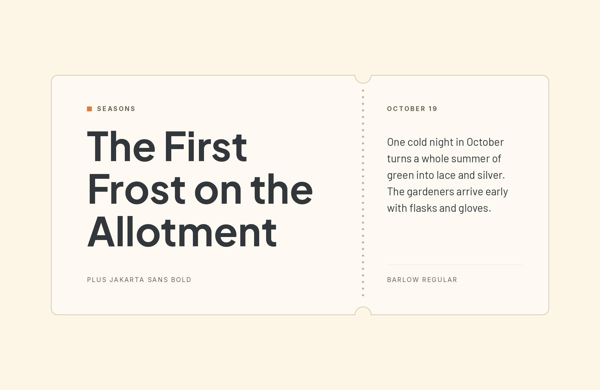
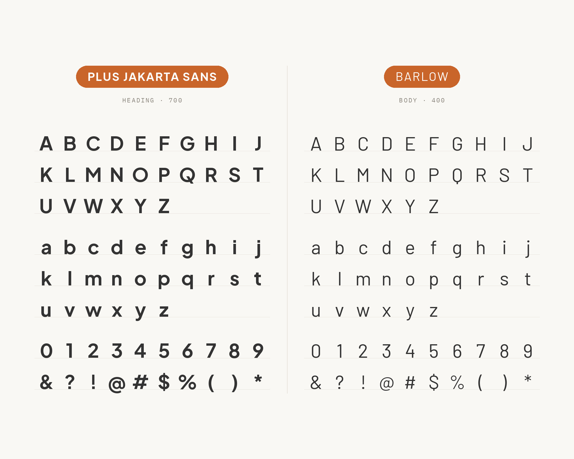
MaxiBestOf lists the Tandem website using Barlow with Plus Jakarta Sans. Barlow is a slightly rounded, low-contrast grotesk with a narrower, more upright fit than Jakarta. That is the useful difference. A Barlow headline packs more words into a line, while Jakarta’s wider, rounder forms stay comfortable for body text. Use Barlow for compact headlines, navigation and data labels. Use Plus Jakarta Sans for paragraphs and buttons. The two share a friendly, rounded tone, so the pair feels coordinated rather than contrasting.
13. Prompt
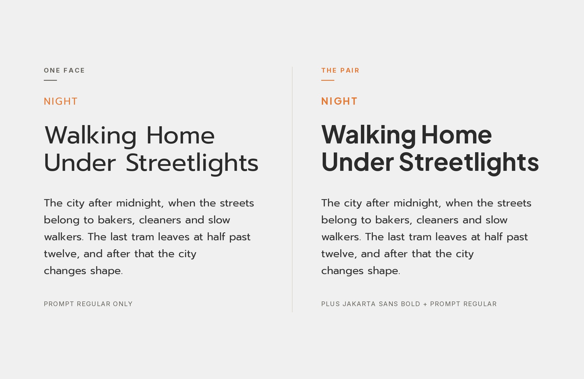
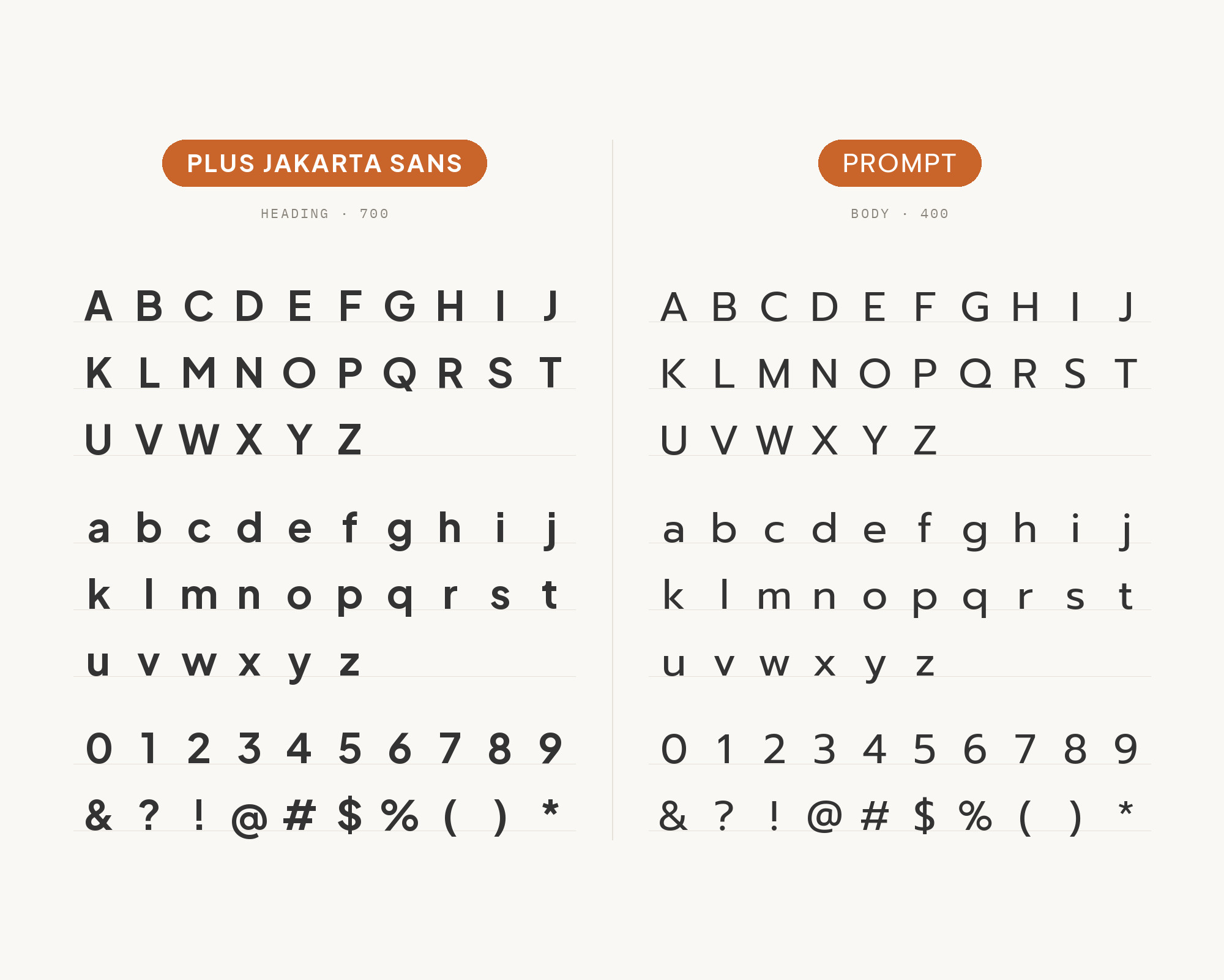
MaxiBestOf lists the Starcow website using Plus Jakarta Sans with Prompt. Prompt is a loopless Thai and sans Latin typeface, with a squared, slightly technical geometry. Its letters are more rectangular than Jakarta’s round bowls, so a Prompt headline feels firmer and more mechanical. This works as a heading and body split: Prompt SemiBold or Bold on titles, Plus Jakarta Sans Regular for reading. It is also a practical choice for bilingual Thai and English work, where Prompt covers the Thai text and Jakarta keeps the Latin reading layer consistent. Keep the Prompt headings short, and let Jakarta handle everything that needs rhythm.
Conclusion
Plus Jakarta Sans works alone, and many brands use it that way. When teams add a partner, the evidence shows three patterns. A plainer sans takes the reading: Public Sans in the Grove design system, Inter in a pairing tool and a real identity. A secondary face with a clear job adds a voice: Sora as Fyva’s secondary type, Arvo for JCI’s quotes, Roboto Mono for data. And a serif brings warmth: Lora on the Gbatteries site, Cormorant Garamond for portfolio work.
Pick the partner by the job it has to do, not by how different it looks. If Jakarta leads, choose a quiet body face. If Jakarta reads, choose a partner with a strong display personality. Then set real text at the size you will publish, and check that the two faces never compete at the same size and weight.
Sources
- Fonts In Use (Plus Jakarta Sans)
- Fonts In Use (Secret Project)
- Fonts In Use (Gbatteries)
- Fonts In Use (École Nationale d’Ingénieurs de Metz)
- Grove design system (typography)
- Todaymade (24 modern font pairings)
- Fyva brand guidelines
- JCI Brand Guidelines
- cmlabs brand typography
- Figma resource library (font pairings)
- Ollie (three font pairs)
- DiverseKit (20 best Google font pairings)
- getillustrations font pairing tool
- Pimp My Type (Plus Jakarta Sans)
- Google Fonts DESCRIPTION (Plus Jakarta Sans)
- Google Fonts DESCRIPTION (Prompt)
