Trajan pairs great with Lato, Gotham + Requiem and Avenir. All 5 pairings are shown below in real rendered specimens, with the reason each one works.

What fonts go with Trajan? The honest answer is: almost nothing, and that is by design. Trajan is one of the small handful of typefaces built to stand completely alone — on a movie poster, a wine label, a courthouse plaque — and any search for a true companion face runs into that fact almost immediately.
Carol Twombly drew Trajan for Adobe in 1989, tracing the inscriptional capitals carved into the base of Trajan’s Column in Rome around 113 AD. She kept the proportions, the restrained stroke contrast, and one deliberate omission: the Roman letter-cutters never carved a lowercase, so Trajan has none either. Every character is a capital, with the same slow, chiseled bracketing on every serif. It is a titling face in the oldest sense of the word — built for a headline of a few words, not a paragraph of running text.
That is the whole problem. A typeface with no lowercase and one case has little internal hierarchy to hand off to a partner, and little for a serif or sans companion’s own capitals to line up against. Trajan does not so much pair with other fonts as tolerate them nearby. The five faces below are not “matches” in the usual editorial sense. They are the plainest, quietest partners that real projects have reached for when body copy or credits became unavoidable.
Why Trajan Resists Pairing
The web’s font-pairing ecosystem all but confirms this. Typewolf and Typ.io, sites that catalogue thousands of combinations, carry no page for Trajan at all — not a thin one, an absent one. Working designers rarely pair Trajan; they set it alone and build everything else around it. Its reputation has curdled into cliché for exactly this reason: a 2007 Typographica essay by Stephen Coles dubbed it “the fallback font for lazy movie marketers,” and noted that when The Da Vinci Code‘s marketing team wanted to signal something other than default prestige, they chose Penumbra instead of reaching for Trajan again.
Trajan’s carved, static monumental proportions also fight anything with a modern skeleton. A geometric sans reads as anachronistic beside stone-carved capitals; a high-contrast serif competes for the same formal register instead of stepping back from it. And because Trajan is a capitals-only display face, with small caps in place of a lowercase, its weights cannot carry a full text hierarchy on their own, so any hierarchy has to come from whatever else shares the page. The only companions that hold up are the ones willing to disappear.
The Least-Worst Options
Doug’s rule for a loud solo face like this: the partner must be neutral, contrasting, and completely out of the way. It is not there to add personality — Trajan already supplies all of that — it is there to carry the mixed-case reading text that Trajan structurally cannot. Here are ways to give Trajan that supporting voice.
1. Lato
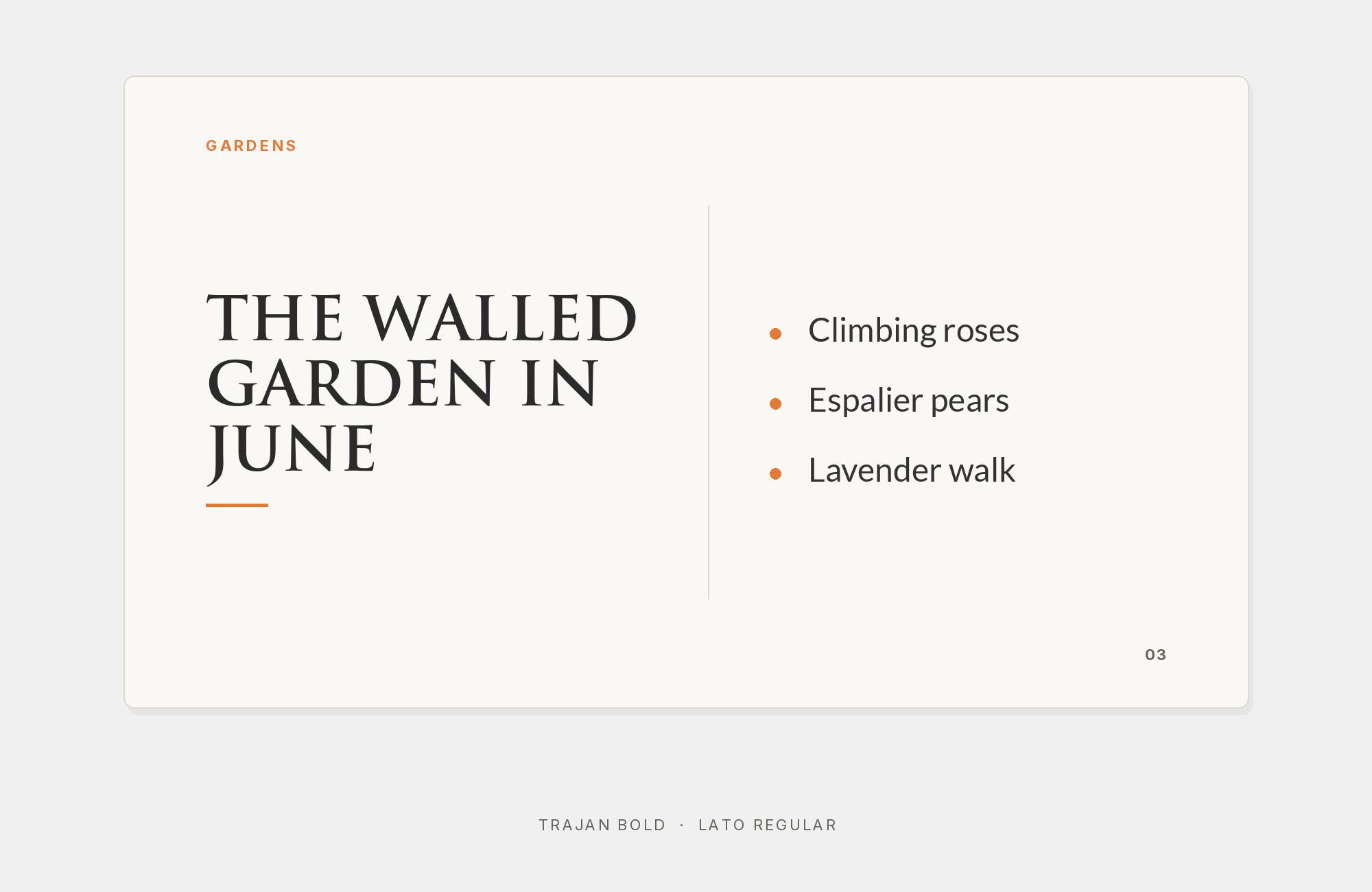
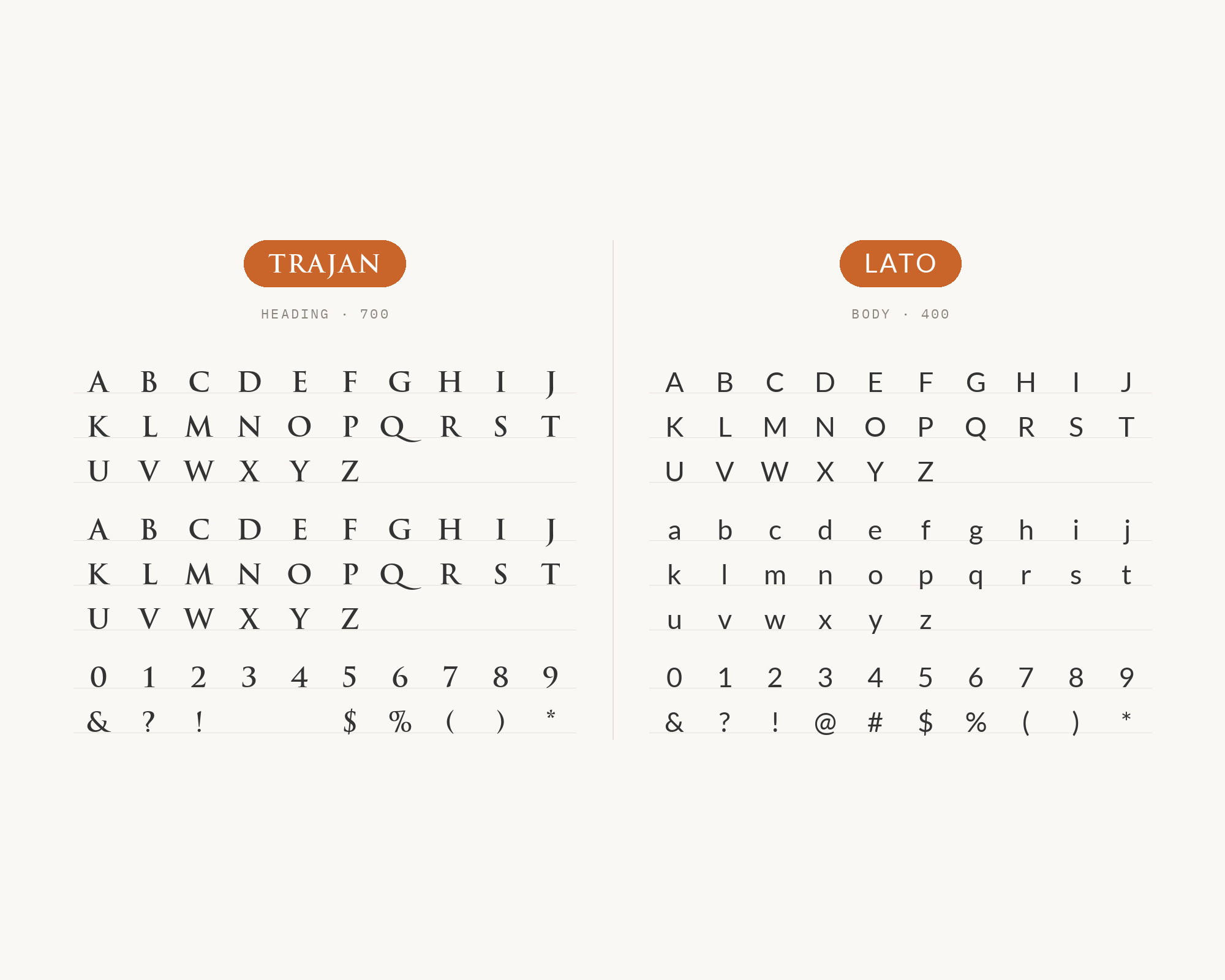
Lato is Łukasz Dziedzic’s humanist sans, released free through Google Fonts in 2010 and now one of the most-served typefaces on the web. Its semi-rounded terminals and even, humanist warmth soften the jump from Trajan’s static capitals more than a strict grotesque would. Cascadia Capital’s brand guide assigns Trajan to extra-large headings and Lato to body copy. The University of Arkansas uses Trajan Pro in its wordmark and specifies Lato for web body text and links. The fit is still approximate, not ideal: Trajan carries no lowercase, so Lato handles the reading text Trajan itself refuses to set. Its wide availability and open license make it the easiest option on this list to actually specify.
2. Gotham + Requiem
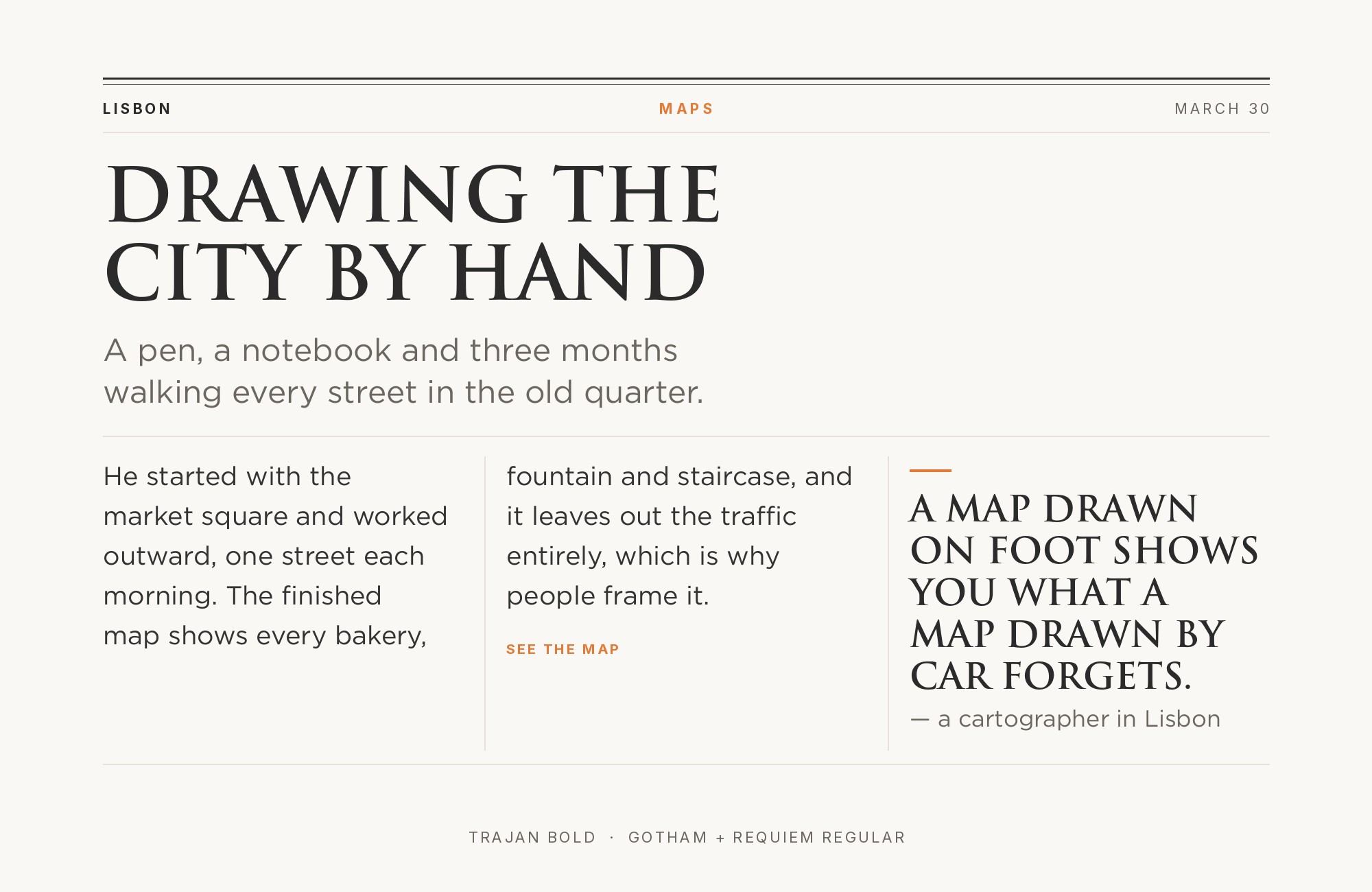
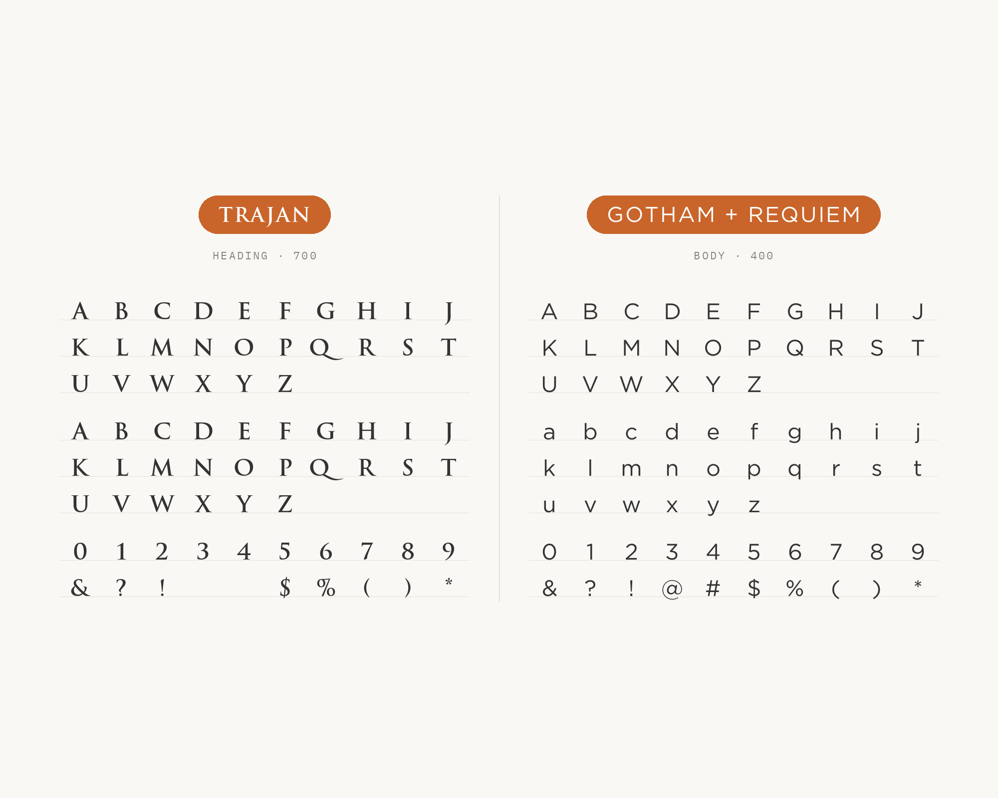
The clearest real-world case of Trajan sharing a system comes from the official branding for Hamilton: An American Musical, where Gotham and Requiem flank a Trajan-lettered title. Tobias Frere-Jones drew Gotham in 2000, taking its broad, even geometry from mid-century architectural signage on New York buildings — a modern, engineered contrast to Trajan’s carved-stone weight. Jonathan Hoefler drew Requiem in 1992 for Travel + Leisure, basing its capitals on Ludovico degli Arrighi’s 1523 writing manual, which gives it a period authority Gotham lacks. Together they split the labor Trajan cannot do itself: Gotham for supporting copy, Requiem for finer, more literary print, both letting the Trajan title carry all the gravitas alone.
3. Avenir
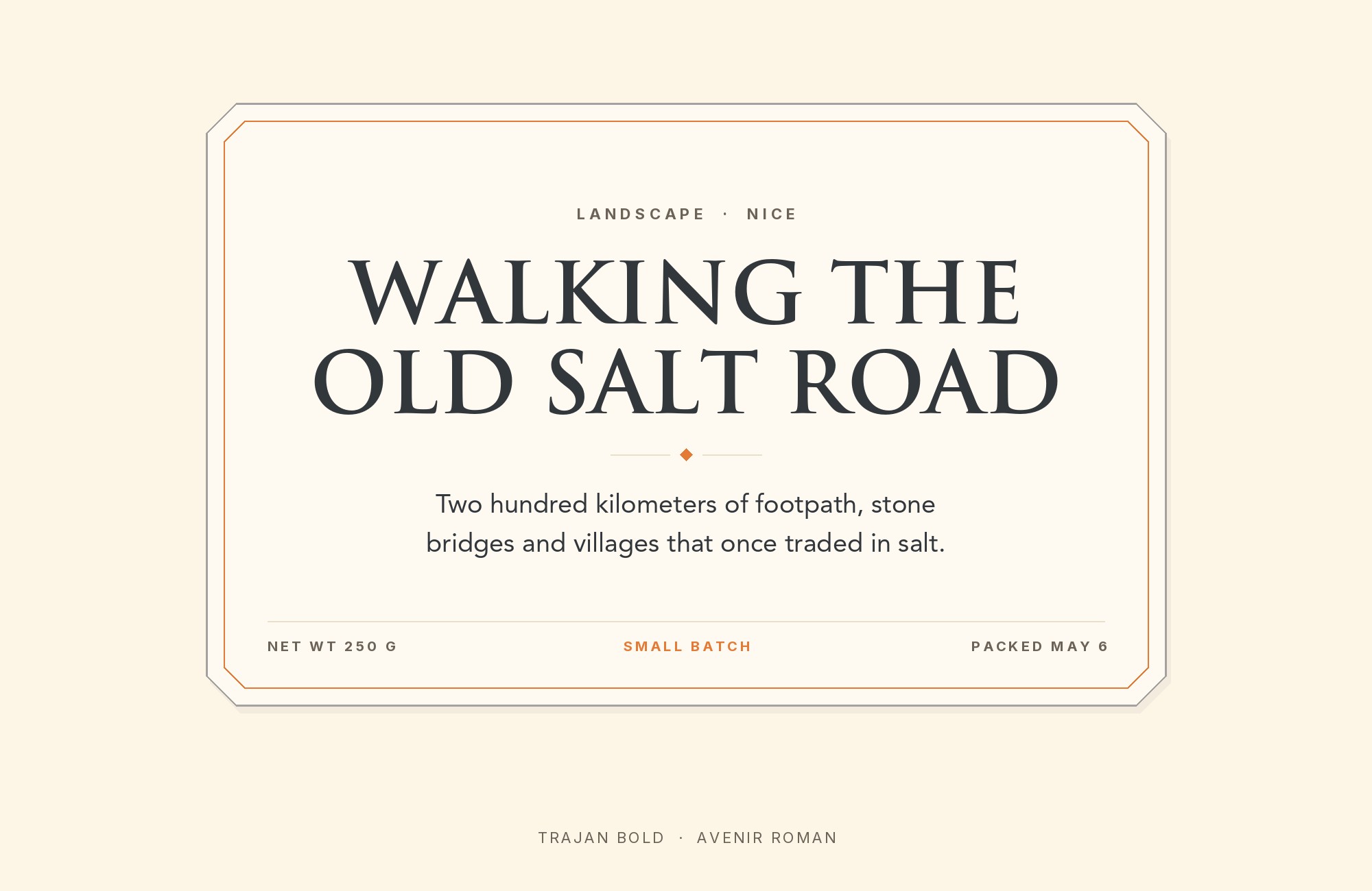
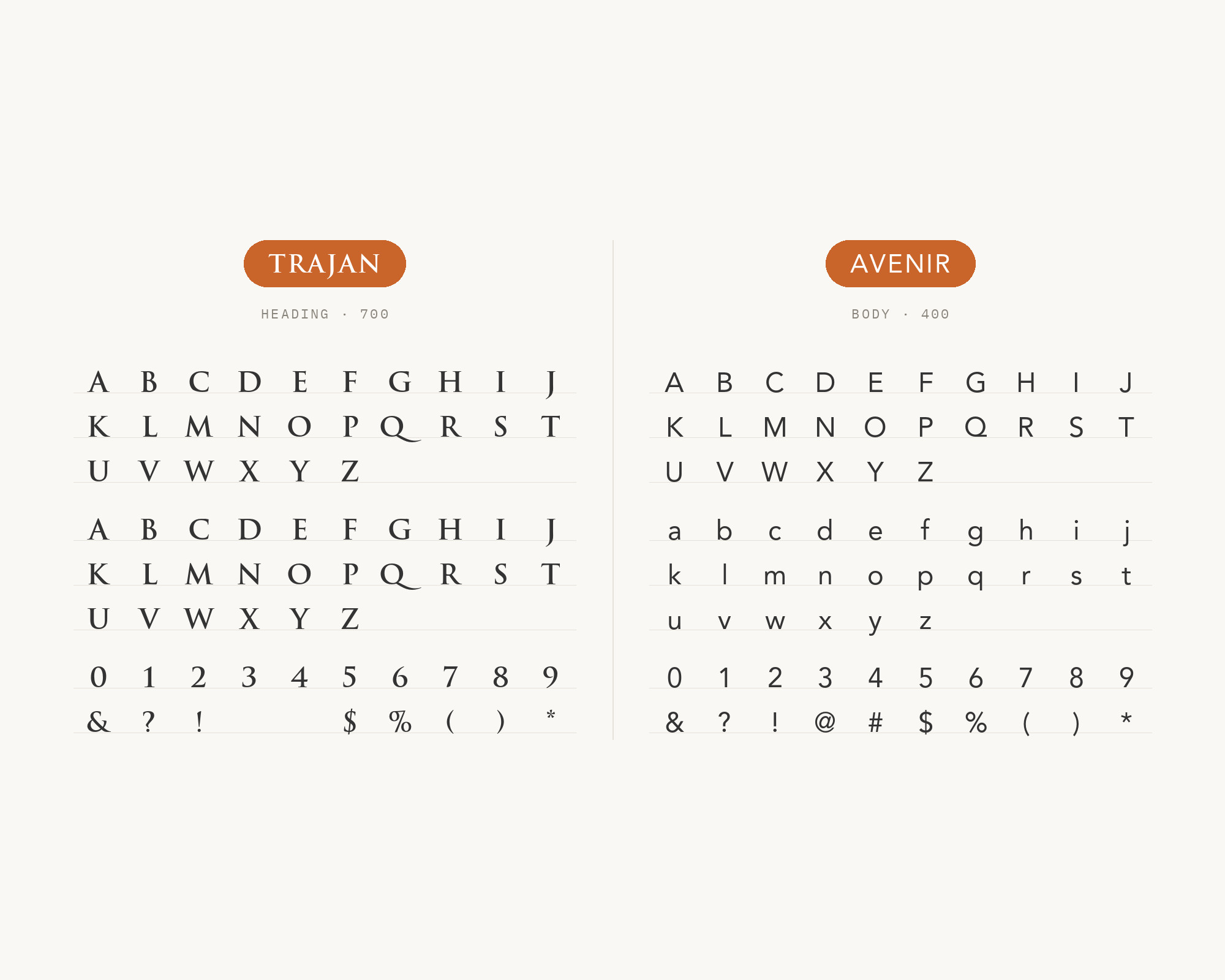
Avenir is Adrian Frutiger’s 1988 geometric sans for Linotype, and its plain, organic neutrality is close to the opposite of Trajan’s carved formality. That contrast is exactly the point: the now-famous Four Seasons Total Landscaping identity uses both, with Avenir in the supporting branding and Trajan on its digital platforms. Frutiger tuned Avenir’s x-height and stroke weight for even color at reading sizes, so it holds up as body text without drawing attention away from a Trajan title above it. It remains a licensed, commercial face, so confirm access before specifying it on a client project.
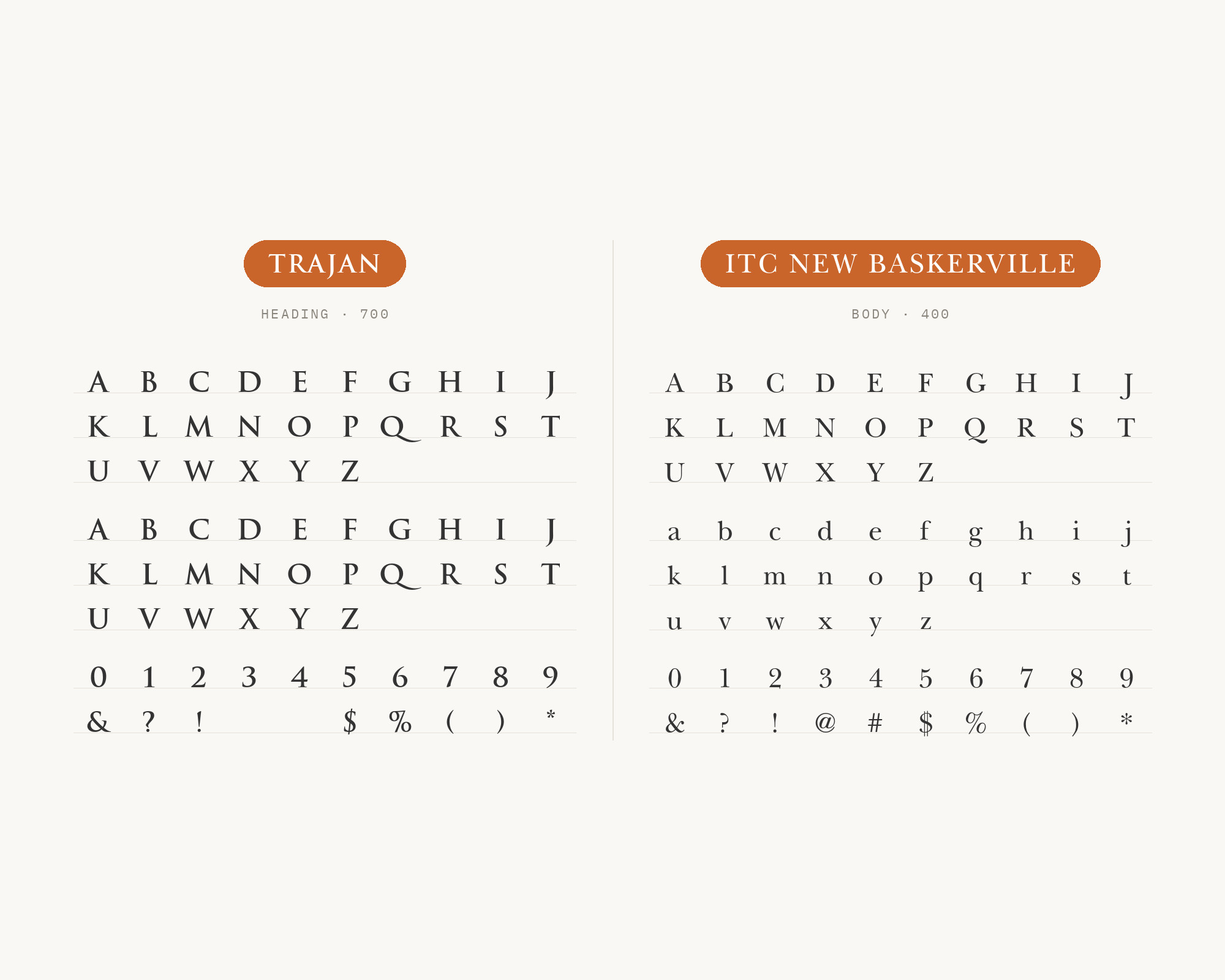
4. ITC New Baskerville
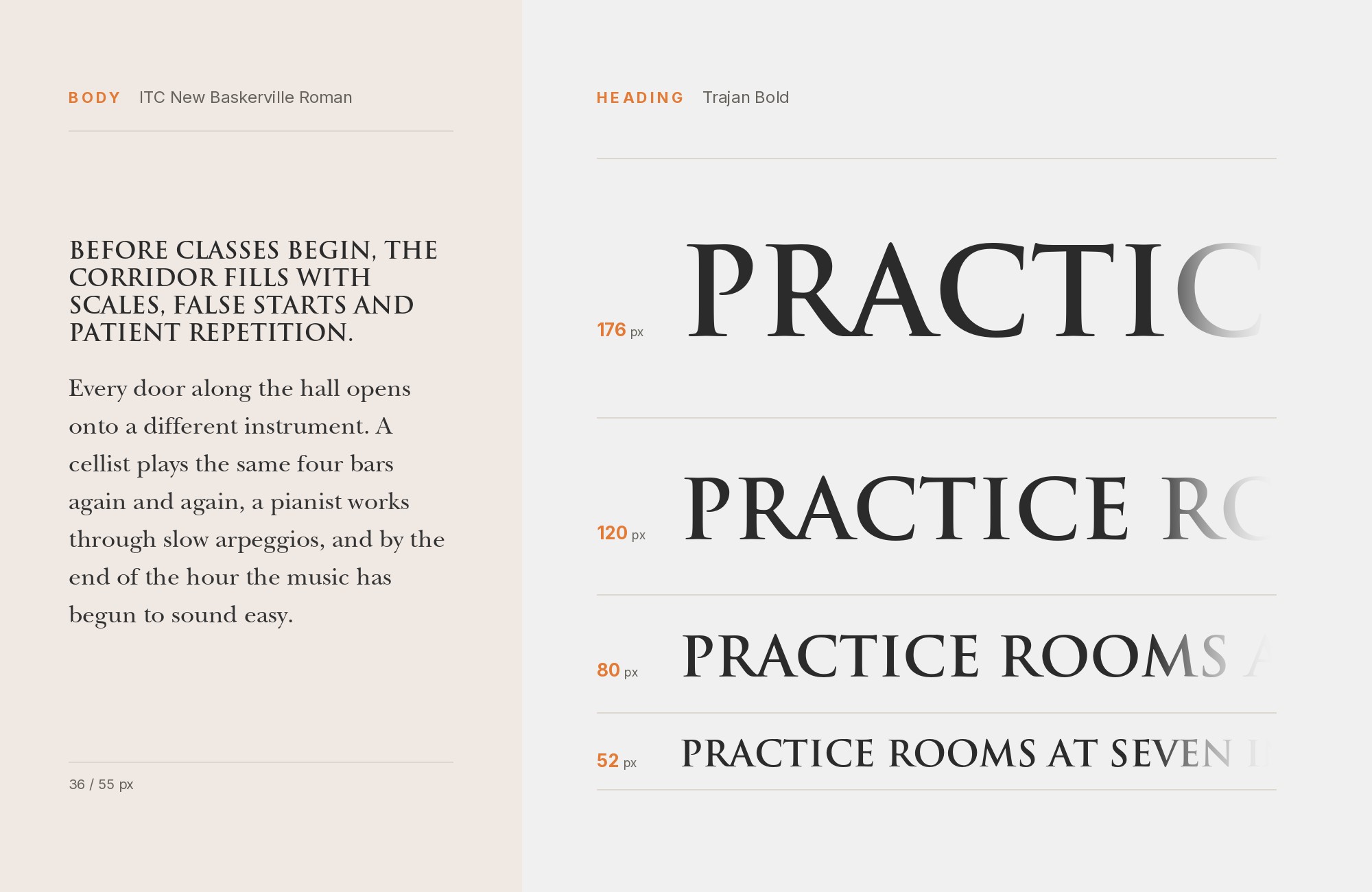
The most common real-world Trajan pattern in this research is an old-style text serif carrying the smaller print beneath a Trajan headline, and ITC New Baskerville is one documented example — most visibly on the Hidden Figures movie poster, where it appears with the Trajan title. John Quaranda drew this late-twentieth-century interpretation of John Baskerville’s original for ITC. Its moderate contrast and old-style figures read as classical without competing with Trajan’s own claim to antiquity, which is why the pattern recurs: Trajan announces, and a humanist serif like this one quietly reads.
5. Times New Roman
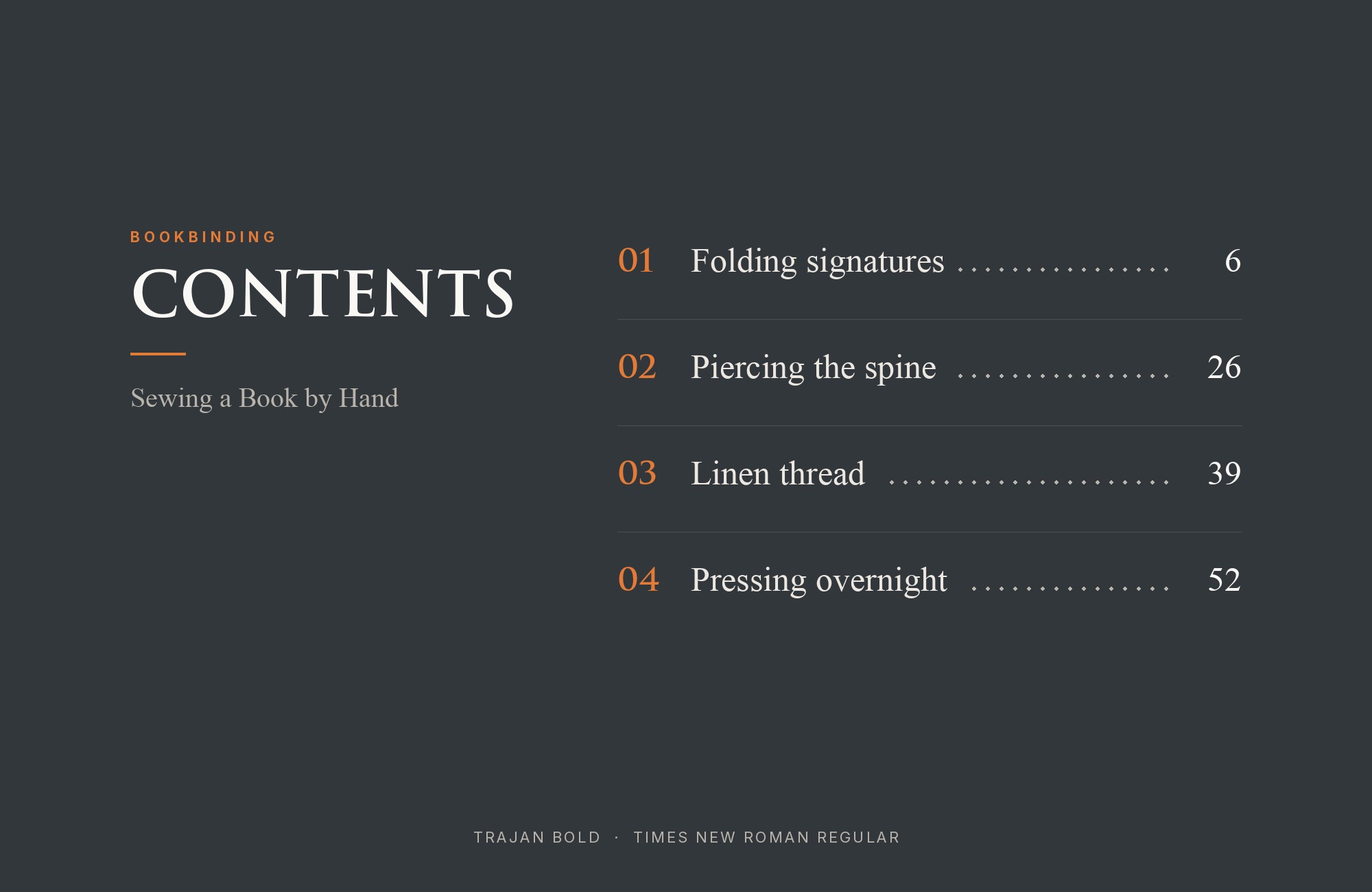
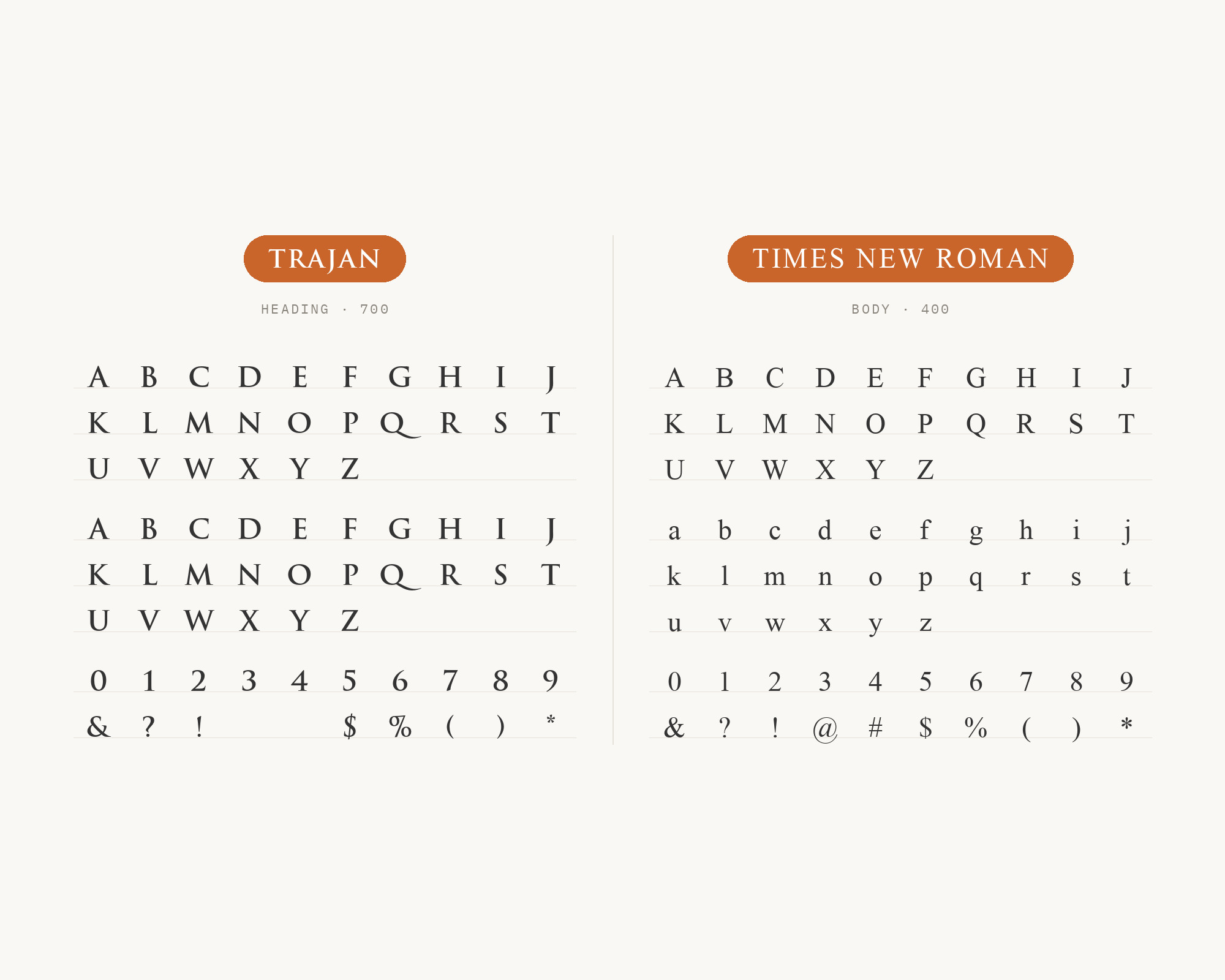
Times New Roman is the plainest, most universally available answer, and it shows up as mixed-case supporting text on more than one Trajan project, independently, including the poster campaign for 2025’s Wolf Man. Stanley Morison and Victor Lardent drew it for Monotype in 1932, tuning its contrast and short descenders for tight linespacing in newspaper columns, which is precisely the low-drama, high-legibility job it does next to Trajan. It needs no license and no justification. When a project has no real typographic ambition beyond finishing the job, this is the default the industry keeps landing on.
What People Try — And Why It Fails
The most common mistake is pairing Trajan with another display face and hoping the two moods blend. Fonts In Use even documents Trajan running alongside Copperplate Gothic on real packaging jobs, the Iron Horse wine label and the Pappas men’s-care line, a genuinely interesting case, but a harder one to defend than it looks. Their formal capitals read as rival headlines rather than a headline with a supporting voice.
Another mistake is reaching for a period-matched decorative or script face to “complete the Roman theme.” A blackletter or an ornate calligraphic italic next to Trajan does not read as historically consistent — it reads as costume, different kinds of ornament competing for the same authority Trajan already claims by itself. Setting too much text in Trajan causes a similar problem: at paragraph size, the broad capitals make reading harder. The rule holds across every failure mode: the moment a second face — or Trajan itself, overused — asks to be noticed twice, the pairing stops working.
What To Use Instead
If a project genuinely needs a full typographic system — headline, body copy, and italics that all feel like the same design — Trajan cannot give that to a designer, because it was never built as a family. Cinzel, free on Google Fonts, is the closest substitute: it keeps the same Roman-capital feel and ships with multiple weights, from regular to black, so the whole system can come from one typeface instead of a headline plus four compromises.
Trajan’s real lesson is not that it lacks partners — it is that it was never supposed to need any. Reach for the partners above only when a plain, quiet supporting voice is needed. Keep the Trajan headline short, and resist the urge to dress up what is already, by design, finished on its own.
Conclusion
Almost nothing pairs with Trajan, and that is not a gap in the research — it is the typeface working exactly as designed. Trajan was cut for one line of stone-carved capitals, not a paragraph, so no true companion exists to complete it.
The five options above are the least-worst, not the best: quiet, neutral faces willing to disappear into a supporting role while Trajan carries the authority alone. When a project needs a full family — headline, body, and italics that feel like one design — Cinzel is the free alternative built to give that, rather than asking Trajan to do a job it was never drawn for.
