BonFX · Similar fonts
Every font below is an alternative to Baskerville, plotted by how closely it matches. The number is its rank. Pick a name to jump to its sample, its one difference, and where to get it.
The closest fonts to Baskerville are Perpetua, Marion and Walbaum. All 22 similar fonts are shown below, ranked by how closely each one matches, with where to get it.
You love the calm, bookish look of Baskerville, but you may not have it on your computer, or you want a free option. Either way, you need a close match that does the same job.
This page ranks 20 fonts, 17 of them free and 3 paid. Every one matches Baskerville between 74% and 81%, and the best free pick scores 81%.
Baskerville is common in book design, and that is why people look for a stand in. Its capitals are bold and can look unbalanced against the lowercase at large sizes, and critics said even in its own day that the style was too stark. It is still a favorite for literary and academic work.
Junior work is now a prompt. The biggest profit center in your studio is vanishing.
How to fix this?
Find Out HowThe font you are matching
Baskerville

Background
Baskerville is a serif typeface designed in 1757 by John Baskerville in Birmingham, England, and cut into metal by punchcutter John Handy. Baskerville is classified as a transitional typeface, intended as a refinement of what are now called old-style typefaces of the period, especially those of Baskerville's most eminent contemporary, William Caslon.
The match map
20 fonts. Click a name.
1.Perpetua
81% matchnear

Character differences

Perpetua is a serif typeface that was designed by the English sculptor and stonemason Eric Gill for the British Monotype Corporation.
Same light weight and open build as Baskerville, but slightly wider. The g, y and Q have a calmer, more cursive shape, and the V and A are slimmer.
↑ map2.Marion
80% matchnear

Character differences

The Marion Font Family was designed by Ray Larabie and published by Typodermic.
Sturdier, with a sharper contrast than Baskerville. The Q tail is short, J sits on the line instead of dropping, and g and y look plainer.
FreeAdobe Fonts
↑ map3.Walbaum
80% matchnear

Character differences

Walbaum is a German surname. Notable people with the surname include:Johann Julius Walbaum (1724–1799), German physician, naturalist and taxonomist Johannes Walbaum, German footballer Justus Erich Walbaum (1768–1837), German type designer and punchcutter Walbaum (typeface), the Didone typeface named after him
Sharper contrast and thinner hairlines than Baskerville. The Q tail is short, J is shorter, and the round letters O and C look narrower and more upright.
PaidMyFonts from $49.00 USD
↑ map4.Sabon
80% matchnear

Character differences

Sabon is an old-style serif typeface designed by the German-born typographer and designer Jan Tschichold (1902–1974) in the period 1964–1967. It was released jointly by the Linotype, Monotype, and Stempel type foundries in 1967.
Garamond-based, with a smaller, tighter feel than Baskerville. W has crossed strokes, g and S are more angular, and the y tail is flatter.
PaidMyFonts from $45.99 USD
↑ map5.Garamond
79% matchnear

Character differences

Monotype Drawing Office 1922. This typeface is based on roman types cut by Jean Jannon in 1615. Jannon followed the designs of Claude Garamond which had been cut in the previous century.
Lighter and more upright than Baskerville, with a small bowl on the a, a narrower g and a lighter W. The Q tail is short.
↑ map6.Sorts Mill Goudy
78% matchnear

Character differences

Sorts Mill Goudy is a serif family by Barry Schwartz. It was added to Google Fonts on 2011-09-07.
Lighter and more calligraphic than Baskerville. The j, z and J are short with small hooks, the W is wide and the Q has a long tail.
FreeGoogle Fonts
↑ map7.Lusitana
78% matchnear

Character differences

Lusitana is inspired by the type found in the 1572 first edition of "The Lusiads", a Portuguese epic poem by Luís Vaz de Camões. This typeface is made for long texts at small sizes.
Sturdier than Baskerville, with a larger x-height and wider letters. The Q tail, J, a and g are simpler, and the thick and thin strokes differ less.
FreeGoogle Fonts
↑ mapUnlimited fonts from $16.50/mo.
29 million fonts, templates and stock assets. One subscription, unlimited downloads.
See the plan8.Adobe Garamond
78% matchloose

Character differences

Lighter and more angled than Baskerville, with a smaller bowl on a and g. W, S, J and y are narrower and have a more calligraphic feel.
FreeAdobe Fonts
↑ map9.Linotype Didot
78% matchloose

Character differences

The Linotype Didot Font Family was designed by Adrian Frutiger, Firmin Didot, Linotype Design Studio and published by Linotype.
Much higher contrast than Baskerville, with hairline strokes and flat serifs. M, N and X have very thin joins, and Q has a short tail.
FreeMyFonts from $29.00 USD
↑ map10.Cardo
78% matchnear

Character differences

Cardo is a large Unicode font specifically designed for the needs of classicists, Biblical scholars, medievalists, and linguists. It also works well for general typesetting in situations where a high-quality Old Style font is appropriate.
Larger x-height than Baskerville, with a lighter, more scholarly look. The g, W and f differ, and the Q has a short tail.
FreeGoogle Fonts
↑ map11.Average
77% matchloose

Character differences
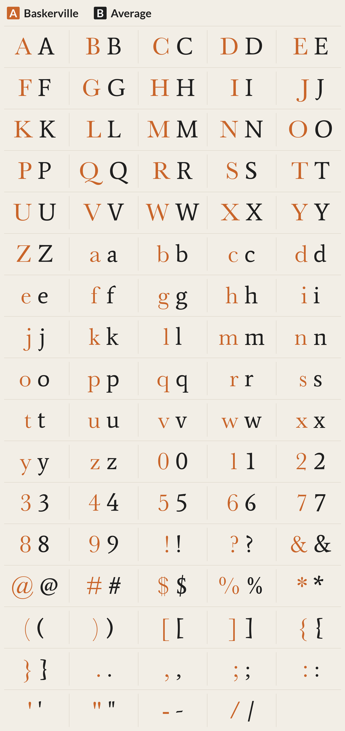
Average is a serif family by Eduardo Tunni. It was added to Google Fonts on 2012-03-14.
Taller x-height and heavier, simpler strokes than Baskerville. The Q, J, y and g are plainer, and the capitals are wider.
FreeGoogle Fonts
↑ map12.Jacques Francois
77% matchnear

Character differences

Jacques Francois revives the c. 1760 Enschedé no. 811 type specimen by Jacques François Rosart (1714-1774), made for Enschedé Printing House. The concept was to create a contemporary webfont with an even typographic color while preserving the essential historic peculiarities and expanding the character set.
Has Baskerville's x-height and a high-contrast build, but it is heavier and wider. The M, o, a and g look darker and rounder.
FreeGoogle Fonts
↑ map13.Garamond Premier Pro
77% matchloose

Character differences

Sharper, more angled Garamond forms. W has crossed strokes, a and c have small bowls and open terminals, and S and F are narrower than in Baskerville.
FreeAdobe Fonts
↑ mapBuild free, plus 500 AI credits.
Design and publish a site at no cost. Paid plans double your credits the first month.
Start free14.Arno
77% matchloose

Character differences

Arno, or Arno Pro, is a serif type family created by Robert Slimbach at Adobe intended for professional use. The name refers to the river that runs through Florence, a centre of the Italian Renaissance.
Taller x-height and a more angled, calligraphic stress than Baskerville. v, y, S and e differ, and Q has a long swinging tail.
FreeAdobe Fonts
↑ map15.Cormorant
76% matchloose

Character differences

Cormorant is a free display type family developed by Christian Thalmann.
Much lighter and more delicate than Baskerville, with a very small look. The Q tail is long and flat, and the S, g, a and f are finer.
FreeGoogle Fonts
↑ map16.Bodoni
76% matchloose

Character differences

Bodoni is the name given to the serif typefaces first designed by Giambattista Bodoni (1740–1813) in the late eighteenth century and frequently revived since. Bodoni typefaces are classified as Didone or modern.
Hairline serifs and sharp thick-thin contrast, unlike the softer Baskerville. W has crossed strokes, and M, N and X have very thin joins.
FreeMyFonts from $40.99 USD
↑ map17.EB Garamond
76% matchnear

Character differences

EB Garamond is a free and open source implementation of Claude Garamond’s typeface, Garamond, with matching italic characters designed by Robert Granjon. Its name is a shortening of Egenolff–Berner Garamond; the letter forms are taken from the Egenolff–Berner specimen printed in 1592.
Slightly narrower and taller in x-height than Baskerville, with lighter, more pointed strokes. The W has crossed strokes, and the a, J and Q differ.
FreeGoogle Fonts
↑ map18.ITC New Baskerville
75% matchnear

Character differences

The ITC New Baskerville Font Family was designed by John Quaranda, John Baskerville and published by ITC.
Baskerville forms, but with a much taller x-height and a wider set. Lowercase v, e, y, s, g and o look bigger and bolder.
PaidMyFonts from $34.99 USD
↑ map19.Cormorant Infant
75% matchloose

Character differences

Cormorant is a free display type family developed by Christian Thalmann.
Light and delicate, unlike Baskerville. It has a single story a and g, a curled y and a long R leg. The K and C are fine.
FreeGoogle Fonts
↑ map20.Libre Bodoni
74% matchloose

Character differences

The Libre Bodoni fonts are based on the 19th century Morris Fuller Benton's ATF design, but specifically adapted for today's web requirements. They are a perfect choice for everything related to elegance, style, luxury and fashion.
Much heavier than Baskerville, with very thin hairlines and flat serifs. The M, G, J and g look stiff and modern. Same size x-height.
FreeGoogle Fonts
↑ map21.Plantin
Font file missing: no match score

22.Perfectly Noted
Font file missing: no match score
Questions
What fonts are similar to Baskerville?
The closest fonts to Baskerville are Perpetua, Marion and Walbaum. All 22 similar fonts are shown below, ranked by how closely each one matches, with where to get it.
What is a free font like Baskerville?
Free fonts like Baskerville include Perpetua, Marion and Garamond. Each one is shown below with a link to where to get it.
What are the best Baskerville alternatives?
By measured letter shape, the best Baskerville alternatives are Perpetua, Marion and Walbaum. Which one is best for you depends on whether you need a free font or a paid one.
Keep reading
- What Fonts Go With Baskerville? Pairings that work with Baskerville.
- Font Combinations: The Complete Guide to Font Pairings Every pairing, with examples.
- The Big Book of Font Combinations
- 29 Principles for Making Great Font Combinations
