Figtree pairs great with Georgia, Open Sans and Noto Serif. All 15 pairings are shown below in real rendered specimens, with the reason each one works.

What fonts go with Figtree, the friendly geometric sans made for web and mobile apps? The short answer is: almost anything with a clear job of its own. Figtree is so calm that most partners only need to bring one thing it does not have.
Erik Kennedy designed Figtree, and he is the creator of Learn UI Design and Learn UX Design. Fonts In Use dates its release to Aug 2022.
Kennedy describes it as a geometric sans walking the line between simplicity and friendliness. In his words, it is minimalist but not stiff, casual but not silly. Its most characteristic letters are the t, f and y, all with unabashed curves.
Adobe Fonts describes Figtree as a clean yet friendly geometric sans serif for web and mobile apps. It comes as a variable font with seven legacy weights, light through black.
The italic style was added in November 2022 to complete the family. Pimp my Type says it immediately recalls Proxima Nova. Proxima Nova is a bit narrower, with more open apertures.
So what does Figtree need from a partner? It has almost no stroke contrast, so a serif brings texture and a sense of history. It is quiet in headlines, so a louder display face can take the top of the page.
And it is excellent in interfaces, so it often ends up as the body text under someone else’s headline. The pairings below come from real university and brand type systems, documented websites and a named type critic. Here are 15 fonts that pair with Figtree.
1. Georgia
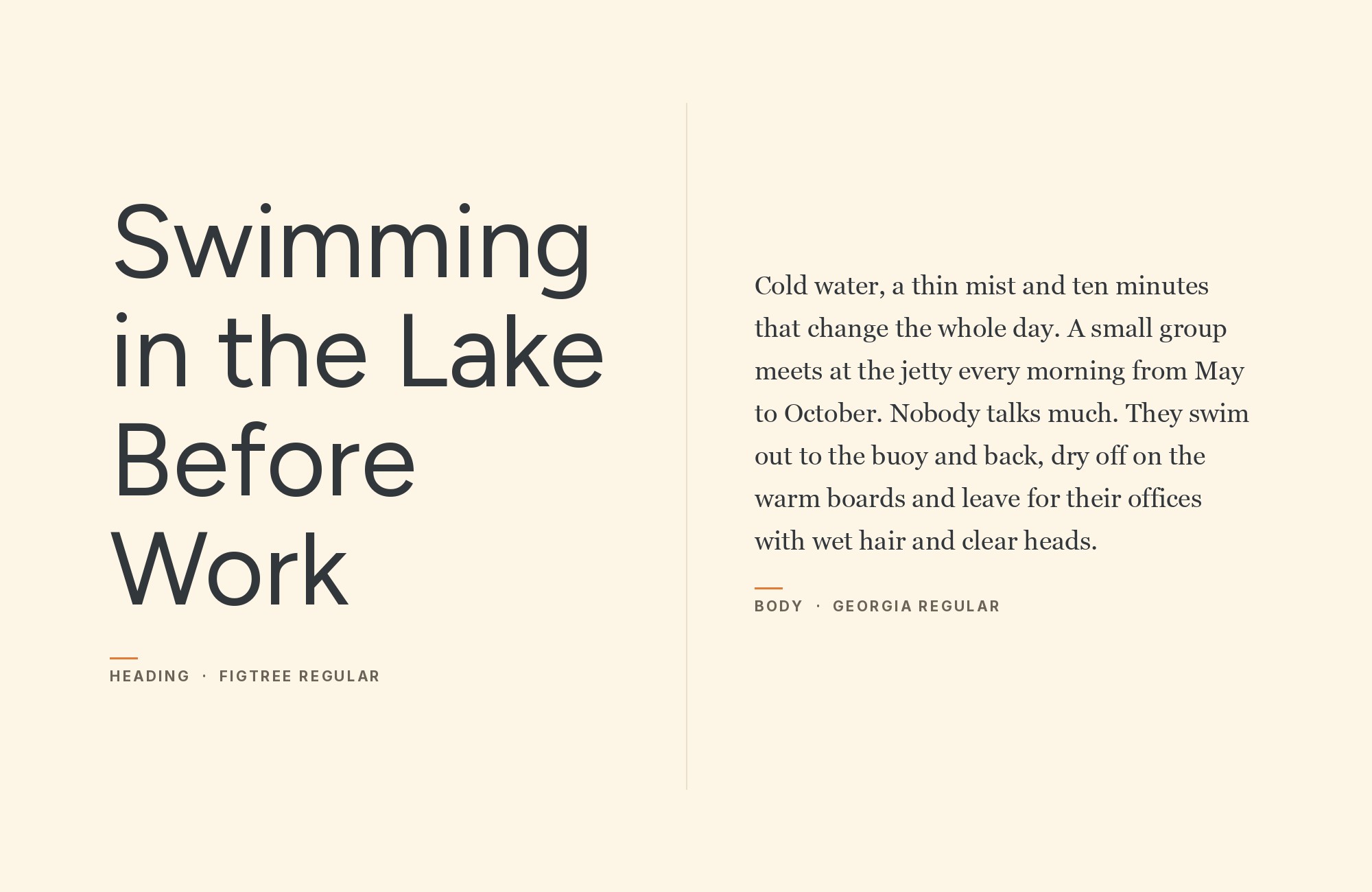
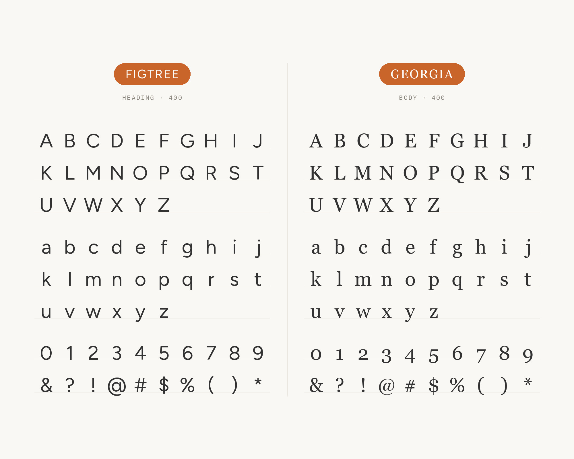
KTH Royal Institute of Technology names Figtree and Georgia as its primary fonts. Figtree serves as the choice for headlines, subheadings and concise body text. For longer passages, KTH opts for Georgia.
Matthew Carter designed Georgia, a serif released in 1996. Its large x-height and sturdy forms read well on screens. Next to Figtree, it adds warmth without slowing the reader.
This is the simplest strong pairing on the list: Figtree on top, Georgia for the reading.
Turn your ideas into repeatable creative workflows - no code required. Create with ready-made templates and AI-powered tools in Picsart Flow.
See details2. Open Sans
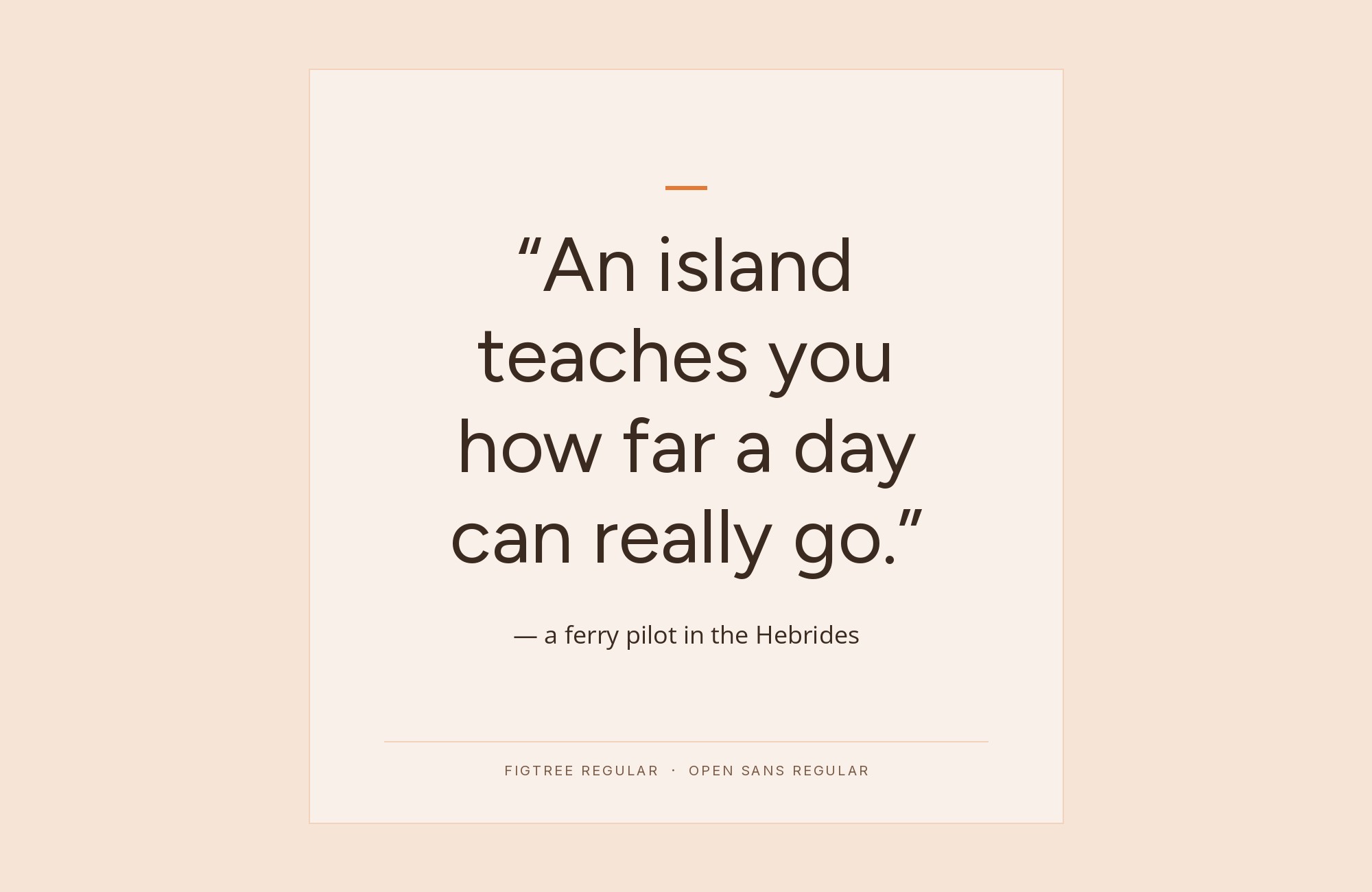
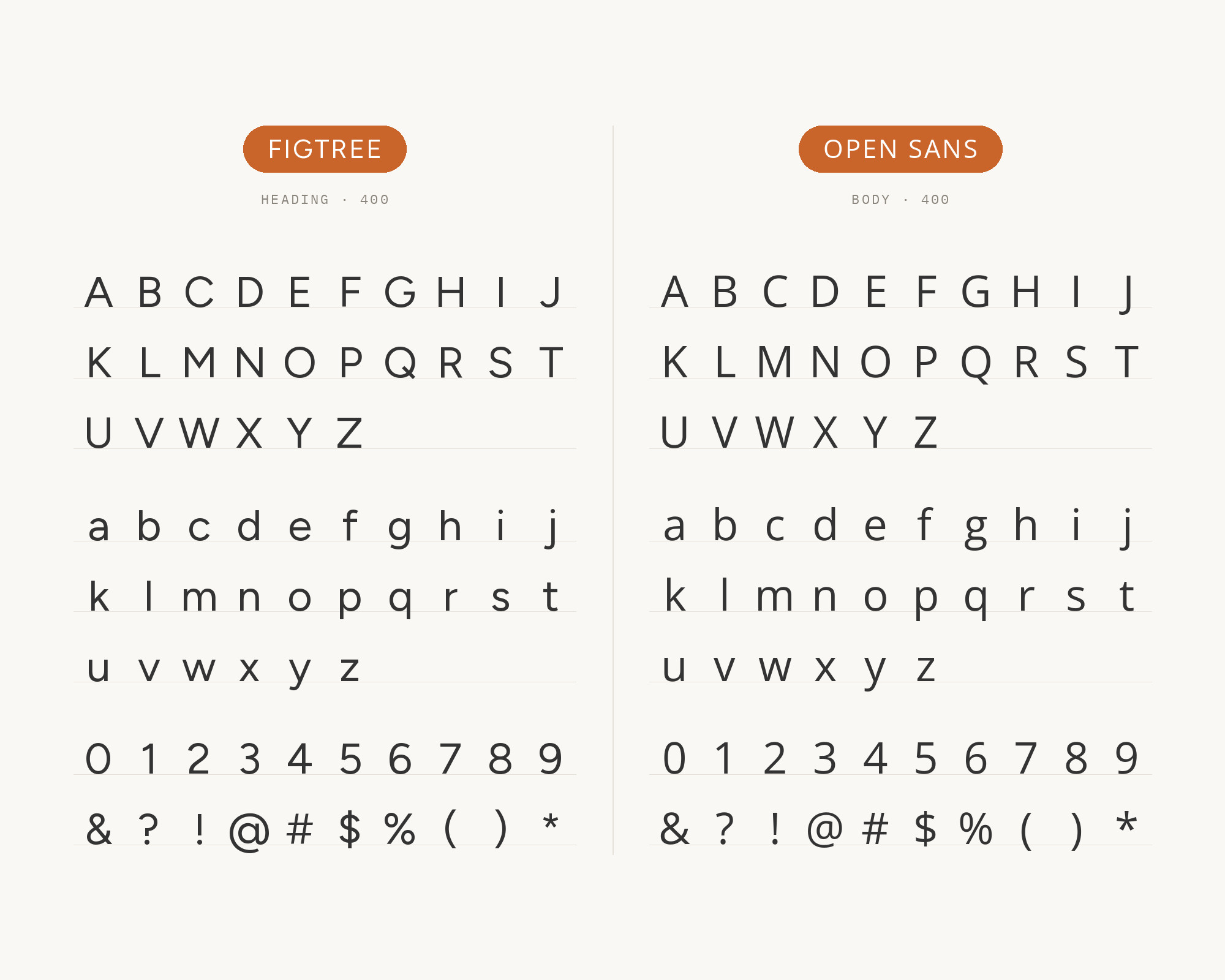
Marquette University uses Figtree for informational copy and subheads. It uses Open Sans for body copy, because it is highly legible in print and digital applications. George Mason University also lists Figtree and Open Sans together among its web and digital fonts.
Steve Matteson designed Open Sans as a humanist sans. Its open apertures and slightly narrower fit separate it from Figtree’s round geometry.
Keep the weights apart: a semibold Figtree subhead over regular Open Sans text.
3. Noto Serif
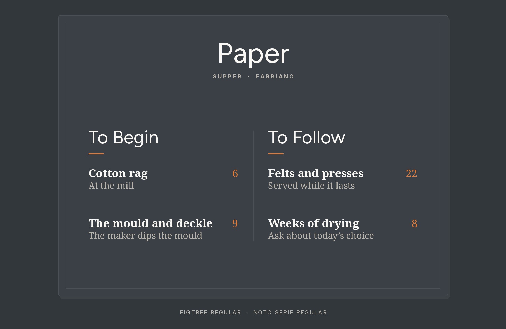
George Mason University lists Figtree, Open Sans and Noto Serif as its web and digital fonts. Noto Serif is a plain, sturdy text serif. It gives Figtree’s headings a calm, institutional reading face.
Use Noto Serif for long articles, and keep Figtree for headings, navigation and captions. The three together make a full system: two sans faces for structure and one serif for reading.
4. EB Garamond
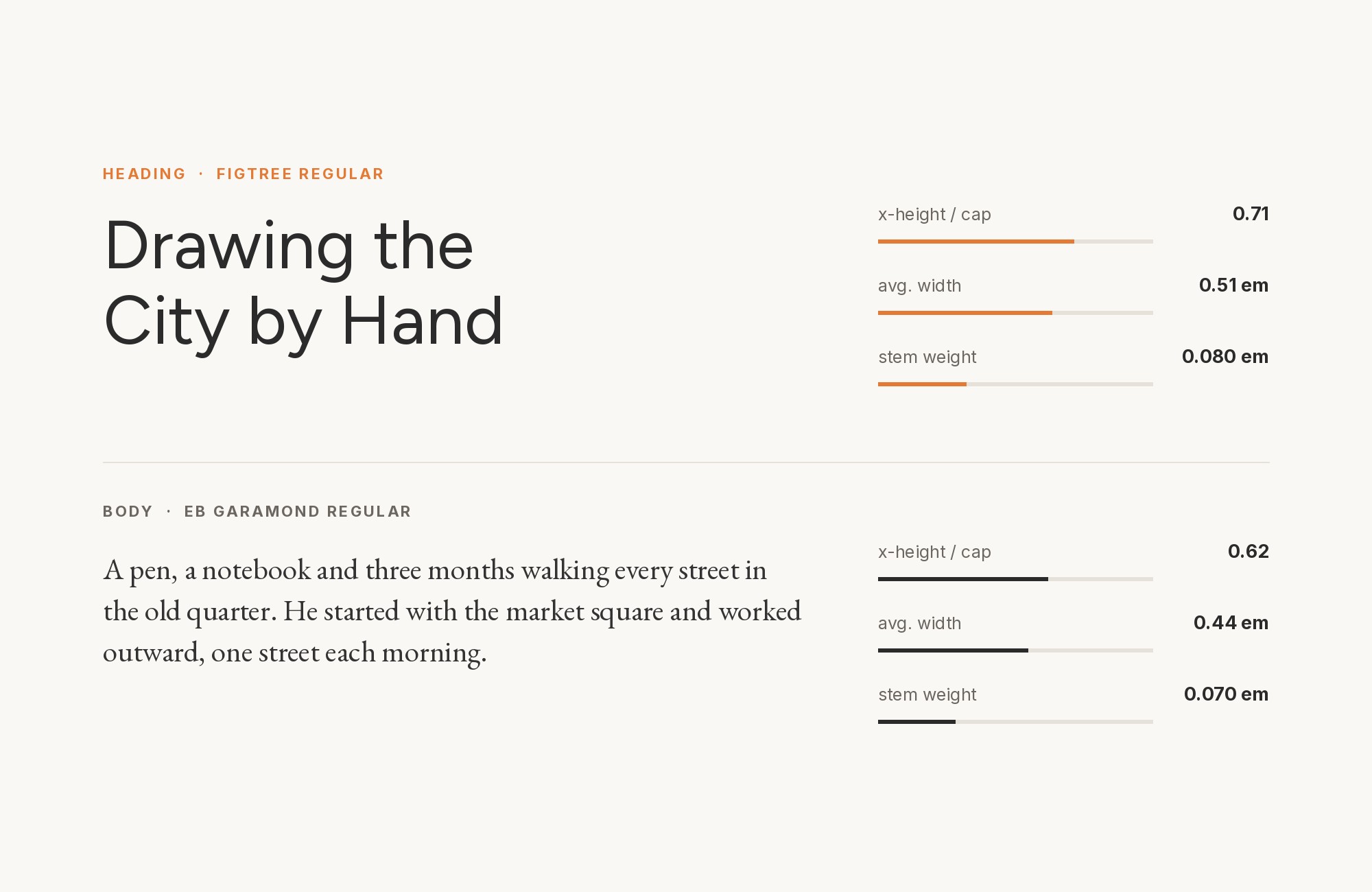
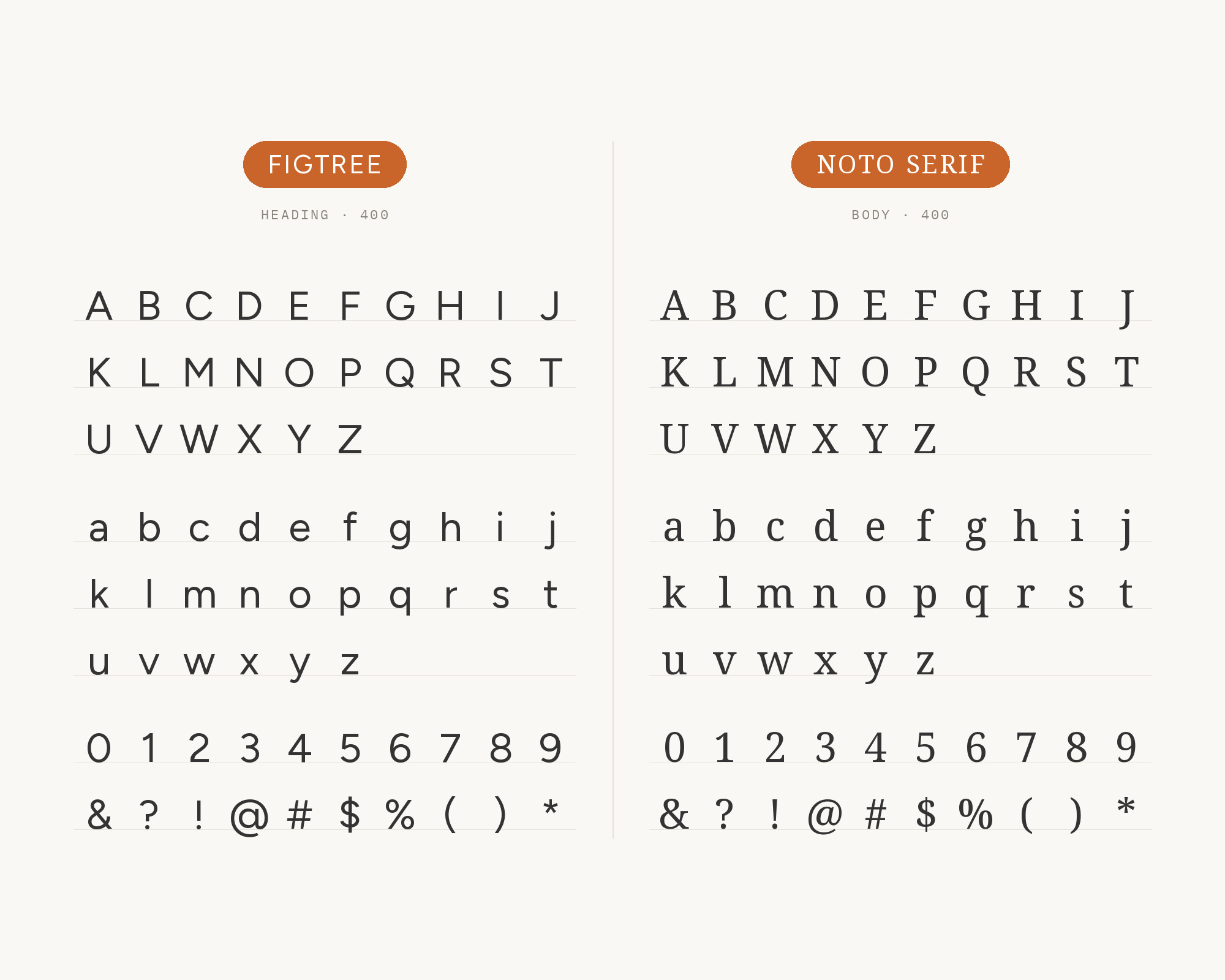
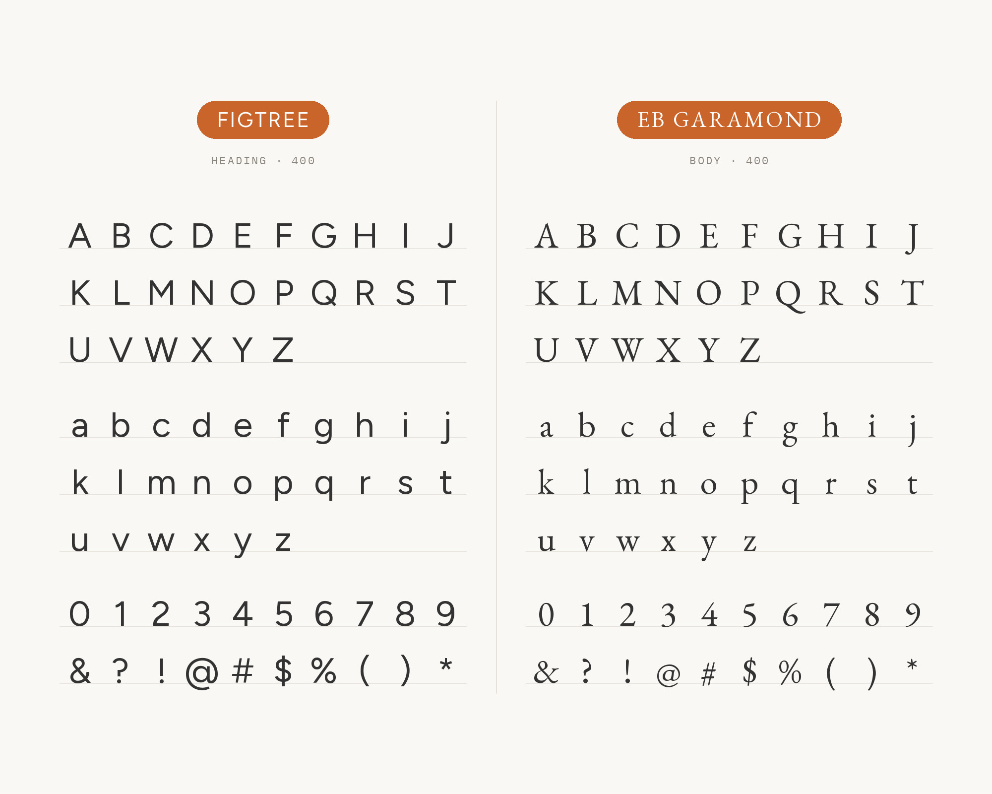
Loyola University Maryland uses serif fonts, Cormorant and EB Garamond, for storytelling and long-form content. It uses Figtree for clarity, hierarchy and digital applications. A1 Gallery also records the Wispr Flow website with Garamond and Figtree.
EB Garamond is a free Garamond released by Georg Duffner in 2011. Its Renaissance proportions give long text a bookish rhythm. Against it, Figtree reads as the clean, modern interface layer.
Paid prompt-to-site tools are going to lock you in.
How can your studio escape this?
Find Out How5. Cormorant
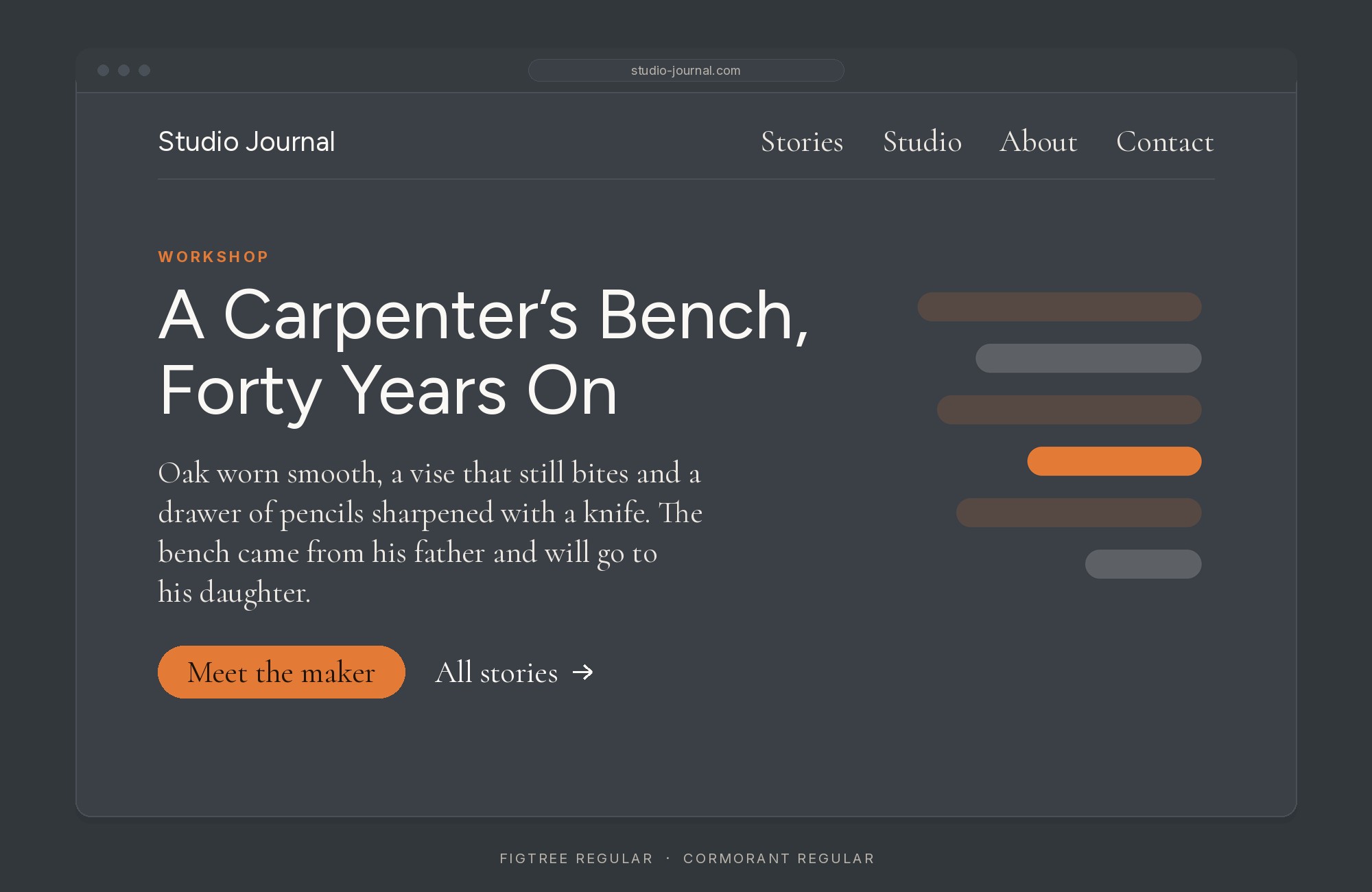
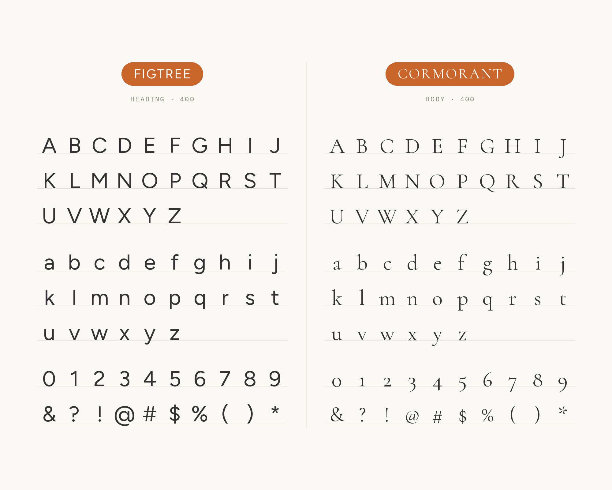
Cormorant is the second serif in the same Loyola University Maryland system. It has sharp, elegant details and very fine hairlines.
That is a lot of contrast next to Figtree’s even strokes.
Use Figtree for headings and labels, and give Cormorant generous sizes for features, quotes and long stories. Do not set Cormorant small, because its hairlines need room.
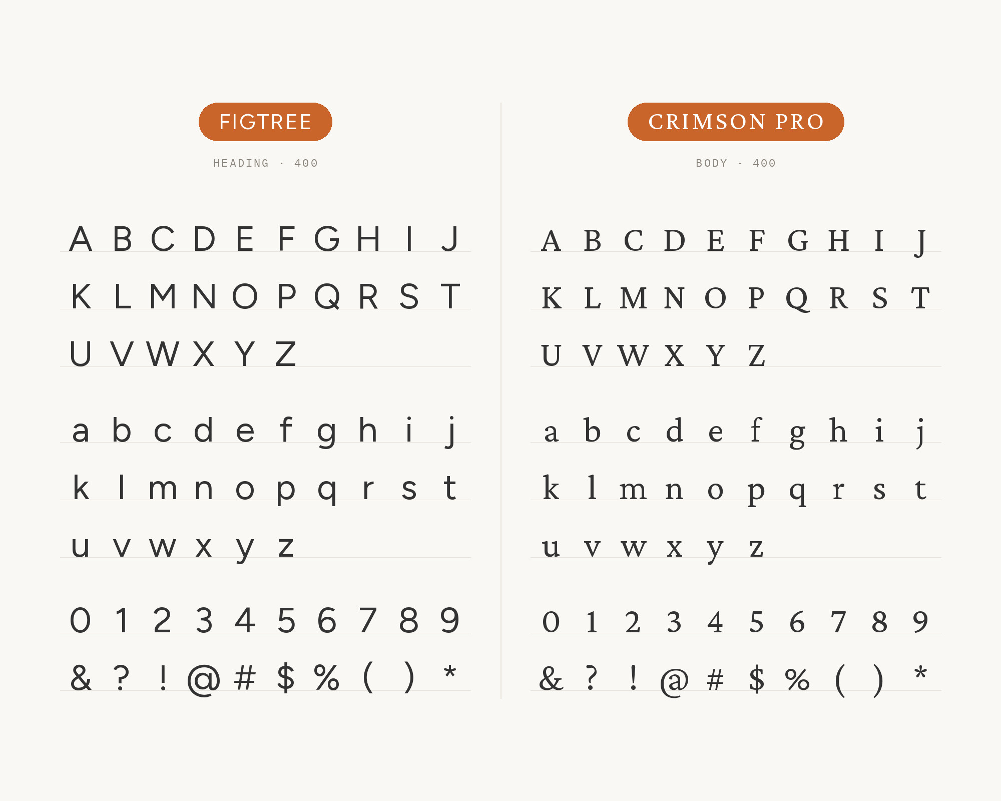
6. Crimson Pro
Santa Clara University pairs Avenir Next with Minion Pro in its brand.
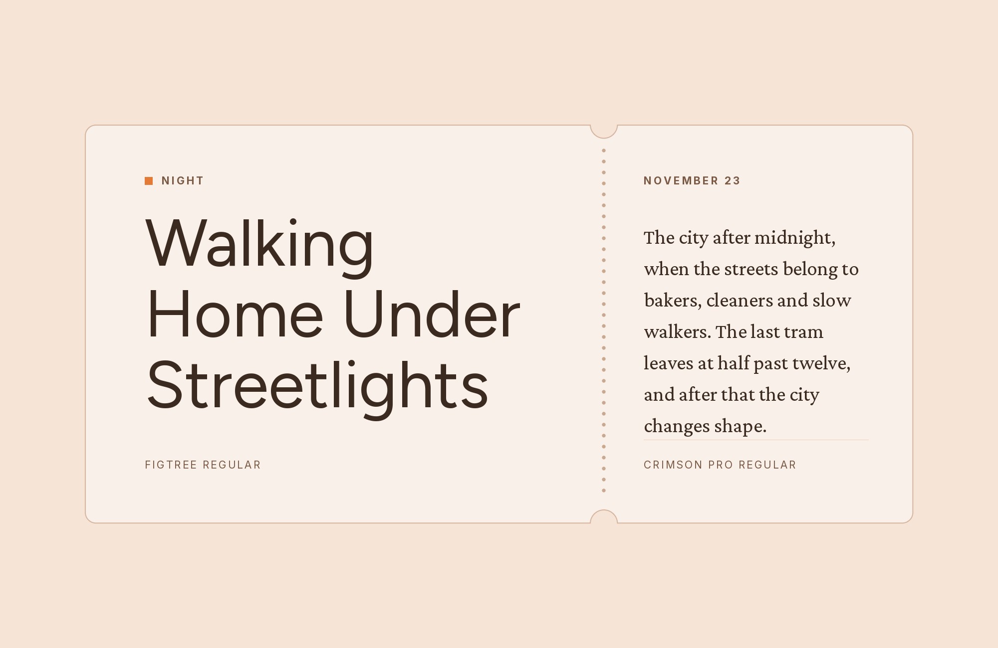
When those fonts are unavailable, it uses Figtree in place of Avenir Next and Crimson Pro in place of Minion Pro. So Figtree and Crimson Pro form the university’s free stand-in pair.
Crimson Pro is an old-style book serif with moderate contrast. It mirrors Minion’s role: Figtree for headlines and body, and the serif for pull quotes and elevated communications.
7. Adobe Garamond Pro
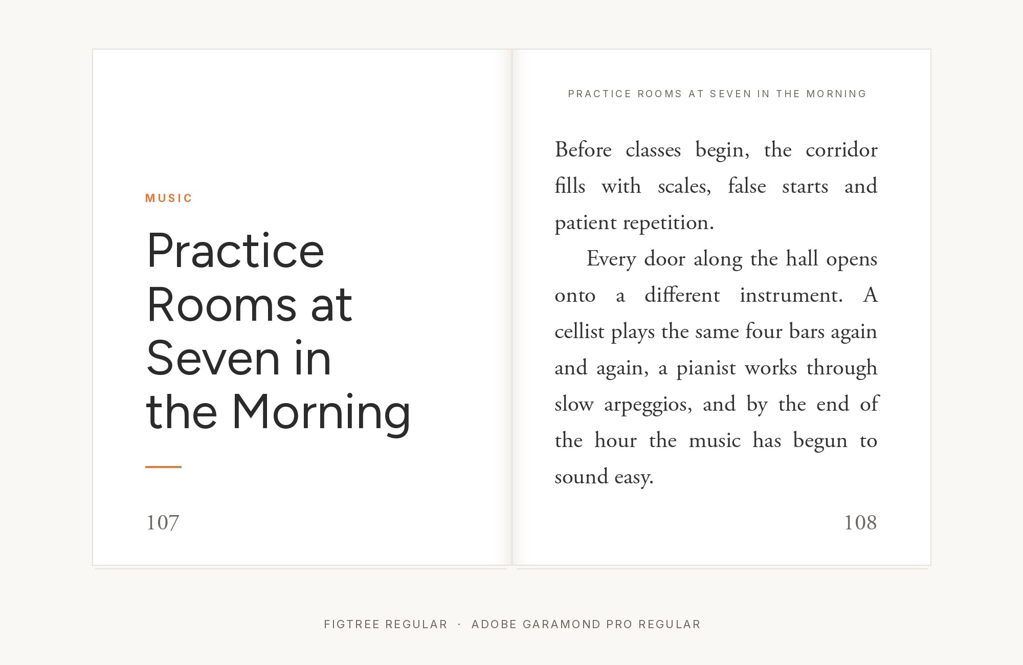
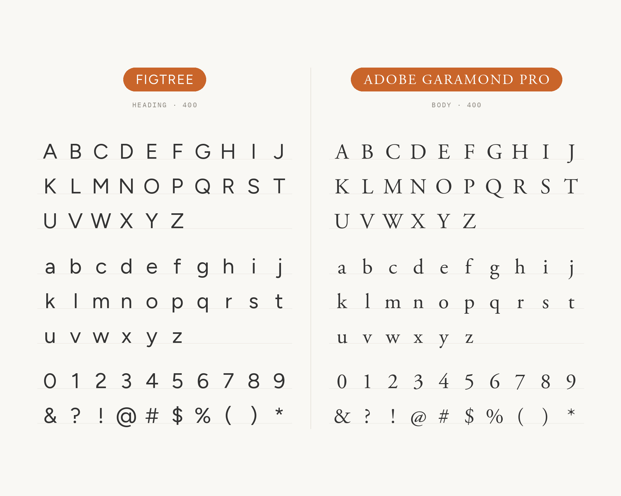
Champlain College names Figtree and Adobe Garamond Pro as the typefaces that play the biggest role in its brand look. Figtree is the primary typeface used to typeset most copy. Adobe Garamond Pro is the secondary typeface, reserved mostly for formal pieces.
Champlain also uses it to typeset quotes and callouts. This is the traditional half of a modern college identity. Figtree does the daily work, and Garamond marks the moments that should feel formal.
Try Semrush free. No credit card.
Start on the $0 plan. Paid plans from $117/mo billed annually.
Try for free8. Caveat
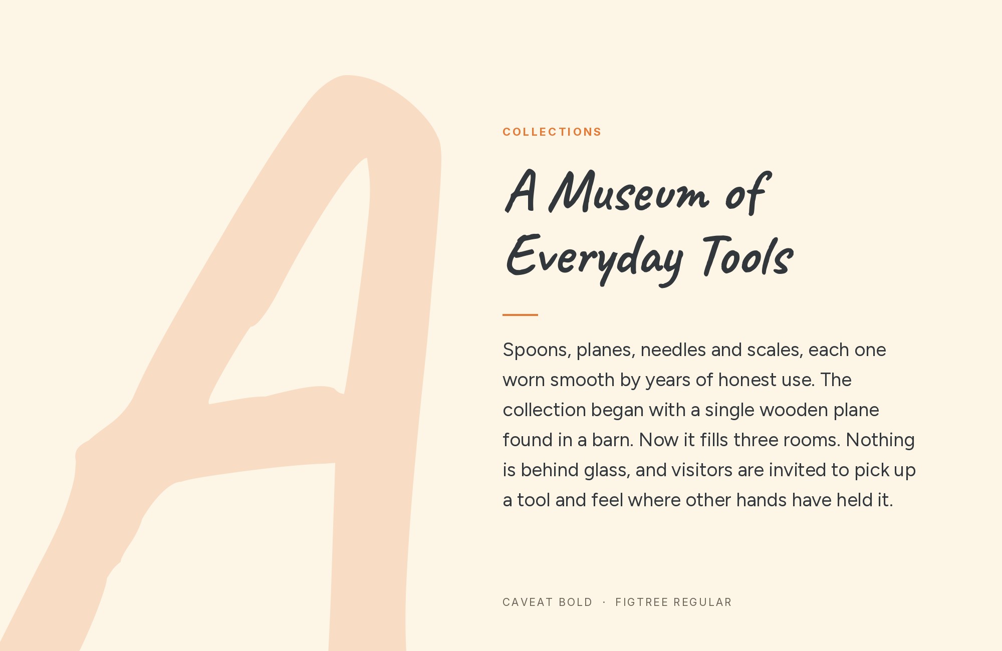
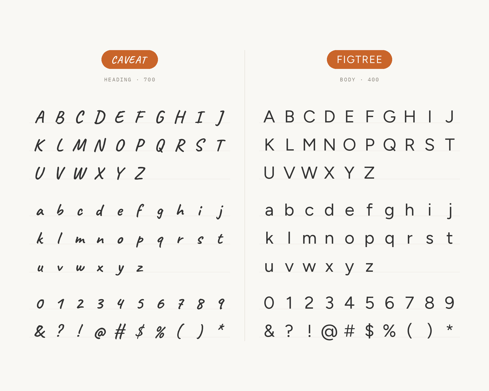
Champlain College also uses Caveat as a supplemental typeface for headlines and pull quotes. Caveat is the college’s official handwritten typeface, used to add a personal voice.
So in this pairing, Caveat takes the headline and Figtree takes the text. The contrast is total: a quick, handwritten script over a clean geometric sans.
Use Caveat for a short line, a quote or a note, and sparingly.
9. Oswald
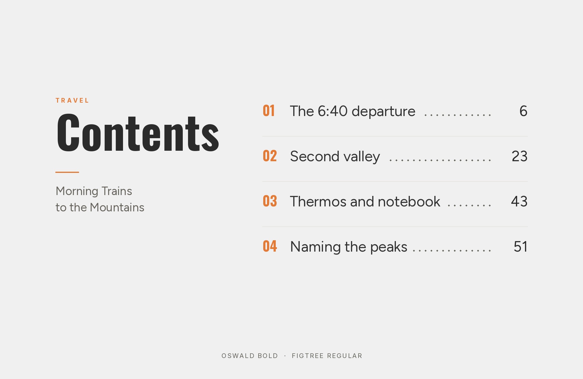
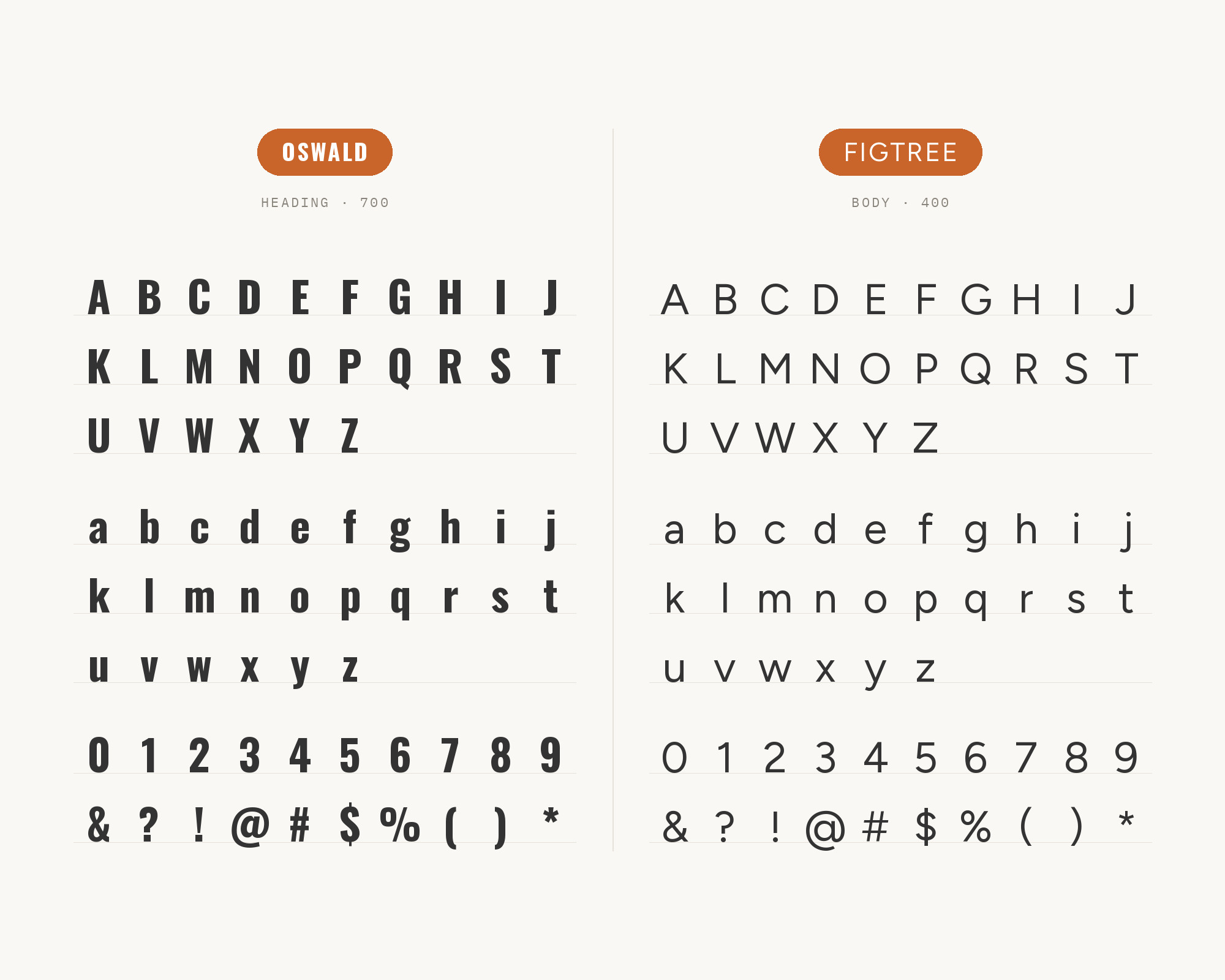
The EA brand guide uses Oswald for headers, always in all-caps. It uses Figtree for clean, modern body copy.
So Oswald takes the headings here. Oswald is a condensed gothic, so it packs a big headline into a narrow measure. Figtree’s wider, rounder text gives the eye a rest below it.
This is a strong editorial pairing for agencies, events and news-style layouts.
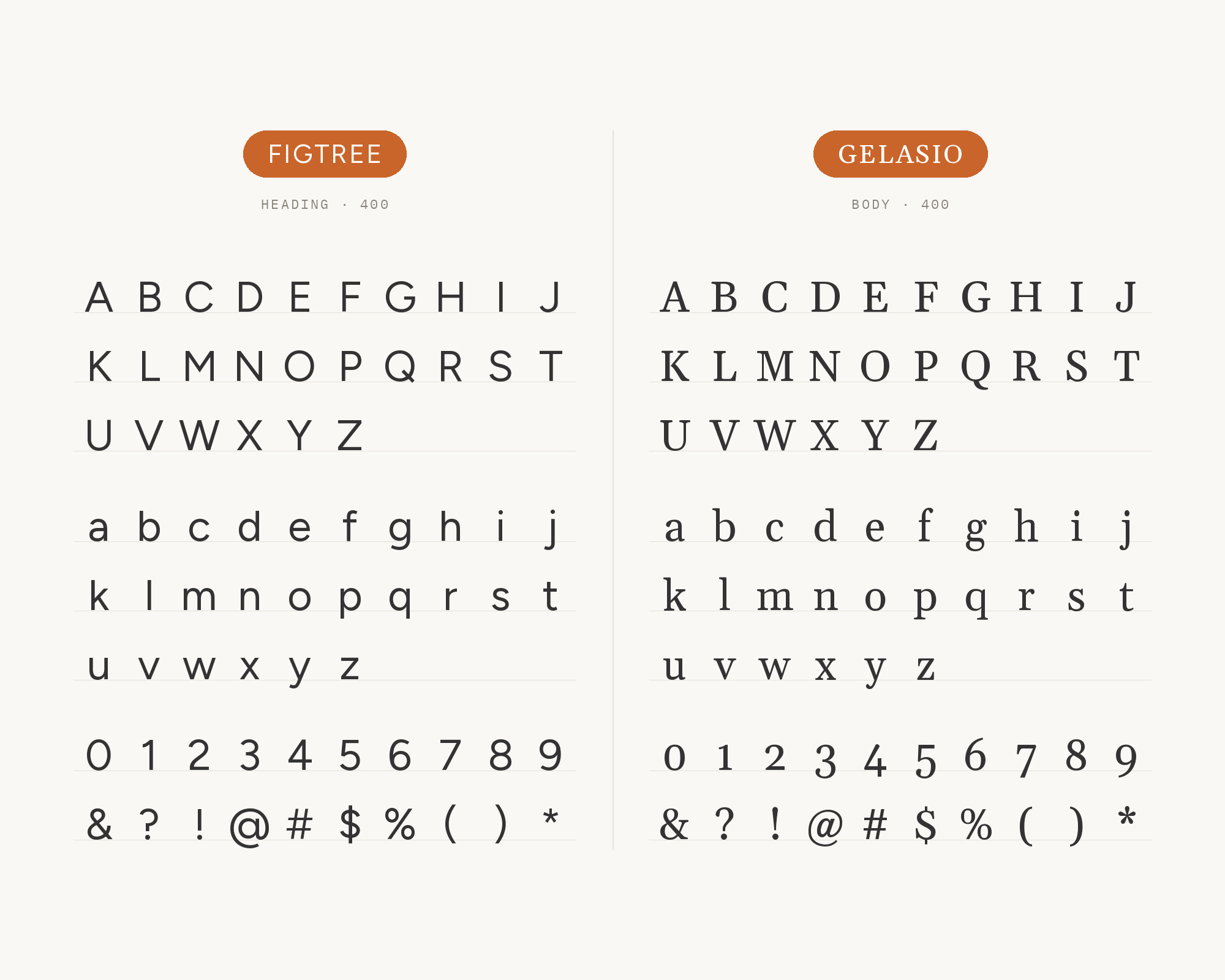
10. Gelasio
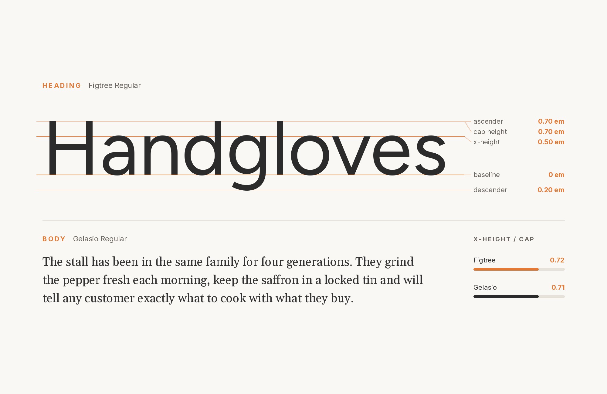
The same EA system uses Gelasio for serif moments of contrast, depth or refined expressive flair. Gelasio is a sturdy, traditional text serif.
It adds a third voice when Figtree and Oswald need a break. Use it for intros, quotes and short feature text under Figtree headings. It gives the system a serif accent without a fourth family.
11. Prociono
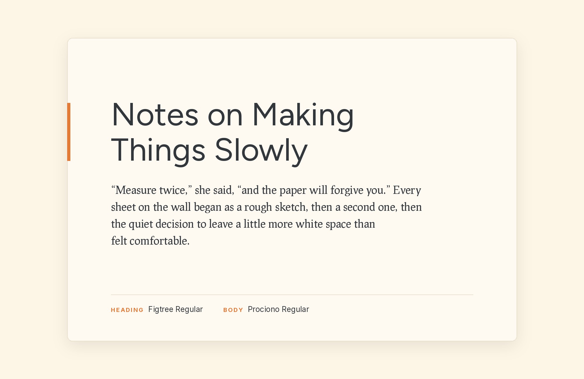
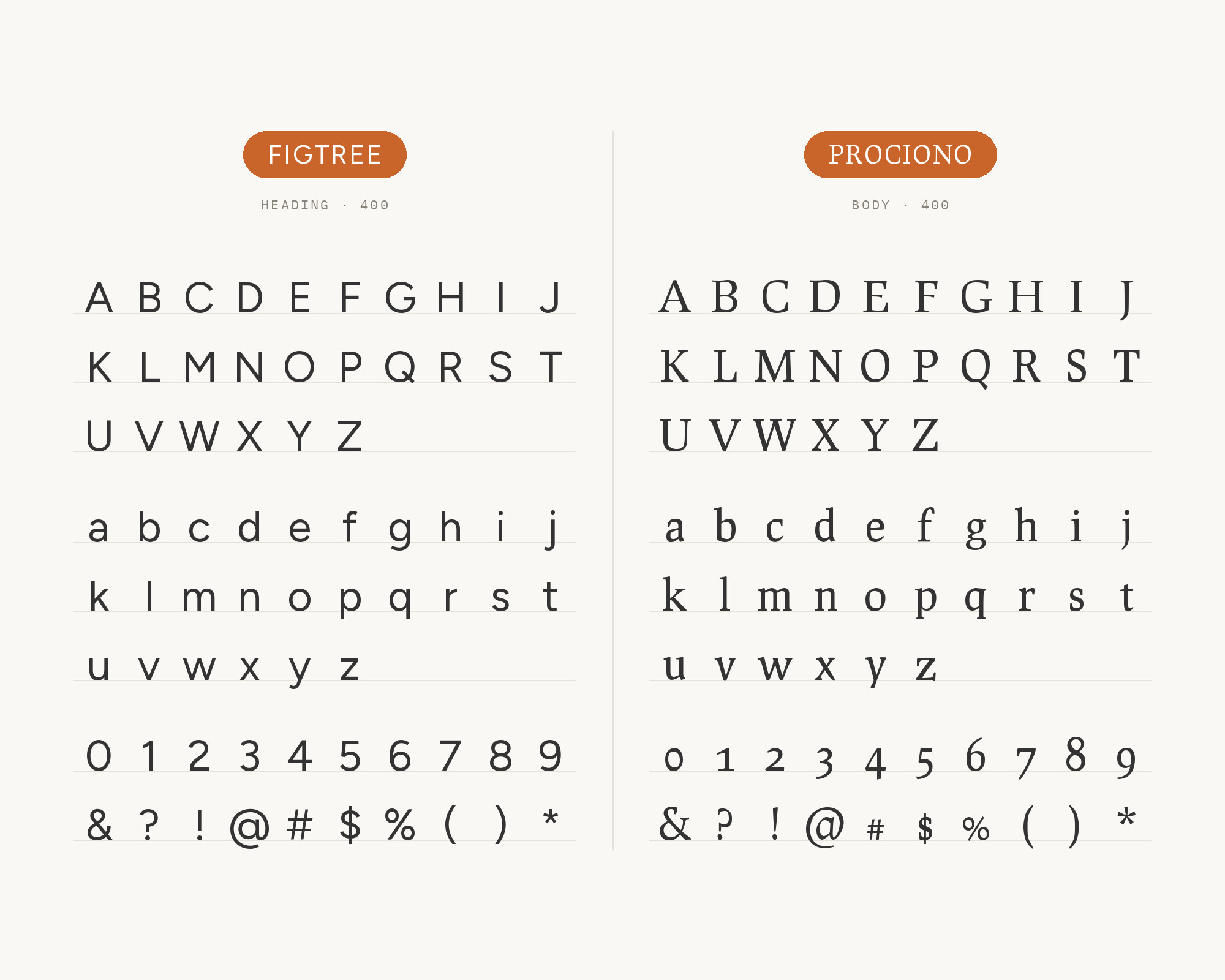
Typ.io records the clarodata.co website with Figtree and Prociono.
Prociono is an unusual, slab-flavored serif with a hand-drawn feel. It is a deliberate oddball next to Figtree.
Use Figtree for headings and interface text, and Prociono for a few lines of display or quote text. The contrast comes from texture, not size.
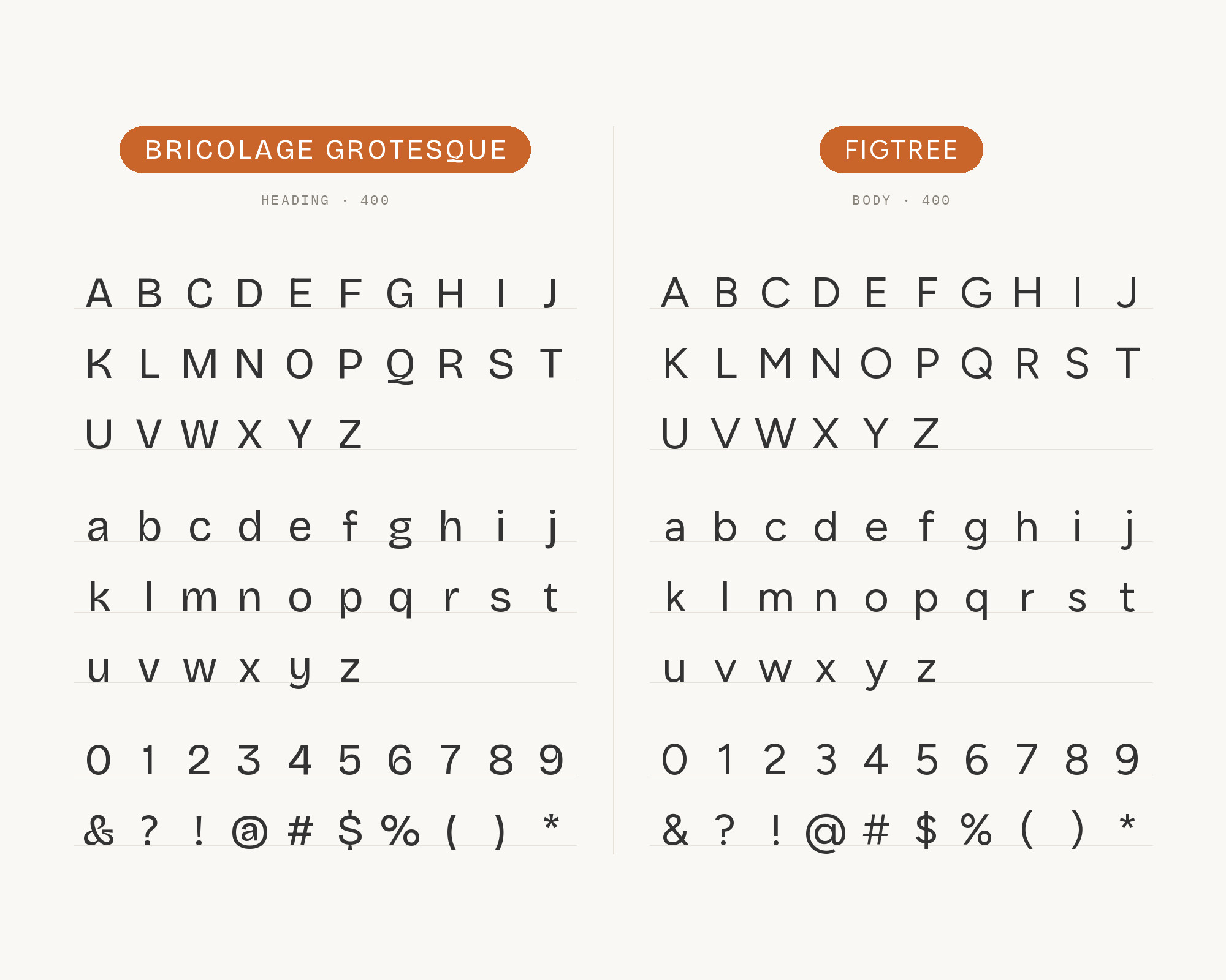
12. Bricolage Grotesque
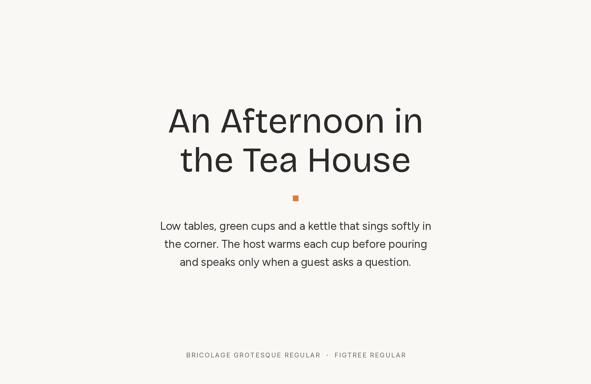
Pimp my Type says Figtree works best in body text and UI text. It suggests partners for more engaging headings, and Bricolage Grotesque is one of them. So in this pairing, Bricolage Grotesque takes the headings.
Bricolage has quirky ink traps and a lively width range. Figtree stays calm underneath, so the page gets personality without noise.
13. Intel One Mono
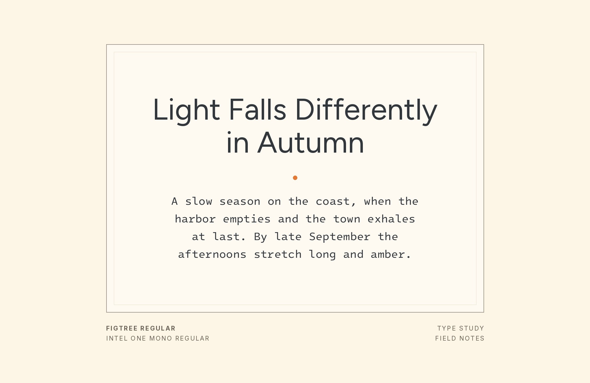
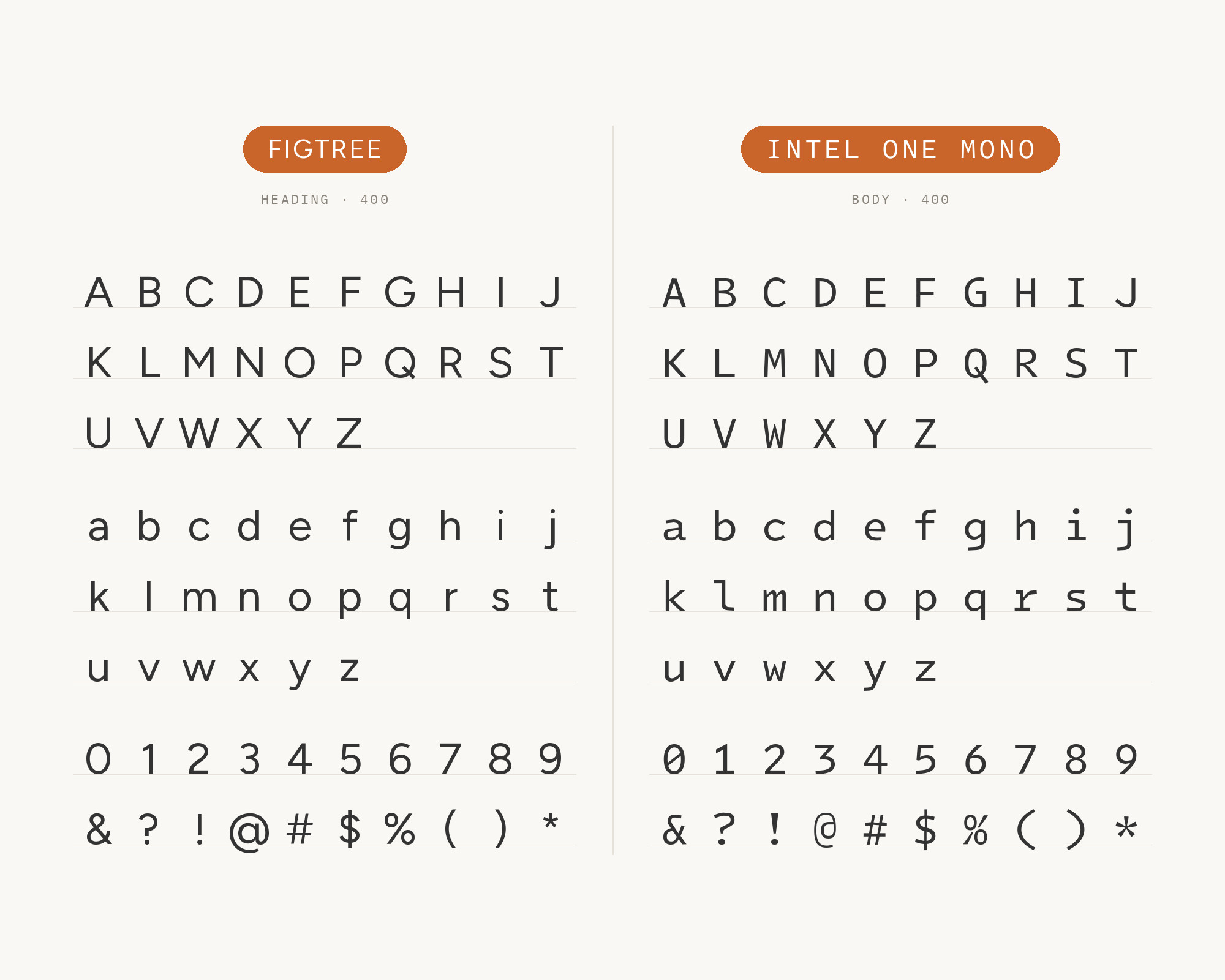
The same Pimp my Type list includes Intel One Mono for copy and UI text. A monospace marks code, data and inputs as different from prose.
Figtree keeps the headings and the reading text. Intel One Mono’s open, readable shapes stay friendly next to Figtree.
Use it for developer docs, dashboards and product changelogs.
14. Poppins
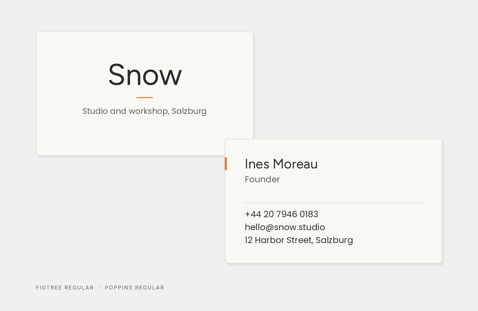
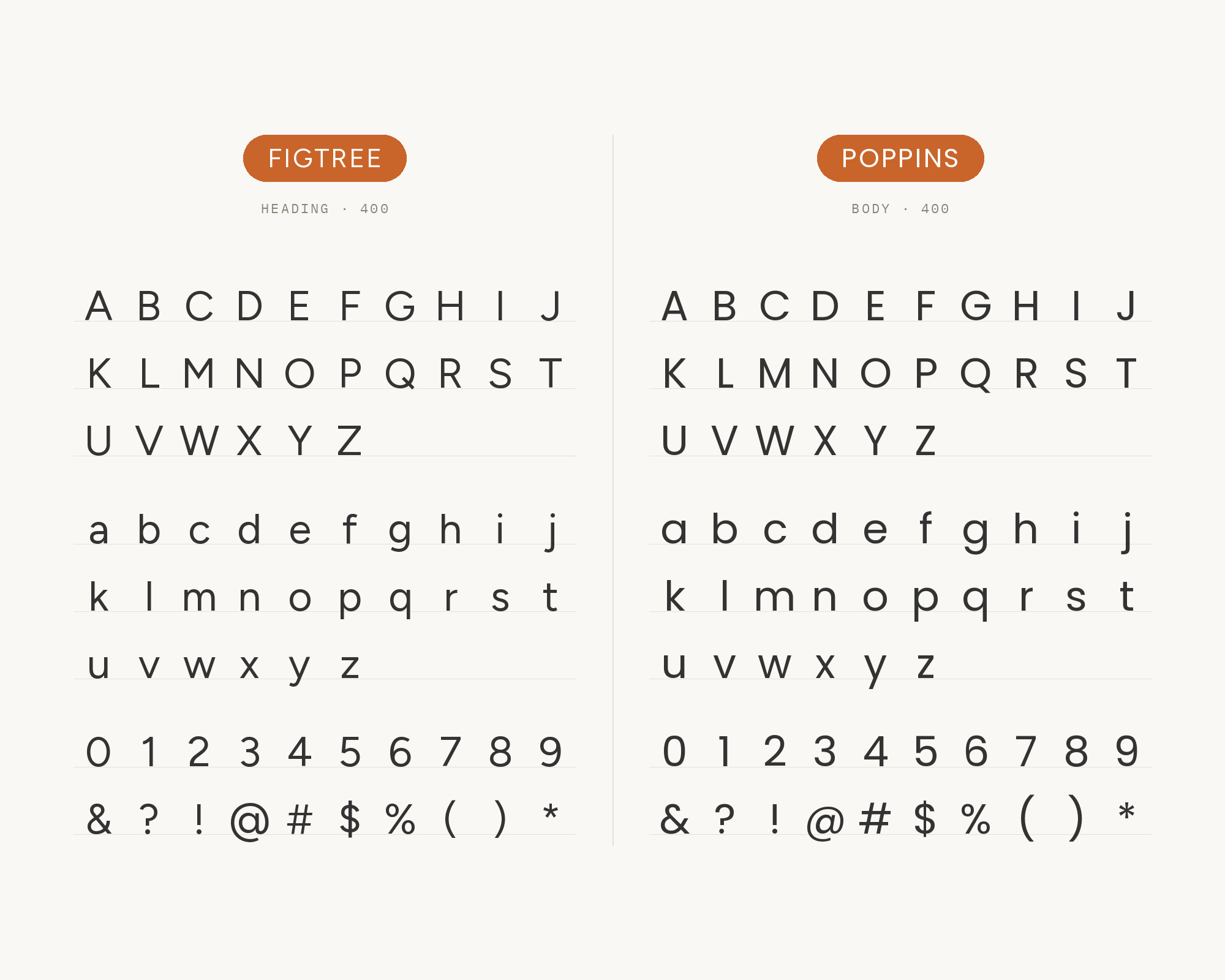
A1 Gallery records the WeNatal website with DM Sans, Figtree and Poppins.
Poppins is a geometric sans with almost perfectly circular bowls. Next to it, Figtree looks a little softer and more relaxed. Two geometric sans faces need a clear split, so build it with weight and size.
Use a heavy Figtree for headings and Poppins for short labels, or the other way around.
15. Helvetica Now
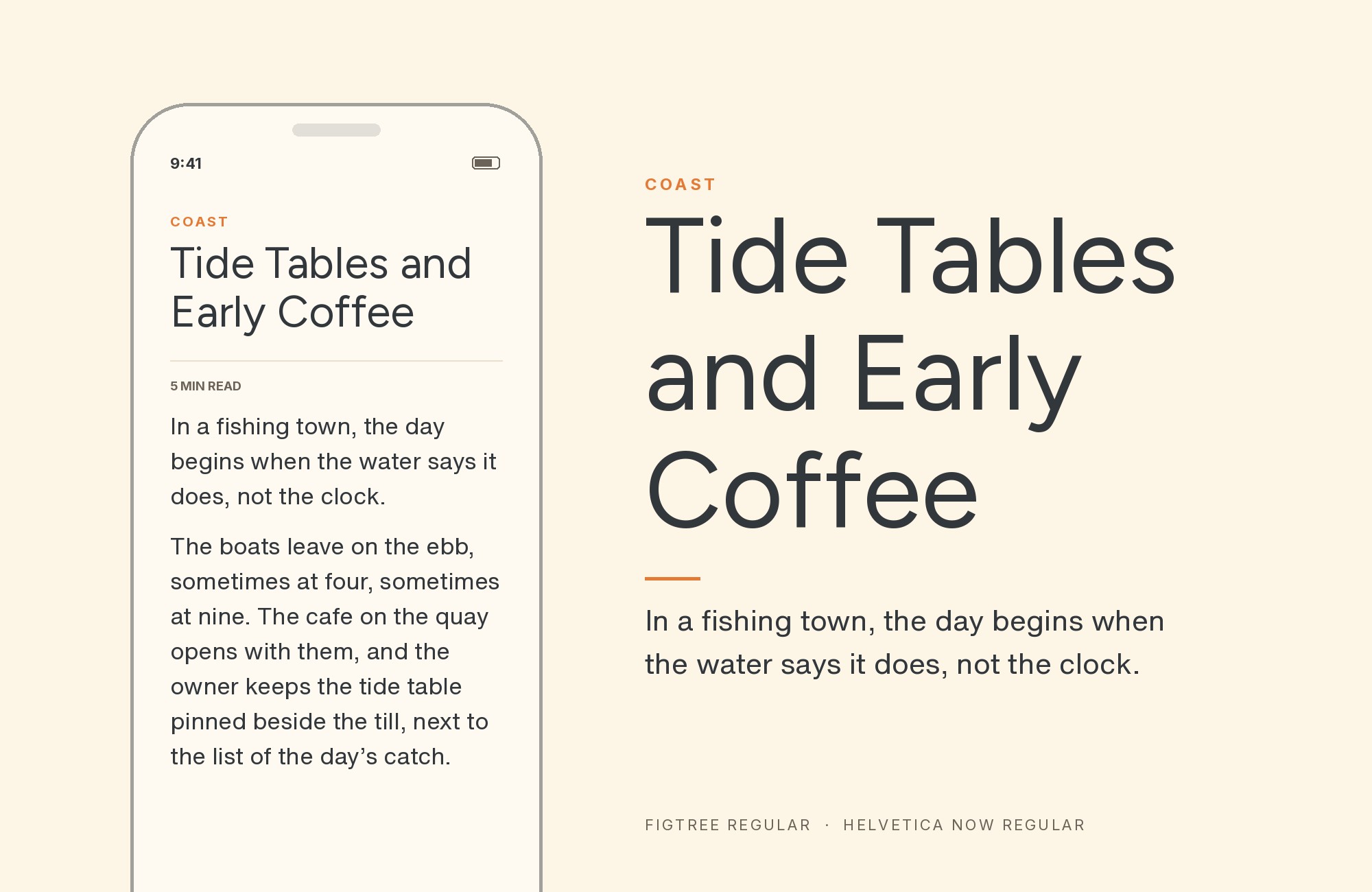
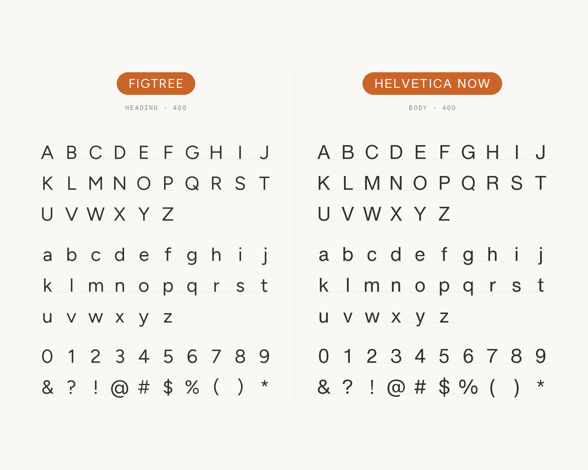
A1 Gallery records the Kinhive website with Figtree, Helvetica Now and Maxeville. In April 2019 Monotype released Helvetica Now, an update of Neue Helvetica.
Its neutral grotesque forms are the opposite of Figtree’s friendly curves. Use Figtree for warm headlines, and Helvetica Now for tight, factual text and labels. The pair works well for startups that want to feel friendly and serious at once.
Conclusion
Figtree is a team player. It asks very little of a partner, so the real question is what job you want that partner to do.
For reading, take a serif: Georgia, Noto Serif, EB Garamond or Crimson Pro. For a louder top line, let Oswald, Bricolage Grotesque or Caveat take the headings. For products, Open Sans, Intel One Mono and Helvetica Now keep the interface tidy.
Many universities and brands already run Figtree this way. Test your pair with real copy at real sizes, and give each font one clear role.
Sources
- KTH Intranet, Fonts
- Marquette University, Typography
- George Mason University, Fonts and Typography
- Loyola University Maryland, Typography
- Santa Clara University, Typography
- Champlain College, Institutional Typography
- EA Brand Guide, Typography
- Typ.io (Figtree)
- Pimp my Type (Figtree)
- A1 Gallery (Wispr Flow, WeNatal, Kinhive, Buffer, SLR Consulting)
- Fonts In Use (Figtree)
- Erik Kennedy, Figtree
- Adobe Fonts (Figtree)
