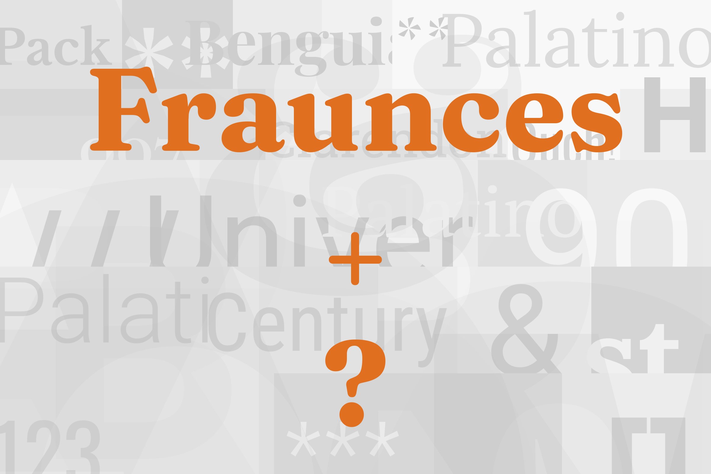
Fraunces pairs great with Poppins, Overpass and Aileron. All 13 pairings are shown below in real rendered specimens, with the reason each one works.

What fonts go with Fraunces, the soft serif everyone seems to love right now? Start with the font itself, because Fraunces is not a quiet serif.
It is soft and full of personality, with a wonky streak. That personality decides almost every pairing below.
Fraunces was designed by Phaedra Charles and Flavia Zimbardi, partners at Undercase Type. In 2018, Google Fonts commissioned them to make a new display typeface that would show the promise of variable fonts with a sense of humor.
Google Fonts added Fraunces to its library on 29 October 2020. Its models are early 20th century typefaces such as Windsor, Souvenir, and the Cooper Series. It is a variable font with four axes: Weight, Optical Size, Softness, and Wonky.
The Softness axis controls the “inkiness” of the letters. The Wonky axis brings in the leaning h, n, and m of the Roman. Typewolf lists nine weights with matching italics, each in three optical sizes.
So the partner has one job. It has to stay calm while Fraunces does the talking. Almost every documented pairing below gives Fraunces the headings and gives the reading text to a plain, even sans serif.
A few add a monospace for code and labels. Here are the fonts that go with Fraunces, strongest evidence first.
1. Poppins
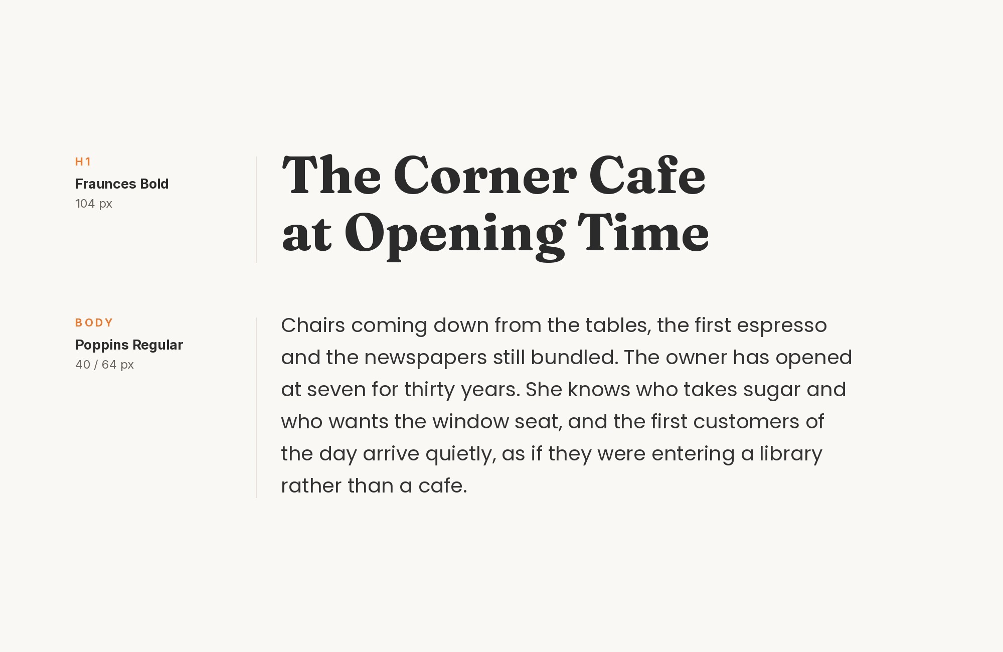
Poppins is the best-documented Fraunces partner on this list. Fonts In Use records the website of gelato consultant Maria Coassin, where the text is set in Fraunces and Poppins.
The same page credits Poppins to Indian Type Foundry. Leadpages recommends the same pair, with a medium weight of Fraunces for headlines and Poppins for paragraphs.
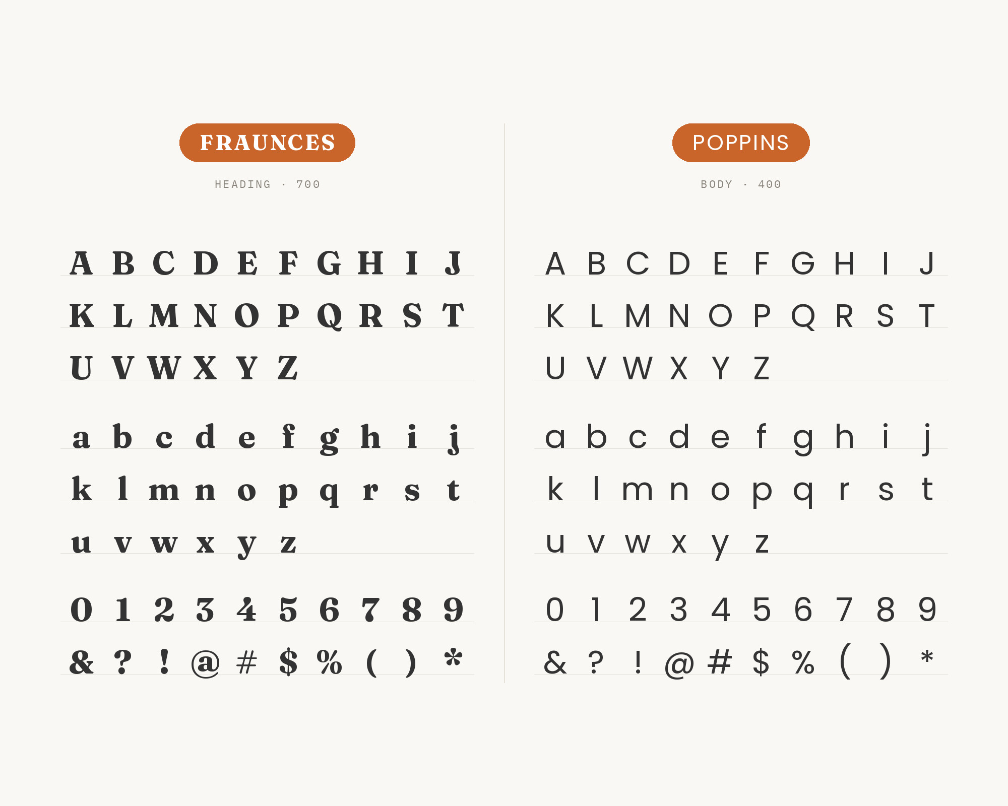
The logic is geometry against softness. Poppins has near-circular bowls and flat, even strokes. Fraunces has swelling curves and soft, rounded joins.
Put them together and each one makes the other look more like itself. Set Fraunces large and Poppins in a light or regular weight, and the hierarchy takes care of itself.
Unlimited fonts from $16.50/mo.
29 million fonts, templates and stock assets. One subscription, unlimited downloads.
See the plan2. Overpass
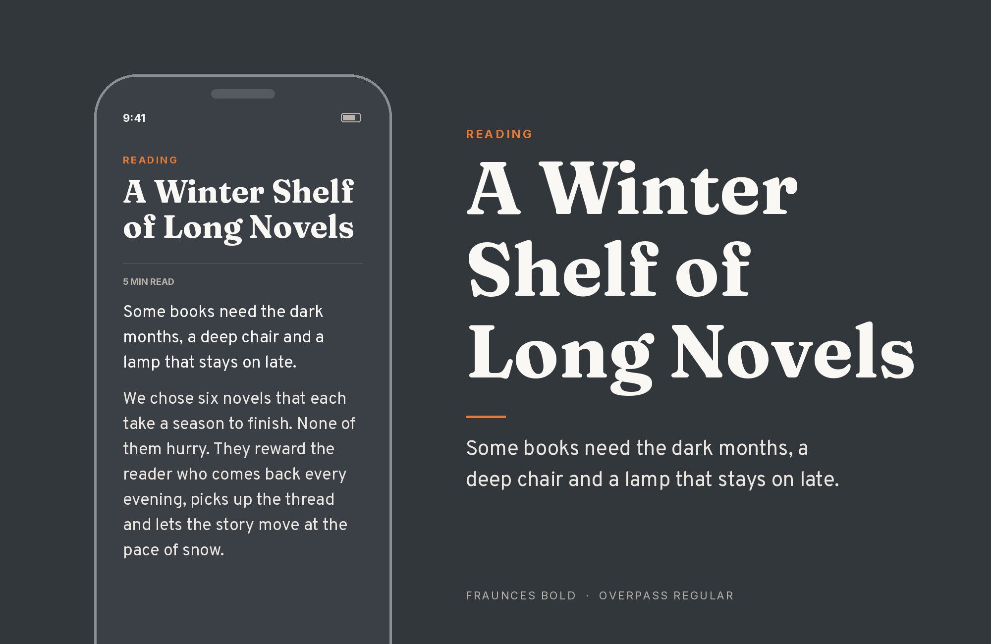
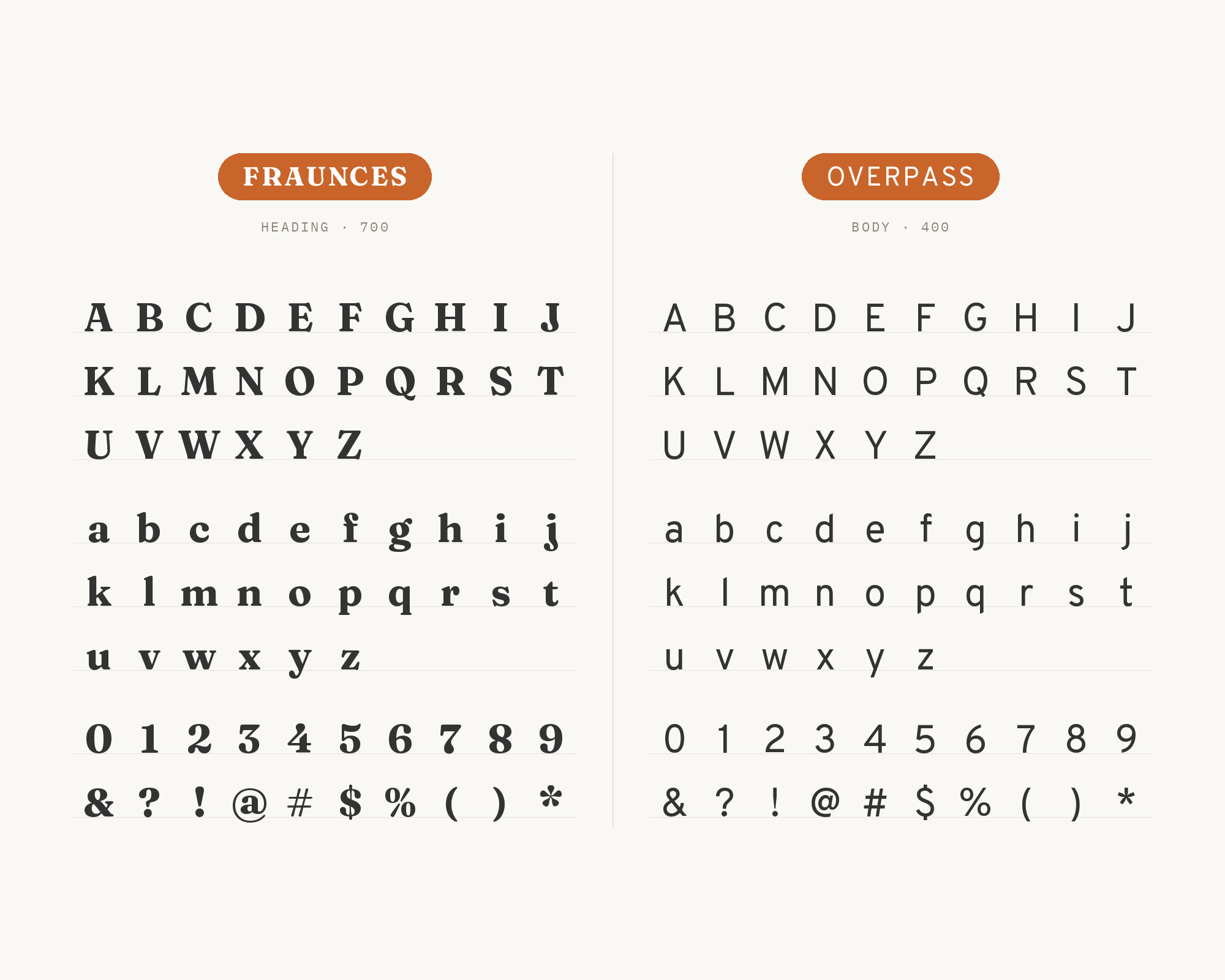
Overpass is the most clearly argued pairing here, because the designers explained it themselves. For the BiteSize Learning rebrand, the studio chose Fraunces for display and headlines and Overpass for body copy.
They describe Overpass as based on the US Highways sign alphabet. They picked it so slides stay readable in PowerPoint even when video quality is low.
That is the whole case for this pair in one line: Fraunces brings the personality, Overpass brings the legibility. Intentionally Designed lists Fraunces with Overpass Light as a brand pairing.
Overpass has the straight, open shapes of road signs. Next to it, the soft curves of Fraunces read as warm rather than fussy. Keep Overpass in Regular or Light for paragraphs, and save the heavy Fraunces weights for titles.
3. Aileron
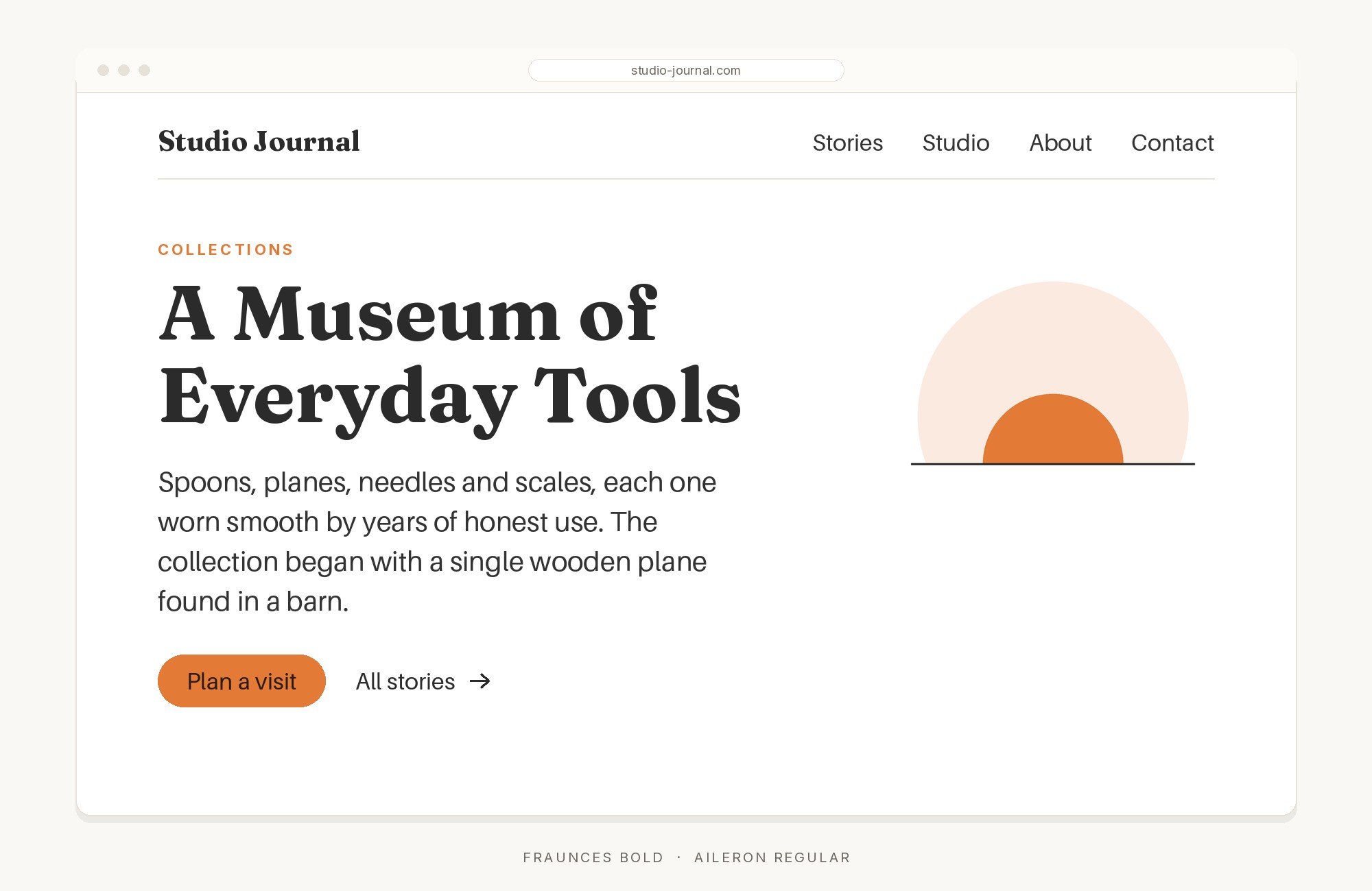
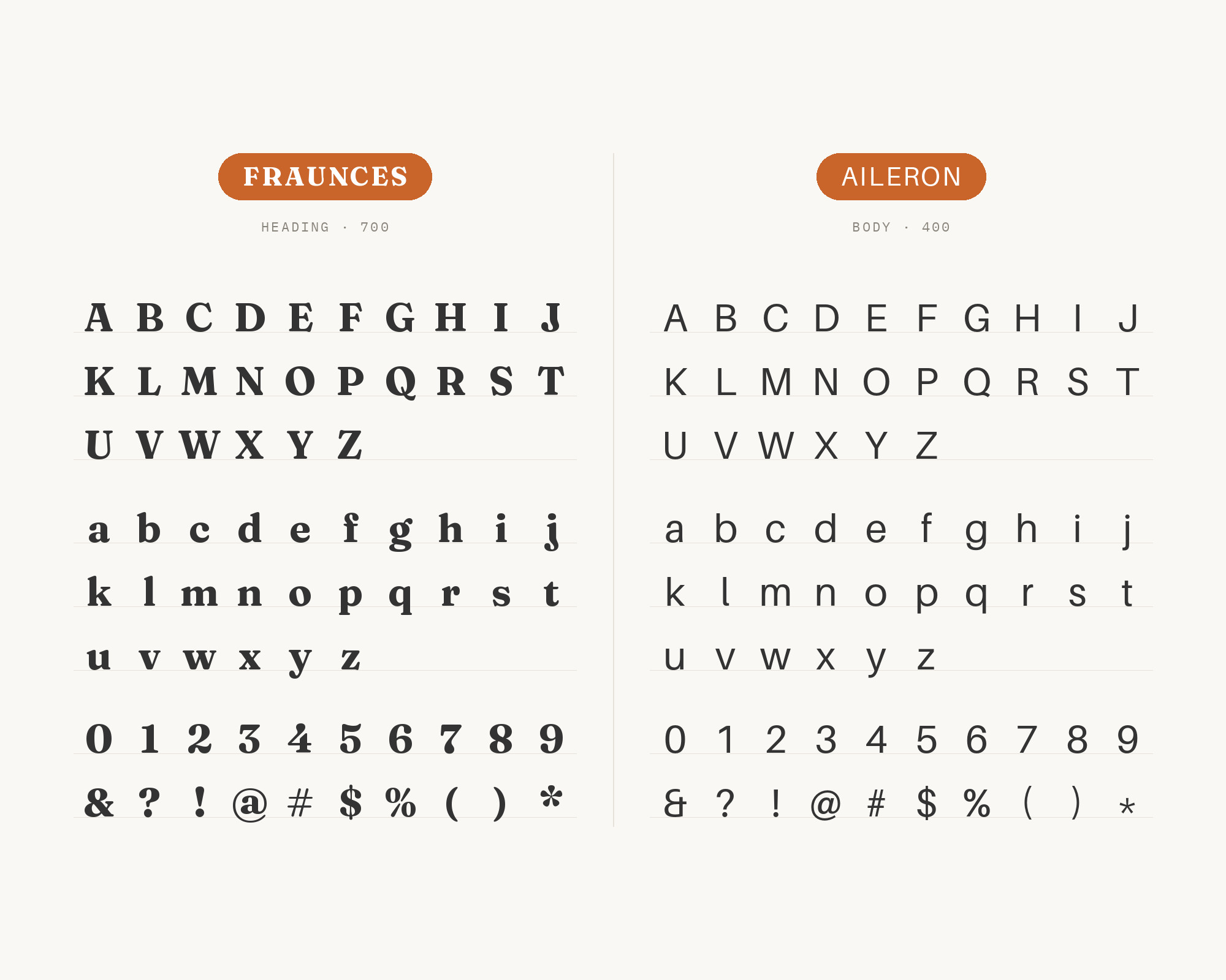
Aileron is a neutral grotesque, and that neutrality is the point. Fonts In Use documents the book Inteligência Financeira by Nox, a Brazilian educational publisher. In it, the running text was set in Aileron, and Fraunces was used for titles and subtitles.
There is a nice fit here, because Flavia Zimbardi is a native of Rio de Janeiro. She has said that Fraunces has been used like crazy in Brazil. Aileron has no quirks to compete with.
Its even strokes and plain shapes let every lean and swell in a Fraunces title stand out. Use it when the text is long and the reader must not get tired. This is a textbook headline and body split.
Junior work is now a prompt. The biggest profit center in your studio is vanishing.
How to fix this?
Find Out How4. Inter
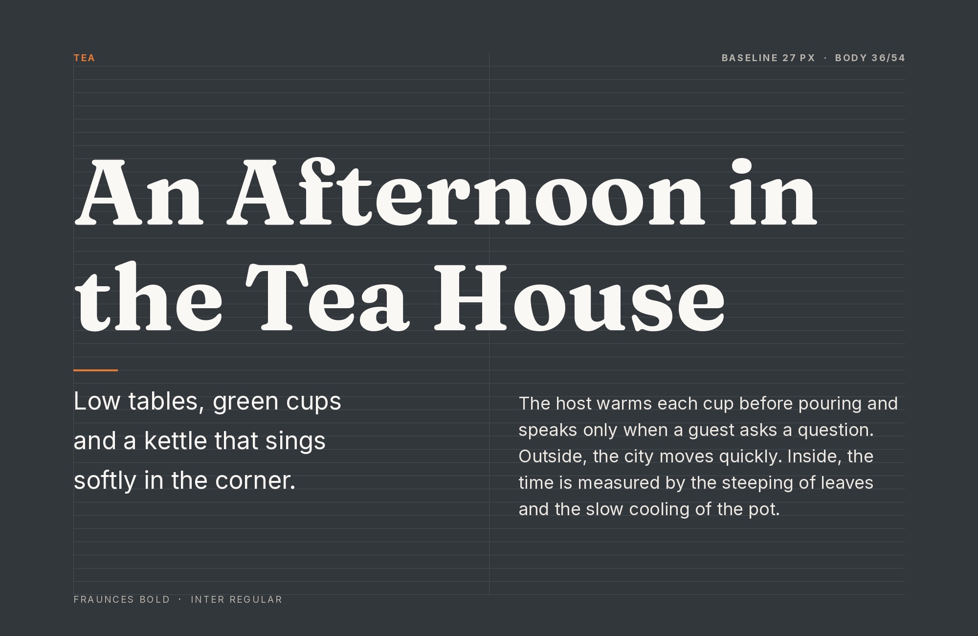
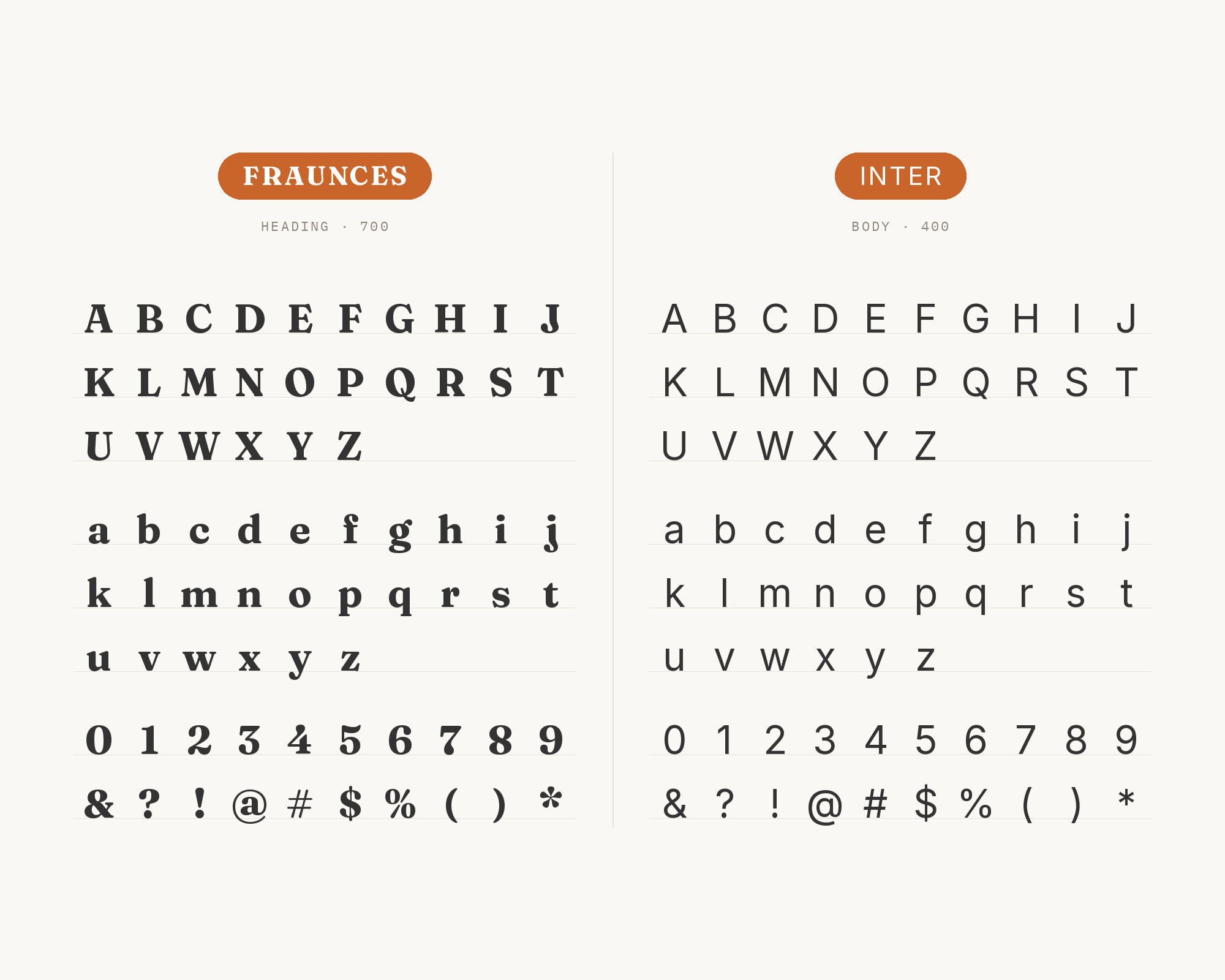
Inter is the screen-first partner. MaxiBestOf, a curated website gallery, lists Fraunces and Inter as the fonts in use on the Chester How site. It also lists Inter next to Fraunces on the Outseta site.
The gallery credits Inter to Rasmus Andersson. Inter has a tall x-height and very open shapes, so it stays clear at small sizes in an interface. Fraunces has the warmth Inter does not try to have.
The result is a product page with a friendly voice and a calm interface underneath. Use Fraunces for the hero line and section titles, and let Inter carry buttons, menus, and paragraphs.
5. DM Mono
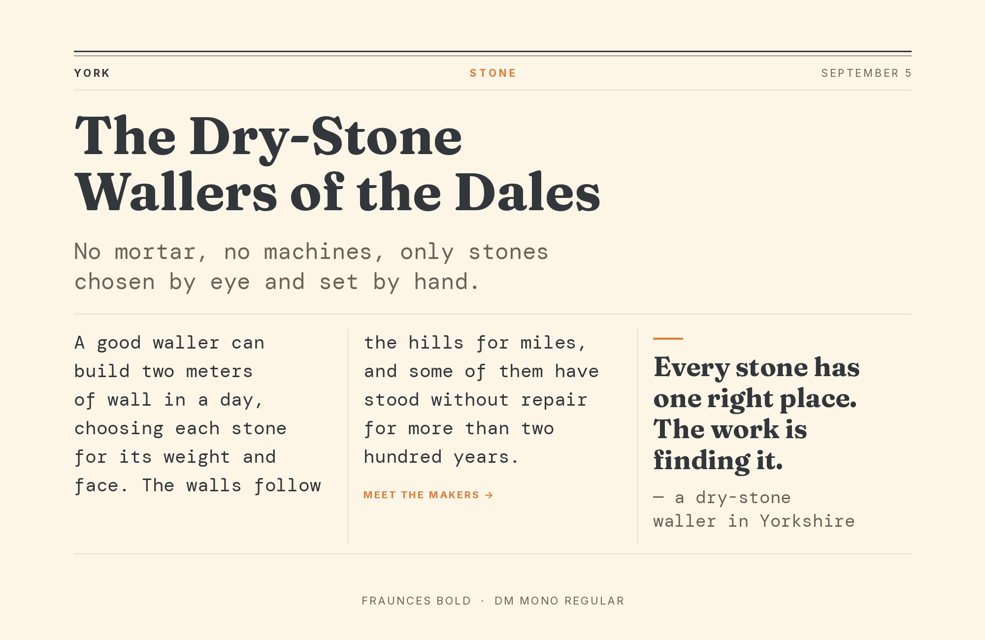
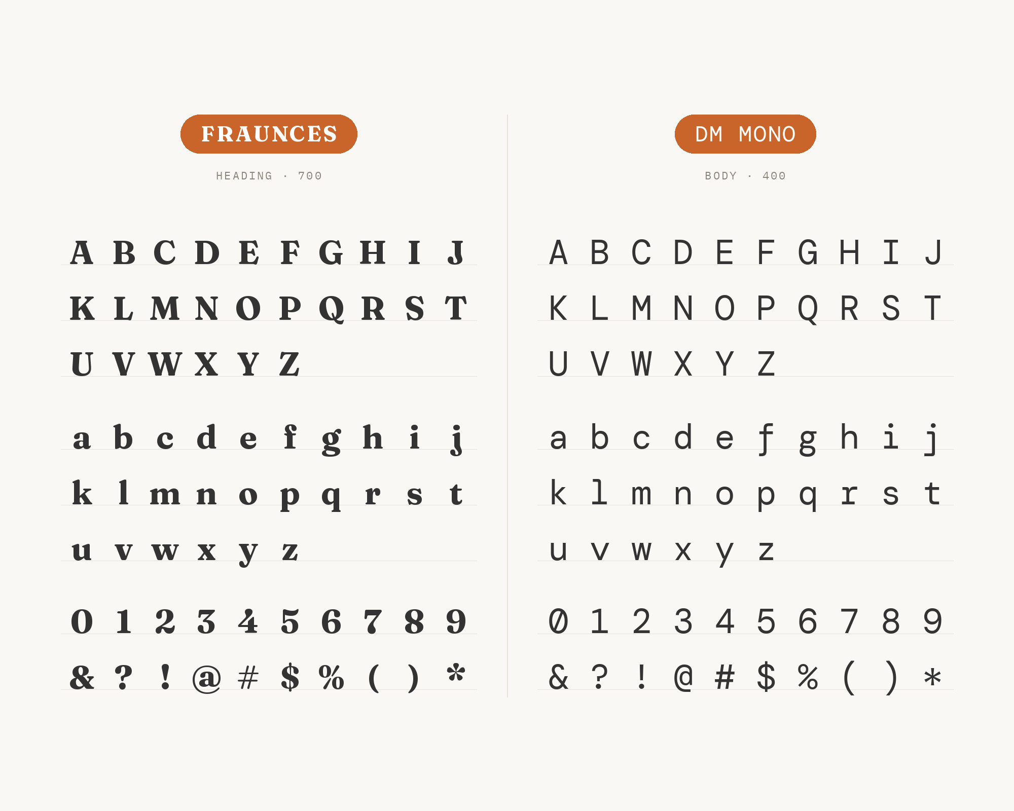
DM Mono is the monospace partner with the strongest curation behind it. Typewolf featured the Flask & Field website as its Site of the Day on March 3, 2023, with Fraunces and DM Mono.
MaxiBestOf lists Fraunces and DM Mono for the Flask & Field site as well. A monospace gives each letter the same width.
That fixed rhythm feels technical, almost like a label or a lab note.
Fraunces adds the human, hand-drawn side. Use DM Mono for small labels, prices, dates, and captions, and keep Fraunces for the big lines.
Do not set long paragraphs in the monospace, because its even spacing gets tiring.
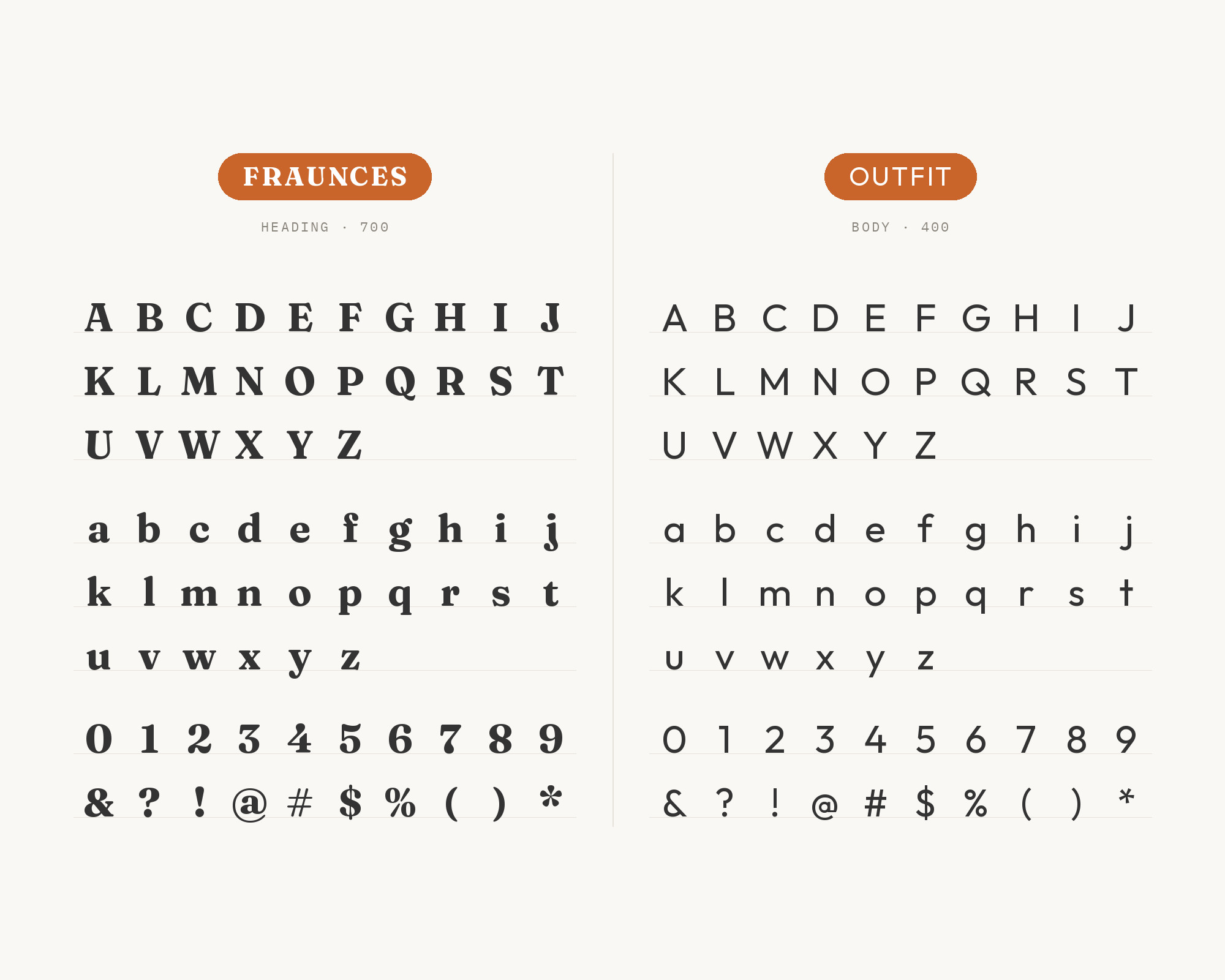
6. Outfit
Outfit is a recommendation from a typography consultant, not a project. Oliver Schöndorfer, a typography consultant, wrote about Fraunces on his site Pimp my Type.
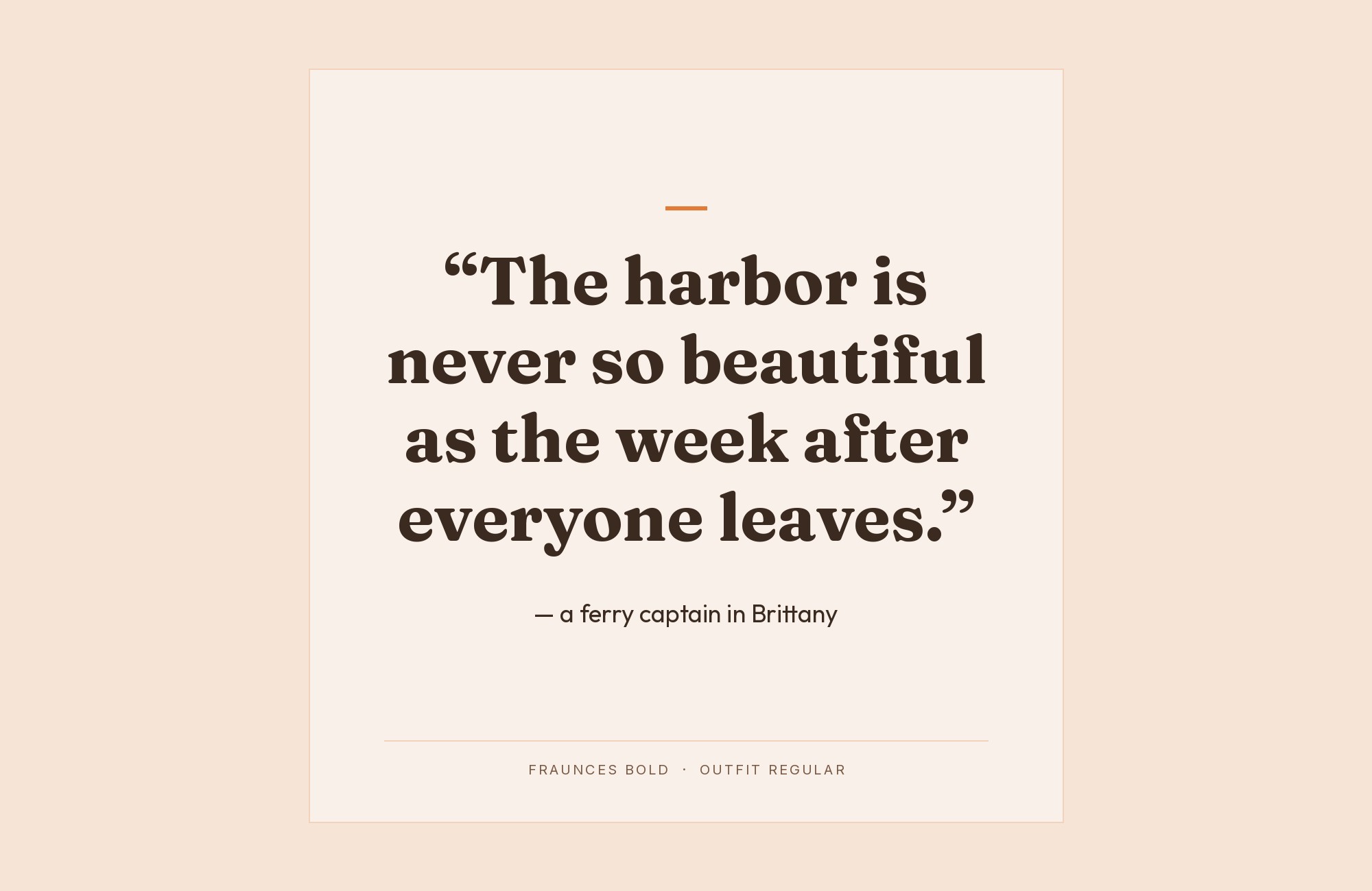
He suggests that you emphasize Fraunces’ softness with geometric Outfit. The idea is to lean in to the softness instead of fighting it.
Outfit is a clean geometric sans with round letters. Its circles echo the soft curves of Fraunces, while its plain strokes keep the page tidy.
Use Fraunces for headings and Outfit for body copy and interface text.
If the page starts to feel too sweet, choose the sharper, less soft Fraunces styles.
Paid prompt-to-site tools are going to lock you in.
How can your studio escape this?
Find Out How7. Nunito
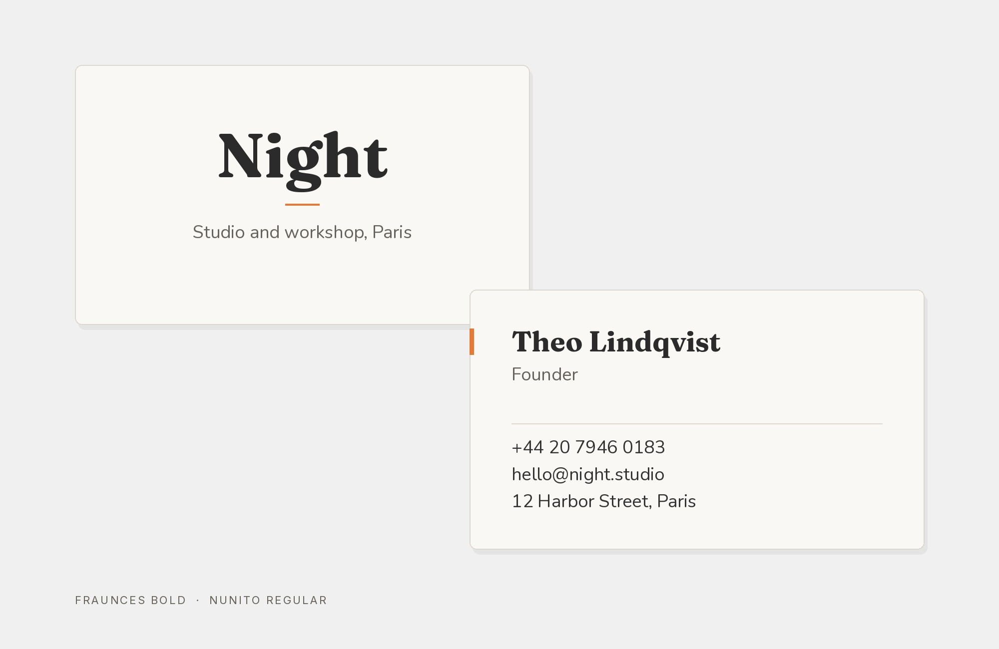
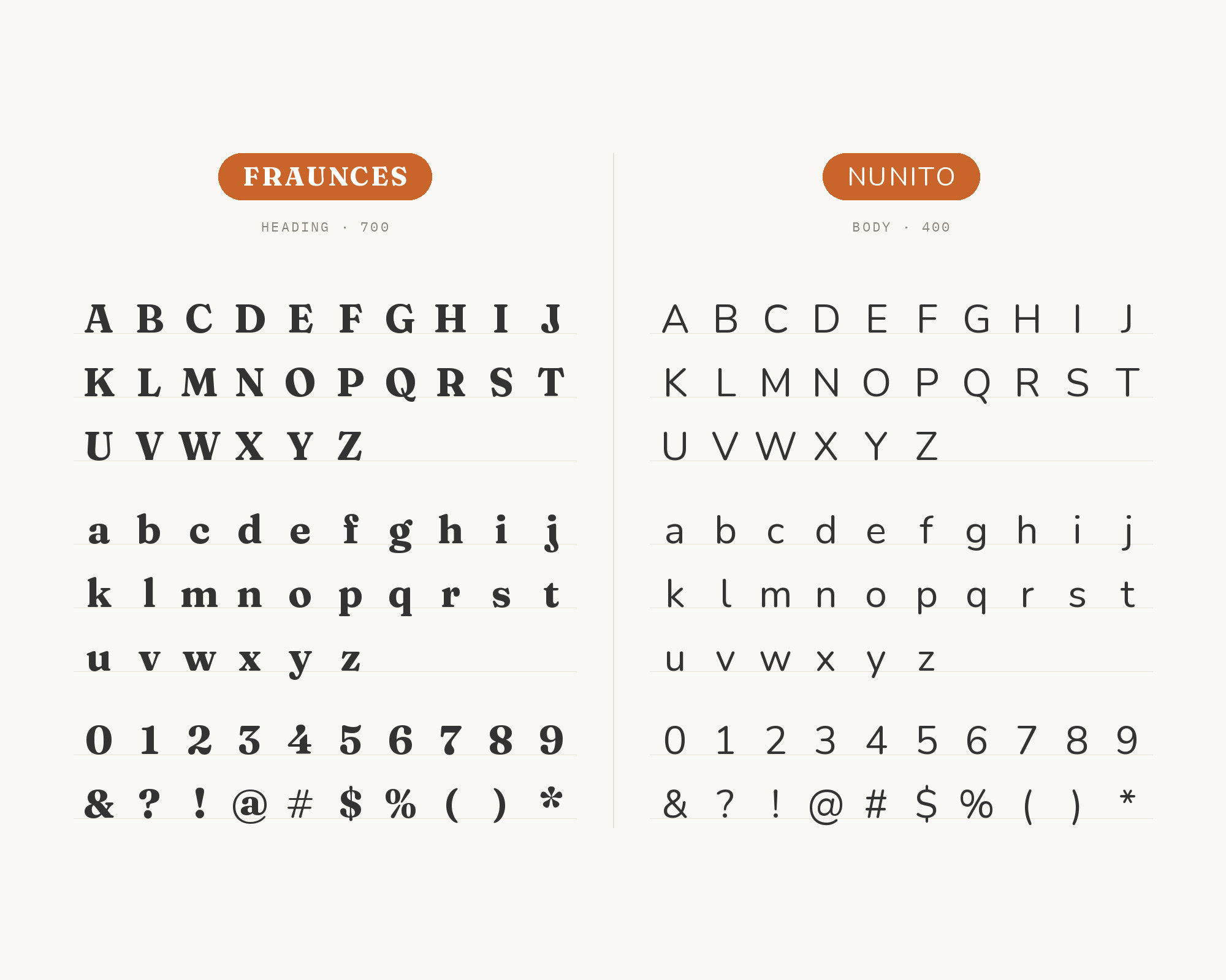
Nunito is the softest partner on the list. Fonts In Use lists G2 Ciao, Nunito, and Fraunces as the typefaces of the book Domande a distanza.
It was an academic project developed at ISIA Urbino, in the MA in Communication and Design for Publishing. Nunito has rounded terminals, so its strokes end in soft caps.
That matches the soft settings of Fraunces closely.
The pairing is warm and friendly, good for education, children’s books, and cultural projects. Because both fonts are soft, make the contrast with size and weight.
Use a heavy Fraunces for titles and a regular Nunito for the text.
8. Epilogue
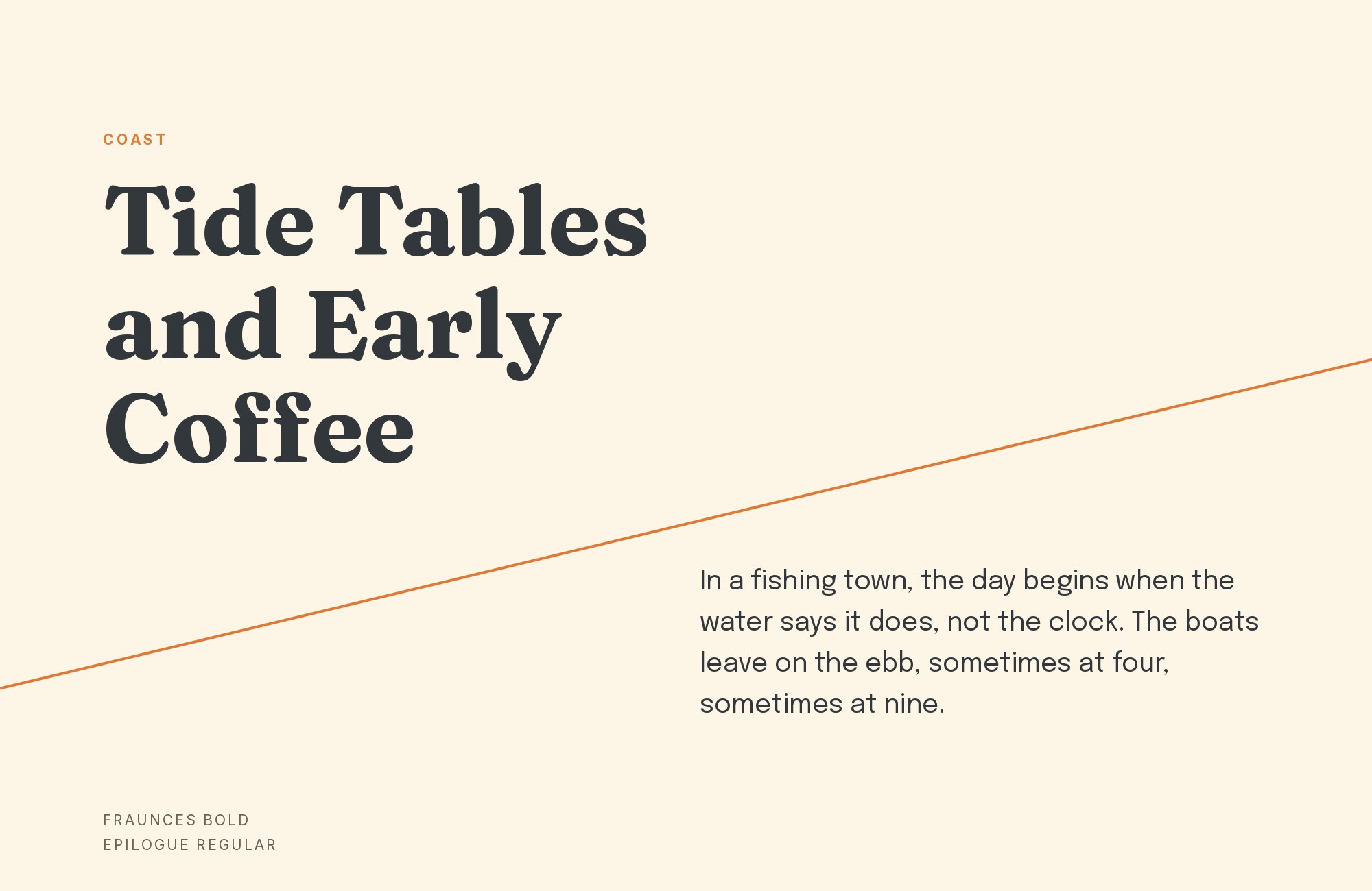
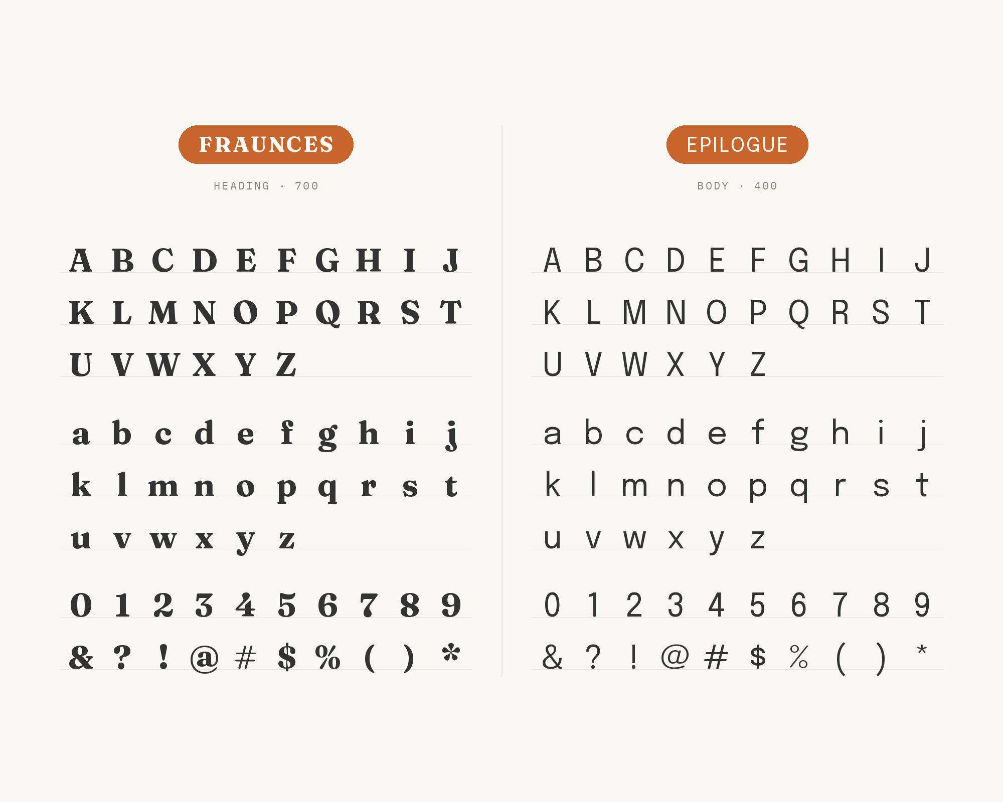
Epilogue is a sturdy grotesque with a contemporary edge. MaxiBestOf lists Epilogue and Fraunces as the fonts in use on the Zerocircle site. The gallery credits Epilogue to Etcetera Type.
Epilogue has a firm, compact texture. Its plain shapes keep the reading text steady, while Fraunces gives the headings their character. Use this pair for studios, editorial sites, and portfolios that want a serif headline with a modern grotesque body.
9. Work Sans
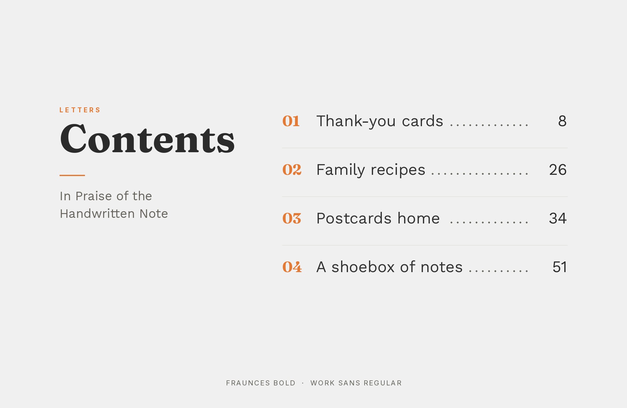
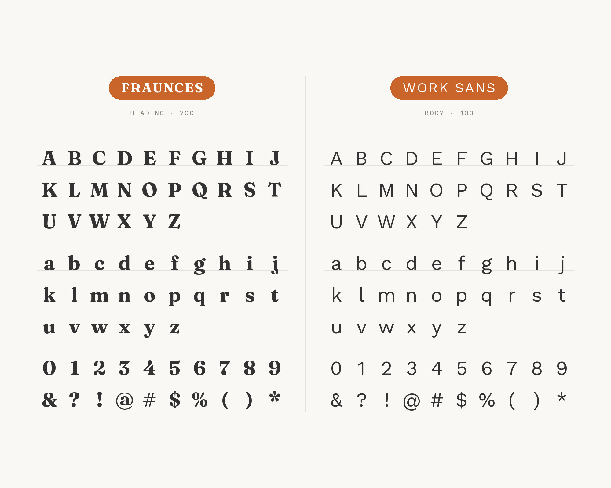
Work Sans is a simple, slightly wide grotesque. MaxiBestOf lists Fraunces, Sofia, and Work Sans as the fonts in use on the Uplift Founders site. Work Sans is plain on purpose.
Its open counters and even weight make it an easy reading face on screens. That plainness gives Fraunces room to be expressive in the headings. Use Work Sans for paragraphs and navigation, and keep Fraunces for the large, warm titles.
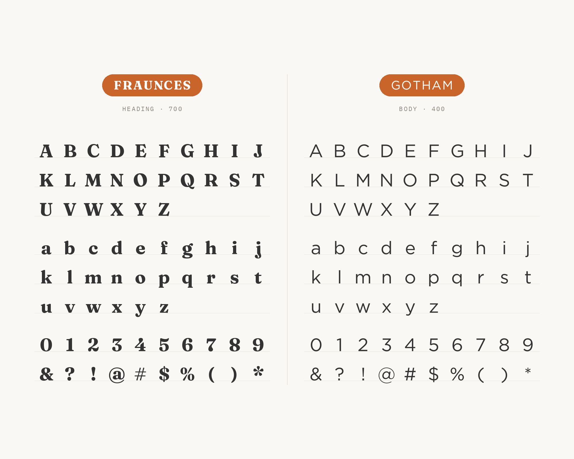
10. Gotham
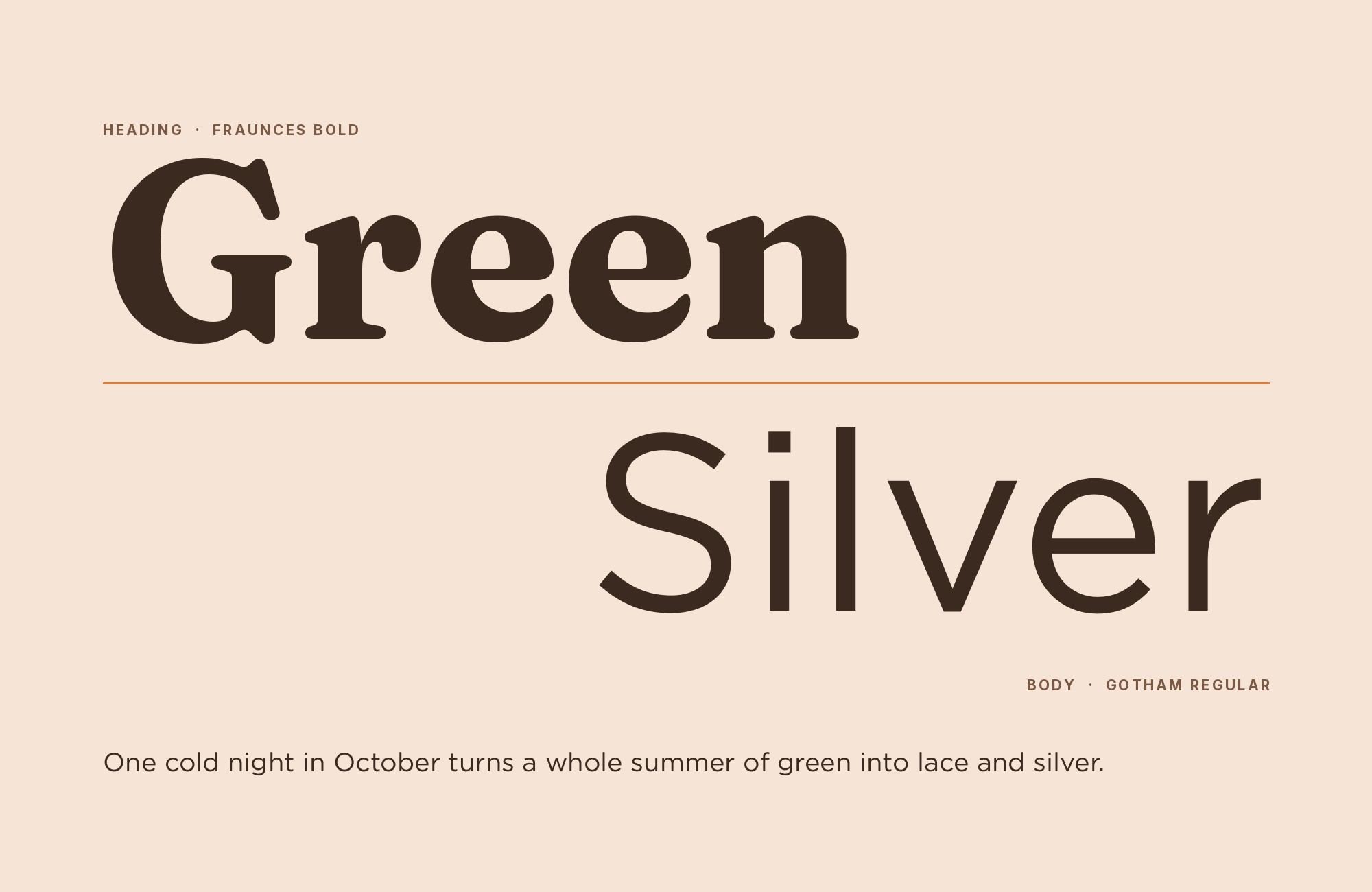
Gotham is the one commercial classic in this list. MaxiBestOf lists Fraunces and Gotham as the fonts in use on the Amici site, with credit to Beaucoup Studio. The gallery credits Gotham to Hoefler and Co.
Gotham is a geometric sans with broad, confident capitals. Its American signage feel adds structure to the old-fashioned charm of Fraunces. Gotham in small caps or tracked uppercase makes a good label style under a Fraunces headline.
Keep the Gotham text lighter and smaller so Fraunces stays the main voice.
11. Darker Grotesque
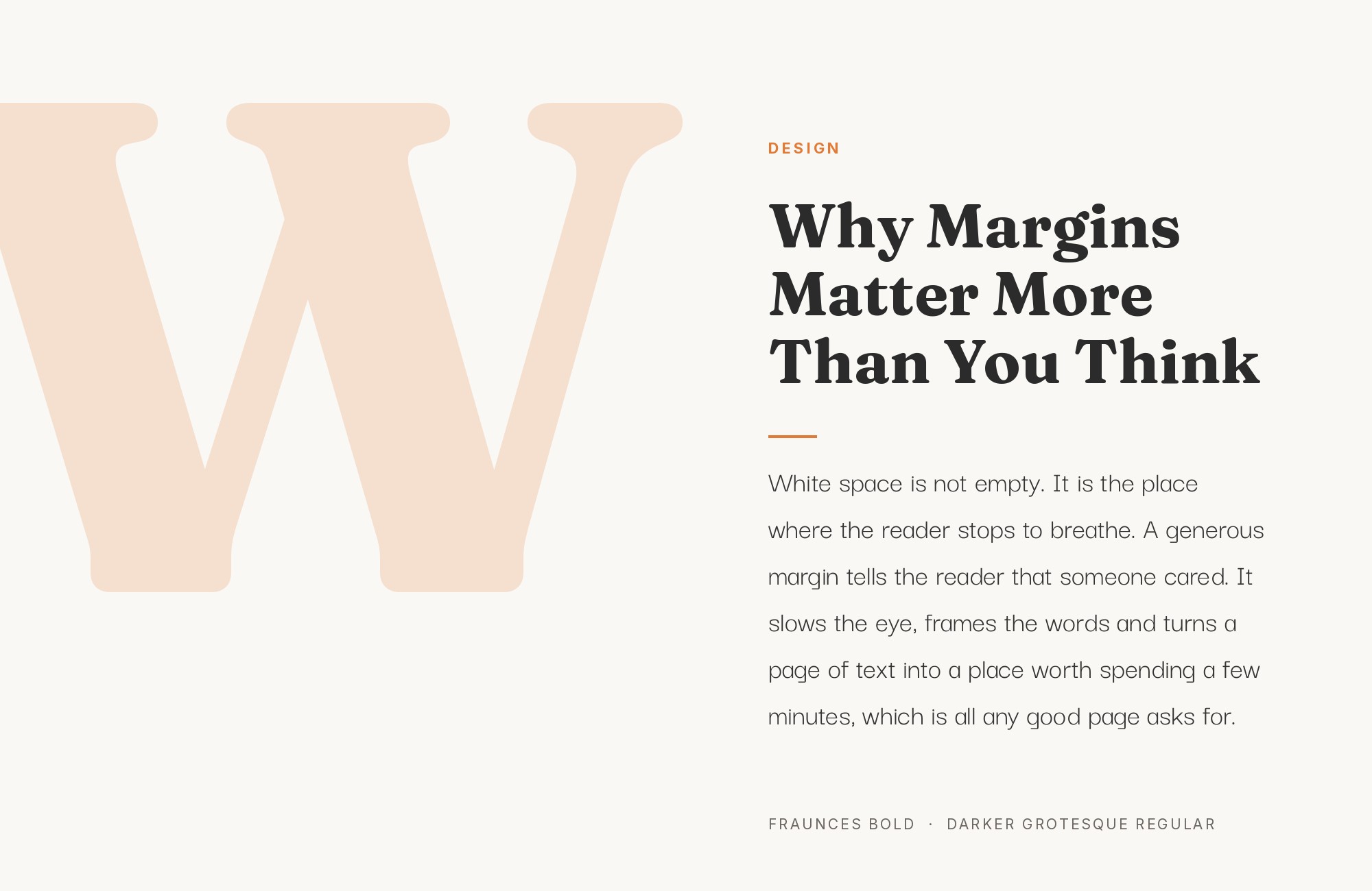
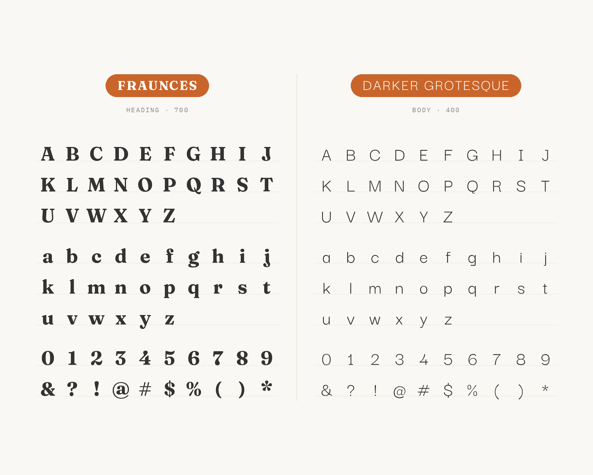
Darker Grotesque is the most stylish sans partner here. MaxiBestOf lists Darker Grotesque and Fraunces as the fonts in use on the Kiel Foods site.
Darker Grotesque has narrow letters, small apertures and a tight, dark texture at heavy weights. Next to the round, soft Fraunces, that tightness gives a crisp contrast in width.
Use Darker Grotesque for short text, menus, and subheads. For long paragraphs, choose a regular weight and a generous line height.
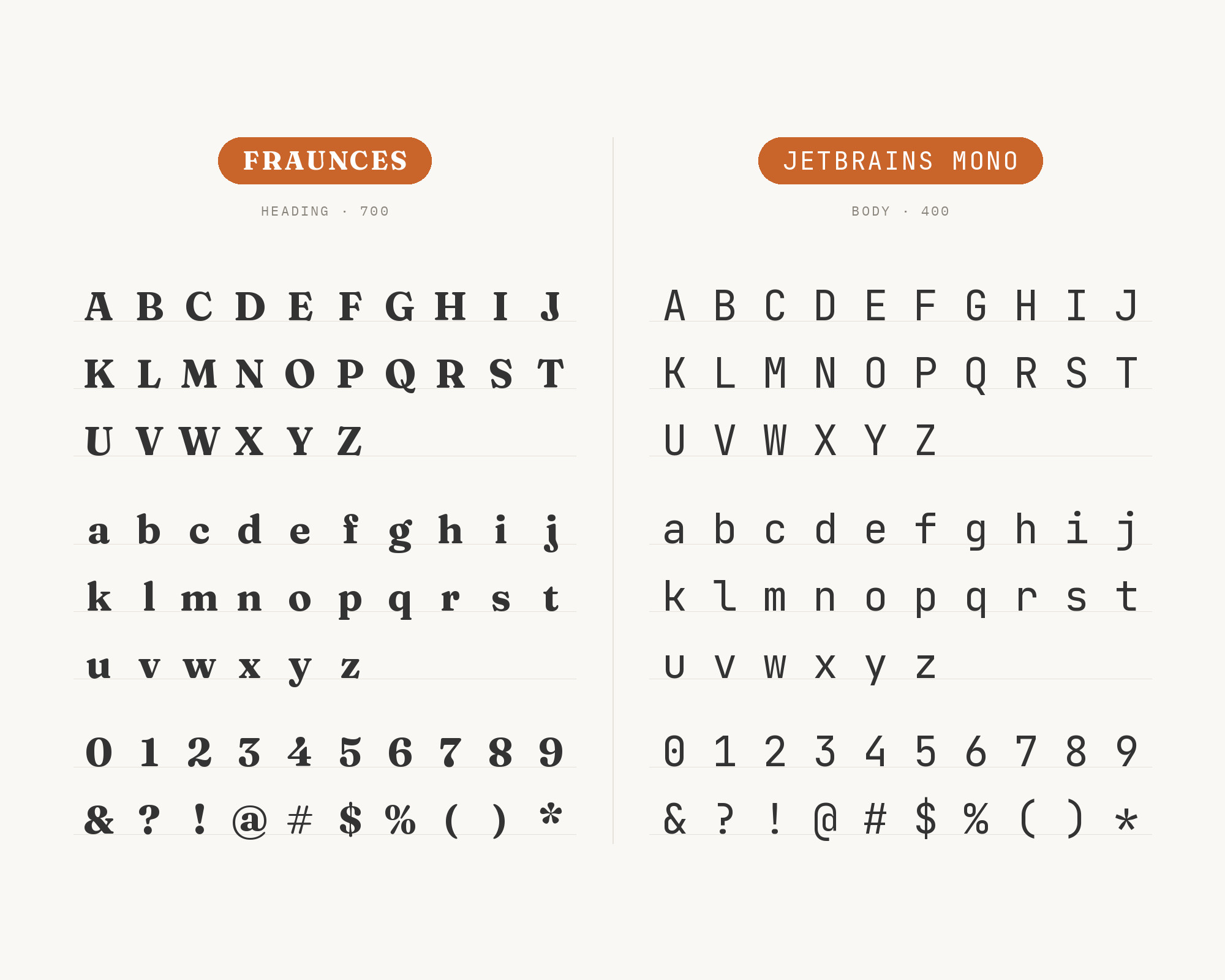
12. JetBrains Mono
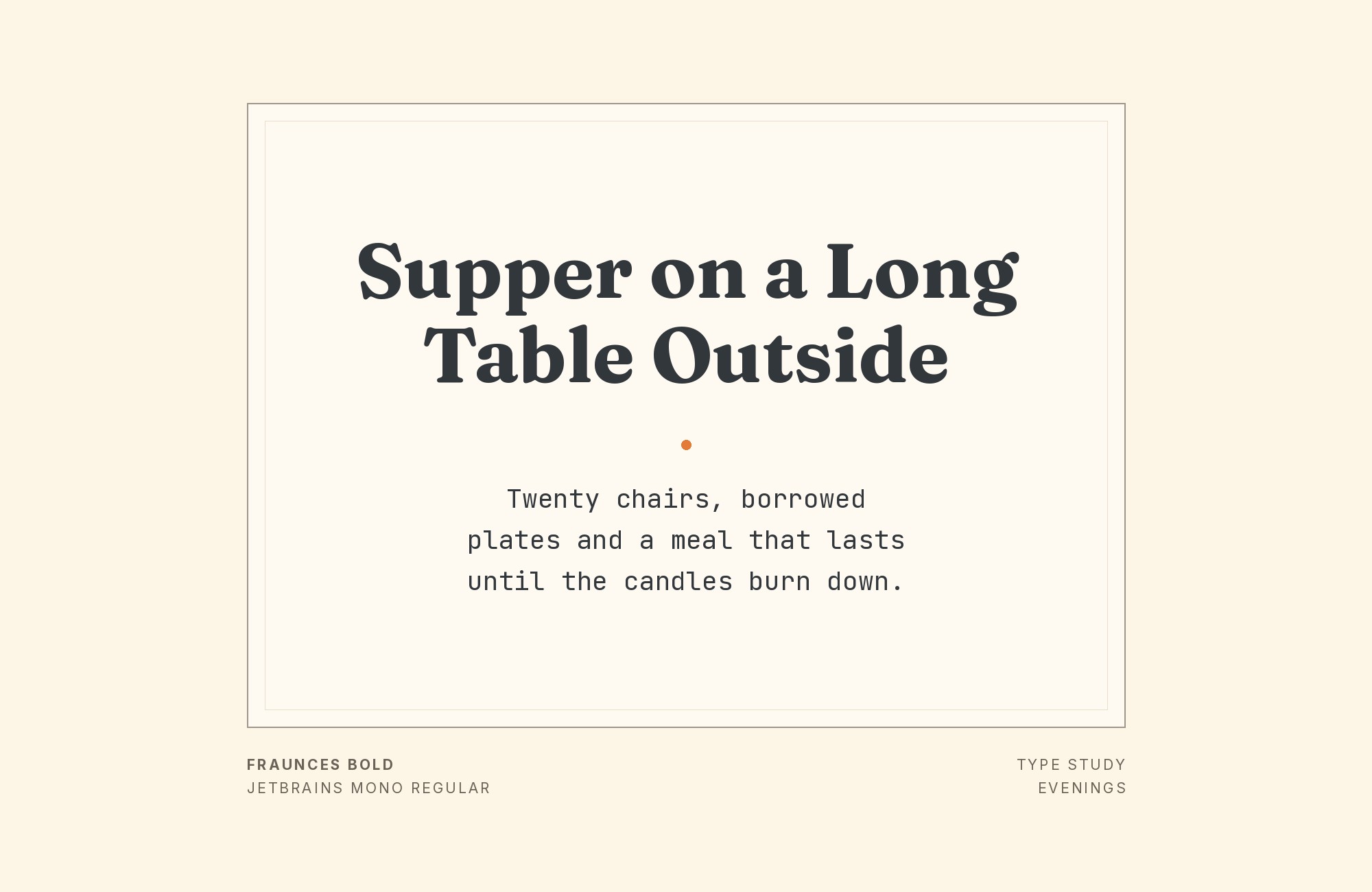
JetBrains Mono is a coding font with a tall x-height. MaxiBestOf lists Chakra Petch, Fraunces, Inter, JetBrains Mono, and Kaio as the fonts in use on the Outseta site.
So in that system, the monospace sits beside a serif display face and a sans for the interface. JetBrains Mono is built for code, with clear shapes for letters that are easy to confuse.
Fraunces brings the human tone that a software product often lacks. Use JetBrains Mono for code samples, data, and small technical labels, and keep Fraunces for titles.
13. Fira Mono
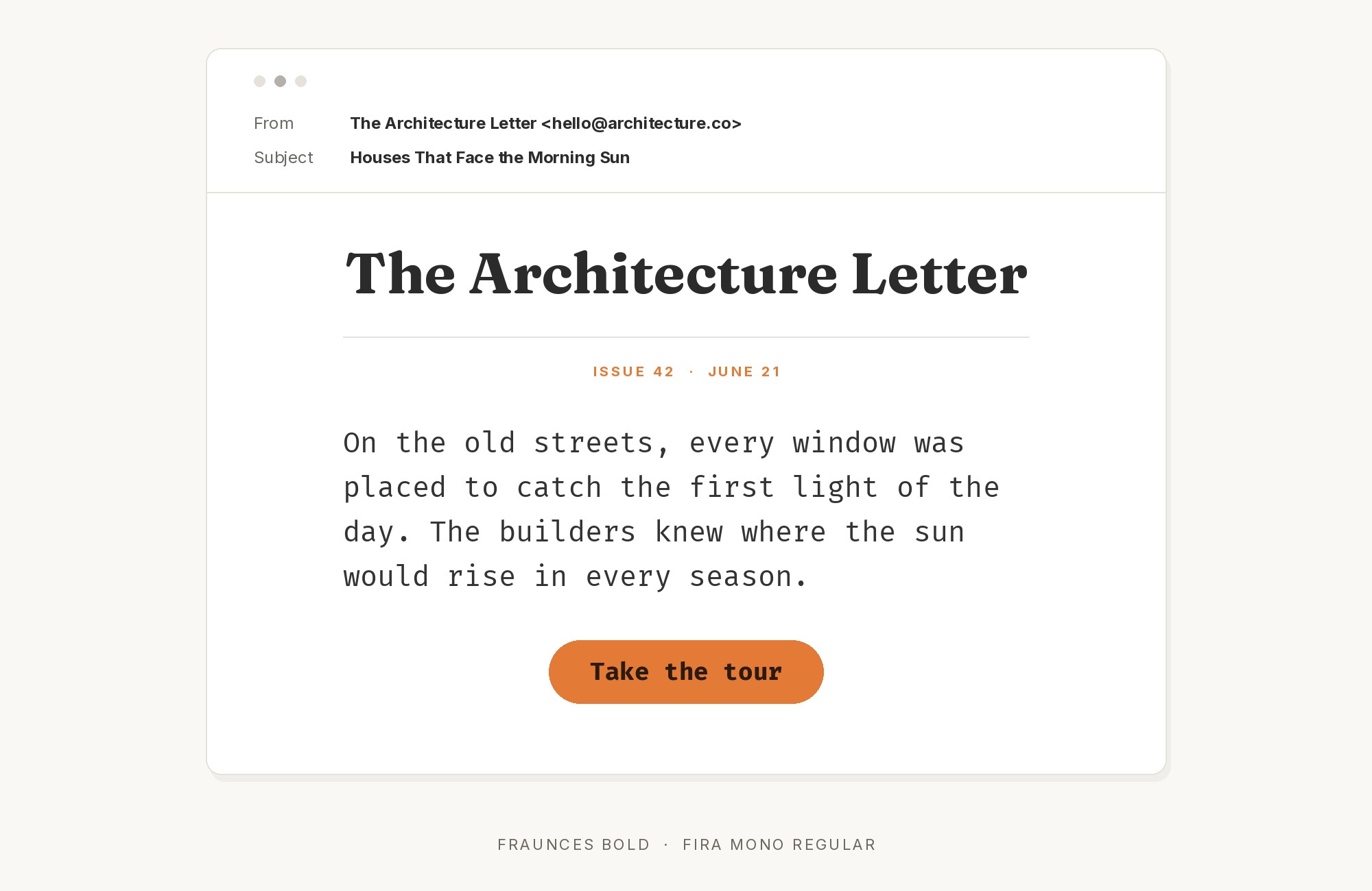
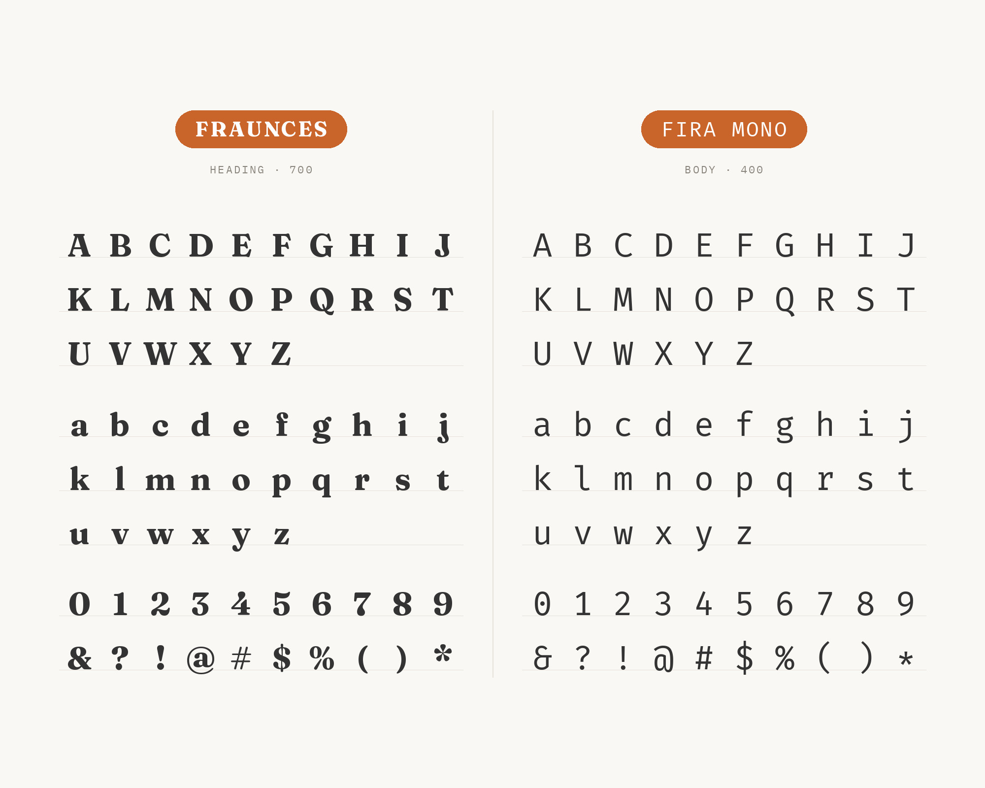
Fira Mono is the second monospace partner, with a more humanist feel. Fonts In Use records the portfolio site of Berlin web designer Alina Sava. In its Blog section, Fraunces appears in the featured images and Fira Mono is the webfont for code snippets.
That is a clean division of roles: Fraunces as the display image, Fira Mono as the working text. Fira Mono has a warmer texture than most coding fonts, so it sits well next to Fraunces.
Use it for code and technical notes in a blog that wants a friendly serif in its headers.
Conclusion
Fraunces is easy to pair once you accept that it should lead. Give it the headings, the hero lines and the logo.
Then pick a partner that is calm and even. Poppins, Overpass and Aileron have the clearest evidence for the reading text. Inter, Epilogue and Work Sans suit websites and products.
DM Mono, JetBrains Mono and Fira Mono add a technical layer for labels and code. Check the soft and wonky settings before you choose. A sharp, straight Fraunces and a supersoft, wonky Fraunces can need different partners.
