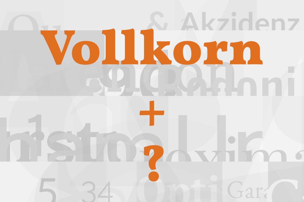
Vollkorn pairs great with Montserrat, Lato and Roboto. All 12 pairings are shown below in real rendered specimens, with the reason each one works.

What fonts go with Vollkorn? Its name is German for wholemeal — plain, dense, and built to be eaten every day — and that is exactly the design brief its letterforms deliver.
Friedrich Althausen released Vollkorn in 2005 as a free text face for bread and butter use, drawing letterforms sturdier and darker in color than a classical old-style serif: heavier strokes, tighter fitting, and a texture built to hold up at small sizes on ordinary screens rather than shine as a display face. Years later, Althausen expanded Vollkorn into a family of twelve styles, roman and italic, but the working brief never changed — Vollkorn was designed as a workhorse, not a showpiece, and it still reads that way beside almost anything you set next to it.
Because Vollkorn is doing the quiet job of carrying paragraphs, most of its best partners are calm, neutral sans-serifs pulled in to handle headlines, navigation and interface chrome without fighting the body text’s inkier texture. A smaller number of sources argue the opposite: pair Vollkorn with something genuinely loud, since its own restraint means it can absorb the contrast without looking cluttered. Both directions are represented below. Here are 12 fonts that pair well with Vollkorn.
1. Montserrat

Montserrat is a geometric-leaning sans drawn from urban signage lettering, with evenly weighted strokes, moderate x-height and just enough humanist warmth to avoid feeling cold. Set above Vollkorn’s inkier, old-style body texture, it gives headlines a clean, modern voice without competing for the same register — a display/text split rather than a stylistic match. It is Typewolf’s suggested pairing for Vollkorn, and other designers recommend it too, which makes it a safe starting point. Free on Google Fonts. Use Montserrat for headings and short UI copy; let Vollkorn carry every paragraph beneath it.

Pro from $14/mo, save $60 yearly.
Premium templates, vector export, and a commercial license on every paid plan.
See plans2. Lato

Lato is a humanist sans with semi-rounded terminals and a warm, even weight that keeps it neutral enough to sit quietly above or below Vollkorn without fighting its denser texture. It is one of the most recommended sans-serif partners for Vollkorn across independent design write-ups, which says less about excitement and more about reliability: Lato never introduces a problem. Use it for navigation, buttons and any interface text that needs to stay out of the way while Vollkorn does the actual reading work. Free on Google Fonts, and about as close to a default-safe choice as pairing gets.

3. Roboto

Roboto is Android’s system sans, built on a mechanical skeleton, with friendly, open curves softening what would otherwise read as sterile. Against Vollkorn’s warmer, grainier serif texture, Roboto reads unmistakably as “interface,” which frees Vollkorn to read as “content” — a chrome-versus-copy split that is easy to apply consistently across a whole site. It is free on Google Fonts and already installed on most Android devices, so mobile rendering is essentially guaranteed. Use Roboto for buttons, forms and labels; reserve Vollkorn for headlines and body paragraphs where its texture actually shows.

4. Poppins

Poppins is built on true geometric circles rather than optically corrected curves, giving its headlines a clean, contemporary edge against Vollkorn’s more traditional, calligraphic-inflected body forms. The contrast here comes from construction, not just weight: one face is compass-drawn, the other is pen-drawn, and that difference reads clearly even at a glance. It works well for brand and landing-page headers where Vollkorn handles the supporting paragraphs underneath. Free on Google Fonts. Keep Poppins to headline and subhead sizes — its rounded geometry loses precision in dense paragraph text.

5. Source Sans Pro

Source Sans Pro was Adobe’s first open-source typeface, drawn to be deliberately neutral and tuned for screens rather than for personality. Beside Vollkorn’s more characterful old-style texture, it makes a low-drama partner for body/caption splits — captions, metadata, and footnotes in Source Sans Pro, the actual reading experience in Vollkorn. Neither face asks for attention it doesn’t need, which is precisely the point of choosing it. Free and open-source, available on Google Fonts. Use it at 14–16px for supporting text; it has little presence at display sizes.

6. Karla

Karla is a grotesque sans with softened details and an unusually large x-height, giving UI text a gentle, contemporary feel that never competes with Vollkorn’s denser texture in longer passages. It sits a step warmer than a strict neo-grotesque like Roboto or Open Sans, which suits brands that want Vollkorn’s old-style warmth echoed slightly in the interface rather than flatly contrasted against it. Free on Google Fonts. Set Karla for navigation, form labels and short UI copy, and let Vollkorn hold every paragraph of actual reading.

7. Archivo

Archivo is a sturdy grotesque with blunt, confident capitals, drawn across enough widths and weights to cover headline, subhead and label duties from a single family. Against Vollkorn’s old-style body proportions, Archivo’s structural authority reads like a museum label beside a printed page — a split built for cultural and editorial work where headings need to assert themselves. Free on Google Fonts, with a wide range of weights available for hierarchy without introducing a second typeface. Reserve Vollkorn for the reading text; Archivo’s job is titles, captions and wayfinding.

8. Asap

Asap is a rounded, contemporary sans with approachable, slightly soft terminals that read as current beside Vollkorn’s classic, sturdy serif forms. The pairing works as one traditional voice and one modern voice sharing a layout, rather than the more common “neutral chrome plus content” split most Vollkorn pairings settle for. That makes it a good fit for lifestyle and consumer brands that want a friendlier headline face than a strict grotesque provides. Free on Google Fonts. Use Asap for headings and callouts, keeping Vollkorn for extended paragraphs.

9. Lora

Lora is itself a contemporary serif with moderate stroke contrast, so pairing it with Vollkorn leans on shared serif warmth rather than sans/serif contrast. Set Lora for display headlines and Vollkorn for body text, or reverse the roles, and the result reads as one coherent editorial family rather than two competing voices — a rarer, more subtle move than reaching for a sans partner. It suits long-form editorial and publishing projects that want texture without introducing a second register entirely. Free on Google Fonts. Keep the weight difference between them deliberate, or the two will blur together.

10. Unica One

Unica One is a condensed unicase sans with a retro-futurist, technical feel, built for headlines and short texts rather than to be read at length. Vollkorn’s plain, unshowy body text keeps that display face from overwhelming a page, so the pairing reads as a conceptual headline sitting over genuinely calm reading text underneath. It suits editorial or brand headers that want a distinctive, slightly retro voice without extending that voice into the paragraphs. Free on Google Fonts. Display and short headline sizes only — it has no reading-length use.

11. Rakkas

Rakkas is an unusual, heavy single-weight display face designed for Arabic and Latin together: the Arabic draws on Ruq’ah lettering from Egyptian movie posters, and the Latin infuses blackletter with informality. Set as a loud headline over Vollkorn’s quiet, plain body copy, it lets the display face carry all the drama while the reading text stays completely calm — a deliberate contrast pairing rather than the safer neutral-sans route most of this list takes. It suits bold editorial or cultural projects willing to commit to a genuinely distinctive headline voice. Free on Google Fonts. Display only, and best used sparingly — one headline per page, not a running head style.

12. Gotham

Gotham is a geometric sans built from architectural signage lettering, with engineered caps that read as confident and corporate in a way none of the free options on this list quite match. Against Vollkorn’s grainy, bookish body text, the pairing splits cleanly into a modern brand voice up top and a warm reading experience below. It is a commercial retail release rather than a free Google Font, which is why it closes this list — a genuinely strong pairing, but one that carries a real licensing cost the eleven above it do not.

Conclusion
Vollkorn was built to disappear into the page as reading text, which means most of its partners exist to handle everything Vollkorn deliberately doesn’t: clean interface chrome, sharp headlines, or in Rakkas’s case, genuine drama. Neither direction — safe neutral sans or bold display contrast — is more correct than the other; they solve different briefs.
Set your choice at the sizes the page will actually use before deciding. A workhorse text face like Vollkorn earns its keep at 17–19px in a real paragraph, not in a specimen graphic, and a headline face that looks sharp at 400% zoom can crowd a real layout at normal size.
