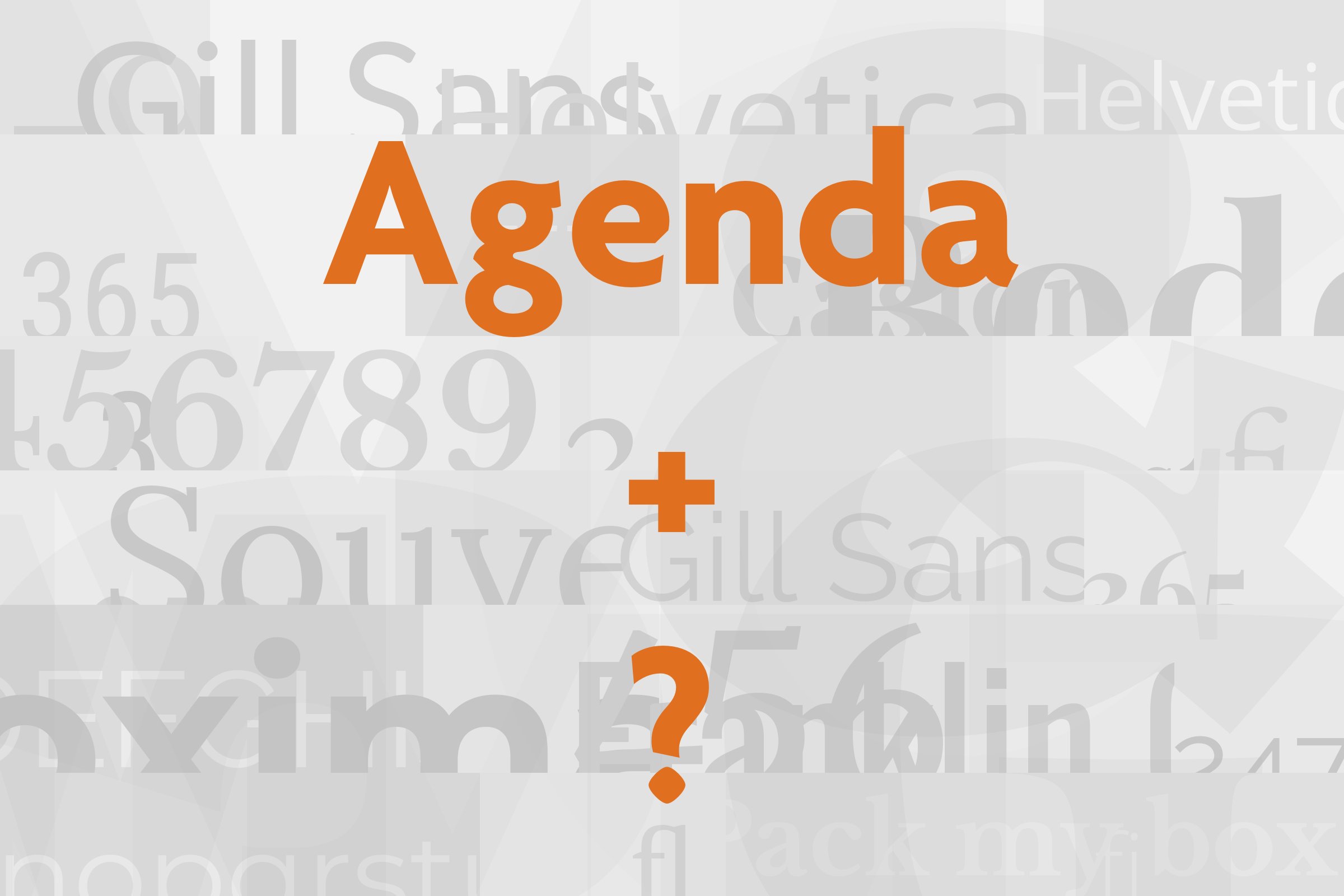
Agenda pairs great with Adobe Garamond, Sabon and Utopia. All 10 pairings are shown below in real rendered specimens, with the reason each one works.

What fonts go with Agenda, the sleek humanist sans from the nineties? Agenda is a working typeface. It shows up in brand guides far more often than in design blogs.
So the best answers come from real organizations that chose a partner for it.
Agenda was designed by Greg Thompson. Font Bureau describes it as a fresh humanist sans serif inspired by Edward Johnston’s London Transport face, drawn for the Underground in 1916.
The Font Bureau series offered fifty-two versions of the design. Greg Thompson Type dates the original Agenda to about 1993 through 2000. In 2022, Greg Thompson released a remaster called Agenda One.
Adobe Fonts calls Agenda one of the iconic typefaces of the nineties. Its letters have humanist proportions, with open curves and a calm, slightly narrow rhythm.
That makes Agenda a natural organizer. It handles headings, labels, captions, and navigation without drawing attention to itself. The partners below fall into a clear pattern.
Most are old-style serifs that carry long reading text. The rest are practical sans serifs for screens and office documents. Here are the fonts that go with Agenda, strongest evidence first.
1. Adobe Garamond

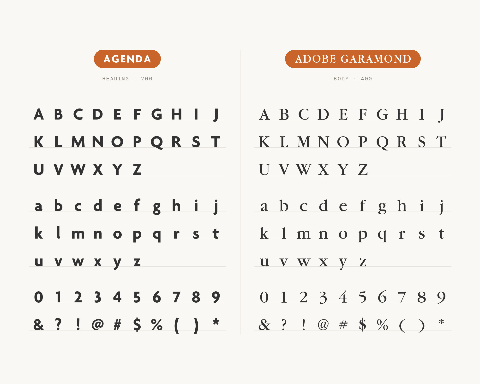
Adobe Garamond is the classic book face with the strongest case. The NHLA style guide makes Agenda its primary typeface and Adobe Garamond Pro its secondary typeface. It says Agenda Medium and Bold work best for headings and are always set in caps.
It also says Adobe Garamond is ideal for large amounts of body copy. A second source points the same way.
Fonts In Use published a review of the Room & Board 2014 catalog. The review lists Agenda among American sans serifs that could suit the brand and contrast with its logo, a modified Adobe Garamond.
The contrast here is all about texture on the page. Agenda is even and clean, while Garamond has a lively, calligraphic rhythm.
Use Agenda in caps for headings and labels, and give the paragraphs to Garamond.
Turn your ideas into repeatable creative workflows - no code required. Create with ready-made templates and AI-powered tools in Picsart Flow.
See details2. Sabon
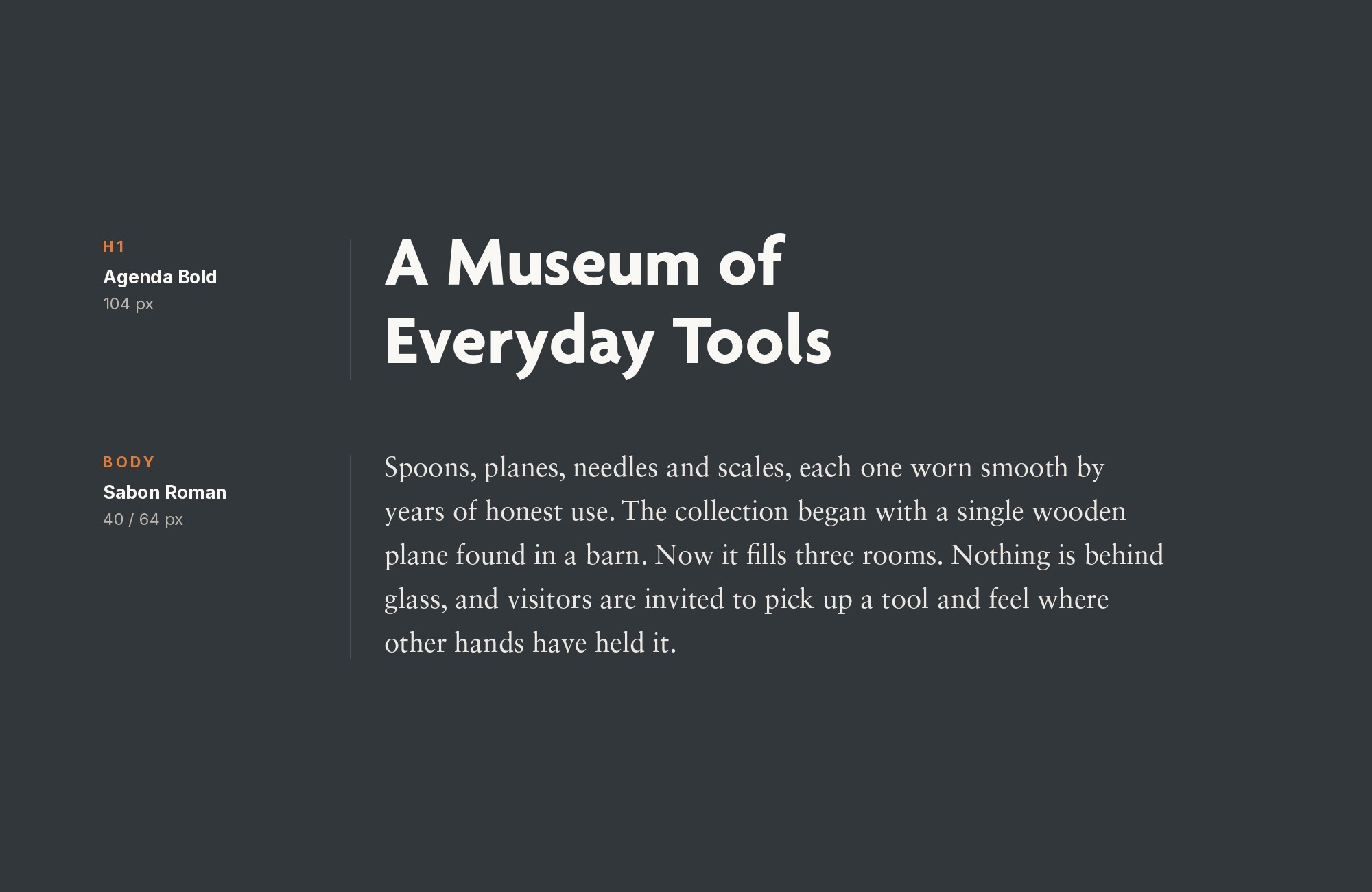
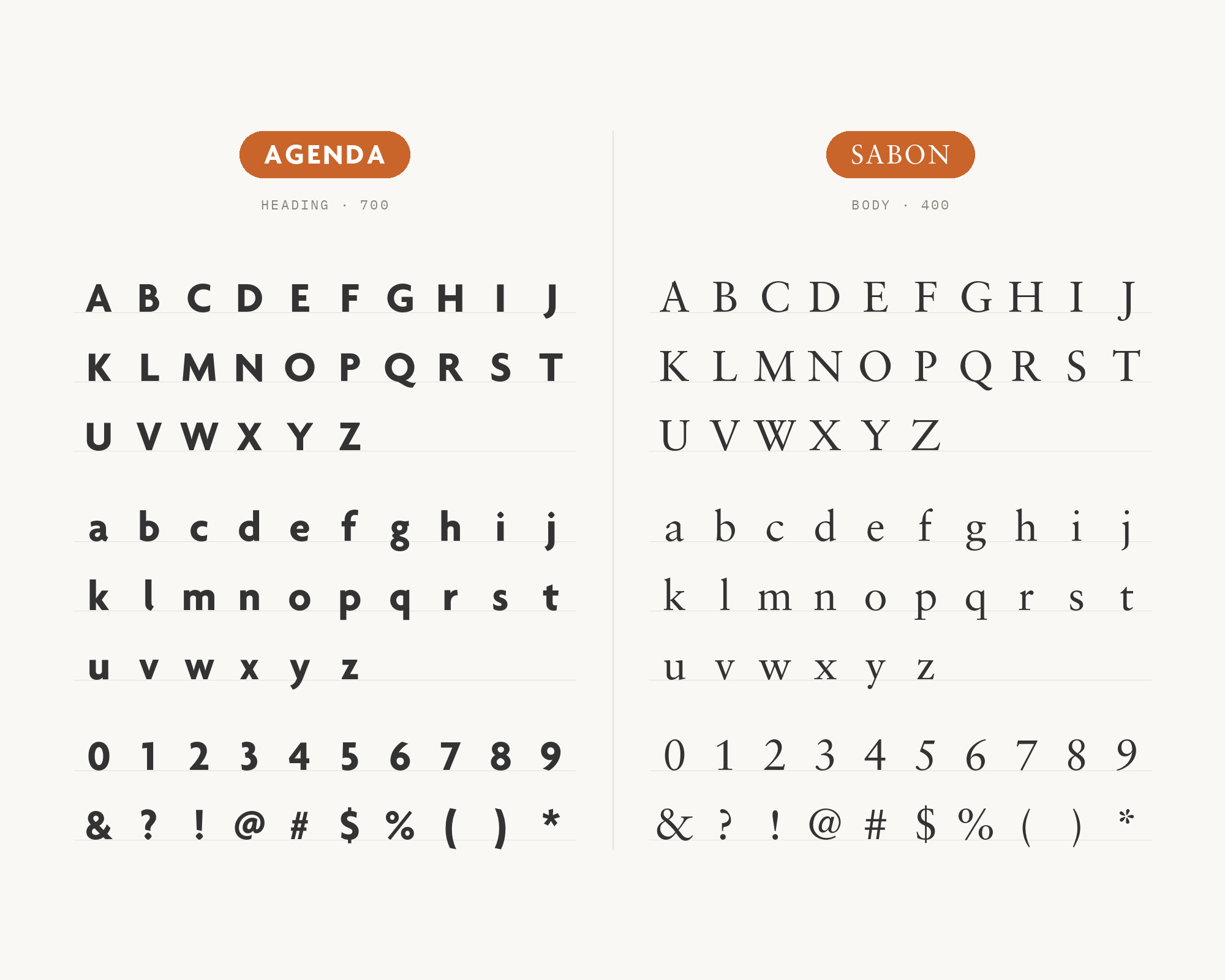
Sabon is the most repeated serif partner in the brand guides. The NorQuest College guidelines say the classic serif Sabon complements the sans-serif Agenda and gives print materials a traditional feel.
The same guide allows Sabon in print pieces where long text is mandated. The Chabot-Las Positas Community College District shows the Sabon family and the Agenda family side by side in its typography pages.
Sabon is a crisp old-style serif with even serifs. That calm texture sits well under Agenda’s clean headings. Use Agenda for titles, navigation, and captions, and use Sabon for newsletters, reports, and long essays.
Webflow. Framer. Squarespace. Wix. Lovable. Not your future.
Your own AI CMS agent is.
Find Out More3. Utopia
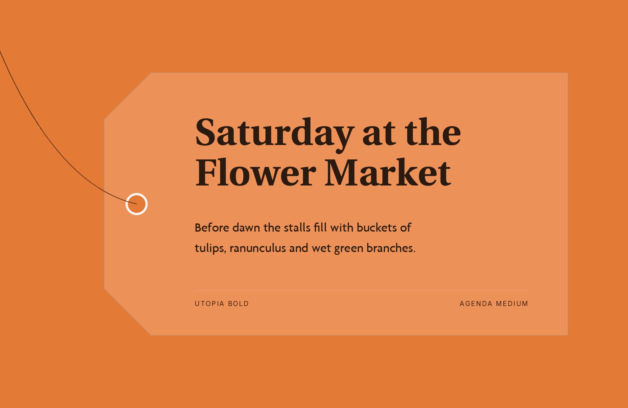
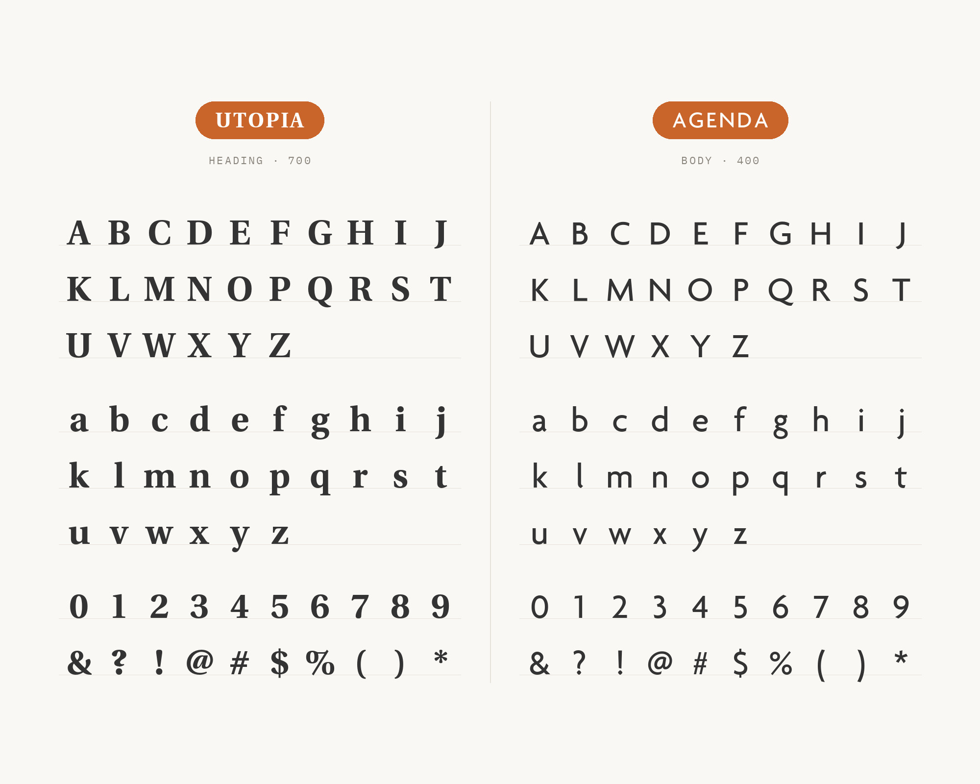
Utopia) is the partner that reverses the usual roles. SUNY Cortland has two official typefaces: Agenda as the sans serif and Utopia as the serif.
Its guide calls the sans serif ideal for subheads, body copy, and captions. It calls the serif ideal for headlines, subheads, or body copy.
So here, the serif takes the headline.
Utopia has a sturdy, transitional structure with sharp serifs. Large Utopia headlines give the page authority.
Agenda then carries the subheads and text with its clean, open shapes.
4. Minion
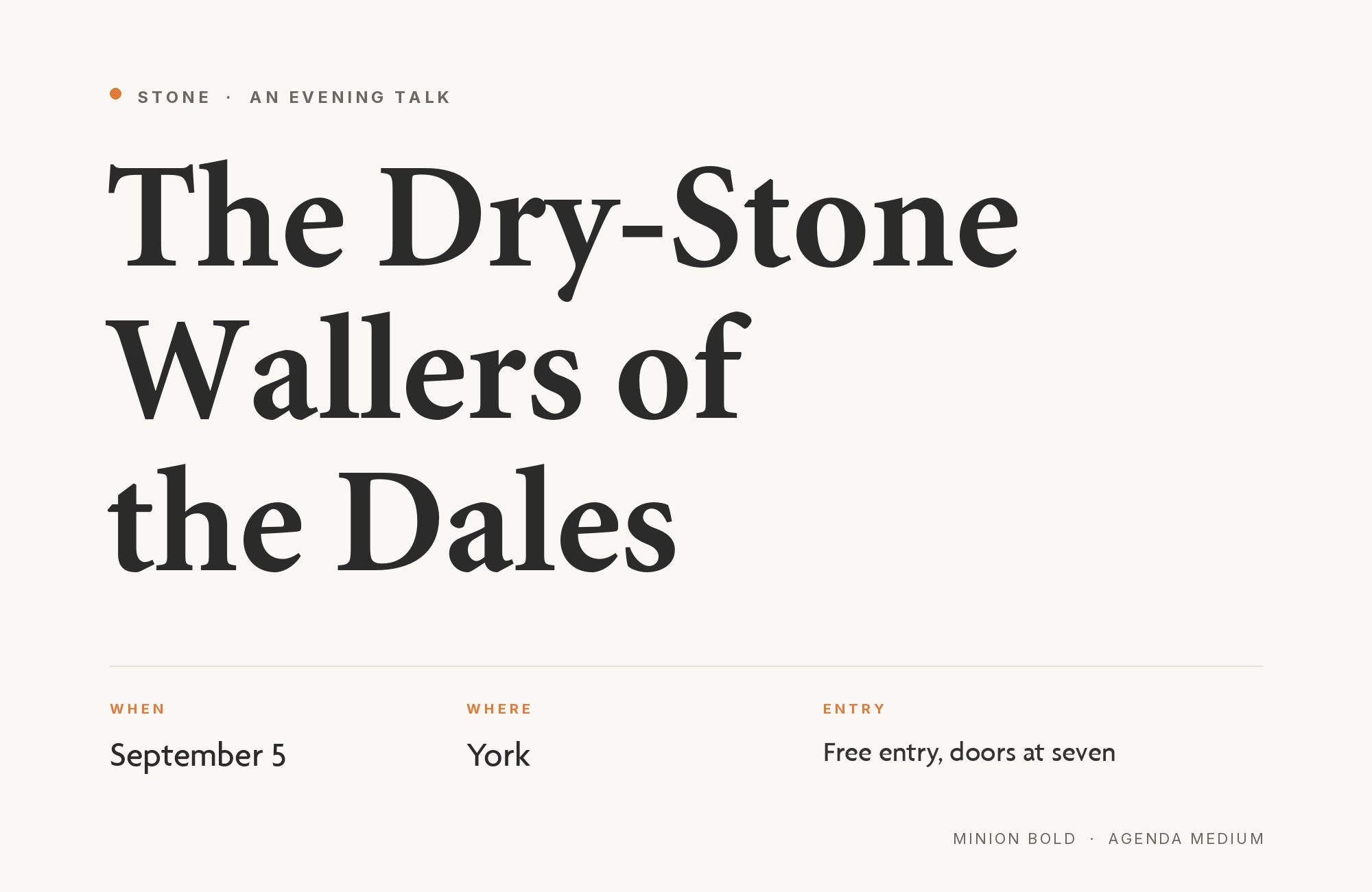
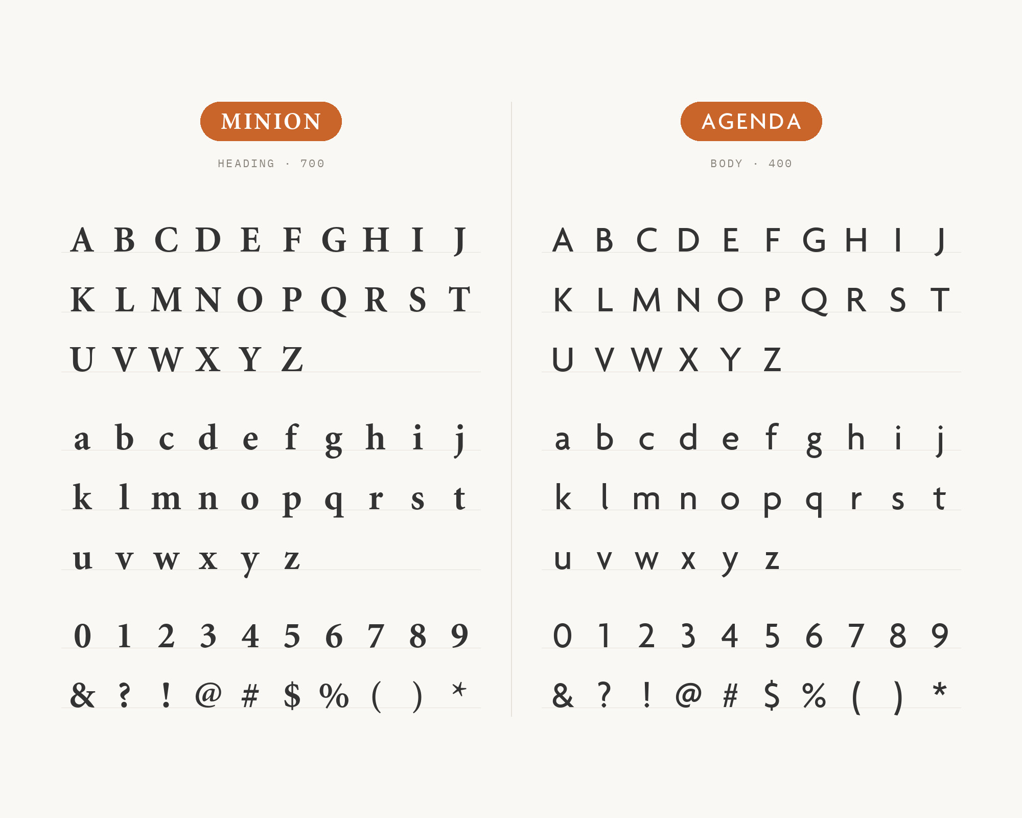
Minion is another serif that takes the lead.
The Saint Mary branding guidelines name Minion Pro for main headings and body copy on signature communications. The same guidelines name Agenda for body copy on publications, sub-headings, and other informational hierarchies.
That is a clear division of jobs.
Minion is a refined old-style text face with gentle contrast. Agenda adds a structural layer for the details: subheads, lists, and small text. Use this pair when a formal serif voice must lead and Agenda must keep the information tidy.
5. Adobe Caslon
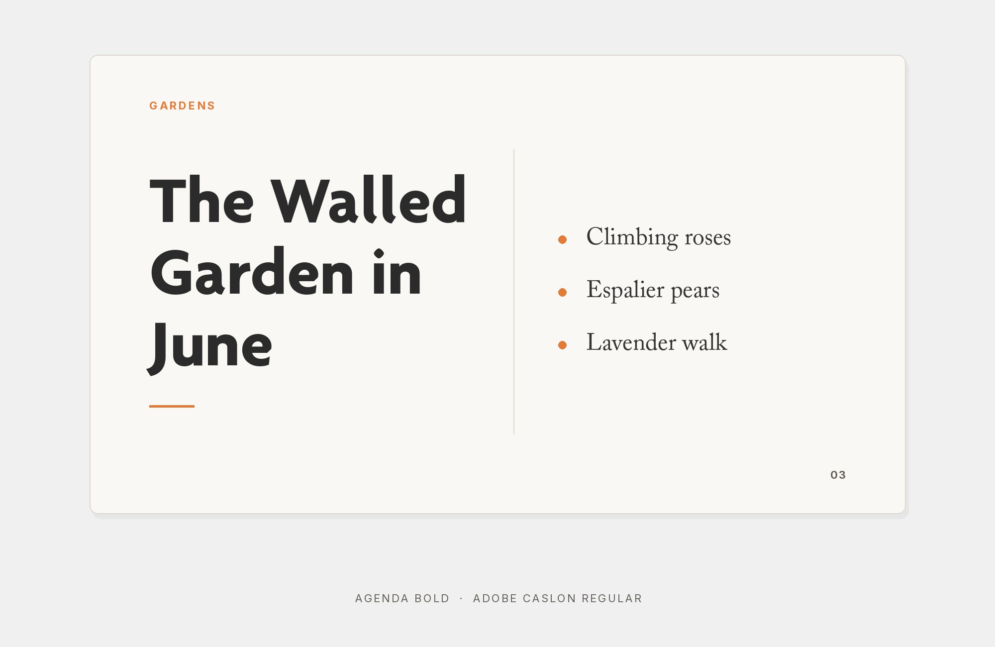
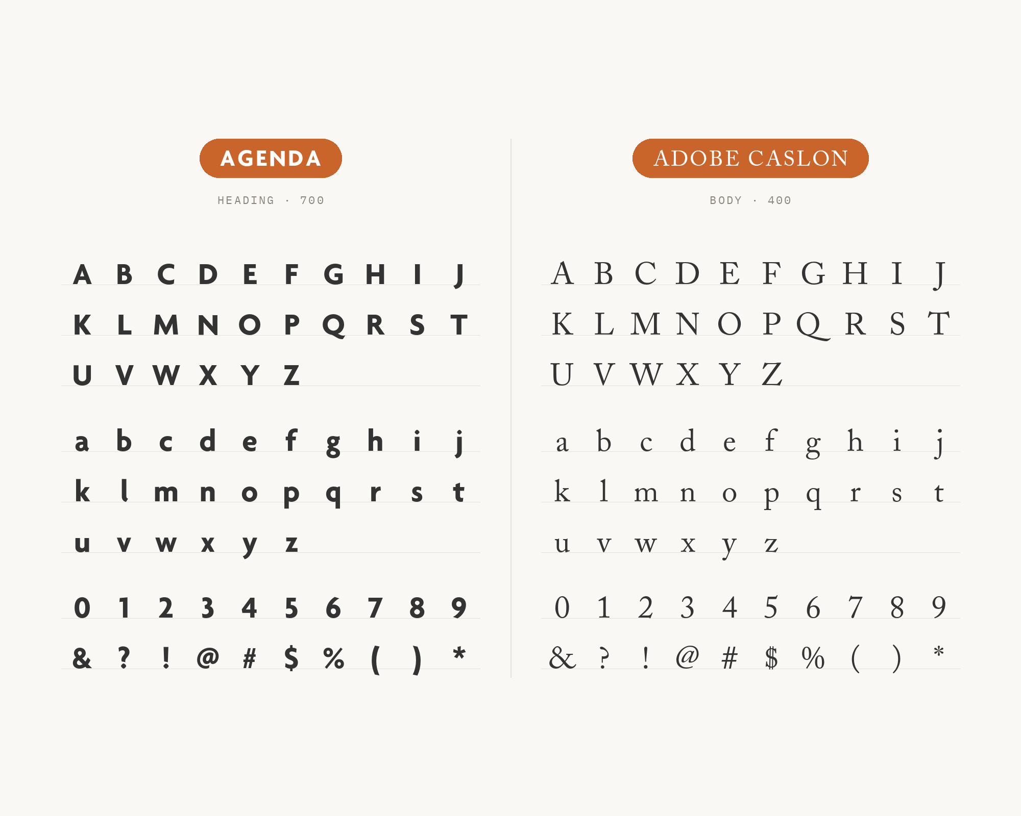
Adobe Caslon brings a traditional English book texture. Fonts In Use lists Agenda, Bodoni, Bryant, and Adobe Caslon as the typefaces of the experimental publication C-Lab. It was created at CalArts in a class taught by Dylan Fracaretta.
Caslon has bracketed serifs and warm, irregular curves. Agenda is smooth and controlled by comparison. Let Agenda handle the headings and navigation, and let Adobe Caslon carry the essays and quotes.
“AI builds anything, so what do I sell?”
Taste is the answer. Own your stack and automate your own CMS.
Find Out How6. Bodoni
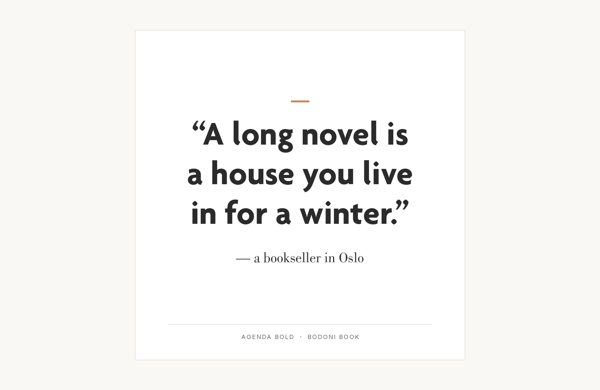
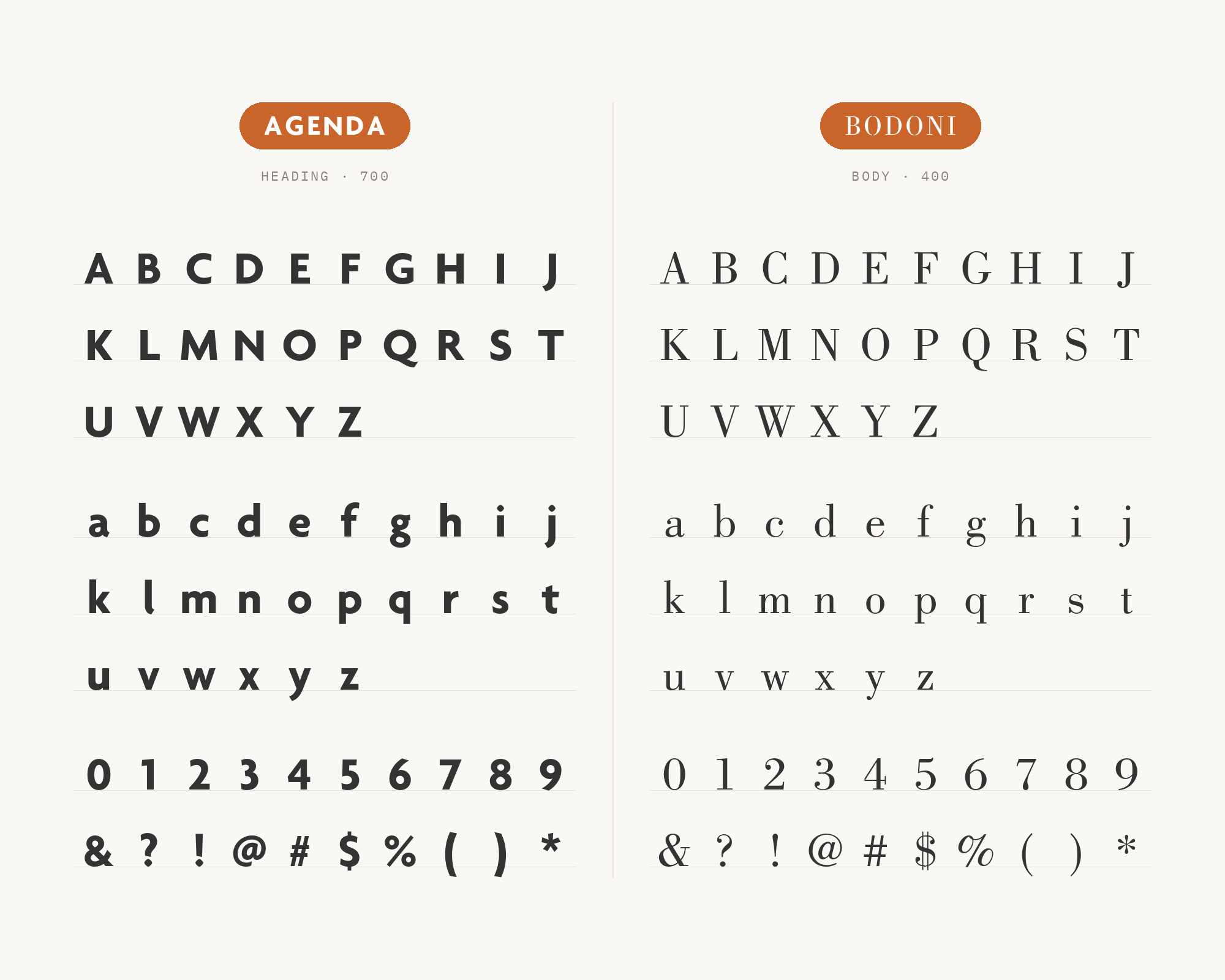
Bodoni is the high-contrast partner from the same CalArts publication. Bodoni has vertical stress and a dramatic change from thick to thin strokes. Agenda has almost none of that drama.
That gap makes Bodoni a strong display face for a short title or a pull quote.
Keep Bodoni large, because its hairlines need size.
Then let Agenda carry the explanation under it.
7. PT Sans
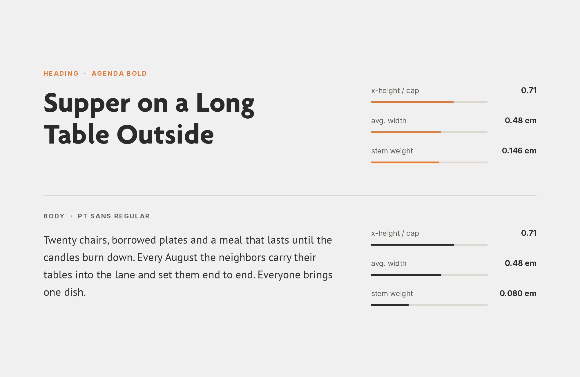
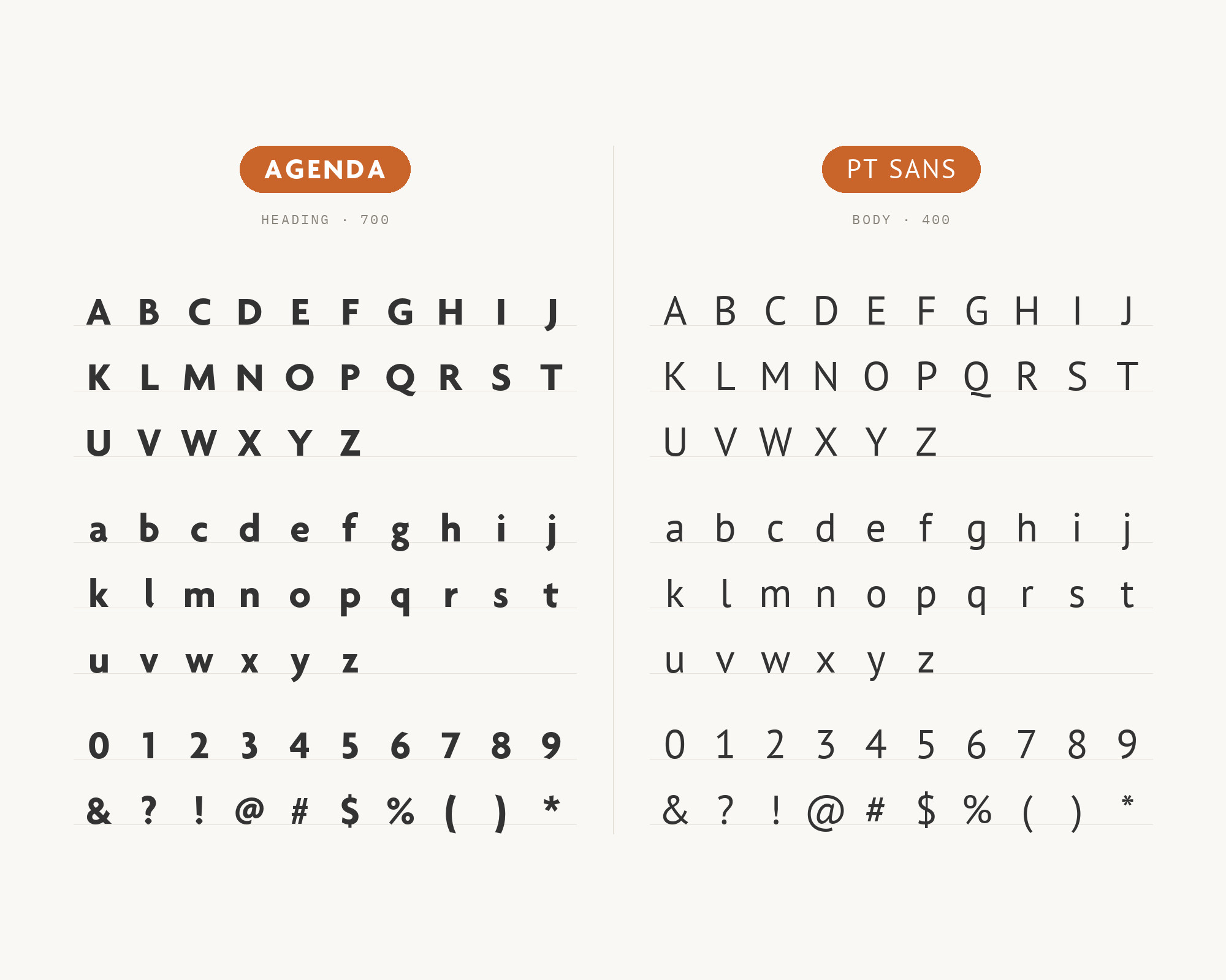
PT Sans is the web partner with the clearest editorial example. Fonts In Use records Mirror Online using the webfont Agenda for headlines, sub-heads, and navigation menus. The same entry lists PT Sans as the second typeface.
This is an all-sans pairing, so the contrast must come from roles, size, and weight. Agenda takes the bold, compact headlines. PT Sans gives the reading text a practical, open texture.
Use a clear size step between them so the two humanist sans serifs never blur together.
8. Nimbus Sans
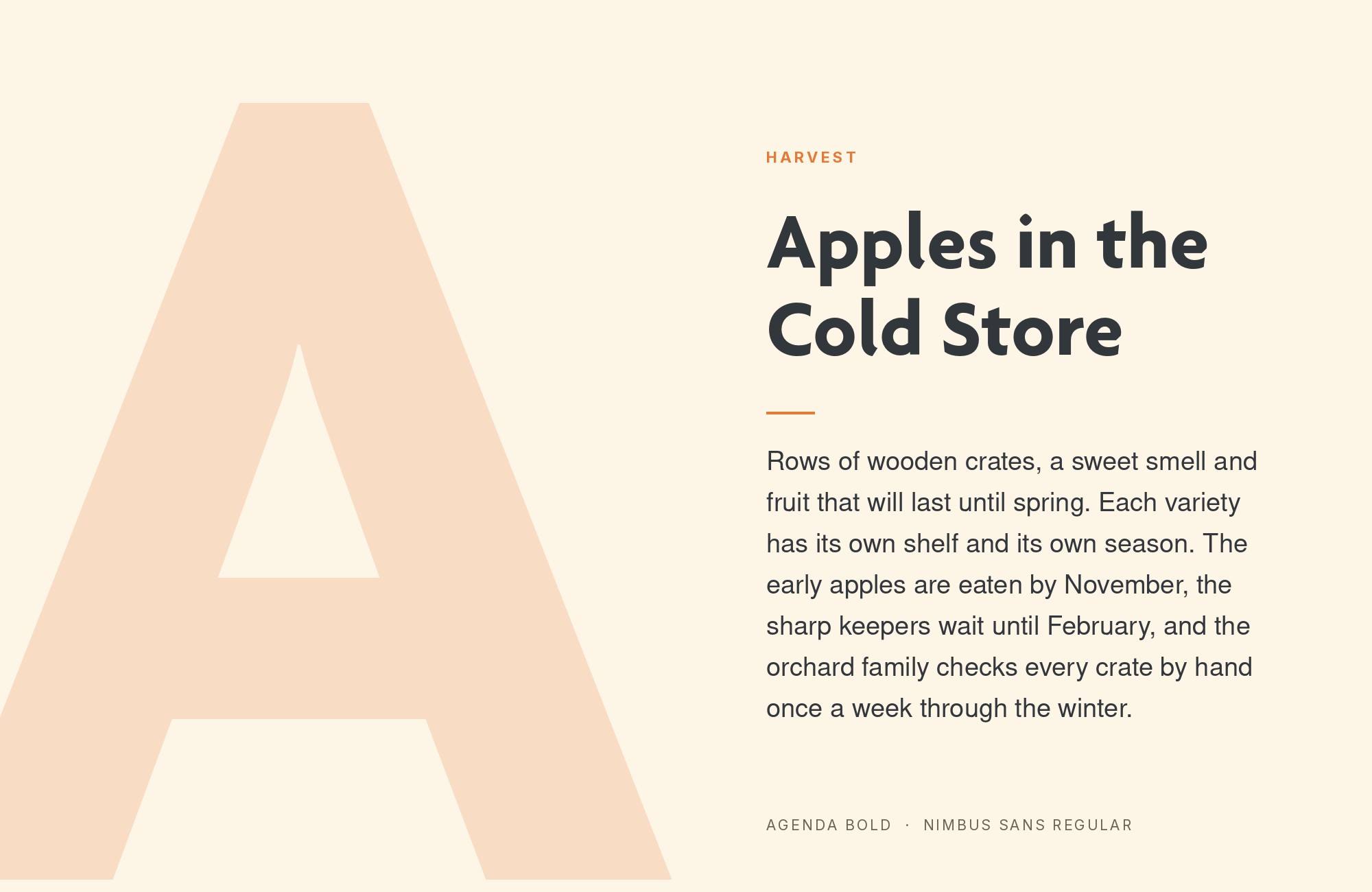
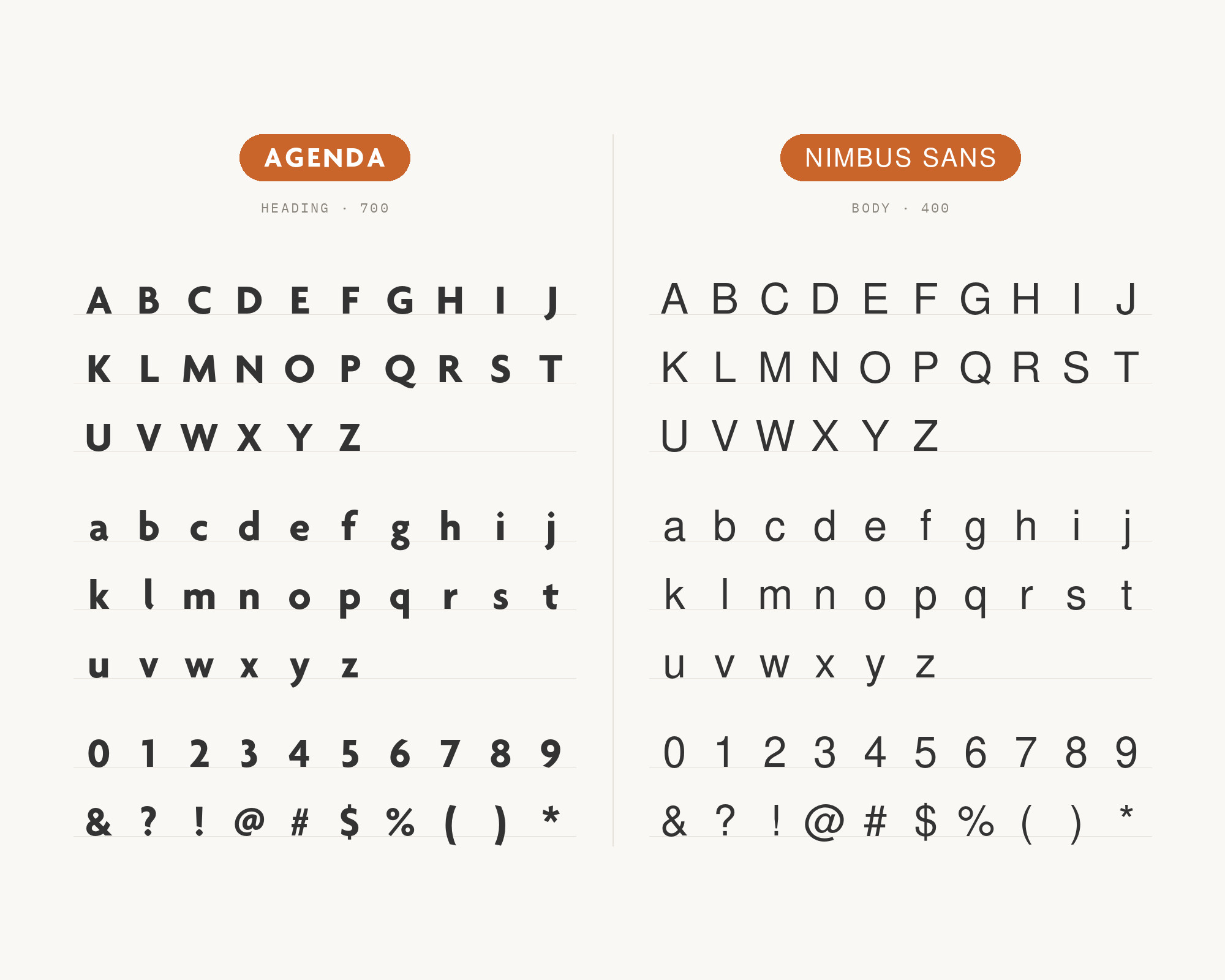
Nimbus Sans is a grotesque that does the everyday work in one research brand. The John Innes Centre brand guidelines set the institute name in its logo in Agenda Medium.
They make Nimbus Sans the corporate typeface for printed material and online text where possible. The guide names Nimbus Light for main titles and body copy.
So Agenda is the identity voice, and Nimbus Sans is the working voice. Nimbus Sans is a neutral grotesque, so it does not compete with the humanist details of the Agenda logo.
Use Agenda for the name and key display lines, and use Nimbus Sans everywhere else.
9. Verdana
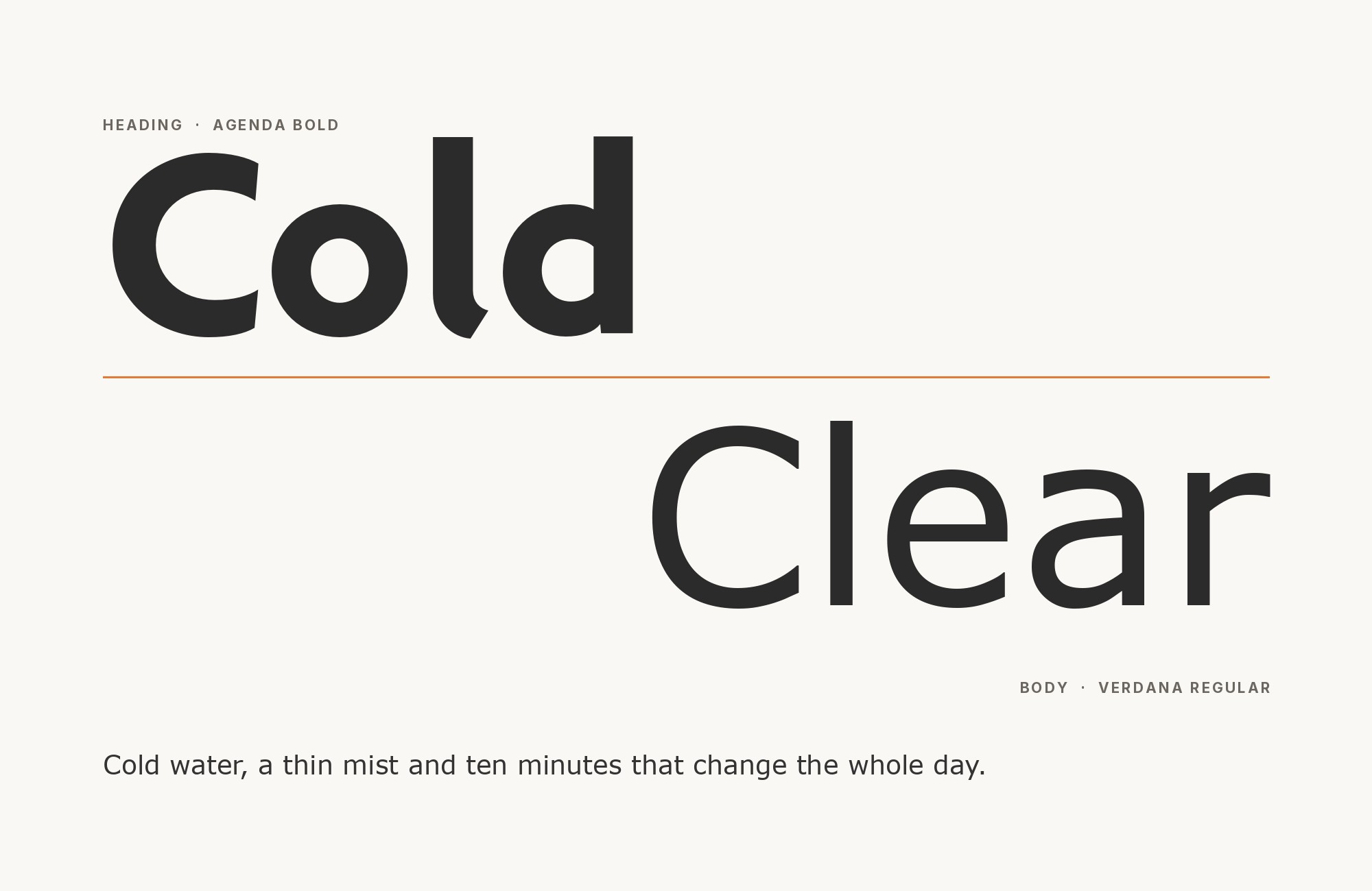
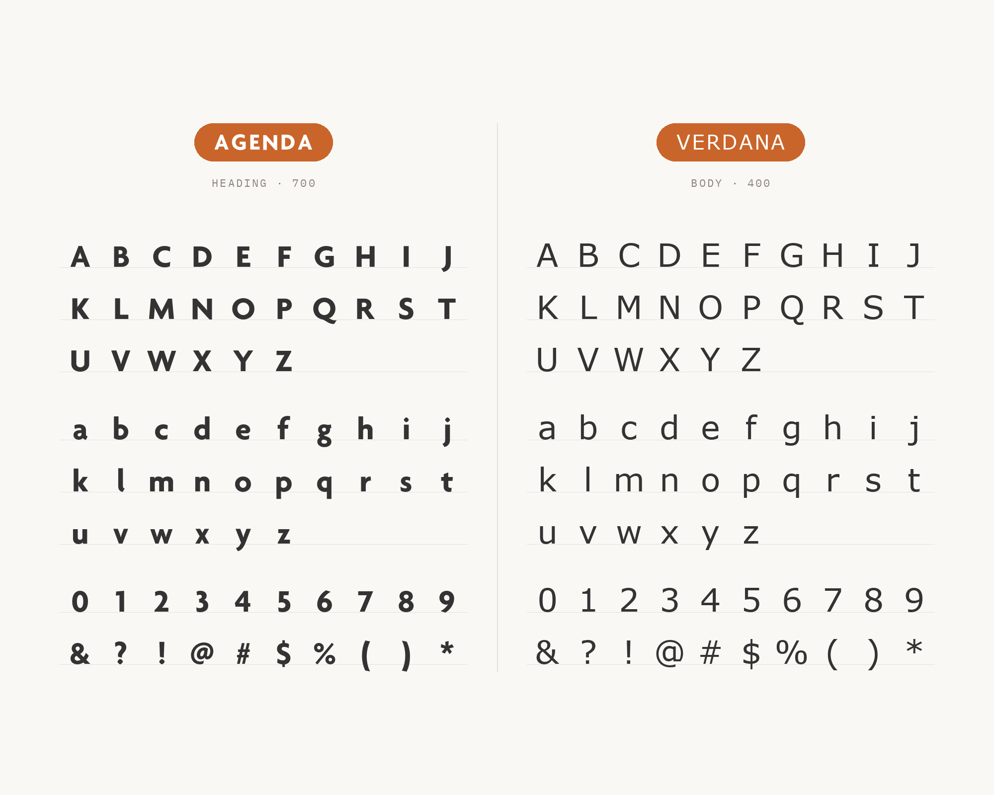
Verdana is a documented office and screen companion, not a print pair. The NorQuest College guidelines tell staff to use Verdana for internal applications and MS Office documents. They say Verdana bears similarities to humanist sans-serif typefaces such as Agenda.
They also note that Verdana was designed to be readable at small sizes on a computer screen. So in this system, Agenda carries the designed materials and Verdana carries letters, memos, and email.
Verdana is wide and loosely spaced. Do not set the two in the same paragraph. Treat Verdana as the everyday text partner beside an Agenda logo or heading.
10. Arial
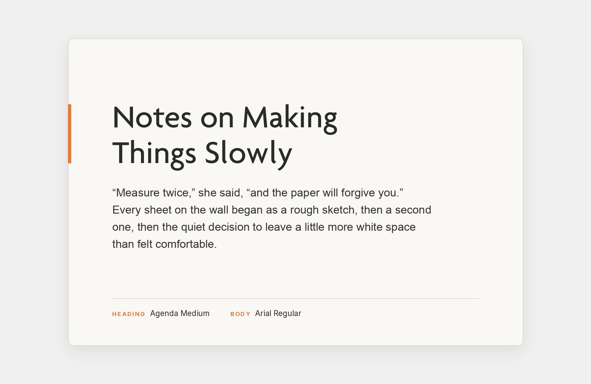
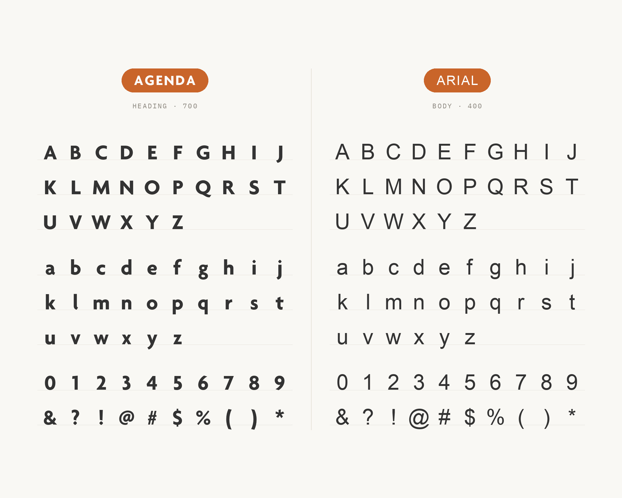
Arial is the digital partner for Agenda in real brand systems. The UK Space Agency guidelines name Agenda as the primary typeface for printed communications and use the Agenda family in the logo.
They name Arial for digital purposes, including letters from the Word letterhead template and PowerPoint presentations. The Technip brand manual also names Arial as its secondary typeface, for Word documents and PowerPoint presentations where Agenda is unavailable.
That is a practical pairing, not a stylistic one.
Arial is installed almost everywhere, so the brand still works in a shared document. Keep Agenda for the logo, the print pieces, and the large headings, and let Arial carry the office documents.
Conclusion
Agenda pairs best when it has a clear job. In the strongest systems, Agenda organizes the page and a classic serif carries the reading. Adobe Garamond and Sabon have the best evidence for that role.
Utopia and Minion show the reverse, with the serif on the headline and Agenda on the details. PT Sans, Nimbus Sans, Verdana, and Arial cover screens and offices. Pick the partner by the job the text must do, and Agenda will keep the rest in order.
Sources
- Fonts In Use (Agenda typeface page)
- Fonts In Use (Room & Board 2014 catalog)
- NHLA style guide
- NorQuest College brand guidelines
- CLPCCD district + LPC branding guidelines
- SUNY Cortland fonts
- Saint Mary branding guidelines
- John Innes Centre brand guide
- UK Space Agency brand guidelines
- Technip brand identity manual
- Central Gardens communications guidelines
- PATHWAYS visual identity
- Greg Thompson Type / Adobe Fonts / Type Network
