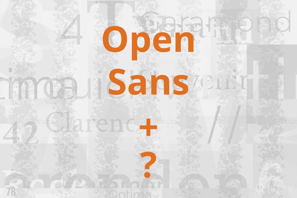
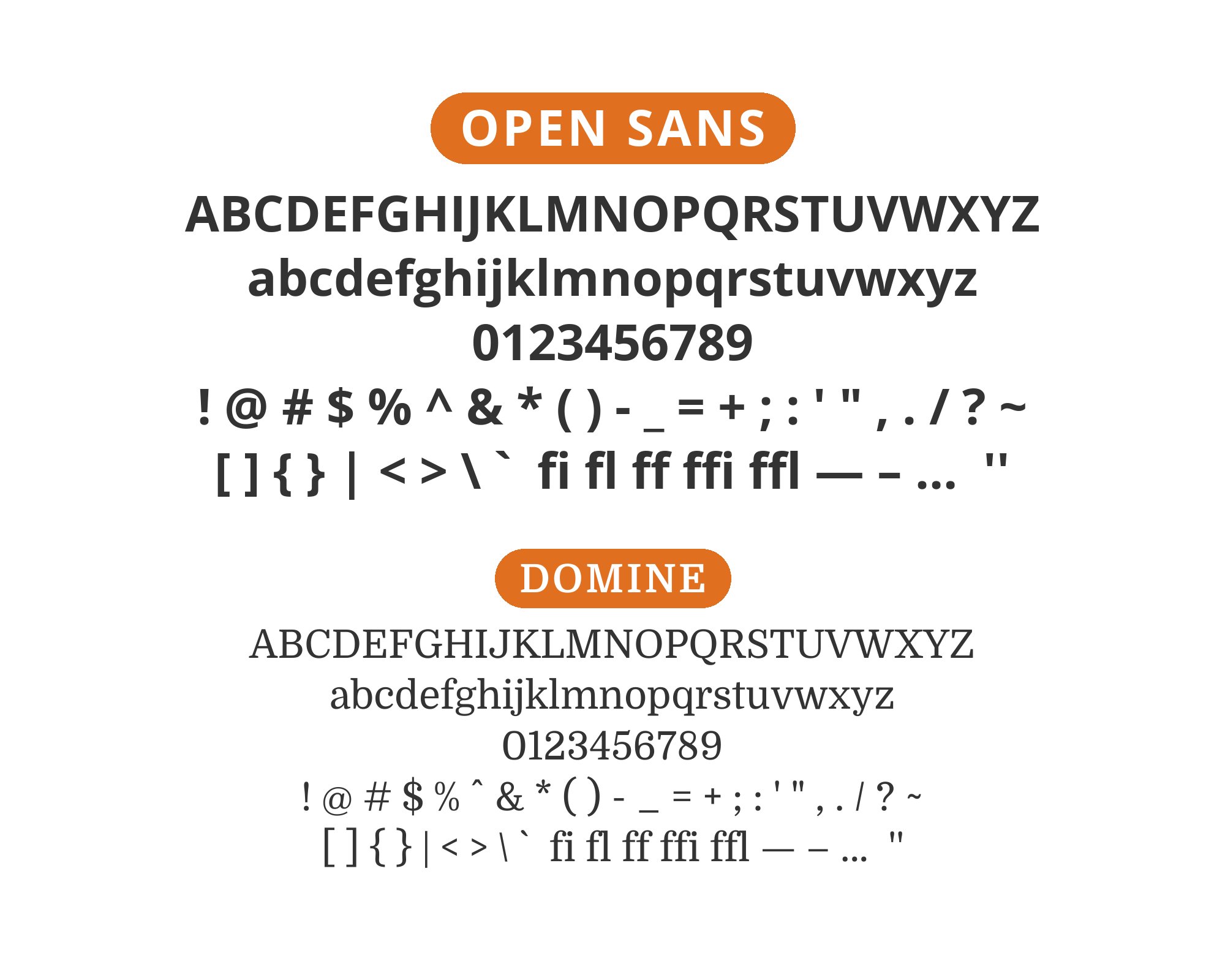
What fonts go with Open Sans? As one of the most widely used fonts on the web, this humanist sans-serif presents a pairing paradox: it works with almost everything, but choosing thoughtfully matters more than ever.
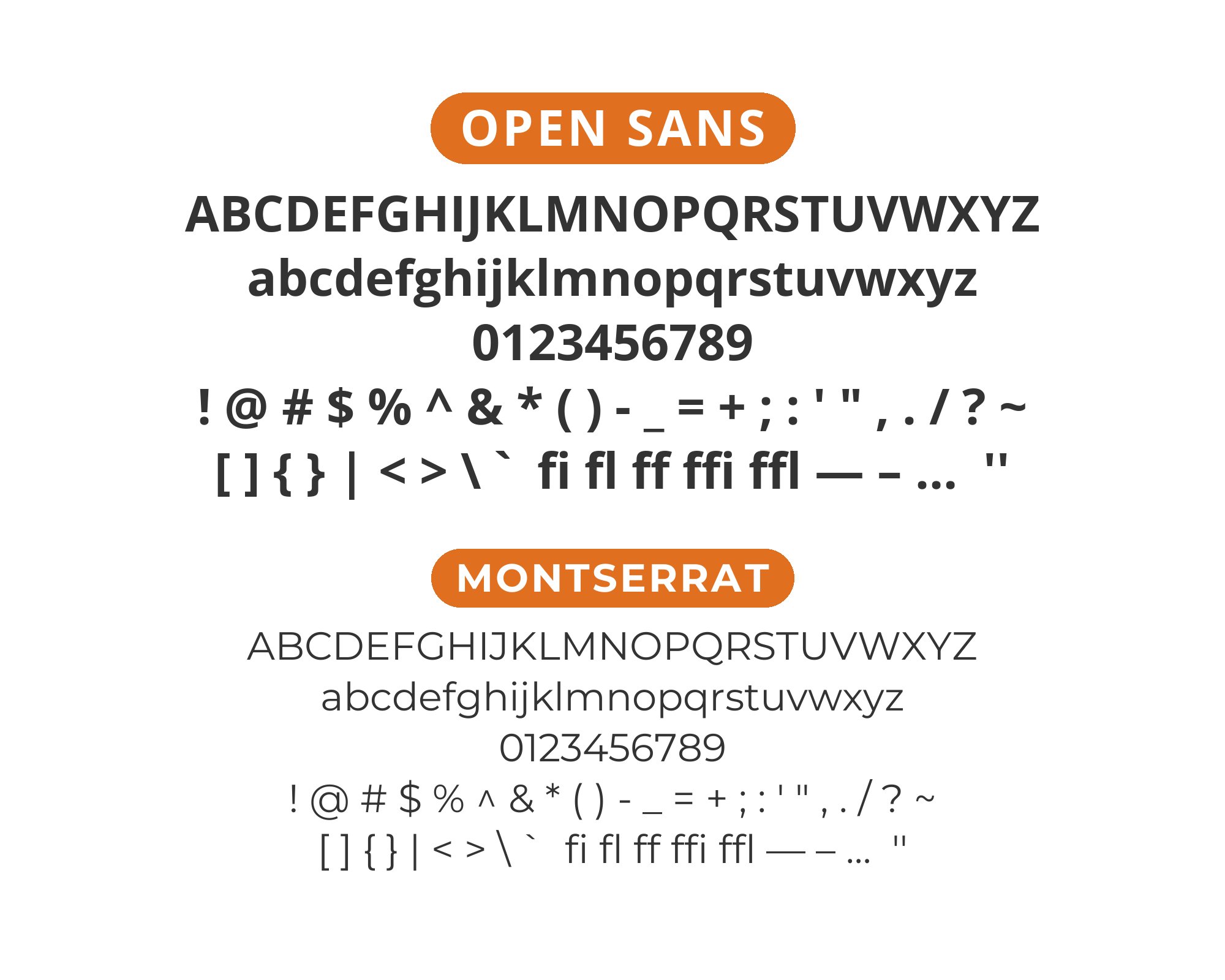
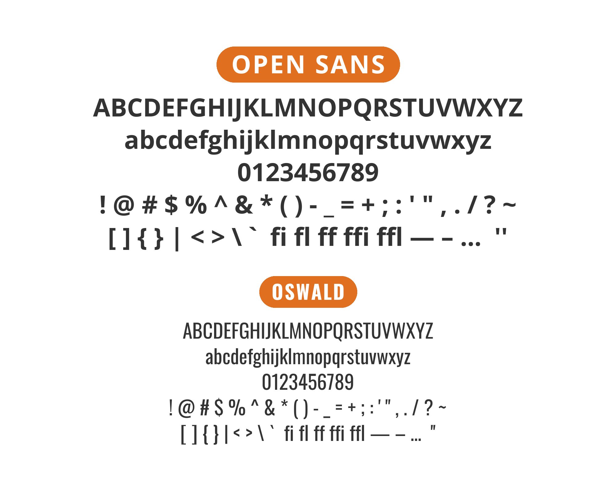
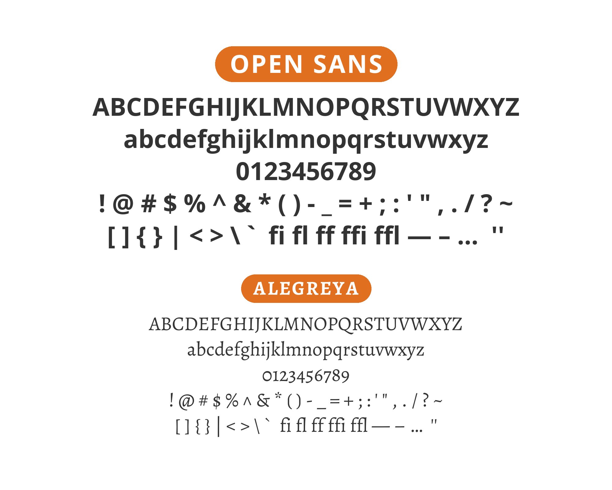
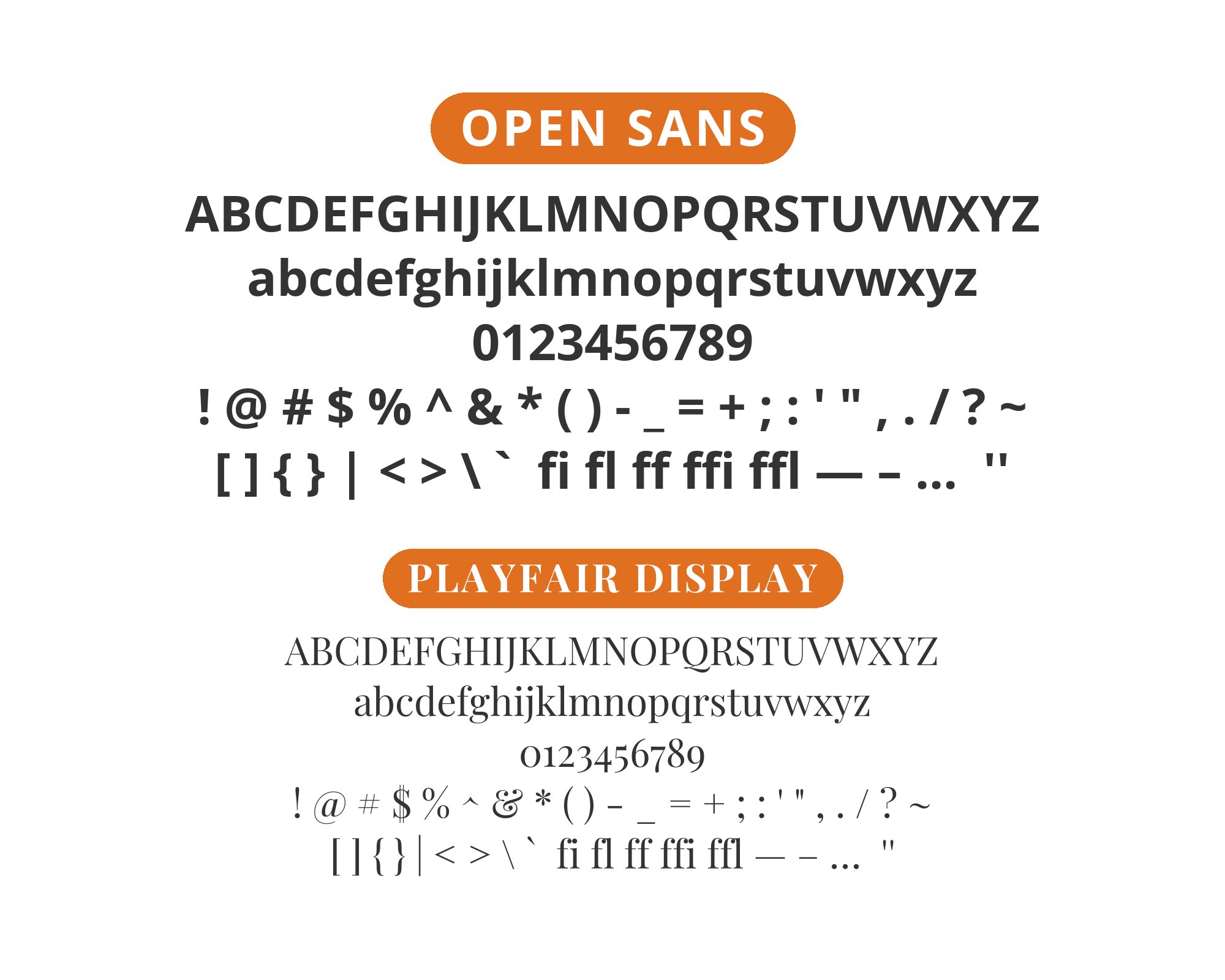
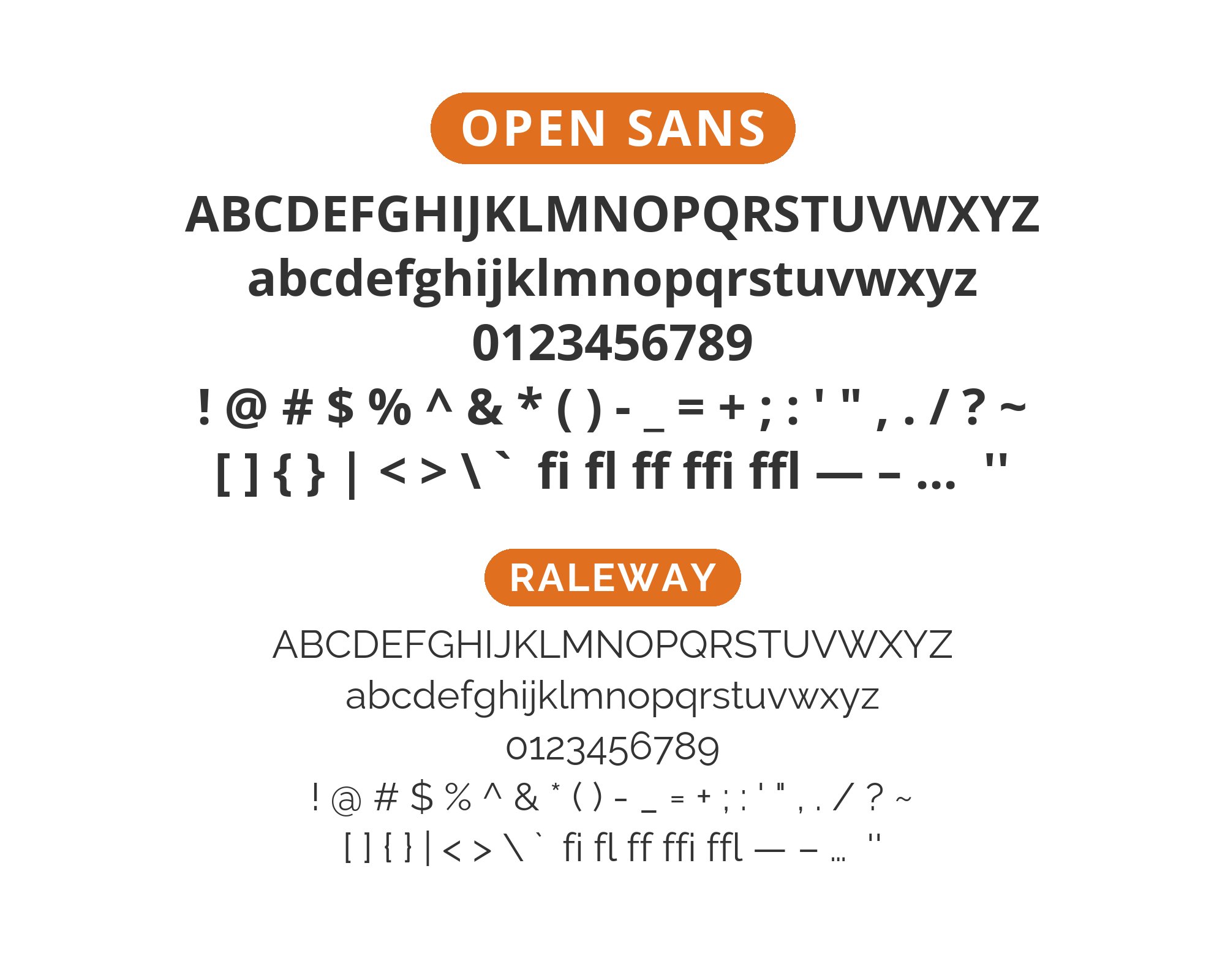
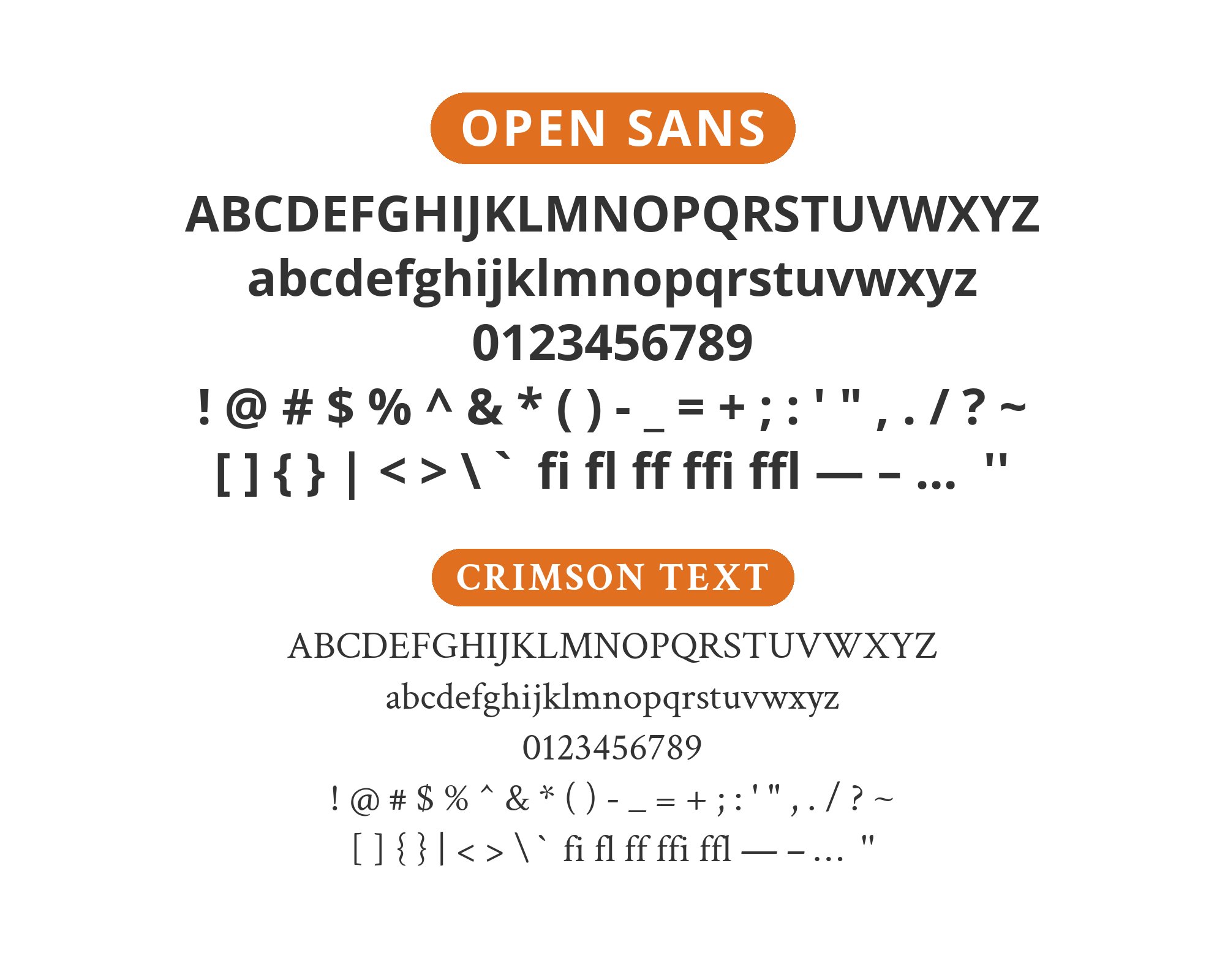
Open Sans, designed by Steve Matteson, was built from the start as a digital-first typeface. Its open forms, neutral appearance, and excellent legibility across platforms made it an instant favorite when it launched on Google Fonts. The design features upright, open letterforms and a neutral yet friendly appearance, optimized for print, web, and mobile interfaces. Its comprehensive character set and careful hinting ensure consistent rendering across an enormous range of contexts.
The difficulty with Open Sans isn’t finding fonts that work with it but rather avoiding combinations that feel like default choices. Its very neutrality means almost any pairing is technically successful, which puts pressure on designers to make intentional decisions. Serif companions can add editorial gravitas, while more characterful sans-serifs can bring personality that Open Sans deliberately lacks. Here are 15 fonts that pair well with Open Sans, selected for creating combinations that feel designed rather than defaulted.
1. Montserrat

Two geometric workhorses, but with distinct personalities. Montserrat‘s slightly wider proportions and distinctive uppercase characters bring creative flair that Open Sans’ pure utility lacks. The fonts share enough geometric DNA to harmonize, but Montserrat’s extra character prevents visual monotony. This pairing suits marketing sites, portfolios, and any project wanting contemporary polish without extreme typographic statements. Reliable versatility for the modern web.
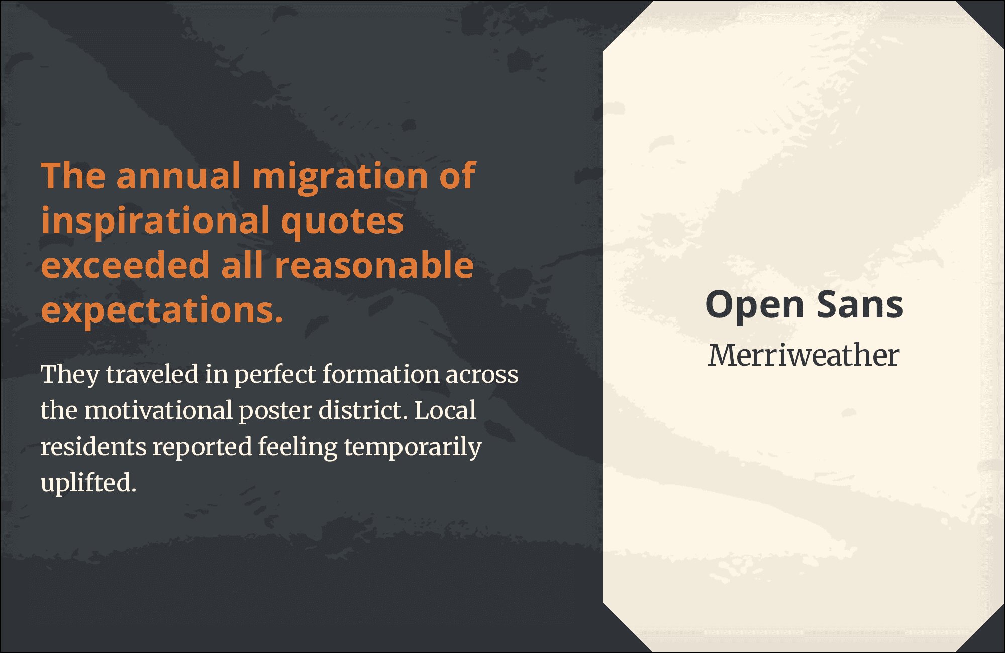
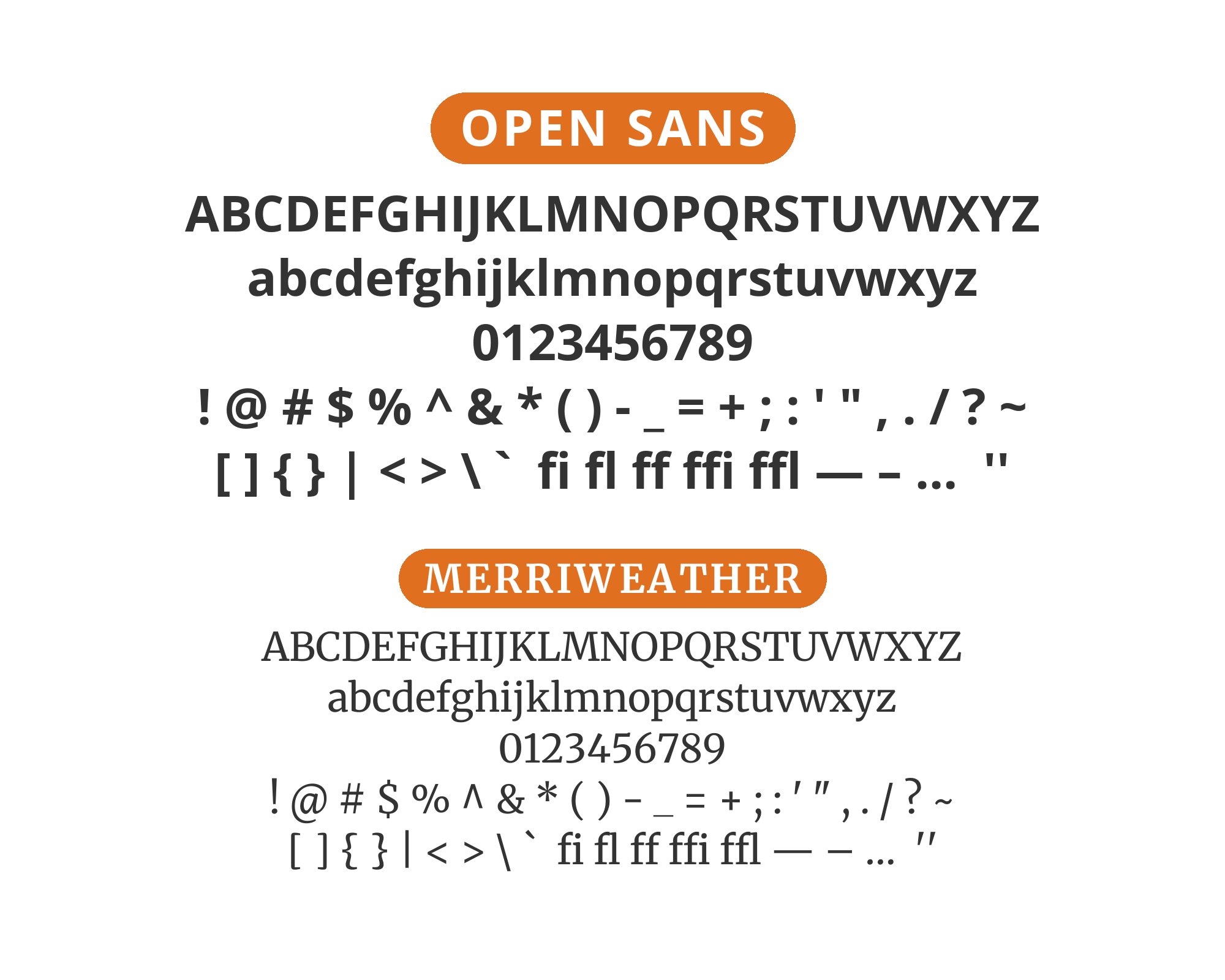
2. Merriweather

This is the accessibility pairing par excellence. Both fonts sport tall x-heights designed explicitly for screen readability, making body text scannable and comfortable across devices. Merriweather‘s sturdy serifs provide the classical contrast that makes Open Sans sing, while Open Sans handles utilitarian body work with its optimized letterforms. Government sites, healthcare portals, and educational platforms reach for this tested combination when readability cannot be compromised.
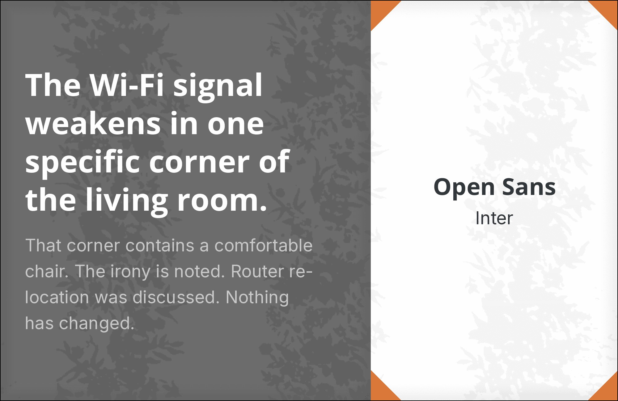
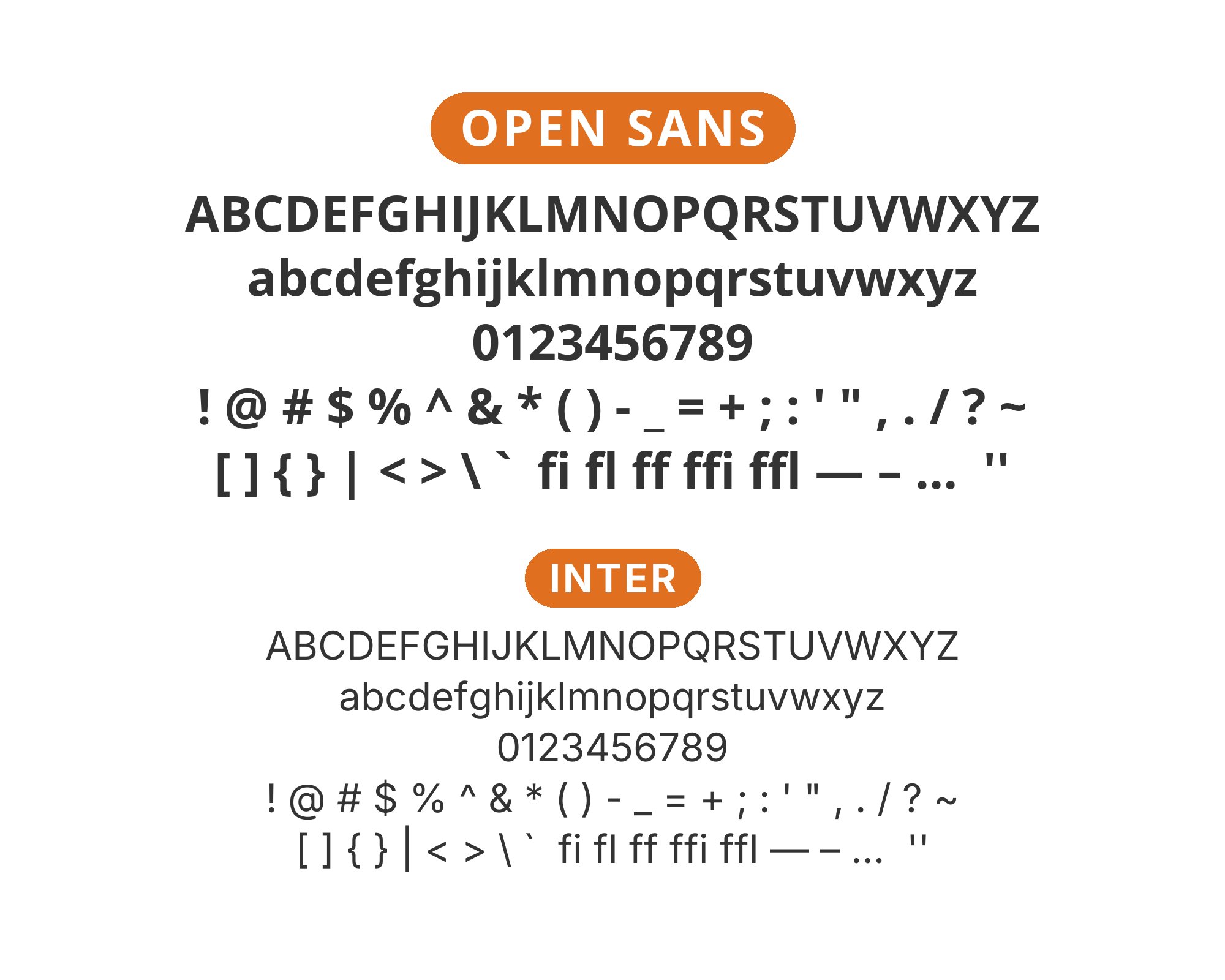
3. Inter
Two philosophies of screen readability meeting in productive harmony. Open Sans carries more humanist warmth with its calligraphic heritage, while Inter maintains Swiss geometric precision. The x-heights align closely enough that switching between them feels natural. This is the pairing for content platforms prioritizing pure delivery over typographic personality, the Wikipedia approach to type where the design disappears into pure utility.
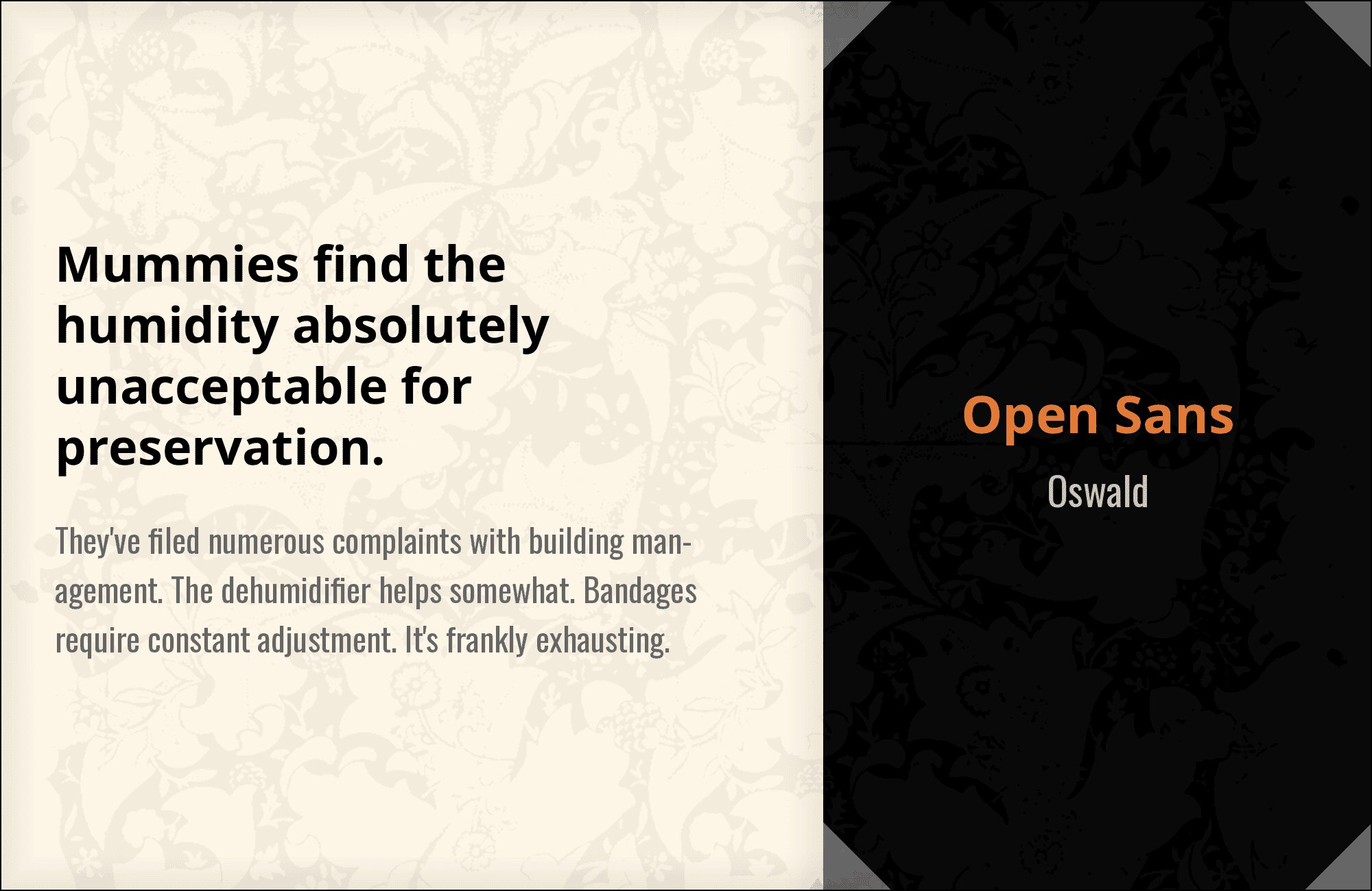
4. Oswald
Oswald‘s condensed, punchy letterforms create dramatic contrast against Open Sans’ friendly width. The pairing is about typographic volume control: Oswald shouts headlines in tight spaces while Open Sans speaks body text in measured tones. Those compressed proportions make Oswald perfect for news sites, sports applications, and event promotions. Open Sans handles the explanatory work below. Impact and clarity in perfect balance.
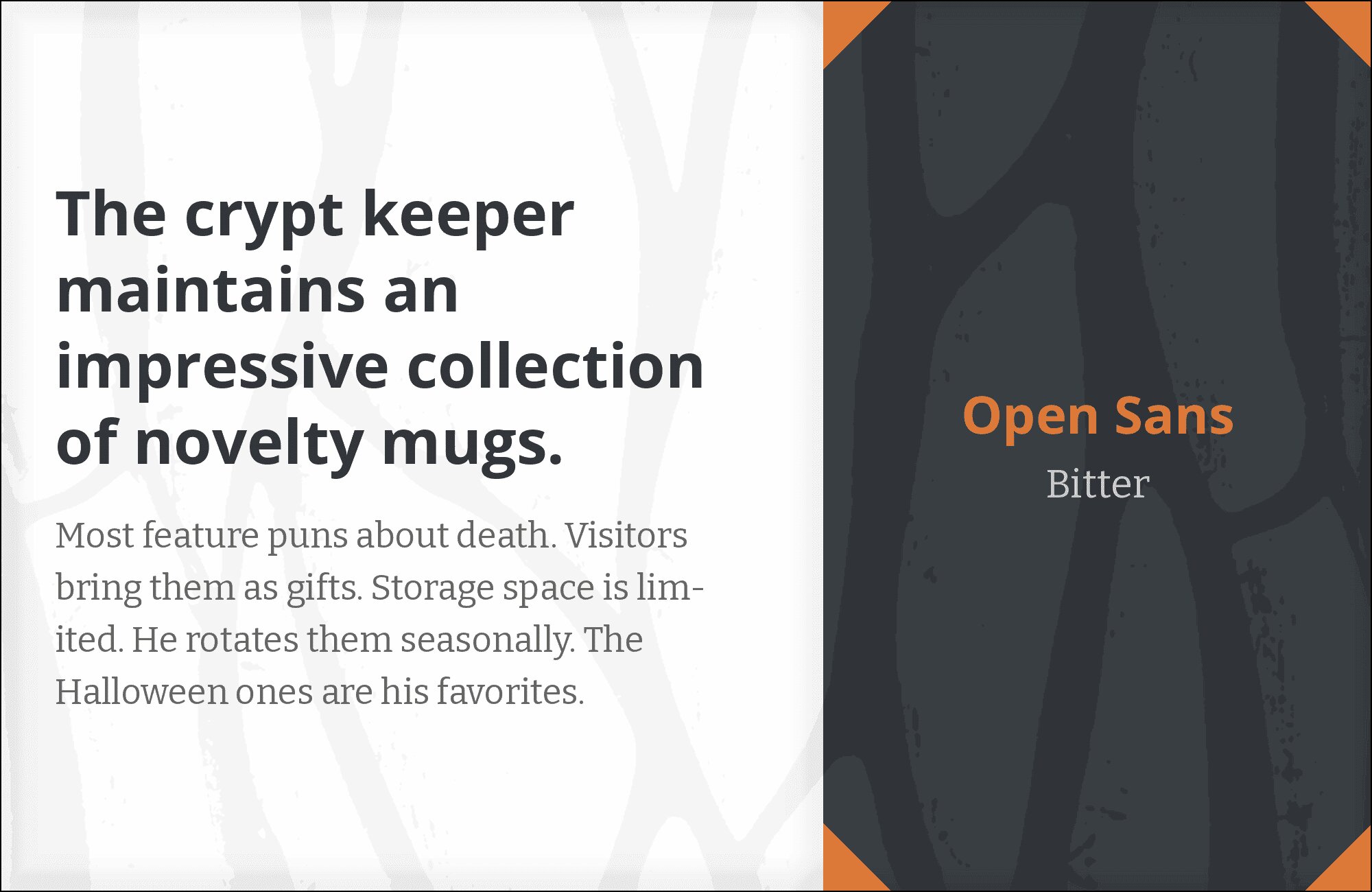
5. Bitter
Slab serifs command attention, and Bitter does so with a particularly warm, approachable character. Its sturdy slabs and consistent stroke weights create strong visual hierarchy against Open Sans’ clean geometry. This isn’t aggressive typography; it’s confident typography. The pairing works beautifully for editorial content, blog platforms, and any design wanting serif authority without stuffiness. Bitter headlines feel like a firm handshake.

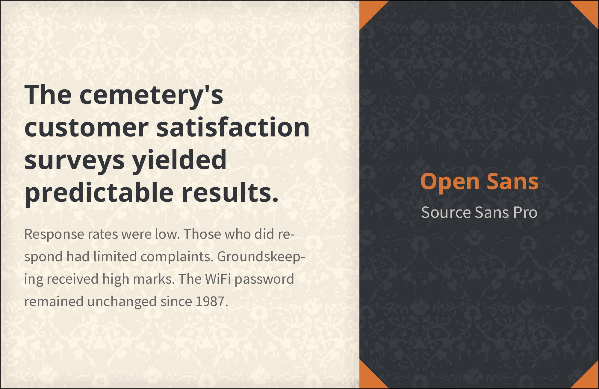
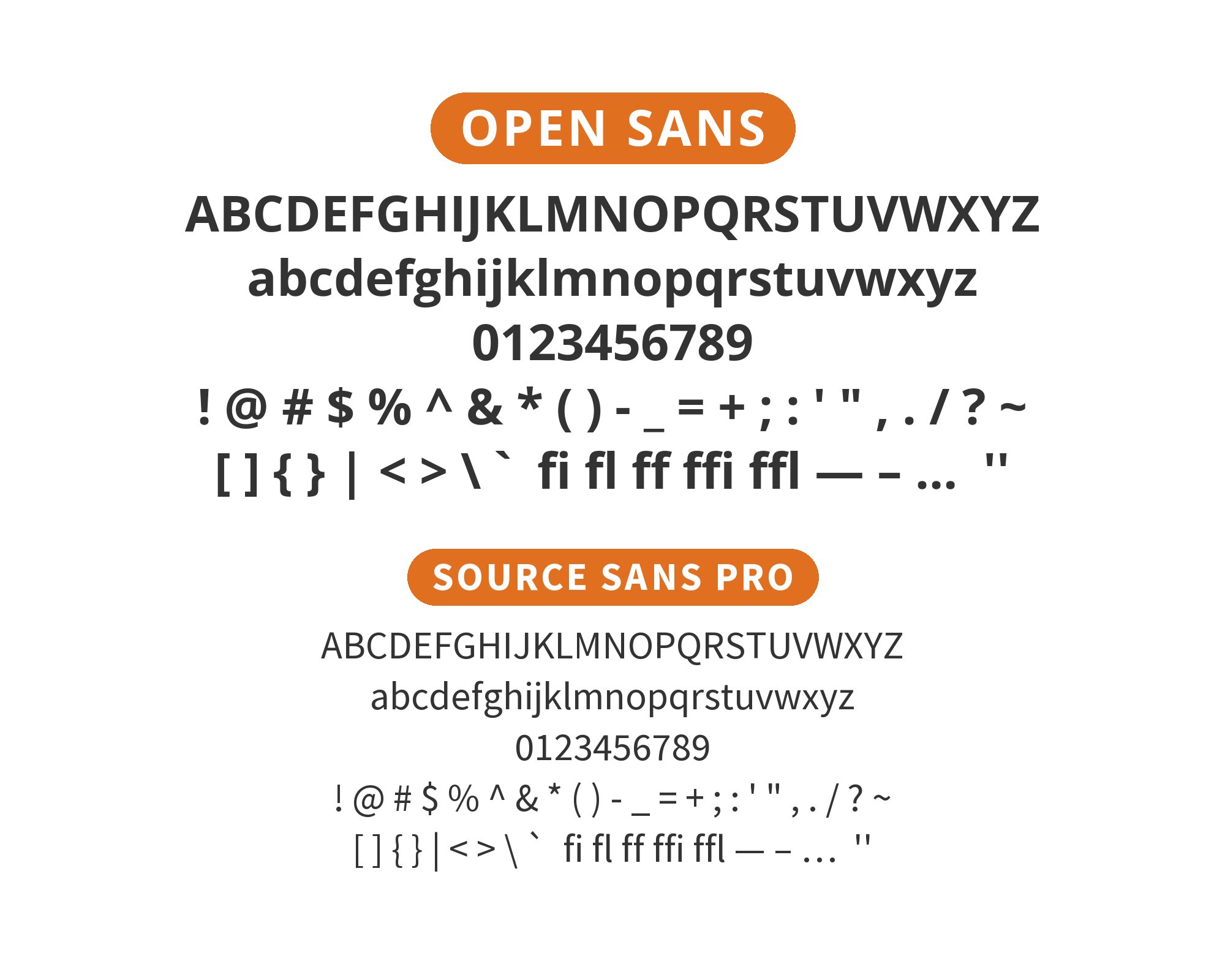
6. Source Sans Pro
Both fonts share humanist DNA and a commitment to screen optimization, making them feel like siblings rather than strangers. Source Sans Pro brings Adobe’s systematic approach, Open Sans brings Google’s accessibility focus. The proportions align closely enough that mixing feels intentional. This pairing suits design systems needing flexibility, enterprise applications requiring visual consistency across diverse content types. Professional harmony.

You'll love this article!
A visual guide for designers.
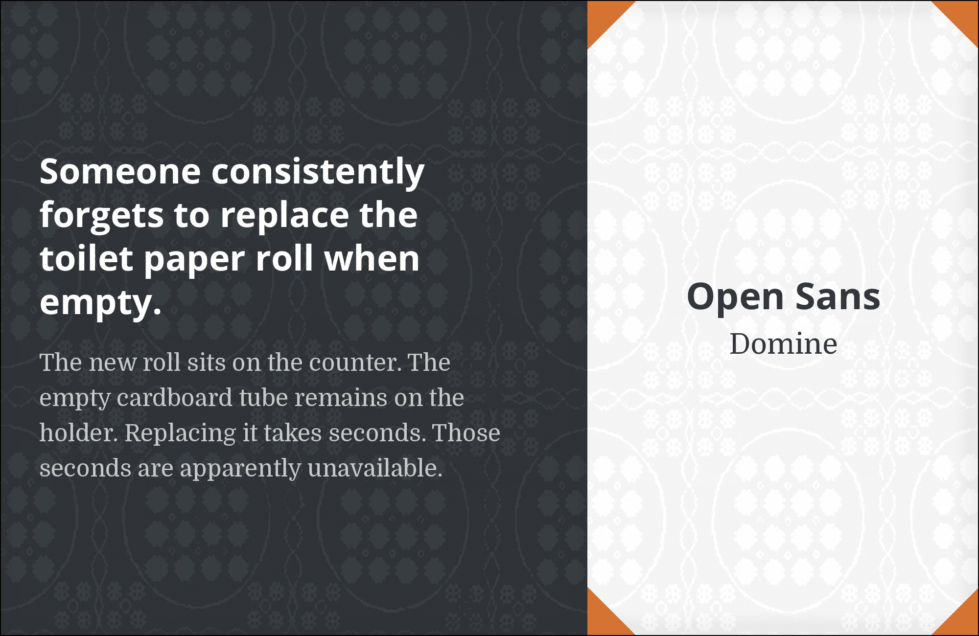
7. Domine
Domine‘s transitional serifs bring old-world authority that Open Sans’ friendliness complements perfectly. Those modulated strokes and refined proportions create the kind of classical contrast that typography textbooks celebrate. Domine wants to be sized generously for headlines, where its sophistication reads clearly. Open Sans handles the democratic work of body text below. Publishing platforms, cultural institutions, and brands wanting gravitas find their voice here.
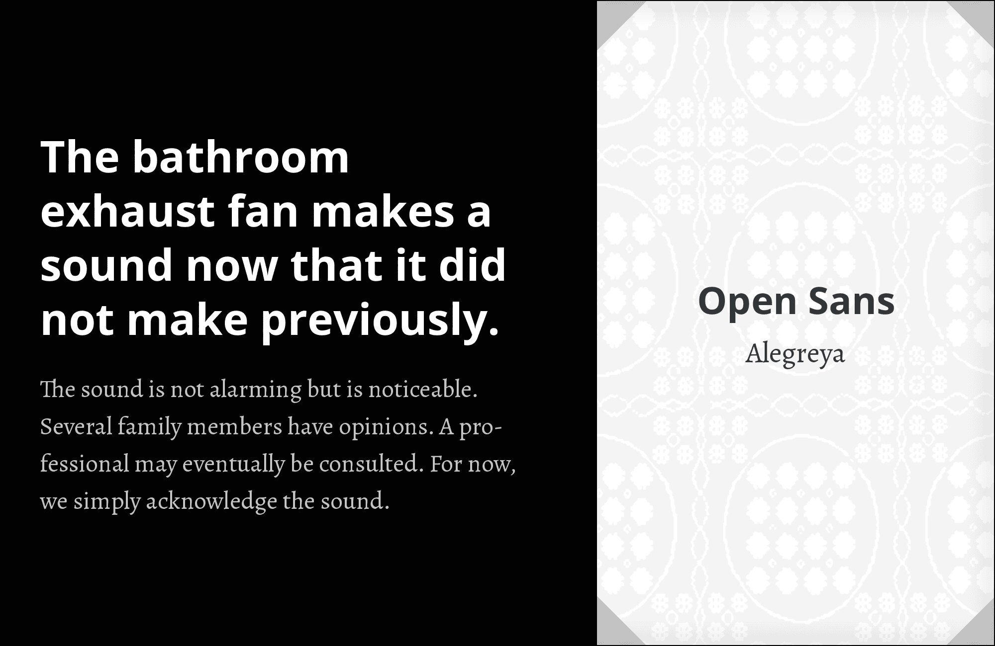
8. Alegreya
Alegreya‘s humanist warmth brings personality that Open Sans’ neutrality craves. Those calligraphic curves and organic letter shapes create visual interest that sustains long-form reading. Against Open Sans’ clean geometry, Alegreya reads like personality meeting pragmatism. This pairing excels in literary contexts, book-like digital experiences, and any platform where content deserves typographic character. Words that want to be savored.
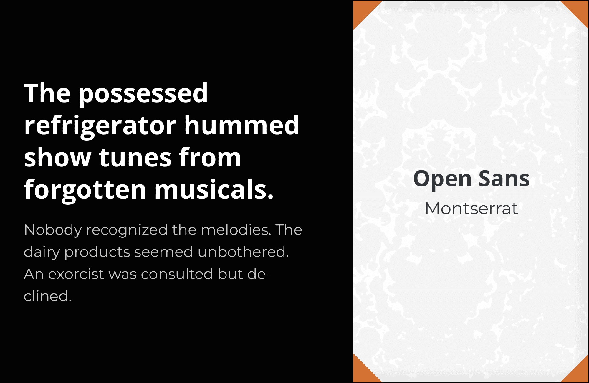
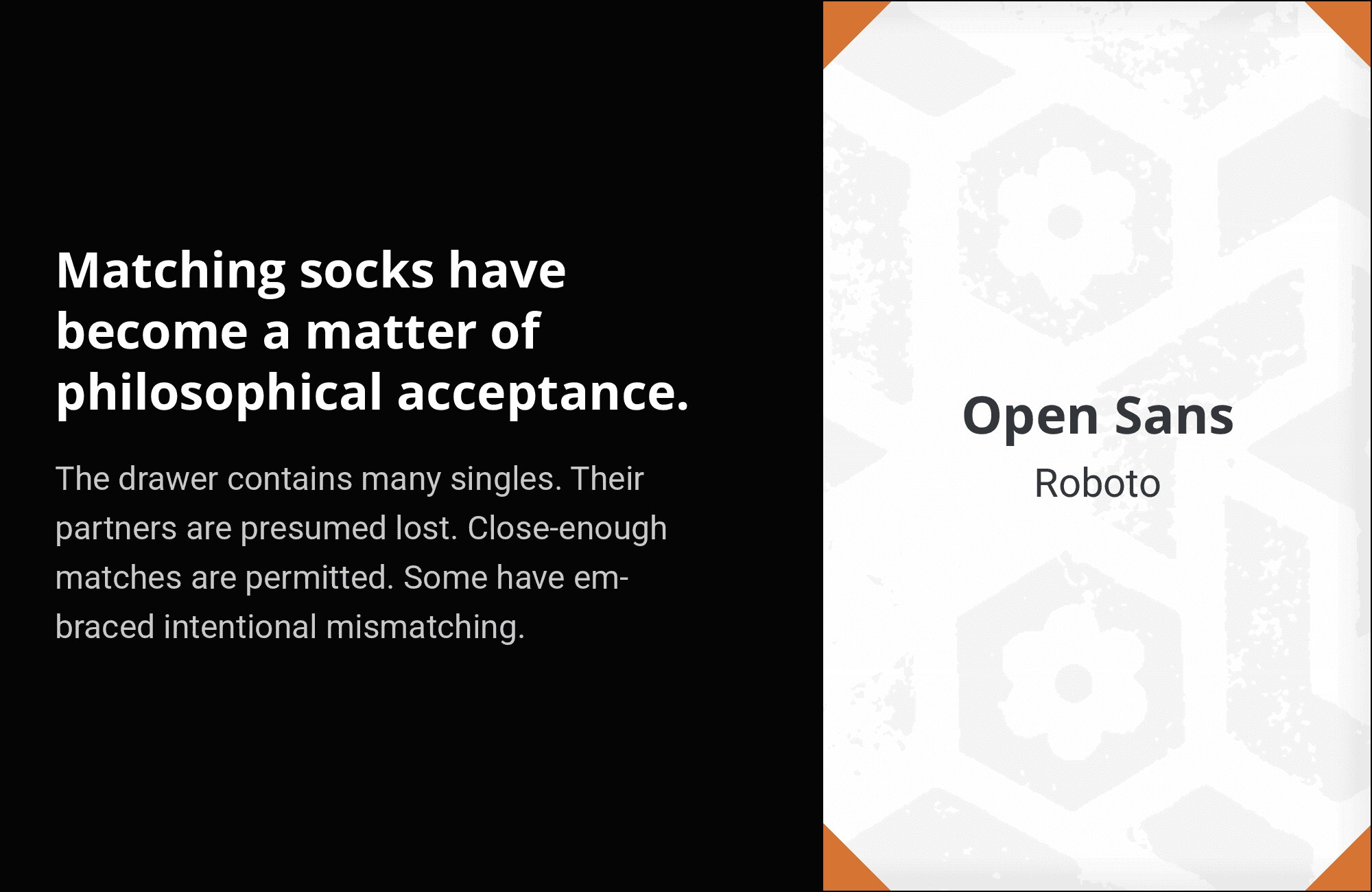
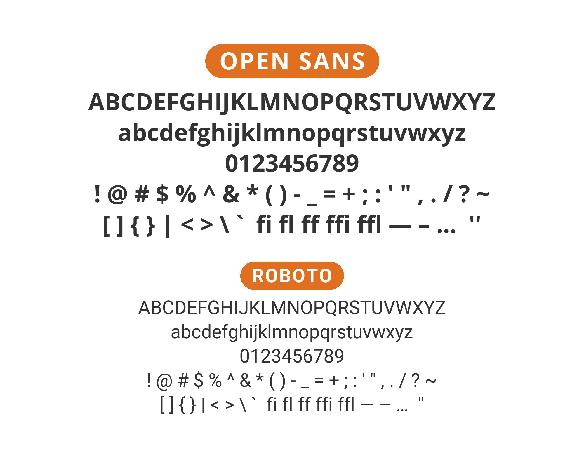
9. Roboto
The most neutral of neutral pairings. Both Roboto and Open Sans represent the gold standard of screen-safe typography, exhaustively optimized across devices and rendering contexts. Roboto brings slightly more geometric precision, Open Sans slightly more humanist warmth. Together they create an invisible typographic system that never distracts from content. Universal accessibility, pure and simple.
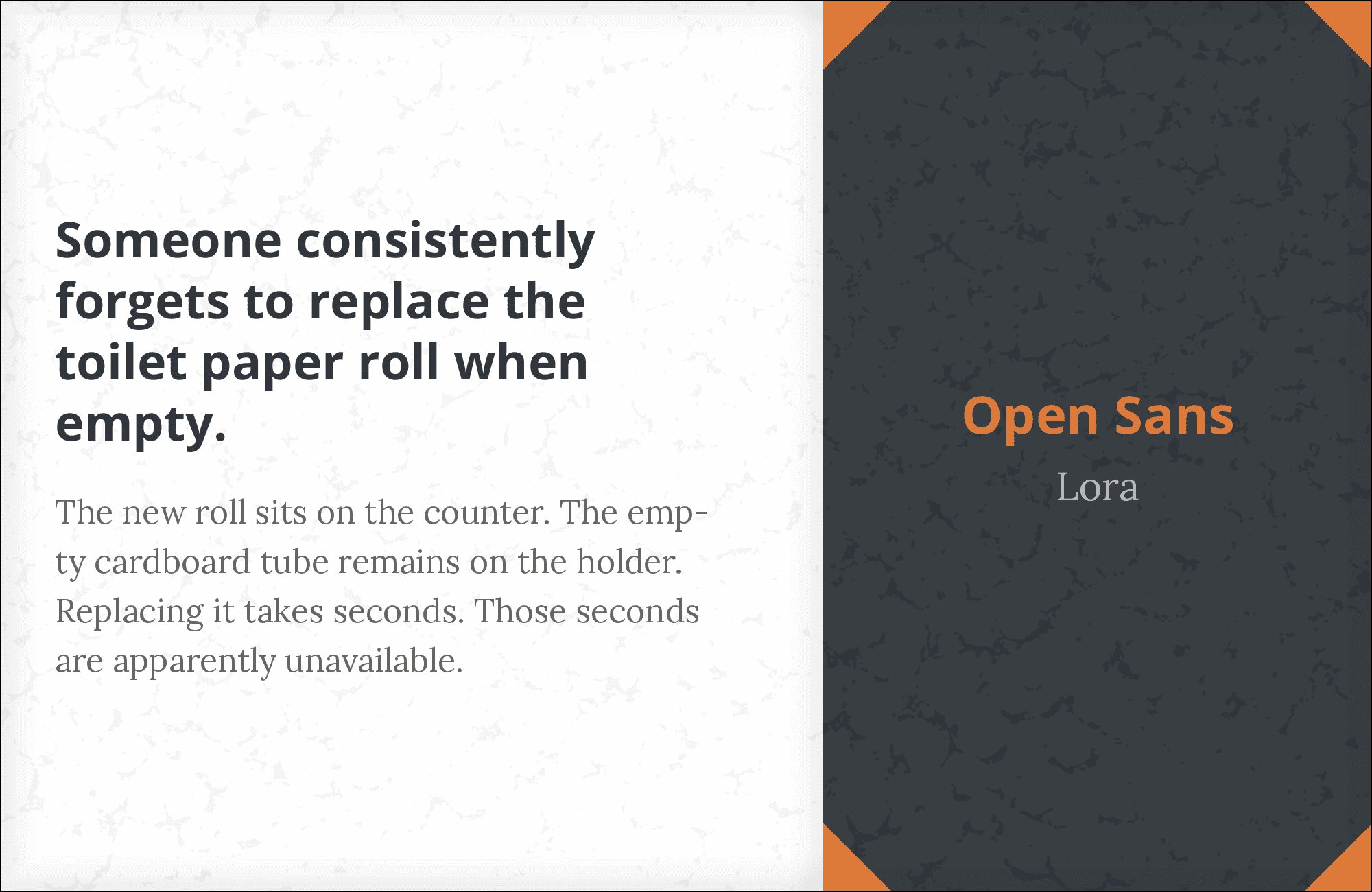
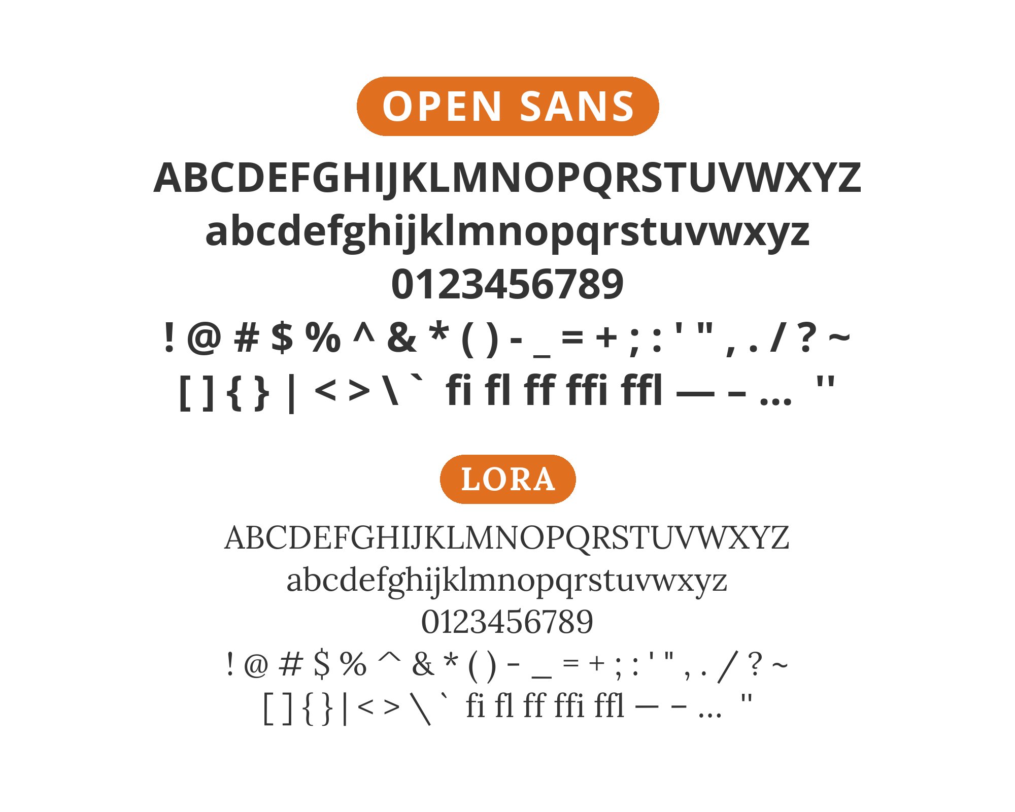
10. Lora
Lora‘s calligraphic charm provides the emotional depth that Open Sans’ utility can lack. Those brushed serifs and gentle stress create warmth against Open Sans’ open, friendly geometry. The pairing feels natural because both fonts prioritize readability while expressing different typographic philosophies. Content-heavy sites, particularly those with editorial ambitions, find balance here. Technical clarity meeting human warmth.
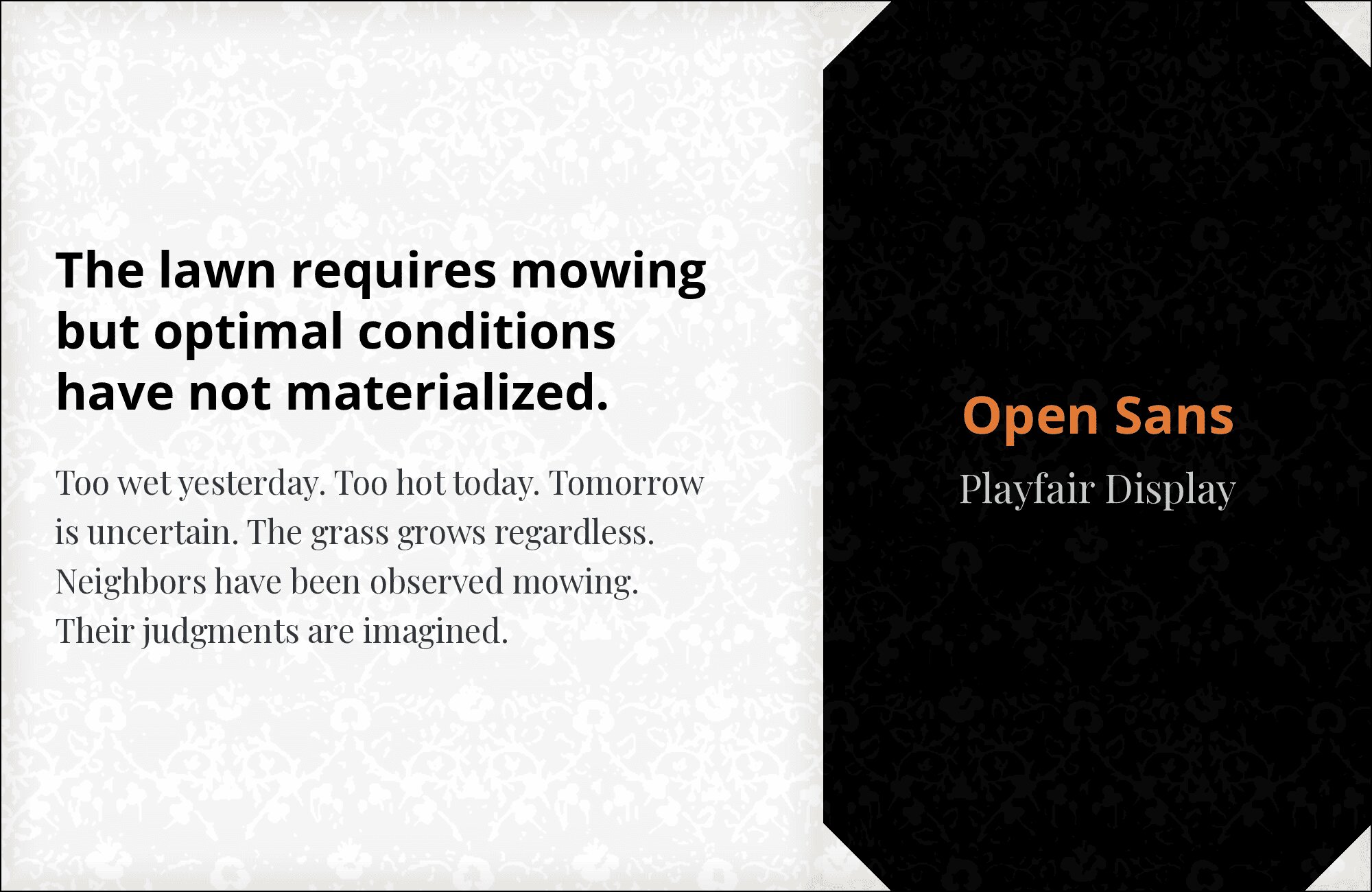
11. Playfair Display
High contrast meets humble utility. Playfair Display‘s dramatic hairlines and bold strokes demand attention at headline sizes, while Open Sans handles the practical work of readable body text. The contrast is absolute: 18th-century elegance against 21st-century accessibility. This pairing works for luxury brands wanting approachability, editorial sites wanting sophistication, and any design bridging classical and contemporary aesthetics.
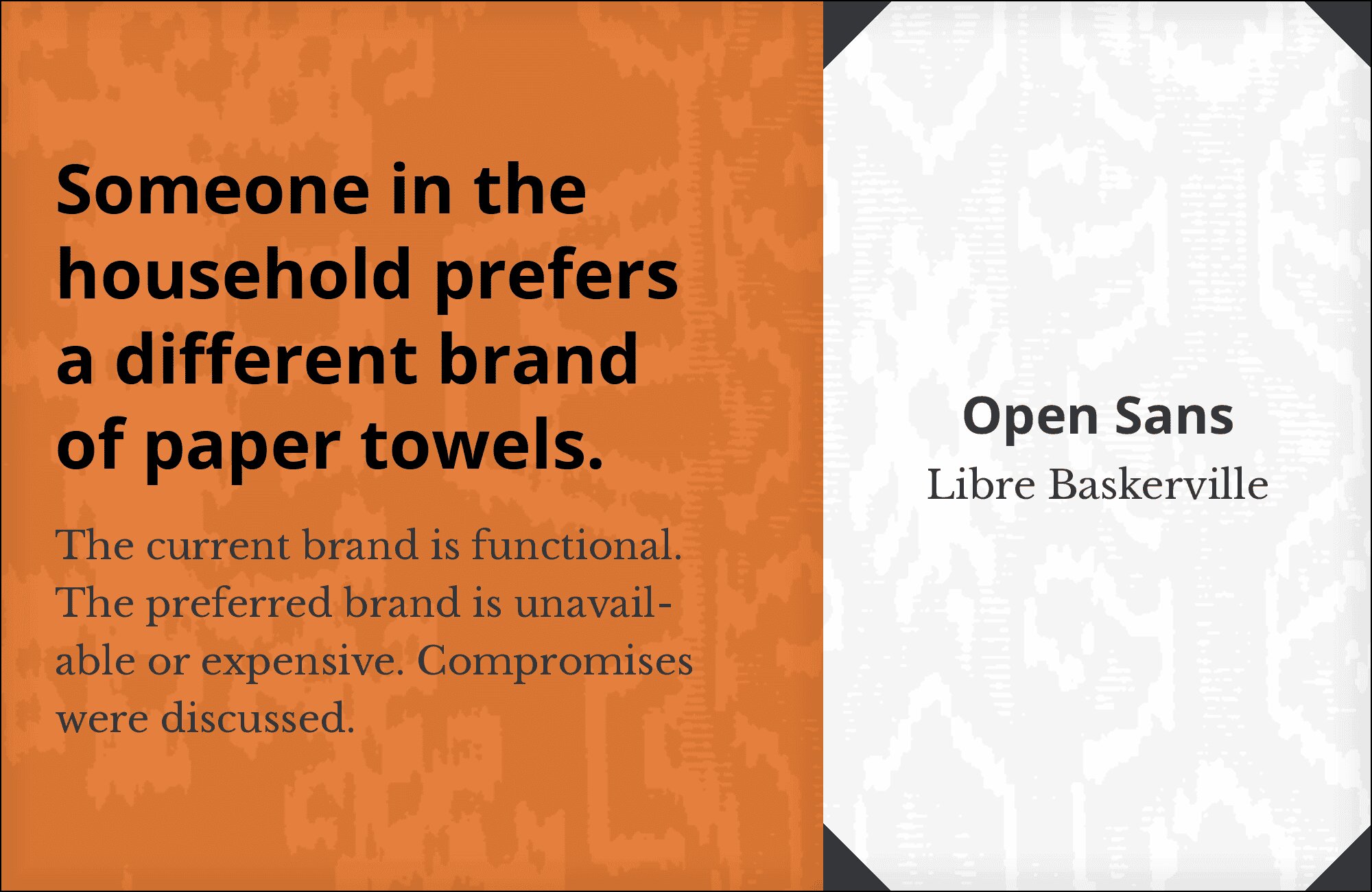
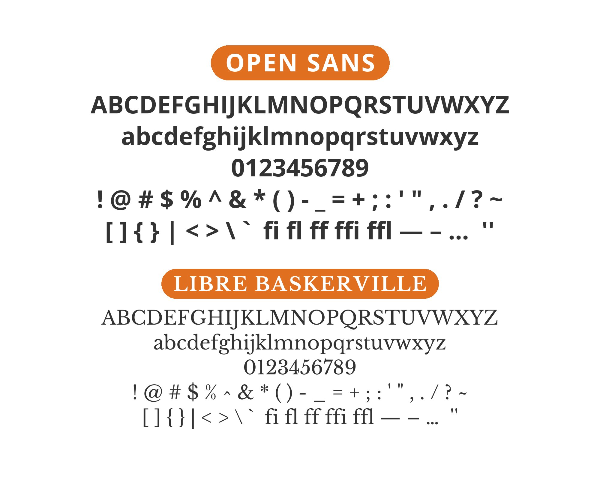
12. Libre Baskerville
Baskerville’s transitional elegance has survived three centuries for good reason. Against Open Sans’ modern friendliness, those refined serifs create the kind of typographic authority that communicates trust. Libre Baskerville for headlines suggests establishment, credibility, permanence. Open Sans below maintains approachable readability. Law firms, financial services, and institutions wanting to project reliability understand this pairing intuitively.
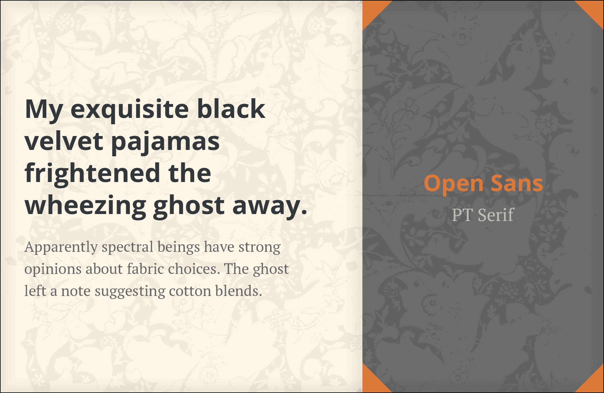
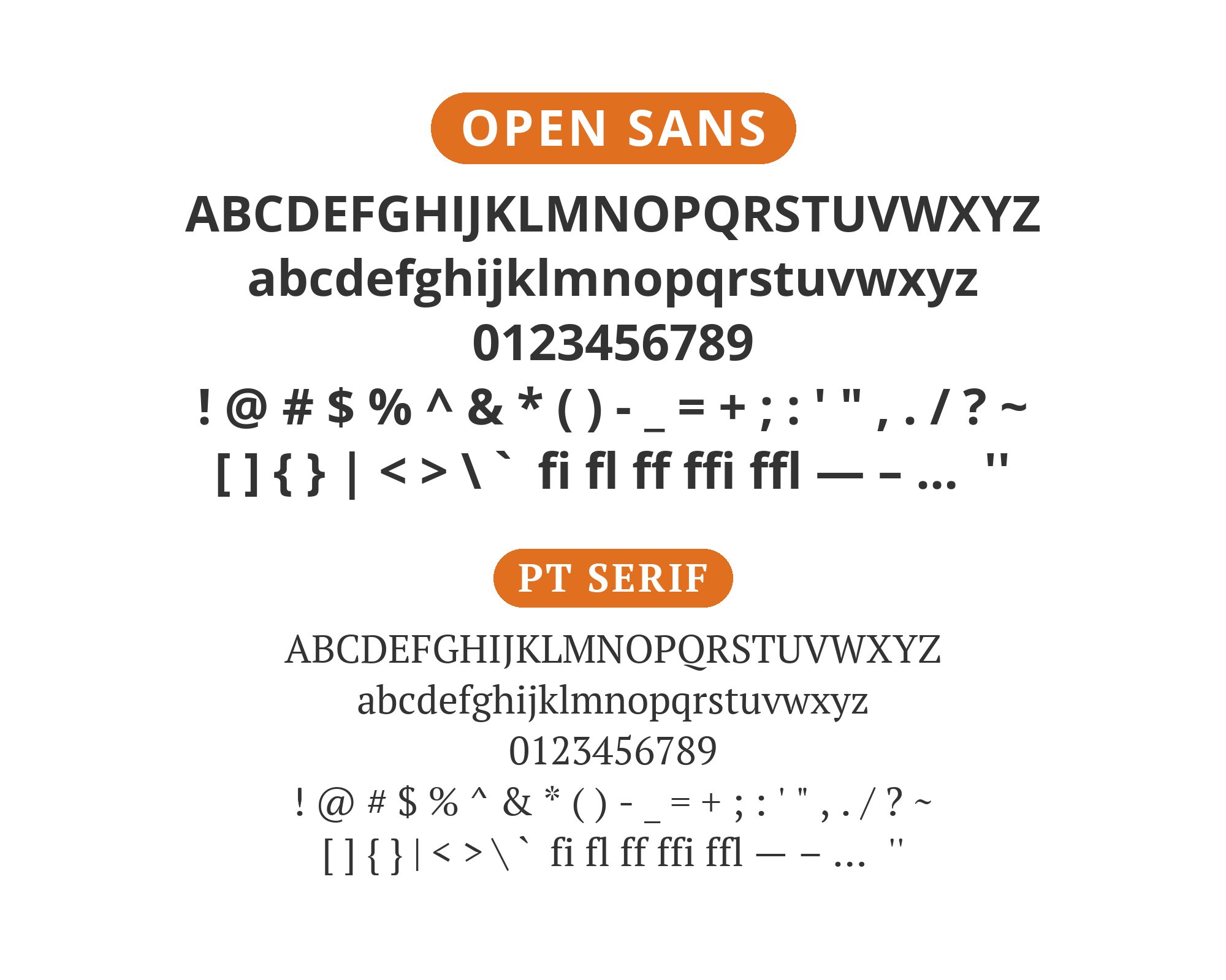
13. PT Serif

PT Serif brings ParaType’s Russian typographic tradition to the web with surprisingly universal results. Its sturdy proportions and readable details pair beautifully with Open Sans’ international neutrality. Both fonts prioritize functional clarity over stylistic flourish, making them natural companions. This pairing suits multilingual platforms, educational content, and any application where typography must serve rather than star.
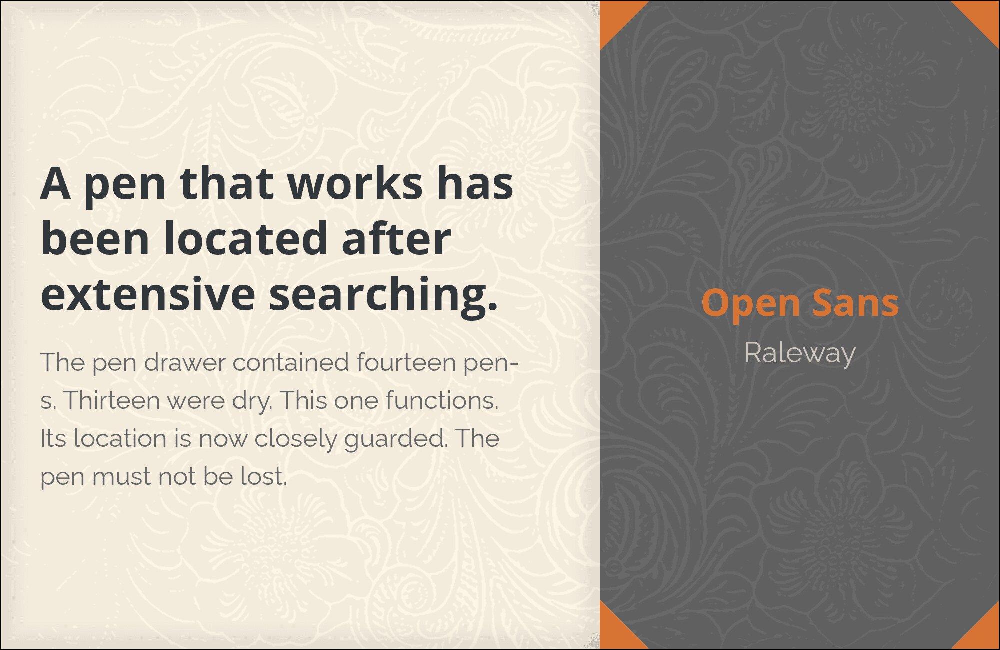
14. Raleway
Raleway‘s distinctive character, particularly in its weights and unique letterforms, brings personality that Open Sans’ pure utility lacks. The fonts share enough modern sensibility to harmonize, but Raleway’s extra flair prevents monotony. This pairing works for fashion, design, and lifestyle brands wanting contemporary sophistication. Raleway headlines feel intentional; Open Sans body text feels inevitable.
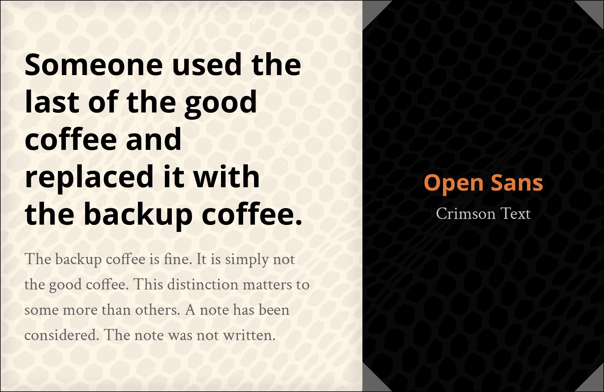
15. Crimson Text
Old-style elegance meets modern practicality. Crimson Text‘s Renaissance-inspired forms, with their diagonal stress and organic curves, create classical warmth against Open Sans’ clean accessibility. The pairing speaks to anyone wanting typographic gravitas without sacrificing screen readability. Academic publishing, literary magazines, and cultural commentary find their voice here. History and utility in productive conversation.
Conclusion
There are no absolute rules for font pairing, just principles to guide you. The key is contrast—in weight, in style (serif vs. sans-serif), or in personality. Open Sans is versatile enough to play well with many different typefaces.
Trust your eye, experiment freely, and remember that the best pairing is the one that serves your content and audience. Typography should enhance communication, not complicate it.