BonFX · Similar fonts
Every font below is an alternative to Raleway, plotted by how closely it matches. The number is its rank. Pick a name to jump to its sample, its one difference, and where to get it.
The closest fonts to Raleway are Quicksand, Proxima Nova and Gotham. All 28 similar fonts are shown below, ranked by how closely each one matches, with where to get it.
You like the airy, elegant look of Raleway, but you want something close that feels a little different. Maybe you need a stand-in for a project where Raleway does not quite fit.
This page shows 20 fonts that echo it. 17 of them are free, and the match scores run from 78% to 83%.
Raleway is a common sight on fashion sites, portfolios and luxury brands, and it earns that place with its light weights. But the thin ones are too fine for body text, and it is less comfortable for long reading. At heavier weights it turns into a generic geometric sans that many free fonts can match.
Try Semrush free. No credit card.
Start on the $0 plan. Paid plans from $117/mo billed annually.
Try for freeThe font you are matching
Raleway

Background
Raleway is an elegant sans-serif typeface family. Initially designed by Matt McInerney as a single thin weight, it was expanded into a 9 weight family by Pablo Impallari and Rodrigo Fuenzalida in 2012 and iKerned by Igino Marini. A thorough review and italic was added in 2016. It is a display face and the download features both old style and lining numerals, standard and discretionary ligatures, a pretty complete set of diacritics, as well as a stylistic alternate inspired by more geometric sans-serif typefaces than its neo-grotesque inspired default character set.
The match map
20 fonts. Click a name.
1.Quicksand
83% matchnear

Character differences

Quicksand is a display sans serif with rounded terminals. The project was initiated by Andrew Paglinawan in 2008 using geometric shapes as a core foundation. It is designed for display purposes but kept legible enough to use in small sizes as well.
Light and round like Raleway, but with fully rounded ends on every stroke. The y has a curved tail and the W is plain.
FreeGoogle Fonts
↑ map2.Proxima Nova
82% matchnear

Character differences

The Proxima Nova Font Family was designed by Mark Simonson and published by Mark Simonson Studio.
The same wide, round build, but heavier. The W is a plain W, not Raleway's crossed one, and the numbers are all full height.
PaidMark Simonson Studio $39.99 per style; 16-style family $359.99; 80-style superfamily $975.99
↑ map3.Gotham
82% matchnear

Character differences

Gotham is a geometric sans-serif typeface family designed in 2000 by American type designer Tobias Frere-Jones with Jesse Ragan and released through the Hoefler & Frere-Jones foundry in 2002.
Wide round capitals like Raleway and a similar light feel. The W is plain and the numbers sit on the line.
PaidMyFonts licenses from $200.00 USD; family of 120 fonts $1,200.00 USD
↑ map4.Encode Sans Expanded
82% matchnear

Character differences

Encode Sans Expanded is a sans serif family by Impallari Type, Andres Torresi, Jacques Le Bailly. It was added to Google Fonts on 2017-02-08.
Wide letters with a light, even weight like Raleway. The W is plain and the numbers are full height.
FreeGoogle Fonts
↑ map5.Questrial
82% matchnear

Character differences

Questrial is a sans serif family by Joe Prince, Laura Meseguer. It was added to Google Fonts on 2011-08-10.
Round, geometric capitals like Raleway at a medium weight. The W is plain and the lowercase j has no hook.
FreeGoogle Fonts
↑ map6.Red Hat Display
81% matchnear

Character differences

Red Hat is a family of typefaces produced in 2 optical sizes and a monospace style, in a range of weights with italics. The fonts were originally commissioned by Paula Scher, Pentagram and designed by Jeremy Mickel, MCKL for the new Red Hat identity.
Round capitals and an open build like Raleway, but a little heavier. The W is plain.
FreeGoogle Fonts
↑ map7.Kanit
81% matchnear

Character differences

Kanit is a sans serif family by Cadson Demak. It was added to Google Fonts on 2015-12-07.
Very light like Raleway, with round capitals. The G has a hook and the numbers are full height.
FreeGoogle Fonts
↑ map8.Varela
81% matchloose

Character differences

Varela is a sans serif family by Joe Prince. It was added to Google Fonts on 2011-06-29.
Round and friendly like Raleway, but clearly heavier. The W is plain and the lowercase is a little wider.
FreeGoogle Fonts
↑ map“AI builds anything, so what do I sell?”
Taste is the answer. Own your stack and automate your own CMS.
Find Out How9.SF Pro
81% matchloose

Character differences

San Francisco is a neo-grotesque sans-serif typeface made by Apple Inc. It was first released to developers on November 18, 2014. It is the first new typeface designed at Apple in nearly twenty years, and was inspired by Helvetica and FF DIN.
The weight is much heavier than Raleway and the fit is tighter. The shapes are plain and neutral.
↑ map10.Helvetica Now
80% matchloose

Character differences

The Helvetica Now Font Family was designed by Max Miedinger, Charles Nix, Monotype Design Studio, Friedrich Althausen, Malou Verlomme, Jan Hendrik Weber, Emilios Theofanous and published by Monotype.
A neutral grotesque, not a geometric. It is heavier than Raleway and the round letters are less round.
PaidMyFonts from $42.99 USD; family of 96 fonts $548.99 USD · Free clone: Helvetica
↑ map11.Mulish
80% matchnear

Character differences
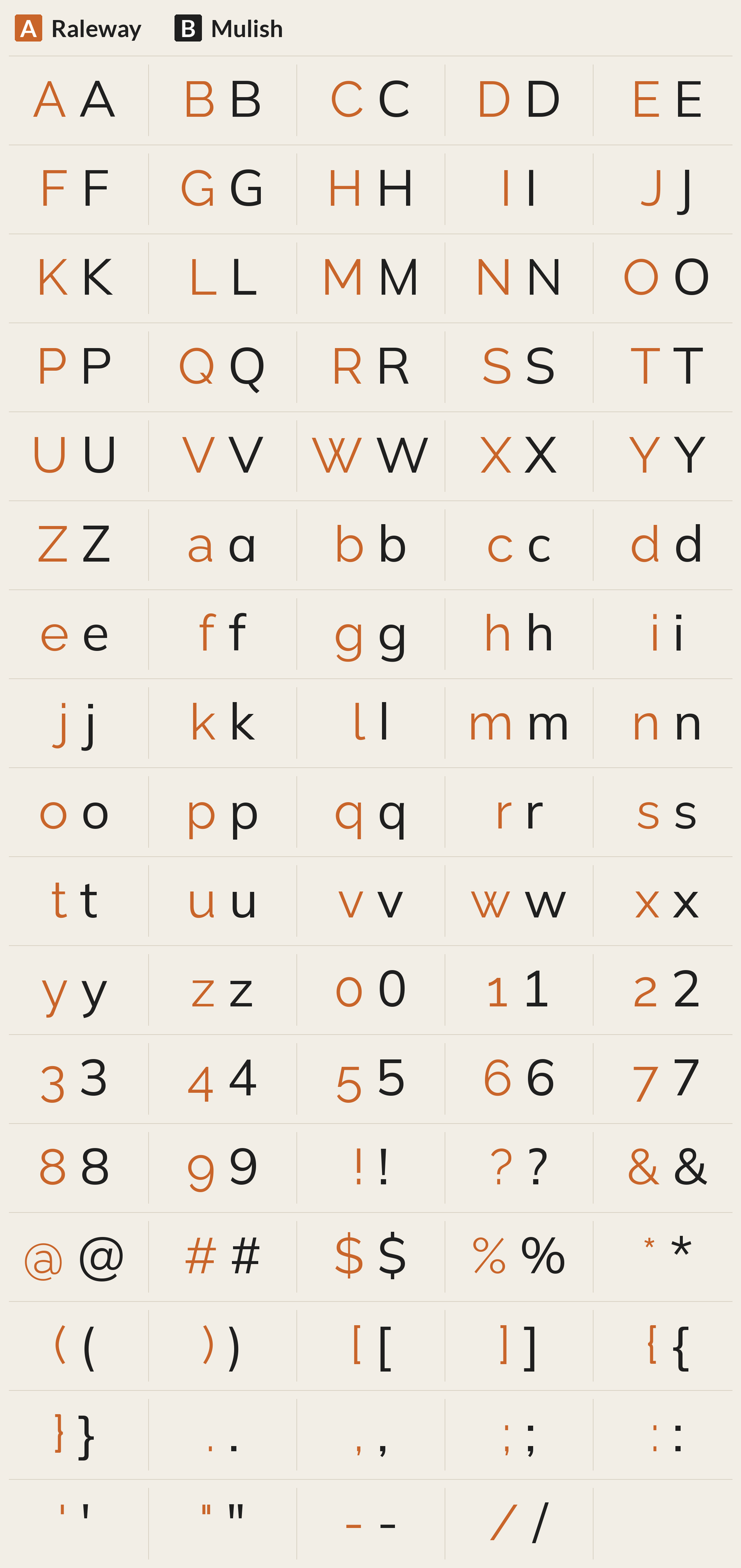
Mulish is a minimalist Sans Serif typeface, designed for both display and text typography.
Clean and round like Raleway, at a medium weight. The W is plain and the numbers are full height.
FreeGoogle Fonts
↑ map12.Merge One
80% matchloose

Character differences

Merge One is a sans serif family by Kosal Sen. It was added to Google Fonts on 2012-10-05.
Medium weight with softly rounded corners. Heavier than Raleway and the W is plain.
FreeGoogle Fonts
↑ map13.NTR
80% matchloose

Character differences

NTR is a Telugu handwriting font inspired by the artist Bapu who is famous among Telugu people. Many artists followed him and created their own style and this font shows that influence.
Round and open like Raleway but heavier. The W is plain and the lowercase letters are wider.
FreeGoogle Fonts
↑ map14.Plus Jakarta Sans
79% matchnear

Character differences

Plus Jakarta Sans is a fresh take on geometric sans serif styles, designed by Gumpita Rahayu from Tokotype. The fonts were originally commissioned by 6616 Studio for Jakarta Provincial Government program's +Jakarta City of Collaboration identity in 2020.
Round capitals with a light feel like Raleway. The W is plain and the numbers are full height.
FreeGoogle Fonts
↑ map15.Varela Round
79% matchloose

Character differences

Varela Round is based on the well known font Varela. Its rounded corners make it perfect for a soft feel and work great at any size. It is suitable for headlines and printed collateral, and maintains its distinct properties amongst other objects.
Soft round ends and a medium weight. Heavier than Raleway, with a plain W.
FreeGoogle Fonts
↑ map16.Urbanist
79% matchnear

Character differences

Urbanist is a low-contrast, geometric sans-serif inspired by Modernist typography and design. The project was launched by Corey Hu in 2020 with 9 weights and accompanying italics. Conceived from elementary shapes, Urbanist's neutrality makes it a versatile display font for print and digital mediums.
Geometric and light like Raleway, with a very round O and C. The W is plain.
FreeGoogle Fonts
↑ map17.Inter
78% matchloose

Character differences

Inter is a variable font family carefully crafted & designed for computer screens. Inter features a tall x-height to aid in readability of mixed-case and lower-case text.
A plain grotesque with a much heavier weight than Raleway. The round letters are less round.
FreeGoogle Fonts
↑ mapWebflow. Framer. Squarespace. Wix. Lovable. Not your future.
Your own AI CMS agent is.
Find Out More18.Figtree
78% matchnear

Character differences
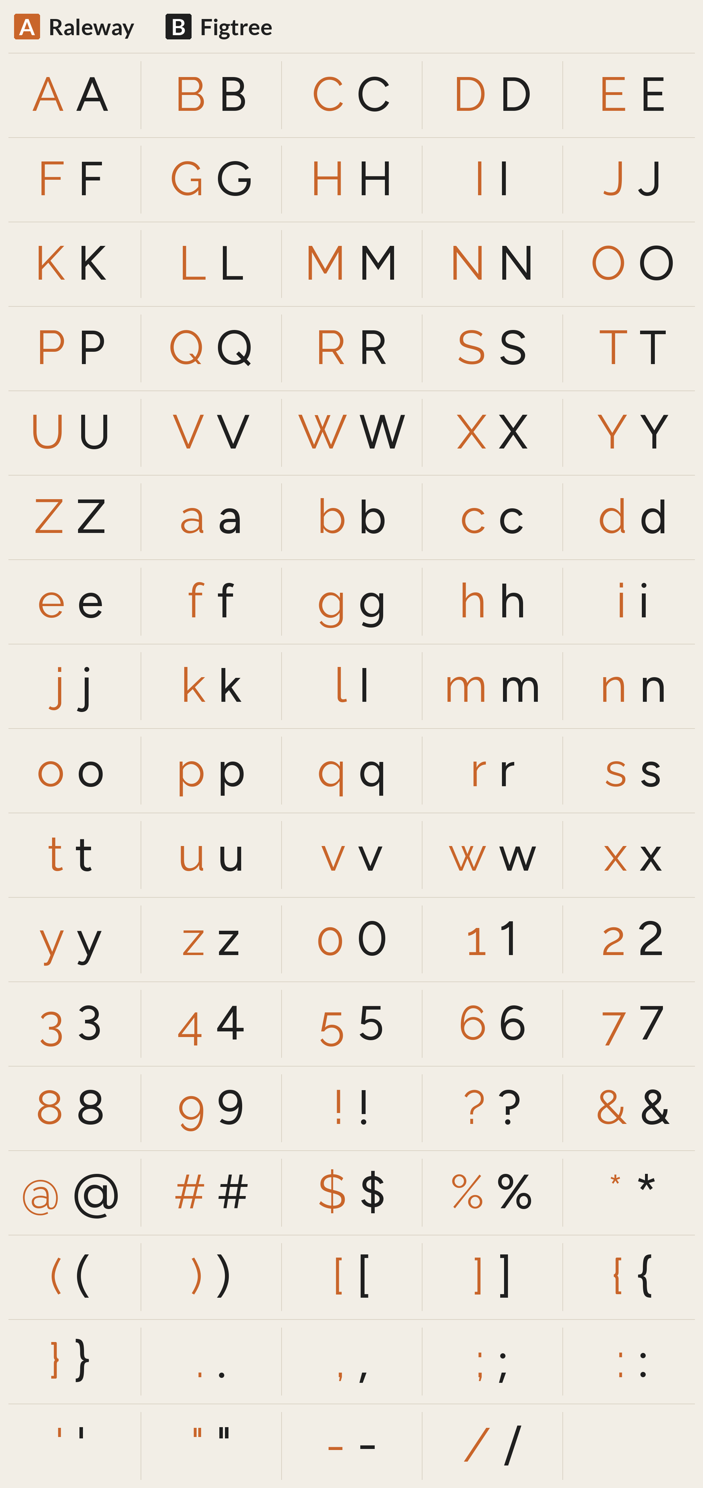
Figtree is a sans serif family by Erik Kennedy. It was added to Google Fonts on 2022-07-21.
Round and friendly like Raleway, with a slightly heavier stroke. The W is plain.
FreeGoogle Fonts
↑ map19.Comfortaa
78% matchloose

Character differences

Comfortaa is a display family by Johan Aakerlund. It was added to Google Fonts on 2011-08-10.
Fully rounded ends and circular letters; a playful look. Rounder than Raleway.
FreeGoogle Fonts
↑ map20.Tenor Sans
78% matchnear

Character differences

Tenor Sans is a humanist sans-serif typeface designed by Denis Masharov. Intended for the setting of body text, it can also be applied to headlines. Optimized for print and web, it has excellent legibility characteristics in its letterforms.
Thin classic capitals with a humanist feel, close to Raleway in weight. The W is plain and the lowercase is wider.
FreeGoogle Fonts
↑ map21.Einer
Font file missing: no match score

22.Kross
Font file missing: no match score
23.Metrisch
Font file missing: no match score
24.Celesta
Font file missing: no match score
25.Focus
Font file missing: no match score
26.Luxora
Font file missing: no match score
27.Mriya
Font file missing: no match score
28.Ripple
Font file missing: no match score
Questions
What fonts are similar to Raleway?
The closest fonts to Raleway are Quicksand, Proxima Nova and Gotham. All 28 similar fonts are shown below, ranked by how closely each one matches, with where to get it.
What is a free font like Raleway?
Free fonts like Raleway include Quicksand, Encode Sans Expanded and Questrial. Each one is shown below with a link to where to get it.
What are the best Raleway alternatives?
By measured letter shape, the best Raleway alternatives are Quicksand, Proxima Nova and Gotham. Which one is best for you depends on whether you need a free font or a paid one.
Keep reading
- What Fonts Go With Raleway? Pairings that work with Raleway.
- Font Combinations: The Complete Guide to Font Pairings Every pairing, with examples.
- The Big Book of Font Combinations
- 29 Principles for Making Great Font Combinations
