Jost pairs great with Cormorant Garamond, Space Grotesk and Literata. All 10 pairings are shown below in real rendered specimens, with the reason each one works.

What fonts go with Jost, the free geometric sans with Futura in its blood? The short answer: almost anything with more personality than Jost has. Jost is a geometric workhorse, and it is happiest when a partner brings the drama.
Owen Earl released it in 2017 under the name Renner. In 2018 he renamed it Jost, after Heinrich Jost.
Heinrich Jost helped Paul Renner realize Futura in 1927. Jost is designed and maintained by Owen Earl, who created the foundry indestructible type. Its own specimen says it aims to keep the attitude of Futura rather than the exact design.
So it has a larger x-height and more balanced capitals. It comes in nine weights. A stylistic alternate brings back Futura’s single-story a.
In 2020 Earl and Mirko Velimirovic made it a variable font. Google Fonts added it in 2020. That history explains how Jost behaves on a page.
It has Futura’s clean circles and straight lines, but it reads more easily at text sizes. That makes it a rare geometric sans that can carry body text as well as headings. So the pairings below go two ways.
Sometimes a serif with strong character takes the headings, and Jost does the reading. Sometimes Jost takes the headings, and a text face or a mono does the rest. Here are 10 fonts that pair with Jost, each one taken from a real template, theme, site or documented project.
1. Cormorant Garamond
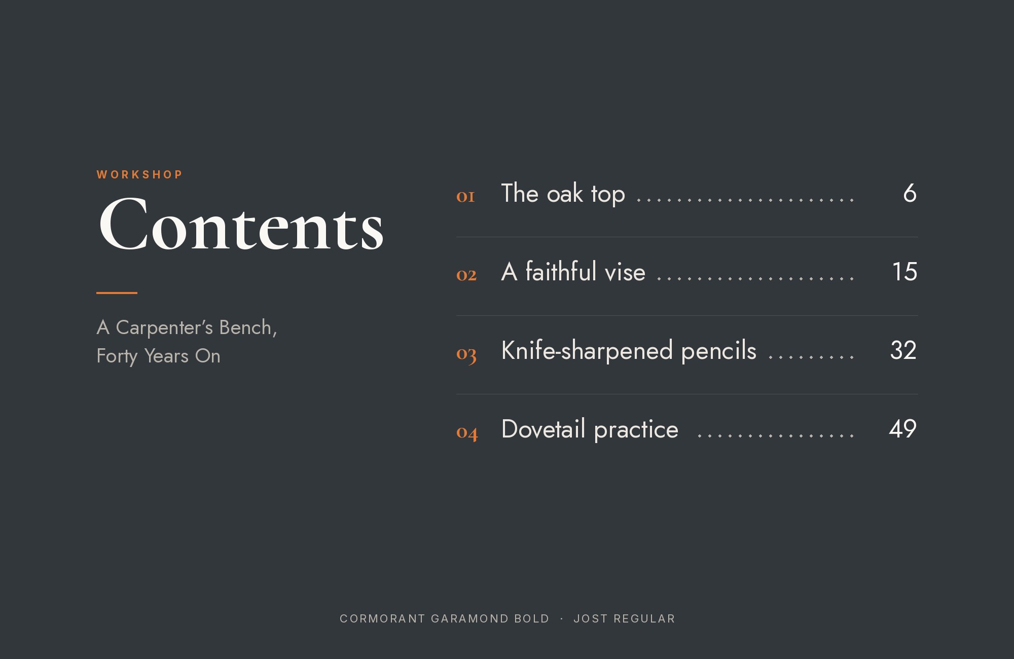
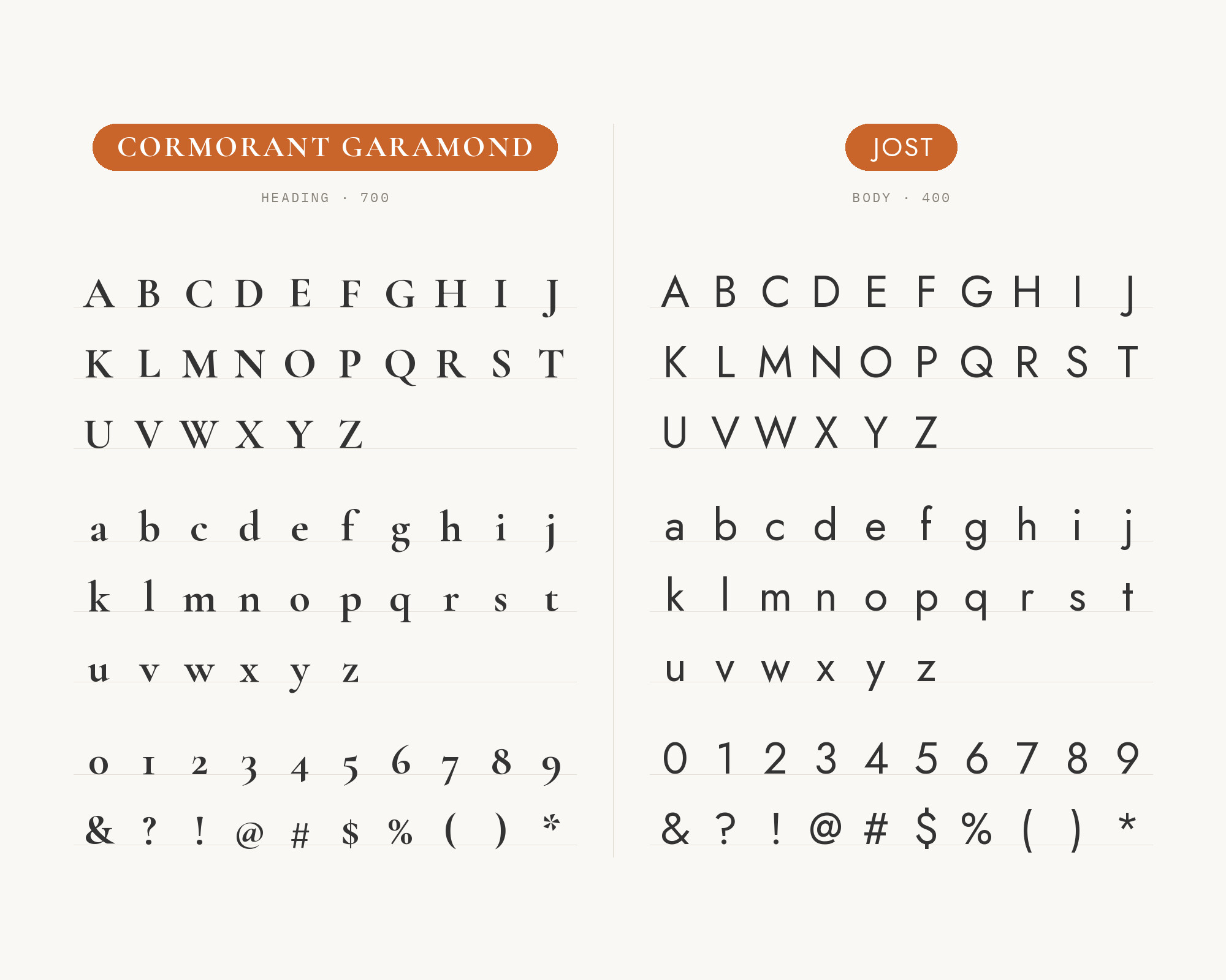
The Flavor site template sets its menu and main content in Jost and its headings in Cormorant Garamond. The Anatolian Drive’s design system uses Cormorant Garamond for every display heading and Jost for body copy, labels and UI. Christian Thalmann drew Cormorant, inspired by Claude Garamont’s legacy.
Cormorant Garamond has high contrast and sharp, delicate serifs. Jost has almost no contrast.
That gap is the whole appeal. The serif feels luxurious at large sizes, and Jost keeps the reading plain and easy.
Set Cormorant Garamond big, because its hairlines need room. Set Jost light or regular, with a little extra tracking on small capitals. This pair suits restaurants, hotels, fashion and travel.
Unlimited fonts from $16.50/mo.
29 million fonts, templates and stock assets. One subscription, unlimited downloads.
See the plan2. Space Grotesk
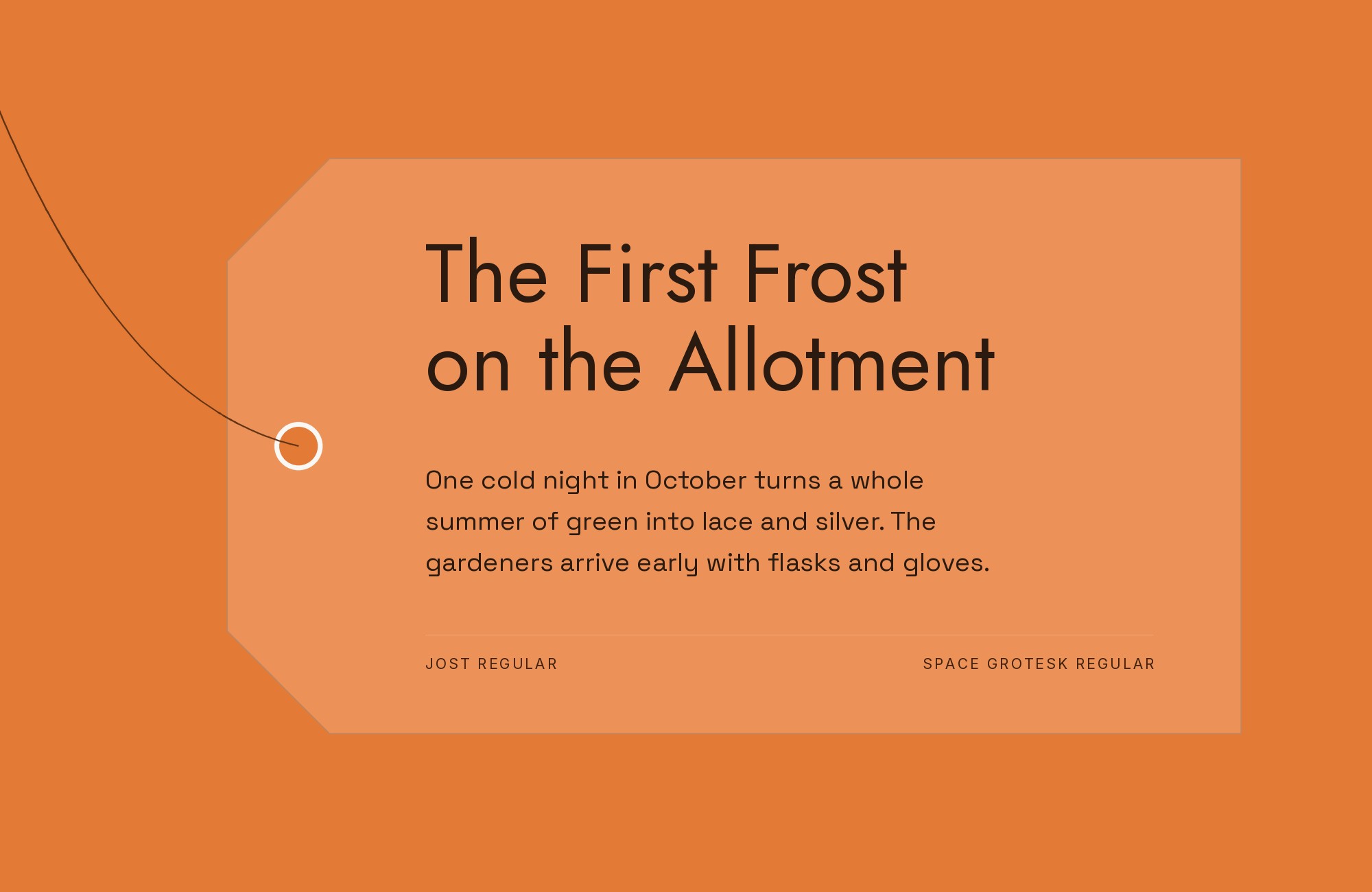
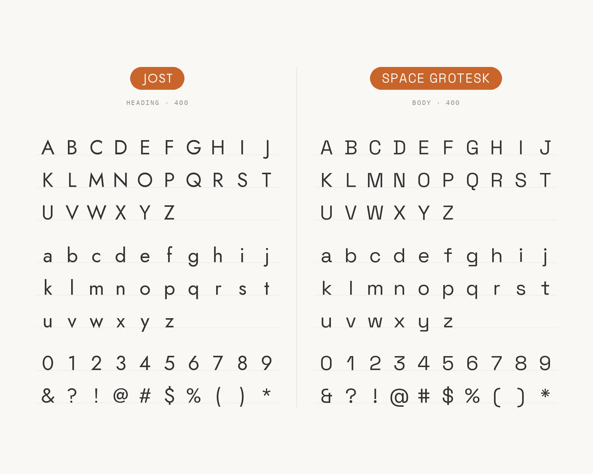
Typ.io records weeeze.com using Jost with Space Grotesk. Fonts In Use also lists both in Dragon Reactor, a tabletop role-playing game book.
Florian Karsten designed Space Grotesk in 2018 from Colophon Foundry’s Space Mono. Space Grotesk keeps some odd, mono-born details in a proportional sans. Jost is pure geometry by comparison.
So this is a sans with sans pairing that works on detail, not on category. Use Jost for headings, where its circles look clean and strong.
Use Space Grotesk for body text, where its quirks add a technical flavor. Keep the weights apart, so the two faces never look like a mistake. This pair suits architecture, tech and studio sites.
3. Literata
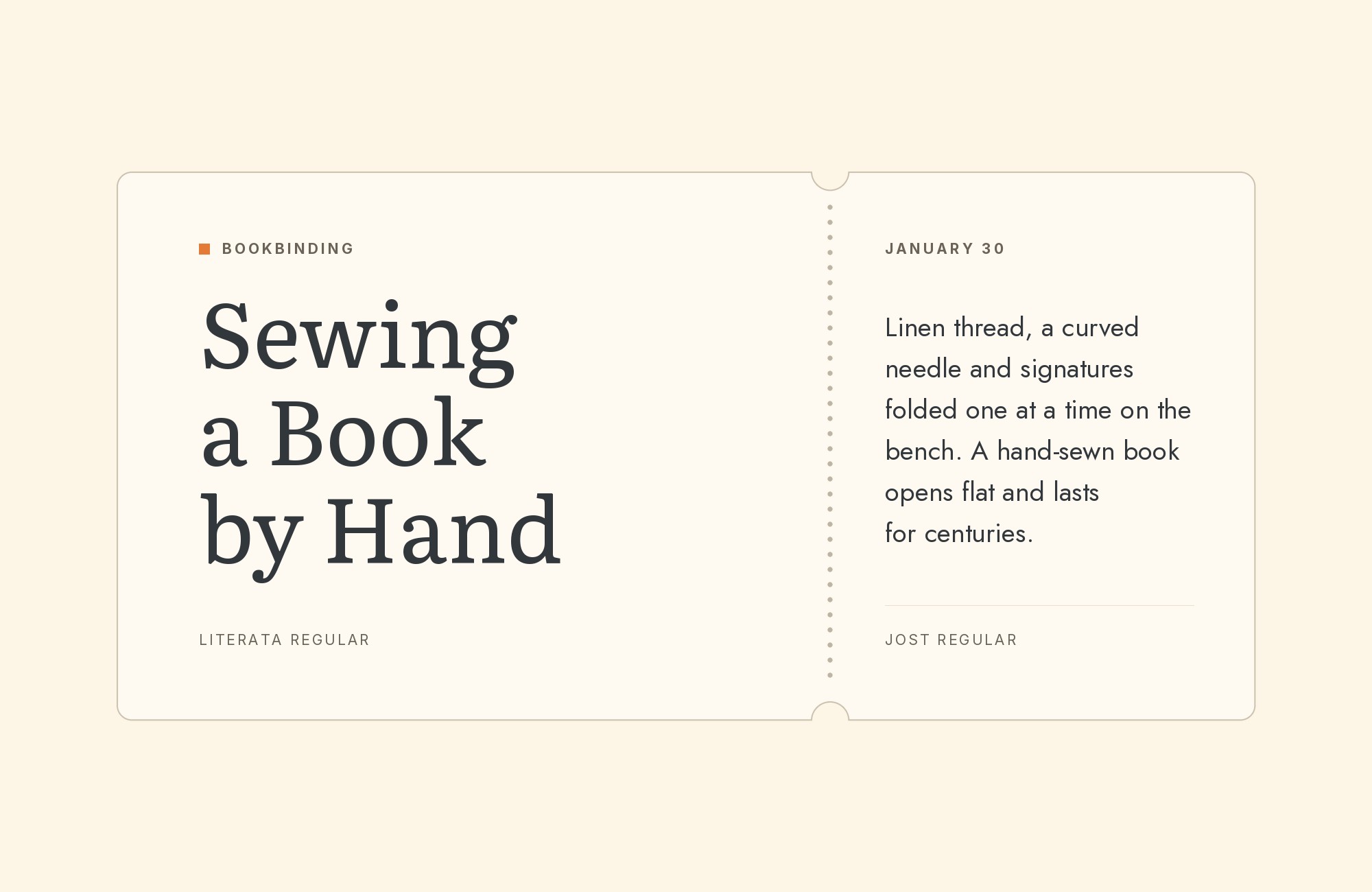
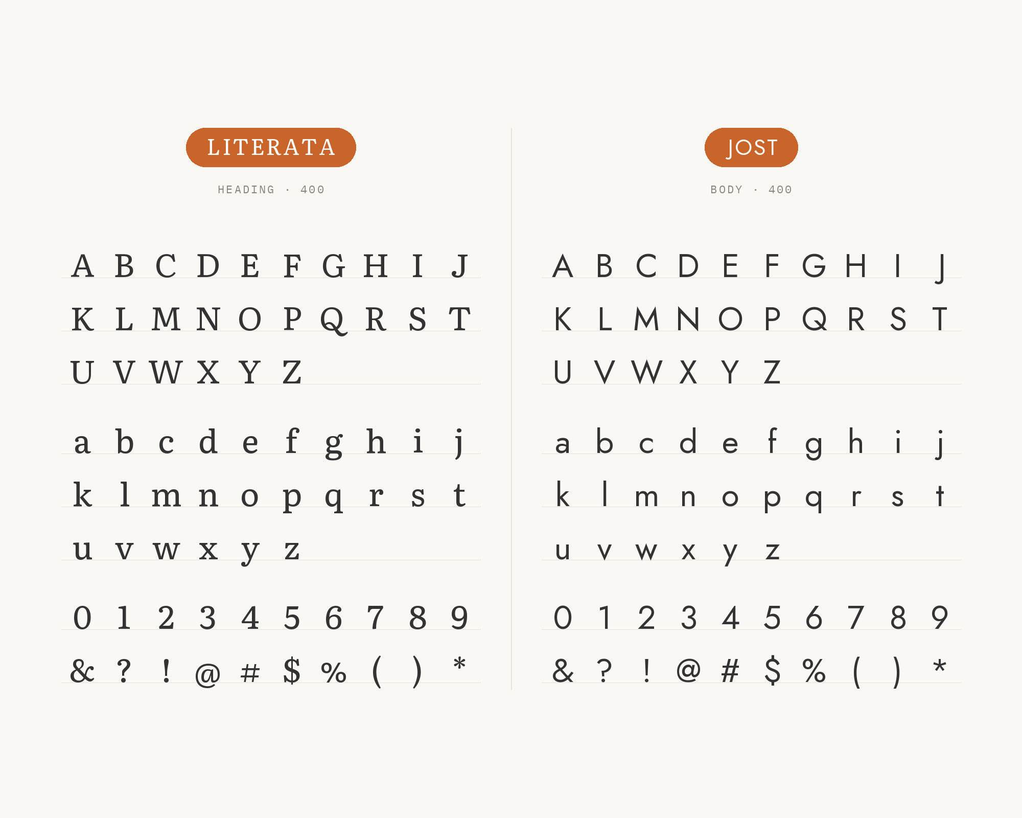
Automattic’s design spec for its Pendant theme puts headings in Literata and body text in Jost. The spec was posted on Mar 16, 2022. TypeTogether created Literata for Google Play Books.
Literata is a bookish serif built for screens. Jost under it gives the page a modern, quiet base.
The contrast is serif warmth above, geometric order below. The Pendant spec uses a light Jost for body and a heavier Jost for buttons.
That is a good model: one serif voice for headings, and Jost weights for everything else. Use this pair for blogs, portfolios and small business sites.
4. Fraunces
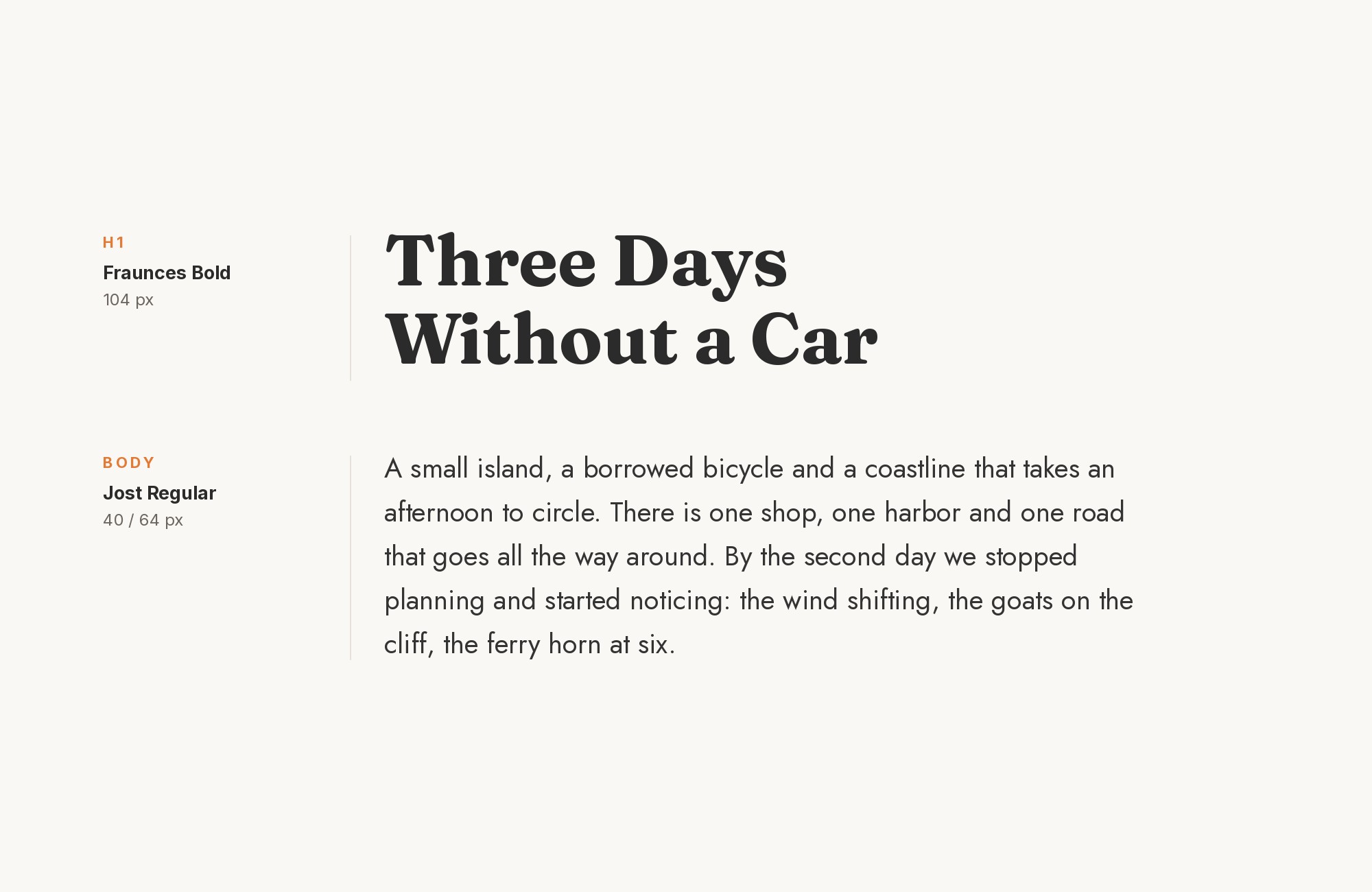
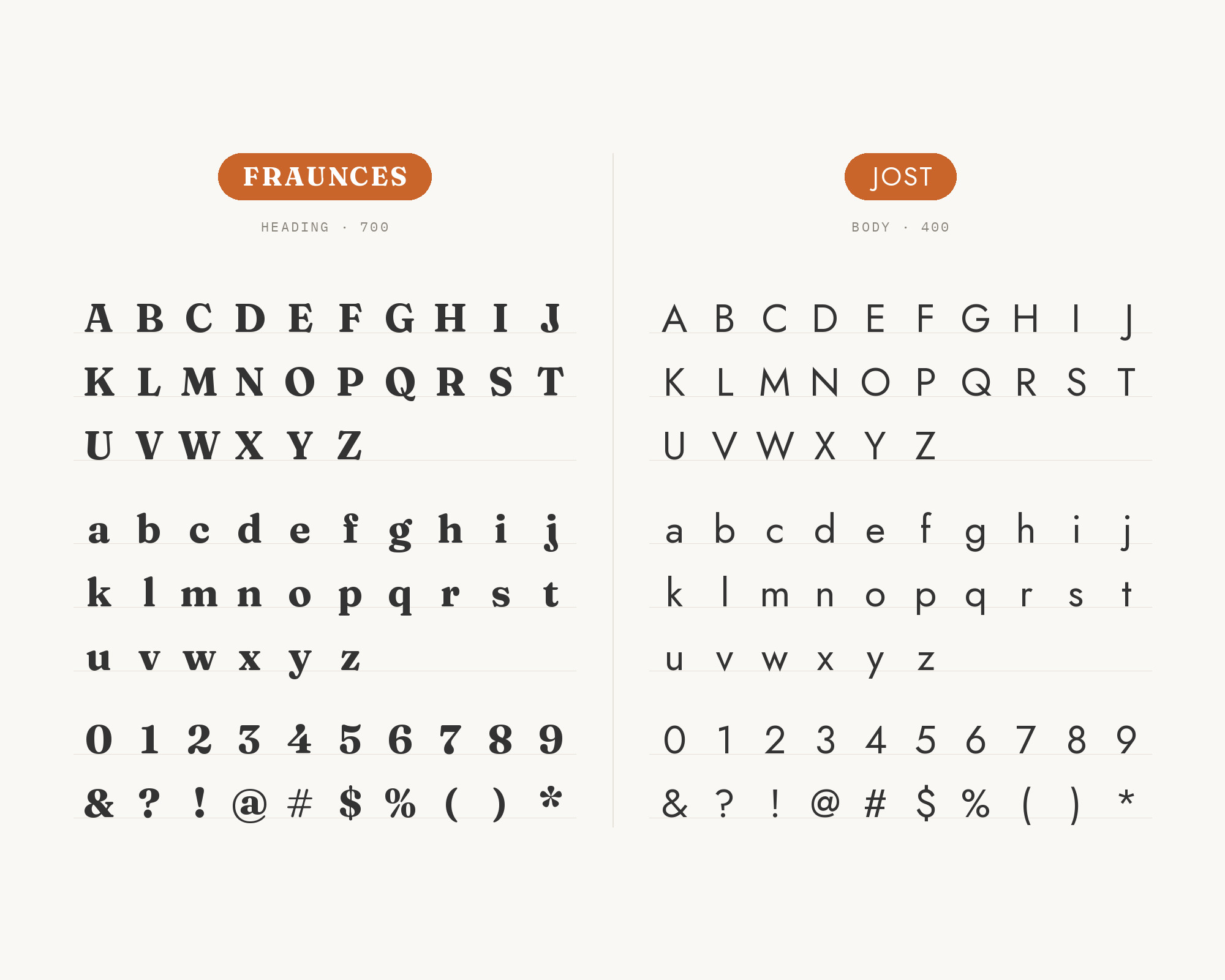
Hearten Made’s Daze theme sets body text in Jost and headings in Fraunces. Fraunces is a soft-serif display face inspired by early 20th century types like Windsor, Souvenir and Cooper.
Fraunces is soft, round and a little wonky. Jost is steady and exact. So Fraunces supplies the personality, and Jost supplies the order.
Let Fraunces take headings and pull quotes. Let Jost take paragraphs, menus and buttons. This pair suits lifestyle brands, bakeries, shops and creative blogs.
5. Merriweather
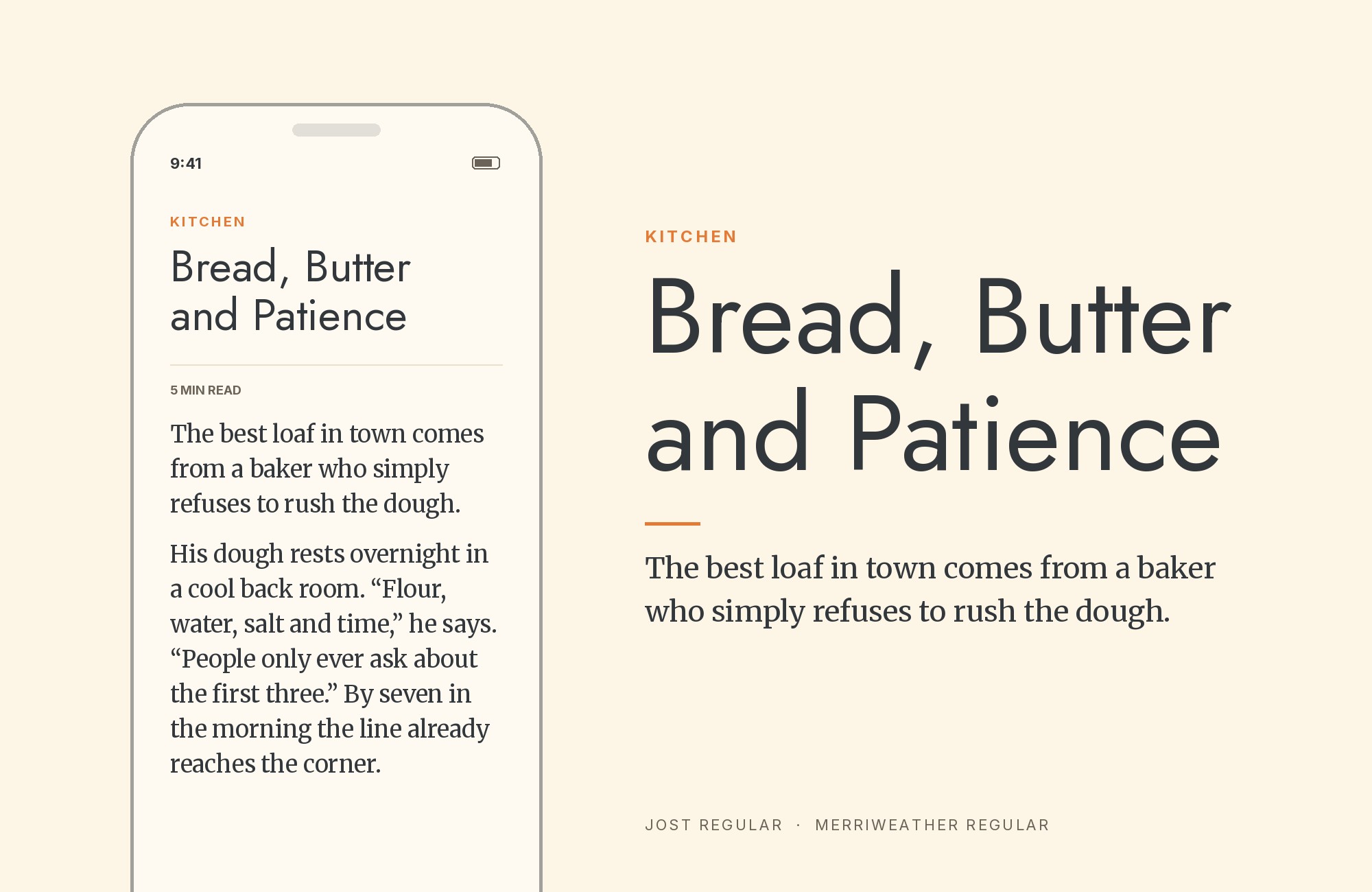
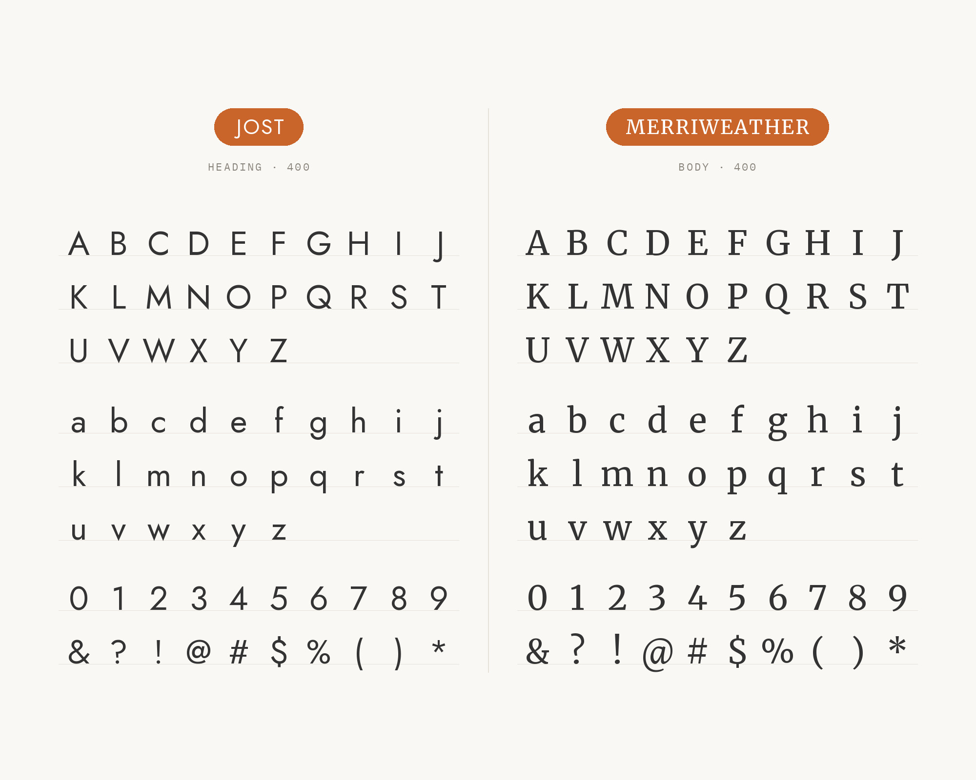
Typ.io records adlerbrixen.com, a hotel site, using Jost with Merriweather. Merriweather was designed as a text face that is pleasant to read on screens, with a very large x-height. Merriweather is sturdy, with strong serifs and open forms.
Here the roles go the classic way. Jost takes the headings, where its geometric capitals look crisp and modern. Merriweather takes the long text, where its serifs guide the eye.
Give Merriweather a generous line height. Its large x-height makes it look big, so set it a size smaller than you expect. This pair suits hospitality, travel and editorial sites.
“AI builds anything, so what do I sell?”
Taste is the answer. Own your stack and automate your own CMS.
Find Out How6. Forum
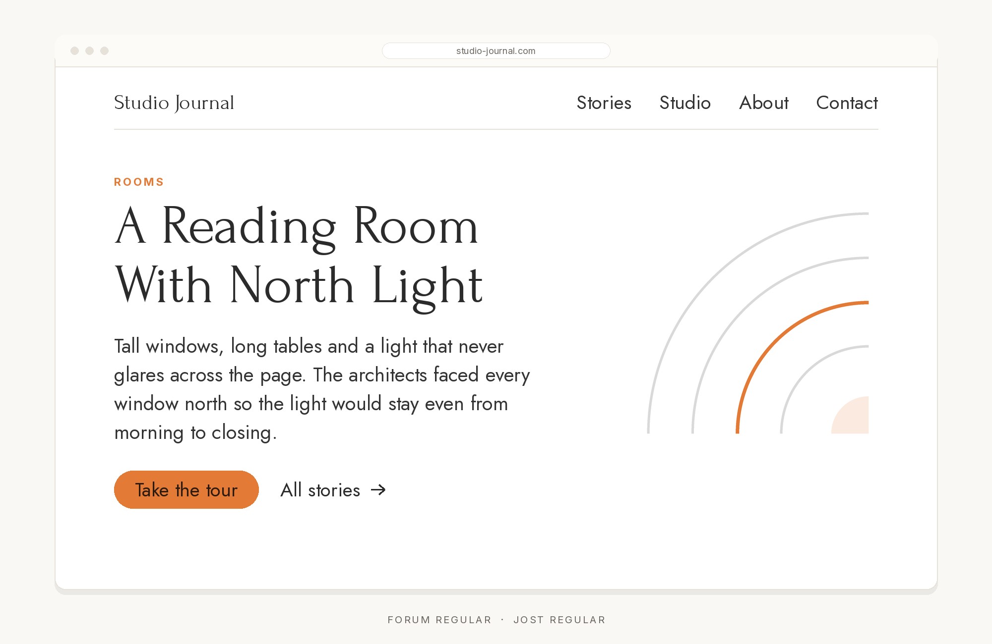
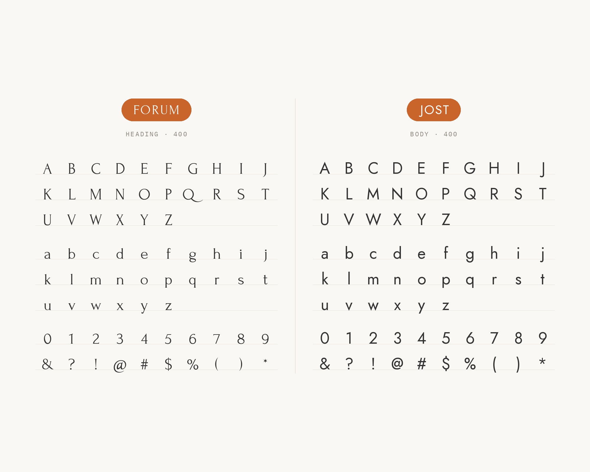
Hearten Made’s Honeydew theme sets body and menu text in Jost and headings in Forum.
Forum is a classical face with Roman-inscription capitals. It works best as a display face, so it needs a partner with range. Jost brings that weight range for body, menus and buttons.
Set Forum headings large and spaced, in capitals or title case. Keep Jost light for text, so the page stays elegant. This pair suits weddings, salons, boutiques and spas.
7. IBM Plex Serif
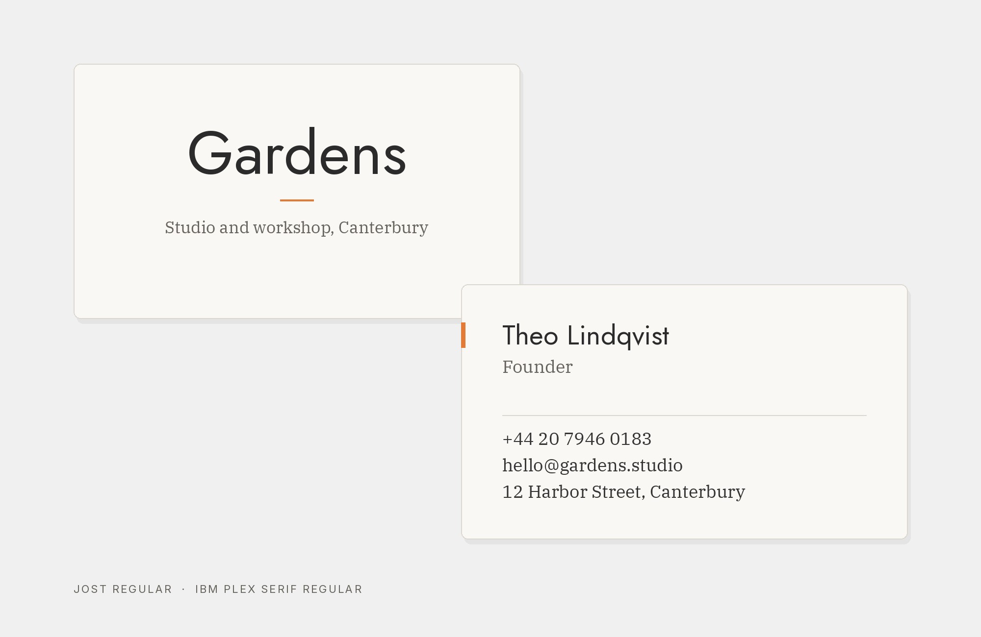
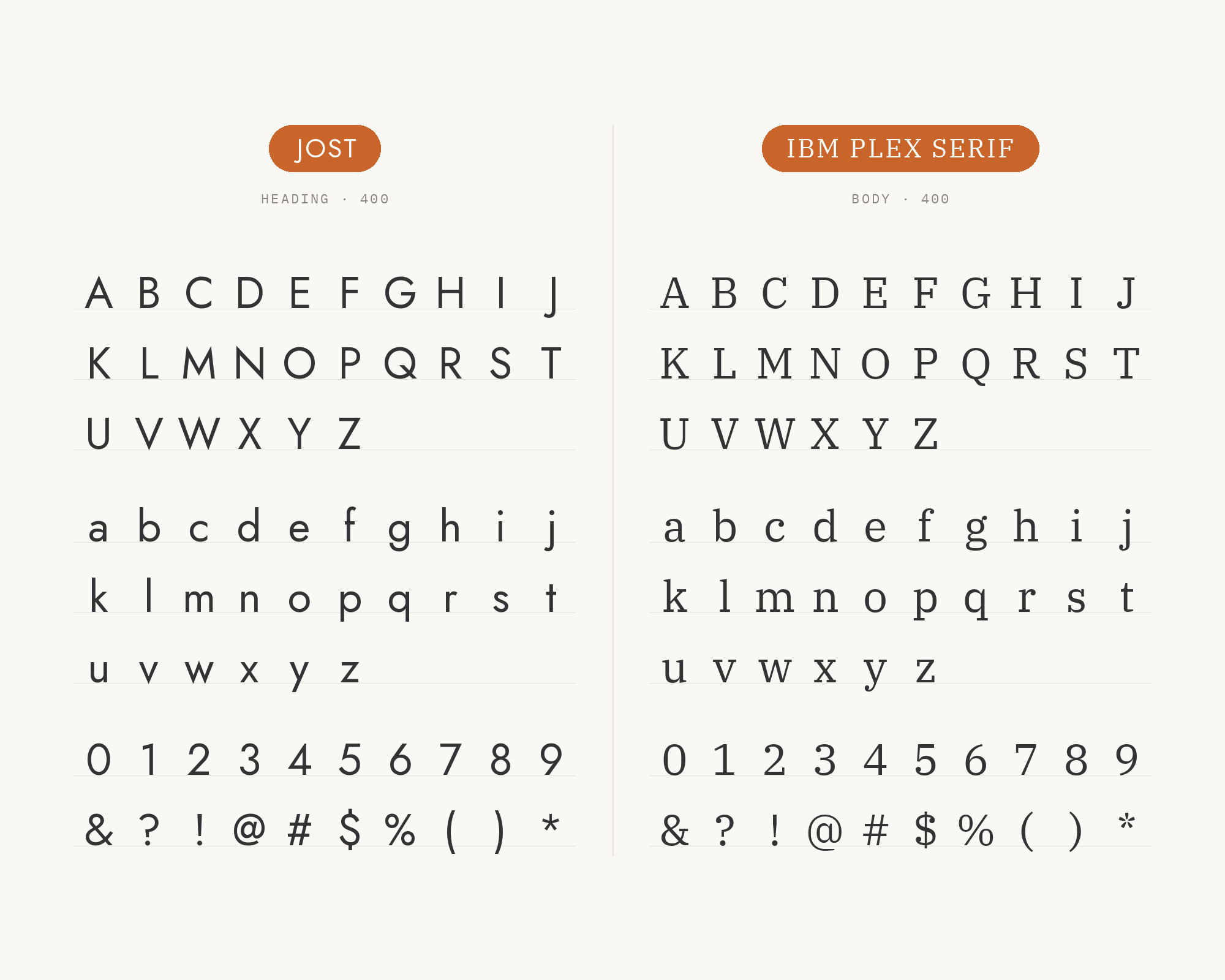
Fonts In Use lists IBM Plex Serif with Jost in Dragon Reactor. The designer chose fonts that were free, and picked Jost because Futura appears in the documents that inspired the book. IBM Plex is IBM’s corporate typeface family, with a Sans, a Mono and a Serif.
IBM Plex Serif has engineered slab-like serifs. It reads well in long text and looks a little technical. Jost above it keeps headings clean and mid-century in tone.
Use Jost for headings and Plex Serif for the reading text. This pair suits manuals, reports, games and technical writing.
8. Space Mono
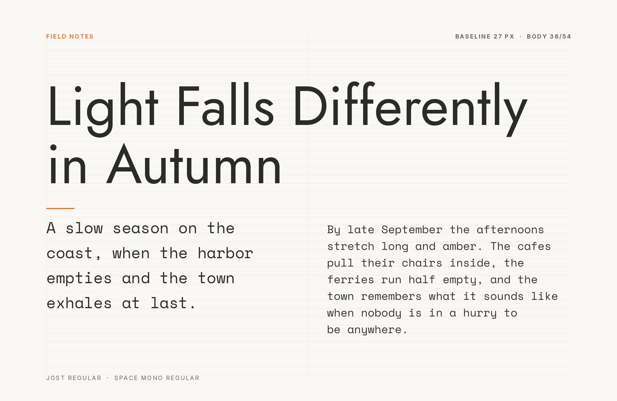
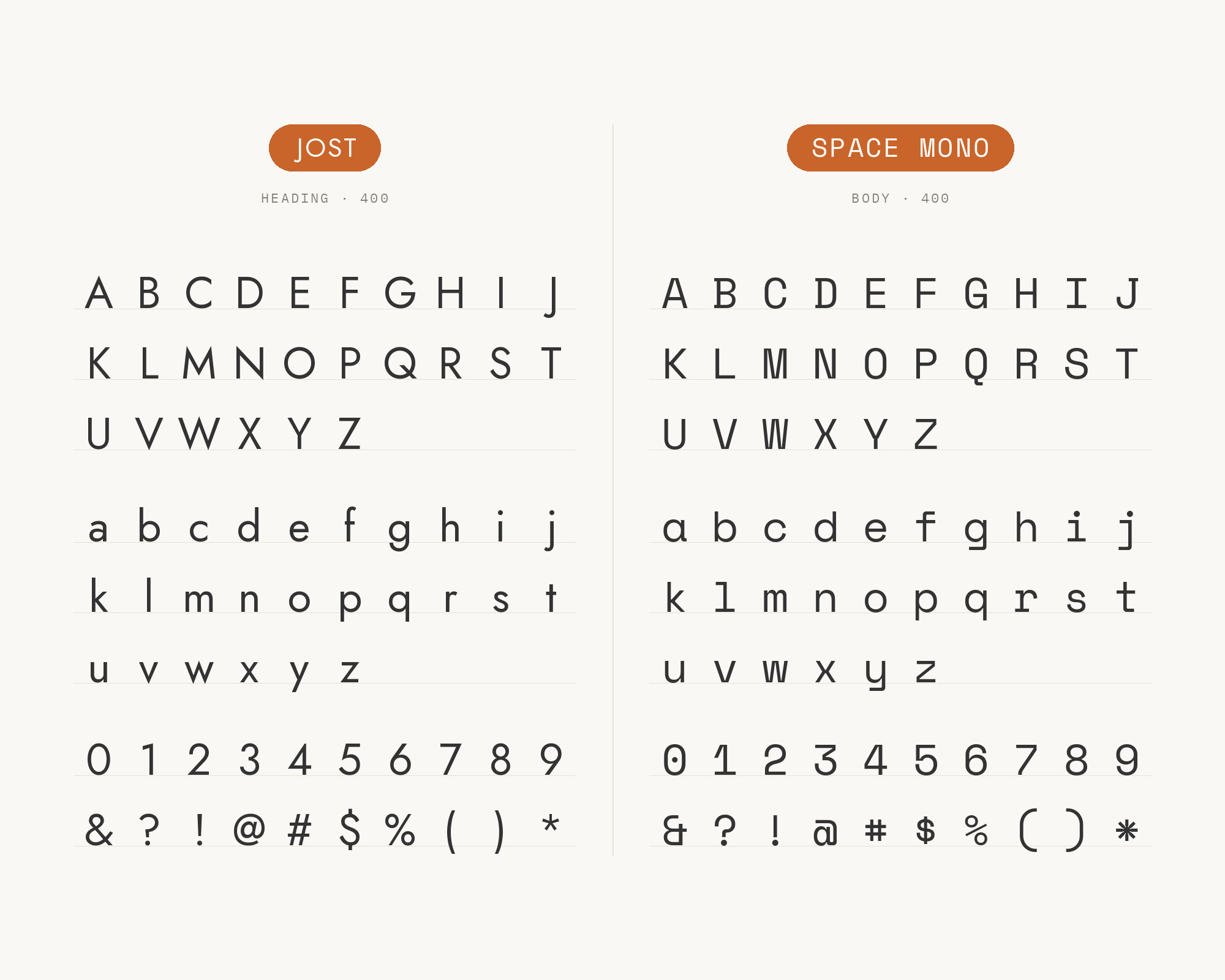
Space Mono is in the same Dragon Reactor typeface list. Colophon Foundry designed Space Mono for Google Design.
Space Mono is a fixed-width face with geometric roots. Those roots make it a natural cousin of Jost.
Use Jost for headings and paragraphs.
Use Space Mono for data: stats, labels, captions and code. The fixed width makes those small lines read as a different kind of information. This pair suits games, dashboards and product pages.
9. Rye
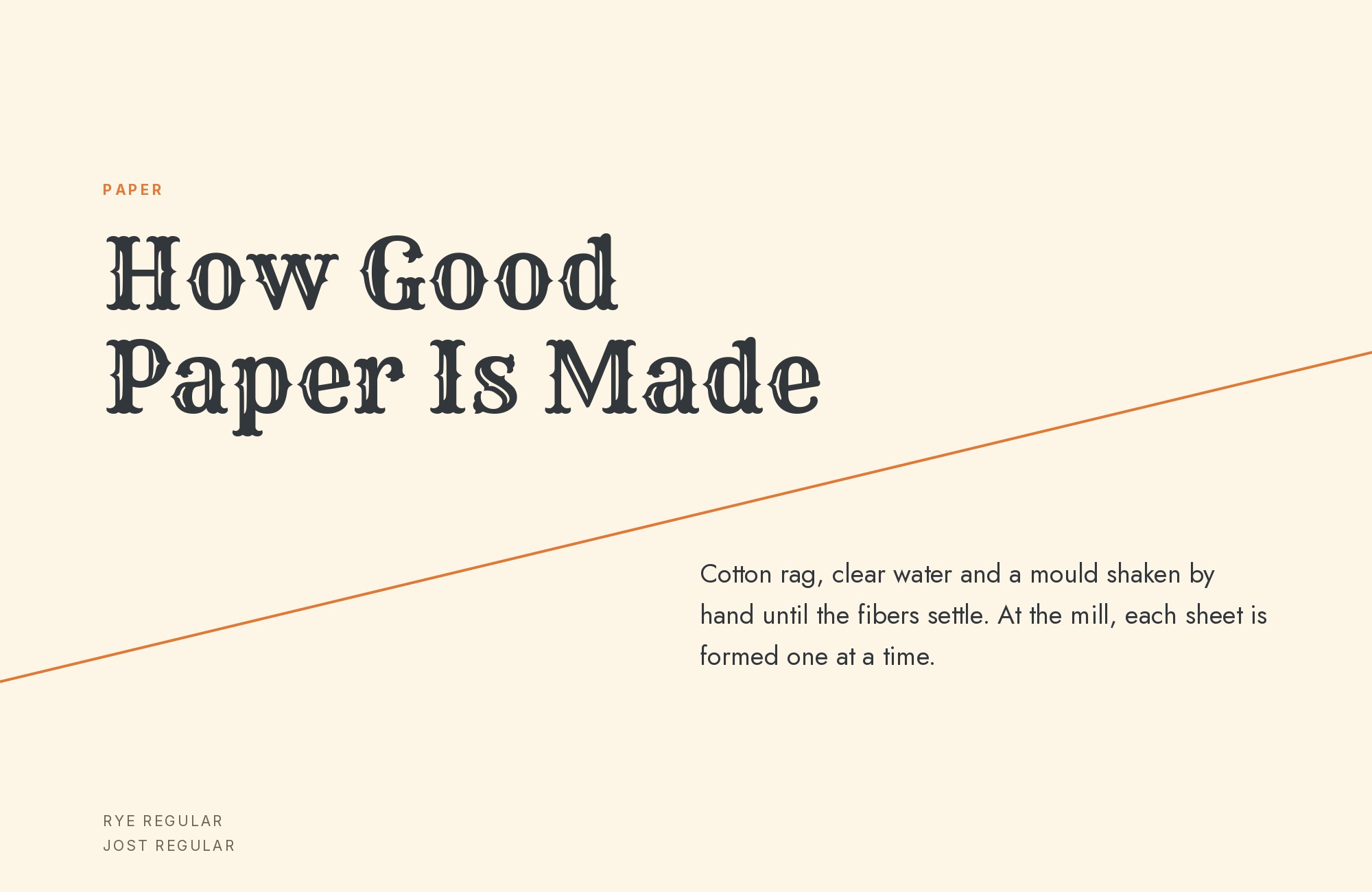
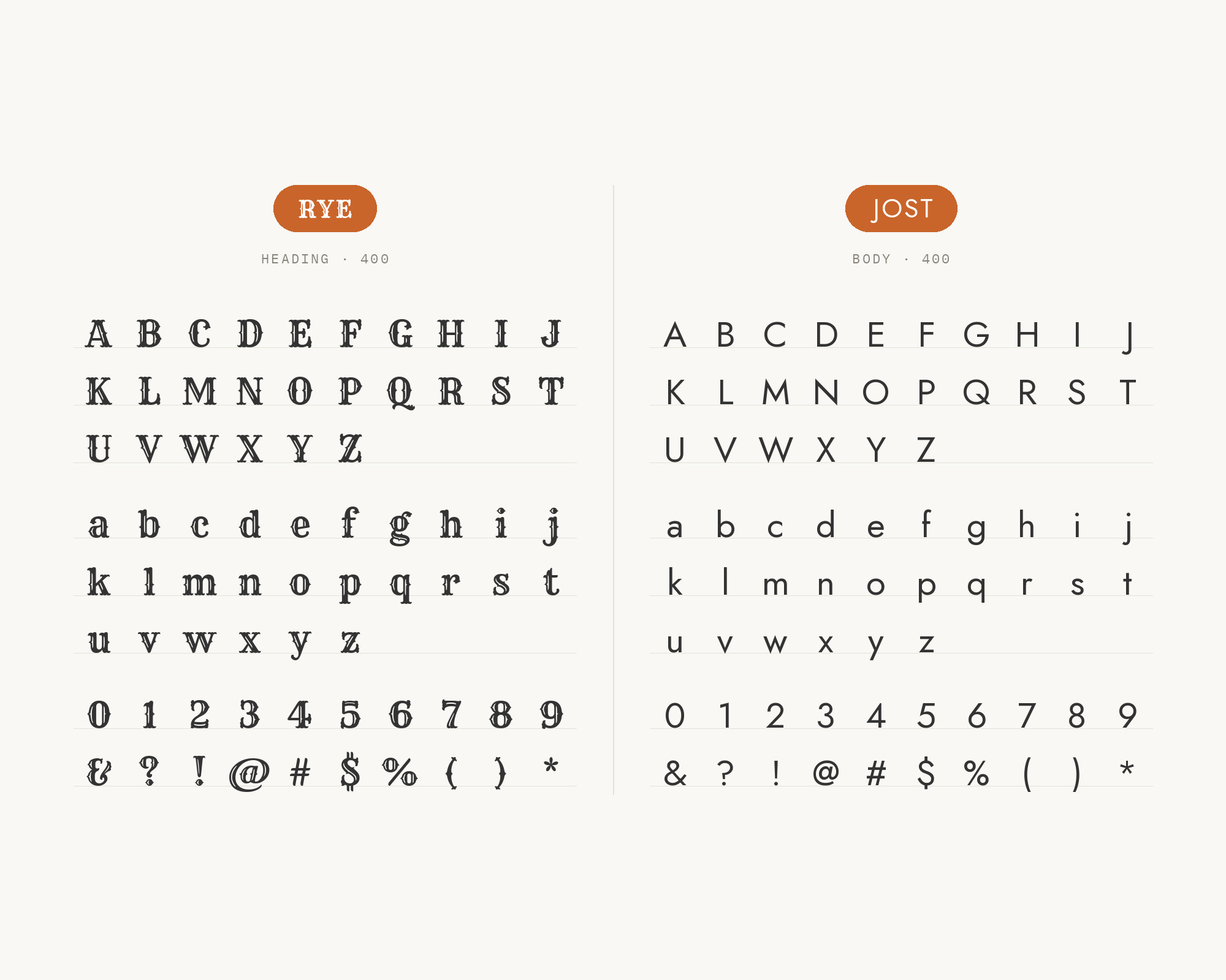
Idraluna Archives’ old-school RPG templates recommend Rye for the title and Jost for the body. Rye is a Western display face, like old wood type on a poster.
It is all decoration, so it must stay in the title. Jost below it is plain and readable, and it lets Rye shine.
Use Rye for one title or a few words only.
Use Jost for every line of real text. This pair suits game books, event posters, barbecue menus and anything with a frontier mood.
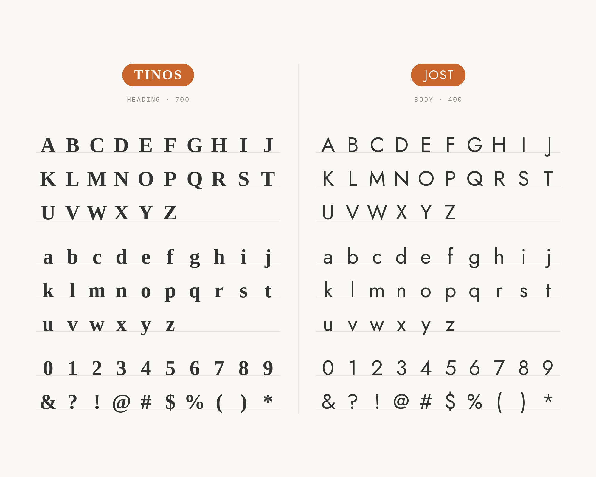
10. Tinos
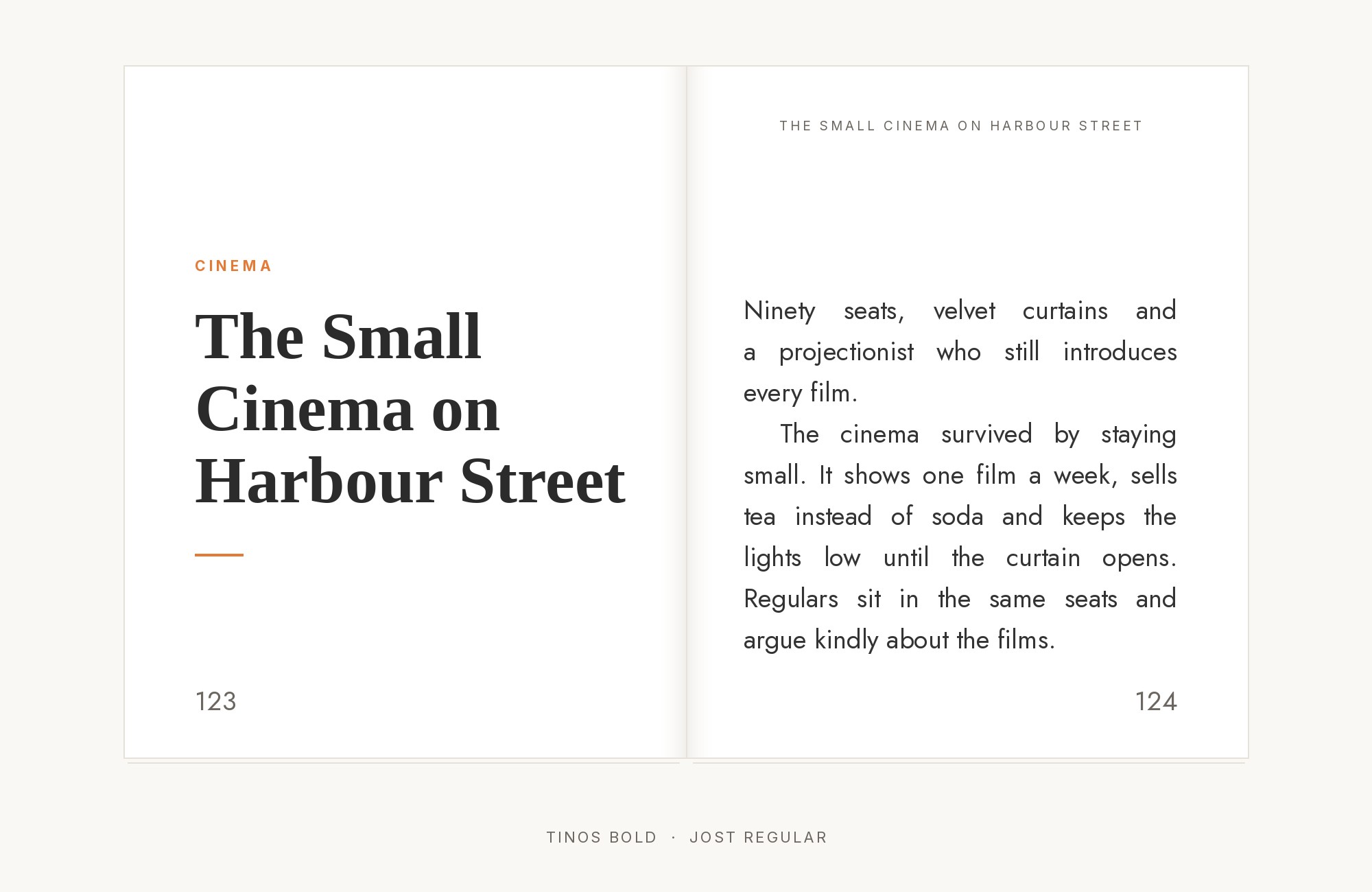
The same templates add Tinos for the header and footer. Steve Matteson designed Tinos as a width-compatible serif for documents that move across platforms. Tinos gives the page a traditional frame: running heads, page numbers, notes.
Jost carries the body text inside that frame. The mix of a book serif frame and a geometric text face feels like a reprinted classic. Keep Tinos small and quiet at the top and bottom of the page.
Use this pair for long documents, rulebooks and zines.
Conclusion
Jost is easy to pair because it is clean and has a wide weight range. The strongest evidence is for Cormorant Garamond, documented in a site template and a live brand system. Most real projects give the headings to a serif with character and the text to Jost.
For luxury, choose Cormorant Garamond. For warmth, choose Fraunces or Forum. For long screen reading with Jost on top, choose Merriweather.
For a serif heading over Jost text, choose Literata. For a technical feel, choose Space Grotesk, IBM Plex Serif or Space Mono.
Try the single-story a for a more Futura-like look in headings. Test your pair at real sizes, because Jost’s light weights can look faint on some screens. For more tested combinations, see The Big Book of Font Combinations.
