Antique Olive pairs great with Helvetica, Univers and Gill Sans. All 14 pairings are shown below in real rendered specimens, with the reason each one works.

What fonts go with Antique Olive? Almost none of the obvious ones, because this is a sans that behaves like a display face at every size — enormous x-height, stunted descenders, and stroke weight piled onto the tops and bottoms of the curves instead of the sides.
Roger Excoffon drew it for the Marseille-based Fonderie Olive, which issued it in eleven styles, starting with the ultra-bold Nord in 1958, followed by the roman in 1960, Compact in 1961, and the remaining styles in 1964–71. The French word antique means sans-serif in that country’s type vocabulary, so the name simply says “Olive’s sans” rather than anything about age. Its defining trick is reversed contrast: most typefaces thin out at the top and bottom of a bowl, and Antique Olive thickens there instead. The counters and bowls, especially the O, resemble an olive, although the name comes from the foundry, Fonderie Olive, not the fruit. Lewis Blackwell called it an attempt to offer a more refined sans serif than Helvetica and Univers. It carried the Air France logo from the 1960s until 2009, and it was used for Walmart logos as well.
That construction dictates the pairing logic. Antique Olive has a very large x-height and short extenders, so a partner with delicate ascenders will look undersized beside it at matching point sizes. It also has no restraint in reserve, which means the second font has to be the one that holds the grid, sets the paragraphs and supplies the vertical stress Antique Olive inverts. The archive of real production work bears this out: the faces that actually appear with it are Swiss grotesques, geometric sans such as Futura and Kabel, big-bodied slabs, and one brush script by the same hand. Here are 14 fonts that pair well with Antique Olive.
1. Helvetica
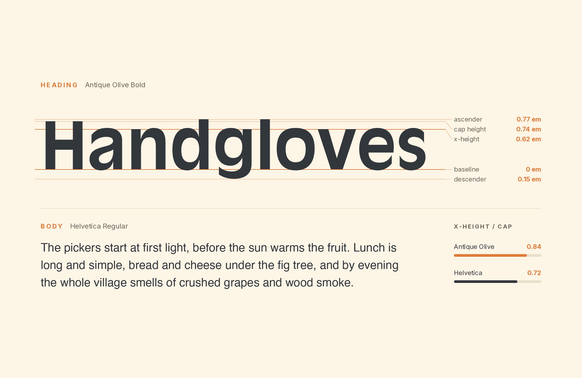
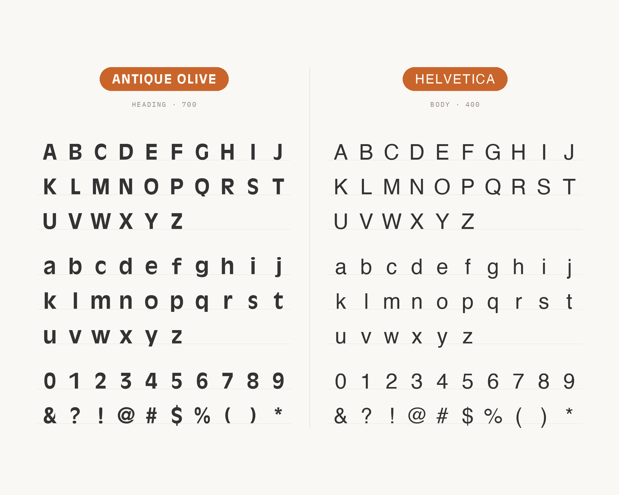
Max Miedinger designed Helvetica in 1956-1957 under the direction of Eduard Hoffmann. It was originally named Neue Haas Grotesk, and in 1959 it was adapted for Linotype typesetting machines and renamed Helvetica. It is a well-documented partner for Antique Olive in the Fonts In Use archive, with productions including Bill Gold’s 1976 Marathon Man poster and the 1988 Brain Damage logo and poster set. The reason is structural before it is historical: Helvetica’s stress is conventionally vertical, its terminals are cut on a strict horizontal, and its counters are deliberately closed, so every characteristic Antique Olive inverts is present in its partner in the orthodox form. Setting Helvetica for body copy and interface text stages the original 1960s argument on one page — even vertical stress and closed counters underneath, reversed-contrast bowls on top — without either face losing its identity.
2. Univers
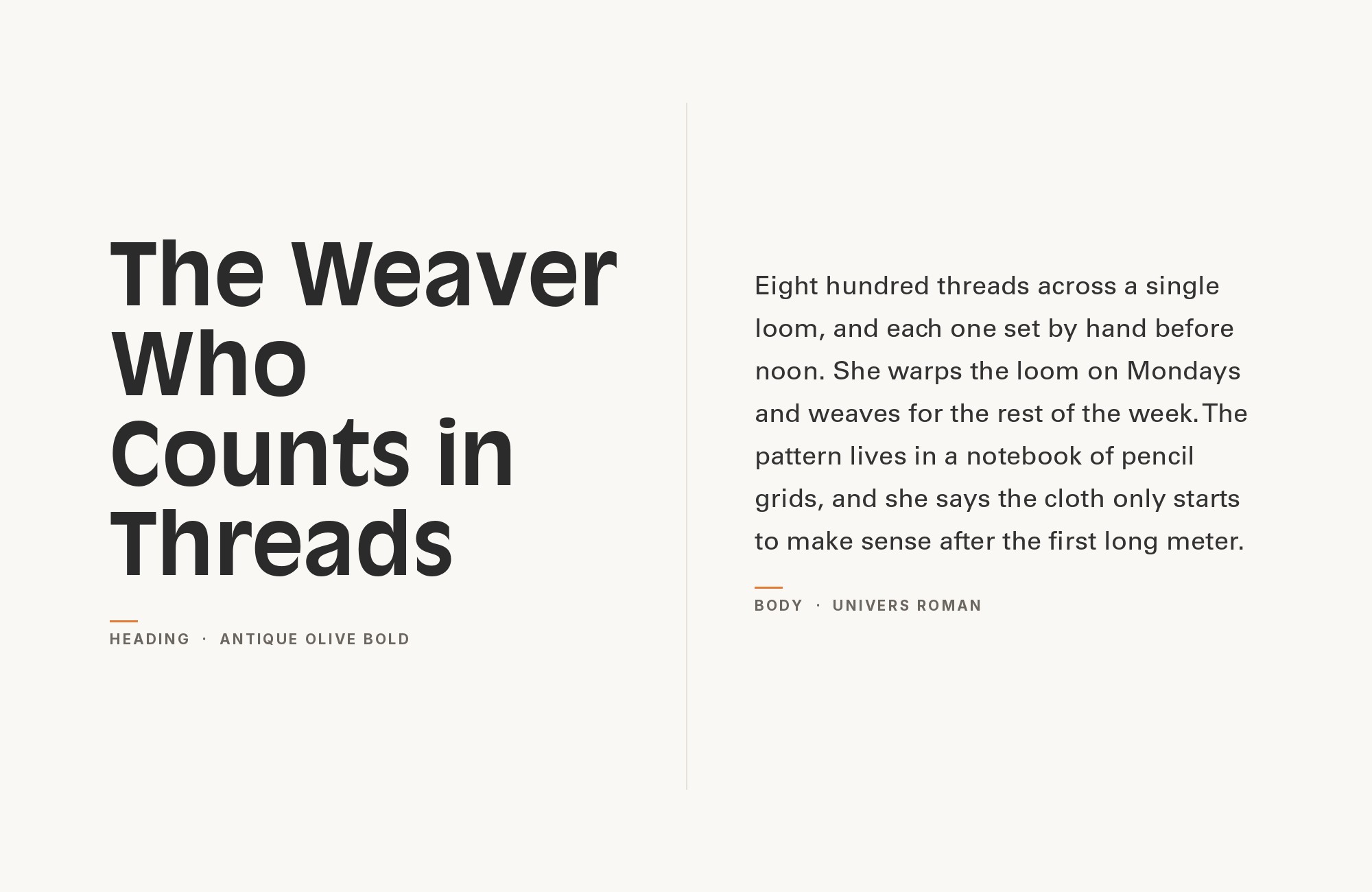
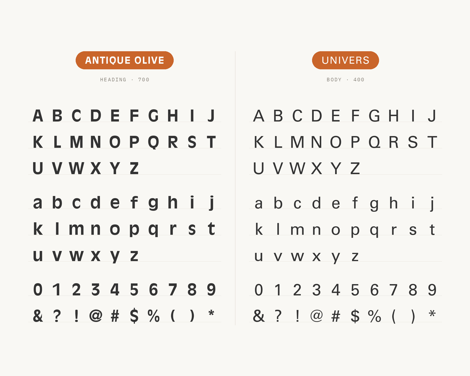
Adrian Frutiger designed Univers, and his employer Deberny & Peignot released it in 1957 in a comprehensive range of weights and widths, named with numbers rather than words. Lewis Blackwell described Antique Olive as an attempt at a more refined sans than Helvetica and Univers had offered, which makes this pairing a direct conversation between rivals rather than a compromise. The Groove Merchant record label system of 1974 used only these two faces, and Ken Garland’s Galt Toys work set them together as well. Univers gives a project something Antique Olive cannot: a ranked, predictable weight axis for hierarchy. Use the numbered system for every functional level — captions, labels, running text — and let Antique Olive take the one line that has to carry personality.
3. Gill Sans
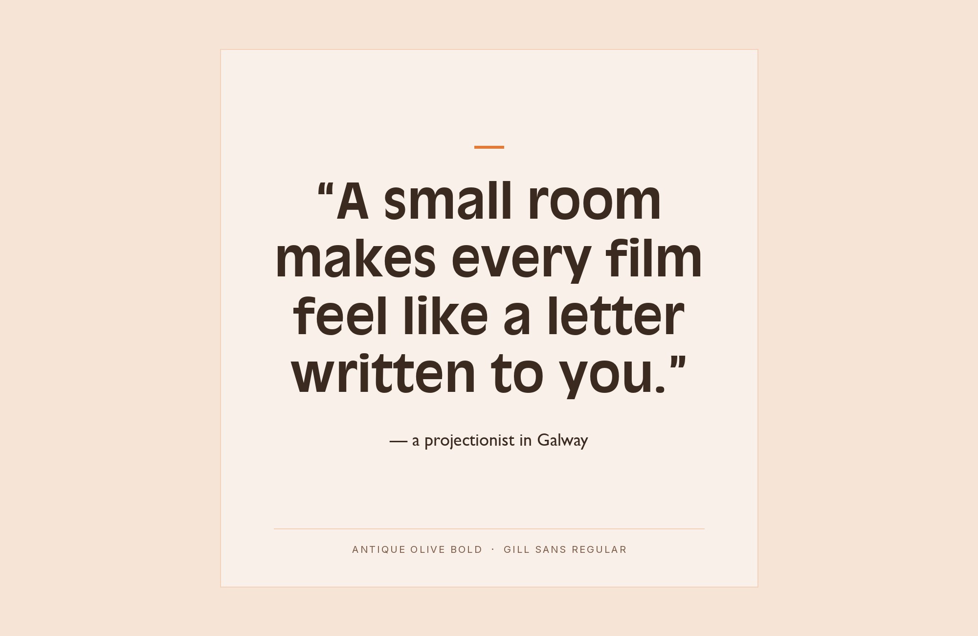
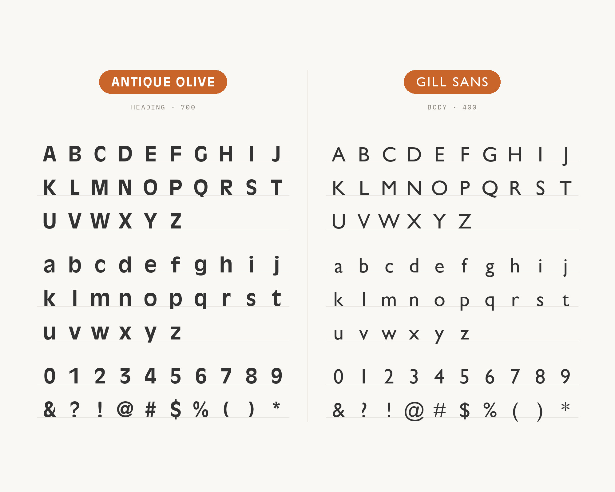
Eric Gill designed Gill Sans, released by the British branch of Monotype in 1928, blending Edward Johnston’s Underground Alphabet with classic serif typefaces and Roman inscriptions. It is the closest thing Antique Olive has to a documented ancestor: Antique Olive is classified as a humanist sans, designed along the lines of Gill Sans, rather than as a grotesque. That shared lineage shows in real work: British Rail’s 1975 “Hot Baked Potatoes” poster is a two-font design using nothing but Antique Olive and Gill Sans, and the 1980–82 Lego advertising set both. What Gill Sans keeps is exactly what Excoffon threw away: a modest x-height and long, elegant ascenders. It reads as the quiet older relative, which is why it holds paragraphs comfortably while Antique Olive holds the headline.
Turn your ideas into repeatable creative workflows - no code required. Create with ready-made templates and AI-powered tools in Picsart Flow.
See details4. Futura
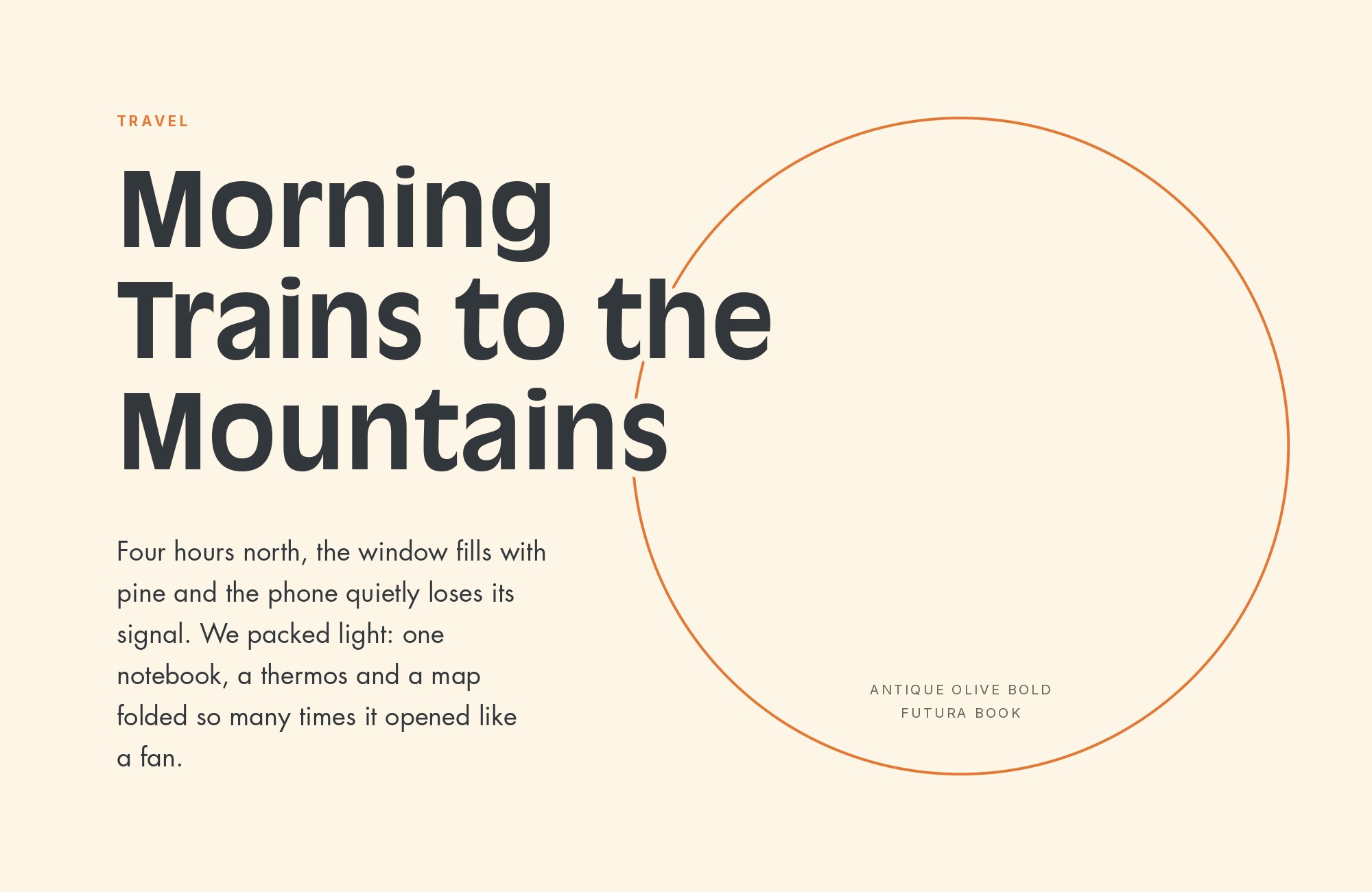
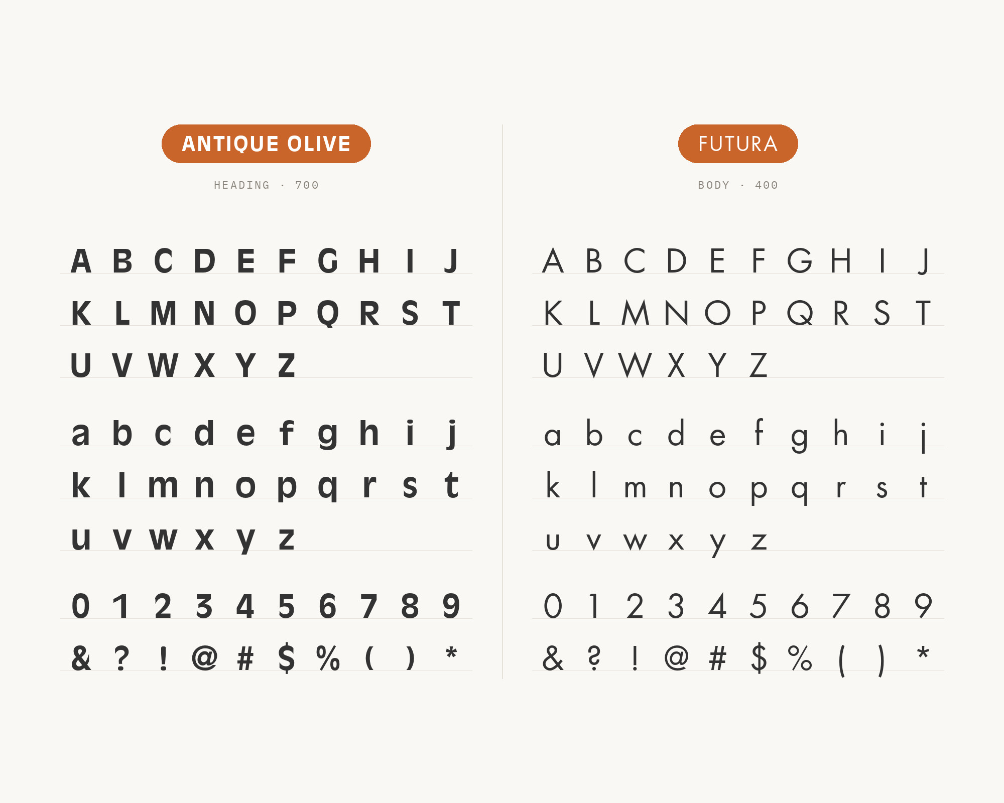
Paul Renner designed Futura, released in 1927 and developed as a typeface by Bauersche Gießerei, from near-perfect circles, triangles and squares with strokes of near-even weight. It appears with Antique Olive in archived productions spanning the 1968–1970 Otis Redding record campaign and the 1971 Stevie Wonder’s Greatest Hits Vol. 2 sleeve. The contrast is total and immediate: Futura has thin even strokes and small tight counters, Antique Olive has swollen top-weighted strokes and enormous open ones. They occupy opposite ends of twentieth-century European sans design, which means they separate at any size without needing a weight or colour difference to help. Set Futura small and wide-tracked for labels and subheads, and keep Antique Olive for display.
5. Eurostile
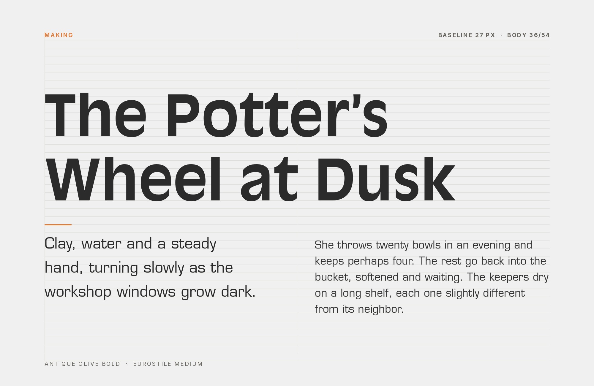
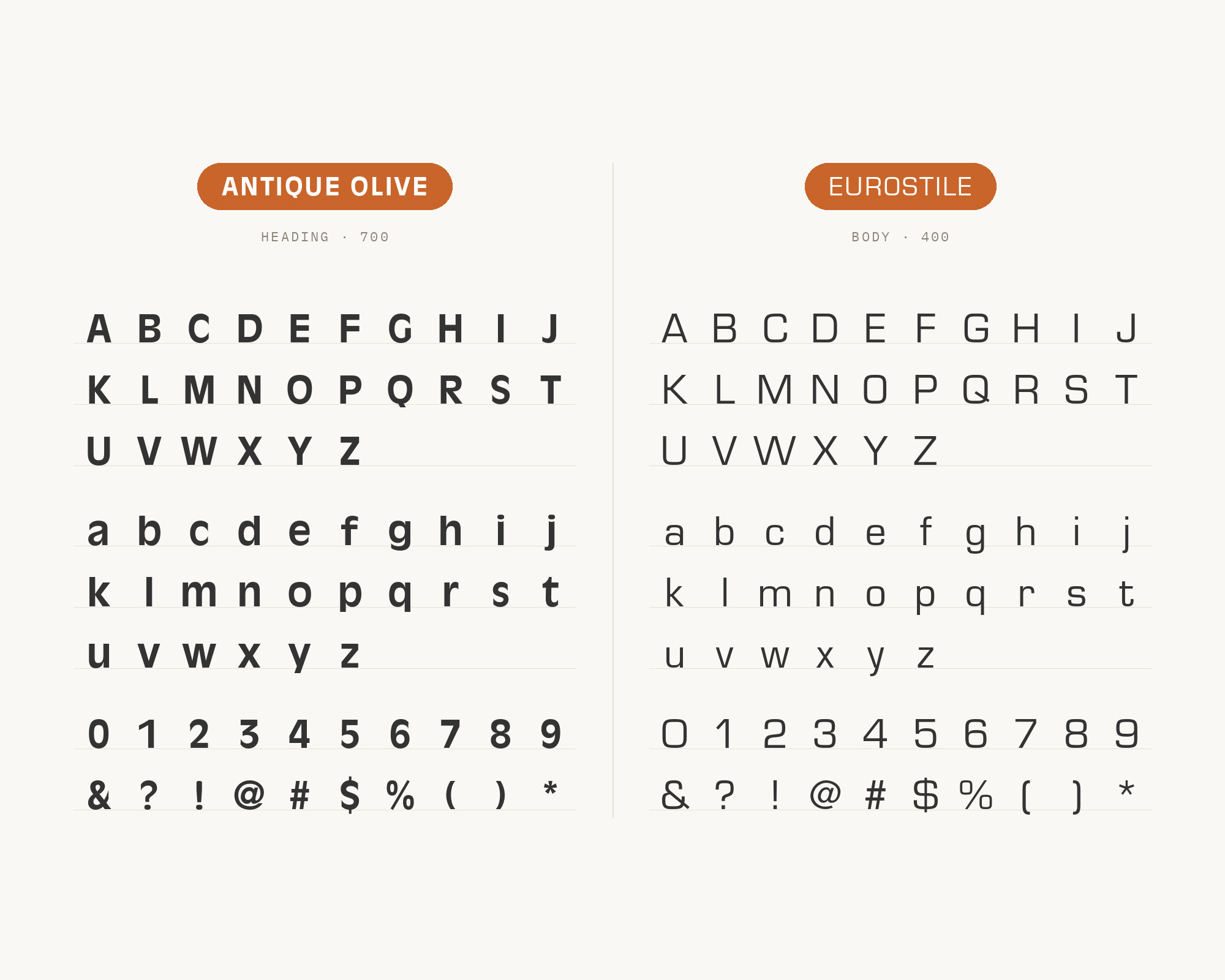
Aldo Novarese designed Eurostile for Nebiolo in 1962 as a successor to Microgramma, adding lowercase letters to its squarish superellipse forms, a shape that evokes television screens of the 1950s and 1960s. It is the exact period partner to Antique Olive — the same early-1960s continental moment, the same appetite for a face with an opinion, and precisely the opposite geometry. Archived work confirms it, including the 1986 Star Crystal poster and Datsun’s German 280Z and 1200 brochures. Eurostile’s flat sides and squared counters give a layout the horizontal and vertical structure that Antique Olive’s olive-shaped bowls actively refuse to provide. Eurostile’s squared counters against Antique Olive’s olive-shaped bowls suit automotive, technical and science-fiction subjects, the same mix of industrial and display voices those productions actually used.
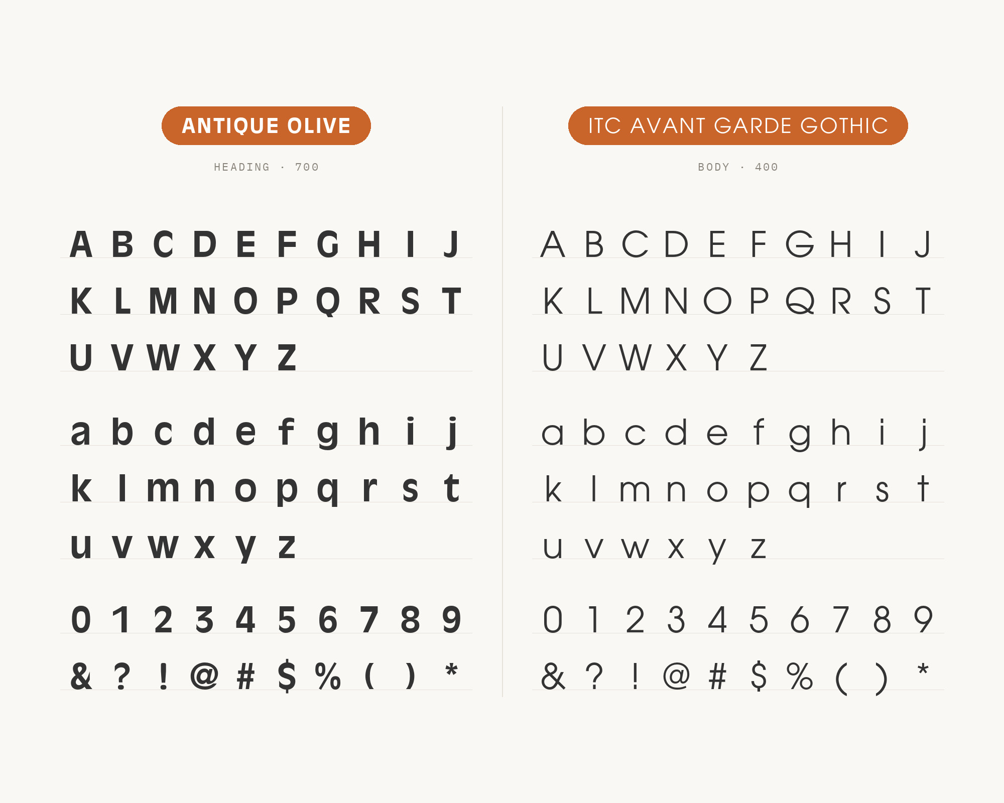
6. ITC Avant Garde Gothic
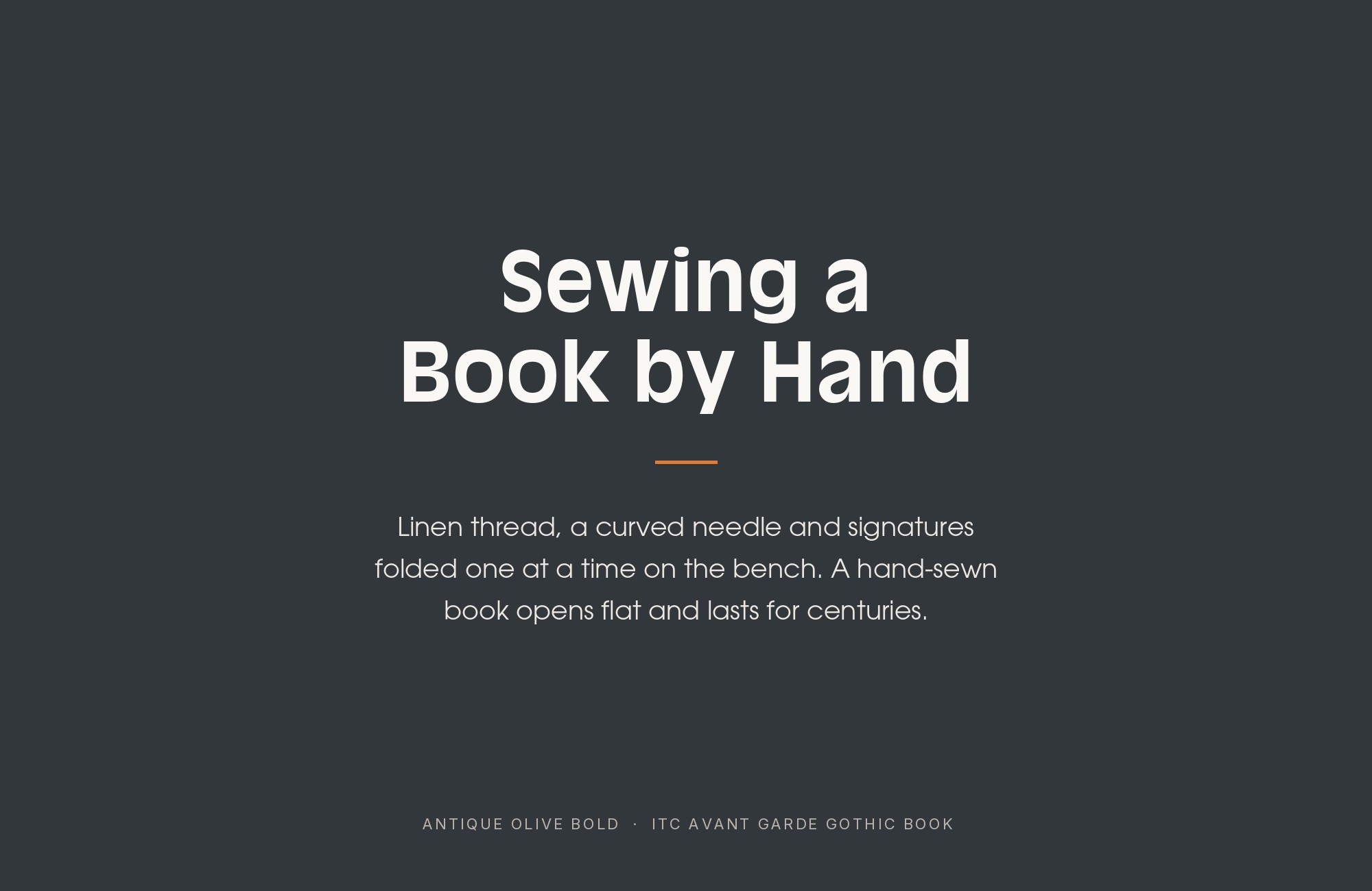
Herb Lubalin and Tom Carnase developed ITC Avant Garde Gothic from the logo font of Avant Garde magazine, giving it near-perfect circular bowls, sharp diagonal joins and a famous set of alternate characters and ligatures. It sits with Antique Olive in archived productions including Mego’s Micronauts toy packaging around 1976 and the Element of Crime “Fremde Federn” sleeve. Both faces share a very large x-height and a willingness to be looked at, so they sit at the same apparent size without adjustment — but Lubalin’s forms are geometric, angular and set extremely tight, while Excoffon’s are soft, top-loaded and comparatively open. Reserve Avant Garde for short stacked display lines where the ligatures can work, and let Antique Olive take the primary statement.
Build free, plus 500 AI credits.
Design and publish a site at no cost. Paid plans double your credits the first month.
Start free7. Windsor
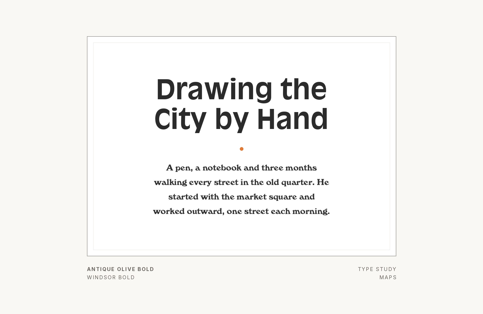
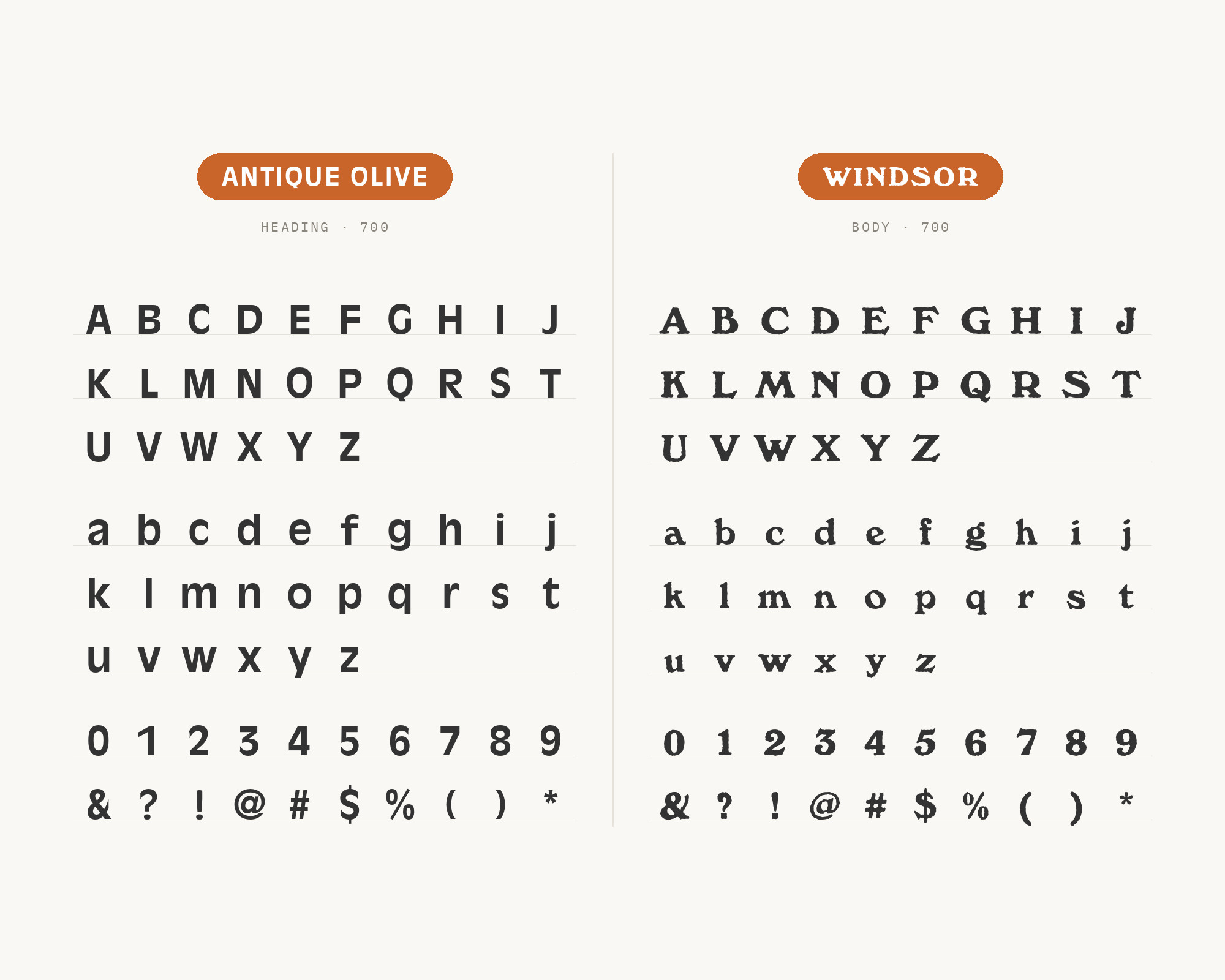
Windsor is a serif created by Elisha Pechey and released by the Stephenson Blake foundry, dated to 1905 and intended for display and headings rather than body text. It has thick irregular serifs, bulging bowls and a distinctly hand-cut asymmetry. Windsor has unusually broad evidence as an Antique Olive partner: it appears on the 1971 Stevie Wonder’s Greatest Hits sleeve and in the 38HOURS city guides, and Typewolf records Chateau Orlando running the same combination in 2022. The pairing works because both faces are warm and slightly swollen without being the same category — Windsor’s bulges are in its serifs and stems, Antique Olive’s are in its curves. Set Windsor for headlines when you want a nostalgic, bookish register and Antique Olive for the sans-serif support around it.
8. Rockwell
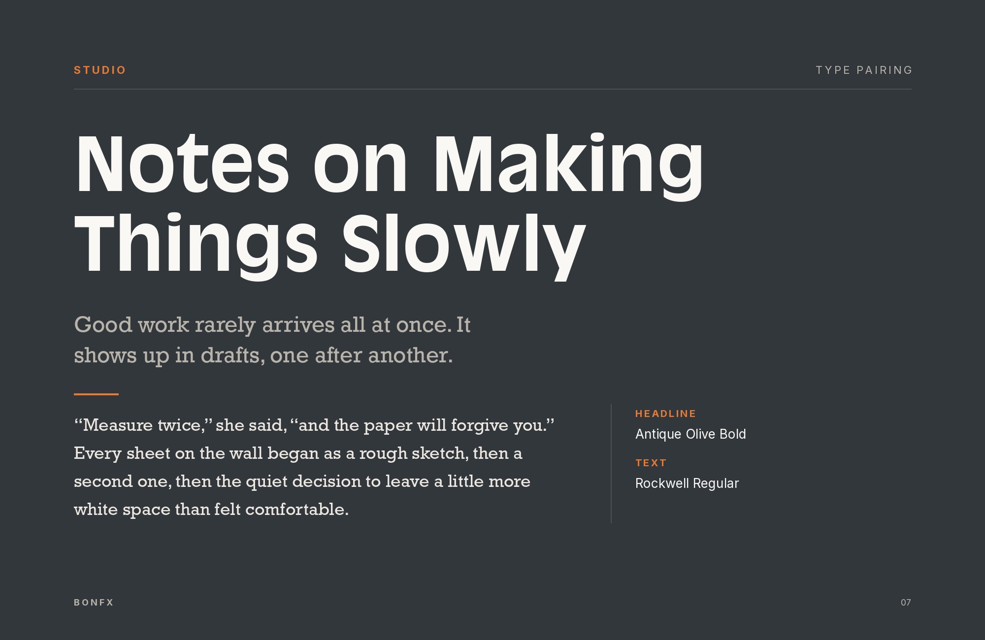
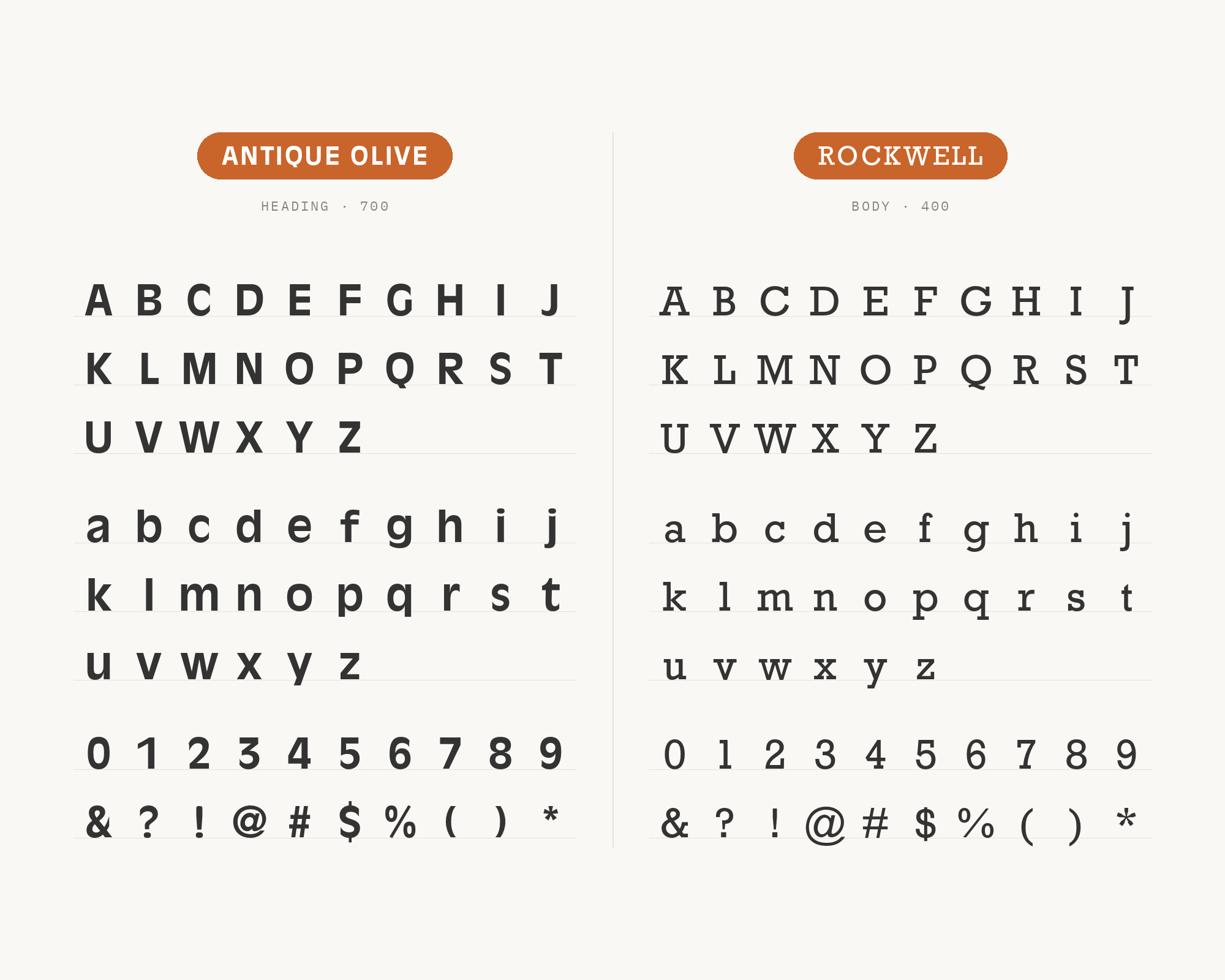
Monotype released Rockwell in 1934 as a geometric slab serif with a monoline construction, all of its strokes appearing roughly the same width. It joins Antique Olive in three archived productions — the 1980–82 Lego advertising, the Brain Damage campaign and the Element of Crime sleeve. Rockwell brings the one quality Antique Olive has no supply of: mechanical evenness. Its strokes never swell, its serifs land on an exact grid, and its rhythm is relentlessly regular, which gives a layout a stable skeleton underneath a headline that is doing the opposite. Use Rockwell for subheads, pull quotes and callouts at middle weights, where its slabs read as emphatic without competing with Antique Olive for the top of the visual hierarchy.
9. Kabel
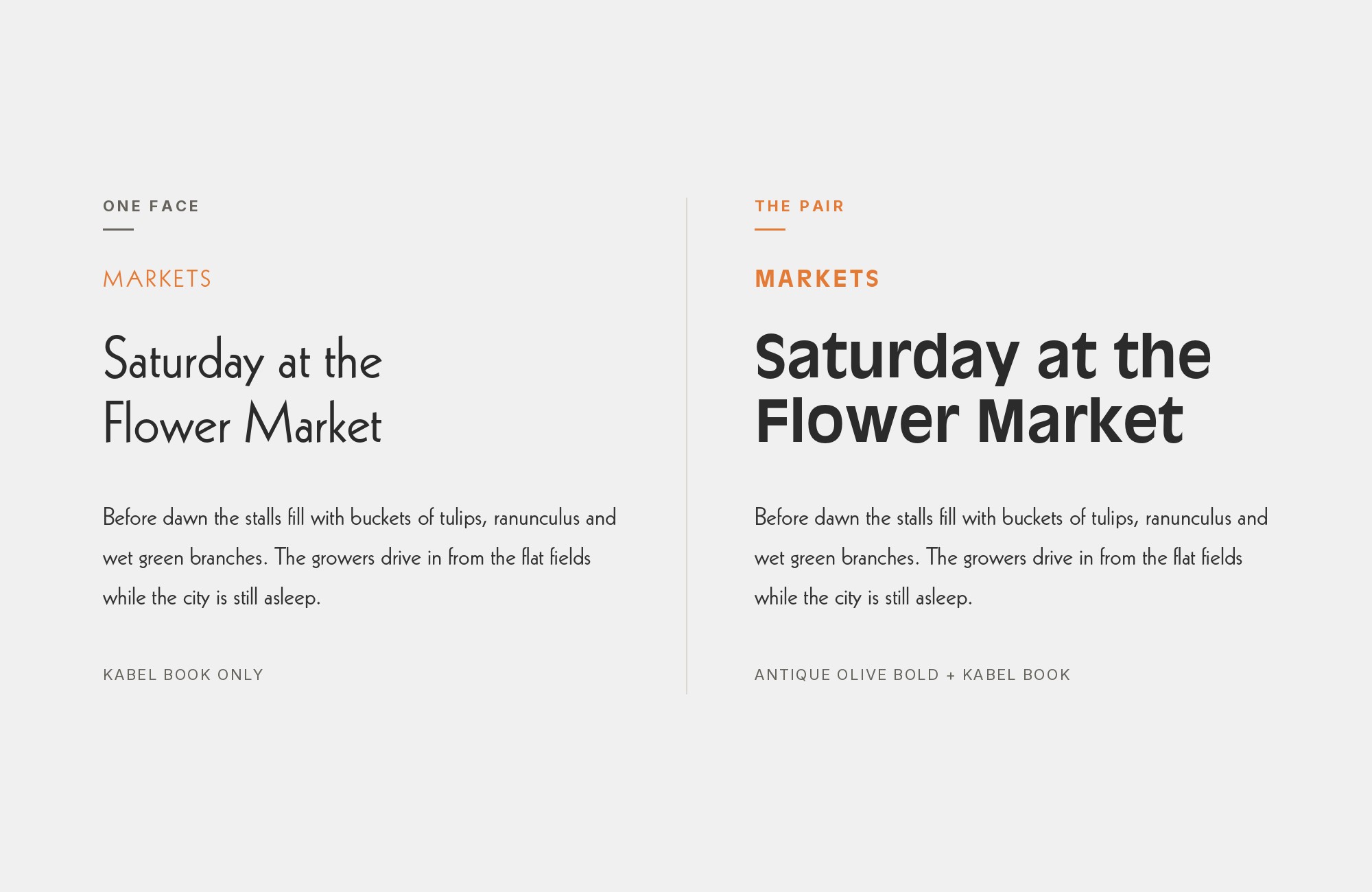
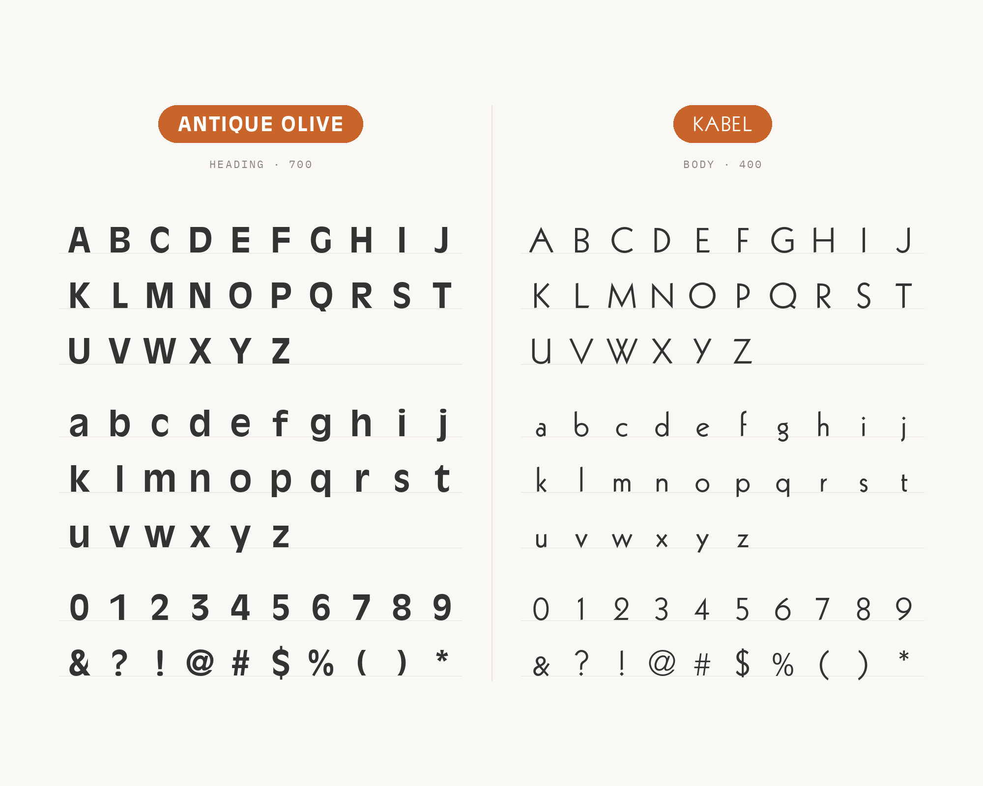
Rudolf Koch designed Kabel, released by the Klingspor foundry in 1927, the same year as Futura, but built it with far more idiosyncrasy: a tilted e, irregularly angled terminals and a delicately low x-height. It appears with Antique Olive in archived productions: Datsun’s German brochures use the roman, and Touchdown Illustrated, Vol. 1, from 1973 uses Kabel Black as a second display voice. Because Kabel’s x-height is so much smaller, it changes the texture of a page completely while staying inside the same historical vocabulary of geometric European sans. Use Kabel Black when you want two display faces that argue, and the roman when you want one to recede.
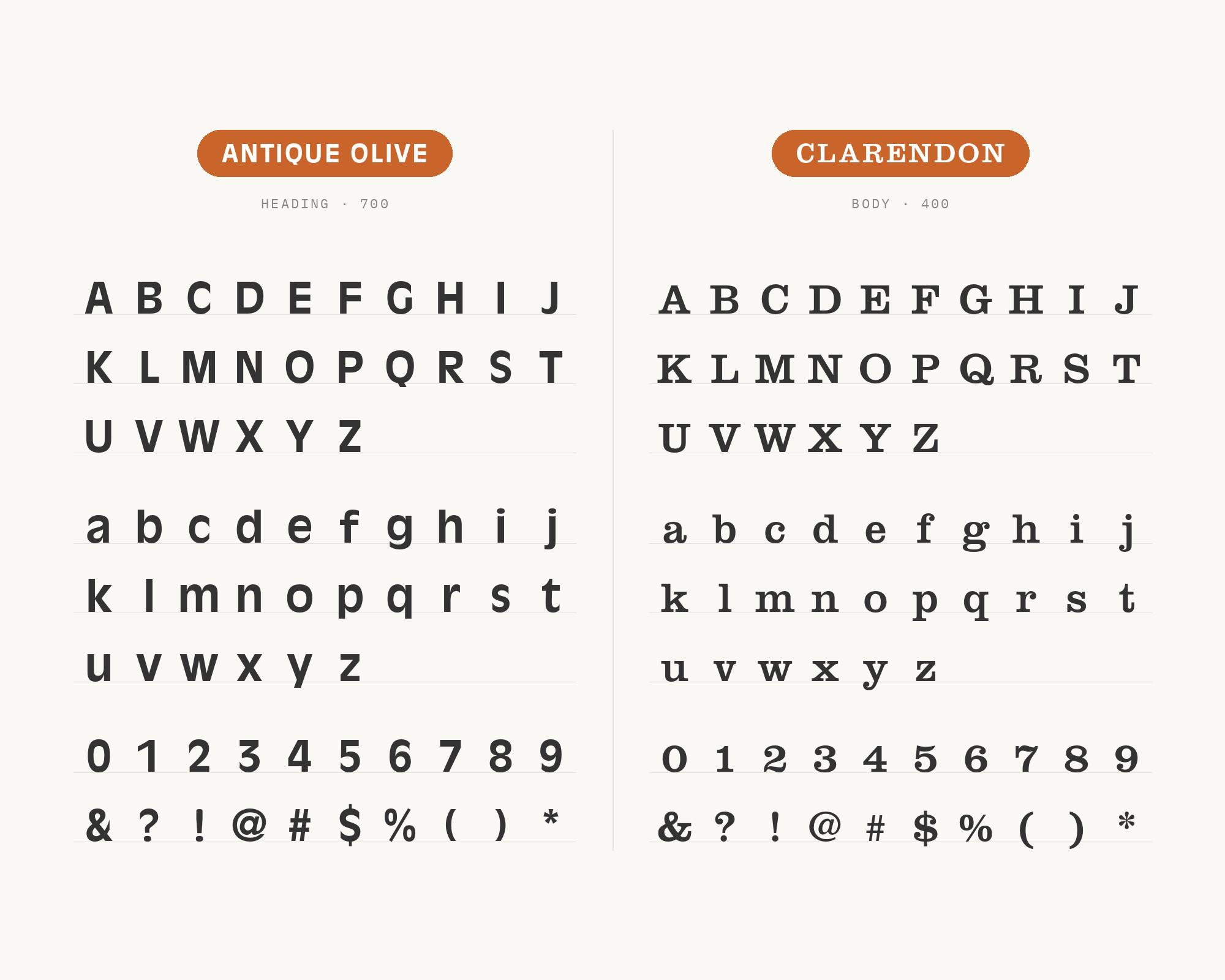
10. Clarendon
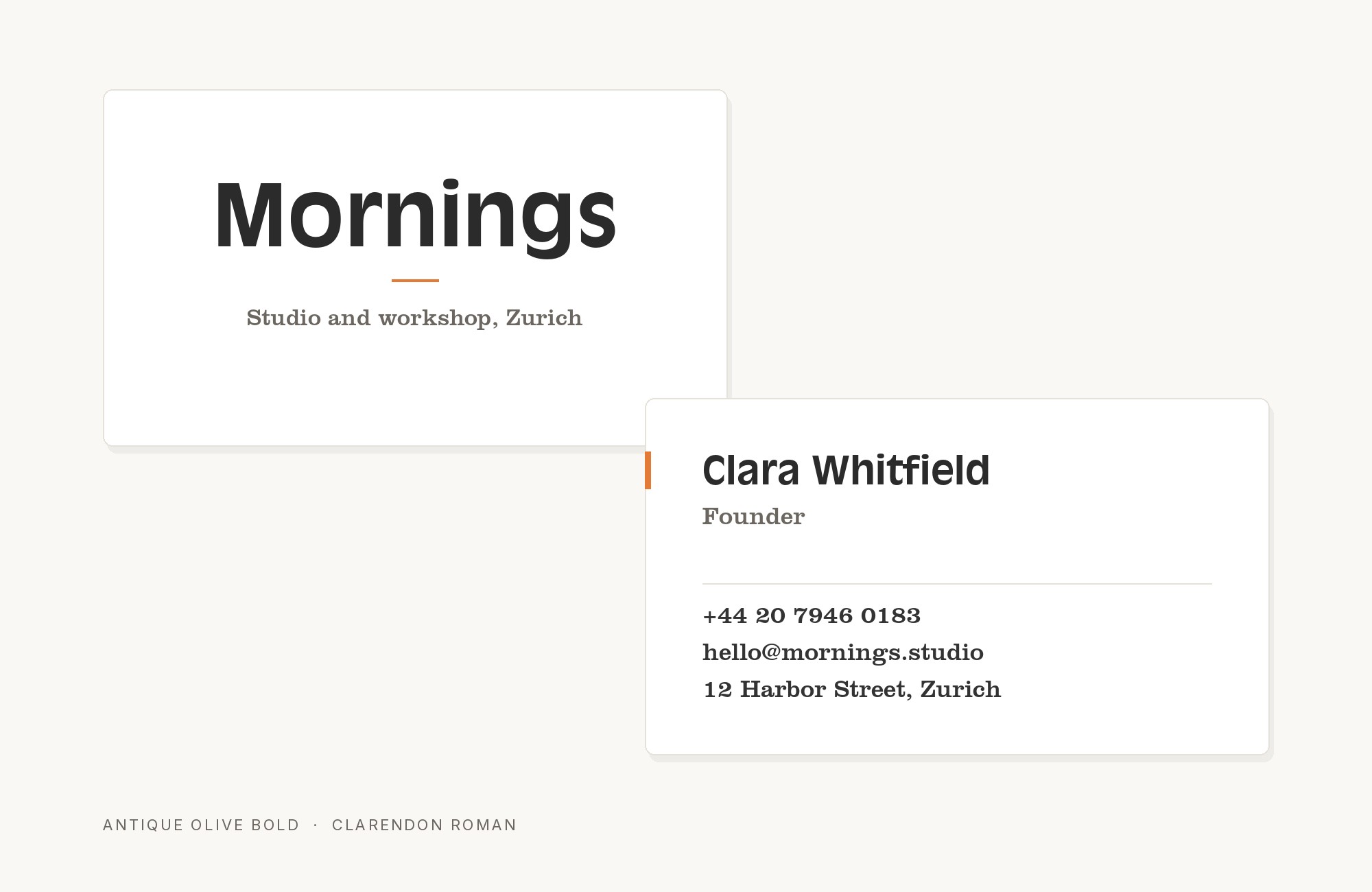
The Fann Street Foundry released Clarendon in 1845. The design is credited to Robert Besley and was engraved by punchcutter Benjamin Fox. It is a bold slab with bracketed serifs and less contrast than the moderns of its day, first used for emphasis within body text. It sits with Antique Olive, Windsor and Futura in the 38HOURS city guide series. Clarendon is one of the very few serifs that can hold a heading beside this sans without being overpowered, because it shares the two things that make Antique Olive dominant — a large x-height and substantial stroke weight — while adding the bracketing and the serifs the sans lacks entirely. Set the two at the same size and they read as equals, which makes Clarendon the right choice when a design needs two strong voices rather than one strong and one quiet.
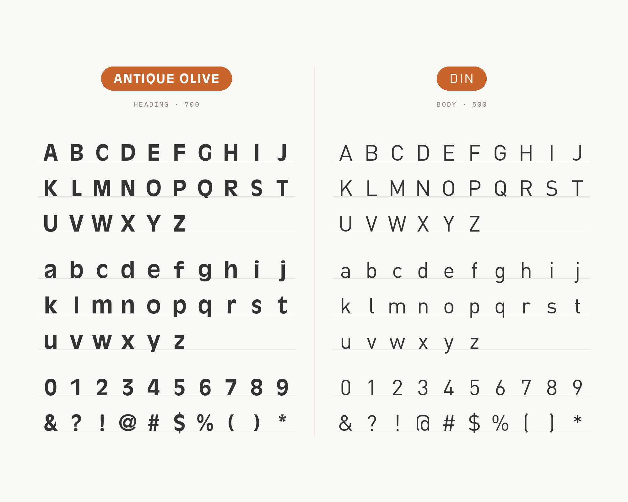
11. DIN
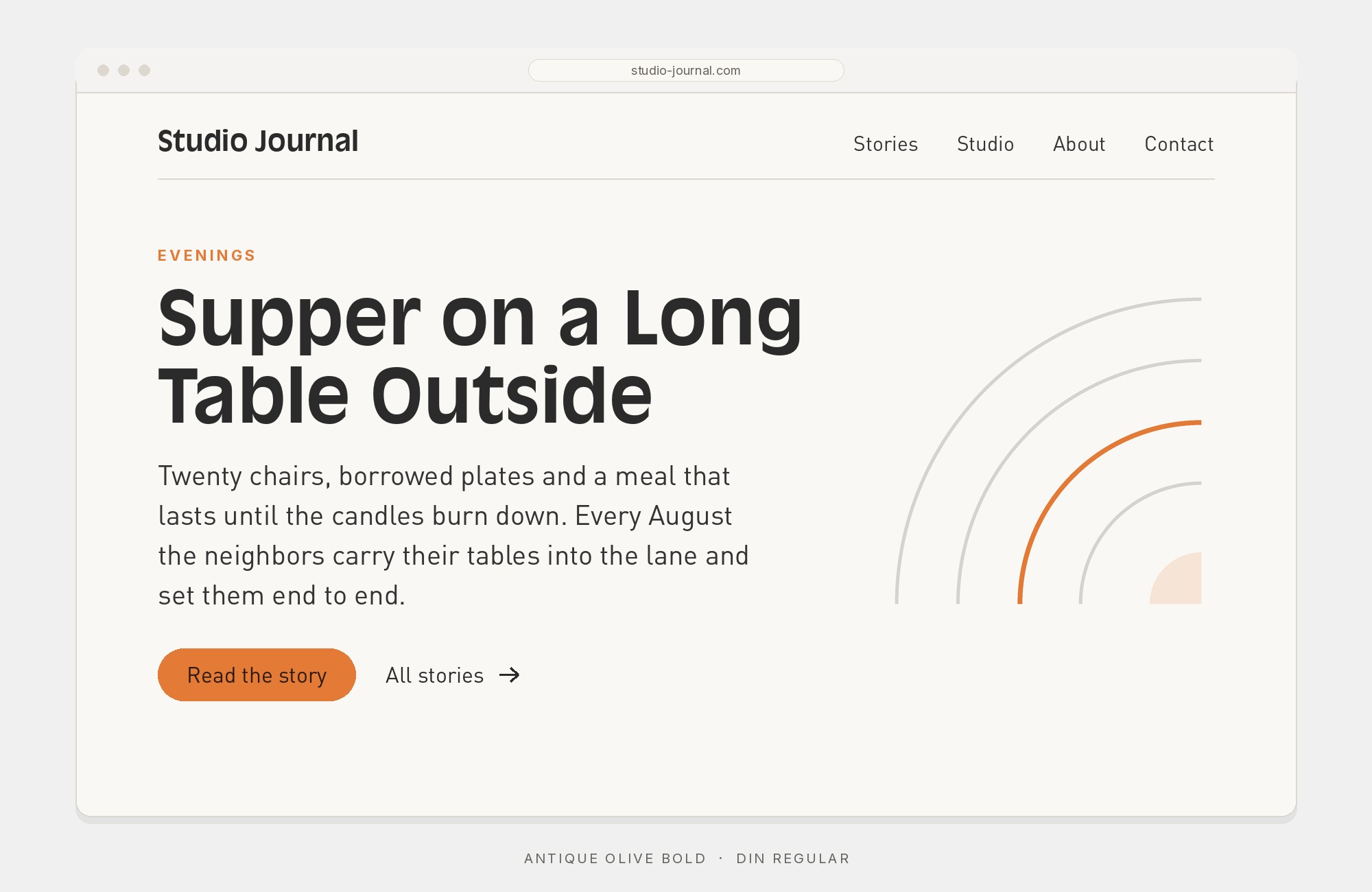
DIN descends from DIN 1451, the German standard typeface that became official in 1936 for signage, traffic signs and technical drawings. Albert-Jan Pool digitised it as FF DIN in 1995. Typewolf records the Chateau Orlando site running DIN with Antique Olive and Windsor. The appeal is its complete absence of opinion: flat sides, even stroke weight, narrow proportions and terminals cut without flourish. That makes it the ideal load-bearing partner for interface work — navigation, form labels, captions, specification tables — where Antique Olive would be unusable. Set DIN at small sizes with open tracking and let Antique Olive own every headline on the page.
12. Georgia
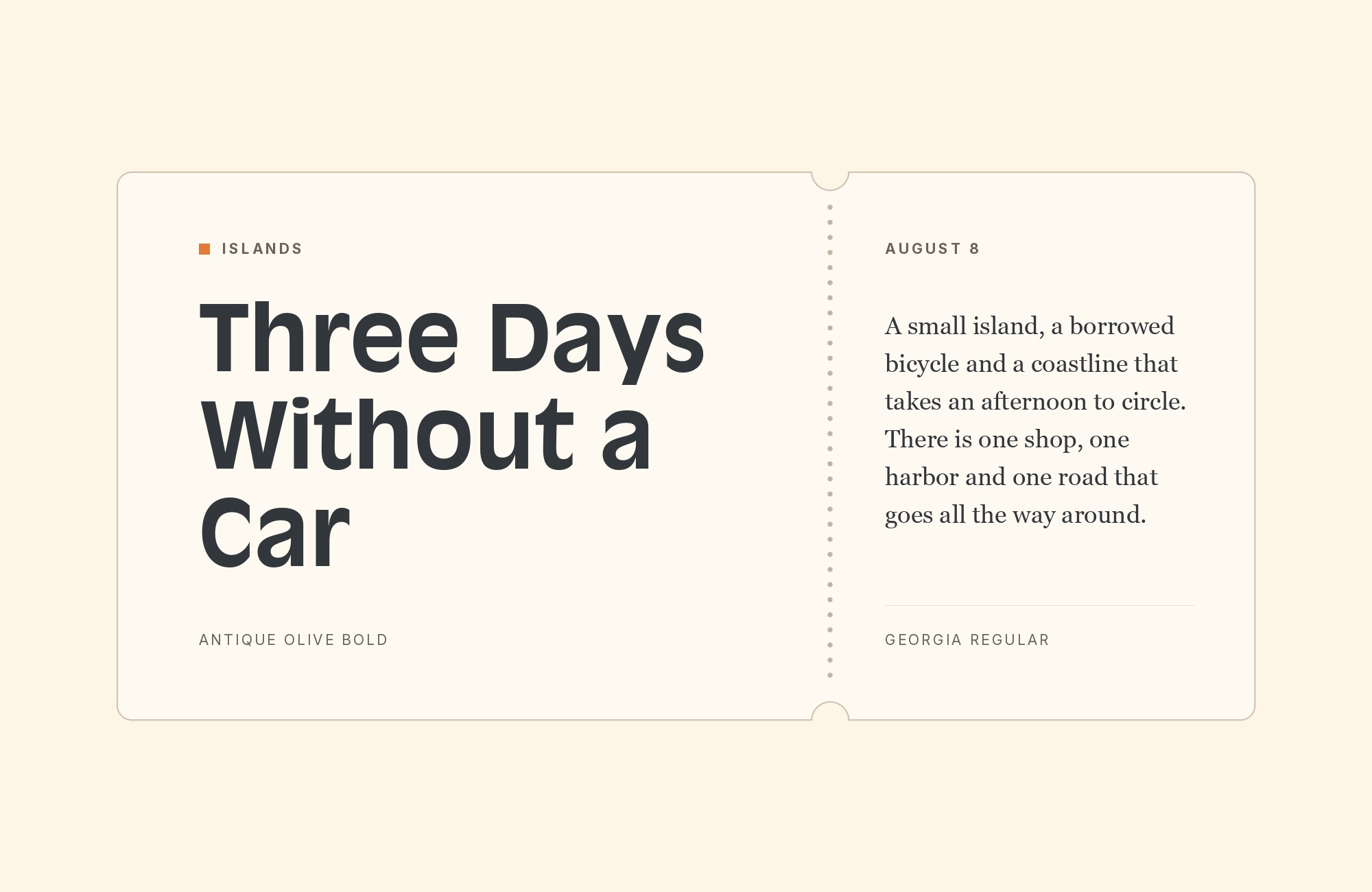
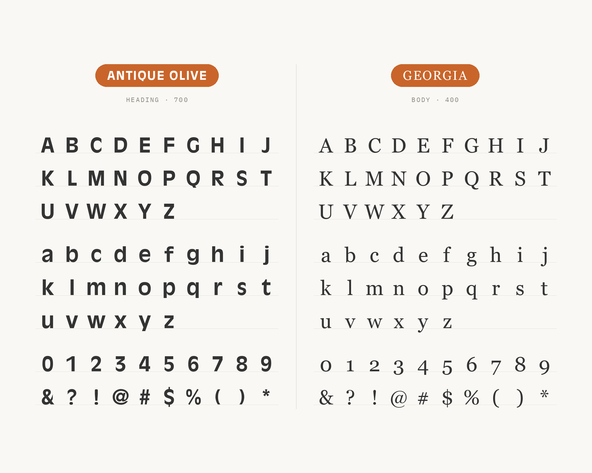
Matthew Carter designed Georgia in 1993 for Microsoft, with Thomas Rickner hinting it, as a serif that stays elegant but legible when printed small or on low-resolution screens. It has sturdy serifs and text figures. Typewolf documents the Beyond Prison site running Georgia alongside Antique Olive. Georgia solves the practical problem most serifs create under this sans: at screen sizes its sturdy strokes hold their colour instead of thinning out and looking frail beneath a top-weighted display face.
13. Mistral
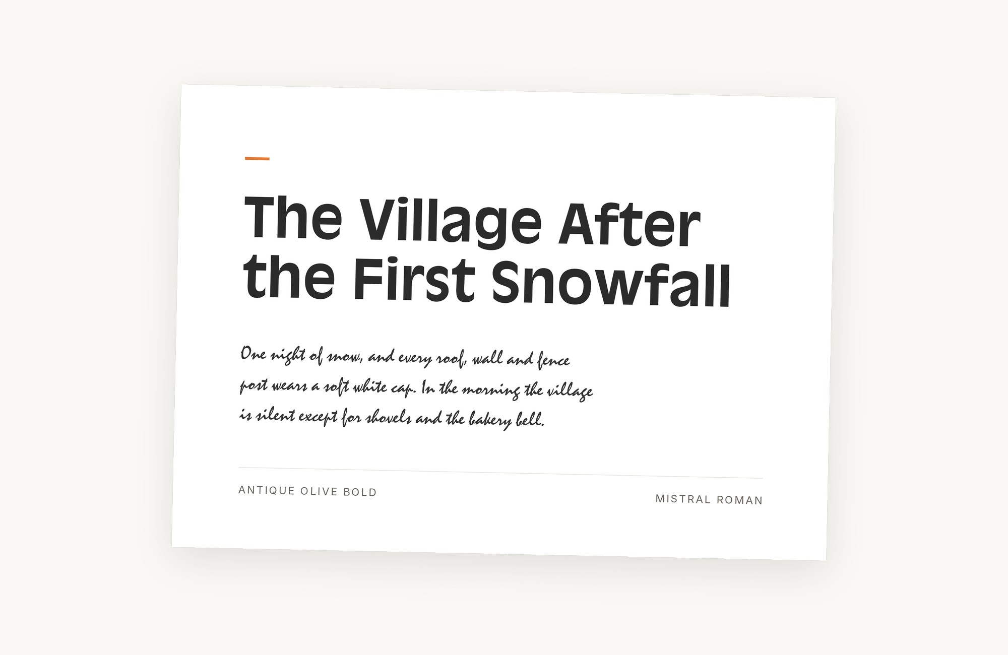
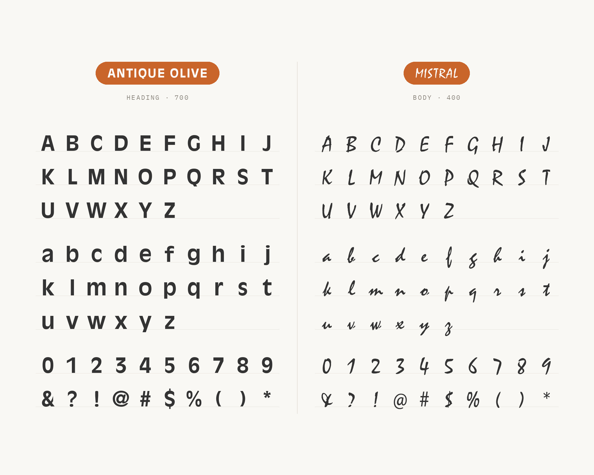
Roger Excoffon designed Mistral for Fonderie Olive, released in 1953 and based on his own handwriting. Its lowercase letters connect to an extent unusual in script fonts, a true connecting script. The archive documents a print piece using only Mistral and Antique Olive. This is the rare case of pairing a designer with himself: both faces came from the same hand at the same Marseille foundry within a decade, and both belong to the same vocabulary of mid-century French advertising lettering. That shared origin is why Mistral reads as a signature on the page rather than an applied decoration. Use it for one short line — a product name, a sign-off, a tagline — and never for more.
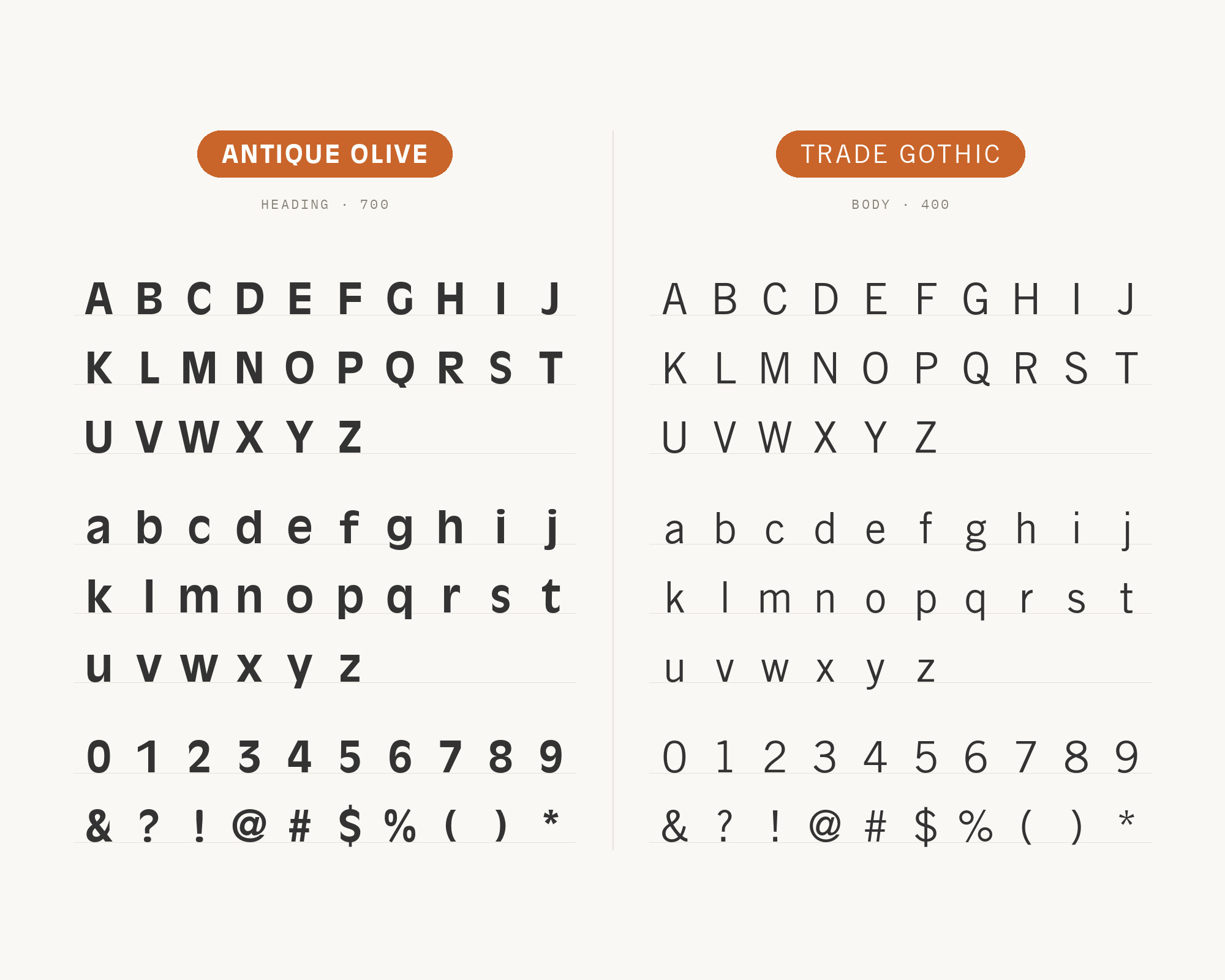
14. Trade Gothic
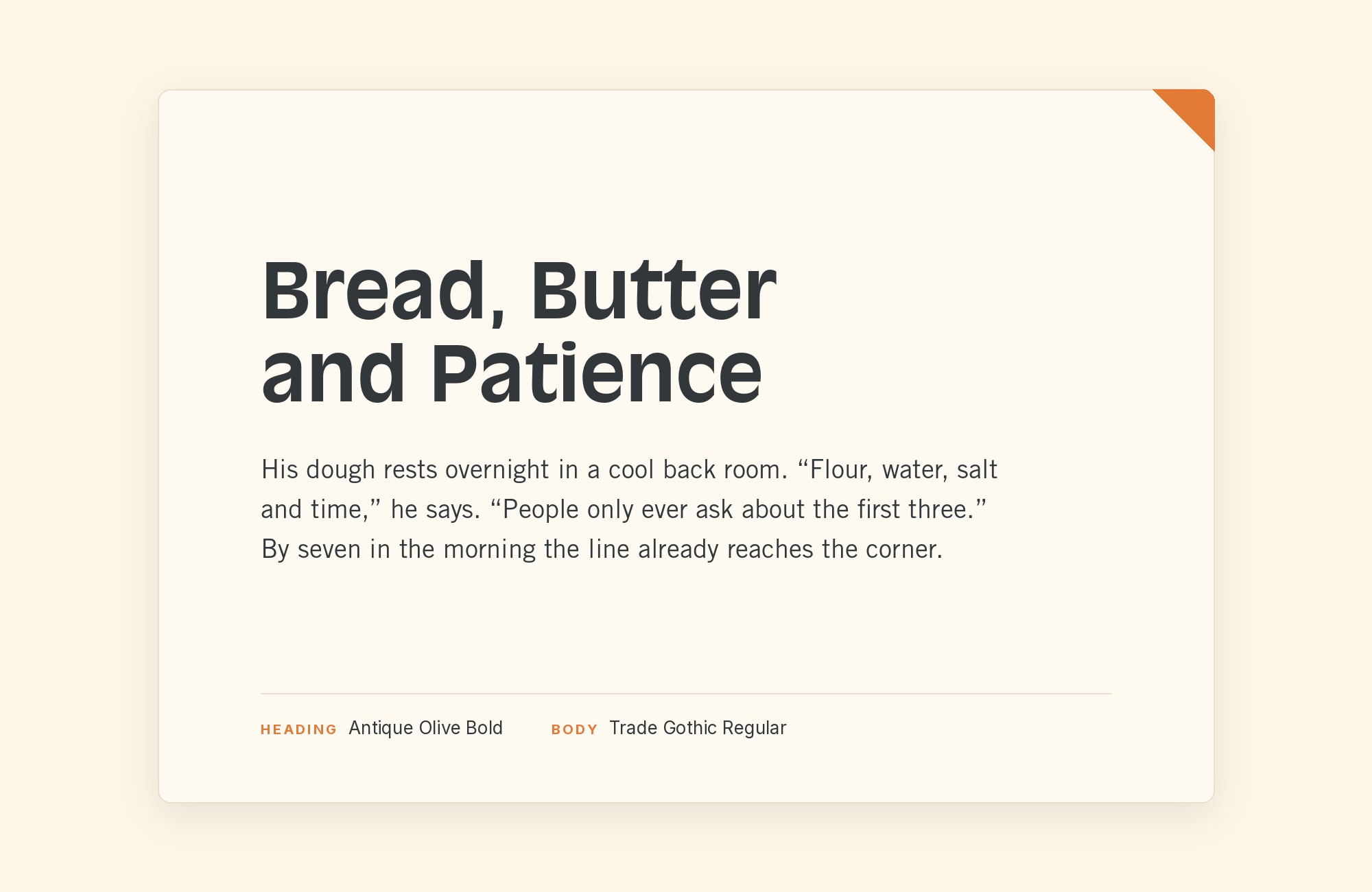
Jackson Burke designed Trade Gothic in 1948 and kept adding style-weight combinations until 1960, while he was director of type development for Linotype in the US. The archived Dansk Købenstyle advertisement pairs it with Antique Olive as a clean two-font system, which is stronger evidence than a multi-font collage provides. Trade Gothic is narrow, plain and slightly rough in a way Helvetica is not, so it sets dense advertising and editorial copy efficiently while leaving all the width and all the character to the display line above it. Its condensed weights are particularly useful here, since they free horizontal space for Antique Olive’s wide bowls to occupy.
Conclusion
Antique Olive is not a neutral sans that happens to have character; it is a display face with a text weight attached, and every combination above accepts that. The pattern across decades of real production work is consistent: pair it with a face that supplies the structure it refuses to — the Swiss grotesques Helvetica and Univers, the geometric sans Futura and Kabel, the engineered DIN — and let Antique Olive keep the single line that has to be remembered. Its own family provides the range it needs at display sizes, since Nord and Compact carry far more weight than any partner should try to match.
The serif choices divide on one technical question rather than on taste. Clarendon and Georgia both work because they are sturdy serifs, Clarendon bold and low in contrast and Georgia built to stay legible small and on screen, so they hold their colour beside it at the same size; a delicate high-contrast book serif set the same way will look starved. Windsor and Mistral belong to a different strategy again — matching the face’s warmth instead of correcting it — and both need to be kept to a headline or a single line. Set real copy at real sizes before committing, and check the descenders first, because that is where a mismatched partner shows itself.
