Outfit pairs great with Spectral, Fraunces and Poppins. All 10 pairings are shown below in real rendered specimens, with the reason each one works.

What fonts go with Outfit, the friendly geometric sans from outfit.io? It is a geometric sans with a lot of personality in its small details. So the right partner depends on the job you give Outfit, and on what it cannot do by itself.
Rodrigo Fuenzalida designed Outfit as the custom typeface for the brand automation company outfit.io. It was made available under the SIL Open Font License in 2021. The type family was inspired by the ligature-rich outfit wordmark.
Typewolf lists nine weights and no italics. Pimp my Type sees a lot of the elegance of Futura in it, plus influences from Kabel. That gives Outfit a clean geometric skeleton with round, friendly letters.
It also has one practical quirk. Its proportions are a bit wide, so it is rather space consuming in a user interface. Those two facts shape every good pairing.
With no italic, a partner often has to supply the emphasis that Outfit cannot. With wide letters, a partner that sets a little narrower helps long text. A serif with real stroke contrast is the classic answer.
A quieter sans or a monospace works when the page is a product, not a magazine. The pairings below come from real brand guides, documented websites and named type critics. Here are 10 fonts that pair with Outfit.
1. Spectral
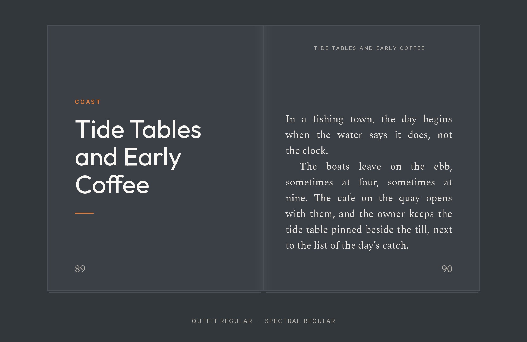
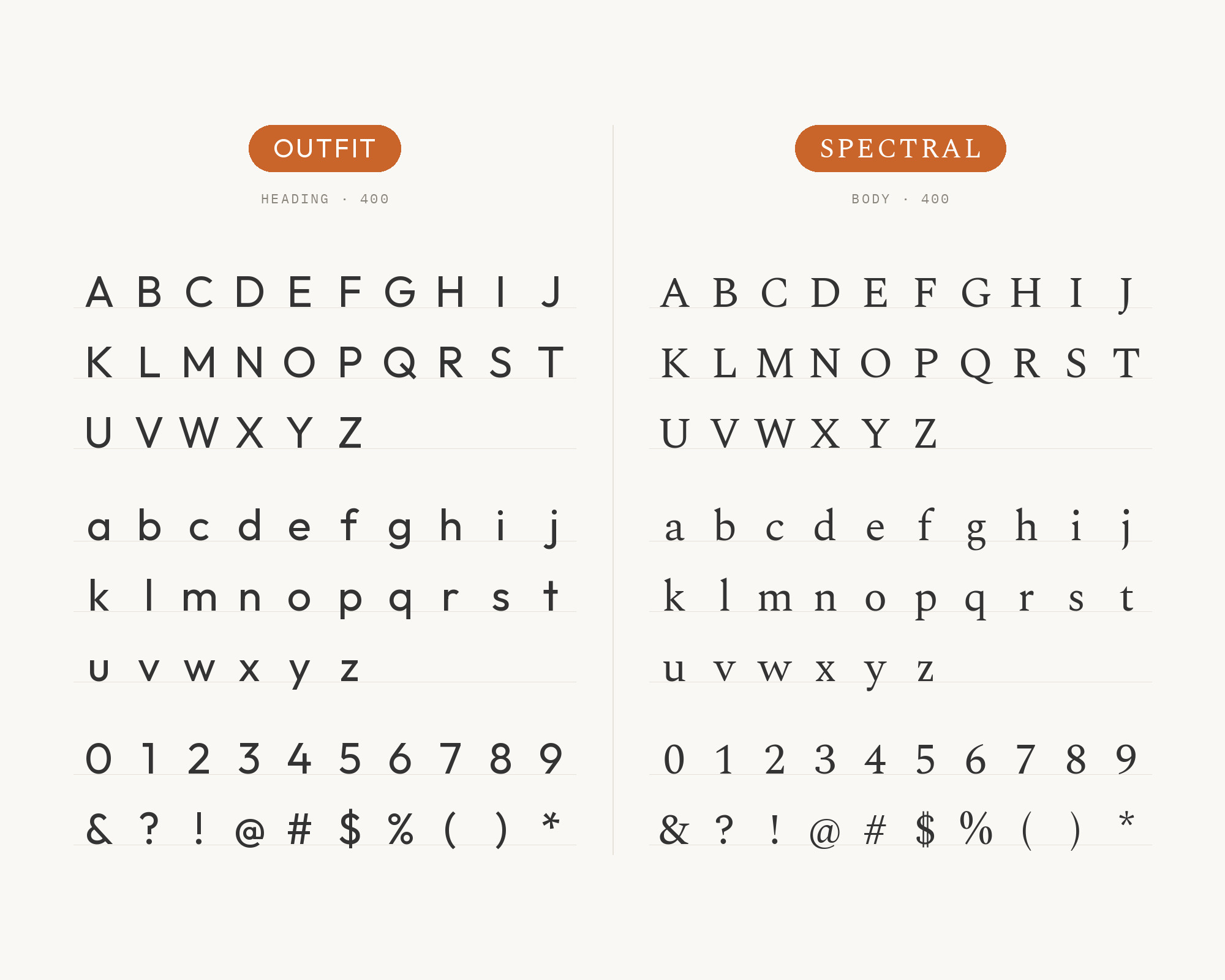
Typewolf’s suggested font pairing for Outfit is Spectral. Spectral is a slim, sharp serif with real stroke contrast.
That contrast is exactly what Outfit’s even, monolinear strokes do not have.
Set Outfit in a bold weight for headings. Then let Spectral carry the paragraphs, where its narrower letters save the space Outfit spends. The pair suits editorial sites, portfolios and long-form landing pages.
Turn your ideas into repeatable creative workflows - no code required. Create with ready-made templates and AI-powered tools in Picsart Flow.
See details2. Fraunces
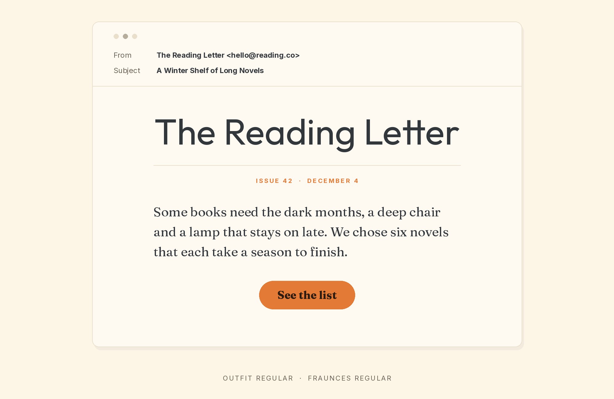
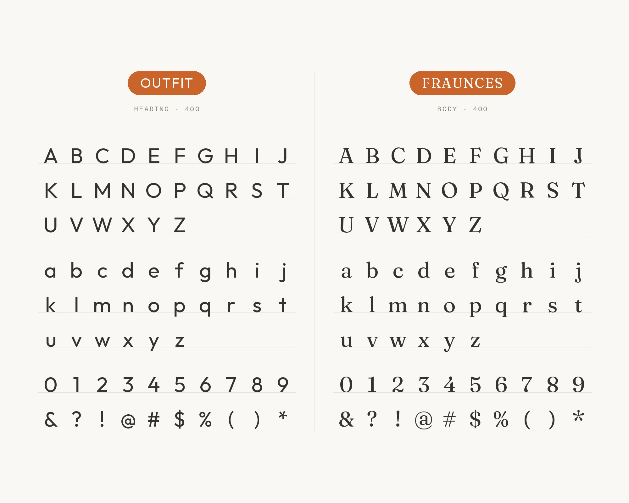
Pimp my Type suggests Fraunces when you want a very different vibe in your body text. Fraunces is a soft, wonky old-style serif with a lot of character. Against Outfit’s clean geometry, it adds warmth and a slightly retro flavor.
Keep Outfit for headings, navigation and buttons. Give Fraunces the reading text, at a generous size and with open leading. This is a good pair for food brands, small studios and friendly editorial sites.
Try Semrush free. No credit card.
Start on the $0 plan. Paid plans from $117/mo billed annually.
Try for free3. Poppins
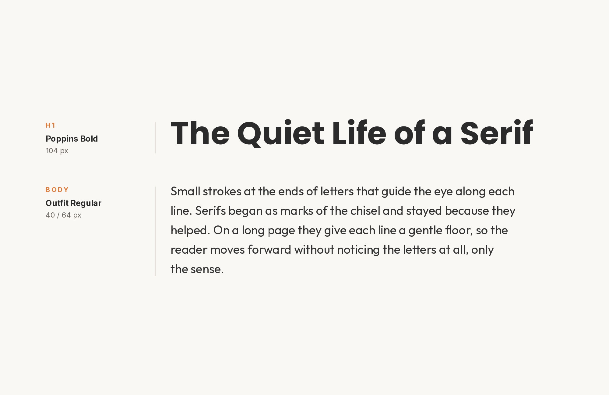
Fonts In Use documents the Presentable design studio website, where Poppins and Outfit share the work. Poppins is used for supporting headings and structured content. Outfit is used for body copy and interface elements, chosen for its clarity at smaller sizes.
So in this pairing, Poppins takes the headings and Outfit takes the text. Both are geometric sans faces, so the difference comes from weight and shape, not category. Poppins has rounder, more circular bowls, and a heavy Poppins heading reads louder than Outfit at the same size.
Use a bold Poppins for headings and a regular Outfit for paragraphs and labels.
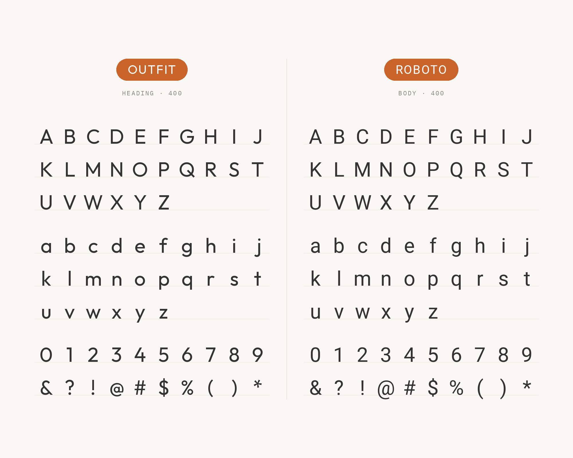
4. Roboto
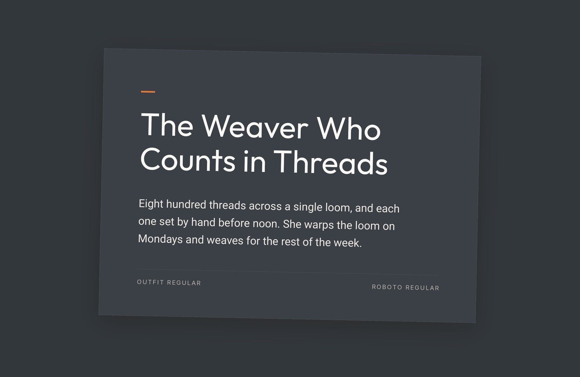
The SpouseWorks visual style guide names two primary typefaces for its materials: Outfit and Roboto. Outfit was used to create the SpouseWorks logo. Roboto is the secondary font, used with Outfit or when Outfit is not available.
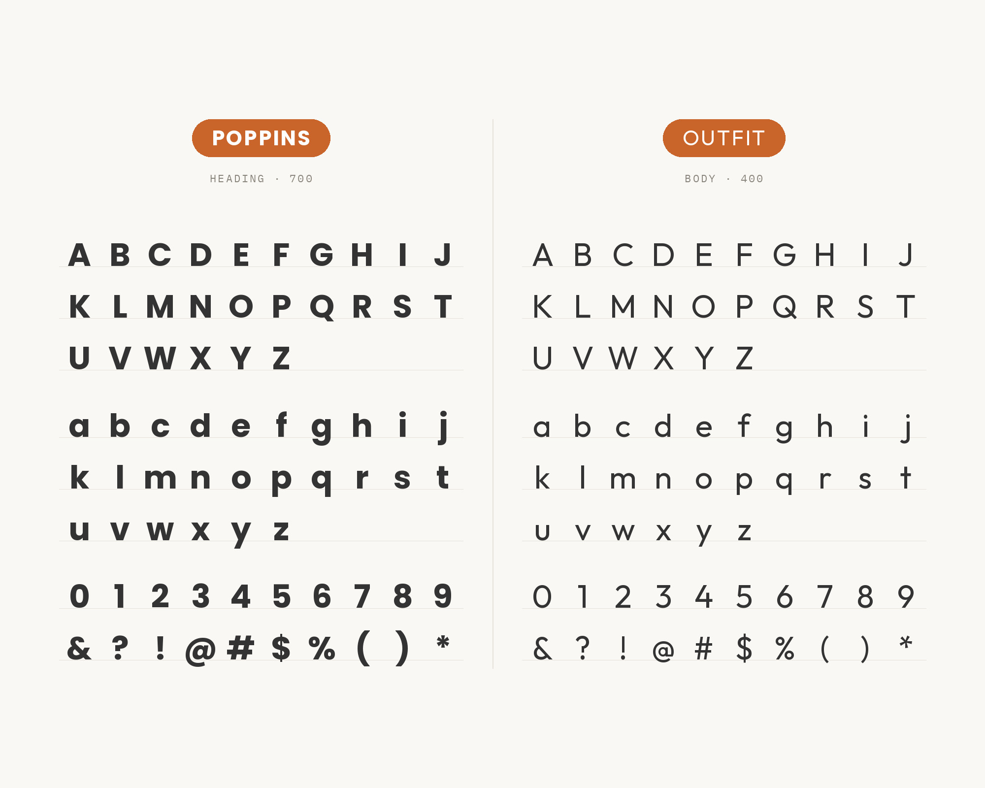
Roboto was created as the system font for Google’s Android operating system. Its mechanical skeleton and narrower fit make it a sober text partner. Outfit keeps the friendlier display voice.
Use Outfit for headlines and Roboto for forms, tables and dense text.
5. Geist
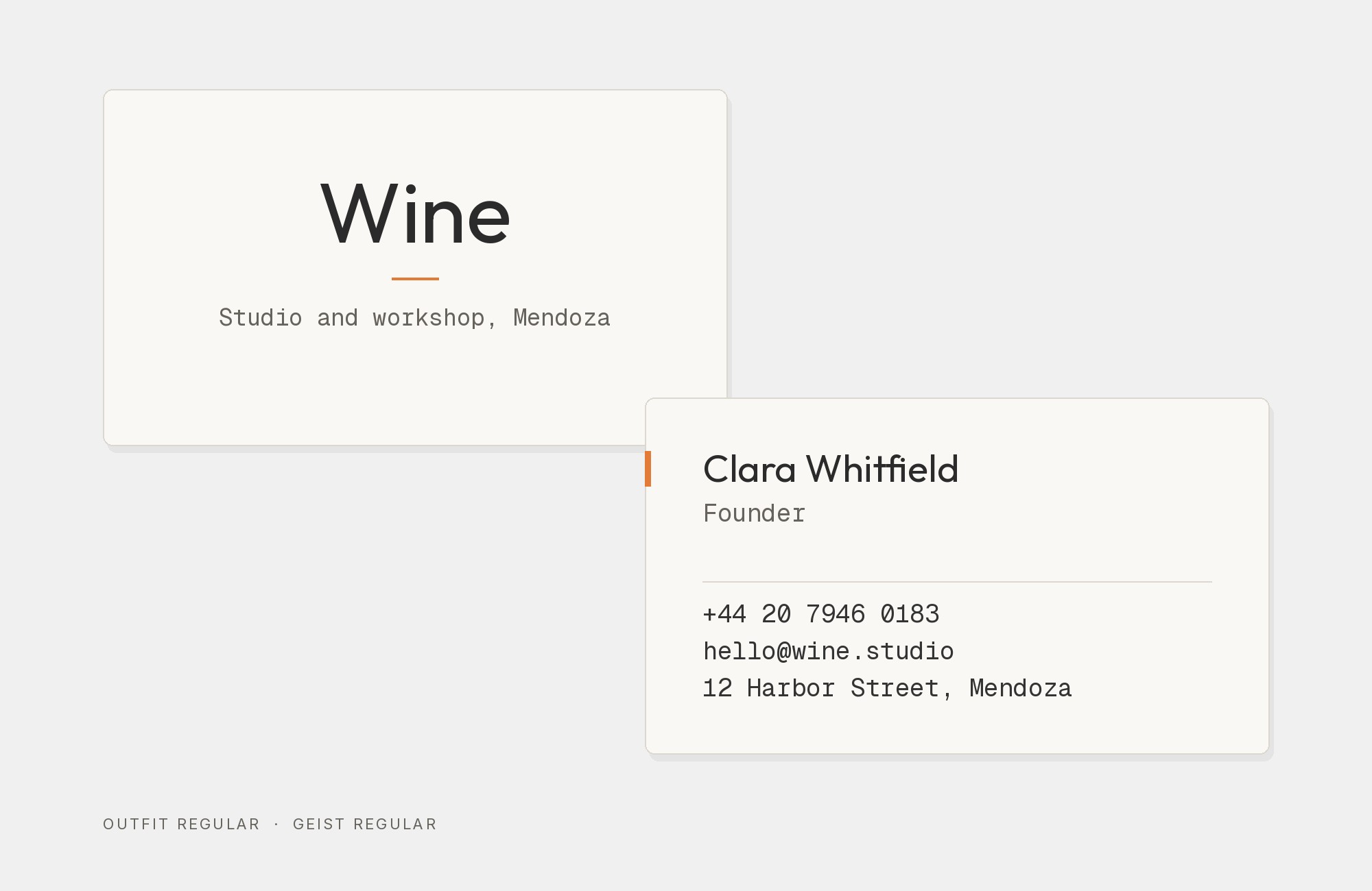
A1 Gallery records the Tokens Studio website with Geist, Outfit and PT Mono.
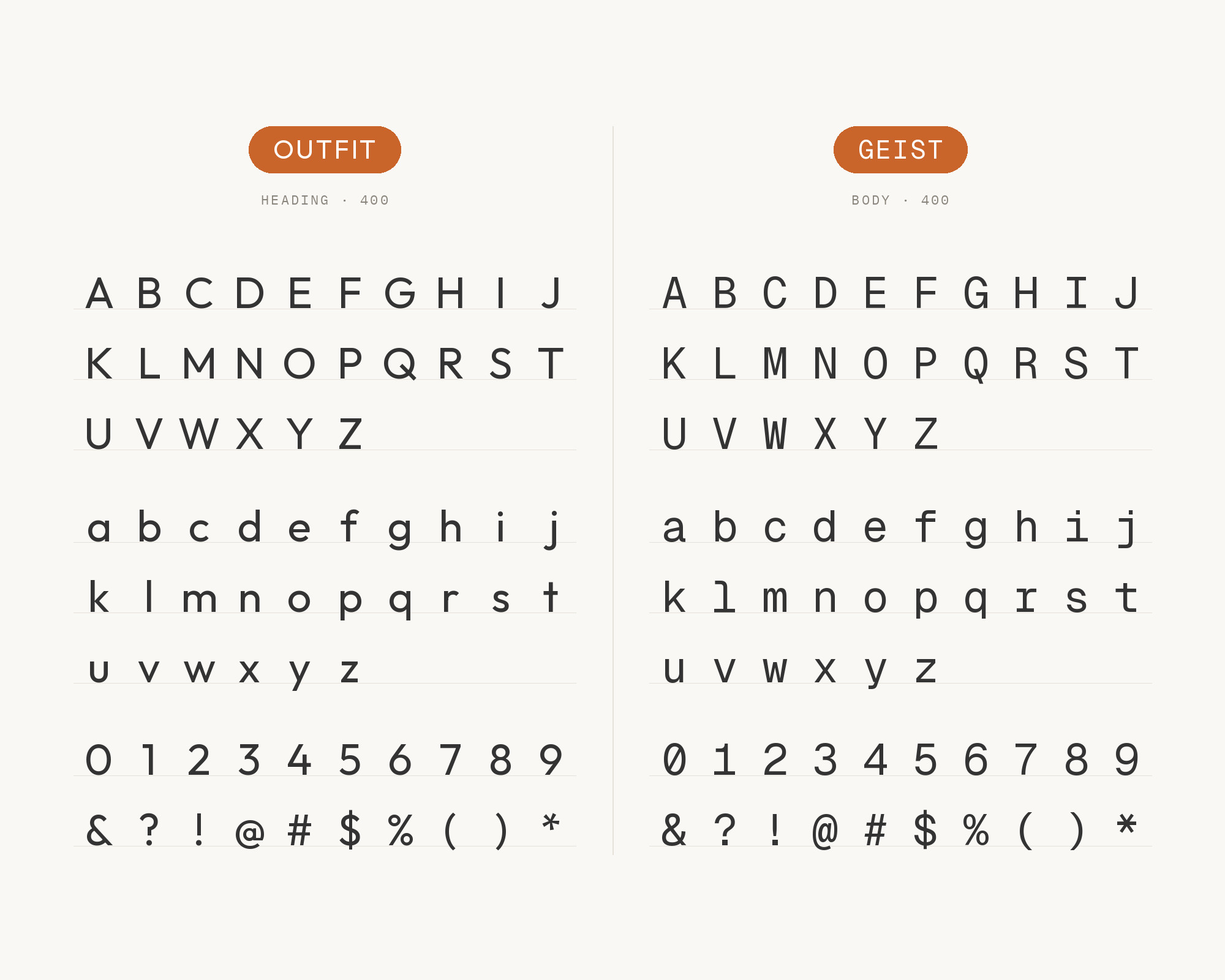
Geist is a tight, neutral sans with a technical feel. Next to it, Outfit’s round letters read as the brand voice. Geist does the quiet work in body text and interface labels, where Outfit’s wide proportions would cost space.
Keep the two apart with weight: a bold Outfit heading over a regular Geist paragraph.
This is a natural pair for software products and design-tool sites.
“AI builds anything, so what do I sell?”
Taste is the answer. Own your stack and automate your own CMS.
Find Out How6. PT Mono
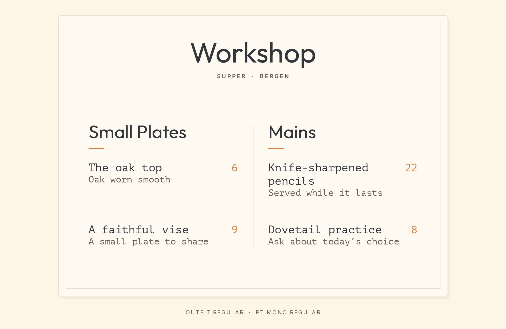
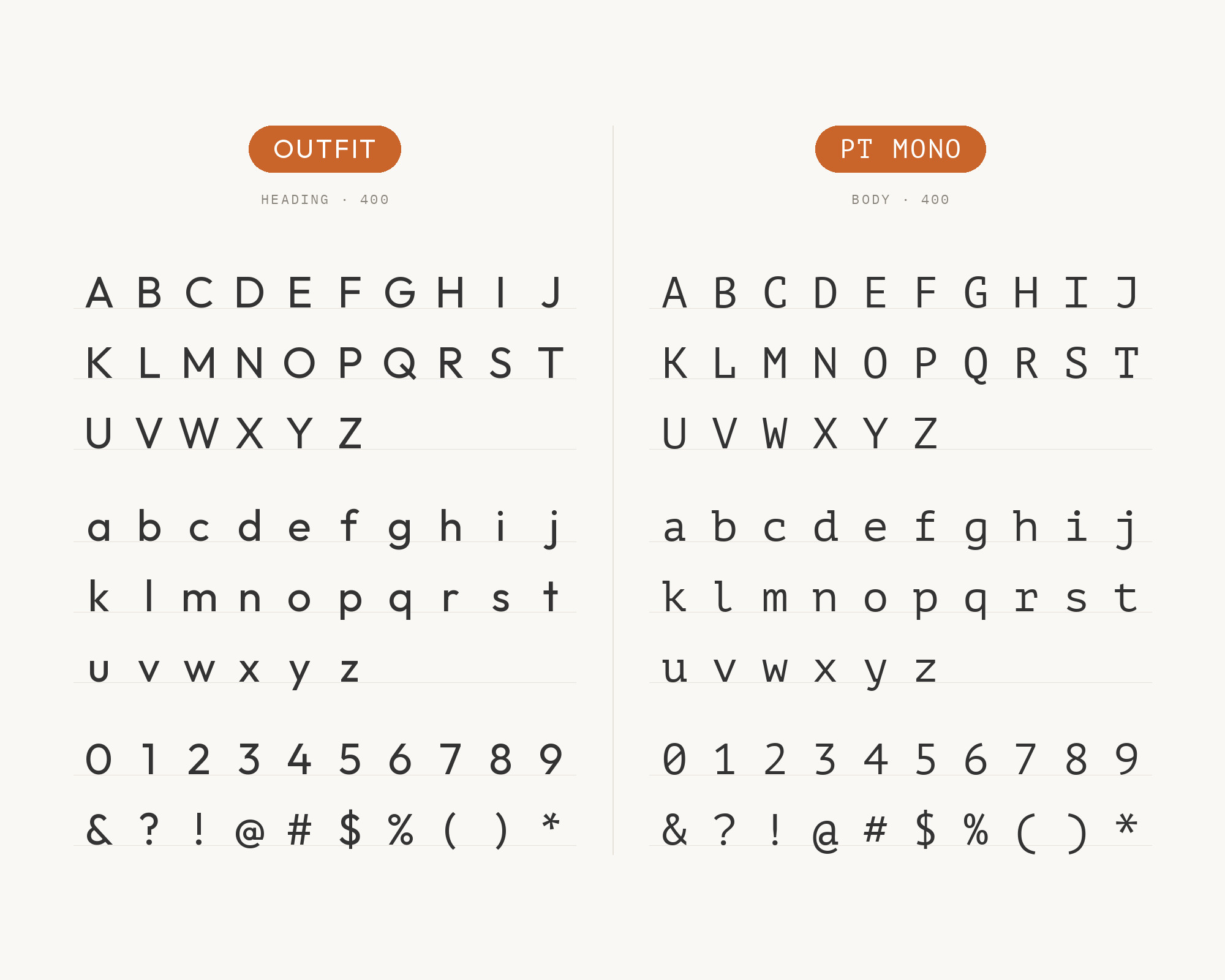
PT Mono is the third font in the same Tokens Studio record. PT Mono belongs to the free Public Type family, with PT Sans and PT Serif.
A monospace gives code, tokens and numbers a fixed rhythm. Outfit handles headings and prose, and PT Mono marks anything a user might copy or type.
Keep the mono small and use it sparingly.
This pair works for documentation, developer tools and changelogs.
7. Avenir Next Pro
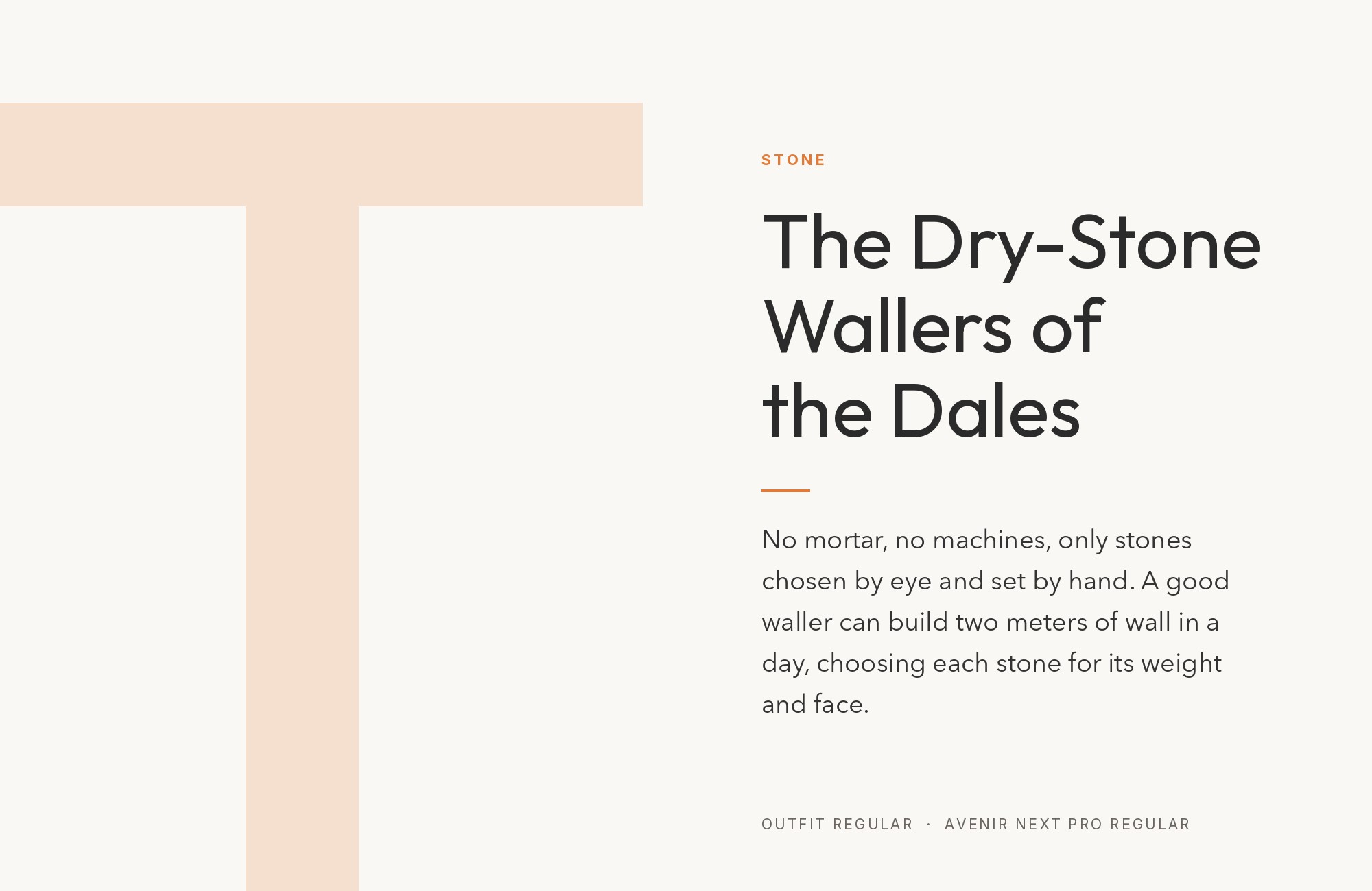
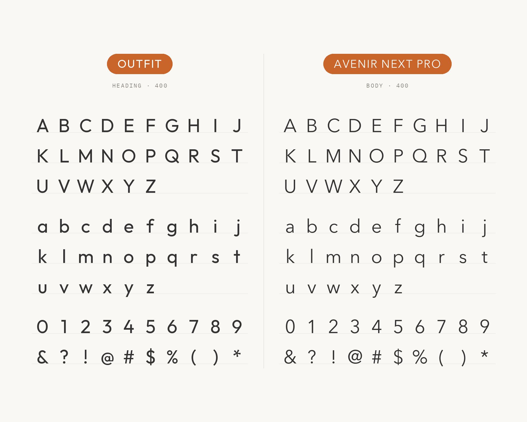
Transcarent’s brand guide makes Outfit the brand font for all designed pieces. For internal documents and presentations, or anywhere Outfit is unavailable, it names Avenir Next Pro as the fallback font.
Avenir is a geometric sans-serif typeface designed by Adrian Frutiger. Frutiger later reworked the family with Akira Kobayashi, and the result was titled Avenir Next.
It is a sensible stand-in, because both are geometric sans faces. Avenir Next is calmer and more even, so it keeps a document readable without fighting Outfit’s personality. Use the pair inside one system: Outfit on anything designed, Avenir Next in the files people edit.
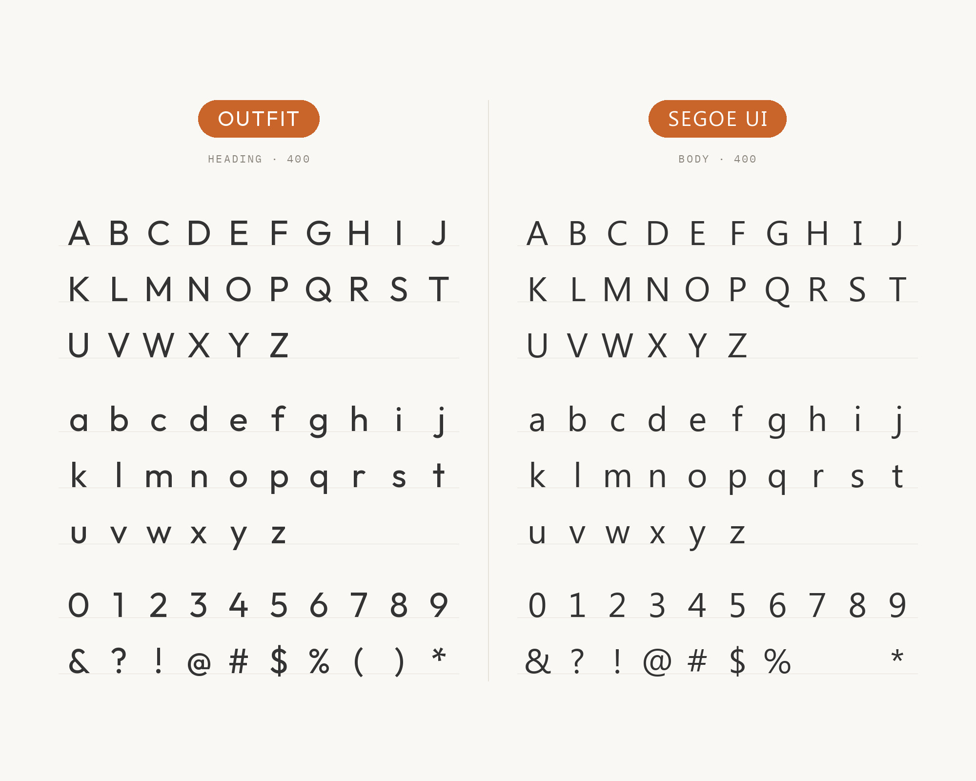
8. Segoe UI
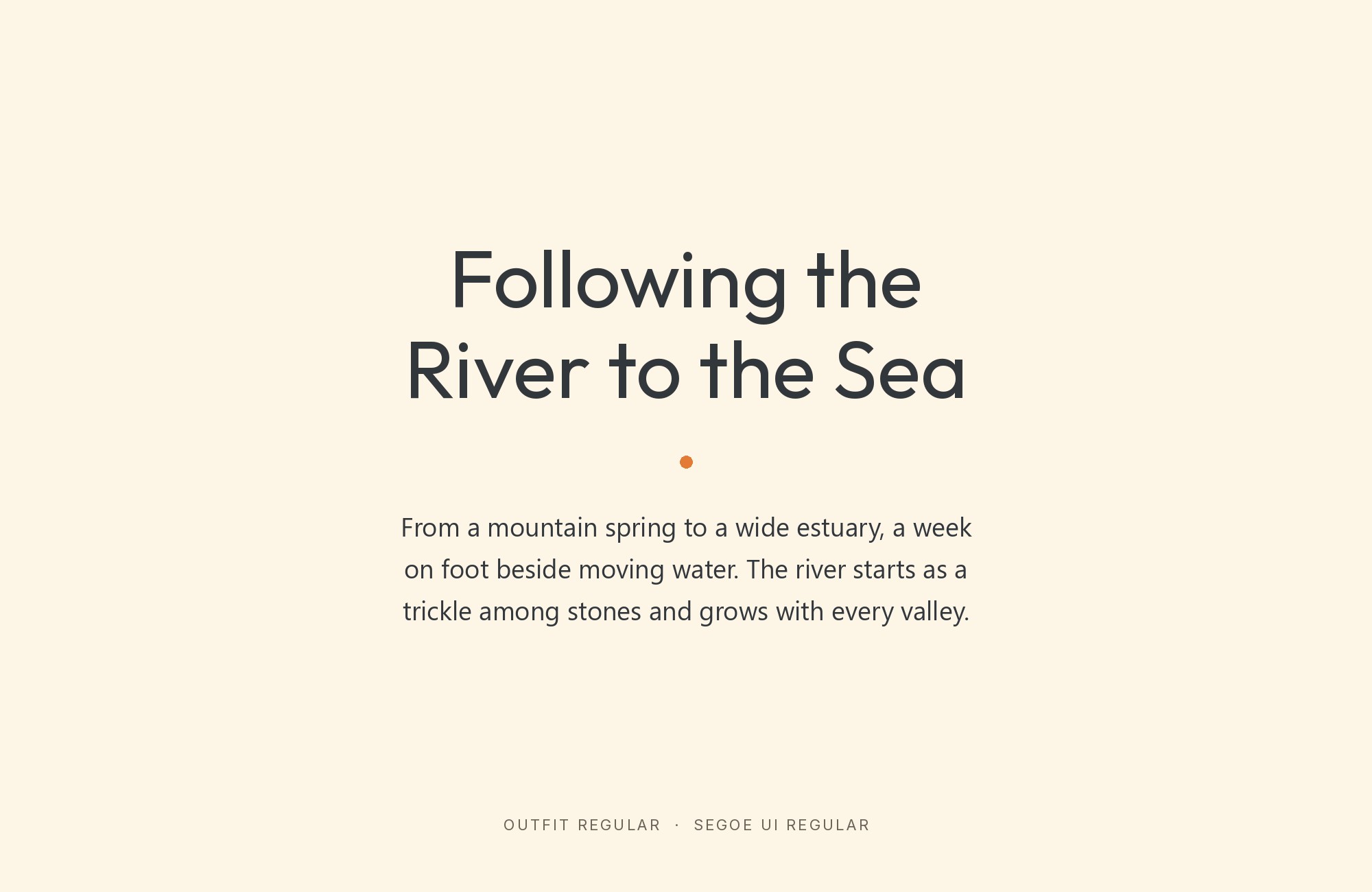
Fonts In Use documents the Curl Maven website, where Outfit is used for navigational elements and selected subheadings. Smaller type is rendered in the visitor’s default system font.
In the documented screenshots, that body font is Segoe. Segoe UI was first introduced with Windows Vista.
Its humanist forms are open and calm, so Outfit stays the only voice with character. This pairing is about honest defaults: a styled webfont for the labels, and a fast system font for reading.
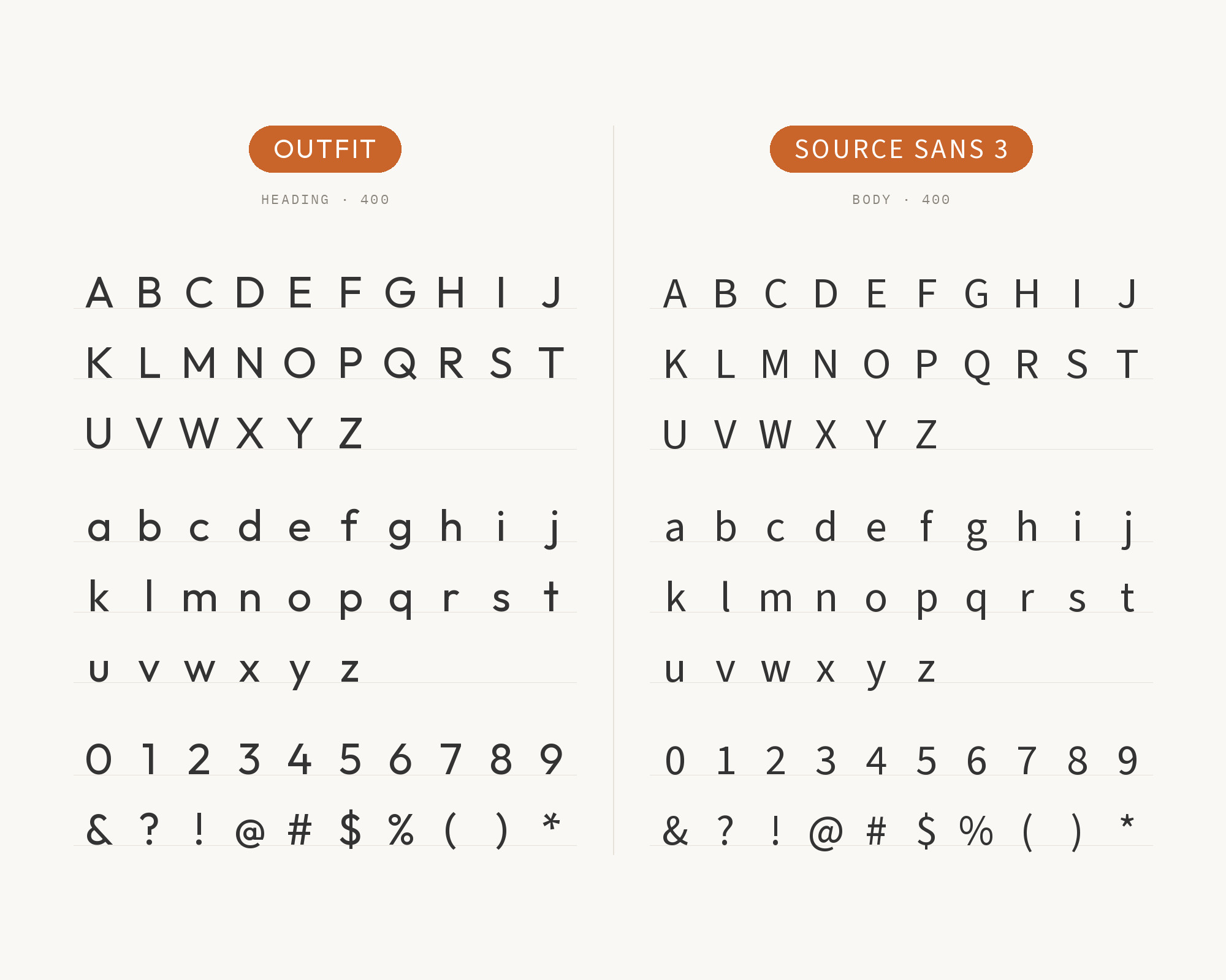
9. Source Sans 3
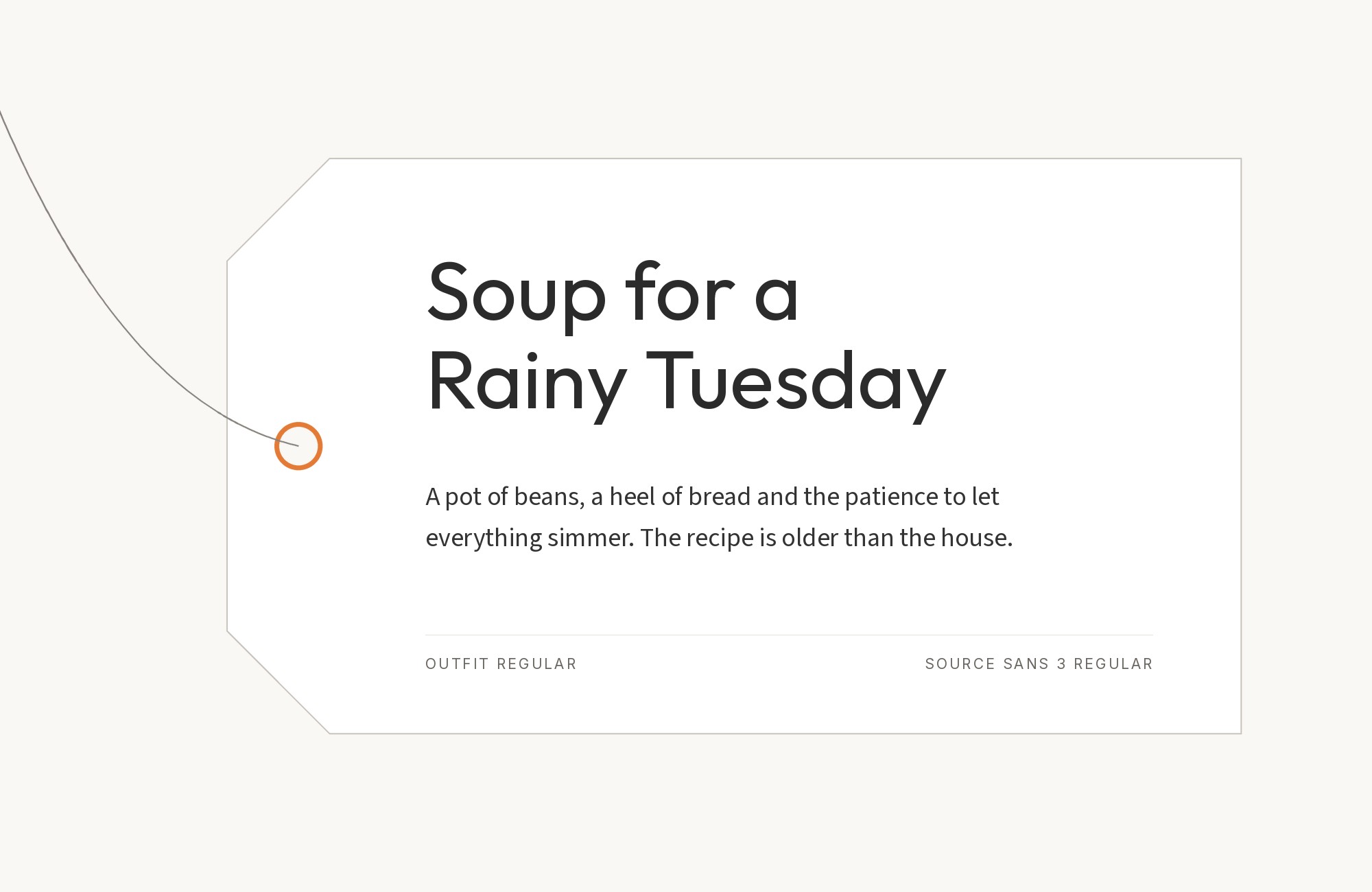
Nikki Kipple, a product designer and design instructor, lists Outfit with Source Sans 3 in The Crit’s guide to portfolio font pairings. She calls Source Sans 3 Adobe’s workhorse body font.
Source Sans is the first open-source font family from Adobe. Its humanist shapes have more open apertures than Outfit, which helps in long text. The contrast is quiet, so build it with weight: a heavy Outfit name over light, even Source Sans text.
Use it for portfolios, case studies and product pages.
10. Nunito
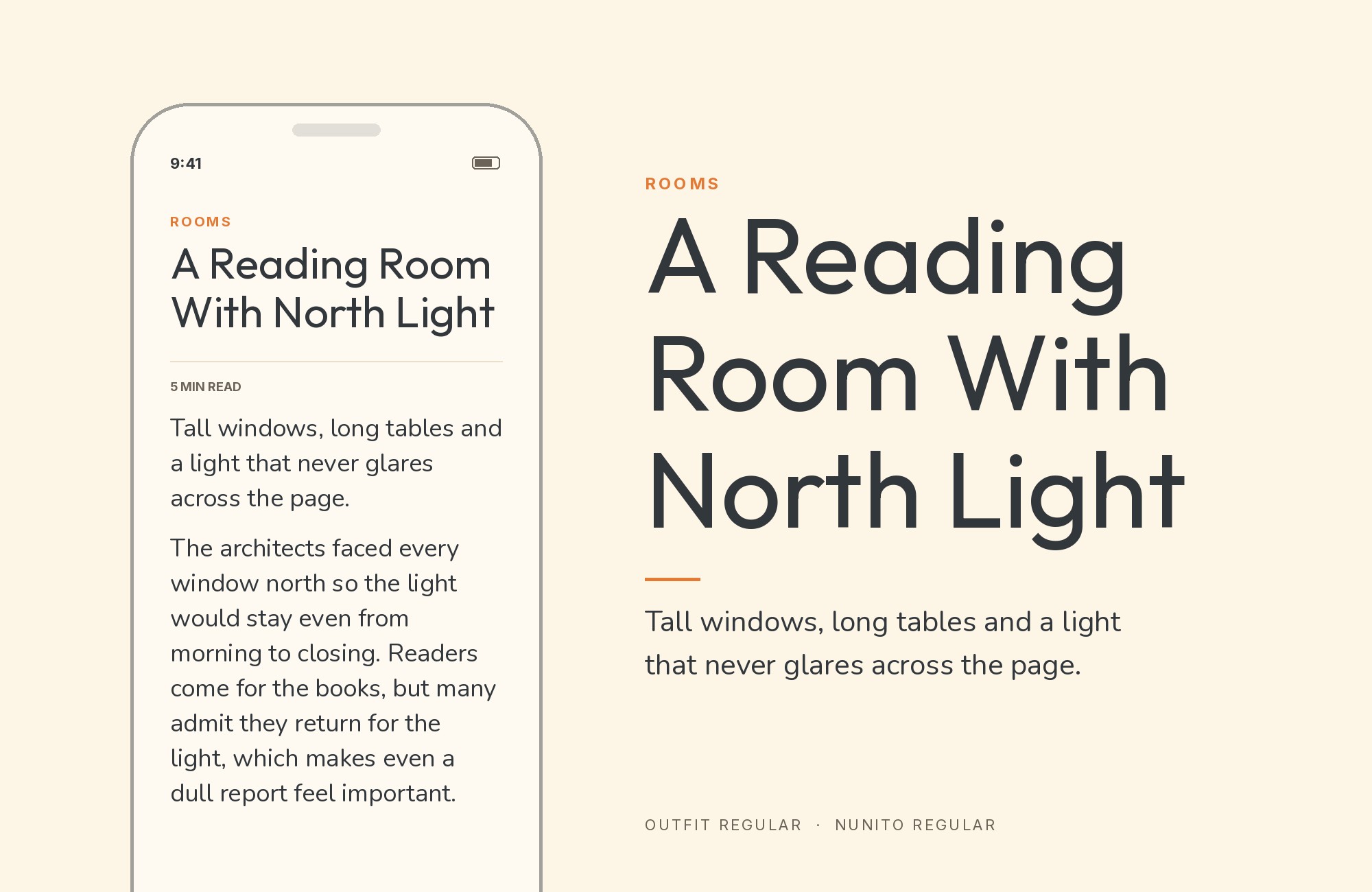
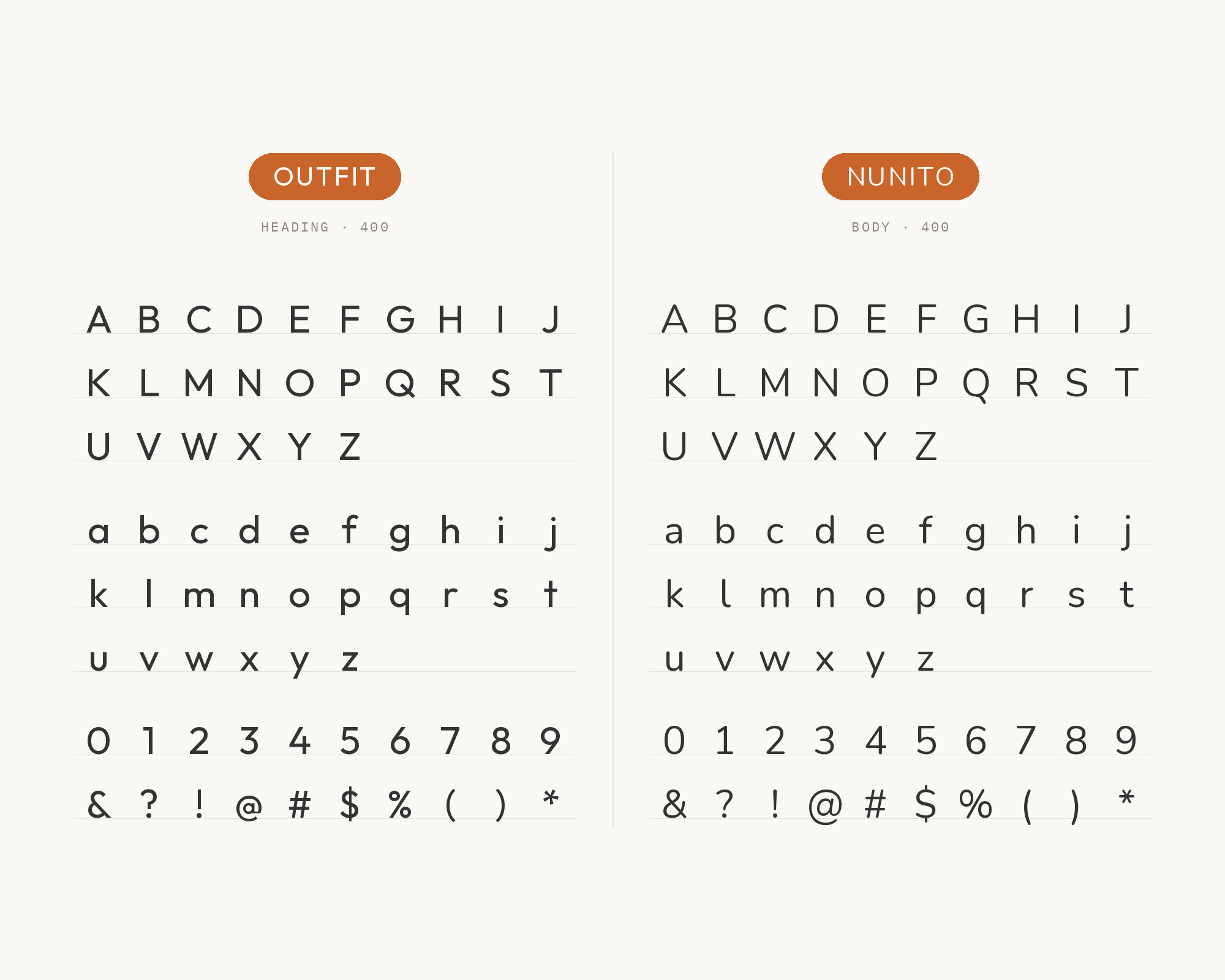
The same guide pairs Outfit with Nunito, because both have rounded terminals.
Nunito is fully rounded, so the pair leans soft and friendly. Outfit keeps the headings crisp, and Nunito makes the body text feel gentle. Size and weight must do the work, because the two are close in mood.
Use it for education, wellness or children’s products.
Conclusion
Outfit is easy to like and a little hard to pair. Its wide, round letters want a partner that saves space or adds contrast.
For editorial work, start with Spectral or Fraunces. For products and interfaces, Geist, PT Mono or Segoe UI keep the reading text efficient. For brand systems, Roboto and Avenir Next Pro show how real teams protect Outfit when it cannot load.
Test any pairing at your real sizes. And keep Outfit’s rare ligatures for headlines, where they have room to show.
Sources
- Typewolf (Outfit)
- Fonts In Use (Outfit typeface page)
- Fonts In Use (Presentable website)
- Fonts In Use (Curl Maven website)
- Pimp my Type (Outfit)
- GitHub Outfitio/Outfit-Fonts
- SpouseWorks Visual Style Guide
- EPPITA typography (Google Sites)
- Transcarent Brandguide
- A1 Gallery (Tokens Studio, Avolin)
- The Crit (Nikki Kipple)
