BonFX

Typography & Graphic Design Blog

  • Blog
  • Font Combinations
  • Books
    • The Preposterously Huge Book of Google Font Combinations
    • The Big Book of Font Combinations (Classic Fonts Edition)
  • Contact
You are here: Home / Font Combinations / What Fonts Go With Zilla Slab?

The BonFX Letter

One good pairing.
Every Tuesday.

2-minute read · free

This week — no. 14

Quiet authority

Merriweather sets the tone in one line. Lato stays out of the way and lets it.

MERRIWEATHER 700  +  LATO 400

A font specimen, a pairing that works, and one line on why it works. That is the whole email.

Free. One click to unsubscribe. No sharing, ever.

zilla slab font pairing

What Fonts Go With Zilla Slab?

October 5, 2026 by Douglas Bonneville

Zilla Slab pairs great with Inter, Source Sans Pro and Lato. All 10 pairings are shown below in real rendered specimens, with the reason each one works.

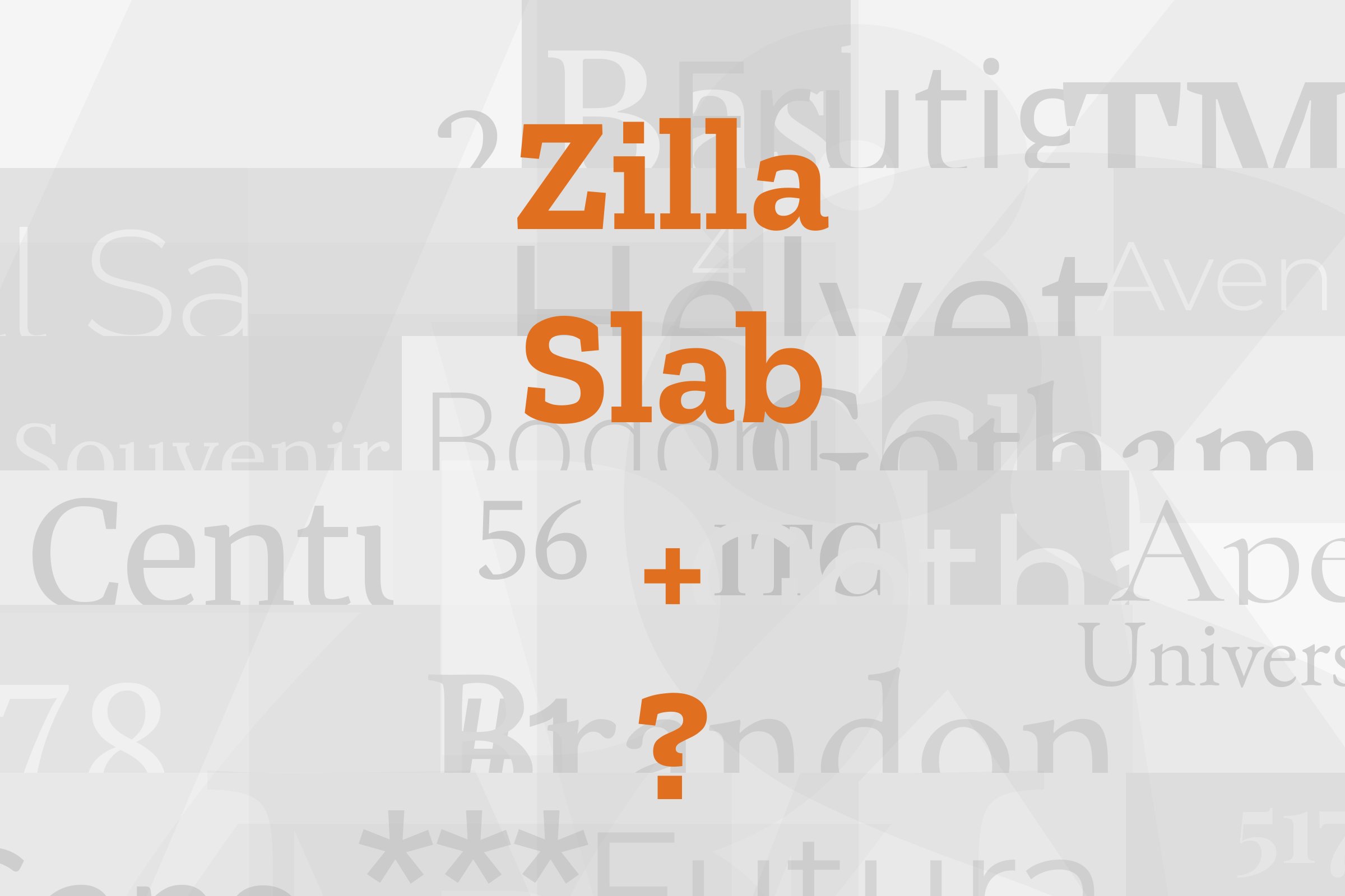
Zilla Slab type specimen

What fonts go with Zilla Slab, the friendly slab serif from Mozilla? The short answer is a calm sans serif, and Mozilla said so first.

Typotheque drew Zilla Slab for Mozilla, and it was released in 2017 under the SIL Open Font License. The designers credited are Nikola Djurek and Peter Biľak.

It is a contemporary slab serif based on Typotheque’s Tesla. It comes in five weights plus italics, with a separate Highlight style in two weights. Mozilla made it the font for its wordmark and accompanying copy lines.

Mozilla chose it to evoke Courier, the original default font in coding, and said it has a journalistic feel. Mozilla’s own brand site calls it a casual and contemporary slab serif with a good amount of quirk. Google Fonts describes an unexpectedly sophisticated industrial look and a friendly approachability in all weights.

That mix is the key to pairing it. The slabs are sturdy but the curves are soft, so Zilla Slab wants a partner that stays quiet and plain. Most of the documented pairings below put Zilla Slab on the headline and a plain sans serif underneath.

One goes the other way, with a rough stencil face on top. Here are 10 fonts that pair with Zilla Slab.

Ad
Envato Elements

Taking it to the next level means cinematic visuals, faster turnarounds, and work that wins clients. Create with unlimited downloads of creative stock assets, and access to powerful AI tools to fast-track your workflow!

Subscribe

Font Pairings for Zilla Slab

  1. Inter
  2. Source Sans Pro
  3. Lato
  4. Avenir
  5. Stencil
  6. Metropolis
  7. Montserrat
  8. Roboto
  9. Open Sans
  10. Oxygen

1. Inter

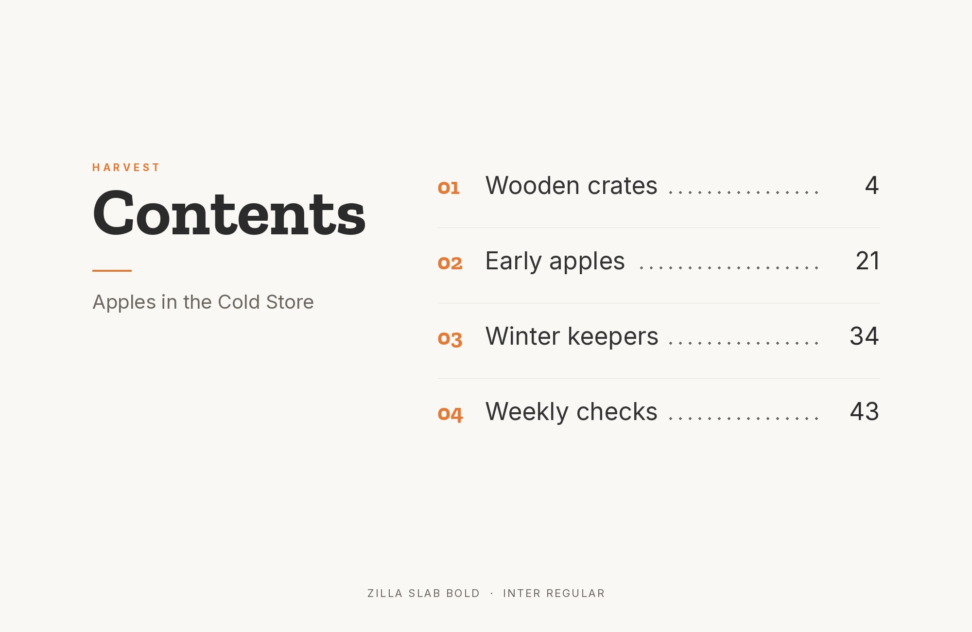
Zilla Slab and Inter font pairing: Zilla Slab headline with Inter body text

This is the pairing Mozilla wrote down as a rule. Mozilla’s Protocol design system named Zilla Slab and Inter as the standard typefaces on Mozilla branded websites.

Its instruction was plain: pair headings in Zilla Slab with subheadings in Inter. The same guide called Zilla Slab primarily a display font for large text like headings. Inter is an open source sans serif designed by Rasmus Andersson.

Its tall x-height and even, neutral strokes keep body text and interface labels out of the slab’s way. Zilla Slab gives the page its voice, and Inter does the reading work. Use it for product sites, documentation and any brand that wants one warm accent over a clean interface.
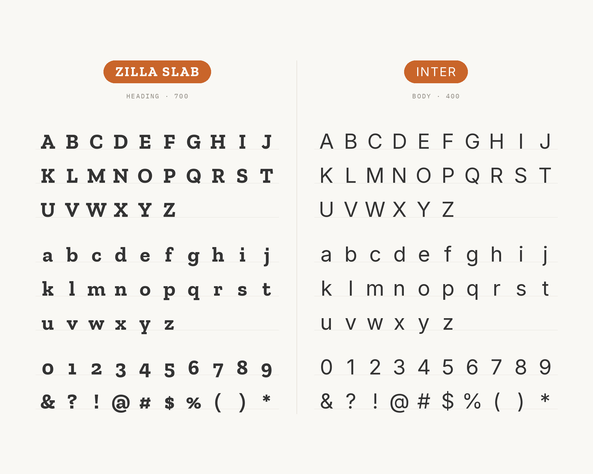
Character specimen: Zilla Slab (heading) and Inter (body) letters, numbers and symbols side by side

2. Source Sans Pro

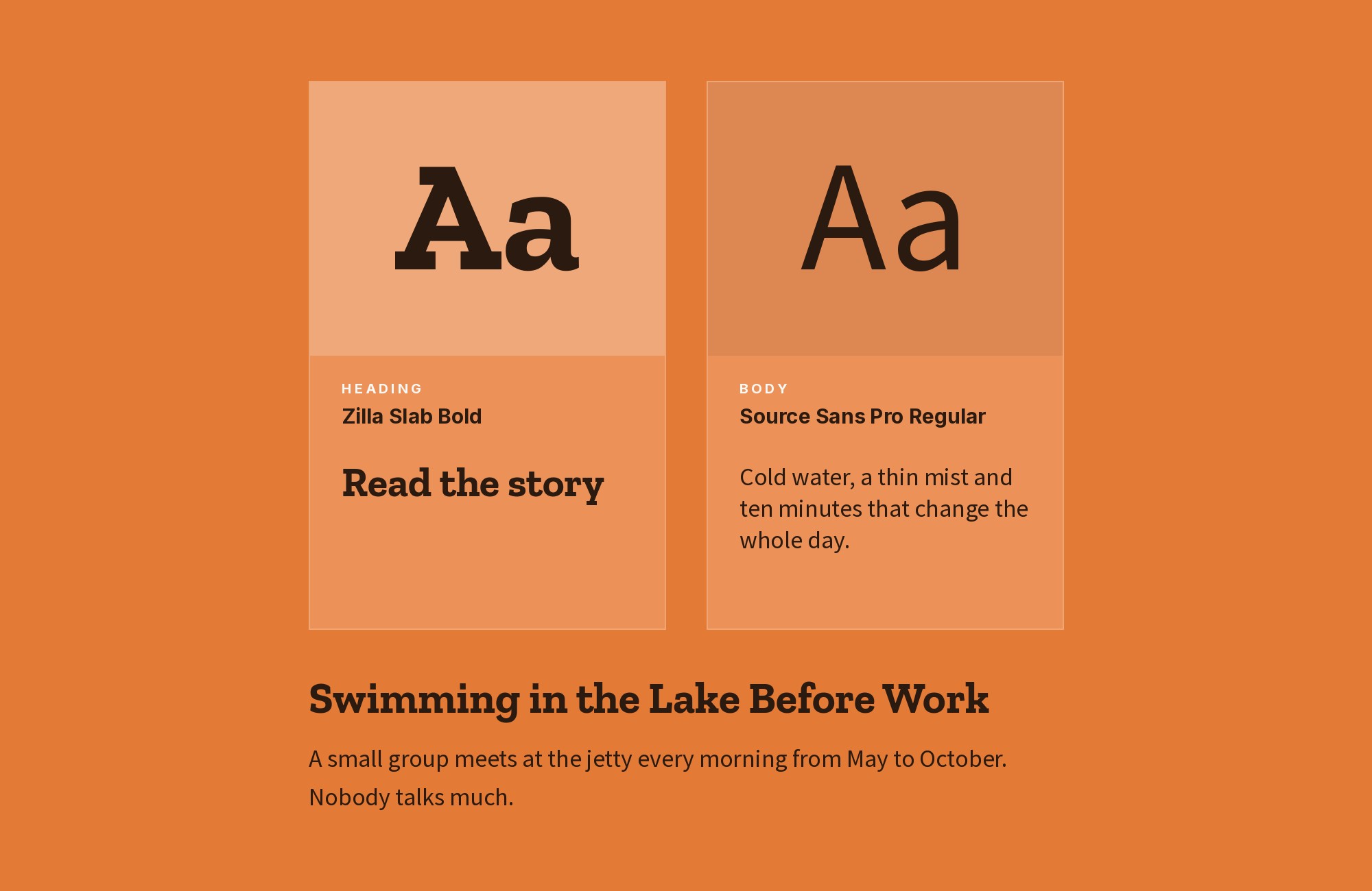
Zilla Slab and Source Sans Pro font pairing: Zilla Slab headline with Source Sans Pro body text

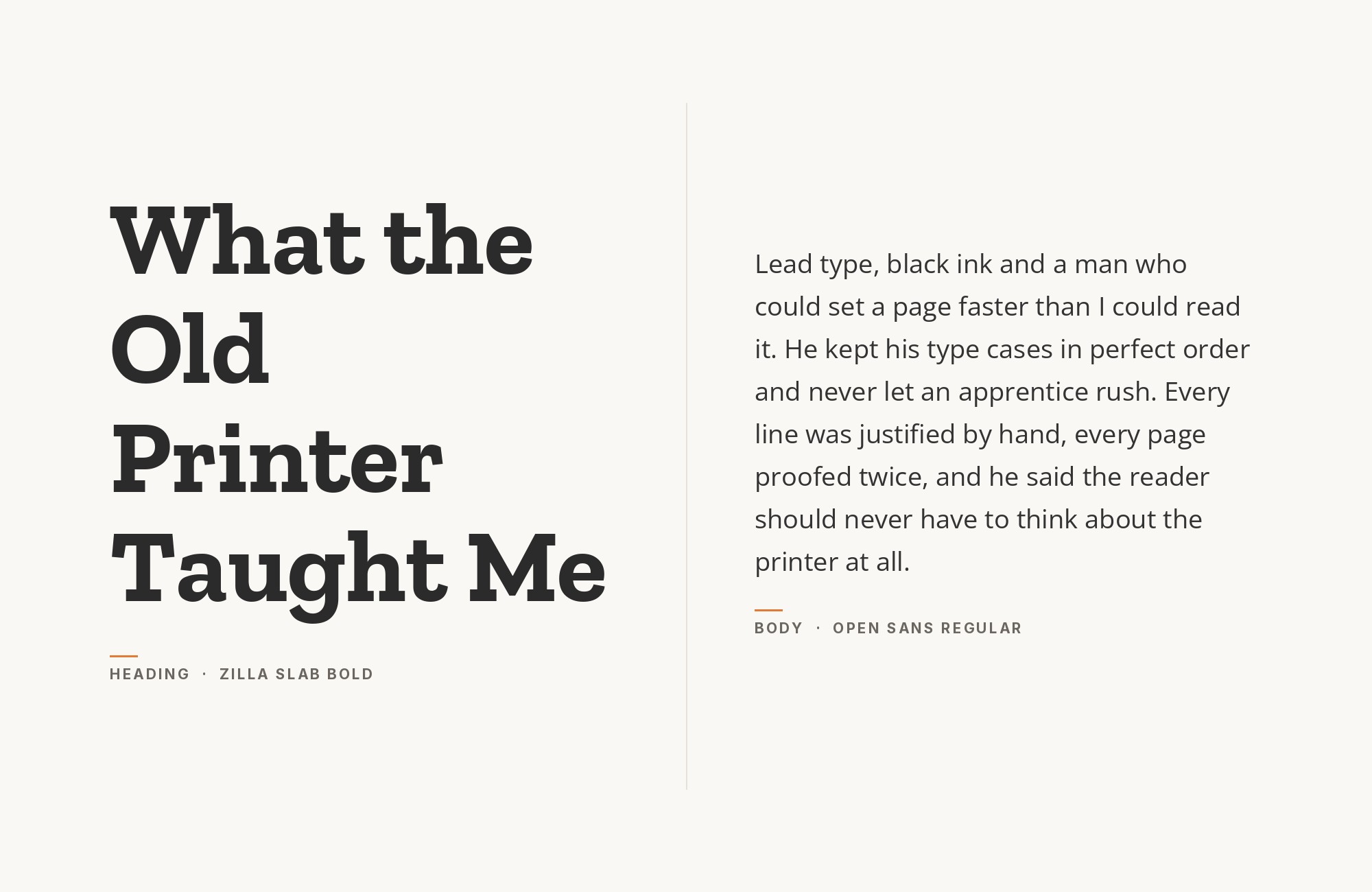
Fonts In Use documents the TriMet transit website, where Source Sans is paired with Zilla Slab for headings. TriMet’s slogan and much of its branding use Source Sans as well.

Source Sans Pro is the same family under its longer name. It is a clear, slightly narrow humanist sans built for long reading. Zilla Slab adds weight and character to the headings without slowing down the timetables and service notes below.

This is a good model for public service sites, where clarity matters more than style.

Let Source Sans Pro carry everything functional and save Zilla Slab for the headings.
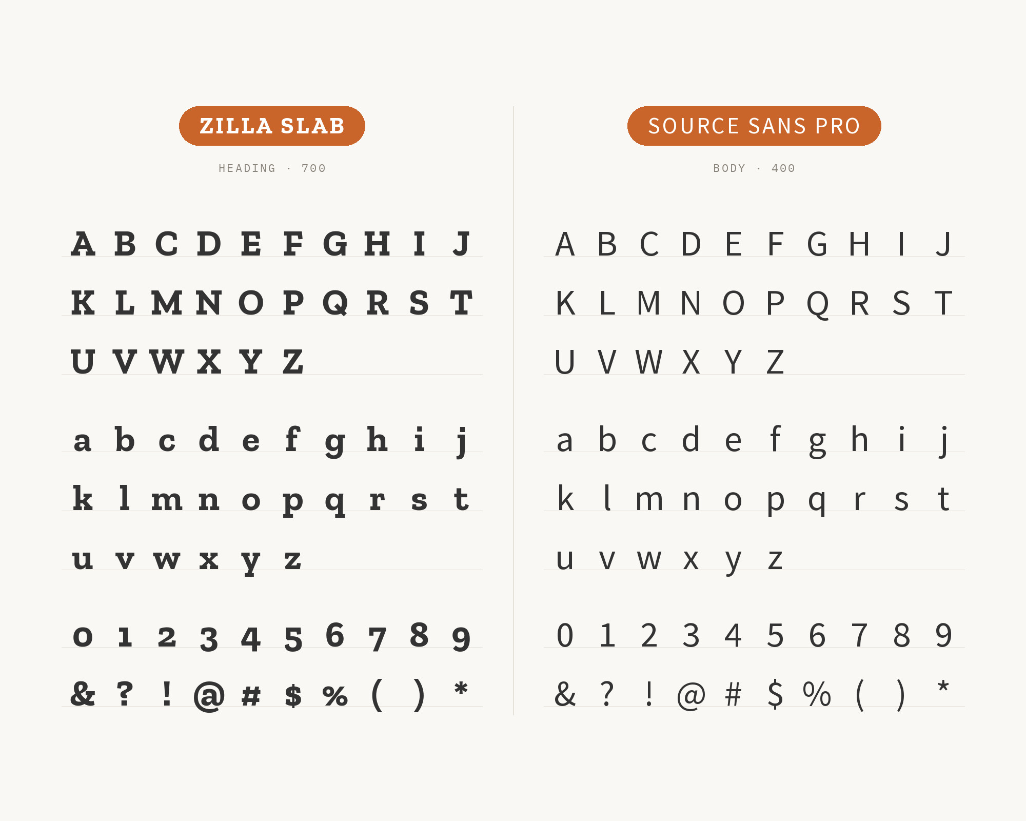
Character specimen: Zilla Slab (heading) and Source Sans Pro (body) letters, numbers and symbols side by side
Ad
Shutterstock

Don't start with a blank page. Shutterstock Unlimited: endless downloads of premium human-made assets plus powerful AI tools.

Sign Up

3. Lato

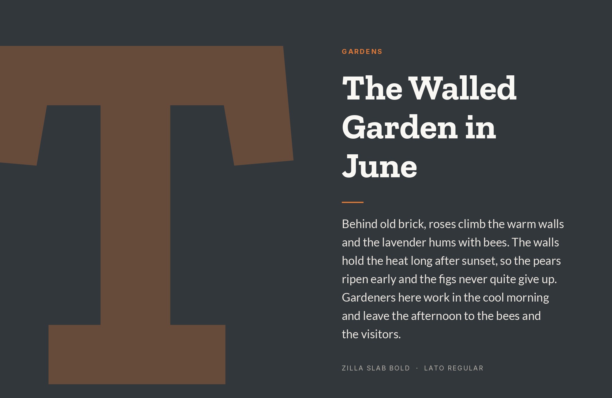
Zilla Slab and Lato font pairing: Zilla Slab headline with Lato body text

On the Humly Room Display website, Lato carries the body text and Zilla Slab handles menus and a few text blocks. SlidesCarnival’s font guide also suggests Zilla Slab for headings and Lato for body on editorial and brand pages. Lato is a warm humanist sans with semi-rounded details.

Those details soften the page, while Zilla Slab’s flat slab serifs add a firm edge. The two never compete, because one is clearly a serif and the other clearly is not. Use Zilla Slab for headings, menus and short callouts, and give Lato the paragraphs.
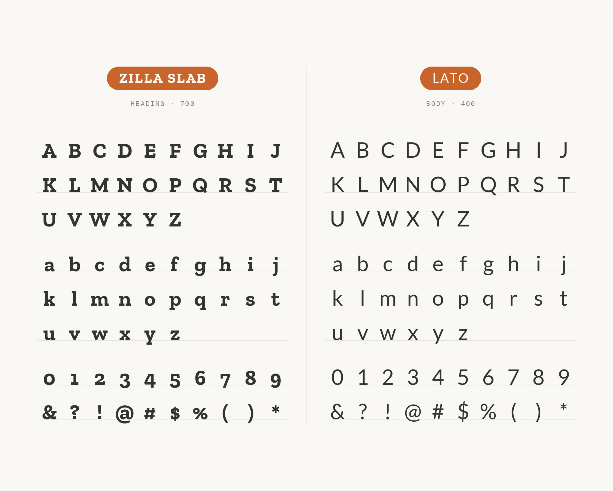
Character specimen: Zilla Slab (heading) and Lato (body) letters, numbers and symbols side by side

4. Avenir

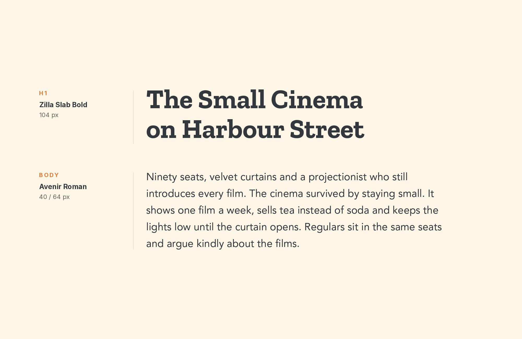
Zilla Slab and Avenir font pairing: Zilla Slab headline with Avenir body text

Fonts In Use documents the identity of Mathilde Marteau Atelier, a Marseille-based jewelry studio. That identity pairs its serif logotype face with Adrian Frutiger’s Avenir and Zilla Slab.

Avenir is a geometric sans with humanist corrections, so its circles feel calm and its text stays readable. Next to it, Zilla Slab looks crafted and a little handmade.

The result is refined but not cold.

Give Zilla Slab the headings and short statements, and let Avenir set captions, prices and contact details. It suits studios, shops and small craft brands.
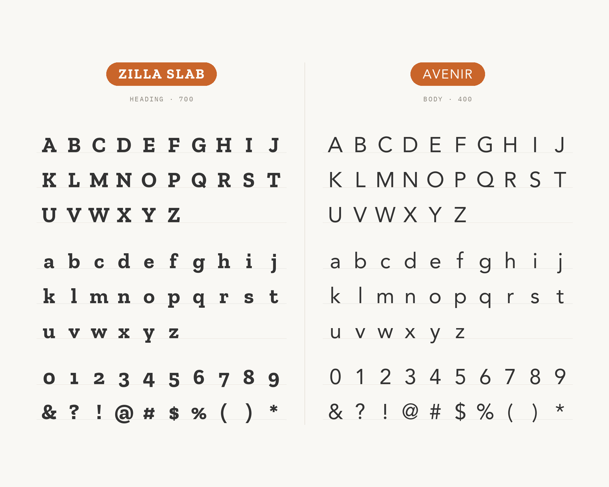
Character specimen: Zilla Slab (heading) and Avenir (body) letters, numbers and symbols side by side

5. Stencil

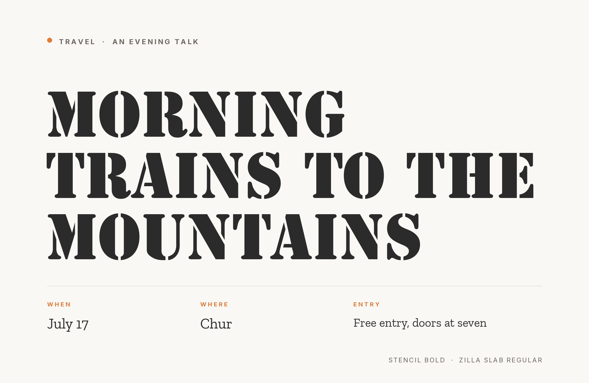
Zilla Slab and Stencil font pairing: Stencil headline with Zilla Slab body text

This pairing reverses the usual roles.

In a direct-mail campaign for Theater Morgenstern, Stencil is used for titles and accents. Zilla Slab was chosen for its industrial but friendly appearance.

Stencil is a heavy, broken-stroke display face, so it shouts the title. Zilla Slab then carries the text below with sturdy but readable slabs. The shared industrial mood holds the two together, and the size jump keeps the order clear.

Set Stencil big and short, and never use it for paragraphs. It suits posters, theater, events and anything with a rough, handmade message.
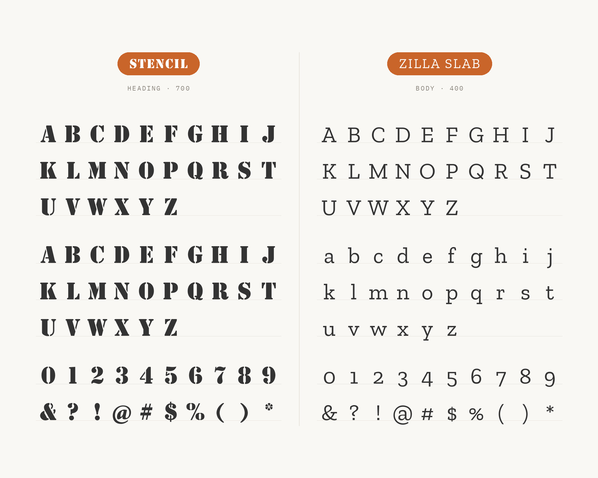
Character specimen: Stencil (heading) and Zilla Slab (body) letters, numbers and symbols side by side
Ad
Framer

From idea to launch with AI, keeping full design control.

Sign Up

6. Metropolis

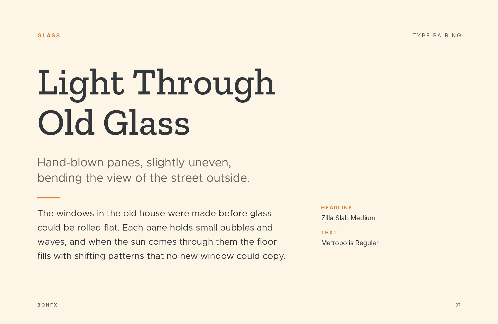
Zilla Slab and Metropolis font pairing: Zilla Slab headline with Metropolis body text

MaxiBestOf records Mozilla’s design site using Inter, Metropolis and Zilla Slab together. Mozilla’s Protocol system later named Metropolis and Inter as the standard typefaces on Firefox branded websites.

So on that site, Zilla Slab speaks for Mozilla and Metropolis speaks for Firefox. Metropolis is a geometric sans with round bowls and a crisp, modern tone.

That geometry is the opposite of Zilla Slab’s quirky slabs, so the contrast is easy to see. Use Zilla Slab for the main headline and Metropolis for short sans headings, labels and buttons.

If you need long text too, add a neutral body face, as Mozilla did with Inter.
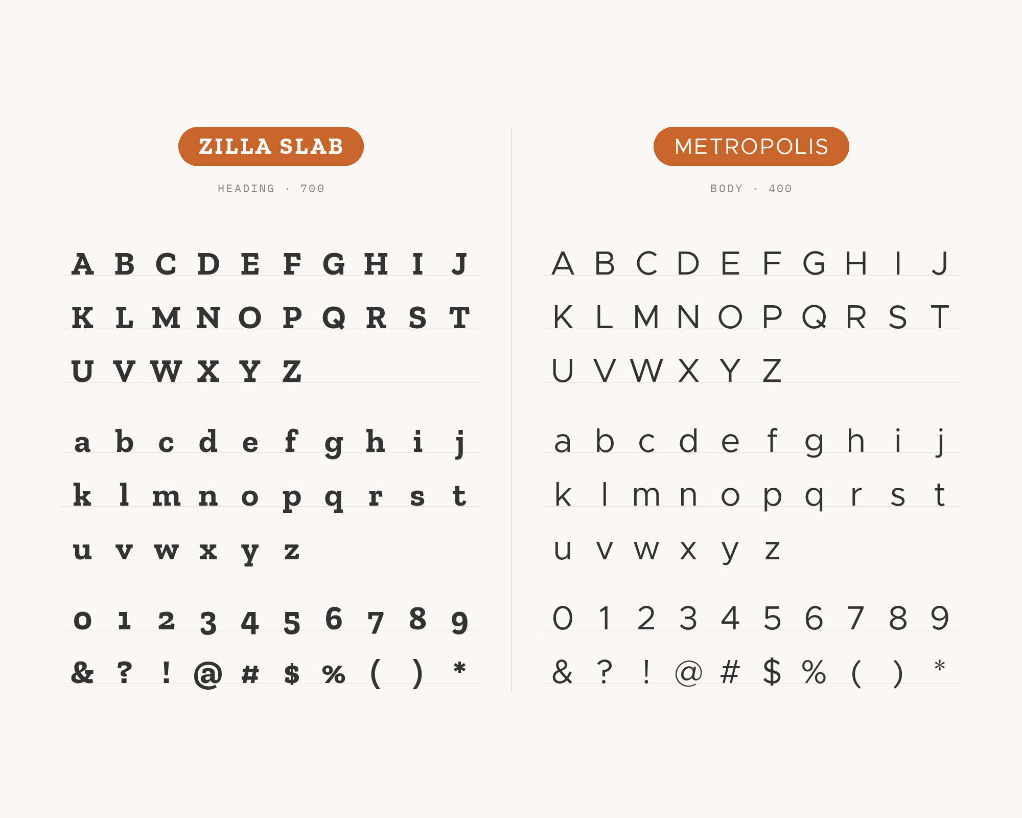
Character specimen: Zilla Slab (heading) and Metropolis (body) letters, numbers and symbols side by side

7. Montserrat

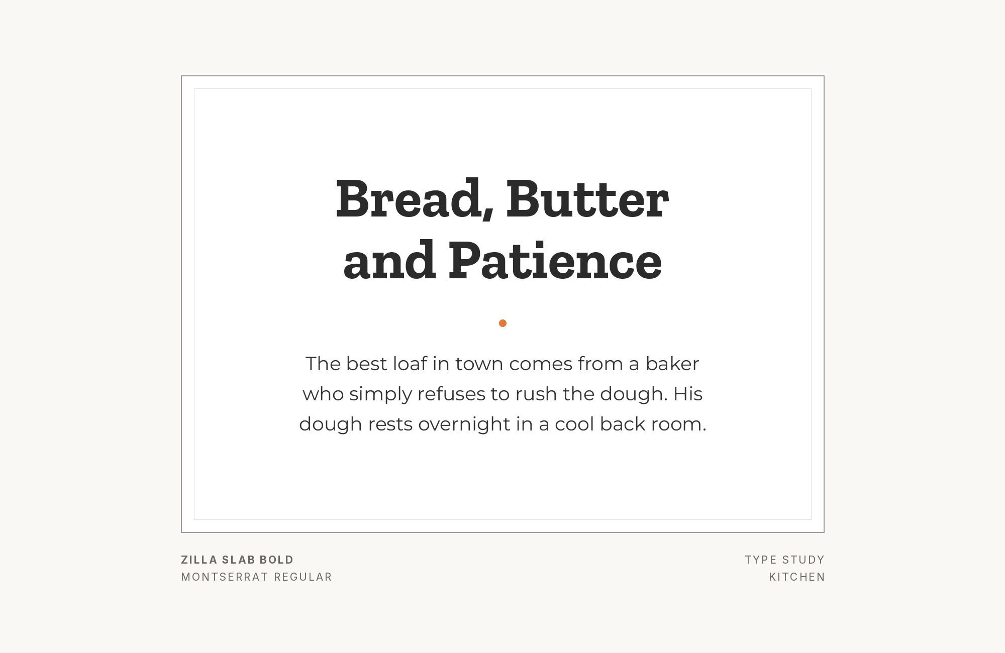
Zilla Slab and Montserrat font pairing: Zilla Slab headline with Montserrat body text

SlidesCarnival’s Aediles presentation template is set in Montserrat and Zilla Slab. Montserrat is a wide geometric sans with broad capitals. Its width gives slides a bold, modern frame.

Zilla Slab adds a sturdy serif voice, so the deck does not feel like one long sans serif. Use Montserrat in caps for titles or labels and Zilla Slab for the slide text, or reverse the roles for a quieter look. Keep the sizes clearly different so the two do not fight.
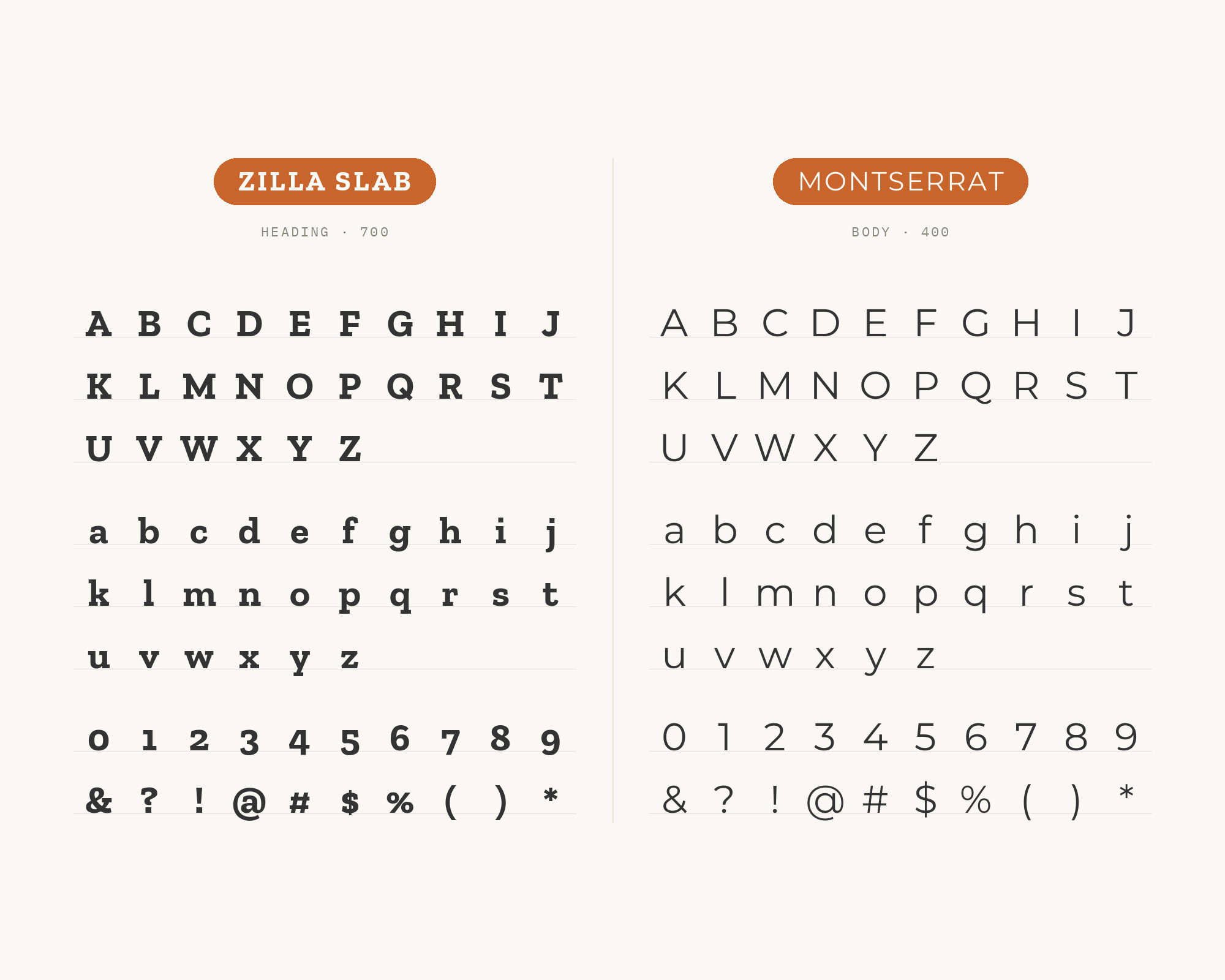
Character specimen: Zilla Slab (heading) and Montserrat (body) letters, numbers and symbols side by side

Still Googling UX terms?

Stop. They're all right here.

UX for Cats book cover

50 terms. Illustrated.
So simple your cat gets it.

Get the Book →

Print & ePub on Amazon

8. Roboto

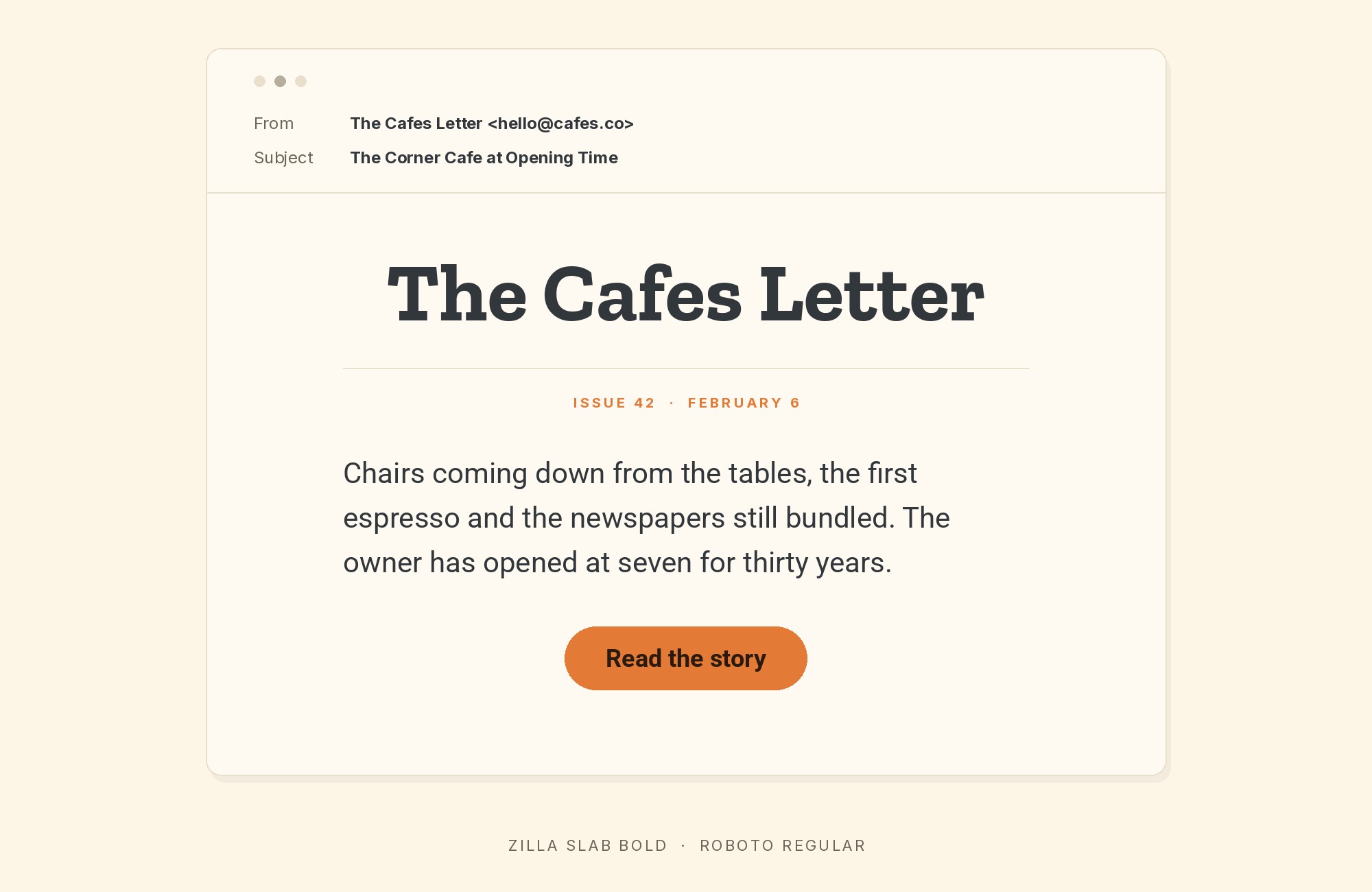
Zilla Slab and Roboto font pairing: Zilla Slab headline with Roboto body text

SlidesCarnival’s font guide suggests Zilla Slab for headings and Roboto for body on tech and blog pages. Roboto has a mechanical skeleton with open curves.

It is familiar, neutral and easy to read on screens. Against it, Zilla Slab’s slab serifs stand out at once. The pair suits blogs, tech articles and simple product pages.

Use a bold Zilla Slab for headings and a regular weight of Roboto for the text.
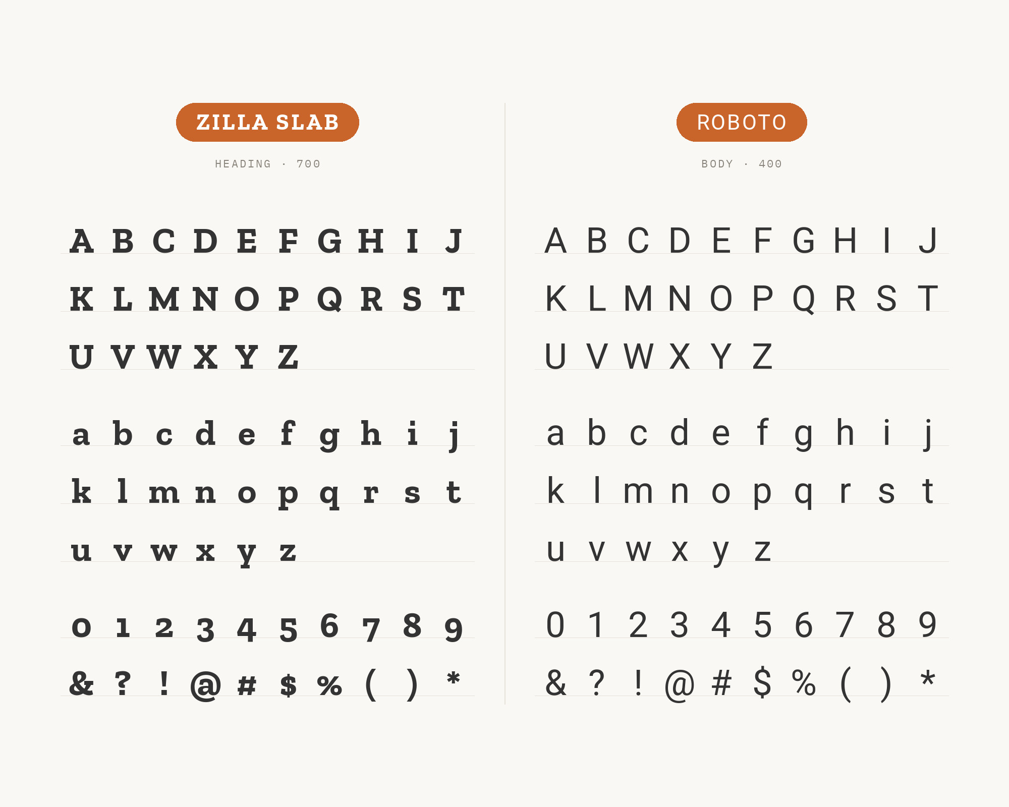
Character specimen: Zilla Slab (heading) and Roboto (body) letters, numbers and symbols side by side

9. Open Sans

Zilla Slab and Open Sans font pairing: Zilla Slab headline with Open Sans body text

SlidesCarnival’s font guide also suggests Zilla Slab headings with Open Sans body on reports and documentation. Open Sans is a humanist sans with open forms and a tall x-height.

It reads well in long passages and small sizes. Zilla Slab gives the headings weight and a bit of personality.

This is a safe, readable choice for reports, manuals and help pages.

Keep Zilla Slab for headings only, so the text stays calm.
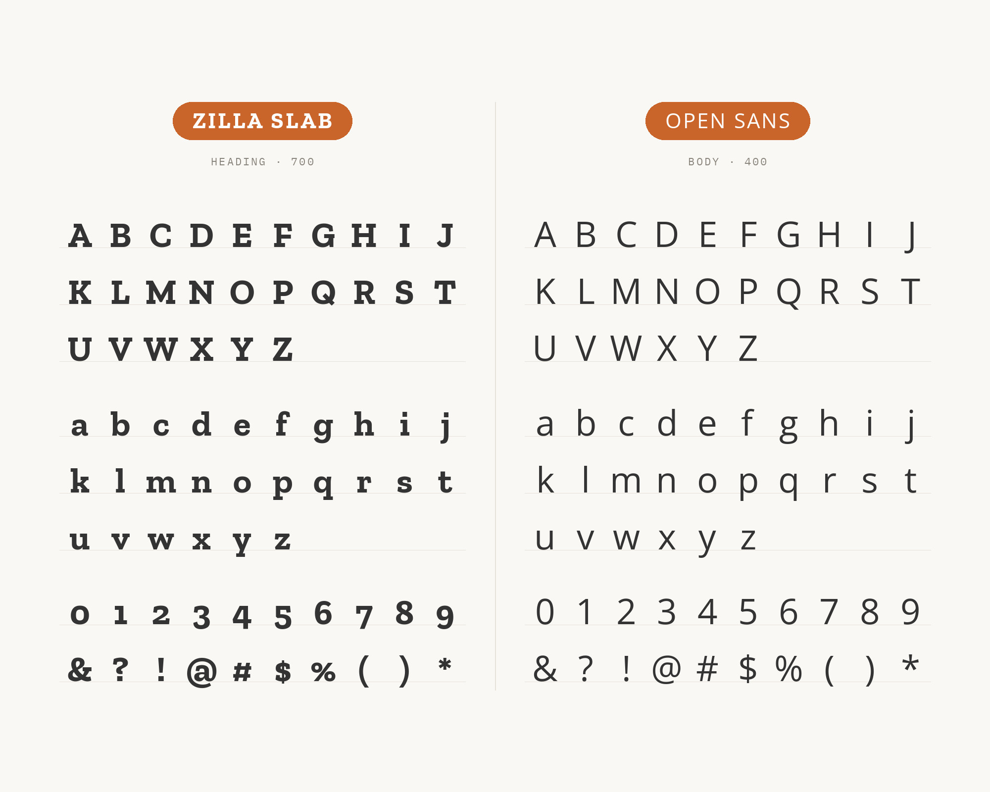
Character specimen: Zilla Slab (heading) and Open Sans (body) letters, numbers and symbols side by side

10. Oxygen

Zilla Slab and Oxygen font pairing: Zilla Slab headline with Oxygen body text

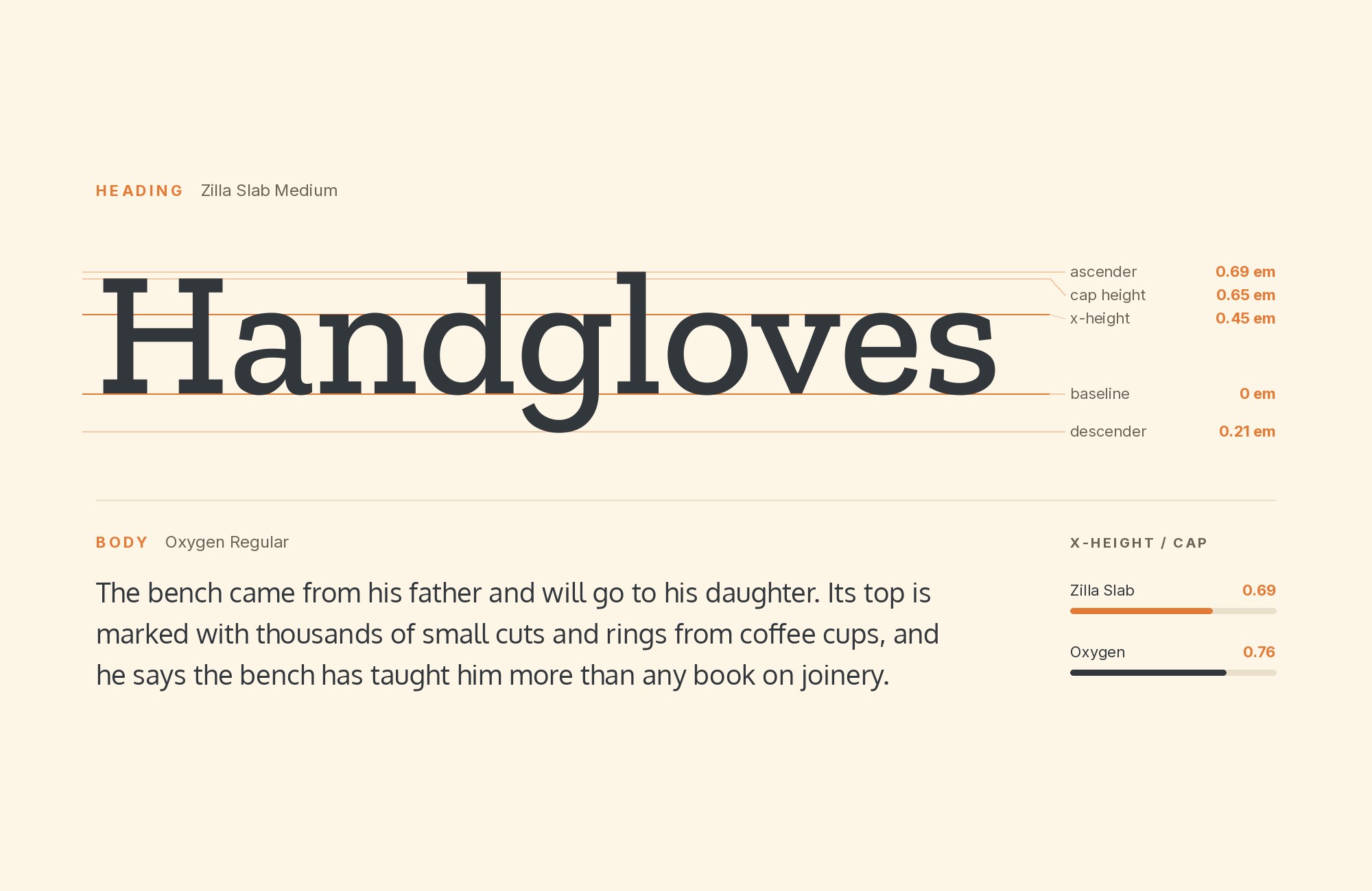
SlidesCarnival’s Whitmore presentation template is set in Oxygen and Zilla Slab.

Oxygen is a simple sans serif with a slightly rounded, screen-friendly feel. Its plain shapes leave all the personality to the slab. Zilla Slab brings the contrast: square slabs and a little quirk against Oxygen’s soft, even strokes.

Use Zilla Slab for slide titles and Oxygen for bullet text and captions.

The pair suits presentations, school material and simple web pages.
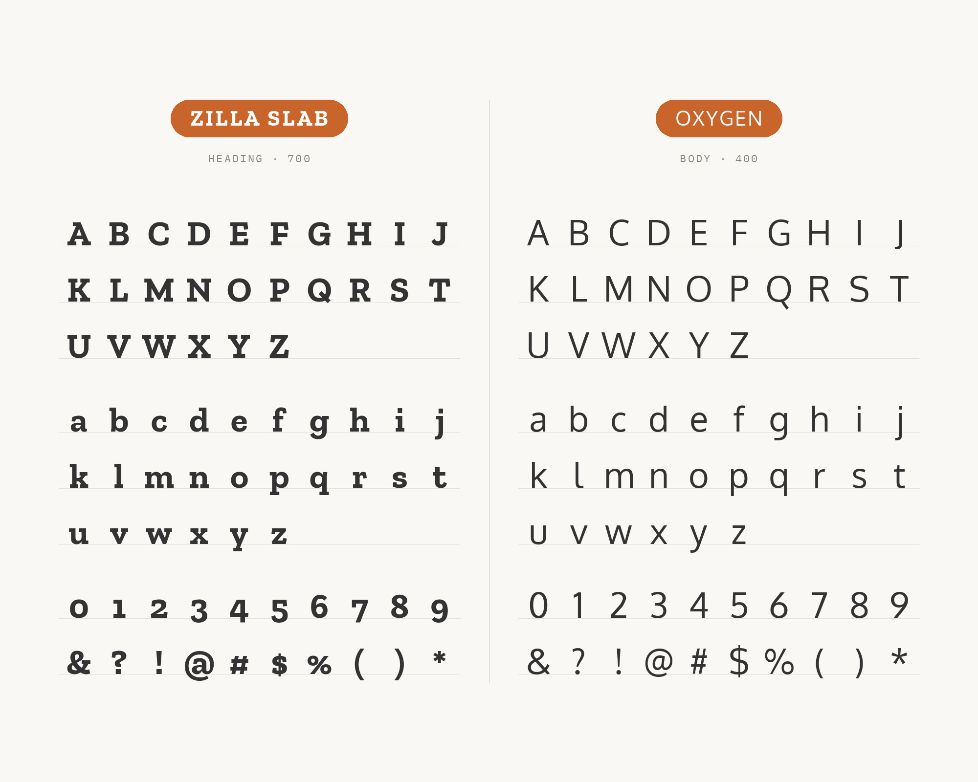
Character specimen: Zilla Slab (heading) and Oxygen (body) letters, numbers and symbols side by side

Conclusion

Zilla Slab is a headline face with a friendly streak. The strongest evidence comes from Mozilla itself, which paired it with Inter and wrote that rule into its design system. TriMet and Humly show the same pattern with Source Sans Pro and Lato.

Roboto, Open Sans and Oxygen follow it too. Stencil is the one reversal, where a rough display face takes the title and Zilla Slab carries the text.

So start with a calm sans under a Zilla Slab headline. Then test your real headings at real sizes, and keep only the partner that stays out of the way.

Sources

  • Fonts In Use (Zilla Slab typeface page)
  • Mozilla Protocol typography (2019 and 2020 snapshots)
  • Mozilla Dot Design typography (2020 snapshot)
  • Mozilla Open Design blog, Arrival (2017)
  • SlidesCarnival (Zilla Slab font page)
  • SlidesCarnival templates (Aediles, Whitmore)

More Font Resources

  • Font Combinations: The Complete Guide to Font Pairings
  • The Big Book of Font Combinations
  • 29 Principles for Making Great Font Combinations

About the Author

Douglas Bonneville is a graphic designer and typographer since 1992. He is the author of The Big Book of Font Combinations and has contributed to numerous design publications. His work focuses on making typography accessible and practical for designers at all levels.

Related font pairings

  • What Fonts Go With Inter?
  • What Fonts Go With Source Sans Pro?
  • What Fonts Go With Antique Olive?
  • What Fonts Go With Brush Script?

More font pairing guides

  • Font Combinations: The Complete Guide to Font Pairings
  • 100 Best Fonts
  • 17 Basic Kinds of Fonts
  • What Fonts Go With Cormorant Garamond?
  • 20 Popular Free Google Wedding Font Combinations

About Douglas Bonneville

Douglas has been a graphic designer since 1992, in addition to software developer and author. He is a member of Smashing Magazine's "Panel of Experts" and has contributed to over 100 articles. He is the author of "The Big Book of Font Combinations", loves cats, and plays guitar.

The BonFX Letter

One good pairing.
Every Tuesday.

2-minute read · free

This week — no. 14

Quiet authority

Merriweather sets the tone in one line. Lato stays out of the way and lets it.

MERRIWEATHER 700  +  LATO 400

A font specimen, a pairing that works, and one line on why it works. That is the whole email.

Free. One click to unsubscribe. No sharing, ever.

Free download

The Typography Primer.
Yours, right now.

Adobe's classic · PDF · free

The Typography Primer — book cover

The guide to type that everyone learned from. Subscribe and it is yours instantly. The BonFX Letter follows.

Free. One click to unsubscribe. No sharing, ever.

Still Googling UX terms?

Stop. They're all right here.

UX for Cats book cover

50 terms. Illustrated.
So simple your cat gets it.

Get the Book →

Print & ePub on Amazon

350 font combinations you can steal.

The Big Book of Font Combinations

Every pairing shown in context — web, print, headings, body. Open it, find one that works, use it.

That's it. That's the book.

In print or ePub 40% OFF on Gumroad

Scrolling Google Fonts for "the right one"?

You've been at it for 20 minutes. You'll be at it for 20 more. There are 1,500 fonts in there.

Pocket Handbook of Google Fonts Combinations

We paired every useful Google Font.
7,500 pages. Done.

Get the PDF →

Instant download on Gumroad

Recent Inspirations

  • What Fonts Go With Bodoni Moda? October 5, 2026
  • What Fonts Go With Urbanist? October 5, 2026
  • What Fonts Go With Figtree? October 5, 2026
  • What Fonts Go With Outfit? October 5, 2026
  • What Fonts Go With Jost? October 5, 2026
  • What Fonts Go With Andale Mono? October 5, 2026
  • What Fonts Go With Agenda? October 5, 2026
  • What Fonts Go With Fraunces? October 5, 2026
  • What Fonts Go With Marcellus? October 5, 2026
  • What Fonts Go With Zilla Slab? October 5, 2026
  • What Fonts Go With Utopia? September 30, 2026
  • What Fonts Go With Titillium Web? September 30, 2026
  • What Fonts Go With Sora? September 30, 2026
  • What Fonts Go With Questrial? September 30, 2026
  • What Fonts Go With Public Sans? September 30, 2026

About BonFX

Douglas Bonneville has been a graphic designer since 1992 and has written about type here since 2009. BonFX is a blog about typography and design, and the books that came out of it.

  • The Big Book of Font Combinations
  • The Preposterously Huge Book of Google Font Combinations
  • UX for Cats

More about BonFX →

Start Here

  • Font Combinations: The Complete Guide
  • The 100 Best Fonts
  • 17 Types of Fonts
  • 29 Principles for Great Font Combinations
  • 23 Really Bad Font Choices
  • 20 Free Google Wedding Font Combinations

Contact

Questions about the books or the site? Contact us.

Follow @dbonneville on X.

The BonFX Letter: one good pairing every Tuesday, free. The signup is in the sidebar of every page.

Copyright © 2026 · BonFX

  • Blog
  • Font Combinations
  • Books
    • The Preposterously Huge Book of Google Font Combinations
    • The Big Book of Font Combinations (Classic Fonts Edition)
  • Contact