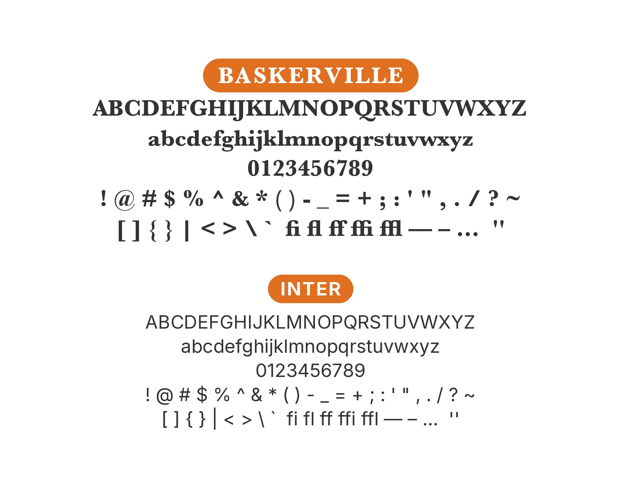
Baskerville pairs great with Helvetica, Lato and Inter. All 13 pairings are shown below in real rendered specimens, with the reason each one works. Every pairing below is checked against 5 published typography sources.

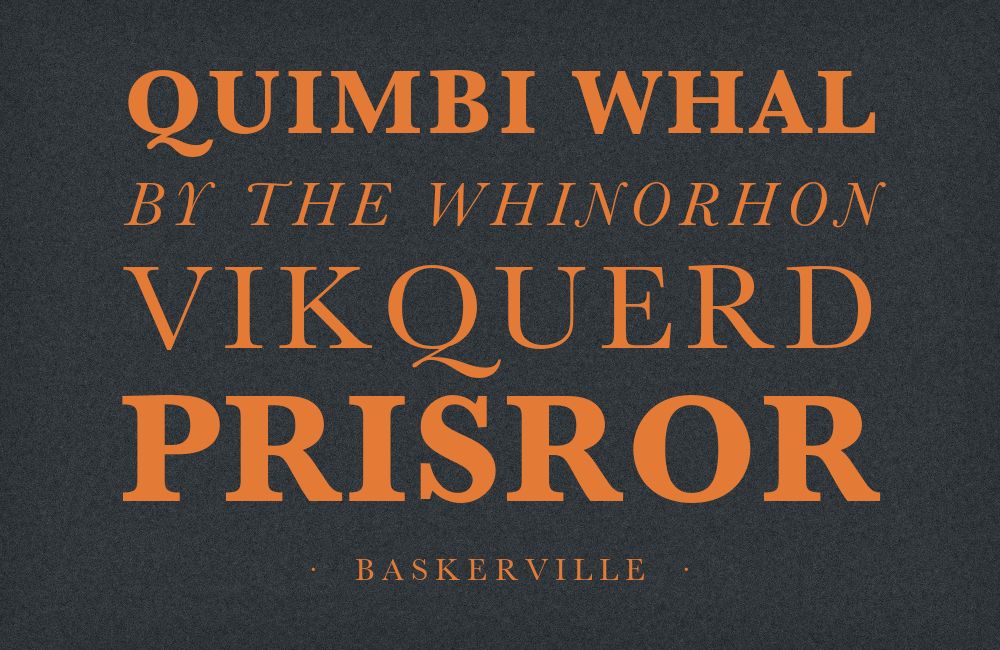
What fonts go with Baskerville? It is one of the few classic serifs you can pair without installing anything at all — Apple has shipped it on every Mac for years.
John Baskerville cut his types in Birmingham, England, in the 1750s, pushing English printing toward sharper, higher-contrast letterforms than the old-style Garalde faces that came before — a transitional serif, sitting between Garamond’s calligraphic warmth and the extreme, almost brittle contrast Bodoni would push type toward decades later. Baskerville’s vertical stress, crisp bracketed serifs and generous proportions read as considered and rational rather than antique, which is why it has stayed in active use in books, branding and film credits for nearly three centuries.
Because Baskerville already carries real historical weight and sharp, confident contrast, its best partners tend to fall into one of two camps: neutral humanist sans-serifs that let Baskerville’s own character do all the talking, or austere geometric grotesques that meet its precision head-on rather than softening it. Both directions are represented below, alongside a couple of options built for specific free Baskerville revivals rather than the classic system face. Here are 13 fonts that pair well with Baskerville.
1. Helvetica
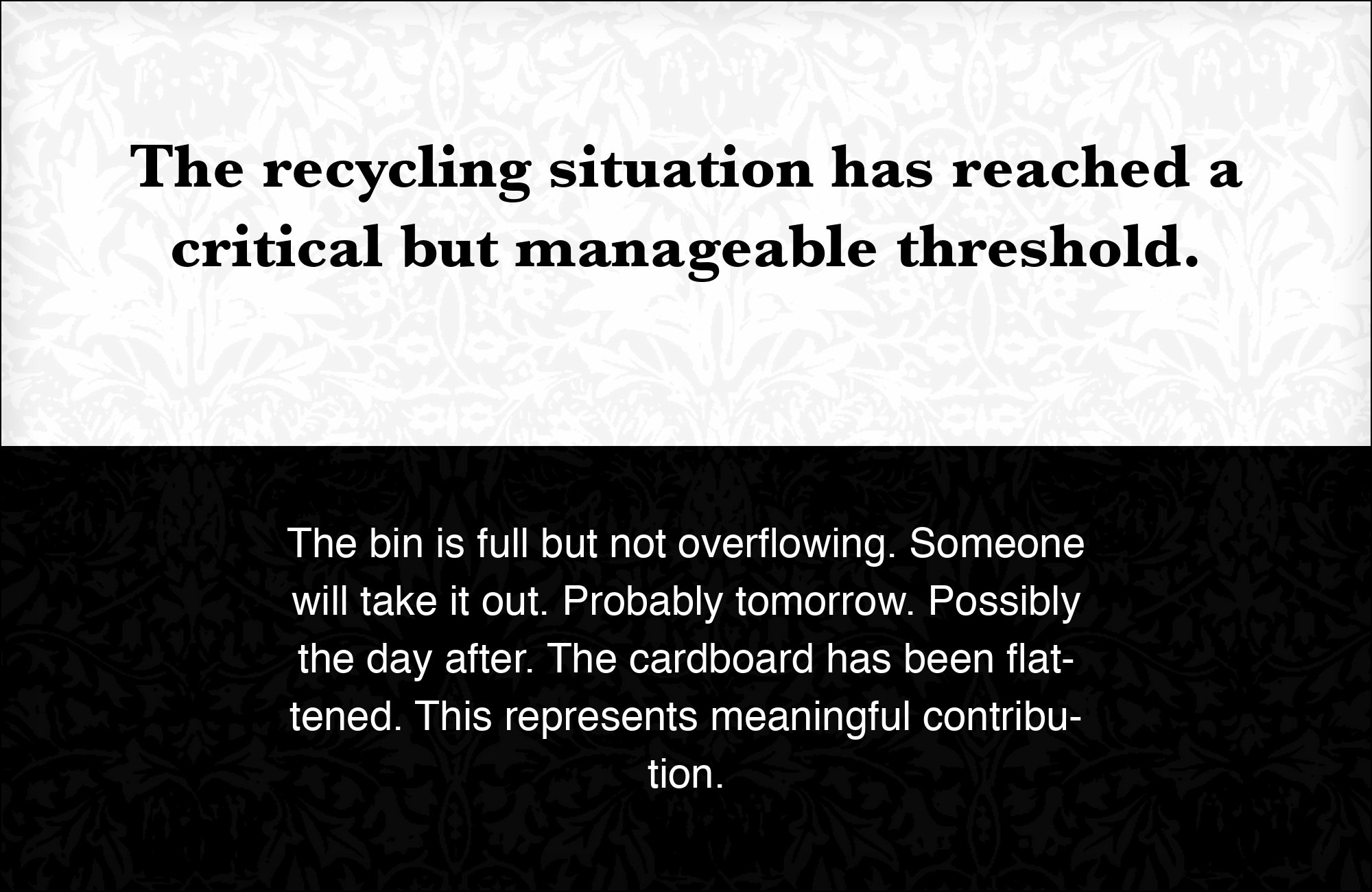
Max Miedinger and Eduard Hoffmann released the face as Neue Haas Grotesk in 1957 for the Haas foundry, and Stempel and Linotype renamed it Helvetica for international sale in 1960 — a neutral grotesque with even stroke weights and tight spacing that carries almost no historical inflection of its own. Set beside Baskerville, the pairing works in either direction: Baskerville’s serif formality reads as tradition against Helvetica’s modernist neutrality, so hierarchy comes from a genuine change in typeface character rather than just size or weight. Available through Adobe Fonts and most major foundries. Use whichever face carries the headline role consistently across a document; switching mid-layout undoes the contrast.

2. Lato

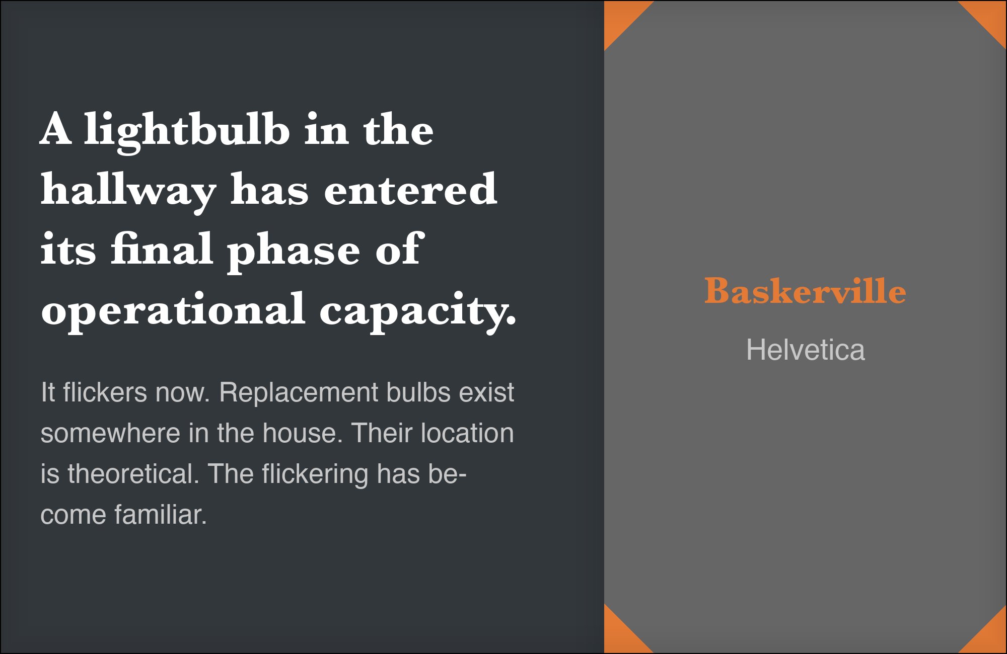
Lato is a humanist sans with semi-rounded terminals and a warm, moderate weight, absorbing workhorse reading duties reliably at small sizes and freeing Baskerville to move up into headlines and titles where its serif detail actually shows. The pairing suits documents and editorial layouts that want Baskerville’s transitional sharpness at display sizes without asking it to also carry dense paragraph text, where its contrast can tire the eye. Free on Google Fonts. Set Lato at 15–17px for body copy, and reserve Baskerville for anything 24px and above.


3. Inter
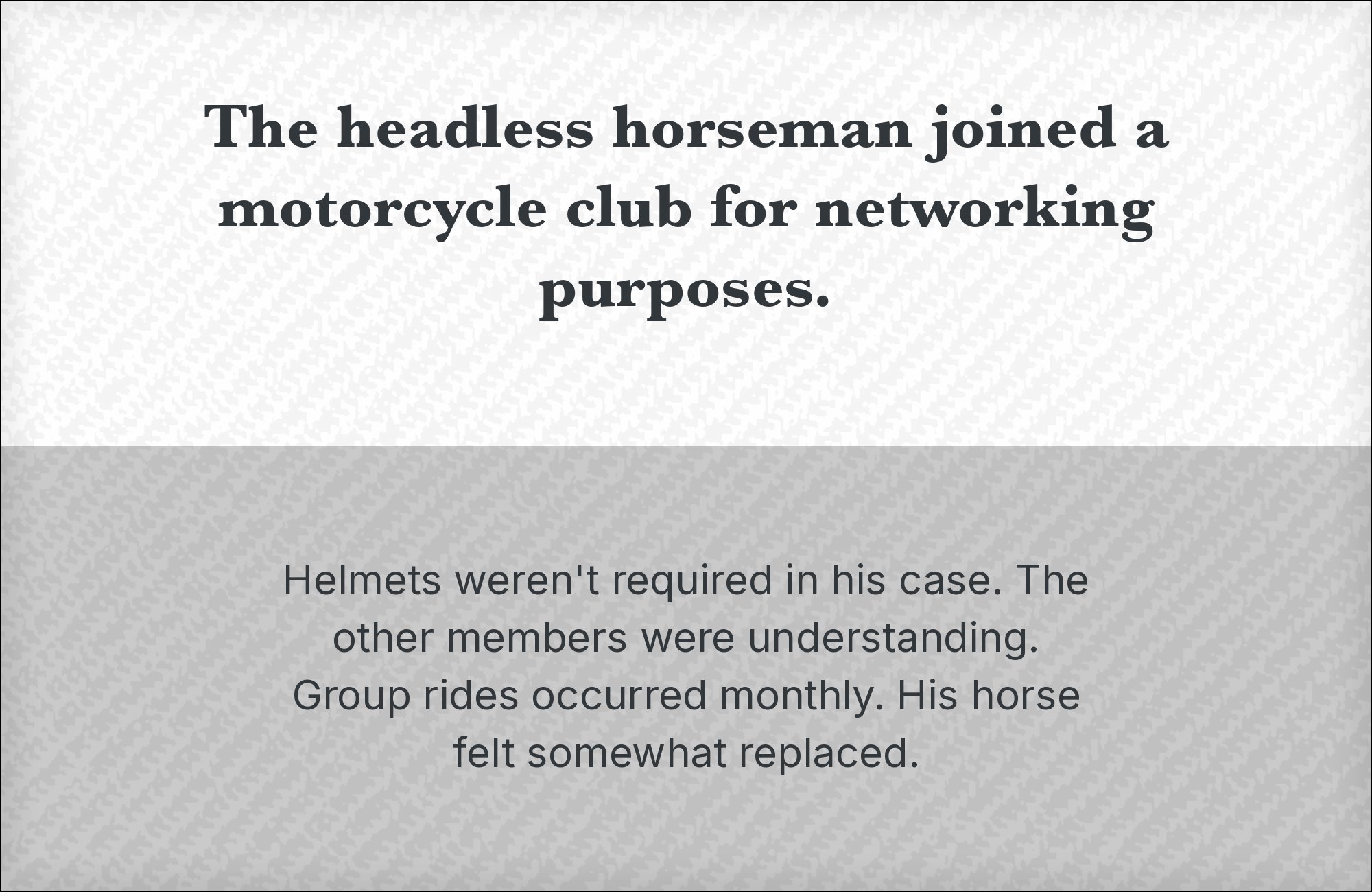
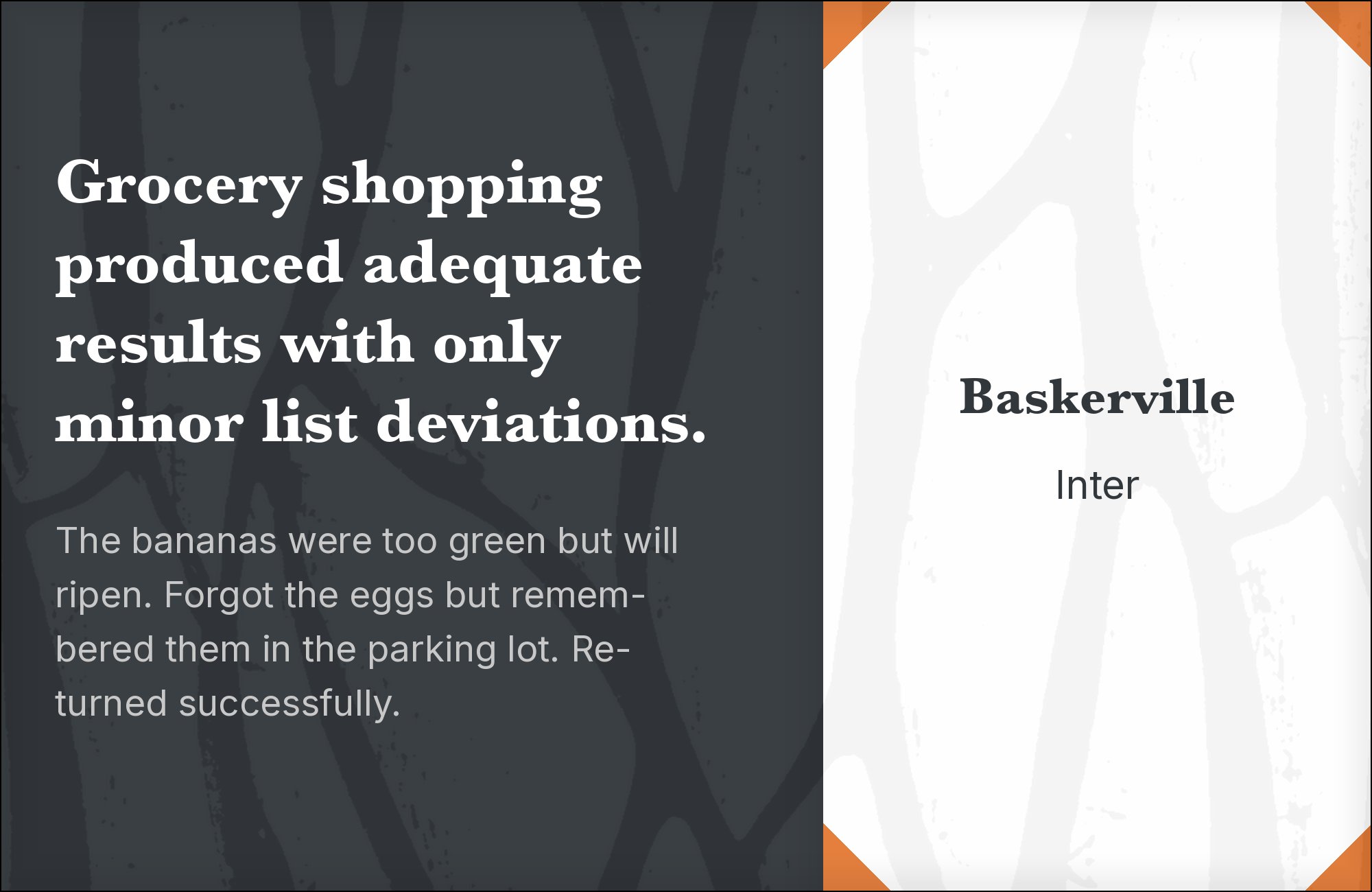
Inter’s tall x-height and screen-tuned hinting keep small system text crisp — a practical foil when a design needs Baskerville’s editorial warmth in headlines but ordinary interface copy everywhere else: buttons, forms, navigation, metadata. The two rarely compete because they are never doing the same job at the same size; Inter disappears into UI chrome exactly where Baskerville would start to strain. Free on Google Fonts. A good default for publications and content sites that need Baskerville’s gravity in the masthead and headlines but a modern, invisible interface underneath.
4. Work Sans
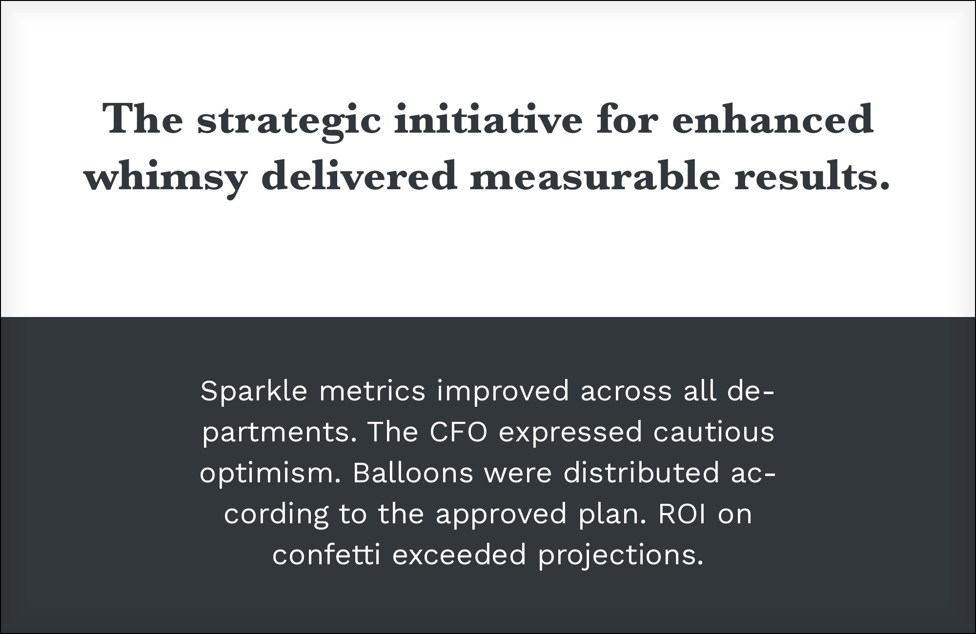
Work Sans holds text-heavy screens steady with even, unfussy strokes and open apertures, which gives Baskerville room to carry display and pull-quote work without a second serif competing for the reader’s attention. It is a plainer, quieter partner than a strict neo-grotesque like Helvetica, suited to editorial sites that want Baskerville’s sharp transitional contrast to stand out precisely because everything around it stays calm. Free on Google Fonts. Use Work Sans for captions, bylines and body copy, and let Baskerville handle headlines and pull quotes exclusively.


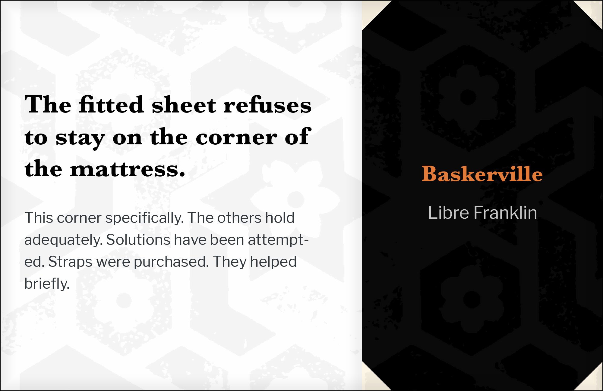
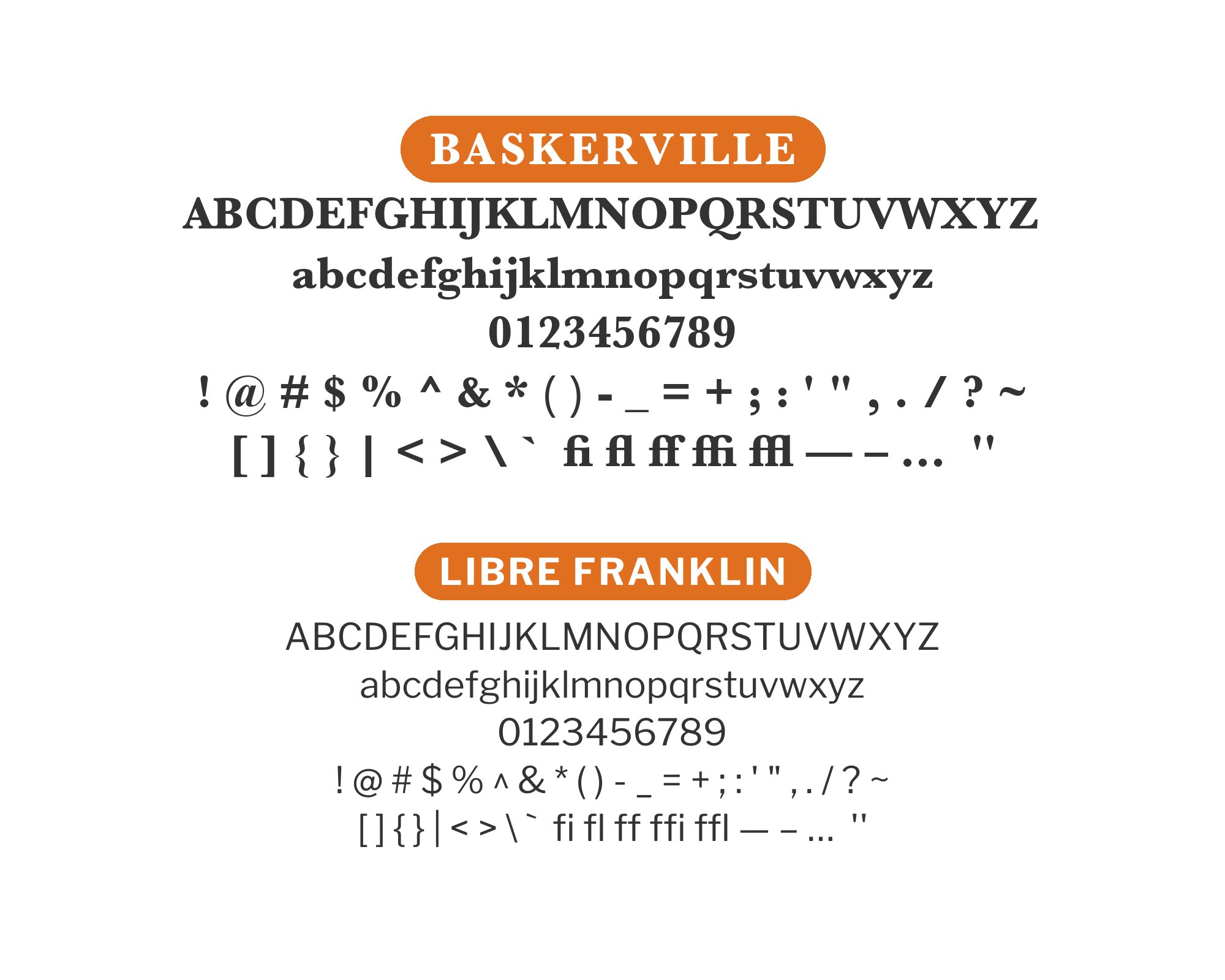
5. Libre Franklin

Libre Franklin is Impallari Type’s interpretation of Morris Fuller Benton’s 1912 Franklin Gothic, drawn by Pablo Impallari and Rodrigo Fuenzalida and hosted on Google Fonts. It was not commissioned as a companion to Libre Baskerville, but pairing directories and Typewolf arrive at the same suggestion independently. Its sturdy grotesque capitals give titles real structural confidence, while classic Baskerville’s sharper, higher-contrast serifs still carry the reading text underneath. Free on Google Fonts. A natural first choice for anyone who wants a split that more than one pairing directory already recommends rather than a guess.

6. DM Sans
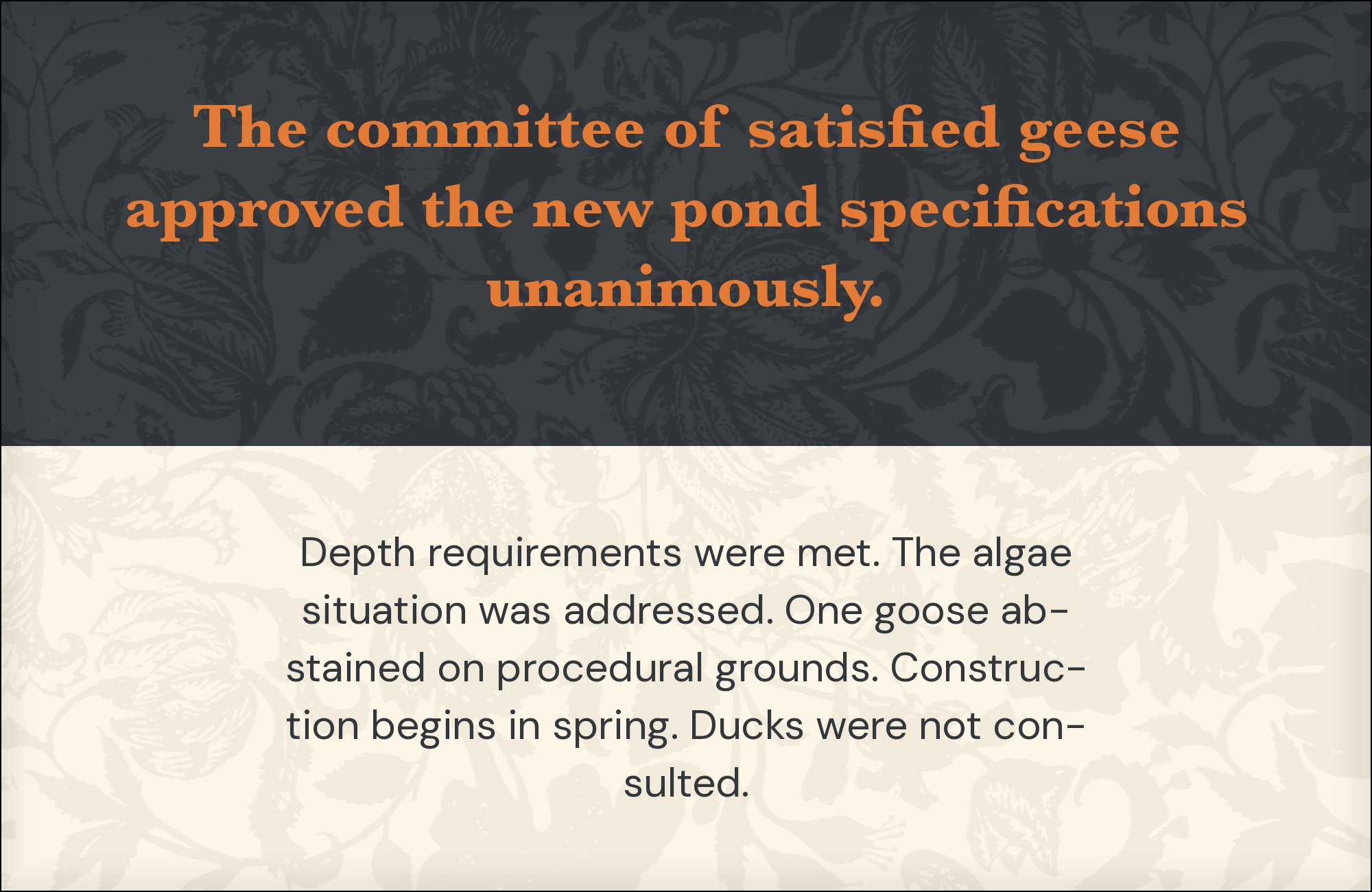
DM Sans has rounded terminals and low contrast that soften the jump from Baskerville’s sharp, high-contrast serifs, useful when a brand wants Baskerville’s gravity in the type without the rest of the page feeling stiff or dated by association. It reads as contemporary without asking for attention, which keeps the eye on Baskerville’s headlines rather than competing with them. Free on Google Fonts. Suited to modern editorial and lifestyle brands that want one foot in classic type and one in a current, approachable interface voice.


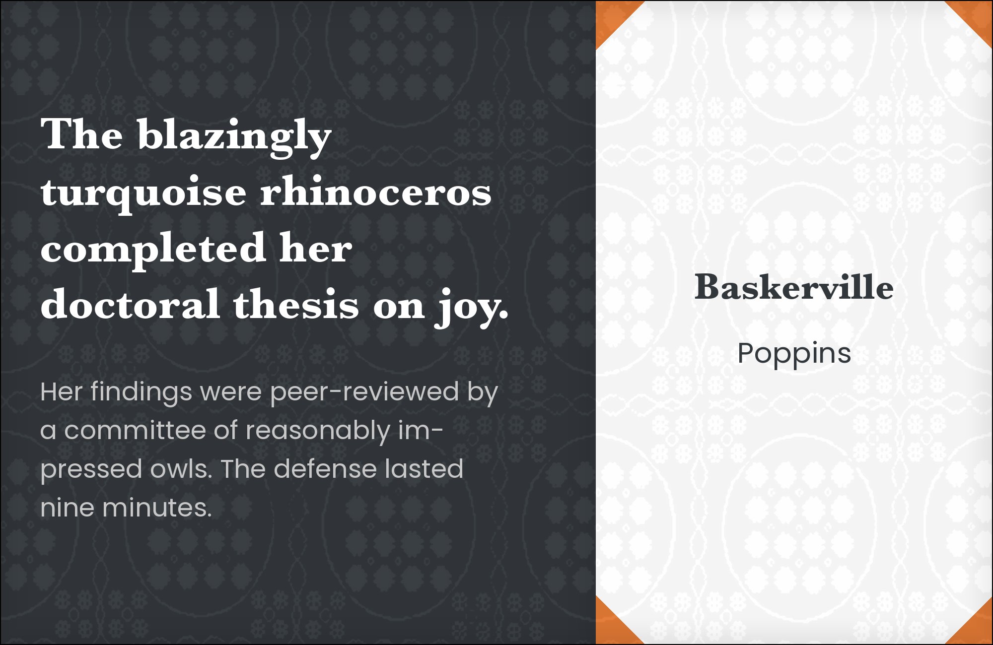
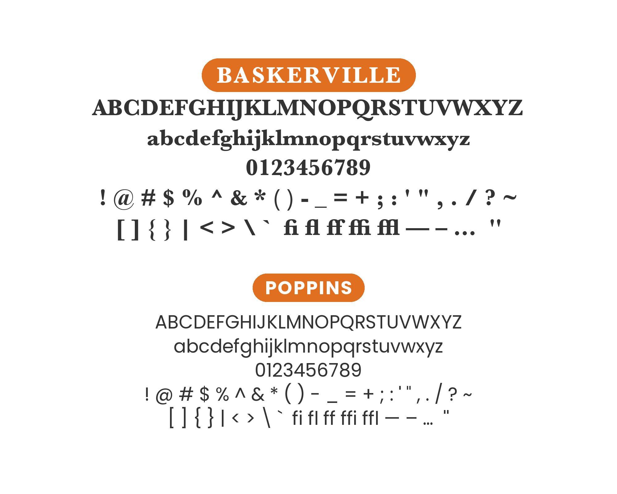
7. Poppins
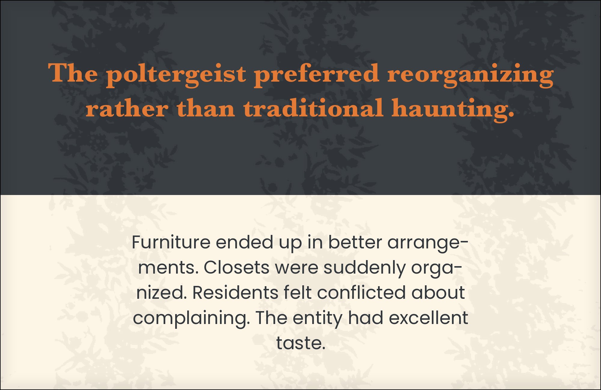
Poppins is built on true geometric circles and open counters, giving portfolio and editorial layouts a contemporary floor to stand on while Baskerville’s transitional serif brings historical weight to the headings above it. The contrast is deliberate and visible: one face is compass-drawn and current, the other hand-cut and centuries old, and neither pretends to be the other. Free on Google Fonts. Keep Poppins to body copy and supporting text; Baskerville’s contrast is what should draw the eye first on the page.
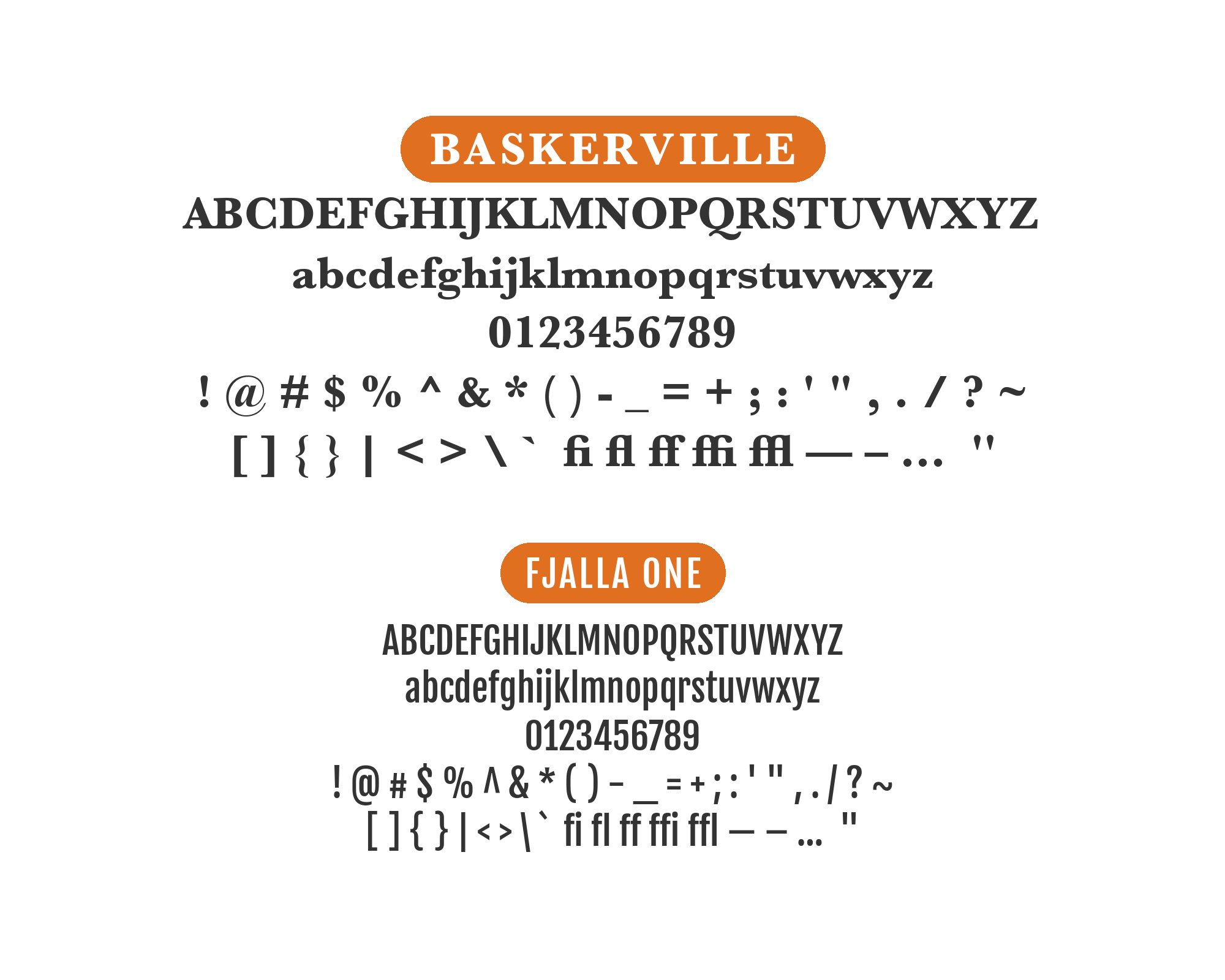
8. Fjalla One
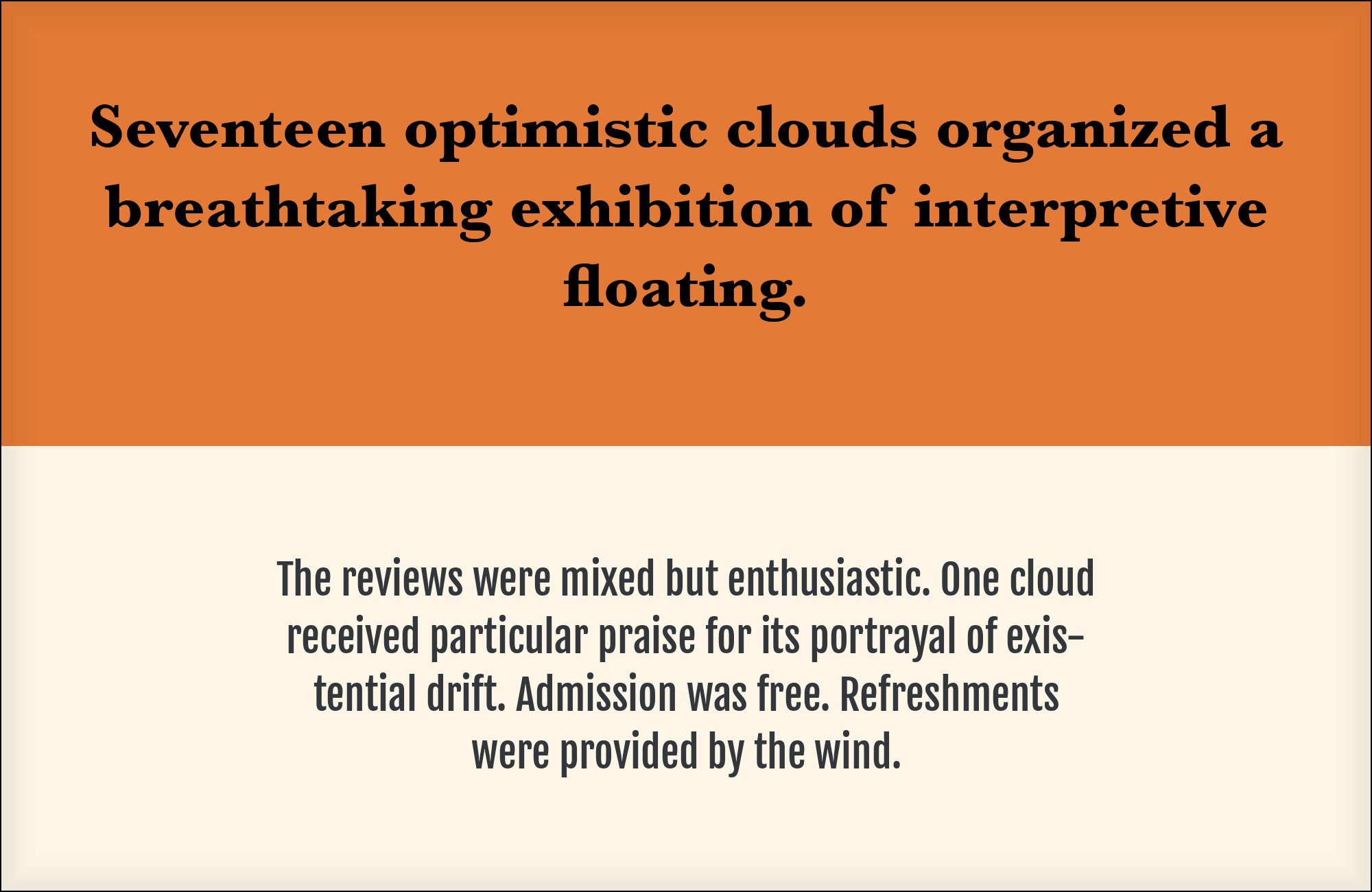
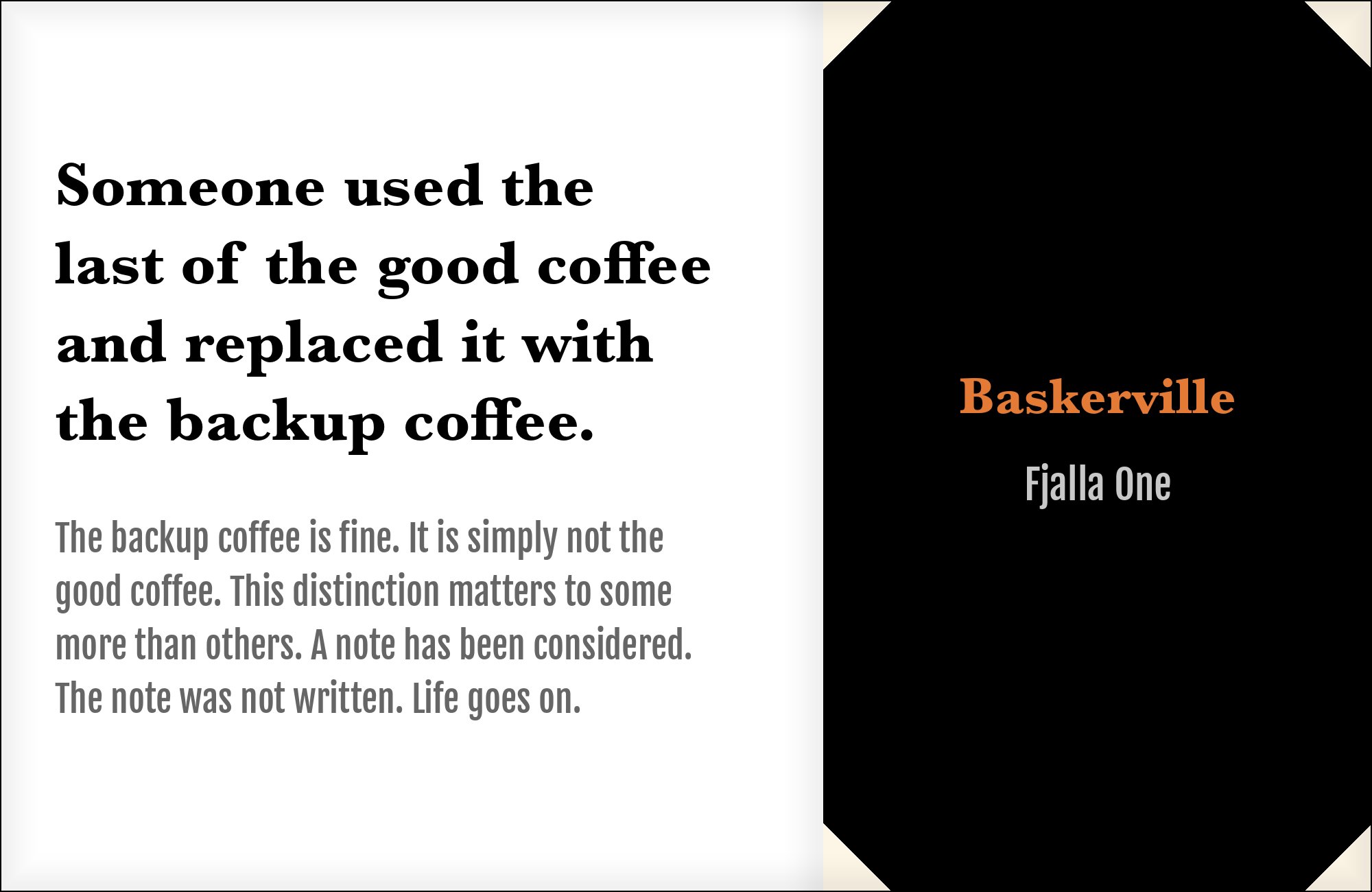
Fjalla One is a condensed, neutral grotesque with narrow caps that stay quiet as a headline face, which lets Baskerville itself take the more expressive role in a layout rather than being treated as just a body-text workhorse. That reversal — condensed sans up top, characterful serif doing the talking below — suits editorial designs that want Baskerville to be the star rather than a supporting player. Free on Google Fonts. Use Fjalla One sparingly, for section labels and small caps-style headers only.
9. Futura
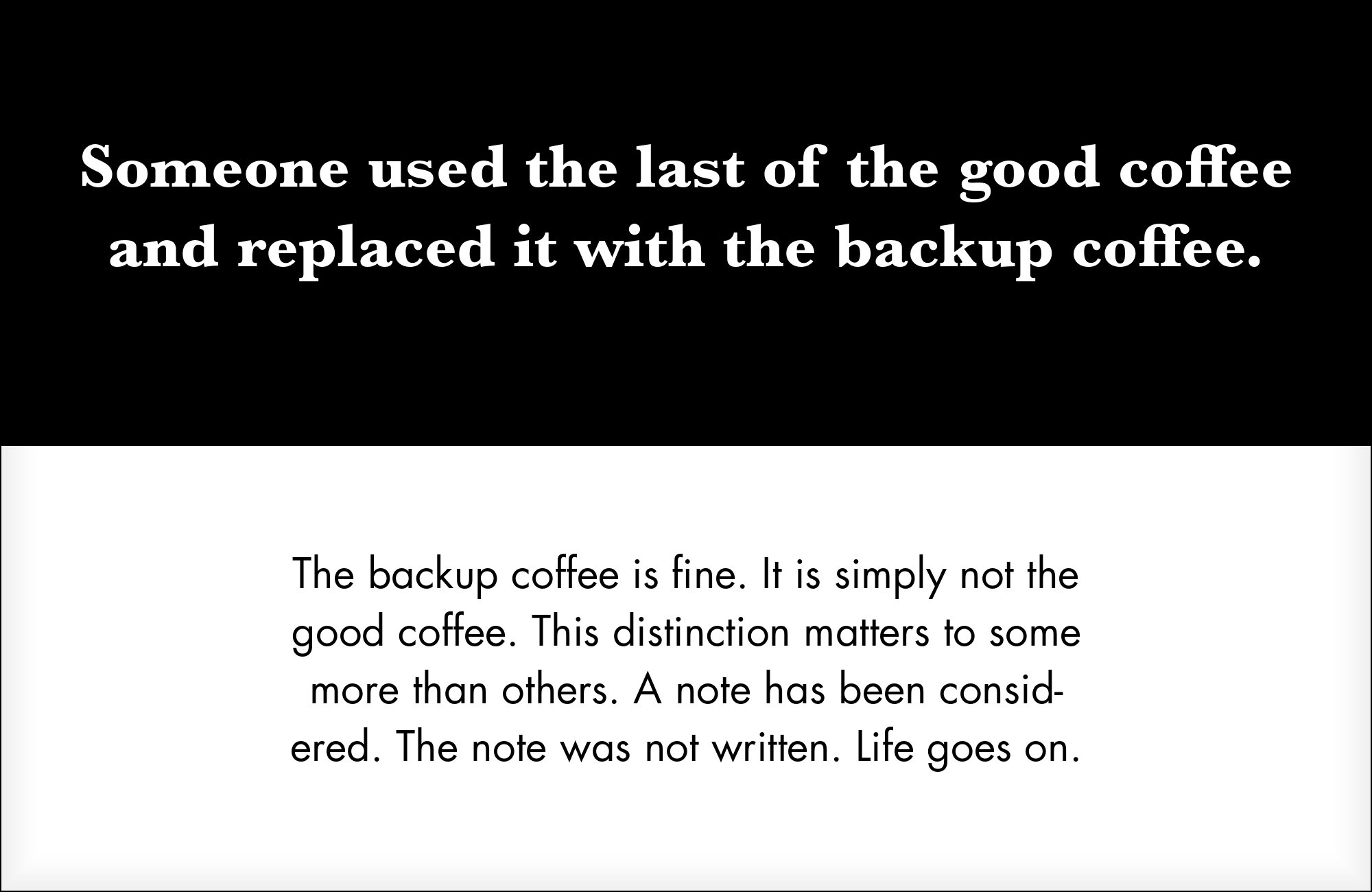
Paul Renner’s 1927 geometric sans is built from pure circles and triangles, sharing no structural DNA with Baskerville’s humanist serif skeleton, so the two separate cleanly on a page. Futura works well as short display lines or standalone titles, with Baskerville carrying the actual reading type underneath — confirmed in real branding work that pairs the two directly. Futura is a commercial retail face, so it sits lower on this list for cost reasons rather than typographic ones. Display sizes only; its strict geometry loses precision in paragraph text.


Still Googling UX terms?
Stop. They're all right here.
50 terms. Illustrated.
So simple your cat gets it.
Print & ePub on Amazon
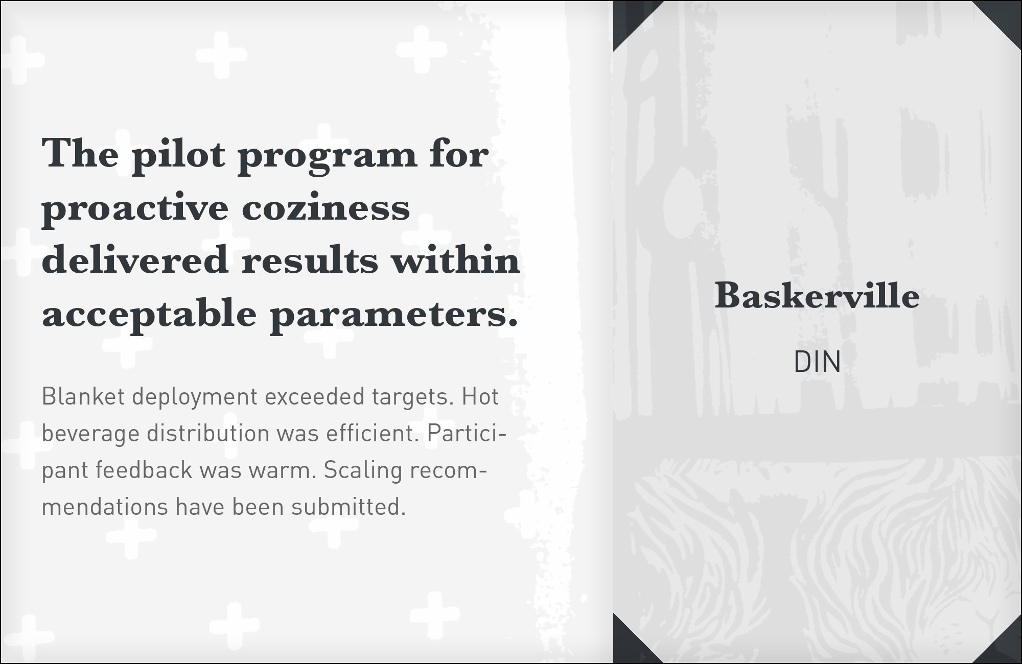
10. DIN

DIN traces to a German industrial and signage standard from the early twentieth century — narrow apertures, an engineered, technical construction built for legibility on signs and forms rather than in books. Against Baskerville’s warmer, book-trained serif, DIN reads instantly as a labeling or navigation voice, leaving Baskerville to do the actual reading work without the two competing for the same job. Several digital revivals exist, most requiring a commercial license. Reserve DIN for captions, wayfinding text and technical labels; it has no warmth to offer body copy.

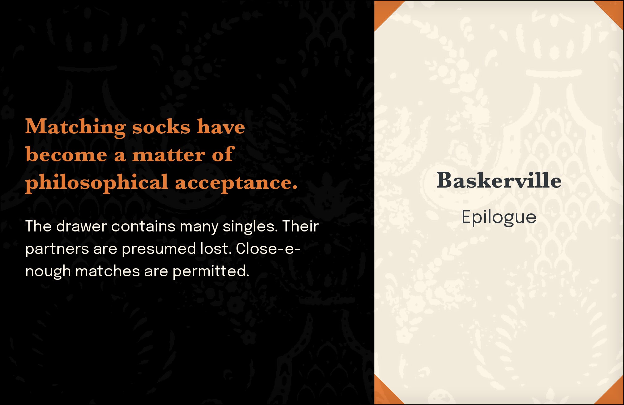
11. Epilogue

Epilogue is a tall, slightly quirky grotesque with enough personality in its details to stand next to Baskervville — a separate, more calligraphic Google Fonts revival of Baskerville’s letterforms — without reading as a flat, generic system font. The pairing is closest in spirit when used with that specific free revival rather than the classic system face, since Baskervville’s overtly calligraphic character needs a sans with a comparable amount of quiet character. Free on Google Fonts. Use Epilogue for UI and short headlines, keeping the Baskervville-style serif for actual reading.

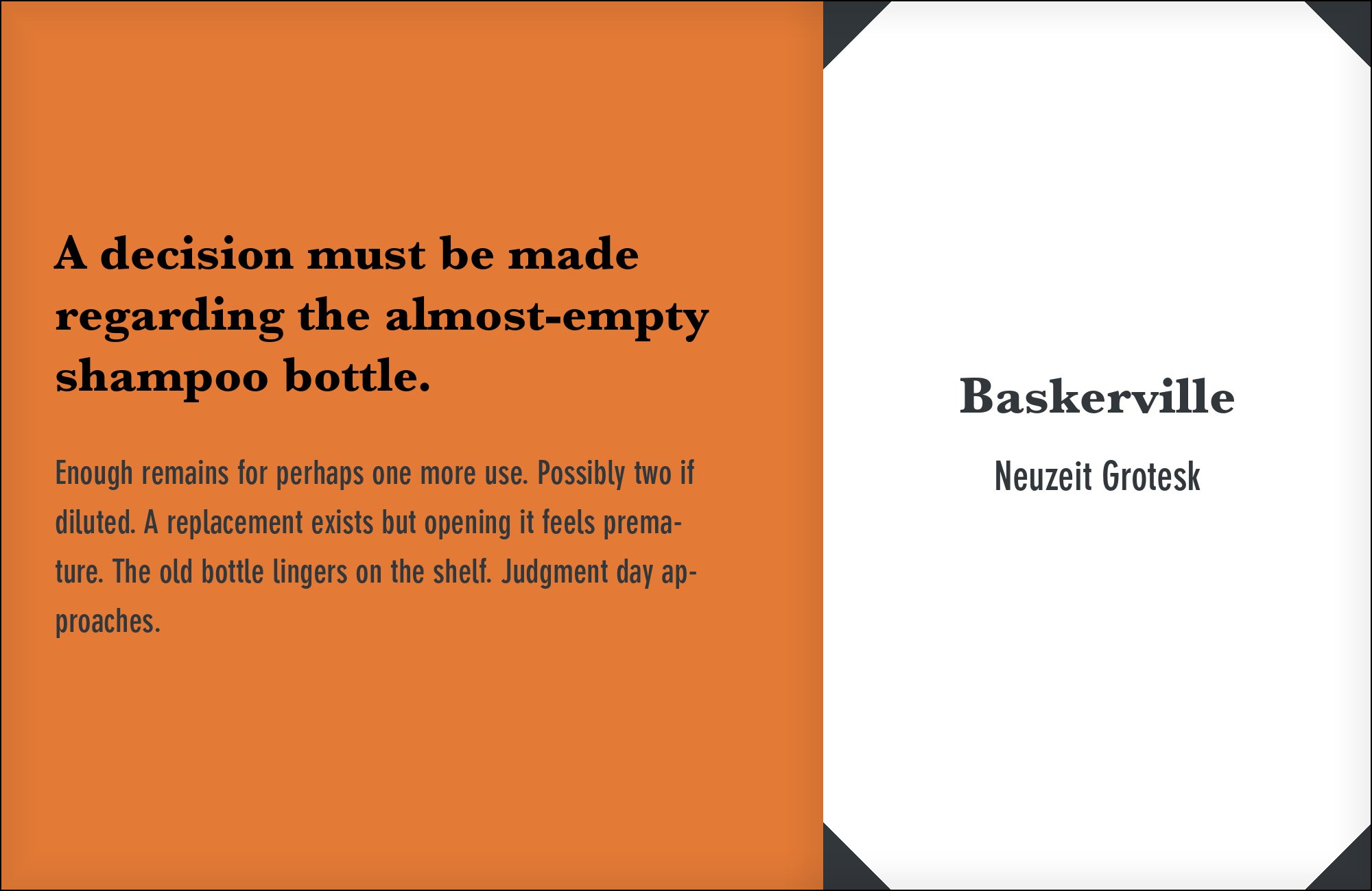
12. Neuzeit Grotesk
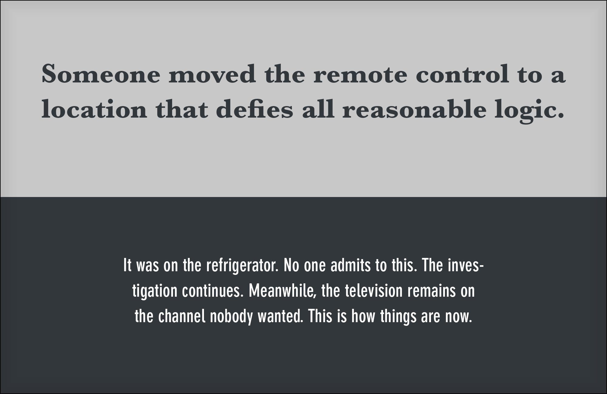
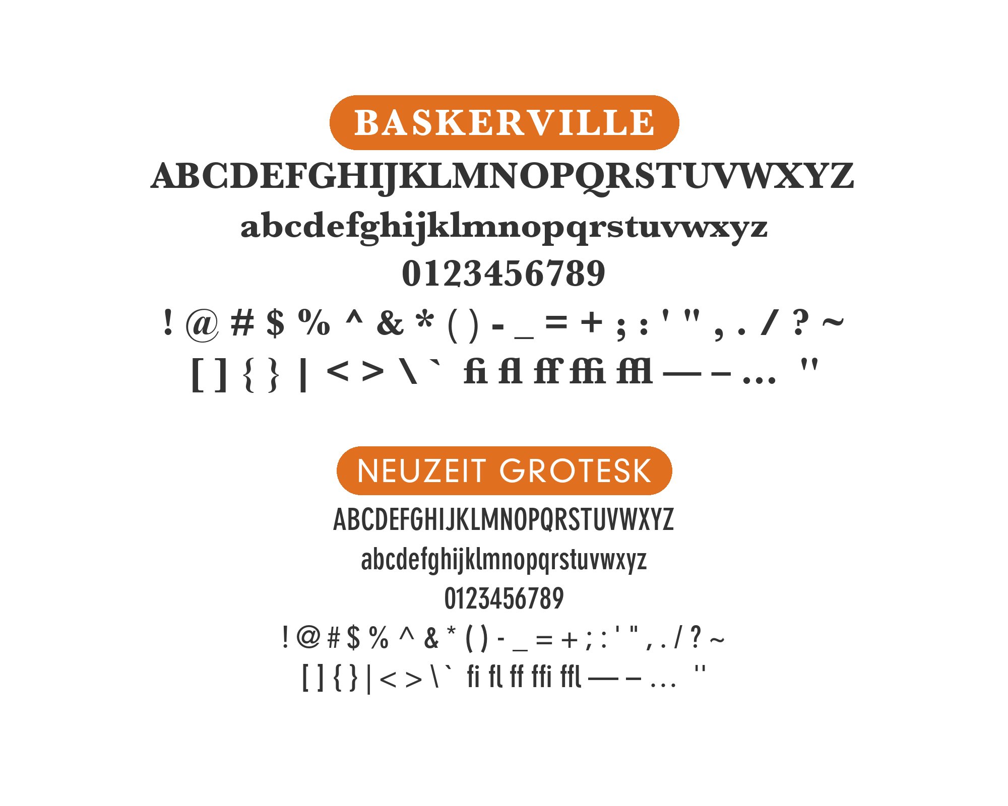
Neuzeit Grotesk was drawn by Wilhelm Pischner for the Stempel foundry in 1928, an engineered, tightly fitted grotesque with even strokes and almost no ornamentation. Set against Baskerville’s calligraphic, high-contrast serifs, the two sit at opposite poles — Baskerville expressive and historical, Neuzeit Grotesk technical and restrained — so captions and headlines read as a deliberate old-versus-new statement rather than a mismatch. It is a commercial retail face requiring a paid license. Use it for functional text only: captions, labels and navigation, never as a competing display voice.
13. Neue Haas Grotesk

Neue Haas Grotesk is Christian Schwartz’s careful restoration of Helvetica’s original 1957 Haas drawings, closer to Max Miedinger’s actual pen strokes than the later, more standardized Helvetica Neue. Against Baskerville’s dramatic stroke contrast and crisp, sharply cut bracketed serifs, its steady, even grid keeps long body copy calm underneath a display headline set in Baskerville — a classic editorial split used in serious publication design. It is a commercial release with a genuine licensing cost, which is why it closes this list. Reserve it for projects that already hold the license for other work.


Conclusion
A companion either stays a neutral humanist sans so Baskerville’s own character carries the page, or meets the transitional contrast with a technical grotesque such as DIN or Neuzeit Grotesk.
Whichever direction you choose, set it at the size you will actually publish before deciding. Baskerville’s contrast holds up beautifully in a headline and can turn strained in a dense paragraph, and a companion sans that looks calm in a mockup can still crowd a real layout once real copy fills it in.
