BonFX

Typography & Graphic Design Blog

  • Blog
  • Font Combinations
  • Books
    • The Preposterously Huge Book of Google Font Combinations
    • The Big Book of Font Combinations (Classic Fonts Edition)
  • Contact
You are here: Home / Graphic Design / What Fonts Go With Work Sans?

The BonFX Letter

One good pairing.
Every Tuesday.

2-minute read · free

This week — no. 14

Quiet authority

Merriweather sets the tone in one line. Lato stays out of the way and lets it.

MERRIWEATHER 700  +  LATO 400

A font specimen, a pairing that works, and one line on why it works. That is the whole email.

Free. One click to unsubscribe. No sharing, ever.

What Fonts Go With Work Sans?

What Fonts Go With Work Sans?

August 29, 2026 by Douglas Bonneville

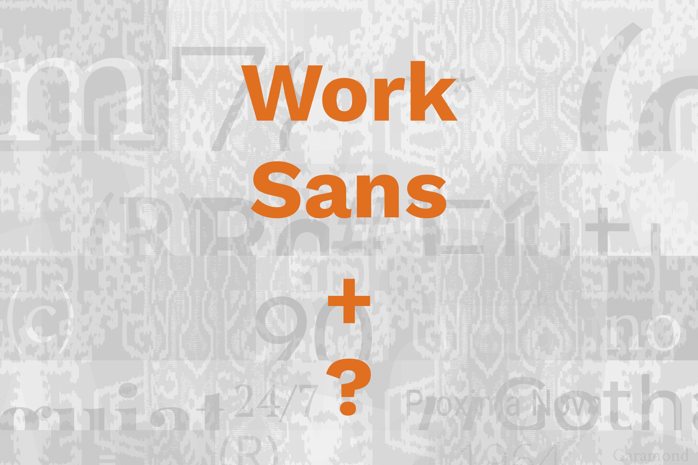
Work Sans pairs great with Playfair Display, Merriweather and Bitter. All 15 pairings are shown below in real rendered specimens, with the reason each one works.

Work Sans type specimen

What fonts go with Work Sans? This functional grotesque brings workhorse reliability that demands companions capable of leveraging its practical character while providing meaningful visual contrast.

Work Sans was designed by Wei Huang as a typeface optimized for on-screen text usage. Drawing inspiration from early grotesques by foundries including Stephenson Blake, Miller & Richard and Bauerschen Giesserei, the design simplifies features for screen resolutions. The family spans nine weights with matching italics, making it remarkably versatile for interfaces, branding, and editorial work where functional clarity serves the content.

Pairing Work Sans means finding fonts that either complement its utilitarian spirit or provide meaningful contrast through serif elegance or geometric precision. Its neutral, hardworking character makes it a flexible partner that welcomes both traditional and contemporary companions. Here are 15 fonts that pair well with Work Sans, each chosen to extend its capabilities across different design contexts.

Envato Elements
Featured
···
The world's broadest stock library
Envato.com
Envato.com
Your All-in-one Creative Asset Toolkit
Subscribe

Font Pairings for Work Sans

  1. Playfair Display
  2. Merriweather
  3. Bitter
  4. Libre Baskerville
  5. Roboto Mono
  6. Poppins
  7. Lora
  8. Source Serif Pro
  9. Inter
  10. Spectral
  11. Space Grotesk
  12. Crimson Text
  13. Manrope
  14. Alegreya
  15. JetBrains Mono

1. Playfair Display

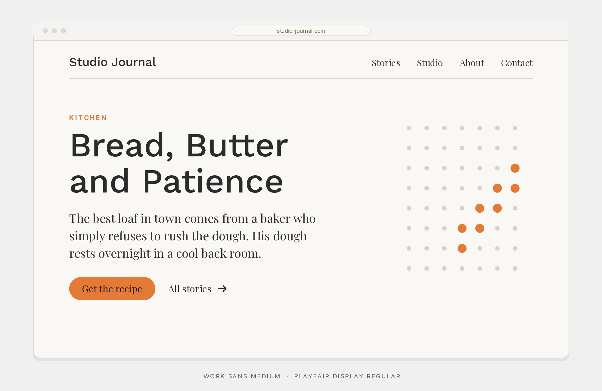
Work Sans and Playfair Display font pairing: Work Sans headline with Playfair Display body text

Playfair Display creates dramatic contrast against Work Sans’s practical simplicity. Claus Eggers Sørensen’s high-contrast serifs bring editorial sophistication that elevates Work Sans’s workmanlike character into something more distinguished. The delicate hairlines dance against Work Sans’s sturdy strokes, creating visual tension that energizes layouts. This pairing excels in fashion editorials, lifestyle brands, and any project where utility needs elegance.
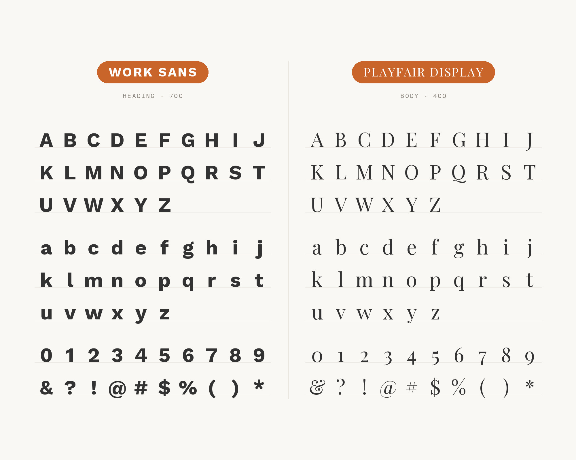
Character specimen: Work Sans (heading) and Playfair Display (body) letters, numbers and symbols side by side

2. Merriweather

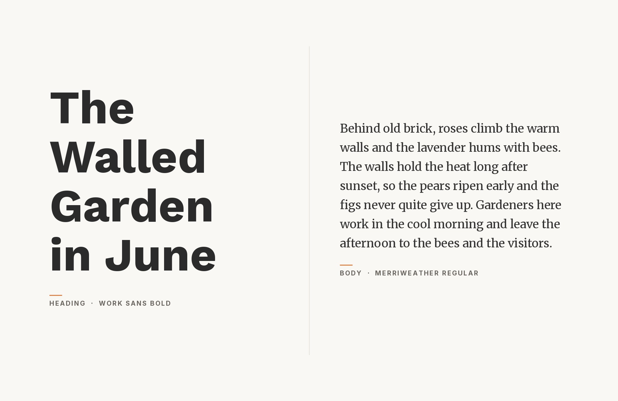
Work Sans and Merriweather font pairing: Work Sans headline with Merriweather body text

Merriweather‘s screen-optimized serifs find natural harmony with Work Sans’s digital-first philosophy. Both fonts were engineered for modern reading environments, sharing commitment to legibility across devices and sizes. Sorkin Type’s sturdy serifs provide authoritative headlines while Work Sans handles body text with unflappable reliability. This pairing suits content-heavy platforms, news sites, and educational content where readability serves diverse audiences.
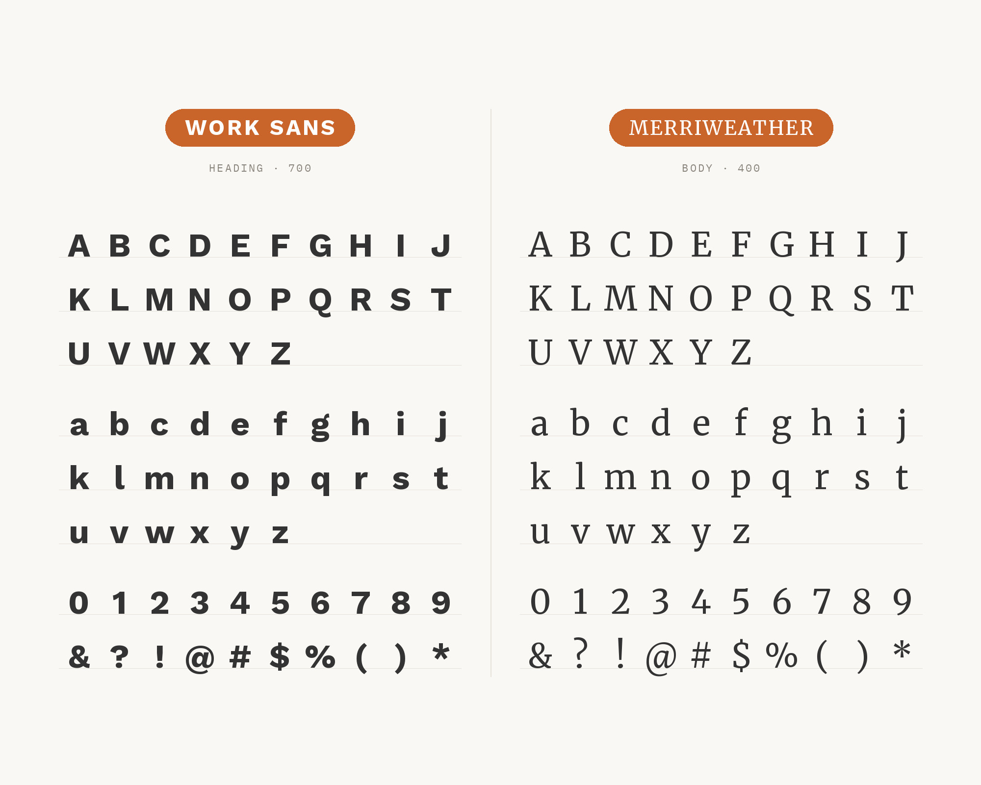
Character specimen: Work Sans (heading) and Merriweather (body) letters, numbers and symbols side by side

3. Bitter

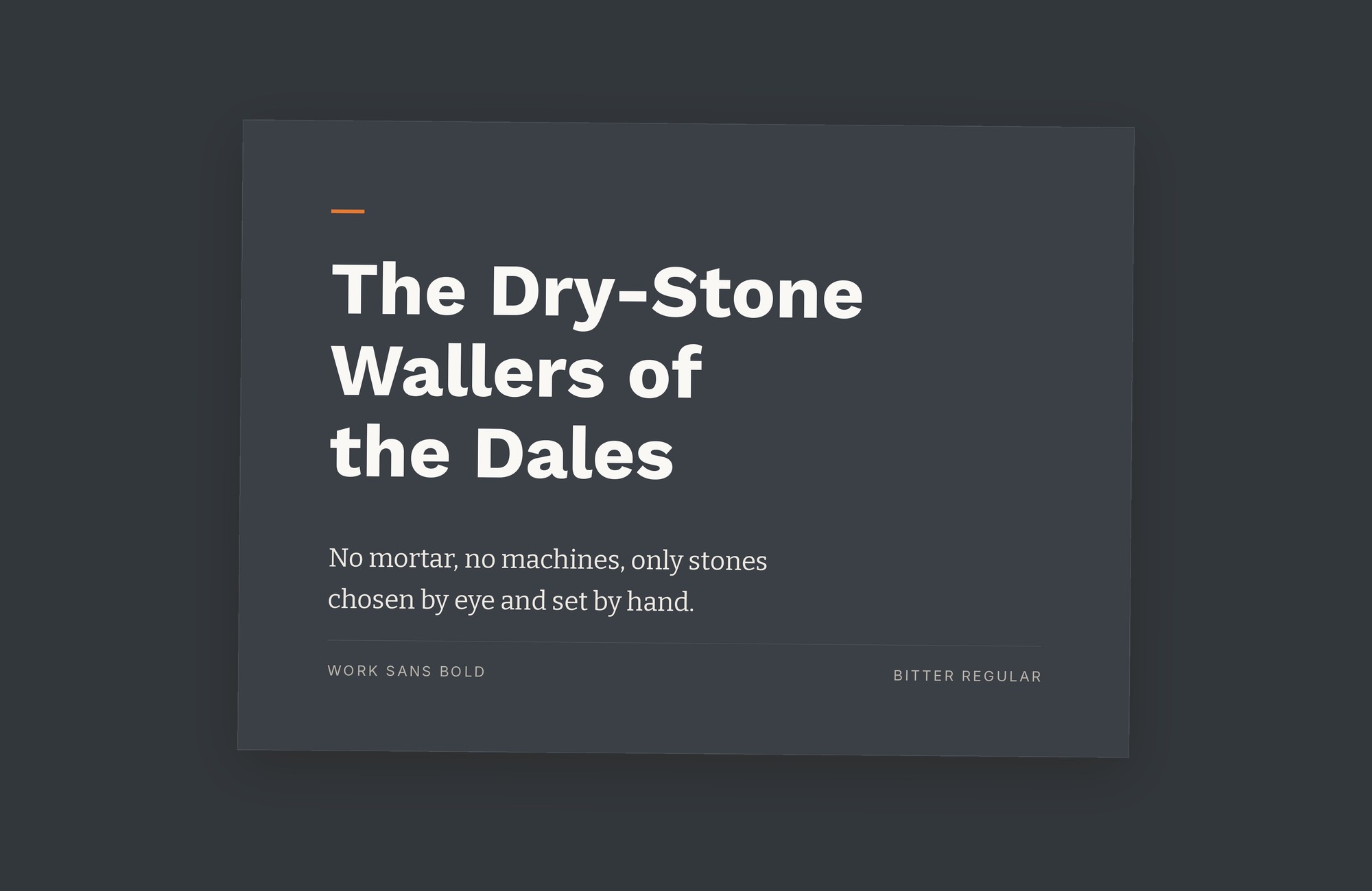
Work Sans and Bitter font pairing: Work Sans headline with Bitter body text

Bitter brings slab serif warmth that complements Work Sans’s functional character. Sol Matas designed a serif specifically for comfortable screen reading, sharing Work Sans’s practical sensibility. The combination feels purposeful—two fonts united by commitment to readable functionality. This pairing works beautifully for blogs, editorial platforms, and any project where approachable authority serves the content.
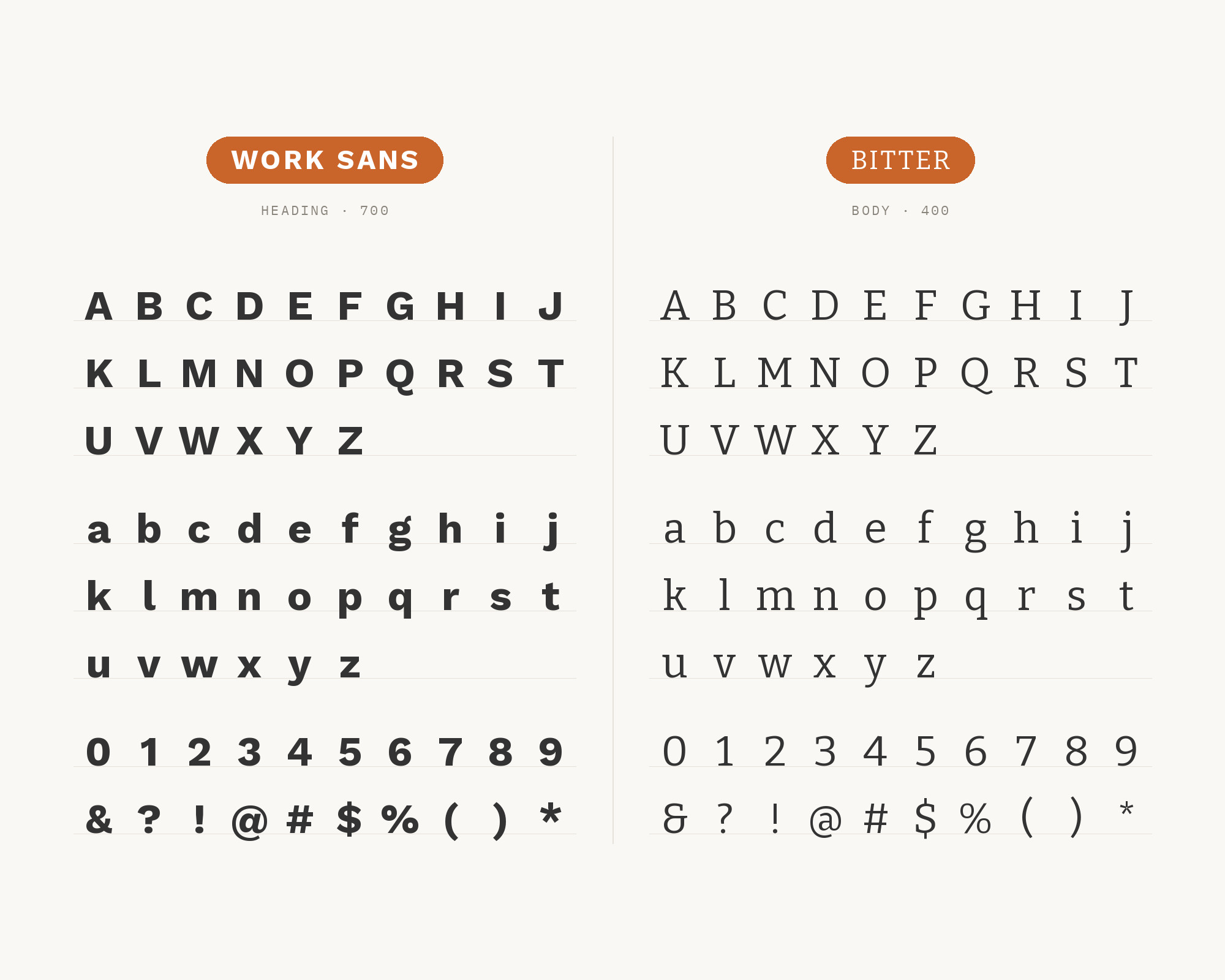
Character specimen: Work Sans (heading) and Bitter (body) letters, numbers and symbols side by side

4. Libre Baskerville

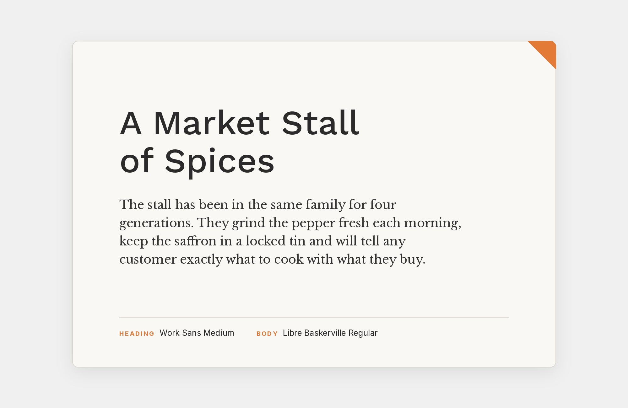
Work Sans and Libre Baskerville font pairing: Work Sans headline with Libre Baskerville body text

Libre Baskerville introduces classical refinement to Work Sans’s utilitarian disposition. Impallari Type created this screen-optimized Baskerville interpretation, which retains transitional elegance. Against Work Sans’s grotesque foundations, Libre Baskerville provides intellectual depth that signals substance. This pairing excels in academic publishing, professional services, and any project bridging traditional credibility with contemporary accessibility.
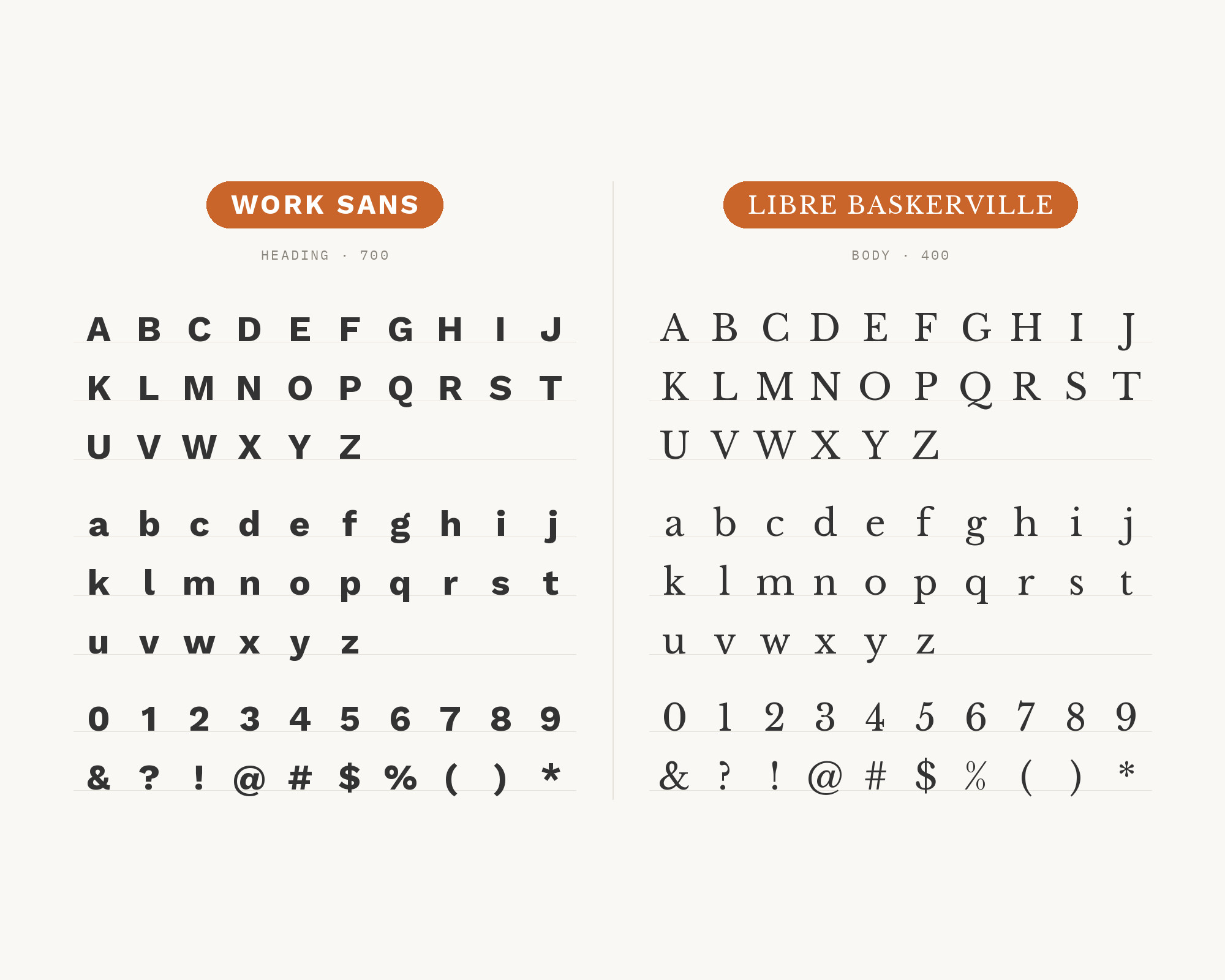
Character specimen: Work Sans (heading) and Libre Baskerville (body) letters, numbers and symbols side by side
Canva Pro
Featured
···
Magic Layers
Canva.com
Canva.com
Try Canva Magic Layers
Learn More

5. Roboto Mono

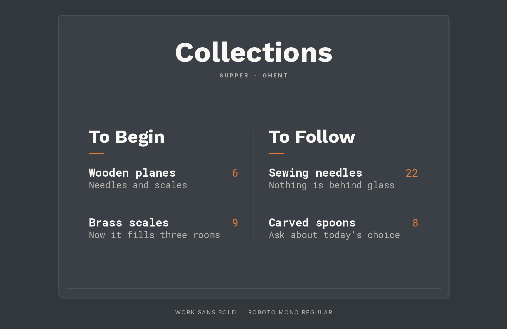
Work Sans and Roboto Mono font pairing: Work Sans headline with Roboto Mono body text

Technical clarity meets functional design when Roboto Mono pairs with Work Sans. Christian Robertson’s monospace design brings code-ready precision that complements Work Sans’s practical character. This pairing speaks directly to developer portfolios, technical documentation, and digital products where code and content coexist. The systematic precision of Roboto Mono anchors Work Sans’s more flexible proportions.
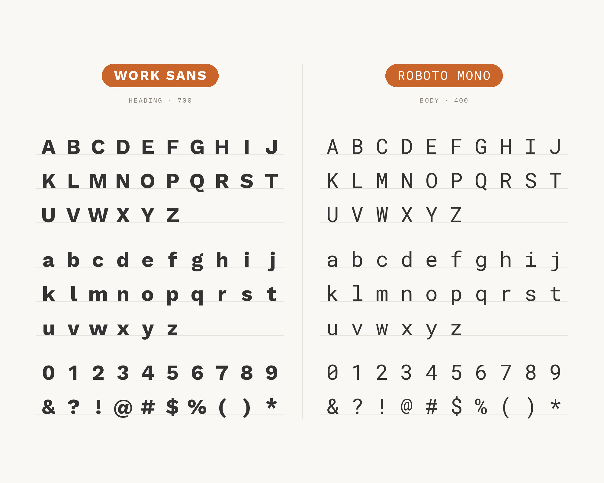
Character specimen: Work Sans (heading) and Roboto Mono (body) letters, numbers and symbols side by side

6. Poppins

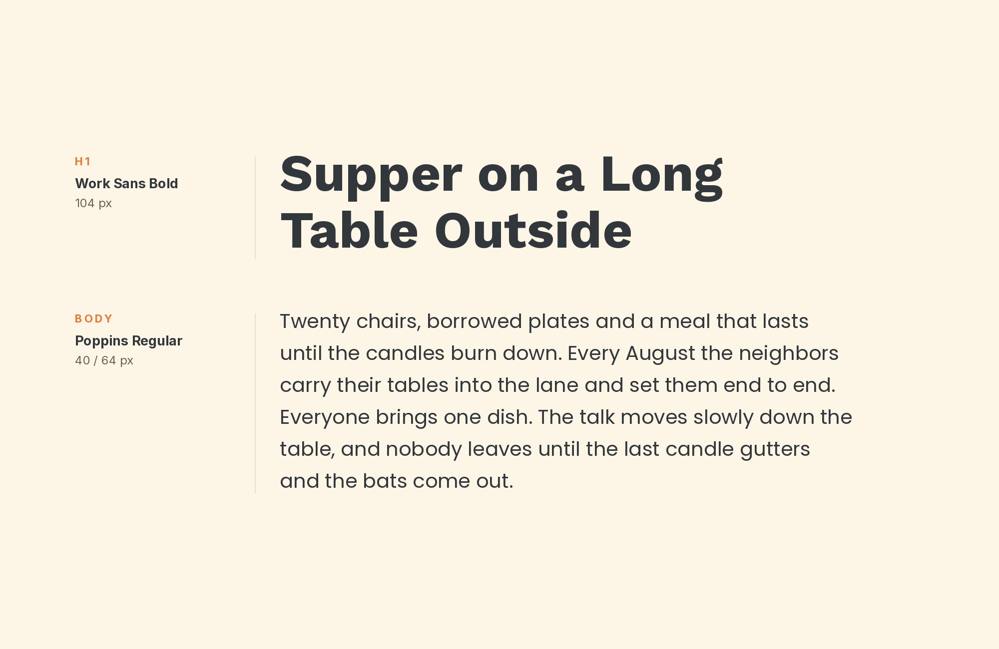
Work Sans and Poppins font pairing: Work Sans headline with Poppins body text

The geometric precision of Poppins provides clean contrast against Work Sans’s grotesque foundations. Indian Type Foundry’s creation brings circular geometry that sharpens Work Sans’s more organic forms. Both fonts share commitment to functional clarity while expressing it through different design philosophies. This pairing suits tech startups, SaaS products, and modern interfaces where geometric headlines need practical body text.
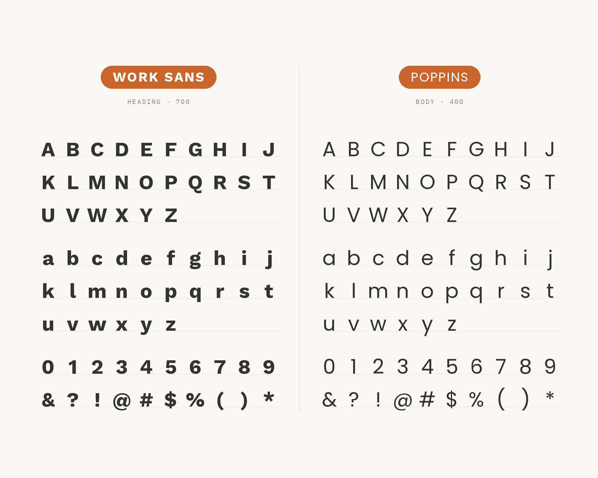
Character specimen: Work Sans (heading) and Poppins (body) letters, numbers and symbols side by side

7. Lora

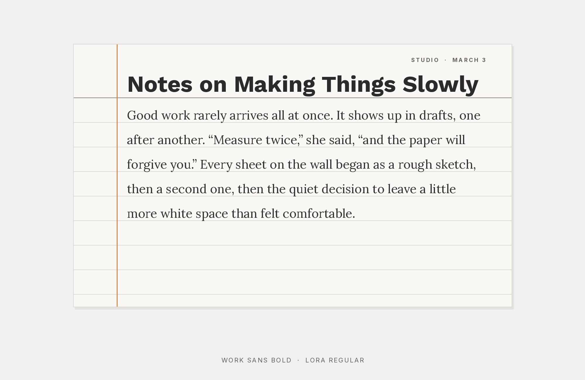
Work Sans and Lora font pairing: Work Sans headline with Lora body text

Lora brings calligraphic warmth that humanizes Work Sans’s businesslike demeanor. Those brushed curves and moderate contrast create visual dialogue between traditional elegance and modern utility. Cyreal’s contemporary serif adds personality that Work Sans’s neutrality welcomes. This pairing suits lifestyle brands, boutique businesses, and content platforms where warmth enhances user experience.
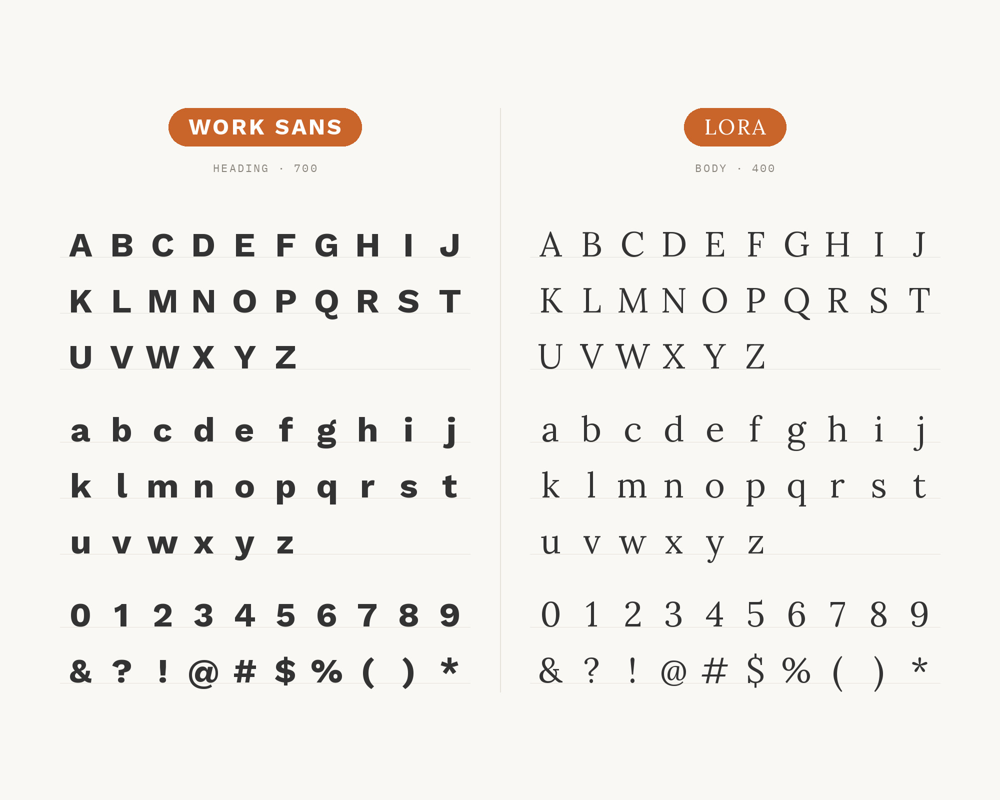
Character specimen: Work Sans (heading) and Lora (body) letters, numbers and symbols side by side
Adobe Creative Cloud
Featured
···
Before you burn a stock credit, edit.
Adobe.com
Adobe.com
Welcome to AI Studio.
Learn More

8. Source Serif Pro

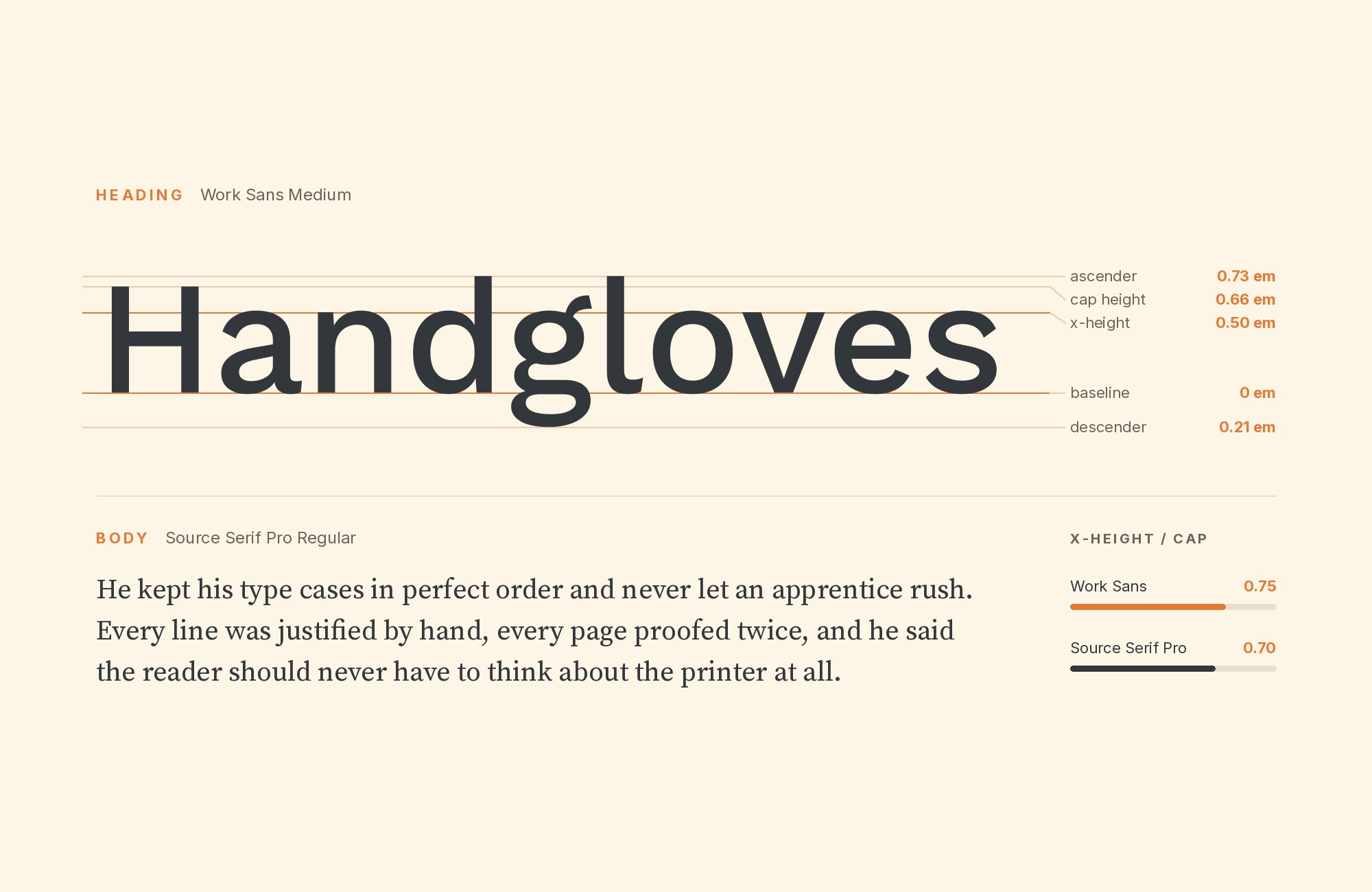
Work Sans and Source Serif Pro font pairing: Work Sans headline with Source Serif Pro body text

Source Serif Pro creates systematic harmony when paired with Work Sans. Both fonts emerged from thoughtful, systematic design processes: Source Serif from Adobe’s open-source type program and Work Sans from Wei Huang’s Google Fonts commission. Frank Grießhammer’s transitional serif provides classical contrast without overwhelming Work Sans’s functional character. This pairing excels in documentation, publishing platforms, and any project where design consistency serves content delivery.
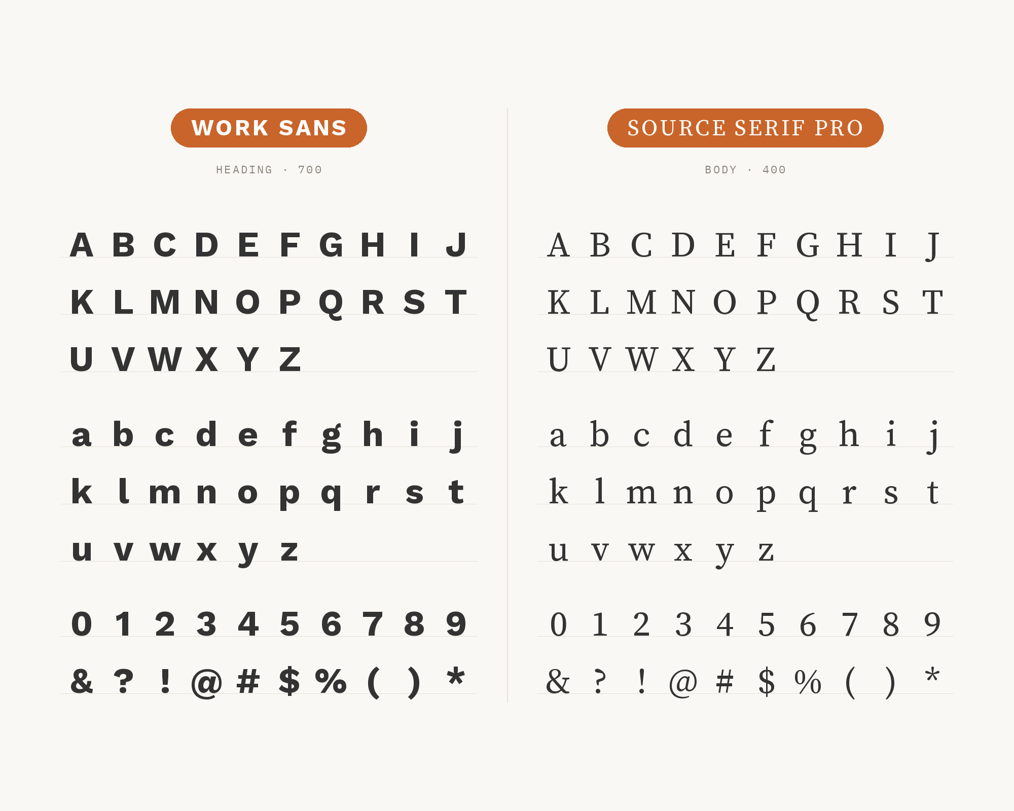
Character specimen: Work Sans (heading) and Source Serif Pro (body) letters, numbers and symbols side by side

9. Inter

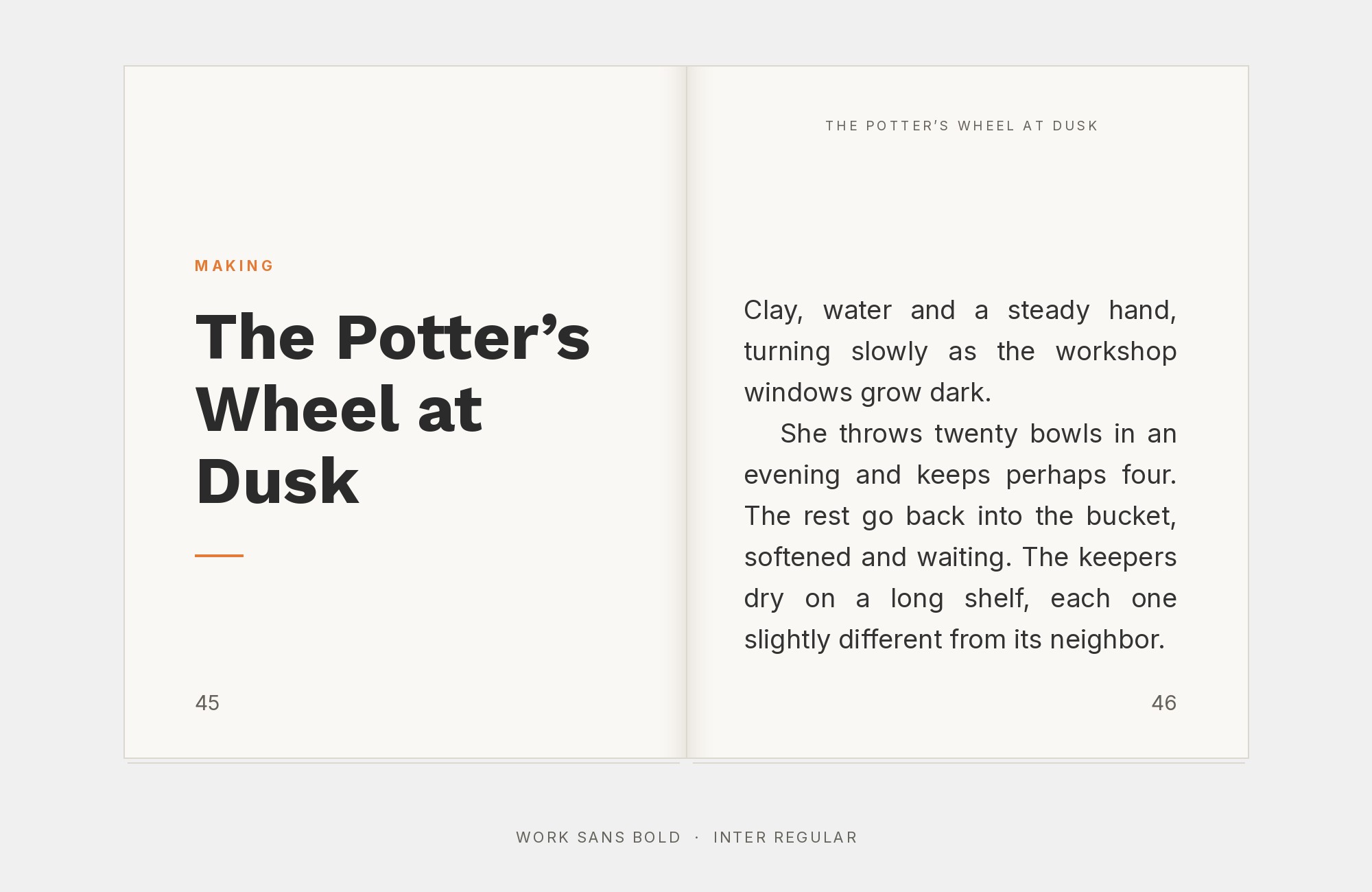
Work Sans and Inter font pairing: Work Sans headline with Inter body text

Screen-first meets workhorse when Inter pairs with Work Sans. Rasmus Andersson’s meticulous creation shares Work Sans’s commitment to functional excellence. Both fonts represent modern typography engineering at its finest—making subtle differences in letterforms create enough visual interest for hierarchy. This pairing suits dashboards, applications, and design systems where typographic quality signals software quality.
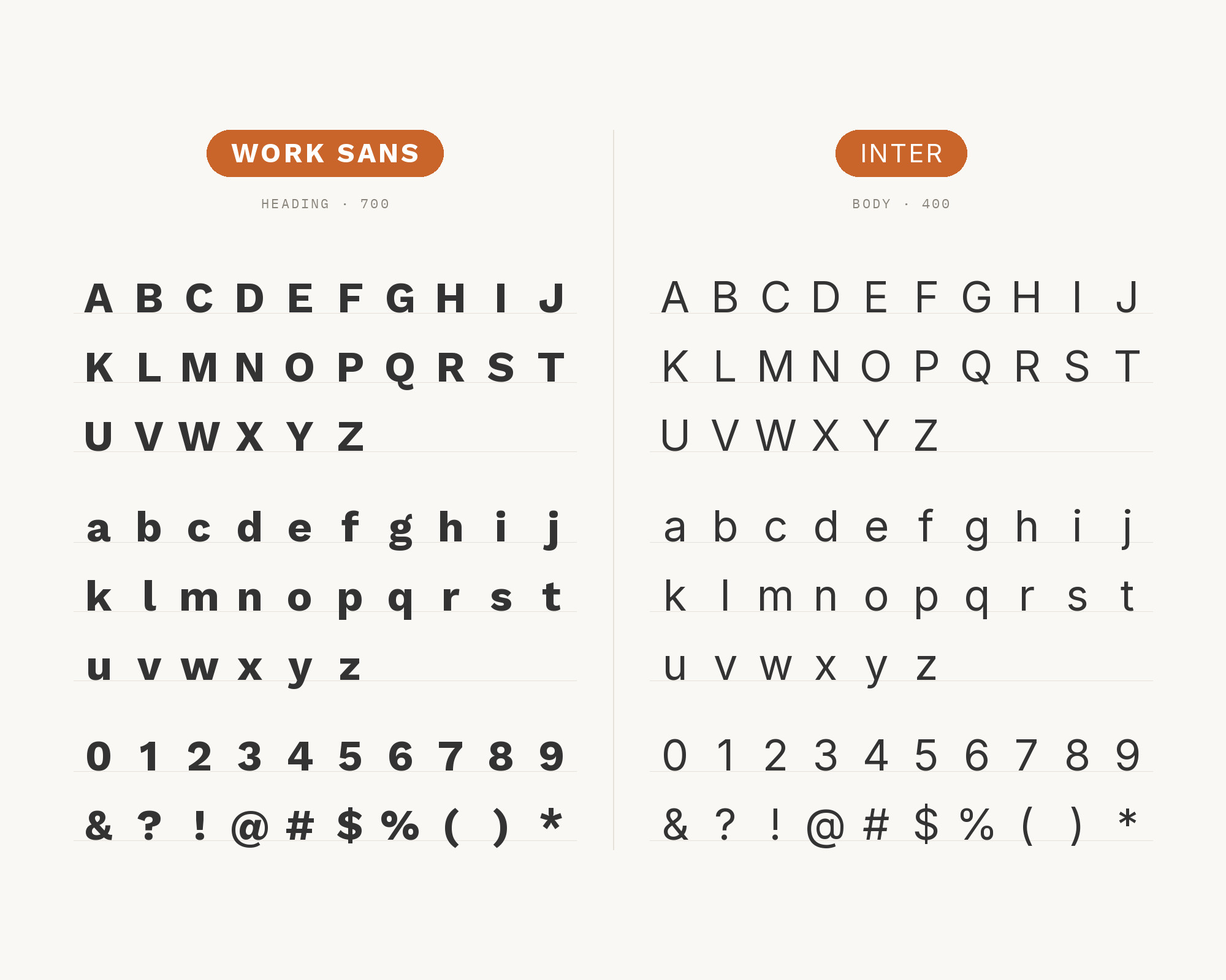
Character specimen: Work Sans (heading) and Inter (body) letters, numbers and symbols side by side

10. Spectral

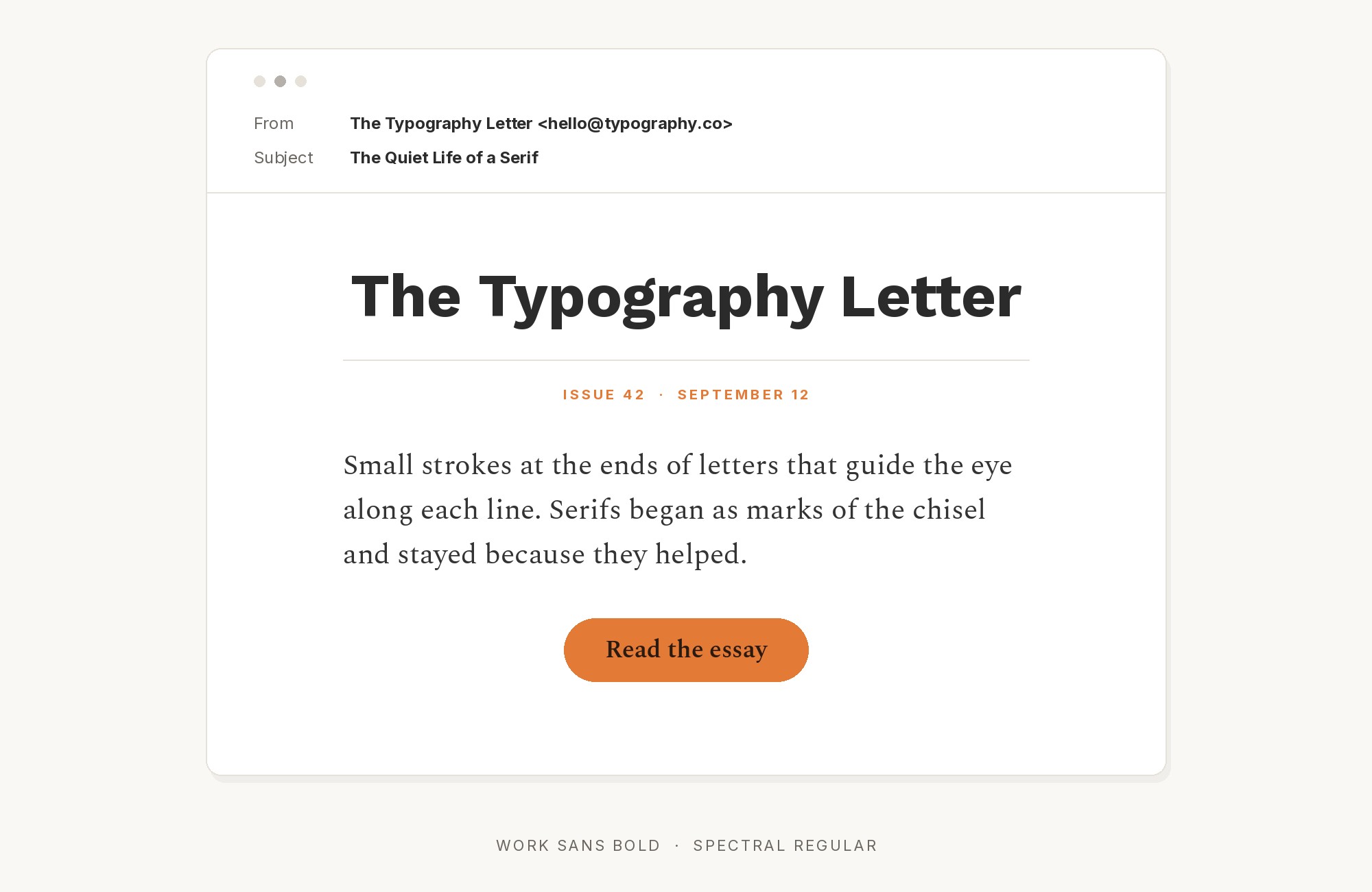
Work Sans and Spectral font pairing: Work Sans headline with Spectral body text

Spectral brings literary elegance that elevates Work Sans’s practical character. Production Type designed this serif on commission from Google Fonts, and it is free to use across Google Docs, Sheets and Slides. The result is typography that feels both productive and refined—ideal for publishing platforms, documentation sites, and content-forward projects where elegance serves efficiency.
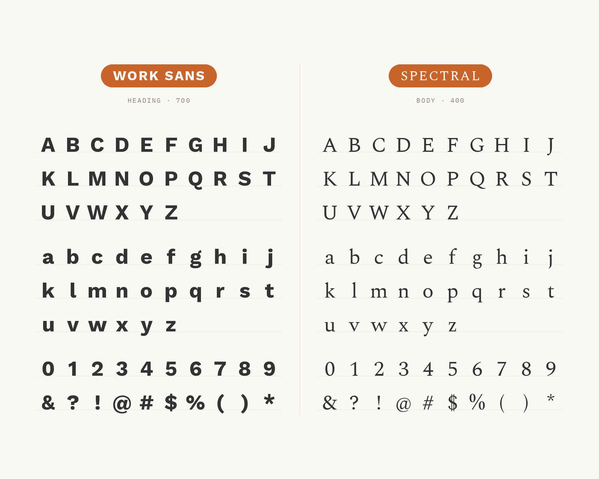
Character specimen: Work Sans (heading) and Spectral (body) letters, numbers and symbols side by side

Still Googling UX terms?

Stop. They're all right here.

UX for Cats book cover

50 terms. Illustrated.
So simple your cat gets it.

Get the Book →

Print & ePub on Amazon

11. Space Grotesk

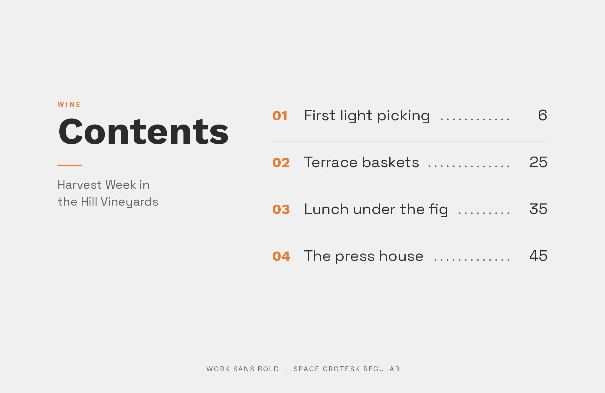
Work Sans and Space Grotesk font pairing: Work Sans headline with Space Grotesk body text

Space Grotesk and Work Sans appear together in the seekicks booklet documented by Fonts In Use. Florian Karsten’s design brings slightly quirky character that creates visual interest without disrupting Work Sans’s reliable foundations. Together they create contemporary systems that feel both functional and distinctive, ideal for tech brands, creative agencies, and modern applications.
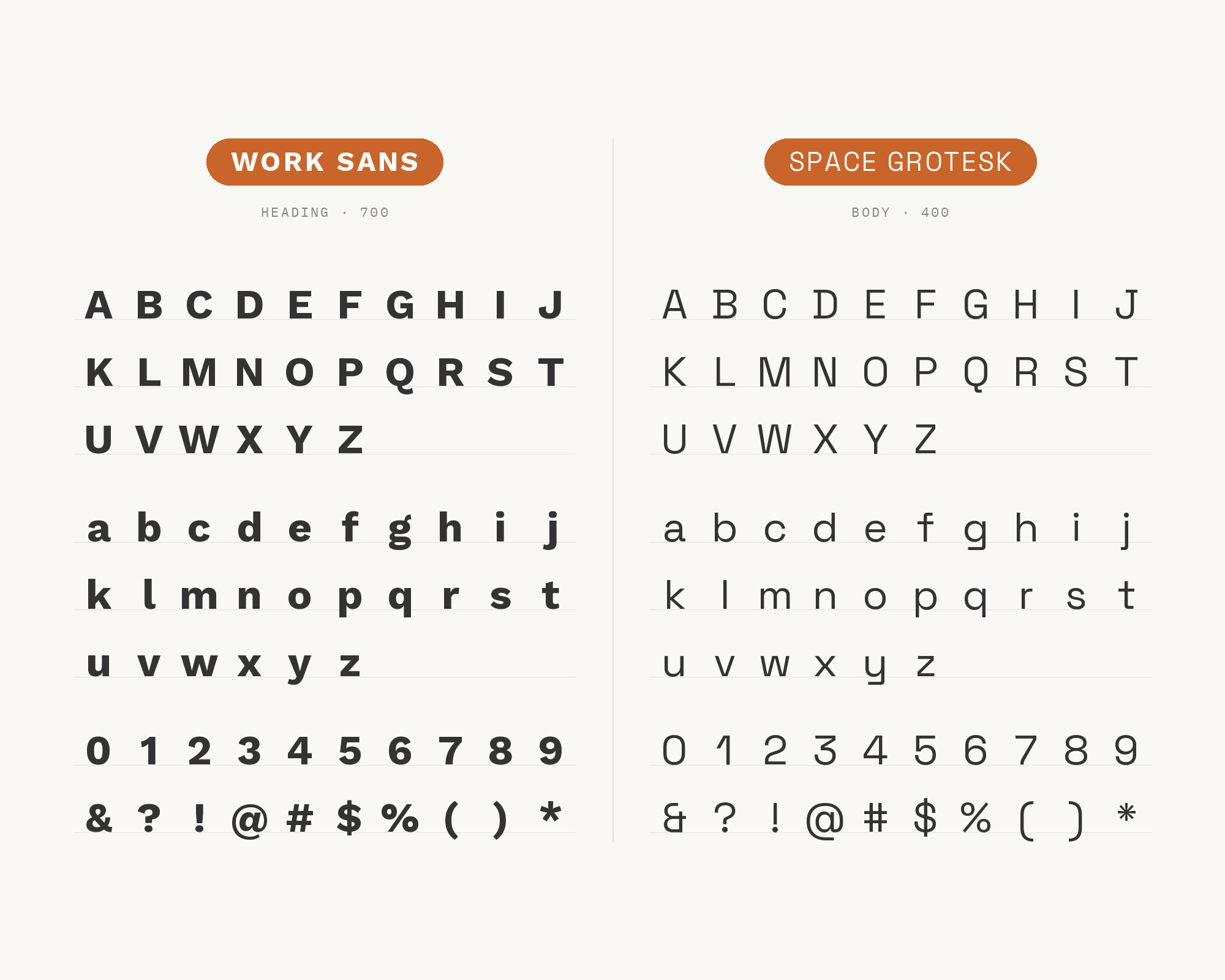
Character specimen: Work Sans (heading) and Space Grotesk (body) letters, numbers and symbols side by side

12. Crimson Text

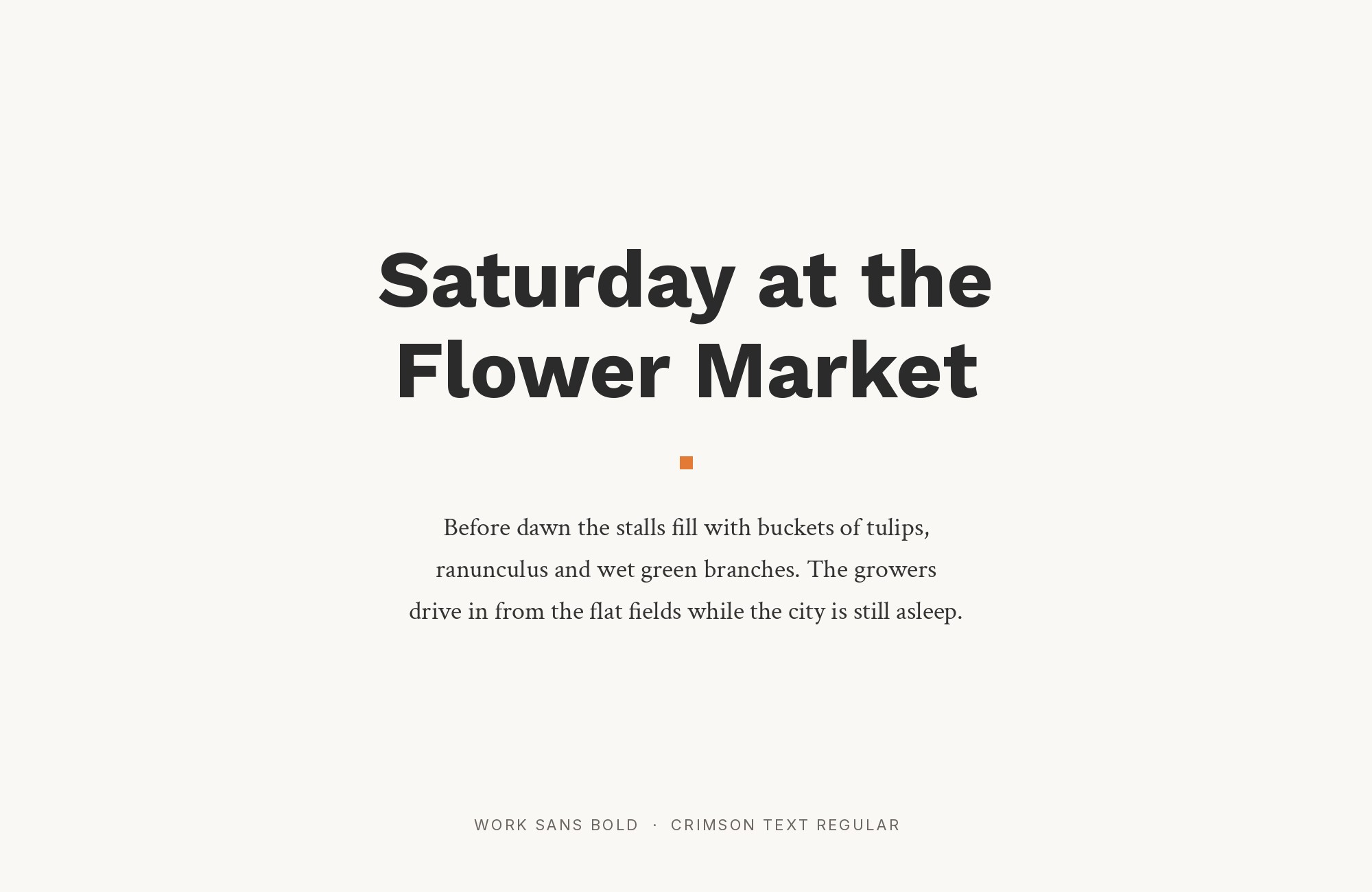
Work Sans and Crimson Text font pairing: Work Sans headline with Crimson Text body text

Crimson Text introduces old-style elegance that creates meaningful contrast with Work Sans’s grotesque modernity. Sebastian Kosch’s design channels classical book typography, bringing literary depth to practical layouts. This pairing suits publishers, cultural institutions, and any project where Work Sans’s functionality needs classical grounding.
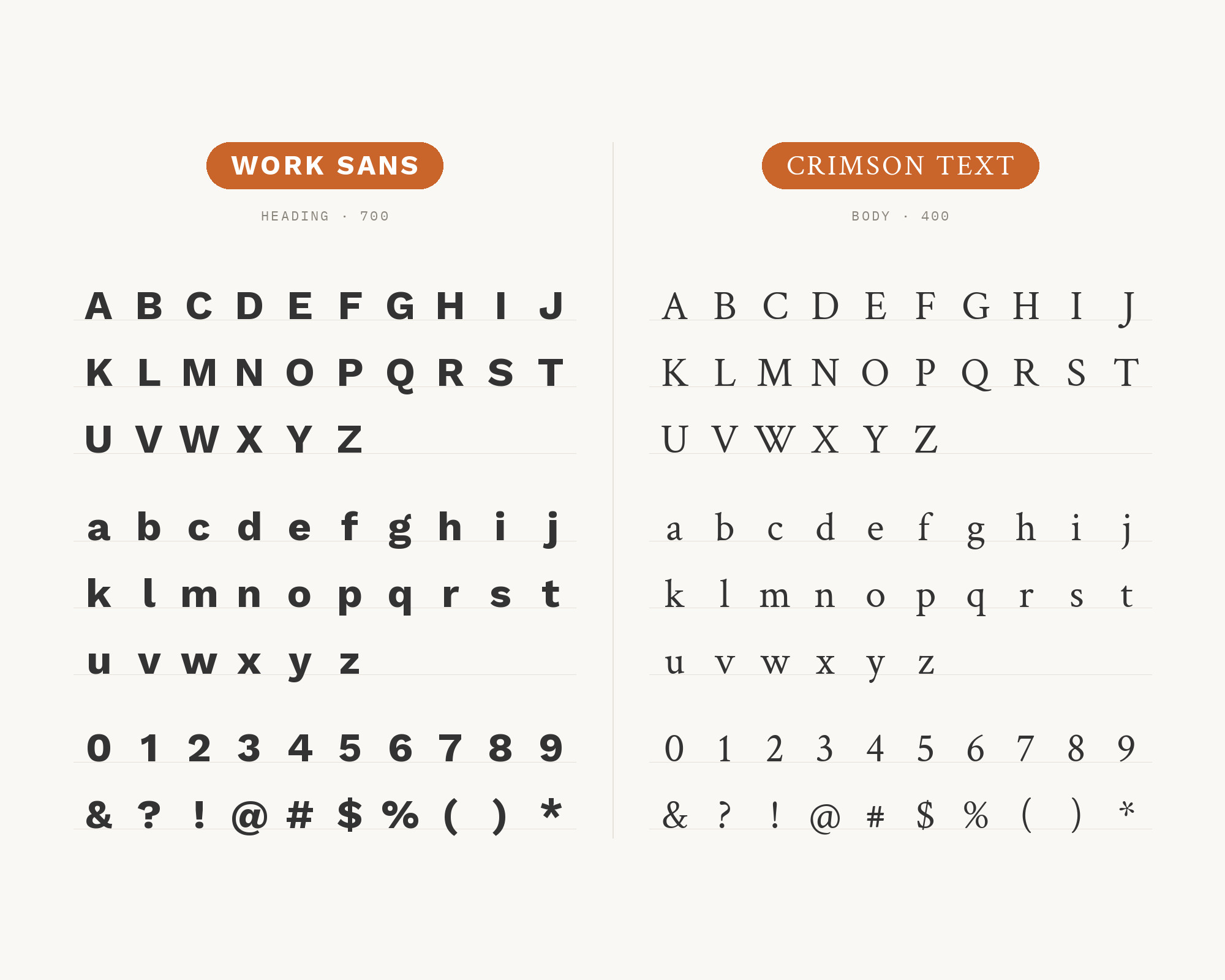
Character specimen: Work Sans (heading) and Crimson Text (body) letters, numbers and symbols side by side

13. Manrope

Work Sans and Manrope font pairing: Work Sans headline with Manrope body text

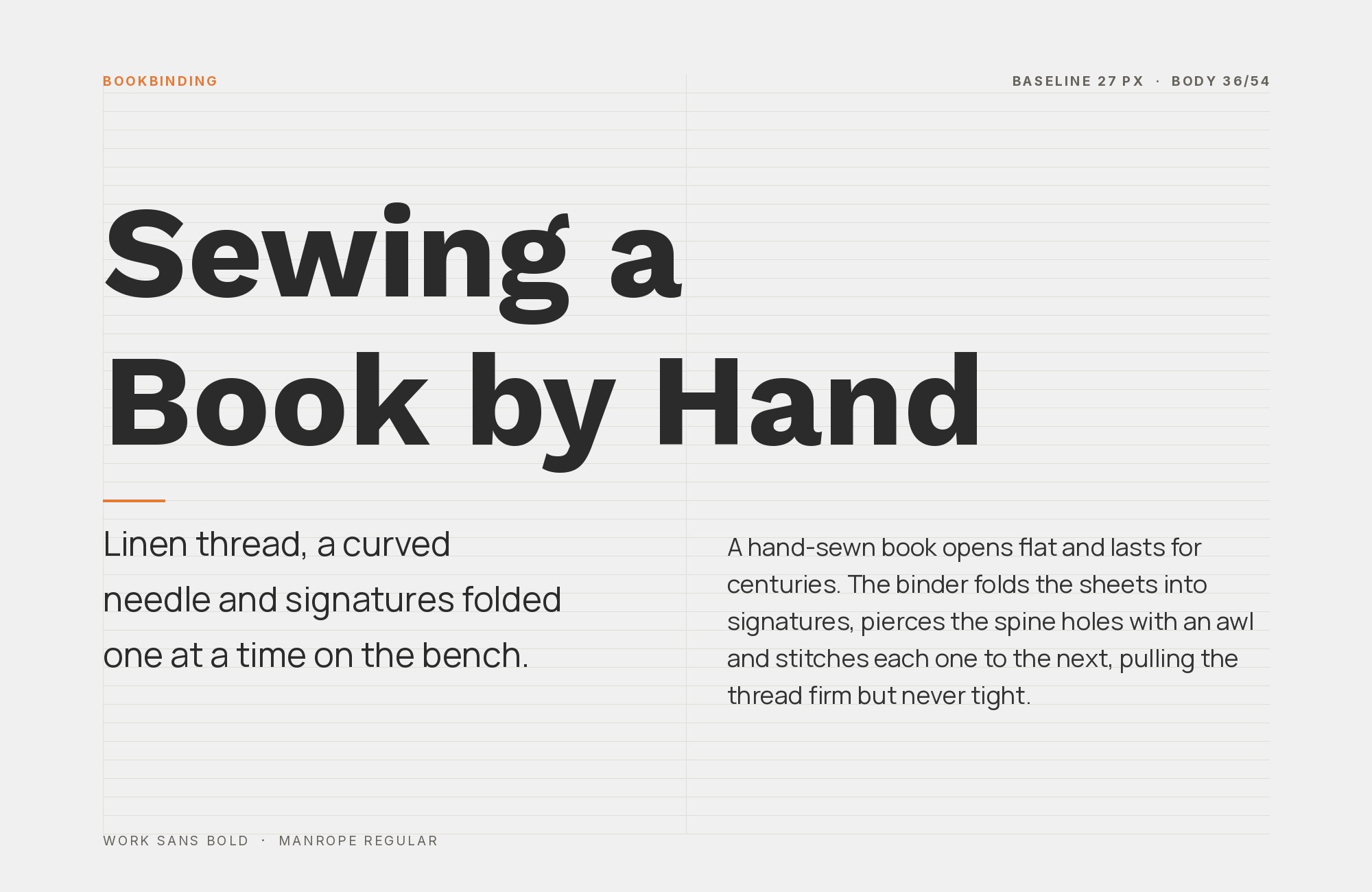
Manrope‘s geometric precision provides contemporary balance to Work Sans’s early grotesque inspiration. Its geometric forms create modern contrast in utilitarian layouts. This pairing excels in fintech, professional services, and applications where brands need to signal both innovation and reliability.
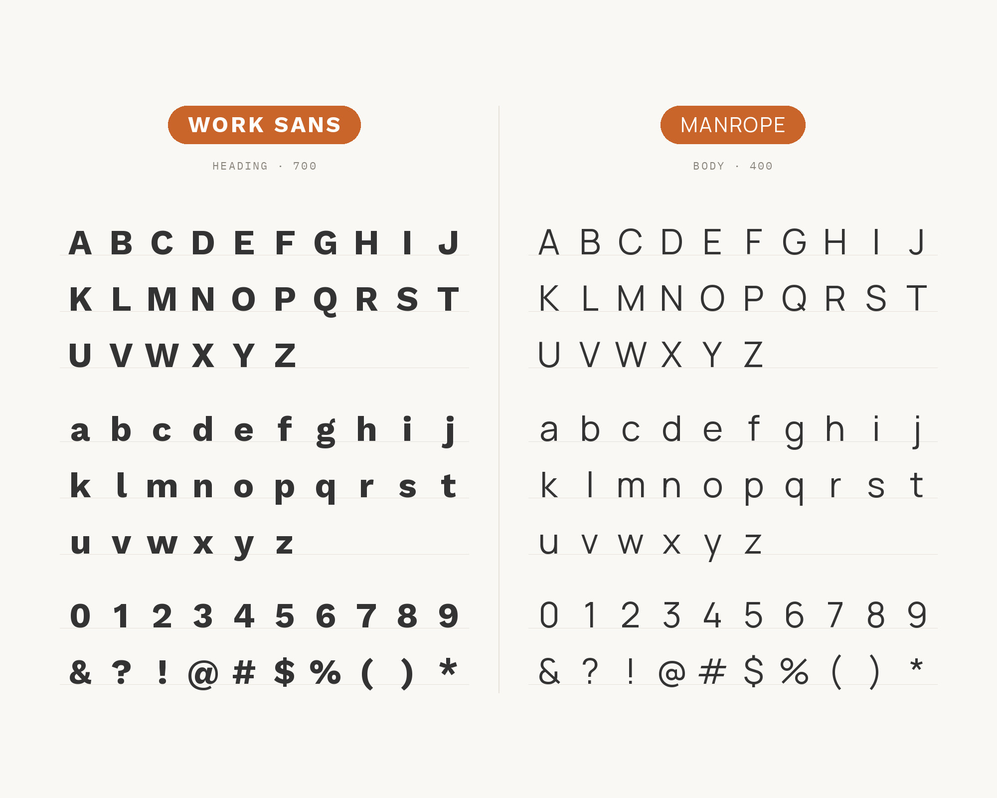
Character specimen: Work Sans (heading) and Manrope (body) letters, numbers and symbols side by side

14. Alegreya

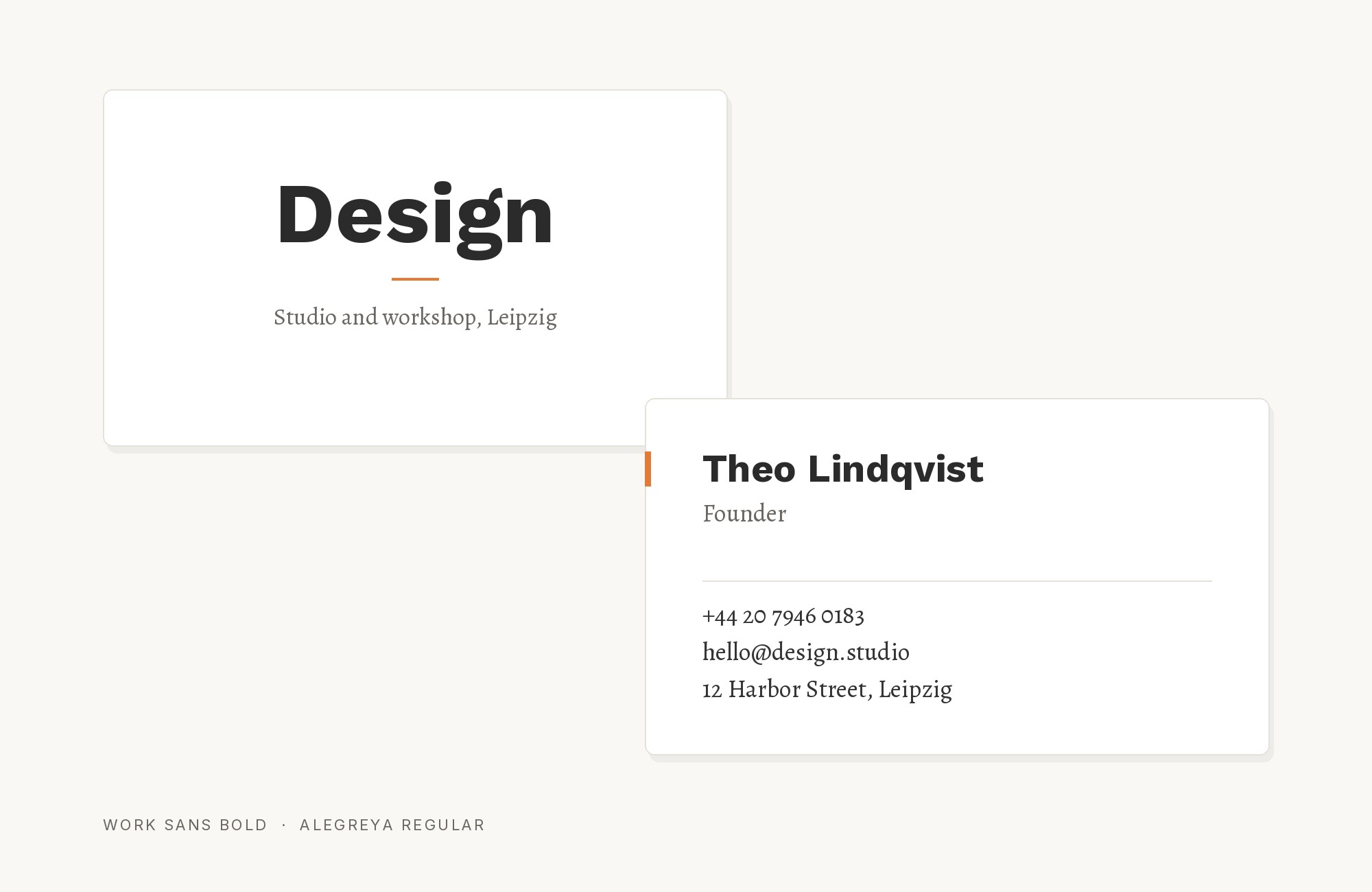
Work Sans and Alegreya font pairing: Work Sans headline with Alegreya body text

Alegreya brings dynamic rhythm that enriches Work Sans pairings. Juan Pablo del Peral’s calligraphic design features flowing forms that create lively contrast against Work Sans’s stable geometry. The result is typography that feels both literary and functional—ideal for storytelling platforms, cultural magazines, and editorial projects where text deserves personality.
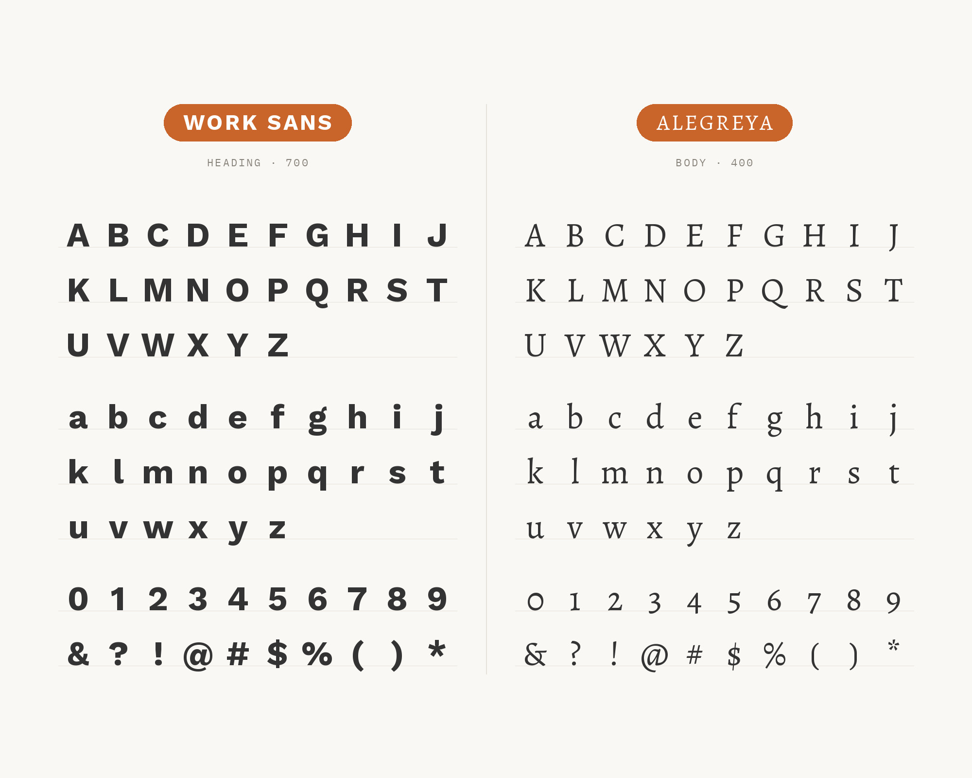
Character specimen: Work Sans (heading) and Alegreya (body) letters, numbers and symbols side by side

15. JetBrains Mono

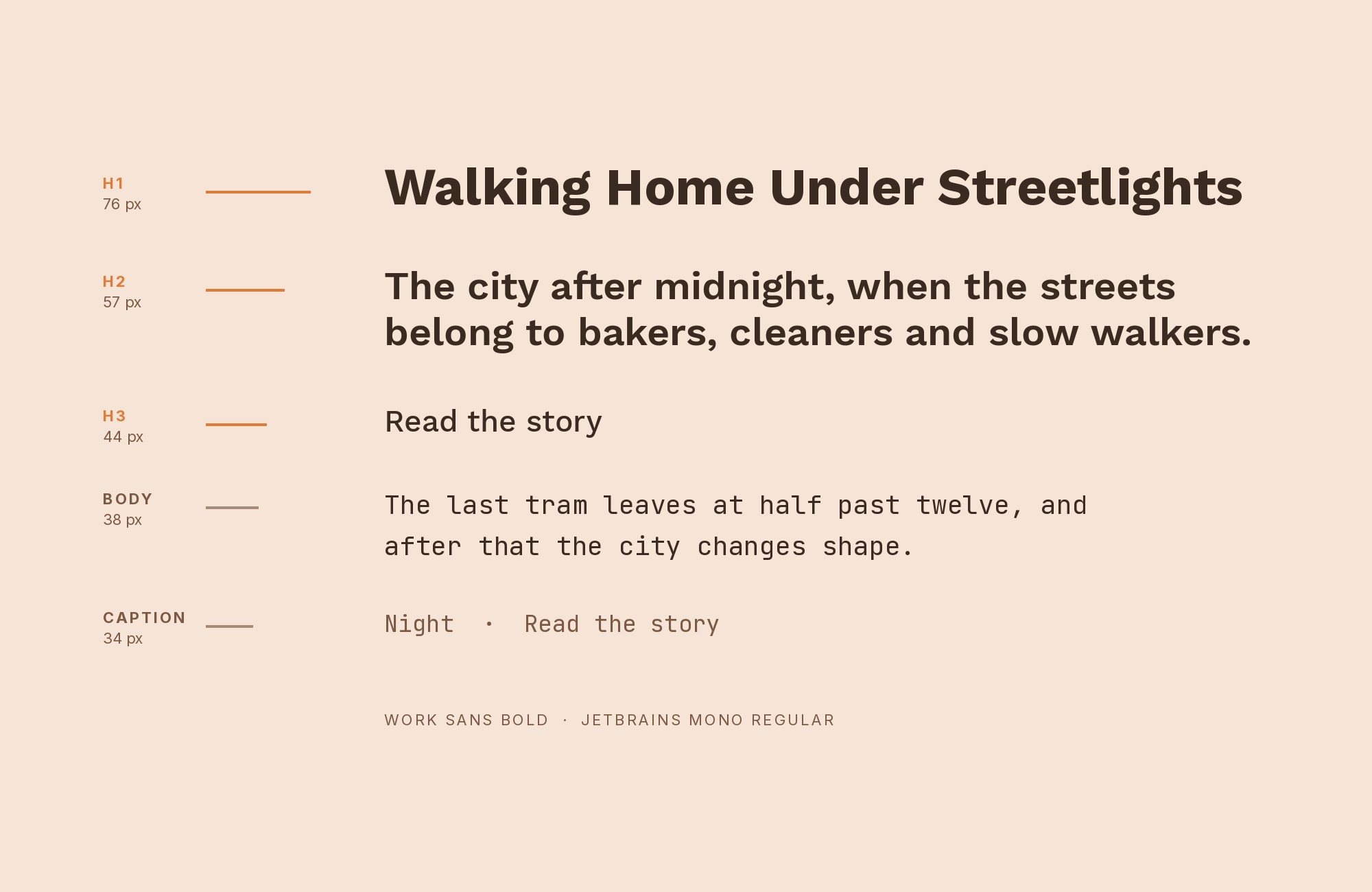
Work Sans and JetBrains Mono font pairing: Work Sans headline with JetBrains Mono body text

JetBrains Mono brings developer credibility that complements Work Sans’s practical foundations. Made for the needs of developers, this monospace font gives code a distinct voice beside Work Sans. Against Work Sans’s interface-ready character, JetBrains Mono provides technical authenticity. This pairing excels in developer documentation, coding tutorials, and tech platforms bridging code and content.
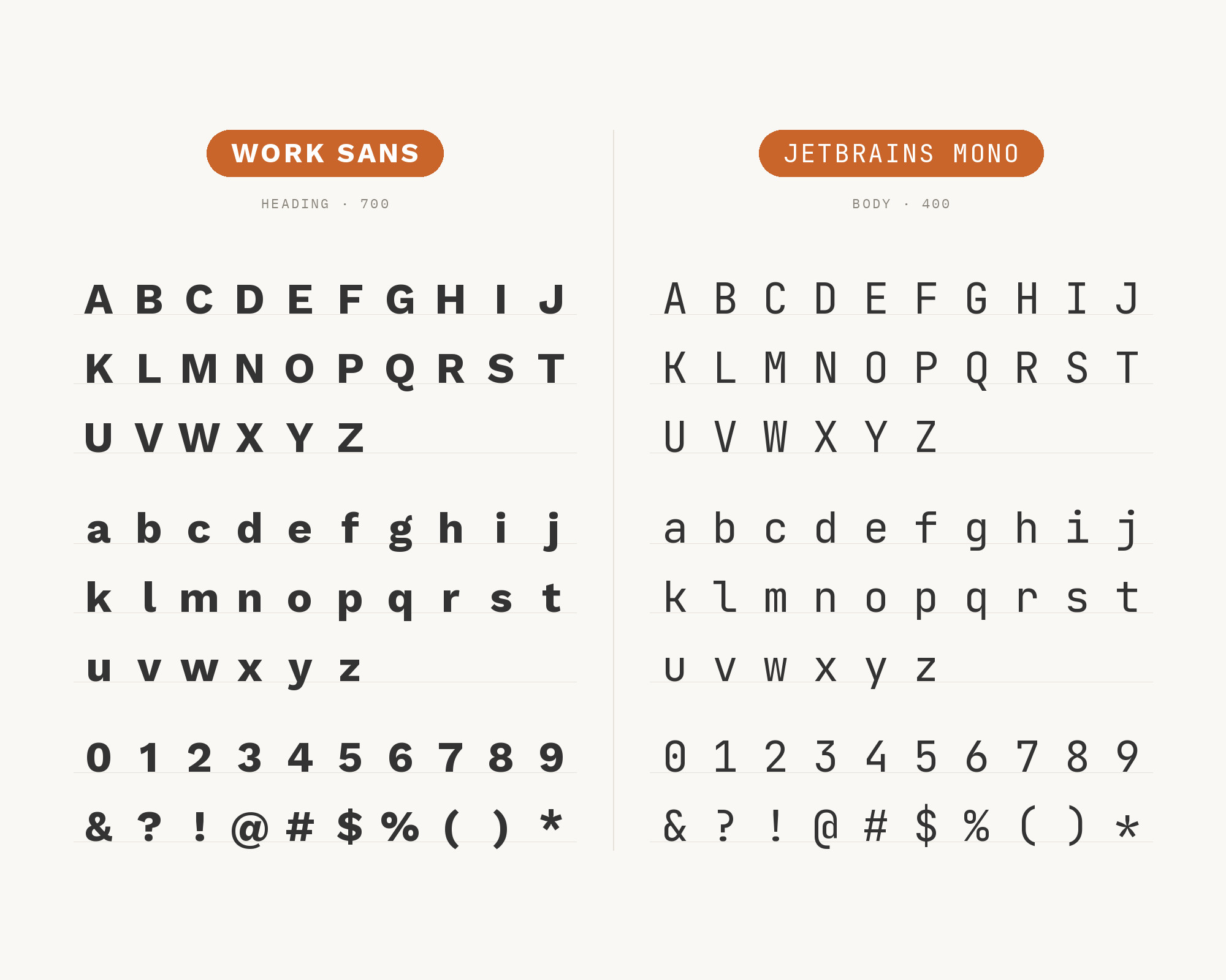
Character specimen: Work Sans (heading) and JetBrains Mono (body) letters, numbers and symbols side by side

Conclusion

There are no absolute rules for font pairing, just principles to guide you. The key is contrast—in weight, in style (serif vs. sans-serif), or in personality. Work Sans is practical enough that it welcomes companions bringing either traditional elegance or contemporary edge.

Trust your eye, experiment freely, and remember that the best pairing is the one that serves your content and audience. Typography should enhance communication, not complicate it.

Sources

  • FontPair.co
  • Typ.io
  • Typewolf
  • Fonts In Use
  • Garett Southerton
  • Charles Butt Foundation
  • Artisan Themes / Mai Knoblovits
  • TUX design system
  • Typewolf Google Fonts collection
  • Smashing Magazine author page

More Font Resources

  • Font Combinations: The Complete Guide to Font Pairings
  • The Big Book of Font Combinations
  • 29 Principles for Making Great Font Combinations

About the Author

Douglas Bonneville is a graphic designer and typographer since 1992. He is the author of The Big Book of Font Combinations and has contributed to numerous design publications. His work focuses on making typography accessible and practical for designers at all levels.

Related font pairings

  • What Fonts Go With Playfair Display?
  • What Fonts Go With Merriweather?
  • What Fonts Go With Archivo Narrow?
  • What Fonts Go With Cinzel?

More font pairing guides

  • Font Combinations: The Complete Guide to Font Pairings
  • What Fonts Go With Manrope?
  • What Fonts Go With Roboto?
  • What Fonts Go With Cormorant Garamond?
  • 17 Basic Kinds of Fonts

About Douglas Bonneville

Douglas has been a graphic designer since 1992, in addition to software developer and author. He is a member of Smashing Magazine's "Panel of Experts" and has contributed to over 100 articles. He is the author of "The Big Book of Font Combinations", loves cats, and plays guitar.

The BonFX Letter

One good pairing.
Every Tuesday.

2-minute read · free

This week — no. 14

Quiet authority

Merriweather sets the tone in one line. Lato stays out of the way and lets it.

MERRIWEATHER 700  +  LATO 400

A font specimen, a pairing that works, and one line on why it works. That is the whole email.

Free. One click to unsubscribe. No sharing, ever.

Free download

The Typography Primer.
Yours, right now.

Adobe's classic · PDF · free

The Typography Primer — book cover

The guide to type that everyone learned from. Subscribe and it is yours instantly. The BonFX Letter follows.

Free. One click to unsubscribe. No sharing, ever.

What Fonts Go With Work Sans - the book from BonFX, coming soon

Still Googling UX terms?

Stop. They're all right here.

UX for Cats book cover

50 terms. Illustrated.
So simple your cat gets it.

Get the Book →

Print & ePub on Amazon

350 font combinations you can steal.

The Big Book of Font Combinations

Every pairing shown in context — web, print, headings, body. Open it, find one that works, use it.

That's it. That's the book.

In print or ePub 40% OFF on Gumroad

Scrolling Google Fonts for "the right one"?

You've been at it for 20 minutes. You'll be at it for 20 more. There are 1,500 fonts in there.

Pocket Handbook of Google Fonts Combinations

We paired every useful Google Font.
7,500 pages. Done.

Get the PDF →

Instant download on Gumroad

Recent Inspirations

  • What Fonts Go With Utopia? September 30, 2026
  • What Fonts Go With Titillium Web? September 30, 2026
  • What Fonts Go With Sora? September 30, 2026
  • What Fonts Go With Questrial? September 30, 2026
  • What Fonts Go With Public Sans? September 30, 2026
  • What Fonts Go With Plus Jakarta Sans? September 30, 2026
  • What Fonts Go With Oxygen? September 30, 2026
  • What Fonts Go With Orbitron? September 30, 2026
  • What Fonts Go With Maven Pro? September 30, 2026
  • What Fonts Go With Lobster? September 30, 2026
  • What Fonts Go With Lexend? September 30, 2026
  • What Fonts Go With Domine? September 30, 2026
  • What Fonts Go With DM Serif Display? September 30, 2026
  • What Fonts Go With Comfortaa? September 30, 2026
  • What Fonts Go With Caveat? September 30, 2026

About BonFX

Douglas Bonneville has been a graphic designer since 1992 and has written about type here since 2009. BonFX is a blog about typography and design, and the books that came out of it.

  • The Big Book of Font Combinations
  • The Preposterously Huge Book of Google Font Combinations
  • UX for Cats

More about BonFX →

Start Here

  • Font Combinations: The Complete Guide
  • The 100 Best Fonts
  • 17 Types of Fonts
  • 29 Principles for Great Font Combinations
  • 23 Really Bad Font Choices
  • 20 Free Google Wedding Font Combinations

Contact

Questions about the books or the site? Contact us.

Follow @dbonneville on X.

The BonFX Letter: one good pairing every Tuesday, free. The signup is in the sidebar of every page.

Copyright © 2026 · BonFX

  • Blog
  • Font Combinations
  • Books
    • The Preposterously Huge Book of Google Font Combinations
    • The Big Book of Font Combinations (Classic Fonts Edition)
  • Contact