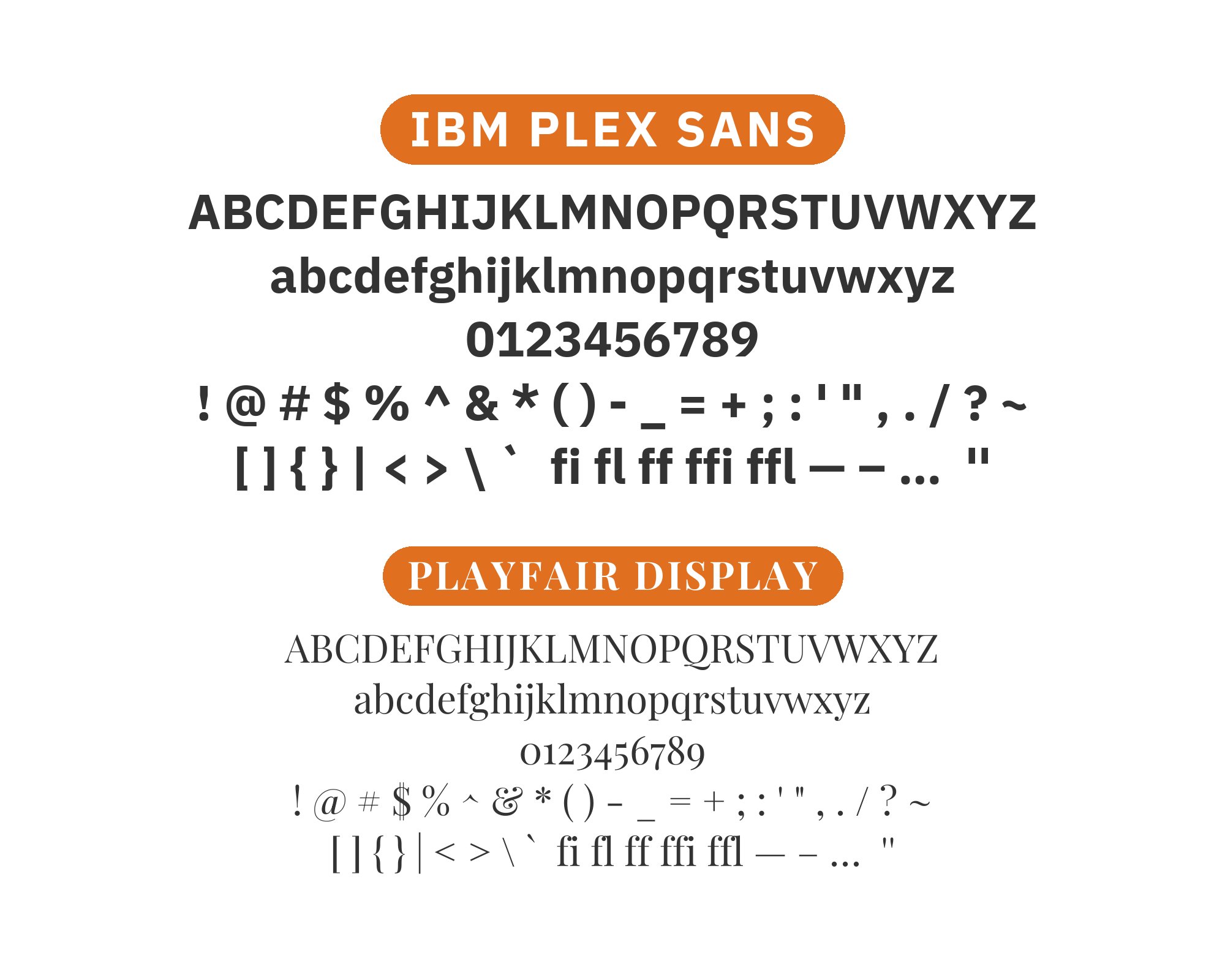
What fonts go with IBM Plex Sans? Finding the right companions for IBM’s custom typeface means understanding what makes it simultaneously corporate and humane, technical and approachable.
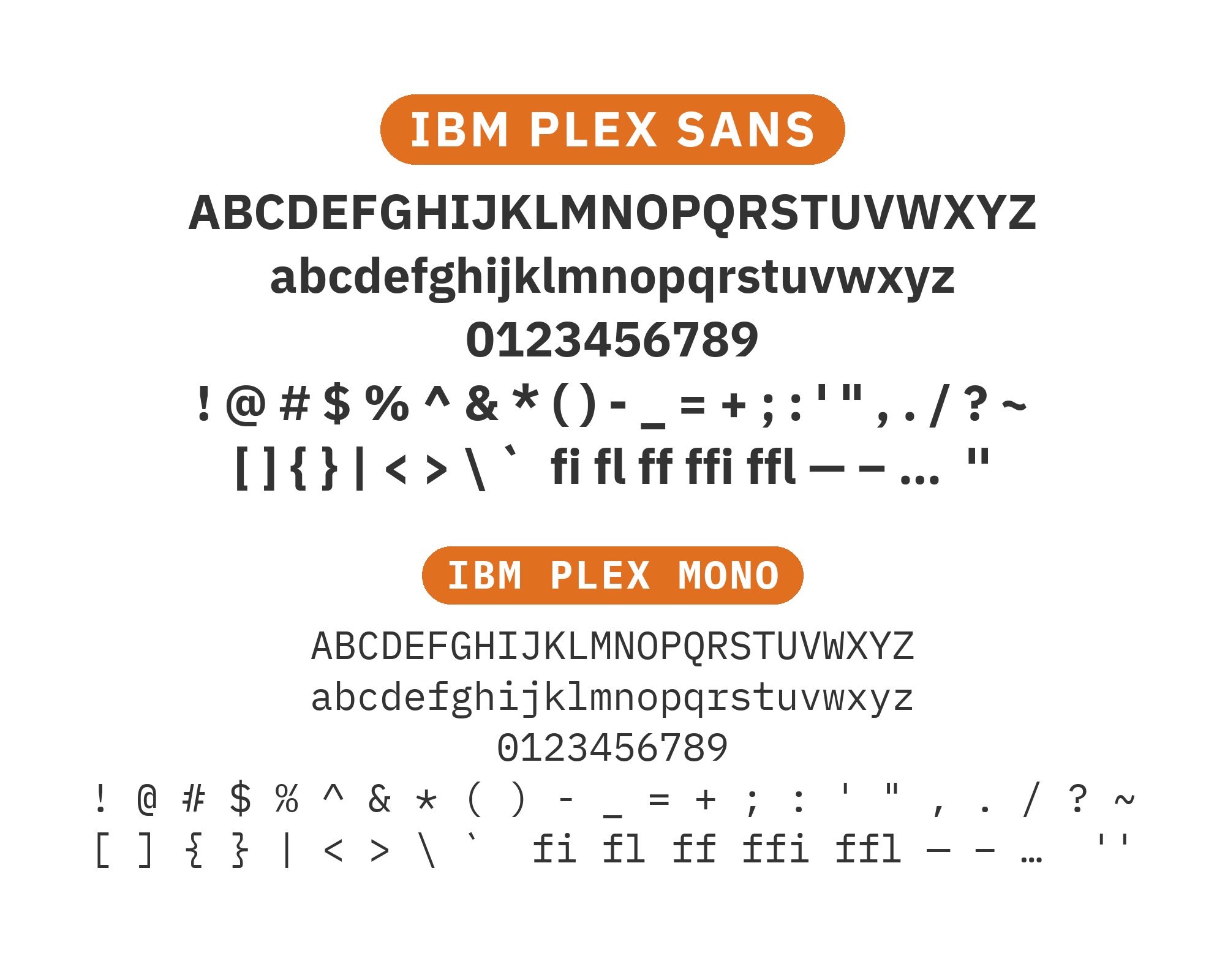
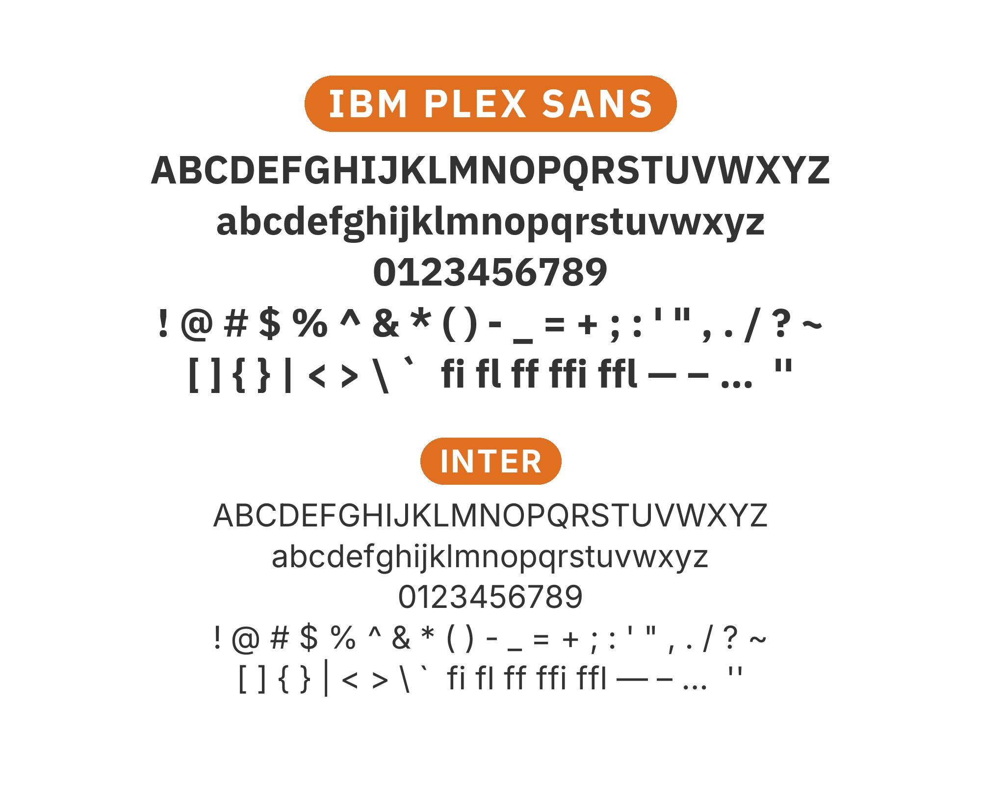
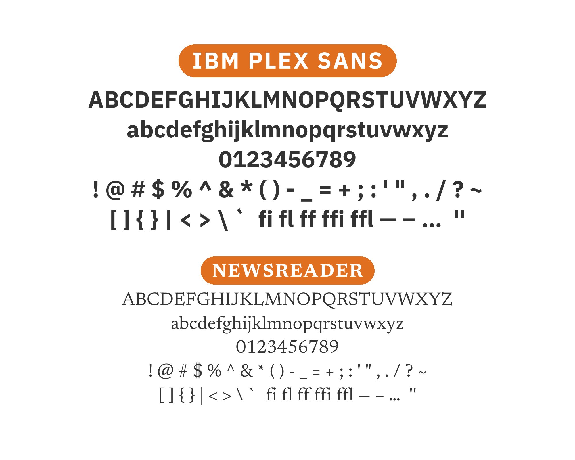
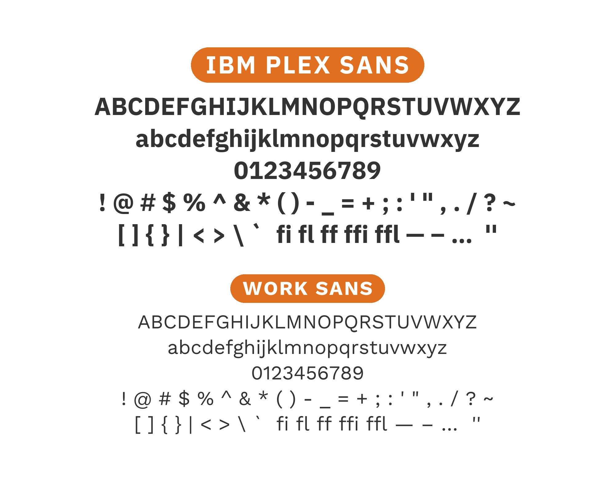
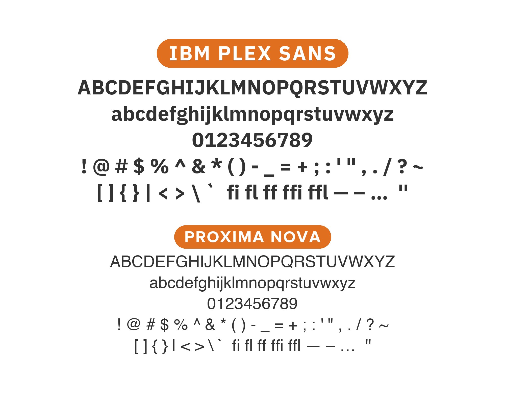
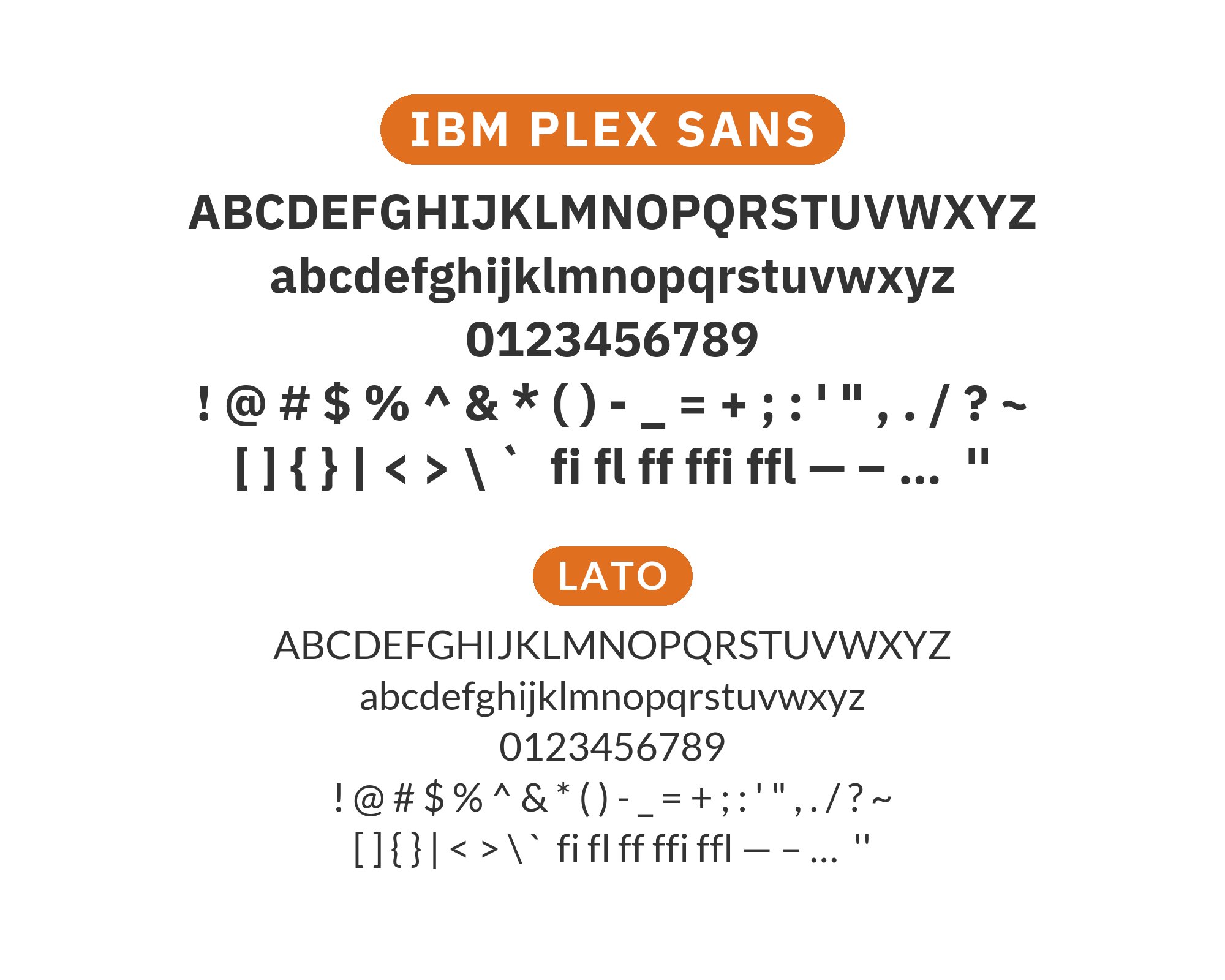
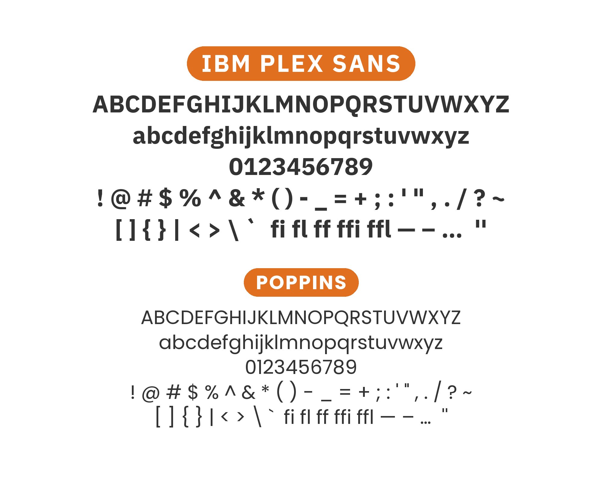
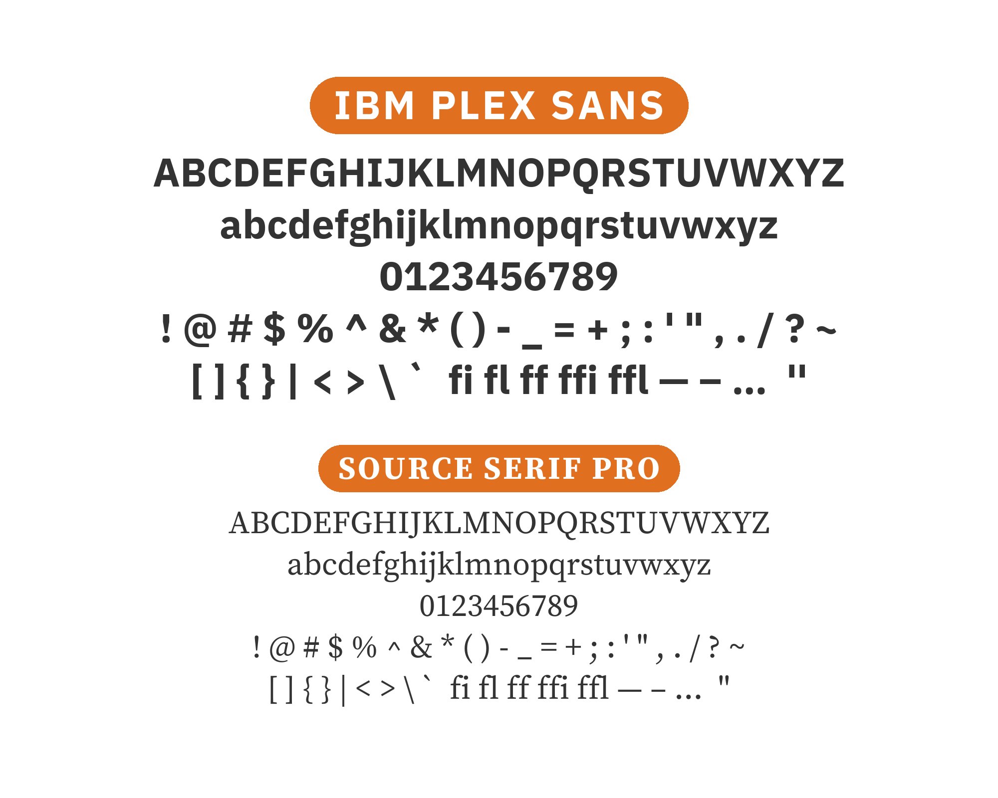
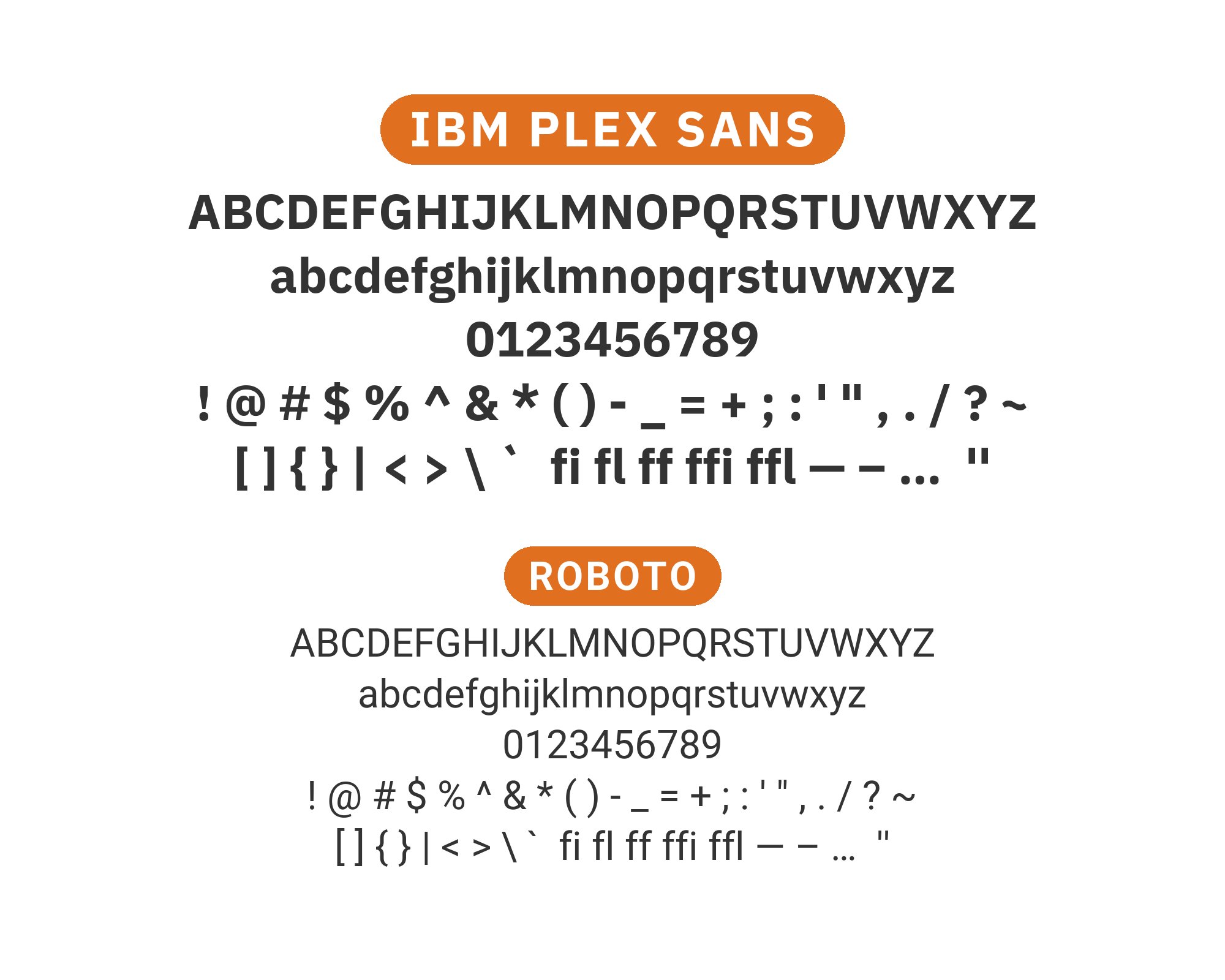
IBM Plex Sans represents one of the most ambitious corporate typography projects of the modern era. Released in 2017, it replaced Helvetica Neue as IBM’s global typeface, bringing with it a distinctive character that balances the company’s heritage in computing with contemporary design sensibilities. The typeface features a slightly mechanical skeleton with humanist touches, evident in its distinctive lowercase ‘a’ and ‘g’ and the subtle curves in its terminals. Its large x-height and open counters ensure excellent screen rendering, while its extensive weight range from Thin to Bold provides tremendous flexibility.
The challenge with IBM Plex Sans lies in its specificity; it was designed to feel both neutral and distinctive, which means pairings need to either embrace its technical underpinnings or provide warmth as counterbalance. Serif companions should feel sophisticated without being stuffy, while alternative sans-serifs need enough personality to justify their presence alongside such a well-considered design. Here are 15 fonts that pair well with IBM Plex Sans, selected for their ability to complement its unique dual nature.
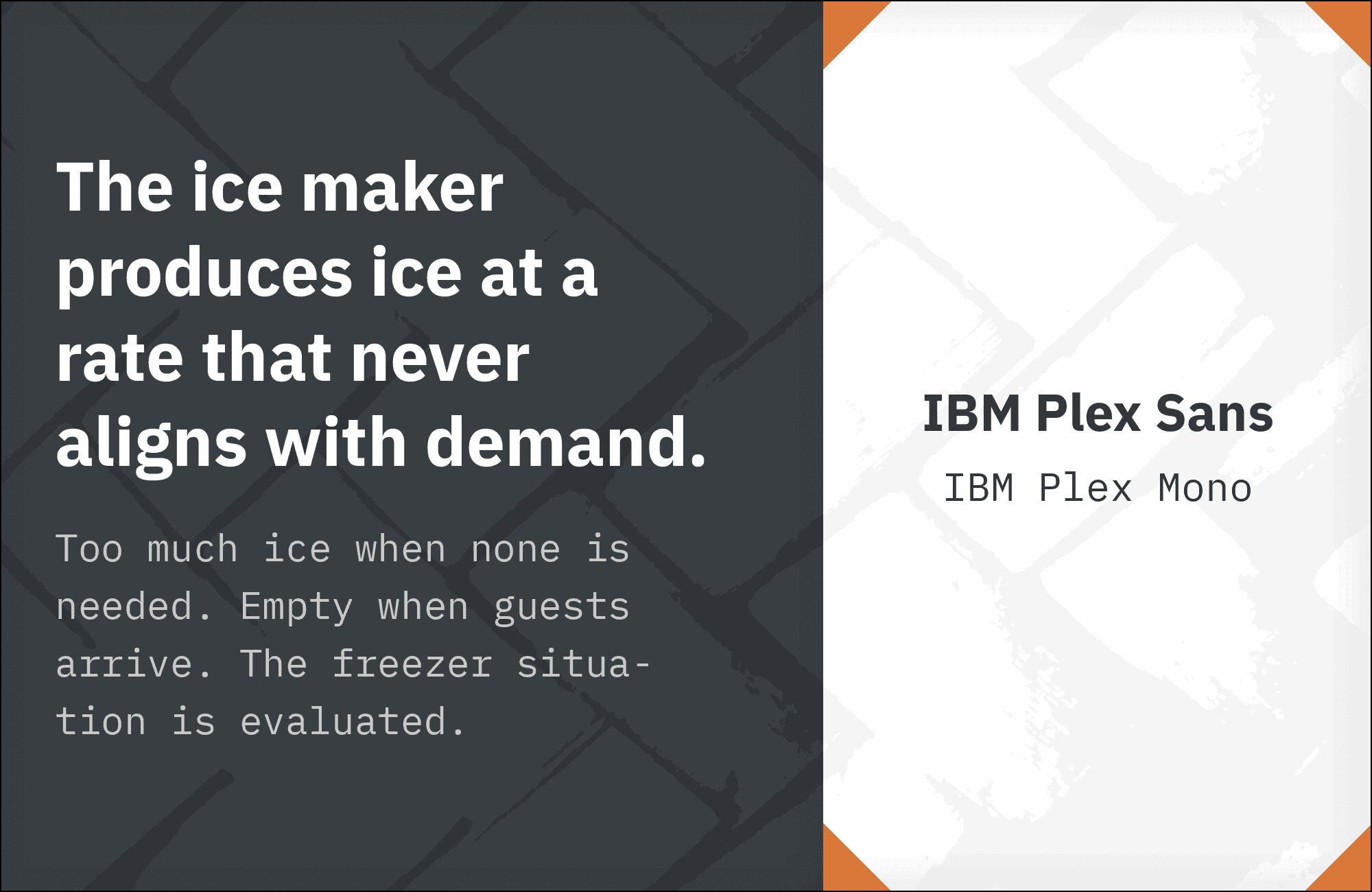
1. IBM Plex Mono
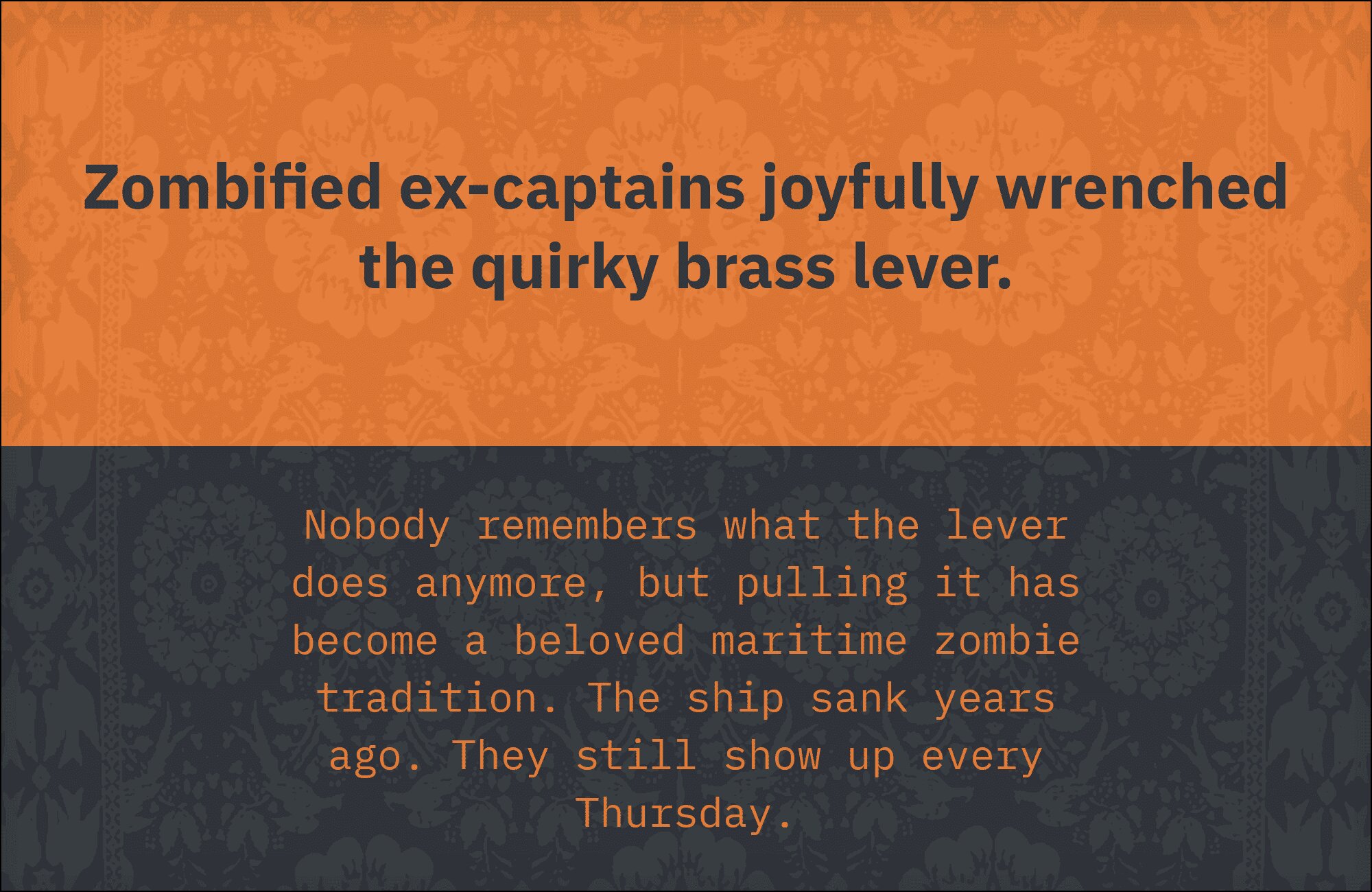
The Plex family reunion that makes sense. IBM Plex Sans and Plex Mono share identical design DNA, creating seamless transitions between prose and code. The monospace variant brings technical credibility to code snippets, data tables, and terminal output while the sans handles everything else with corporate clarity. This pairing is essential for developer documentation, technical writing, and any interface toggling between human language and machine language. The systematic nature of both fonts creates visual order in complex information architectures.
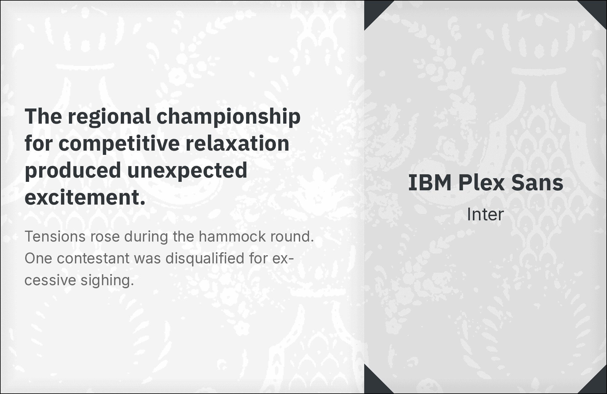
2. Inter
Two sans-serifs designed for screens meet in a pairing that prioritizes performance over personality. Inter‘s distinctive letter shapes create just enough contrast to establish hierarchy against IBM Plex Sans’s more neutral forms. Both fonts share similar x-heights and screen-optimization philosophies, making transitions smooth. This combination suits enterprise interfaces, SaaS applications, and any digital product where readability trumps expressiveness. The extensive weight ranges in both fonts enable complex typographic systems.
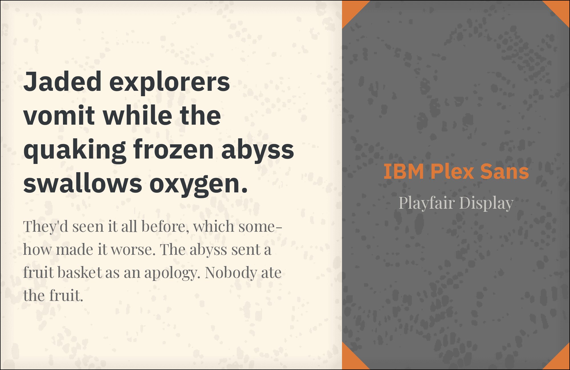
3. Playfair Display
Playfair Display‘s baroque extravagance meets IBM Plex Sans’s corporate rationalism in a contrast that shouldn’t work but absolutely does. The high-contrast Didone serif creates headlines that demand attention while the sans delivers body copy with businesslike efficiency. This pairing suits financial publications, luxury B2B brands, and any context where prestige and professionalism need to coexist. Use Playfair exclusively for display sizes; its hairlines require space to breathe.
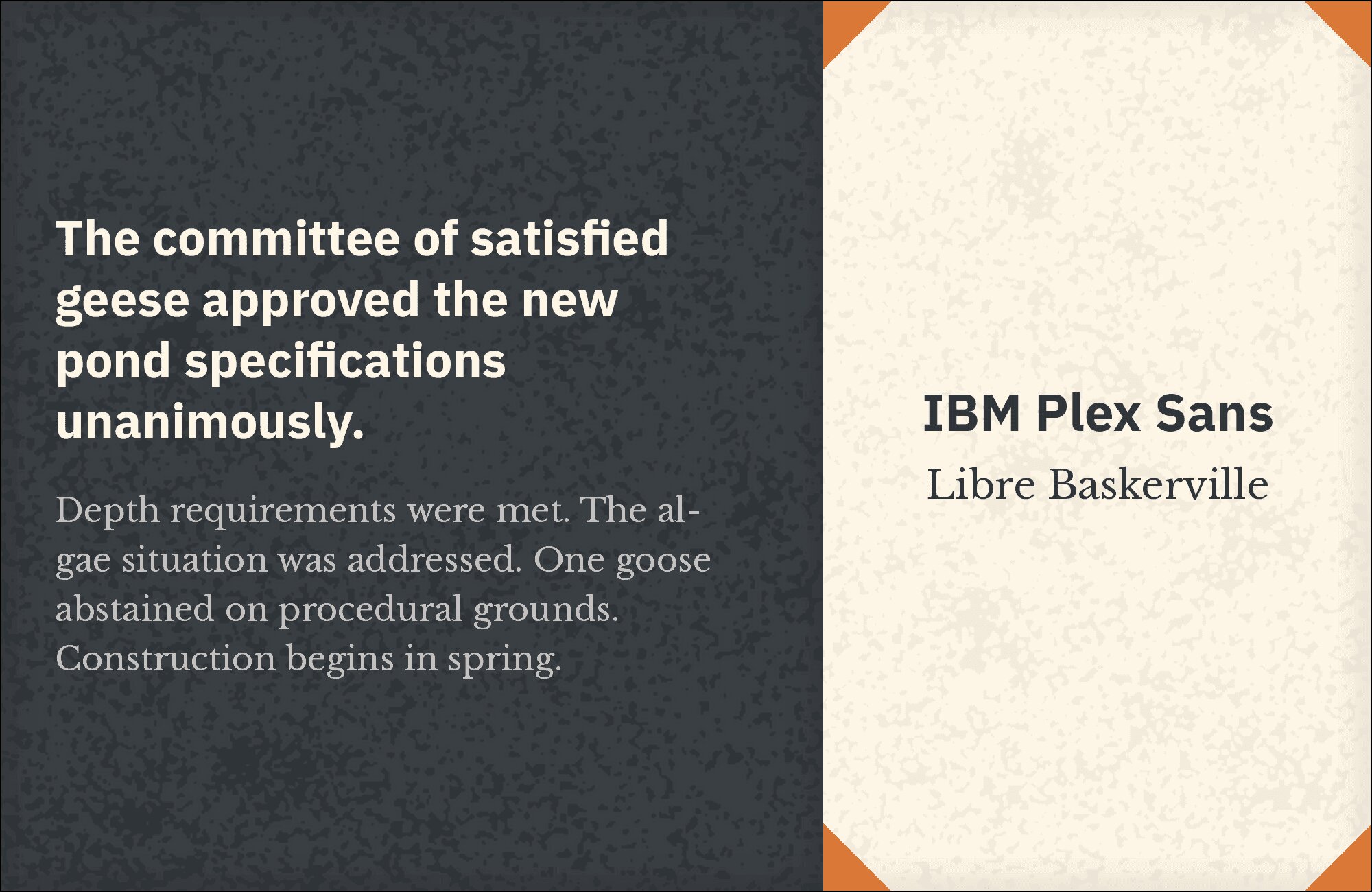
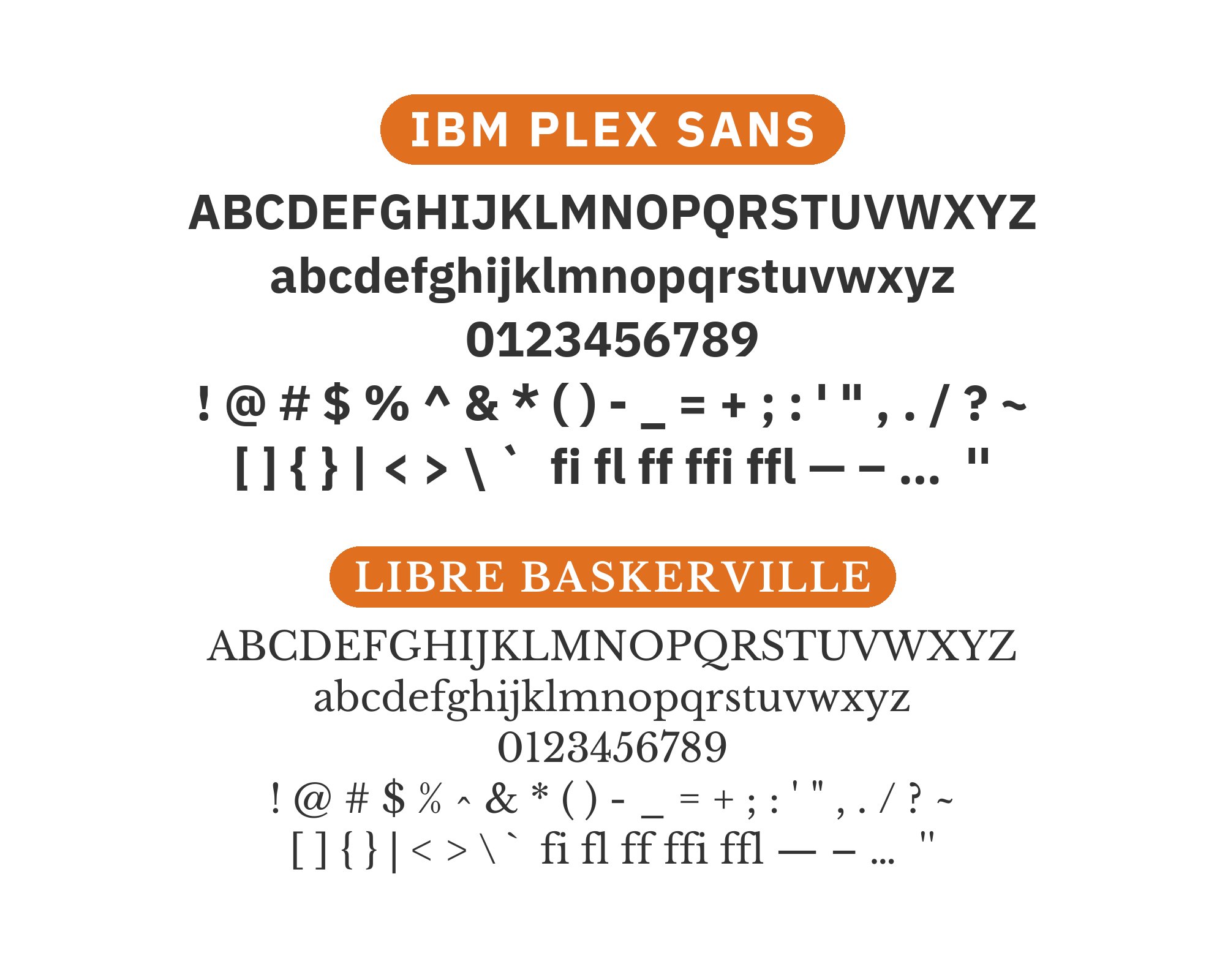
4. Libre Baskerville
Libre Baskerville‘s 18th-century refinement meets IBM Plex Sans’s contemporary pragmatism in a pairing that bridges centuries of typographic evolution. The transitional serif brings scholarly authority to headlines while the sans handles body copy with modern clarity. This combination excels in professional publications, legal documents, and any context requiring traditional credibility delivered through contemporary design. Both fonts feature strong screen performance, making them reliable for digital-first projects.
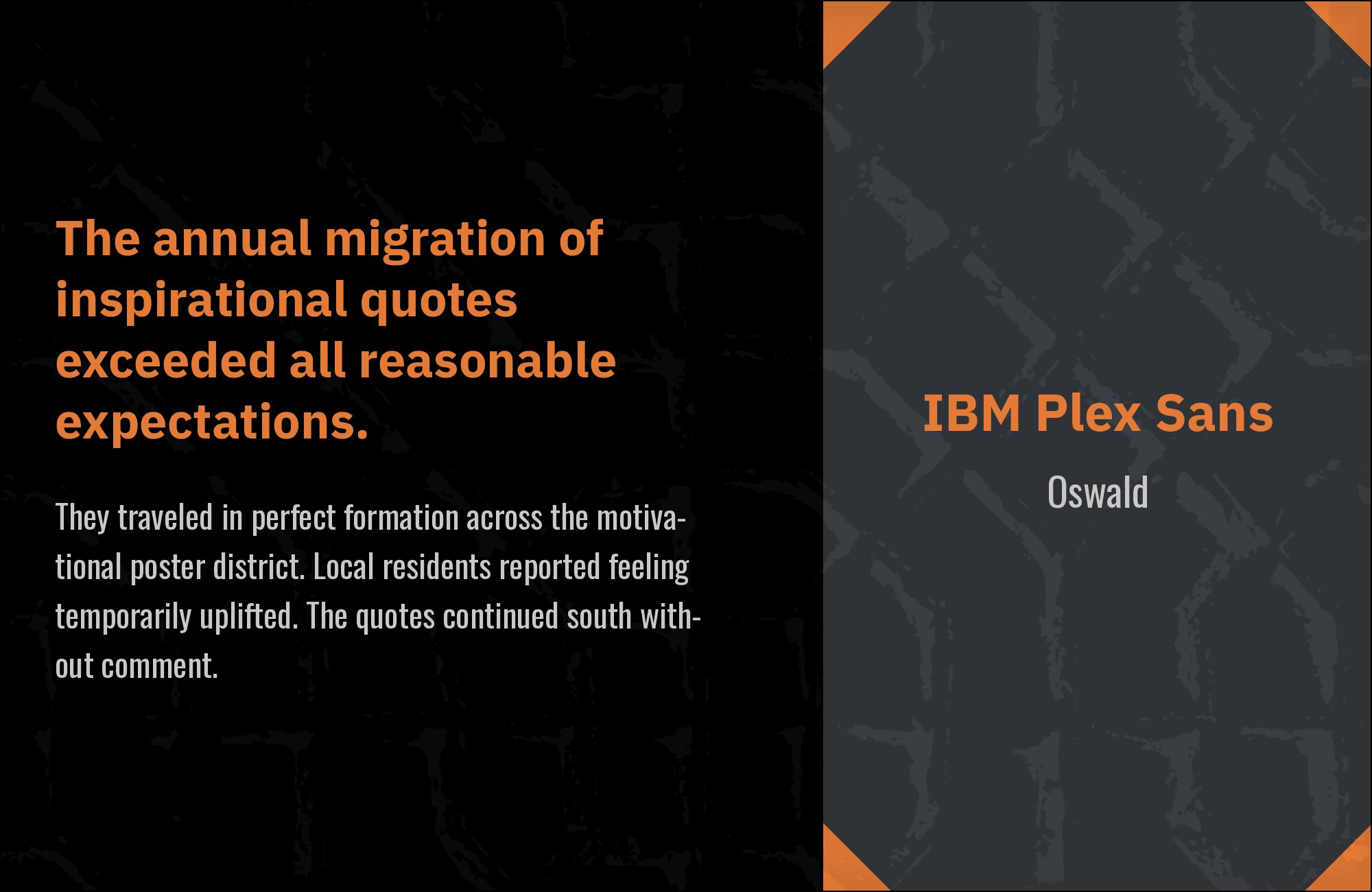
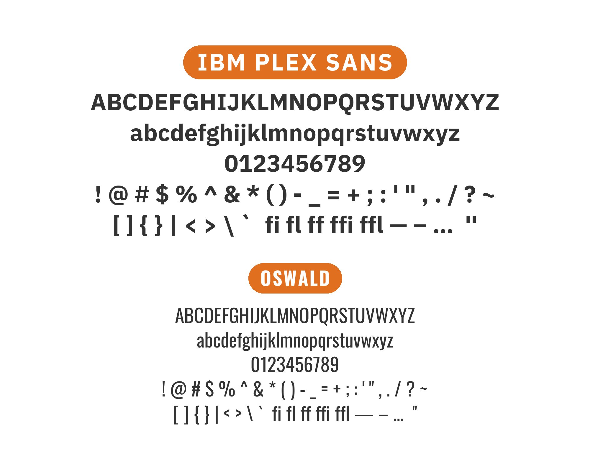
5. Oswald
Oswald‘s narrow, muscular headlines cut through layouts with newsstand urgency while IBM Plex Sans provides the measured reading experience below. The condensed sans brings American editorial traditions into modern interfaces, creating bold hierarchy without sacrificing professionalism. This pairing works for news sites, media companies, and any context where headlines need to compete for attention in crowded environments. The weight contrast is dramatic but purposeful.
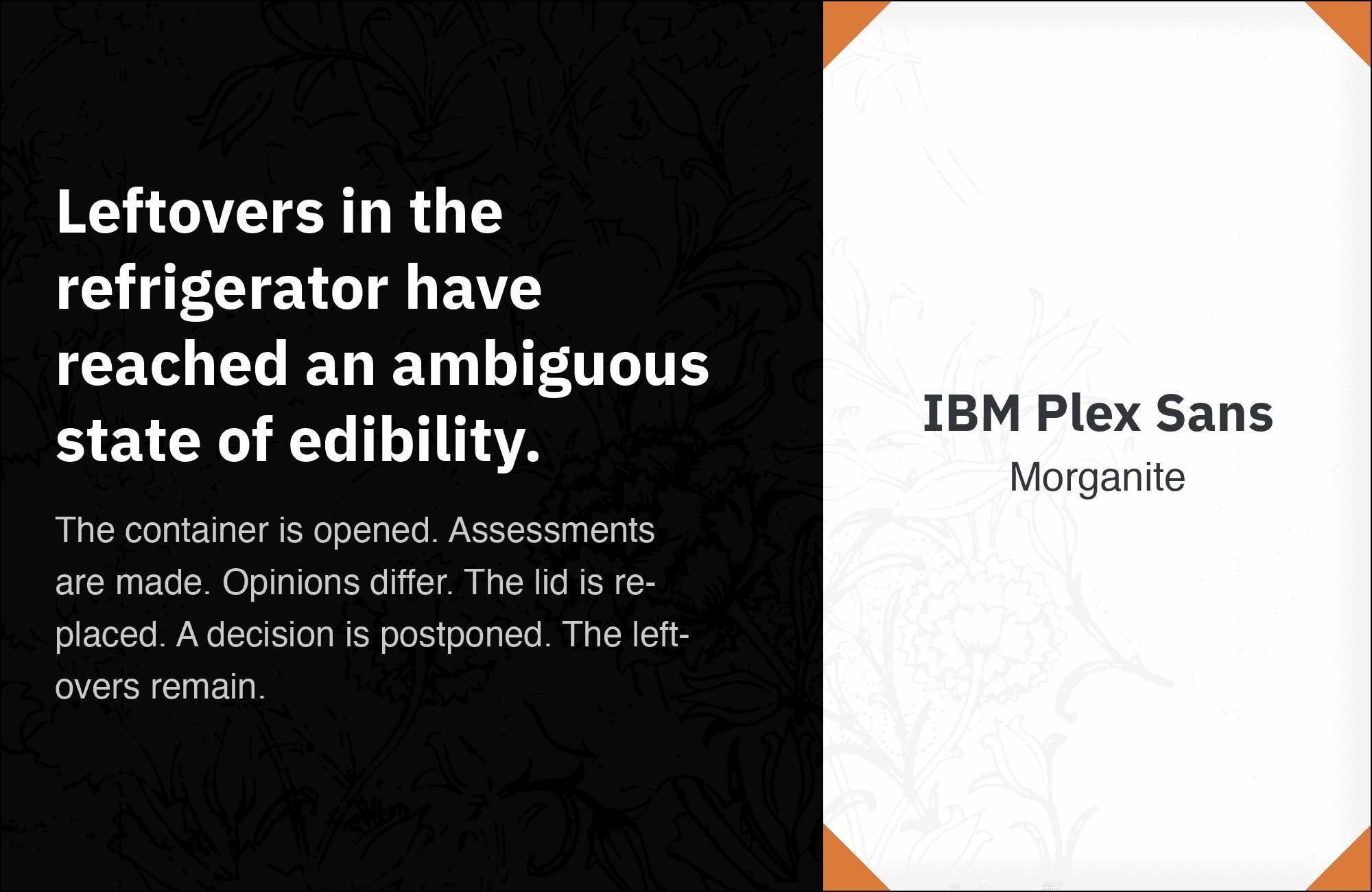
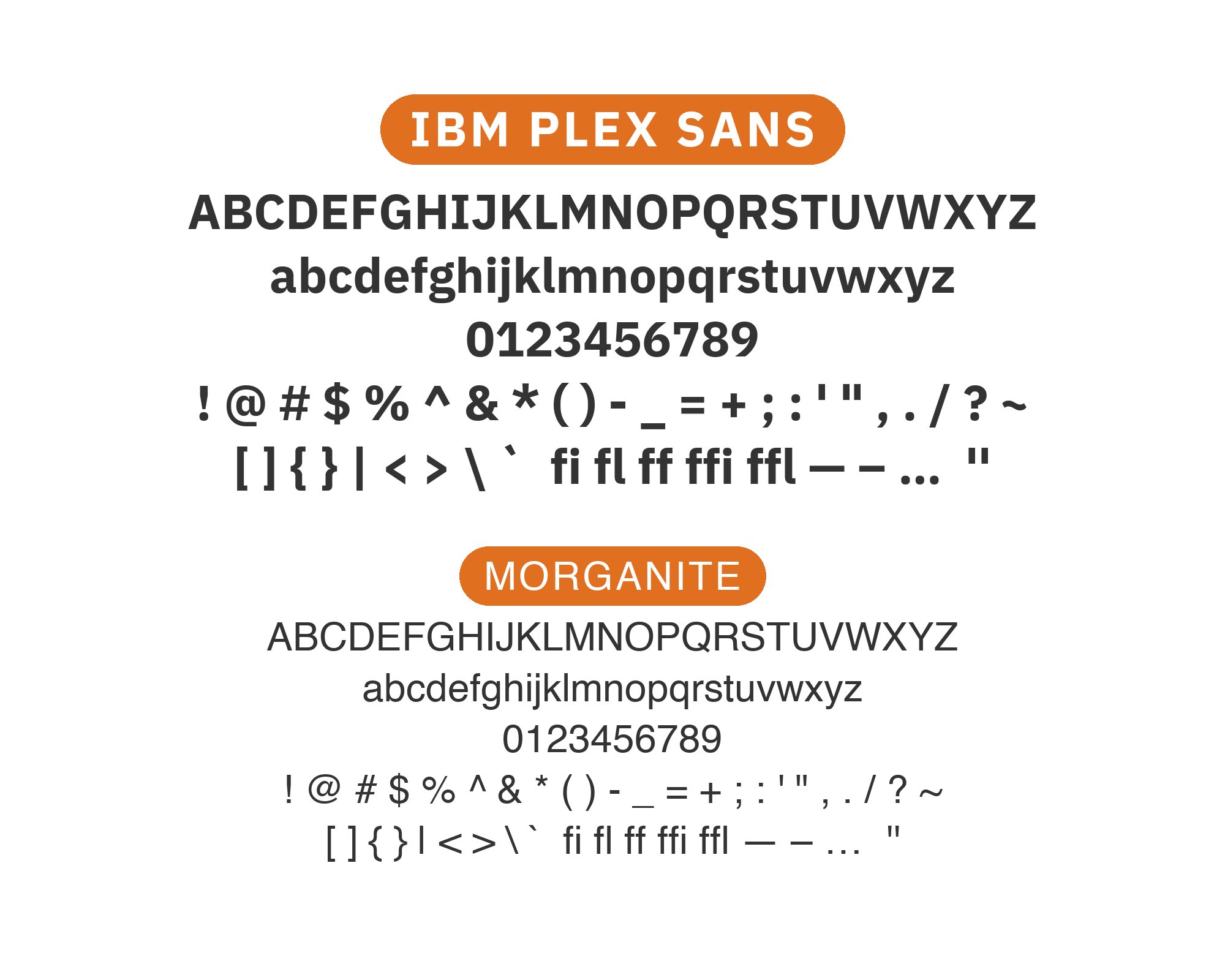
6. Morganite
Morganite‘s extended display forms create sculptural headlines that IBM Plex Sans grounds with corporate practicality below. The display font brings fashion-editorial aesthetics to layouts while the sans handles the communication with systematic clarity. This pairing suits creative agencies, fashion tech, and any brand bridging artistic expression with business functionality. Use Morganite strictly for display; its extended proportions require substantial size to read comfortably.

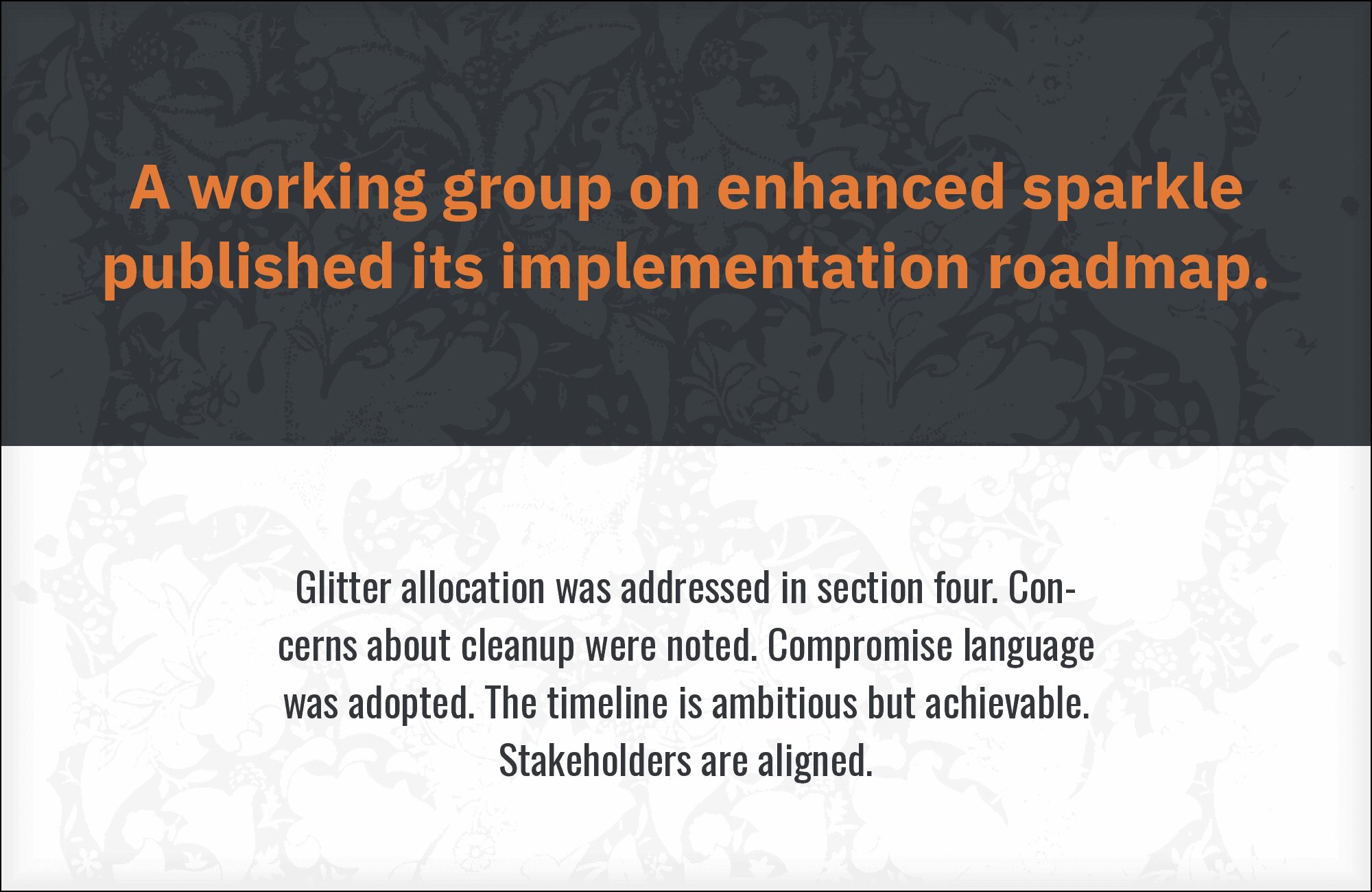
You'll love this article!
A visual guide for designers.
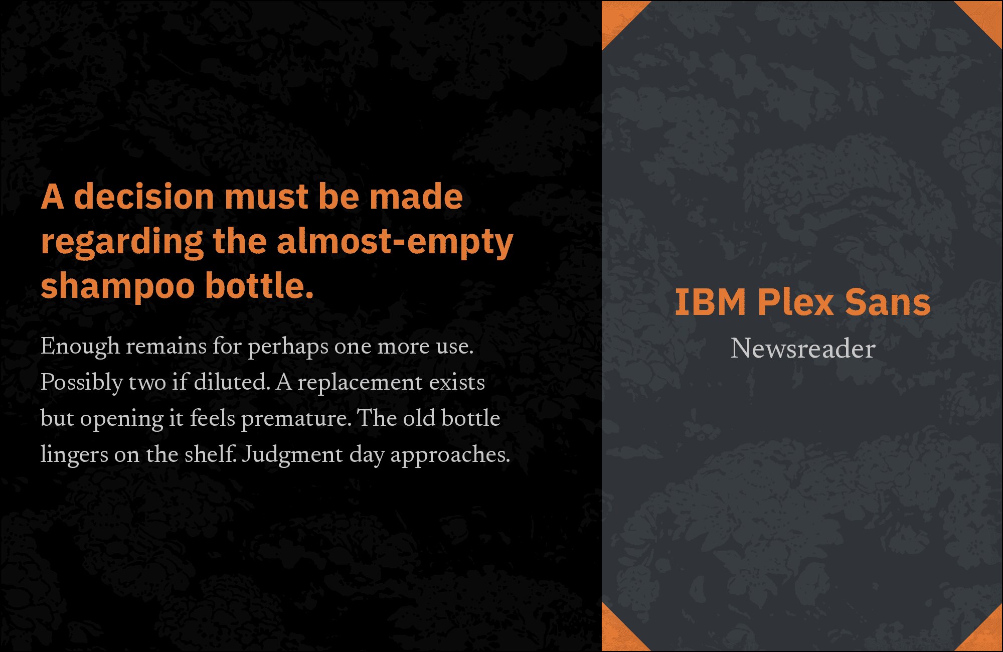
7. Newsreader
Newsreader‘s editorial heritage meets IBM Plex Sans’s corporate efficiency in a pairing designed for serious journalism. The serif brings newspaper-inspired authority to headlines and pull quotes while the sans handles body copy with contemporary clarity. Both fonts were designed for extended reading on screens, making them natural partners for digital publications. The contrast between Newsreader’s traditional letterforms and Plex Sans’s systematic approach creates visual interest without conflict.
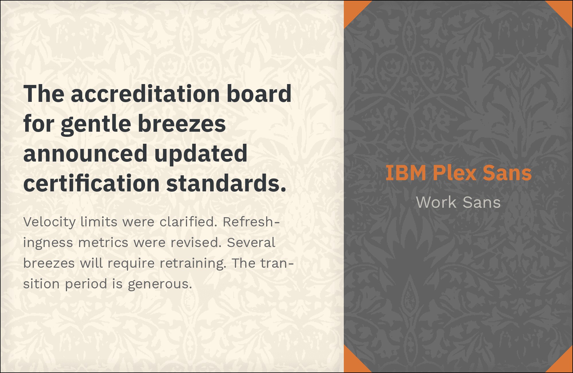
8. Work Sans
Two fonts designed specifically for screens meet in a pairing that prioritizes digital performance. Work Sans brings slightly more personality to headlines while IBM Plex Sans provides the systematic body copy foundation. Both share generous x-heights and open counters optimized for pixel rendering. This combination suits web applications, dashboards, and any interface where users spend extended time reading on screens. The slight stylistic differences create hierarchy without jarring transitions.
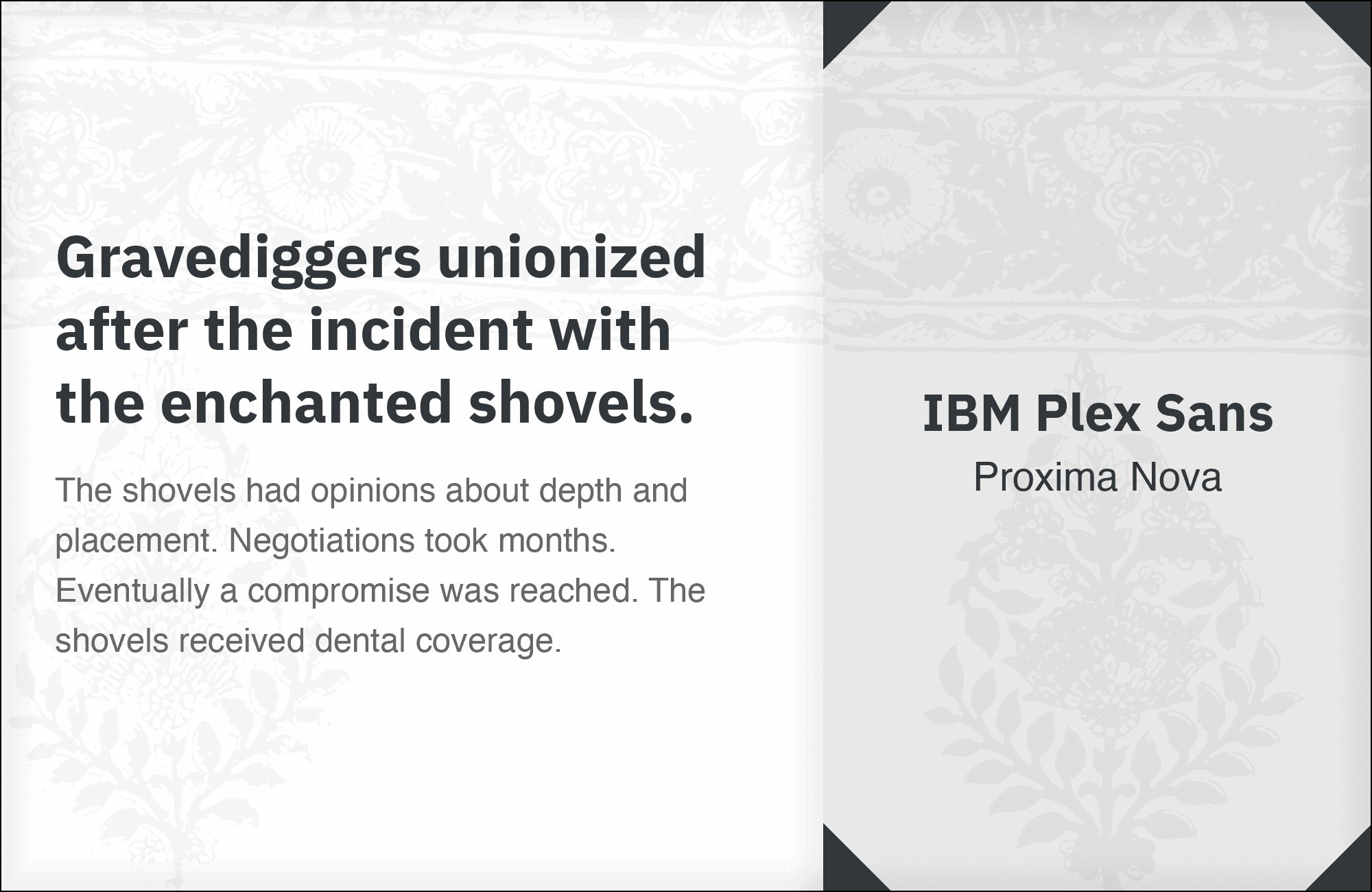
9. Proxima Nova
Proxima Nova‘s geometric warmth meets IBM Plex Sans’s structured precision in a pairing that balances approachability with professionalism. The classic web font handles headlines with familiar confidence while Plex Sans delivers body copy with systematic clarity. This combination suits startups wanting established aesthetics, enterprise products seeking approachability, and any brand navigating between innovation and tradition. The similar x-heights maintain reading flow across font changes.
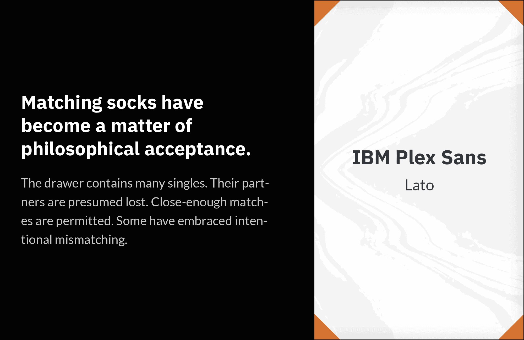
10. Lato
Lato‘s rounded terminals and humanist warmth soften IBM Plex Sans’s more systematic nature in headlines and display text. The contrast isn’t dramatic but meaningful: Lato brings subtle friendliness while Plex Sans maintains corporate credibility in body copy. This pairing works for professional services, B2B platforms, and any context where warmth and professionalism need to coexist. Both fonts feature excellent screen performance and extensive weight ranges for complex typographic hierarchies.
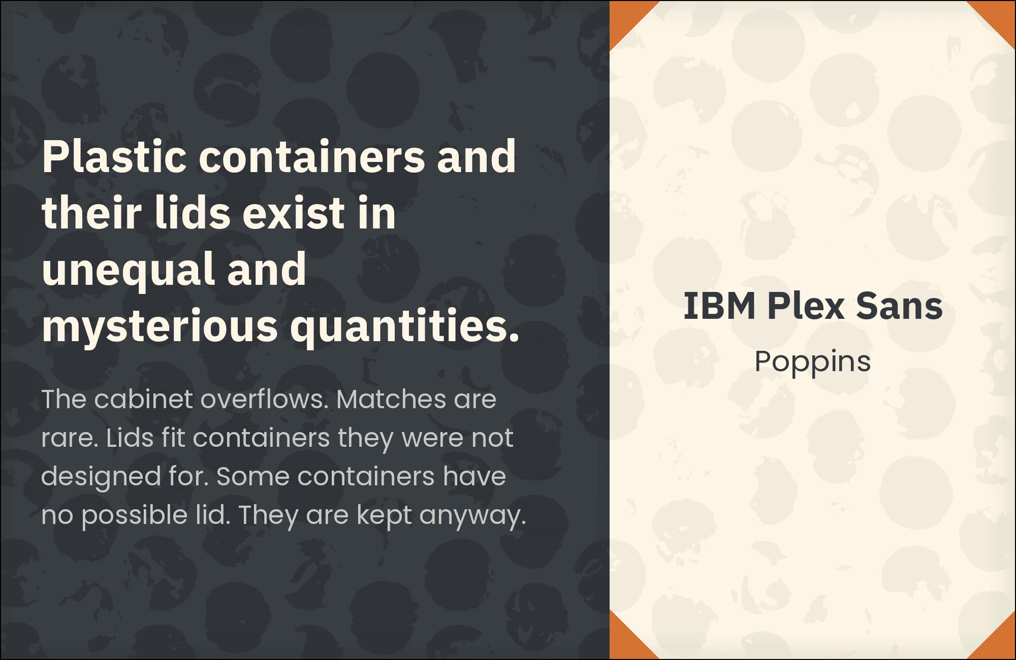
11. Poppins
Poppins‘s perfectly circular bowls create geometric headlines that contrast productively with IBM Plex Sans’s more traditional grotesque forms in body copy. The pure geometry of Poppins establishes modern positioning while Plex Sans grounds extended reading in corporate reliability. This pairing suits tech companies, innovation studios, and any brand signaling contemporary thinking with practical communication. The similar x-heights maintain cohesion despite the stylistic contrast.
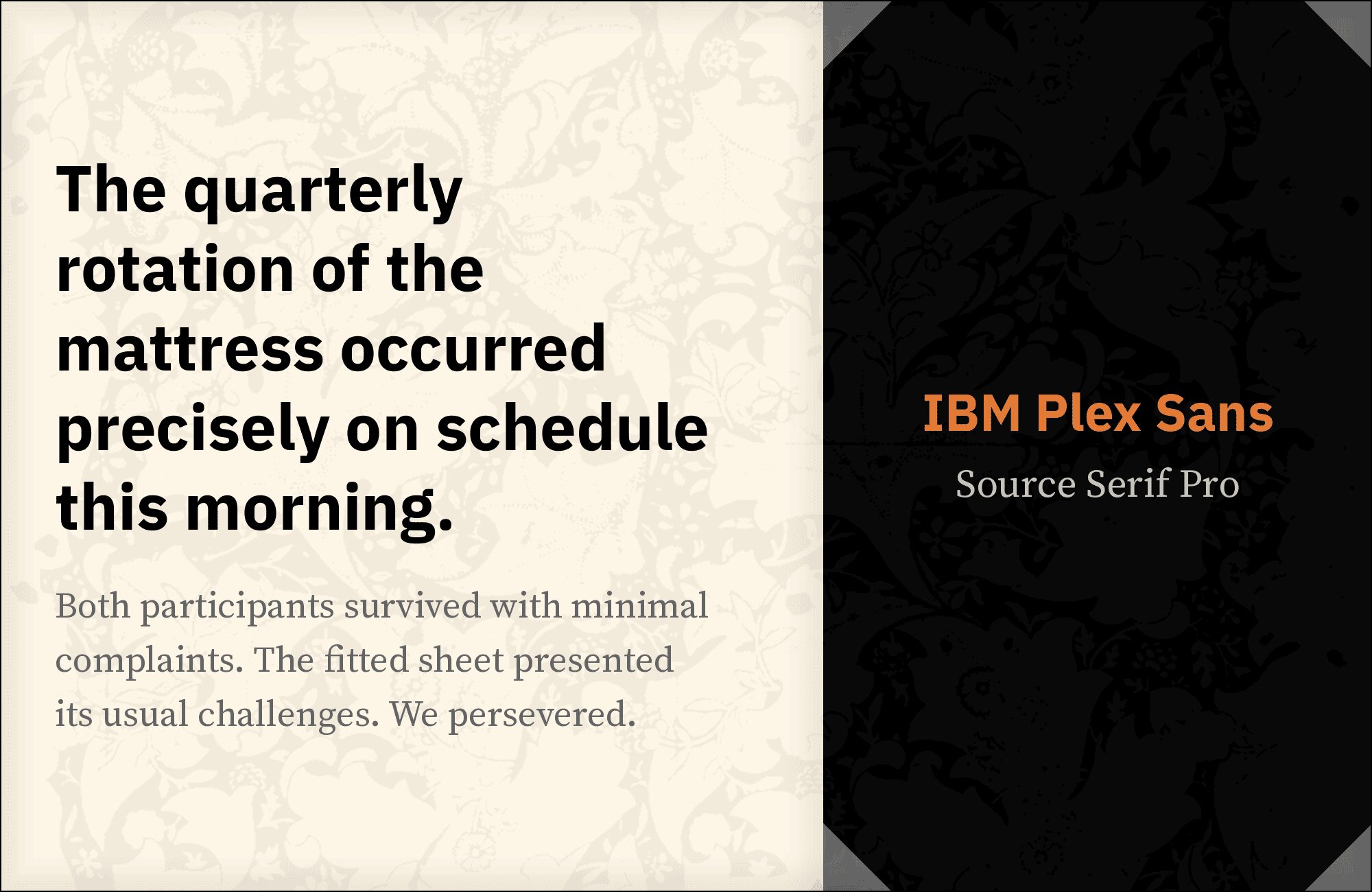
12. Source Serif Pro
Source Serif Pro‘s moderate contrast and sturdy serifs bring traditional authority to headlines while IBM Plex Sans handles body copy with contemporary clarity. Both fonts share screen-optimization DNA, having been designed for digital environments. This pairing excels in professional publications, corporate communications, and any context requiring serif credibility with sans-serif readability. The contrast between styles creates natural hierarchy while shared design philosophies maintain cohesion.
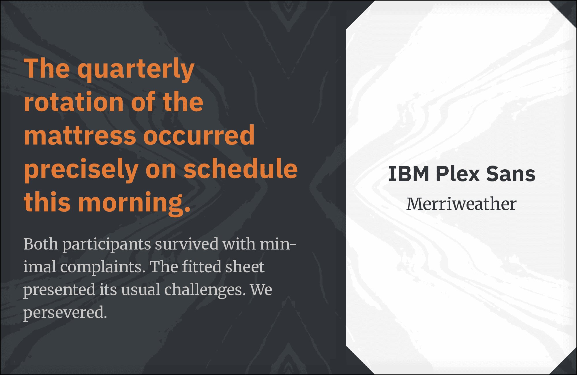
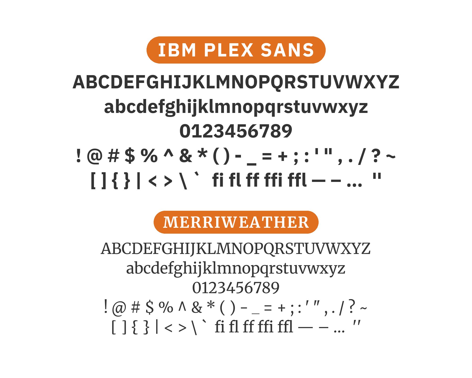
13. Merriweather
Merriweather‘s tall x-height and robust details create headlines with traditional authority while IBM Plex Sans delivers body copy with systematic precision. Both fonts were designed with screen legibility as primary concern, making them natural partners for digital reading experiences. This pairing suits news platforms, educational content, and long-form journalism where readers spend extended time with your text. The serif’s warmth balances the sans’s corporate coolness productively.
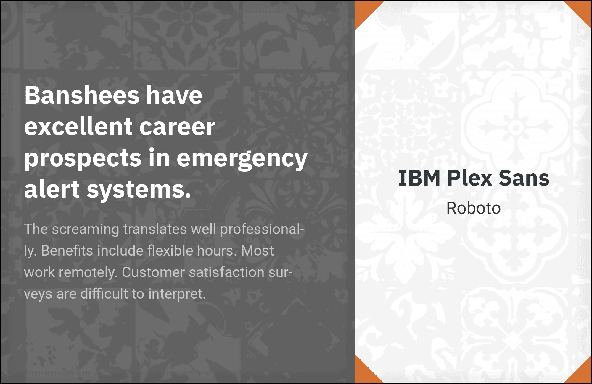
14. Roboto
Two systematic sans-serifs meet in a pairing more practical than exciting. Roboto‘s widespread familiarity can establish headline hierarchy against IBM Plex Sans’s more distinctive letterforms in body copy, or vice versa. Both fonts share similar design philosophies and screen optimization, making transitions seamless. This combination suits enterprise applications, Android-ecosystem products, and any context prioritizing universal readability over typographic personality. Sometimes functional wins the day.
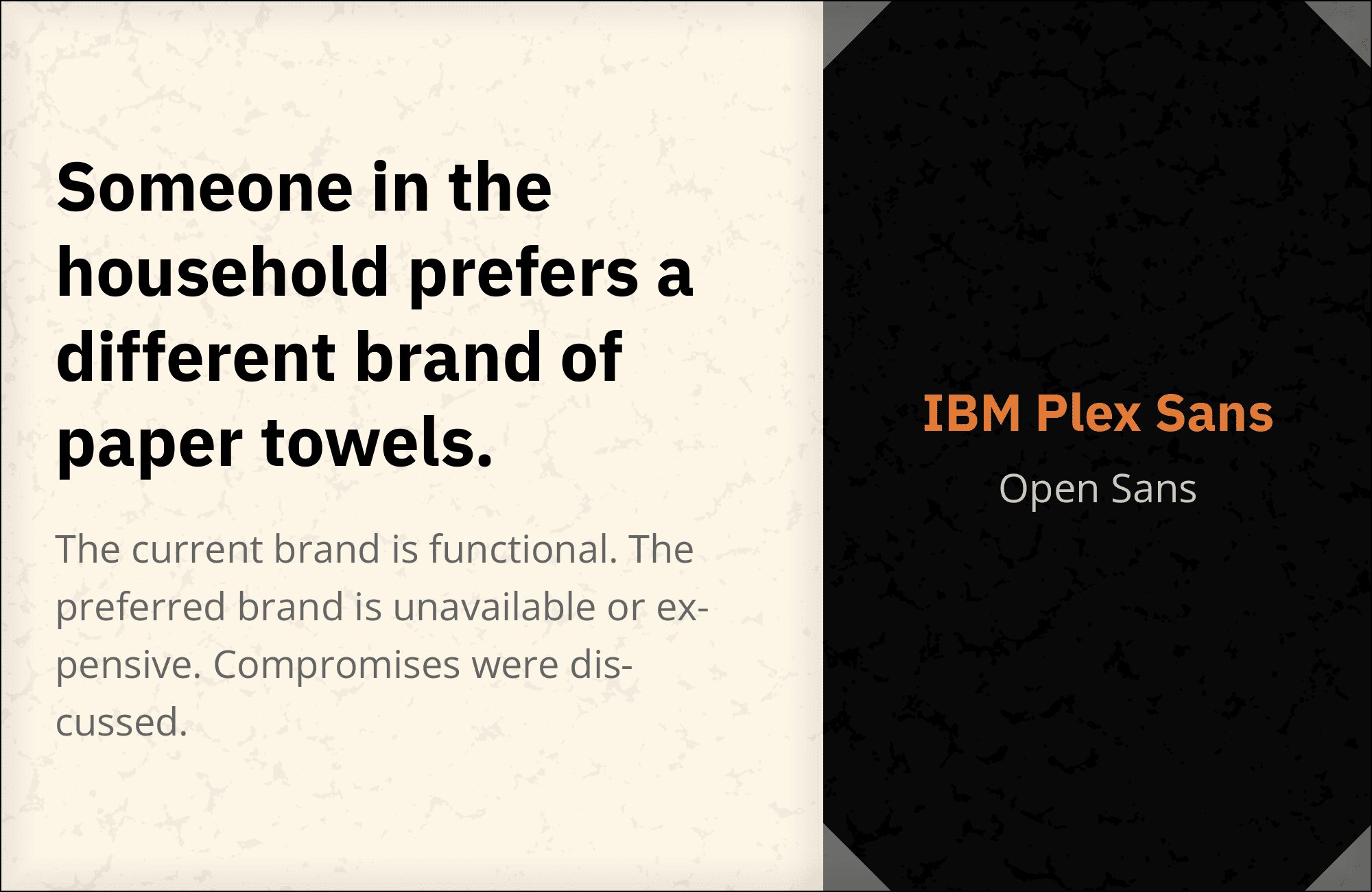
15. Open Sans
Open Sans‘s friendly neutrality meets IBM Plex Sans’s more structured personality in a pairing that prioritizes accessibility above all else. Both fonts feature generous x-heights, open counters, and excellent screen performance. The slight stylistic differences create enough hierarchy without jarring transitions. This combination suits government platforms, healthcare applications, and educational content where reaching the widest audience takes precedence over making design statements.

Conclusion
There are no absolute rules for font pairing, just principles to guide you. The key is contrast—in weight, in style (serif vs. sans-serif), or in personality. IBM Plex Sans is versatile enough to play well with many different typefaces.
Trust your eye, experiment freely, and remember that the best pairing is the one that serves your content and audience. Typography should enhance communication, not complicate it.