Gotham pairs great with Source Serif 4, PT Serif and Times New Roman. All 15 pairings are shown below in real rendered specimens, with the reason each one works. Every pairing below is checked against 4 published typography sources.

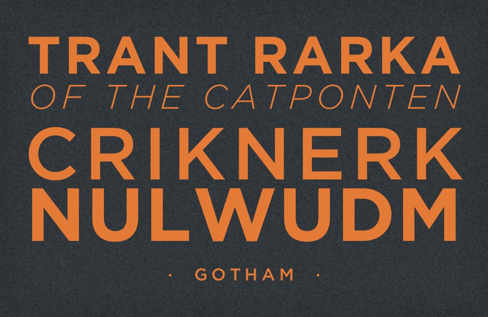
What fonts go with Gotham? Hoefler & Co’s geometric sans was drawn from New York street lettering and became one of the most recognisable retail typefaces of the past twenty-five years — recognisable enough that the harder question is usually what body text can sit underneath it without feeling like an afterthought.
Gotham takes its wide, squared-off capitals and even stroke weight from mid-century signage lettering found on New York buildings and storefronts, rather than from a drafting compass — the detail that separates it from purer geometric sans faces like Futura. Its apertures are open, its counters are generous, and its proportions are wide enough to hold their own on a billboard or a subway platform, the conditions the letterforms were originally observed in. It is a retail typeface, licensed through Hoefler & Co rather than distributed free. Hoefler & Co later issued Gotham ScreenSmart for small on-screen sizes, but the core family was drawn for signage-scale display, so most pairings still need a second face to carry paragraphs.
Because Gotham is retail, some readers reaching for this list will not already own it — where that matters, a free geometric alternative such as Poppins, Montserrat or Century Gothic can stand in for headlines while keeping the same wide, circular structure. The pairing question underneath is more interesting than it looks: font-pairing theory generally warns against setting one geometric sans against another, arguing the similarities read as monotony rather than contrast, but real-world usage data contradicts that advice constantly, pairing Gotham with other sans-serifs on working sites. Here are 15 fonts that pair well with Gotham, with the strongest, most easily obtained choices first.
1. Source Serif 4

Source Serif 4 is Adobe’s own restrained transitional serif, drawn specifically as the text companion inside the wider Source superfamily rather than as a display face in its own right. Its moderate contrast and workable x-height carry paragraph after paragraph without strain, exactly the job Gotham’s wide geometric caps were never built to do. Source Serif 4 is on Google Fonts, so the only license in the pairing is Gotham’s. Keep Source Serif 4 for body copy and captions at 17–19px, and reserve Gotham for headlines, navigation and any short line that benefits from its confident, sign-painted geometry.


2. PT Serif

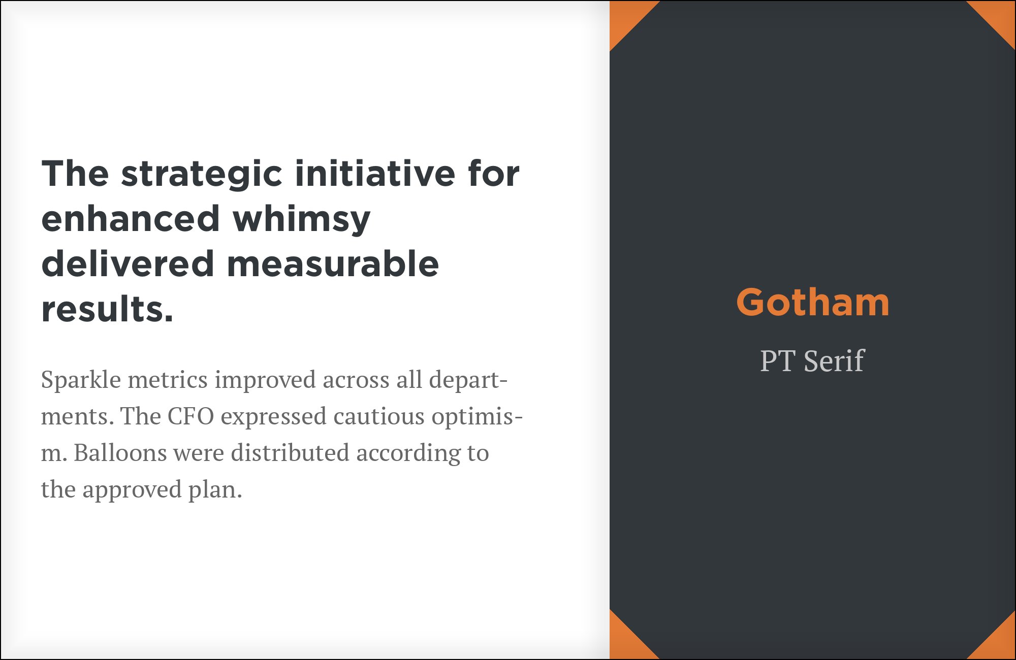
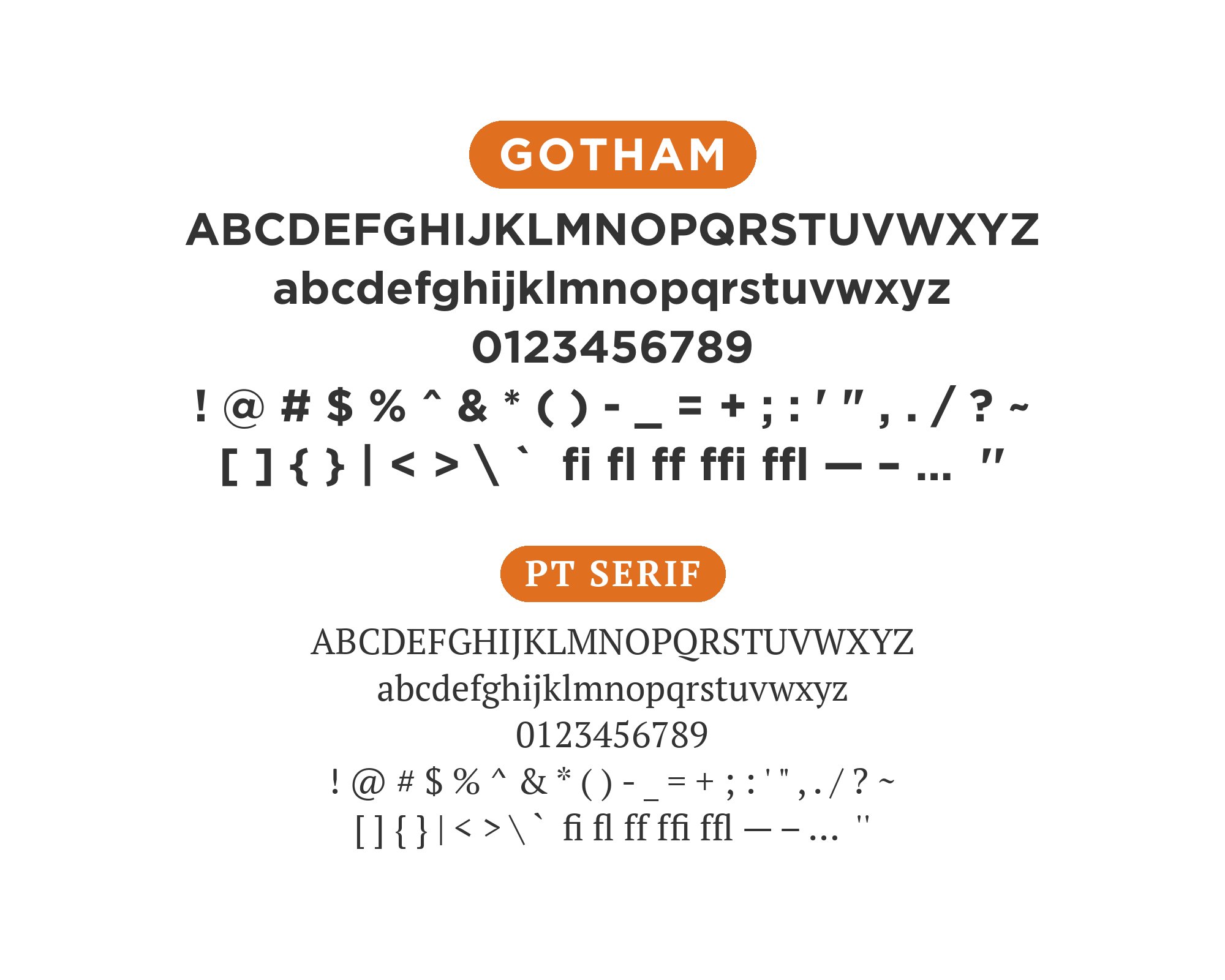
PT Serif was drawn by ParaType as the serif half of the PT type system, built with sturdy strokes and a tall x-height for dense official documents rather than editorial flourish. That plainness holds body copy tight and legible underneath Gotham’s open, wide-set headline caps without competing for attention. Google Fonts serves it at no cost, making it one of the lowest-friction serif partners available for a retail display face. The combination suits reports, government and institutional sites, and any layout that needs Gotham’s authority up top and dependable reading underneath it.
3. Times New Roman
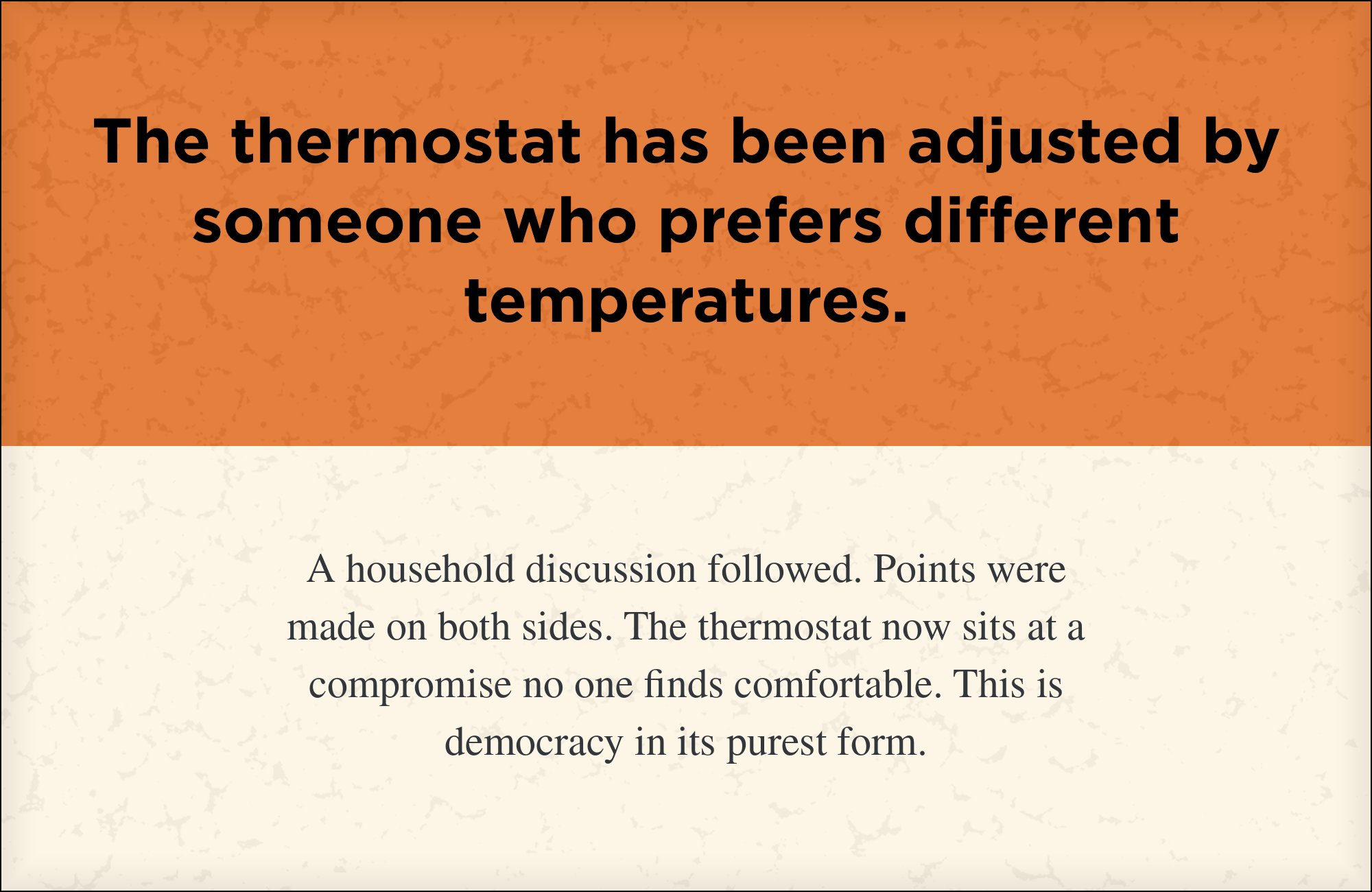
Times New Roman is the most widely installed serif in existence, which makes pairing it with Gotham less about typographic theory and more about guaranteed availability. Set as dense, no-frills body copy under a clean geometric Gotham headline, it works whenever a build can’t be certain a licensed serif is present on every machine that renders it. The two faces share nothing structurally — that gap is what keeps the hierarchy legible at a glance. It ships with essentially every operating system, so unlike Gotham itself, this half of the pairing never requires a license or a webfont request.
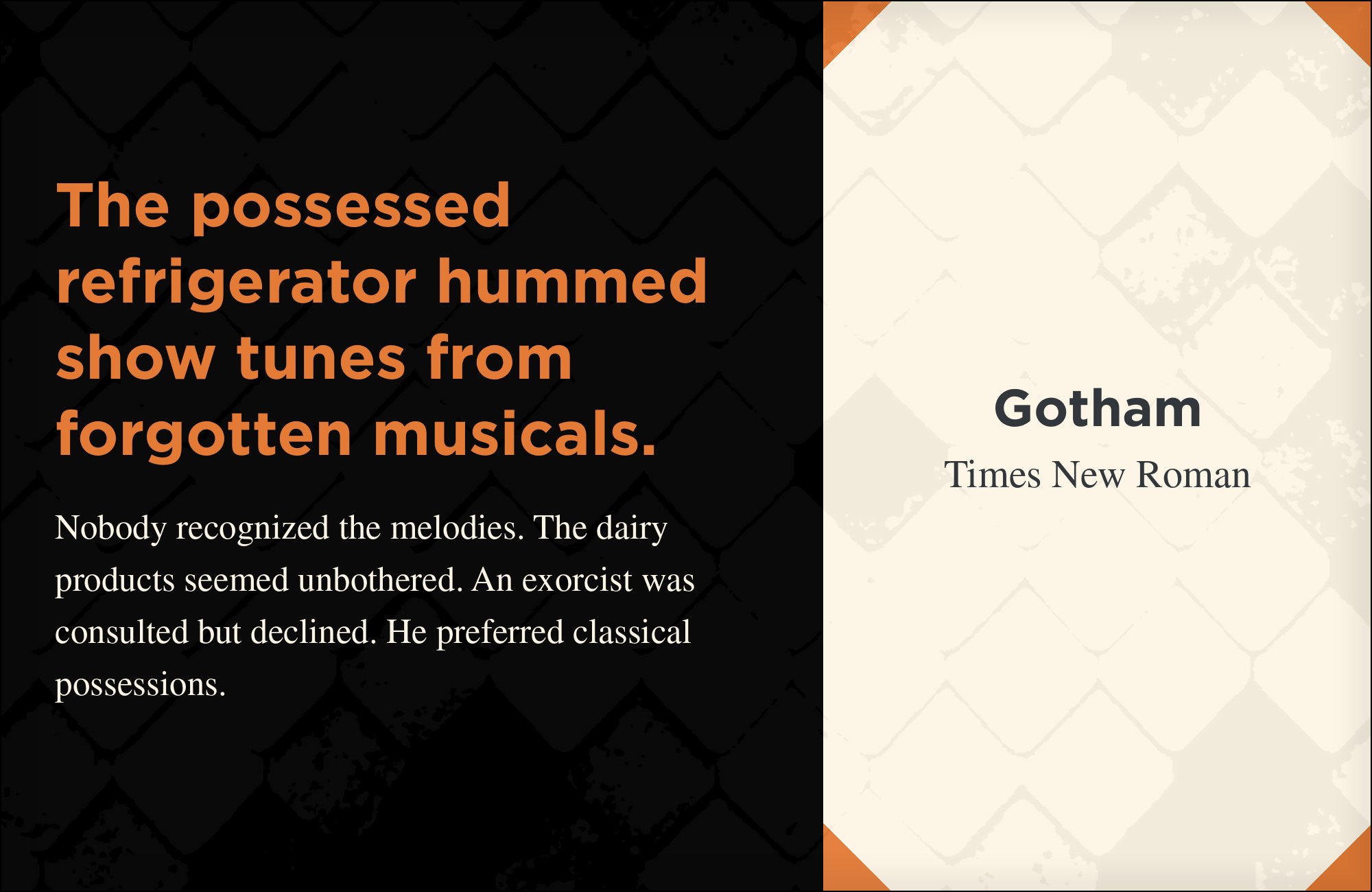

4. Futura

Futura and Gotham are both built from circles and straight lines, but Futura’s tighter apertures and true-circle bowls give it a noticeably different accent from Gotham’s wider, sign-painted geometry. Real-world usage data shows the two shipped together on live sites more often than pairing theory would predict, contradicting the standard advice against setting one geometric sans against another. It ships with macOS and is otherwise available through most major foundries. Used carefully — Futura at a lighter weight for secondary text, Gotham reserved for primary headlines — the pairing reads as one geometric family with two distinct voices rather than a clash.
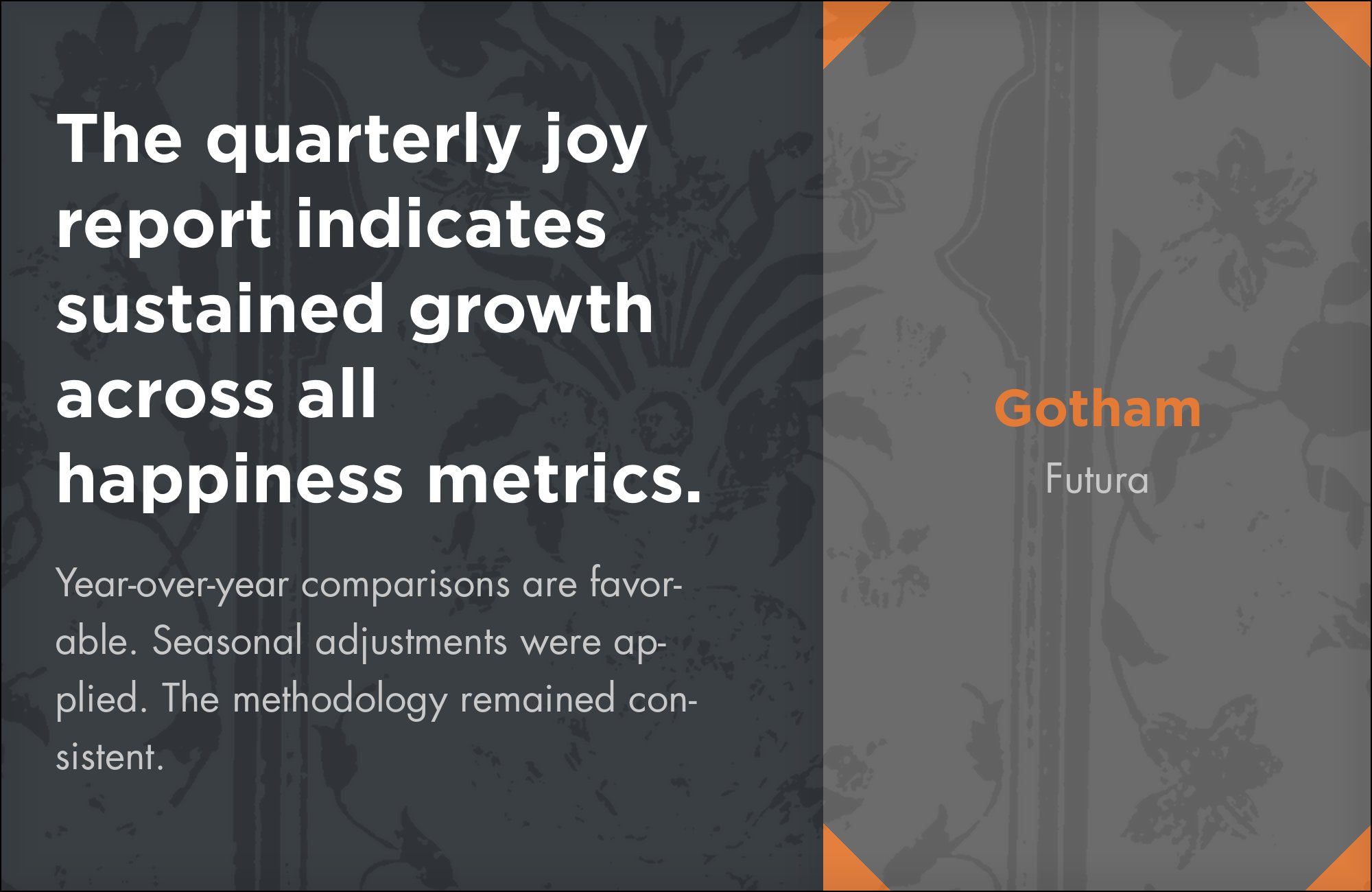

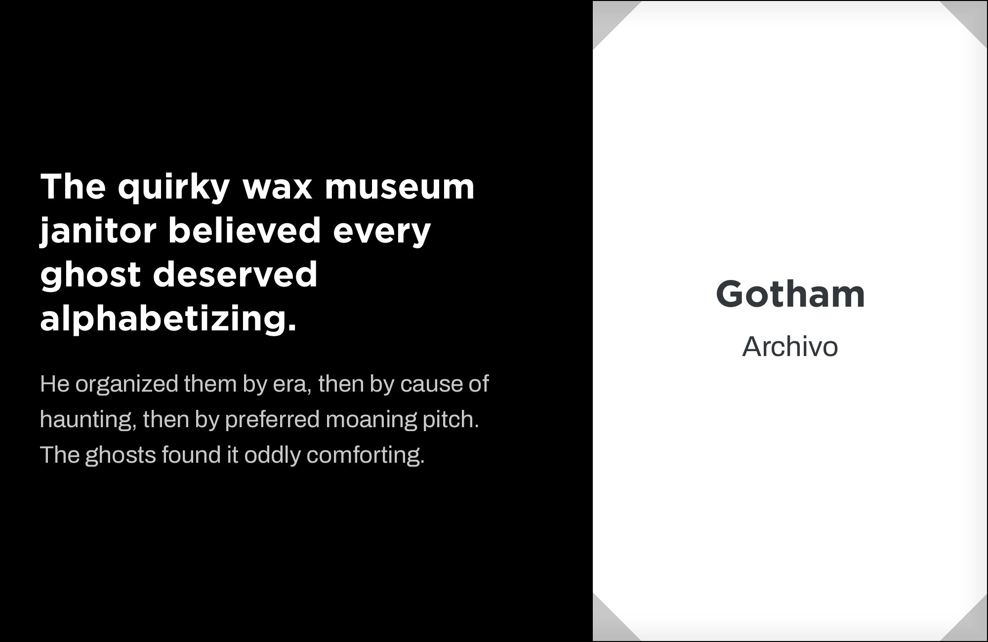
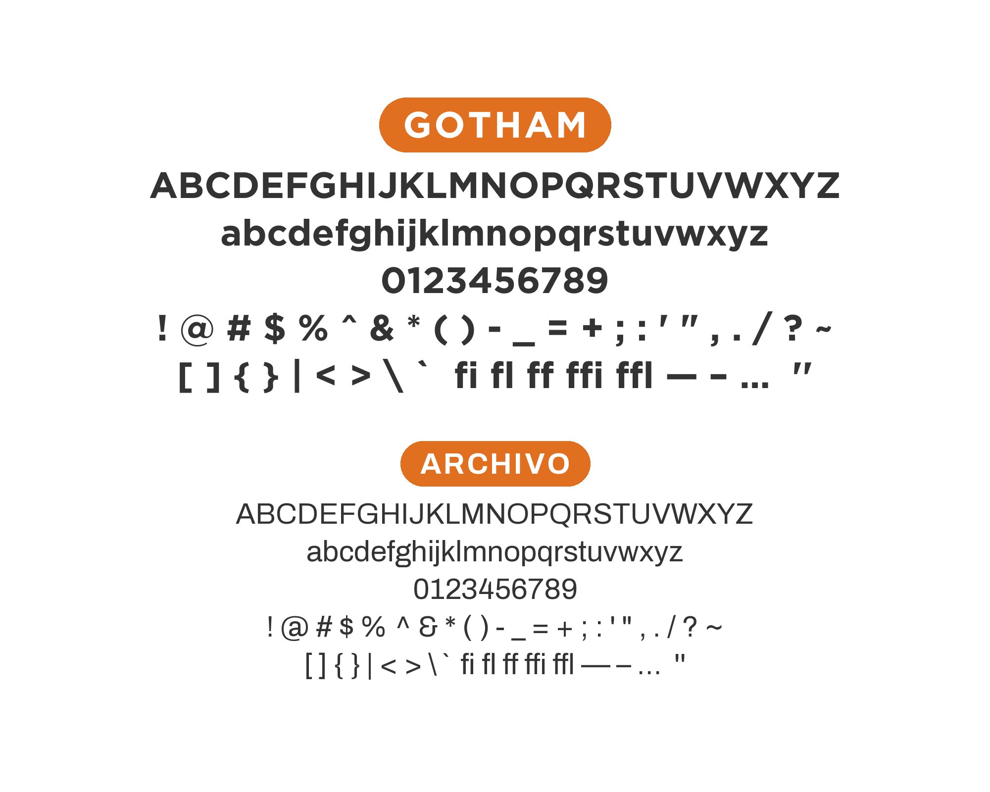
5. Archivo
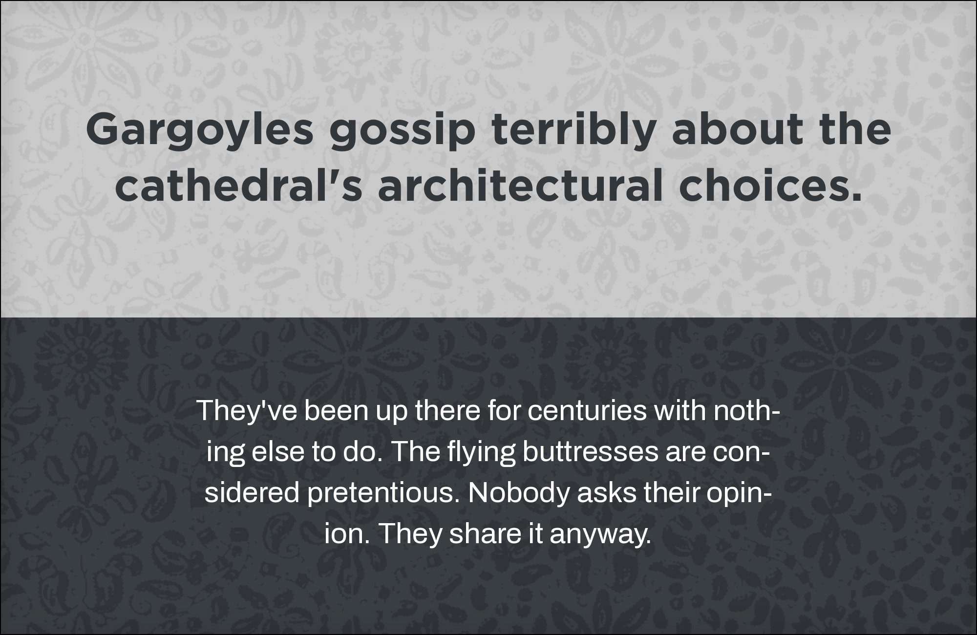
Archivo is a grotesque sans with a squarer, more mechanical rhythm than Gotham and a wide range of weights built for interface and editorial text. It works better as a secondary sans inside the same overall system than as a pure contrast partner, sharing Gotham’s confidence without duplicating its geometry. Archivo is free on Google Fonts, so the combination is easy to license entirely. Use it for UI chrome, secondary navigation and dense interface text where Gotham’s wider proportions would waste horizontal space.
6. Lora
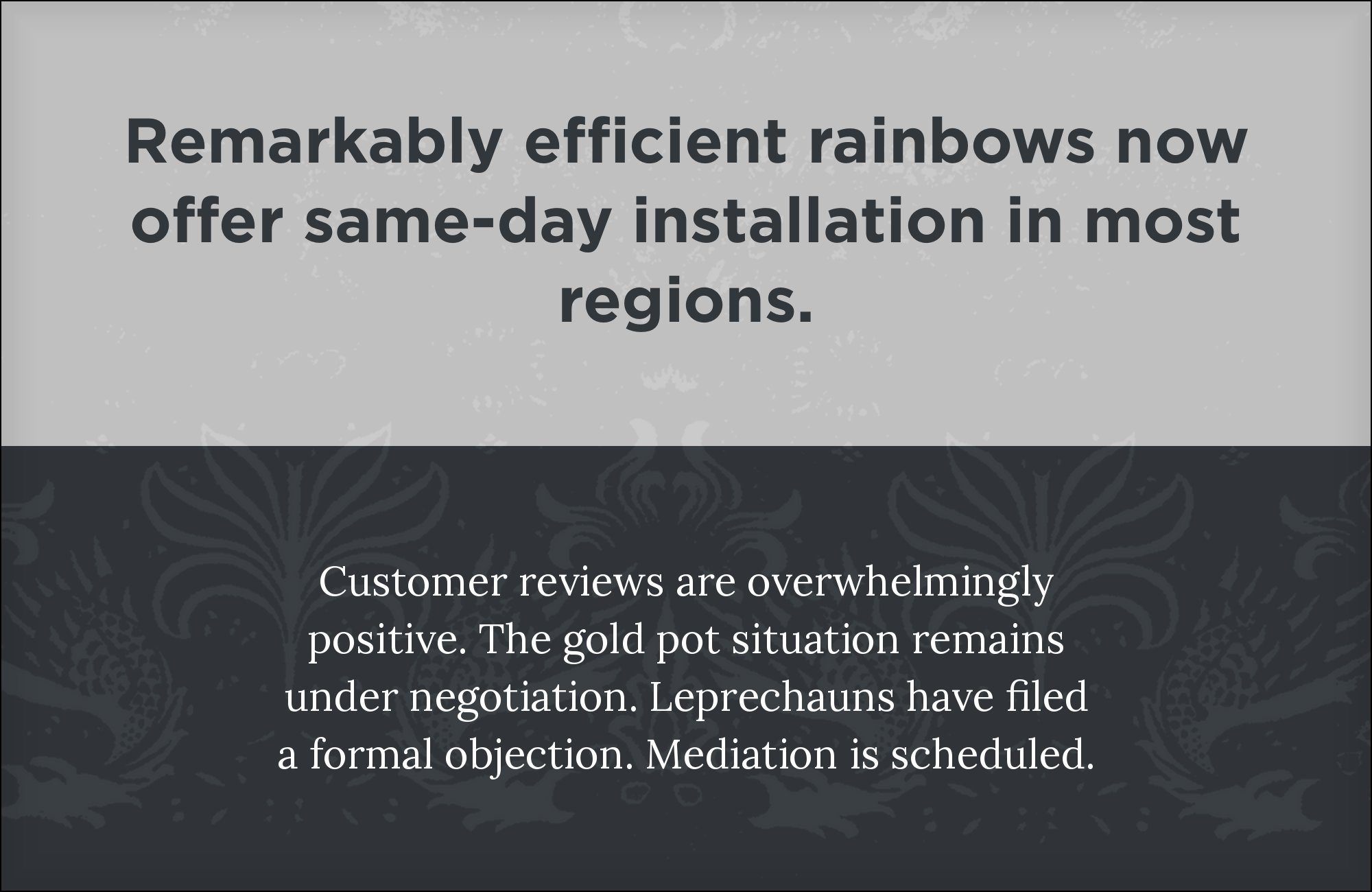

Lora is a contemporary text serif with brushed, slightly calligraphic curves built specifically for legibility at small sizes rather than display drama. It carries long-form copy comfortably, freeing Gotham’s wide geometric caps for navigation and headlines where their scale actually matters. The moderate warmth in Lora’s letterforms softens Gotham’s engineered precision without introducing the historical weight a period serif would bring. Lora costs nothing on Google Fonts, and the pairing suits editorial sites, blogs and any long-scroll layout where a reader needs to stay comfortable well past the headline.


7. Bitter

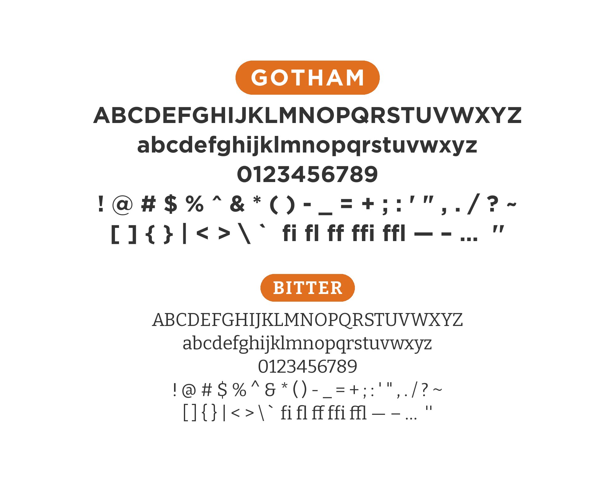
Bitter is a slab serif designed specifically for on-screen reading, with plain rectangular serifs and sturdy, even strokes rather than the playful ball terminals of a decorative slab. That restraint keeps it closer in spirit to Gotham’s no-nonsense geometry than a more characterful slab would be, so the two faces feel related rather than in competition. The Google Fonts release is free. Use Bitter for body copy and Gotham for the structural elements around it — headings, labels, navigation — where its wide caps read as calm rather than loud.

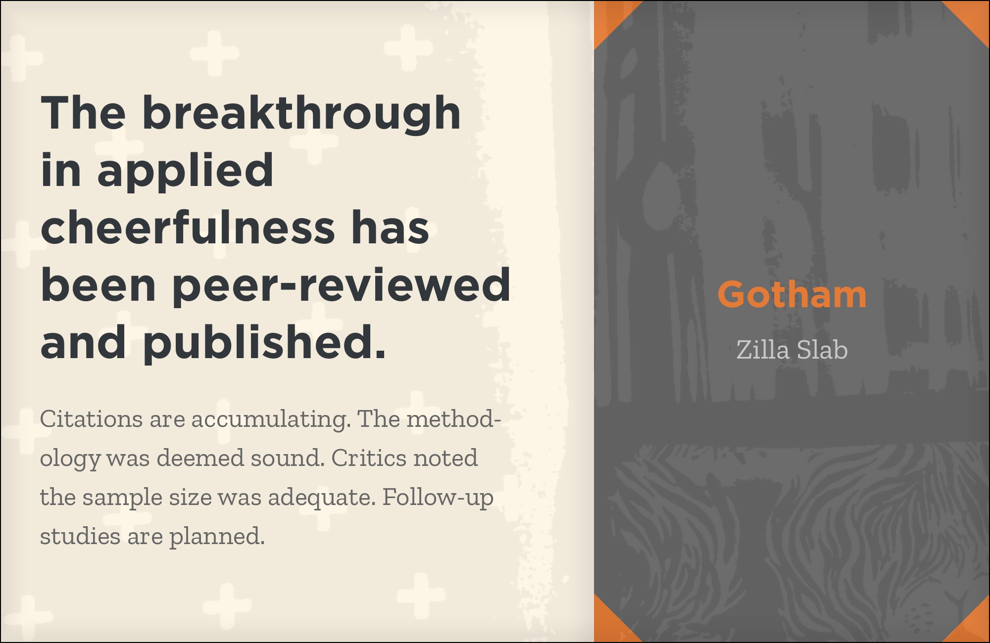
8. Zilla Slab

Zilla Slab is a humanist slab serif with moderate contrast and a generous x-height, designed for comfortable reading on screens. Its rounded, softened slab serifs give headings real structural heft that a hairline serif can’t supply, while Gotham keeps the supporting text calm and geometric around it. It is free on Google Fonts, so the pairing is available without a second license. Reserve Zilla Slab for subheads and pull quotes rather than the smallest body copy, where its slab weight is most useful, and let Gotham anchor the primary headline above it.

9. Anton
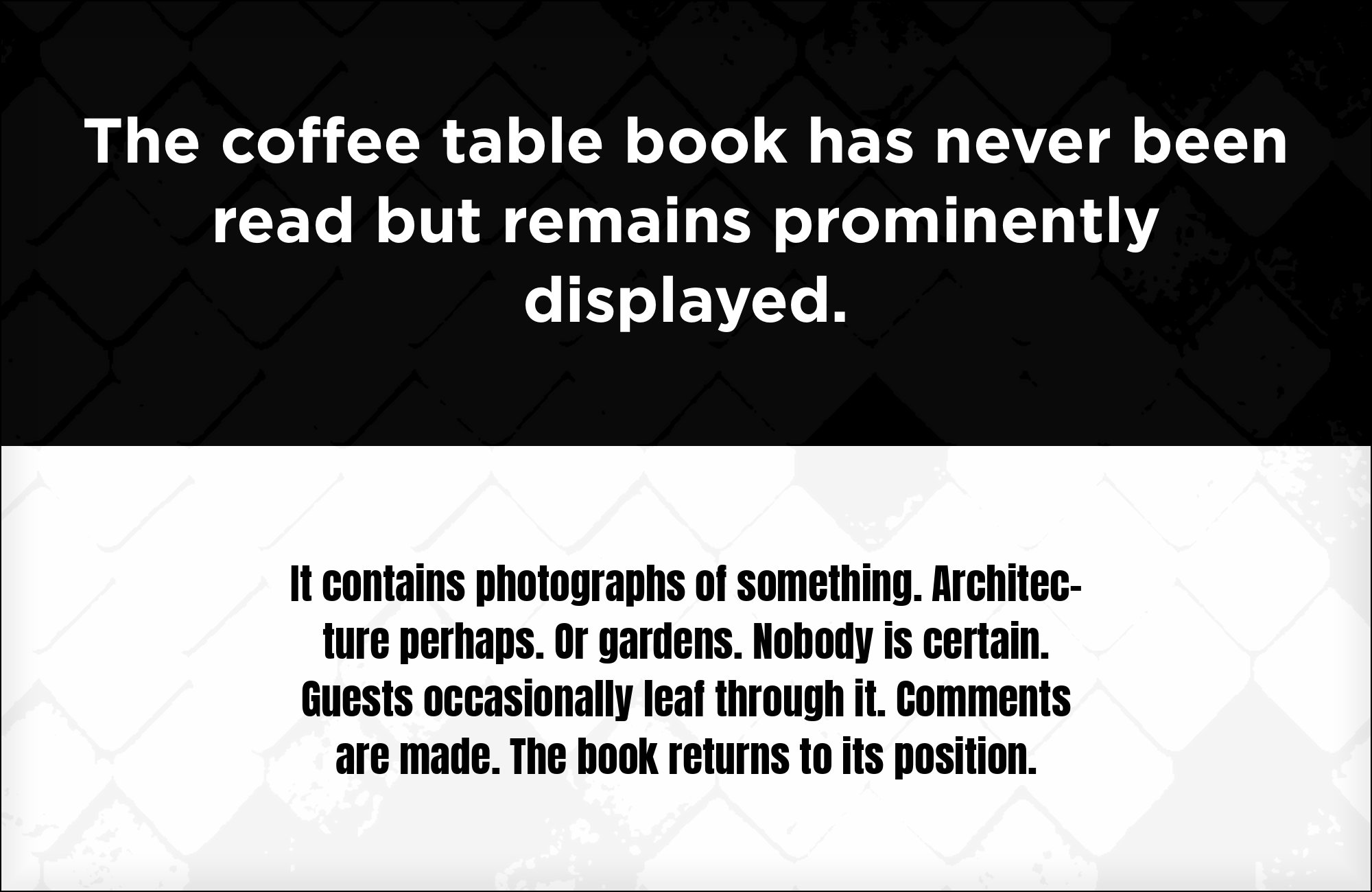
Anton is an ultra-bold, tightly condensed display sans built for maximum poster impact, with none of Gotham’s restraint or open spacing. Reserving it for a single oversized headline lets Gotham’s calmer geometric forms carry everything else meant to be read — captions, navigation, body copy — without the layout shouting twice. It is free on Google Fonts, a low-cost way to add a second, louder register above Gotham’s usual authority. Use Anton sparingly and only at the largest sizes; it has no place in running text of any kind.


10. Playfair Display

Playfair Display is a high-contrast display serif with sharp, Baskerville-inflected thick-thin strokes that give headlines a drama Gotham deliberately withholds. Splitting the two roles this way — Playfair loud on the headline, Gotham quiet on everything supporting it — avoids two competing neutral faces fighting for the same job. Google Fonts hosts it at no charge, and the pairing suits editorial mastheads, fashion and lifestyle brands, and any layout where the headline is meant to carry emotion while Gotham handles the practical reading underneath it.


Still Googling UX terms?
Stop. They're all right here.
50 terms. Illustrated.
So simple your cat gets it.
Print & ePub on Amazon
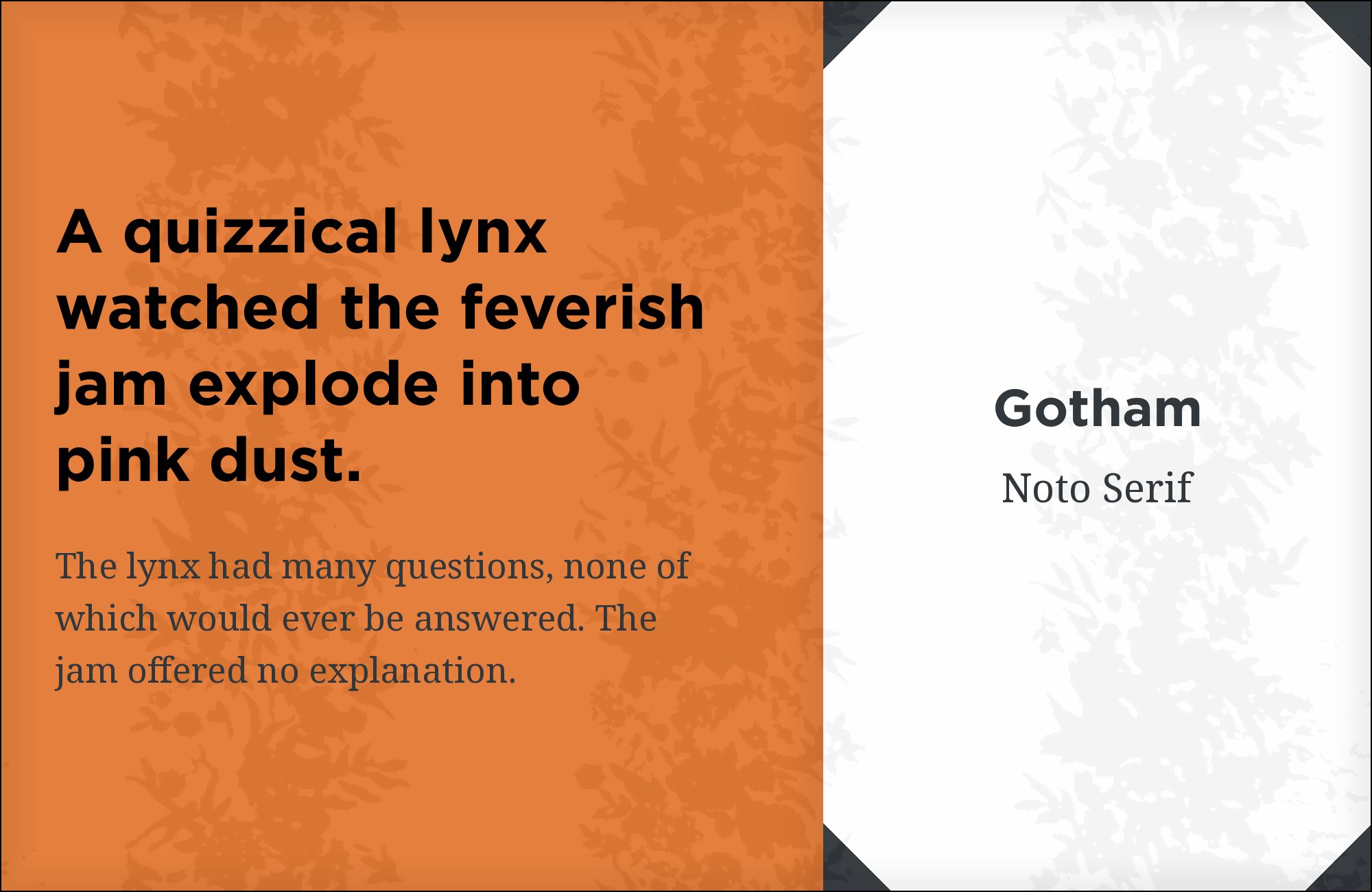
11. Noto Serif
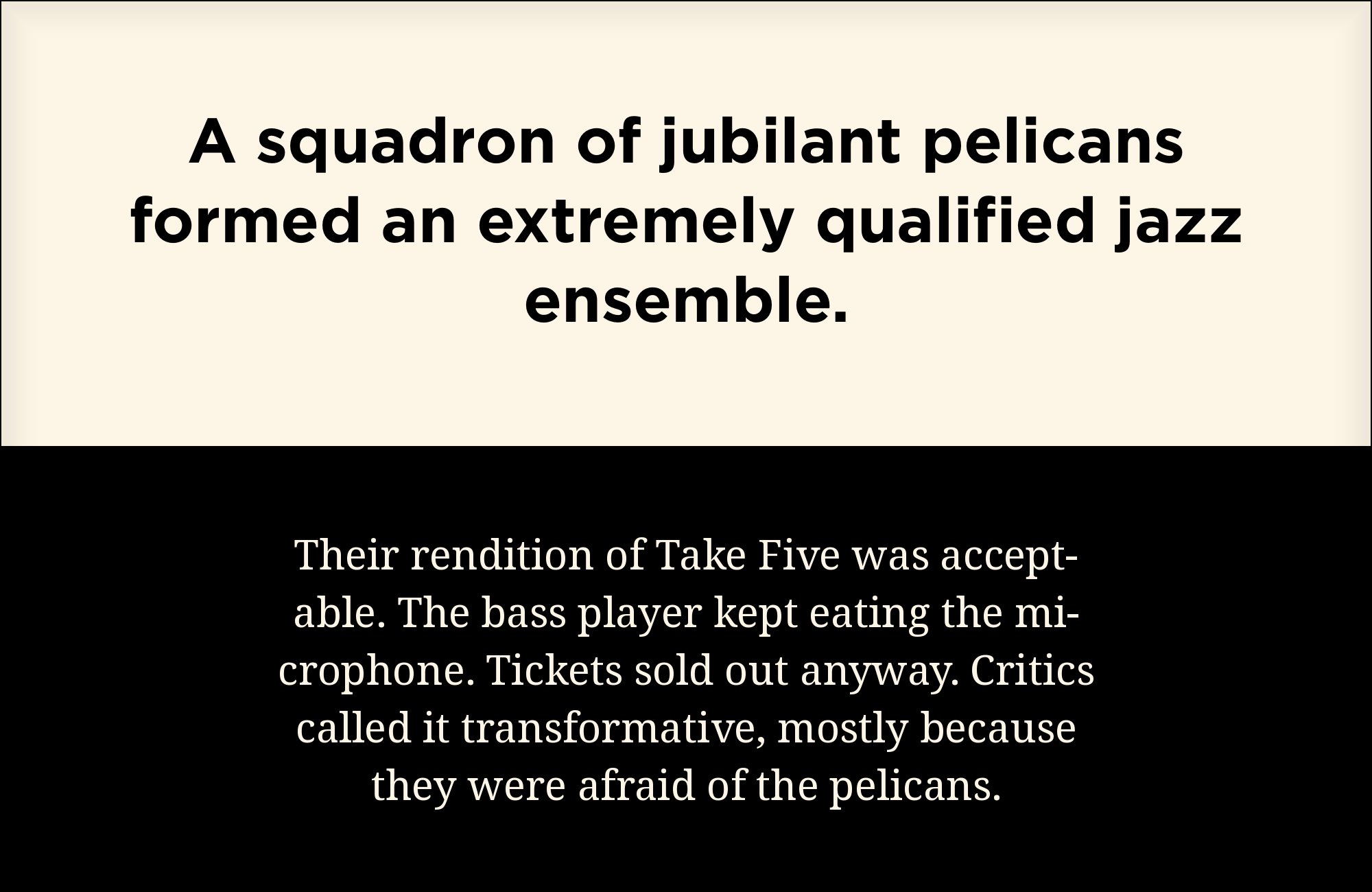
Noto Serif is a plain, restrained transitional serif built for broad multilingual coverage rather than editorial flair, and that lack of a strong personality is precisely its usefulness here. Its calm, workmanlike rhythm keeps body text readable under Gotham’s open, wide-set headlines without adding a second competing voice to the page. It is free on Google Fonts and covers far more language scripts than most text serifs, which matters for any Gotham-based system that needs to localize. Use it for dense body copy and documentation rather than display work.

12. Public Sans
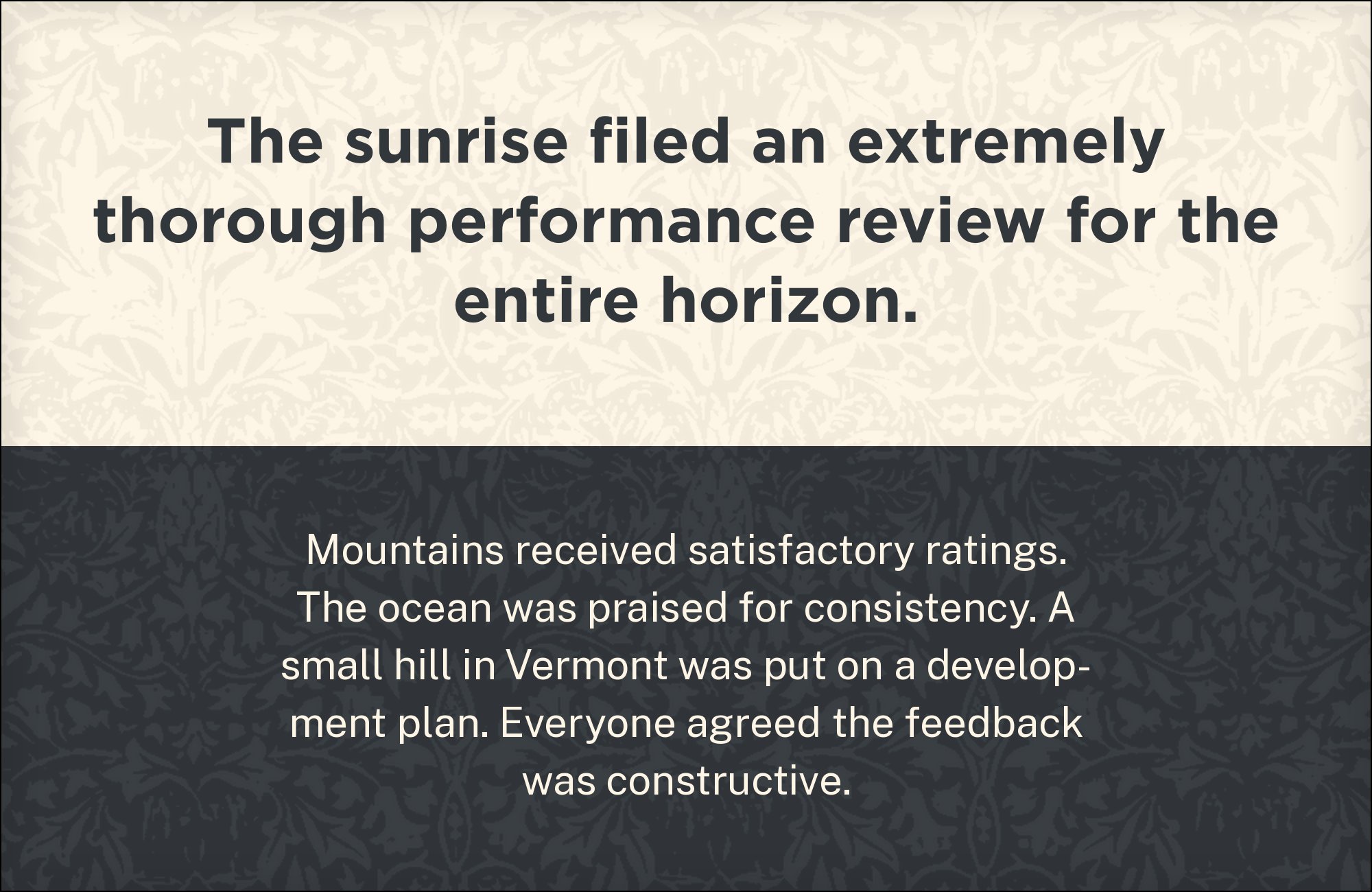
Public Sans is a civic grotesque built for U.S. government digital services, derived from Libre Franklin with a robust, no-frills structure designed to hold up under heavy accessibility scrutiny. Using it as Gotham’s secondary typeface avoids the problem of two geometric sans competing for the same job, keeping UI chrome and body text plain and entirely functional. Public Sans costs nothing to license, and the pairing suits institutional, civic and enterprise systems where Gotham supplies visual identity at the top of the page and Public Sans handles everything a user actually has to read.


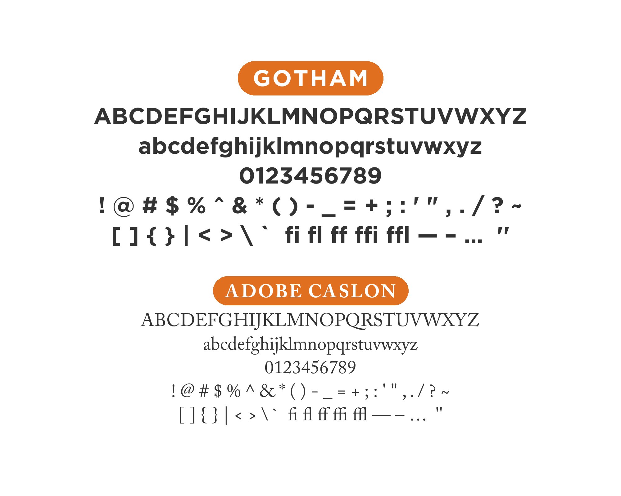
13. Adobe Caslon
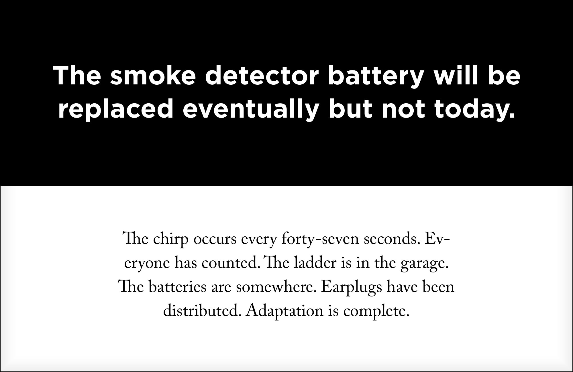
Adobe Caslon’s bracketed serifs and eighteenth-century proportions read as institutional trust, offsetting Gotham’s engineered, sign-painter geometry with a very different kind of authority. The pairing ties directly back to Gotham’s own signage-and-campaign history, where a period-appropriate serif underneath modern geometric headlines was a recurring choice. Adobe Caslon is a retail face, available through an Adobe Fonts subscription rather than free — worth noting since Gotham itself already carries a license cost. Best suited to reports, brand systems and any project where both faces’ premium sourcing is already accounted for in the budget.
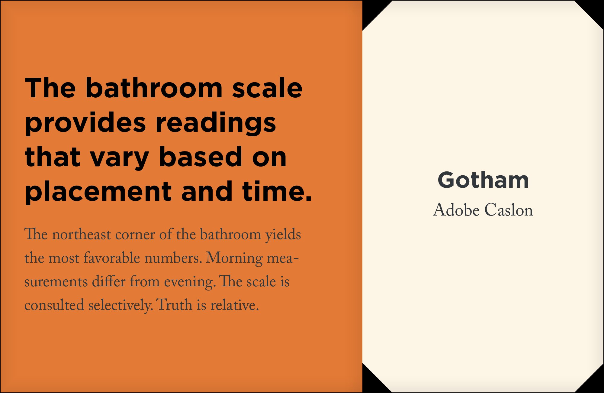
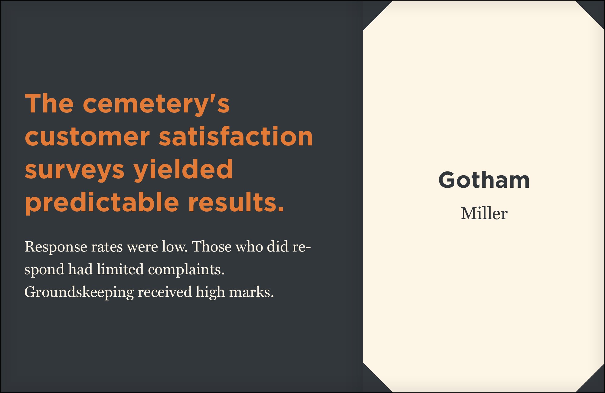
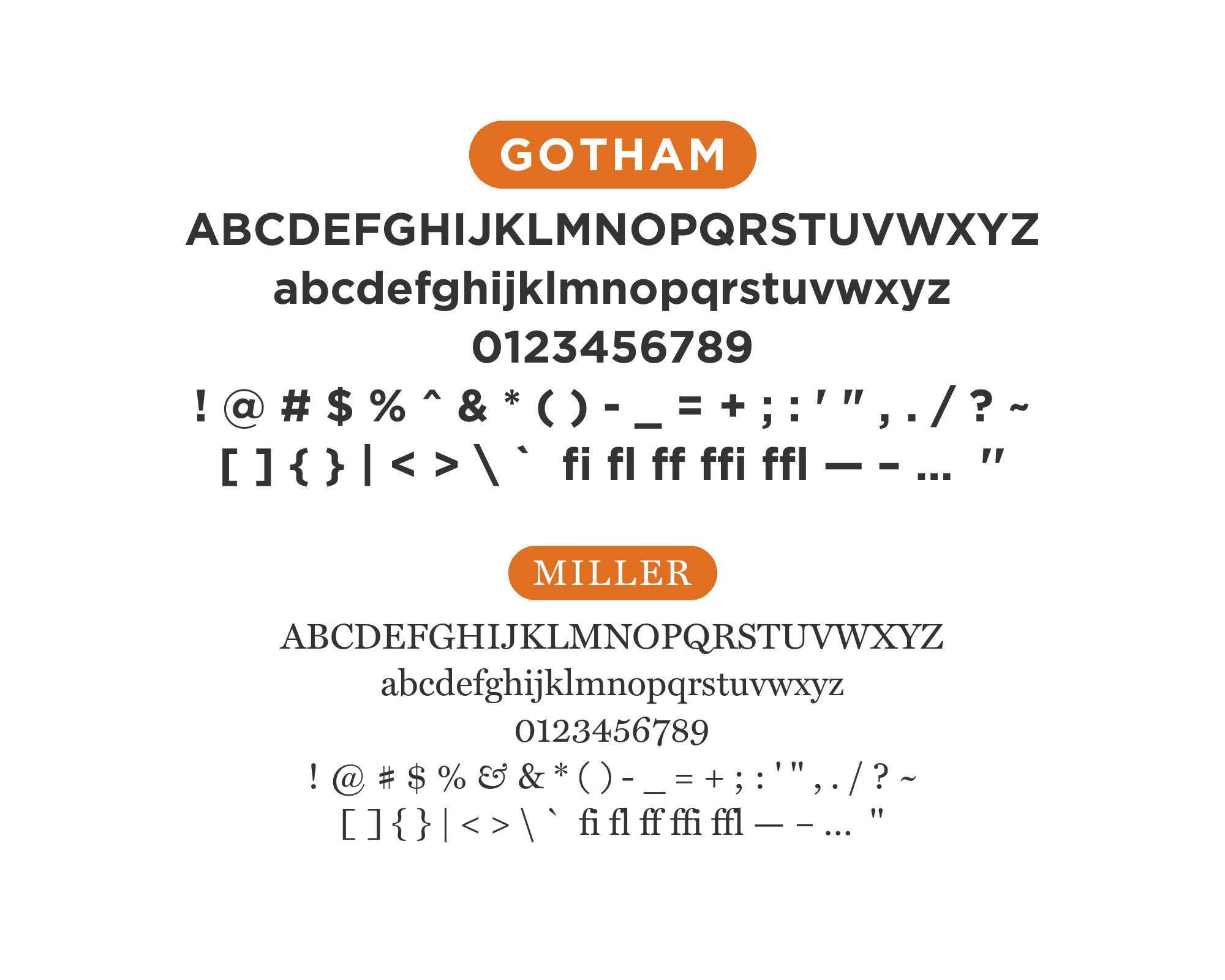
14. Miller

Miller is a classic Scotch-Roman text serif with old-world editorial gravity, and set beside Gotham’s ruler-and-compass forms it reads like a magazine masthead sitting next to modern wayfinding type. The historical weight it carries is a genuine counterpoint to Gotham’s engineered neutrality rather than a plain body workhorse. Miller is a retail face licensed through Font Bureau rather than free, adding a second premium cost on top of Gotham itself. Reserve it for editorial contexts — long-form journalism, magazine layouts — where that particular masthead-and-signage contrast is the whole point of the pairing.
15. Myriad
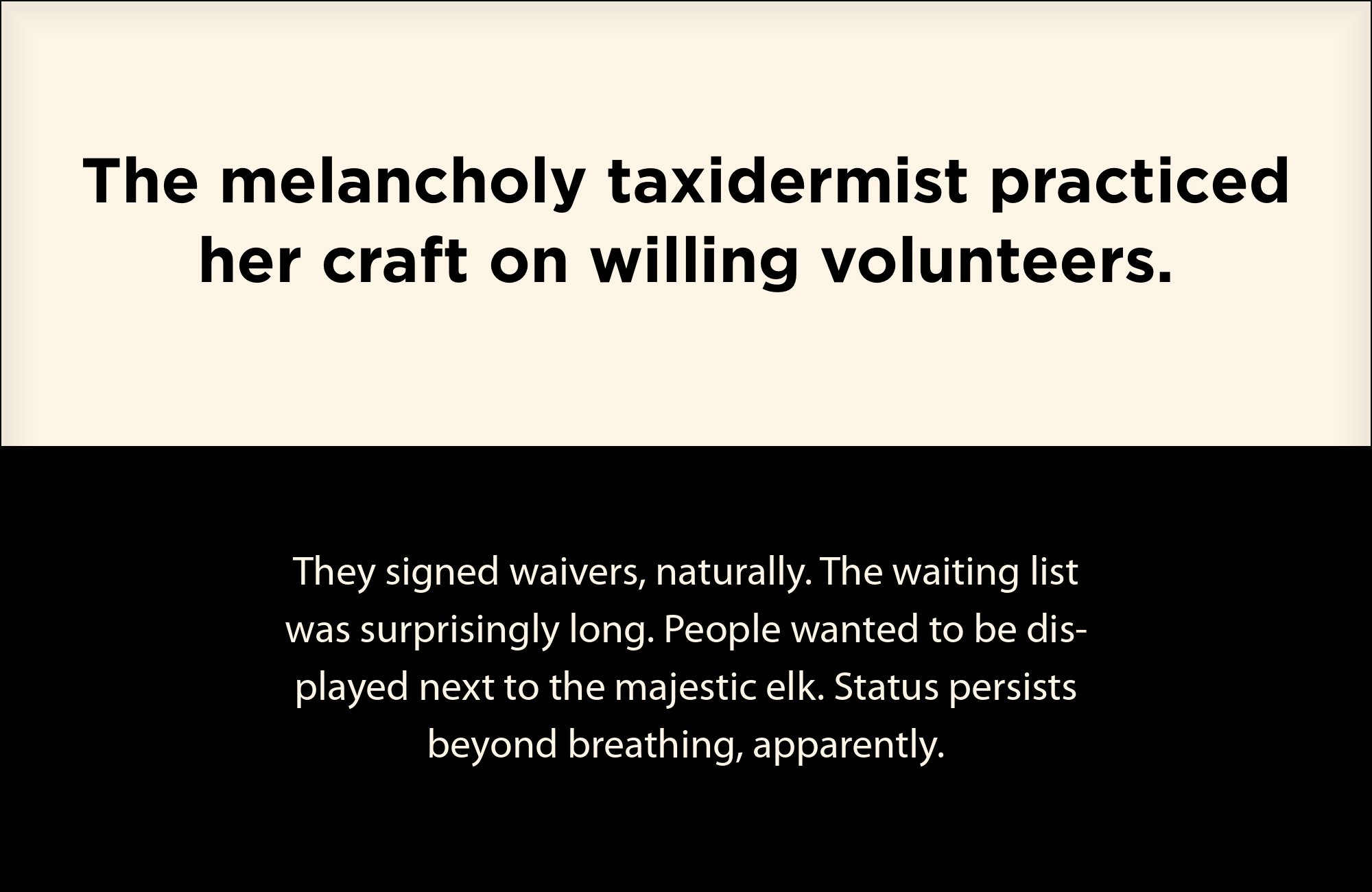
Myriad is the reverse of the geometric-on-geometric problem: its humanist warmth and near-universal Adobe distribution make it a low-risk, unglamorous running-text partner for a project that needs to stay entirely within widely licensed fonts. It has none of Gotham’s engineered wide caps and none of a text serif’s historical baggage, just calm, readable letterforms drawn for long documents. Myriad has shipped with Adobe software for years, which makes it easier to license than a dedicated text serif in many corporate environments. Use it for body copy in Gotham-based systems that already sit inside the Adobe ecosystem.


Conclusion
Gotham’s wide, sign-painted capitals were built to be seen at a distance, not read in paragraphs, so the practical question behind every pairing above is the same one: what carries the text Gotham can’t. Some partners answer with plain structural contrast, others share Gotham’s geometric family and separate on detail alone — both approaches work, and the standard advice to avoid pairing two geometric sans together doesn’t always hold up against how designers actually use the face.
Because Gotham is a licensed retail face, confirm access to it — or a free geometric substitute — before committing a layout to any of these pairings. Then test the combination at the sizes you will publish; a pairing that separates cleanly in a specimen can still blur once real copy fills the page.
