Source Serif pairs great with Source Sans Pro, Source Code Pro and Montserrat. All 15 pairings are shown below in real rendered specimens, with the reason each one works.
What fonts go with Source Serif? The question has an unusually literal answer, because Adobe designed this face to be half of a pair from the beginning — but the obvious partner is only the starting point, and the documented evidence from real brand systems points somewhere more interesting.
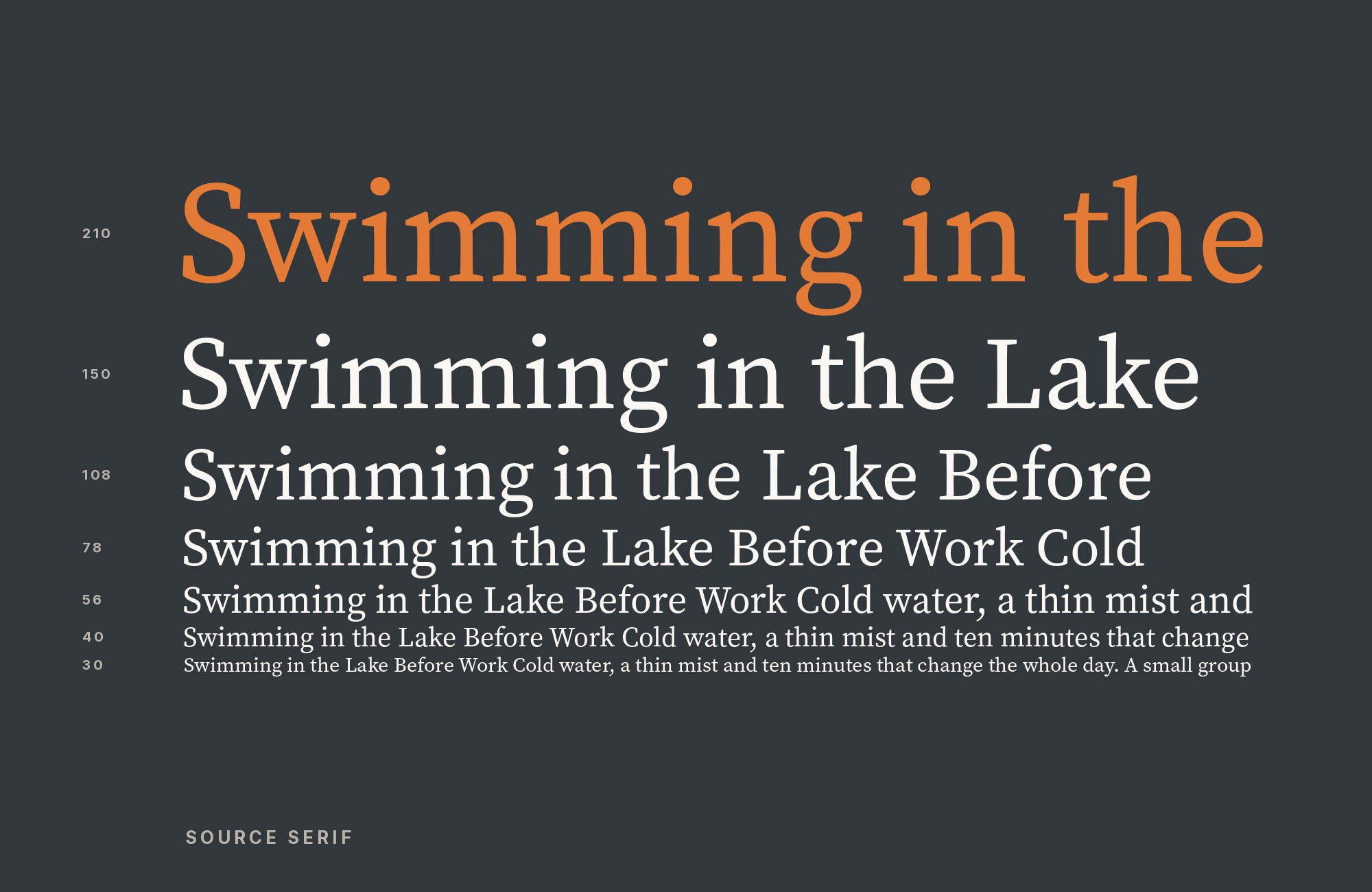
Frank Grießhammer drew Source Serif for Adobe and released it in 2014 under the SIL Open Font License, making it the third open-source family from the company after Source Sans and Source Code Pro. Its skeleton comes from Pierre Simon Fournier’s eighteenth-century types, which is where the mixed vertical and diagonal stress, the ball terminals and the faintly quaint serif shapes originate. What Grießhammer did with that inheritance is modern: large counters on the e, a and g, a large x-height, and moderate stroke contrast that holds together at interface sizes rather than shattering the way a true Didone would. The family dropped “Pro” from its name in 2021, when version 4 added five optical sizes and a variable axis running continuously from weight 200 to 900. Italics, absent from the original release, arrived in 2018.
That construction dictates the pairing logic. Source Serif began as a text-oriented family, while Source Serif 4 now spans Caption, Small Text, Text, Subhead, and Display optical sizes. For this guide, the partner fonts take either supporting sans roles or a more conspicuous display role. So partners fall into two jobs. The larger group is neutral sans companions: Source Sans Pro, IBM Plex Sans, Open Sans, Work Sans, Rubik and Space Grotesk, each paired with Source Serif in the sections below. The smaller group supplies the display voice — Montserrat — while Gill Sans and Source Code Pro serve more specific structural roles. Here are 15 fonts that pair with Source Serif, ordered by how well the evidence supports them.
1. Source Sans Pro

Paul D. Hunt designed Source Sans Pro for Adobe in 2012 as the company’s first open-source release, drawing on the American gothics of Morris Fuller Benton rather than on European grotesques. Google Fonts now ships the family as Source Sans 3, the same rename logic Adobe applied to Source Serif itself. This is the pairing the typeface was built for, and it is the only one Typewolf suggests: Grießhammer drew Source Serif explicitly as the serif complement to Source Sans. Crossgrove writes that their proportions match and that their restrained, slightly industrial characters suit one another — neither face is the showy partner. That is exactly what you want in a long-lived system rather than a campaign. Set Source Sans for interface chrome, navigation and data tables, and let Source Serif carry every paragraph of actual reading. The combination is documented working at scale in Liferay’s 2021 annual report.

Turn your ideas into repeatable creative workflows - no code required. Create with ready-made templates and AI-powered tools in Picsart Flow.
See details2. Source Code Pro

Paul D. Hunt also drew Source Code Pro, released by Adobe in 2012 as the monospaced member of the same superfamily, derived directly from Source Sans and tuned for reading code in a terminal or an editor. It shares a superfamily lineage with Source Sans and appears with Source Serif in two documented projects. Use it for aligned technical material, then test apparent size in context. Fonts In Use documents the combination twice: in Liferay’s annual report and in the TIM online textbook. Use it for anything that must preserve character alignment — code, command names, identifiers, tabular figures — and resist the temptation to promote it into headings, where its fixed advance width reads as a gimmick.

3. Montserrat

Julieta Ulanovsky designed Montserrat in 2011, drawing its letterforms from the early-twentieth-century signage and painted lettering of the Montserrat neighbourhood in Buenos Aires. It is a geometric sans with generous, wide capitals and a near-monoline stroke — a more geometric display voice than Source Serif 4’s own Display optical size. Set Montserrat large and bold for headlines and section openers, where its wide caps and flat terminals give a page architecture, and drop to Source Serif for everything at reading size, where Montserrat’s geometry would grow monotonous over a paragraph. Typewolf documents the two working together on the DCCC site, where Montserrat ran alongside Source Serif Pro in a live editorial system. The structural reason is width: Montserrat’s circular bowls are considerably wider than Source Serif’s slightly condensed, Fournier-derived forms, so the contrast between display and text reads as deliberate hierarchy rather than as two faces at war.

4. IBM Plex Sans

Mike Abbink designed IBM Plex Sans with Bold Monday and IBM released it in 2017 as the corporation’s open-source replacement for its licensed Helvetica. Plex and Source Serif share an unusual origin story — both are corporate typeface programmes given away under open licences — and that shared brief shows in the drawing. Neither face is calligraphic; both are engineered, with rationalised joints and a slightly technical evenness that makes them read as institutional rather than personal. Plex Sans carries a marginally squarer skeleton and flatter curves than Source Serif’s rounder Fournier bowls, which is enough separation to keep the roles distinct without introducing a clash of philosophies. Fonts In Use lists IBM Plex Sans, Source Code, and Source Serif in the TIM online textbook. I would assign Plex Sans to labels and Source Serif to body text so the roles stay distinct. Reach for this pairing on documentation sites, technical handbooks and product manuals, where the tone needs to be authoritative and impersonal without turning cold.

Junior work is now a prompt. The biggest profit center in your studio is vanishing.
How to fix this?
Find Out How5. Open Sans

Steve Matteson designed Open Sans under commission from Google and released it in 2011 as a humanist sans with upright stress, open apertures and a notably large x-height. That last property is the whole argument for pairing it with Source Serif. Source Serif also carries a large x-height — Crossgrove singled it out as the reason the face survives screen typography at any size. Both have large x-heights, so they are reasonable candidates for a mixed interface. Test their optical size and apparent scale in the actual setting rather than assuming equal point sizes will match automatically. The Sphere Bio identity, archived on Fonts In Use, runs the combination. Set Open Sans for navigation, form labels, buttons and metadata, and Source Serif for article text and pull quotes. The pairing is low-risk and slightly conservative, which is the right choice when the type system has to survive many hands editing it.

6. Work Sans

Wei Huang designed Work Sans, starting the project in 2014 and releasing it through Google Fonts in 2015, building it from early grotesque models but optimising the middle of the family specifically for on-screen text at medium sizes. The Work Sans project describes its core styles as optimized for on-screen, medium-sized text from 14px to 48px. That makes it a plausible sans for subheads, captions, and interface text beside Source Serif, whose optical sizes can be selected for the intended application size. The pair therefore divides reading work rather than competing for display attention — Work Sans takes subheadings, captions and interface text, Source Serif takes the paragraphs, and neither is straining outside its designed range. The seekicks project, archived on Fonts In Use, runs Source Serif with Work Sans and Space Grotesk. Use this combination for editorial sites and long-form publishing where screen legibility, not brand personality, is the governing constraint.

7. Rubik

Philipp Hubert and Sebastian Fischer designed Rubik for a Google Rubik’s Cube exhibition, and its defining feature is the slight rounding applied to the corners of otherwise plain geometric letterforms. Those softened corners do real work next to Source Serif. Source Serif’s Fournier inheritance gives it a sober, faintly historical text colour, and a hard-edged grotesque above it would push the whole system toward institutional seriousness. Rubik’s rounding pulls in the opposite direction, adding approachability at headline size without sacrificing the geometric clarity that makes a heading scan quickly. Fonts In Use lists Rubik and Source Serif among the typefaces used on Aardman Animations’ 2023 website. That co-use supports the combination; the proposed heading/body hierarchy here is my recommendation. Set Rubik for headings, navigation and call-to-action type, Source Serif for the reading text beneath, and let the corner rounding carry the warmth so the serif does not have to.

8. Space Grotesk

Florian Karsten designed Space Grotesk in 2018 as a proportional variant of Colophon Foundry’s Space Mono, keeping the original’s squared-off bowls, tight apertures and faintly distorted, retro-technical skeleton while freeing the advance widths. Version 2.0.0 followed in October 2020. Set above Source Serif it produces a chronological contrast the other sans partners do not: eighteenth-century French text structure under a face whose visual argument is near-future computing. That gap is the point. Where Montserrat’s geometry reads as classical modernism, Space Grotesk reads as specifically contemporary and slightly strange, which suits technology products, research publications and cultural programming that want editorial credibility in the body text without looking like a legacy institution in the headings. The same seekicks archive that documents Work Sans also places Space Grotesk on the page. Keep Space Grotesk at display sizes and short labels — its tight apertures and squared terminals grow tiring across a full paragraph, which is precisely why Source Serif is there.

9. Gill Sans

Eric Gill designed Gill Sans for Monotype, released from 1928, building it on classical Roman inscriptional proportions rather than on the uniform widths of a grotesque. That is the structural reason it pairs with Source Serif rather than merely coexisting with it: both faces derive their width relationships from the same classical tradition, so the wide O, narrow S and pointed apex of Gill Sans echo proportions already present in Source Serif’s Fournier-derived capitals. The result is a serif-and-sans pair that shares a skeleton while differing entirely in finish — humanist consistency without the flatness of pairing two neutral faces. The February 2023 issue of Classic & Sports Car, in the Fonts In Use archive, sets its article text in Source Serif under a magazine logo based on Gill Sans. Use Gill Sans for standfirsts, captions and decks in editorial print work, and Source Serif for the running text. The combination reads as traditional and literate without tipping into the stiffness that a Times-plus-Helvetica pairing produces.

10. Public Sans

Public Sans gives Source Serif a practical interface partner without making the page feel like a matched superfamily. A primary brand guide documents the division clearly: LFW sets its wordmark in Source Serif 4 Display, the one place the serif appears, and uses Public Sans for everything people read, from headings to labels and body copy. Use the serif for editorial emphasis, then let Public Sans absorb the repeated controls and longer explanations. Match apparent size by eye, since the sans can look larger at the same nominal setting.

11. Inter

Inter is the sharper product-interface answer when Public Sans feels too civic. AviatorPro’s primary brand guide uses Inter for body copy and UI while reserving Source Serif 4 for editorial moments and pull quotes. That role split keeps the serif special: one quotation, feature title or reflective passage can interrupt an otherwise quiet screen system without forcing Source Serif through buttons and dense navigation. Use Inter Regular for body, Medium or Semibold for controls, and Source Serif at display or pull-quote size. Their generous lowercase proportions are compatible, but preserve a clear scale change so the two families never compete for one job.

12. Fira Sans

Fira Sans adds more visible character than a neutral grotesque while leaving Source Serif in charge of sustained reading. In his illustrated 2026 guide to favourite typeface pairings, Ameel Khan names Fira Sans as a Source Serif 4 option when he wants “a bit more character.” That recommendation fits a system that needs distinctive navigation or compact subheads without promoting a second decorative face. Set Fira Sans in short interface phrases, captions and section labels; keep Source Serif on paragraphs and longer editorial passages. Compare the fonts at their shipping sizes, because Fira’s open forms can appear larger than the serif at equal points.

13. Merriweather Sans

Merriweather Sans supplies a softer supporting voice than the technical sans faces elsewhere on this list. Ameel Khan’s illustrated personal typography guide recommends it with Source Serif 4 when a design needs more elegance. The useful move is to keep that elegance structural rather than ornamental: use Merriweather Sans for decks, navigation and concise explanatory copy, then return to Source Serif for the reading text. Both families have generous lowercase proportions, so hierarchy should come from size, weight and role rather than a dramatic mismatch. Start with the sans at Regular and reserve bold weights for short labels, especially when the serif is already carrying a prominent title.

14. Oswald

Oswald introduces a condensed display register that Source Serif cannot create by changing optical size alone. Johns Hopkins University’s 2025 typography transition placed Oswald and Source Serif 4 in the same open-source brand palette, alongside Work Sans and Roboto Slab. Use Oswald for compact all-caps labels, event titles or narrow promotional headlines, then let Source Serif carry longer editorial text. The width contrast is substantial, so the roles read immediately even in a restrained color palette. Keep tracking and line length under control: Oswald is useful because it compresses a title, while Source Serif restores a comfortable reading rhythm below it.

15. Roboto Slab

Roboto Slab gives Source Serif a second serif voice with a sturdier, more mechanical texture. Johns Hopkins University’s documented 2025 transition palette included both families, using Source Serif 4 as the replacement for its editorial serif and Roboto Slab as a temporary slab option while a proprietary replacement was planned. Treat the slab as a short display or information face rather than another paragraph font: it can hold figures, compact subheads and emphatic callouts while Source Serif maintains the longer reading voice. The contrast is subtler than a serif-sans pairing, so separate them through size and weight and avoid alternating the two within one level of hierarchy.

Conclusion
Across the archived projects, Source Serif appears with sans, mono, and display companions. The role assignments here are my recommendations unless a source explicitly states them. Source Serif 4’s own Display optical size also exists for display settings.
Which partner to pick therefore reduces to what the system needs above the text. Source Sans Pro is the designed companion and Source Code Pro extends the superfamily into monospaced work; test scale and spacing rather than assuming no correction. IBM Plex Sans, Open Sans and Work Sans are the practical choices when a product needs a sans with its own weight range and a large enough x-height to match. Rubik and Space Grotesk both add a specific attitude — warmth and technical modernity respectively — that Source Serif will support without objection. Montserrat, Gill Sans and Space Grotesk give the louder display answers. Choose by the job the second font has to do, and Source Serif will hold the rest of the page together.
Sources
- Typewolf (Source Serif Pro)
- Typewolf (DCCC, Site of the Day)
- Typewolf (Pressures & Perspectives, Site of the Day)
- Typographica review by Carl Crossgrove
- Fonts In Use (Source Serif typeface page)
- Fonts In Use (Liferay Design 2021 Annual Report)
- Fonts In Use (TIM online textbook)
- Fonts In Use (Aardman Animations website)
- Fonts In Use (seekicks)
- Fonts In Use (Sphere Bio)
- Fonts In Use (Classic & Sports Car, February 2023)
- Fonts In Use (Dribbble logo and website, 2023)
- Wikipedia (Source Serif)
- Adobe Fonts (Source Serif)
- LFW brand guidelines
- AviatorPro brand guidelines
- Ameel Khan, My favourite typeface pairings (2026)
- Johns Hopkins University Brand
