Oxygen pairs great with Maven Pro, Oswald and Quicksand. All 10 pairings are shown below in real rendered specimens, with the reason each one works.

What fonts go with Oxygen? Start with where it came from. Oxygen was not drawn for a magazine or a poster. It was drawn for a desktop, and that origin explains both what it does well and what a partner has to add.
The Oxygen typeface family was created as part of the KDE Project, a libre desktop for the GNU+Linux operating system. Vernon Adams designed it, and Google Fonts added it on 29 March 2012. His stated aim was a clear, legible sans serif that would be rendered with FreeType on Linux-based devices. So he built it closely around the gridfitting of the FreeType engine and autohinted it with ttfautohint. The result is a calm, low-contrast humanist sans with open counters and very little decoration. The Google Fonts version comes in three weights, from light to bold. KDE later moved on: its VDG design team asked for the default Plasma font to be changed from Oxygen to Noto.
That history sets up the pairing problem. Oxygen is quiet, even and a little plain at large sizes, so it rarely wants to be the loud voice. The supported pairings split two ways. Some partners take the display role above an Oxygen body, like Maven Pro, Oswald and Quicksand. Others take the reading role under an Oxygen heading, like Open Sans, Source Sans Pro and a set of text serifs. Here are 10 fonts that pair well with Oxygen, each backed by a real site, a brand manual, a template or a published recommendation.
1. Oxygen Mono
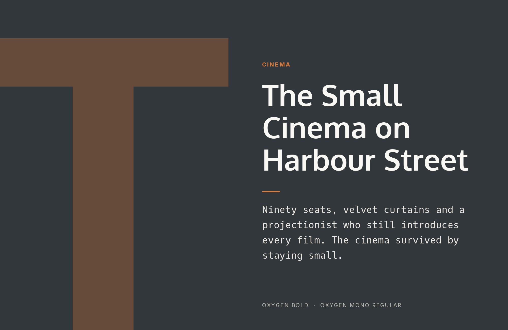
Google Fonts describes Oxygen Mono as “the monospace companion family to Oxygen, the KDE project UI and brand type.” Vernon Adams designed both, and Google Fonts added the mono on 8 September 2012. The monospace was part of the plan from the start: the first alpha release contains three weights, regular, bold and monospace. That makes this the most natural pairing on the list. The two share proportions, stroke weight and the same FreeType-first drawing, so they sit on a page as one system rather than two voices. Use Oxygen for interface labels, headings and running text, and switch to Oxygen Mono for code samples, file paths, keyboard shortcuts and tabular numbers. This is the pairing for documentation sites, developer tools and any product that needs its code to look related to its prose. Keep the mono small and occasional. A full paragraph of it will slow readers down.
2. Maven Pro
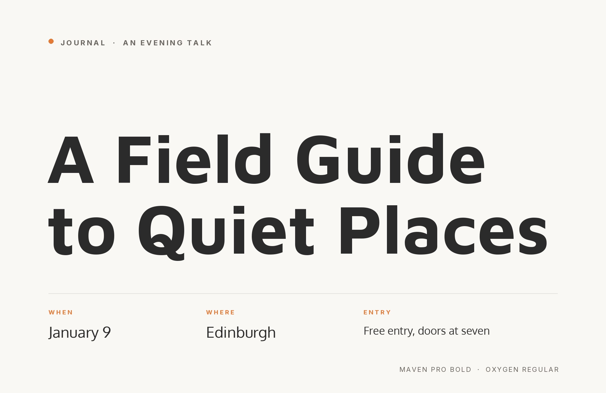
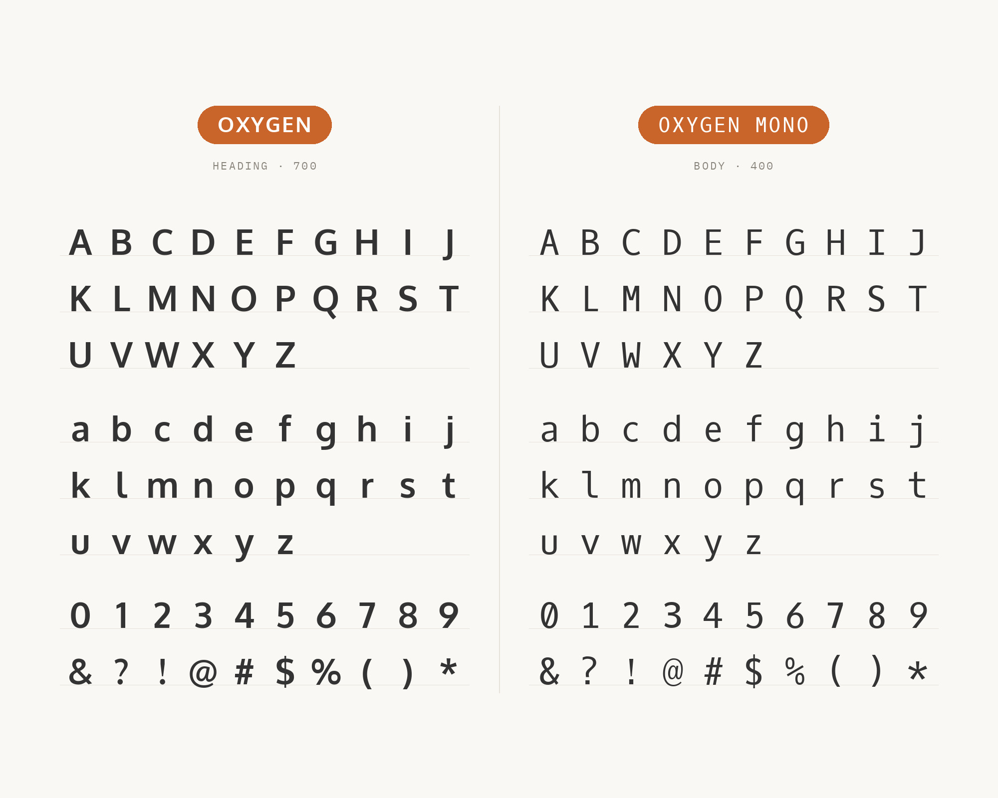
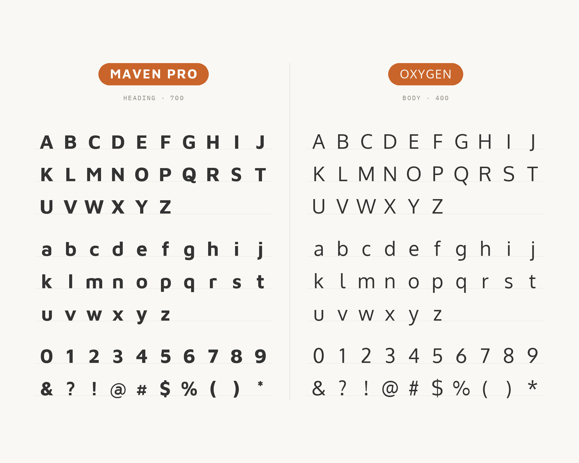
Kai Marie Group, a healthcare consulting firm, publishes a brand manual that assigns the two roles directly. “Maven Pro is our primary typeface used for headlines and titles,” it says, and Oxygen is the secondary typeface for all body copy. The manual sets its body text in Oxygen Light and allows three weights of Maven Pro but one of Oxygen. Maven Pro is a sans serif with what its Google Fonts description calls unique curvature and flowing rhythm. That curvature is the contrast. Oxygen is steady and upright, so Maven Pro’s rounder, more distinctive letters carry the personality in the headline while Oxygen Light keeps paragraphs even and restful. Both are sans serifs, so the split has to come from weight and size. Put Maven Pro in Bold or Semi Bold for titles and let Oxygen Light run underneath at a comfortable size. It is a good model for service brands that want to feel professional without feeling cold.
Try Semrush free. No credit card.
Start on the $0 plan. Paid plans from $117/mo billed annually.
Try for free3. Oswald
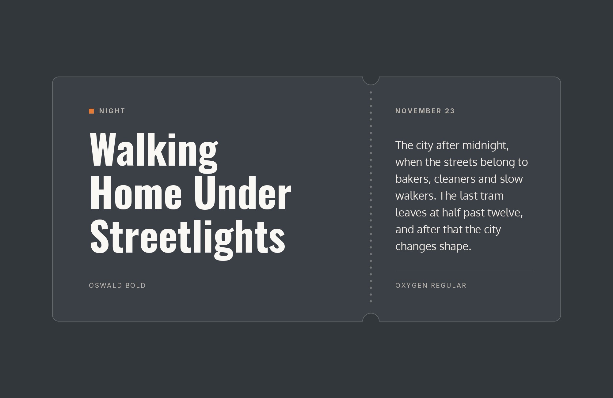
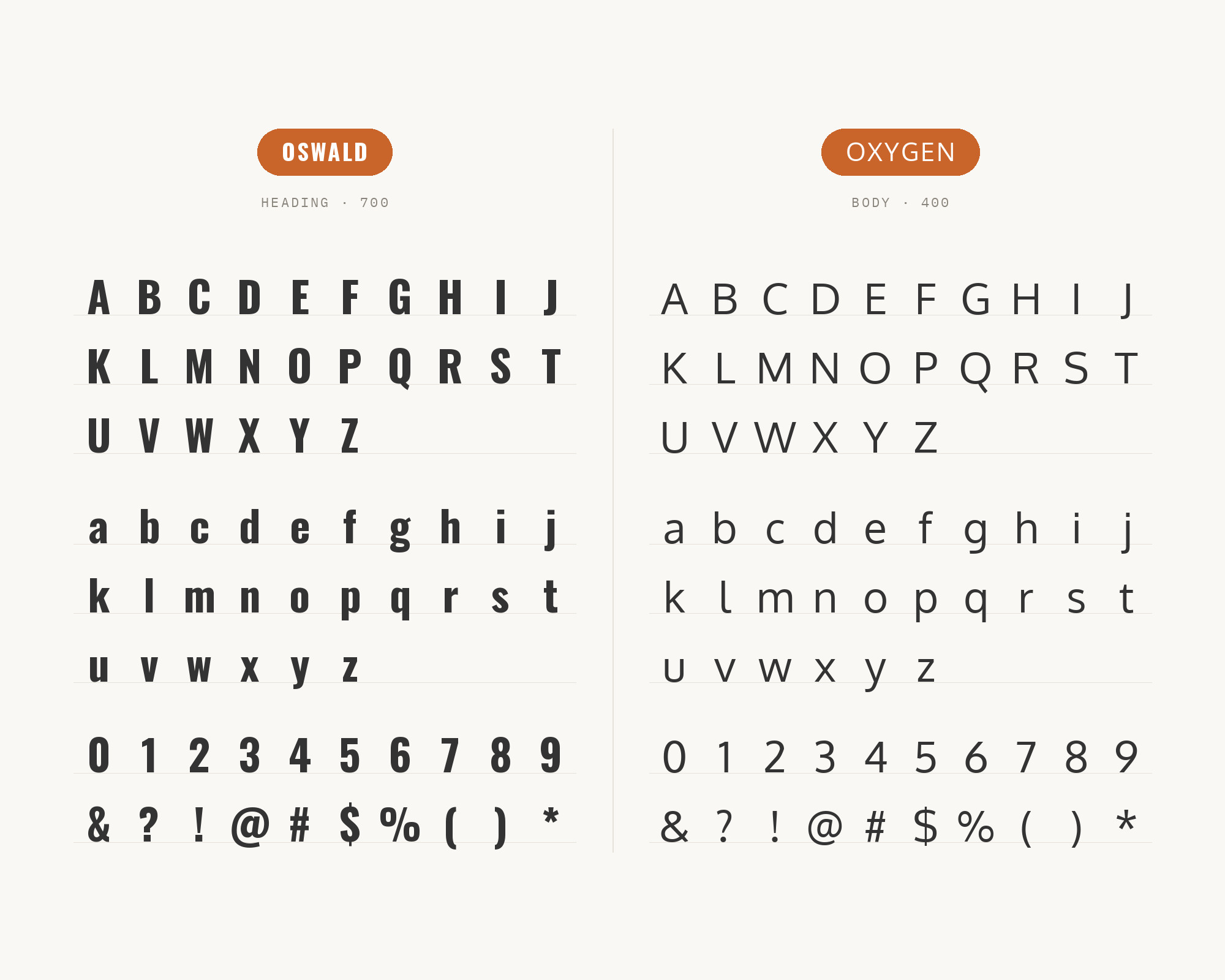
Oswald is also Vernon Adams’s work: since the initial launch in 2011, he updated it continually until 2014. It is a reworking of the classic style historically represented by the Alternate Gothic sans serif typefaces. Typ.io records the pair live on generateconf.com, a conference site tagged for its lineup and running order. DocHipo’s education flyer example also puts the display type in Oswald and Oxygen, with the body text in Open Sans. The logic is simple. Oswald is narrow, tall and heavy, so it packs a big headline into a small space. Oxygen has normal width and a quiet texture, so it reads comfortably under that headline. Use Oswald in capitals for event names, schedules and section titles, and use Oxygen Regular for descriptions and details. Because the two fonts come from the same designer, the pairing feels related even though the widths are very different.
4. Quicksand
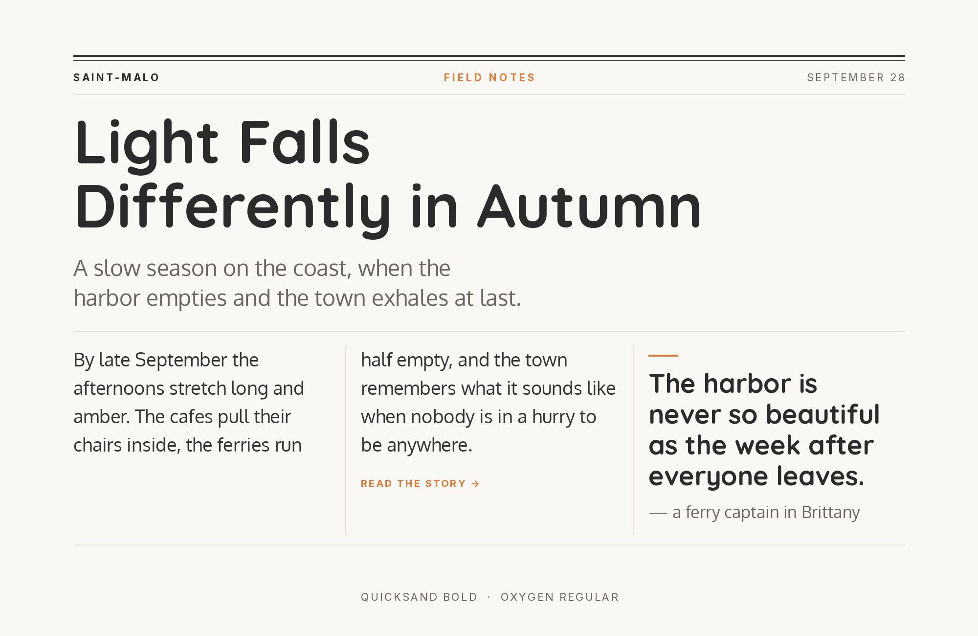
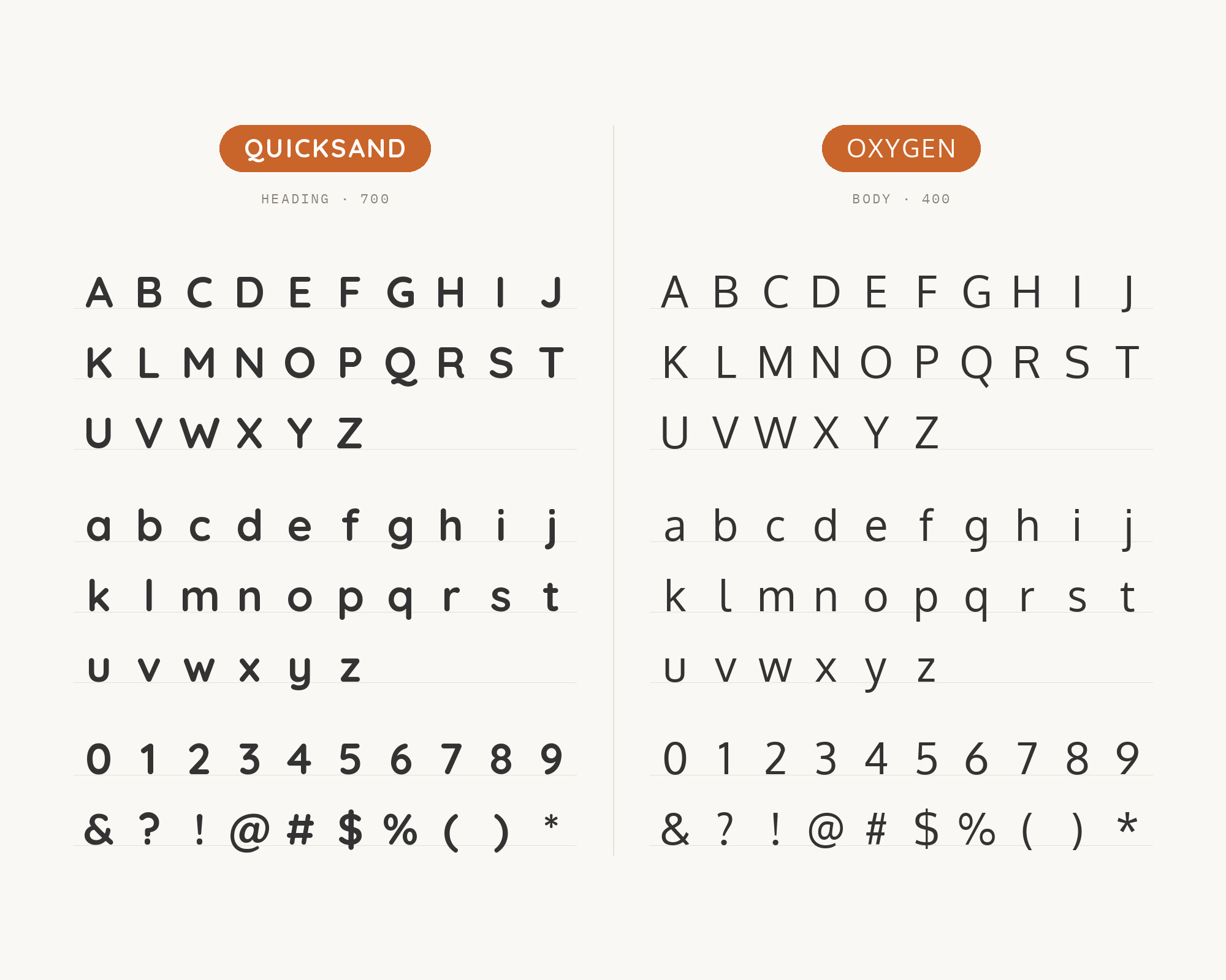
Typ.io records Oxygen with Quicksand on thelostcinema.co.uk, a site tagged for cinema, movies and entertainment. Quicksand is a display sans serif with rounded terminals. Andrew Paglinawan started the project in 2008 using geometric shapes as a core foundation. That is the useful difference. Quicksand is round, light and friendly, built from circles. Oxygen is a humanist sans with plainer, more practical shapes. Let Quicksand take the title, the film name or the short promotional line, where its soft geometry reads as warm and playful. Let Oxygen take the listings, times and paragraphs, where Quicksand’s thin rounded strokes would start to look fragile. This pairing suits entertainment, hospitality and family brands. Keep Quicksand at a large size and a medium or bold weight so it does not wash out next to Oxygen.
5. Open Sans
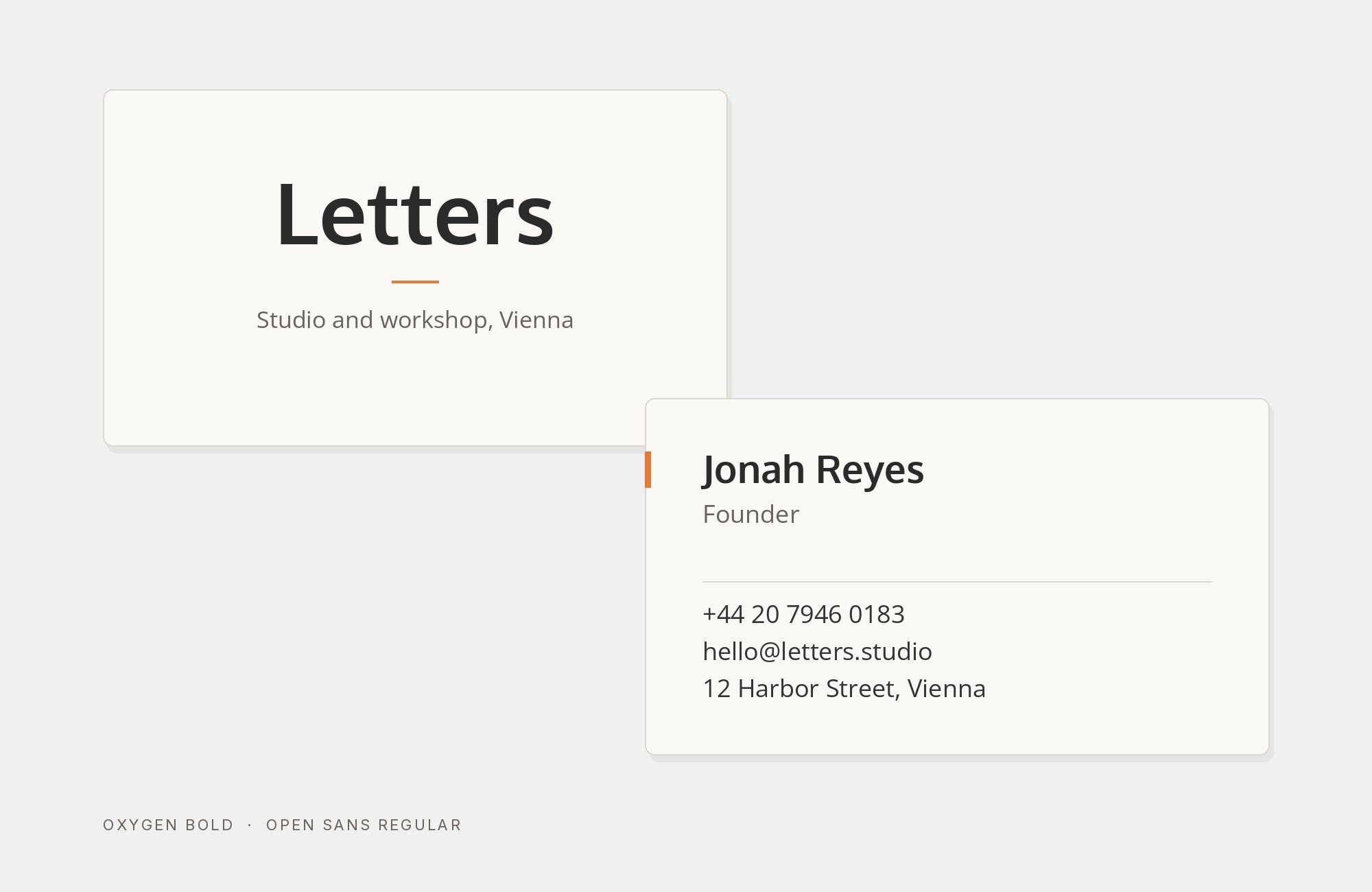
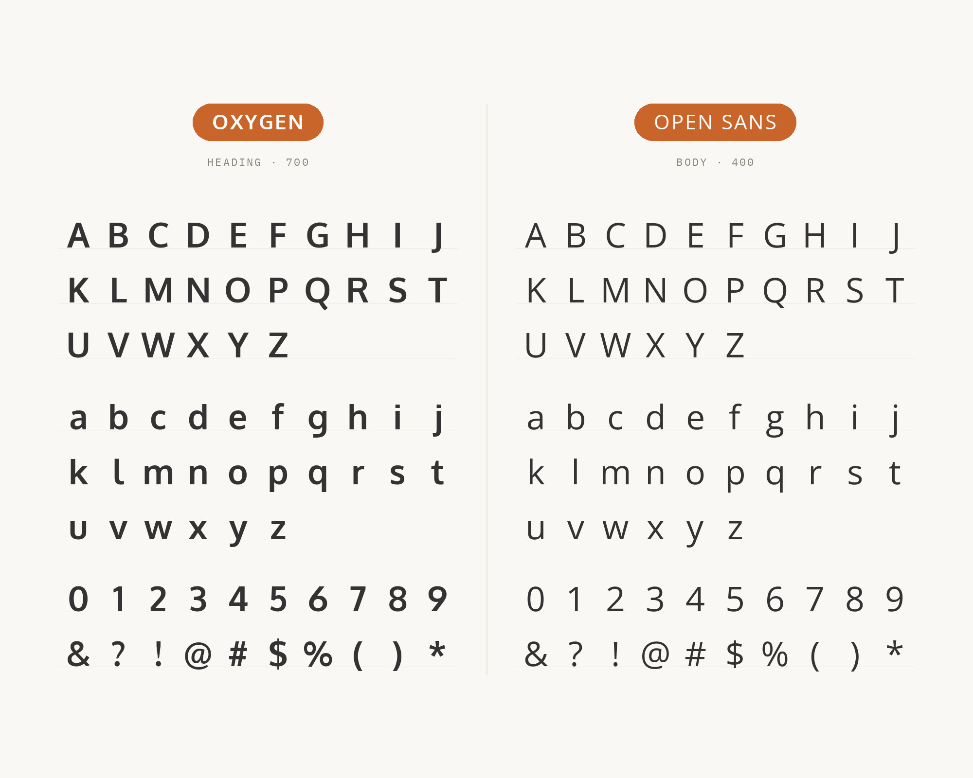
Venngage recommends Oxygen with Open Sans with a direct instruction: “Set the headings and display elements in Oxygen bold and your text in Open Sans regular in your annual reports or pitch decks.” DocHipo’s flyer example also keeps its body text in Open Sans under an Oxygen and Oswald display. Open Sans is a humanist sans serif typeface designed by Steve Matteson, with an upright stress, open forms and a neutral, yet friendly appearance. That makes the two close relatives, so contrast has to come from weight, not from style. Oxygen Bold is compact and firm in a heading. Open Sans Regular is wide and open in a paragraph. Keep a clear size step between them and avoid setting both in the same weight. This is a practical pairing for business documents, slides and reports, where the reader should notice the content and not the fonts.
Pro from $14/mo, save $60 yearly.
Premium templates, vector export, and a commercial license on every paid plan.
See plans6. Source Sans Pro
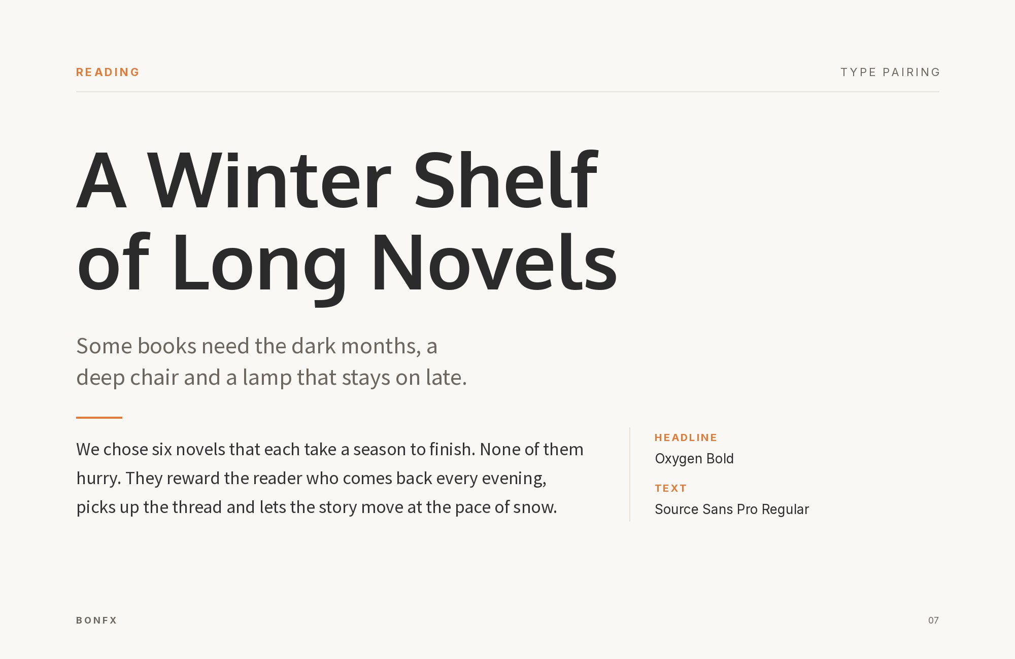
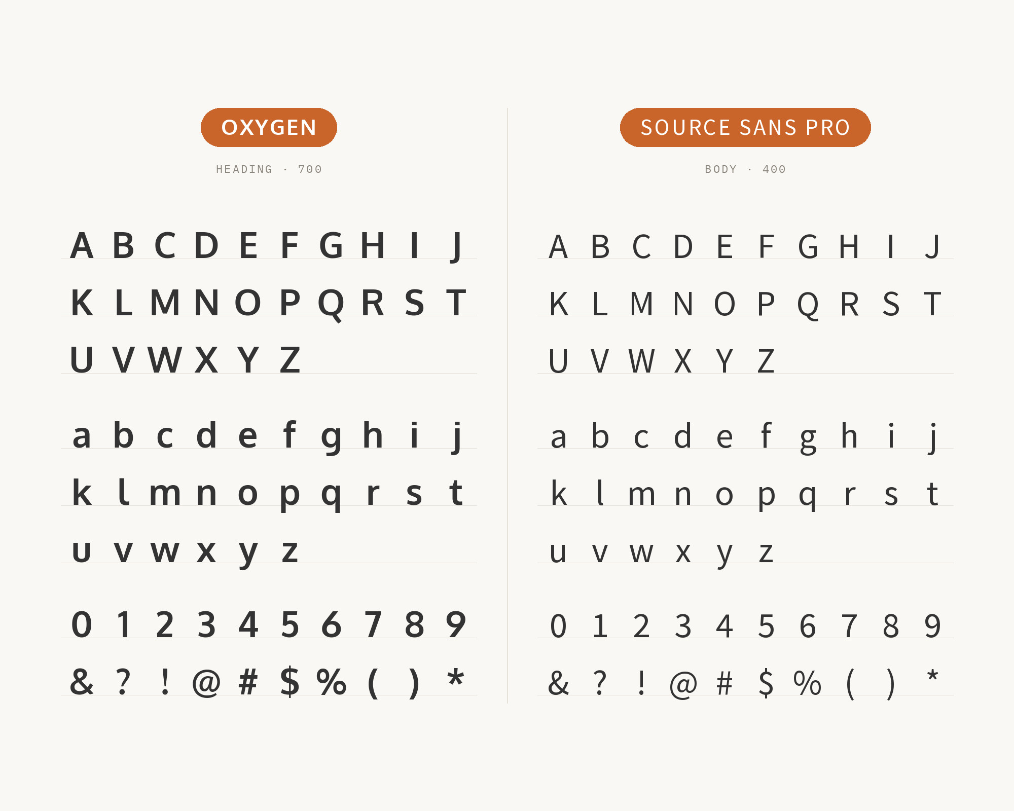
Raindrops Insider lists Oxygen for headline and display and Source Sans Pro for body and copy, and notes that a bold Oxygen weight turns it into a display face. Pagecloud’s minimalist sans-plus-sans example uses the same split, with Oxygen as the title font and Source Sans Pro as the paragraph font. Source Sans Pro is Adobe’s first open source typeface family, designed by Paul D. Hunt and intended to work well in user interfaces. So this is another pairing of interface faces. Source Sans Pro is slightly narrower and more open in text, and it has a much bigger weight range. Use Oxygen Bold for titles, then let Source Sans Pro carry paragraphs, captions and form labels. If you install the current release, it is called Source Sans 3. The pairing logic is the same.
7. Noto Serif
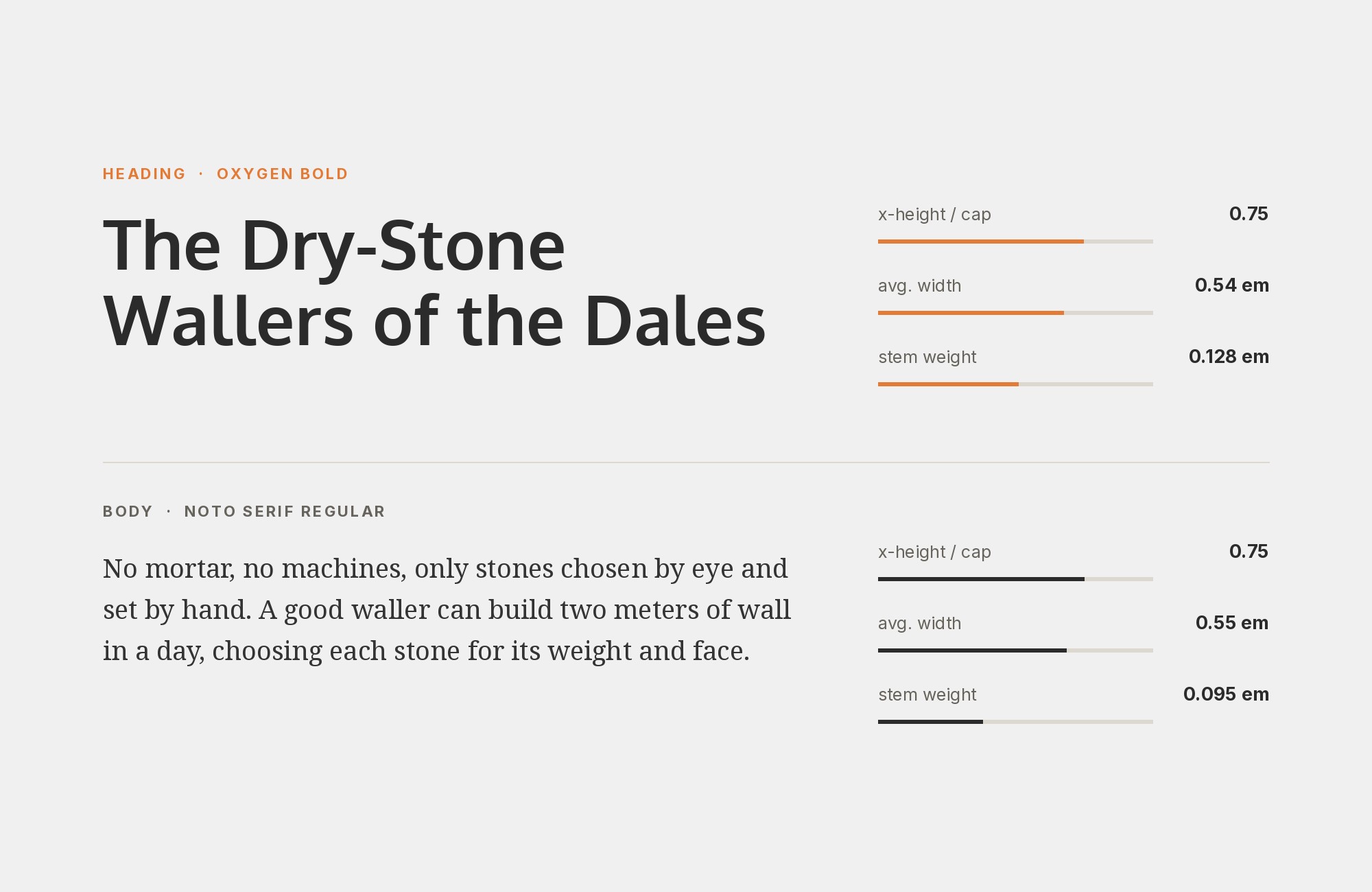
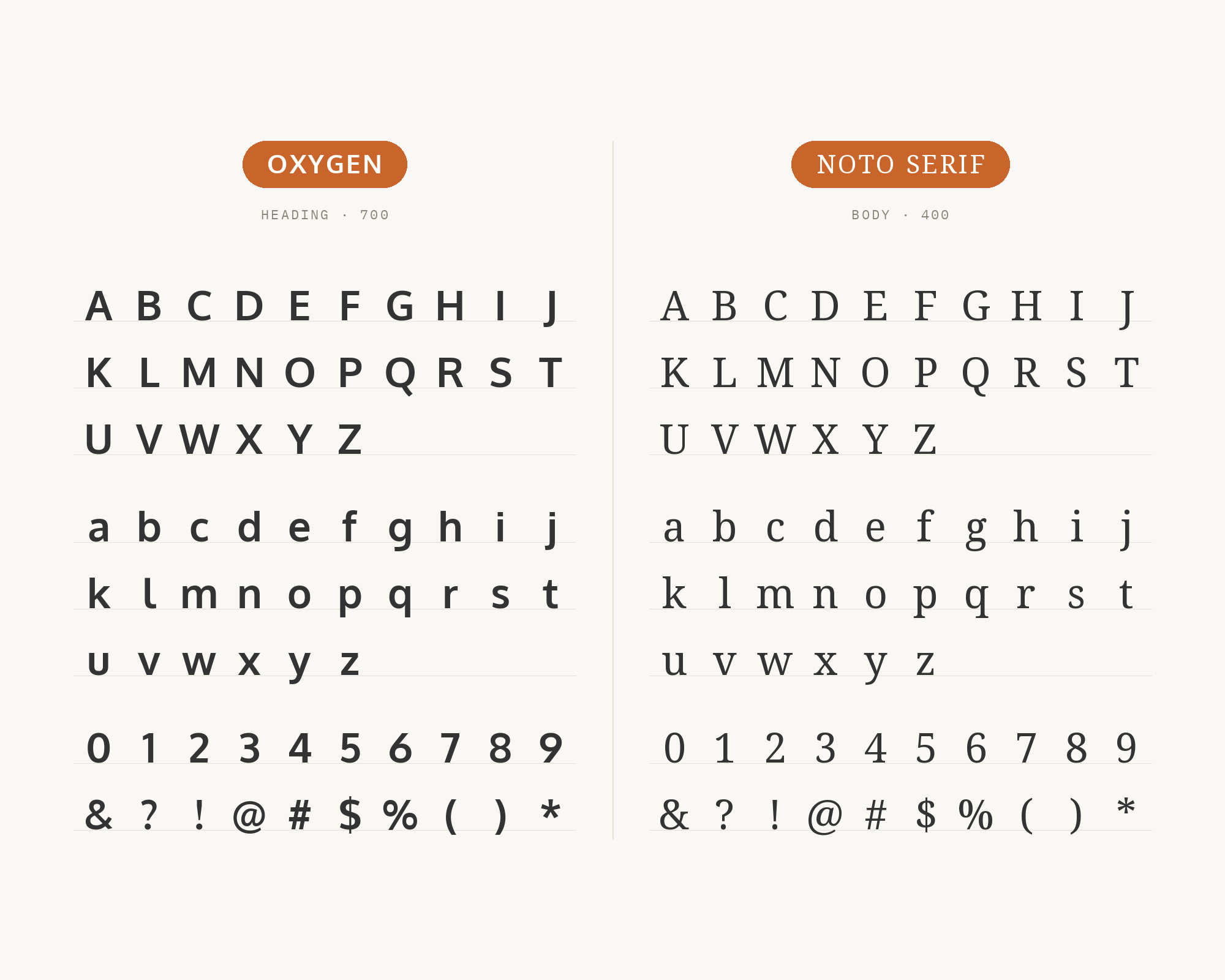
Reliable PSD’s pairing collection sets oxygen light over Noto serif regular, with a link to view Oxygen and Noto on Google Fonts. Noto Serif is a modulated design for texts in the Latin, Cyrillic and Greek scripts, part of Google’s Noto collection for all modern and ancient languages. The pairing has a neat echo: Noto is the family KDE chose when it replaced Oxygen as the Plasma default. Here the two work together. Oxygen Light gives a large, airy heading. Noto Serif gives the body real stroke contrast and serifs, so the page gets the classic sans-over-serif split. Use it for blogs, help centers and long articles that need a heading with a technical feel and a body that reads like a book. Keep Oxygen Light large, well above body size, where its thin strokes still hold.
8. Zilla Slab
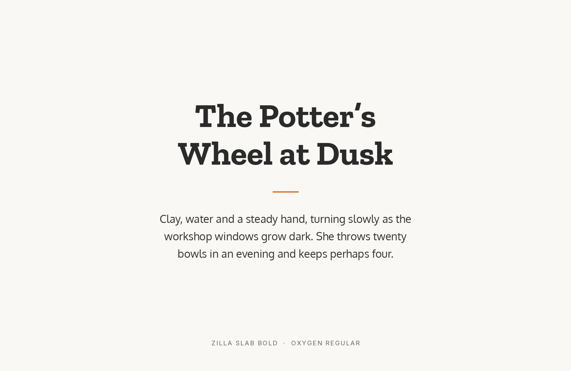
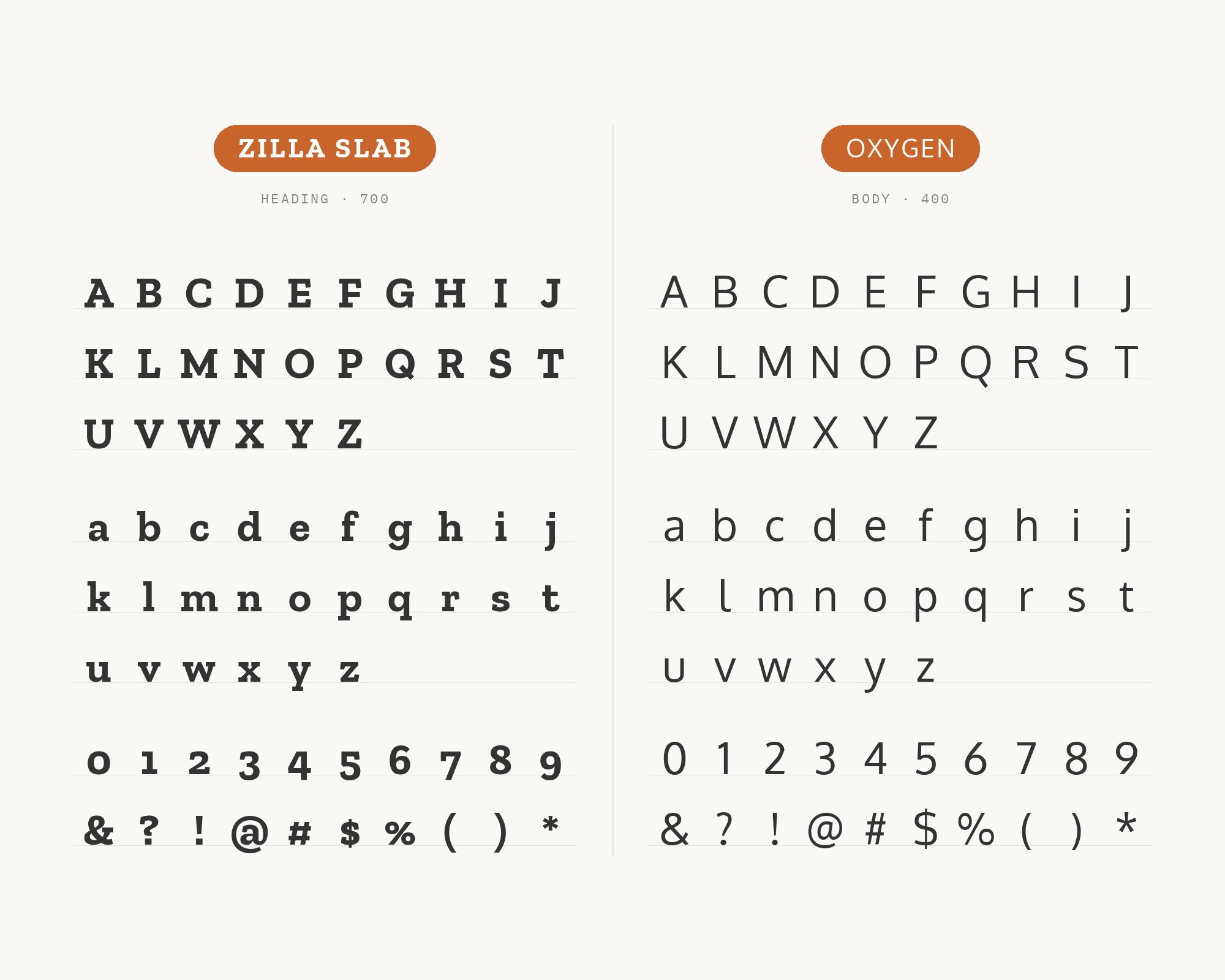
SlidesCarnival’s Whitmore presentation template is set in the fonts Oxygen and Zilla Slab. Zilla Slab is Mozilla’s core typeface, a contemporary slab serif designed by Typotheque and based on its Tesla. Slab serifs have heavy, square serifs and little contrast, so Zilla Slab shares Oxygen’s even stroke but adds a firm, mechanical edge. That is a good fit for a font that was born on a Linux desktop. Give Zilla Slab the slide titles and the big numbers, where its block serifs look confident. Give Oxygen the bullet points and body text, where its open, plain letters stay easy to read on a screen from across a room. The pairing works for tech presentations, reports and product pages. Keep to one slab weight in a layout. Zilla Slab Bold is already strong next to Oxygen Regular.
9. Lora
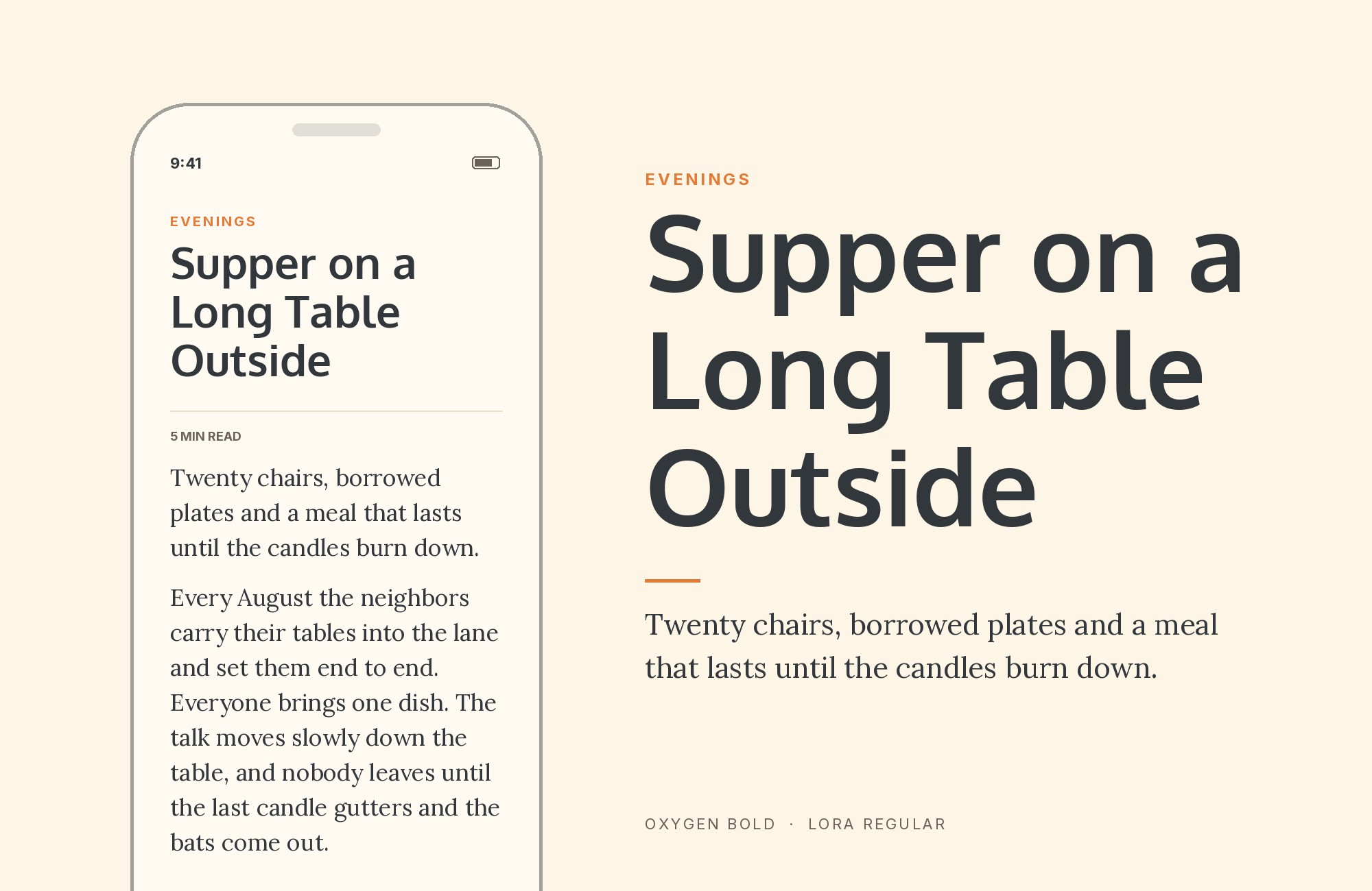
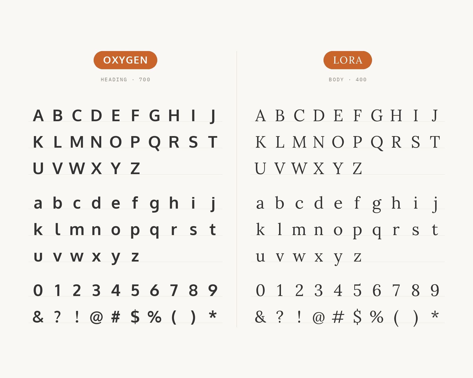
Jukebox Print’s Oxygen specimen features a sample pairing with a heading in Oxygen and body text in Lora, and says that Oxygen works beautifully alongside Lora. Lora is a well-balanced contemporary serif with roots in calligraphy, with moderate contrast well suited for body text. This is the warmest pairing on the list. Oxygen’s heading is clean and neutral. Lora’s brushed curves and sharp serifs bring a literary, slightly handmade texture to the paragraphs underneath. Use Oxygen Bold for headings and navigation, and set Lora Regular for articles, stories and product descriptions. It suits blogs, small publishers and lifestyle brands that want a modern frame around a more personal reading voice. If you need emphasis, use Lora’s own italic before adding a third family.
10. EB Garamond
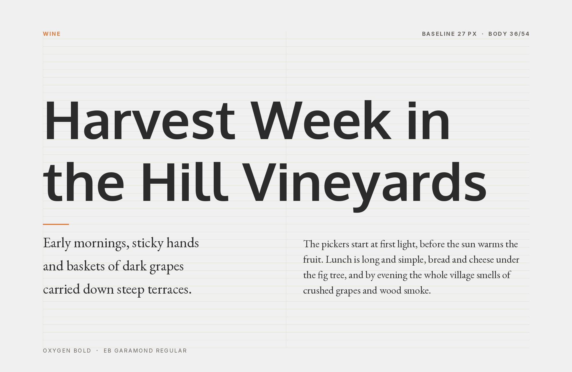
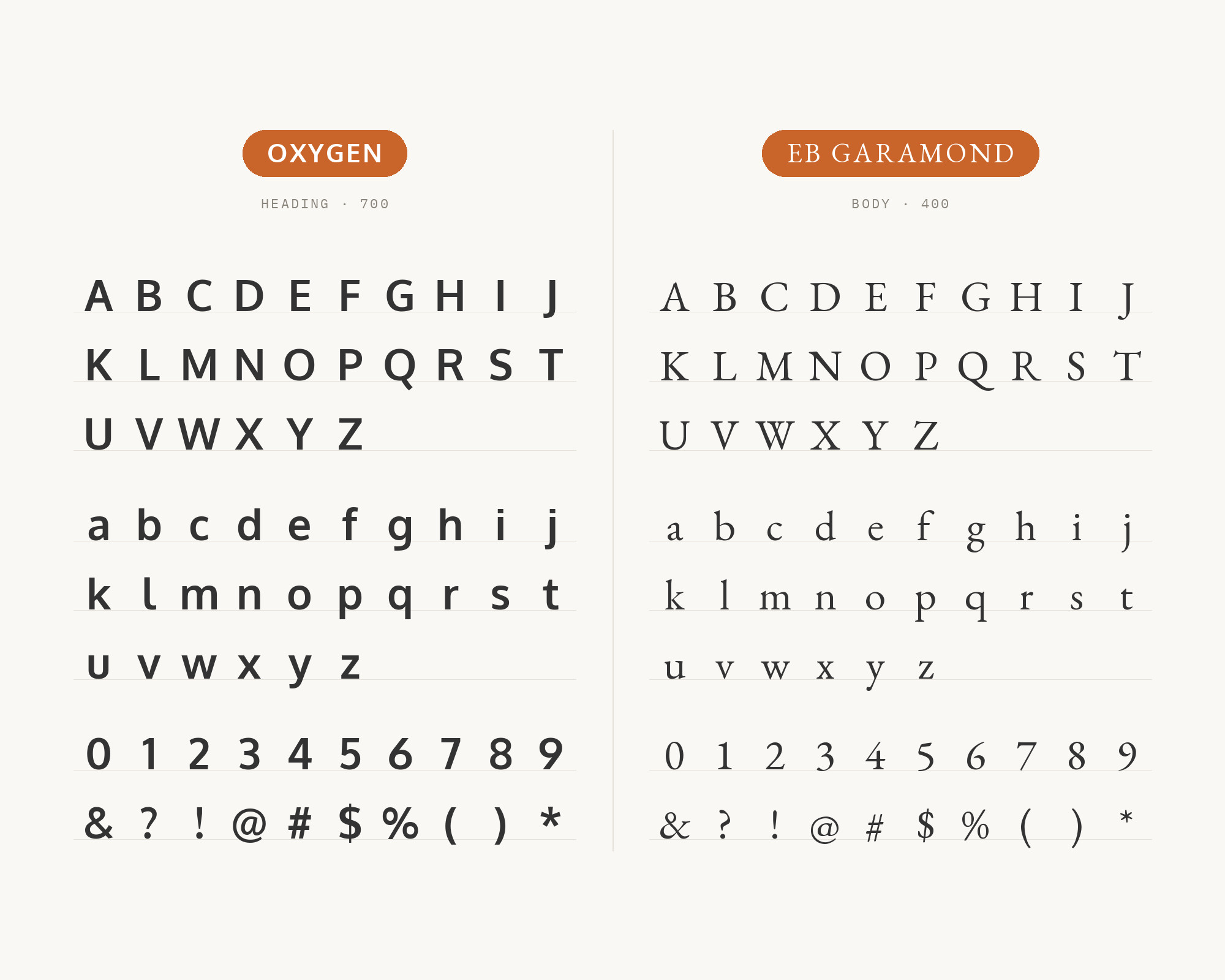
Jukebox Print’s Oxygen FAQ names EB Garamond as a serif partner and frames the combination as a headline and body pairing. This is the most classical option here. EB Garamond is a community project to create a revival of Claude Garamont’s famous humanist typefaces from the mid-16th century, and its source is a specimen composed in 1592 by Conrad Berner. Against that, Oxygen reads as clearly digital. The contrast is historical as much as visual: an interface sans for headings, and a Renaissance book face for reading. Use Oxygen Bold for short headings, labels and navigation. Set EB Garamond a little larger than you would set a sans, because its small x-height makes it look smaller at the same point size. This works for cultural organizations, academic sites and editorial pages that want a modern structure around traditional text.
Conclusion
Oxygen’s best partners follow from its origin. It is an interface face, calm and even, so it rarely needs a partner that is also calm and even. The best-documented pairings give it a companion with a stronger voice. Maven Pro, Oswald and Quicksand take the headline and leave Oxygen the reading. Open Sans and Source Sans Pro invert that, with a bold Oxygen heading over a wider text sans. The serifs, from Noto Serif to EB Garamond, add the stroke contrast that Oxygen does not have.
If you want one answer, start with Oxygen Mono for technical work and Maven Pro for brand work. Both are backed by first-hand evidence, a shared design history in one case and a published brand manual in the other. Then test with real copy at the sizes you intend to publish, and keep one clear role for each font.
Sources
- Typ.io (Oxygen)
- Typ.io (Oxygen with Oswald)
- Kai Marie Group brand manual
- Venngage
- Raindrops Insider
- Pagecloud
- DocHipo
- Reliable PSD
- SlidesCarnival (Whitmore)
- Jukebox Print
- Fontpair (Oxygen)
- Google Fonts (Oxygen)
- Vernon Adams, oxygenFont README
- KDE oxygen-fonts README
- Jonathan Riddell, Your New Monospace Font: Hack
- OMG! Ubuntu
- Figma (Oxygen)
