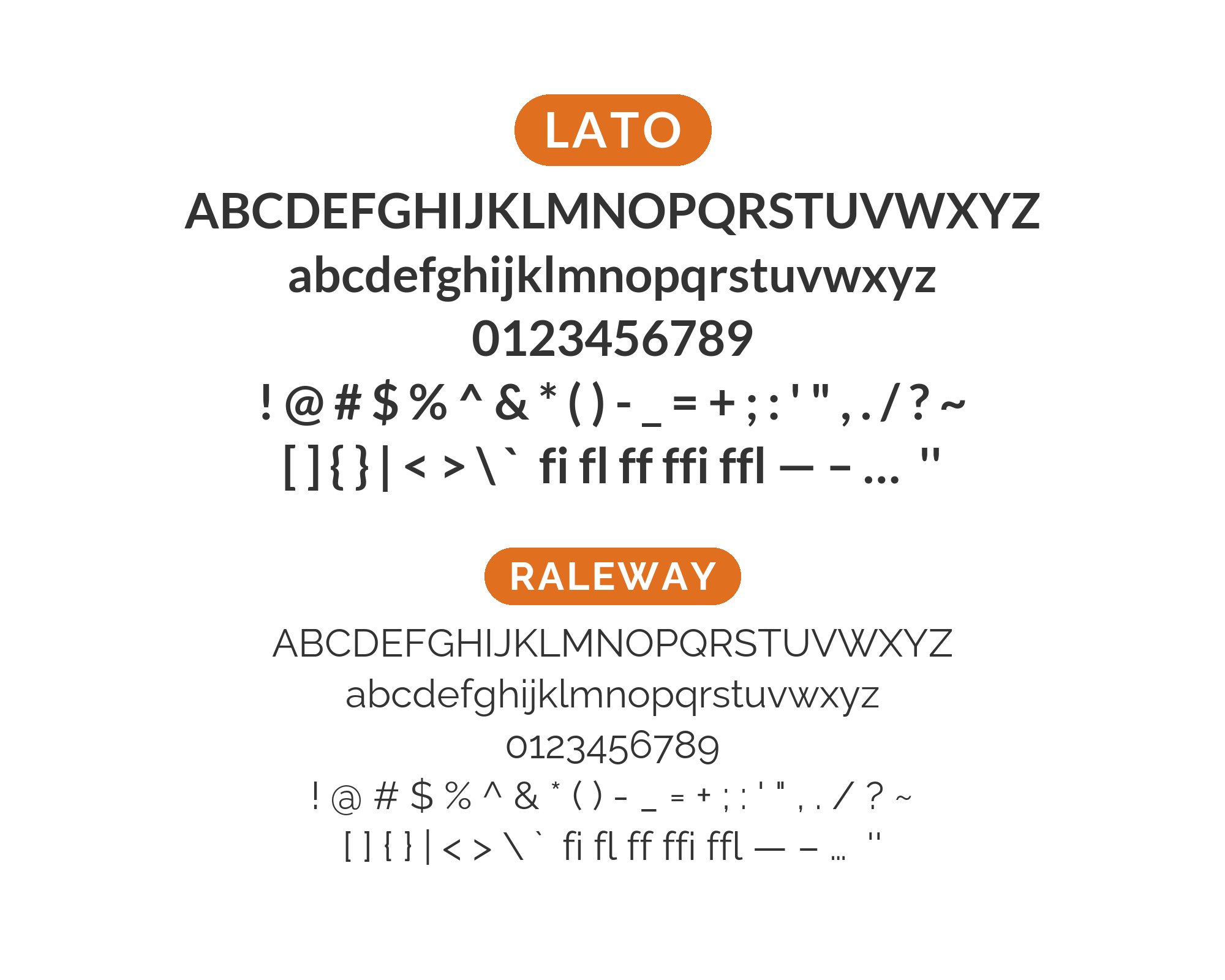
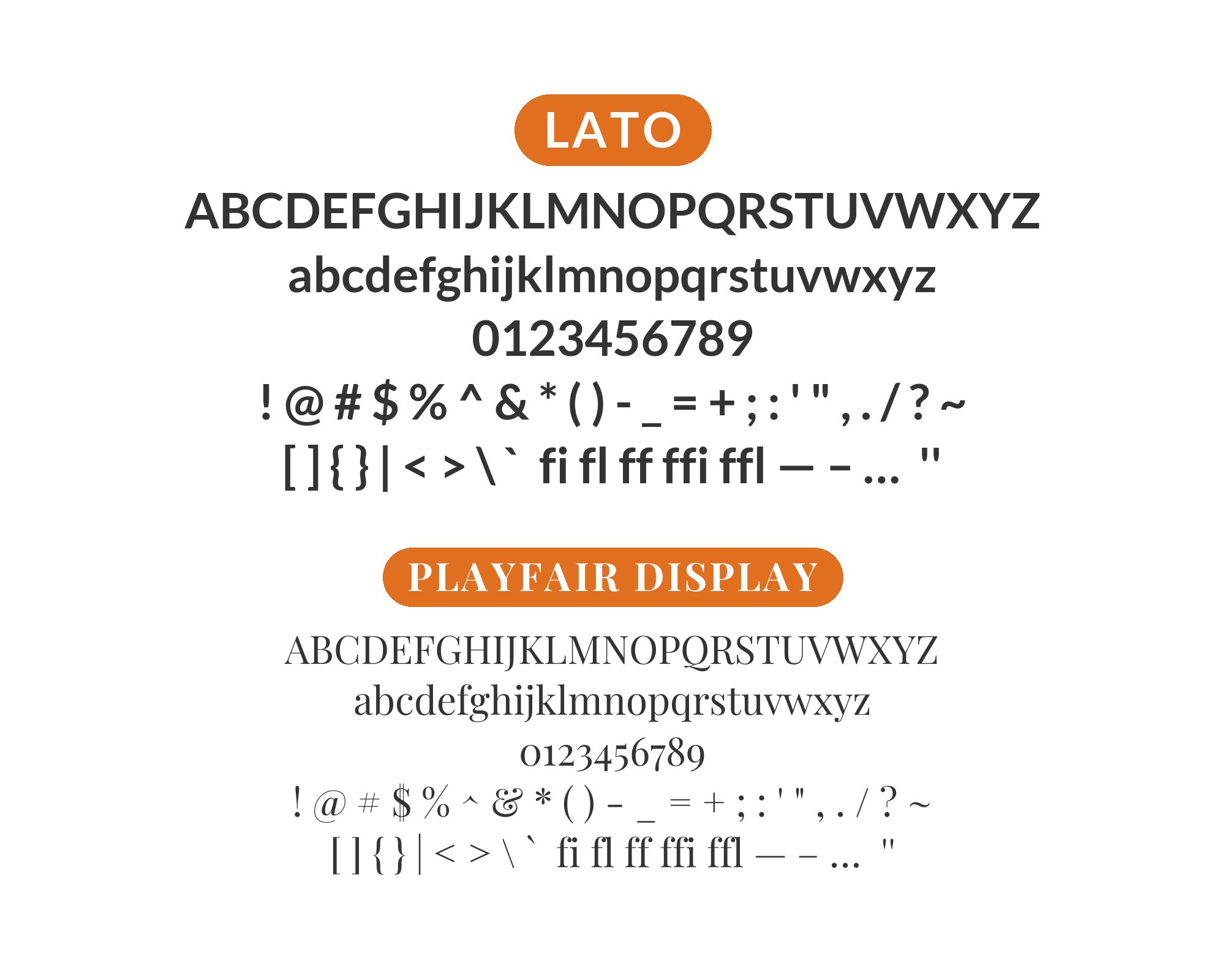
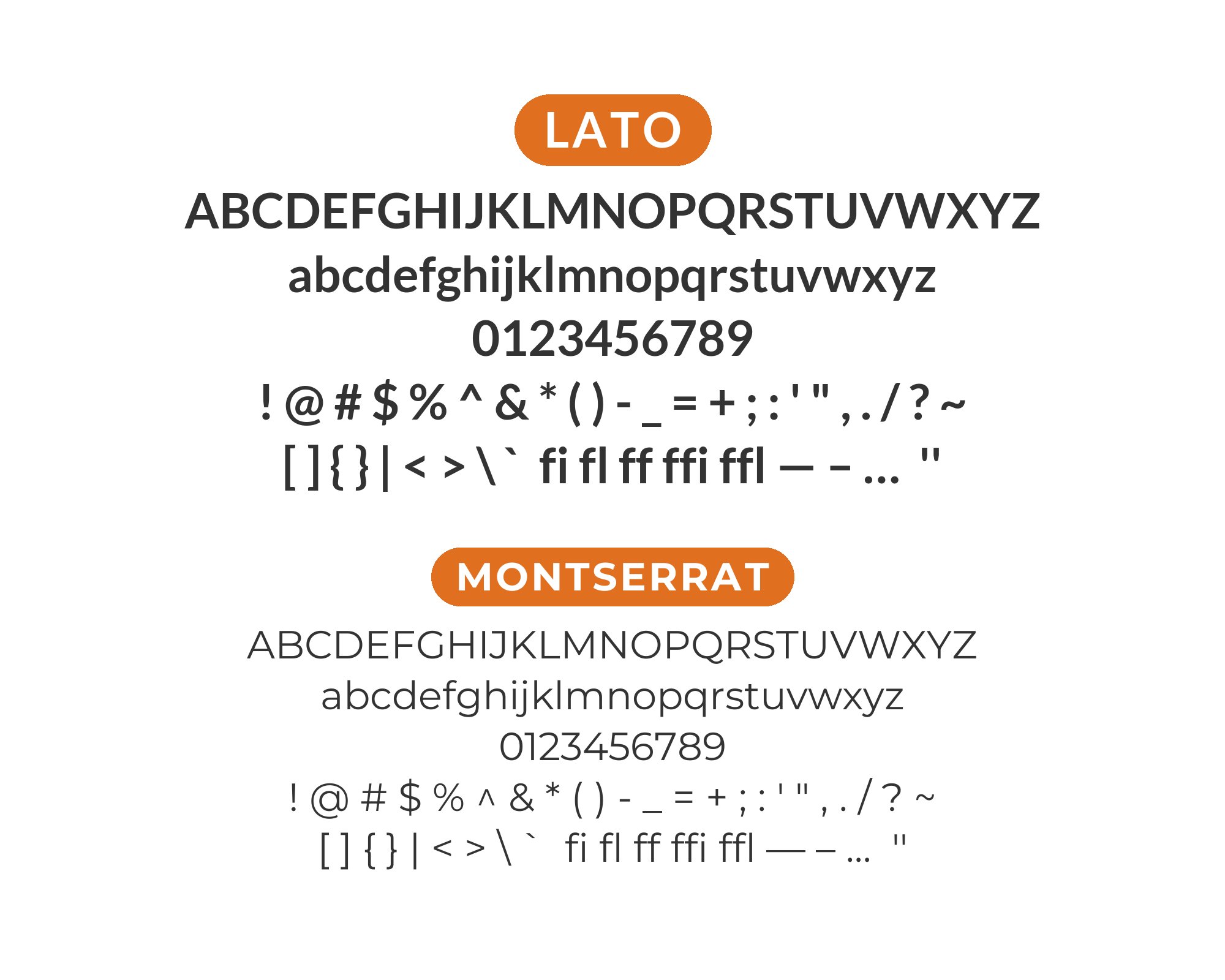
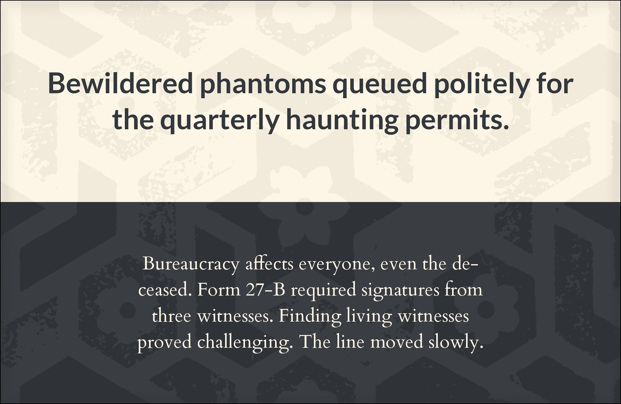
What fonts go with Lato? This widely-loved sans-serif offers a warmth and approachability that make it remarkably partnership-friendly, though its very ubiquity creates its own pairing considerations.
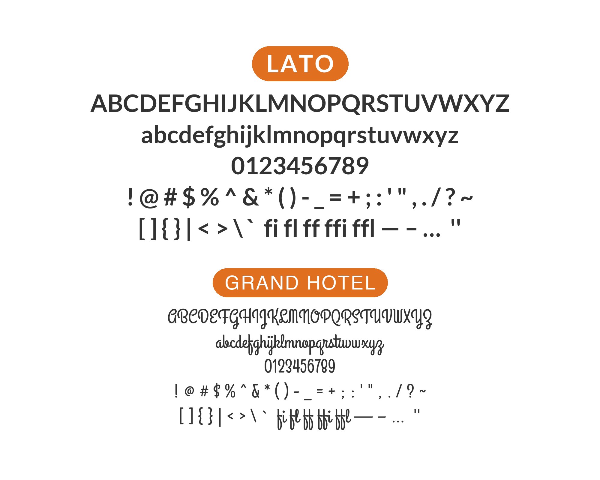
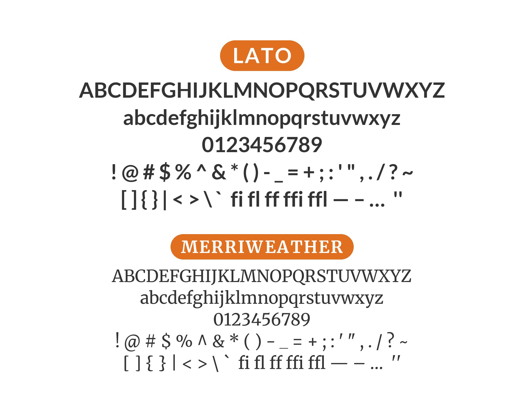
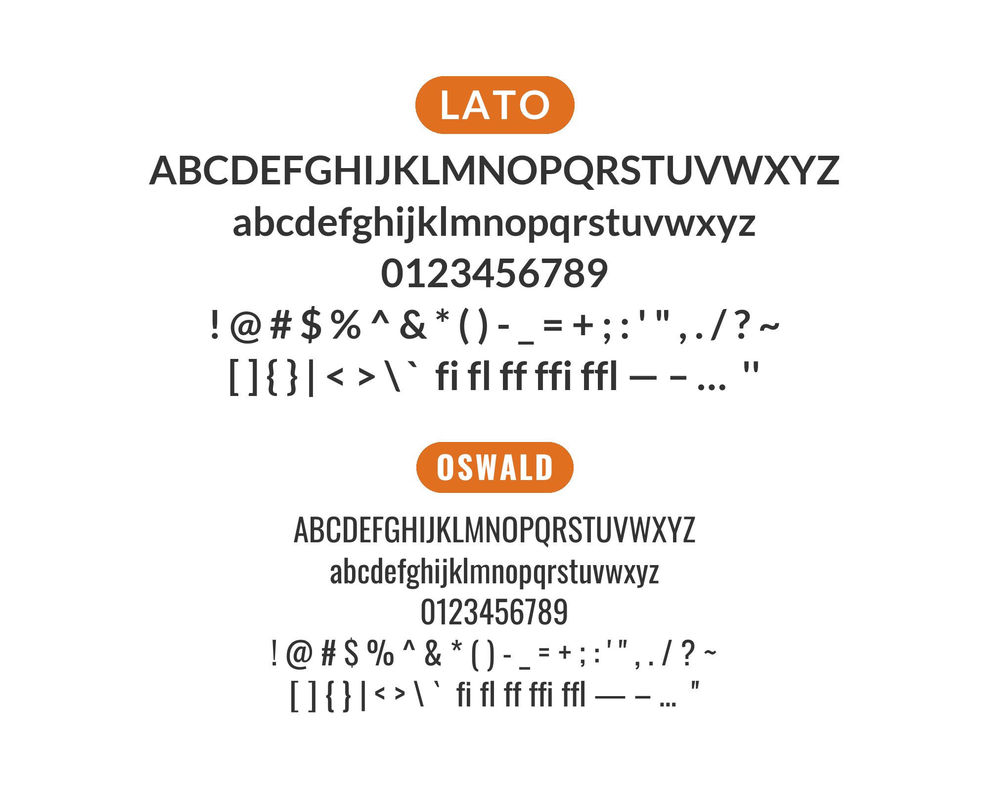
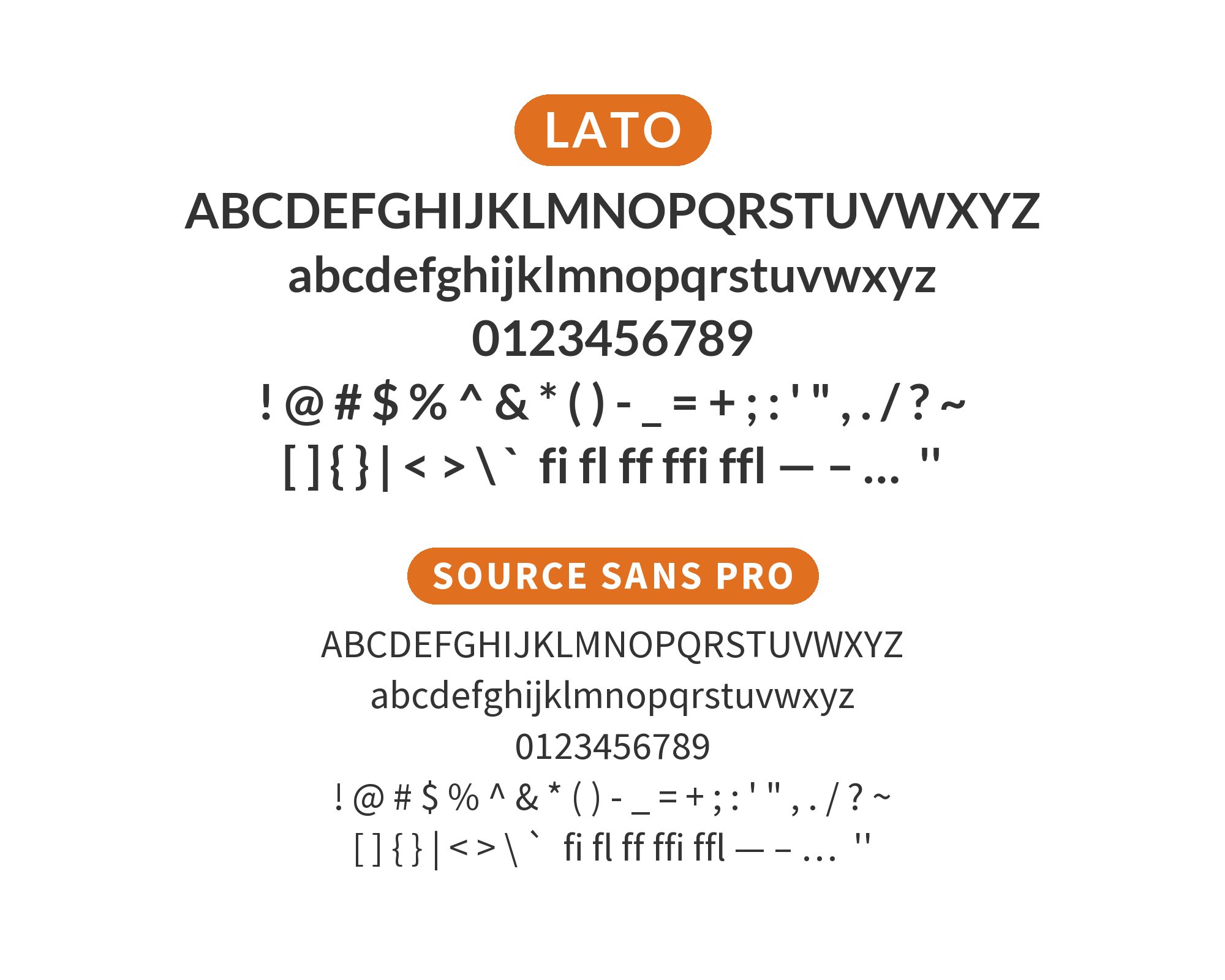
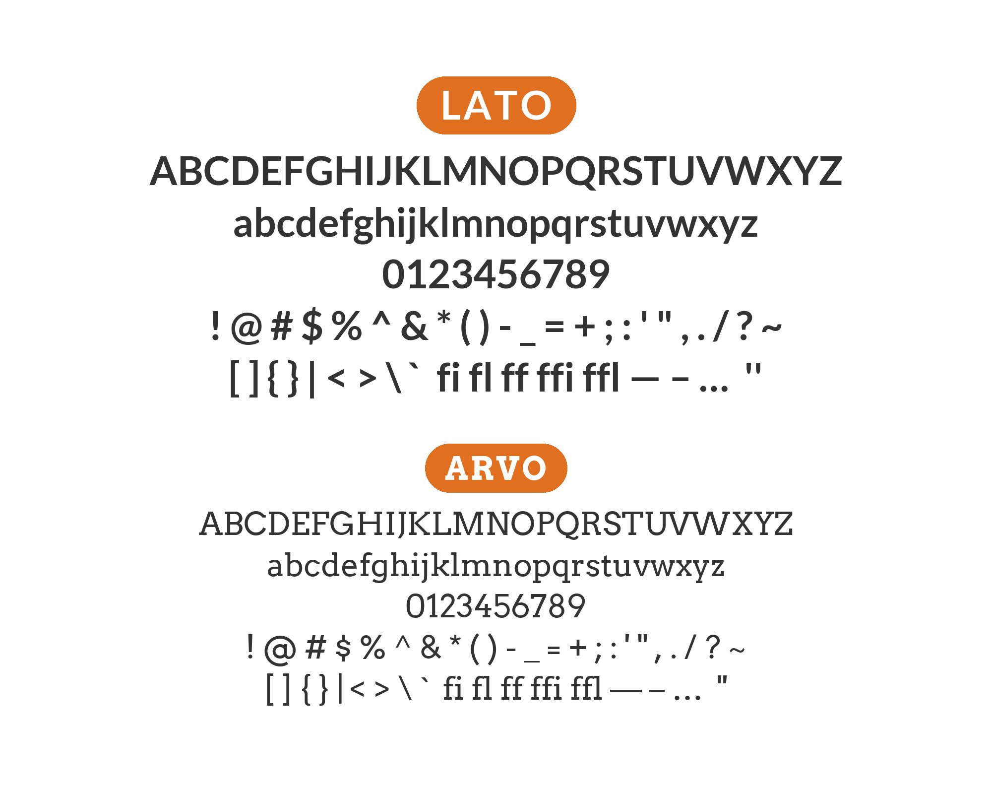
Lato, meaning ‘summer’ in Polish, was designed by Warsaw-based designer Lukasz Dziedzic with the intention of creating something that felt serious yet friendly. The typeface achieves this through a clever balance: semi-rounded details convey warmth, while its strong structure maintains professionalism. The extensive family spanning nine weights with matching italics provides tremendous range, from hairline elegance to heavy impact. Lato’s generous x-height and open forms ensure excellent readability, which partly explains why it became one of the most popular fonts on Google Fonts.
The challenge with Lato isn’t finding fonts that work alongside it but rather selecting pairings that feel intentional rather than default. Its friendly nature means it plays well with almost everything, which paradoxically requires more thoughtfulness to create distinctive combinations. Serif partners can add editorial sophistication, while other sans-serifs need enough distinction to create visual interest. Here are 15 fonts that pair well with Lato, chosen for creating combinations that feel curated rather than convenient.
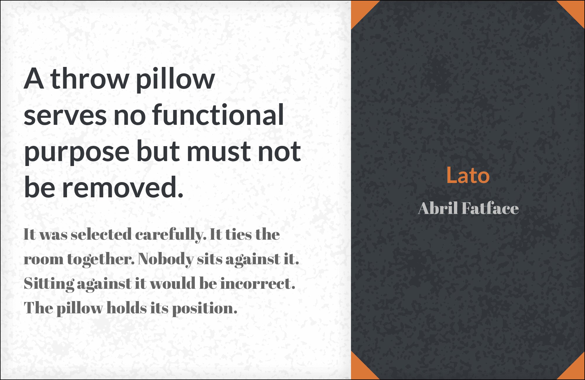
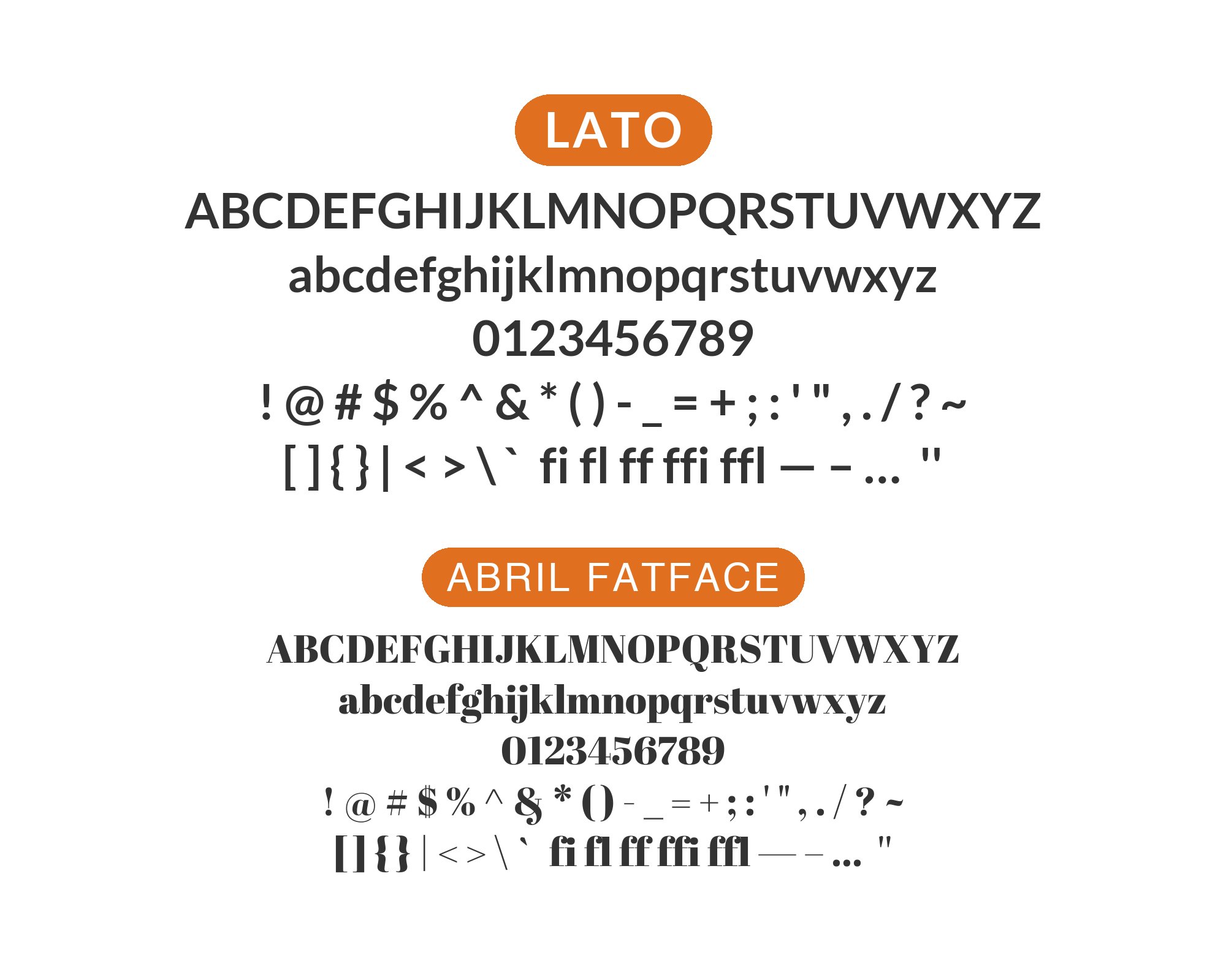
1. Abril Fatface
Bold, baroque drama meets understated elegance. Abril Fatface‘s ultra-high contrast and hairline serifs demand attention in headlines, while Lato’s even-tempered body copy handles the supporting role with grace. The contrast is stark but harmonious, perfect for fashion editorials, luxury branding, and theatrical announcements. Abril commands; Lato explains. One of the most striking serif-sans combinations available.
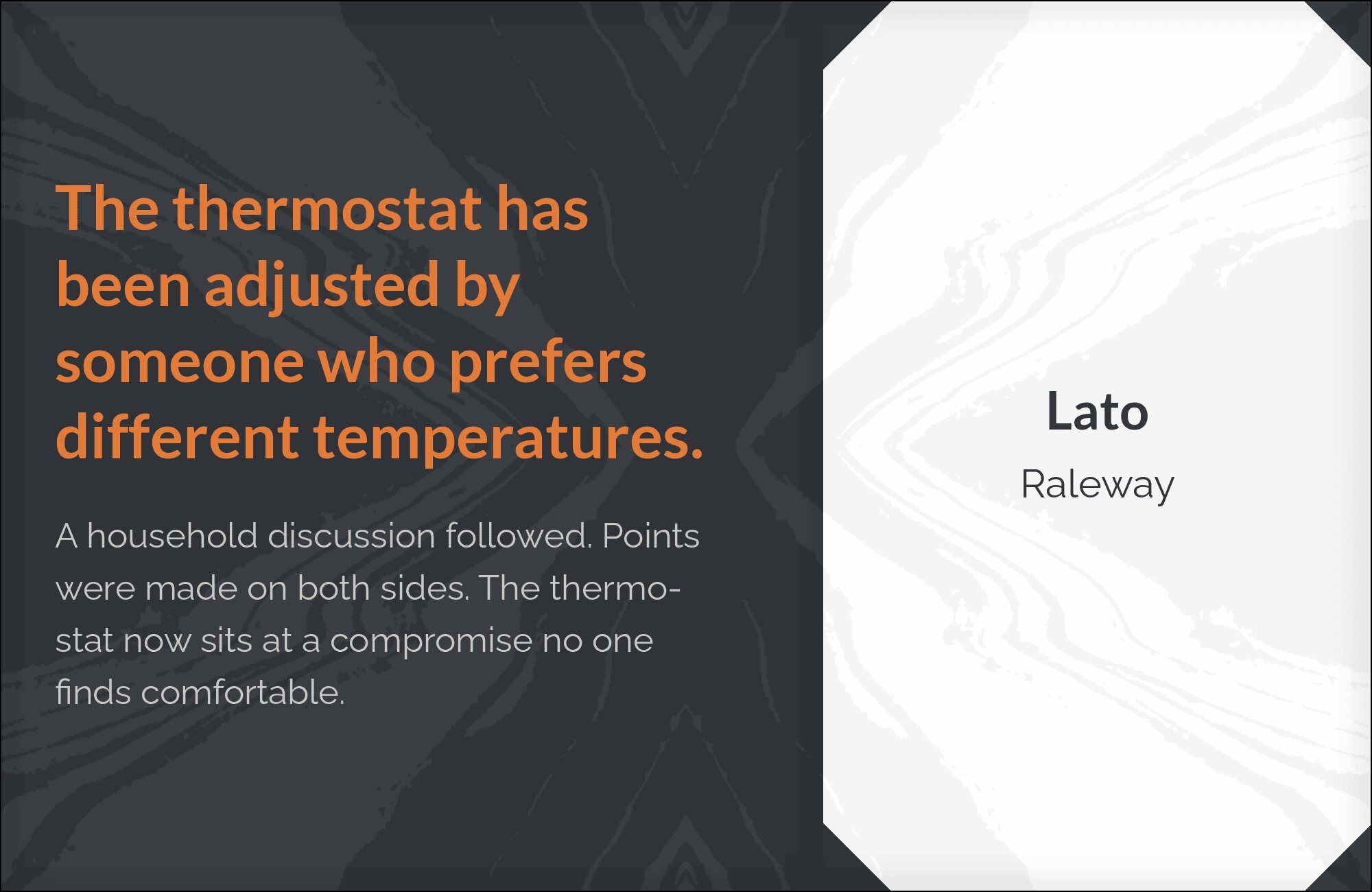
2. Raleway

Two sans-serifs that somehow avoid redundancy. Raleway‘s elegant thin weights and distinctive ‘W’ design contrast with Lato’s rounder, more grounded letterforms. Use Raleway for airy headlines and Lato for substantial body text. The pairing works for lifestyle blogs, creative portfolios, and design agencies wanting sophistication without serif formality. Both fonts offer extensive weight ranges for nuanced hierarchy.
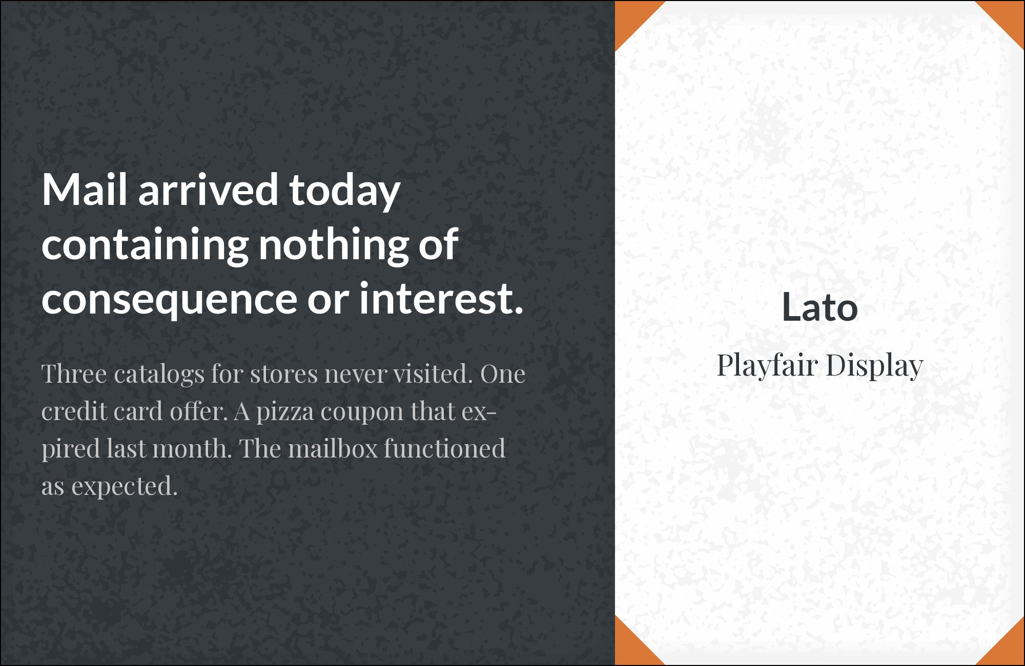
3. Playfair Display
Didone elegance pairs with Lato’s warm neutrality. Playfair‘s dramatic thick-thin contrast in headlines creates instant sophistication that Lato supports without competing. The rounded terminals in Lato soften Playfair’s formality, making the combination accessible yet elevated. Editorial layouts, restaurant branding, and premium product sites benefit from this classic meets contemporary pairing.
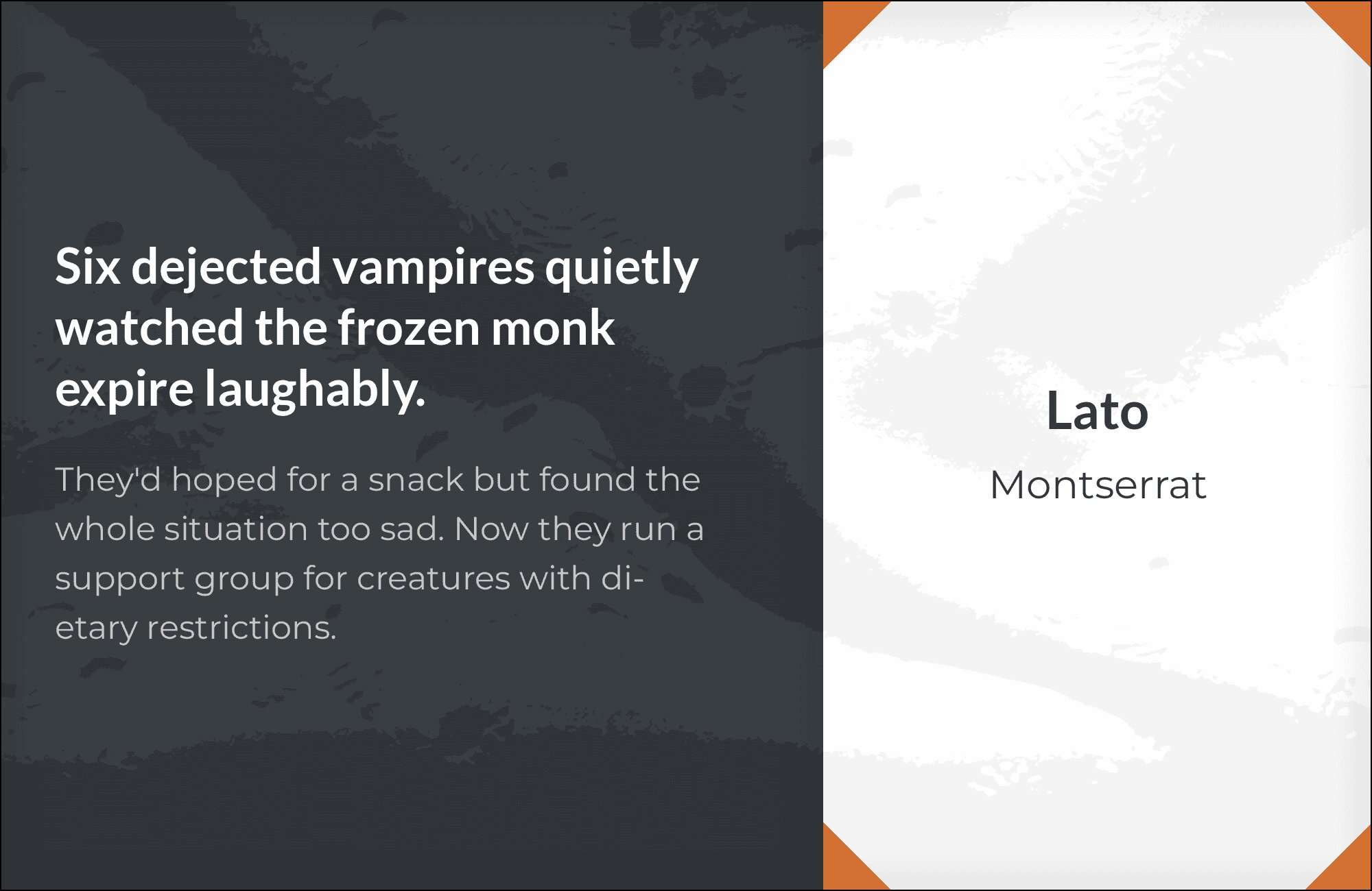
4. Montserrat
Geometric cousins with distinct personalities. Montserrat‘s Art Deco heritage contrasts with Lato’s semi-rounded humanist feel, creating interest through subtle differences. Use heavier Montserrat weights for headlines and Lato’s comfortable proportions for extended reading. The pairing feels modern without being cold, professional without being corporate. Ideal for startups and creative businesses.
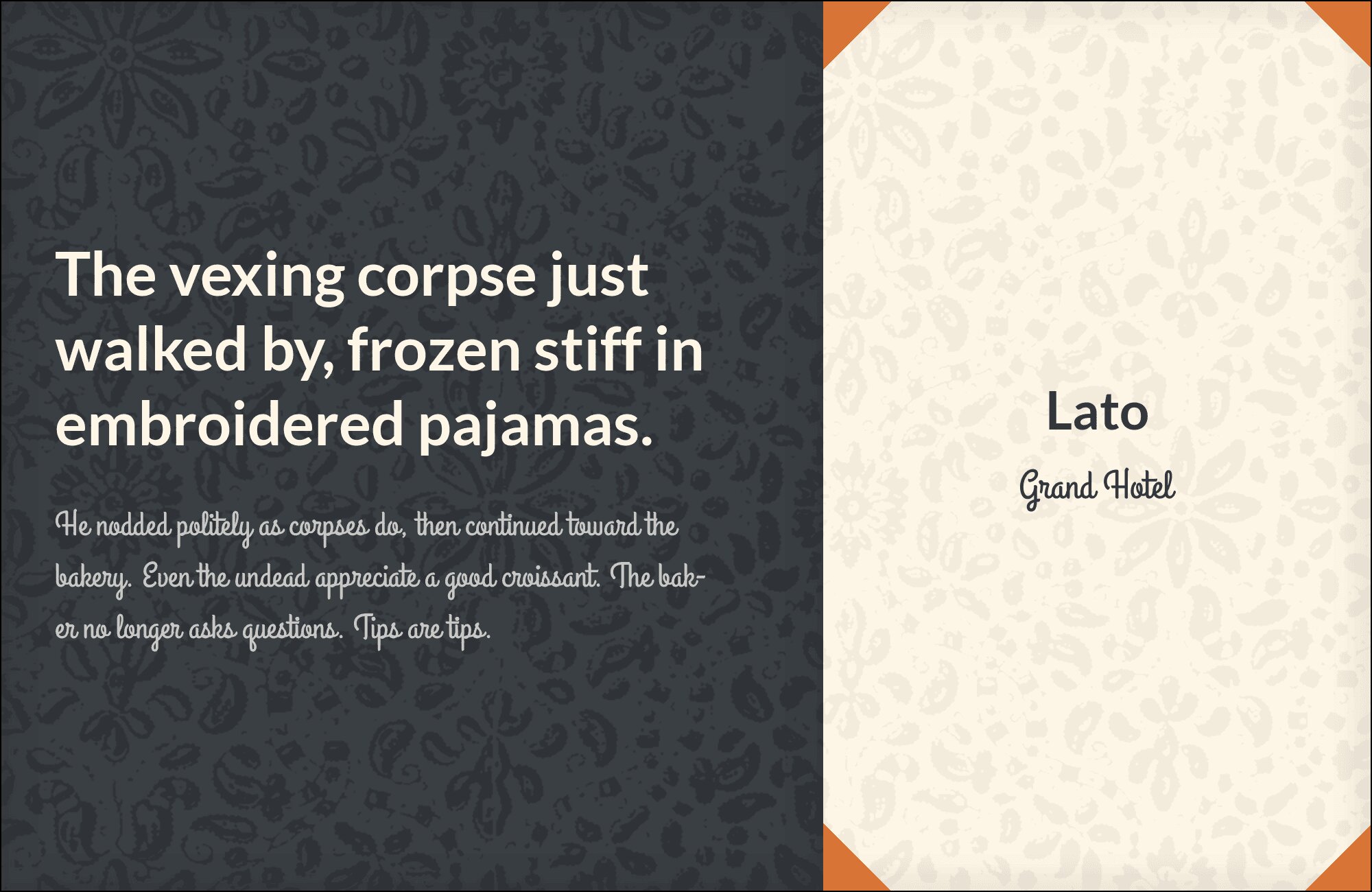
5. Grand Hotel
Elegant script meets structured sans. Grand Hotel‘s connected letterforms and vintage personality add warmth and occasion to Lato’s dependable foundation. Use the script for accent elements, pull quotes, or decorative headlines while Lato handles everything readable. Perfect for event invitations, hospitality branding, and romantic aesthetics that still need practical typography.
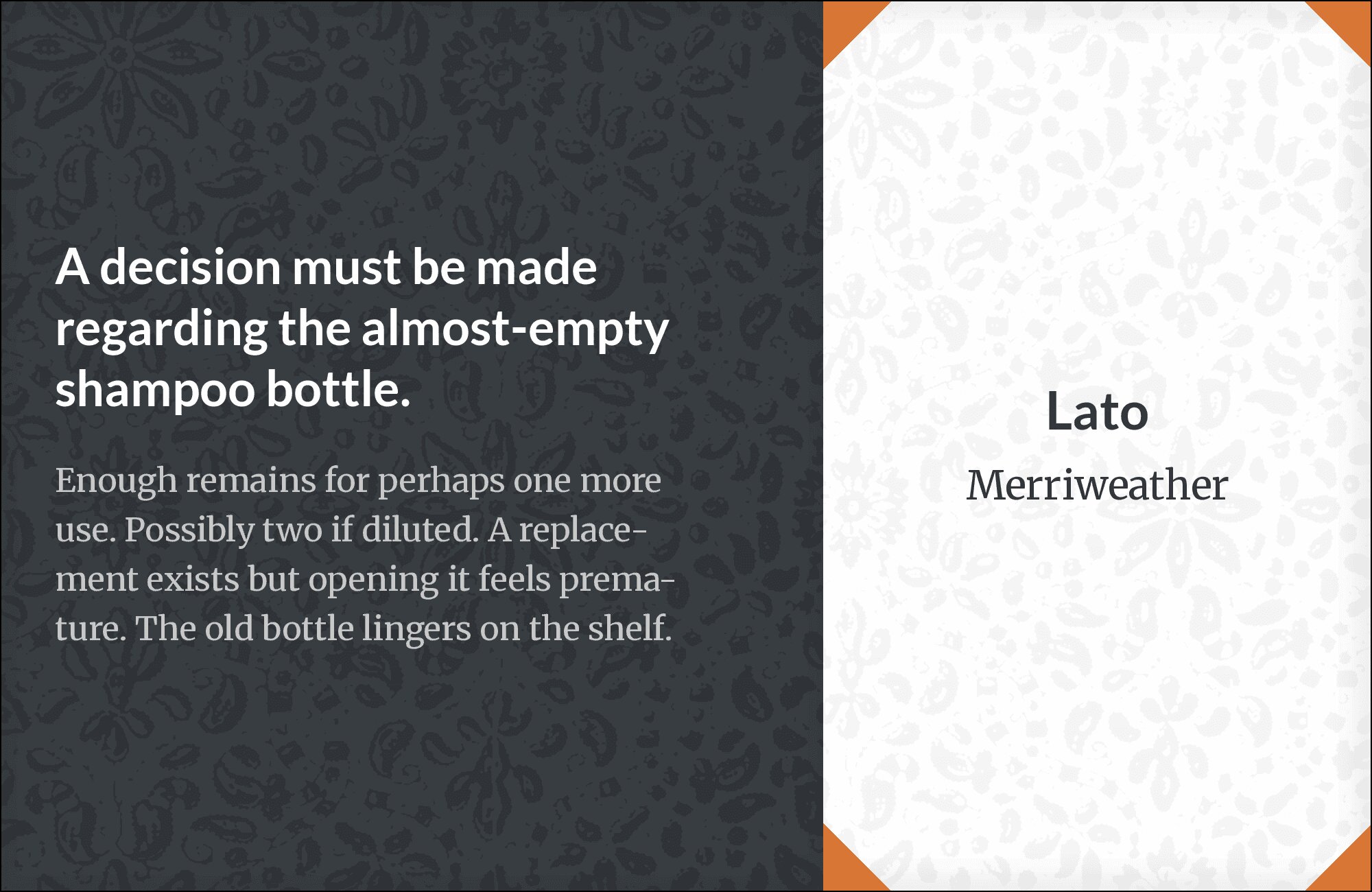
6. Merriweather
Tall x-heights on both fonts create exceptional readability across devices. Merriweather‘s sturdy serifs provide classical contrast to Lato’s clean lines without jarring transitions. This combination handles long-form content beautifully, ideal for blogs, magazines, and documentation. The similar x-heights mean text blocks feel unified even when switching between serif headlines and sans body.

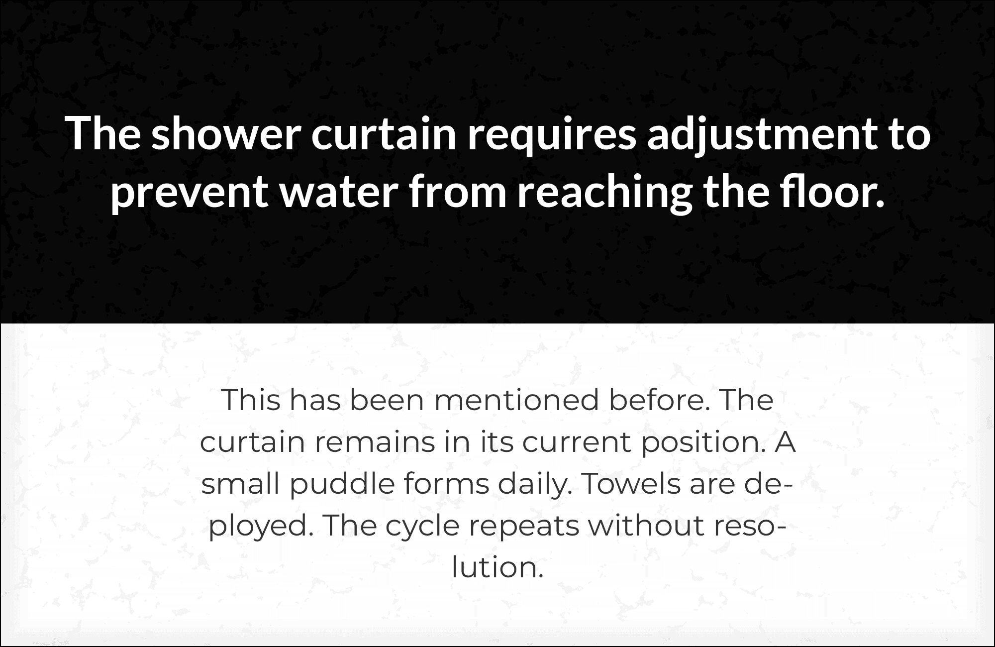
You'll love this article!
A visual guide for designers.
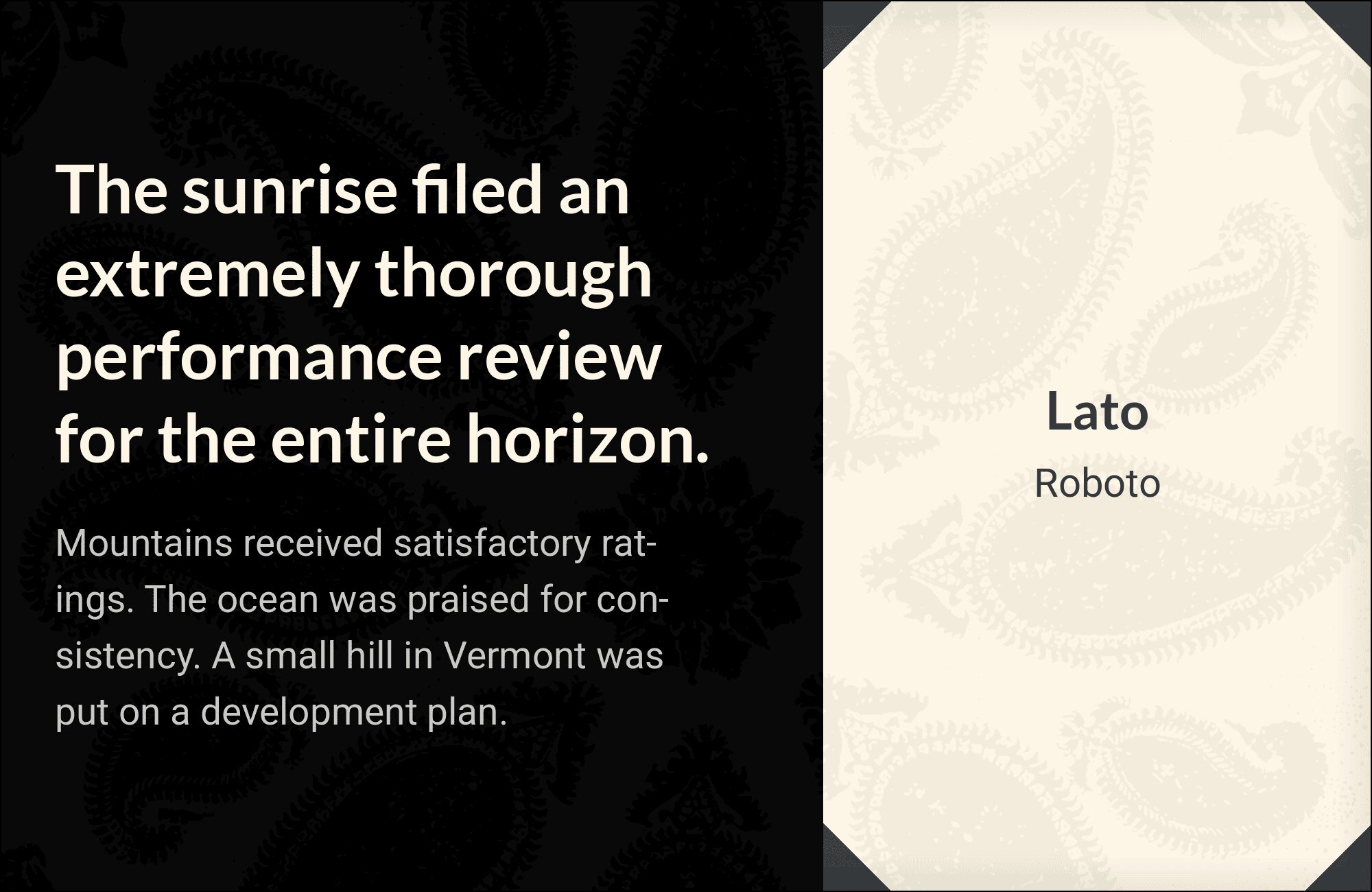
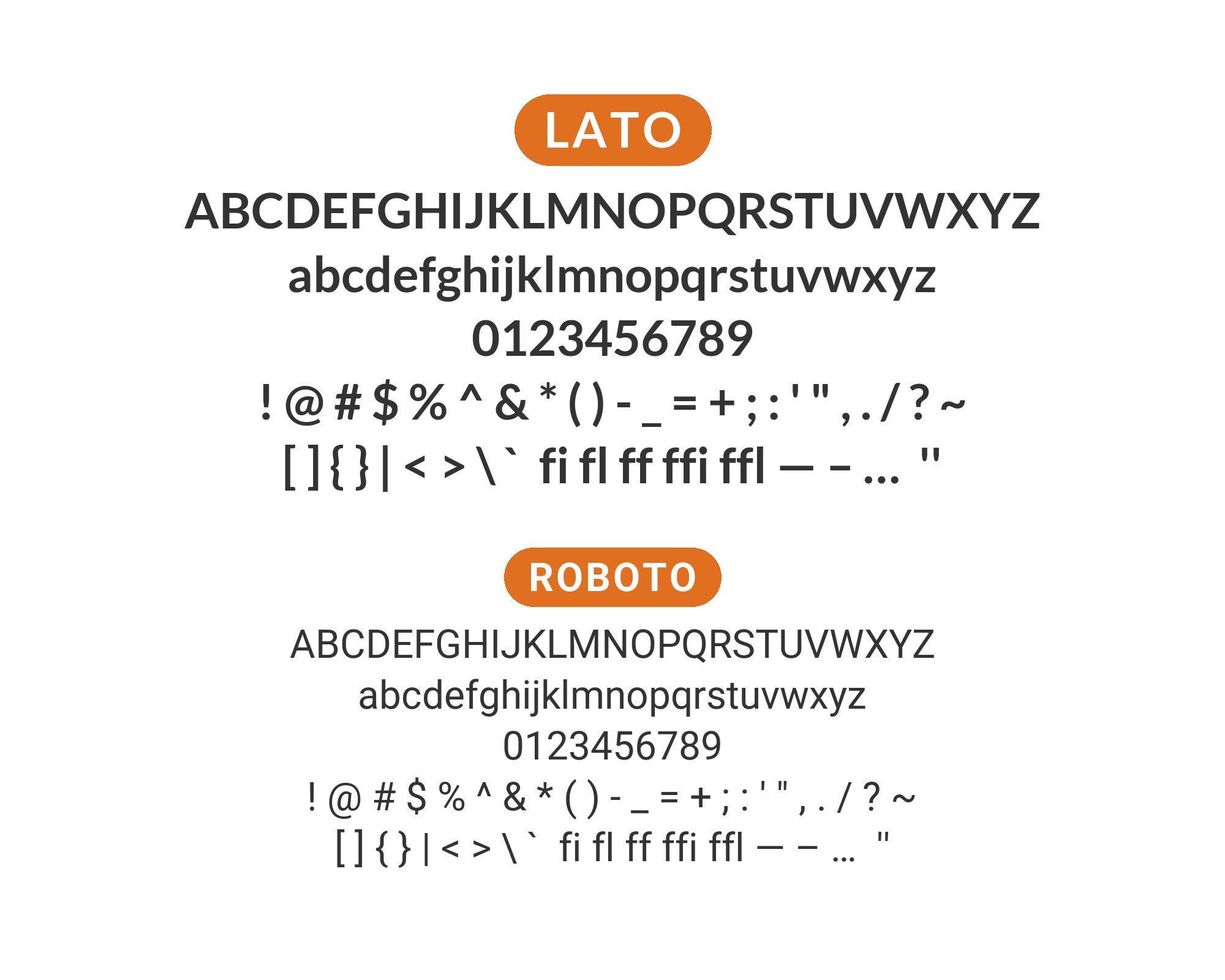
7. Roboto
Two of the web’s most versatile sans-serifs together. Roboto‘s slightly mechanical precision complements Lato’s warmer, rounder character. The pairing feels familiar yet refined, working for enterprise applications, product interfaces, and anywhere neutrality matters. Both fonts excel at small sizes and scale predictably. Weight matching is effortless given both families’ extensive options.
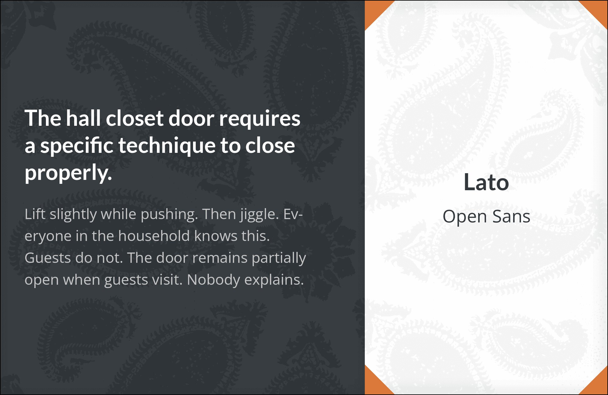
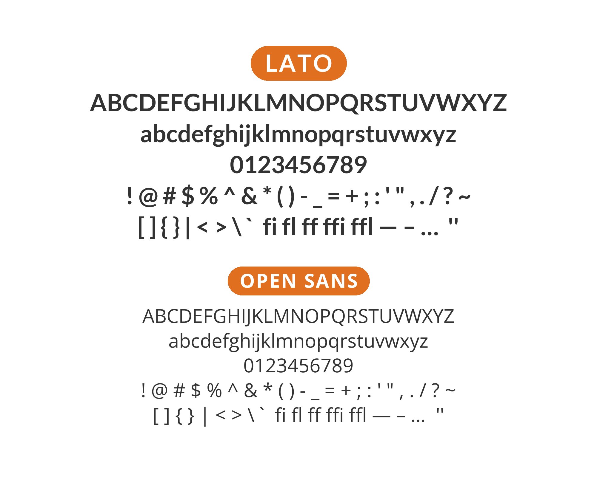
8. Open Sans
Maximum readability with minimal drama. Both humanist sans-serifs share approachable personalities while differing enough in detail to avoid monotony. Lato’s semi-rounded terminals contrast with Open Sans‘s more traditional forms. Use this pairing for long-form content, accessibility-focused projects, and anywhere reader comfort trumps stylistic statement.
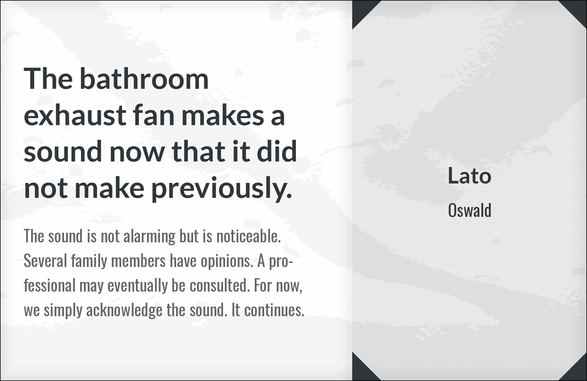
9. Oswald
Bold condensed headlines meet approachable body text. Oswald‘s narrow, commanding letterforms create instant hierarchy above Lato’s friendly proportions. The contrast is dramatic but not jarring, working for news sites, sports branding, and any project needing strong headlines with readable supporting text. Oswald grabs attention; Lato holds it.
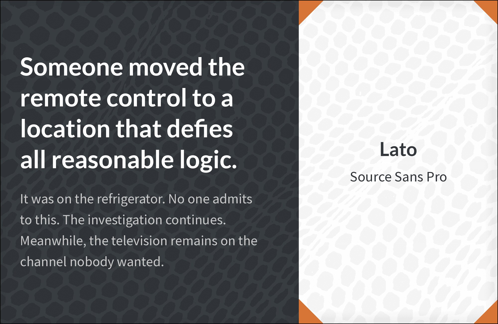
10. Source Sans Pro
Two humanist sans-serifs sharing warmth and clarity. Source Sans Pro‘s Adobe pedigree pairs with Lato’s Polish craftsmanship for professional layouts without corporate coldness. Both fonts optimize for screen reading, making this combination ideal for documentation, UI design, and content-heavy sites. Subtle differences in stroke terminals prevent visual boredom.
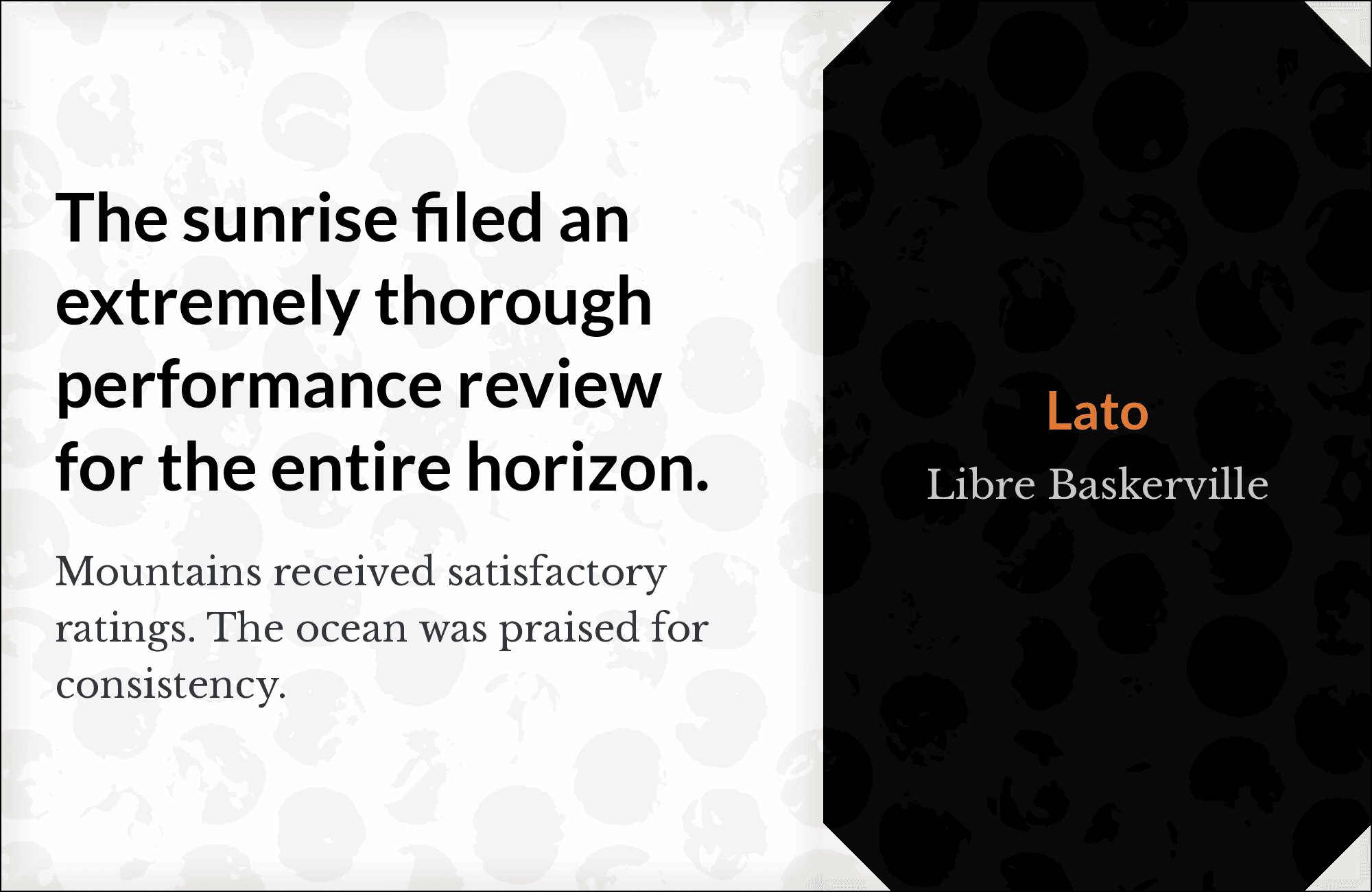
11. Libre Baskerville
Traditional Baskerville elegance grounded by Lato’s modern practicality. Libre Baskerville‘s sharp serifs and refined proportions command headline attention while Lato’s comfortable letterforms invite extended reading. The pairing bridges heritage and accessibility, perfect for law firms, publishers, and institutions wanting classical credibility with contemporary usability.
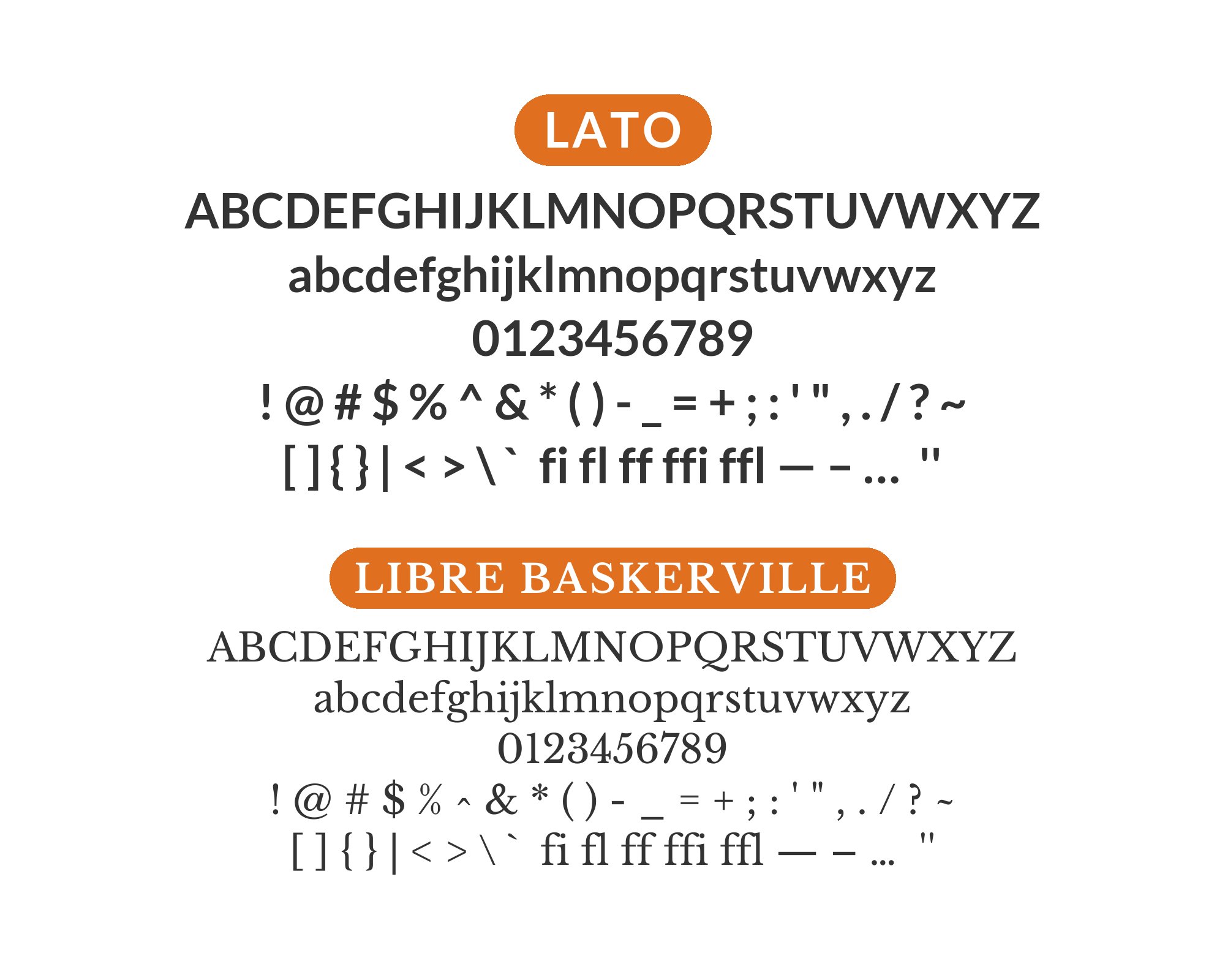
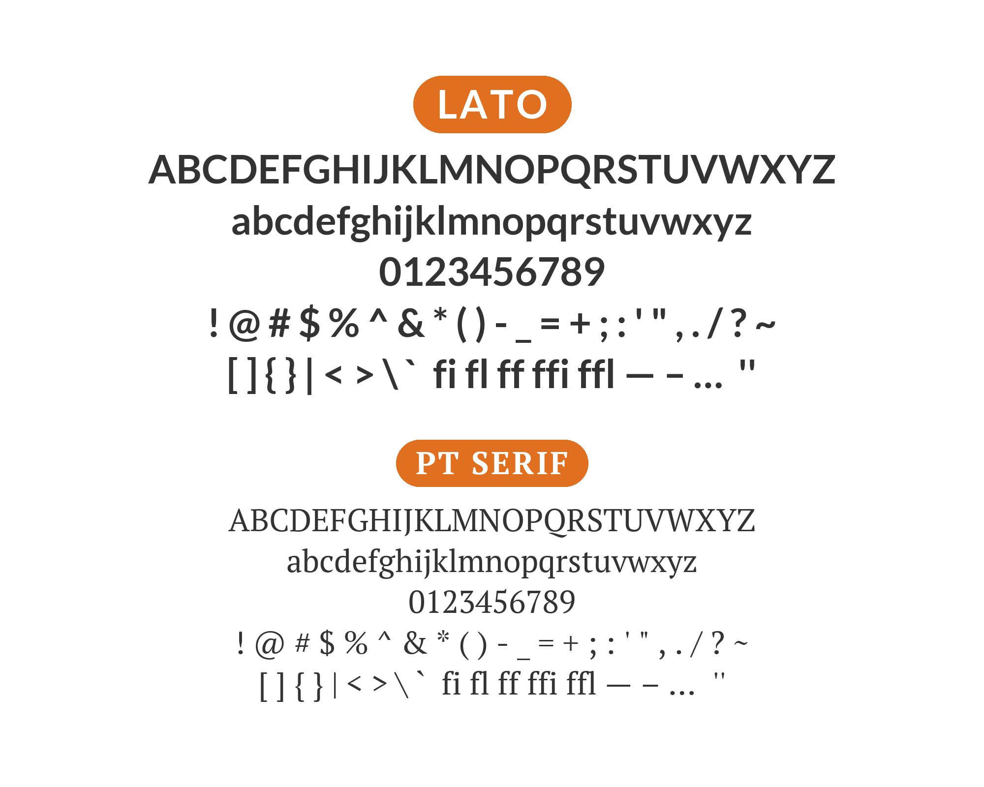
12. PT Serif
Classic Russian typography meets Polish sans-serif design. PT Serif‘s humanist warmth complements Lato’s rounded character without redundancy. The serif’s slightly condensed proportions create efficient headlines while Lato’s open counters ensure body text breathes. Ideal for multilingual projects, cultural publications, and designs needing broad character support.
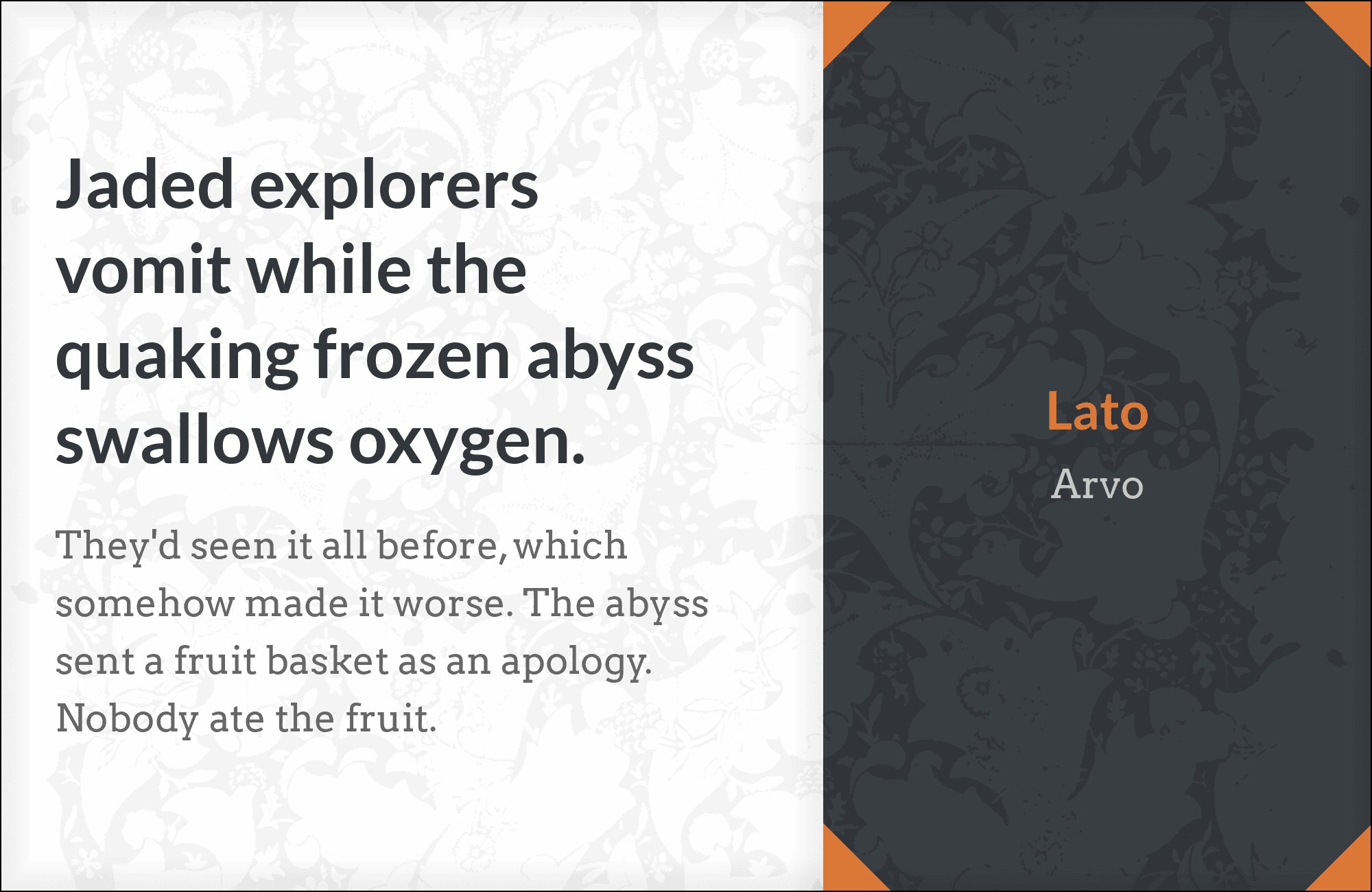
13. Arvo
Slab serif strength meets sans-serif warmth. Arvo‘s bold geometric slabs create unmistakable hierarchy above Lato’s approachable body text. The combination feels sturdy and confident, working for creative agencies, tech products, and brands wanting presence without pretense. Both fonts handle weight variations gracefully for complex typographic systems.
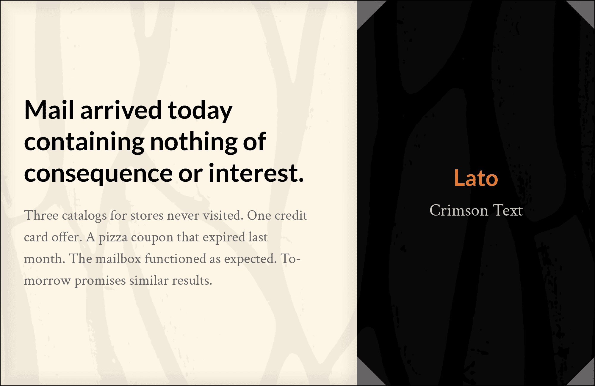
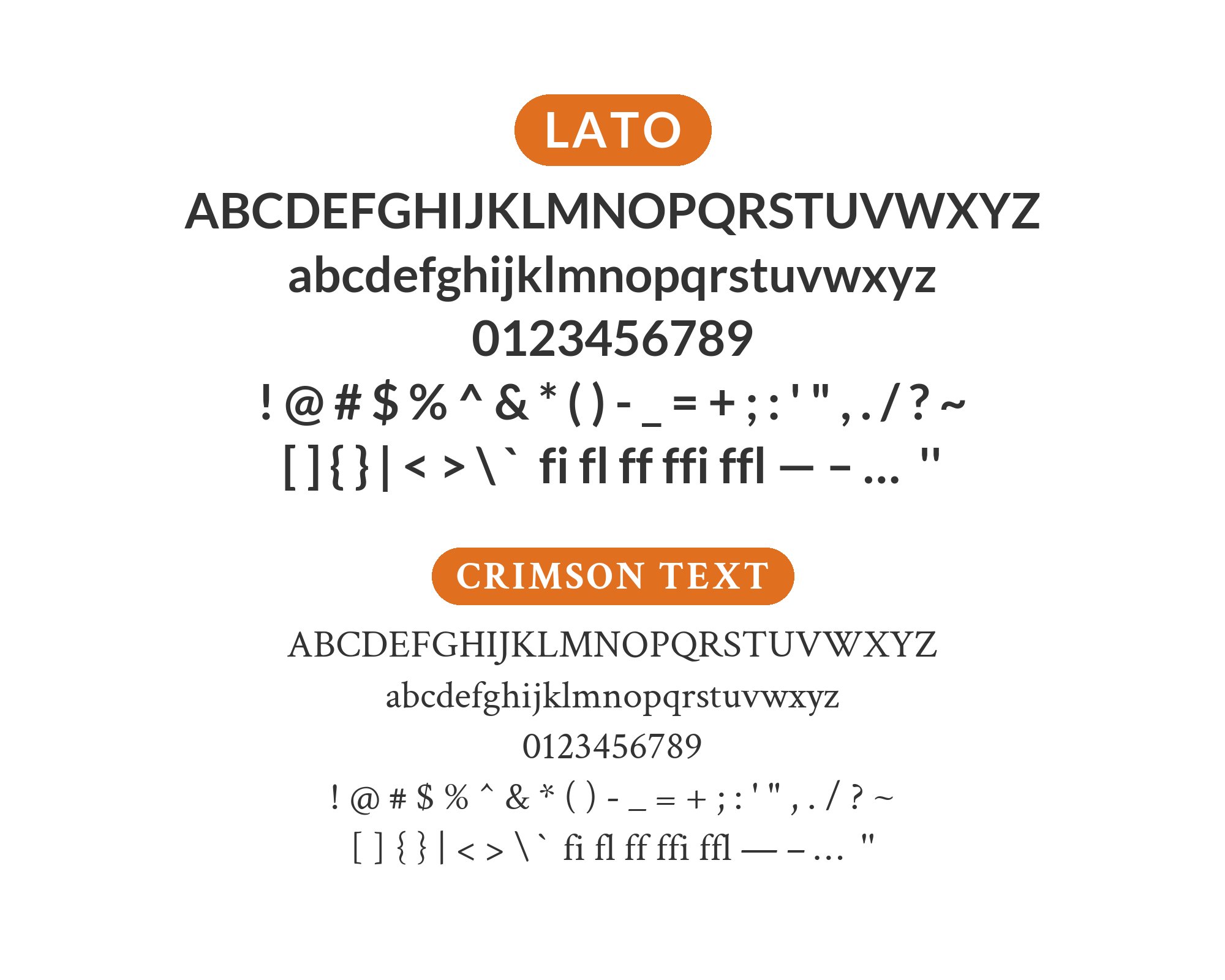
14. Crimson Text

Old-style elegance tempered by modern neutrality. Crimson Text‘s Renaissance proportions and subtle bracketed serifs bring scholarly refinement to headlines, while Lato’s even-tempered character handles body copy accessibly. Perfect for literary magazines, academic publications, and cultural institutions wanting heritage aesthetics with digital practicality.
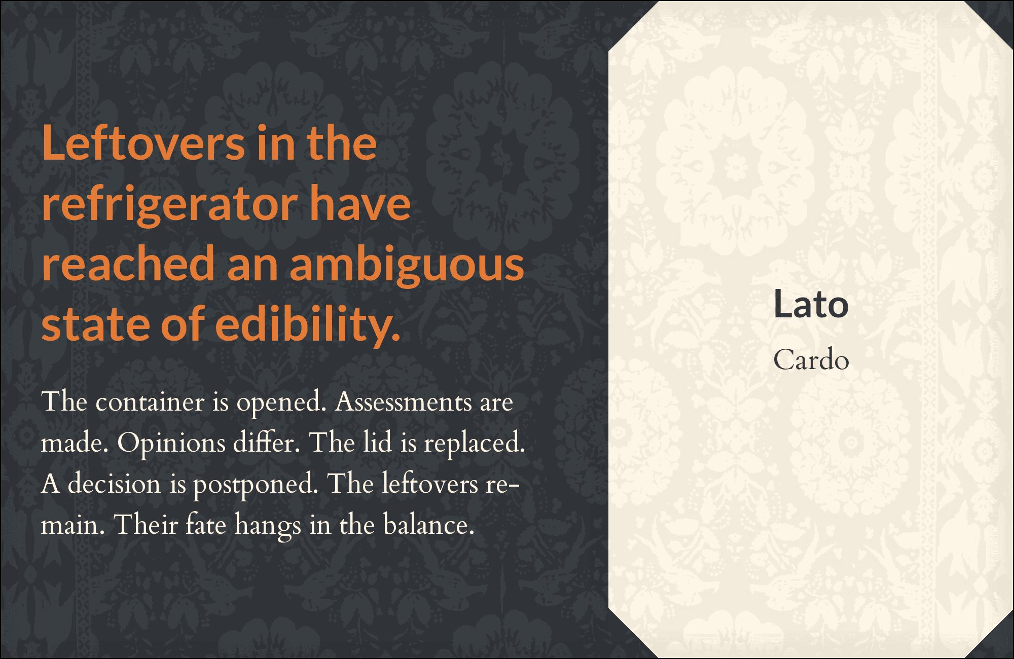
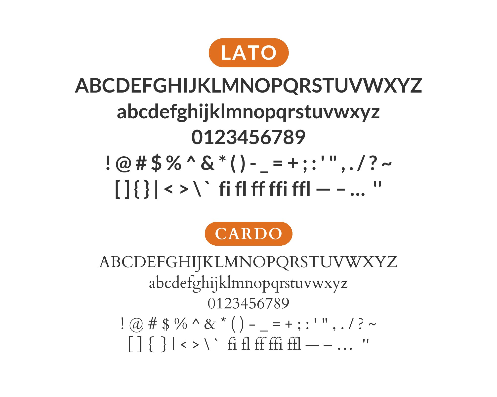
15. Cardo
Scholarly gravitas meets everyday clarity. Cardo‘s classical proportions and academic heritage elevate Lato’s friendly neutrality for intellectual content. Use Cardo for display text and pull quotes where weight matters, then let Lato ensure readers stay comfortable through paragraphs. The combination serves research publications, university sites, and thought leadership platforms.
Conclusion
There are no absolute rules for font pairing, just principles to guide you. The key is contrast—in weight, in style (serif vs. sans-serif), or in personality. Lato is versatile enough to play well with many different typefaces.
Trust your eye, experiment freely, and remember that the best pairing is the one that serves your content and audience. Typography should enhance communication, not complicate it.