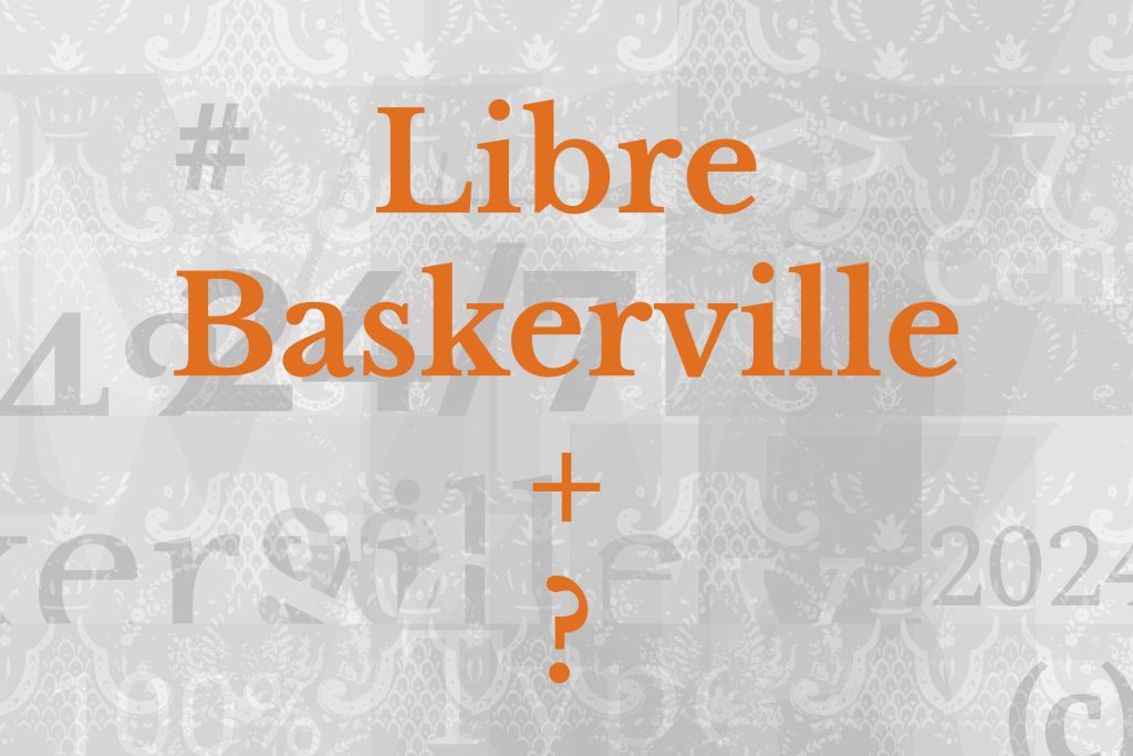
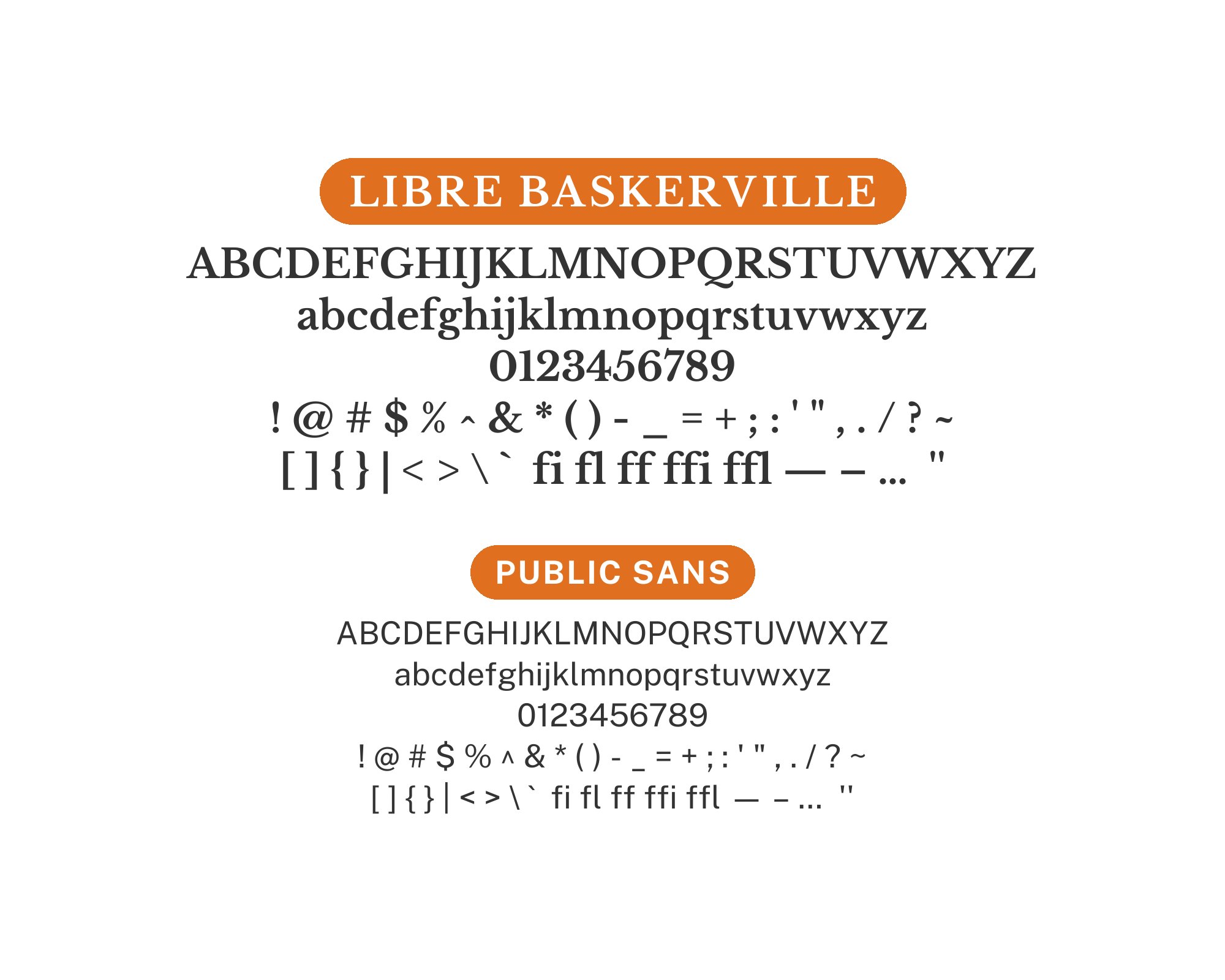
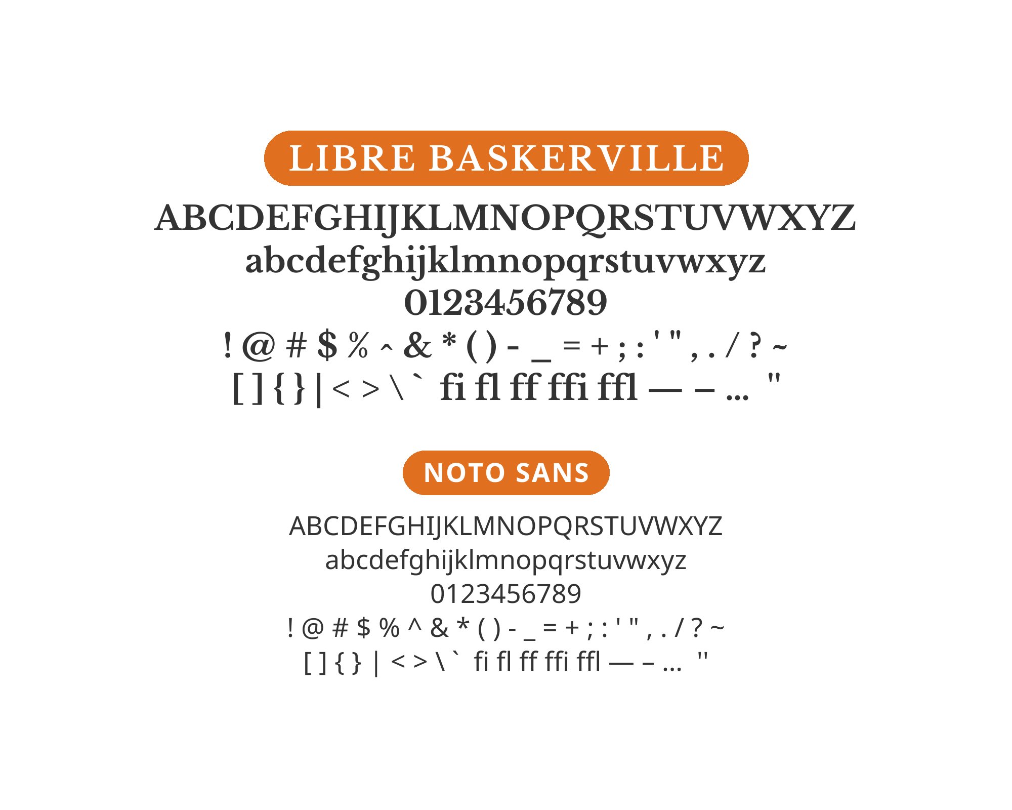
What fonts go with Libre Baskerville? This web-optimized revival of the classic Baskerville design needs companions that respect its literary heritage while accommodating its screen-first approach.
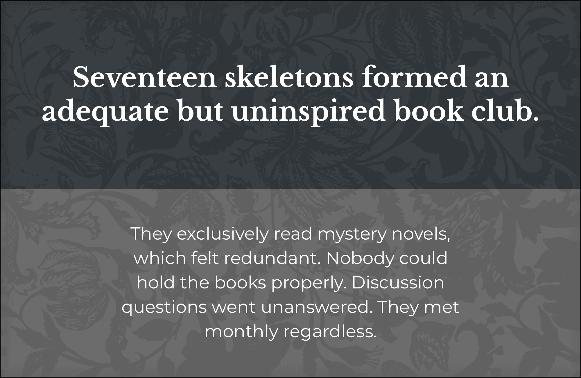
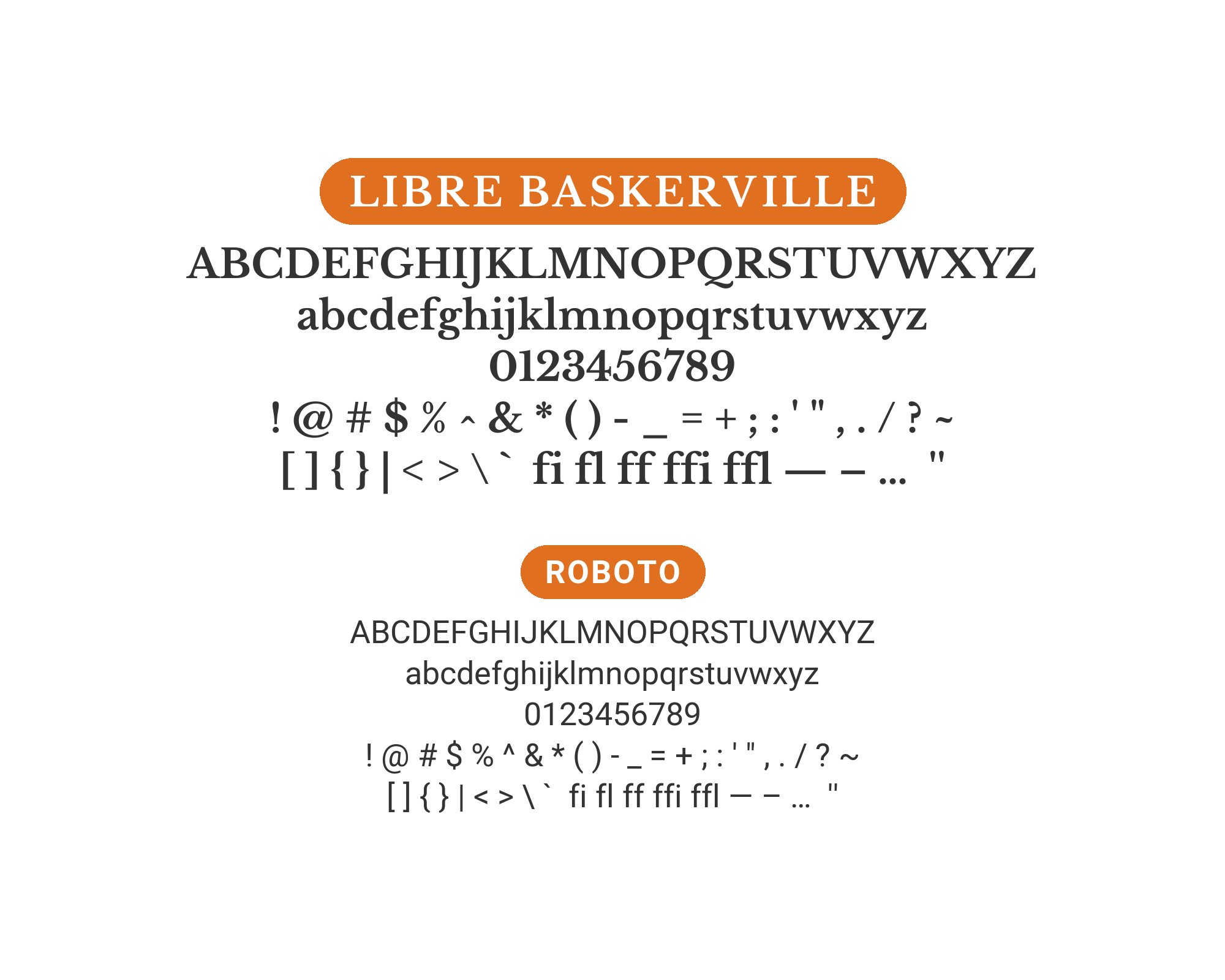
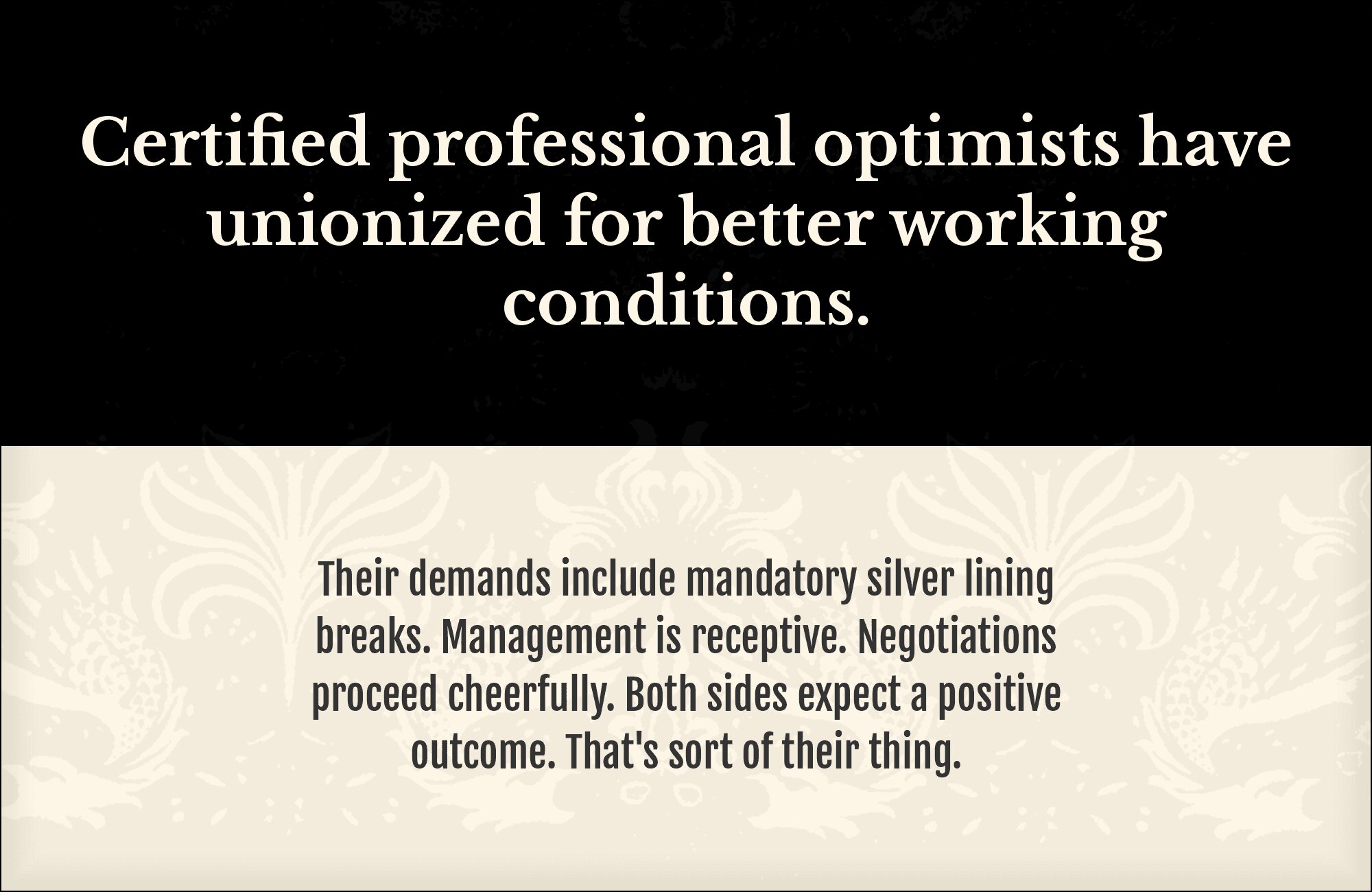
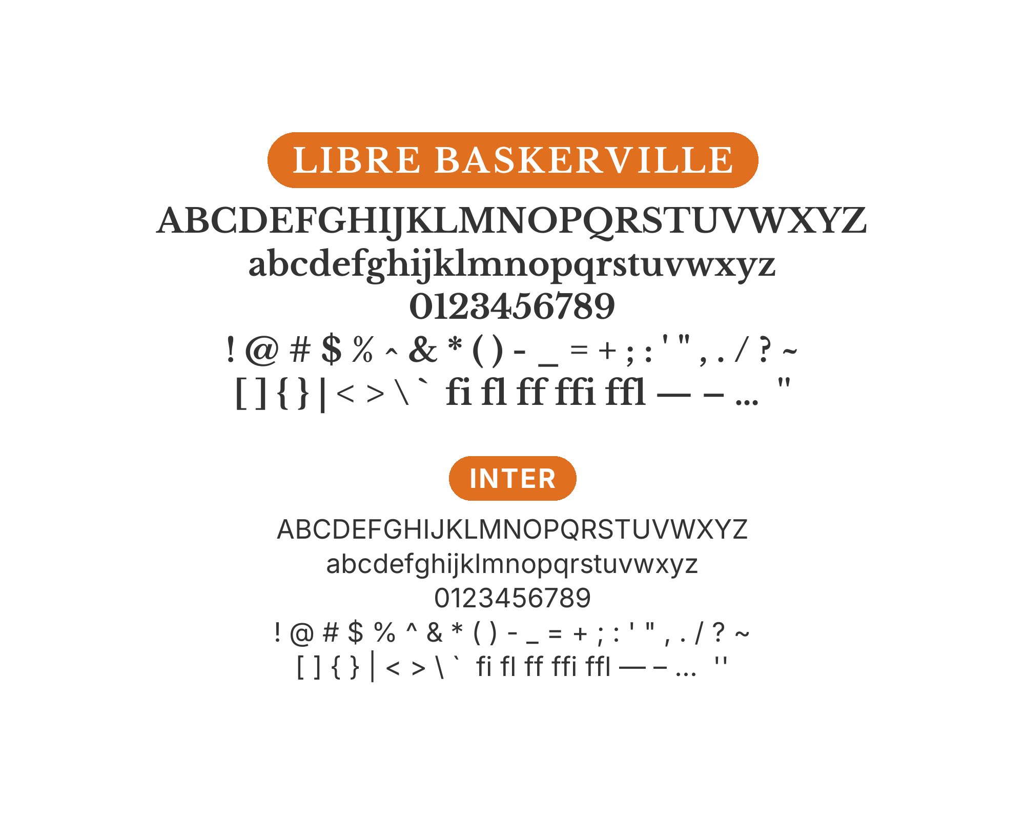
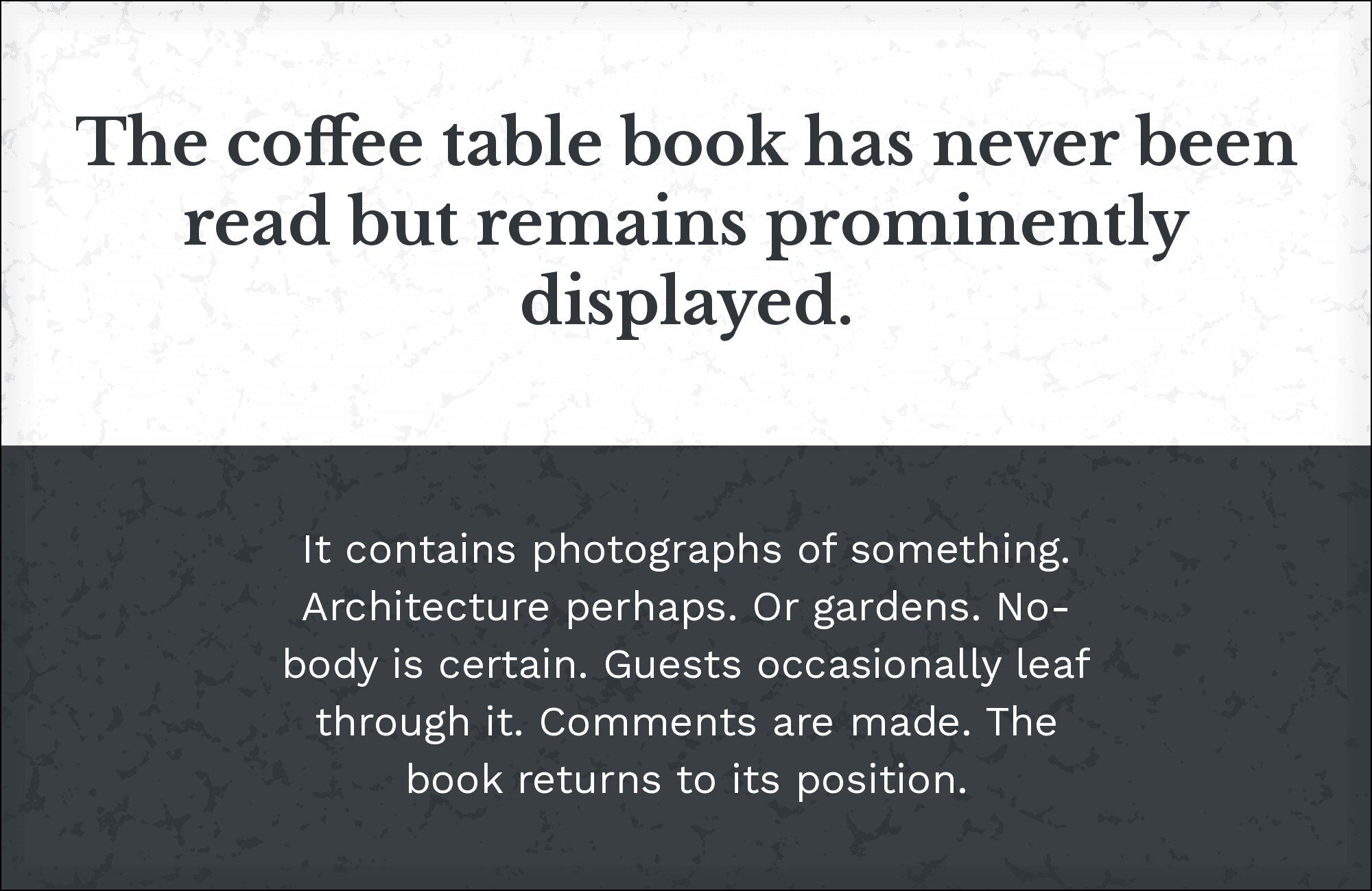
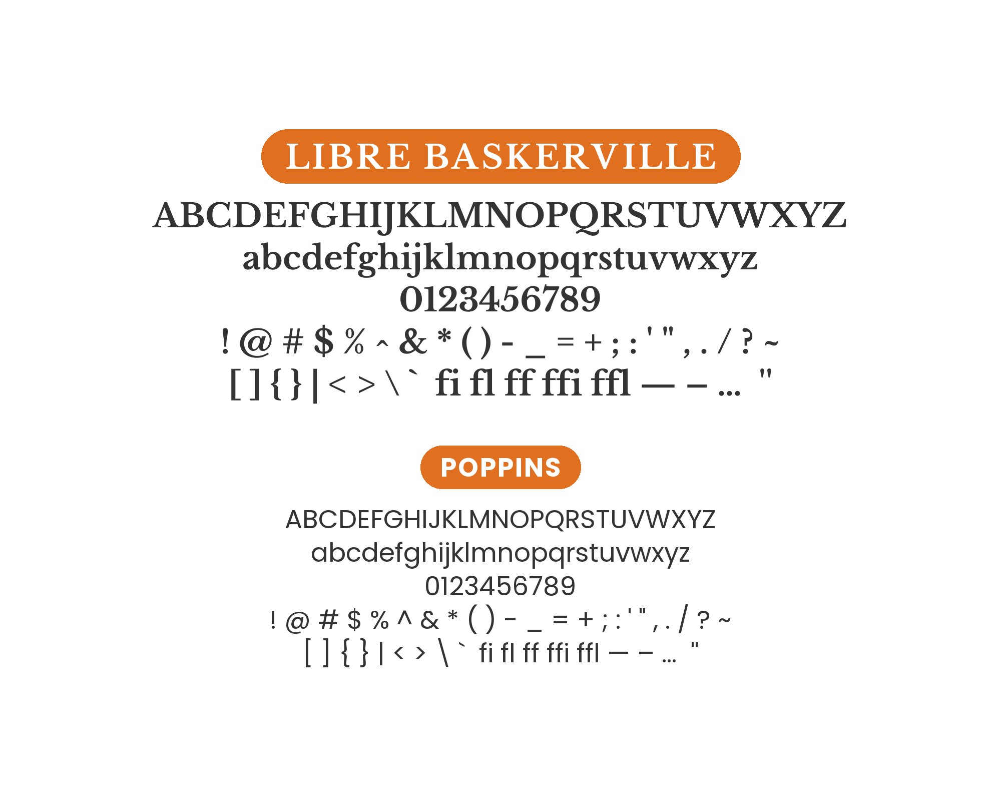
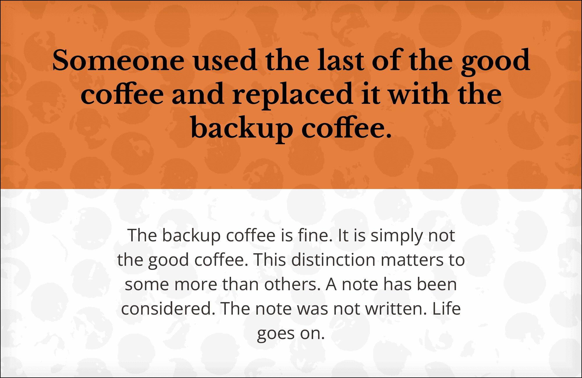
Libre Baskerville, designed by Pablo Impallari, takes the elegant proportions and refined details of John Baskerville’s 18th-century masterpiece and adapts them for the demands of digital reading. Unlike many Baskerville interpretations that prioritize print fidelity, Libre Baskerville was built from the ground up for screen display, with a larger x-height, wider letterforms, and more robust stroke contrast than its historical ancestor. This makes it significantly more readable at body text sizes on screens while retaining the graceful, literary quality that has made Baskerville a favorite of book designers for centuries.
Pairing with Libre Baskerville means navigating between its classical associations and its modern optimization. Sans-serif companions need to feel contemporary without clashing with its refined character, while other serifs must be different enough to create clear hierarchy. The font works beautifully for longform reading, so pairings often involve finding strong headline partners that set the stage. Here are 15 fonts that pair well with Libre Baskerville, each chosen for how they complement its particular balance of tradition and practicality.
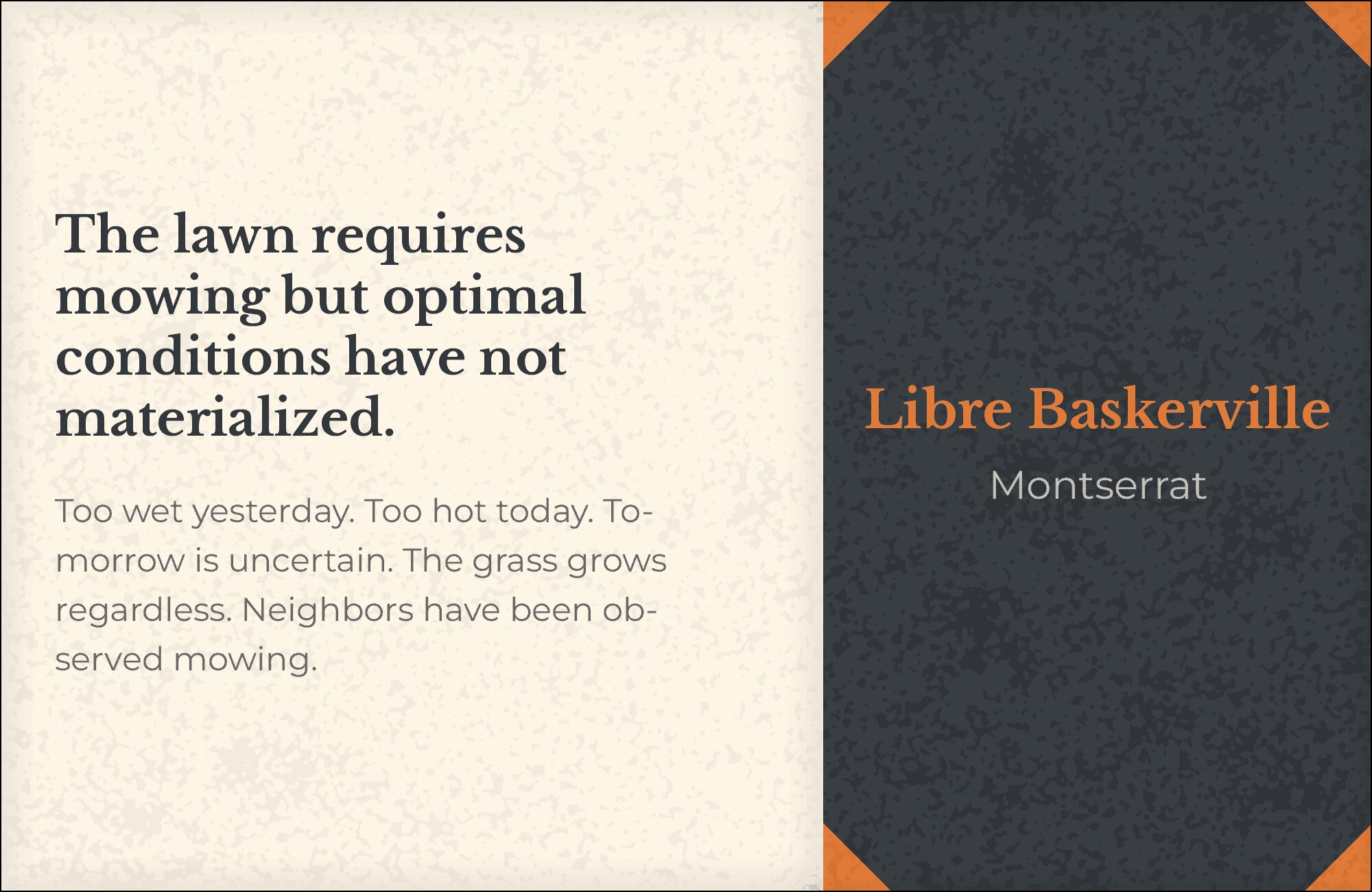
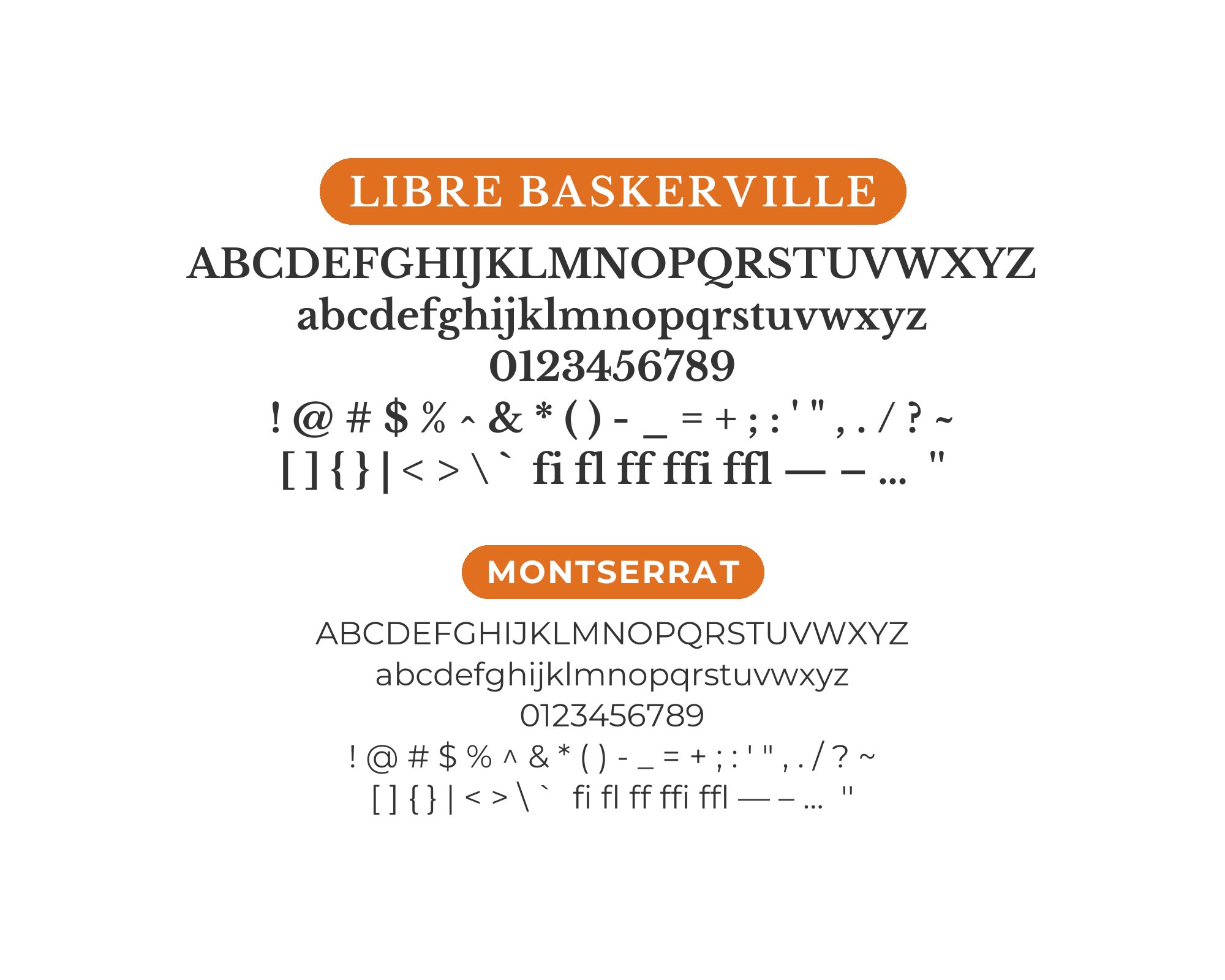
1. Montserrat
Transitional serif meets geometric sans in this sophisticated pairing. Libre Baskerville’s calligraphic origins and refined stroke contrast provide body text with literary gravitas, while Montserrat‘s bold geometric headlines punch through with contemporary confidence. The temporal contrast creates dynamic tension that reads as intentional rather than conflicted. Perfect for publishers, literary magazines, or brands bridging traditional and modern aesthetics.
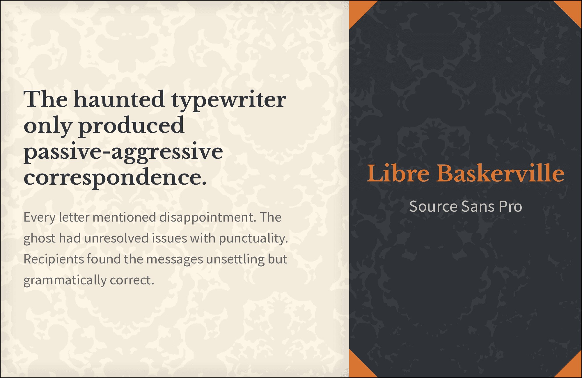
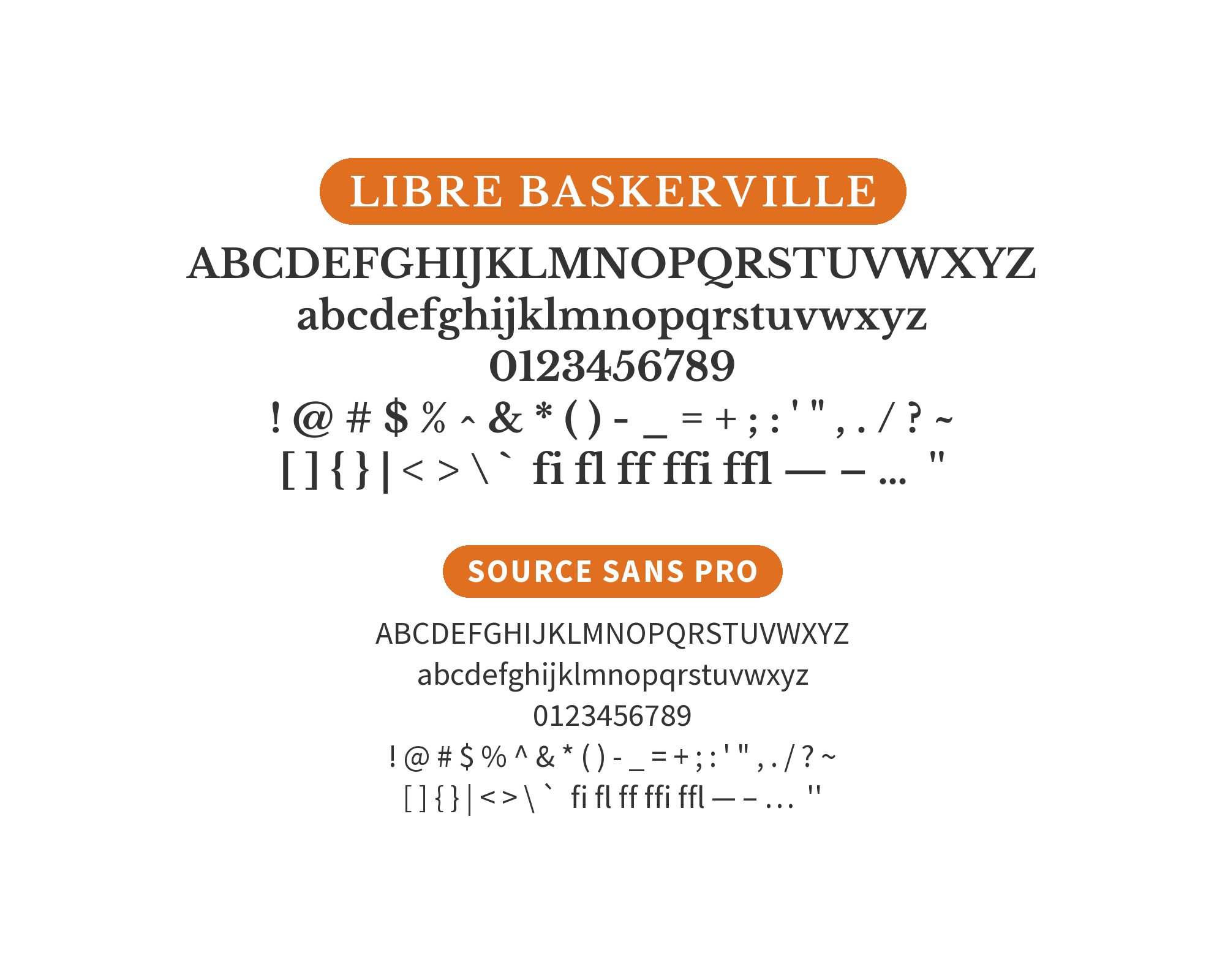
2. Source Sans Pro
Adobe’s humanist sans brings contemporary clarity to Libre Baskerville’s classical presence. Source Sans Pro‘s friendly letterforms and excellent screen rendering create accessible body text or navigation elements, while the refined serif handles extended reading with ease. This pairing balances tradition with usability, ideal for academic institutions, cultural organizations, or professional services.
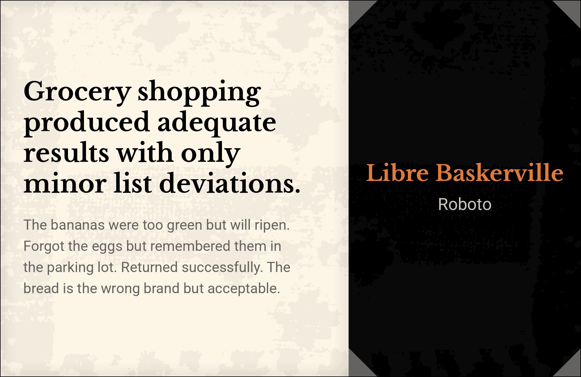
3. Roboto
Google’s most versatile sans-serif meets one of Google Fonts’ finest serifs. Roboto‘s neutral character provides clean UI elements and navigation, while Libre Baskerville brings refined elegance to content areas. The combination spans contexts from corporate sites to editorial platforms. Use this when you need proven readability with a touch of literary sophistication.
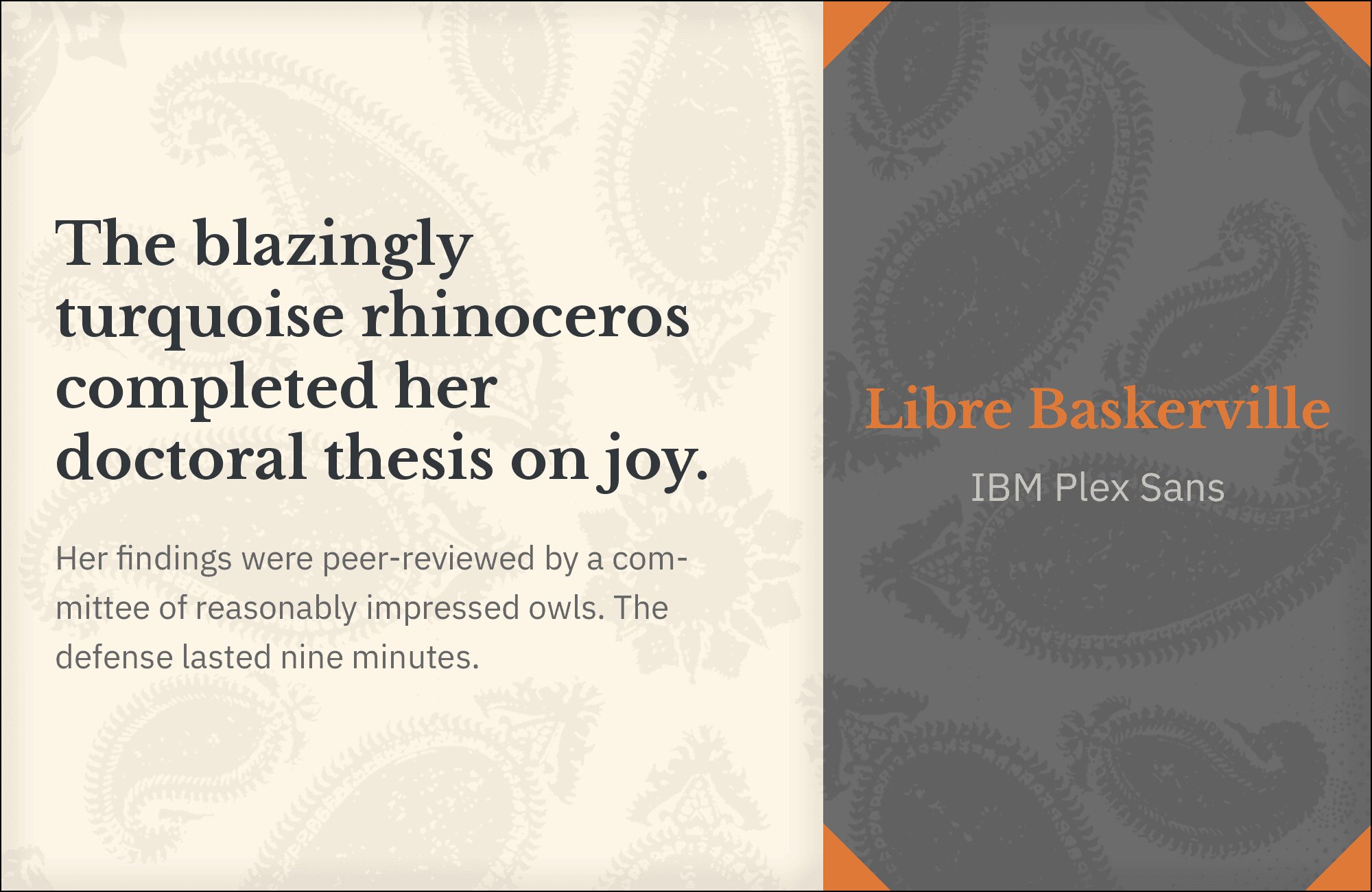
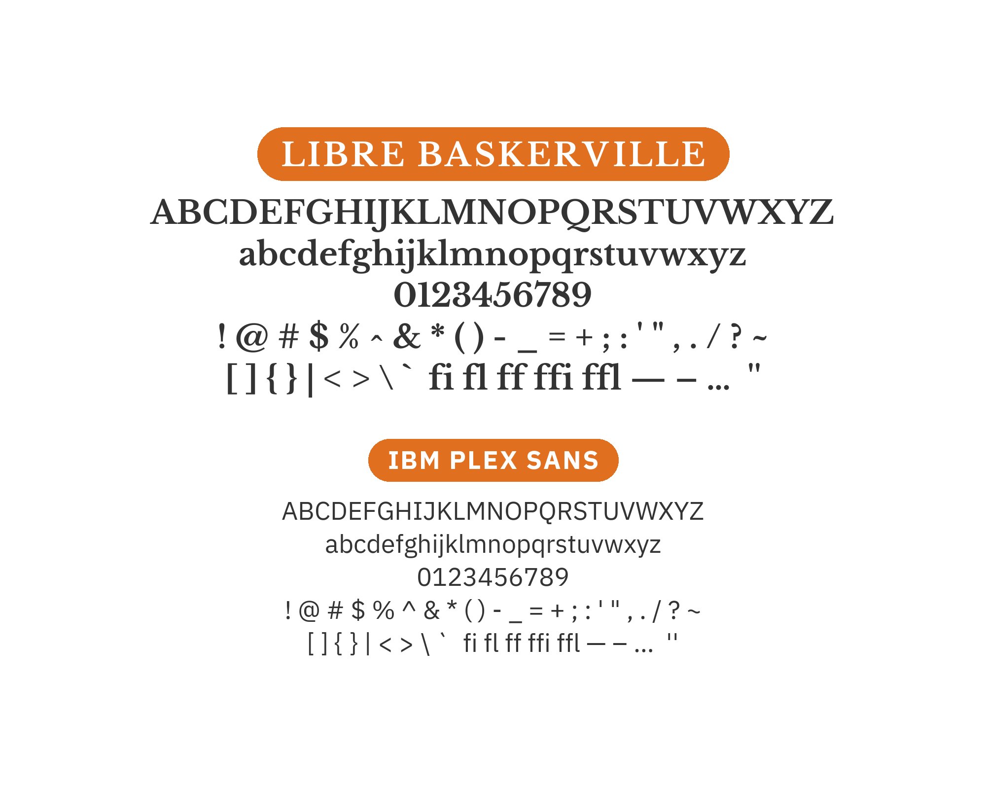
4. IBM Plex Sans
Corporate precision meets classical refinement. IBM Plex Sans brings structured letterforms designed for UI applications, while Libre Baskerville provides the warmth and readability that extended content deserves. The pairing suggests technological capability grounded in humanist values. Ideal for enterprise platforms, fintech applications, or any context where trust matters.
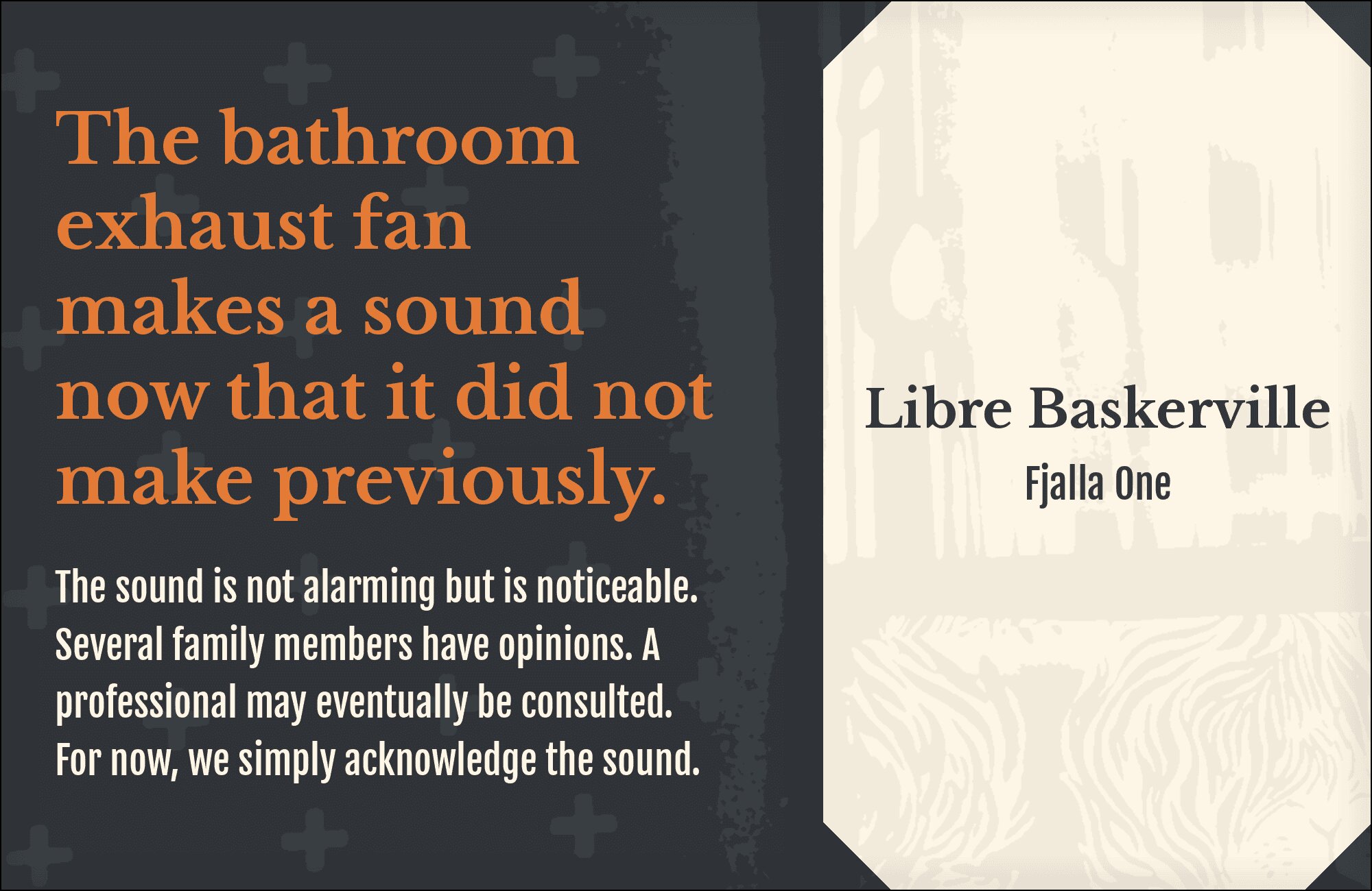
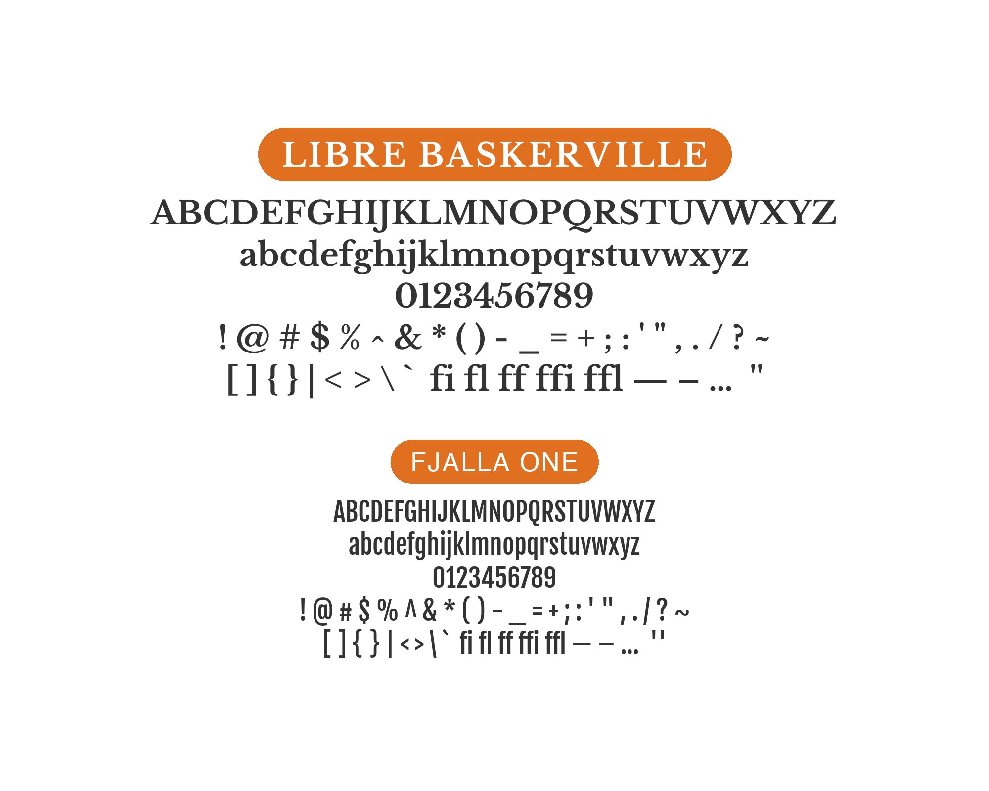
5. Fjalla One
Bold condensed headlines tower over refined serif body text. Fjalla One‘s compact power creates visual impact while Libre Baskerville unfolds gracefully below, its bracketed serifs and classical proportions ensuring comfortable reading. The weight and width contrast establishes unmistakable hierarchy. Perfect for news sites, magazine layouts, or content platforms prioritizing scannable headlines.
6. Inter
The most popular Google Font meets one of its most refined serifs. Inter‘s screen-optimized clarity provides excellent UI legibility, while Libre Baskerville brings classical elegance to content areas. This pairing represents the best of contemporary and traditional typography united. Deploy for SaaS platforms, dashboard interfaces, or any modern application needing moments of sophistication.

You'll love this article!
A visual guide for designers.
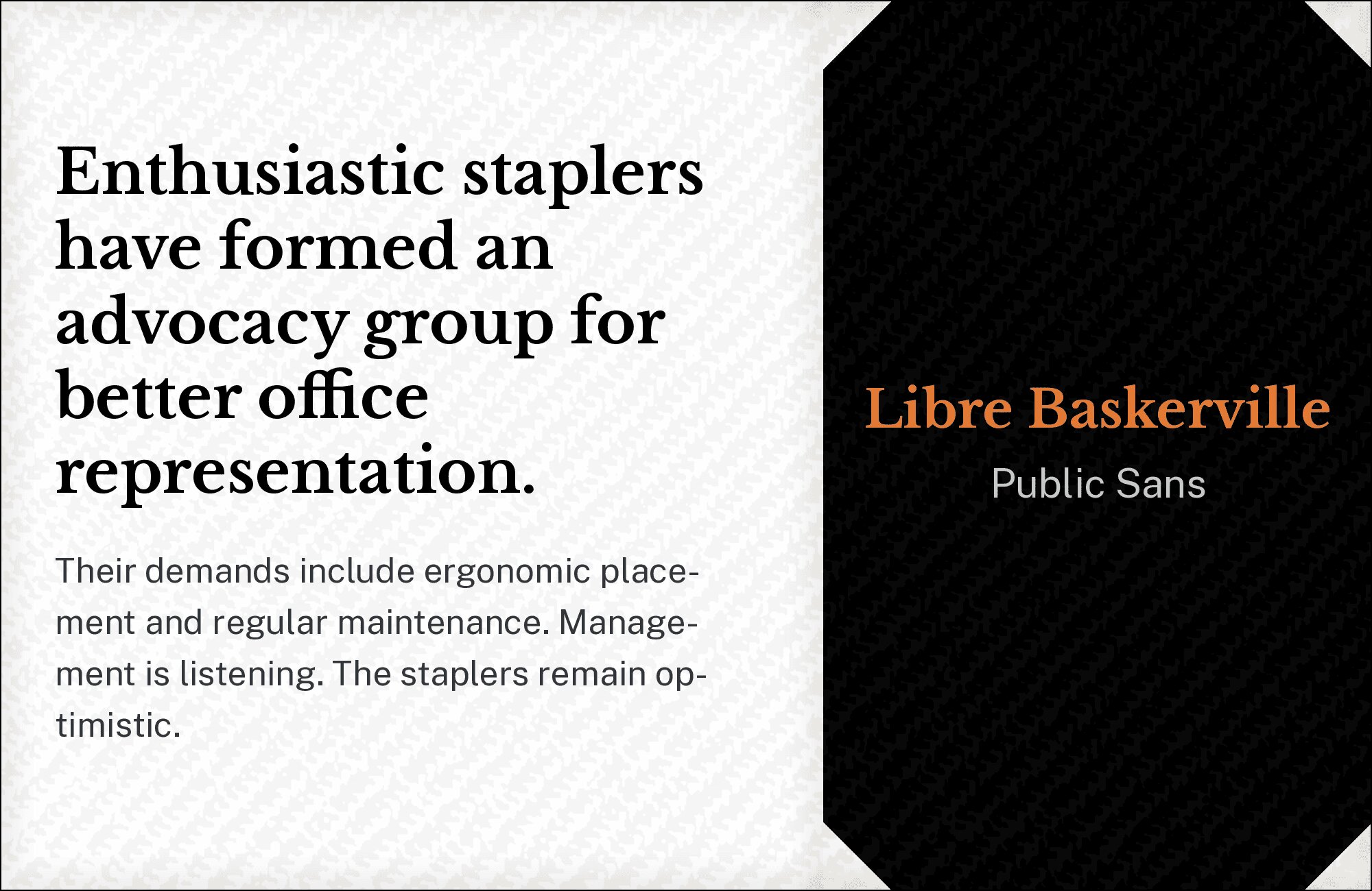
7. Public Sans
Government-grade clarity meets scholarly refinement. Public Sans brings USWDS-approved neutrality and accessibility, while Libre Baskerville provides the warmth that official communications often lack. The pairing suggests trustworthy authority without coldness. Perfect for civic organizations, public institutions, or any context where clarity and credibility must coexist.
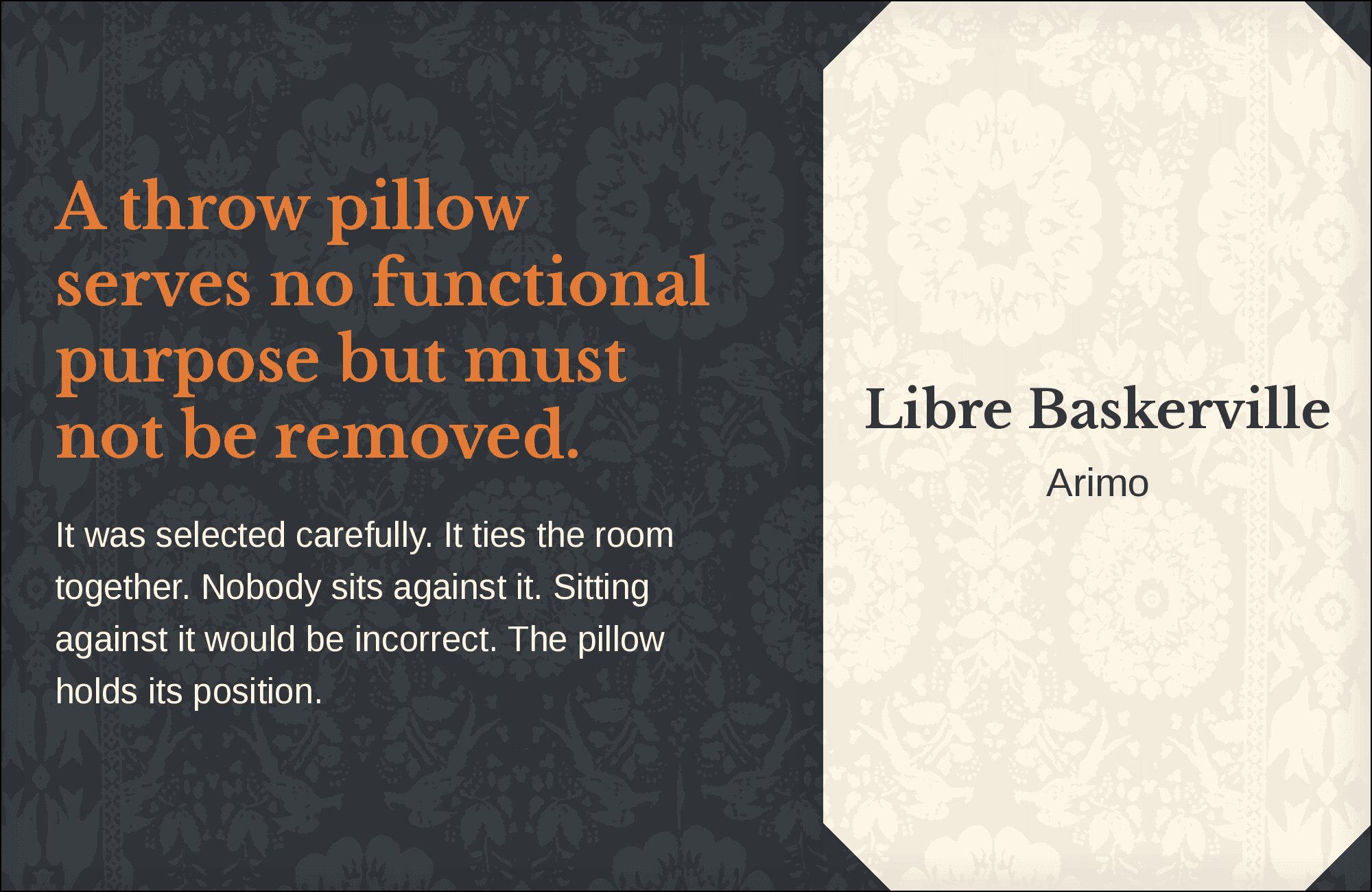
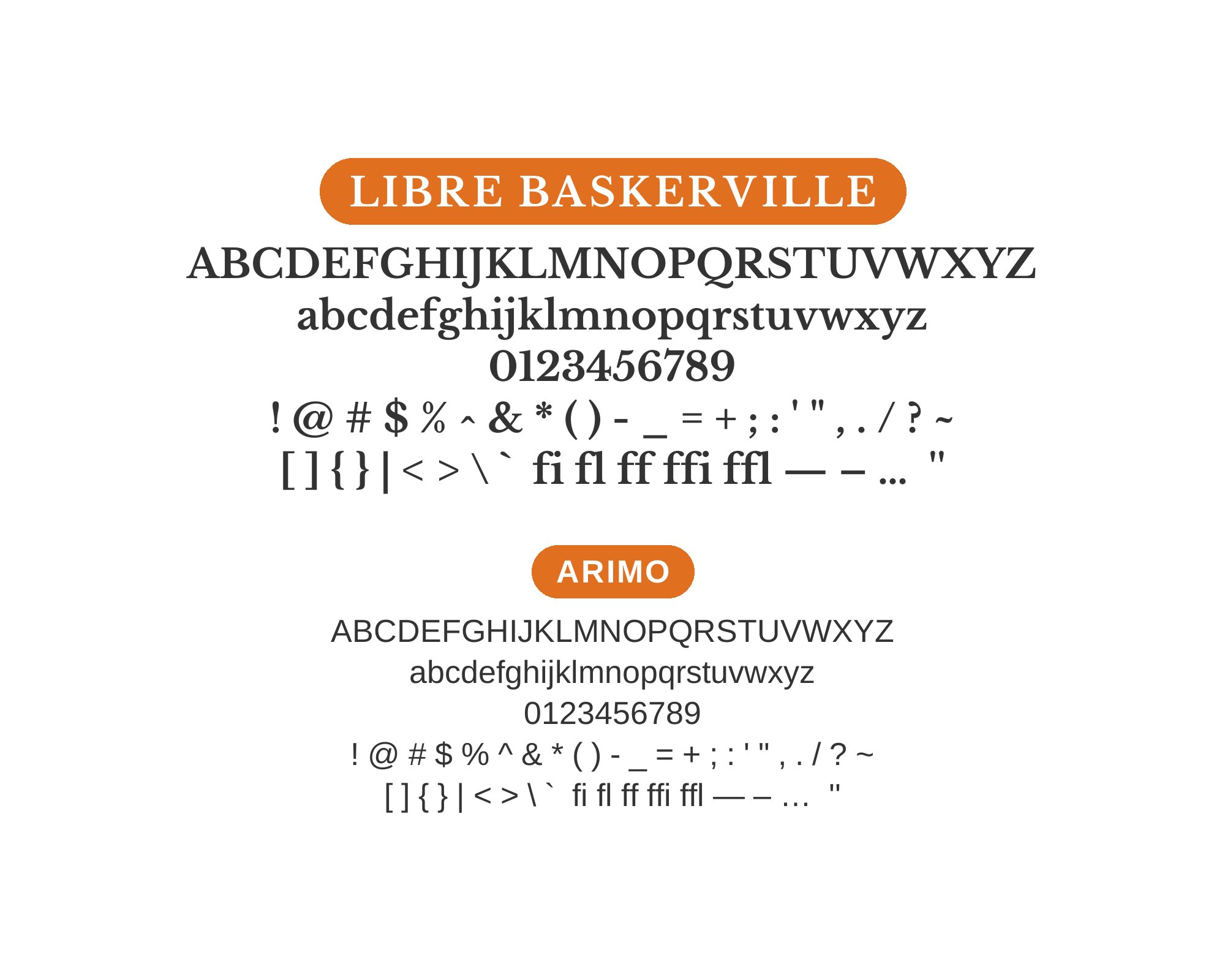
8. Arimo
Arial’s open-source cousin provides reliable body text beneath Libre Baskerville’s elegant display headlines. Arimo‘s familiar letterforms ensure instant readability, while the refined serif adds typographic distinction. The contrast between utilitarian sans and classical serif creates subtle sophistication without pretension. Use this for practical applications requiring a touch of refinement.
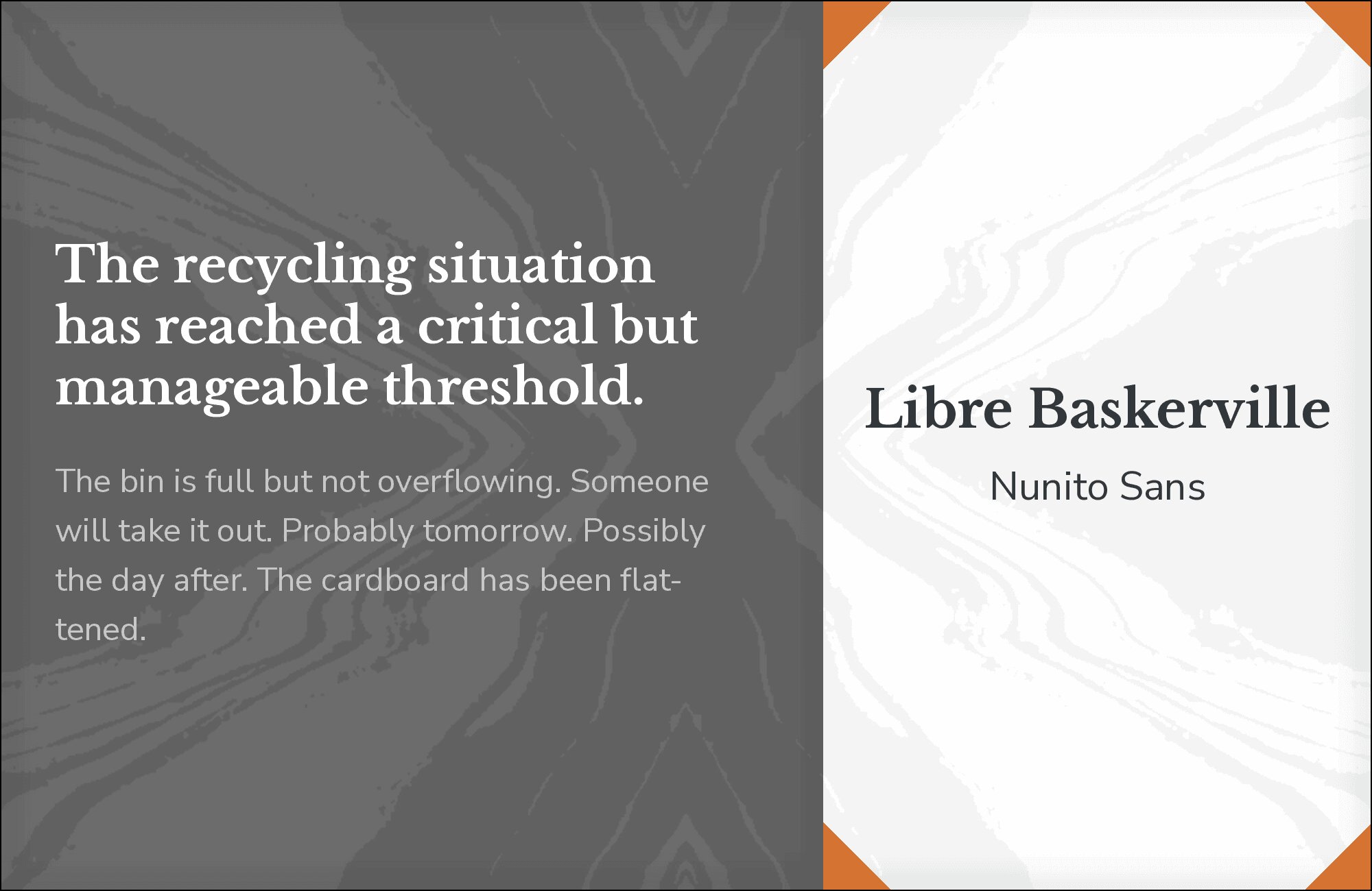
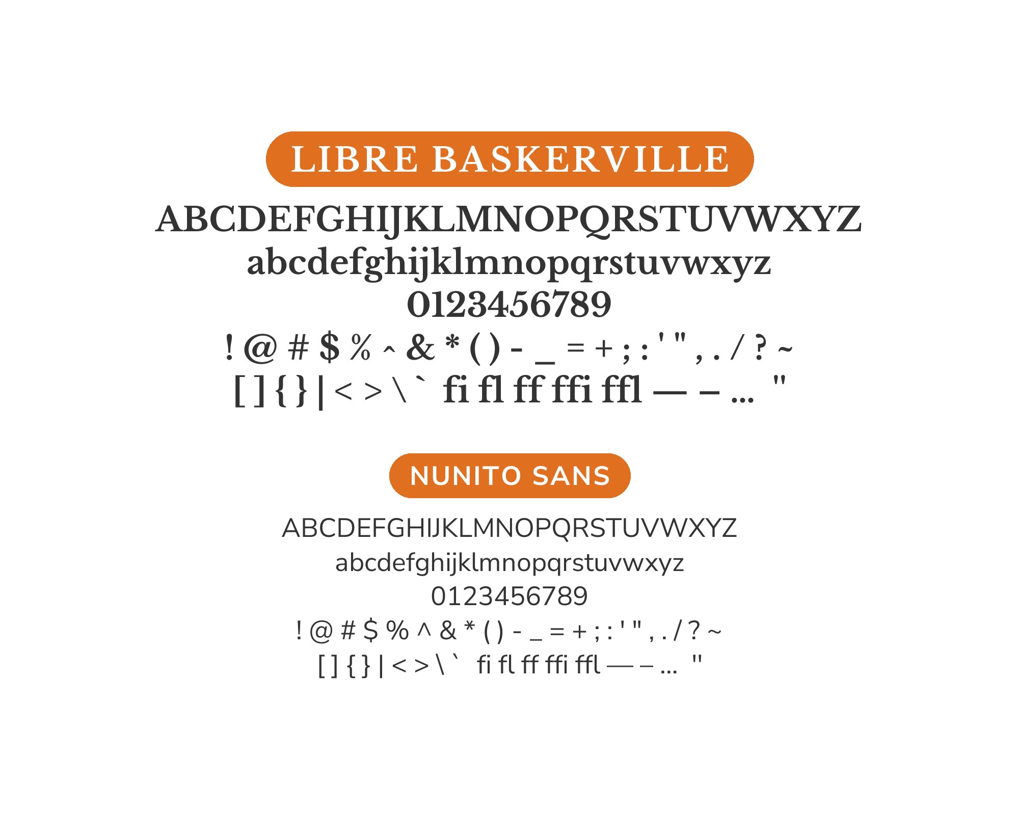
9. Nunito Sans
Rounded terminals bring approachable warmth to complement Libre Baskerville’s classical elegance. Nunito Sans softens any formality the serif might project, creating friendly yet refined layouts. The pairing works for educational publishers, family-oriented brands, or any context where accessibility and sophistication must coexist harmoniously.
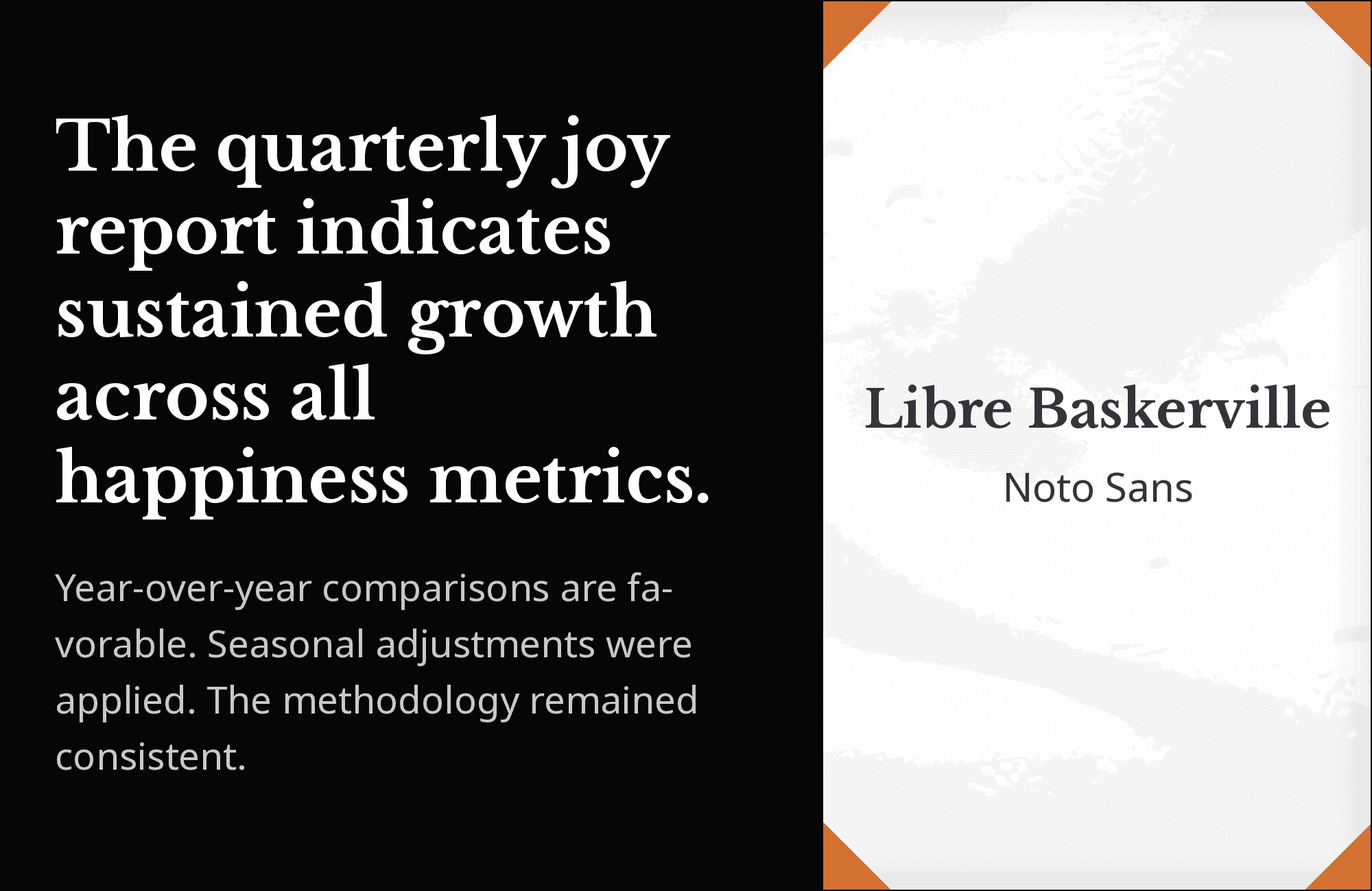
10. Noto Sans
Google’s pan-language achievement provides universal accessibility beneath Libre Baskerville’s classical display presence. Noto Sans brings exceptional character support for global audiences, while the refined serif handles Western-language content with distinction. This pairing serves international organizations, multilingual publications, or any project requiring both elegance and reach.
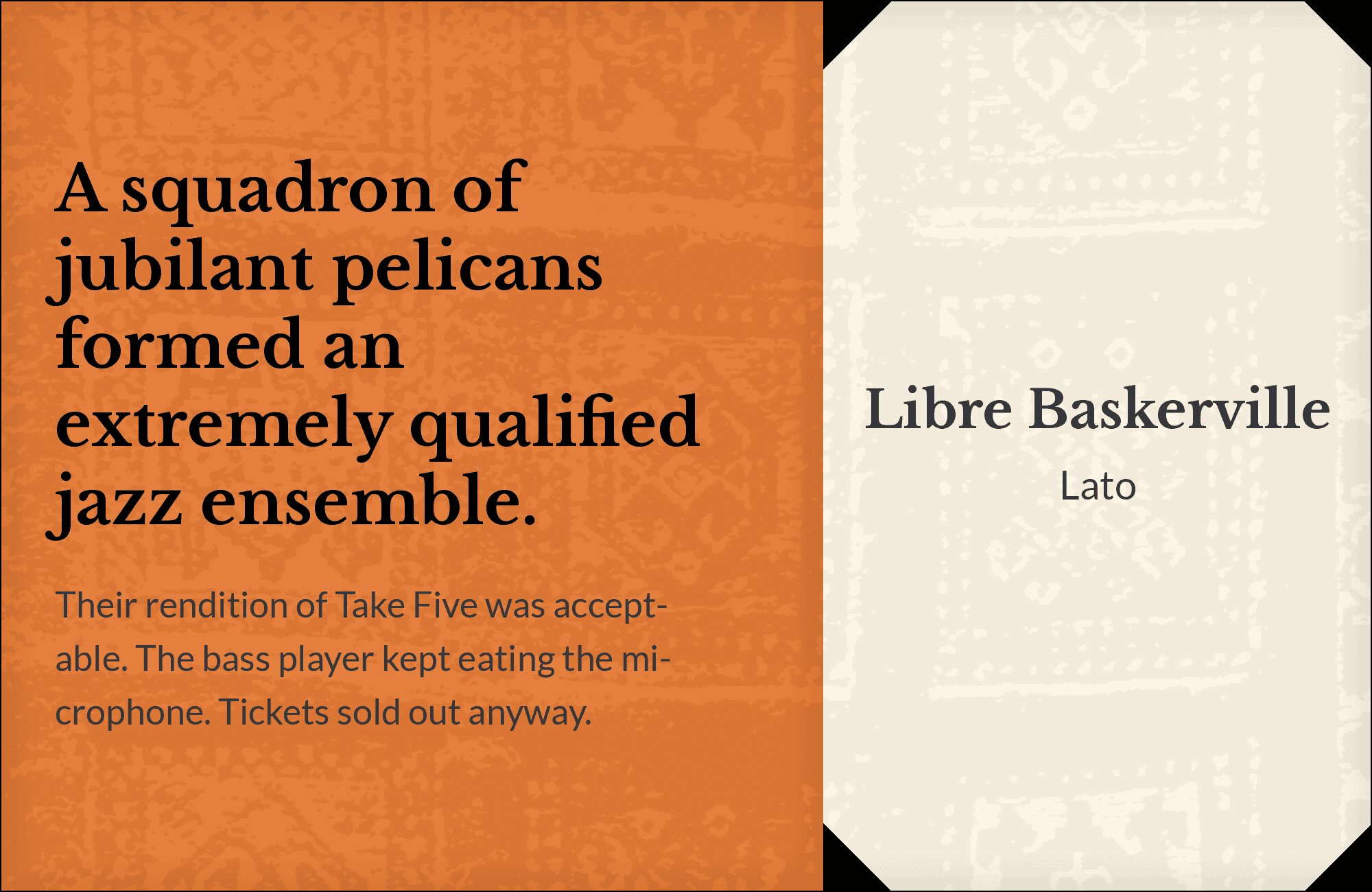
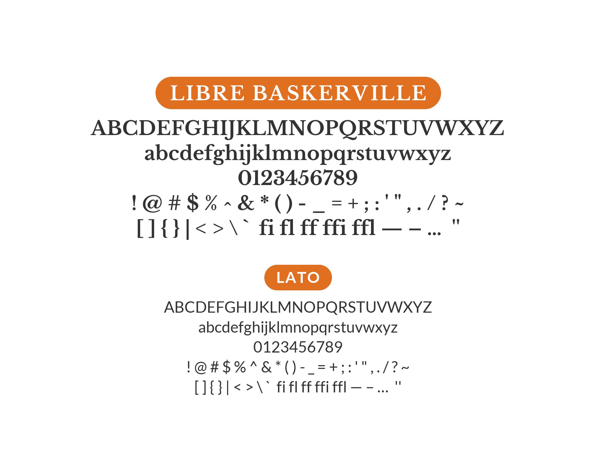
11. Lato

Rounded humanist warmth grounds Libre Baskerville’s refined elegance. Lato‘s friendly letterforms and excellent weight range provide flexible body text options, while the classical serif brings literary presence to headlines. The pairing suggests approachable authority, perfect for law firms, consultancies, or professional services balancing expertise with accessibility.
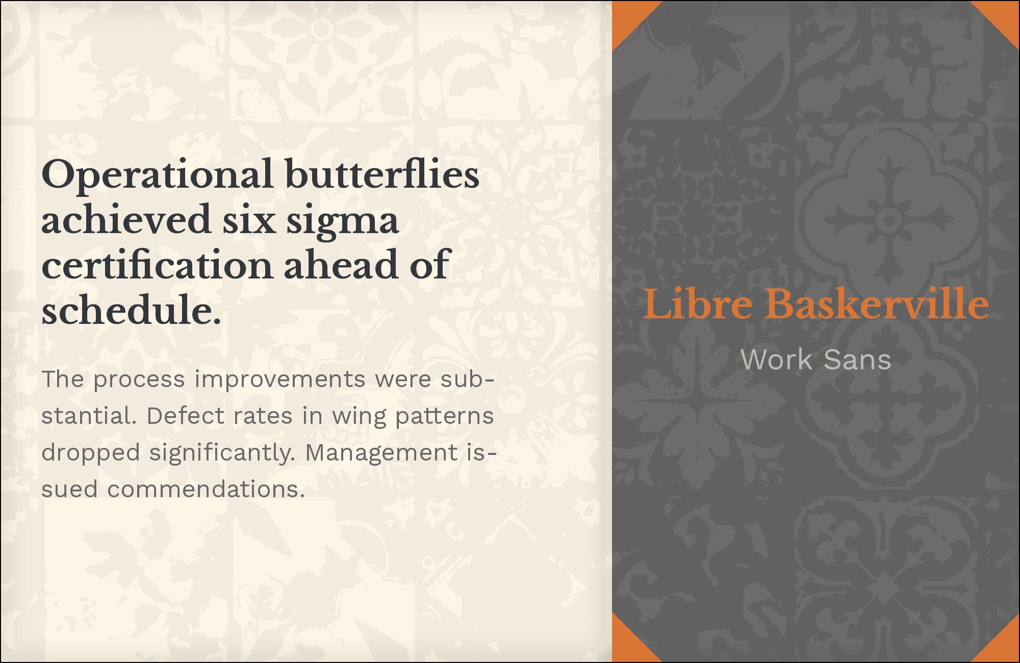
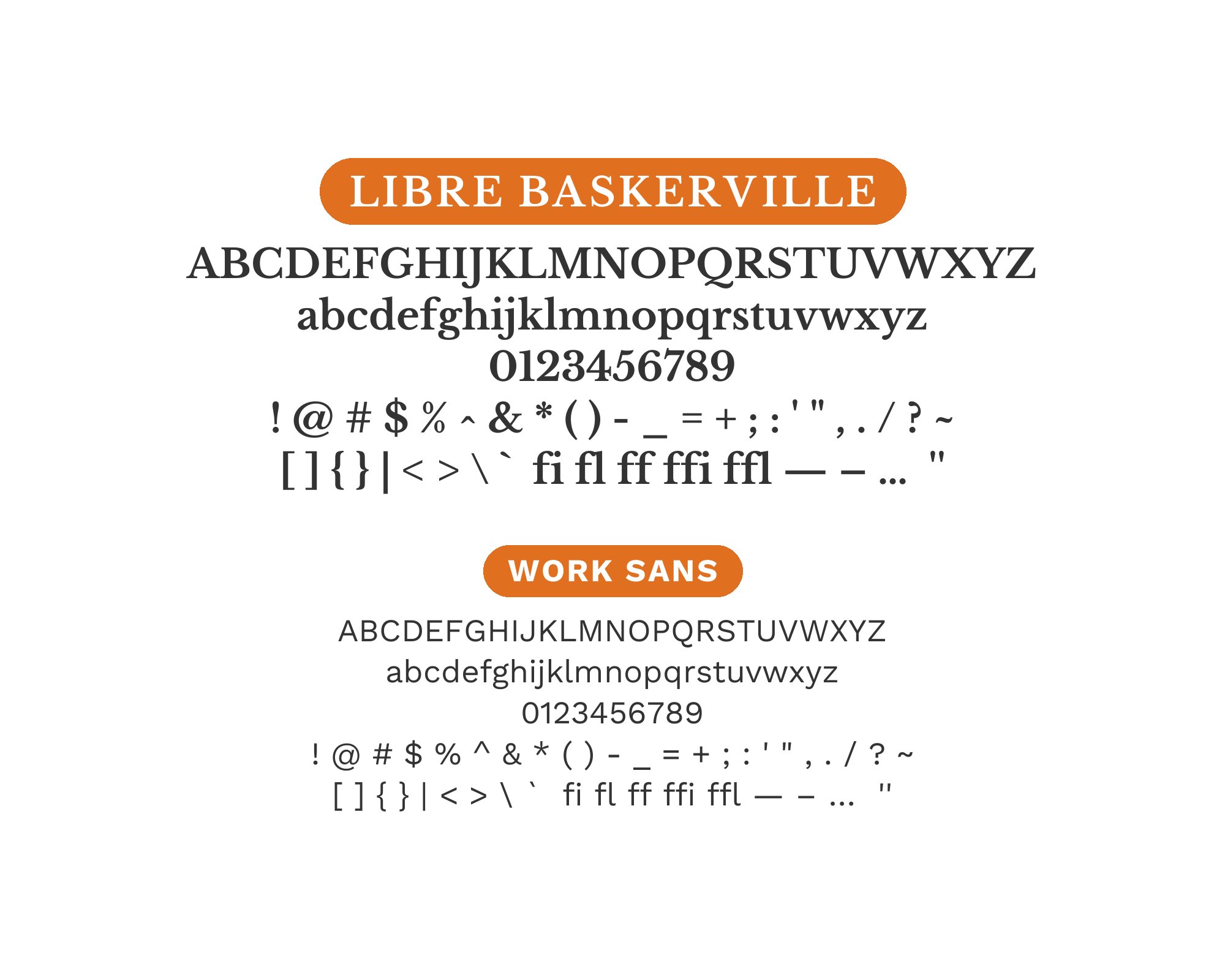
12. Work Sans
Screen-optimized pragmatism meets classical refinement. Work Sans brings nine weights of web-ready utility, while Libre Baskerville provides the elegant contrast that prevents purely functional typography from feeling sterile. The pairing works for productivity apps, content platforms, or any interface where efficiency needs occasional moments of beauty.
13. Poppins

Geometric modernity meets transitional classicism. Poppins‘ perfectly circular counters and even stroke weights create contemporary headlines that contrast dramatically with Libre Baskerville’s calligraphic heritage. The tension between these aesthetics generates visual energy without discord. Perfect for creative agencies, design studios, or brands celebrating typographic range.
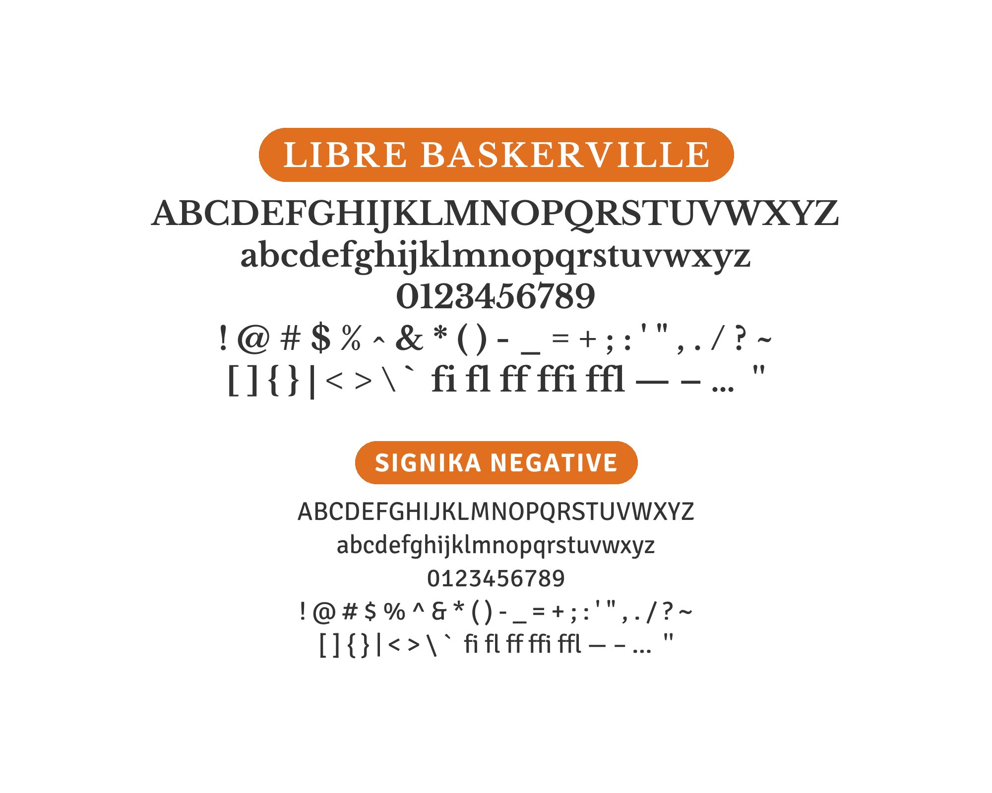
14. Signika Negative
Signage-optimized clarity serves as an unexpected complement to classical serifs. Signika Negative‘s legibility-focused design creates punchy, readable body text while Libre Baskerville brings refined elegance to headlines. The reversal of typical serif-for-body conventions creates interesting visual dynamics. Use this for environmental design, wayfinding systems, or unconventional editorial layouts.
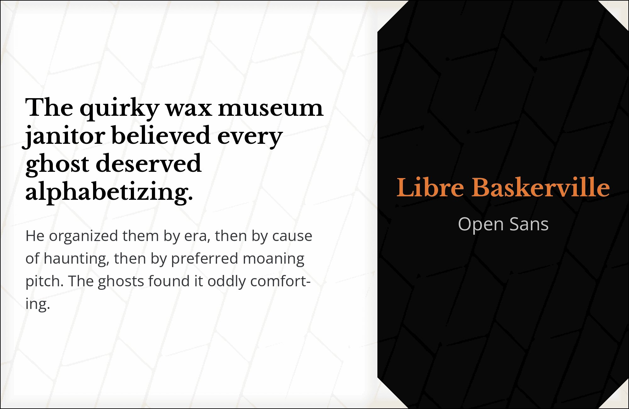
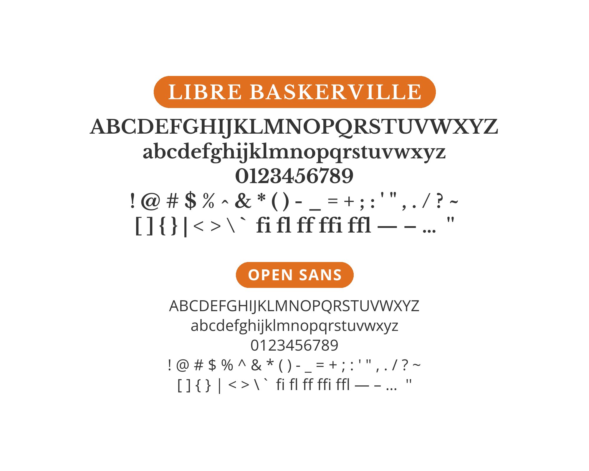
15. Open Sans
Perhaps the most versatile pairing in this collection. Open Sans‘s humanist neutrality and exceptional legibility provide stable ground for Libre Baskerville’s refined display presence. The serif’s classical proportions and Open Sans’s contemporary clarity create balanced layouts adaptable to nearly any context. Deploy for corporate sites, editorial platforms, or anywhere proven typography matters.
Conclusion
There are no absolute rules for font pairing, just principles to guide you. The key is contrast—in weight, in style (serif vs. sans-serif), or in personality. Libre Baskerville is versatile enough to play well with many different typefaces.
Trust your eye, experiment freely, and remember that the best pairing is the one that serves your content and audience. Typography should enhance communication, not complicate it.