Maven Pro pairs great with Oxygen, Patua One and Lato. All 10 pairings are shown below in real rendered specimens, with the reason each one works.

What fonts go with Maven Pro? It is one of those free fonts you have probably seen many times without knowing its name. Friendly, a little techy, softly squared. It can set a headline and it can set a paragraph, which makes the pairing question more open than usual. You get to decide which job Maven Pro does, and the partner takes the other one.
Google Fonts credits Maven Pro to Joe Prince, and it was added to the library in 2011. Its own description calls it a sans-serif typeface with unique curvature and flowing rhythm. That curvature is the thing to look at. The bowls of letters like a and d swing out in soft, slightly squarish curves, and the arches of n, m and r have a gentle, rounded spring to them. Oliver Schöndorfer of Pimp my Type says Maven Pro reminded him of FF Dax, though wider and sturdier. The family was updated in January 2019 with a variable font weight axis, and on Google Fonts it runs from Regular to Black. The three light weights are sold separately on Lost Type. One practical note from that same review: the Regular weight is quite light, so a font-weight of 450 helps in body text.
Pairing Maven Pro is mostly a question of which role it plays. As a headline face, its curves want a calmer, more neutral text partner. As a body face, it wants a heading with more character: a slab, a serif, something with a bit of weight. The evidence below covers both directions, from a healthcare brand manual and live websites to named designers’ recommendations. Here are 10 fonts that pair with Maven Pro.
1. Oxygen
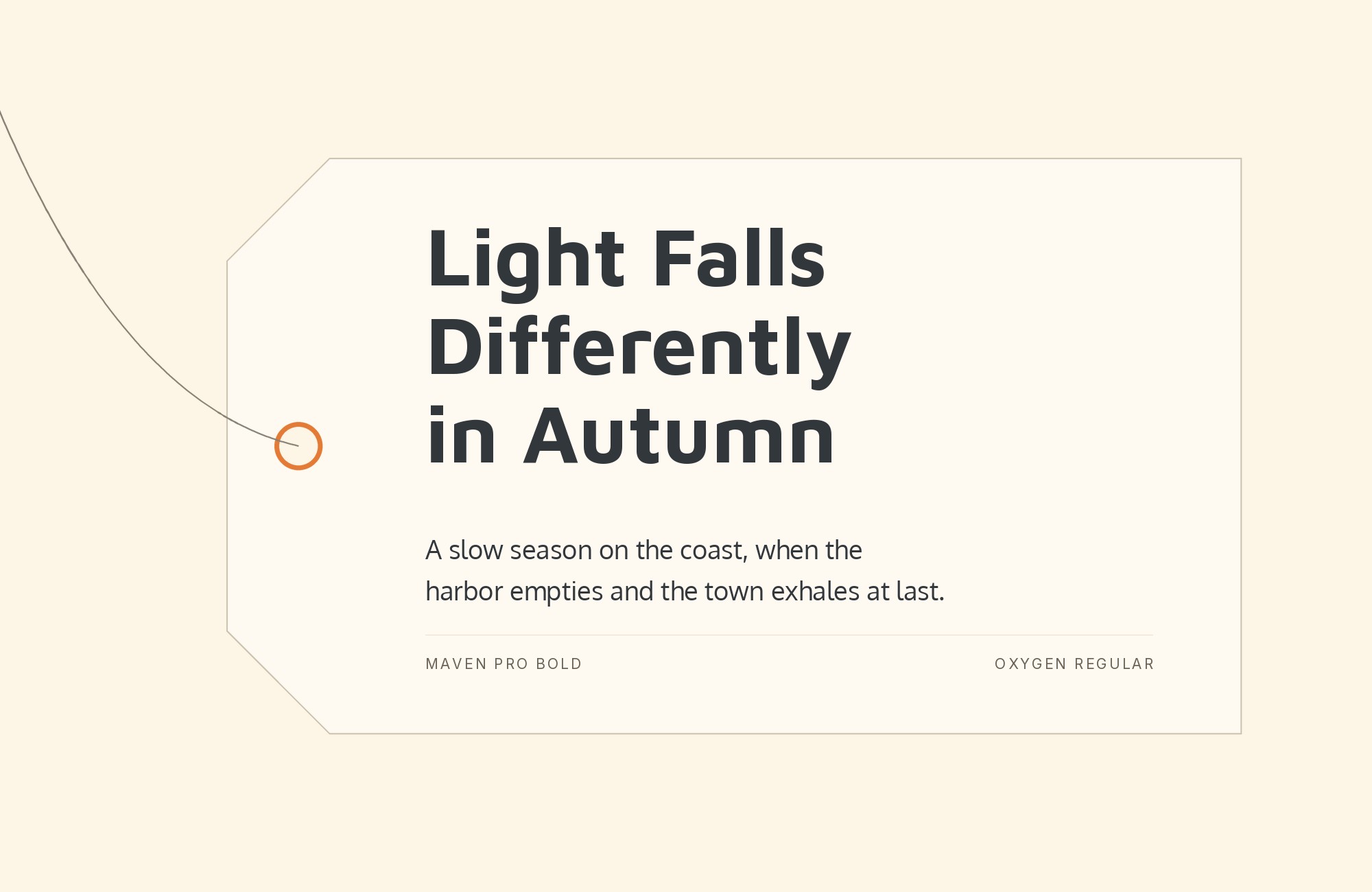
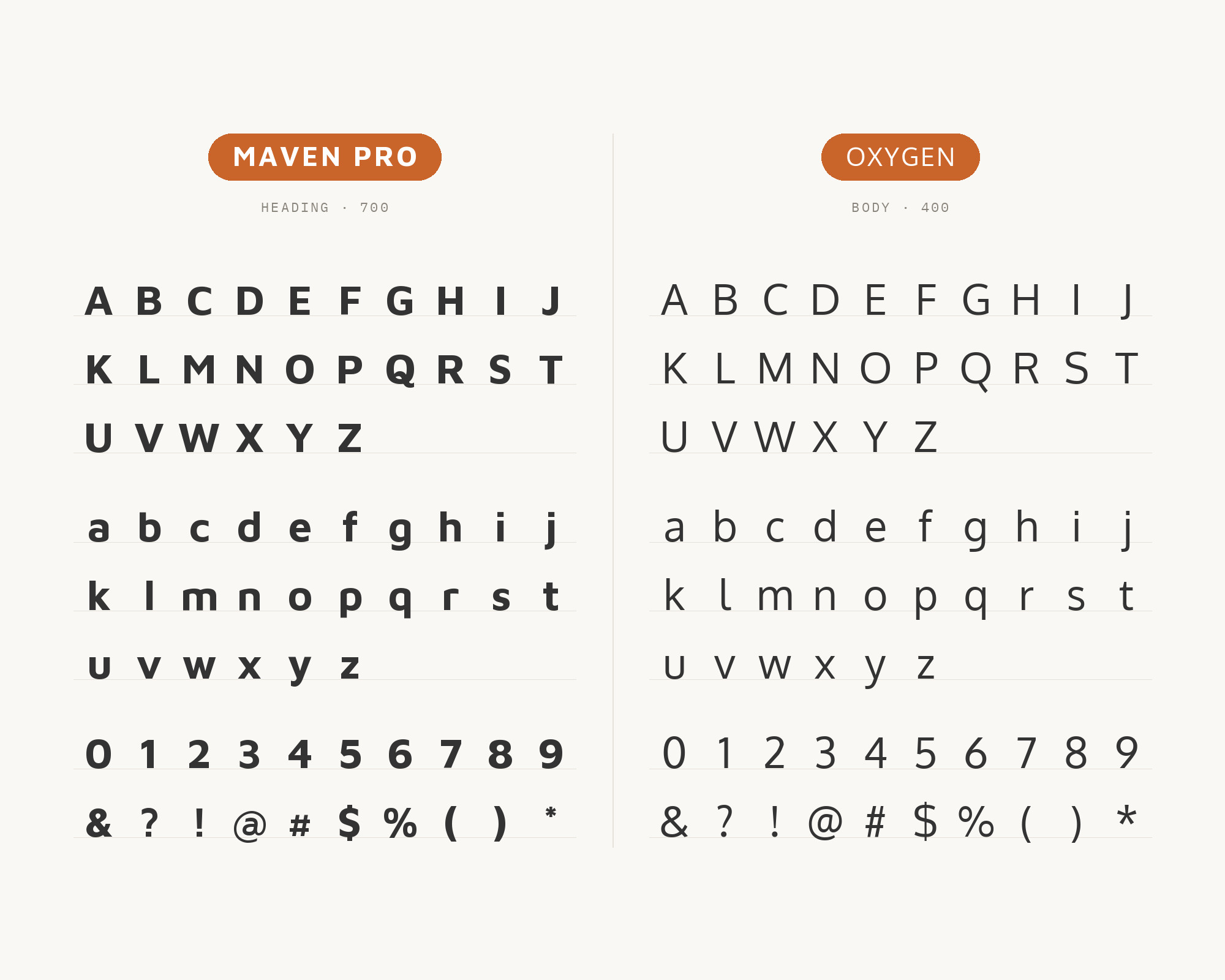
This one is documented in a real brand manual. Kai Marie Group, a healthcare consulting firm, uses Maven Pro as its primary typeface for headlines and titles and Oxygen as its secondary typeface for all body copy. Its type hierarchy sets title headers in Maven Pro Bold and body text in Oxygen Light. Vernon Adams designed Oxygen, which was created as part of the KDE Project, a libre desktop for Linux. That origin matters here. Oxygen was drawn to work well in graphical user interfaces, so it is plain, even and practical, and it gives the page a calm gray texture under Maven Pro’s rounder, more expressive headings. The light weight keeps body copy airy. For most screens, though, I would set Oxygen Regular for longer text and save Light for short intro lines.
Paid prompt-to-site tools are going to lock you in.
How can your studio escape this?
Find Out How2. Patua One
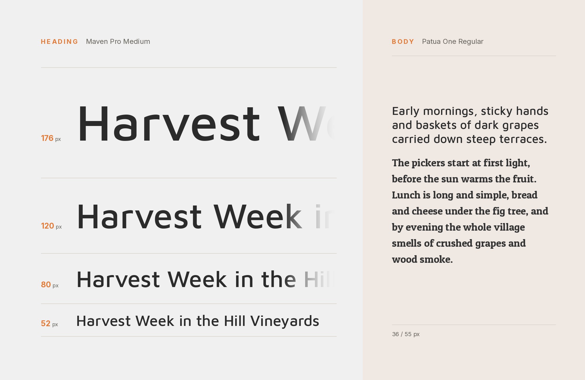
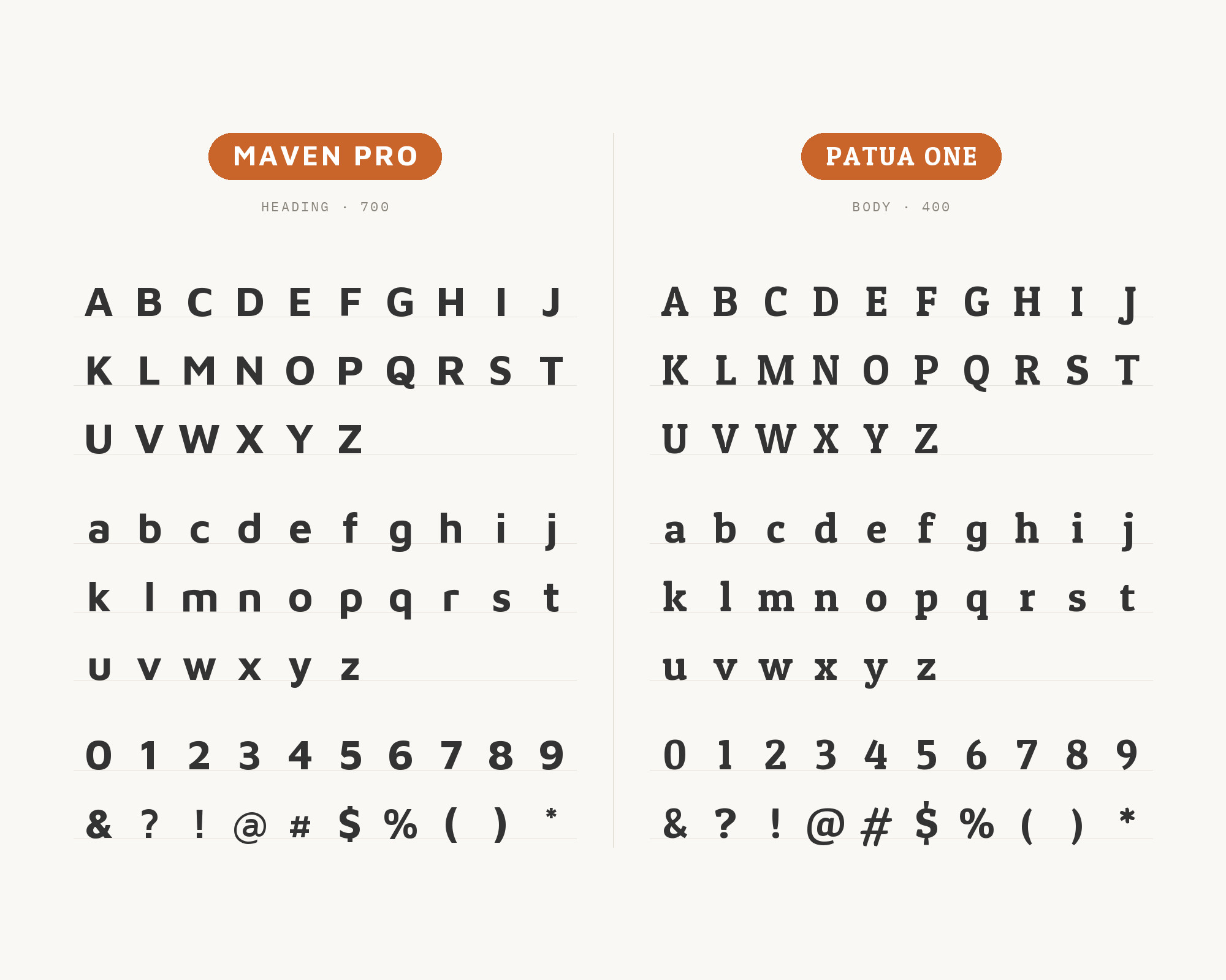
Patua One is the most recommended Maven Pro partner I found. Vev’s list of font pairings sets Patua One Regular for headers and Maven Pro Regular for paragraphs. CSS Chopper recommends the same Patua One and Maven Pro combination, and ReliablePSD includes it in its collection of Google font pairings. LatinoType designed Patua One as a slab serif with low contrast and strong serifs, and its thick serifs are curved for a touch of smoothness. Those curved slabs are the link. Maven Pro’s curves are soft and rounded, and Patua One’s serifs are soft and rounded too, so the two feel like they come from the same friendly place. The slab gives the heading weight and warmth; Maven Pro keeps the reading light and clean. Great for food brands, community sites, schools and anything that should feel welcoming.
Junior work is now a prompt. The biggest profit center in your studio is vanishing.
How to fix this?
Find Out How3. Lato
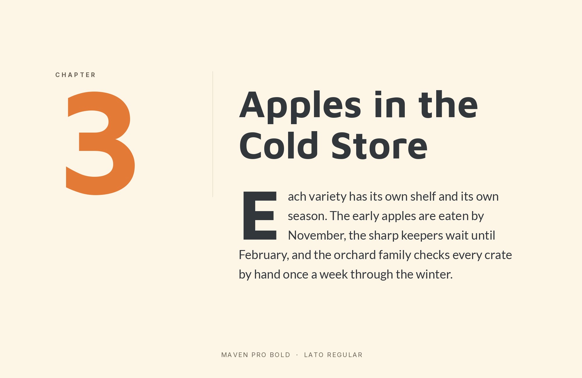
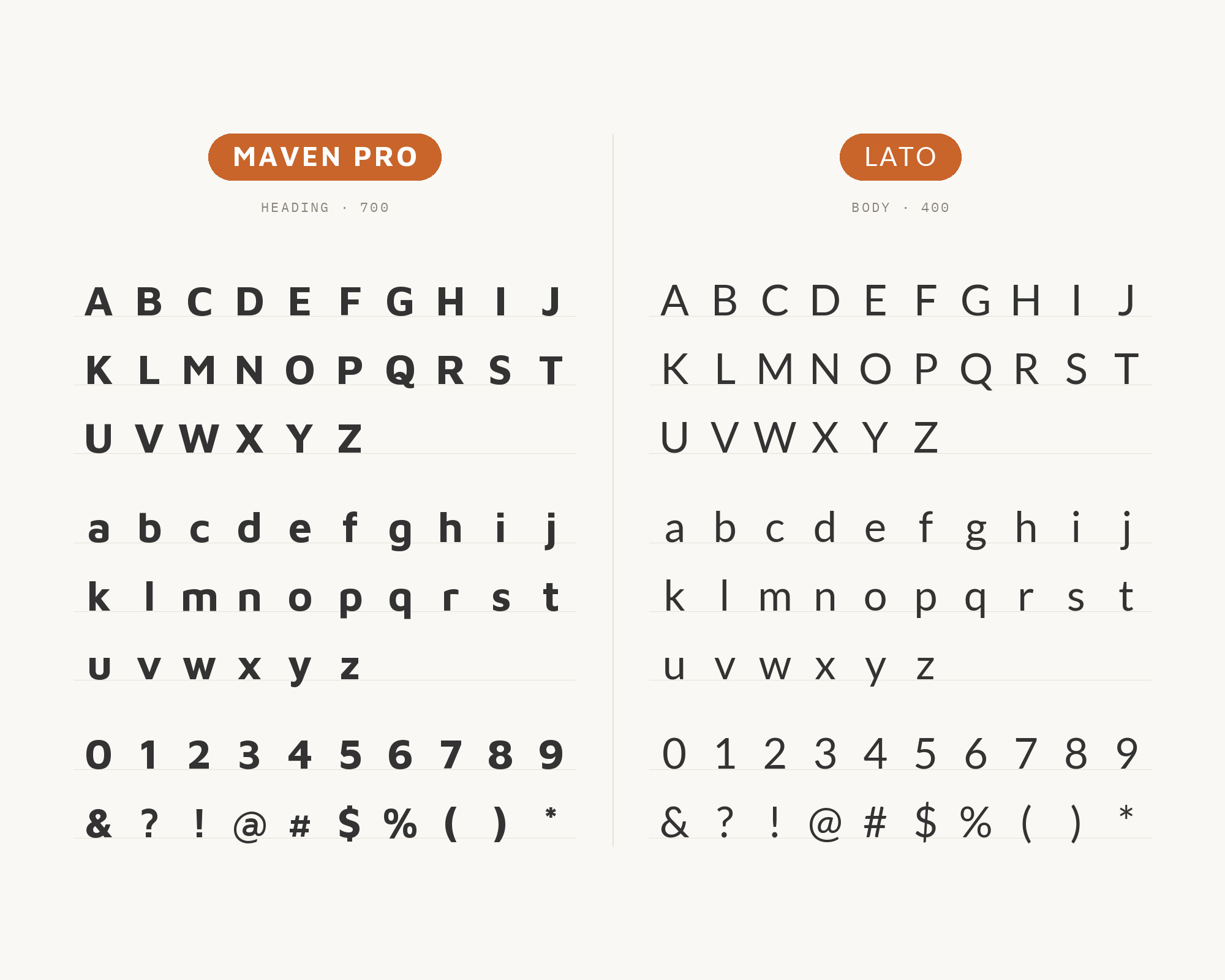
Typ.io records Maven together with Lato on claap.io, and its Maven page says the face goes well with Lato and Helvetica Neue. (Typ.io lists the face simply as Maven.) Łukasz Dziedzic designed Lato in Warsaw, starting in the summer of 2010. Lato’s semi-rounded details and classical proportions give a steady, even text texture, and it stays a bit quieter than Maven Pro. So Maven Pro takes the headlines and product names, where its curvature is visible, and Lato carries paragraphs and interface copy. Both are humanist-leaning sans serifs with rounded touches, so the contrast is subtle. Make it clear with weight: Maven Pro SemiBold or Bold on top, Lato Regular underneath.
4. Helvetica Neue
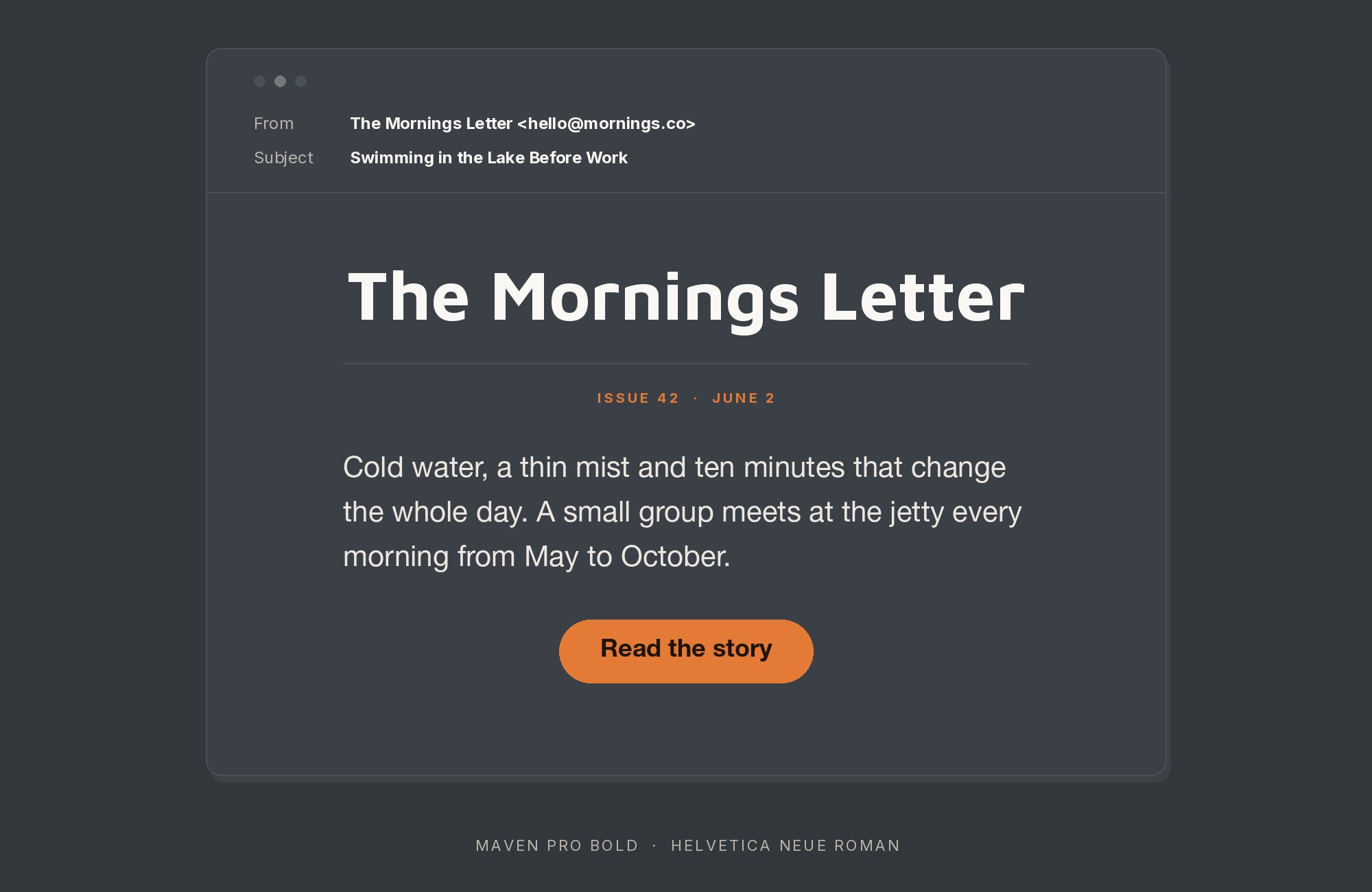
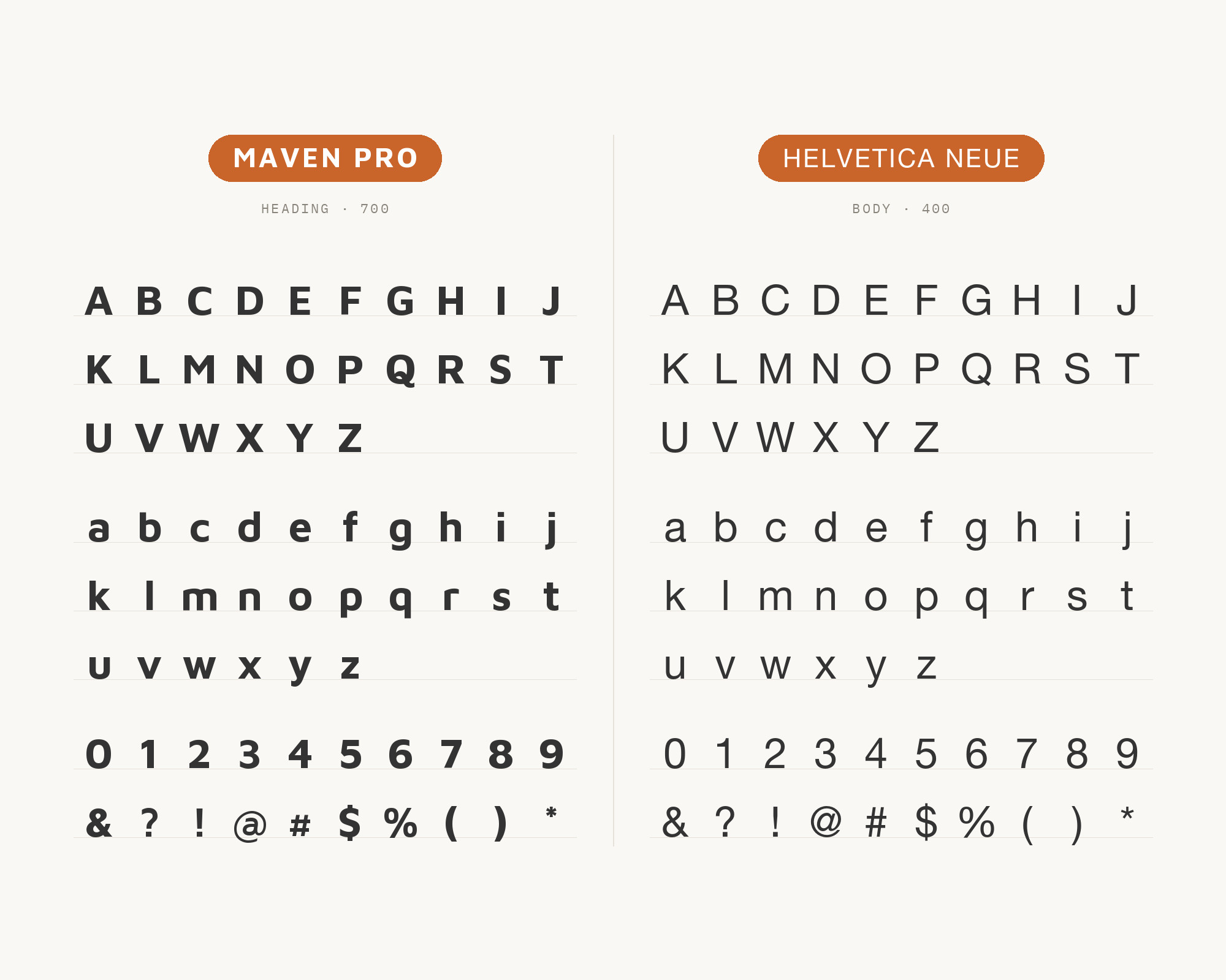
Typ.io also records Maven with Helvetica Neue on doo.net, a document app site. This is the neutral-partner move. Helvetica Neue has a tight, closed, very regular structure, almost the opposite of Maven Pro’s open, flowing curves. That contrast is useful when Maven Pro is the brand voice: the curvy face sets the logo and headings, and the neo-grotesque carries everything that has to be read quickly without any personality at all. Watch the widths. Maven Pro is fairly wide and Helvetica Neue is more compact, so give the body text a touch more tracking or size than you would by default. If you cannot use Helvetica Neue, the same logic works with any neutral grotesque already on the system.
5. Domine
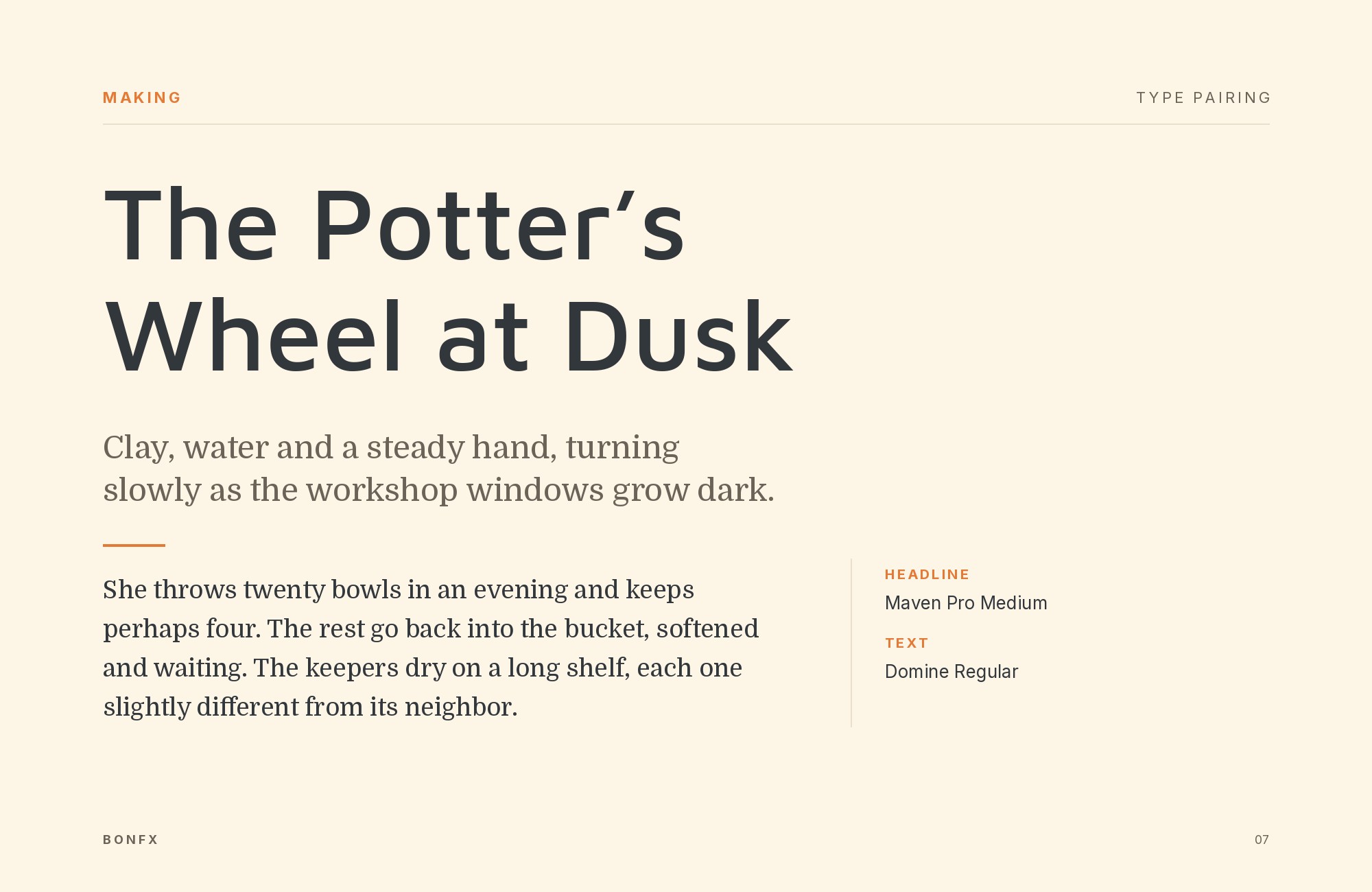
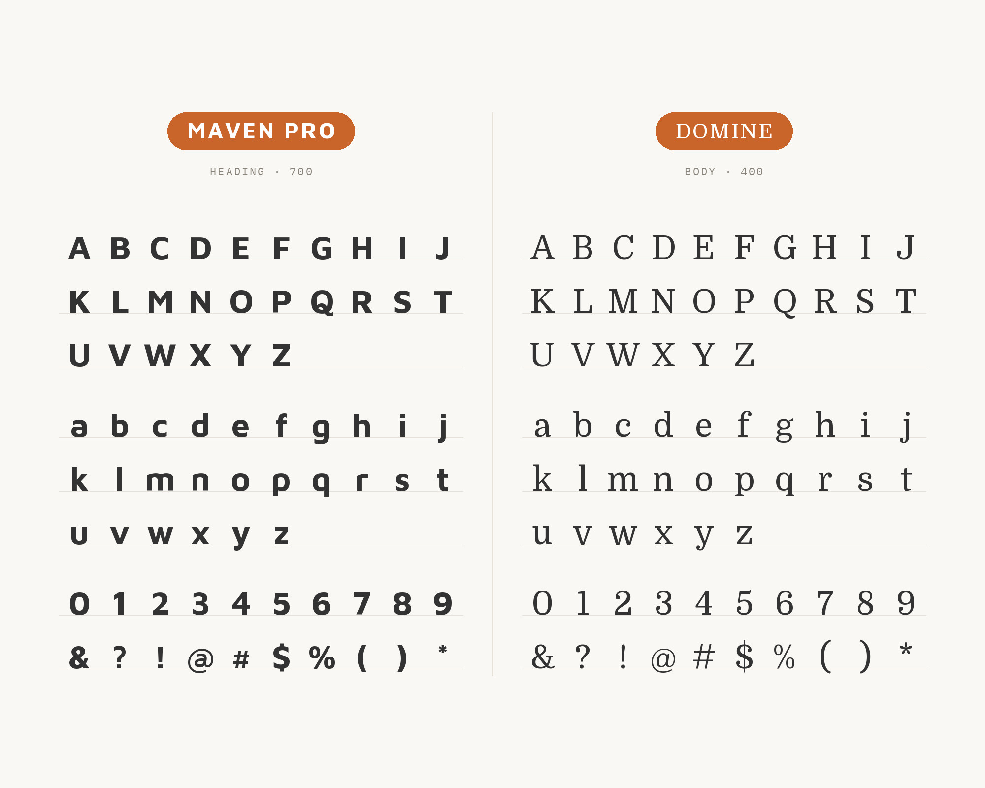
Oliver Schöndorfer’s Pimp my Type review lists Domine among his Maven Pro pairing suggestions, for headings and copy. Impallari Type designed Domine, and it was designed, tested and optimized for body text on the web. This is the classic sans-and-serif split. Maven Pro takes headings and interface text, and Domine takes the long reading, where its sturdy, friendly serifs guide the eye along the line. It also works the other way round: Domine for a warm, solid headline and Maven Pro for text. Either way, the two share a friendly, open, slightly rounded personality, so the contrast comes from serif against sans, not from mood. A good fit for magazines, blogs and news sites that want a softer, less corporate look.
6. Radio Canada
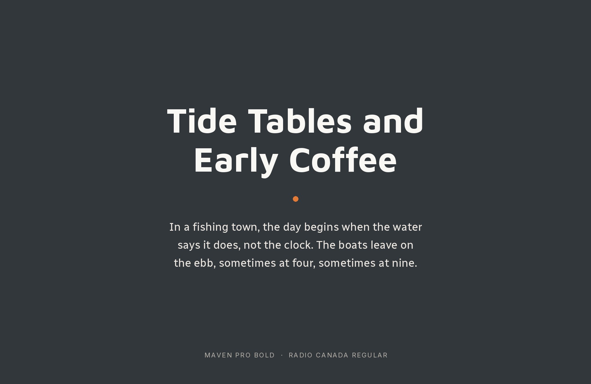
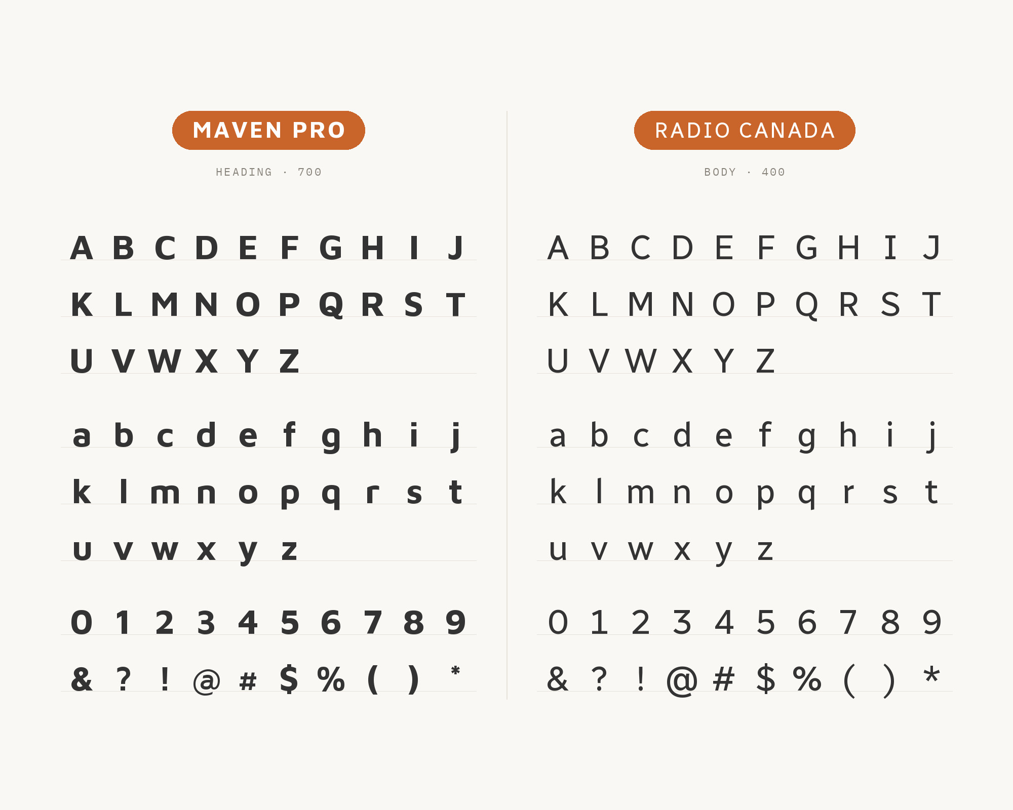
The same Pimp my Type review suggests Radio Canada for headings, copy and UI text. Charles Daoud created the Radio-Canada font in 2017 with Coppers and Brasses and Alexandre Saumier Demers, as the brand font for CBC/Radio-Canada. Its own description calls it a humanistic style with distinctive angles and subtle curves. That is the pairing logic in one line. Maven Pro is all curves; Radio Canada mixes curves with sharper angled cuts. Put them together and the angles add a bit of edge next to Maven Pro’s softness, while both stay very readable. Use Maven Pro for headlines and Radio Canada for body and UI, or flip it for a more editorial feel. Both families have enough weights to build a full hierarchy.
7. Intel One Mono
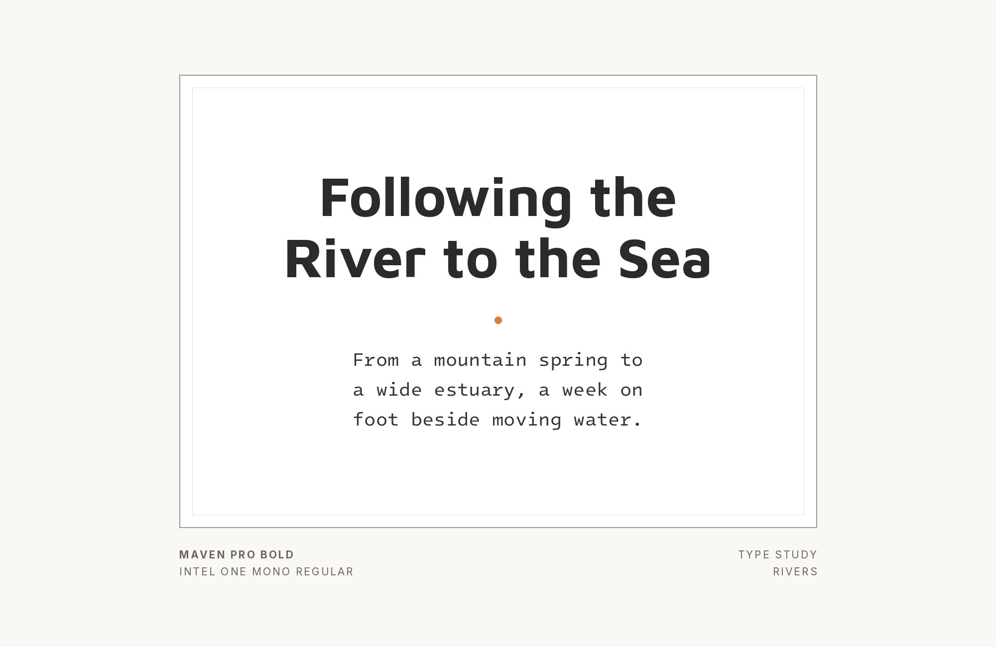
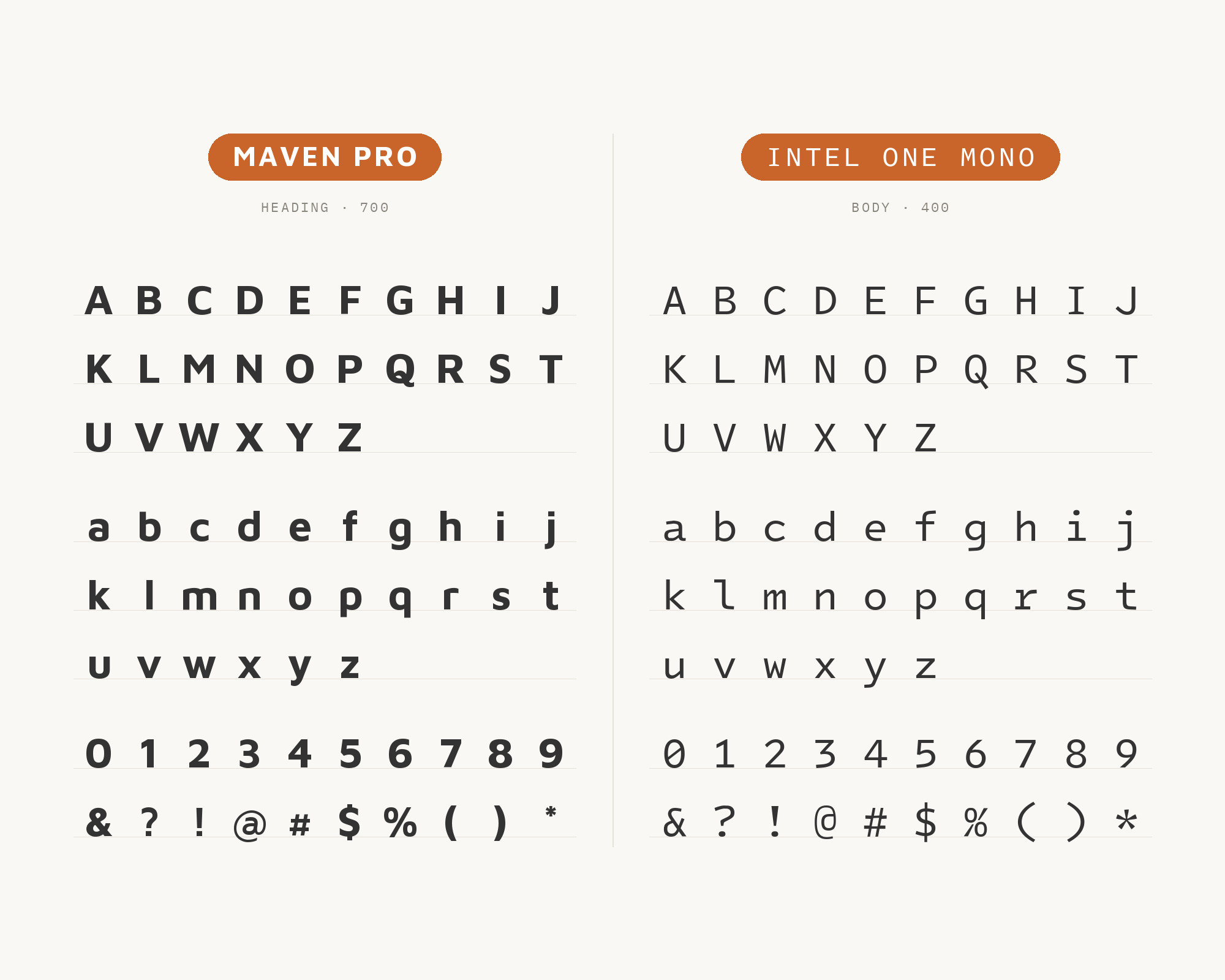
Pimp my Type also pairs Maven Pro with Intel One Mono, recommended for copy and UI text. Frere-Jones Type designed Intel One Mono in partnership with the Intel Brand Team and VMLY&R, for maximum legibility for developers. This pairing is for technical products. Maven Pro gives the product name, the headings and the marketing lines a friendly face, and the monospace handles code samples, commands, data and small labels. Because Intel One Mono was built for clarity, it reads well even in dense UI panels. Keep the monospace to technical content, though. A whole paragraph of it next to Maven Pro headlines feels heavy.
8. Josefin Slab
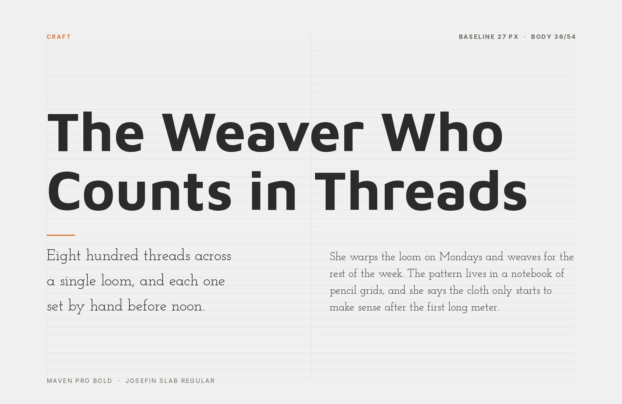
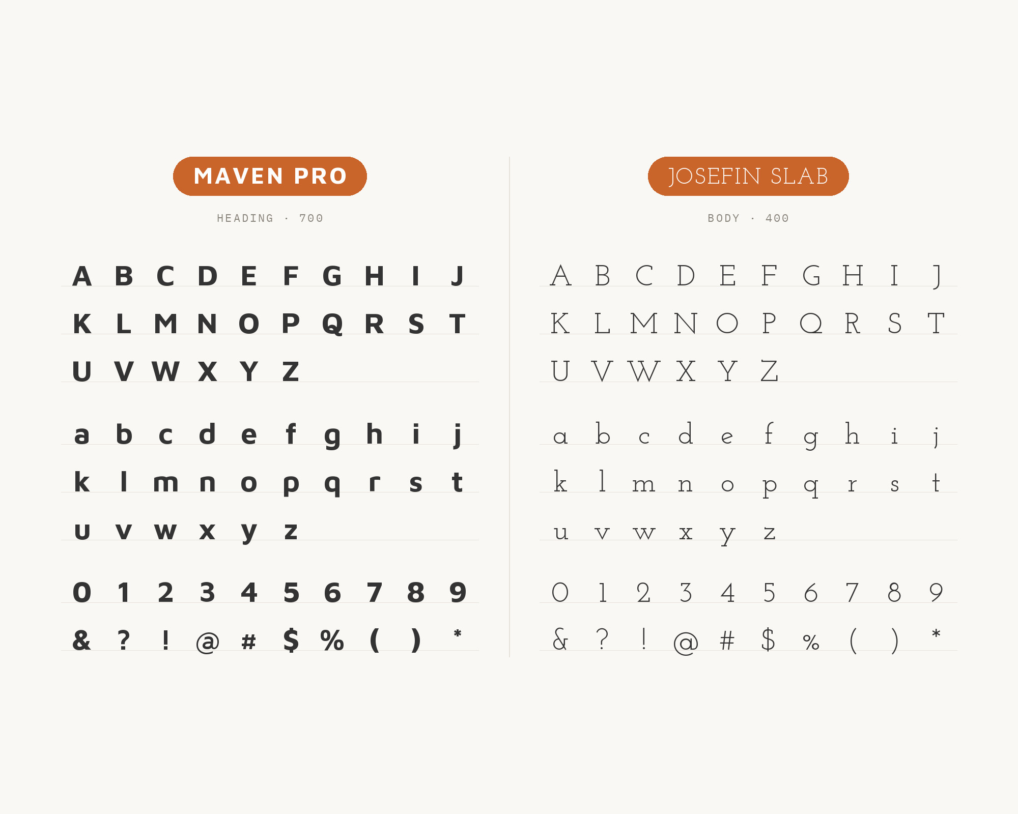
Raindrops Insider’s list of font combinations sets Josefin Slab as the headline font and Maven Pro as the body copy. The writer describes Maven Pro as clear and easy to read as body text, despite its slightly futuristic style. Santiago Orozco designed Josefin Slab, and he says he aimed for something between Kabel and Memphis with modern details. That gives Josefin Slab a geometric, retro feel with thin, precise slabs, which pairs nicely with Maven Pro’s modern curves. This pairing flips the usual role. Josefin Slab carries a short, elegant headline with a vintage accent, and Maven Pro handles the paragraphs. Set Josefin Slab large; its thin strokes need size to hold up.
9. Montserrat
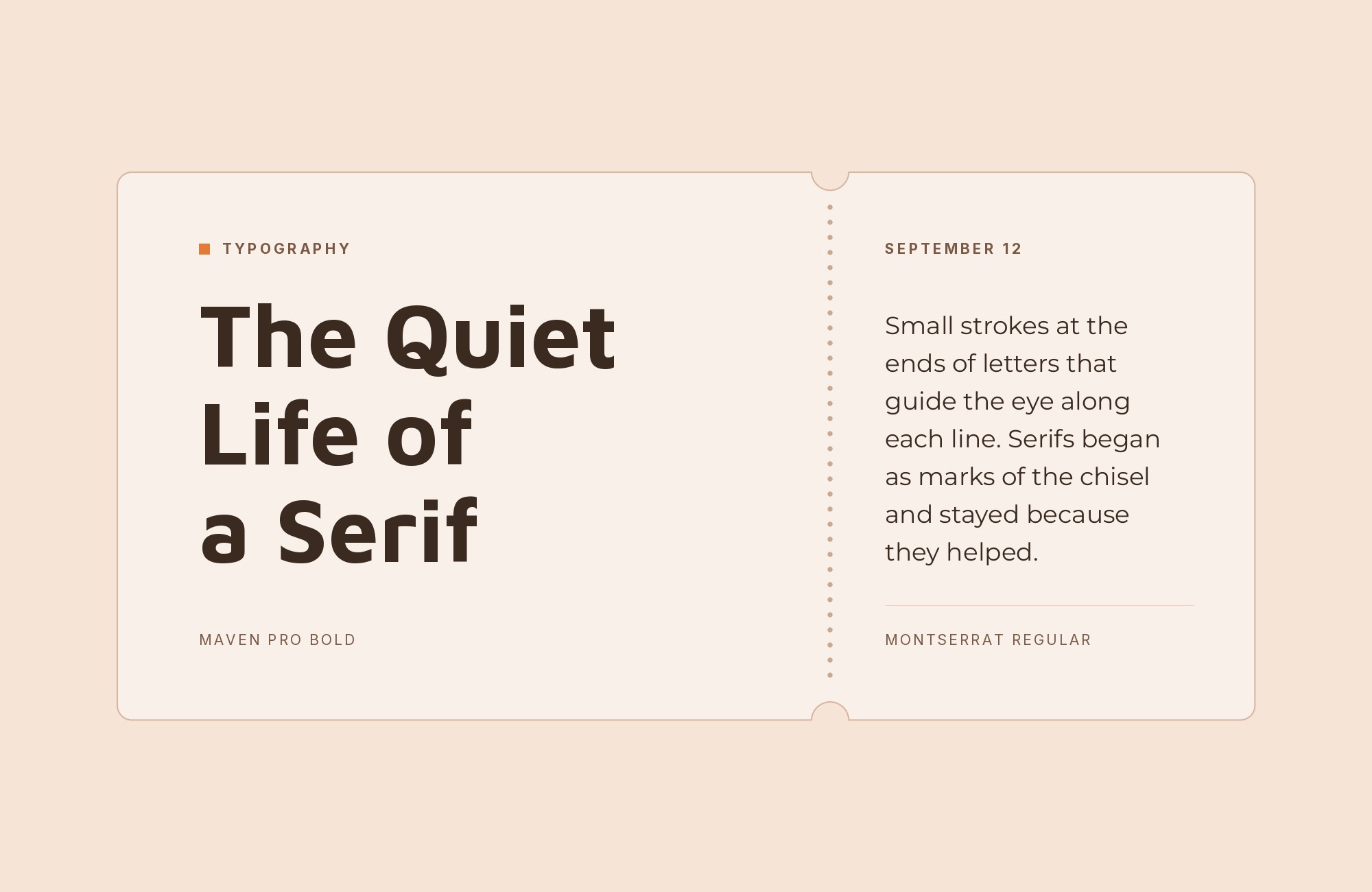
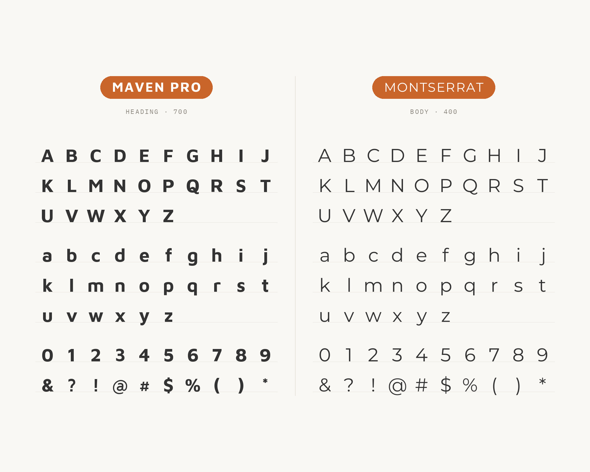
Easil’s font pairing guide says Maven Pro pairs with Montserrat and Roboto. Julieta Ulanovsky designed Montserrat, inspired by old posters and signs in the Montserrat neighborhood of Buenos Aires. It is a wide geometric sans, and it gives this pairing a strong, even heading voice. I would put Montserrat SemiBold or Bold in headings and let Maven Pro’s curves carry subheads and body. Both faces are wide and friendly, so be strict with size and weight differences, or the two will look like almost-twins. This is a good choice for startups and apps that want a bold, clean header with a slightly softer text face underneath.
10. Roboto
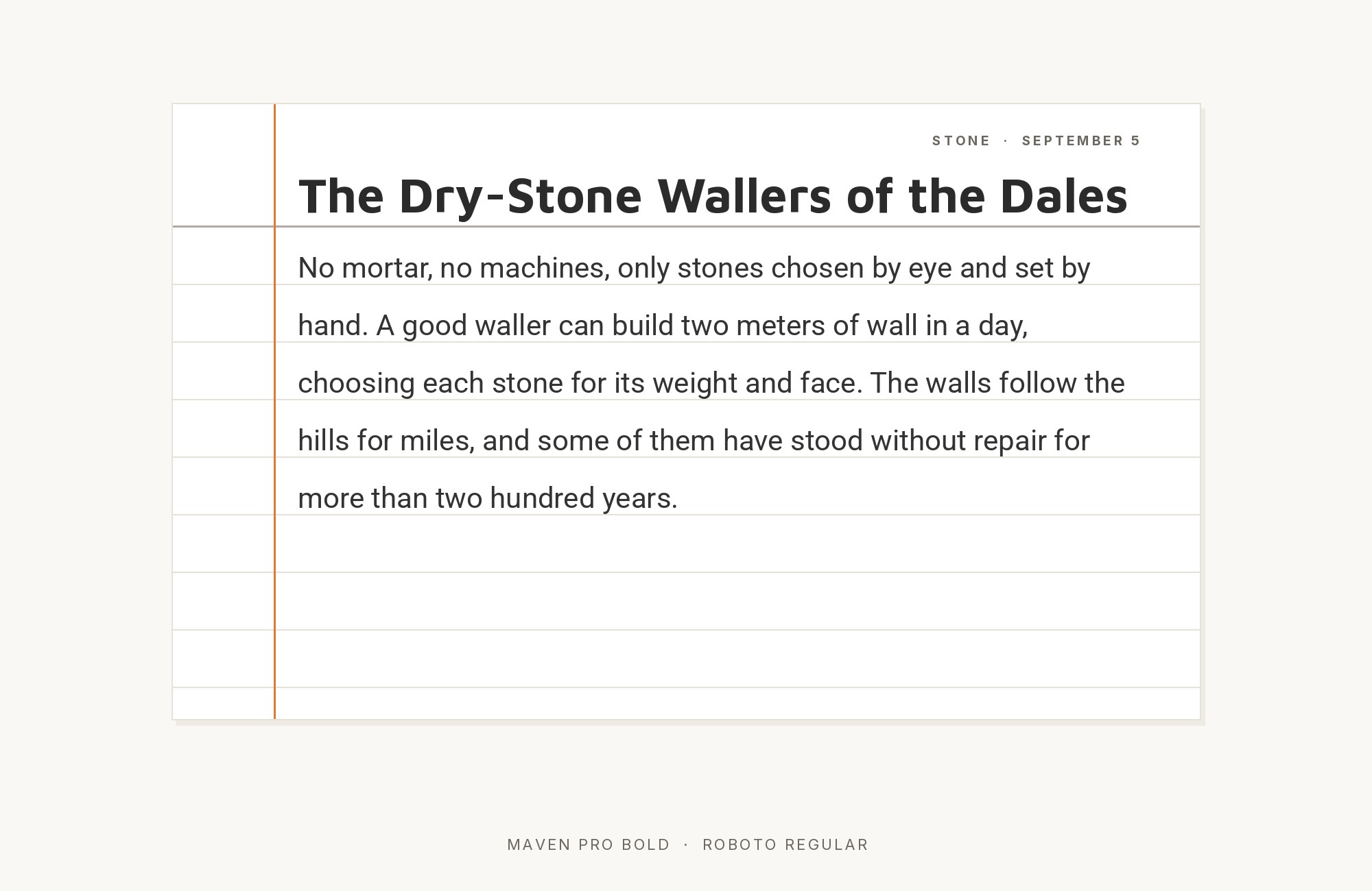
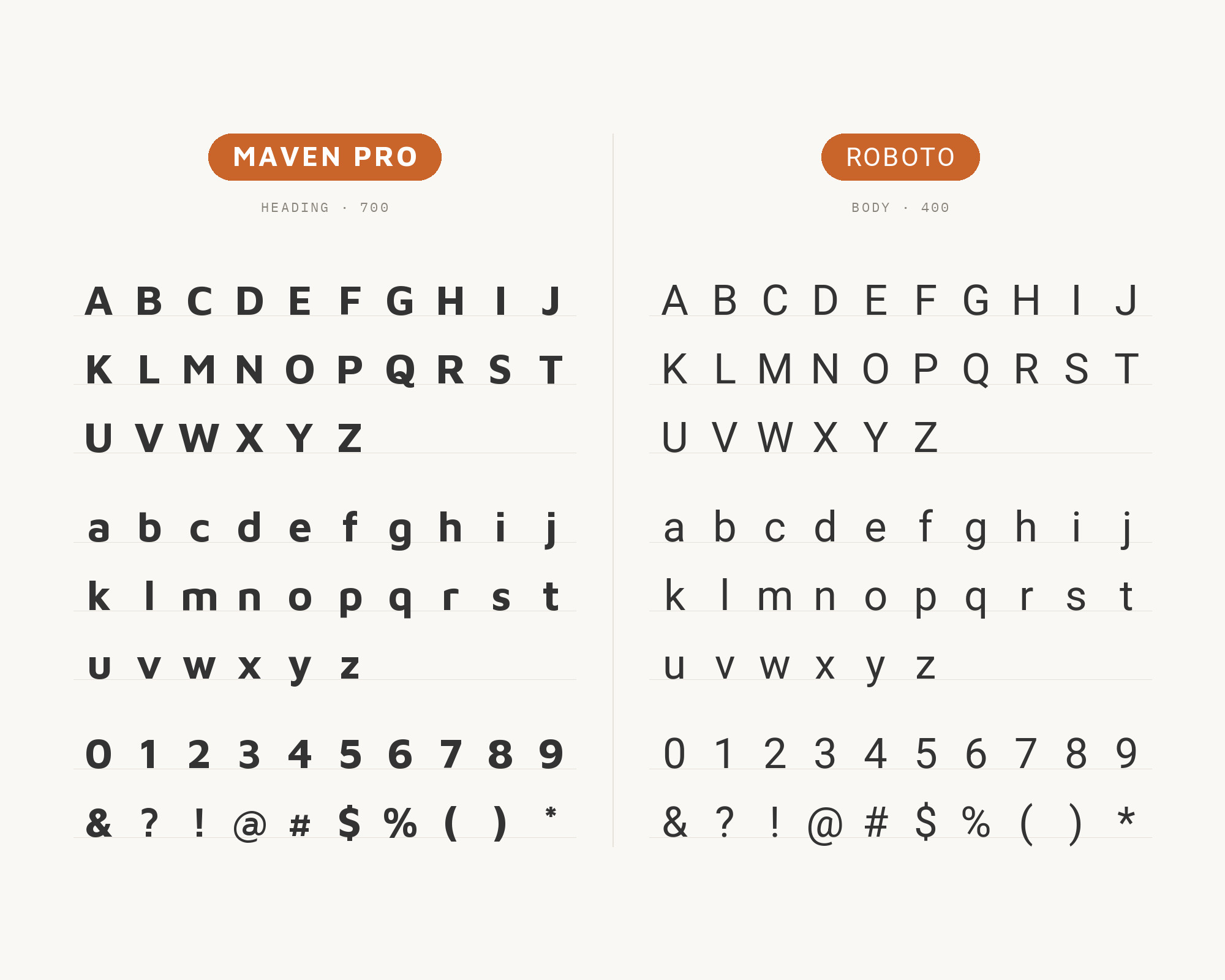
The same Easil guide also names Roboto. Google Fonts credits Roboto to Christian Robertson, ParaType and Font Bureau, and its own description says it has a mechanical skeleton with largely geometric forms. That mechanical frame is the contrast. Maven Pro’s curves are soft and flowing; Roboto’s are more controlled and regular. Use Maven Pro for headings and brand moments and Roboto for body, forms and interface text. The result is friendly on top and very functional underneath, which is often exactly what a product site or a dashboard needs.
Conclusion
Maven Pro can lead or support, and the evidence shows both. In the Kai Marie Group manual it leads, with Oxygen underneath. In the Patua One and Josefin Slab pairings it supports, as the clean body under a slab headline. Live sites pair it with Lato and Helvetica Neue, and Oliver Schöndorfer adds Domine, Radio Canada and Intel One Mono.
So start by choosing Maven Pro’s job. For a friendly heading over calm text, try Oxygen, Lato or Roboto. For a warm slab or serif heading over Maven Pro text, try Patua One, Josefin Slab or Domine. For a technical product, add Intel One Mono. And remember that Regular is a little light, so test a slightly heavier weight for body text at the size you will actually publish.
