Roboto Slab pairs great with Open Sans, Lato and Oswald. All 15 pairings are shown below in real rendered specimens, with the reason each one works.
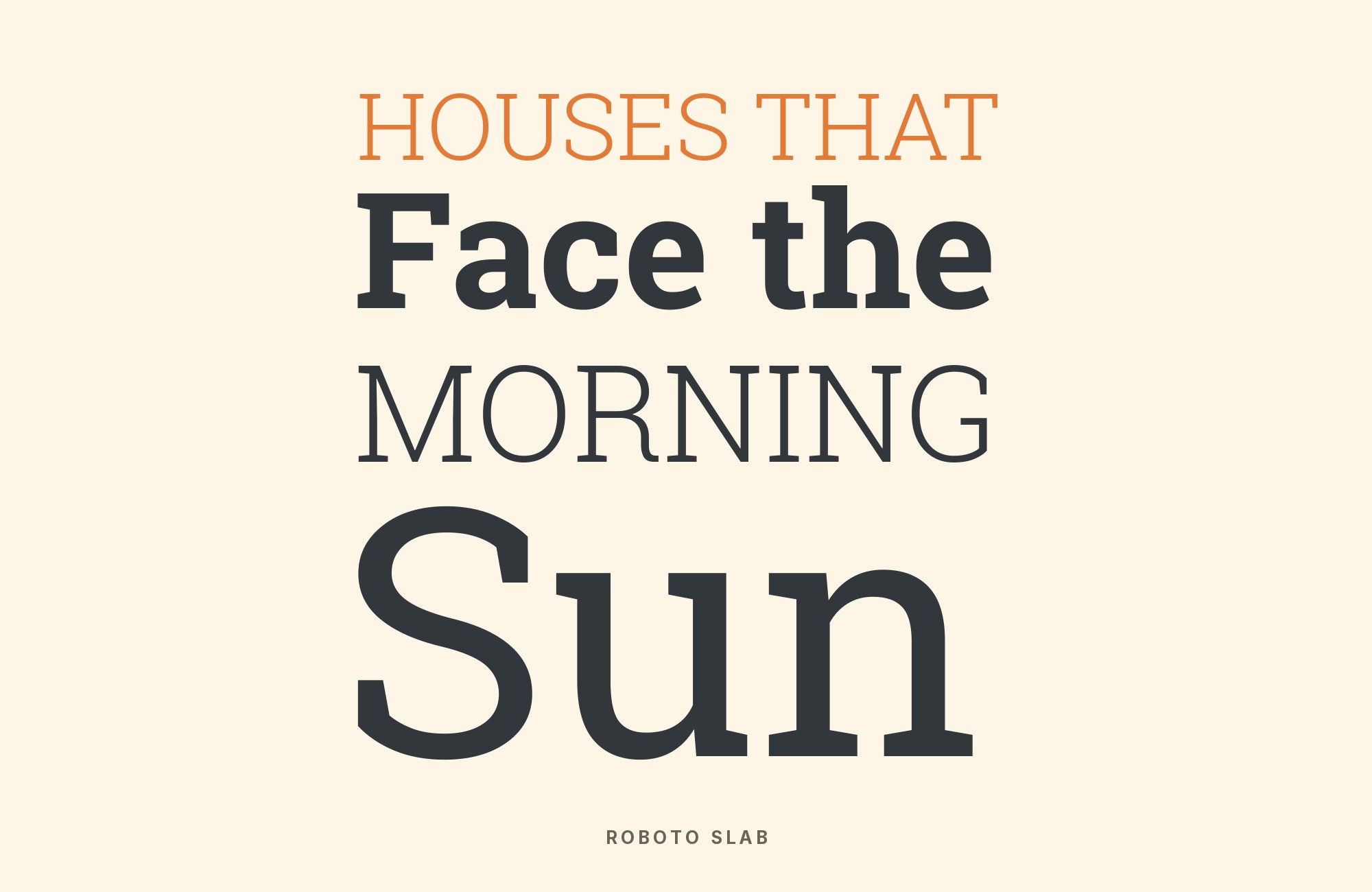
What fonts go with Roboto Slab? Start by treating it as a companion, not a loner: it is the slab-serif counterpart to Roboto, drawn to share that sans’s geometry and open curves so a page can switch from mechanical grotesque to sturdy slab without changing type families.
Christian Robertson designed Roboto Slab and Google introduced it in March 2013 as the official slab companion to Roboto, the Android system sans he had drawn two years earlier. The letterforms share Roboto’s mechanical skeleton and largely geometric forms, with friendly and open curves, rather than a Clarendon or Egyptian revival. The family ships nine weights from Thin to Black and, as Typewolf points out, no italic — which is why it is a poor choice for long body copy that needs emphasis. A 2019 rebuild added a variable weight axis, so the whole Thin-to-Black range now lives in one file. It was designed to sit beside Roboto, and that intention still governs how the face behaves in a system.
Pairing Roboto Slab is mostly a role problem. The strongest published evidence converges on the family pairing: the slab for headlines and a Roboto relative for everything else. Independent sources then fill in a second pattern, a neutral sans under the slab or a width and display contrast. The pairings below stay with faces a reader can actually obtain and render. Here are 15 fonts that pair well with Roboto Slab.
1. Roboto

Christian Robertson drew Roboto inside Google and shipped it in 2011 as Android’s system typeface: a neo-grotesque whose mechanical bones carry open, unhurried curves. Roboto Slab is not a contrast partner so much as the same drawing with rectangular serifs attached: shared x-height, shared weight range, shared curve logic. That is why Typewolf publishes exactly one suggested pairing for the slab — Roboto Slab + Roboto — and why the combination shows up on Google’s own blog, on Paone Creative, and in UtilityCove’s pairing generator. Run the slab at display sizes, where the unbracketed serifs register as structure rather than decoration, and let Roboto carry body copy, UI labels, and anything that needs italics. The pairing is the zero-friction answer for Android-adjacent products, documentation sites, and any system that already lives in the Roboto superfamily. Keep the two at matching weights, for example Slab 700 over Roboto 400, so the family relationship reads as hierarchy, not as two different typefaces arguing.

2. Open Sans

Steve Matteson drew Open Sans on commission for Google and released it in 2011: a humanist sans with an unusually large lowercase, upright axis and low contrast, all of it tuned to hold together at small sizes. That large x-height is the pairing logic: it lands close enough to Roboto Slab’s own generous lowercase that headline and paragraph sit at the same apparent size without optical scaling. Open Sans’s open apertures and humanist terminals also keep long reading comfortable in the range Typewolf correctly warns the slab not to occupy, given the missing italic. The empirical record backs the combination twice: Typewolf documents the Oscar site running Roboto Slab with Open Sans (and Proxima Nova, which is not used here), and Typ.io records peoplzz.com pairing the two. Use the slab for titles, section openers, and short decks; set Open Sans 400 for body, captions, and interface text. News, community, and product sites get slab authority up top here without committing to the Roboto superfamily underneath.

3. Lato

Łukasz Dziedzic released Lato in December 2010, a humanist sans whose softly rounded, semi-serif details land between a pure grotesque and a true serif. That in-between warmth is why it works under Roboto Slab: the slab’s unbracketed rectangular serifs are blunt and constructed, and Lato’s semi-rounded terminals restore a human finish the slab deliberately withholds. Typ.io records the pair live on everywhere.is. Compared with Open Sans, Lato is friendlier and slightly more designed — a better choice when the brand needs to feel approachable rather than documentary. Set Lato for body, navigation, and form labels, and keep Roboto Slab for headlines and pull quotes. Match apparent size carefully: Lato’s generous x-height will look large next to the slab if both are set at the same pixel size, so drop the sans a point or two, or step the slab up a weight, until the color of the page balances. Nine weights on both sides make the hierarchy easy to tune without leaving the two families.

4. Oswald

Vernon Adams designed Oswald, later expanded by Kalapi Gajjar, as a condensed gothic revival in the newspaper-headline tradition of Alternate Gothic — tall, narrow, and built for impact in a short horizontal measure. The pairing logic is width, not serif versus sans: Oswald’s compressed caps occupy a completely different horizontal register from Roboto Slab’s normal-width serifs, so the two never compete for the same space on a line. Typ.io lists Oswald among the faces Roboto Slab “goes well with,” which is recommendation-list evidence rather than a live-site sample, but the structural case is strong enough to stand on. Use Oswald for kickers, category labels, navigation, and short all-caps lines; keep the slab for titles and decks where the rectangular serifs can show. Do not set both as competing headlines at similar sizes — two loud display voices will cancel. Because neither face is a comfortable long-text italic, this combination still wants a third voice for extended reading, or it wants to stay in short-copy contexts: posters, landing-page heroes, event identity, sports and news mastheads. Tighten Oswald’s tracking slightly at large sizes so the condensed rhythm does not gap.

Don't start with a blank page. Shutterstock Unlimited: endless downloads of premium human-made assets plus powerful AI tools.
Sign Up5. Montserrat

Julieta Ulanovsky designed Montserrat in 2011 as a geometric sans drawn from the old posters and signs of the Buenos Aires neighborhood that gave the face its name. Its circular bowls and even stroke share enough constructed logic with Roboto Slab’s geometric skeleton that the two read as related forms in different registers rather than as a clash of families. Typ.io names Montserrat in the slab’s “goes well with” set, again as a listed partner rather than a documented live sample on that page. The working split is familiar: Roboto Slab for display lines, where the unbracketed serifs add weight a geometric sans cannot, and Montserrat for UI, labels, and supporting text, where its cleanliness keeps the page from feeling industrial. Because both faces are popular to the point of invisibility, the pairing needs a decisive size and weight jump — Slab 700 at display size over Montserrat 400 at text size — or it will look like two defaults stacked. Startups, architecture, and product marketing want engineered confidence without the Android-system overtones of pairing the slab with Roboto itself; that is what this delivers. Montserrat’s italic, unlike the slab, can handle emphasis inside paragraphs.

6. Roboto Serif

Roboto Serif is the other serif in the Roboto superfamily, a natural same-family reading partner for Roboto Slab. BAUHAUS4EU’s visual guidelines recommend Roboto Serif for editorial and stationery applications and name Roboto Slab as a complementary typeface. Material Design introduced Roboto Serif in 2022 as a reading face with a wide range of weights, widths and optical sizes, built to stay comfortable from UI captions to print. That is a different job from Roboto Slab’s unbracketed display slabs: Serif is for long reading, Slab is for the line that has to land as a title. Use Roboto Slab at display sizes, where the rectangular serifs read as structure, and let Roboto Serif carry articles, documentation and any passage that needs italics and optical-size text cuts. Keep them in the same weight family so the page still feels like one system, not a revival serif parked next to an Android slab. Product sites that already live in Roboto can add reading texture without leaving Google’s superfamily.

7. Source Serif 4

Frank Grießhammer designed Source Serif 4 for Adobe as a transitional serif loosely based on Pierre-Simon Fournier, drawn to sit beside Source Sans rather than beside a slab. MaxiBestOf records it with Roboto Slab on the Black Jays Ventures website, a real co-usage. The contrast is historical versus mechanical: Source Serif’s bracketed, Fournier-derived stress against Roboto Slab’s unbracketed rectangular serifs. Put Source Serif on long reading, where its text colour and italics work, and keep Roboto Slab for titles and decks. Do not set both as competing headlines; two serifs at the same size will cancel. The pairing suits a portfolio or editorial site that wants a bookish column under a sturdy modern slab, without borrowing Roboto’s sans.

“My clients will build their own sites with their own AI.”
How are you supposed to navigate this?
Find Out How8. Lexend

Bonnie Shaver-Troup’s Lexend project, drawn with Thomas Jockin, was built to reduce visual stress in reading, with a variable weight and a set of widths that open out as they get larger. Fonts In Use records the Laura Skebba Photography site using Lexend Exa — one of those wider cuts — for navigation and selected subheadings, while Roboto Slab carries the body text. That reversal is useful: the slab, which Typewolf warns against as body copy, is here doing supporting reading under a more open sans display line. Use Lexend (the obtainable family; Exa is a width of it) for short headlines, labels and nav, and keep Roboto Slab for the paragraphs underneath when the passage is short enough that a missing italic will not matter. Wedding, photography and service sites that need a calm reading column under a wide, friendly sans are the brief.

9. Megrim

Daniel Johnson designed Megrim and released it in 2011 as an experimental display sans covering Western Latin, with stylistic alternates and a thin, geometric construction that reads as diagram more than as a text face. It is the sharpest contrast on this list: Megrim’s light, almost skeletal letterforms are everything Roboto Slab’s sturdy unbracketed slabs refuse to be. The pairing is not a hypothetical. femmebot’s Google Type gallery — a hand-set Aesop specimen built to show Google Fonts in full typographic settings — runs “The Astronomer” in Megrim for the title and Roboto Slab for the reading text. That role split is mandatory. Megrim has no business at body sizes; it needs large, spare settings where its experimental drawing can register. Roboto Slab then does the paragraphs, which is one of the few contexts where using the slab for reading text is justified: a fable-length passage, not a journal article, and no italic required. Cultural, scientific, and editorial features that need a night-sky, diagrammatic title over a grounded slab body are the target. Give Megrim generous tracking and plenty of margin; crowd it and the experiment collapses into noise.

10. Ruda

Mariela Monsalve and Angelina Sanchez designed Ruda as a sans intended for product labels: a very large x-height, a low cap-height, and open forms that stay legible when the type is small, the stock is unforgiving, and the line is short. ReliablePSD (now Hey Reliable) publishes “ruda regular / Roboto Slab” as pairing 6 in its tested Google Fonts collection, and the specimen reverses the usual jobs — Ruda takes the short headline, Roboto Slab supplies the supporting text. That reversal is the design. Ruda’s oversized lowercase and compact caps make a punchy, packaging-like display line that does not need slab serifs to land, while the slab’s low-contrast, large-x-height construction is sturdy enough to carry a paragraph of explanation underneath without looking fragile. Use this split on labels, cards, and short-copy brand systems where the slab should not shout. If the project needs italics in the supporting text, this pairing has the same limit as any Roboto Slab body setting; keep the slab passage short, or move long reading into a third face. A 2020 variable-font upgrade gives Ruda a weight axis, so the headline can step up without leaving the family.

11. Noto Sans

GATE’s official brand book assigns Roboto Slab to titles and Noto Sans to longer body text and subtitles. The slab gives a headline weight and rectangular definition; the sans opens the reading layer and adds broad language coverage. Follow the guide’s division of labor: Roboto Slab Regular for short titles, Noto Sans Regular for paragraphs, and Noto Sans Semibold for subheads. Because both families have sturdy, screen-friendly proportions, size and spacing must make the hierarchy clear. This pairing works especially well for international organizations, public programs, and reports that need a recognizable display voice while keeping long or multilingual content calm and legible.

12. Roboto Mono

Typewolf suggests Roboto Mono with Roboto Slab. Their shared superfamily origin keeps basic proportions familiar, while the mono’s fixed-width spacing announces a different information layer. Use Roboto Slab for headings and the mono for captions, technical labels, prices, or short code fragments. A whole paragraph in Roboto Mono will create too much grid against the slab, so keep it to repeated data roles and let another face handle long prose if necessary. Weight is the subtle control here: a medium mono usually balances a bold slab more cleanly than equal weights. The combination works for technical publishing, product documentation, exhibits, and dashboards that want a warmer heading than a sans serif provides.

13. Source Sans 3

The National Western Stock Show’s official guide assigns Roboto Slab to headlines, display text, and graphic accents and Source Sans 3 to body copy, quotes, data charts, and callouts. The slab provides a sturdy public-facing voice, while the open sans carries every repeated or information-dense role. Use Roboto Slab at bold or semibold for short titles and Source Sans 3 Regular for paragraphs and tables. Their large x-heights keep the transition practical, but the serif change still creates an obvious hierarchy. This pairing suits events, institutions, reports, and public programs where the display layer needs character and the working text must remain flexible across print and screen.

14. Roboto Condensed

Typewolf suggests Roboto Condensed with Roboto Slab. The shared family skeleton creates continuity, then width and serif structure divide the work. A Roboto Slab title feels sturdy and horizontal; Roboto Condensed turns supporting labels and narrow columns into a faster vertical rhythm. Avoid setting both as competing headlines in adjacent sizes. Give the slab the primary voice and reserve the condensed sans for subheads, captions, schedules, or sidebars, or reverse the roles for a denser poster. Because the letterforms are related, spacing and scale must create the hierarchy. The pairing suits publications, event programs, data-heavy pages, and responsive layouts where horizontal room is limited.

15. Inter

Imperavi’s UI Typography guide demonstrates Roboto Slab for headings with Inter for body text. The slab supplies weight and a clear editorial accent, while Inter’s open counters and screen-focused spacing keep controls and paragraphs quiet. Set Roboto Slab in a strong display weight, then move down to Inter Regular for the reading layer and Inter Medium for interface labels. The contrast is strongest when the headline stays short; repeated slab subheads can make an interface feel heavy. Inter’s broad functional range also prevents the need for a third family. Use this combination for documentation, product education, dashboards, and landing pages that need a distinctive title without sacrificing the familiar rhythm of modern UI text.

Conclusion
Roboto Slab is almost always the headline voice in a system, not one equal among many. The strongest pattern in the published record is the family pairing Robertson designed it for: the slab for titles, Roboto for everything else — Typewolf’s only suggestion and Google’s own blog both land on that split. When the system cannot or should not stay inside one family, a quiet sans — Open Sans, Lato, Lexend — takes the body or nav role the slab is structurally unfit for, because nine weights and no italic will not carry emphasis through a long article. Serif partners such as Source Serif 4 give the slab a reading partner that actually has italics.
Width and display contrast is the other legitimate path. Oswald and Montserrat change the horizontal register or the geometric temperature; Megrim and Ruda reverse or exaggerate the display job, one as an experimental title over slab reading text, the other as a label sans over a quieter slab paragraph. Those combinations are real, just less common than the Roboto companion. Set real copy at the sizes you intend to publish, watch the missing italic, and judge each pairing by whether the unbracketed slabs still read as the headline once the sans is in place.
