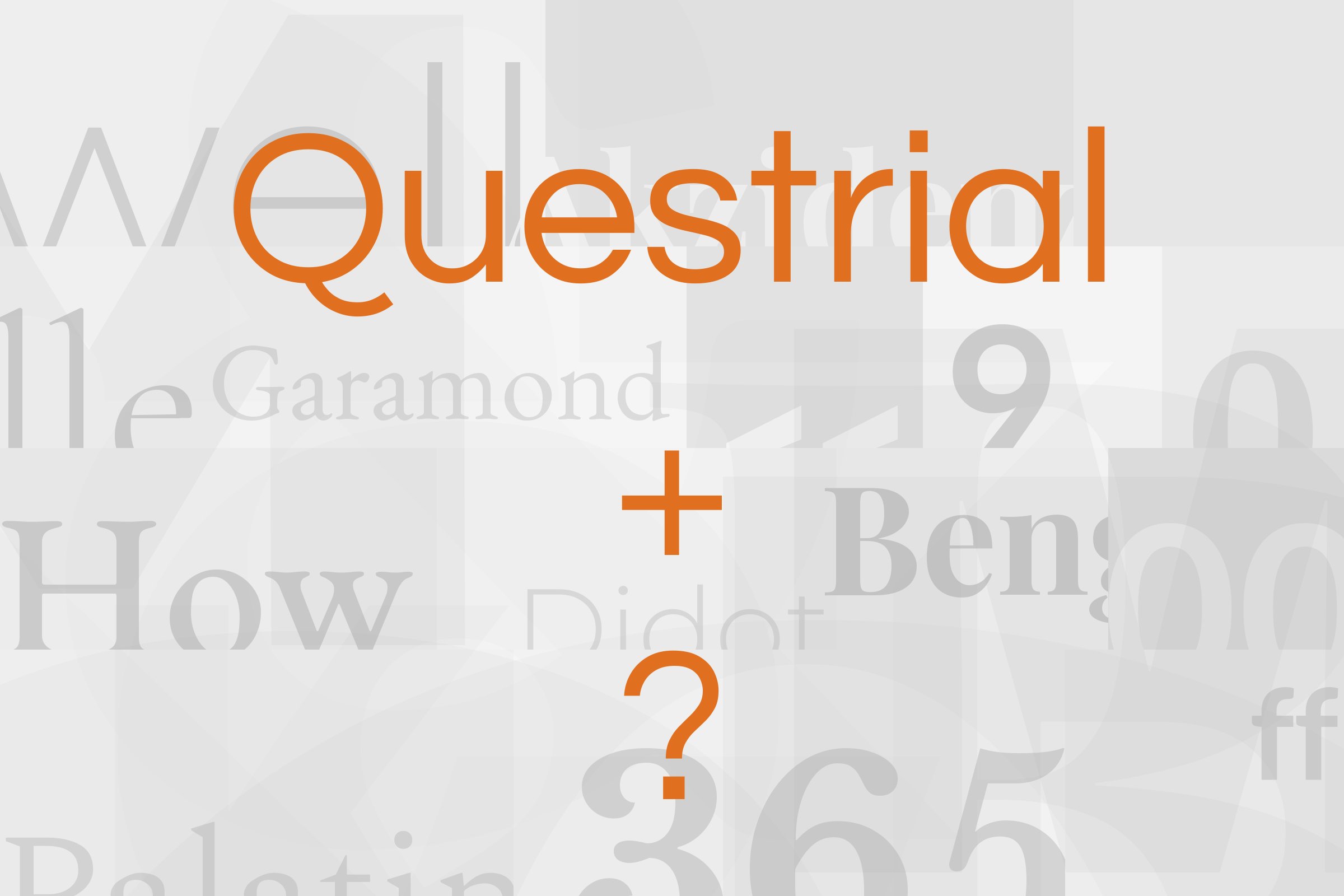
Questrial pairs great with Americana, Cutive Mono and Old Standard TT. All 11 pairings are shown below in real rendered specimens, with the reason each one works.

What fonts go with Questrial? Start with the limitation the face will not outgrow: it ships as a single Regular, with no bold and no italic, so every partner is really being hired to finish a type system Questrial cannot finish alone.
Joe Prince designed Questrial, and Google Fonts added it in 2011. Many of its characters have full-circle curves, it is heavily influenced by Swiss design in a grotesk style close to Helvetica, and its numbers are tabular figures made for tables and forms. The letterforms are somewhat short and extended, which is useful when vertical space is tight. In May 2020 Google Fonts commissioned Laura Meseguer as type designer and Denis Moyogo Jacquerye as language consultant to expand it with an African Latin glyph set. The current family covers African Latin and full Vietnamese, and Meseguer’s studio adds Small Caps and tabular figures to the list, far beyond the original single-style release. The foundry copy still calls it suitable for body text and headlines. Typewolf disagrees, and the disagreement is the pairing problem: a Regular with no italic cannot mark emphasis, cannot build a weight hierarchy, and starts to look thin across a long paragraph.
Successful partners therefore do one of two jobs. A display serif — Americana, Quattrocento, Old Standard TT — takes the title so Questrial can stay on short, modern supporting lines. A text family with real weights and italics — Alegreya or IBM Plex Sans — takes the reading so Questrial can stay on labels, navigation, and a single display size. Cutive Mono is the texture exception: a typewriter grid against circular geometry. What is not a pairing, though it is often mentioned, is Helvetica: Prince and Meseguer name it as a kinship, a description of Questrial’s Swiss grotesk skeleton, not as a companion to set beside it. Here are 11 fonts that pair well with Questrial, each supported by a pairing guide or documented use.
1. Americana
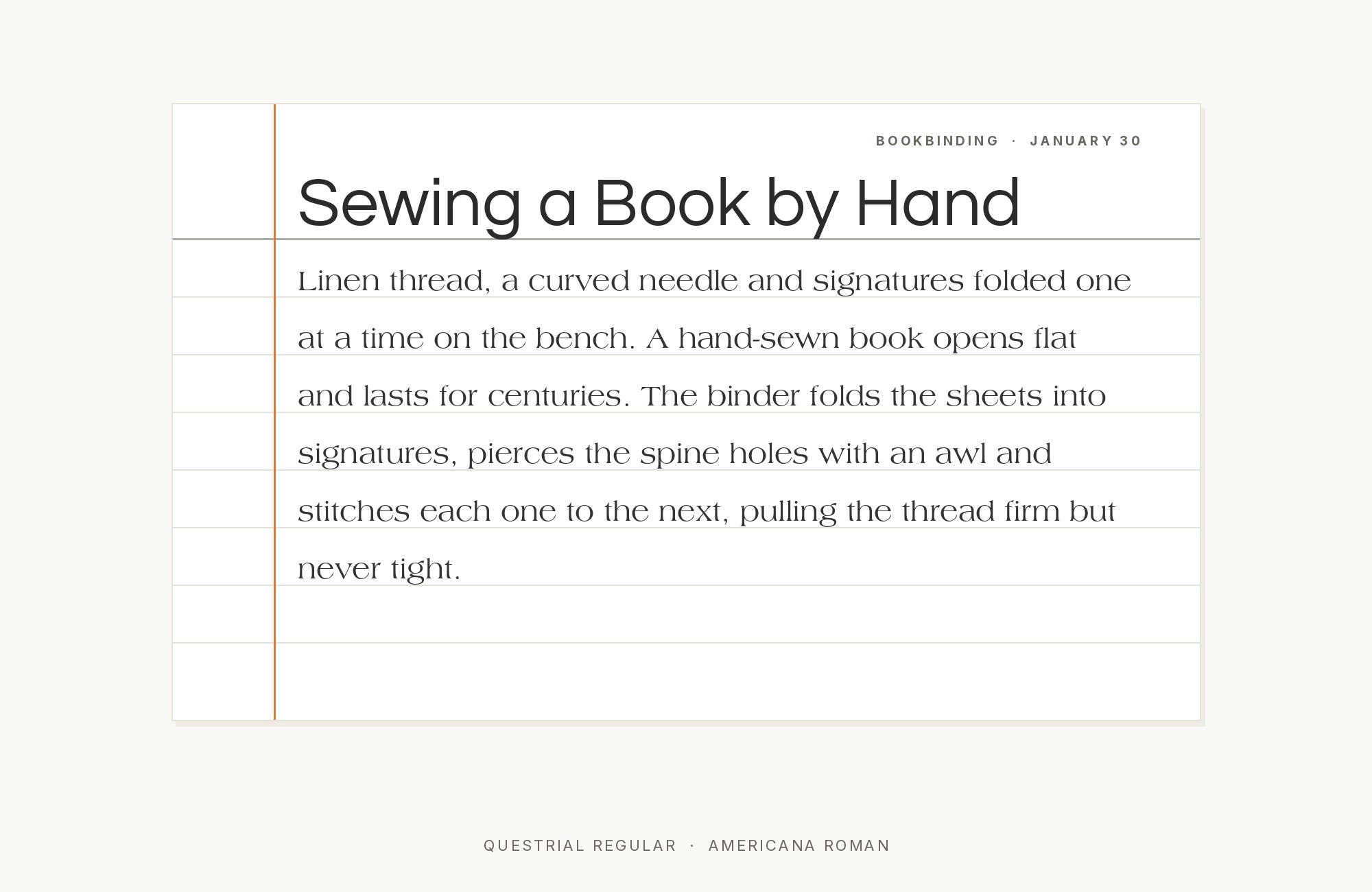
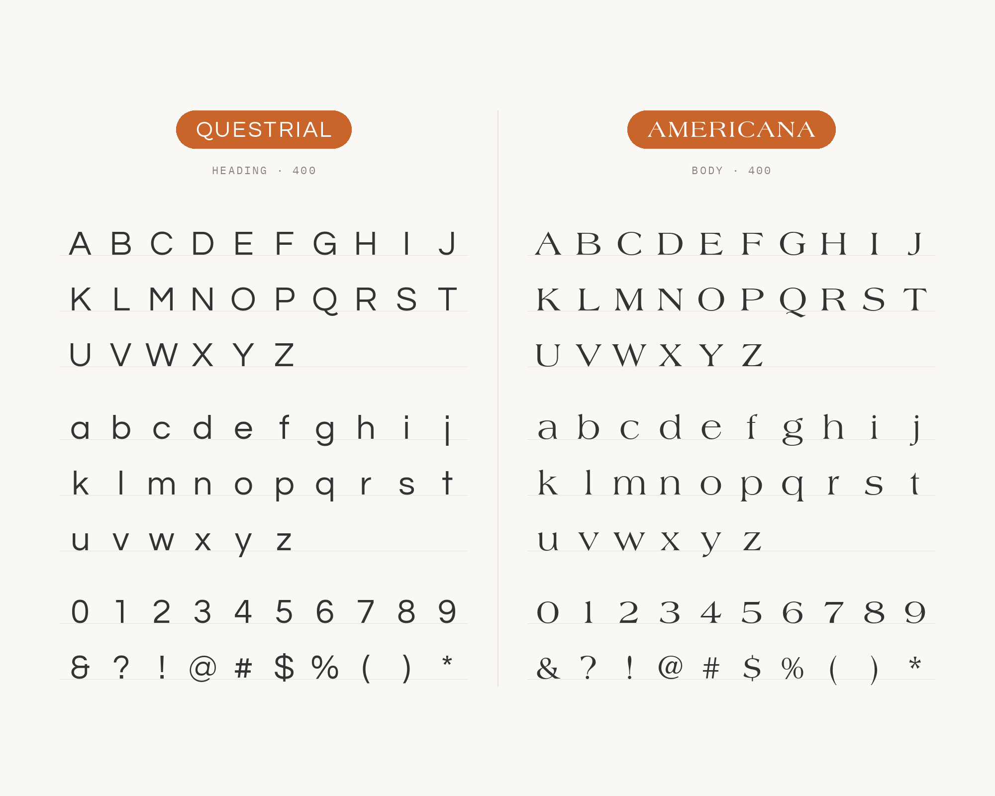
Richard Isbell designed Americana for American Type Founders in 1965, and it was the last face ever cut by ATF. It is a wide display face with small triangular serifs and an optimistic American-vernacular stance that has more in common with inscriptional signage than with a book roman. Typewolf’s own suggested pairing for Questrial is Americana, and the logic is contrast of construction. Questrial’s circular, Helvetica-adjacent grotesk has no serifs and almost no stroke contrast; Americana is all serif and all flare. Give Americana the titles, mastheads, and short display lines, large enough that those triangular serifs read as a decision. Keep Questrial on labels, navigation, and supporting copy in its single Regular, where the circular curves stay quiet. The combination suits hospitality, travel and heritage brands that want a period American display voice over a clean contemporary sans. Do not set Americana at caption size — the wedges clog — and do not ask Questrial to carry the paragraphs Americana is too display-oriented to hold.
Build free, plus 500 AI credits.
Design and publish a site at no cost. Paid plans double your credits the first month.
Start free2. Cutive Mono
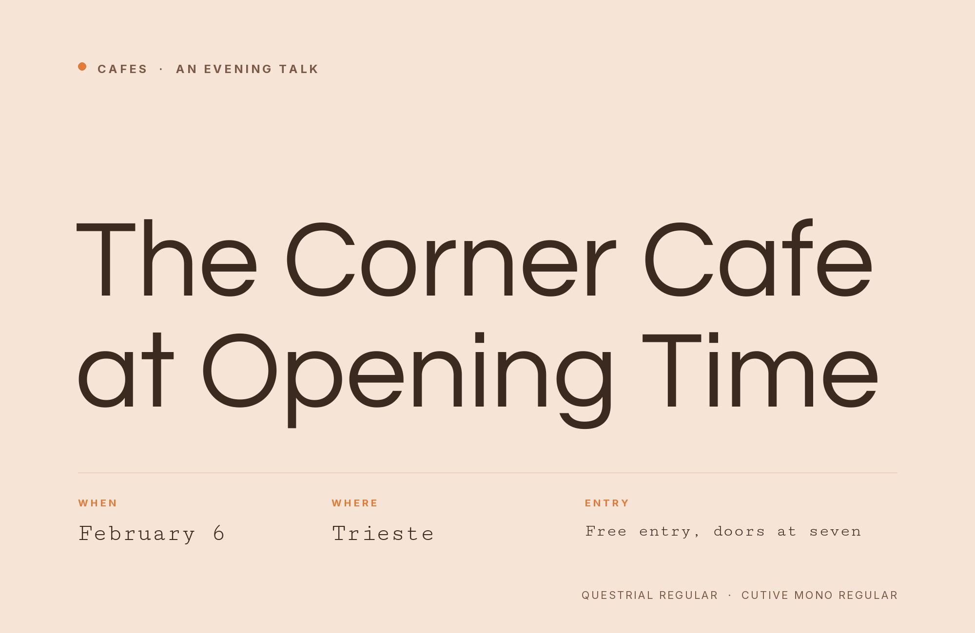
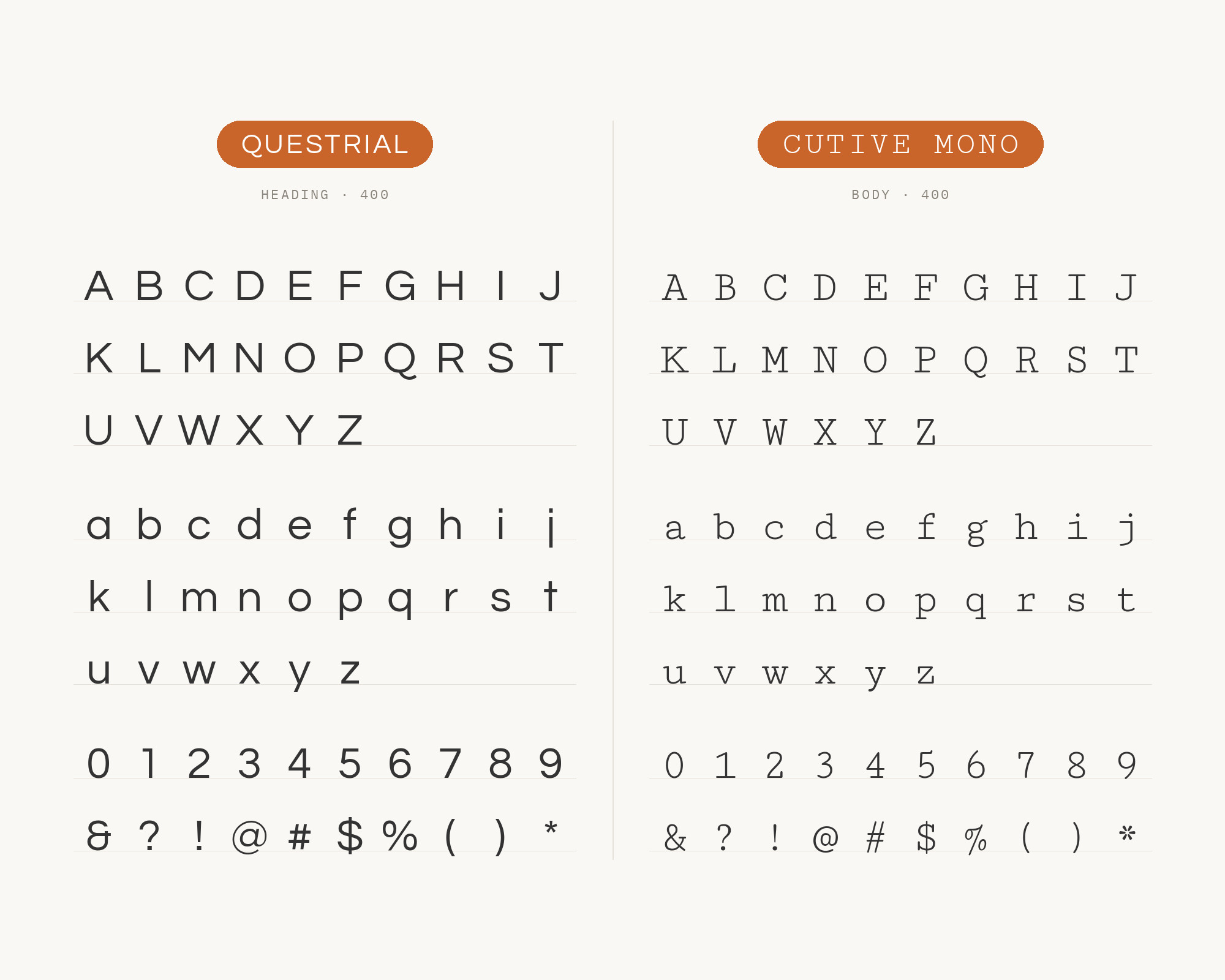
Vernon Adams drew Cutive Mono, the monospace sister of Cutive, from classic typewriter faces, in particular IBM’s Executive and the older Smith-Premier. It has slab-like terminals and the even character widths of a machine that advanced one unit at a time. Against Questrial’s proportional, circular geometric sans it supplies a completely different rhythm: a grid instead of a circle. Typewolf documents Dodge & Burn, a site from July 2013, running Questrial with Cutive Mono. That is the portfolio and editorial-apparatus use case — image captions, metadata, pull-out data, short code-adjacent lines — not a second reading face. Keep Cutive Mono small and in short runs, where its fixed pitch reads as craft rather than as a typesetting error, and let Questrial handle the short display and interface copy it can actually sustain in one weight. It suits photography sites and studios when a layout needs typewriter texture without giving up a geometric sans everywhere else.
Webflow. Framer. Squarespace. Wix. Lovable. Not your future.
Your own AI CMS agent is.
Find Out More3. Old Standard TT
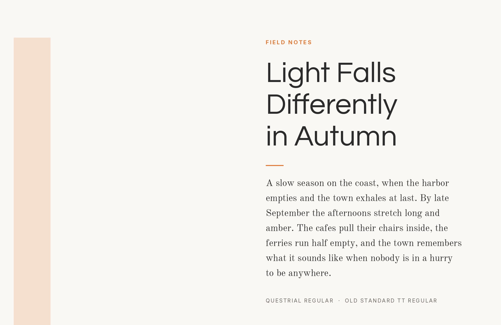
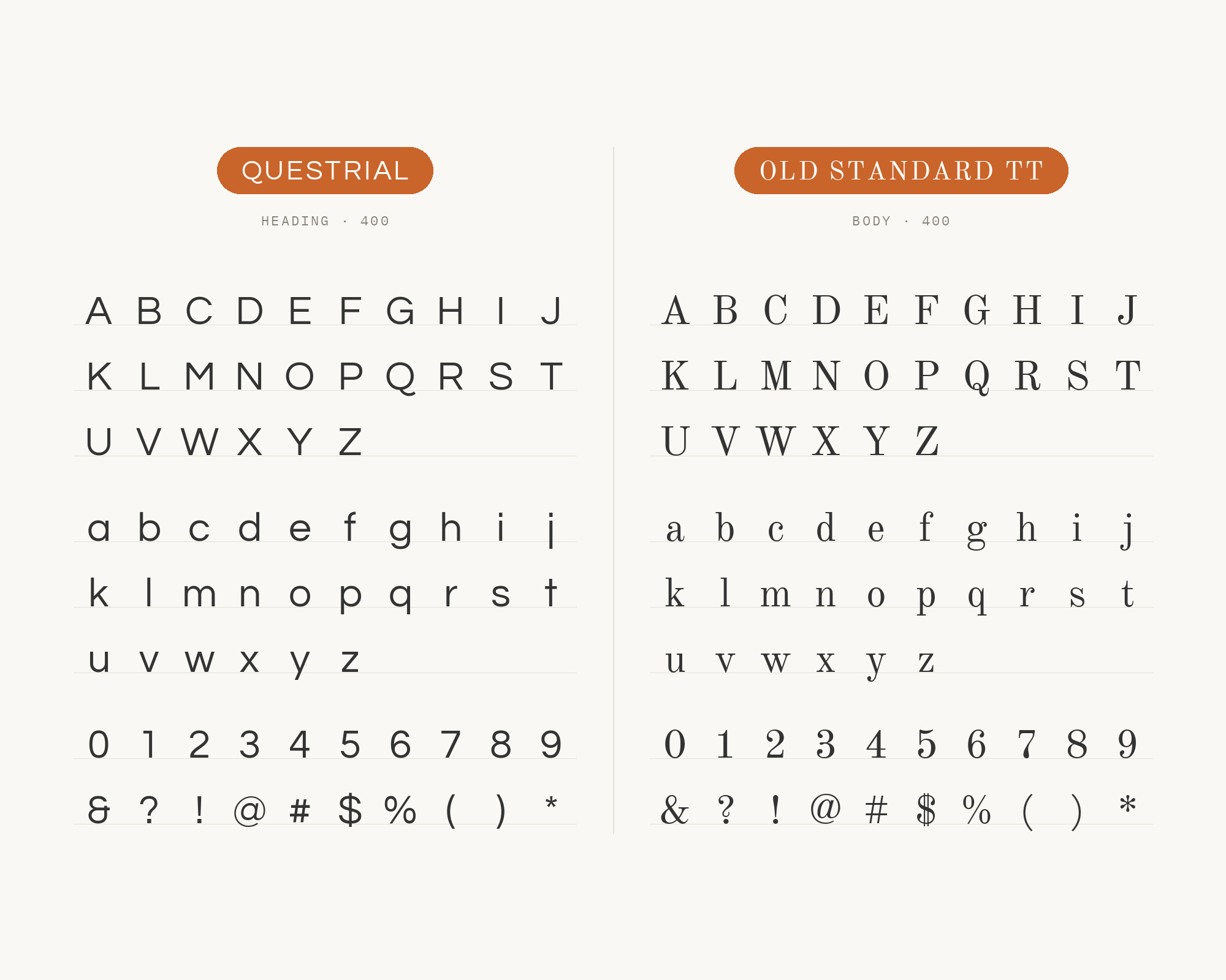
Alexey Kryukov designed Old Standard TT to reproduce the Modern (classicist) serif style that was very common in editions of the late 19th and early 20th century, and he recommends it for scientific papers. It has high stroke contrast, small sturdy serifs, and a bookish, slightly severe air modern readers now read as vintage on purpose. Pairing it with Questrial is the most deliberate historical contrast on this list — late-nineteenth-century scholarly roman against a 2011 circular grotesk. Femmebot’s Google Type project sets Old Standard TT with Questrial on “The Crow and the Pitcher,” attributed to @michaelryap. Give Old Standard the fable, the quotation, the long reading; keep Questrial for the modern frame around it — headings in Regular, navigation, the website chrome. It suits literary journals and classical programs when a paragraph should read as a citation. Old Standard’s hairlines were drawn for print; on coarse screens keep it a point or two larger than you would a screen-first serif, and never let Questrial try to match its contrast.
4. Alegreya
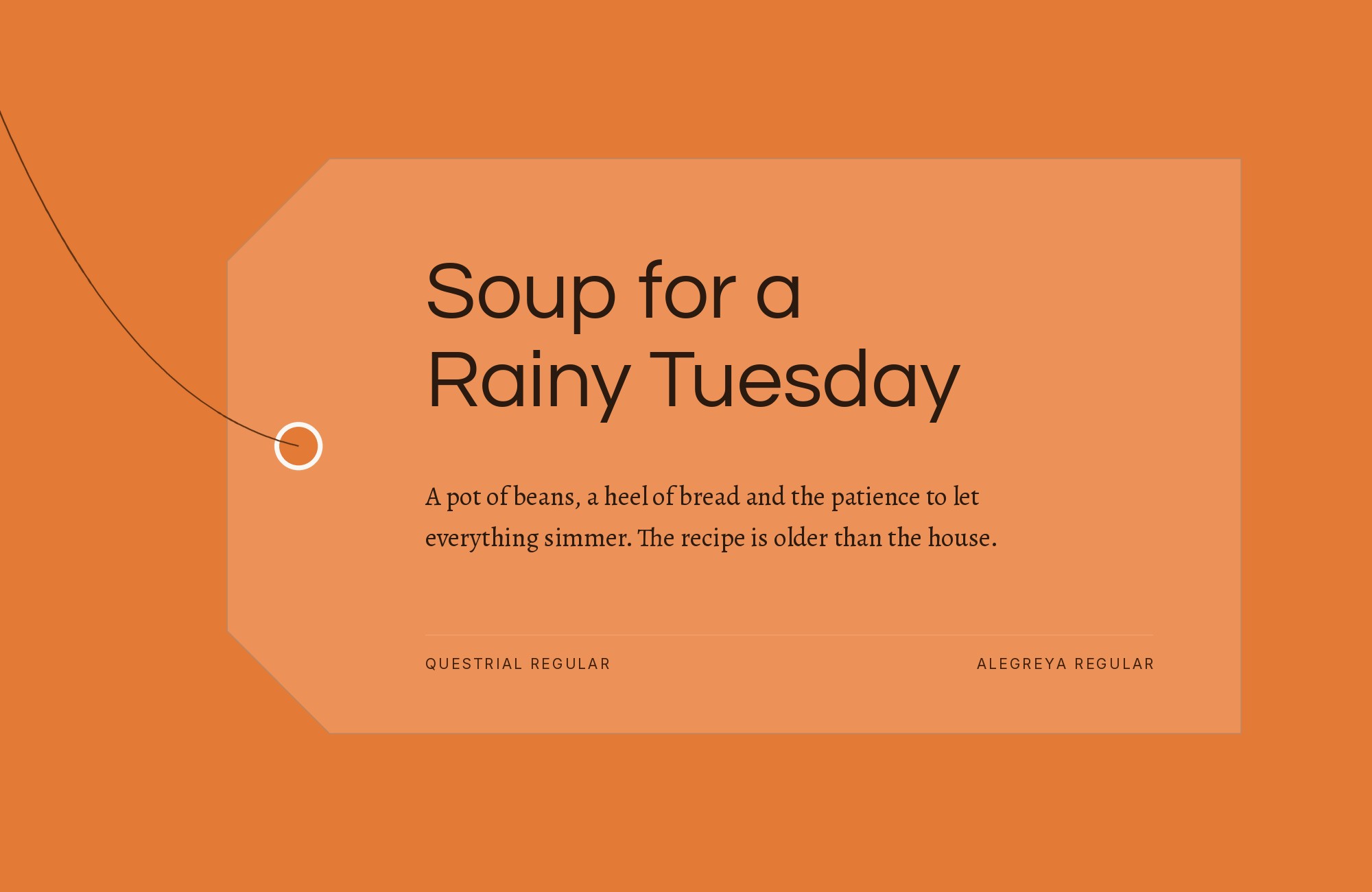
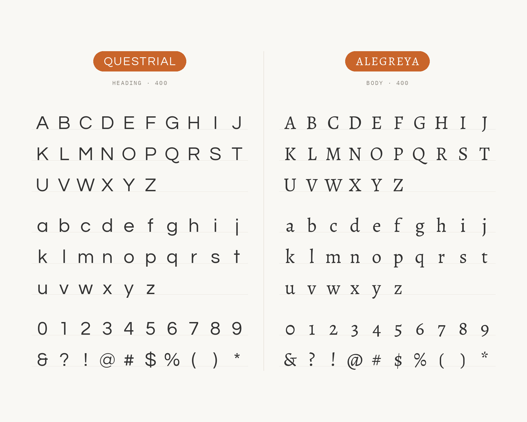
Juan Pablo del Peral designed Alegreya for HT Fonts as a typeface for literature that refers to the calligraphic letter, with an italic drawn with as much care as the roman. It has the warmth of a face drawn from the pen rather than the compass. That warmth is what Questrial’s even, circular strokes withhold. Hey Reliable’s pairing #18, by Lou Levit, is Questrial with Alegreya Regular, shown as a live specimen. Run Questrial in Regular for headlines and short display lines, where its circular geometry is the modern voice, and let Alegreya take every paragraph, pull quote, and caption that needs an italic or a second weight. Publishing, education and cultural sites get a geometric sans up top without a cold reading experience underneath it. Because both faces are on Google Fonts, the combination has no license friction. Do not reverse the roles: Alegreya at display size will out-character Questrial, and Questrial at paragraph size will look under-equipped.
5. Quattrocento
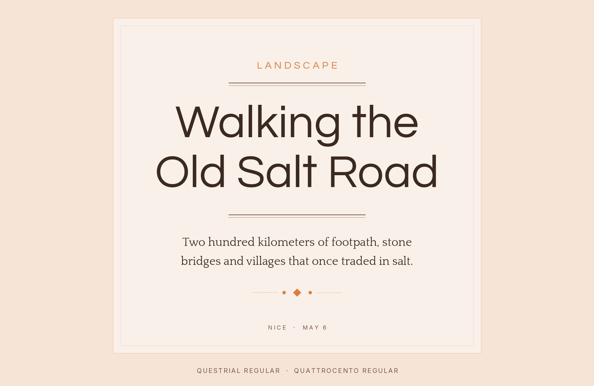
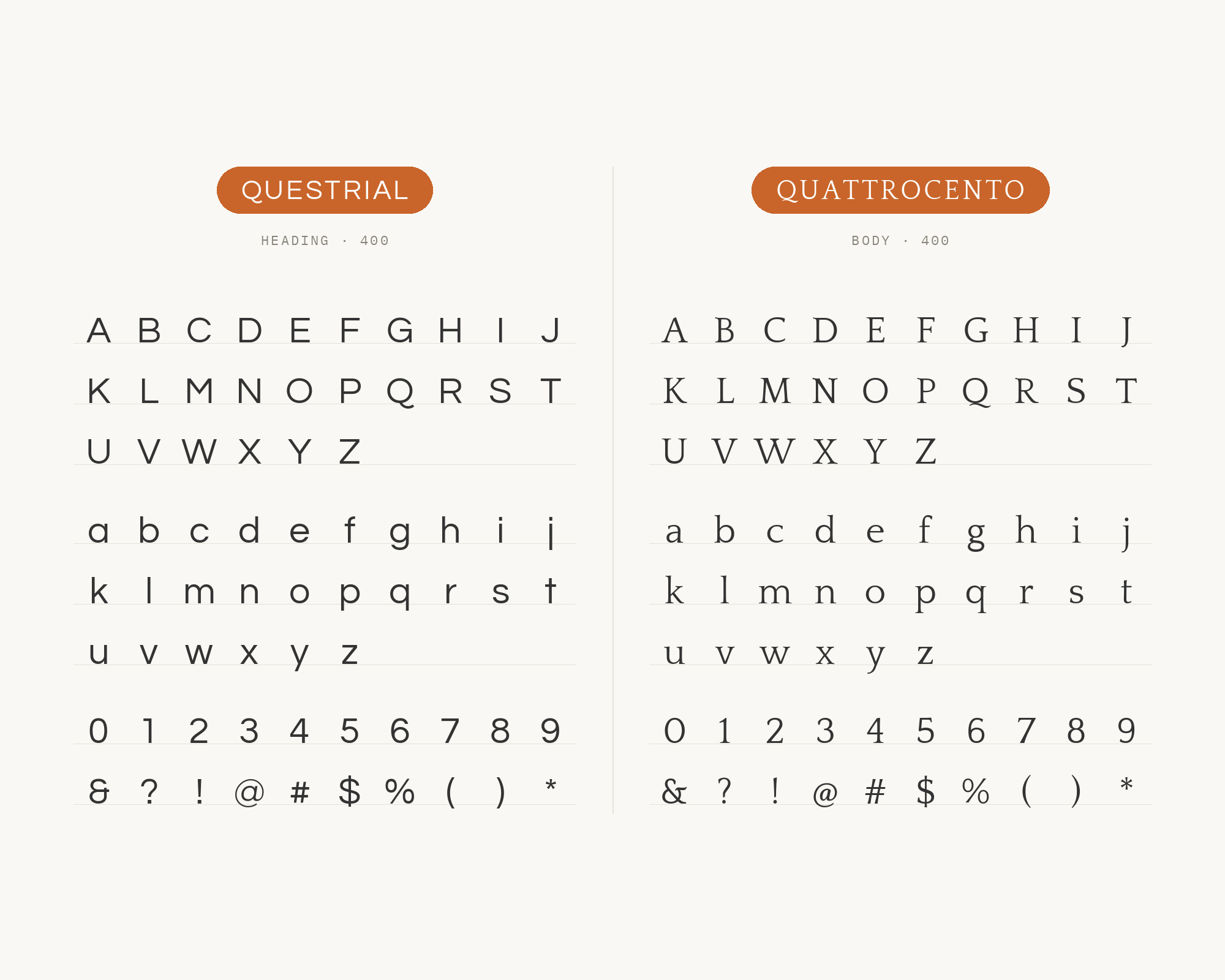
Impallari Type designed Quattrocento as a classic, elegant, sober and strong serif with wide, open letterforms. Its generous x-height keeps it legible in body text, and its tiny details make it a good choice for display typography too. Leadpages, in a pairing list by its Creative Director, Staci Carpenter, names “Quattrocento + Questrial” and argues the split directly: Quattrocento’s distinctive roman characteristics make it “perfect for a classic, elegant, and strong brand,” while Questrial’s circular curves and highly readable forms blend with other fonts without disappearing. Set Quattrocento for headlines and any line that should feel considered and historical; set Questrial for paragraph-adjacent supporting text, buttons, and UI, accepting Typewolf’s caution that a single Regular is a supporting face, not a novel. It suits professional services and architecture practices, along with anything aiming at classic-modern. Both are Google Fonts, so the combination is easy to test at production sizes before you commit.
6. IBM Plex Sans
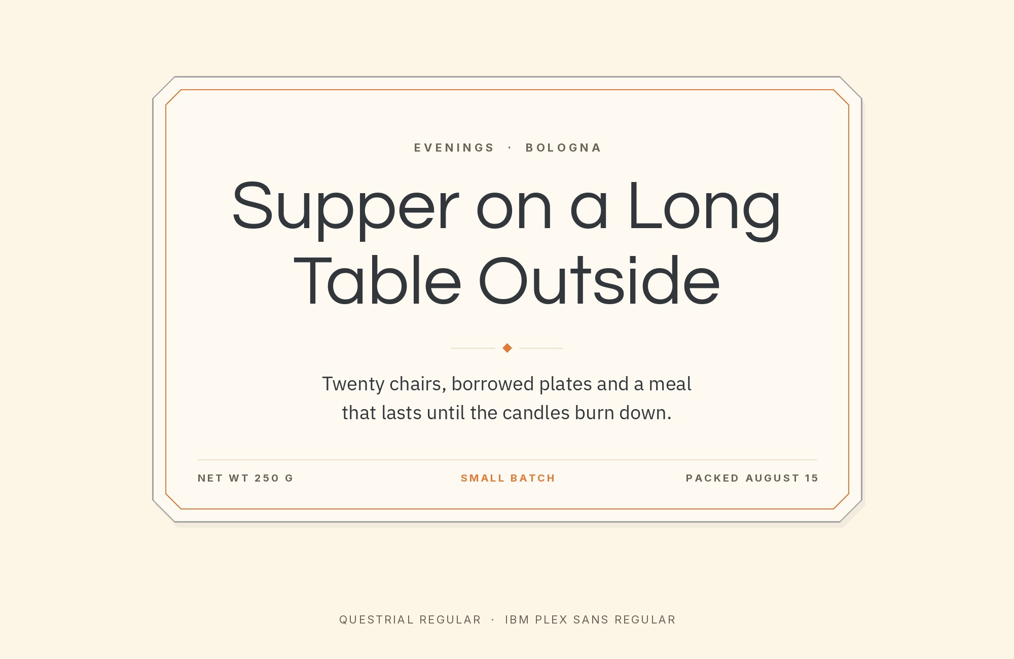
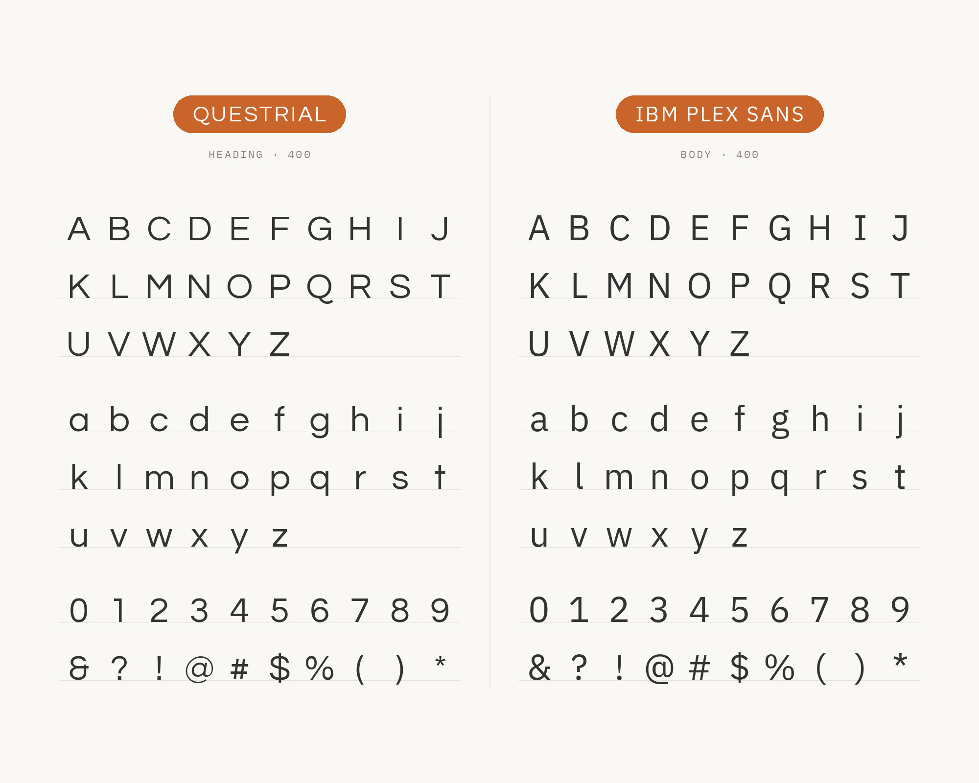
Mike Abbink developed IBM Plex Sans at IBM in collaboration with Bold Monday, and in 2017 Plex replaced Helvetica as IBM’s corporate typeface. Version 1.0 had eight weights, from Thin to Bold, with true italics. That weight range is the point of the pairing. Questrial is a Regular; Plex is a system. Teachery’s Font Pairing 2 is titled “IBM Plex Sans + Questrial” and publishes the CSS: Plex for body and lesson titles, Questrial in uppercase for module names and button text. Use that split. Questrial’s circular curves and tabular figures work as a second sans for short, spaced-out lines; Plex carries the reading, the UI, and every weight Questrial never shipped. Products and courses that want two sans faces with different jobs, rather than a serif contrast, are the case for it. Do not set both at the same size and weight — two grotesks in Regular will read as a mistake.
7. Figtree
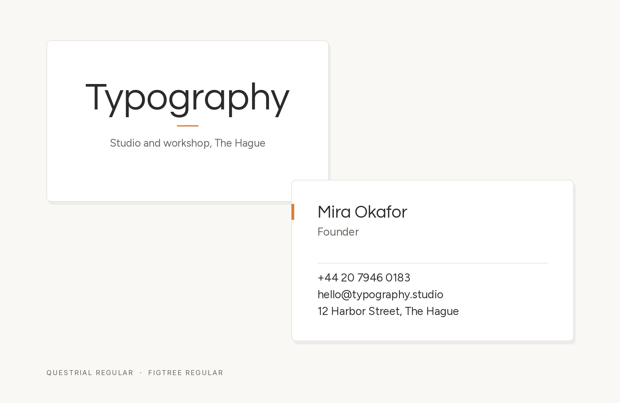
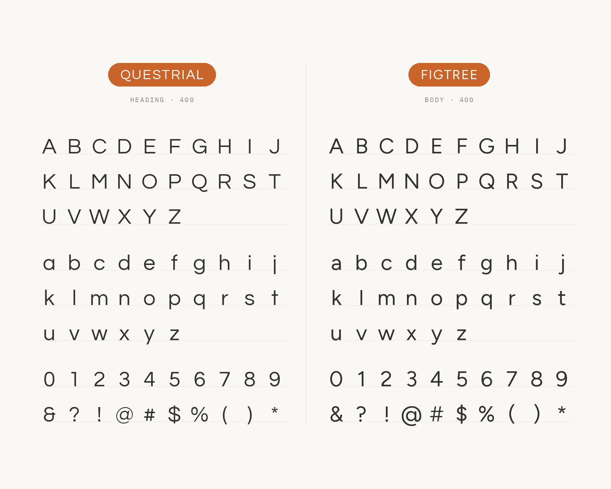
CLT 3D Printing’s public brand guidelines name Questrial for headings, emphasis, calls to action and body text, then specify Figtree for the logo word. This is a real identity system using both faces, even though the guide gives Figtree the tightly scoped wordmark role. Questrial’s circular regular cut can handle the page’s headings and copy, while Figtree supplies a second voice for the brand lockup. Keep Figtree in the logo or short wordmark role and Questrial in the page text; do not inflate this evidence into a general body pairing the source does not claim.
8. Poppins
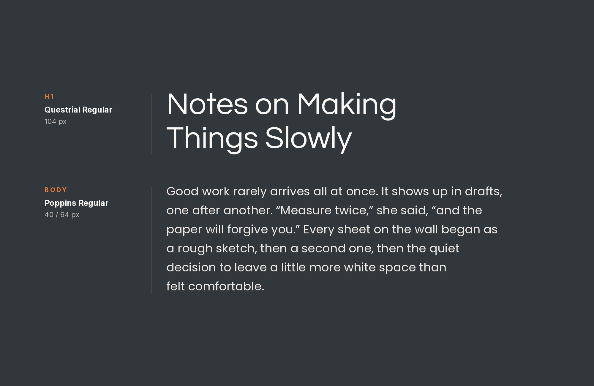
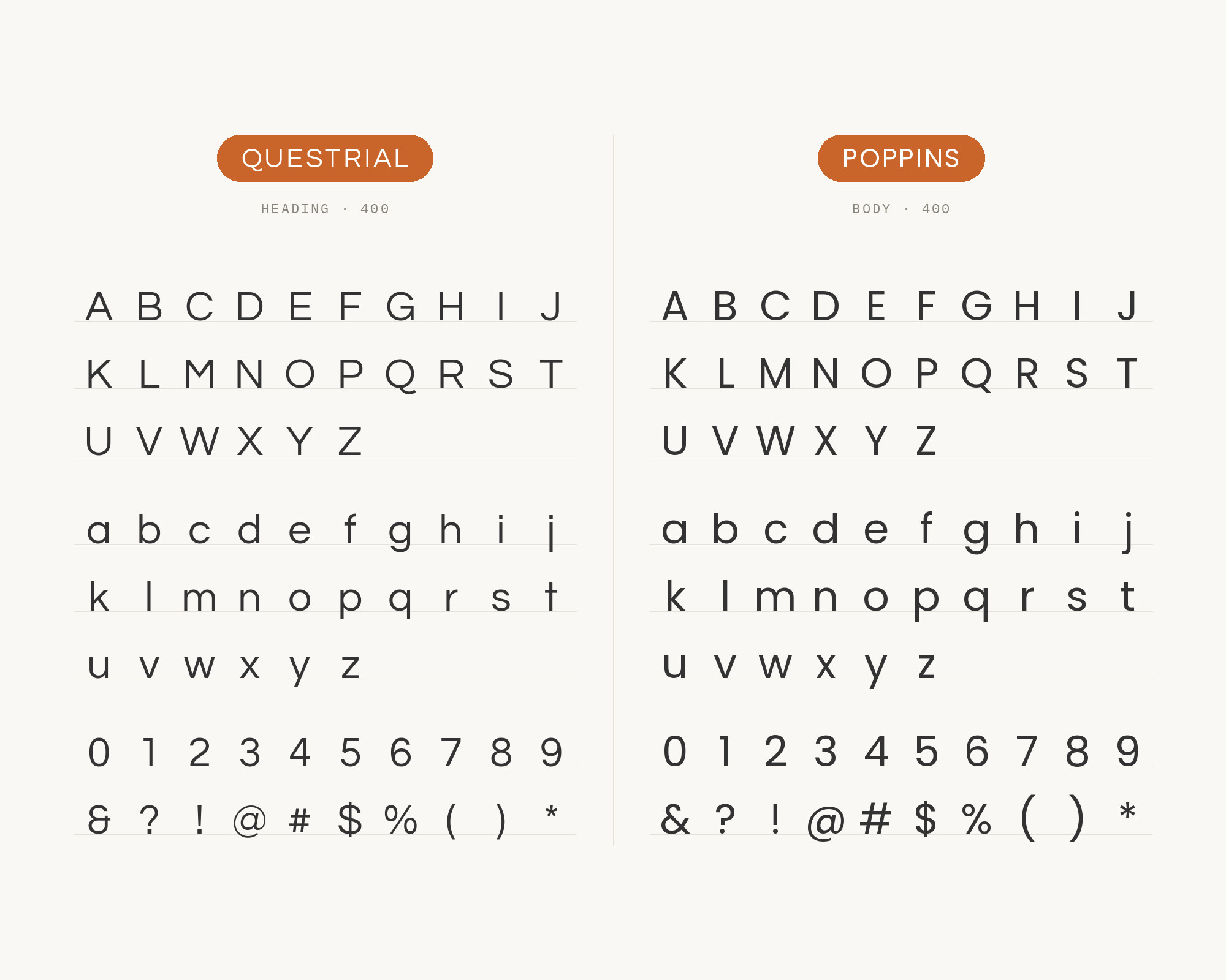
CadaVinci Studio’s published brand system names Poppins as its strategy and authority layer, Questrial as its communication layer, and Open Sans as its action layer. Questrial therefore has a documented role beside Poppins in the same three-layer identity: use Poppins for the high-level headline or strategic statement, then Questrial for the clear supporting message. Poppins’ geometric weight and Questrial’s single rounded regular are distinct enough to separate hierarchy. Keep the source’s role split intact and avoid asking either face to replace the other throughout a long page.
9. Open Sans
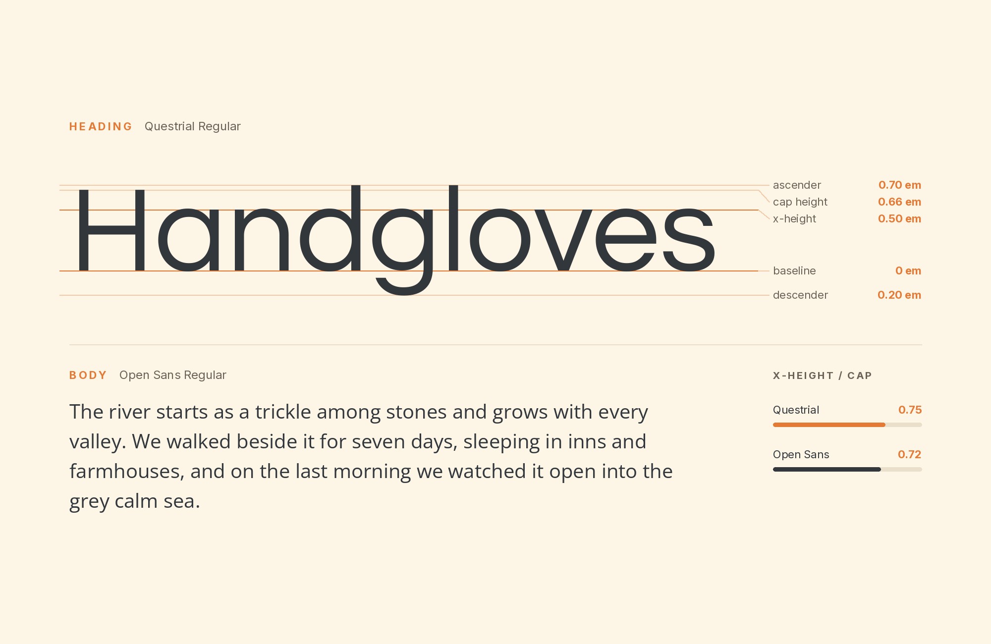
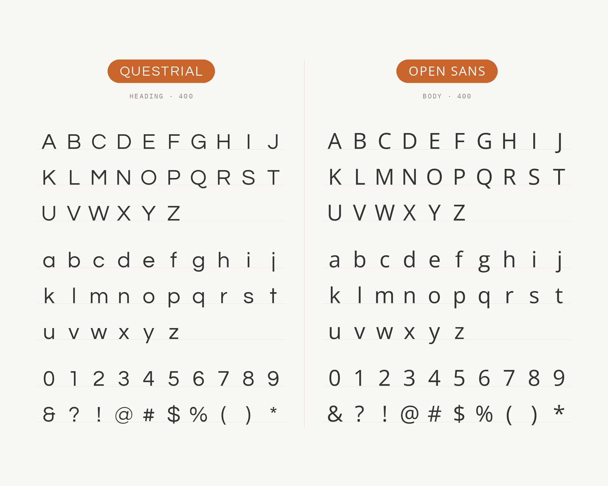
CadaVinci Studio’s typography system explicitly assigns Poppins to strategy, Questrial to communication and Open Sans to action and usability. That same identity framework makes Questrial and Open Sans a supported pair: Questrial can state the clear message while Open Sans handles action labels, controls and utility text. Open Sans’ open apertures and broad weight range compensate for Questrial’s single regular cut. Use Questrial for the short explanatory or display line and Open Sans for buttons, captions and dense interface copy, following the source’s three-layer roles rather than flattening them into interchangeable sans faces.
10. Roboto
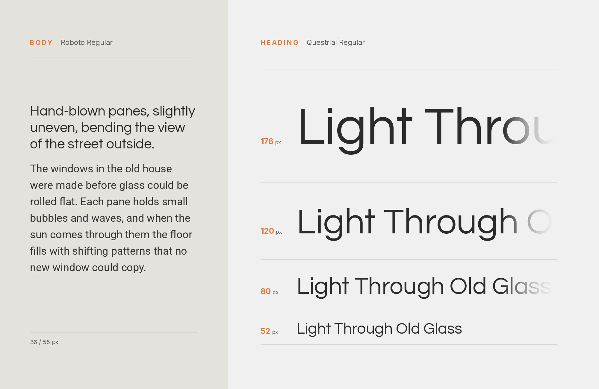
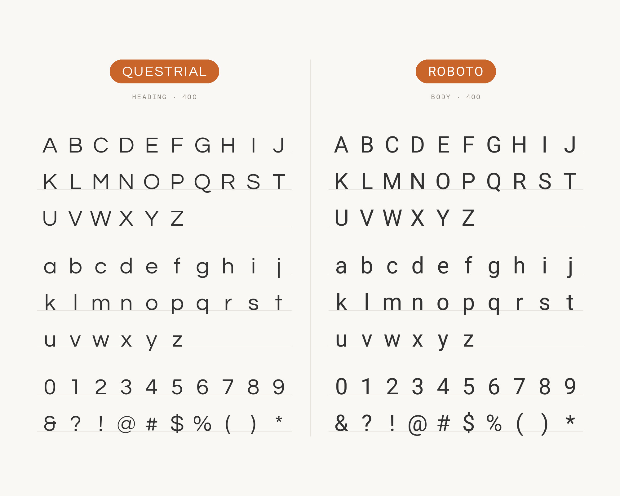
Wonderful Machine’s 2025 case study for photographer Brian Riedel names Questrial and Roboto as the brand identity’s font selection. The author describes Questrial as modern and friendly with smooth, rounded letters, while Roboto supplies a clean, simple, readable countervoice. This is a direct, named identity pairing rather than a generic list: let Questrial carry the personable display and short brand lines, then give Roboto the explanatory copy, navigation and captions. Roboto’s weight range also supplies the hierarchy Questrial’s single regular does not ship.
11. Impact
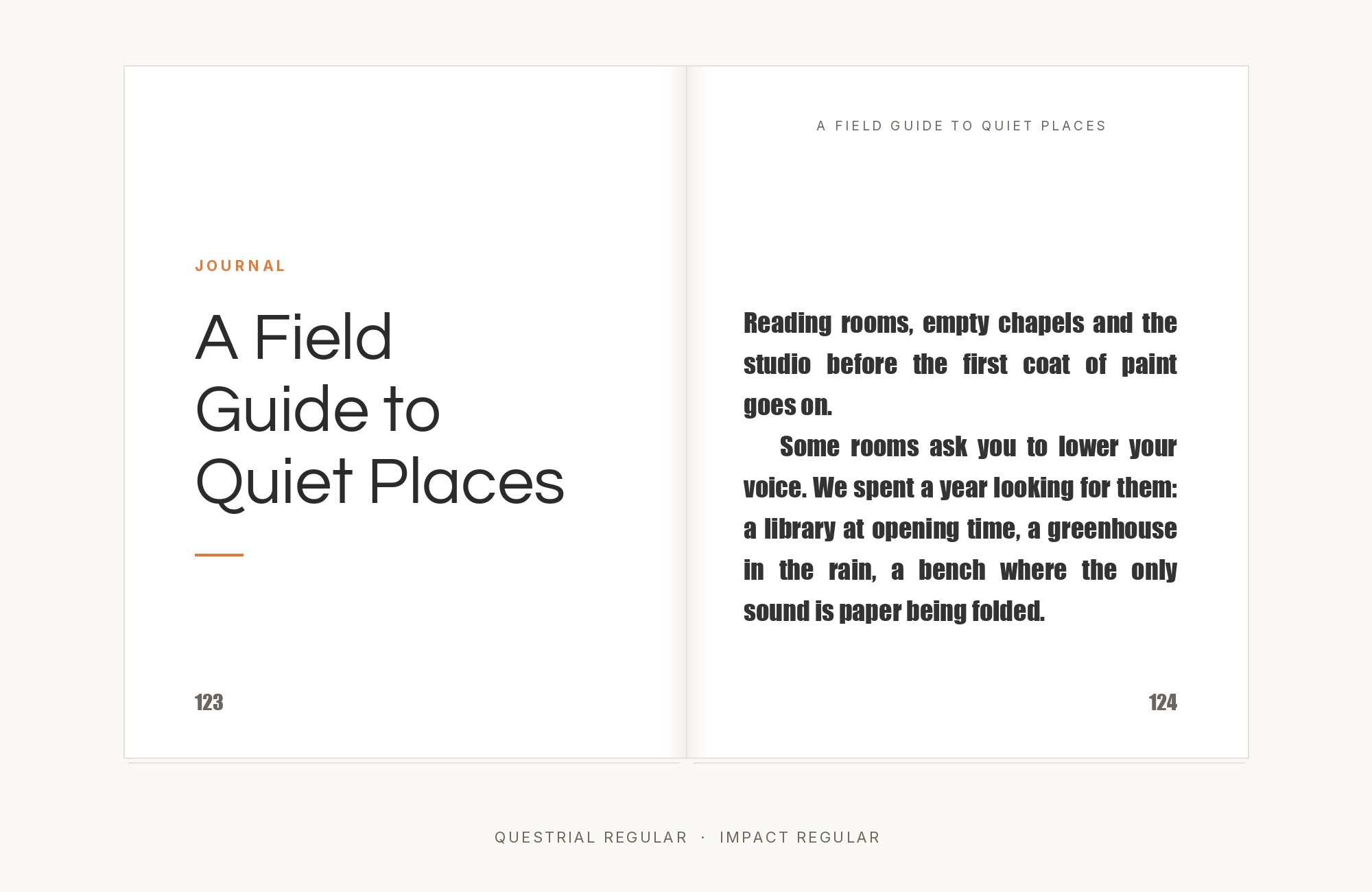
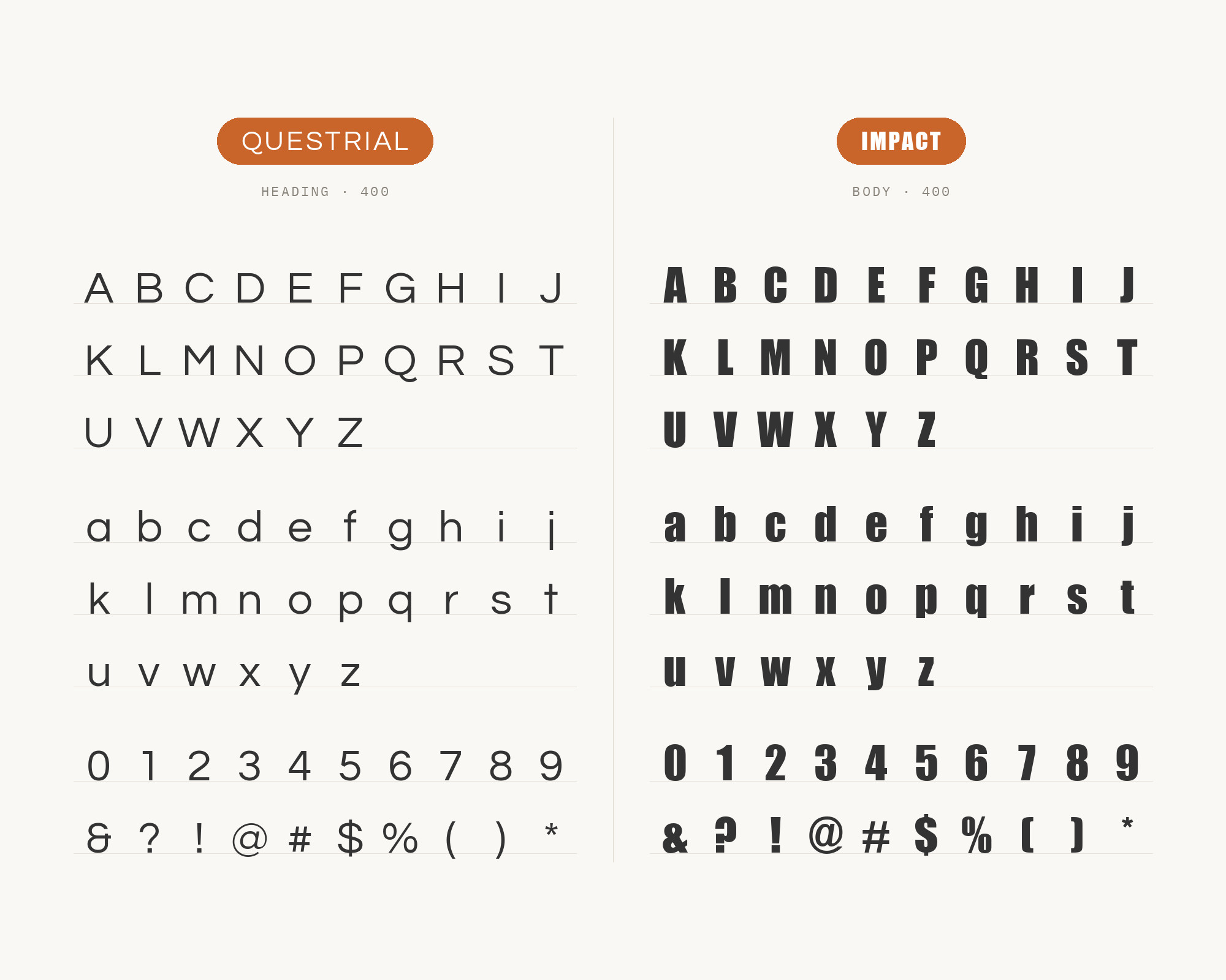
Digikentro’s Bajango case study pairs Impact for headlines with Questrial for body text in a delivered brand system. Impact supplies the compressed, heavy display voice that Questrial’s single regular weight cannot create, making the hierarchy immediate even in a limited color palette. Both are sans serifs, but their widths and density sit at opposite extremes: Impact packs letters tightly into a strong block, while Questrial leaves open counters and an even rhythm. Use Impact only for very short headlines, campaign words or numbers, and let Questrial handle supporting lines, captions and interface labels. Extra space around the headline prevents Impact’s mass from overwhelming the lighter text beneath it.
Conclusion
Questrial is a single Regular with circular, Swiss-adjacent geometry, and the pairings that work treat that as a fact rather than a flaw. Typewolf’s caution — not a body face — is the more useful brief in production, even though Prince and Meseguer still describe it as suitable for paragraphs. The classic editorial partners either take the display serif role Questrial cannot play (Americana, Quattrocento, Old Standard TT) or supply a real text family underneath it (Alegreya, IBM Plex Sans). Cutive Mono is the texture exception, a typewriter grid against the circle.
The combination to avoid is Questrial as the only face on a long page. There is no italic for emphasis, no bold for hierarchy, and the circular Regular starts to look like an unfinished system. Substituting Questrial for Futura — a use that appears on substitute lists, not pairing lists — is a different job and does not tell you what to set next to it. Pick one partner that can actually set a paragraph, keep Questrial on the short geometric lines where its curves register, and judge the pairing by whether that Regular still reads as a decision once the body text is in place.
Sources
- Typewolf (Questrial)
- femmebot Google Type
- Hey Reliable / Reliable PSD (Lou Levit)
- Leadpages (Staci Carpenter)
- Jukebox Print
- Teachery
- Fonts In Use (Questrial)
- Laura Meseguer
- GitHub (googlefonts/questrial)
- Google Fonts (Questrial)
- Florida Farm Bureau Brand Guide
- All Court Tennis Club Brand Guidelines
- Digikentro (Bajango case study)
- Ashley Rodrigues (Acoma case study)
