BonFX

Typography & Graphic Design Blog

  • Blog
  • Books
    • The Preposterously Huge Book of Google Font Combinations
    • The Big Book of Font Combinations (Classic Fonts Edition)
  • Gallery
    • Monster Alphabet
    • Pen and Ink Cartoons
    • The Algorithm FX
  • Services
  • About
  • Contact
You are here: Home / Graphic Design / What Fonts Go With Manrope?
What Fonts Go With Manrope?

What Fonts Go With Manrope?

January 11, 2026 by Douglas Bonneville

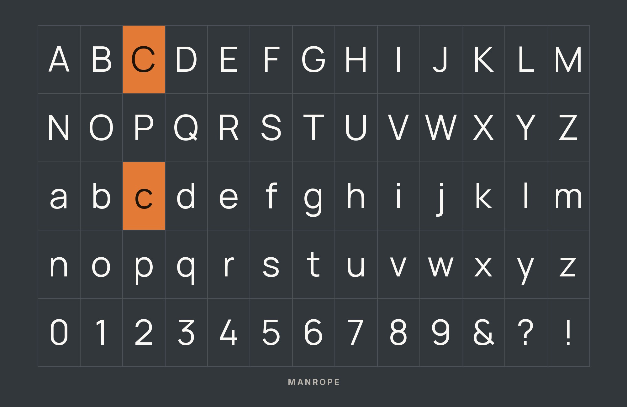
What fonts go with Manrope? This versatile variable font blends geometric foundations with humanist warmth, creating pairing opportunities that can lean either direction.

Manrope, designed by Mikhail Sharanda, represents the best of modern variable font design. Its semi-condensed proportions and clean geometric structure give it a contemporary feel, while subtle humanist touches in the curves and terminals prevent it from feeling cold or mechanical. The variable font format allows for precise weight tuning, from ultralight to extrabold, enabling designers to find exactly the right emphasis for any context. Manrope’s slightly rounded details make it feel approachable, yet its disciplined geometry keeps it professional enough for serious applications.

Pairing with Manrope benefits from understanding its dual nature. It can lean into geometric minimalism with similarly structured companions, or you can play up its humanist side with warmer serif partners. The font’s clean lines make it particularly effective as a headline face, where its modern character can shine while body text handles the heavy lifting. Here are 15 fonts that pair well with Manrope, each chosen for creating combinations that exploit its versatile personality.

Font Pairings for Manrope

  1. Inter
  2. Plus Jakarta Sans
  3. Prata
  4. Marcellus
  5. Italiana
  6. Corben
  7. Roboto Mono
  8. Azeret Mono
  9. Playfair Display
  10. Monument Extended
  11. FK Screamer
  12. Formula
  13. Oakes Grotesk
  14. Work Sans
  15. Source Serif Pro

1. Inter

Manrope paired with Inter - Style A showing headline and body text

Two geometric sans-serifs designed for modern interfaces meet in a pairing that speaks fluent tech startup. Inter‘s distinctive letter shapes create just enough differentiation from Manrope’s more rounded forms to establish hierarchy. Both share screen-optimization DNA and generous x-heights, making transitions seamless. This combination suits fintech dashboards, productivity apps, and any SaaS product wanting contemporary aesthetics without sacrificing readability. The subtle contrast is intentional minimalism, not laziness.

Manrope and Inter - Style B layout Character specimen showing Manrope and Inter alphabets

2. Plus Jakarta Sans

Manrope paired with Plus Jakarta Sans - Style A showing headline and body text

Plus Jakarta Sans and Manrope share the same geometric DNA and contemporary sensibilities, creating a pairing that feels unified rather than forced. Jakarta brings slightly more ink trap detailing that creates subtle visual interest at larger sizes while Manrope handles body copy with quiet efficiency. This duo dominates modern interface design, powering startup landing pages, mobile apps, and digital products worldwide. Both fonts were built for screens first, making them natural partners.

Manrope and Plus Jakarta Sans - Style B layout Character specimen showing Manrope and Plus Jakarta Sans alphabets

3. Prata

Manrope paired with Prata - Style A showing headline and body text

Prata‘s Didone-influenced curves create elegant headlines that Manrope’s geometric body copy grounds in contemporary practicality. The high-contrast serif brings fashion-editorial sensibilities to layouts while the sans maintains startup-world readability below. This pairing works for luxury tech brands, design studios, and any context bridging high aesthetics with digital functionality. Use Prata exclusively for display sizes; its delicate serifs require breathing room to perform.

Manrope and Prata - Style B layout Character specimen showing Manrope and Prata alphabets

4. Marcellus

Manrope paired with Marcellus - Style A showing headline and body text

Marcellus brings Roman inscription gravitas to headlines while Manrope provides the contemporary geometric body copy below. The classical serif’s chiseled letterforms create natural authority that modern brands sometimes struggle to project. This pairing suits law firms, architectural studios, and cultural institutions wanting timeless positioning with contemporary execution. The contrast between ancient inspiration and modern geometry creates visual interest without conflict.

Manrope and Marcellus - Style B layout Character specimen showing Manrope and Marcellus alphabets

5. Italiana

Manrope paired with Italiana - Style A showing headline and body text

Italiana‘s refined, almost calligraphic uppercase forms create stately headlines that Manrope’s geometric lowercase supports with contemporary clarity. The display serif brings European elegance while the sans grounds everything in modern usability. This pairing excels in fashion brands, luxury hospitality, and any context where refined aesthetics meet digital functionality. Use Italiana strictly for headlines; its delicate forms demand display sizes to perform.

Manrope and Italiana - Style B layout Character specimen showing Manrope and Italiana alphabets

6. Corben

Manrope paired with Corben - Style A showing headline and body text

Corben‘s 1920s-inspired letterforms bring vintage personality to headlines while Manrope provides the contemporary reading foundation. The rounded serif channels Art Deco energy without kitsch, creating nostalgic headlines that feel intentional rather than derivative. This pairing works for breweries, barbershops, and any brand trading on authentic vintage aesthetics. The contrast between Corben’s historical references and Manrope’s thoroughly modern forms creates productive tension.

Manrope and Corben - Style B layout Character specimen showing Manrope and Corben alphabets
UX for Cats book cover
Love typography?
You'll love this article!
50 UX terms. Illustrated beautifully.
A visual guide for designers.
Read the Visual Guide

7. Roboto Mono

Manrope paired with Roboto Mono - Style A showing headline and body text

Roboto Mono brings technical credibility to code snippets and data displays while Manrope handles the surrounding prose with geometric grace. The monospace characters align perfectly with Manrope’s developer-friendly aesthetics, creating cohesive layouts for technical documentation. This pairing powers countless dev blogs, API documentation sites, and technical tutorials. The functional contrast between fixed-width and proportional text serves communication rather than decoration.

Manrope and Roboto Mono - Style B layout Character specimen showing Manrope and Roboto Mono alphabets

8. Azeret Mono

Manrope paired with Azeret Mono - Style A showing headline and body text

Azeret Mono‘s contemporary monospace forms bring modern technical aesthetics while Manrope provides the geometric prose foundation. The mono variant’s unique character shapes create visual interest in code blocks and data tables without sacrificing readability. This pairing suits blockchain projects, AI platforms, and any tech brand signaling cutting-edge positioning. Both fonts share geometric DNA, creating cohesion despite the fundamental monospace-versus-proportional contrast.

Manrope and Azeret Mono - Style B layout Character specimen showing Manrope and Azeret Mono alphabets

9. Playfair Display

Manrope paired with Playfair Display - Style A showing headline and body text

Playfair Display‘s baroque elegance crashes into Manrope’s Silicon Valley minimalism in a high-contrast pairing that demands attention. The Didone-influenced serif creates dramatic headlines while the geometric sans grounds body copy in contemporary readability. This combination suits luxury e-commerce, high-end editorial, and any brand wanting to project sophistication through modern channels. Use Playfair strictly for display; its hairlines will disappear at body sizes.

Manrope and Playfair Display - Style B layout Character specimen showing Manrope and Playfair Display alphabets

10. Monument Extended

Manrope paired with Monument Extended - Style A showing headline and body text

Monument Extended‘s stretched letterforms create statement headlines that Manrope’s measured geometry balances below. The extended sans brings bold visual presence while maintaining readability at display sizes. This pairing suits bold brands, creative agencies, and any context where typography itself makes the statement. Use Monument exclusively for headlines; its proportions require substantial size to read comfortably. The contrast creates dramatic hierarchy.

Manrope and Monument Extended - Style B layout Character specimen showing Manrope and Monument Extended alphabets

11. FK Screamer

Manrope paired with FK Screamer - Style A showing headline and body text

FK Screamer‘s expressive display forms shout from headlines while Manrope provides the measured, readable prose below. The display font brings editorial drama while the geometric sans grounds everything in contemporary usability. This pairing works for music publications, creative agencies, and any brand comfortable making typographic statements. The contrast between expressive display and systematic body creates intentional visual tension that captures attention.

Manrope and FK Screamer - Style B layout Character specimen showing Manrope and FK Screamer alphabets

12. Formula

Manrope paired with Formula - Style A showing headline and body text

Formula‘s technical display aesthetics meet Manrope’s geometric precision in a pairing that speaks fluent automation. The display font brings racing-inspired energy while maintaining the structured letterforms that technical brands favor. Manrope provides the readable foundation for body copy and UI elements. This combination suits automotive tech, engineering firms, and any context where precision and performance are brand values. Both fonts share geometric DNA.

Manrope and Formula - Style B layout Character specimen showing Manrope and Formula alphabets

13. Oakes Grotesk

Manrope paired with Oakes Grotesk - Style A showing headline and body text

Oakes Grotesk and Manrope share enough grotesque heritage to create cohesion while maintaining enough distinction for hierarchy. Both fonts feature geometric foundations with humanist touches, creating layouts that feel unified without monotony. This pairing suits design-forward brands, creative studios, and any context where typographic sophistication matters. The subtle contrast requires careful weight management to establish clear hierarchy between headlines and body copy.

Manrope and Oakes Grotesk - Style B layout Character specimen showing Manrope and Oakes Grotesk alphabets

14. Work Sans

Manrope paired with Work Sans - Style A showing headline and body text

Work Sans‘s screen-optimized letterforms meet Manrope’s geometric precision in a pairing built for digital environments. Both fonts share similar design philosophies and generous x-heights, making them natural partners for interfaces where users spend extended time reading. This combination suits web applications, dashboards, and responsive designs where type must perform flawlessly across devices. The slight stylistic differences create hierarchy without jarring transitions.

Manrope and Work Sans - Style B layout Character specimen showing Manrope and Work Sans alphabets

15. Source Serif Pro

Manrope paired with Source Serif Pro - Style A showing headline and body text

Source Serif Pro brings traditional typographic authority to headlines while Manrope provides the contemporary geometric body copy below. The serif’s moderate contrast and sturdy details create readable headlines while establishing clear hierarchy. This pairing suits publishers modernizing their aesthetics, tech companies wanting editorial credibility, and any context bridging traditional and contemporary positioning. Both fonts excel on screens, having been designed with digital reading in mind.

Manrope and Source Serif Pro - Style B layout Character specimen showing Manrope and Source Serif Pro alphabets

Conclusion

There are no absolute rules for font pairing, just principles to guide you. The key is contrast—in weight, in style (serif vs. sans-serif), or in personality. Manrope is versatile enough to play well with many different typefaces.

Trust your eye, experiment freely, and remember that the best pairing is the one that serves your content and audience. Typography should enhance communication, not complicate it.

More Font Resources

  • Types of Fonts
  • Best Fonts for Designers
  • Google Font Combinations
  • Fonts That Work With Gill Sans

About the Author

Douglas Bonneville is a graphic designer and typographer since 1992. He is the author of The Big Book of Font Combinations and has contributed to numerous design publications. His work focuses on making typography accessible and practical for designers at all levels.

About Douglas Bonneville

Douglas has been a graphic designer since 1992, in addition to software developer and author. He is a member of Smashing Magazine's "Panel of Experts" and has contributed to over 100 articles. He is the author of "The Big Book of Font Combinations", loves cats, and plays guitar.

Still Googling UX terms?

Stop. They're all right here.
UX for Cats book cover

50 terms. Illustrated.
So simple your cat gets it.

Get the Book →

Print & ePub on Amazon

350 font combinations you can steal.

The Big Book of Font Combinations

Every pairing shown in context — web, print, headings, body. Open it, find one that works, use it.

That's it. That's the book.

In print or ePub 40% OFF on Gumroad

Scrolling Google Fonts for "the right one"?

You've been at it for 20 minutes. You'll be at it for 20 more. There are 1,500 fonts in there.

Pocket Handbook of Google Fonts Combinations

We paired every useful Google Font.
7,500 pages. Done.

Get the PDF →

Instant download on Gumroad

Recent Inspirations

  • 50 Essential UX Terms Every Designer Must Know, Illustrated February 8, 2026
  • Why Ugly Websites Win: The Case for Brutal Minimalism in 2026 January 20, 2026
  • The Post-Design Web: Why System Fonts Are the Future January 20, 2026
  • What Fonts Go With Work Sans? January 11, 2026
  • What Fonts Go With Source Sans Pro? January 11, 2026
  • What Fonts Go With Rubik? January 11, 2026
  • What Fonts Go With Nunito Sans? January 11, 2026
  • What Fonts Go With Neuton? January 11, 2026
  • What Fonts Go With Josefin Sans? January 11, 2026
  • What Fonts Go With Inconsolata? January 11, 2026
  • What Fonts Go With Fira Sans? January 11, 2026
  • What Fonts Go With Chivo? January 11, 2026
  • What Fonts Go With Cardo? January 11, 2026
  • What Fonts Go With Roboto? January 11, 2026
  • What Fonts Go With Spectral? January 11, 2026

Copyright © 2026 · BonFX

  • Blog
  • Books
    • The Preposterously Huge Book of Google Font Combinations
    • The Big Book of Font Combinations (Classic Fonts Edition)
  • Gallery
    • Monster Alphabet
    • Pen and Ink Cartoons
    • The Algorithm FX
  • Services
  • About
  • Contact