What fonts go with Poppins? This geometric sans-serif with its perfectly circular curves needs companions that either embrace its mathematical precision or provide deliberate organic contrast.
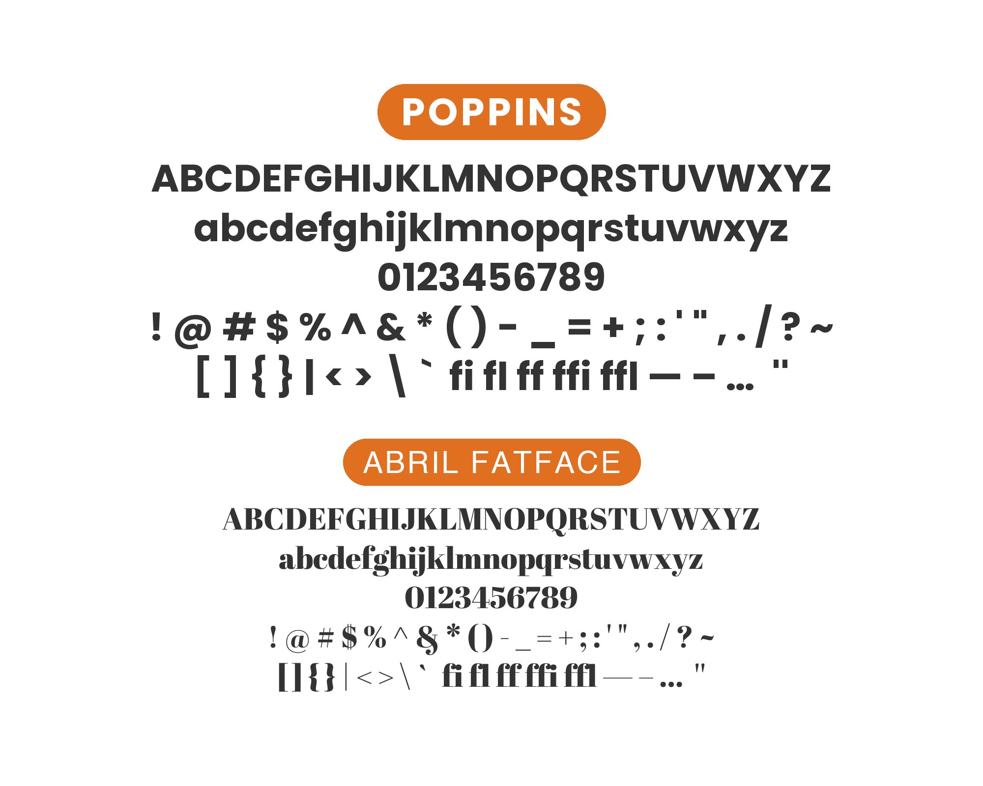
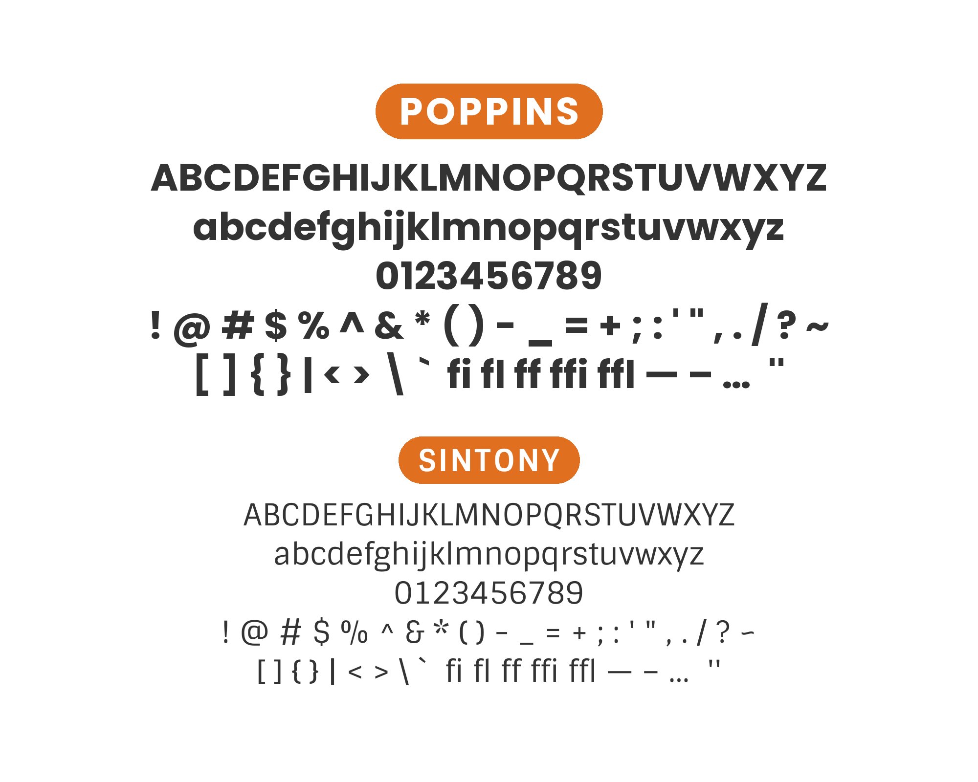
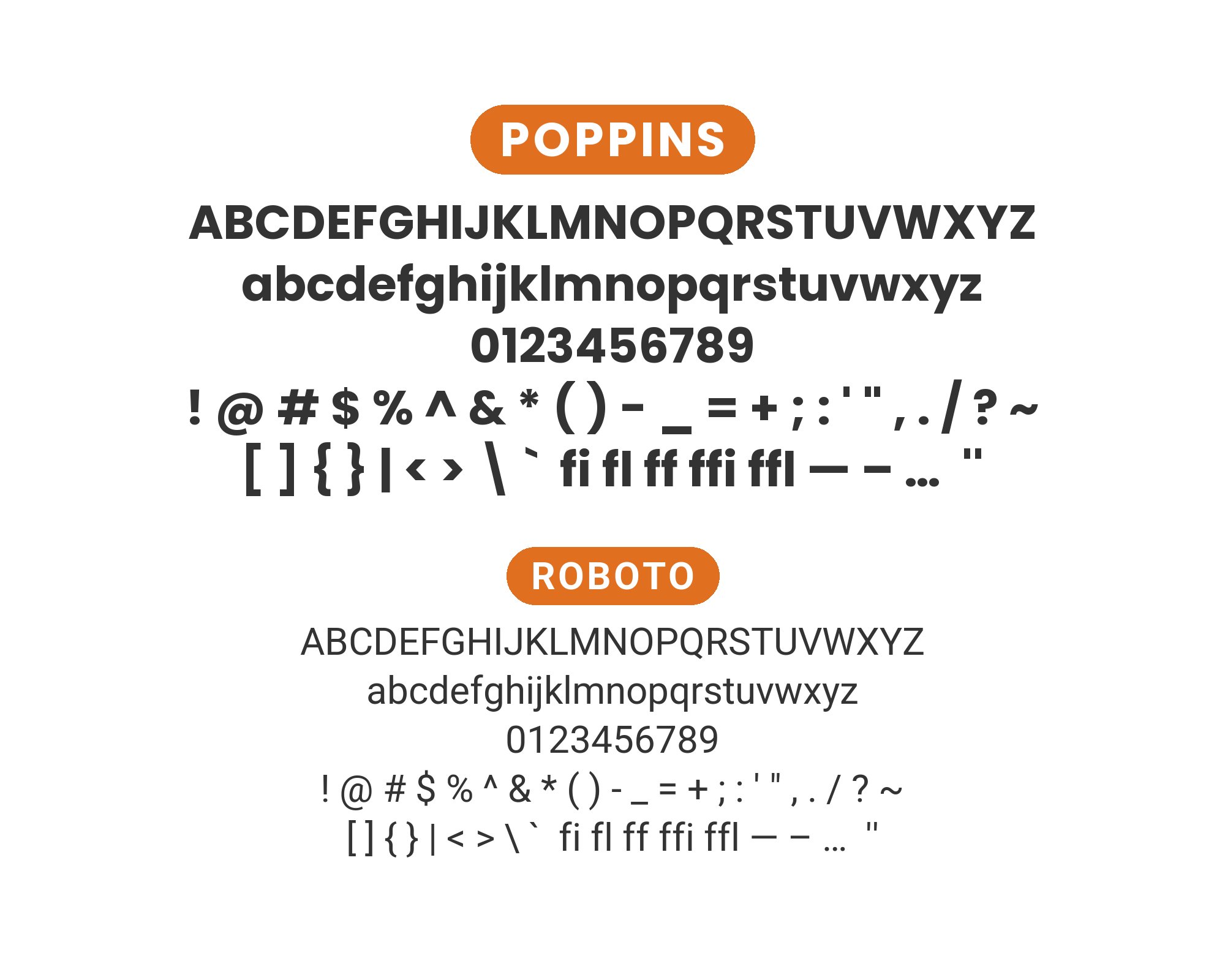
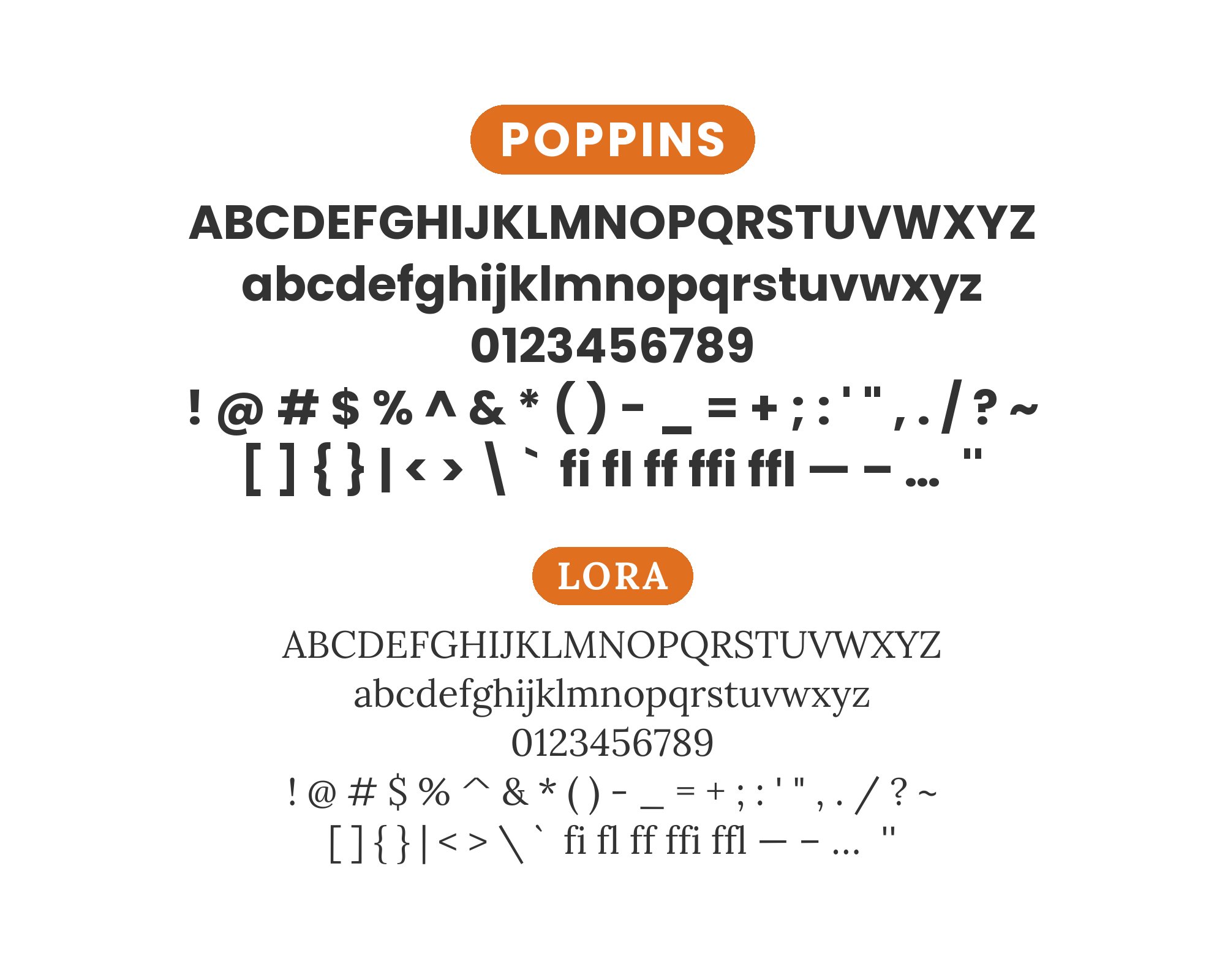
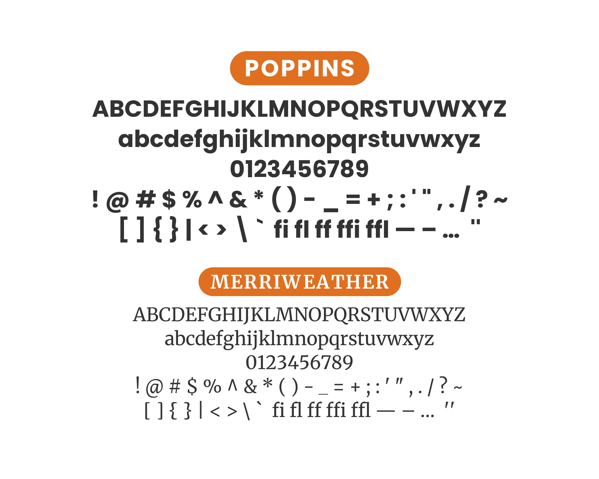
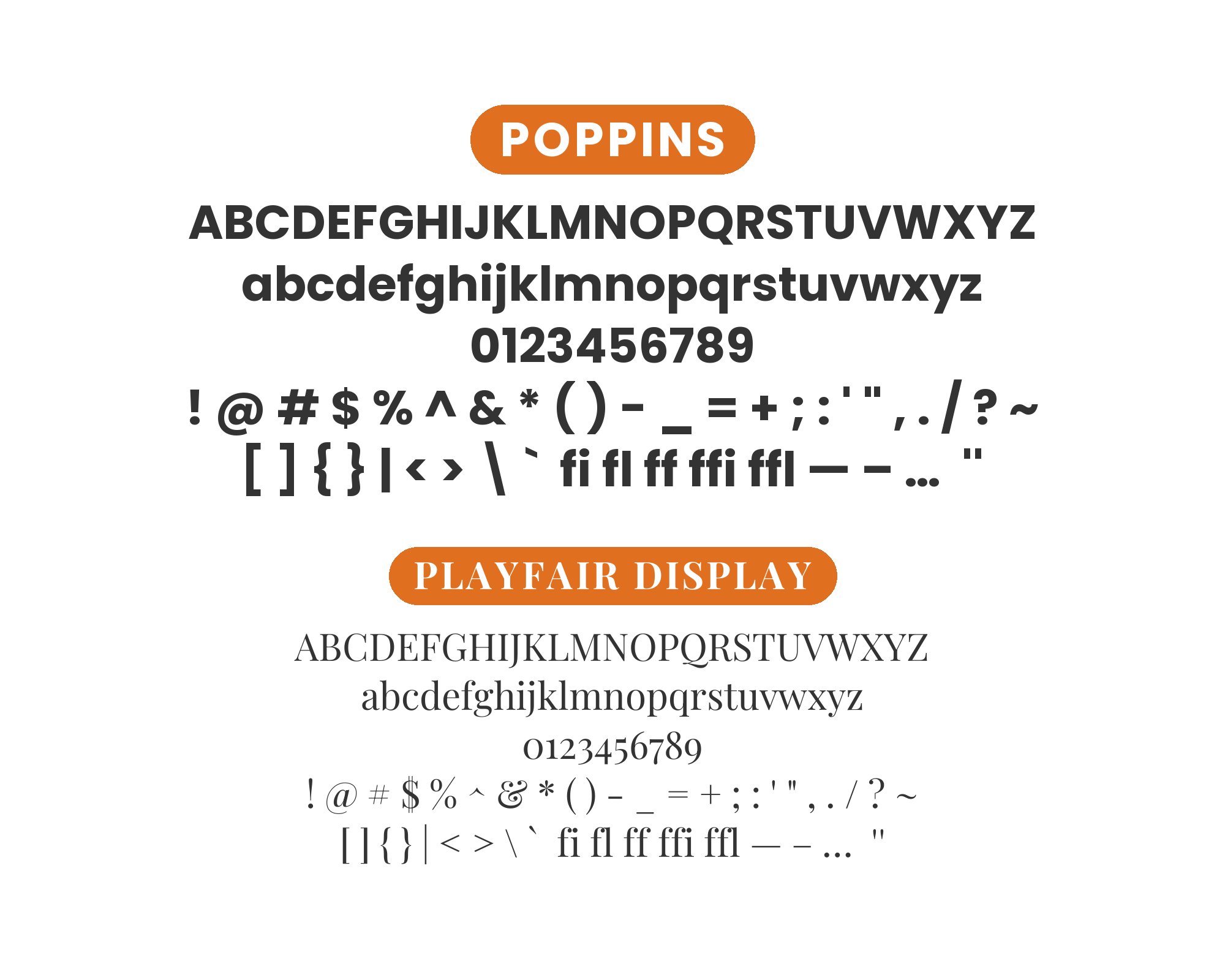
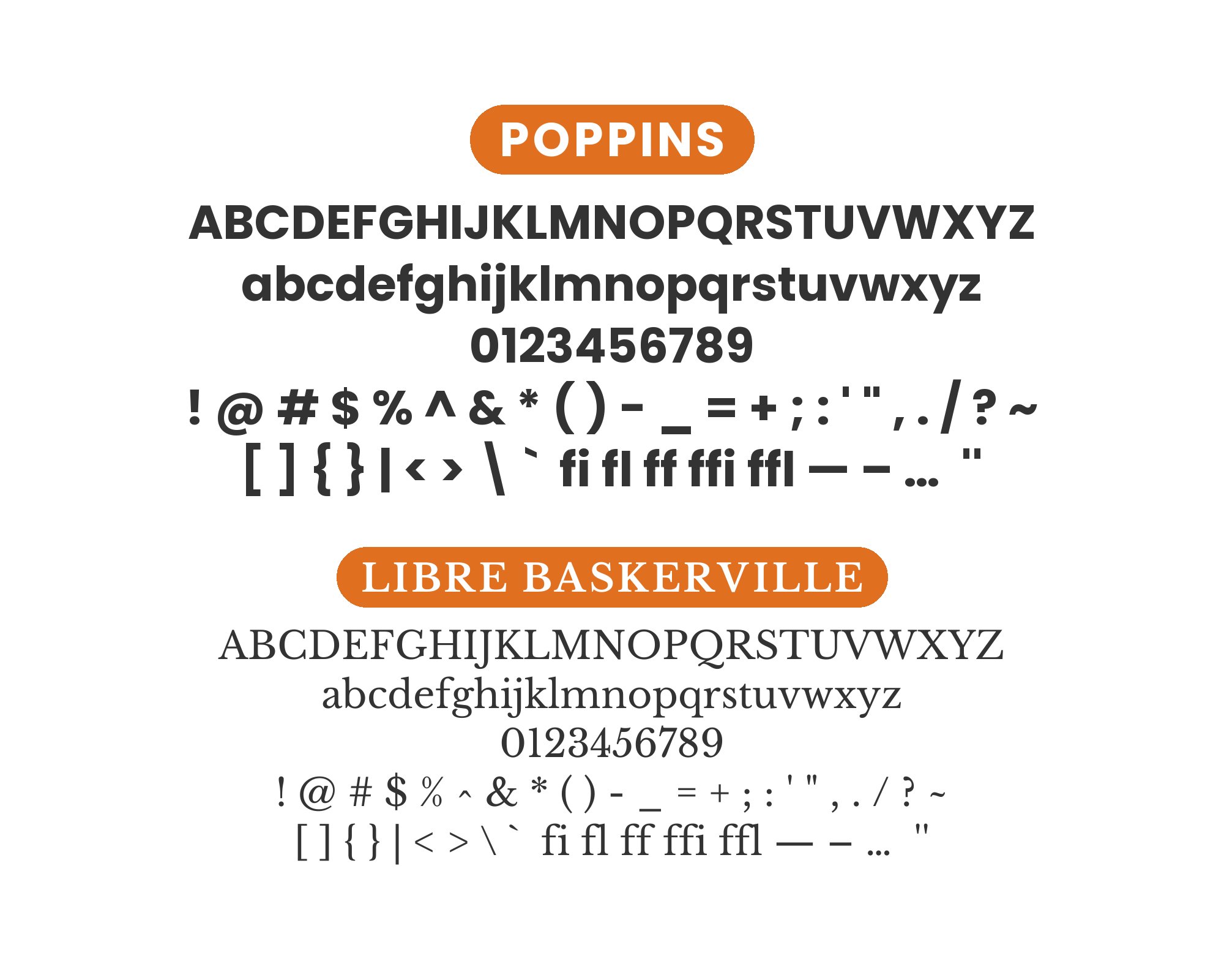
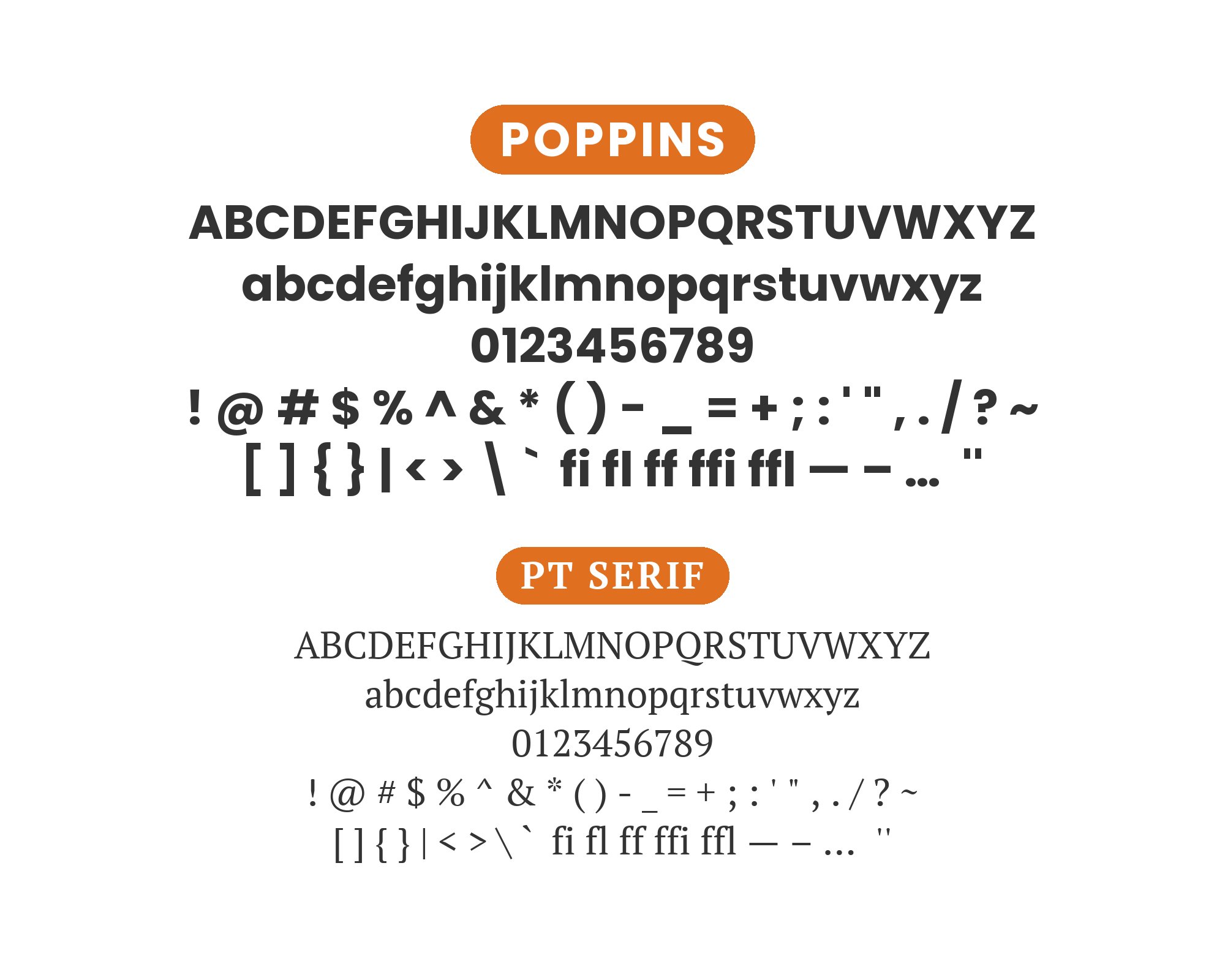
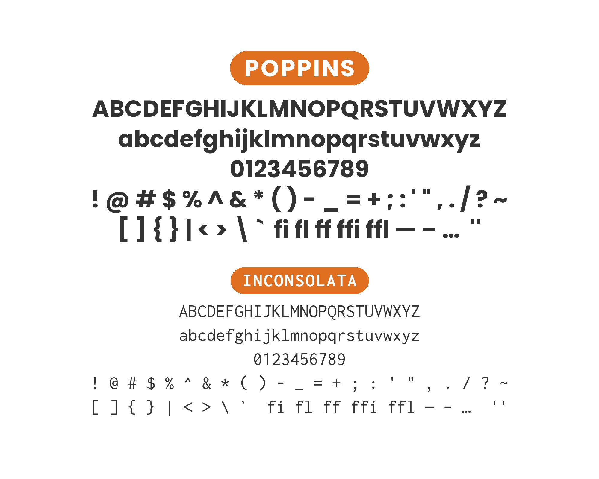
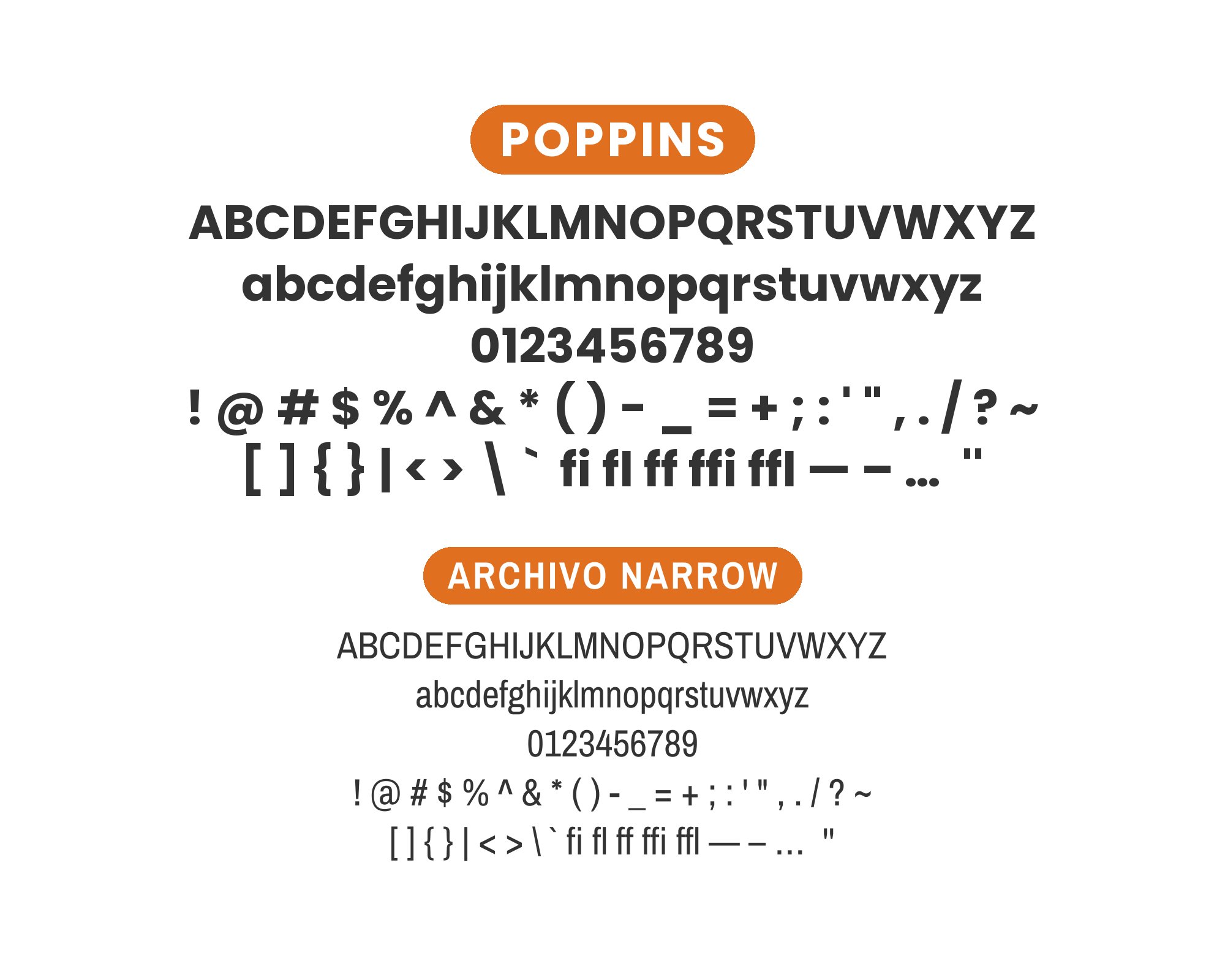
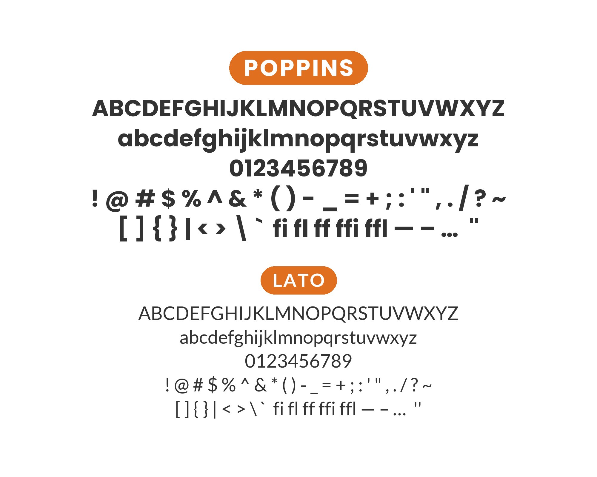
Poppins, designed by Indian Type Foundry, takes geometric sans-serif design to its circular extreme. Its round letters are based on near-perfect circles, giving the entire typeface a consistent, almost playful rhythm. Despite this geometric purity, Poppins maintains excellent readability through careful optical corrections and generous spacing. The extensive family spanning nine weights means it can handle everything from delicate light text to bold headlines, making it a popular choice for brands seeking clean, contemporary aesthetics with personality.
Pairing with Poppins means deciding whether to complement or contrast its circular geometry. Other geometric sans-serifs can create unified modern systems, while humanist designs or serifs introduce organic elements that highlight Poppins’ mathematical nature through difference. The font’s inherent friendliness, thanks to those round forms, makes it welcoming in many contexts but also means partners should bring either matching warmth or intentional sophistication. Here are 15 fonts that pair well with Poppins, each offering a distinct approach to complementing its geometric character.
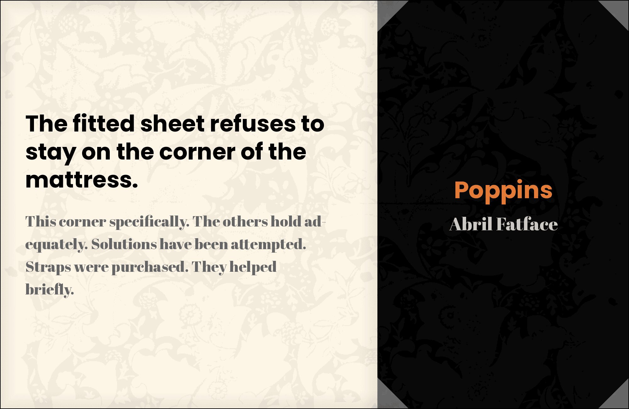
1. Abril Fatface
Dramatic Didone curves meet geometric purity. Abril Fatface‘s ultra-high contrast and sensuous letterforms create arresting headlines that Poppins’ circular geometry balances with measured calm. The pairing delivers instant sophistication for fashion, beauty, and luxury brands. Abril demands attention; Poppins guides the eye smoothly through supporting text. High impact, high elegance.
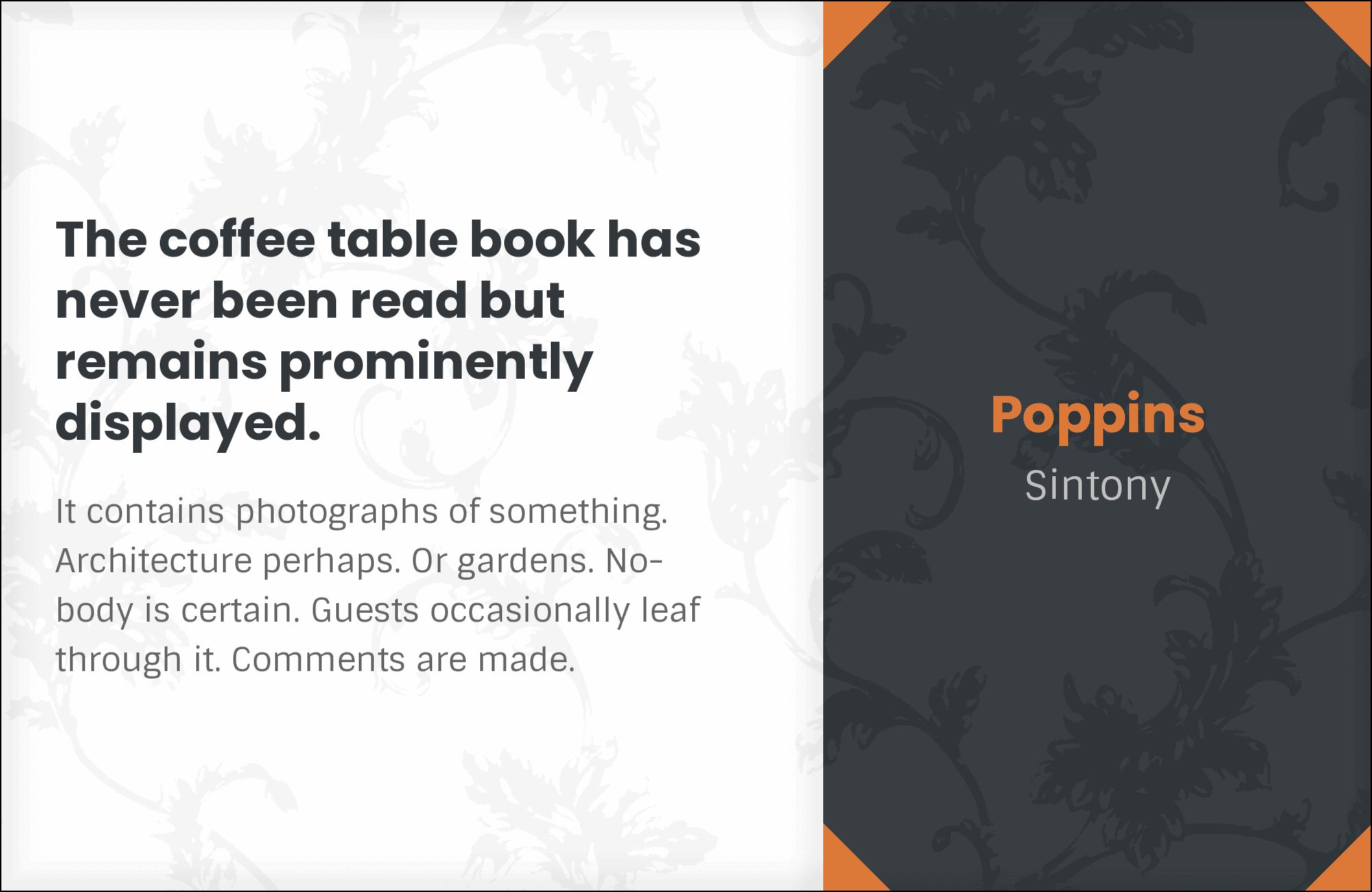
2. Sintony
Subtle sophistication through structural contrast. Sintony‘s slightly square letterforms add intellectual edge to Poppins’ friendlier circles. The combination feels designed and intentional, perfect for architecture firms, design studios, and tech companies wanting thoughtful typography. Both fonts share modern proportions while differing enough in detail to create visual interest.
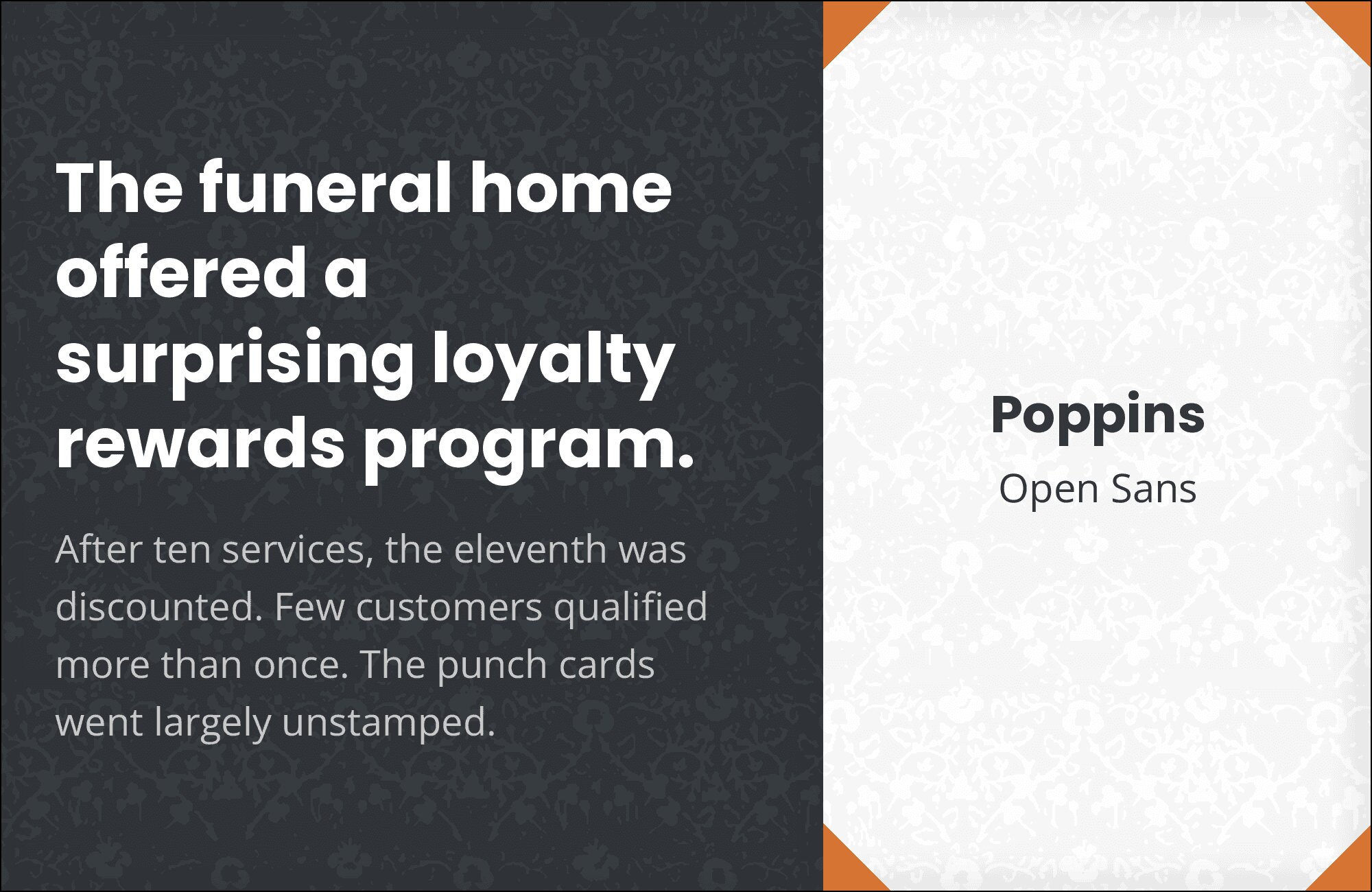
3. Open Sans
Professional warmth without pretense. Open Sans‘s humanist character complements Poppins’ geometric clarity for layouts that feel approachable yet polished. The pairing dominates corporate sites, product interfaces, and documentation where readability matters most. Similar x-heights ensure smooth transitions between headline and body. Clean, reliable, universally acceptable.

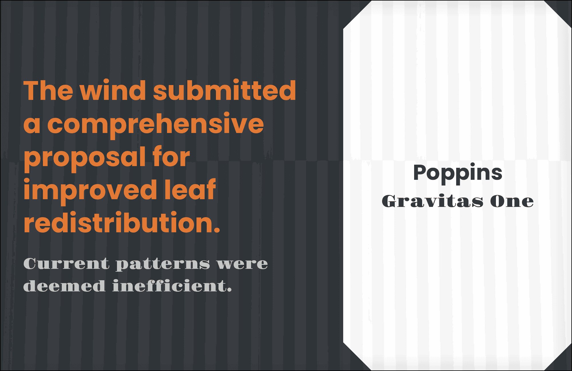
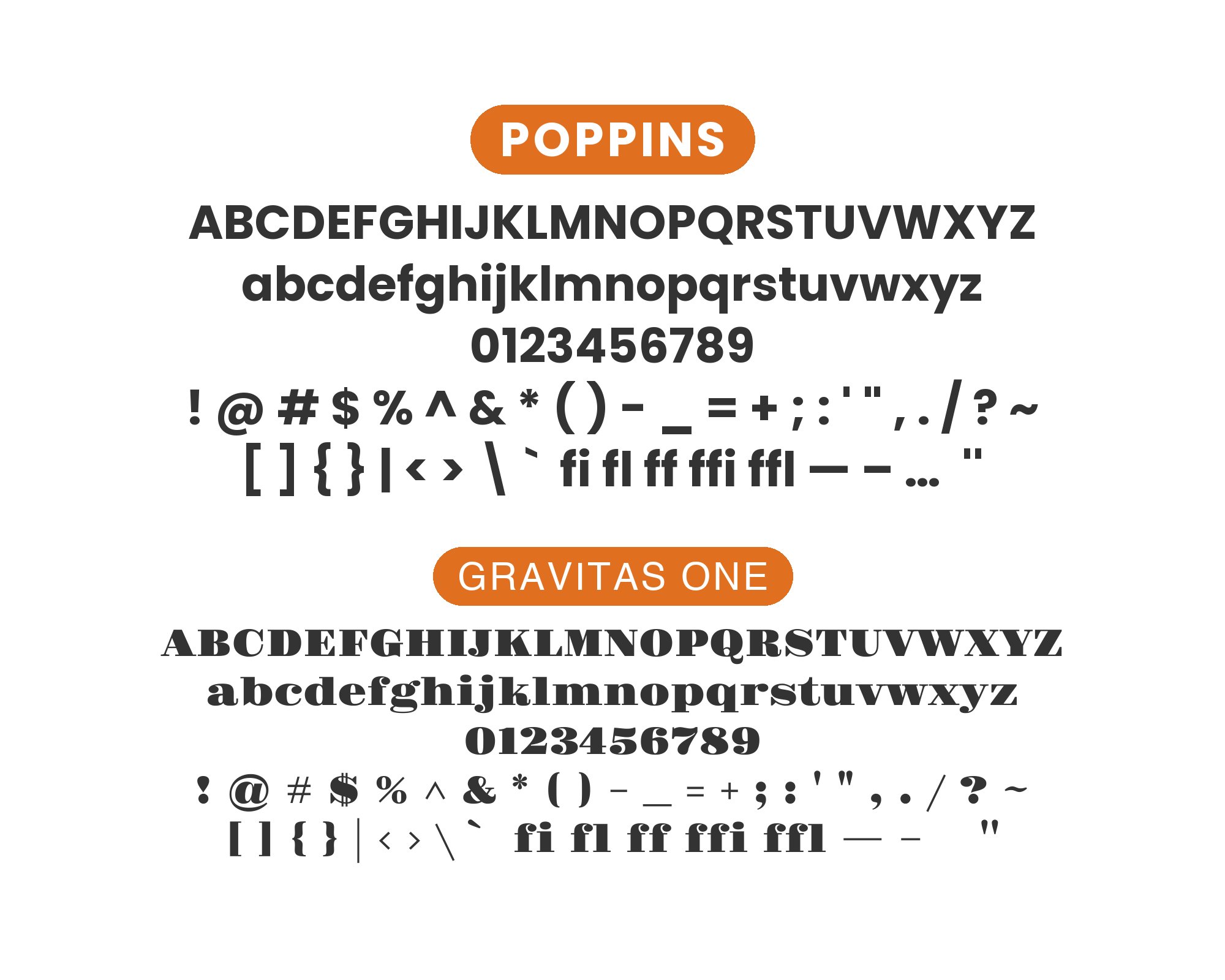
4. Gravitas One
Bold display drama meets geometric versatility. Gravitas One‘s heavy strokes and commanding presence create unmistakable headlines that Poppins’ circular simplicity anchors in body copy. The contrast is dramatic but harmonious, working for headlines, posters, and any design needing impact without chaos. Gravitas shouts; Poppins speaks clearly.
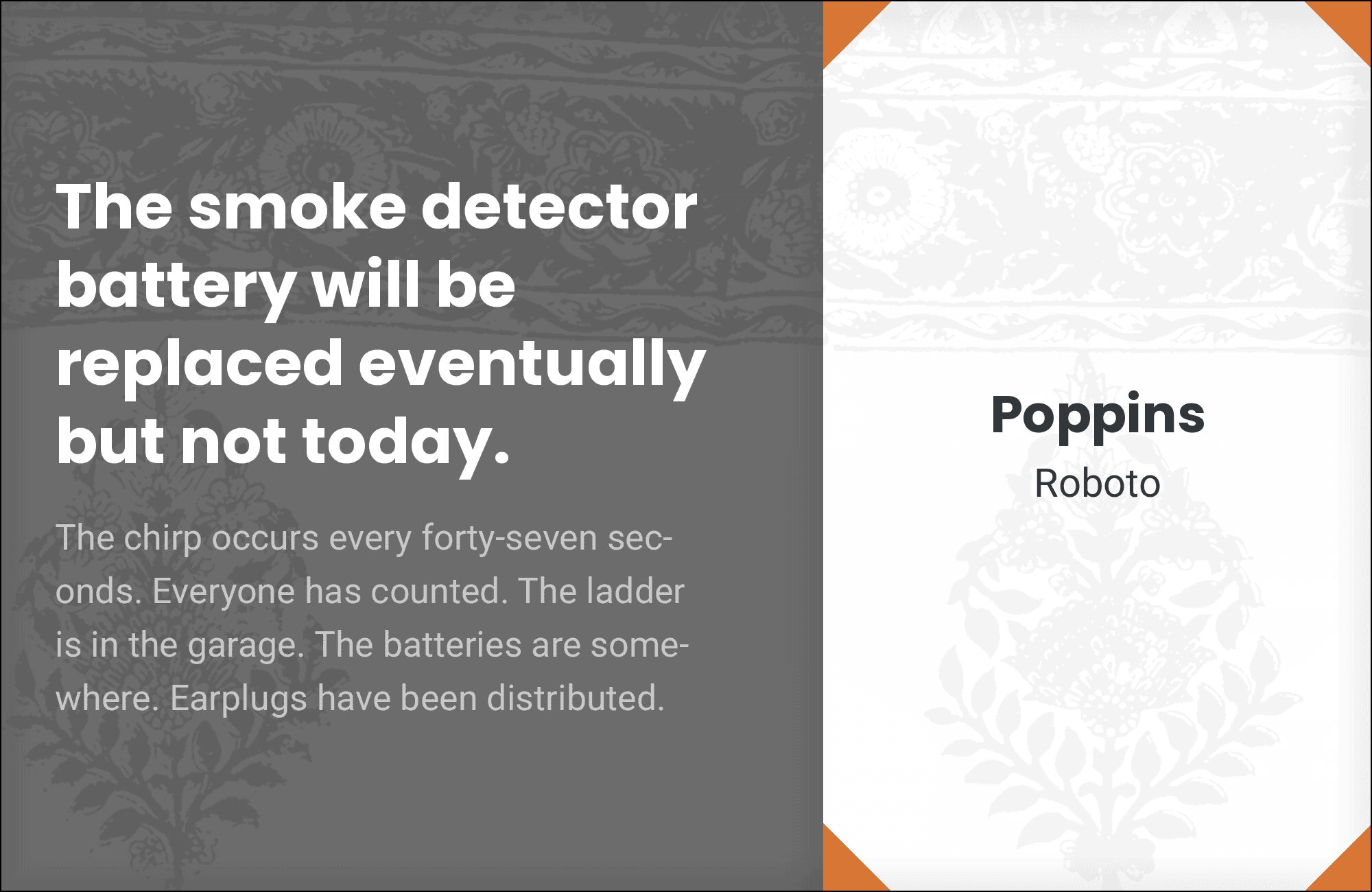
5. Roboto
Two geometric sans-serifs for systematic design. Roboto‘s slightly mechanical feel contrasts with Poppins’ friendlier circles, creating hierarchy through personality rather than contrast. The pairing dominates UI design, app interfaces, and Material Design implementations. Both fonts scale predictably and handle dense information without fatigue.
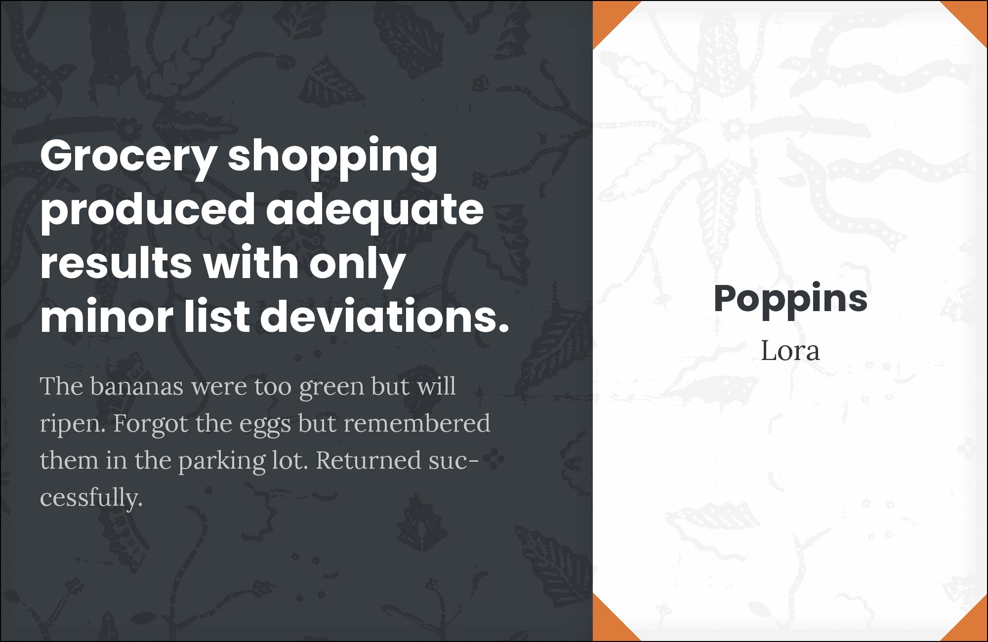
6. Lora
Calligraphic warmth meets geometric precision. Lora‘s brushed curves and elegant serifs add soul to Poppins’ constructed foundation. The combination works beautifully for editorial layouts, boutique branding, and designs wanting warmth without sacrificing modern credibility. Their x-heights align well, making paragraph transitions feel natural.

You'll love this article!
A visual guide for designers.
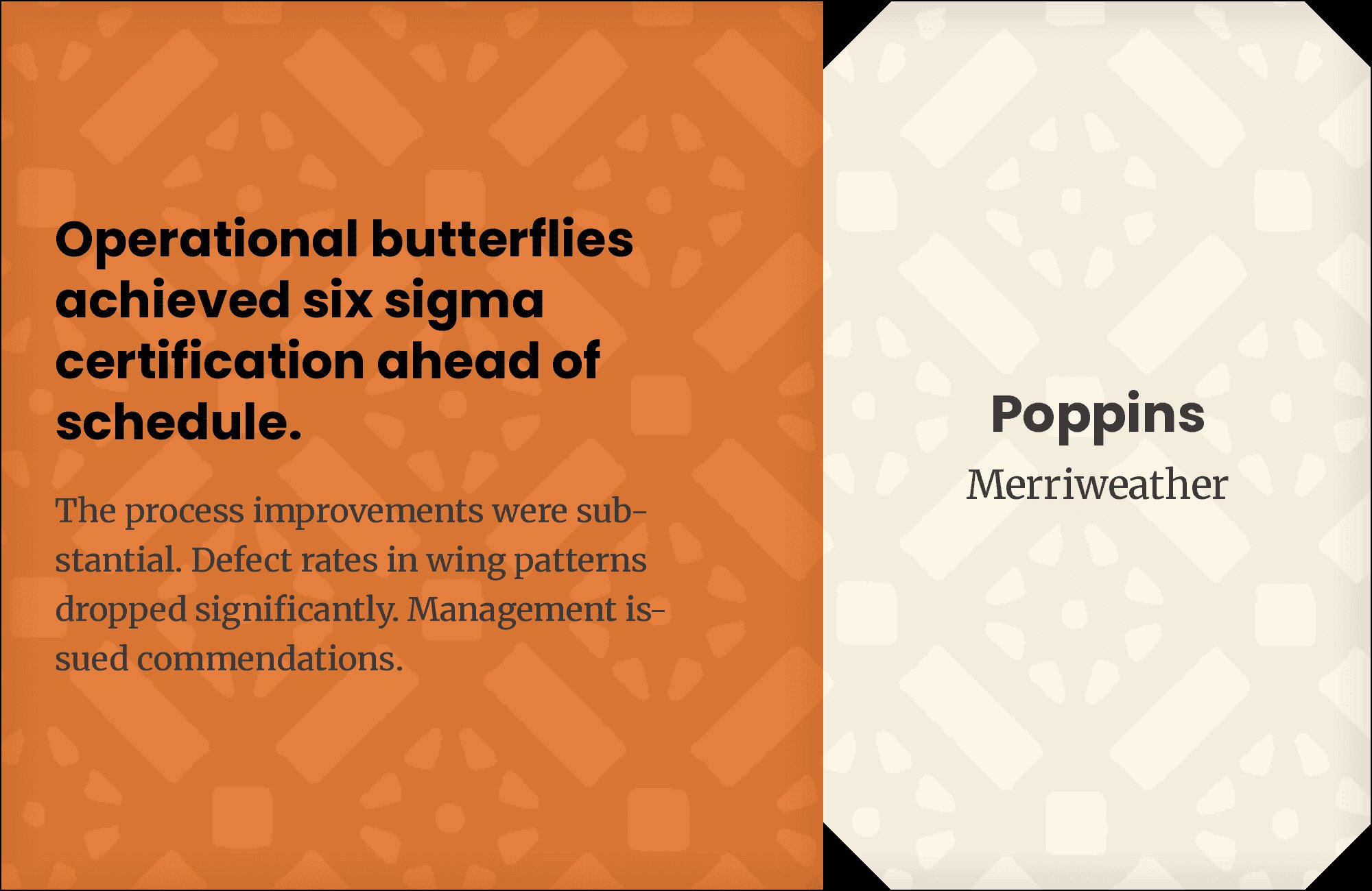
7. Merriweather
Tall x-heights unite serif and sans for maximum readability. Merriweather‘s screen-optimized serifs provide classical contrast to Poppins’ circular geometry without fighting for attention. The pairing handles long-form content gracefully, ideal for blogs, news sites, and educational platforms. Both fonts perform flawlessly from mobile to desktop.
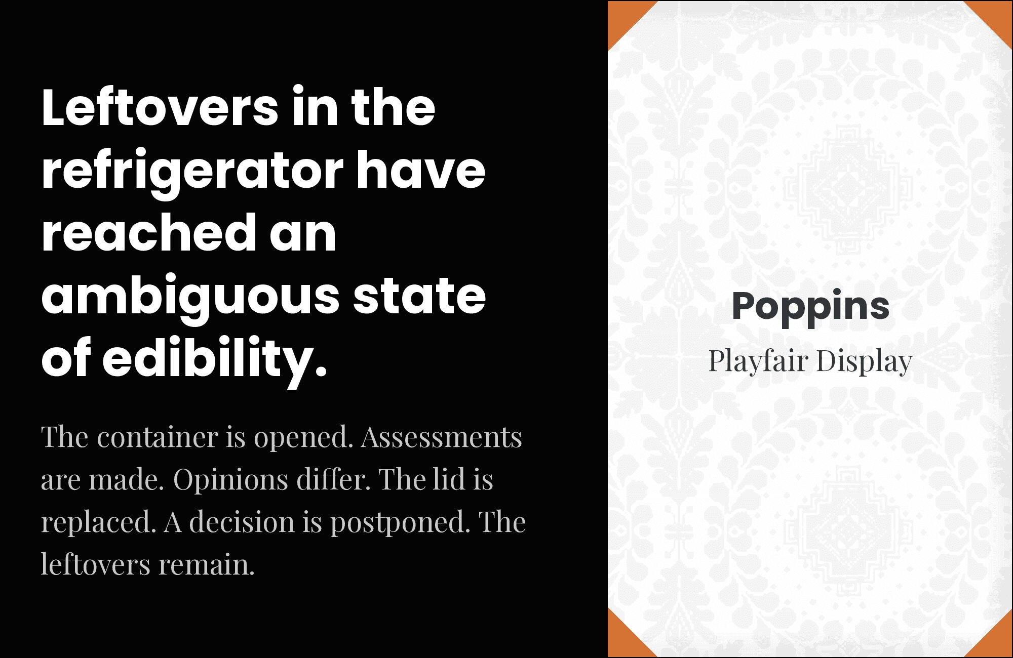
8. Playfair Display
Editorial elegance meets contemporary geometry. Playfair‘s Didone drama and delicate hairlines create sophisticated headlines that Poppins’ even-tempered forms support accessibly. The combination serves fashion magazines, cultural publications, and premium brands wanting classical aesthetics with modern practicality. High contrast, high sophistication.
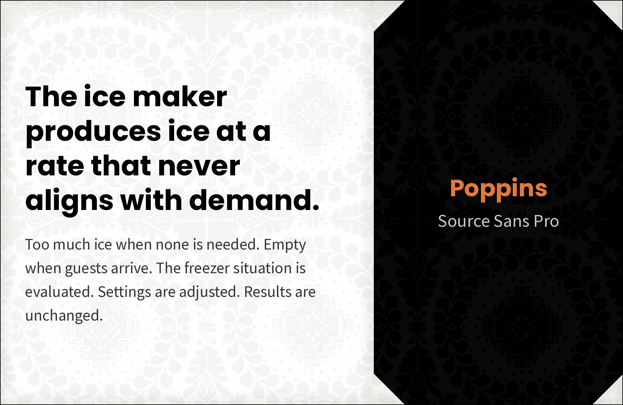
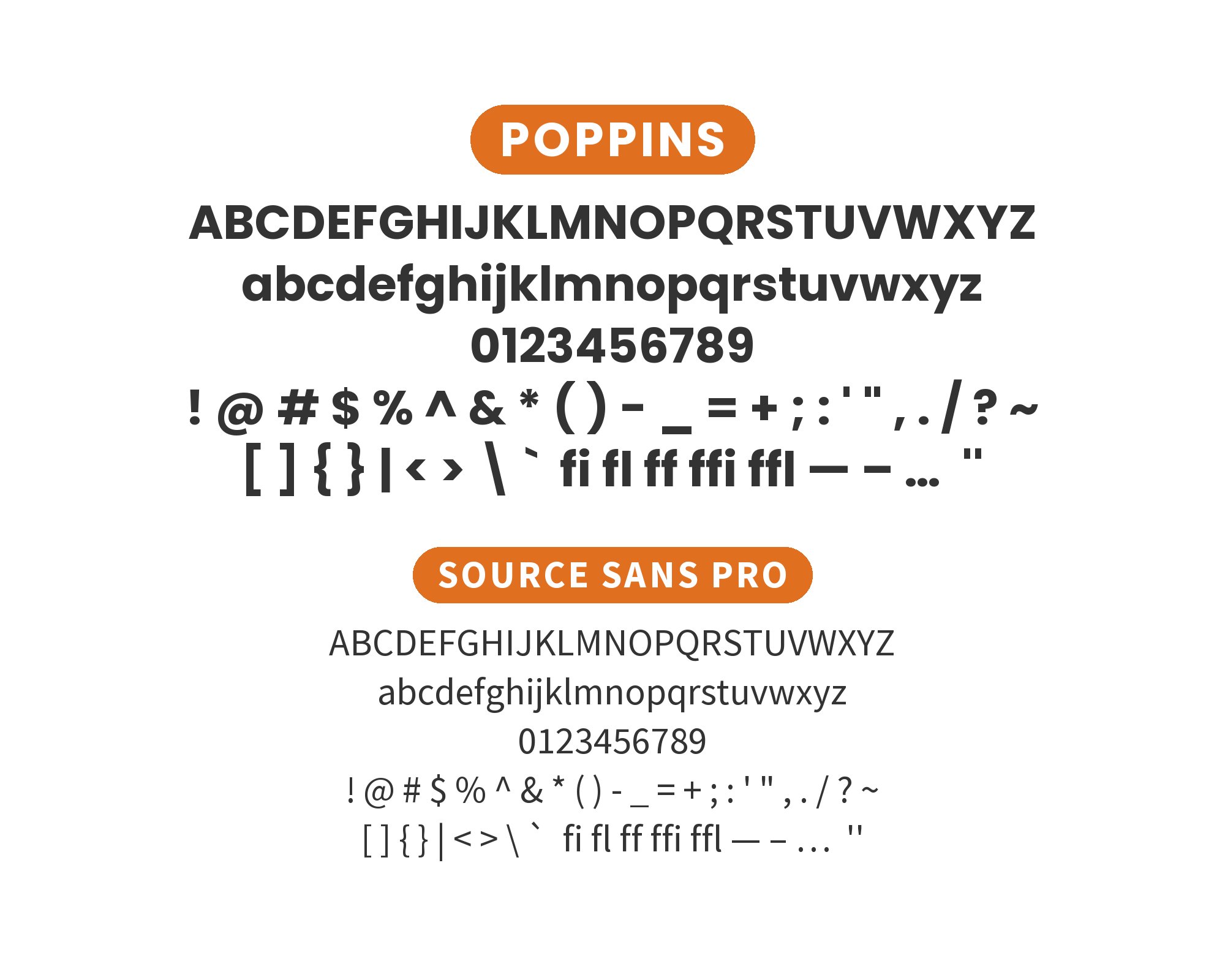
9. Source Sans Pro
Two fonts born for screens, paired for clarity. Source Sans Pro‘s Adobe heritage and Poppins’ Google Fonts pedigree combine for interfaces that feel designed and readable. Similar proportions ensure visual harmony while subtle differences in stroke terminals prevent monotony. Perfect for dashboards, documentation, and data-heavy applications.
10. Libre Baskerville
Classic Baskerville refinement grounded by geometric simplicity. Libre Baskerville‘s sharp serifs and elegant proportions command headline authority while Poppins’ circular letters keep body copy approachable. The pairing bridges tradition and modernity for law firms, publishers, and institutions wanting heritage credibility with contemporary usability.
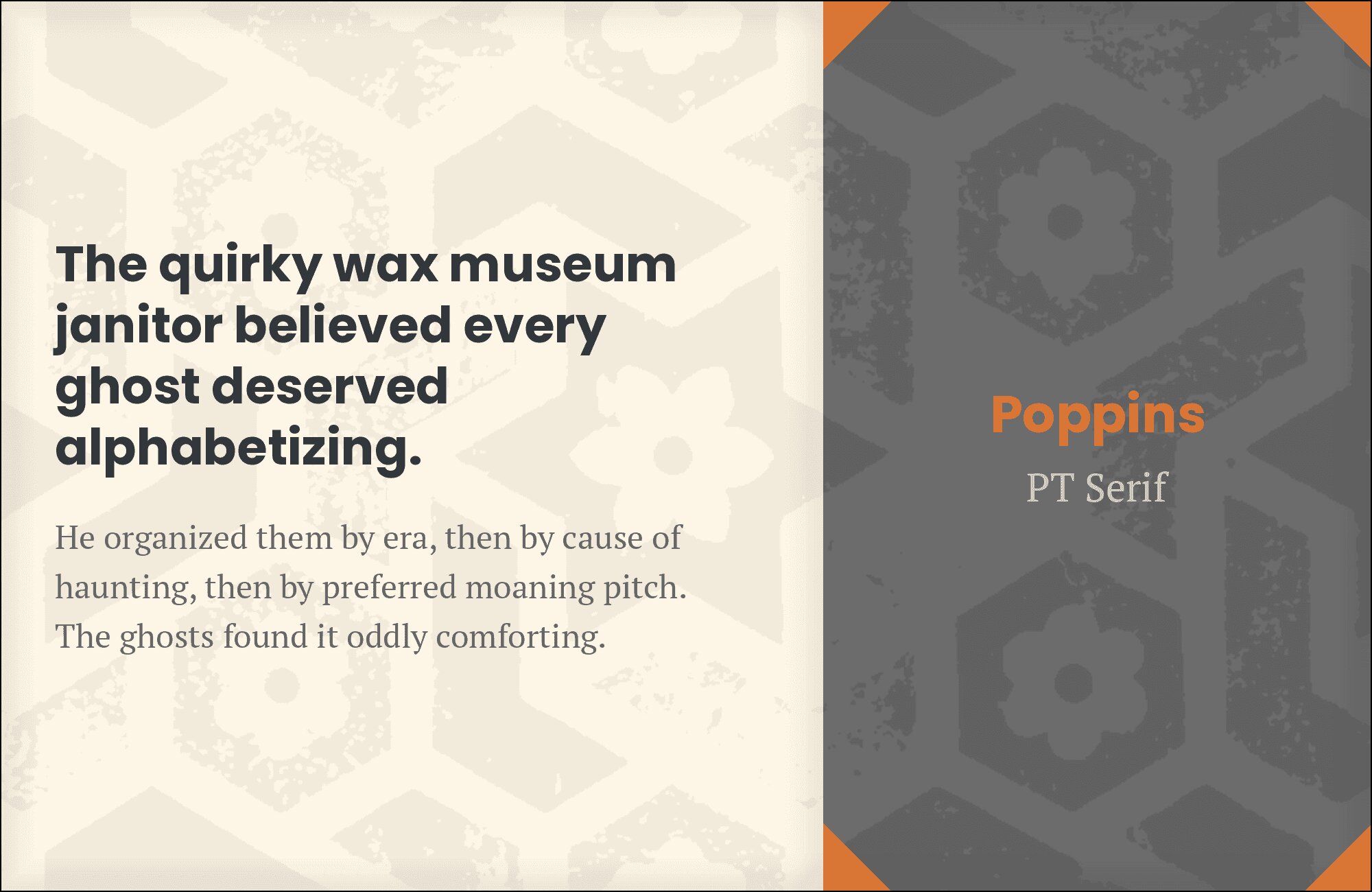
11. PT Serif
Traditional warmth meets geometric clarity. PT Serif‘s humanist serifs add scholarly weight to headlines that Poppins’ friendly circles balance in body text. The combination works for academic sites, cultural publications, and designs needing broad character support. Both fonts handle multilingual content gracefully.
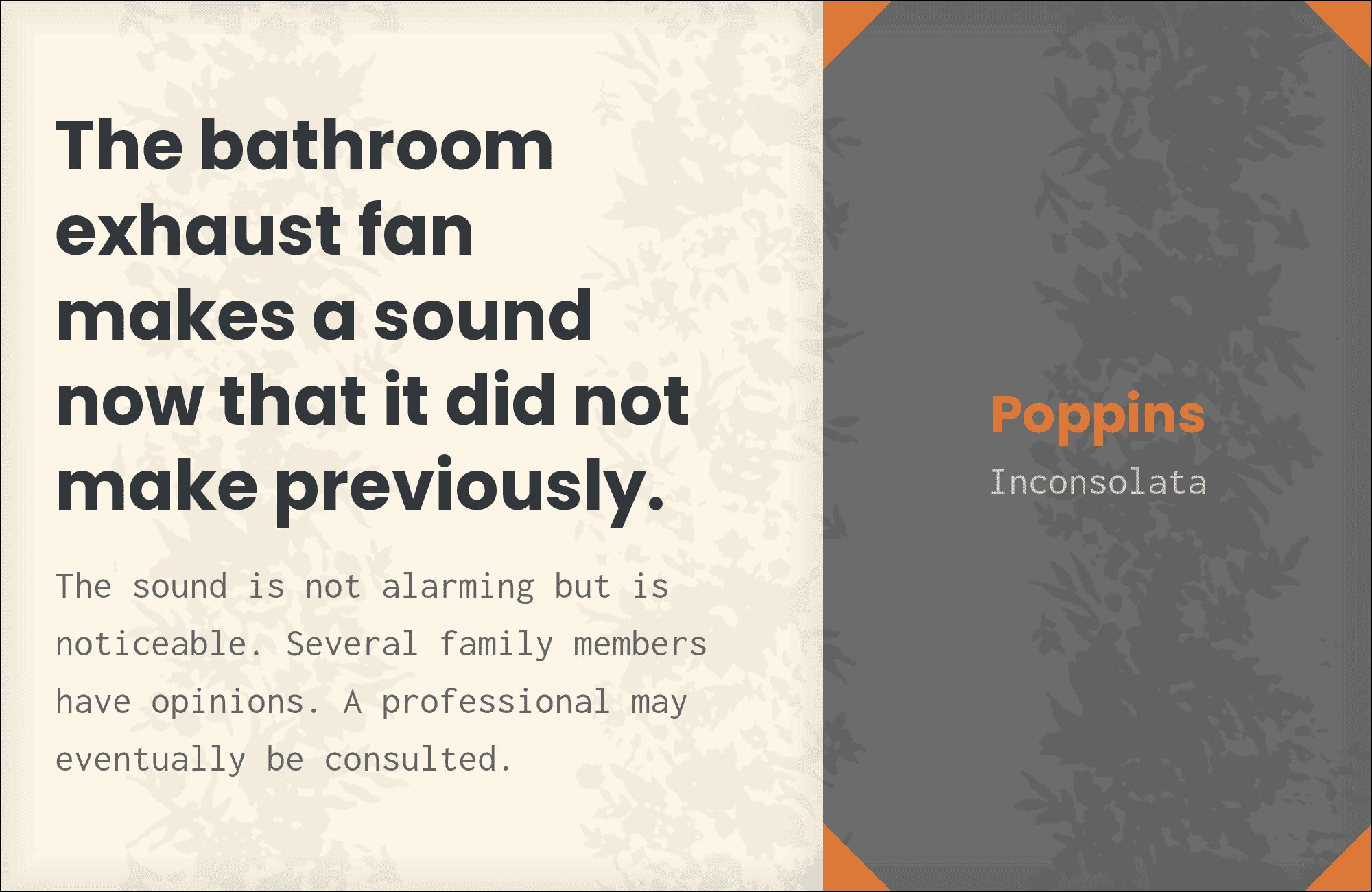
12. Inconsolata
Monospace precision adds technical character to geometric warmth. Inconsolata‘s developer-friendly forms contrast with Poppins’ consumer-friendly circles for documentation, code-focused content, and tech products. Use Inconsolata for code blocks and technical details while Poppins handles human-readable copy. Nerd-friendly yet accessible.
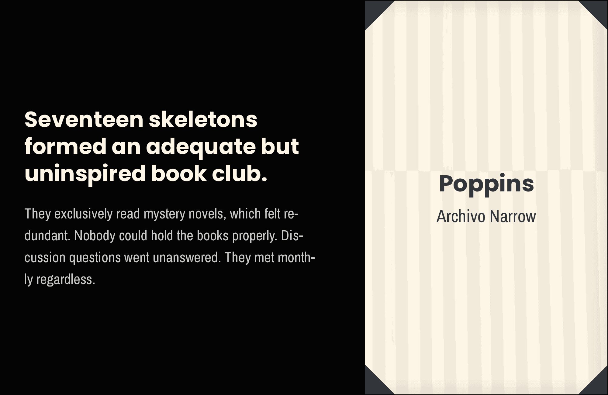
13. Archivo Narrow
Condensed efficiency meets circular openness. Archivo Narrow‘s compressed letterforms pack information densely in headlines while Poppins’ generous proportions give body text room to breathe. The pairing works for data-heavy dashboards, news sites, and layouts where space efficiency matters. Narrow headlines, readable body.
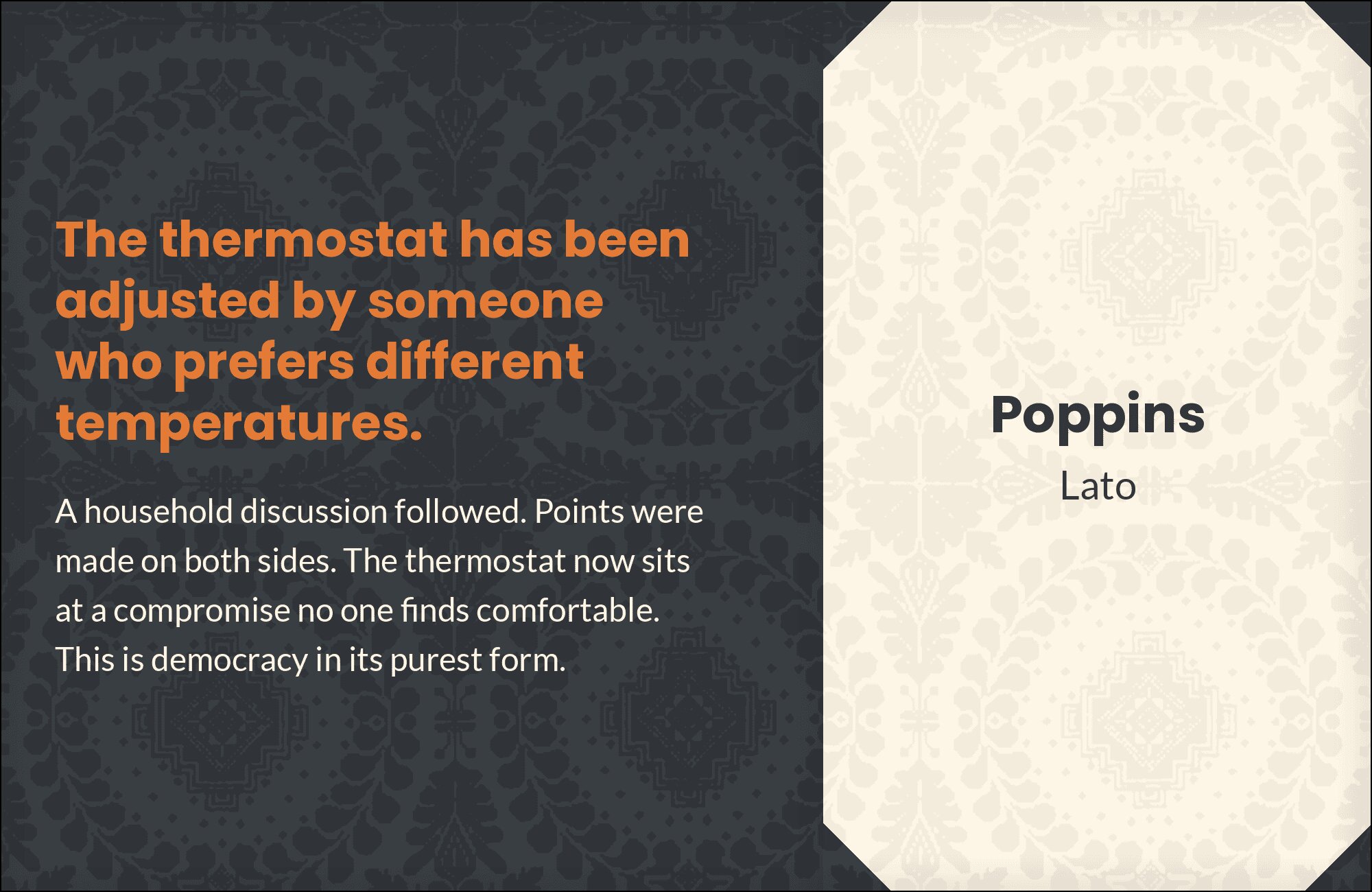
14. Lato
Geometric cousins with complementary warmth. Lato‘s semi-rounded terminals add humanist softness that Poppins’ stricter geometry lacks. The combination feels cohesive yet interesting, working for creative agencies, lifestyle brands, and consumer products wanting approachable professionalism. Both fonts offer extensive weight ranges for nuanced hierarchy.
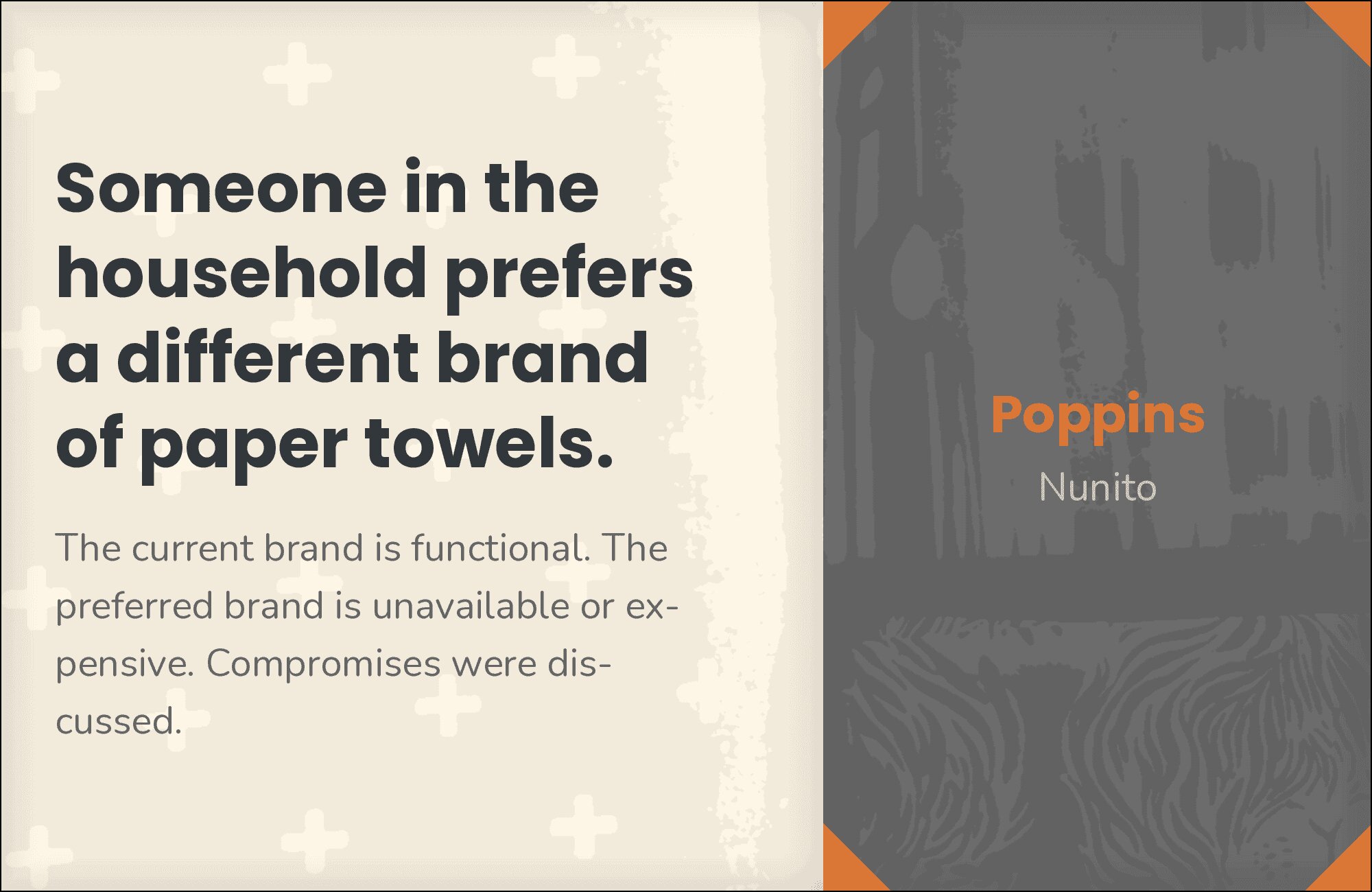
15. Nunito
Rounded terminals harmonize with circular geometry. Nunito‘s soft edges complement Poppins’ friendly circles for layouts that feel warm and inviting. The pairing excels in children’s education, wellness brands, and consumer apps where approachability matters. Similar proportions ensure visual unity while subtle differences prevent blandness.

Conclusion
There are no absolute rules for font pairing, just principles to guide you. The key is contrast—in weight, in style (serif vs. sans-serif), or in personality. Poppins is versatile enough to play well with many different typefaces.
Trust your eye, experiment freely, and remember that the best pairing is the one that serves your content and audience. Typography should enhance communication, not complicate it.