
Archivo pairs great with Lora, Roboto and Times New Roman. All 15 pairings are shown below in real rendered specimens, with the reason each one works.
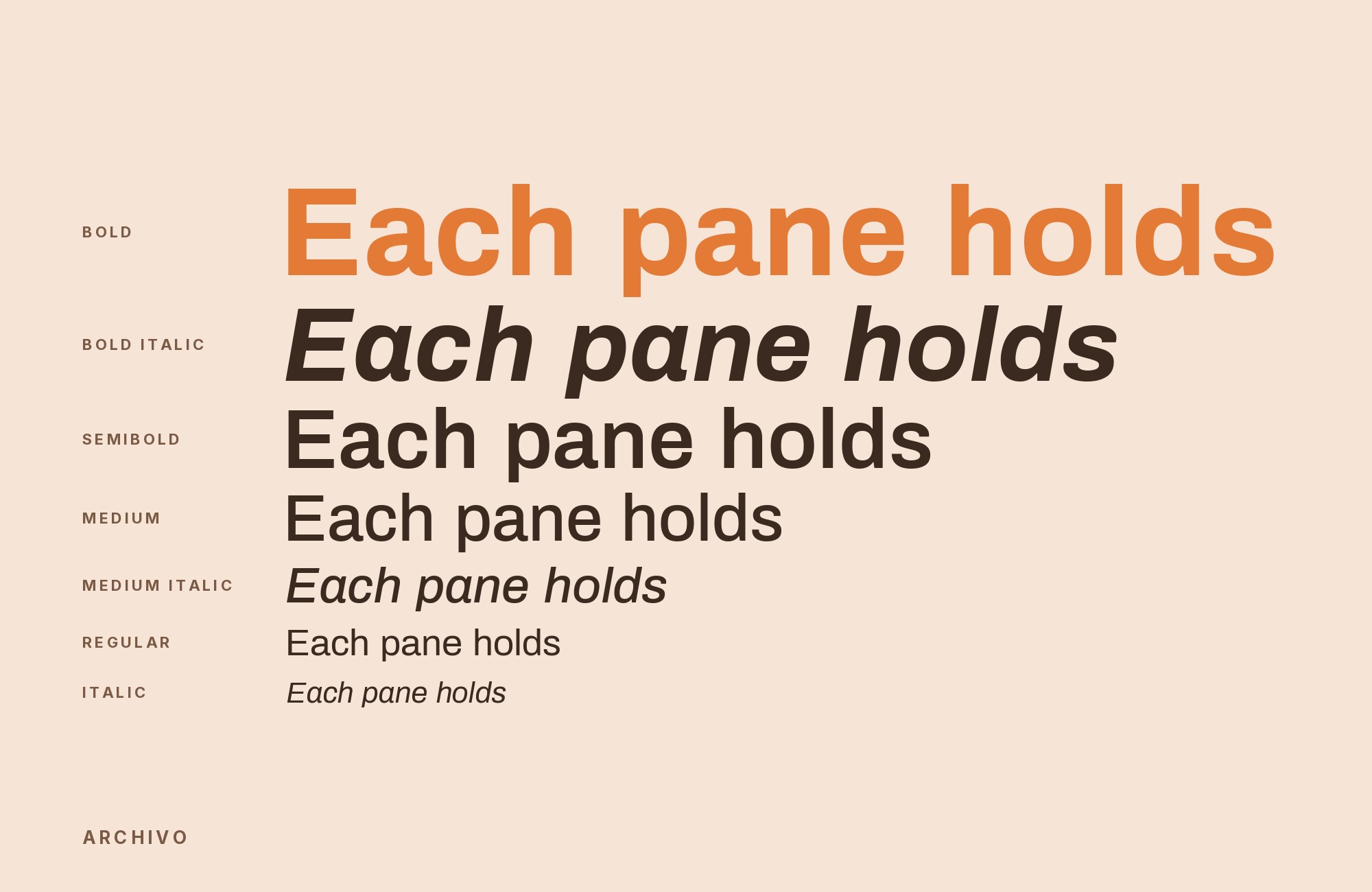
What fonts go with Archivo? The useful answer starts with a correction: Archivo is not the condensed face most people picture. Archivo Narrow and Archivo Black are siblings, not the same font, and the plain-width Archivo is a different pairing problem — a sober workhorse grotesque that will sit under a partner as readily as it sits over one.
Héctor Gatti and the Omnibus-Type team in Argentina released Archivo in 2012, deriving its first styles, Archivo Narrow and Archivo Black, from their earlier face Chivo by charting exact proportions between height and width, then re-cutting b, g, q, r, E, F, L, Q and R as the family grew. The letterforms are low-contrast with a large x-height, and the defining details are flat, sharp terminals over a uniform stroke width — the combination that lets it hold texture at caption sizes and still land hard at poster sizes. Sources disagree slightly on its class: Google Fonts calls it a grotesque reminiscent of late-nineteenth-century American types, while the foundry’s own notes call it a neo-grotesque and name Akzidenz-Grotesk, Venus and Helvetica as ancestors. A 2021 rebuild turned it into a variable family with weight and width axes running from Thin to Black and ExtraCondensed to Expanded.
That breadth is what makes Archivo awkward to pair casually and rewarding to pair deliberately. Because it covers so much range on its own, the mistake is reaching for a second sans that overlaps it. The pairings below come from three kinds of evidence: the foundry’s own prescription for serial publications, curated recommendations from typography editors, and documented co-usage in shipped brand systems, magazines and websites. Here are 15 fonts that pair well with Archivo.
1. Lora

The Cyreal studio designed Lora and released it through Google Fonts in 2011 as a contemporary text serif with roots in calligraphy, built around moderate stroke contrast and what its designers describe as brushed curves running into driving serifs. That gestural quality is precisely the thing Archivo removes on purpose — flat terminals and even strokes leave no trace of a written hand. Lora restores it without introducing the fussiness of a formal book serif, and because it was optimized for screen rendering it holds its color at the same sizes Archivo’s lighter weights occupy. This is the strongest-supported pair on the list: Typewolf publishes exactly one suggested partner for Archivo and it is Lora, and a retrospective exhibition catalog has shipped the combination in print. Set Lora for body copy and long-form paragraphs, and keep Archivo for headings, decks and navigation. Match apparent size by eye: Lora’s moderate contrast will look darker than Archivo Light at the same pixel size, so drop the serif a point or raise the sans a weight until the column and the headline share one grey.

Don't start with a blank page. Shutterstock Unlimited: endless downloads of premium human-made assets plus powerful AI tools.
Sign Up2. Roboto

Christian Robertson designed Roboto in-house at Google and shipped it in 2011 as Android’s system typeface, built on a mechanical neo-grotesque skeleton with unusually open, friction-free curves. Archivo and Roboto are close cousins by class, which is why the pairing needs a role split rather than a style contrast to justify itself: Archivo’s squarer skeleton and flatter terminals give it more graphic weight in the heavier cuts, while Roboto’s softened curves make it recede faster at small sizes. Use Archivo for display lines and section headings, Roboto for interface labels, tables and running text. The combination is not a style-guide hypothetical — it has been measured running live on a production website, and Figma lists Archivo first among its downloadable Roboto pairs. It suits product interfaces and documentation where a neutral register is the requirement.

3. Times New Roman

Stanley Morison directed the design and Victor Lardent drew the letterforms of Times New Roman, commissioned by The Times of London and published in 1932 as a transitional serif engineered for dense newsprint columns. Everything Archivo suppresses, Times New Roman supplies: bracketed serifs, real stroke modulation, and a narrower set width that packs more words into a measure. That makes it an efficient body partner rather than merely a contrasting one, and two separate documented productions, a Latin American photobook review and a zine about a trip to Paris, use both typefaces. Its ubiquity is a feature here, because Archivo’s own neutrality means the pairing never reads as two competing personalities. Set Times New Roman at reading sizes with generous leading, and let Archivo handle every display and labeling role above it.

4. Arial

Robin Nicholas and Patricia Saunders designed Arial at Monotype in 1982; in 1992 Microsoft made it one of the four core TrueType fonts in Windows 3.1, which is why it now sits on nearly every machine in use. Its value beside Archivo is structural insurance rather than aesthetics. Arial carries similar proportions and a comparable x-height, so substituting it where Archivo cannot be embedded — Office documents, email templates, plain-text systems — barely shifts line breaks or copy fit. Fonts In Use lists the two together in two real projects, the Gazoline III album campaign and the Nicht nur Mütter waren schwanger project. Treat this as a load-bearing fallback rather than a design decision: define Arial in the font stack beneath Archivo, and specify it explicitly for anything that leaves the design system.

Turn your ideas into repeatable creative workflows - no code required. Create with ready-made templates and AI-powered tools in Picsart Flow.
See details5. Rosario

Rosario is the rare pairing named by the people who drew the primary font. Héctor Gatti — Archivo’s own designer — developed Rosario privately from 2003 and released it through Omnibus-Type as a sans of classic proportions with subtle contrast and softly weakened stroke endings, aimed at magazines and academic journals. The foundry’s published notes state the intention directly: Archivo for headlines, short snippets and pull quotes in serial publications, with body text set in a face like Rosario. Because both come from one hand and one house, their spacing conventions and vertical proportions already agree, which removes most of the tuning work a cross-foundry pair demands. Rosario’s weaker terminals read as quieter than Archivo’s sharp, flat cuts at the same size, so the hierarchy holds without a weight jump.

6. Unna

Jorge de Buen designed Unna and named it after his mother’s surname; the face pairs delicate serifs with strong stems to build the vertical texture characteristic of neoclassical type. It is the second body face the foundry names for Archivo, and it makes the sharper argument of the two. Where Rosario keeps the system in one class, Unna’s marked thick-to-thin modulation is the clearest available departure from Archivo’s monolinear strokes, so a page using both reads as a decision rather than a default. The trade-off is fragility: Unna’s fine strokes thin out in reversed type and at small sizes on low-density screens. Use it for editorial body copy and pull quotes in print or on high-resolution displays, with Archivo’s medium and semibold weights holding the headings above.

7. Slabo 27px

Tiro Typeworks leads the Slabo project, a collection of size-specific fonts in which each cut is tuned for exactly the pixel size in its name; Slabo 27px is drawn to be correct at 27 pixels rather than scaled to fit. It is the third face the foundry lists as an Archivo partner. Archivo already covers an enormous optical range through its width and weight axes, so the partner does not need range — it needs to be exactly right at one size. The slab serifs also give the text block a horizontal emphasis that Archivo’s flat terminals echo rather than fight. Use it for fixed-size layouts, advertising units and templated web modules where the type size genuinely does not change.

8. Inter

Rasmus Andersson designed Inter and released it in 2017 with one goal: disappear at small sizes on a screen. Its tall x-height, open apertures and near-mechanical forms were tuned for UI legibility, which is a narrower and more disciplined job than Archivo’s all-terrain brief. That difference in ambition is what makes the pair work rather than collide. Archivo’s heavier cuts and squarer skeleton give marketing headlines and wordmarks their graphic edge, while Inter absorbs buttons, labels, form fields and dense running text without ever competing for attention. A documented brand system, Phantm, sets Archivo Narrow for upper case and Inter for body text. Reach for this combination on software products and dashboards, where a distinctive brand voice has to coexist with interface text that must not be distinctive at all.

Try Semrush free. No credit card.
Start on the $0 plan. Paid plans from $117/mo billed annually.
Try for free9. Poppins

The Indian Type Foundry developed Poppins with Jonny Pinhorn, building both its Latin and Devanagari forms from pure geometry — circles above all — with nearly monolinear strokes and optical corrections only where joints demand them. The pairing of two sans faces works because the construction logic is genuinely opposite: Poppins is compass-drawn and circular, Archivo is squared, gothic and derived from nineteenth-century American models. Nothing about their skeletons overlaps, so a reader registers two distinct voices rather than one font rendering inconsistently. A curated Site of the Day has shipped the combination alongside a serif third. Use Poppins for large, friendly display lines and Archivo for everything structural beneath them — or invert it, since Archivo’s Black weights outgun Poppins at poster scale.

10. DM Serif Display

Colophon Foundry drew DM Serif Display for Google, starting from the Latin portion of Adobe’s Source Serif Pro and pushing it into a high-contrast transitional face with delicate serifs and fine detailing built specifically for super-sized settings. That specialization inverts the usual arrangement: instead of Archivo holding the headline, the serif takes it and Archivo drops into the working role beneath. A furniture brand’s website, Kook, uses the two together. The reason it holds is that DM Serif Display has almost no small-size utility — its hairlines vanish — so there is no ambiguity about which face does what. Reserve it for hero lines, chapter openers and product names at genuinely large sizes, and let Archivo carry navigation, specifications, body copy and anything that must survive at fourteen pixels.

11. Crimson Text

Fonts In Use records Archivo with Crimson (Crimson Text) in Triple Canopy issue 23. Crimson Text gives long reading a bookish, modulated texture, while Archivo supplies a firmer grotesque layer for headings, navigation, and captions. Let the serif own paragraphs or an extended introduction and keep Archivo on the structural elements around it. The contrast is strongest when Crimson Text has a generous line height and Archivo uses a medium or semibold weight. Avoid squeezing the serif into the same compact measure as a display grotesque. This pairing fits journals, criticism, research publications, and museum work where the body should feel literary but the overall system still needs a contemporary editorial frame.

12. Andale Mono

Fonts In Use documents Archivo with Andale Mono in Sur, a magazine about Latin American photobooks. The fixed-width face creates an annotation register beside Archivo’s proportional grotesque: ideal for folios, catalog numbers, dates, captions, and small technical notes. Keep Archivo on titles and readable prose, then use Andale Mono in short, repeating fragments. A mono paragraph will dominate the texture and slow the page, while a tracked label gives the editorial grid a useful mechanical edge. Match weight rather than width, since the mono naturally occupies more horizontal room. The combination works for archives, catalogs, photography, and data-rich publishing where metadata should remain visible without competing with the main narrative.

13. DM Sans

The Ginger Rudolph identity documented by Fonts In Use combines Archivo with DM Sans and DM Mono. Archivo has the sharper late-nineteenth-century display bite; DM Sans offers a smoother, low-contrast geometric surface for supporting copy and interface elements. Use Archivo for the name, campaign line, or section title and DM Sans for biographies, navigation, and contact details. Because both are sans serifs with large lowercase forms, the pairing needs a visible change in size or width to avoid looking like an accidental substitution. Keep DM Sans regular and let Archivo carry more weight. This pairing fits personal identities, studios, and contemporary cultural brands that need contrast without moving into a serif voice.

14. IBM Plex Mono

Applied Labs’ brand guide sets display and body in Archivo, then reserves IBM Plex Mono for small tracked labels inside cards. That narrow assignment is the pairing’s strength. Archivo keeps the main voice coherent across headings and paragraphs; the mono signals workflow state, metadata, or machine-generated information. Use IBM Plex Mono in uppercase sparingly, with enough tracking to prevent its fixed-width cells from becoming a dark strip. It should never compete for a headline. The contrast comes from spacing and function rather than a large style change. This combination suits operations software, dashboards, technical services, and documentation systems where readers need to distinguish narrative copy from status, identifiers, and structured data at a glance.

15. Roboto Mono

Rokt’s typography guidelines use Archivo throughout headlines and body copy, with Roboto Mono for notations, eyebrow treatments, and code snippets. Archivo therefore remains the recognizable brand voice while the mono marks information that behaves differently. Set Roboto Mono small and tracked for labels or at a comfortable coding size for short examples; keep long explanations in Archivo. The fixed-width texture is strong enough that extra weight is rarely necessary. A regular mono under a semibold Archivo heading usually creates the cleanest hierarchy. This pairing works for commerce platforms, developer products, analytics, and technical brands that want a single proportional family for ordinary communication plus an unmistakable register for data and code.

Conclusion
Archivo rewards a partner chosen for a specific job rather than a general mood, because the font itself has no strong mood to match. Its flat terminals, uniform strokes and enormous variable range make it capable in almost any slot, which means the real decision is what the second face contributes that Archivo structurally cannot. Three answers recur in the documented evidence. Warmth and a written hand come from a serif — Lora, Unna, Times New Roman. Opposite construction logic comes from a geometric sans — Poppins. And pure interface discipline comes from Inter or Roboto, which do one thing better than Archivo does it.
The foundry’s own recommendation deserves more weight than any style guide, and it is unusually specific: Archivo for headlines, short snippets and pull quotes in magazines and serial publications, with the paragraphs set in Rosario, Slabo or Unna. That prescription assumes Archivo is the display voice, but a high-contrast serif like DM Serif Display can take the headline and leave Archivo for everything else. Decide which of those two systems you are building before choosing the partner, because the same combination behaves very differently depending on which font is carrying the reader. Set real copy at the sizes you intend to publish, and check reversed type and small captions — Archivo’s flat terminals survive those jobs; most of the serif partners here do not.
Sources
- Typewolf (Archivo)
- Typewolf (Enid, Site of the Day)
- Typ.io (Archivo)
- Omnibus-Type / Google Fonts Press Series
- Omnibus-Type (Archivo)
- Google Fonts description (google/fonts repo)
- Fonts In Use (Archivo typeface page)
- Fonts In Use (SUR #1)
- Fonts In Use (Gazoline III)
- Fonts In Use (Phantm branding)
- Fonts In Use (Ginger Rudolph identity)
- Fonts In Use (Kook Furniture website)
- Fonts In Use (Raoul Reynolds catalog)
- Fonts In Use (Paris 巴黎 Zine)
- Fonts In Use (Nicht nur Mütter waren schwanger)
- Fonts In Use (Retrogay zine)
- Fonts In Use (Pikante Reunion flyer)
- Fonts In Use (Triple Canopy #23)
- Jukebox Print (Archivo)
- Beautiful Web Type (Archivo)
- Figma (Roboto font pairings)
