Verdana pairs great with Georgia, Tahoma and Trebuchet MS. All 15 pairings are shown below in real rendered specimens, with the reason each one works.
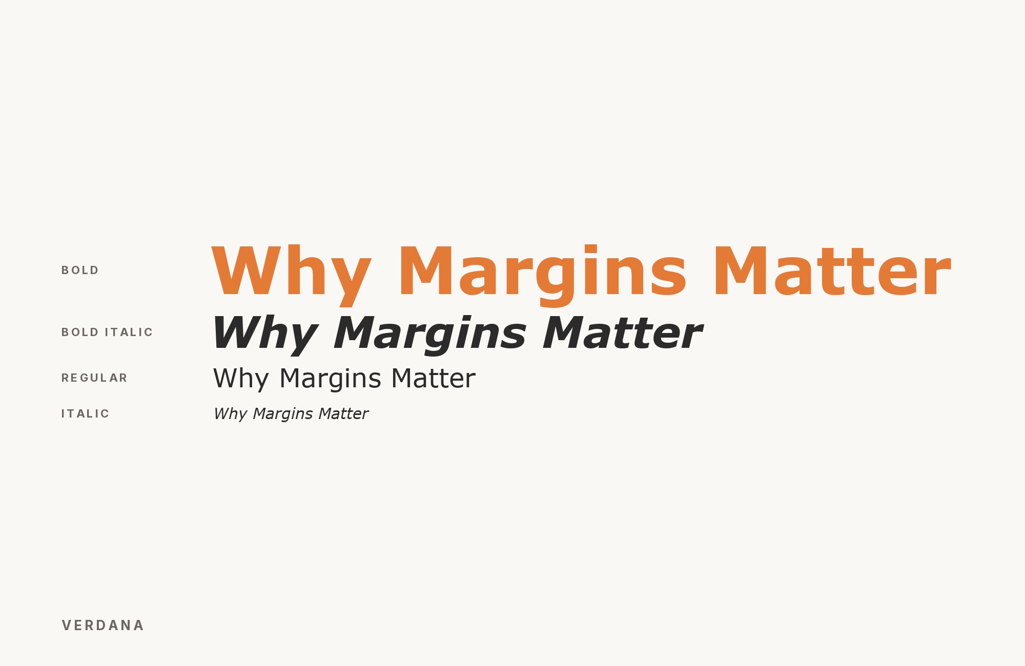
What fonts go with Verdana? Start with the one that was designed alongside it. Verdana was never meant to stand alone: Matthew Carter drew it in 1996 as one half of a pair, and the other half has been sitting on every computer ever since.
Microsoft commissioned Verdana for a specific problem: text on the low-resolution screens of the mid-1990s had to stay legible at small sizes, where most typefaces collapsed into grey smudges. Carter answered with wide letters, a tall x-height, generous spacing and simplified shapes that Tom Rickner then hand-hinted pixel by pixel. The result reads as plain, even utilitarian, and that plainness is the point — every stroke was chosen to survive a bitmap grid, not to express a mood. It ships with nearly every operating system, which makes it one of the few genuinely web-safe fonts left.
That history splits Verdana’s pairings into two families. The first is the matched set: Georgia and Tahoma came out of the same Microsoft project and share its screen-first logic, so pairing them is using the system as designed. The second is contrast: because Verdana is so neutral and so flat, almost any face with real character — a high-contrast serif, a geometric sans, a slab with some weight — reads as a clear second voice above or beside it. Here are 15 fonts that pair well with Verdana, starting with its own family and moving outward.
Turn your ideas into repeatable creative workflows - no code required. Create with ready-made templates and AI-powered tools in Picsart Flow.
See details1. Georgia

Microsoft released Matthew Carter’s Georgia and Verdana in the same year, 1996, for the same brief: legible text on 1996-era screens, one serif and one sans. Pairing them is not a stylistic guess; it is using the two halves of one design project as intended. Georgia’s sturdy bracketed serifs and old-style figures give headlines and pull quotes a print-like warmth, while Verdana carries body copy, captions and interface text with the same generous x-height and open spacing, so the two never fight over rhythm. Both are installed almost everywhere, which makes this the most obtainable serious pairing on the list. Set Georgia for headings at 28px and above and keep Verdana at 15–16px for reading.

2. Tahoma

Adobe Fonts’ own pairing suggestion is to run Verdana in body copy and switch to Tahoma for headlines. The two share a skeleton — Tahoma is essentially Verdana with tighter spacing and narrower proportions — so headings feel related to the body instead of clashing, while the tighter fit gives titles more density at larger sizes. The effect is subtle and workmanlike: nobody will notice the change of face, which is exactly what a corporate or documentation site wants. Use Tahoma Bold for headings and Verdana Regular for text, and the hierarchy holds without any change of voice.

3. Trebuchet MS

Vincent Connare built Trebuchet specifically to give Microsoft a screen font that read differently from Verdana — more humanist curve, less mechanical grid — so the two work as a deliberate texture contrast rather than a coincidence. Trebuchet’s angled terminals and slightly narrower set add a hint of personality that Verdana deliberately avoids, which makes it the better headline face of the two. Both were tuned for the same pixel grids, so they sit at the same apparent size and weight. This is a pairing for anyone who wants a web-safe stack with a little more life than Verdana alone can give.

4. Times New Roman

A classic sans and serif split: Times New Roman’s calligraphic serifs and moderate contrast give body copy or headlines a print-like authority that plays against Verdana’s flat, screen-built strokes. Times is narrow where Verdana is wide, so the contrast in texture is immediate even at small sizes. It reads best with Times carrying long-form text and Verdana reserved for navigation, labels and captions — the roles each was built for. Like Georgia, it is installed everywhere, so nothing needs to be licensed or loaded.

5. Arial

The most-seen real-world combination in live co-usage data: two web-safe sans faces used together for hierarchy rather than contrast, with Verdana in UI labels and Arial in body text, or the reverse. It is a pragmatic, low-friction pairing more than a designed one. Arial’s narrower set and neo-grotesque neutrality make it recede next to Verdana’s wide humanist forms, so the two separate cleanly by role without either one asserting a style. This is the pairing for a form, a dashboard or a government page where obtainability and legibility matter more than character.

6. Bitter

A slab serif with a large x-height and sturdy, low-contrast strokes, built for screen reading, so it holds its own at body-copy sizes next to Verdana’s wide, loose letterforms instead of looking spindly. Bitter’s slabs give headings a solid, editorial weight that Verdana cannot produce on its own, while its screen-first proportions keep the two faces matched in apparent size. Free on Google Fonts, it is the easiest way to add a serif with real presence to a Verdana page without reaching for a print face.

7. Enriqueta

A Google Fonts slab serif drawn for the grid of silkscreen printing, Enriqueta suits pixel screens and echoes Verdana’s screen-legibility bias while still reading as a distinct serif voice for headings. It is softer than Bitter, with rounder shapes and a friendlier tone, which suits editorial and lifestyle layouts where a harder slab would feel industrial. Set it for headings and subheads at 24px and above, and let Verdana handle everything below.

Don't start with a blank page. Shutterstock Unlimited: endless downloads of premium human-made assets plus powerful AI tools.
Sign Up8. Scala

Martin Majoor’s humanist text serif carries long-form body copy with warmth and control, giving a Verdana-headed page a calmer reading typeface than Verdana itself would be at length. Scala was drawn as a serious text face, first for concert programmes and then for FontFont’s library, and its even colour and comfortable rhythm show over several paragraphs in a way Verdana’s wide, evenly spaced letters do not. This pairing reverses the usual roles: Verdana takes the headlines and navigation, where its plainness reads as clarity, and Scala takes the reading. It is a licensed FontFont face, so check obtainability before specifying it.

9. Open Sans

A more refined, narrower humanist sans used as a headline face over Verdana body text — the same sans-serif register, but Open Sans reads as considered where Verdana reads as utilitarian, so headings feel upgraded without breaking a sans-only palette. Steve Matteson drew Open Sans with open forms and neutral proportions that sit comfortably beside Verdana’s wider letters. Because both are humanist and both are neutral, the pairing is quiet; its value is that it lets a page stay all-sans while still signalling which text is the heading.

10. Merriweather

A sturdy, slab-leaning serif built for screens, so it survives next to Verdana’s screen-tuned proportions instead of looking like a print font dropped onto a web page. Sorkin Type designed Merriweather with a tall x-height and slightly condensed letterforms, which makes it a natural headline companion for editorial and portfolio sites — the use the research specifically calls out. It pairs equally well the other way round, carrying body text under Verdana headings, because its weight and colour match Verdana’s at reading sizes.

Still Googling UX terms?
Stop. They're all right here.
50 terms. Illustrated.
So simple your cat gets it.
Print & ePub on Amazon
11. Montserrat

A geometric sans headline face that trades Verdana’s wide, humanist warmth for crisp, uniform geometry — enough of a shape shift to separate heading from body while staying in the same weight range. Montserrat’s circular bowls and even strokes read as modern and deliberate above Verdana’s plain text, and the two share a generous width that keeps them visually related. Use Montserrat Bold or SemiBold for headings; at regular weight and small sizes it starts to compete with Verdana rather than sit above it.

12. Playfair Display

High-contrast, sharply bracketed serifs give Verdana’s flat monoline strokes something dramatic to sit under — a display and body split rather than a quiet one. Playfair’s thin hairlines and heavy verticals are everything Verdana is not, which is why the pairing works: there is no ambiguity about which face is the headline. Keep Playfair at display sizes where its hairlines hold, and let Verdana do all the reading. This is the pairing for a magazine-style feature or a landing page that wants a touch of formality without giving up web-safe body text.

13. Futura

Geometric circle-and-triangle construction reads as a completely different sans logic from Verdana’s grid-built humanism, so headline and body stay visually separate even though both are sans faces. Paul Renner’s Futura brings a clean, modernist authority to headings that Verdana’s practical shapes never attempt, and the co-usage data confirms the two appear together on live sites. Futura’s small x-height means it needs to be set noticeably larger than Verdana to look equal in size; plan for that gap in the type scale.

14. Alegreya

Alegreya’s calligraphic, humanist curves and dynamic rhythm were drawn for literary reading — a serif with real editorial warmth that contrasts against Verdana’s flat, screen-built strokes. Juan Pablo del Peral designed it for long-form text, and it rewards being used that way: give it body copy or pull quotes at reading length, where its character has room to show, and let Verdana handle the functional text around it. Free on Google Fonts, it is the most expressive serif on this list and the one to reach for when a page needs to feel written rather than assembled.

15. ITC Franklin Gothic

Documented in Fonts In Use’s teardown of whitehouse.gov’s typography history: a grotesque with real personality and heft, used as the display counterpart to Verdana’s neutral body text across the site’s early-2000s design. Franklin Gothic’s dark, confident weight gives headlines the authority Verdana lacks, while its American grotesque character keeps the pairing plainspoken rather than decorative. Set it in the heavier weights for headings and keep Verdana for everything else, and the hierarchy is unmistakable.

Conclusion
Verdana is the rare typeface with a correct answer built in. Georgia and Tahoma were designed beside it, for the same screens and the same constraints, and either one makes a pairing that needs no justification and no licensing. Start there.
Everything else on this list is a contrast play, and it works because Verdana is so deliberately plain: a high-contrast serif like Playfair, a geometric like Futura or Montserrat, a slab like Bitter or Merriweather, each reads as a clear second voice against Verdana’s flat, even texture. Set real copy at the sizes you intend to publish, check the size gap with small-x-height faces like Futura, and judge the pairing on a screen, which is the only place Verdana was ever meant to live.
