PT Serif pairs great with Source Sans Pro, PT Sans and Roboto. All 12 pairings are shown below in real rendered specimens, with the reason each one works.

What fonts go with PT Serif? This transitional serif with humanist touches, designed as part of Russia’s public typography project, combines readability with quiet sophistication that makes pairing both easy and interesting.
PT Serif was designed by Alexandra Korolkova, Olga Umpeleva and Vladimir Yefimov as the serif companion to PT Sans, sharing the same public typography mission of the larger Public Types of the Russian Federation project. However, PT Serif is more than just a serif version of its sans-serif sibling; it’s a transitional serif with humanistic terminals, harmonized with PT Sans across metrics and proportions, and it works beautifully for extended reading. Its transitional structure places it between old-style warmth and modern clarity, a versatile position that allows it to feel both classical and contemporary.
The pairing challenge with PT Serif is choosing whether to leverage its built-in partnership with PT Sans or explore more unexpected combinations. While the PT family works harmoniously together, combining PT Serif with different sans-serifs can create fresher results. Its balanced character means it rarely dominates a pairing, making it an accommodating partner for headline fonts with stronger personalities. Here are 15 fonts that pair well with PT Serif, including both obvious and more adventurous companions.
1. Source Sans Pro
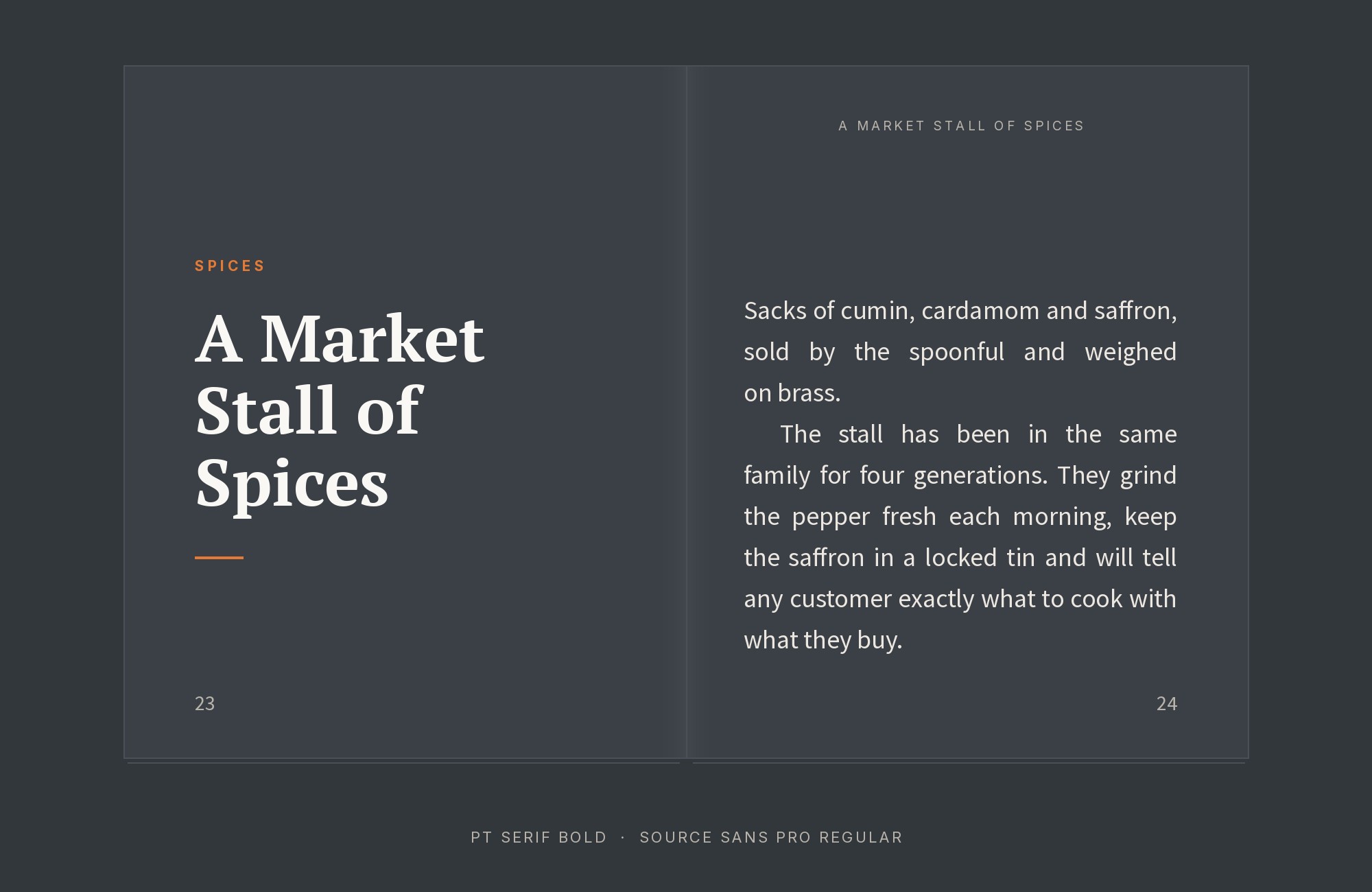
Source Sans Pro‘s utilitarian grace meets PT Serif’s traditional gravitas in a pairing that says ‘we take our content seriously but remain approachable.’ The sans handles UI elements and captions with Adobe’s screen-optimization expertise, while the serif anchors body copy with centuries of typographic credibility. This combination excels in corporate publications, annual reports, and government communications where professionalism and readability share equal weight. Both fonts perform beautifully across screen sizes, making them reliable for responsive designs.
2. PT Sans
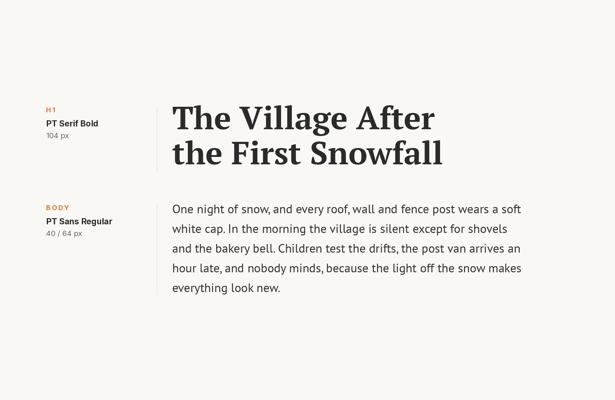
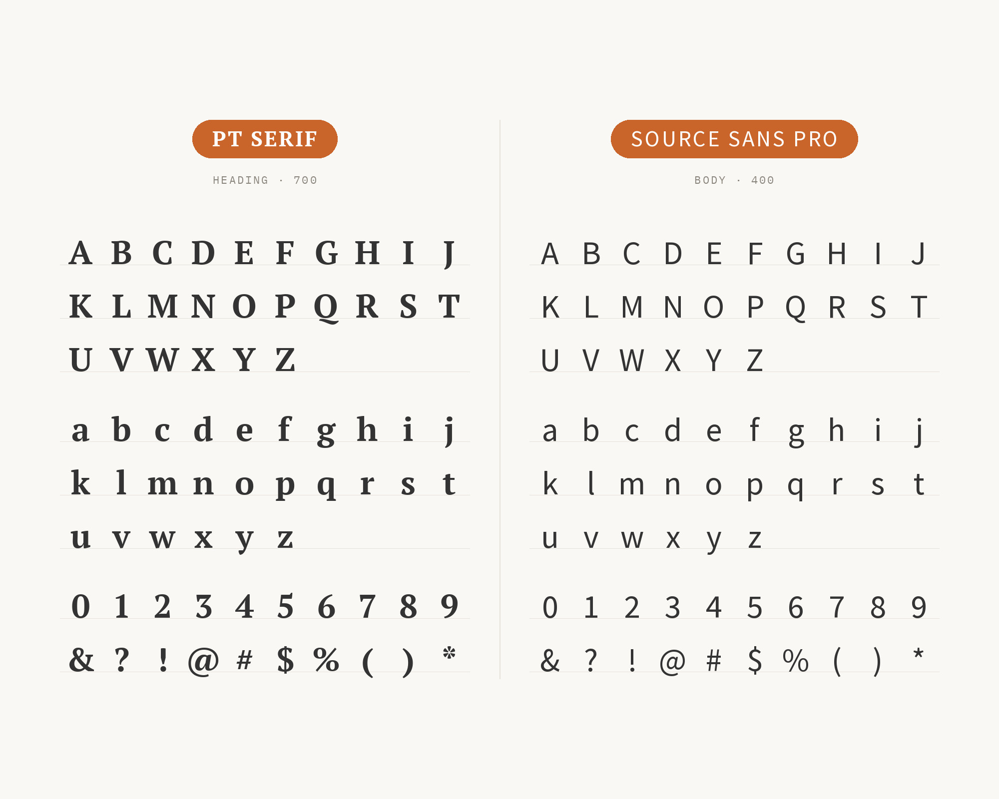
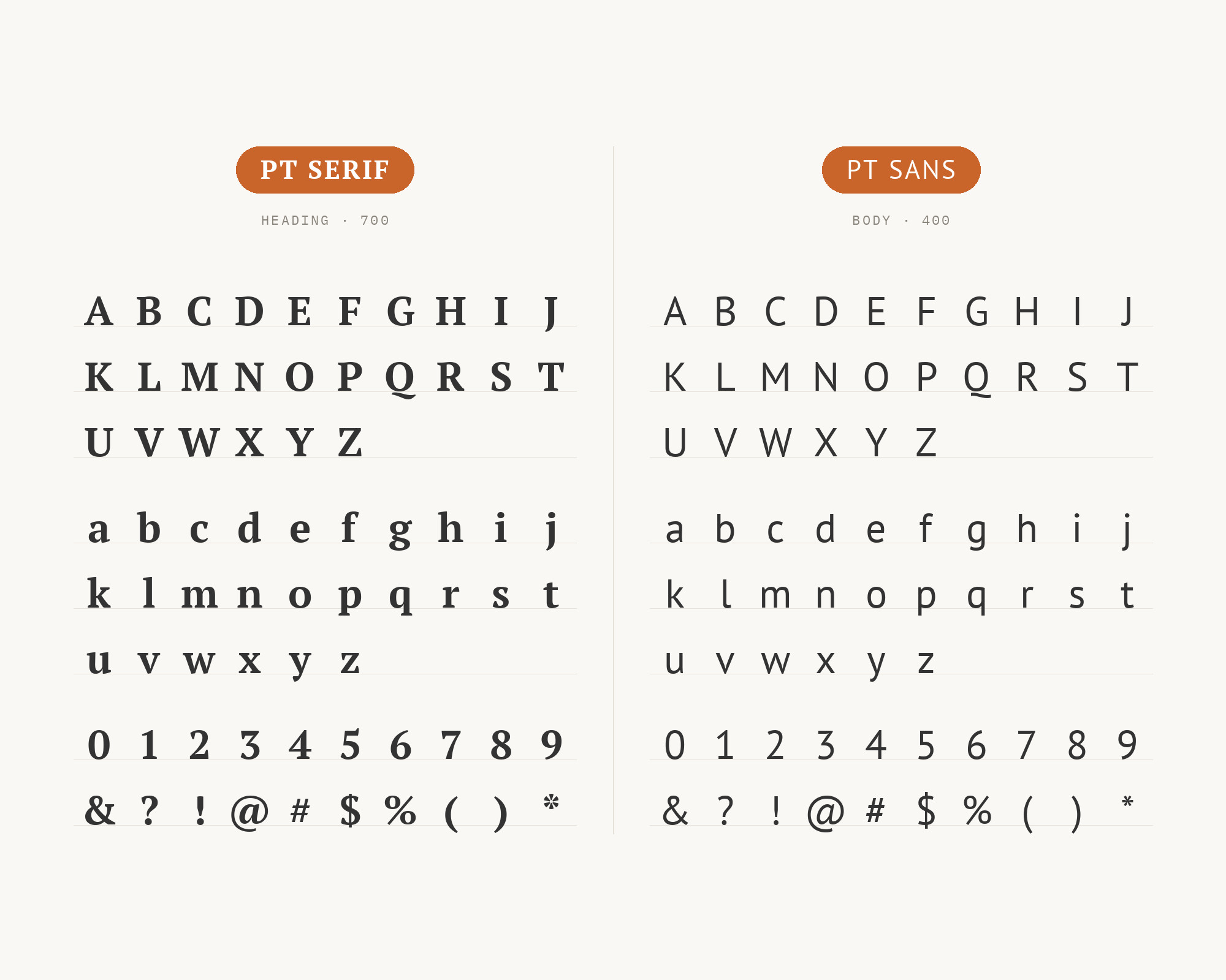
The family pairing that launched a thousand Russian websites. PT Sans and PT Serif share identical proportions, x-heights, and design philosophy, eliminating the guesswork from font pairing. The serif carries body copy with traditional readability while the sans handles headlines, UI elements, and supporting text. This combo was literally designed to work together, making it foolproof for anyone building typographic systems from scratch. The comprehensive Cyrillic coverage makes it essential for projects spanning multiple language communities.
3. Roboto
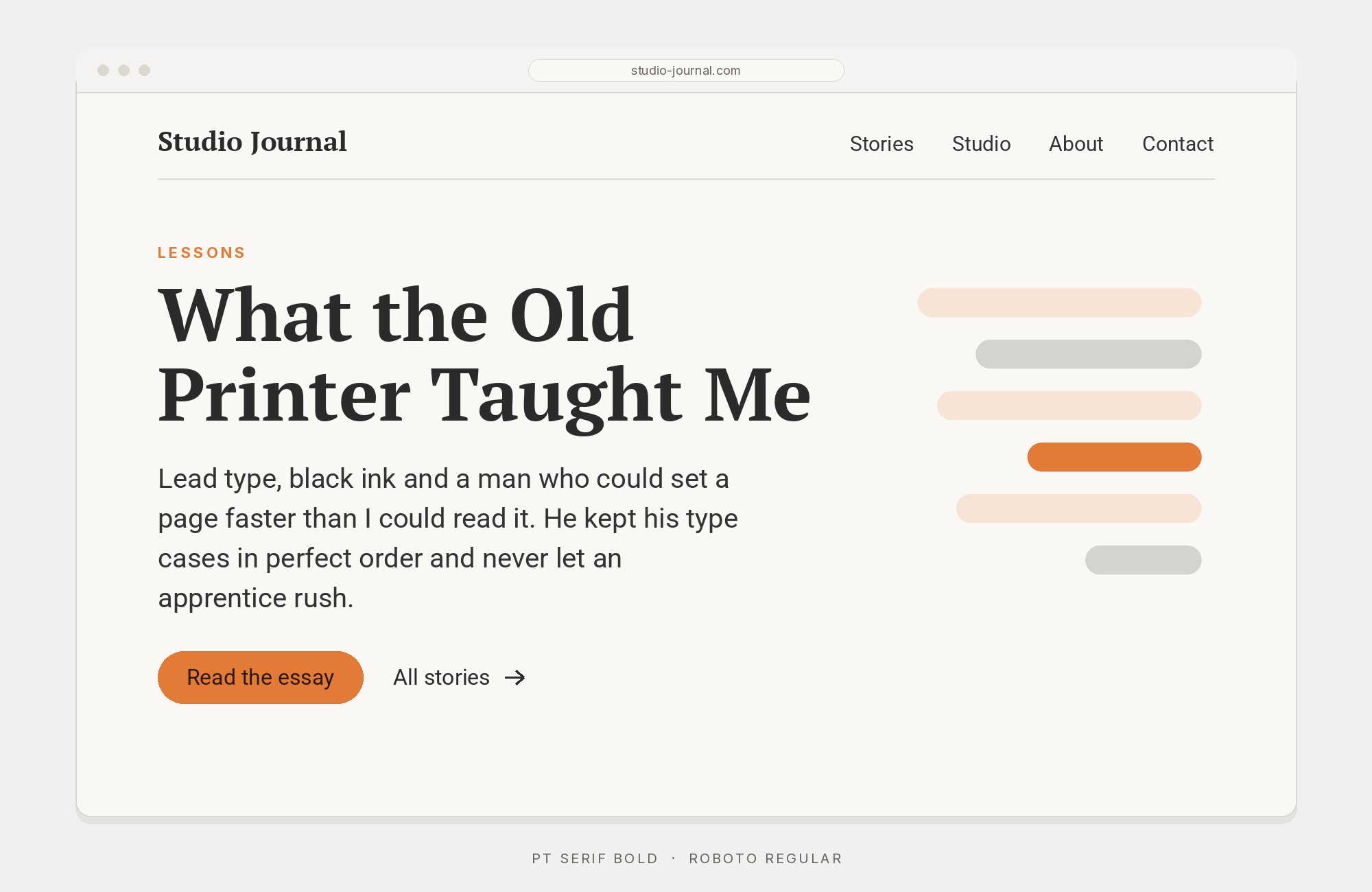
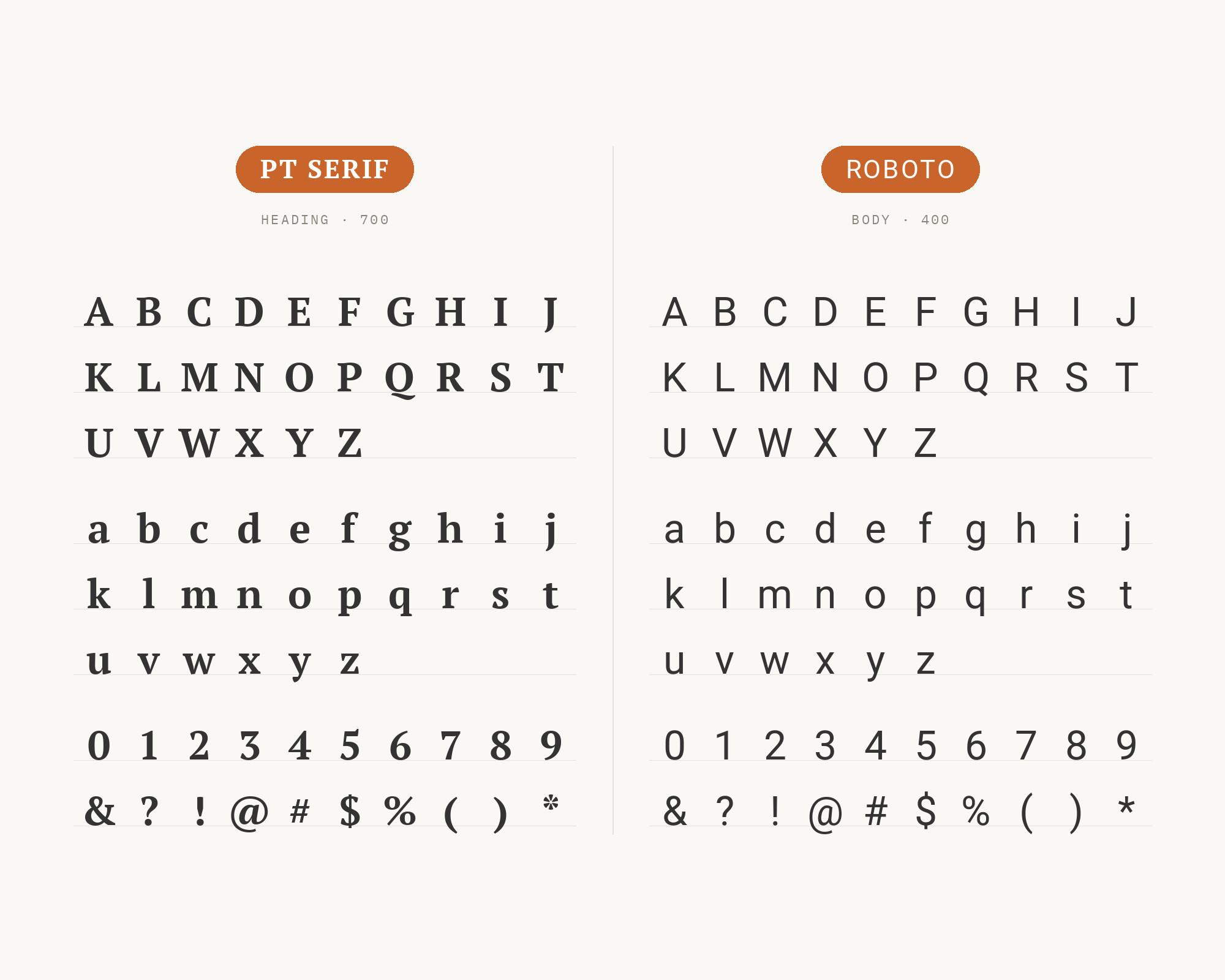
Roboto‘s mechanical precision creates clean headline structures that PT Serif’s organic forms warm up below. Google’s workhorse sans handles navigation, buttons, and display text while PT Serif delivers body copy with old-world readability. This pairing powers countless Material Design implementations that need editorial content sections. The contrast between Roboto’s geometric underpinnings and PT Serif’s traditional proportions creates visual interest without conflict. Both fonts excel at screen rendering, making them natural partners for digital-first publications.
Try Semrush free. No credit card.
Start on the $0 plan. Paid plans from $117/mo billed annually.
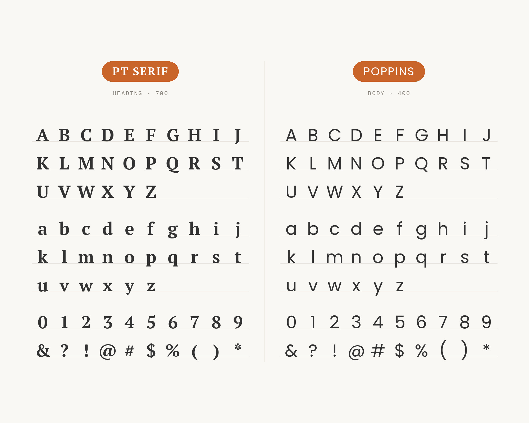
Try for free4. Poppins
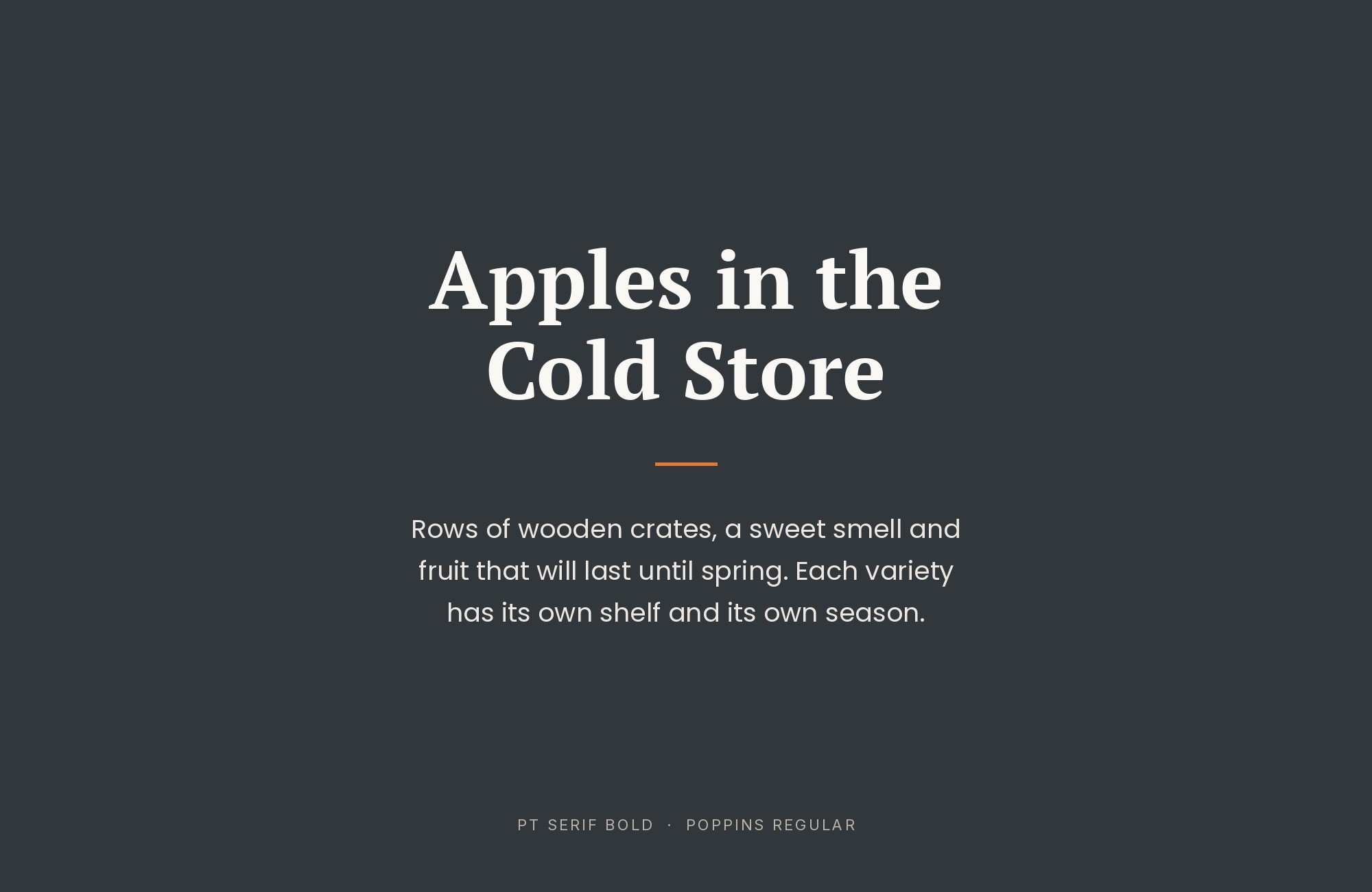
Poppins bounces into headlines with its perfectly circular bowls and geometric enthusiasm while PT Serif holds the body copy steady with traditional authority. The contrast couldn’t be more pronounced: pure geometry against centuries-old serif conventions. This pairing works for brands targeting younger audiences without alienating readers who expect typographic seriousness. The similar x-heights maintain cohesion despite the stylistic gap. Use Poppins for headings and calls-to-action while PT Serif handles anything requiring sustained attention.
5. Montserrat
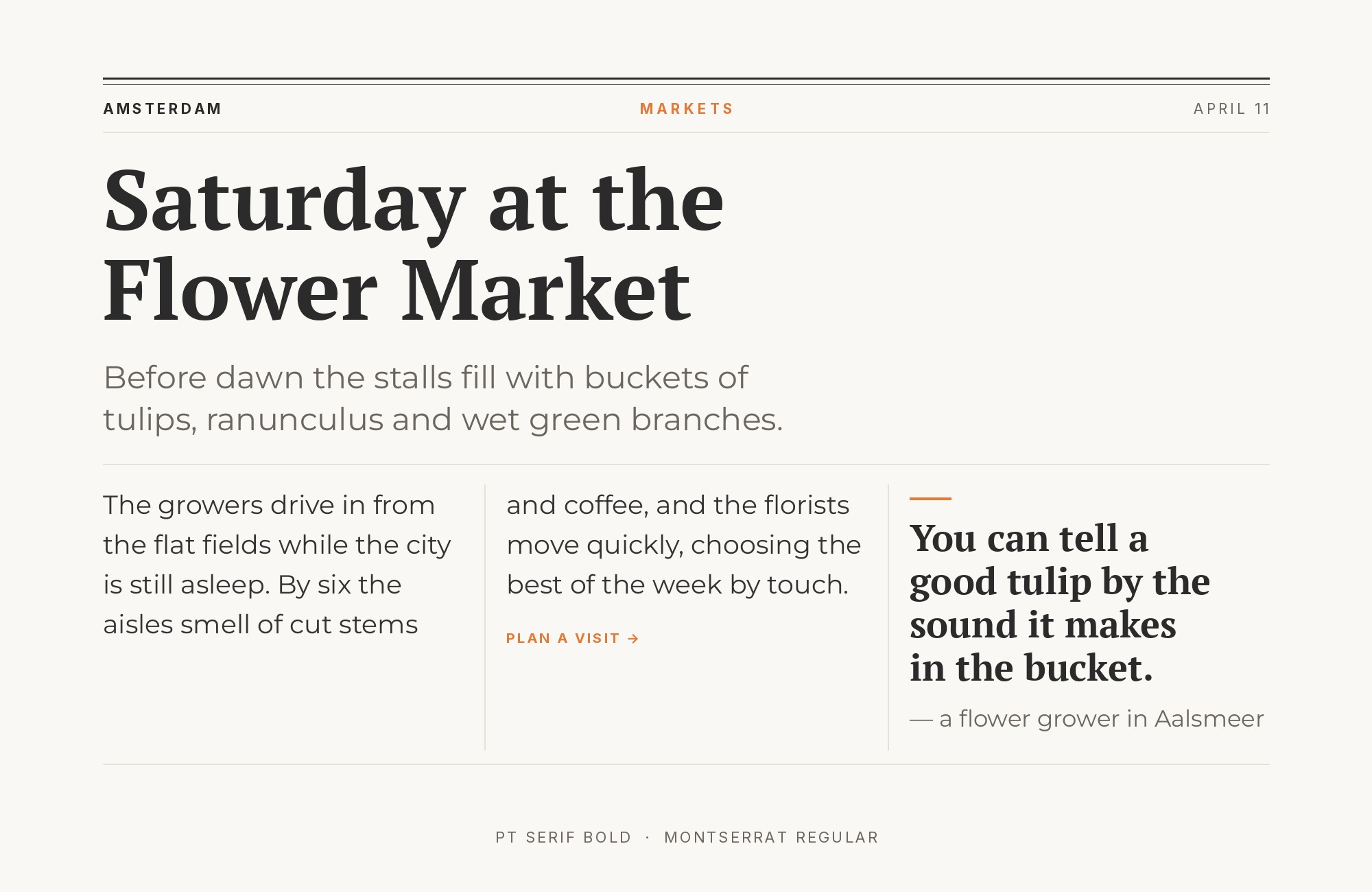
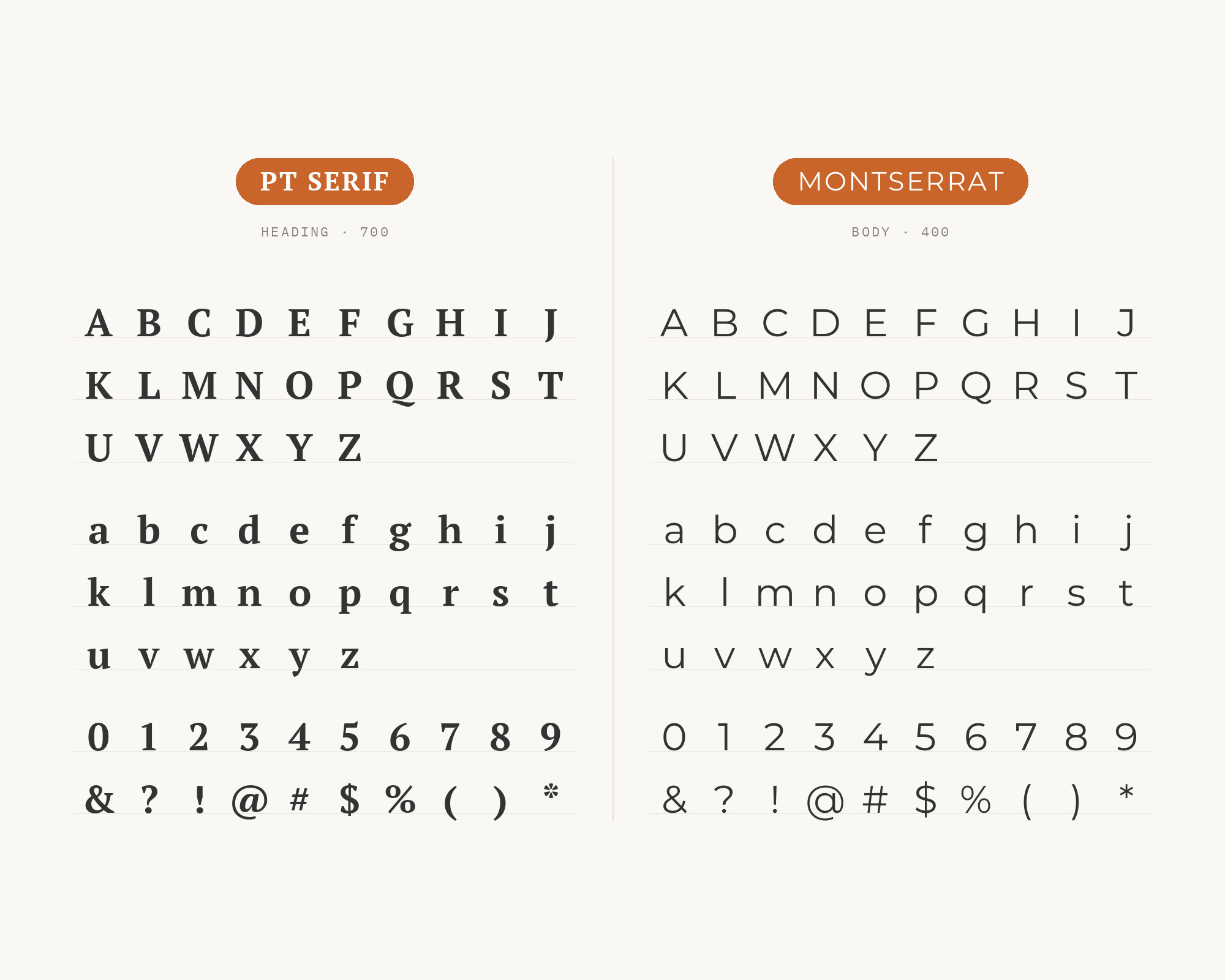
Montserrat‘s urban geometry meets PT Serif’s scholarly tradition in a pairing that bridges Buenos Aires street signs and St. Petersburg libraries. The geometric sans brings headline punch while the serif delivers body copy with European refinement. This combination suits fashion editorials, cultural magazines, and brands navigating between contemporary and classical positioning. Montserrat’s extensive weight range provides headline flexibility while PT Serif maintains consistent reading experience across extended text.
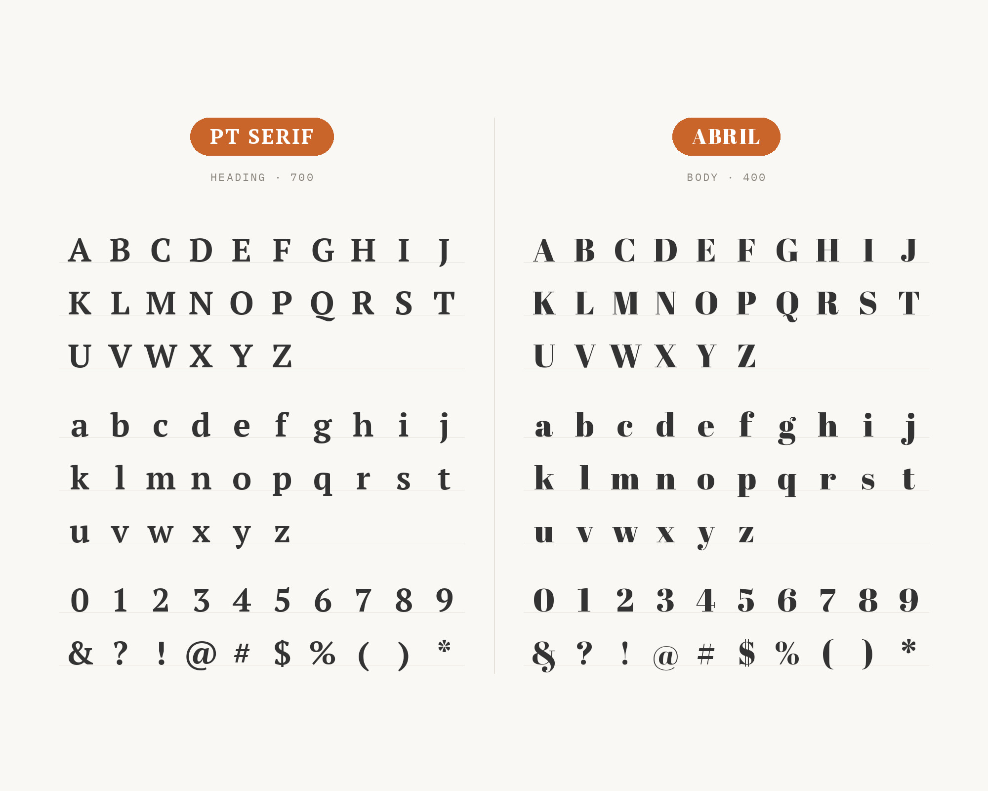
6. Abril
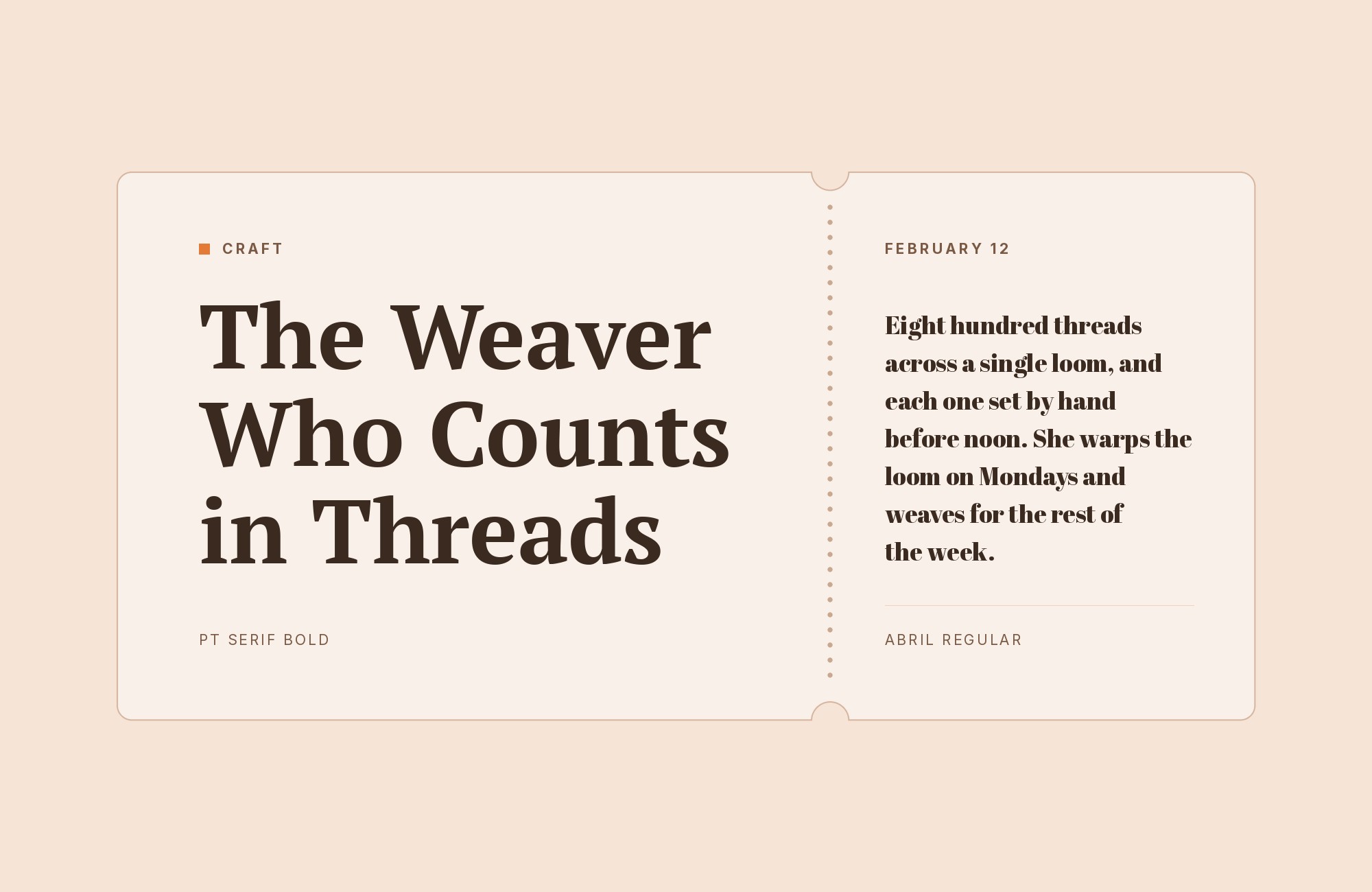
Abril and PT Serif share serif DNA but express it differently: Abril’s Didone-influenced display forms create dramatic headlines while PT Serif’s more understated proportions handle body copy duties. Both fonts speak the same typographic language but in different registers. This pairing excels in magazine layouts, book design, and editorial contexts where you want serif-on-serif sophistication without monotony. The high contrast in Abril’s display weights creates the visual differentiation this all-serif approach requires.
Build free, plus 500 AI credits.
Design and publish a site at no cost. Paid plans double your credits the first month.
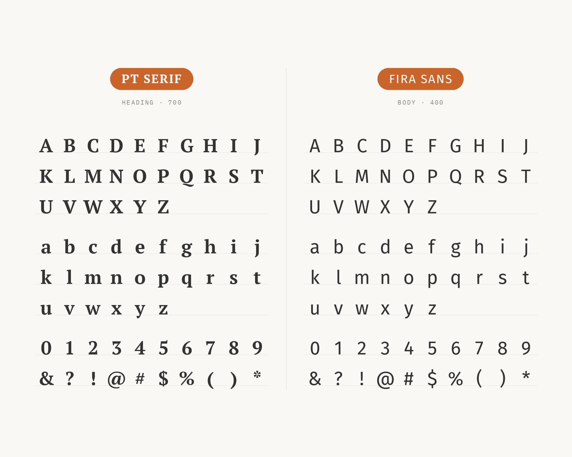
Start free7. Fira Sans
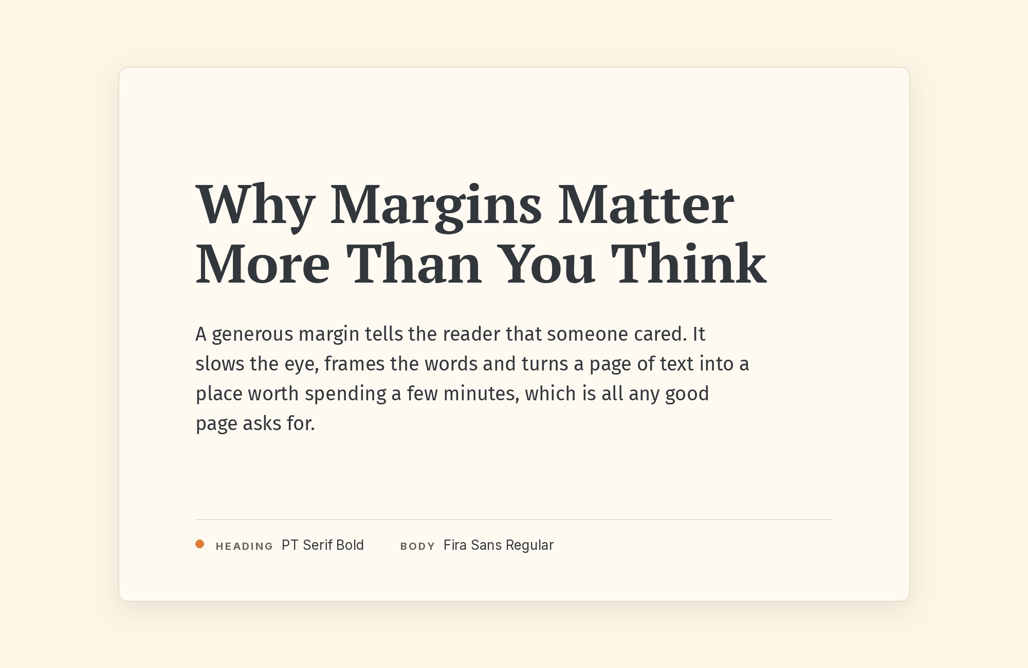
Fira Sans brings Mozilla’s open-source pragmatism to headlines while PT Serif provides the traditional reading experience below. The humanist sans shares enough warmth with PT Serif to create cohesion, while its more contemporary skeleton provides clear hierarchy. This pairing works for tech publications, academic journals, and any context bridging innovation and scholarship. Both fonts render beautifully on screens, having been designed with digital reading in mind. The combination feels purposeful rather than arbitrary.
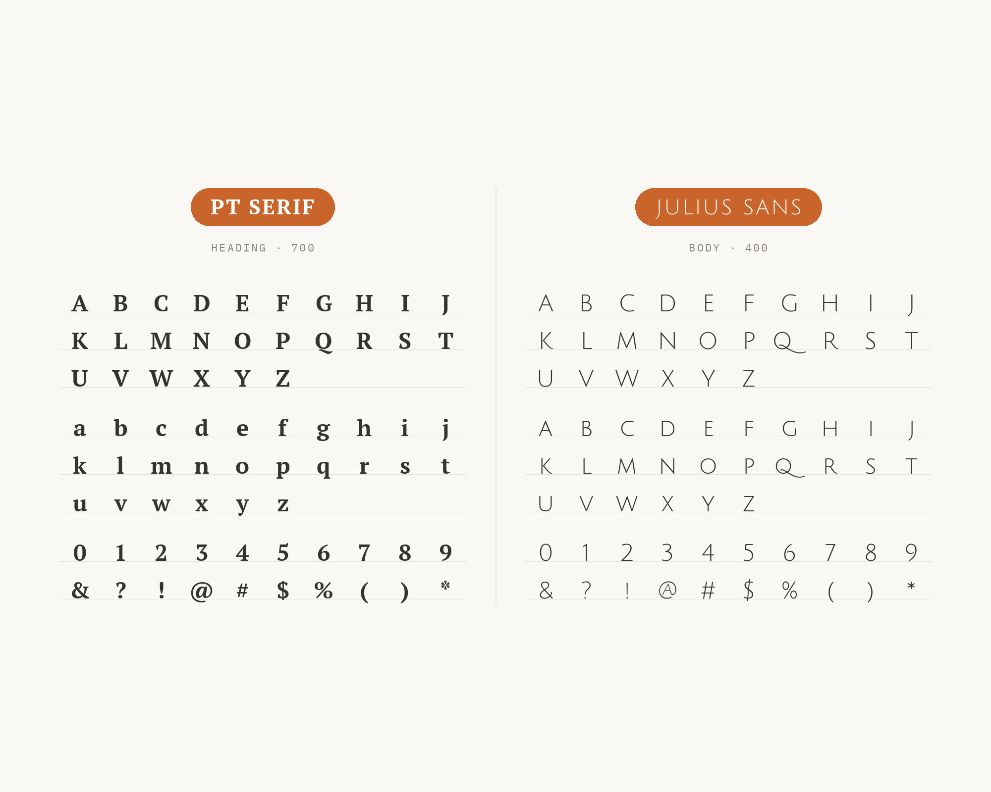
8. Julius Sans
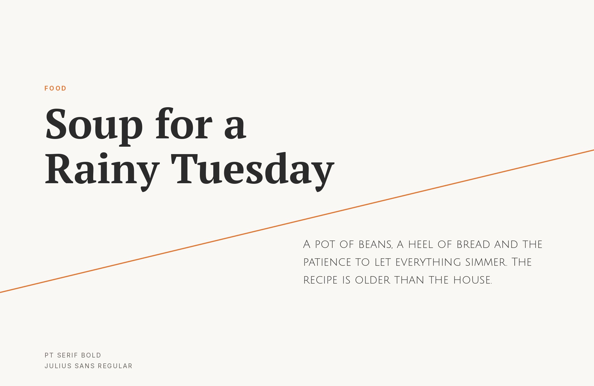
Julius Sans One’s refined, almost regal letterforms create stately headlines that PT Serif’s body copy supports with appropriate gravitas. The sans brings an architectural quality, its thin strokes and wide proportions suggesting engraved stone rather than printed ink. This pairing suits luxury brands, cultural institutions, and any context where understated elegance matters. Use Julius Sans exclusively for display sizes; its delicate forms require breathing room to perform.
9. Open Sans
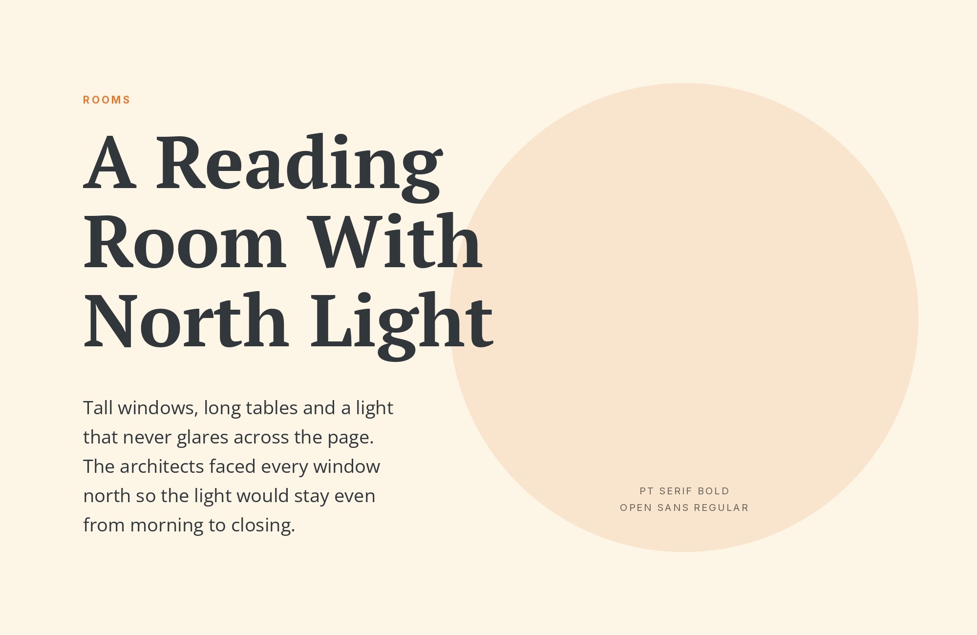
Open Sans‘s friendly neutrality handles headlines and UI elements while PT Serif provides the substantial reading experience below. A WebDevStudios article keeps Open Sans on the body and switches desktop headings to PT Serif, the reverse of the headline role suggested here. This pairing prioritizes accessibility and screen performance above stylistic statement. Both fonts feature generous x-heights and open counters optimized for digital environments. The combination suits educational platforms, healthcare communications, and government websites where reaching the widest audience takes precedence over typographic personality. Sometimes clarity is the only personality you need.
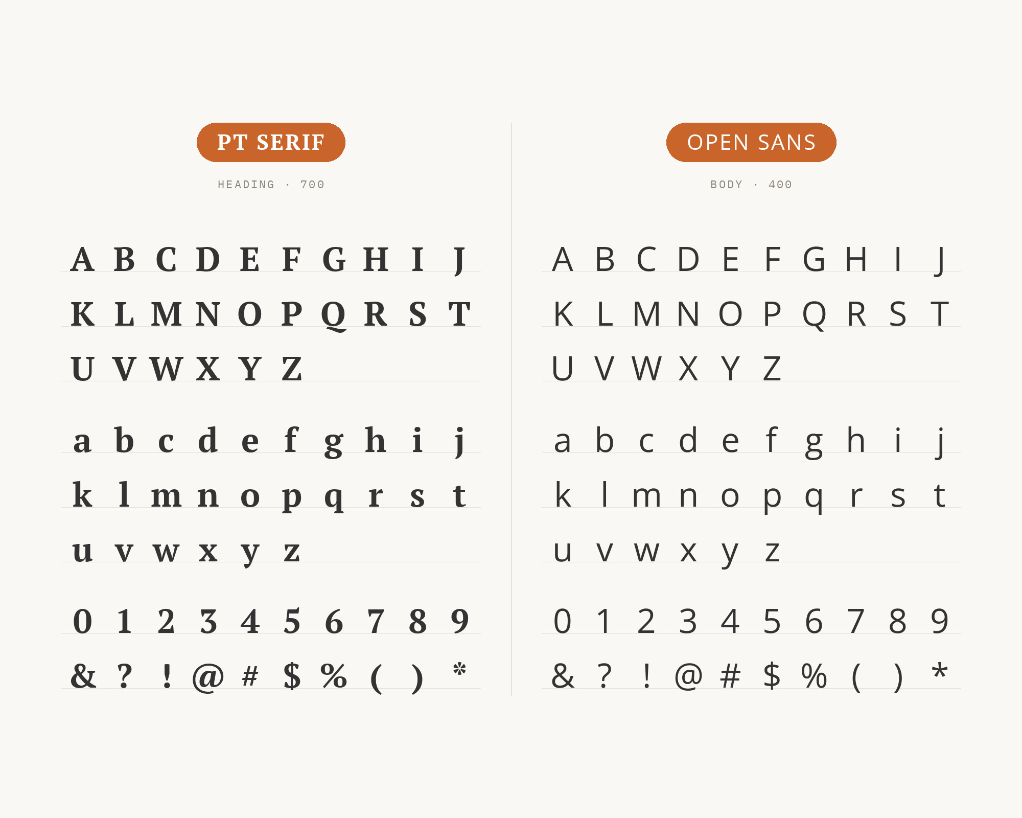
10. Lato
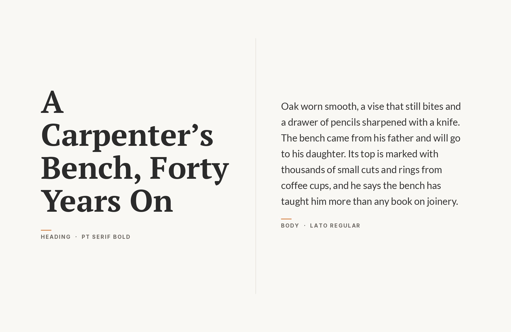
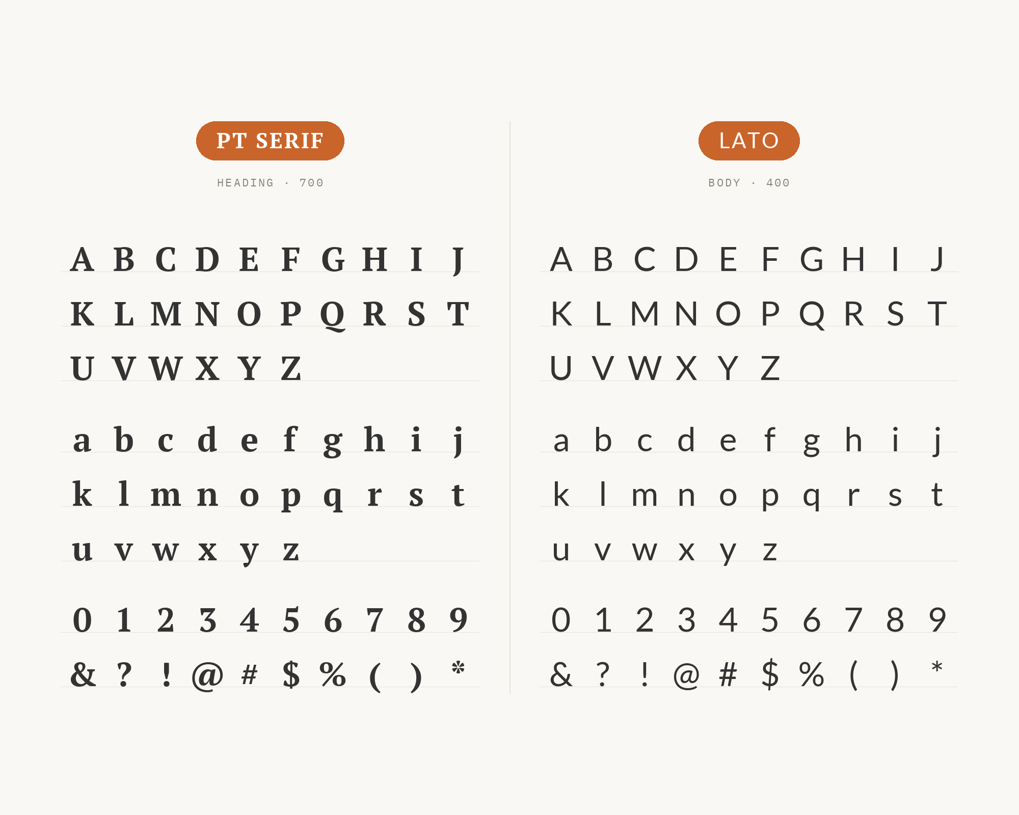
Lato‘s semi-rounded details and warm humanist forms create friendly headlines that transition naturally into PT Serif’s more formal body copy. The slight warmth in both fonts creates cohesion while their structural differences establish hierarchy. This pairing works for professional services, educational content, and any brand balancing approachability with credibility. Lato’s extensive weight range provides flexibility for complex typographic systems while PT Serif anchors the reading experience with traditional reliability.
11. Inter
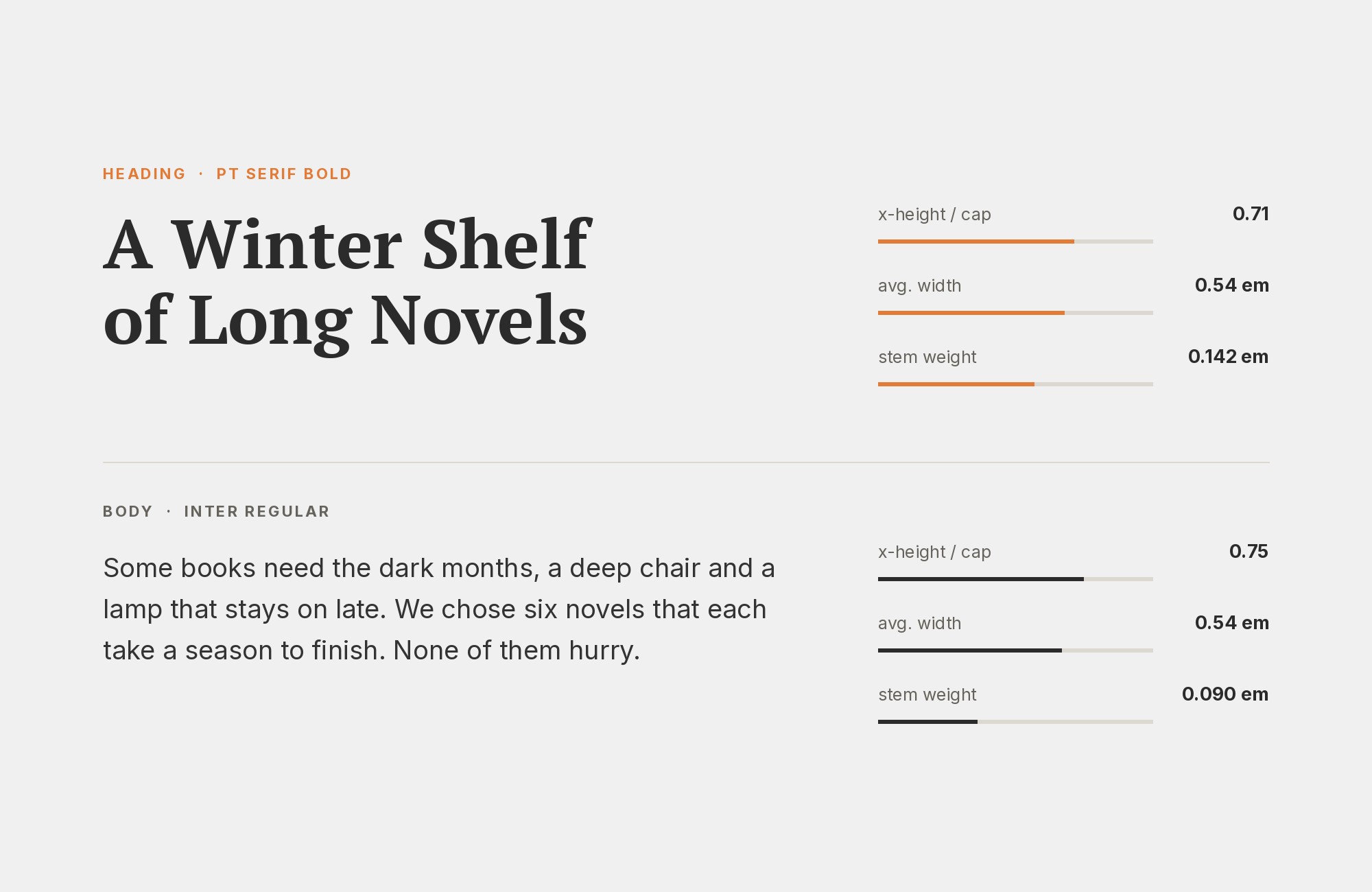
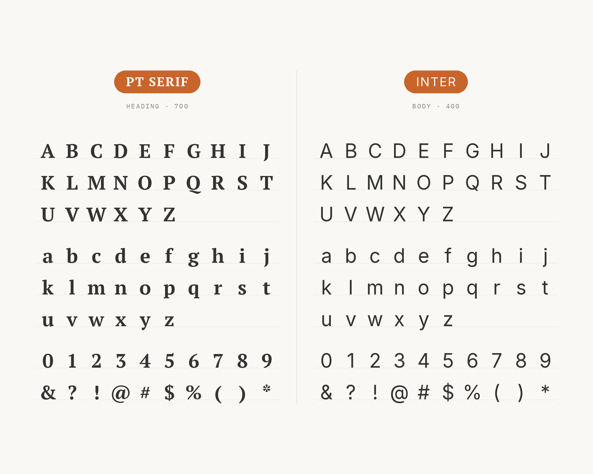
Inter‘s UI-optimized precision handles interface elements and headlines while PT Serif provides the extended reading experience below. The sans brings contemporary digital sensibilities, its distinctive letterforms designed specifically for screen legibility at small sizes. PT Serif offers the contrast of traditional typography when users need to settle in for serious reading. This pairing suits digital publications, web applications, and any context where interface and content need distinct but harmonious treatment.
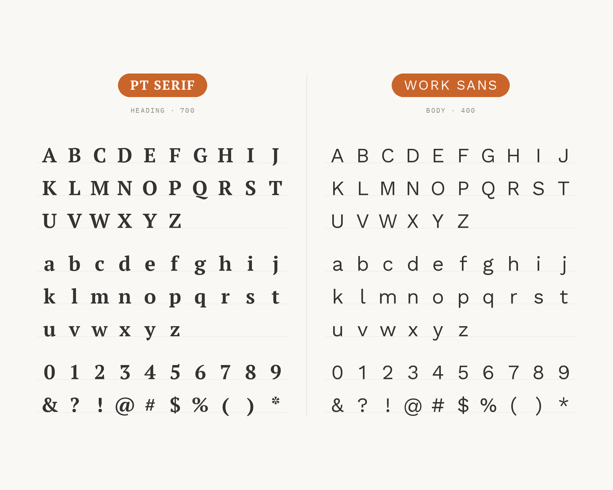
12. Work Sans
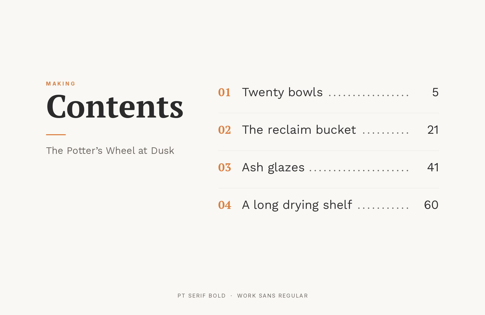
Work Sans‘s screen-optimized letterforms handle headlines and display text while PT Serif provides the traditional reading foundation below. The grotesque-inspired sans brings enough personality to create interest without distraction, while its generous x-height maintains the readability PT Serif delivers at body sizes. This pairing excels in web applications, digital magazines, and responsive designs where type must perform across devices. Both fonts were built for screens first, making them natural partners.
Conclusion
There are no absolute rules for font pairing, just principles to guide you. The key is contrast—in weight, in style (serif vs. sans-serif), or in personality. PT Serif is versatile enough to play well with many different typefaces.
Trust your eye, experiment freely, and remember that the best pairing is the one that serves your content and audience. Typography should enhance communication, not complicate it.
