
Lora pairs great with Roboto, Merriweather Black and Archivo. All 15 pairings are shown below in real rendered specimens, with the reason each one works.
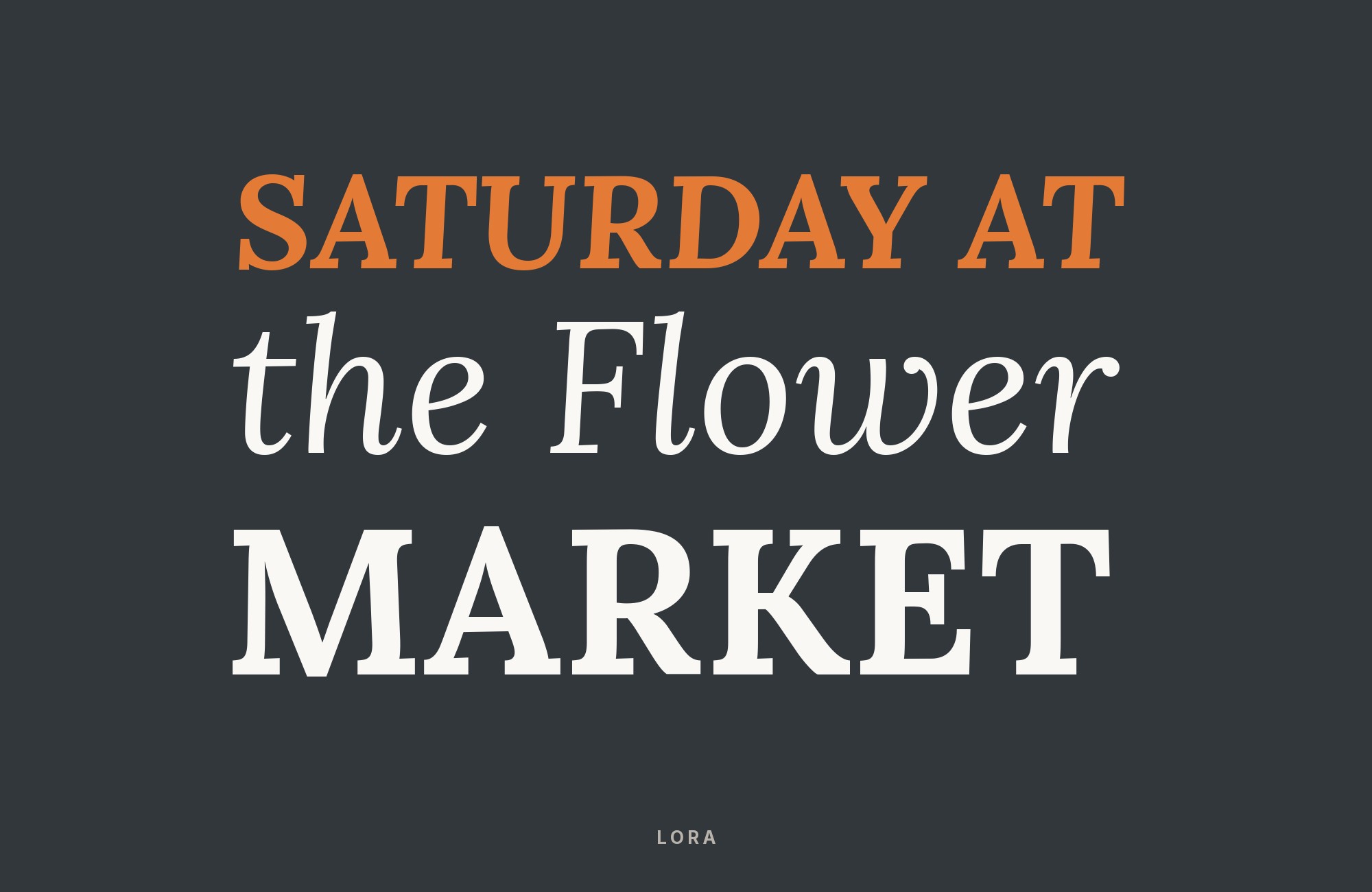
What fonts go with Lora? This contemporary serif with calligraphic roots requires pairings that appreciate its warmth without overwhelming its subtle elegance.
Lora occupies an interesting space in the serif landscape: it’s rooted in calligraphic tradition yet thoroughly modern in execution. Designed by Cyreal, it features brushed curves and moderate contrast that give text a flowing, almost handwritten quality while maintaining the structure needed for extended reading. The italic styles are particularly expressive, with graceful curves that reveal the typeface’s calligraphic DNA. Lora works remarkably well for both body text and display use, a versatility that stems from its balanced proportions and carefully considered details.
The challenge in pairing Lora lies in honoring its warmth without creating combinations that feel too soft or lacking in contrast. Its calligraphic undertones mean it pairs beautifully with humanist sans-serifs that share a similar organic sensibility, but it can also create striking combinations with more geometric designs that highlight its curves through contrast. Here are pairings selected for their ability to complement or thoughtfully contrast with Lora’s unique character.
1. Roboto

Lora’s calligraphic curves and brushed serifs bring literary warmth that Roboto‘s mechanical efficiency complements perfectly. Where Roboto offers systematic clarity designed for Google’s ecosystem, Lora provides the personality of hand-drawn letterforms with roots in calligraphy. The pairing works because Roboto’s generous x-height handles body text efficiently while Lora’s distinctive soft serifs command headline attention. This combination suits editorial platforms, book publishing websites, and content-heavy applications needing warmth without sacrificing usability.

Paid prompt-to-site tools are going to lock you in.
How can your studio escape this?
Find Out How2. Merriweather Black

A second serif gives Lora a striking companion in this sophisticated combination. Merriweather Black‘s bold weight and tall x-height provide commanding headlines, while Lora’s brushed curves and softer contrast handle body text with editorial elegance. Both fonts emerged from screen-first thinking, making them exceptionally compatible for digital reading experiences. This all-serif pairing suits literary magazines, academic journals, and publishing platforms where typographic heritage signals credibility.

3. Archivo

Archivo‘s grotesque sans-serif DNA from Omnibus-Type creates sharp contrast with Lora’s calligraphic warmth. Archivo’s sturdy grotesque forms handle body text with quiet neutrality, allowing Lora’s brushed serifs and romantic curves to shine in headlines. Archivo recalls late nineteenth-century American typefaces, giving Lora a plain, historic partner. Perfect for cultural publications, art magazines, and creative platforms seeking personality without pretension.

4. Source Sans Pro

Adobe’s first open-source typeface meets Lora’s calligraphic elegance in a pairing built for extended reading. Source Sans Pro‘s humanist forms and carefully tuned letter spacing create comfortable body text that never tires the eye. Above it, Lora’s soft serifs and brushed curves add personality to headlines. The combination excels for blogs, online magazines, and content platforms where readers spend significant time engaging with text.

“My clients will build their own sites with their own AI.”
How are you supposed to navigate this?
Find Out How5. Open Sans

A humanist sans meets a serif optimized for the screen. Open Sans provides neutral, friendly body text with Steve Matteson’s signature clarity, while Lora’s calligraphic heritage adds distinctive character to headlines. The contrast between Open Sans’s democratic accessibility and Lora’s literary personality creates hierarchy without tension. This reliable pairing works for nearly any editorial context, from news sites to personal blogs to corporate communications.

6. Montserrat

Montserrat‘s geometric circularity creates striking contrast with Lora’s organic calligraphic forms. The Buenos Aires-inspired sans-serif brings urban modernity while Lora channels traditional brush lettering. This tension between geometric precision and handcrafted warmth energizes editorial layouts. The pairing suits fashion editorials, cultural magazines, and lifestyle brands seeking both contemporary edge and literary sophistication.

7. PT Sans

PT Sans from the Public Types project offers clean Russian and Latin characters with excellent legibility, while Lora provides the serif personality for headlines. Both fonts prioritize screen readability without sacrificing character, making this combination exceptionally practical for international publications and multilingual platforms.

8. Raleway

Raleway, first drawn by Matt McInerney as a single thin weight, brings elegant sans-serif forms to body text beneath Lora’s calligraphic headlines. The contrast works because both fonts share refined sensibilities while occupying different stylistic territories. Raleway’s neo-grotesque forms provide cool modernity, while Lora’s brushed curves add warmth. Use this for design portfolios, fashion blogs, and creative industry publications.

9. Poppins

Poppins, designed in part by Indian Type Foundry, brings geometric structure alongside Lora’s calligraphic warmth. The circle-based, nearly monolinear forms of Poppins provide contemporary clarity in body text, while Lora’s soft serifs and brushed curves add romantic headlines. This global typography combination suits international publications, creative agencies, and brands seeking diverse typographic influences.

10. Work Sans

Work Sans‘s screen-first engineering pairs efficiently with Lora’s literary personality. With its middle weights optimized for on-screen text, Work Sans handles body text with practical clarity while Lora’s calligraphic serifs provide headline distinction. The pairing balances functional necessity with aesthetic ambition, making it ideal for content platforms, editorial websites, and creative publications prioritizing both readability and character.

11. Inter

Inter‘s UI-optimized precision meets Lora’s editorial warmth in a pairing that bridges interfaces and content. Rasmus Andersson’s attention to screen rendering helps body text stay clear at everyday sizes, while Lora’s brushed curves and soft serifs add personality to headlines. This combination suits applications where functional text meets editorial content, from dashboard interfaces to reading applications.

12. Lato

Lato‘s semi-rounded terminals and warm sans-serif personality create gentle contrast with Lora’s calligraphic serifs. Both fonts share humanist warmth, making the transition between headlines and body text feel natural rather than jarring. Łukasz Dziedzic first drew Lato as part of a corporate identity for a large client, but its friendly character works equally well in editorial contexts. Use this for lifestyle blogs, wellness brands, and publications seeking approachable sophistication.

13. Nunito Sans

Nunito Sans, the non-rounded companion to Nunito, brings friendly warmth to body text beneath Lora’s elegant calligraphic headlines. The sans-serif’s friendly geometry provides comfortable reading while Lora’s brushed curves add sophisticated personality. Their different structures create a gentle contrast without disturbing the warm tone. This combination suits children’s publishing, educational platforms, and brands seeking warmth without sacrificing professionalism.

14. Fira Sans

Mozilla’s systematic Fira Sans brings interface precision beneath Lora’s literary warmth. Designed for Firefox OS, Fira Sans offers exceptional screen clarity with humanist touches that complement Lora’s calligraphic heritage. The pairing balances technical functionality with artistic expression, making it ideal for design publications, creative technology platforms, and cultural institutions bridging digital and traditional media.

15. IBM Plex Sans

IBM Plex Sans brings corporate gravitas with subtle personality to complement Lora’s editorial elegance. Designed for IBM’s unified brand experience, Plex Sans offers clean geometry with humanist details that soften its systematic origins. Paired with Lora’s calligraphic warmth, this combination suits publications and platforms seeking credibility without coldness, perfect for business publications, research journals, and professional service firms.

Conclusion
There are no absolute rules for font pairing, just principles to guide you. Look for contrast in size, shape, or personality. Lora is versatile enough to play well with many different typefaces.
Trust your eye, experiment freely, and remember that the best pairing is the one that serves your content and audience. Typography should enhance communication, not complicate it.
Sources
- FontPair.co
- Beautiful Web Type
- Typ.io
- Typewolf
- ManyPixels
- Figma (Google Fonts pairing tool)
- Typewolf 2020 snapshot
- Typ.io 2022 snapshot
- Baltimore City Hall brand guide
- marimo design system
- BRITech brand book
- Action Fonts specimen
- NICE InDepth typography
- SciLifeLab visual identity
- Valdes Homes brand manual
- NICE brand guide
- Font Match pairing examples
- The Book Designer
