DIN pairs great with Open Sans, Baskerville and Futura. All 15 pairings are shown below in real rendered specimens, with the reason each one works.
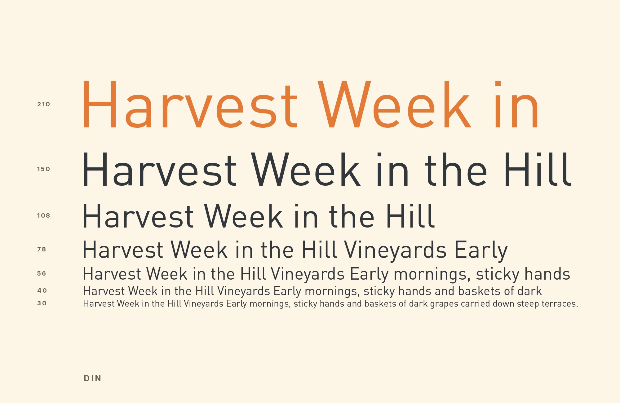
What fonts go with DIN? This is a typeface with no calligraphic ancestry at all — it was drawn from engineering templates for German road signage and technical drawings, not from a pen, and it still reads that way: narrow, mechanically regular, and built to stay legible on a sign glimpsed at speed rather than a page read at leisure.
DIN’s letterforms trace back to DIN 1451, the 1931 German standard for technical-drawing and signage lettering (Ludwig Goller’s committee). Albert-Jan Pool’s FF DIN (FontFont, 1995) and Akira Kobayashi’s DIN Next (Monotype) carry that constructed, almost stencil-like regularity into digital use. Its counters are narrow, its stroke weight is close to uniform, and its proportions were optimized for legibility at a glance rather than comfort over a paragraph. Both families are condensed enough for signage and wayfinding use but complete enough, in their fuller weight ranges, to run headlines, UI chrome and technical labeling in ordinary design work.
That industrial neutrality gives DIN an unusual pairing problem: it has no strong personality of its own to react against, so the interesting decision isn’t which typeface but which register. Real-world use of DIN splits cleanly into two camps. One pairs it with a classic serif for editorial warmth and contrast. The other keeps it inside an all-sans system, using DIN for display and labels while a second, friendlier sans carries the actual reading. Both are legitimate; the fifteen pairings below cover both routes.
1. Open Sans

A humanist grotesque with soft, open apertures and a generous x-height, built specifically for comfortable screen reading — exactly the job DIN was never designed to do. Where DIN’s narrow, engineered letters stay disciplined and slightly cold, Open Sans relaxes just enough to carry paragraphs at length without losing legibility. This is a genuinely practical pairing: it is free on Google Fonts, and it reflects how DIN actually gets used on real sites, as a headline, label and UI-chrome face sitting above a second, friendlier sans doing the reading work. Set Open Sans for body copy at 16 to 18 pixels and keep DIN in headings, navigation and data labels.

Unlimited fonts from $16.50/mo.
29 million fonts, templates and stock assets. One subscription, unlimited downloads.
See the plan2. Baskerville

Baskerville’s transitional serif shapes and moderate stroke contrast carry old-style warmth into long-form text, a register DIN’s condensed, constructed forms were never meant for. It ships with macOS; a Baskerville Old Face digitisation also comes with some Microsoft software. Libre Baskerville on Google Fonts is the free cross-platform stand-in. Set beneath a DIN headline, Baskerville reads as considered and literary rather than technical — a useful contrast for editorial layouts, annual reports, or any project that wants DIN’s precision up top without carrying that coldness through the whole page. DIN stays in labels, navigation and captions, the one place where engineered regularity helps a reader instead of tiring one.

3. Futura

Both read as geometric sans, but the resemblance stops at the surface. Futura’s true circular bowls and open counters give headlines a confident, humanist warmth, while DIN’s narrower, more mechanical letterforms stay disciplined in supporting roles — tables, captions, fine print. This is less a contrast pairing than a division of labor between two geometric faces with different temperaments: one built for display presence, the other for engineered consistency at small sizes. Use Futura where a brand needs an open, approachable headline voice, and drop to DIN for anything structural underneath it. Both require licensing outside a handful of free lookalikes.

4. EB Garamond

EB Garamond’s calligraphic diagonal stress and moderate contrast carry sixteenth-century old-style warmth into body text, leaving DIN entirely free to do the technical work — labels, tables, navigation — without competing for personality. Ivy Tech Community College’s brand guide lists DIN Engschrift and EB Garamond among its official typefaces. It gives EB Garamond a role in paragraph text. The font is free on Google Fonts, which makes this one of the more accessible serif contrasts on this list. The pairing suits editorial projects that want a readable, historically grounded body voice under a modern, engineered heading system: technical publications with a human-facing front section, or brand systems that need both credibility and warmth. Garamond does the reading here, and DIN’s role stays narrow enough that the two never occupy the same size.

Try Semrush free. No credit card.
Start on the $0 plan. Paid plans from $117/mo billed annually.
Try for free5. Roboto

Roboto’s mechanical-humanist skeleton was built for legibility across every UI size, which mirrors DIN’s own wayfinding logic closely enough that the two read as one coherent system rather than two competing voices. It is free on Google Fonts and turns up alongside FF DIN in real branding work, as on Sustane’s website, which says more about the pairing’s durability than any specimen comparison could. Use DIN for display type, section headers and technical labels, and let Roboto run the interface: buttons, body copy, form fields. Both faces share a quiet, engineered temperament, so the transition between them never reads as a style change.

6. Minion

A restrained old-style text serif built for sustained reading, Minion sets a quiet, bookish body voice under DIN’s condensed, wayfinding-style headline system. Its moderate contrast and generous, even spacing hold up at small sizes in ways DIN’s engineered forms were never asked to. It is an Adobe Original on Adobe Fonts, so licensing often overlaps with tools a studio already owns. The combination suits editorial and technical publishing alike — a DIN masthead or section header over long stretches of Minion body copy reads as considered rather than mismatched.

7. Palatino

Palatino’s calligraphic, humanist serif structure and generous x-height bring handwritten warmth and comfortable small-size reading that DIN’s mechanical regularity does not offer on its own. It ships with macOS as Palatino; Palatino Linotype also comes with modern Microsoft software. This is the classic serif-body, grotesque-label split: Palatino carrying paragraphs, DIN handling navigation, captions and technical callouts. It suits documentation, reports and any project where DIN’s engineered precision needs a warmer, more human counterweight for the actual reading. Set Palatino at 17 to 19 pixels for body copy, a size range where its generous x-height does the work DIN’s narrow counters cannot.

8. Playfair Display

High-contrast hairline serifs put Playfair Display about as far from DIN’s uniform, mechanical strokes as two typefaces can get, so a headline and its supporting captions never compete for the same visual register. It is free on Google Fonts and appears in real DIN-adjacent site design for exactly this reason: an easy, no-licensing way to add editorial drama above DIN’s disciplined labels and navigation. Because Playfair Display’s contrast collapses at small sizes the same way Didot’s does, keep it confined to headlines and short display settings, with DIN handling everything functional underneath it.

9. Walbaum

Walbaum’s sharp, high-contrast Didone strokes supply the editorial drama DIN deliberately withholds — a Walbaum headline over DIN captions or data labels reads as a considered hierarchy rather than a style clash. It belongs to the Didone family, so its hairlines thin out at small sizes and it should stay confined to display settings. DIN’s precise, narrow letterforms hold the rest of the layout steady underneath it, doing the structural and technical work Walbaum was never meant for. A specialty pairing for premium editorial and print work rather than everyday interface design.

10. Bodoni

Bodoni’s extreme thick-thin contrast and vertical stress read as maximum drama, the kind of headline that needs a calm, mono-linear partner to keep the rest of a layout from feeling equally loud. DIN’s precise, narrow letterforms do exactly that, holding tables, captions and navigation steady underneath a Bodoni masthead. The two are near-opposites in construction — one calligraphic in spirit despite its rationalized geometry, the other drawn straight from engineering templates — and that opposition is the whole appeal. Bodoni works best large and infrequent; used often, the contrast stops registering as hierarchy and starts reading as noise.

11. Josefin Sans

Josefin Sans’s narrow proportions, low x-height and 1920s geometric detailing give it a softer rhythm than DIN’s engineered shapes. Vincent Giordano’s portfolio sets DIN Pro Bold for titles and Josefin Sans for running text. That is a useful division for posters and brand systems: let DIN carry the firm, compact headline and give Josefin Sans short supporting passages at a comfortable size. It is free on Google Fonts, which makes the pairing easy to test. Keep the body copy generous; Josefin Sans’s low x-height makes very small settings harder to read.

12. ITC Souvenir

Souvenir’s soft, rounded serifs and warm 1970s character work by temperature contrast rather than era — it softens DIN’s cold, engineered geometry instead of fighting it. Where most of DIN’s serif partners lean formal or historical, Souvenir brings an almost playful warmth, useful when a brand needs a friendly, approachable headline sitting over technical supporting text. Check the license before using it in a client project. Souvenir belongs at headline and display size, where its rounded serifs stay soft; smaller, they close up and lose the warmth that justified the pairing.

13. Aachen

A blocky, stencil-adjacent slab serif that echoes DIN’s own industrial, standards-plate origin, Aachen is the pairing Typewolf names outright as its suggested match. The two share an engineered bluntness — heavy, geometric strokes with almost no ornament — so a display headline in Aachen sits naturally over DIN’s technical labels and captions without any tonal mismatch. Give its heavy forms room at large display sizes, and use a more open face for continuous text.

14. Bebas Neue

Both DIN and Bebas Neue are condensed, all-caps-friendly display faces built for tight spaces, which means they can visually collide if set at similar weights. The pairing works when one is set as an outline or reversed variant so the two stay distinct — a technique used on props for The Grand Budapest Hotel, where headlines pair an outlined Bebas with DIN. Typ.io also documents DIN with Bebas Neue on a real site. Google Fonts describes Bebas Neue as a display family suited to headlines and captions. Keep it brief and large.

15. UnifrakturMaguntia

This is a deliberate anachronism, not a neutral pairing: UnifrakturMaguntia’s dense, angular blackletter strokes and diamond-shaped finials sit as far from DIN’s twentieth-century engineering standard as two typefaces can get, and the clash is the entire point. It signals “old-world publication” set directly against “modern signage” within the same layout — a device for fictional newspaper props, heritage branding gone deliberately theatrical, or any project that wants that specific tension. It is free on Google Fonts but loses legibility fast below display size, so use it sparingly, briefly, and only where the anachronism is intentional rather than accidental.

Conclusion
DIN’s engineered neutrality means it rarely fails outright with a partner, but the real decision is what kind of contrast to reach for. One answer is a classic serif — Baskerville, Palatino, Walbaum — for warmth and drama. Another is a second sans, Open Sans or Roboto, keeping the whole system quietly consistent. Neither is wrong; they solve different problems.
Test whichever direction you pick at the sizes the project will actually use. DIN’s condensed forms hold up small, but several of its serif partners — Walbaum, Bodoni, Playfair Display — lose their hairlines exactly the way Didot does, and a display specimen will not tell you that. Set real copy first.
