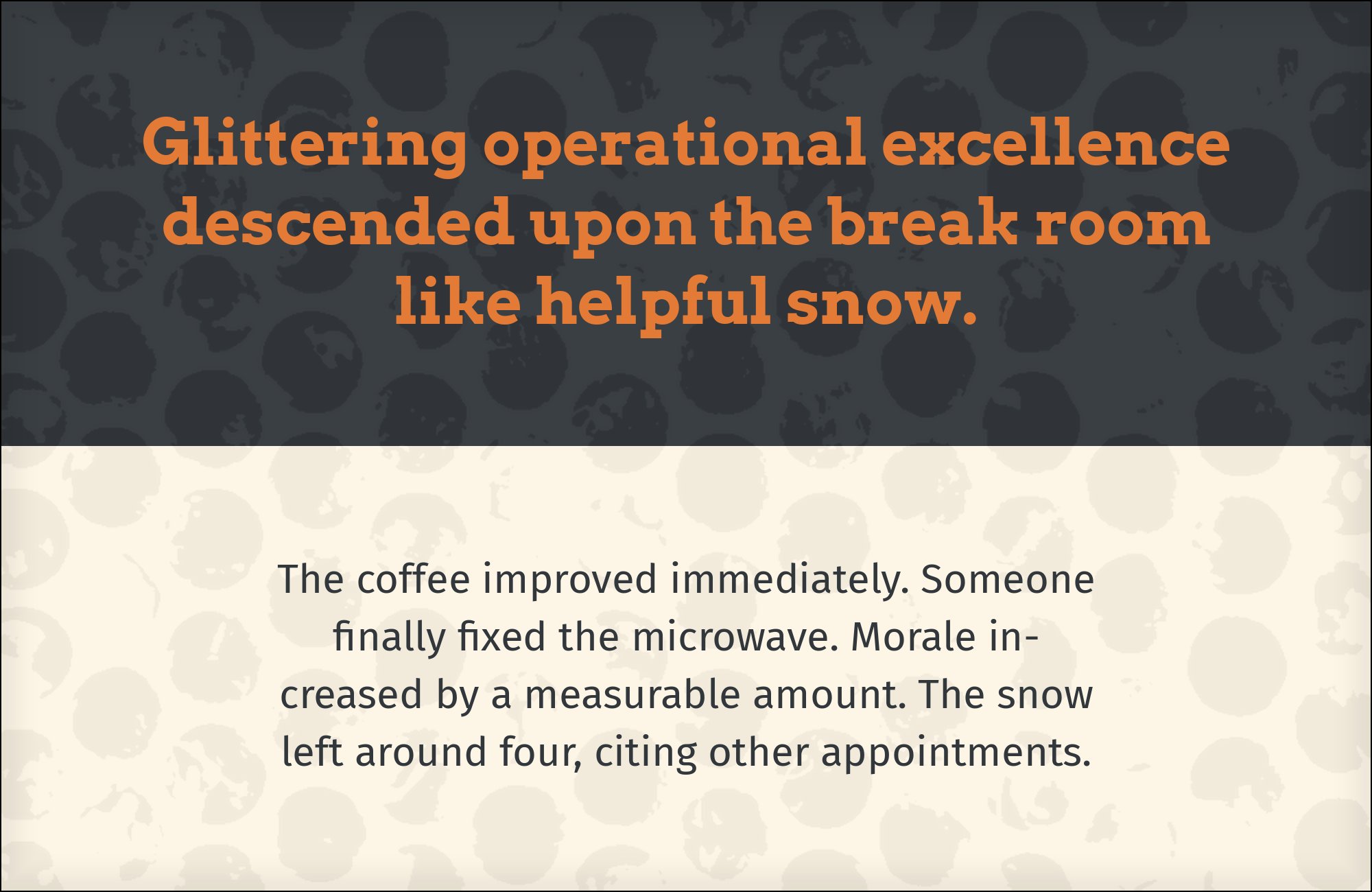
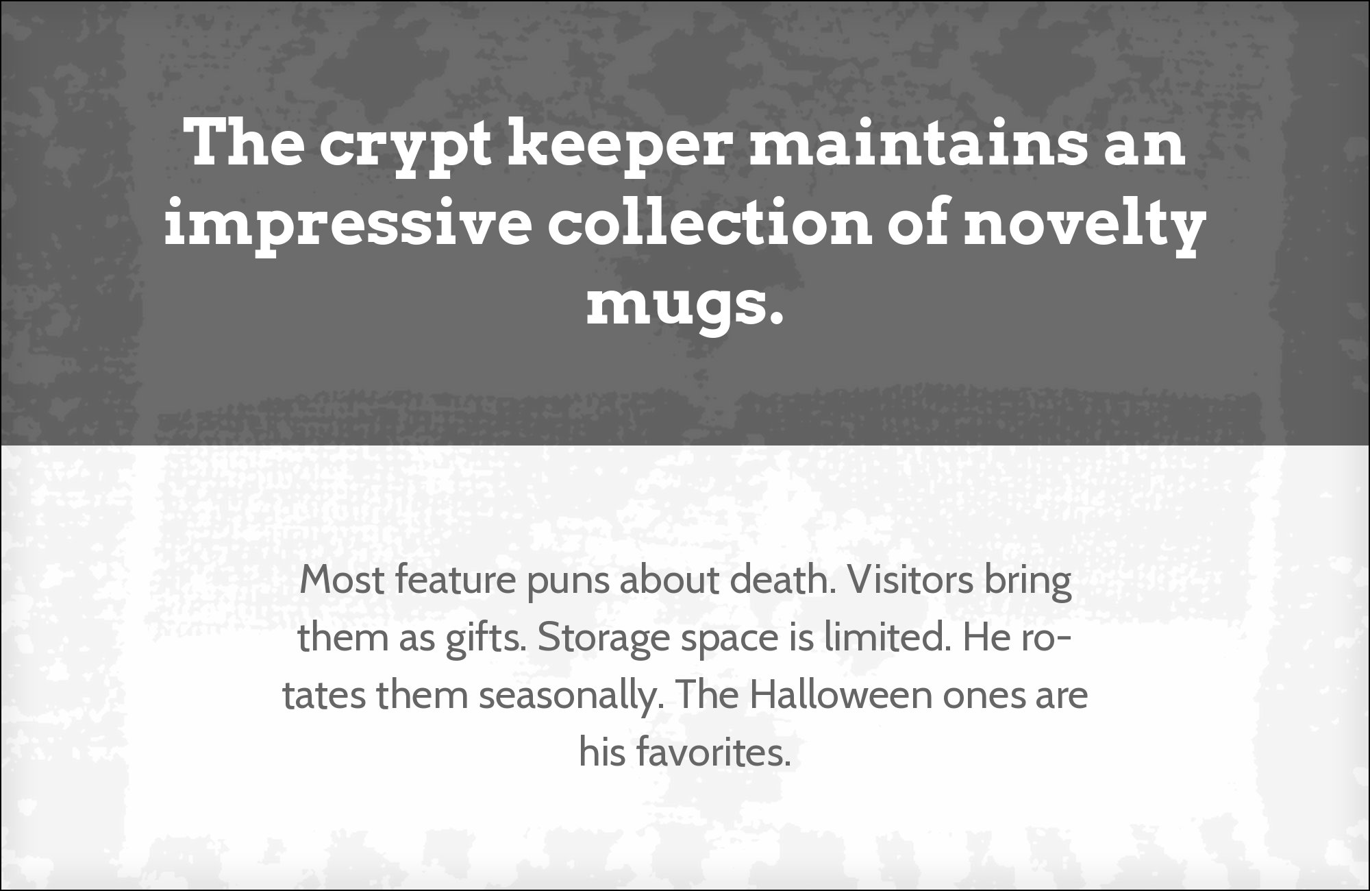
Arvo pairs great with Lato, Open Sans and Roboto. All 15 pairings are shown below in real rendered specimens, with the reason each one works. Every pairing below is checked against 22 published typography sources.
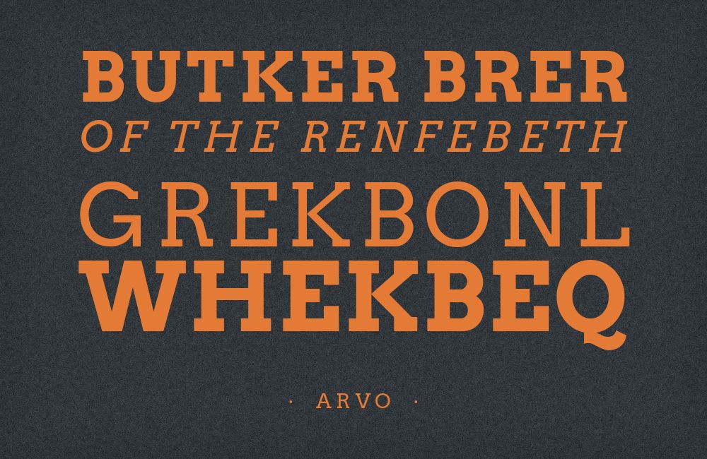
What fonts go with Arvo? The useful first question is which job you are giving it, because the evidence splits cleanly in two: design guides almost always cast Arvo as the slab headline over a quiet sans, while the archive of real published work just as often shows it underneath somebody else’s display logotype, doing the sturdy reading work.
Anton Koovit, an Estonian type designer, released Arvo through Google Fonts in 2010 under the SIL Open Font License, with Adobe Fonts crediting Yassin Baggar alongside him. It is a geometric slab serif in the Rockwell and Stymie line: near-monoline strokes, circular bowls, and unbracketed rectangular serifs that meet the stems at a hard right angle with no transitional curve. It has a large x-height and generous counters, which is why it holds together at small sizes on screen rather than clotting. It shipped with four styles — regular, italic, bold and bold italic — making it usable as a typographic system rather than only a headline ornament.
That breadth is also what complicates pairing it. Arvo is wide, heavy-footed and assertive, so it eats horizontal space and resists being crowded, which rules out any partner that competes on weight or width. But it is also rational and screen-tuned enough to work as body copy, which means the partner sometimes needs to be louder than Arvo, not quieter. The safe move is a neutral humanist sans that matches Arvo’s x-height and gives back the line economy the slabs cost you; the more interesting move is a display inversion, where a fat serif or a script takes the headline and Arvo becomes the structural text voice beneath it. Here are 15 fonts that pair with Arvo, covering both arrangements.
1. Lato

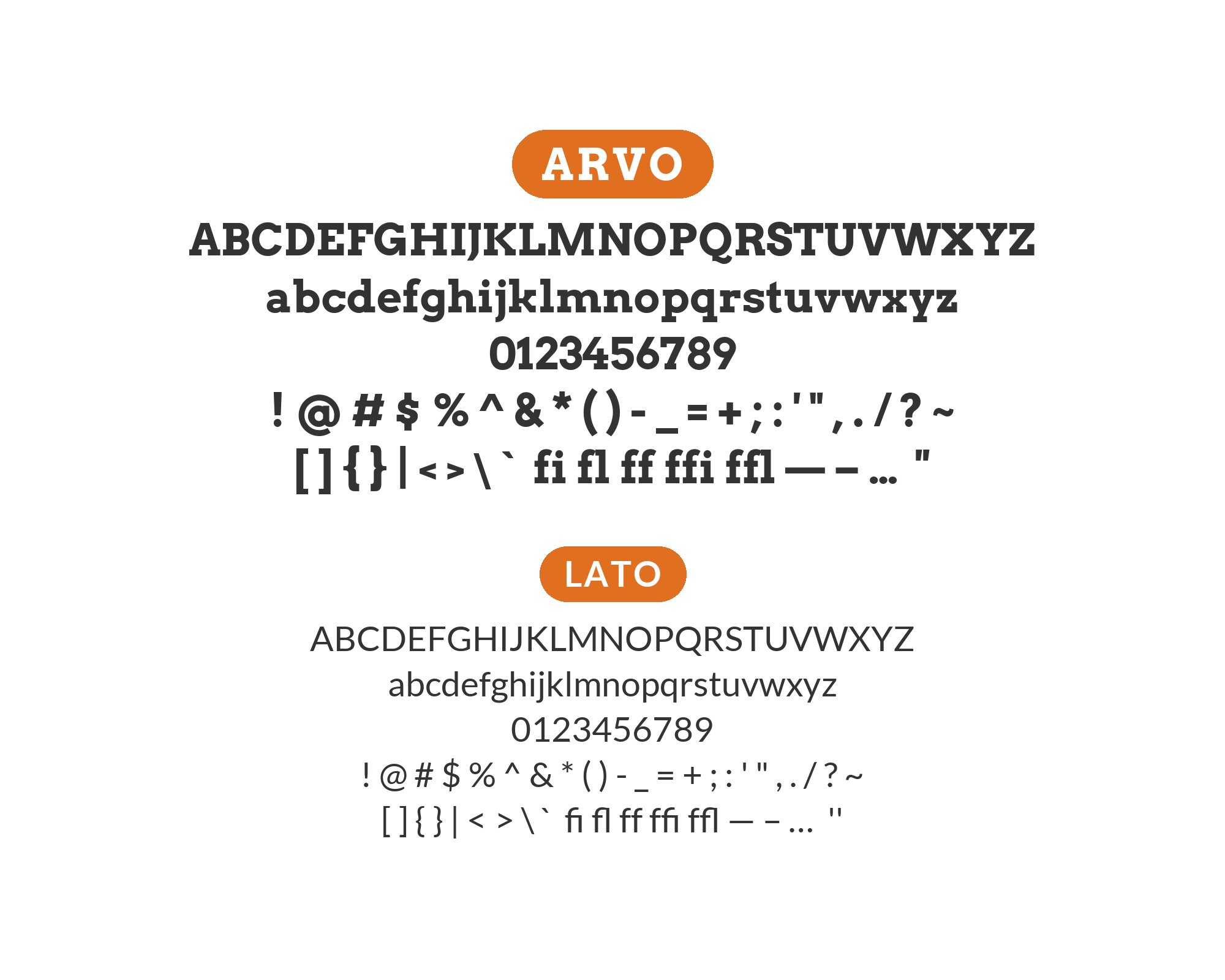
Łukasz Dziedzic designed Lato in Warsaw and released it in December 2010, the same year as Arvo, as a humanist sans with semi-rounded stroke details that keep it warm at text sizes without tipping into softness. Six design guides name Lato as the Arvo partner, and the structural reason holds up under inspection: Lato’s x-height sits close enough to Arvo’s that the two set at the same nominal size look the same size on the page, and both are built on low-contrast, near-even strokes. That shared rhythm means an Arvo headline can run at bold or bold italic without the Lato paragraph beneath it reading as a different system. Use it as the default: Arvo for headings and section labels, Lato for everything at reading size.

2. Open Sans

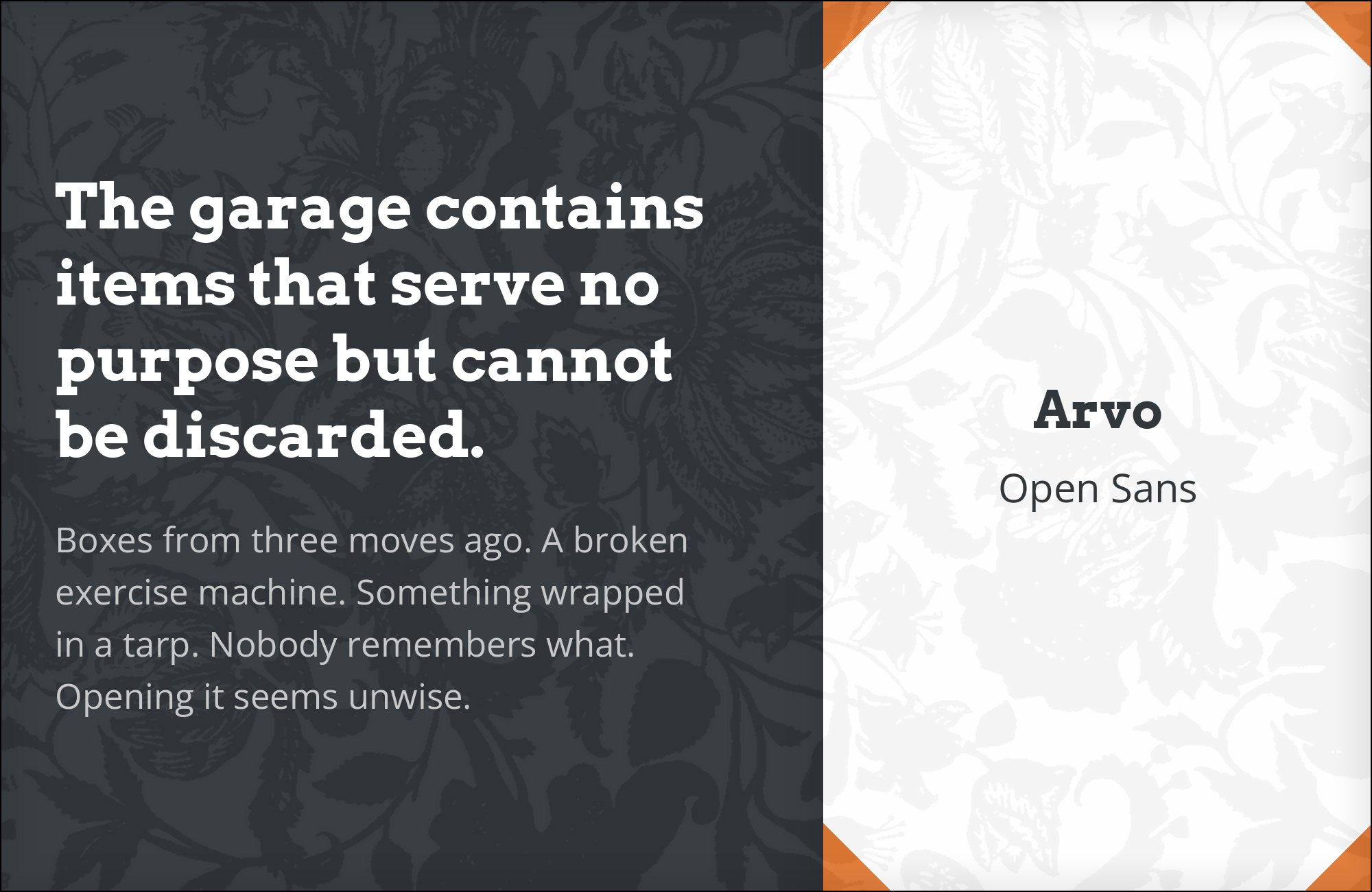
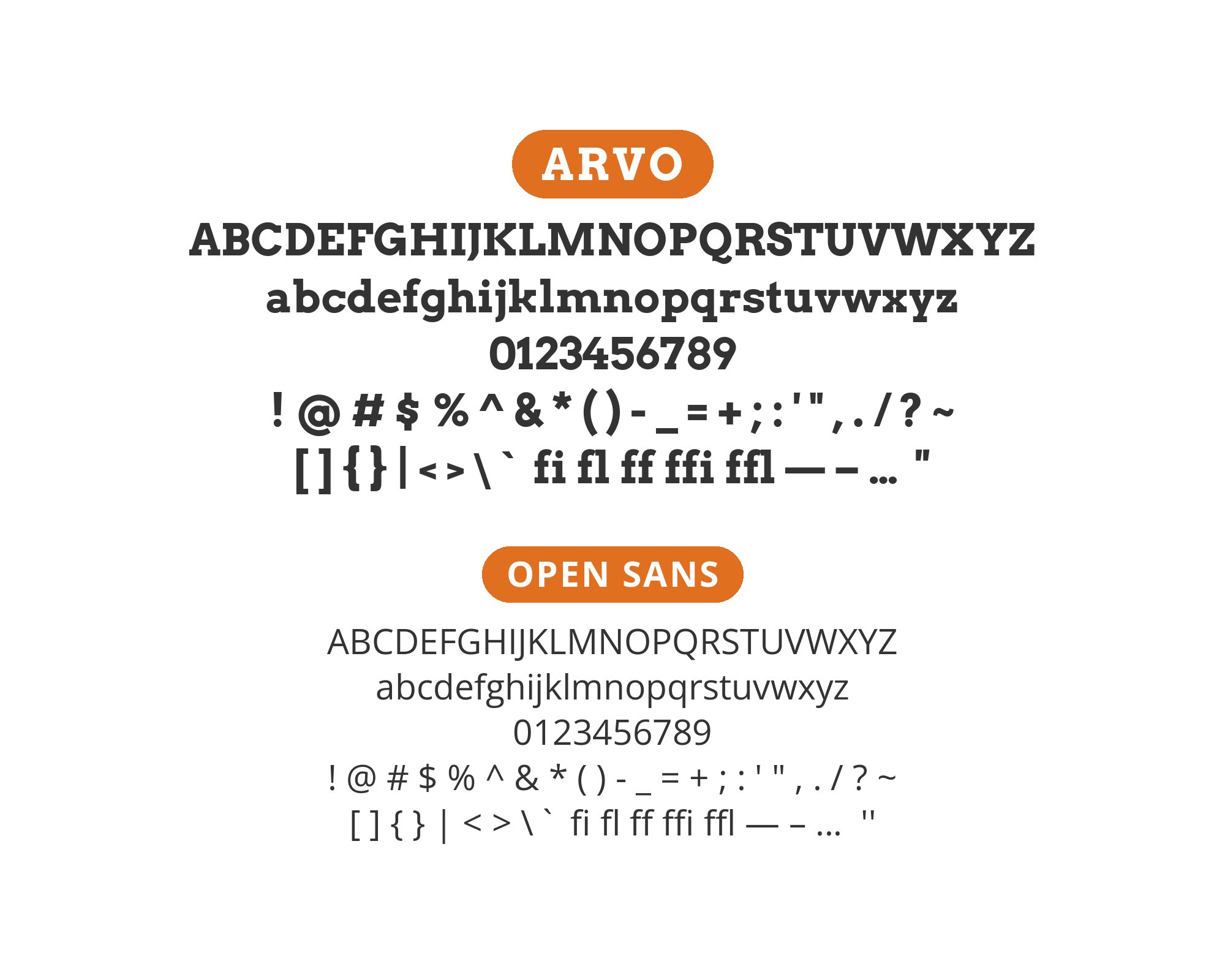
Steve Matteson drew Open Sans under commission from Google and released it in 2011 as an upright, low-contrast humanist sans with a notably large x-height and open apertures tuned for small-size legibility. It is Typewolf’s one curated suggestion for Arvo, and it is separately documented running with Arvo on a live publishing site, so this is a recommendation with production evidence behind it rather than a style-guide guess. The mechanism is simple division of labour: Open Sans has no features that draw attention to themselves, so every distinctive shape on the page — Arvo’s square serifs, its circular bowls, its odd G and s — stays unchallenged. Reach for this combination on documentation, editorial and long-form content sites where Arvo needs to brand the headings and then get out of the way.
3. Roboto
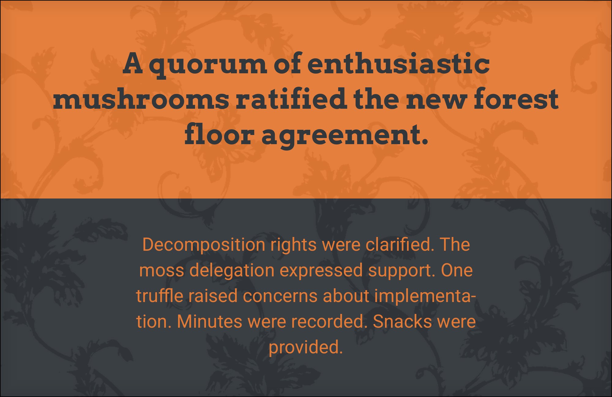
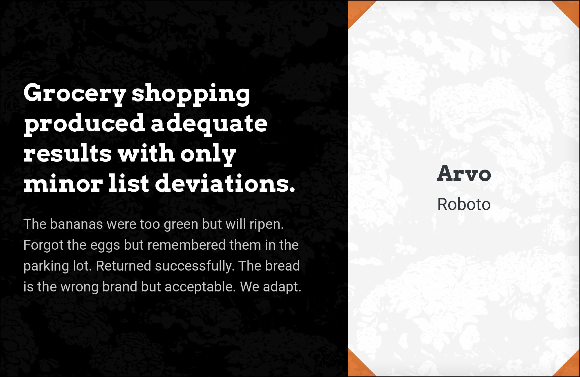
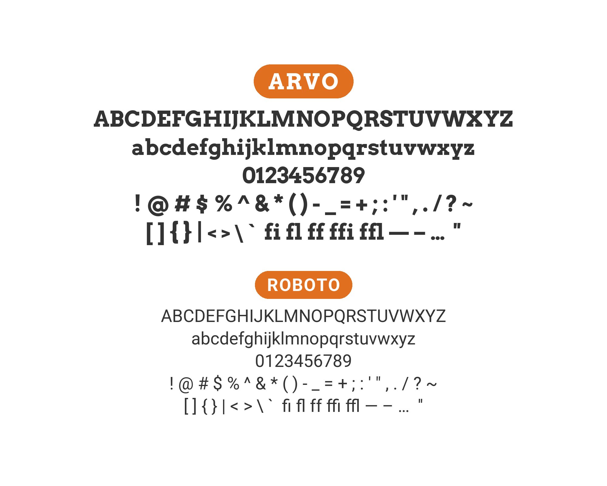
Christian Robertson designed Roboto in-house at Google and released it in 2011 as the Android system typeface, built on a mechanical, largely grotesque skeleton with unusually open, friction-free curves. Two separate kinds of evidence point at this pair: it is named directly in one of the larger published pairing guides, and Fonts In Use documents a real identity that ran Arvo from 2013 and then handed the same role to Roboto on its website in 2014. That succession is the argument. Both faces are screen-first designs with comparable proportions, so they are interchangeable in the text slot — which means putting them together produces a clean role split rather than a clash. Set Arvo for headings and Roboto for interface text, buttons and body copy, and the system holds at every size.
4. Arial
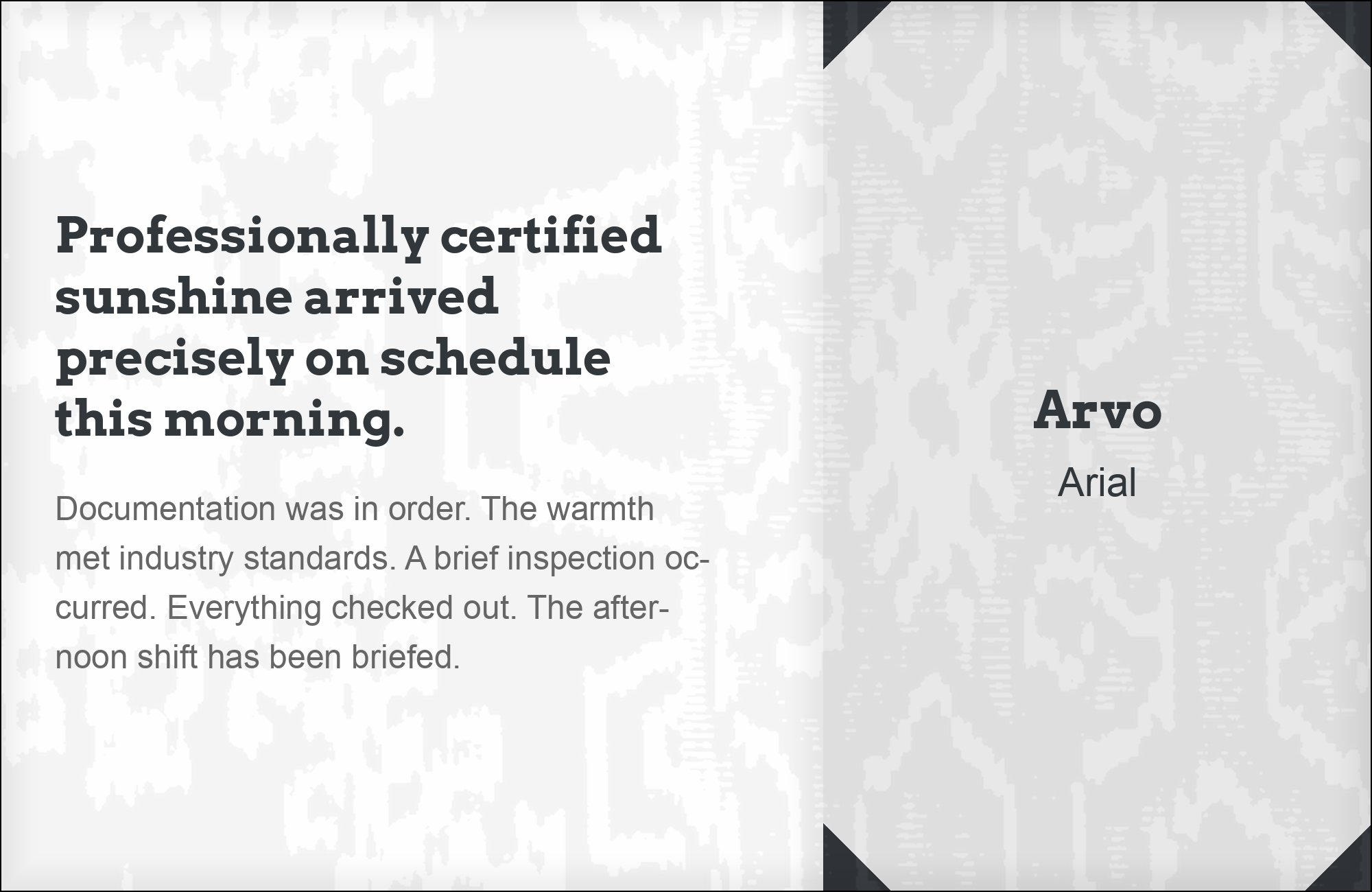
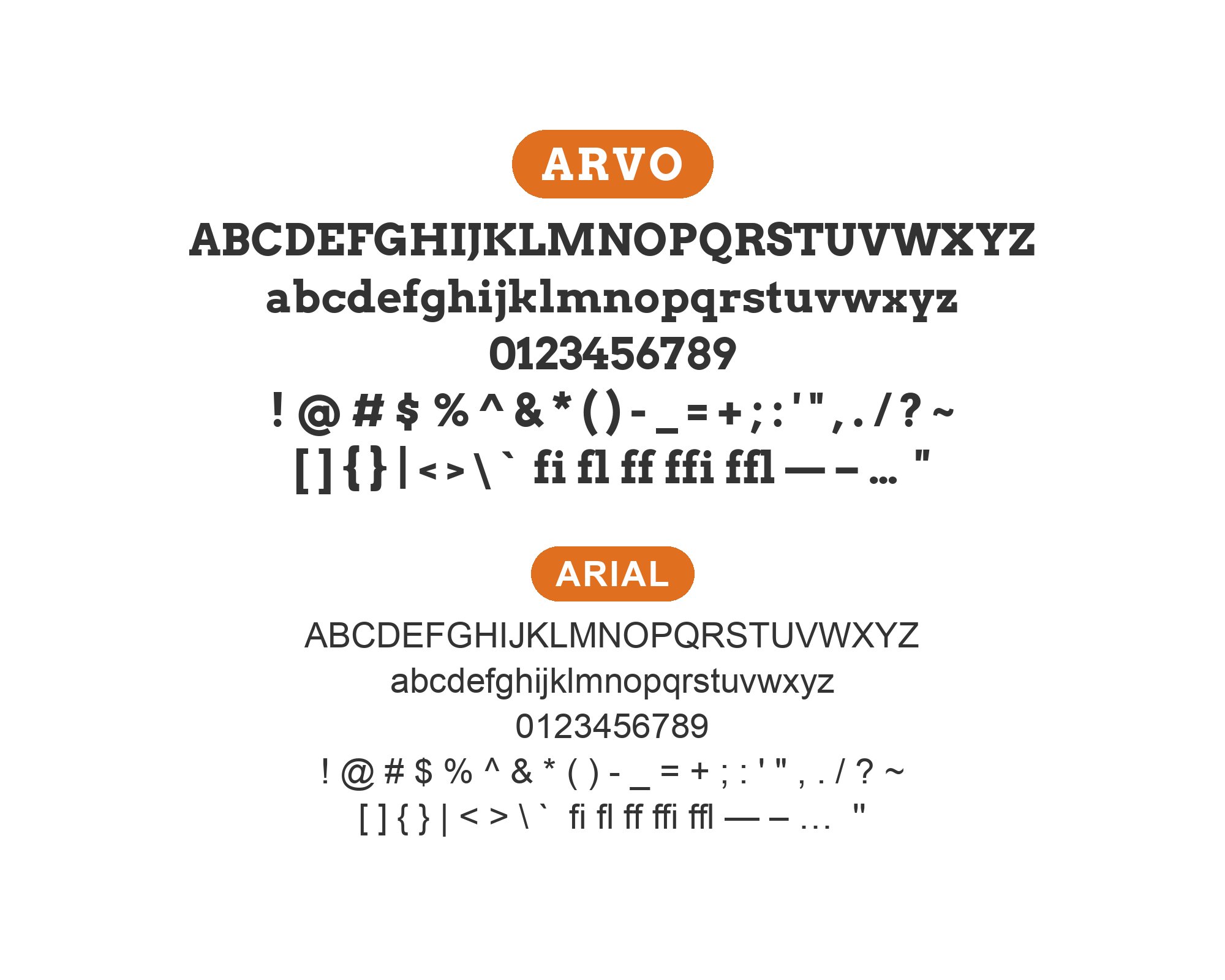
Robin Nicholas designed Arial at Monotype in 1982, later expanding it into a full family with Patricia Saunders, originally for low-resolution laser printers before Microsoft shipped it with Windows 3.1 in 1992. Its case next to Arvo is practical rather than aesthetic: Arial is installed on effectively every machine, so it is the one partner that will render inside an email client, an Office document or a plain-text system where a webfont cannot follow. It is also structurally inert — a closed-aperture grotesque with no distinguishing gesture — which means it never argues with Arvo’s square serifs. Typ.io documents the two together on a live agency site. Treat Arial as a load-bearing fallback that keeps a brand’s type system coherent wherever Arvo cannot be embedded.
5. Fira Sans
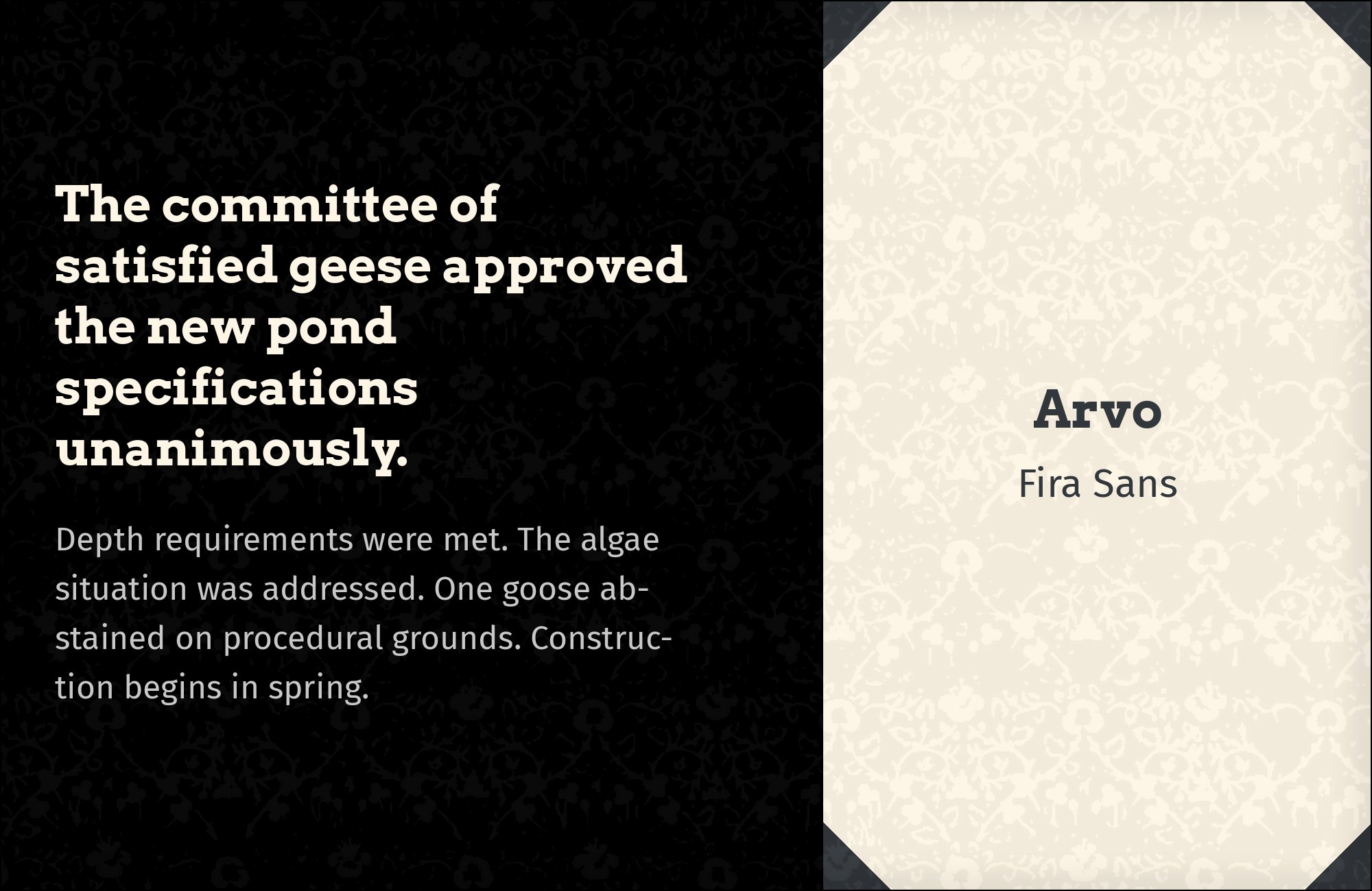
Erik Spiekermann and Ralph du Carrois drew Fira Sans for Mozilla, releasing it in 2013 as the system typeface for Firefox OS, with slightly narrow humanist proportions and large, open apertures aimed squarely at small screens. The documented pairing is worth noting for where it appears: Mozilla’s own Internet Health Report sets Arvo against Fira Sans, which means an organisation with an in-house typeface chose a slab it did not own to sit above it. Both faces were engineered for screen legibility before anything else, so they degrade the same way at small sizes and under poor rendering — the practical test most pairings fail. Fira Sans also carries a much larger weight range than Arvo does, so it can handle every level of hierarchy below the headline on its own.

6. Cabin
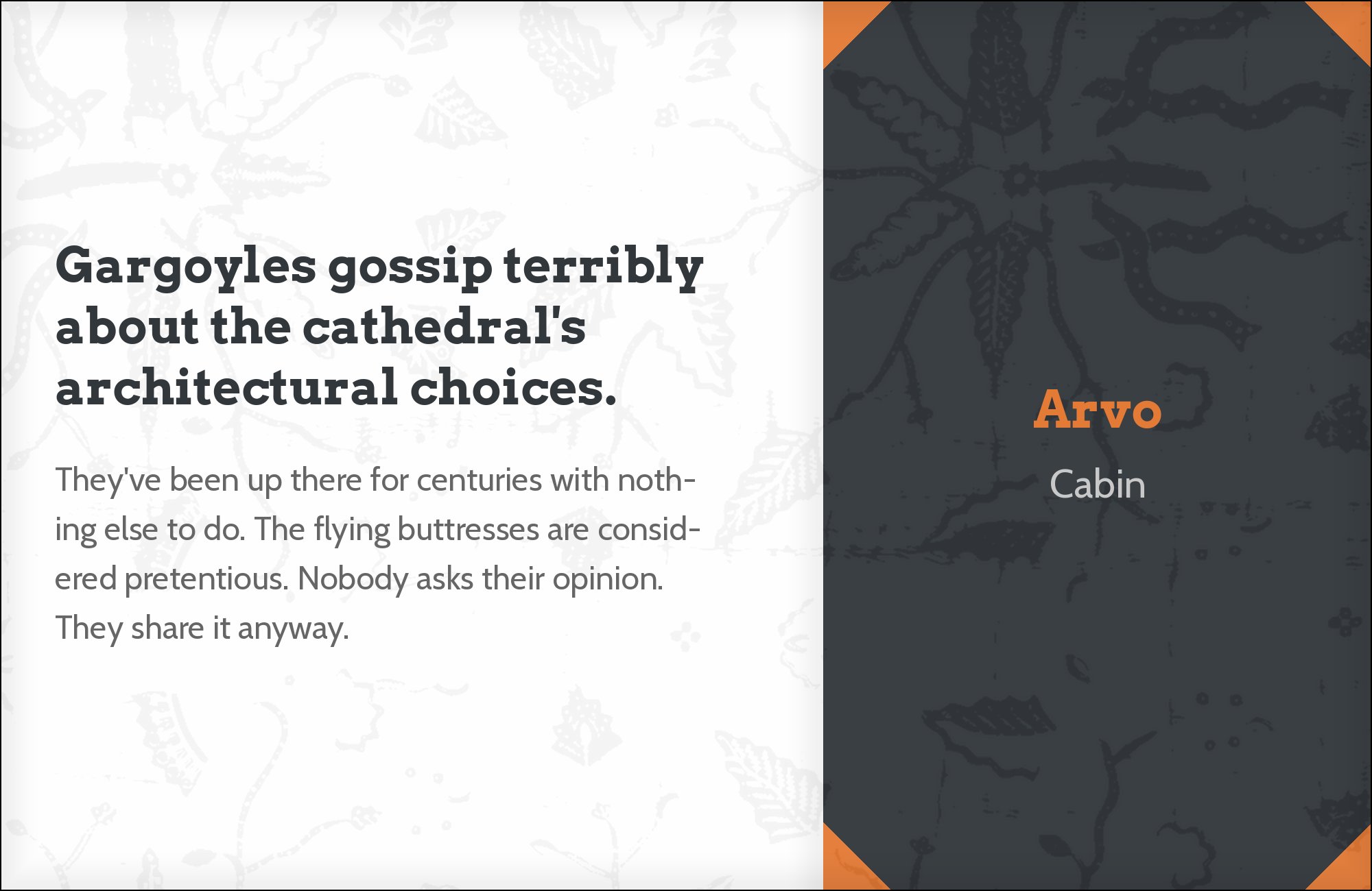
Pablo Impallari designed Cabin and released it through Google Fonts in 2010, drawing on the humanist sans tradition of Edward Johnston and Eric Gill but adding a modernist regularity that Gill Sans never had. The reason it earns a place next to Arvo is width. Arvo is a wide face with heavy serifs that consume horizontal space fast, and a column of it sets very few words per line; Cabin’s slightly condensed proportions claw that economy back without looking compressed. Typ.io documents the two on a live site, alongside Arial and Josefin Slab in the same system. Use Cabin for body text in narrow columns, sidebars and card layouts, where an Arvo heading is already taking more room than you would like.

Free download
The Typography Primer.
Yours, right now.
Adobe's classic · PDF · free
The guide to type that everyone learned from. Subscribe and it is yours instantly. The BonFX Letter follows.
Free. One click to unsubscribe. No sharing, ever.
7. Josefin Slab
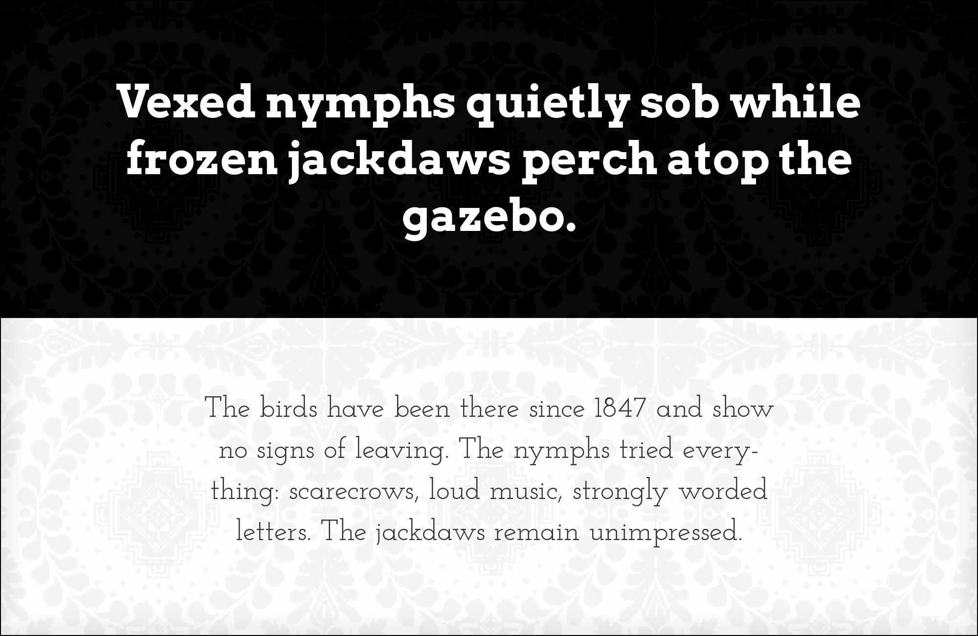
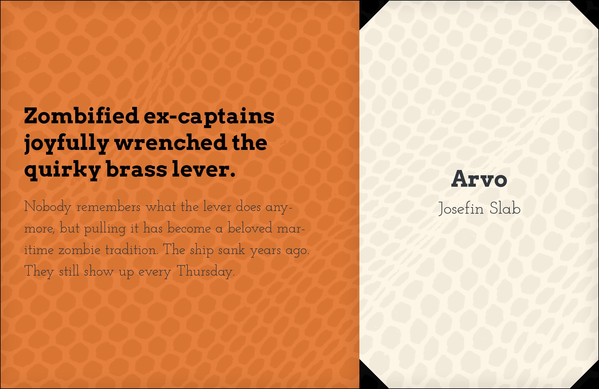
Santiago Orozco designed Josefin Slab and released it in 2010 as a geometric slab drawn from 1920s Swedish-influenced sans models, with a deliberately small x-height, a high waistline and delicate, thin slabs. Pairing two slab serifs normally fails, and it works here only because the two are built on opposite skeletons: Arvo is wide, large-x-height and blunt, Josefin Slab is narrow, small-x-height and fine-boned. At the same nominal size Josefin Slab looks considerably smaller, which gives you hierarchy for free without a weight change. Typ.io documents both on a live agency site. Set Josefin Slab for standfirsts, captions and pull quotes where the family resemblance signals one system, and keep Arvo for the headings that need mass.

8. Roboto Condensed

Christian Robertson’s condensed cut of Roboto, Roboto Condensed, narrows the same mechanical skeleton without thinning the strokes, so it stays dark on the page while setting far more characters per line. Design Wizard’s writer Elisabeth Strasser recommends it specifically as the body partner for an Arvo display line, and the reasoning is a mass balance argument rather than a stylistic one: a blocky Arvo headline puts a lot of ink at the top of a layout, and a normal-width body text can look thin and unresolved beneath it. A condensed face sets a denser, darker text block that holds its own. This is the right choice for news layouts, dashboards and any design where the headline is large and the column is not.


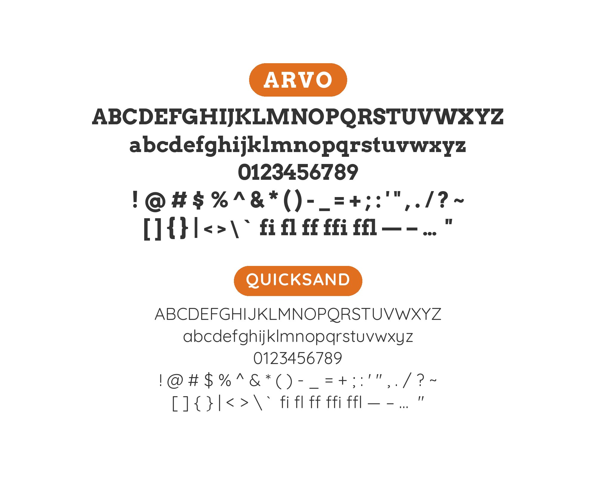
9. Quicksand

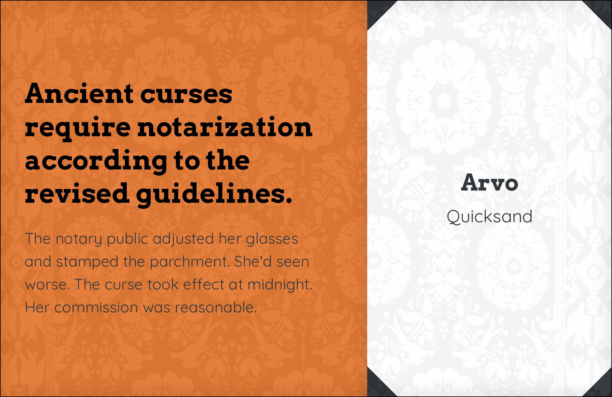
Andrew Paglinawan began Quicksand in 2008 as a rounded geometric sans built from near-perfect circles with every stroke terminal rounded off, later expanded into a full Google Fonts family. Fonts In Use documents it succeeding Arvo in the same brand’s print material, which is the evidence that the two occupy compatible ground. Structurally they share a geometric construction — circular bowls, minimal stroke modulation — and differ only at the terminals, where Arvo squares everything off and Quicksand rounds everything down. That single point of difference is enough contrast to read as intentional and not enough to fracture the system. Use Quicksand for secondary text where Arvo alone would read as too industrial.
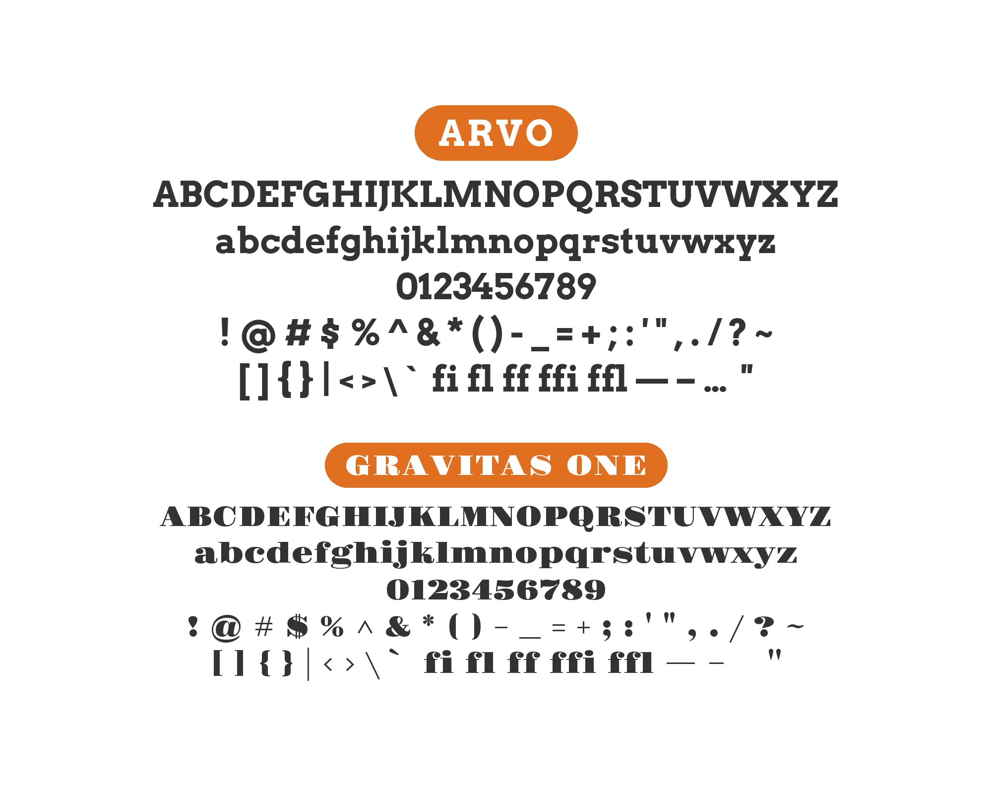
10. Gravitas One
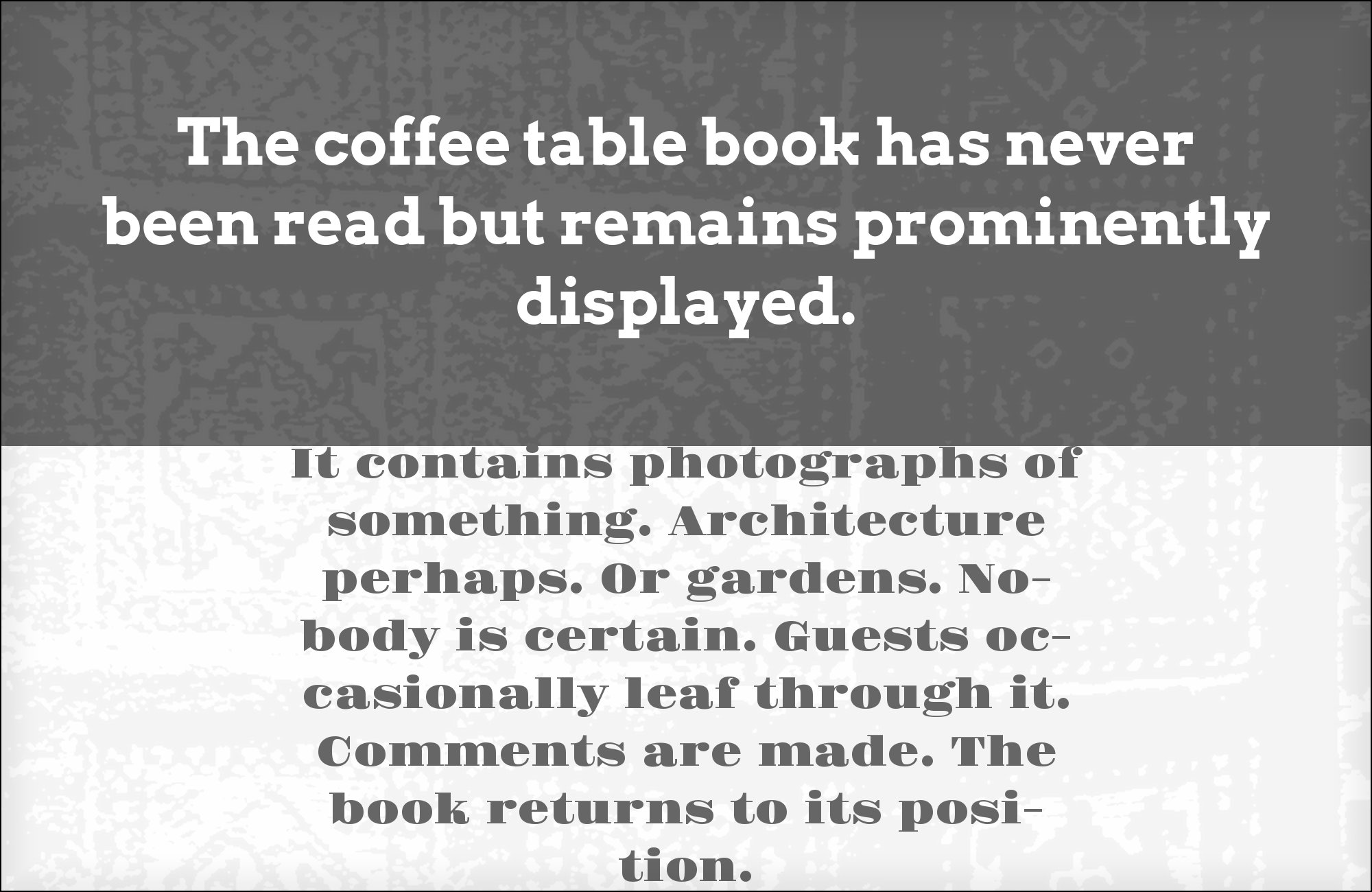
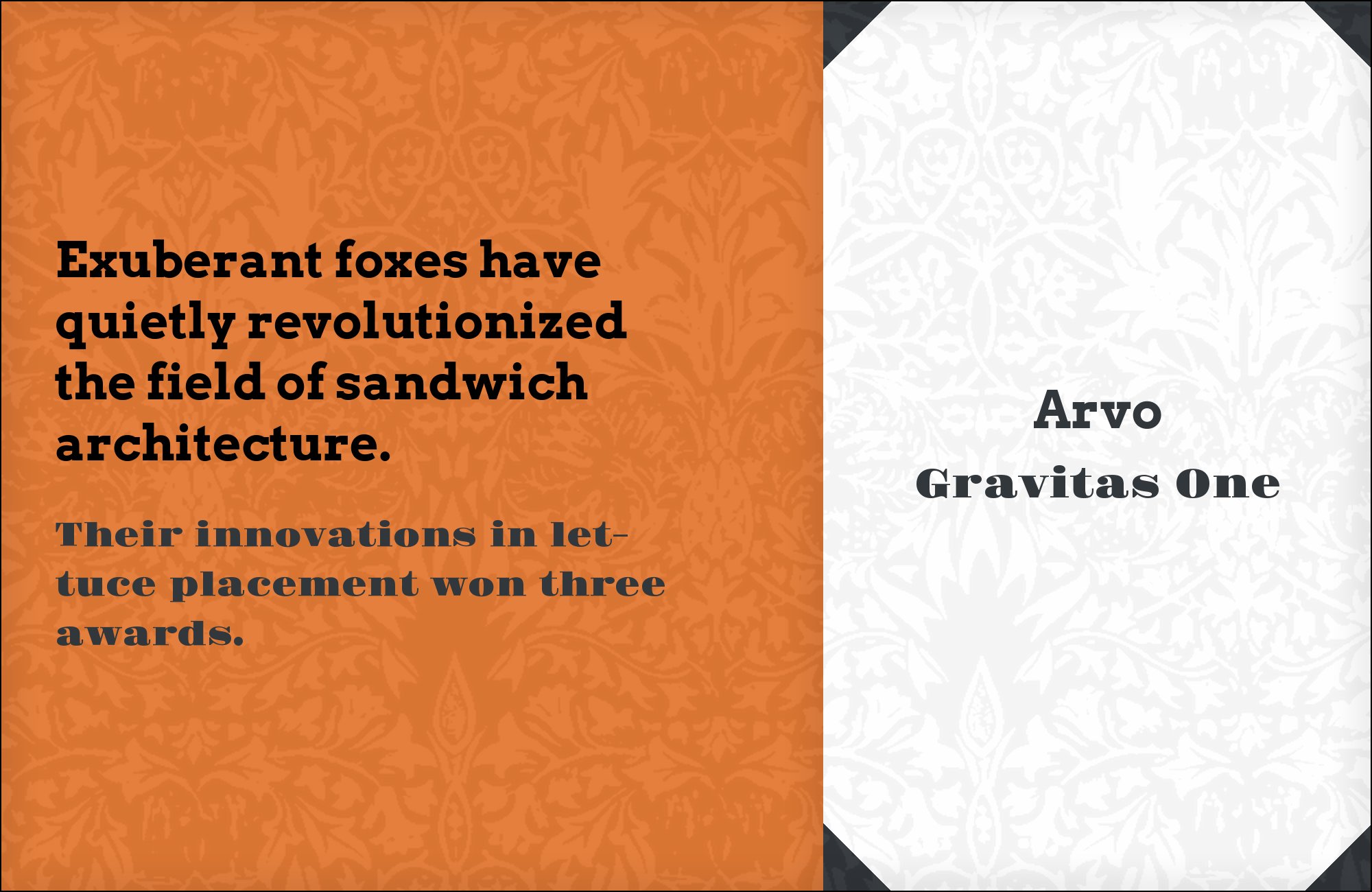
Riccardo De Franceschi designed Gravitas One for Sorkin Type in 2011 as a single-weight fat-face display serif: extremely heavy vertical stems, hairline thins, and flat unbracketed serifs, drawn from the English advertising types of the early nineteenth century. Pairing it with Arvo inverts the usual arrangement — the display serif takes the headline and Arvo drops to sturdy secondary text. This is the structure real published work actually uses: Fonts In Use documents the same inverted job on Tracks magazine, where a heavy display logotype sits above Arvo typography. The pair works because Gravitas One is all contrast and Arvo has almost none, so they never compete for the same visual register. Keep Gravitas One at poster and cover sizes where its hairlines survive, and let Arvo carry everything below the fold.
Still Googling UX terms?
Stop. They're all right here.
50 terms. Illustrated.
So simple your cat gets it.
Print & ePub on Amazon
11. Creepster

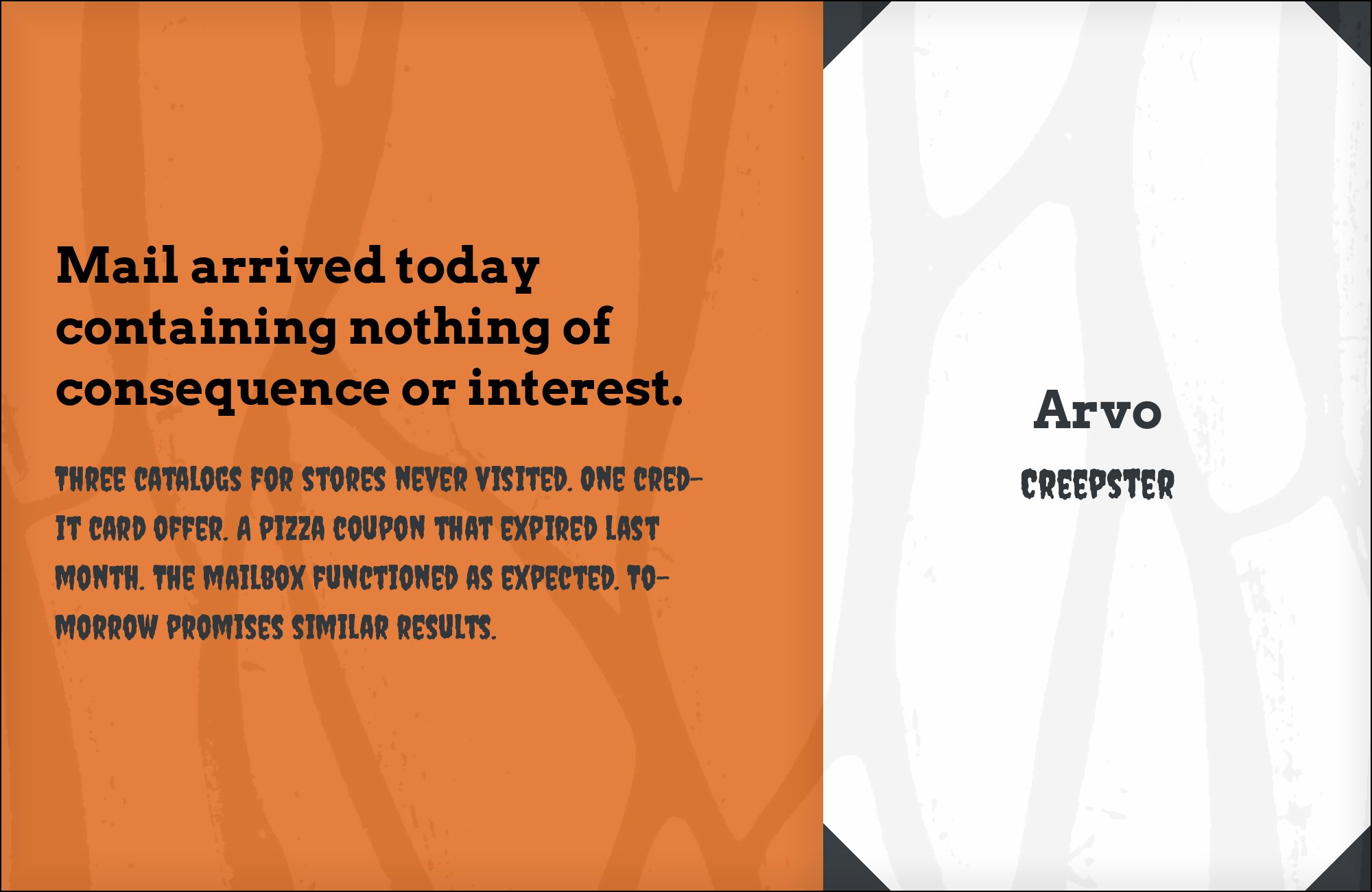
Creepster, released through the Sideshow foundry, is a horror-novelty display face with irregular, dripping stroke weights and deliberately unstable baselines — the kind of type that needs a completely disciplined partner or a layout falls apart. Arvo is a better answer here than a plain neutral sans would be. Its square slabs give small text a solid, structural presence that holds the grid steady, while its low stroke contrast means it never tries to match Creepster’s theatrics. A pairing guide with real template examples names exactly this combination. Use it where a display face has to carry the mood and the rest of the page has to stay readable. Set Arvo at text weight only, and resist the urge to bold it.

12. Lily Script One
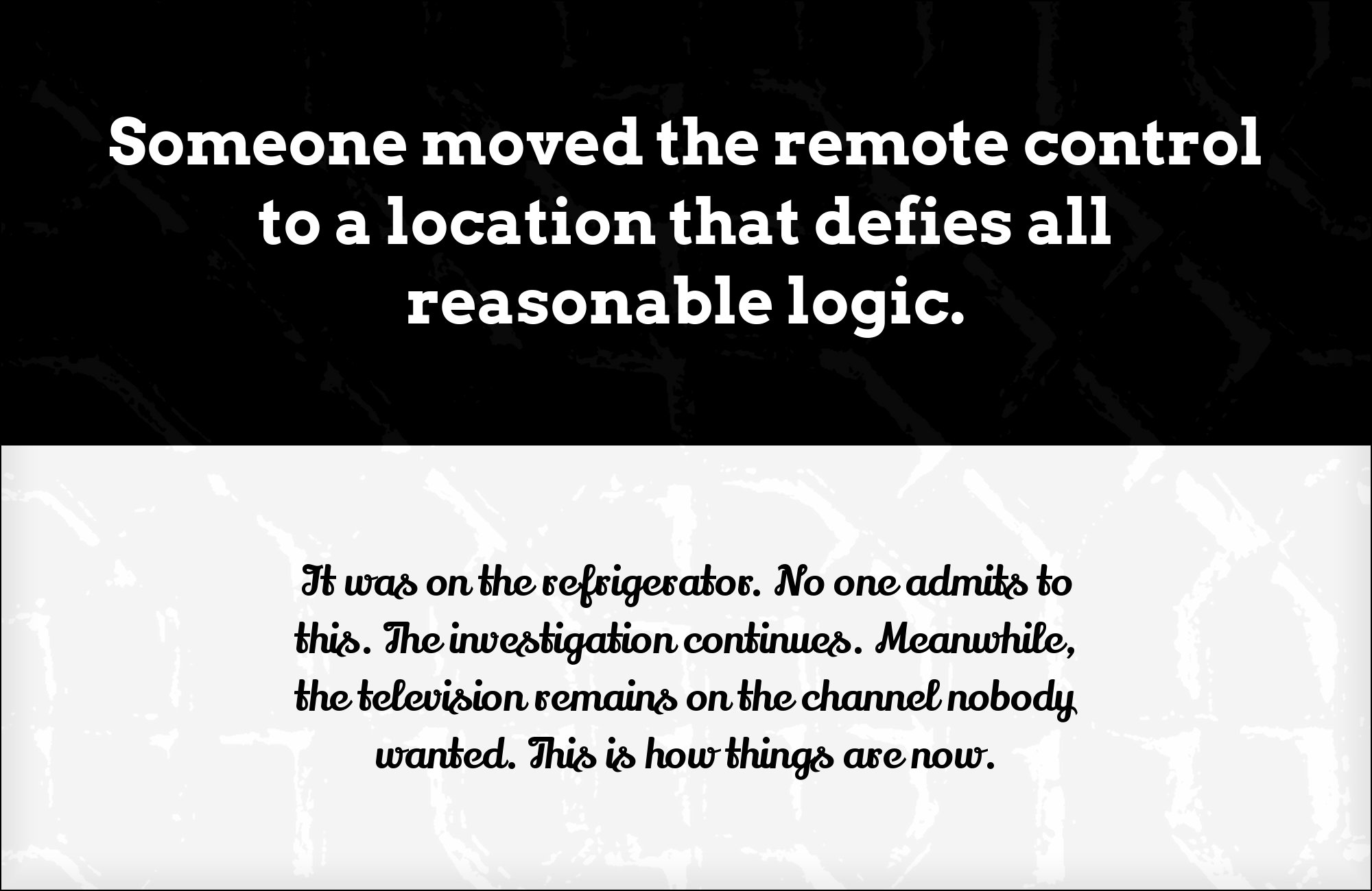
Julia Petretta designed Lily Script One, a single-weight display script with a bold, brush-like texture built for large-format lettering rather than running text. Against Arvo the logic is total complementarity: the script supplies every curve, diagonal and connection in the layout, and Arvo supplies every right angle, flat terminal and vertical stem. There is no shared feature for the two to compete over, which is why the combination reads as deliberate rather than accidental. It also matches the documented real-world pattern for Arvo — an expressive logotype on top, a structural slab underneath. Set Lily Script One for the brand mark or the single hero line, and use Arvo for headings, decks and body copy across the rest of the system.


13. Dancing Script
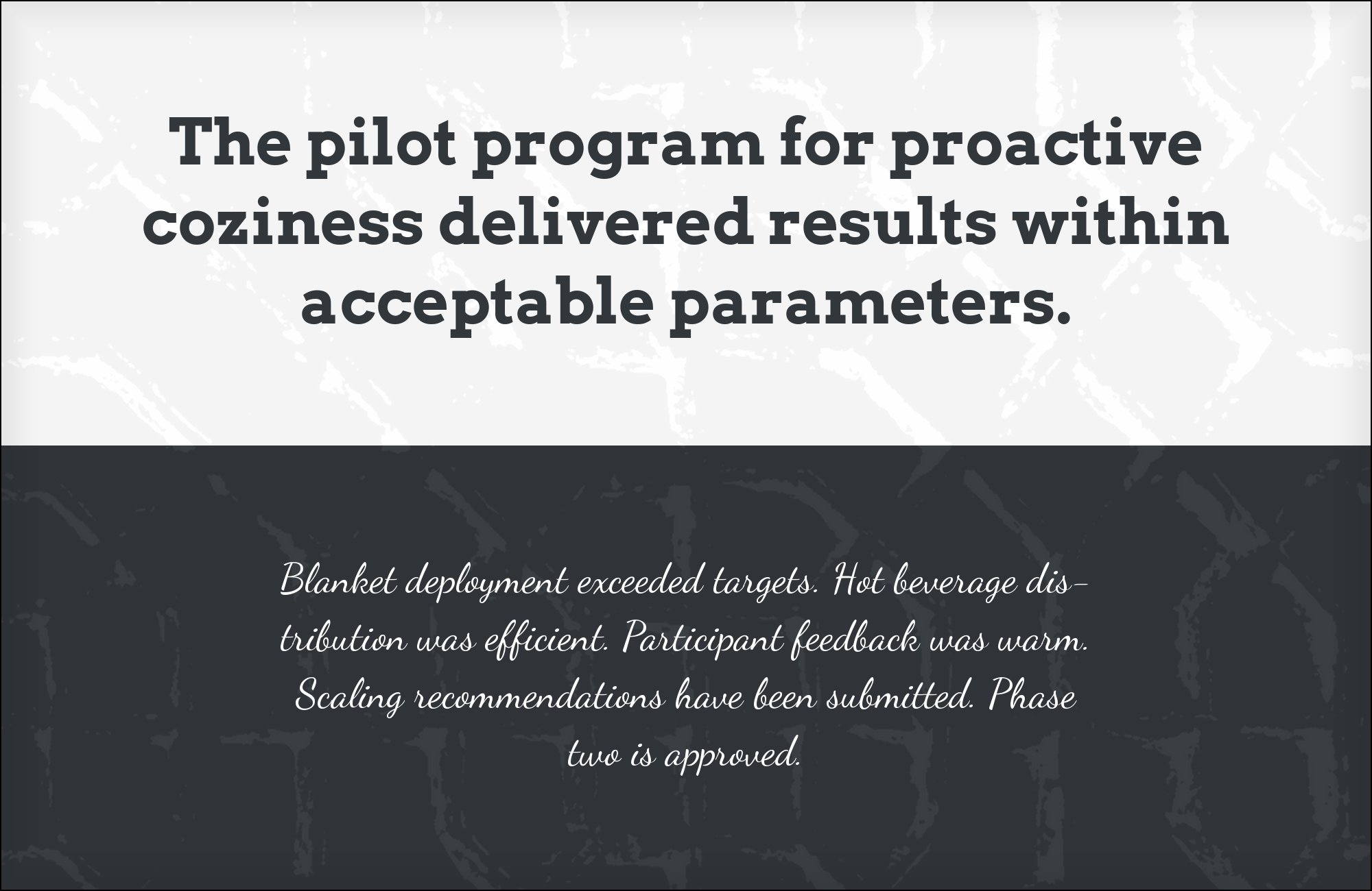
Typ.io records Dancing Script alongside Arvo on rtraction.com, providing evidence of shared use rather than a ready-made explanation of the typography. The visual argument is movement against structure: Dancing Script’s connected strokes and changing baseline interrupt the upright rhythm of Arvo’s slabs. Use the script for a brief invitation, a personal sign-off, or a campaign phrase, then return to Arvo for the supporting message. Give the script enough room to show its joins and avoid an equally heavy slab headline immediately beside it. This pairing is most convincing when one line feels handwritten and the next feels deliberately set, with clear spacing between those two voices.


14. Montserrat

Looka presents Arvo Bold with Montserrat body copy and demonstrates the combination in a table of contents. Arvo’s rectangular serifs give a short heading a firm edge, while Montserrat removes that extra detail from the information underneath. Both can look broad and assertive, so hierarchy needs more than a change of family. Set the slab noticeably larger, keep the supporting sans at a lighter weight, and test the actual line lengths. For a contents page, menu, or short explanatory panel, the pairing can provide a clear sequence without needing decorative rules around every item. Let spacing do some of that organizing work.


15. Work Sans

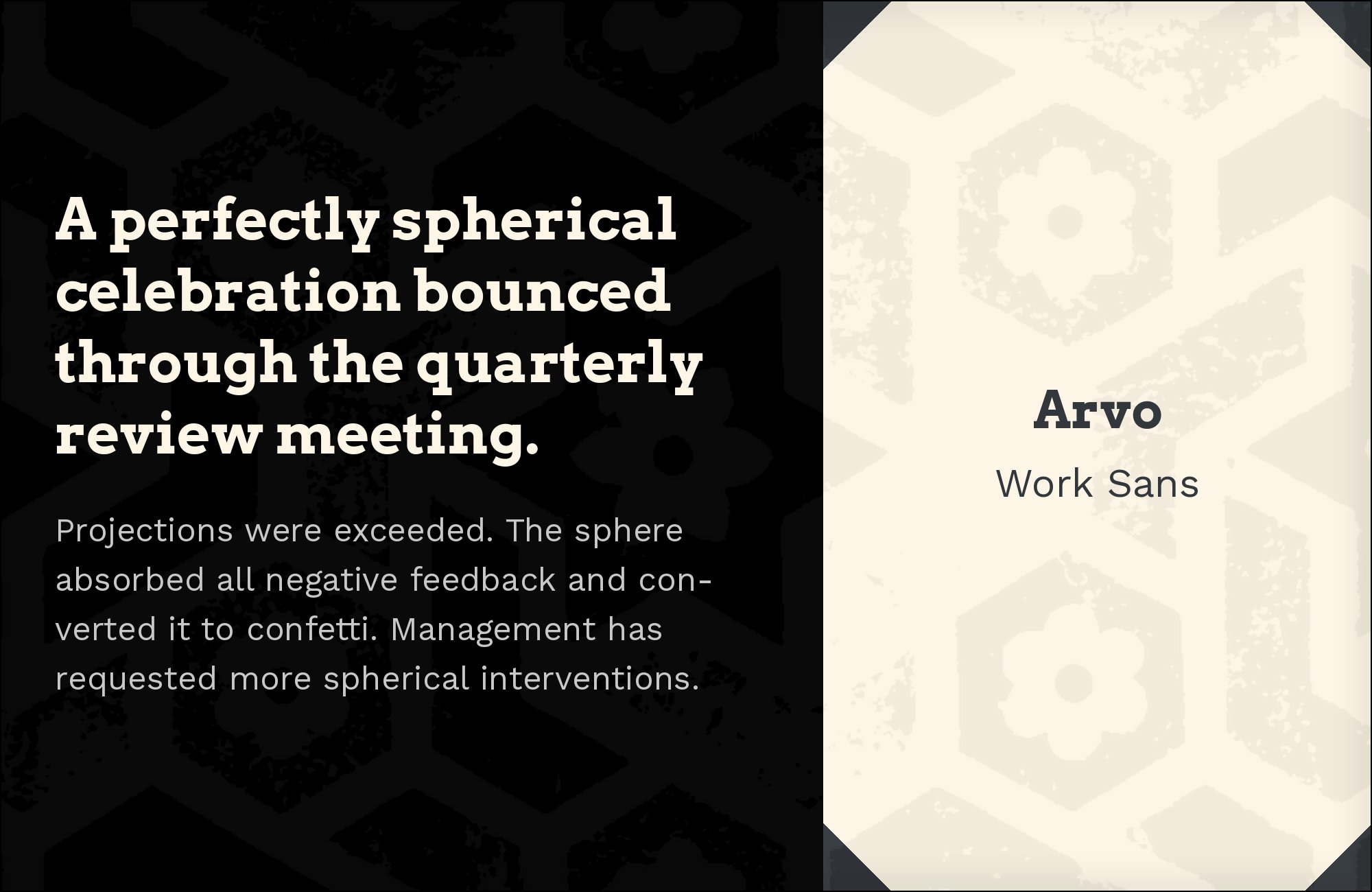
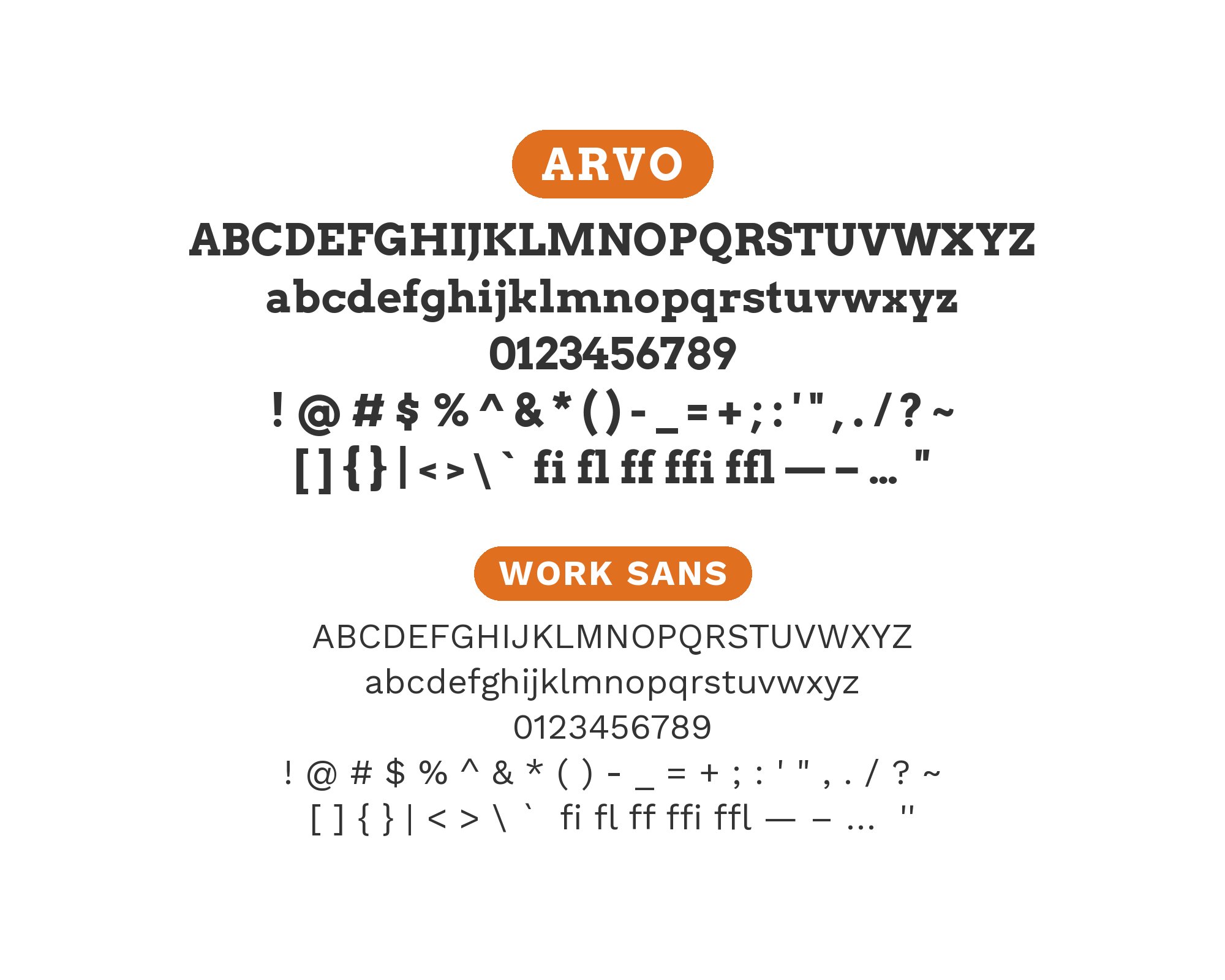
Fondation Marcel Hicter’s brand guidelines assign Arvo to titles and Work Sans to body text, a clean division between display structure and reading economy. Work Sans has open apertures, plain terminals, and a narrower average glyph width, so paragraphs feel lighter after Arvo’s broad bowls and rectangular serifs. Keep Arvo at a clearly larger size and let Work Sans remain regular or medium; pushing both families to bold makes their low-contrast strokes feel unnecessarily dense. This combination suits cultural organizations, reports, and editorial websites where headings need a sturdy identity but long passages still need an efficient, contemporary rhythm.
Conclusion
The honest summary of the evidence on Arvo is that it is a more flexible face than its reputation suggests. The published pairing guides repeatedly return to one recommendation — Arvo headline, Lato body — and that pair is genuinely good, matched in x-height and stroke rhythm and easy to deploy. But the archive of real published work tells a second story that the guides miss entirely: three of the five documented Arvo projects put somebody else’s display type on top and use Arvo for the readable middle of the page. Its large x-height, four shipped styles and screen-first proportions make that job possible in a way most slab serifs cannot manage.
Choose your partner from the role, then. If Arvo is the headline, pick a neutral humanist sans that matches its x-height and gives back the line economy the slabs cost you — Lato, Open Sans, Roboto, Fira Sans, Cabin or Roboto Condensed in narrow columns, with Arial standing in wherever webfonts cannot reach. If something else is the headline, Arvo becomes the disciplined text voice under a fat face, a script or a rounded geometric sans, and the pairing succeeds on the contrast between its right angles and the display face’s curves. Either way, set the combination at the real sizes you intend to publish: Arvo’s serifs are blunt enough to look coarse when scaled up carelessly and dense enough to fill in when scaled down too far.
Sources
- Typewolf (Arvo)
- Typ.io (Arvo)
- Typ.io pair page (Arvo + Arial)
- Typ.io pair page (Arvo + Open Sans)
- Fonts In Use (Arvo typeface page)
- Fonts In Use (Dosed)
- Fonts In Use (Bündnis 90 / Die Grünen)
- Fonts In Use (The Berliner pub)
- Fonts In Use (Tracks magazine covers, 2020)
- Fonts In Use (À la recherche d’Alex P.)
- Fonts In Use (search)
- Figma resource library
- Vandelay Design
- Vev (Lewis Bowen)
- Gravitate Design
- Pagecloud
- Easil font pairing guide
- Design Wizard (Elisabeth Strasser)
- Adobe Fonts (Arvo)
- Typ.io — rtraction.com sample
- Looka — Kaejon, font pair 6
- Fondation Marcel Hicter brand guidelines
