BonFX

Typography & Graphic Design Blog

  • Blog
  • Font Combinations
  • Books
    • The Preposterously Huge Book of Google Font Combinations
    • The Big Book of Font Combinations (Classic Fonts Edition)
  • Contact

The Basics of Color Theory For Beginners

Why Understand Color?

Why is understanding the basics of color theory important for budding designers? Find out answers to questions such as why some palettes work while others are repugnant, what color combinations you should avoid, how to sell with colors that punch or create harmonizing impressions. You will discover answers to these questions and transform your design as you begin to unravel the mystery of color theory. Learning the basics of color theory is essential if you are a new designer. Color is a crucial component of design that emphasizes various elements in a composition. When practicing good color theory, the design will naturally flow well, and likely elicit your desired response from viewers.  Color can be used to highlight typography or distinguish headers from content, emphasize graphic shapes, create rich backgrounds, or isolate areas needing attention. It can convey intense feelings and emotions that an artist might not otherwise be able to express. Likewise, as proven by marketing experts, color can be used to create a desired frame of mind – an allure for potential consumers. Whatever the case, placing tasteful color in a design isn’t arbitrary or flippant, but takes careful consideration. Otherwise, viewers could feel an uncomfortable resistance at first glance even if a hue is slightly off. It’s important to realize that color theory follows a logically organized system. The principles that make up color theory are precise, technical, and intentional. There is a science color theory! We’ll take a peek at some basic terms and principles to consider for making good color choices. But first, a little history on the color wheel…

The Color Wheel

In 1666 Sir Isaac Newton came to understand color like no one before by observing what happens to light as it bends through prisms, and at the time concluded that all colors derived from the primary colors red, yellow, and blue, or RYB. He then produced a circular diagram, paving the path for later understanding and color wheels to be developed by adding hues and variations. Later in the 19th century, scientists found the perception of color was actually expressed best in terms of red, green, and blue, or RGB as its primary colors.

Three Properties of Color

Hue, Value, and Chroma

Within the basic principles of color theory, hue, value, and chroma are fundamental terms that need to be defined.
  • Hue is the basic color name in all its shades; red, green, blue, etc. A hue would be the root of the color whether it be light, dark or dull.
  • You can determine the Value of color by the amount of light or dark that you add to it.  Shades are created when there’s an addition of black, whereas tints are made by adding white.
  • Chroma is another property of color that relates to brightness and saturation. For instance, a color that is fully saturated is unable to be brighter, or more colorful. However, when a color appears to have gray added, the color becomes dull, or desaturated – this is called tonal color. So, the more brightness the color holds, the more saturated it is.
Hue Saturation Value Color Theory In any typical software application, you will notice that a single hue will allow for tremendous variation of shades, value, and saturation which is why it’s important to understand color harmony.


Color Harmony

Color harmony refers to the use of colors that work well together, creating a visually pleasing and balanced composition. It involves selecting colors that complement each other and create a unified visual experience. There are several color harmony systems that provide guidelines for choosing colors that complement each other, including:

Standard Color Harmonies

  • Monochromatic Refers to colors that derive from a single hue. Adding black, gray, and white creates various shades, tones, and tints. Read this post on using Monochromatic colors effectively. Using Monochromatic colors brings fail-free cohesiveness to a piece along with a serene appearance to your work.
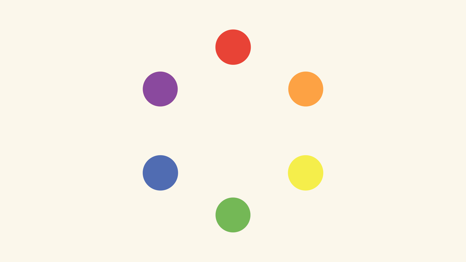
  • Tertiary, Secondary, Primary Mixing Primary colors will produce a Secondary color and mixing a Primary with a Secondary will form a Tertiary color
red, orange, yellow, green, blue, purple dots
  • Triadic Uses three equally spaced colors on the color wheel. Use for a bright design needing some bold contrast without creating tension. Try choosing one color to stand out, and the others to accent to create better harmony.
  • Analogous You can create analogous colors by using colors that are adjacent to eachother on the color wheel. This color palette works well when you are emphasizing a message without an overbearing design to detract attention. Also, it’s instinctually calming as you will find it most often in nature. Try sticking to either cool or warm shades, but not both.
  • Complementary Complementary colors are directly opposite each other on the color wheel. Often you will see red/green or purple/yellow in bold designs, but be careful when employing too many of these colors or placing them side by side. Complementary colors are great for bright and festive logo designs or poppy posters by bringing attention to a focal point and inspiring action.
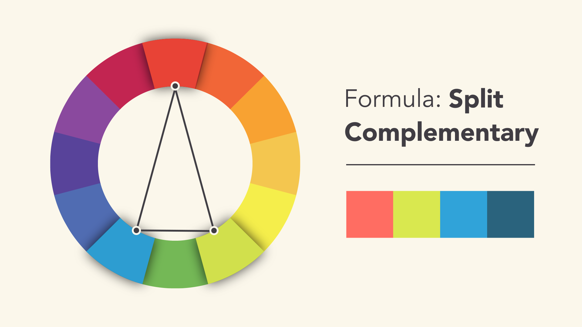
  • Split Complementary On your palette, you would choose two colors that are adjacent to ONE of the complementary pairs. This approach will tone down your color palette a bit as opposed to using the simple complementary palette.
Color Solid (aka color space, or color model)

It is essential to recognize the difference between both RYB and RGB color harmonies. Painters prefer using RYB and find it most harmonizing and visually appealing. Graphic designers, digital illustrators and web developers rely on RGB as computer screens emit white light colored by the RGB spectrum. If printing your work, however, use CYMK (cyan, yellow, magenta, black).  See below.
  • RGB – an Additive Model In the RGB model each color is produced from nothing –you’re simply adding/merging varying shades of each hue on a scale of 0-255. The additive process produces white light of the visible color spectrum when the colors are merged at full intensity.
  • RYB – a Subtractive Model In the commonly known color wheel, red, yellow, and blue are the primary colors.  From these colors, we can create the secondary triad – violet, orange, and green. This method of reducing and blending creates more saturated shades colors. Mixing fully saturated RYB colors gives the appearance of black.
  • CMYK – a Subtractive Model In this case, we start with all the colors cyan, yellow, magenta and black. Reducing or subtracting the colors leaves you with the appearance of black. You can create a full-color spectrum when printing in CYMK when the hue pigments acting as filters, subtract varying degrees of color from white light.
  • HSB Color Model In general software applications, you can find an HSB color model for hue, saturation, and brightness/value. It could also be HLS –  hue, lightness, and saturation which you can adjust as needed.
Additive vs Subtractive Color It’s also good to be aware that colors can convey various meanings culturally, so it’s worth studying something such as Guide to the Psychology of color. Generally, red conveys passion and urgency, blues are calming, and oranges and yellows, are warming. Cool colors tend to recede giving rise to warmer colors in your design, with darker shades in the foreground – all creating depth of value. Use highly saturated bright colors sparingly to bring focus or bold impact. As a designer, you should determine the hierarchy in their composition before adding their color.

Three Simple Pointers When Beginning a Design:

  • Start with a color palette Begin by selecting a color palette that fits the mood or theme of your design. Consider the purpose of your design and the emotions you want to evoke in your audience. Use a color wheel or a color palette tool to help you choose colors that work well together and create a harmonious composition.
  • Use color to create contrast and hierarchy Create visual interest and guide the viewer’s attention to specific elements in the design with color. Use contrasting colors to create a focal point or to emphasize important information. Use lighter or muted colors for less important elements or to create a sense of depth and balance in the composition.
  • Consider color accessibility Color accessibility is an important aspect of designing with color, especially when it comes to digital design. Make sure that your color choices are accessible to everyone, including people with color vision deficiencies. Use high-contrast colors to ensure that the text and important elements in your design are legible and easy to read. You can use color accessibility tools and resources to help you select colors that meet accessibility guidelines and standards.
Overall, designing with color requires careful consideration and planning. By using a well-thought-out color palette, creating contrast and hierarchy, and considering color accessibility, you can create visually appealing designs that communicate your message effectively.
 

Creating Below the Noise

How can one move into the act of creating from the usual habit of conscious, rational thinking to a different, more natural state of intuitive being? How does one learn to see things as they are, and out a deeper seeing become inspired to express oneself, and not just copy (though that copying might be fine, even great for some purposes). One of the biggest difficulties we’re facing as a society, as everyone knows, is the constant barrage of noise. We’re a culture addicted to instant gratification with the need to find out who’s texting us instantly, posting on social media, or more than often we’re wasting time dumbing ourselves down with daily news and following other pointless rabbit trails.

How is it possible then, to give ourselves space, not just space, but deep silence in order to tap into a deeper part of ourselves where the “genius” is can be found, so that we’re able to draw out some truly original work from an infinite stream of abundance. There are unlimited possibilities well below the surface that bubble up from a lively undercurrent, and it brims with life. You won’t find “drab” here, small boxes, rigidity or stuffiness. What’s likely to come out of this realm are creative nuggets born out of serene freedom, and a bit on the wild side, perhaps. You won’t find negativity or the self-critic here – you can save that for the ordinary mind. Rather, insights and affirmation come from these peaceful depths with fluidity and ease for the common good.

For now, I wanted to share some new and classic books on creativity, and how to give birth to the artist that’s buried within.

  • Bored and Brilliant: How Spacing Out Can Unlock Your Most Productive and Creative Self
  • The Power of Creativity : A Three-Part Series for Writers, Artists, Musicians and Anyone In Search of Great Ideas
  • Big Magic: Creative Living Beyond Fear
  • The Artist’s Way
  • The Art of Noticing: 131 Ways to Spark Creativity, Find Inspiration, and Discover Joy in the Everyday 
  • Keep Going: 10 Ways to Stay Creative in Good Times and Bad
  • An Audience of One: Reclaiming Creativity for Its Own Sake 
  • The Artist’s Journey: Bold Strokes To Spark Creativity
Enjoy.

A Few Books That Have Kept Me Making Things

These are books I’ve come back to over the years when I felt stuck, scattered, or a little disconnected from making things. They’re less about “how to be productive” and more about paying attention, trusting the work, and showing up even when it feels awkward or pointless.

I’ve dipped into them at different moments—when starting something new, when confidence dips, or when I need a reminder that creativity doesn’t need permission or an audience to be real.

The Power of Creativity : A Three-Part Series for Writers, Artists, Musicians and Anyone In Search of Great Ideas

The Artist’s Way

The Art of Noticing: 131 Ways to Spark Creativity, Find Inspiration, and Discover Joy in the Everyday

Keep Going: 10 Ways to Stay Creative in Good Times and Bad

The Artist’s Journey: Bold Strokes To Spark Creativity

An Audience of One: Reclaiming Creativity for Its Own Sake

Big Magic: Creative Living Beyond Fear

Art & Fear: Observations On the Perils (and Rewards) of Artmaking

The Creative Habit: Learn It and Use It for Life

Finding Your Voice as an Artist

“To be nobody-but-yourself — in a world which is doing its best, night and day, to make you everybody else — means to fight the hardest battle which any human being can fight.”

— E.E. Cummings

E.E. Cummings

The Battle for Creative Individuality

E.E. Cummings broke every rule of poetry. He ignored capitalization, invented punctuation, split words across lines, and arranged text spatially on the page. His work looked like nothing that came before because he refused to let convention dictate his expression. The quote above explains why: being yourself requires active resistance against the pressure to conform. For designers, this pressure comes from multiple directions. Clients want work that looks like what their competitors have. Design trends create homogeneity across the industry. Software defaults and templates push everyone toward similar solutions. Finding your own voice requires consciously pushing back against all of these forces.

Developing a Distinct Perspective

Your unique viewpoint comes from your specific combination of influences, experiences, and obsessions. No one else has read exactly what you have read, seen exactly what you have seen, or cares about exactly what you care about. That combination is your raw material for originality. The challenge is accessing that material while under pressure to deliver work that meets external expectations. Cummings solved this by refusing to separate his experiments from his “real” work. Everything he published reflected his authentic exploration, even when critics rejected it.

Practical Steps Toward Authenticity

Keep a file of work you love regardless of whether it is trendy or commercially successful. Notice what these pieces have in common. That pattern reveals your genuine taste, uncorrupted by what you think you should like. Take on projects where you have creative freedom, even if they pay less. The work you do without constraints often reveals your true direction. Over time, bring that sensibility into your client work, one element at a time.

How to choose from among all your great ideas

The Paradox of Too Many Ideas

Creative people rarely suffer from a lack of ideas. The problem is usually the opposite: too many ideas competing for attention, each one feeling urgent and promising. This abundance creates paralysis. How do you know which idea deserves your limited time and energy?
“I have lots of ideas. How do I pick the right one? Execute on as many as possible. The right idea will pick you.”

— James Altucher

Altuchers advice sounds counterintuitive at first. If you cannot decide between ideas, executing on all of them seems like it would scatter your focus even further. But there is wisdom in this approach that becomes clear once you try it.

Why Execution Reveals Truth

Ideas in your head exist in a perfect, untested state. They seem equally viable because you have not encountered the friction of making them real. Once you start executing, some ideas immediately reveal themselves as more difficult, less interesting, or less viable than they appeared in the abstract. Other ideas gain energy from execution. The more you work on them, the more possibilities you discover. New connections emerge. The work itself generates enthusiasm rather than draining it. These are the ideas worth pursuing. You cannot determine which ideas will respond this way without trying them. Thinking harder about which idea to choose just keeps you stuck in your head where all ideas remain equal.

Practical Application

When facing competing creative directions, give each one a small trial. Spend a few hours on each idea, doing real work rather than planning. Notice which ones make you want to keep going and which ones feel like obligations. The idea that survives contact with reality and still excites you has proven something. It has demonstrated that it can sustain your interest through difficulty. That track record matters more than any amount of speculation about potential.
  • « Previous Page
  • 1
  • …
  • 33
  • 34
  • 35
  • 36
  • 37
  • …
  • 82
  • Next Page »

The BonFX Letter

One good pairing.
Every Tuesday.

2-minute read · free

This week — no. 14

Quiet authority

Merriweather sets the tone in one line. Lato stays out of the way and lets it.

MERRIWEATHER 700  +  LATO 400

A font specimen, a pairing that works, and one line on why it works. That is the whole email.

Free. One click to unsubscribe. No sharing, ever.

Free download

The Typography Primer.
Yours, right now.

Adobe's classic · PDF · free

The Typography Primer — book cover

The guide to type that everyone learned from. Subscribe and it is yours instantly. The BonFX Letter follows.

Free. One click to unsubscribe. No sharing, ever.

Still Googling UX terms?

Stop. They're all right here.

UX for Cats book cover

50 terms. Illustrated.
So simple your cat gets it.

Get the Book →

Print & ePub on Amazon

350 font combinations you can steal.

The Big Book of Font Combinations

Every pairing shown in context — web, print, headings, body. Open it, find one that works, use it.

That's it. That's the book.

In print or ePub 40% OFF on Gumroad

Scrolling Google Fonts for "the right one"?

You've been at it for 20 minutes. You'll be at it for 20 more. There are 1,500 fonts in there.

Pocket Handbook of Google Fonts Combinations

We paired every useful Google Font.
7,500 pages. Done.

Get the PDF →

Instant download on Gumroad

Recent Inspirations

  • Fonts Similar to Helvetica October 13, 2026
  • Fonts Similar to Raleway October 13, 2026
  • Fonts Similar to Century Gothic October 13, 2026
  • Fonts Similar to Baskerville October 13, 2026
  • What Fonts Go With Bodoni Moda? October 5, 2026
  • What Fonts Go With Urbanist? October 5, 2026
  • What Fonts Go With Figtree? October 5, 2026
  • What Fonts Go With Outfit? October 5, 2026
  • What Fonts Go With Jost? October 5, 2026
  • What Fonts Go With Andale Mono? October 5, 2026
  • What Fonts Go With Agenda? October 5, 2026
  • What Fonts Go With Fraunces? October 5, 2026
  • What Fonts Go With Marcellus? October 5, 2026
  • What Fonts Go With Zilla Slab? October 5, 2026
  • What Fonts Go With Utopia? September 30, 2026

About BonFX

Douglas Bonneville has been a graphic designer since 1992 and has written about type here since 2009. BonFX is a blog about typography and design, and the books that came out of it.

  • The Big Book of Font Combinations
  • The Preposterously Huge Book of Google Font Combinations
  • UX for Cats

More about BonFX →

Start Here

  • Font Combinations: The Complete Guide
  • The 100 Best Fonts
  • 17 Types of Fonts
  • 29 Principles for Great Font Combinations
  • 23 Really Bad Font Choices
  • 20 Free Google Wedding Font Combinations

Contact

Questions about the books or the site? Contact us.

Follow @dbonneville on X.

The BonFX Letter: one good pairing every Tuesday, free. The signup is in the sidebar of every page.

Copyright © 2026 · BonFX

  • Blog
  • Font Combinations
  • Books
    • The Preposterously Huge Book of Google Font Combinations
    • The Big Book of Font Combinations (Classic Fonts Edition)
  • Contact