Why is understanding the basics of color theory important for budding designers? Find out answers to questions such as why some palettes work while others are repugnant, what color combinations you should avoid, how to sell with colors that punch or create harmonizing impressions. You will discover answers to these questions and transform your design as you begin to unravel the mystery of color theory.
Learning the basics of color theory is essential if you are a new designer. Color is a crucial component of design that emphasizes various elements in a composition. When practicing good color theory, the design will naturally flow well, and likely elicit your desired response from viewers. Color can be used to highlight typography or distinguish headers from content, emphasize graphic shapes, create rich backgrounds, or isolate areas needing attention. It can convey intense feelings and emotions that an artist might not otherwise be able to express. Likewise, as proven by marketing experts, color can be used to create a desired frame of mind – an allure for potential consumers.
Whatever the case, placing tasteful color in a design isn’t arbitrary or flippant, but takes careful consideration. Otherwise, viewers could feel an uncomfortable resistance at first glance even if a hue is slightly off. It’s important to realize that color theory follows a logically organized system. The principles that make up color theory are precise, technical, and intentional. There is a science color theory! We’ll take a peek at some basic terms and principles to consider for making good color choices. But first, a little history on the color wheel…
The Color Wheel
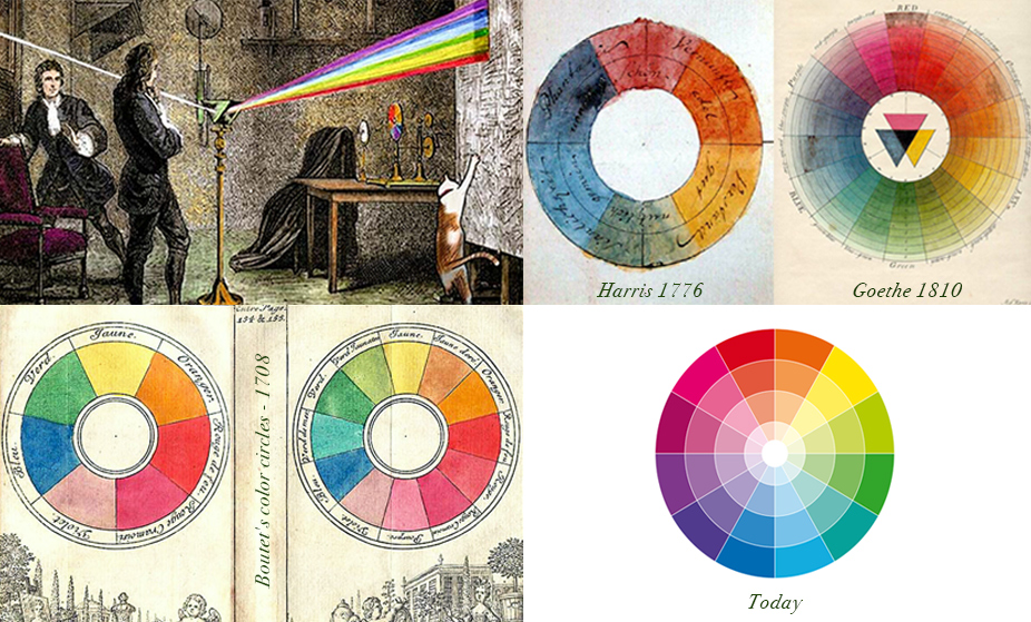
In 1666 Sir Isaac Newton came to understand color like no one before by observing what happens to light as it bends through prisms, and at the time concluded that all colors derived from the primary colors red, yellow, and blue, or RYB. He then produced a circular diagram, paving the path for later understanding and color wheels to be developed by adding hues and variations. Later in the 19th century, scientists found the perception of color was actually expressed best in terms of red, green, and blue, or RGB as its primary colors.
Three Properties of Color
Hue, Value, and Chroma
Within the basic principles of color theory, hue, value, and chroma are fundamental terms that need to be defined.
Hue is the basic color name in all its shades; red, green, blue, etc. A hue would be the root of the color whether it be light, dark or dull.
You can determine the Value of color by the amount of light or dark that you add to it. Shades are created when there’s an addition of black, whereas tints are made by adding white.
Chroma is another property of color that relates to brightness and saturation. For instance, a color that is fully saturated is unable to be brighter, or more colorful. However, when a color appears to have gray added, the color becomes dull, or desaturated – this is called tonal color. So, the more brightness the color holds, the more saturated it is.
In any typical software application, you will notice that a single hue will allow for tremendous variation of shades, value, and saturation which is why it’s important to understand color harmony.
Color Harmony
Color harmony refers to the use of colors that work well together, creating a visually pleasing and balanced composition. It involves selecting colors that complement each other and create a unified visual experience.
There are several color harmony systems that provide guidelines for choosing colors that complement each other, including:
Standard Color Harmonies
Monochromatic
Refers to colors that derive from a single hue. Adding black, gray, and white creates various shades, tones, and tints. Read this post on using Monochromatic colors effectively. Using Monochromatic colors brings fail-free cohesiveness to a piece along with a serene appearance to your work.
Tertiary, Secondary, Primary
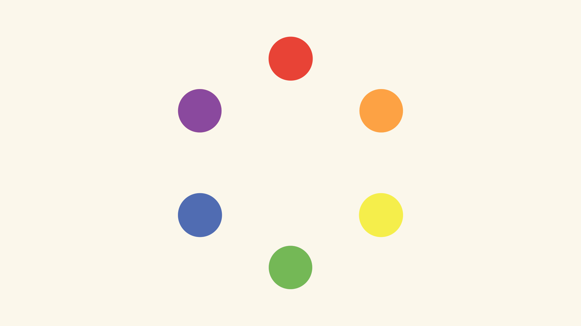
Mixing Primary colors will produce a Secondary color and mixing a Primary with a Secondary will form a Tertiary color
Triadic
Uses three equally spaced colors on the color wheel. Use for a bright design needing some bold contrast without creating tension. Try choosing one color to stand out, and the others to accent to create better harmony.
Analogous
You can create analogous colors by using colors that are adjacent to eachother on the color wheel. This color palette works well when you are emphasizing a message without an overbearing design to detract attention. Also, it’s instinctually calming as you will find it most often in nature. Try sticking to either cool or warm shades, but not both.
Complementary
Complementary colors are directly opposite each other on the color wheel. Often you will see red/green or purple/yellow in bold designs, but be careful when employing too many of these colors or placing them side by side. Complementary colors are great for bright and festive logo designs or poppy posters by bringing attention to a focal point and inspiring action.
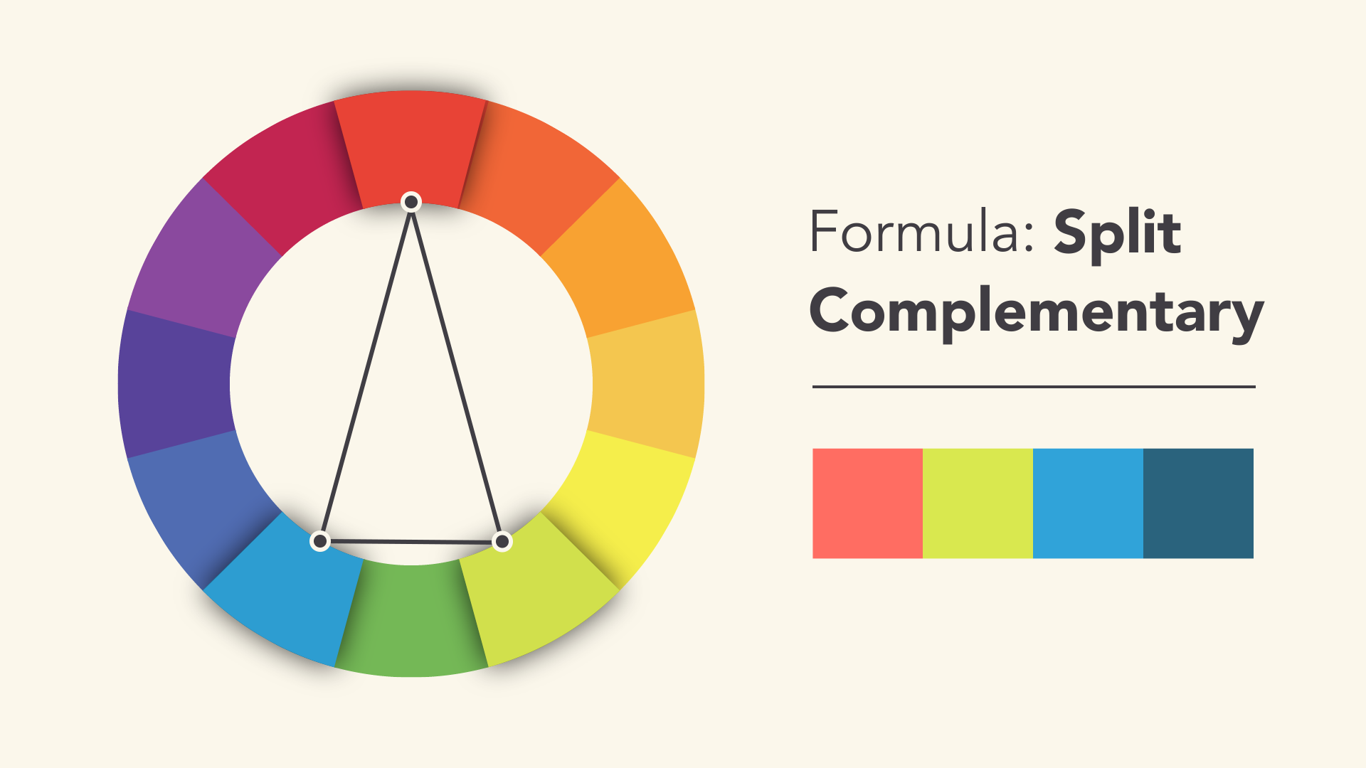
Split Complementary
On your palette, you would choose two colors that are adjacent to ONE of the complementary pairs. This approach will tone down your color palette a bit as opposed to using the simple complementary palette.
Color Solid (aka color space, or color model)
It is essential to recognize the difference between both RYB and RGB color harmonies. Painters prefer using RYB and find it most harmonizing and visually appealing. Graphic designers, digital illustrators and web developers rely on RGB as computer screens emit white light colored by the RGB spectrum. If printing your work, however, use CYMK (cyan, yellow, magenta, black). See below.
RGB – an Additive Model
In the RGB model each color is produced from nothing –you’re simply adding/merging varying shades of each hue on a scale of 0-255. The additive process produces white light of the visible color spectrum when the colors are merged at full intensity.
RYB – a Subtractive Model
In the commonly known color wheel, red, yellow, and blue are the primary colors. From these colors, we can create the secondary triad – violet, orange, and green. This method of reducing and blending creates more saturated shades colors. Mixing fully saturated RYB colors gives the appearance of black.
CMYK – a Subtractive Model
In this case, we start with all the colors cyan, yellow, magenta and black. Reducing or subtracting the colors leaves you with the appearance of black. You can create a full-color spectrum when printing in CYMK when the hue pigments acting as filters, subtract varying degrees of color from white light.
HSB Color Model
In general software applications, you can find an HSB color model for hue, saturation, and brightness/value. It could also be HLS – hue, lightness, and saturation which you can adjust as needed.
It’s also good to be aware that colors can convey various meanings culturally, so it’s worth studying something such as Guide to the Psychology of color. Generally, red conveys passion and urgency, blues are calming, and oranges and yellows, are warming. Cool colors tend to recede giving rise to warmer colors in your design, with darker shades in the foreground – all creating depth of value. Use highly saturated bright colors sparingly to bring focus or bold impact. As a designer, you should determine the hierarchy in their composition before adding their color.
Three Simple Pointers When Beginning a Design:
Start with a color palette
Begin by selecting a color palette that fits the mood or theme of your design. Consider the purpose of your design and the emotions you want to evoke in your audience. Use a color wheel or a color palette tool to help you choose colors that work well together and create a harmonious composition.
Use color to create contrast and hierarchy
Create visual interest and guide the viewer’s attention to specific elements in the design with color. Use contrasting colors to create a focal point or to emphasize important information. Use lighter or muted colors for less important elements or to create a sense of depth and balance in the composition.
Consider color accessibility
Color accessibility is an important aspect of designing with color, especially when it comes to digital design. Make sure that your color choices are accessible to everyone, including people with color vision deficiencies. Use high-contrast colors to ensure that the text and important elements in your design are legible and easy to read. You can use color accessibility tools and resources to help you select colors that meet accessibility guidelines and standards.
Overall, designing with color requires careful consideration and planning. By using a well-thought-out color palette, creating contrast and hierarchy, and considering color accessibility, you can create visually appealing designs that communicate your message effectively.
Massimo Vignelli believed that design principles transcend individual disciplines. Whether designing a subway map, a corporate identity, packaging, furniture, or tableware, the same fundamental rules apply. Visual hierarchy, proportion, grid systems, and typographic discipline work across every medium and scale.
This philosophy stands in contrast to the specialization that dominates modern design. Vignelli would have found it strange that a “web designer” might consider themselves unable to design a book, or that a “brand designer” might avoid packaging. For Vignelli, these artificial boundaries limited creative potential.
The Six Typefaces
Vignelli famously claimed that designers only need six typefaces: Garamond, Bodoni, Century Expanded, Futura, Times Roman, and Helvetica. This constraint was intentional. By limiting his typographic palette, he could focus attention on how type was used rather than which type was chosen.
Modern designers have access to thousands of fonts, which often leads to paralysis or poor choices. There is wisdom in Vignellis restraint. Master a small set of typefaces thoroughly before expanding your toolkit. Know how each one behaves at different sizes, in different contexts, with different spacing.
Timeless Over Trendy
Vignelli dismissed design trends as superficial and temporary. His work aimed for timelessness, which he defined as designs that would remain valid across decades. The New York subway map he designed in 1972 lasted until 1979 and remains influential today.
Achieving timelessness requires stripping away anything fashionable. What remains are fundamental principles of clarity, hierarchy, and proportion that do not change with shifting tastes. Evaluate your work by asking whether it will still function in ten years. If it relies on a current trend for its appeal, it has a short shelf life.
Read Design Culture for an insightful interview with Vignelli covering his story, thoughts on design and type, and advice to young designers.
What artist wouldn’t love this job? New York based studio, Obvious State combined their love of books with their talent for illustration. Now partnering with Boxcar Press, they’re able to produce high quality prints on letterpress. Lovely!
The Bibliophilia collection is inspired by an obsession with the underlined passages in our favorite books. Snippets of text from authors, philosophers and thinkers are used as a springboard for a new idea and illustration.
A good reminder for those of us who still think too much and drown out the creative voice within…..
The men of experiment are like the ant; they only collect and use. The reasoners resemble spiders, who make cob-webs out of their own substance. But the bee takes a middle course; it gathers its material from the flowers of the garden and of the field, but transforms and digests it by a power of its own. – Francis Bacon
Cara Enteles, Bee Polinating Apple Blossom, 2017
And, a bit less poetically, Guy Claxton writes about a study of creativity in “Hare Brain, Tortoise Mind”:
The study of creativity in many different areas shows that what is required for optimal cognition is a fluid balance between modes of mind that are effortful, purposeful, detailed and explicit on the one hand, and those that are playful, patient and implicit on the other. We need to be able both to generate ideas, and also to evaluate them. Intuition is the primary mode of generation. D-mode [deliberating mind] is the primary mode of evaluation.
From an excerpt by English poet Alfred Edward Housman as he articulates his creative process using a balanced mix of intuitive and conscious effort (applicable to all artists, of course…):
Having drunk a pint of beer at luncheon… I would go out for a walk of two or three hours. As I went along, thinking of nothing in particular, only looking at things around me and following the progress of the seasons, there would flow into my mind, with a sudden and unaccountable emotion, sometimes a line or two of verse, sometimes a whole stanza at once, accompanied, not preceded, by a vague notion of the poem which they were destined to form part of…When I got home I wrote them down, leaving gaps, and hoping that for their inspiration might be forthcoming another day. Sometimes it was, if I took my walks in a receptive and expectant frame of mind; but sometimes the poem had to be taken in hand and completed by the brain, which was apt to be a matter of trouble and anxiety, involving trial and disappointment, and sometimes ending in failure. I happen to remember distinctly the genius of the piece which stands last in my first volume. Two of the stanzas, I do not say which, came into my head, just as they are printed, while I was crossing the corner of Hampstead Heath between Spaniards Inn and the footpath of Temple Fortune. A third stanza came with a little coaxing after tea. One more was needed, but it did not come: I had to turn to and compose it myself, that was a laborious business. I wrote it thirteen times, and it was more than a twelvemonth before I got it right.
As creatives, it often seems we try and forcefully recapture creativity or an idea when faced with the famous white canvas or blank screen. Maybe it’s during these times that we get off our duffs and go for a thoughtless stroll, or make a tea and play with the cat in order to allow something deeper than the intellect to percolate and bubble up in its own time.
Douglas Bonneville has been a graphic designer since 1992 and has written about type here since 2009. BonFX is a blog about typography and design, and the books that came out of it.