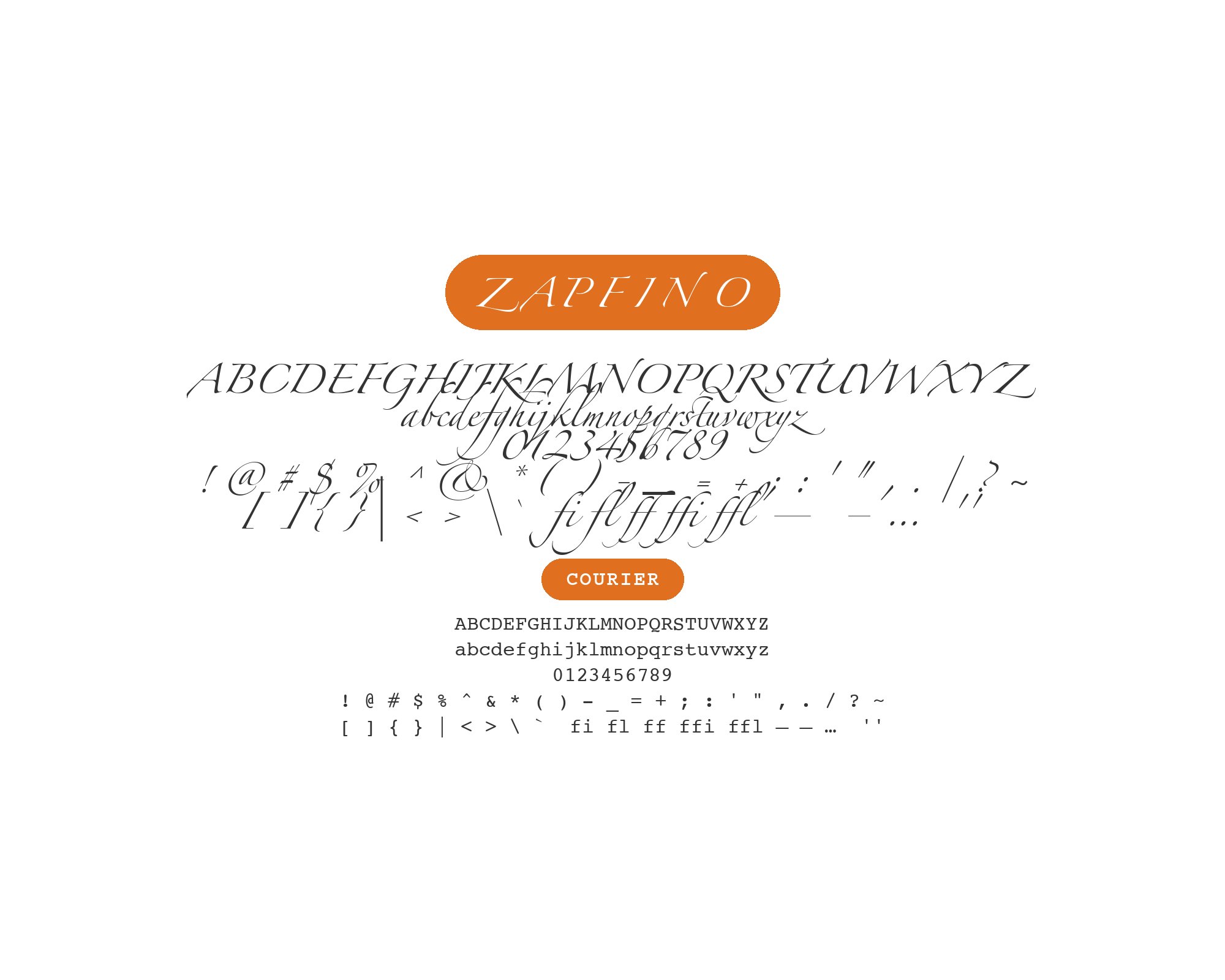
Zapfino pairs great with Myriad, Gill Sans and Frutiger. All 10 pairings are shown below in real rendered specimens, with the reason each one works. Every pairing below is checked against 11 published typography sources.
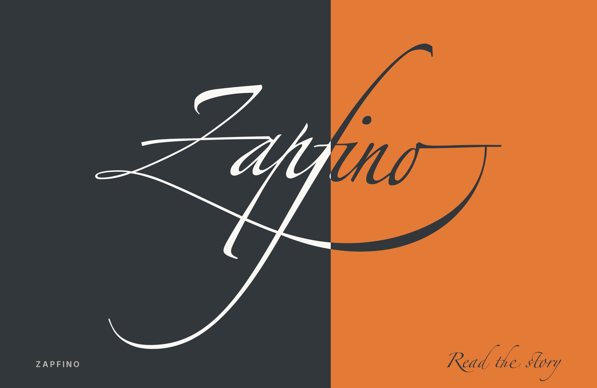
What fonts go with Zapfino? Any script this ornamental makes the same demand of its partners: they must stay low in contrast, steady in weight, and attempt no flourish of their own.
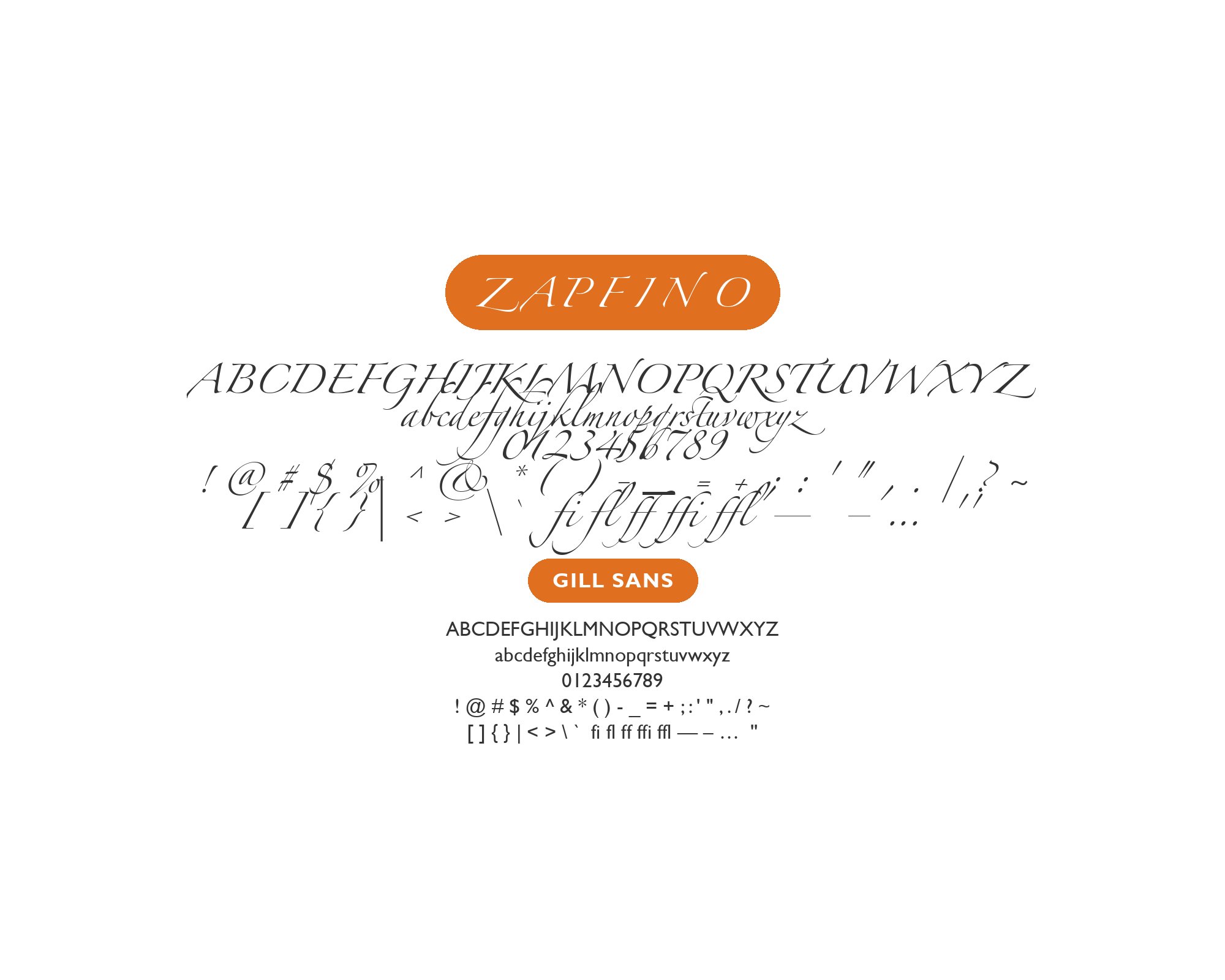
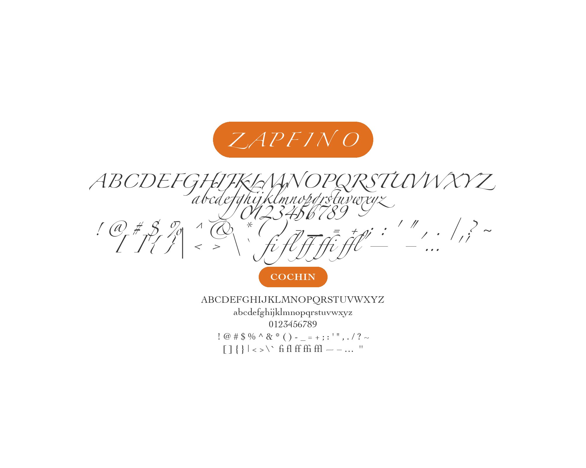
Hermann Zapf drew Zapfino from a calligraphic alphabet he penned in 1944; Linotype released it in 1998 as four interchangeable alphabets, and Zapf reworked and expanded the family with Akira Kobayashi as Zapfino Extra in 2003. It is a calligraphic script — steeply slanted, dramatically thick-thin, and loaded with alternate glyphs, ligatures, and flourishes that let a designer vary repeated letterforms. That ornamental density is the point: Zapfino is display lettering drawn from the calligraphy Zapf wrote by hand, not text type, and it behaves like one voice singing over everything else on the page. Its alternate glyphs and ligatures give a designer many ways to shape a name — a range no partner font needs to imitate.
The evidence for pairing it is unusually well documented. A public Adobe Community thread — with named credentialed experts including Thomas Phinney, Adobe’s product manager for fonts and global typography from 1997 to 2008 — debated Zapfino companions in detail, and the Fonts In Use archive records real productions where designers put the script to work beside specific partners. The expert thread favors humanist, pen-born partners, while the real-use archive also documents deliberate geometric counterpoints. The supporting cast divides by job — humanist sans faces for structure, old-style serifs for reading, and deliberate counterpoints for contrast. Keeping a second ornamental face out of the system gives Zapfino room to work. Here are 10 fonts that pair with Zapfino, every one of them backed by an expert recommendation or a real production, not an affiliate listicle.
1. Myriad
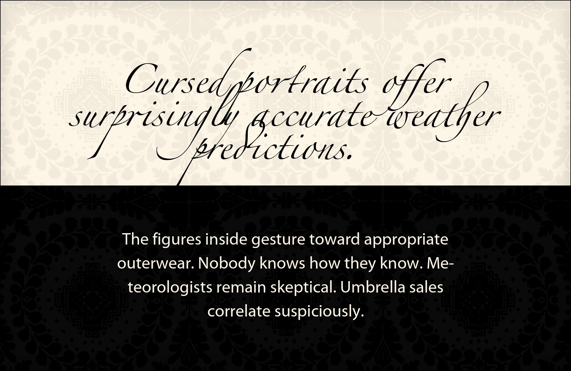
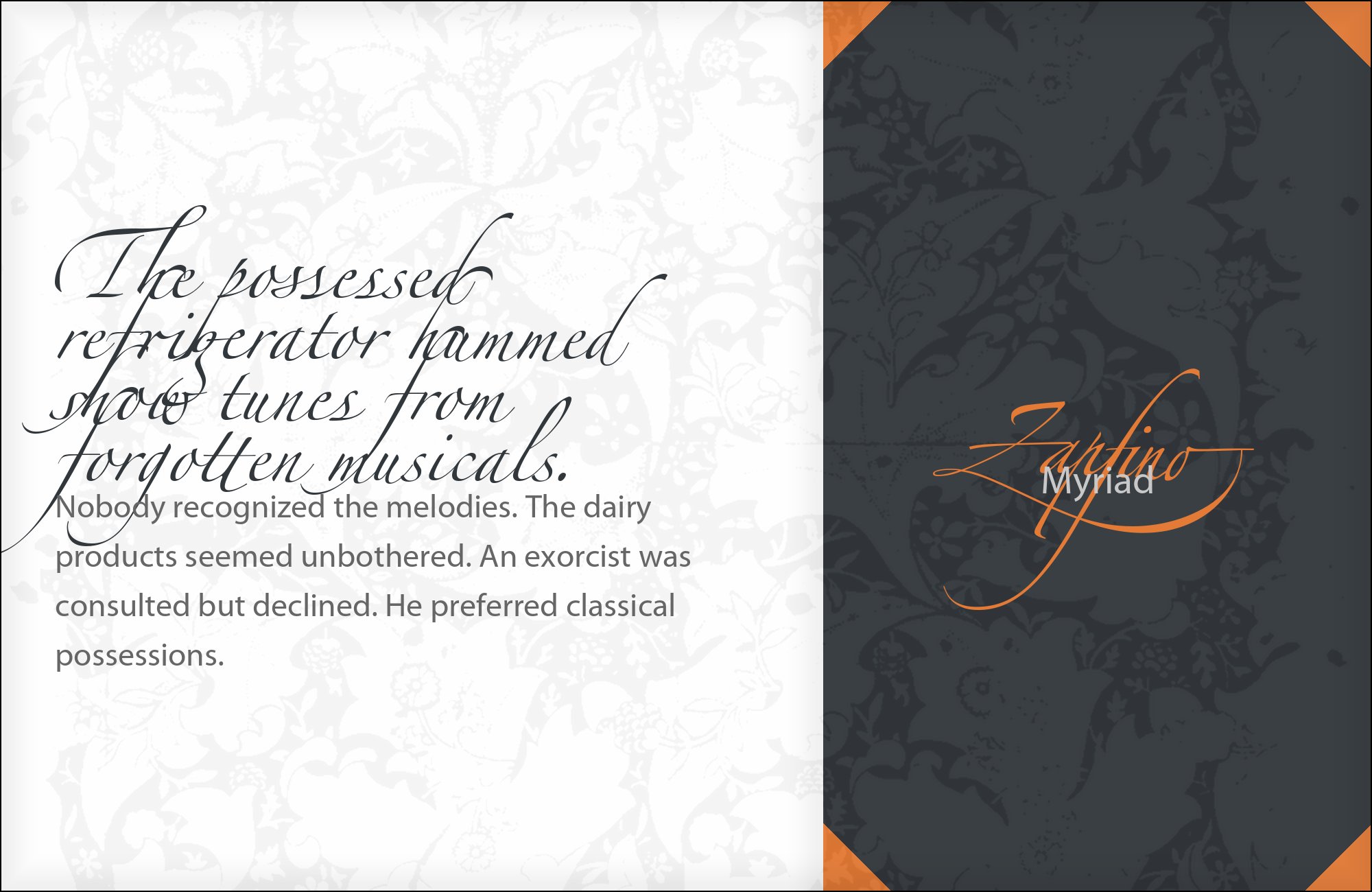
Set Myriad in its regular and semibold weights only — its black is too assertive beside the script. Sizes from 11 to 14 points carry subtitles comfortably, and the humanist apertures keep the text open under the dense flourishes above it. This is the safest Zapfino system to hand to a production team because neither face can embarrass the other.
Robert Slimbach and Carol Twombly drew Myriad for Adobe in 1992, and it became the humanist sans of its era — most famously as Apple’s corporate face from 2002 to 2017. In the Adobe Community thread, Phinney names it first: Zapfino’s humanist script nature calls for a humanist sans, and Myriad’s open apertures and modest stroke contrast supply exactly that. The script supplies the emotion; Myriad supplies the clean, warm, unargumentative structure. Use it for subtitles and body text where the flourishes must never be repeated at small sizes.

Build free, plus 500 AI credits.
Design and publish a site at no cost. Paid plans double your credits the first month.
Start free2. Gill Sans
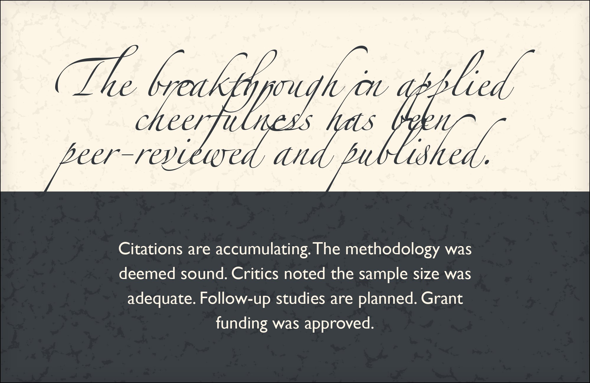
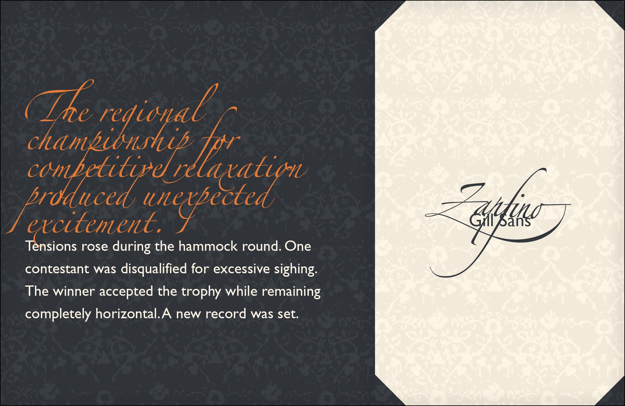
Give Gill Sans the headings-and-captions layer rather than long body text; its quirky lowercase tires at essay length. At 12 to 16 points beside Zapfino display lines the shared pen-drawn ancestry reads instantly — the layout feels drawn by one hand across a century, which is precisely what heritage and hospitality brands pay for.
Eric Gill drew Gill Sans in 1928, tracing its skeleton to Edward Johnston’s London Underground lettering — a separate calligraphic lineage that gives it useful kinship with Zapfino. In the expert thread, type veteran Neil Keller endorses the pairing outright after Phinney proposes it, calling Gill Sans “a wonderful choice.” The shared pen-drawn ancestry is why it works: Gill Sans’s humanist letterforms feel related to the script without ever imitating its slant or its contrast. For heritage branding, set the Gill Sans captions one step below the body size and let the script hold every display line.
3. Frutiger

Frutiger’s wayfinding pedigree means it never argues with a display face: it simply stays legible. Use its 45 and 65 weights for practical layers — addresses, dates, opening hours — and let Zapfino own every emotional word. Packaging and signage systems are where this documented combination proves itself.
Adrian Frutiger drew the signage alphabet for Charles de Gaulle Airport in the early 1970s as Roissy, and it reached the market as Frutiger in 1976; its loose, open letterforms were engineered to stay legible under pressure. Phinney’s thread lists it among the sans partners Zapfino’s humanist nature “really calls for.” The airport DNA matters here: Frutiger keeps its cool at small sizes and awkward angles, which is what supporting text next to a swash-heavy script needs. Give Zapfino the name and Frutiger everything practical, and the hierarchy explains itself without a single rule line.


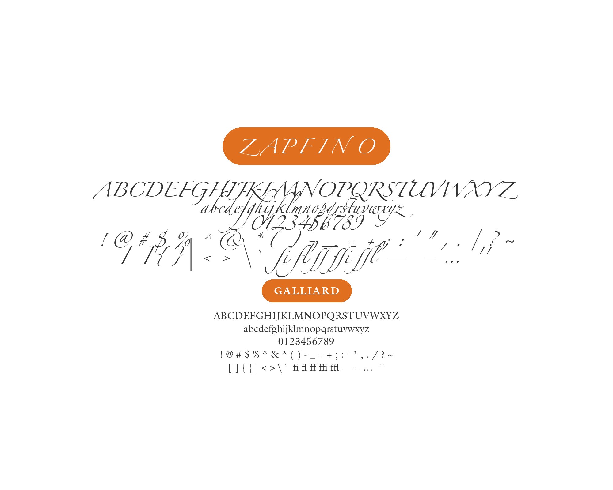
4. Galliard
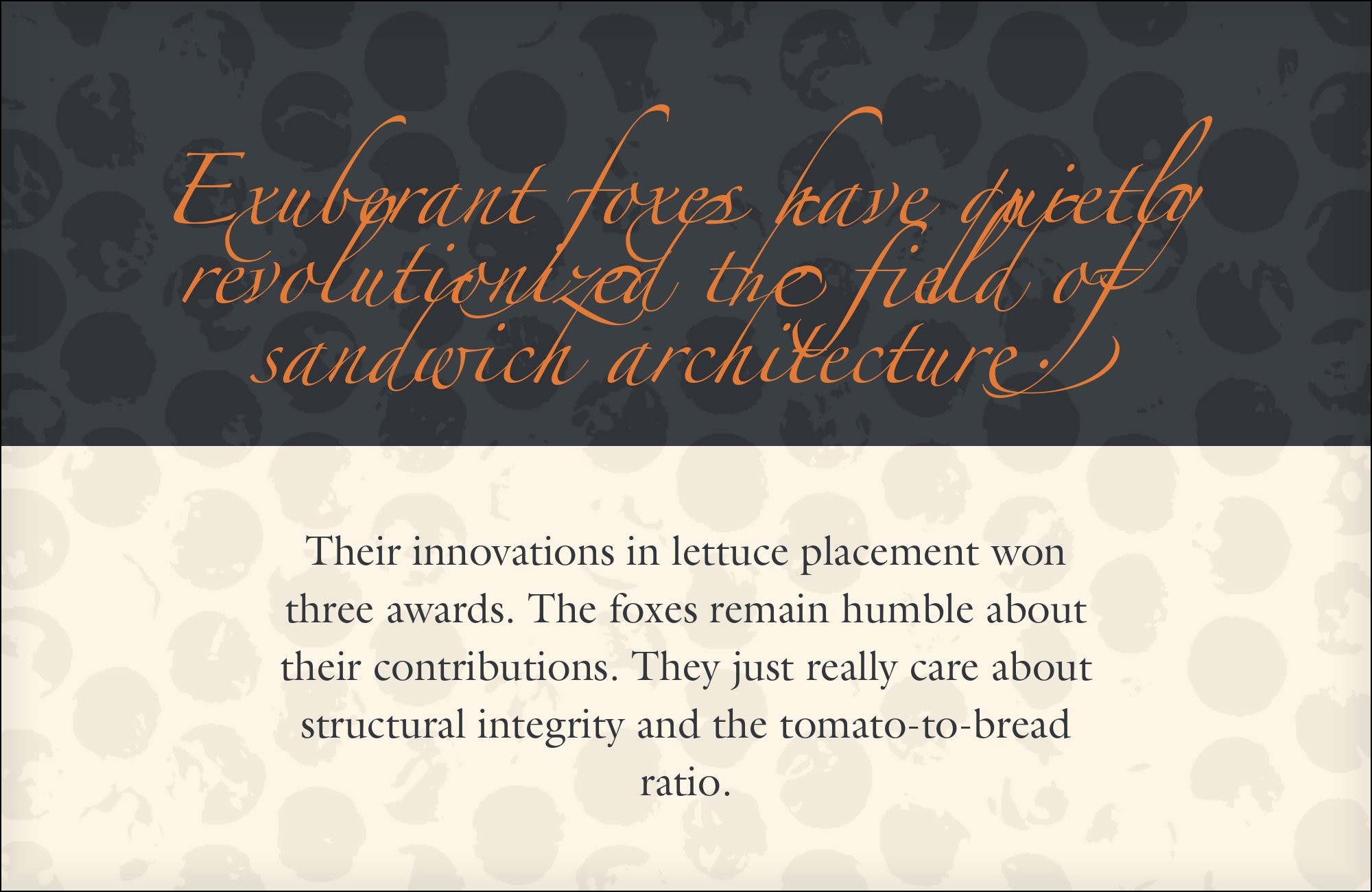
Keller’s advice to keep the partner light, airy, and conservative describes Galliard exactly. Set it at 10 to 12 points with generous leading for the reading text, and resist the display weights — the script supplies all the ornament the page needs. Galliard’s true italic can carry quotations in the same pen-born voice as the script without imitating its slant.
Matthew Carter drew Galliard in 1978 from Robert Granjon’s sixteenth-century roman, and Neil Keller’s thread recommendations name it among the “well-crafted, lighter weight serif fonts that look like they have roots in calligraphy” Zapfino wants. Granjon’s italic tradition is pen-born, so Galliard’s calligraphic italic shares the script’s stroke logic at a completely calm register. The sturdy old-style structure carries paragraph after paragraph beside the flourishes without strain — the specific job Keller described when he advised keeping Zapfino’s partner “conservative” and “airy.”

5. Palatino
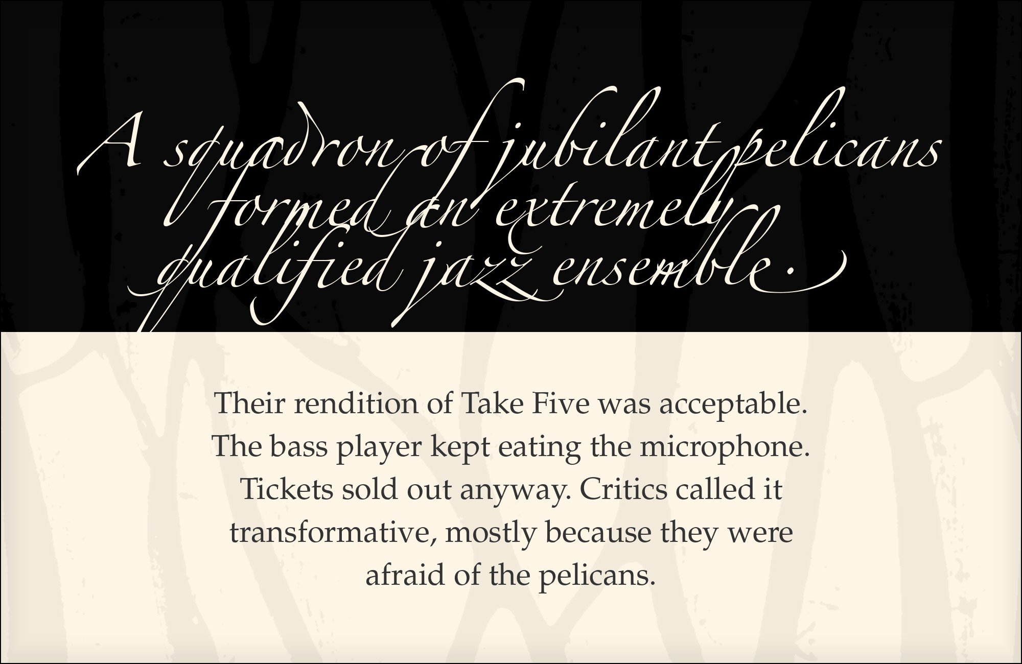
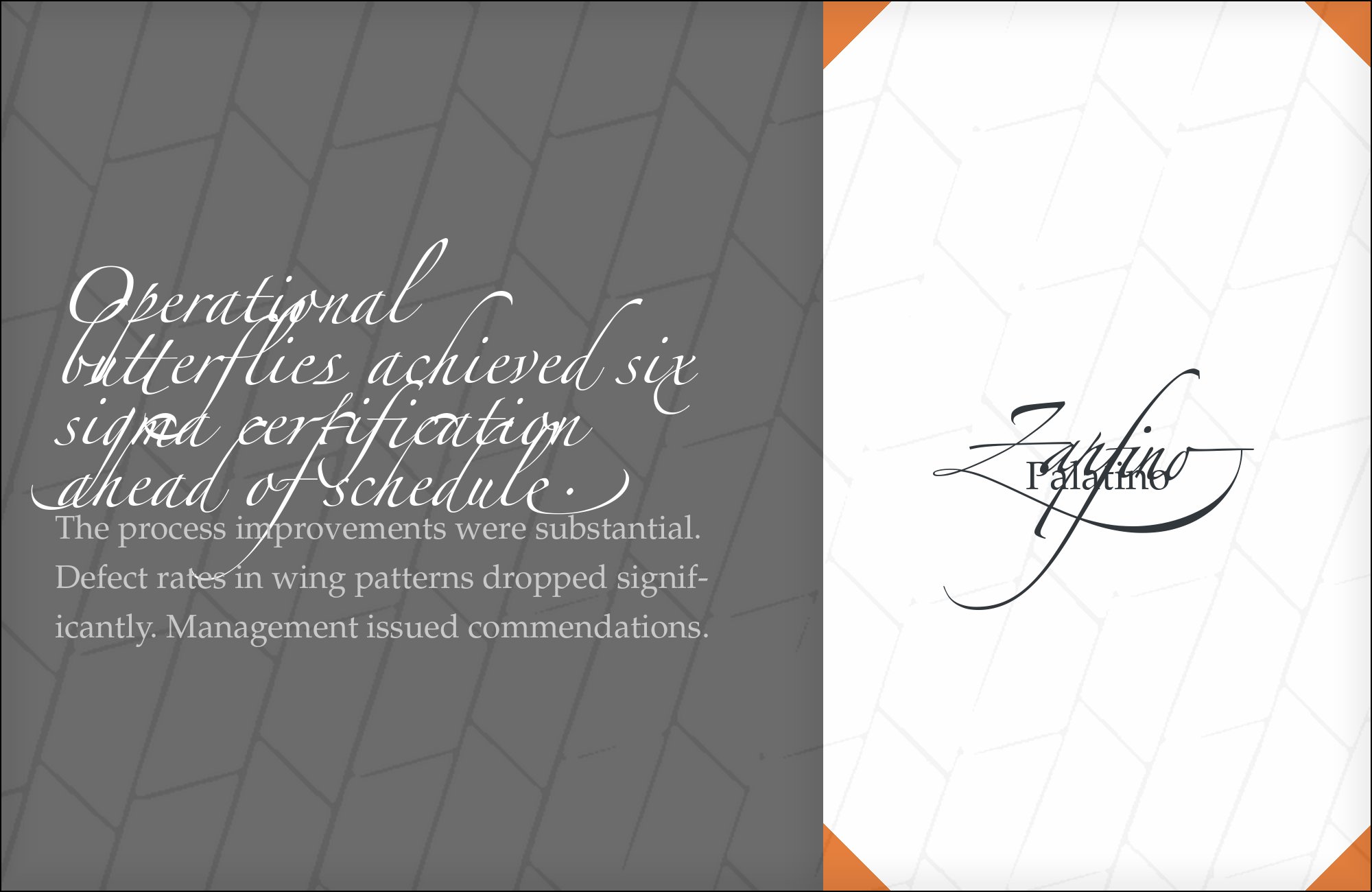
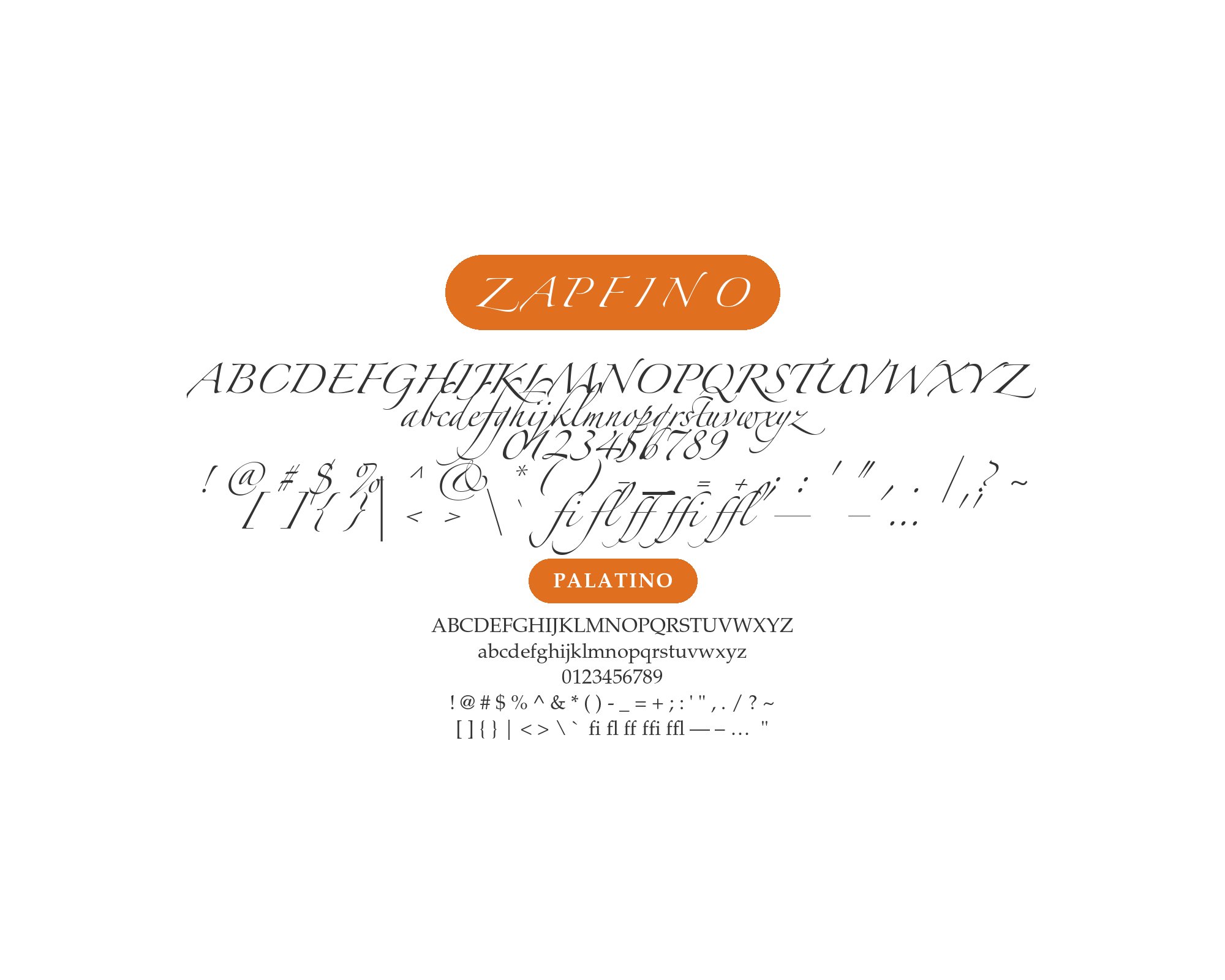
The Uganda Railways production shows the working ratio: Zapfino for the title and chapter openings, Palatino for everything readable. Palatino’s generous proportions let it run at 11 points without strain, and their shared authorship gives the text and display voices a coherent lineage. For wedding suites and formal programs, this is the pairing to try first.
Hermann Zapf drew Palatino himself, released by Stempel in 1949 and modeled on Italian Renaissance calligraphy — making this the rare pairing where both faces come from one designer’s pen. The combination is not just theory: Fonts In Use documents a real heritage publication, the Uganda Railways history, setting text in Palatino under Zapfino display. Both faces come off the same broad-edged pen: Palatino’s Renaissance roman and Zapfino’s chancery script share proportional instincts no cross-designer pairing can manufacture. For formal and ceremonial work, this is the first pairing to test.
Unlimited fonts from $16.50/mo.
29 million fonts, templates and stock assets. One subscription, unlimited downloads.
See the plan6. Courier
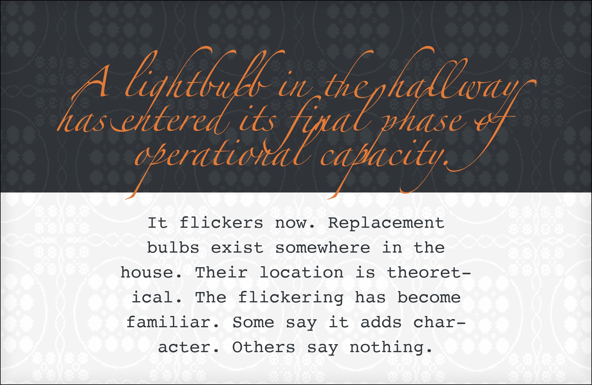
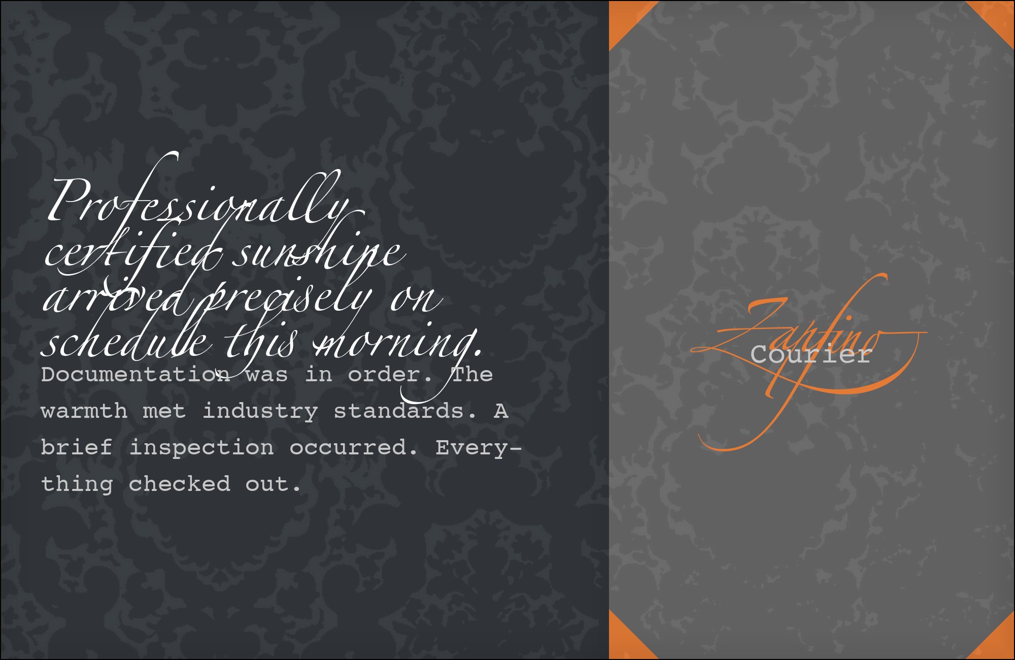
Restrict Courier to short, deliberately typed-looking elements — a date, a file number, an epigraph. Its fixed pitch and slab serifs make paragraphs look like evidence, which is the effect the Uganda Railways designers wanted under a calligraphic title. Keep Courier at or below the script’s x-height visual weight so the hierarchy stays unmistakable.
Courier was drawn by Howard “Bud” Kettler for IBM in 1955 as a monospaced slab for typewriter output, and it still signals “typed fact.” Fonts In Use documents it alongside Palatino and Zapfino on the Uganda Railways publication — the typed-record-under-handwritten-display move done in production. Courier’s fixed rhythm and mechanical slab serifs are the deliberate opposite of everything Zapfino’s pen does, and that contrast is the design: archival honesty beneath calligraphic ceremony. In museum work, hold Courier to one short line per spread; past that the page starts to read as a transcript.
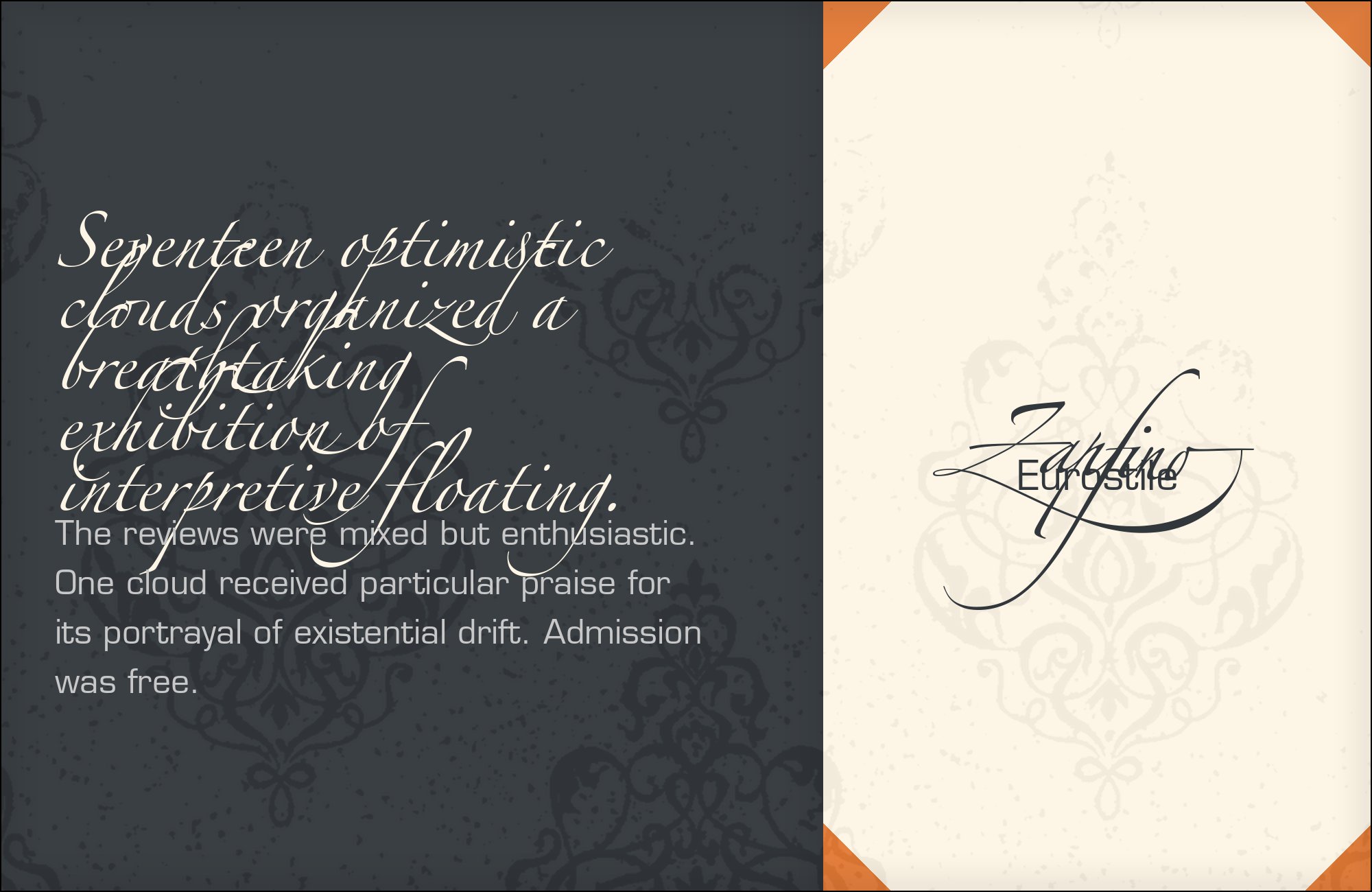
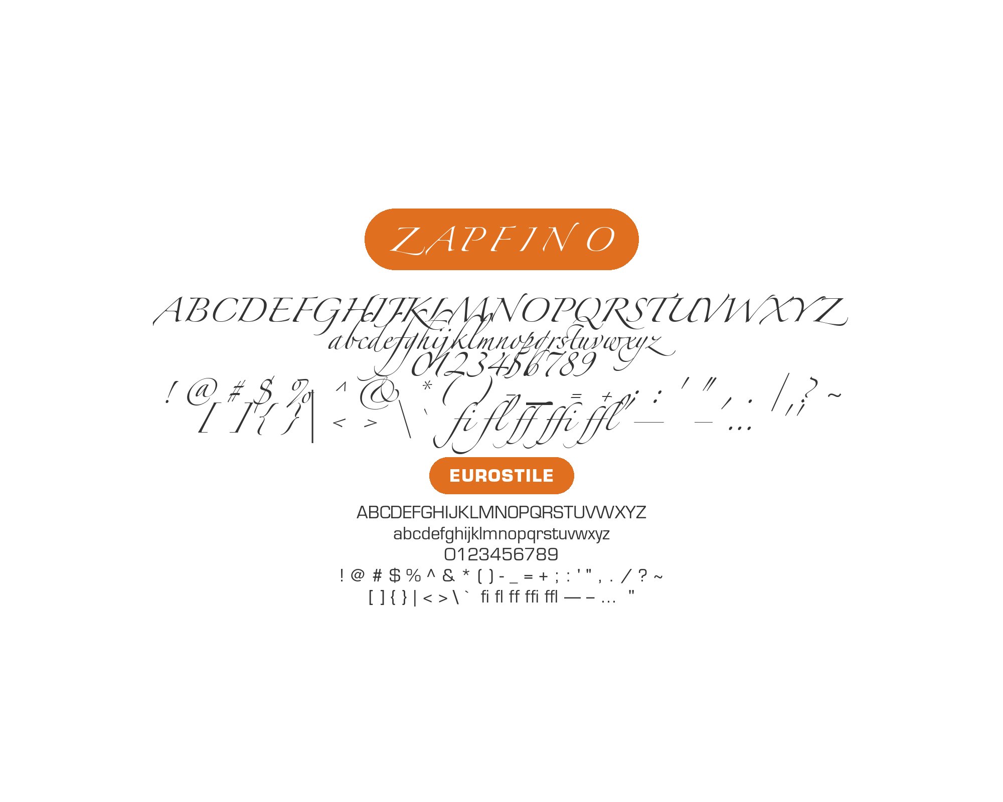
7. Eurostile
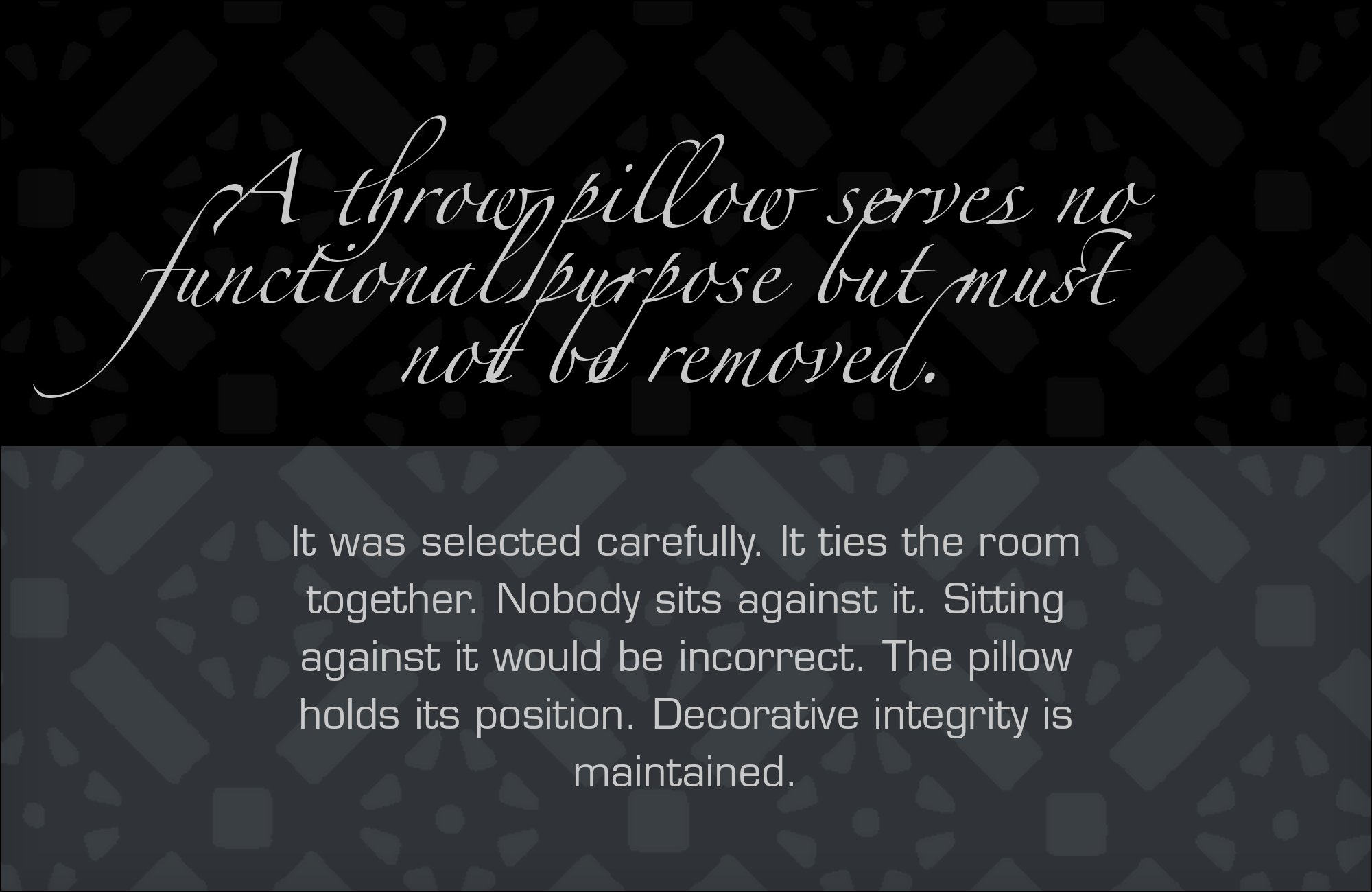
Eurostile works in extended cuts for small labels and bold cuts for subheads — never both. The squared letterforms next to the script create the steampunk, retro-futurist register that exhibition catalogs and album covers trade on. Give the pairing a restricted palette; the letterform contrast is strong enough to carry the design without help.
Aldo Novarese drew Eurostile in 1962, squaring every curve into the most decisively technological letterform set of the century. Fonts In Use records real co-usage with Zapfino on its typeface page. The pairing is a hard cut between worlds: squared, machine-era geometry against fluid, hand-era script. It works because each face is extreme in its own direction and neither blurs into the other — the script reads more ornate, the square sans reads more precise. Use it when a retro-futurist or steampunk register is the actual brief.
8. Futura
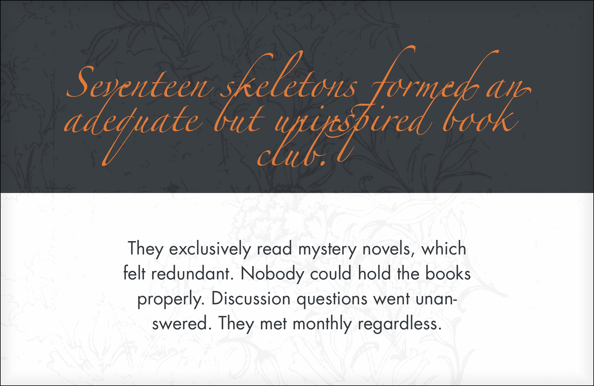
Use the combination when the brief calls for strong tension between geometric discipline and calligraphic freedom. Test a two-page proof — script headline, Futura body, generous leading — before committing it across a long document. Keep Futura at regular or book weight, and give Zapfino ample vertical clearance so its descenders and swashes never collide with the text block.
Paul Renner drew Futura in 1927 as pure compass-and-ruler geometry. Fonts In Use records Futura and Zapfino together in a real production. Use it when the design wants maximum tension between geometric discipline and calligraphic freedom — and test it before committing.

9. Bodoni
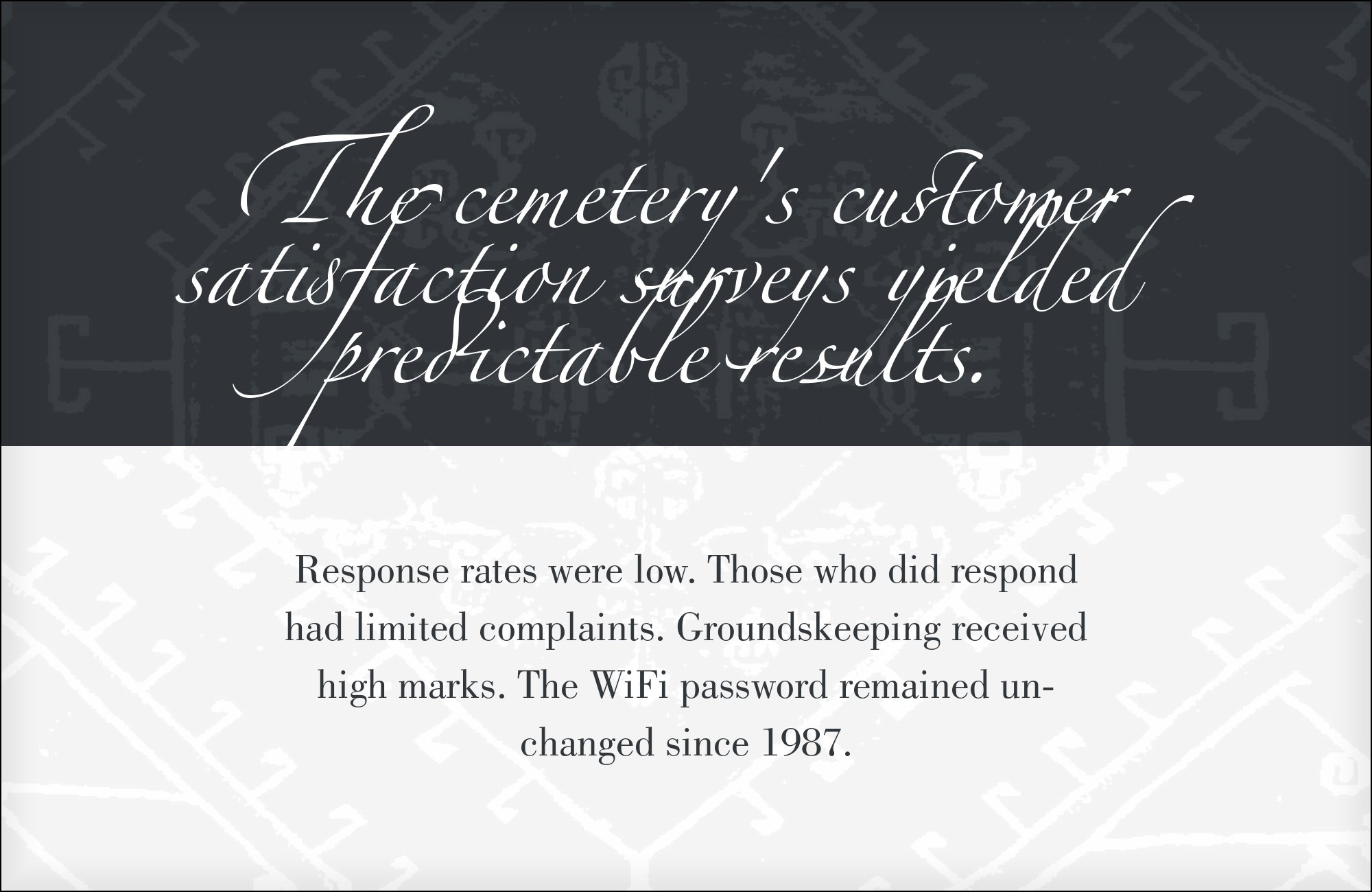
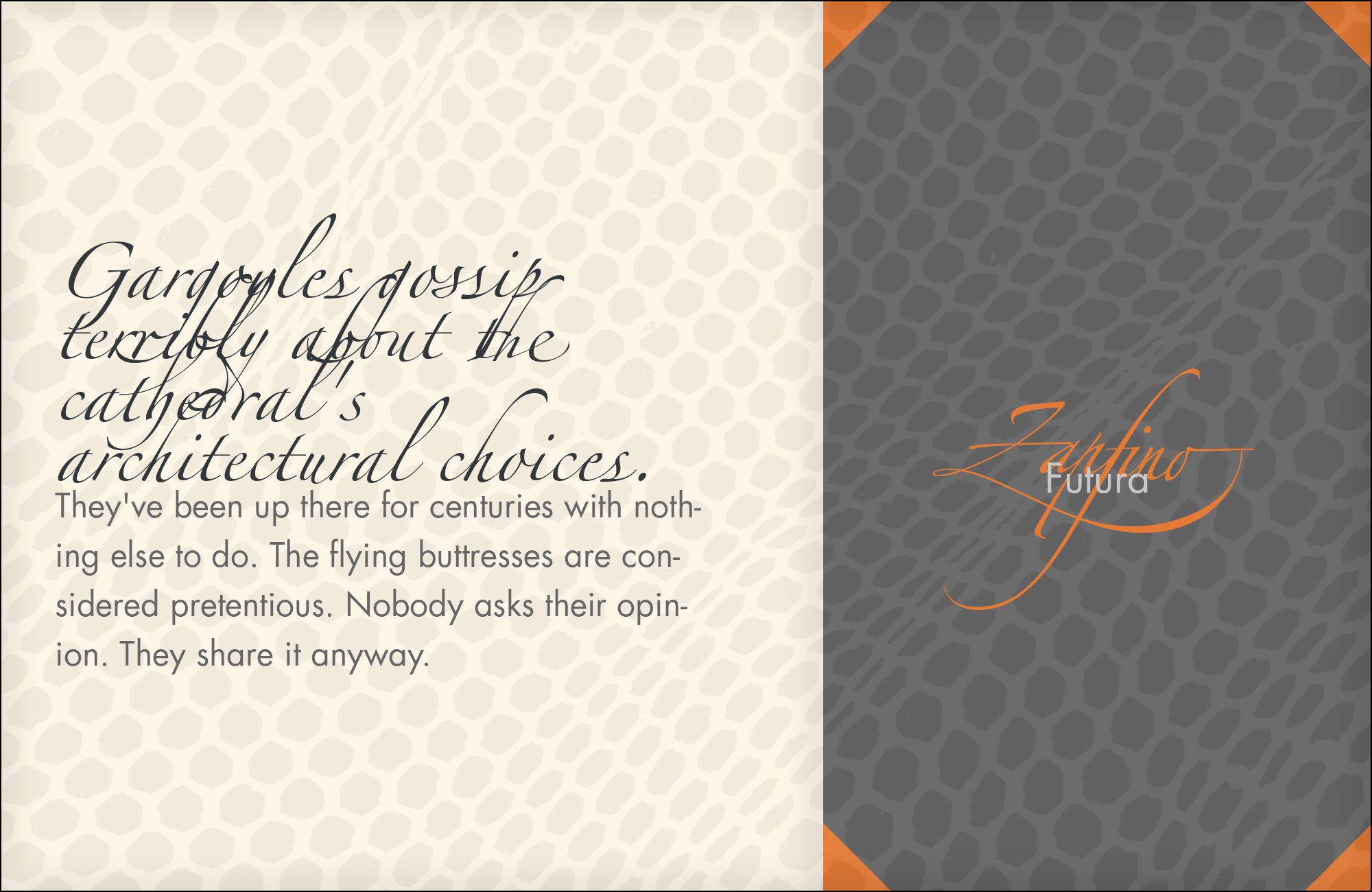
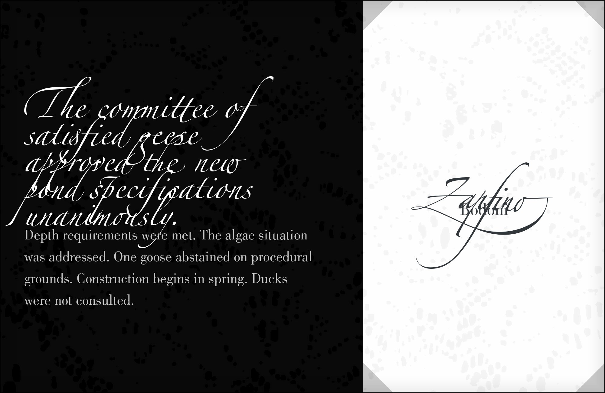
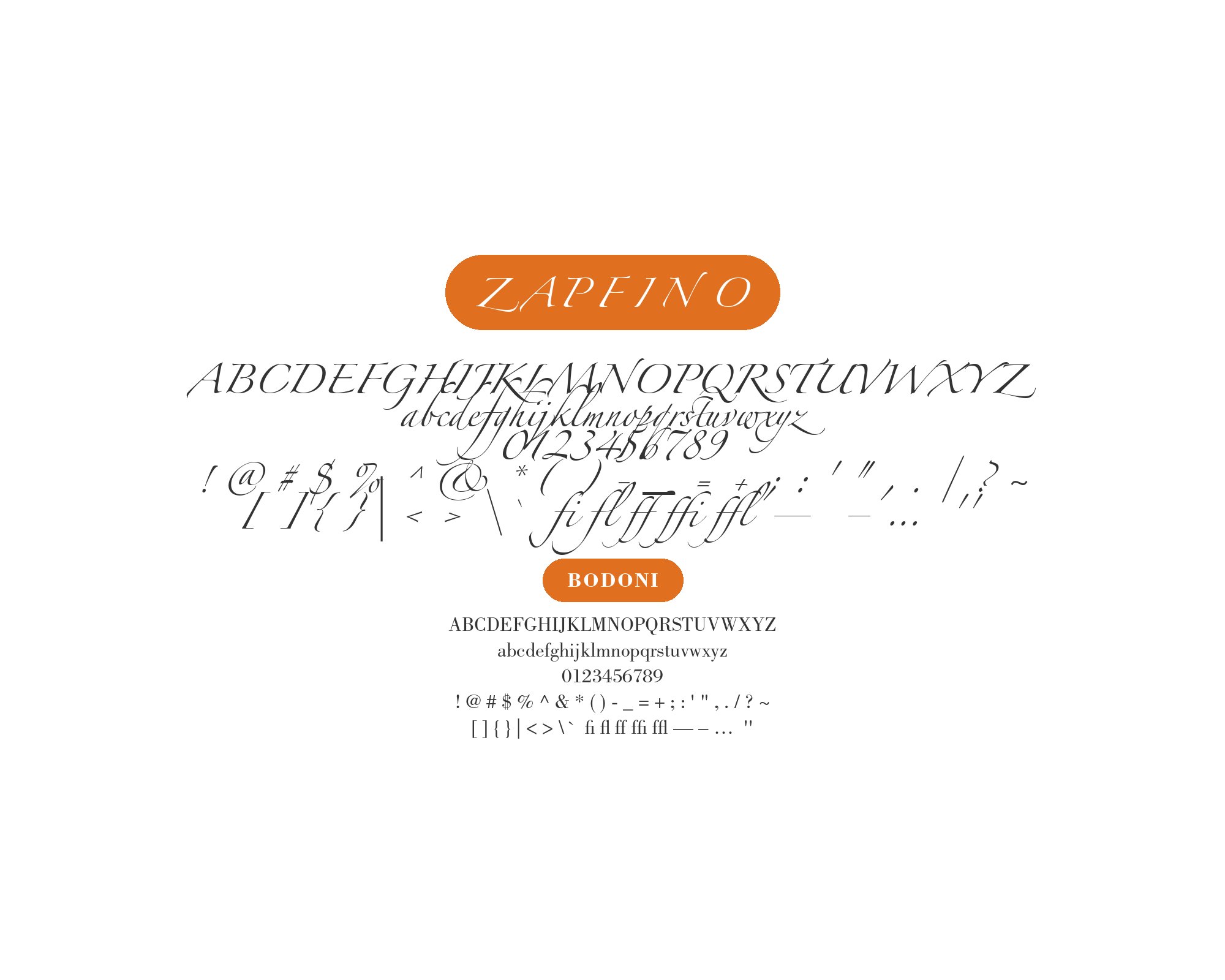
Specimen note: the cited live use is ITC Bodoni Seventy-Two; the rendered specimen draws from the locally held Bodoni revival file.
The Bodoni pairing lives or dies on size contrast: script at 60 points or larger, Bodoni text at 11 points, nothing in between. At those settings the shared pressure logic reads as one pen speaking two languages. Fashion layouts and high-ceremony invitations are the documented territory — Curse and Spindle proves the combination is alive in current work.
Giambattista Bodoni’s late-eighteenth-century roman, best accessed today through the Bodoni revivals, pushes thick-thin contrast to its mechanical extreme. Fonts In Use documents ITC Bodoni Seventy-Two set alongside Zapfino on the 2025 production Curse and Spindle. The kinship is in the pressure logic: a broad-nib or pointed pen produces the same thick-thin rhythm in both faces, one frozen into Didone geometry, the other flowing into script. In fashion layouts, track the Bodoni text a shade open so the small size does not clot under the script.
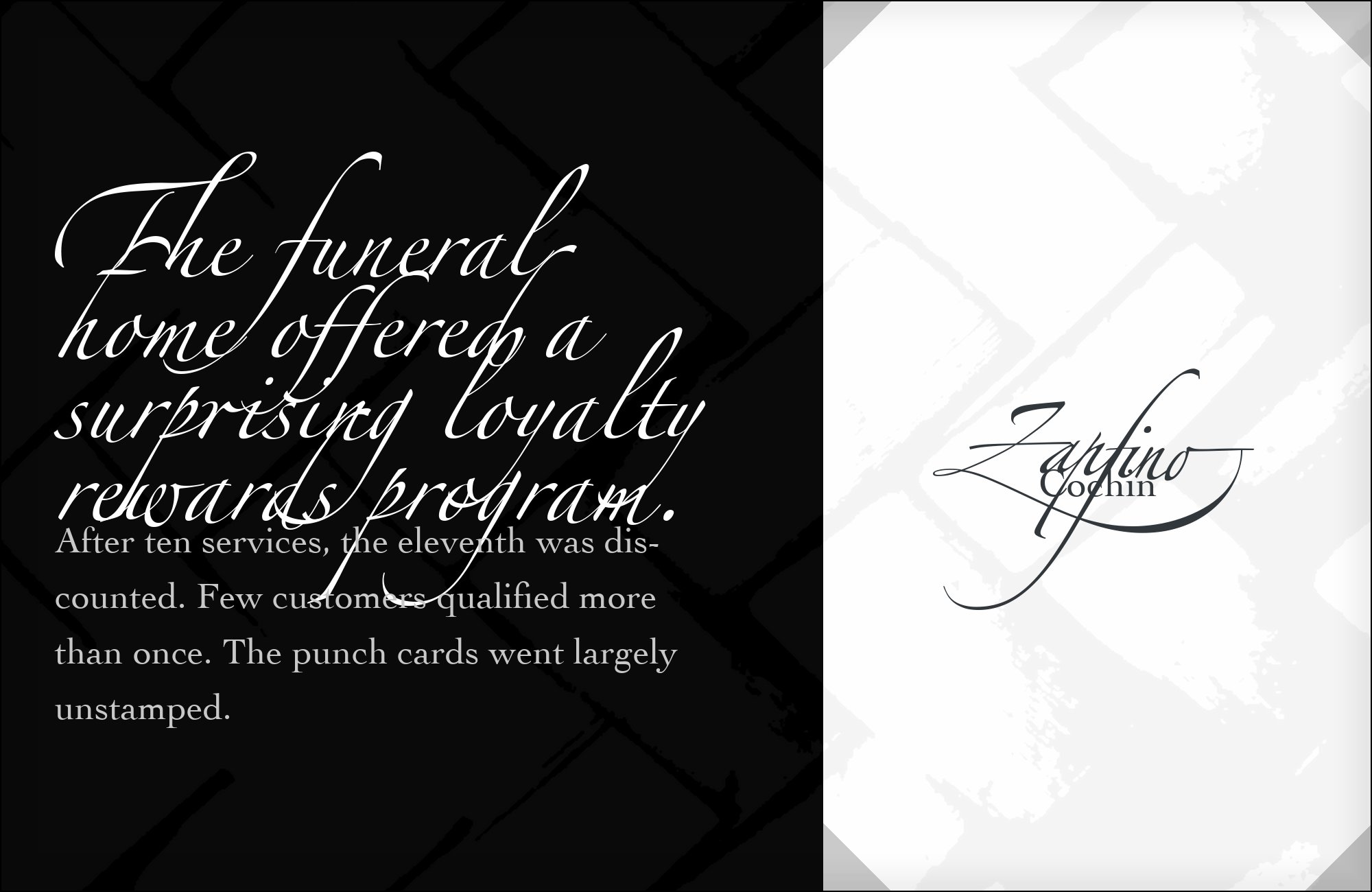
10. Cochin
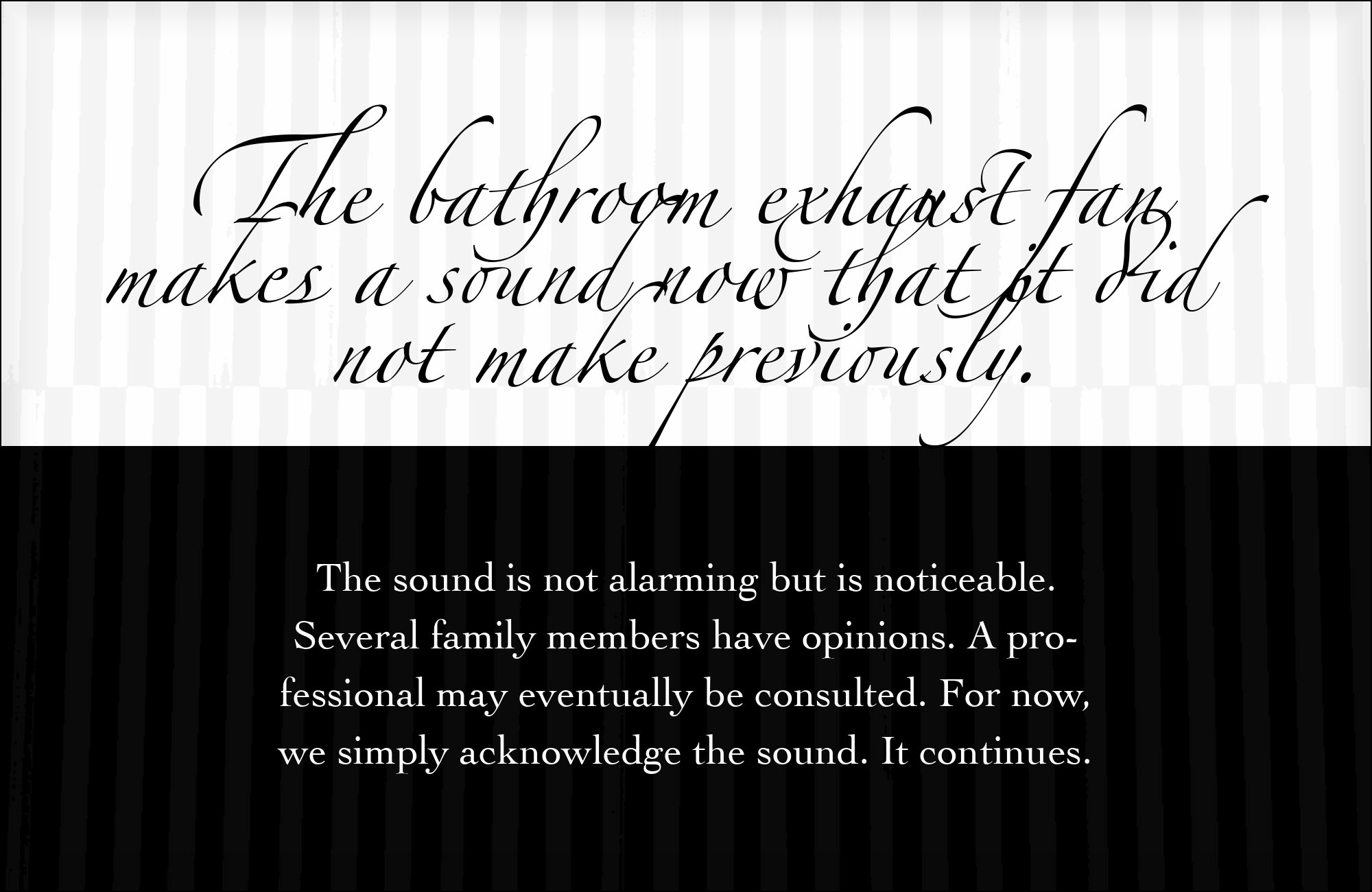
Cochin asks for nothing: set it at text sizes, leave the ornament to the script, and the pairing runs itself. Its quiet text color makes it a practical option for programs, catalogs, and booklets. Where Myriad brings corporate polish, Cochin brings quiet bookishness — choose by whether the page should feel designed or simply set well.
Georges Peignot drew Cochin in 1912 for G. Peignot et Fils, basing it on the copperplate engravings of Charles-Nicolas Cochin; Matthew Carter later adapted Cochin for Linotype. Fonts In Use records the two together on the Out Campaign’s “Scarlet A”, where the red Zapfino capital carries the mark and the URL beneath it is set in Cochin. The pairing is warmth at the lowest possible contrast: Cochin’s pen-influenced old-style serifs sit in the same calligraphic tradition as the script but at a plain, steady, entirely unornamented register. Where every other partner in this list pushes contrast, Cochin simply supports, which makes it the face to reach for whenever the script must be the only decoration on the page.
Conclusion
Zapfino pairs by temperament, not by contrast of era alone. The strongest documented partners are all pen-born: humanist sans faces with calligraphic ancestry (Myriad, Gill Sans, Frutiger), an old-style serif from Zapf’s own hand (Palatino), and a Granjon-rooted revival whose italic remembers the same nib (Galliard). Real productions add the deliberate counterpoints — Courier’s typed honesty, Eurostile’s machine geometry, Bodoni’s frozen pressure rhythm — each giving the script something to push against, while Cochin proves the quietest option: an old-style serif that simply stays out of the script’s way.
The one consistent rule across expert recommendations and real use: never let the partner compete for ornament, and never repeat the script’s slant at small sizes. Keep Zapfino to names, headlines, and single lines; hand the paragraphs to a quiet humanist partner; and let the flourishes do the one job they do well — carry a name or a single line — while a quieter face sets the body.
Sources
- Adobe Community thread “What goes with Zapfino?”
- Fonts In Use (typeface page)
- Fonts In Use (Uganda Railways)
- Fonts In Use (Curse and Spindle)
- Fonts In Use (Scarlet A, Out Campaign)
- Fonts In Use (Ränder dieser Bilder)
- Typewolf
- Typ.io
- Linotype ZapfinoTips PDF
- thatkeith.com (Keith Martin)
- thomasphinney.com/about
