
Pacifico pairs great with Roboto, Lato and Open Sans. All 15 pairings are shown below in real rendered specimens, with the reason each one works.
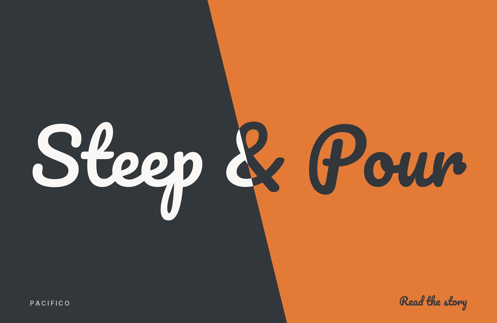
What fonts go with Pacifico? The honest answer starts with a constraint rather than a list: Pacifico is a brush script that cannot set a paragraph or hold a caption. A second decorative face usually competes with it, although the archive records one documented exception at the end of this list. Every partner below exists to do the work Pacifico refuses to do.
Vernon Adams drew Pacifico in 2011 on commission from Google, taking 1950s American surf culture as the reference — appropriate for an English designer with a typeface design MA from Reading who was living in San Clemente, California at the time. Jacques Le Bailly redrew the family at Baron von Fonthausen in 2016, and Botjo Nikoltchev and Ani Petrova at Lettersoup extended it to Cyrillic in 2017. The construction is a connected brush script with soft, blunt terminals and deep looping descenders, and several capitals are drawn in lowercase form to push the informality further. Google Fonts ships it with a default line height of 1.756 em, far taller than a text face needs, because the ascender flourishes and descender loops demand that much vertical room.
Pacifico attracts a large amount of generic pairing advice, much of it interchangeable. The pairings here come from two harder sources: documented co-usage in real productions archived at Fonts In Use and on live sites measured by Typ.io, and named editorial that gives actual reasoning. Across the two-font systems, the recurring pattern is a role split: Pacifico owns the logotype or hero line, while a plain companion carries the information. The archive also records display-on-display exceptions. Here are 15 fonts that pair well with Pacifico.
1. Roboto

Christian Robertson designed Roboto in-house at Google and released it in 2011 as Android’s system typeface, built on a mechanical grotesque skeleton with unusually open, friction-free curves. It is confirmed from two directions: Typ.io’s live-site data names Roboto first among the faces actually appearing beside Pacifico on production websites, and both Typogram and HipFonts independently recommend precisely this class of plain sans. The structural argument is simple division of labor. Pacifico’s stroke is sloped and connected; Roboto’s is upright, even and separable, with open curves that stay legible at the caption and interface sizes where a brush script collapses. Use Pacifico for the product name and the hero headline, and give Roboto every paragraph, button and label underneath.

Paid prompt-to-site tools are going to lock you in.
How can your studio escape this?
Find Out How2. Lato

Łukasz Dziedzic released Lato in December 2010 as a humanist sans with semi-rounded details that sit between a pure grotesque and a true serif in tone. Figma’s pairing library files Pacifico and Lato together specifically for beach, destination and outdoor work, and the reason is tonal rather than structural: Lato is warm enough that it does not read as a correction to the script above it. A hard neo-grotesque next to Pacifico creates an obvious seam between the fun part and the serious part. Lato’s gentler stroke terminals and moderate contrast blur that seam, so the whole system reads as one relaxed voice. This is the right choice when the sans still has to carry long text without sounding like a correction.

3. Open Sans

Steve Matteson designed Open Sans under commission from Google and released it in 2011, giving it a notably large x-height and simple, upright, low-contrast letterforms tuned for small sizes. Easil’s pairing guide names it as Pacifico’s first companion, and the reason is the size gap that every script system runs into. A Pacifico headline works at 48 points and above; the text beneath it frequently runs at 14. Open Sans is engineered for exactly the bottom of that range, so the pair holds together across a four-fold size difference without the body copy looking starved. Set Pacifico once, large, and let Open Sans handle subheads, body and captions without any further adjustment.

4. Merriweather

Sorkin Type designed Merriweather as a screen-reading text face with a very large x-height, slightly condensed letterforms, mild diagonal stress and deliberately sturdy serifs. It is the one serif that two separate sources — Easil and HipFonts — both name for Pacifico, and it earns the place by being the least delicate serif available. High-contrast serifs like Didones fight a brush script, because both faces then claim thick-to-thin drama. Merriweather’s low stroke contrast and heavy, blunt serifs claim none of it, so the brushwork stays Pacifico’s alone. Reach for this combination when the page needs an editorial register rather than a promotional one: long-form blog posts, recipe pages, and any place a reader will stay for several hundred words.

5. Trade Gothic

Jackson Burke developed Trade Gothic at Linotype between 1948 and 1960, expanding the American gothic tradition into a working family with condensed and extended widths. Fonts In Use documents it with Pacifico on a Toronto donut shop’s identity: Pacifico and a slanted Trade Gothic share the logotype, and Trade Gothic carries the website and in-store signage. That is real evidence of the split working at retail scale rather than a stylist’s suggestion. Structurally, Trade Gothic is narrow, upright and slightly irregular in width across the family, which gives it a workmanlike news-print character that never competes with a sweeping script. Its condensed weights are especially useful for the long product names food brands accumulate.

6. Myriad

Robert Slimbach and Carol Twombly designed Myriad at Adobe in 1992 as a humanist sans with open apertures, a large x-height and enough neutrality to serve as Apple’s corporate face for fifteen years. Fonts In Use records it alongside Pacifico on El Estudio de Andrés’s promotional flyer, one of the clearest small-scale examples of the formula in print. Myriad’s value next to a brush script is its open apertures — the c, e and s stay wide and unambiguous at small sizes, which matters when the display line above has already spent all of the reader’s patience. Use it for the dense practical text on a poster or flyer: dates, addresses, prices, terms.

7. Barlow

Jeremy Tribby designed Barlow in 2017 as a slightly rounded, low-contrast grotesque drawn from Californian public signage — car plates, highway signs, buses and trains. That origin makes it an unusually apt partner for a typeface built on 1950s California surf culture; the two faces reference the same coastline from opposite ends of the formality scale. Fonts In Use documents them together on the same El Estudio de Andrés flyer as Myriad. The mechanical reason the pair works is width contrast: Barlow’s normal cut is already slightly narrow, and its Semi Condensed and Condensed siblings go narrower still, so a compact block of text sits under Pacifico’s wide horizontal sprawl without the two fighting for the same measure.

8. Raleway

Matt McInerney drew Raleway in 2010 as a single thin weight, and Pablo Impallari and Rodrigo Fuenzalida expanded it into a nine-weight family in 2012. Design Shack uses Pacifico and Raleway as its worked example of the script-plus-sans formula, on the argument that a casually drawn script wants a sans that is elegant rather than industrial. Raleway’s geometric skeleton and long ascenders give the pair a cleaner, more contemporary register than Lato produces — closer to a boutique than a beach bar. Its light and thin weights are the ones to use here: set at a large subhead size under a heavy Pacifico headline, the weight gap does the hierarchy work and no size change is needed.

“AI builds anything, so what do I sell?”
Taste is the answer. Own your stack and automate your own CMS.
Find Out How9. Oswald

Oswald is Vernon Adams’s other well-known Google font — a 2011 reworking of the Alternate Gothic condensed style, later continued by Kalapi Gajjar and Cyreal. Pairing it with Pacifico therefore keeps both voices in one designer’s hand, which is rare in a free-font system and shows in the shared sense of proportion. HipFonts names Oswald first among its recommended partners, and the pairing works on width rather than style. Oswald is severely condensed with vertical stress; Pacifico is wide, sloped and horizontal. Stacking narrow Oswald subheads under a broad brush headline produces strong contrast in one axis only, which is what keeps it from feeling arbitrary. It suits posters, event graphics and anything with a tight column measure.

10. Quicksand

Andrew Paglinawan initiated Quicksand in 2008 as a geometric display sans with rounded terminals, and Thomas Jockin revised it thoroughly in 2016. HipFonts lists it among Pacifico’s sans partners, and of everything here it is the closest match in mood rather than the sharpest contrast. Quicksand’s rounded terminals are the direct geometric equivalent of a brush stroke’s soft, blunt ending, so the two faces share a finishing detail even though one is drawn with a compass and the other with a brush. That similarity is the whole point and also the limit: use it when the whole system should read as friendly, and avoid it when the text side needs to sound credible.

11. Arimo

Steve Matteson designed Arimo as an open-licensed sans that is metrically compatible with Arial, meaning identical character widths and therefore identical line breaks. Both Visme and Snappa file it with Pacifico in their script-plus-sans sections. The practical argument is stronger than the aesthetic one: because Arimo matches Arial’s metrics exactly, a page that falls back to the system font on a slow connection or inside an email client reflows to the same shape it had before. Nothing shifts, and the Pacifico headline keeps its relationship to the text block. Treat this as the load-bearing choice for email templates, embeddable widgets and any context where webfont delivery is not guaranteed.

12. Josefin Sans

Santiago Orozco designed Josefin Sans in 2010 as a geometric face inspired by 1920s sans-serif designs, with the deliberate oddity that its x-height sits exactly halfway between baseline and cap height — unusually small for a modern sans. Snappa pairs it with Pacifico in its script and decorative section. That small x-height is the reason to choose it over Roboto or Arimo: it makes Josefin Sans look period rather than neutral, so the combination lands in a vintage register instead of a product one. The trade-off is real. Small x-height means reduced legibility at text sizes, so keep Josefin Sans in subheads, navigation and short captions, and bring in a plainer sans if genuine body copy is needed.

13. Assistant

Ben Nathan designed Assistant in Tel Aviv as a contemporary Hebrew sans, with its Latin side built on Paul Hunt’s Source Sans Pro from Adobe Type. Kimp’s pairing guide treats Pacifico and Assistant as a script-plus-sans pair and gets the reasoning right: both faces carry a slightly informal tone, so the sans supports the script’s warmth rather than correcting it. Assistant inherits Source Sans Pro’s even rhythm and generous counters, which hold small text cleanly under an expressive headline. Its distinguishing advantage is the Hebrew coverage — for a bilingual Hebrew and Latin brand that also wants an English script logotype, this is the one pairing here that solves both scripts from a single family.

14. Helvetica Neue

D. Stempel AG and Linotype released Helvetica Neue in 1983 as a systematised redrawing of Max Miedinger’s 1957 original, regularising weights and widths across a numbered family. Typogram names it beside Roboto as the kind of simple sans Pacifico requires, and it represents the maximum-neutrality end of this list. Helvetica Neue claims no personality: its apertures are closed, its terminals are cut on the horizontal, and its uniform stroke weight refuses any expression. That total restraint means every trace of character in a two-font system comes from Pacifico alone, which is the cleanest possible division of labor. Choose it over Roboto when the brand wants a Swiss, corporate baseline underneath the informal mark rather than a software one.

15. Rosewood

Kim Buker Chansler, Carl Crossgrove and Carol Twombly designed Rosewood at Adobe in 1994, revising a nineteenth-century ornamented wood type into a two-layer family where a Fill layer sits beneath a decorated Regular. Fonts In Use documents it with Pacifico on the Golden Burgers identity, and this is the one pairing here that breaks the rule stated in the introduction. Both faces are display type, and neither can set text. It works anyway because the two references sit in the same American vernacular — Victorian fairground signage under 1950s brush lettering — and because the layered construction gives Rosewood a color and texture Pacifico does not have. Use it for food, retail and event branding, and bring in a plain sans for the actual information.

Conclusion
The evidence for Pacifico is unusually one-directional. Across the productions that survive as two-font systems, the working pattern is a strict role split: Pacifico is the single expressive element and the second font is something plain. The archive also records display-on-display exceptions, which this list treats as special cases rather than the default. That makes partner selection less a question of taste than of picking which kind of plain is right: Roboto or Helvetica Neue for neutrality, Lato or Quicksand for warmth, Trade Gothic or Barlow for a working, signage-derived voice, Merriweather when the page has to be read rather than scanned, Arimo when delivery cannot be guaranteed, and Josefin Sans when the period reading is the goal.
The two constraints worth respecting are structural, not stylistic. First, Pacifico’s 1.756-em default line height and looping descenders mean it needs real vertical clearance — crowding it against a following line is the most common way the face is ruined. Second, adding any second decorative font breaks the system, which is why the two documented script-on-script cases were left off this list; Rosewood is the deliberate exception, and it survives only because it shares a specific historical reference rather than a general sense of fun. Set the pairing at the sizes you intend to publish, then check whether the sans still reads calmly at 14 points once the headline is in place.
Sources
- Fonts In Use (Pacifico, Vernon Adams)
- Fonts In Use (El Estudio de Andrés flyer)
- Fonts In Use (Golden Burgers)
- Fonts In Use (Your Friend in Lisbon logos)
- Fonts In Use (An Event Apart 2013)
- Fonts In Use (Billboard cover, May 2021)
- Fonts In Use (ALM / Busy Circuits)
- Fonts In Use (MakHalal)
- Fonts In Use (Tiedye & Tonic)
- Fonts In Use (Andersnogiets?)
- Fonts In Use (search: pacifico)
- Typ.io (Pacifico)
- Typogram / FontDiscovery (Hua Shu)
- HipFonts (Pacifico)
- Easil font pairing guide
- Figma resource library (wedding pairings)
- Design Shack (How to Master Font Pairings)
- Visme (15 Perfect Font Combinations)
- Snappa (50 Font Combinations)
- Kimp (Tried-and-True Font Pairings)
- Google Fonts metadata (Pacifico)
