Myriad pairs great with Sabon, Adobe Garamond and Helvetica Neue. All 6 pairings are shown below in real rendered specimens, with the reason each one works.

What fonts go with Myriad? Start with the fact that almost nobody is asking anymore. Robert Slimbach and Carol Twombly’s 1992 humanist sans spent more than a decade as Apple’s corporate typeface, and it still shows up in packaging, campus signage, and legacy brand systems everywhere — but the pairing conversation among type blogs and foundries moved on to newer faces years ago, which makes finding good partners for it a different kind of research problem.
Myriad, designed by Robert Slimbach and Carol Twombly for Adobe Originals in 1992 (with production work from Fred Brady and Christopher Slye), grew out of the same humanist sans tradition as Adrian Frutiger’s typefaces, and it shows in the warmth of the letterforms — something most geometric or grotesque faces of its era never attempted. Adobe drew it with clean open shapes, a comfortable x-height, and extensive kerning pairs tuned for both text and display use, which is why it scaled from packaging to interface chrome without needing a redraw. Apple adopted a customized cut, Myriad Apple, as its corporate typeface from 2002 until 2015, when San Francisco replaced it, and the standard version has carried identity work for Rolls-Royce, Walmart, several universities, the Beijing 2008 Olympics, and Kharkiv Metro’s signage. That is a lot of real-world mileage for a face many designers now file under “legacy.”
To pair Myriad, start with the work each font will do on the page. Its restrained personality rarely fights a characterful partner for attention; it recedes and lets the other face carry the visual voice, while Myriad handles the reading and interface text around it. That restraint can make a serif or a structurally different sans stand out clearly beside it. Here are some ways to use that contrast.
1. Sabon
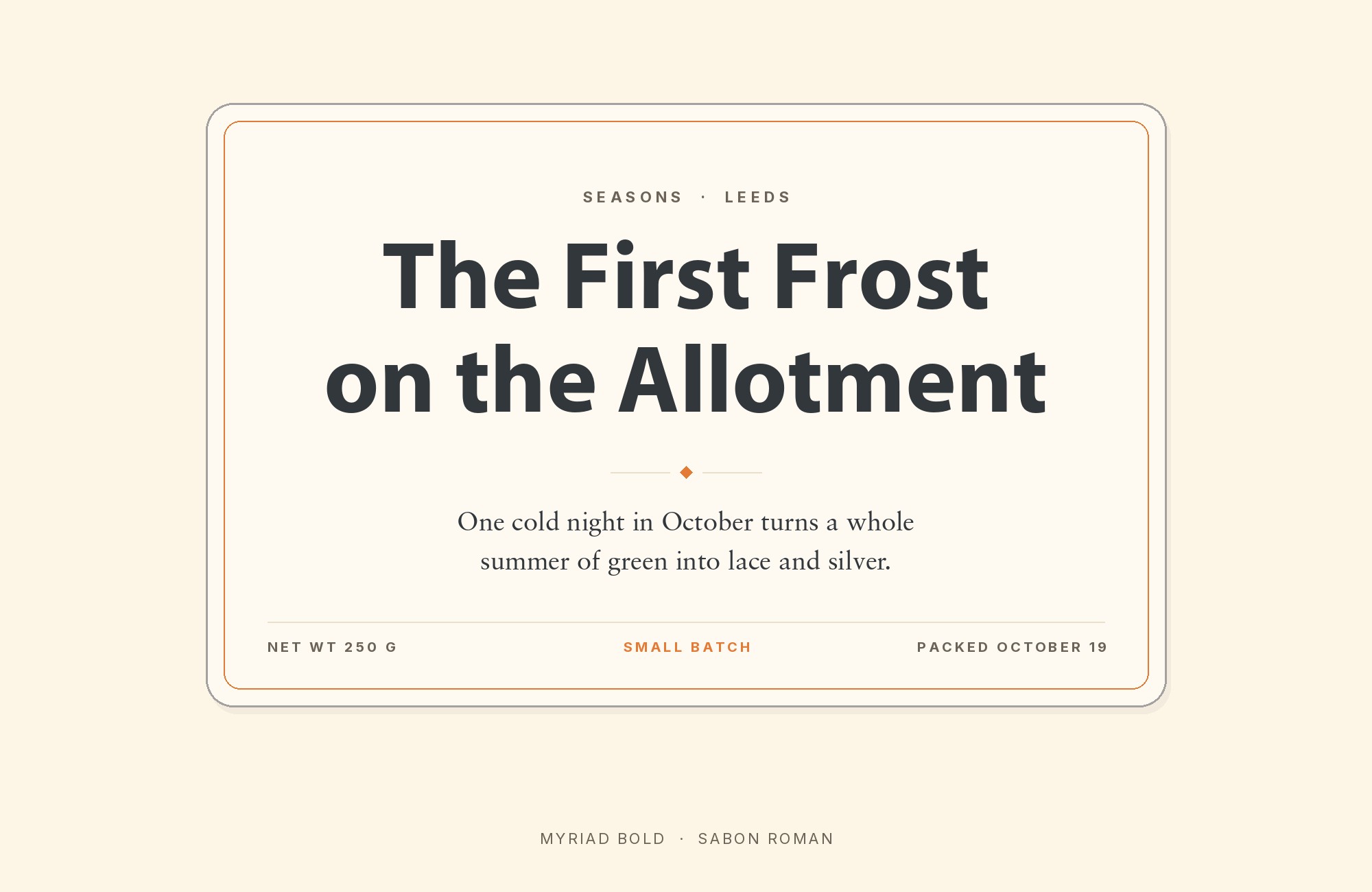
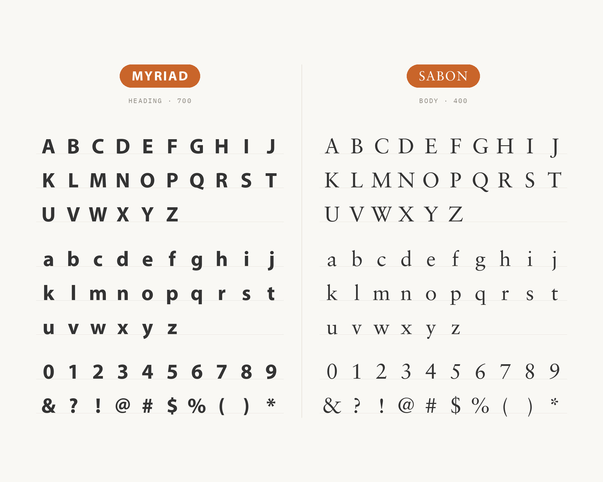
Sabon, the old-style serif Jan Tschichold drew in 1964 for the joint Stempel, Linotype, and Monotype foundries, is the one pairing here with a named endorsement behind it: Typewolf lists it as its own suggested match for Myriad, the strongest single recommendation this research turned up. Tschichold based the roman on a Garamond specimen printed by Konrad F. Berner and drew the italic after Robert Granjon, so Sabon carries genuine calligraphic warmth, moderate stroke contrast, and old-style figures that Myriad’s clean, evenly weighted sans letterforms simply do not have. The formula is the classic one: a plain sans headline sits above body copy that does the emotional work, with Sabon’s serif texture supplying the reading warmth Myriad was built to withhold entirely. It suits anywhere Myriad already carries the interface — editorial layouts, annual reports, long-form marketing pages — that need a serif with genuine reading history behind it rather than contrast chosen for its own sake.
“My clients will build their own sites with their own AI.”
How are you supposed to navigate this?
Find Out How2. Adobe Garamond
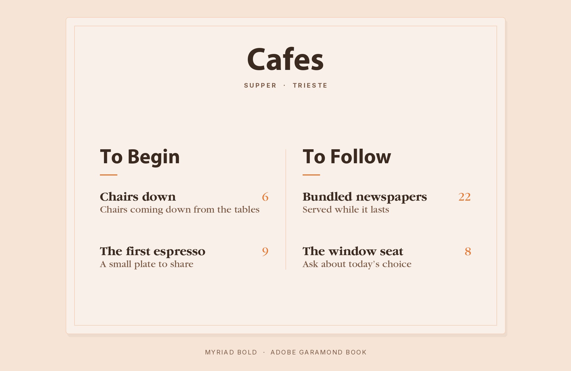
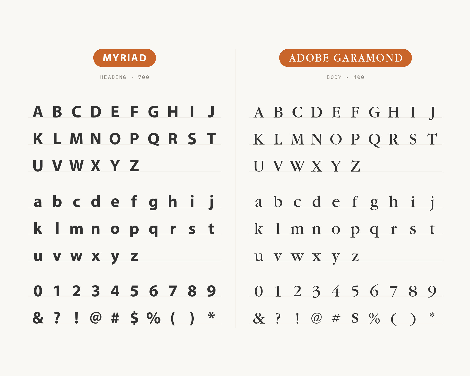
Adobe Garamond, Robert Slimbach’s 1989 revival of Claude Garamond’s roman letters and Robert Granjon’s italic, shares something practical with Myriad that older Garamond revivals do not: both were drawn at Adobe by Robert Slimbach as contemporary digital type families, so their spacing tables and proportions were built to cooperate rather than fight across a shared page grid. That common origin shows up in how naturally Adobe Garamond’s old-style curves and moderate contrast settle under Myriad’s neutral, evenly weighted headlines — there is no awkward size or color mismatch to correct before the pairing works. It is a house pairing in the truest sense: one Adobe Originals face carrying the reading weight for another, both drawn a few years apart by overlapping teams inside the same type department.
Turn your ideas into repeatable creative workflows - no code required. Create with ready-made templates and AI-powered tools in Picsart Flow.
See details3. Helvetica Neue
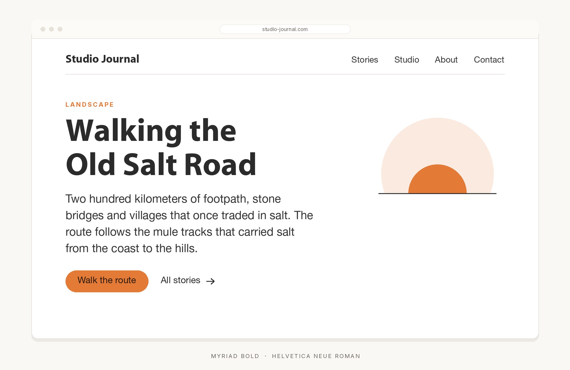
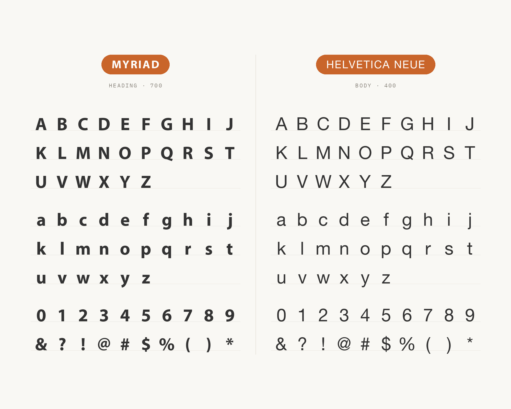
Pairing sans-serif faces can sound redundant until the underlying structures are compared side by side. Helvetica Neue is the 1983 rework of Max Miedinger’s original grotesque, redrawn by the Linotype design studio at D. Stempel AG under studio manager Wolfgang Schimpf, with Erik Spiekermann consulting on the project and its launch materials. Its tight apertures, mechanical curves, and neo-grotesque discipline sit at a noticeably different register from Myriad’s rounder, more open humanist terminals, and that gap is exactly what makes the combination useful instead of repetitive. Set Helvetica Neue in navigation or captions and Myriad in body copy, or reverse the roles, and the structural difference reads as a deliberate hierarchy choice rather than two sans faces competing for the same job on the same page.
4. Chaparral
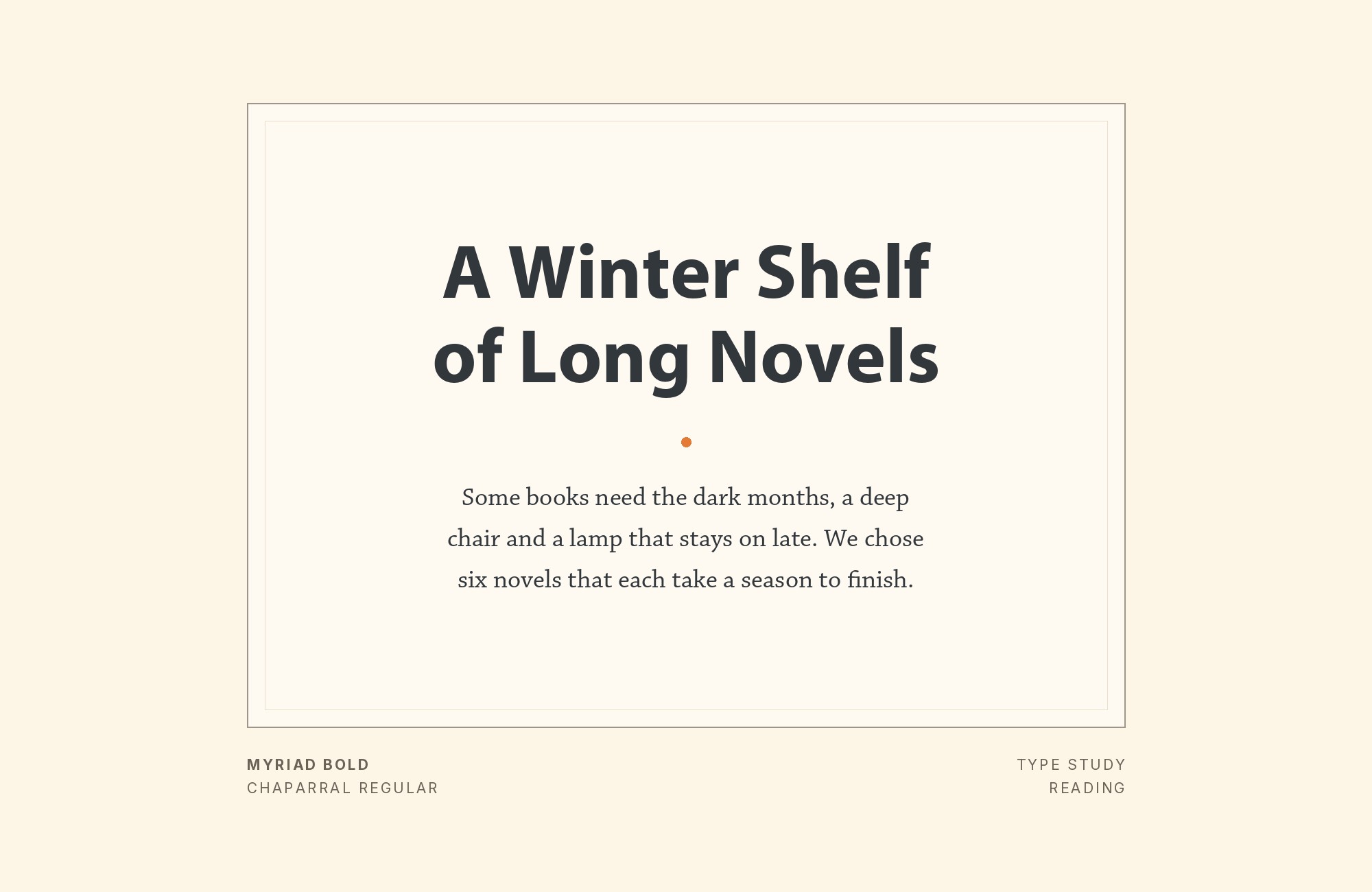
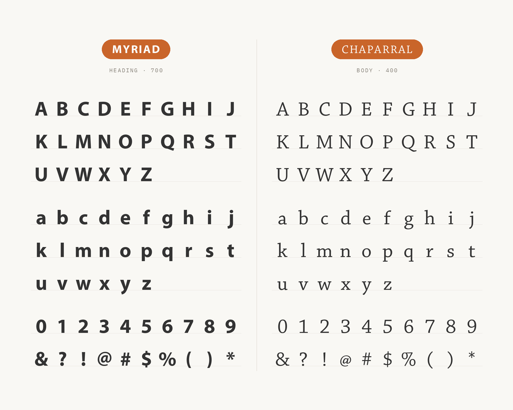
Chaparral is Carol Twombly’s 1997 hybrid for Adobe Originals, developed with calligrapher Linnea Lundquist to fuse the legibility of nineteenth-century slab serifs with the warmth of sixteenth-century roman book lettering. That dual ancestry gives it slab-like, semi-serif letterforms with a friendly, almost handwritten undercurrent — a texture Myriad, built for clean neutrality rather than personality, deliberately withholds. Because Chaparral was also drawn as a multiple-master face with an optical-size axis running from 7 to 72 points, it stays legible in long body copy while still holding its character at display sizes, which makes it a body-copy partner that can carry an entire page beneath a Myriad headline without ever looking thin or borrowed. Try it in a package or brand system where the serif can give Myriad’s quiet structure more warmth.
5. Bree Serif
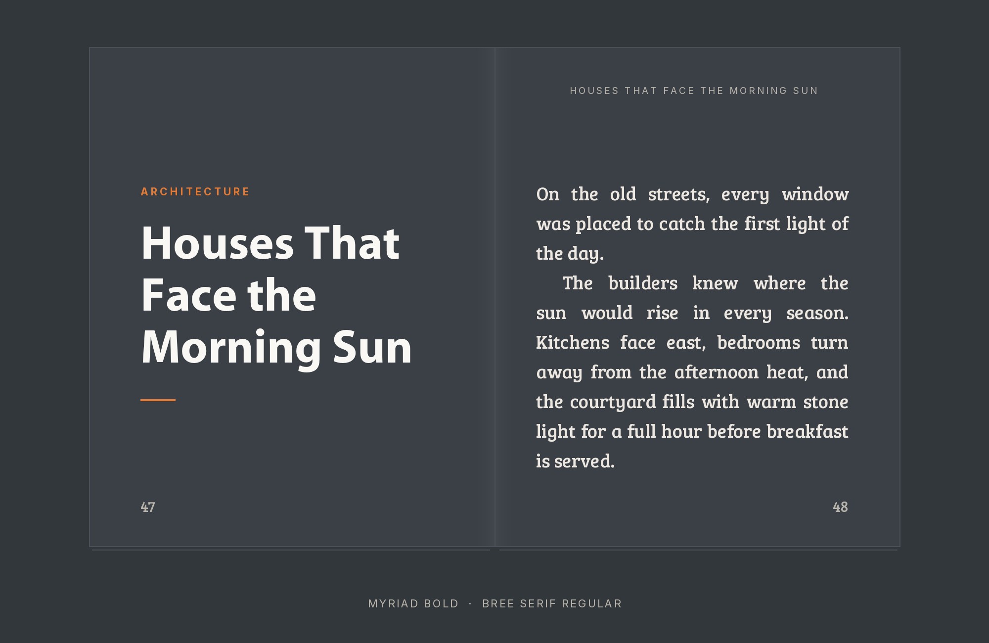
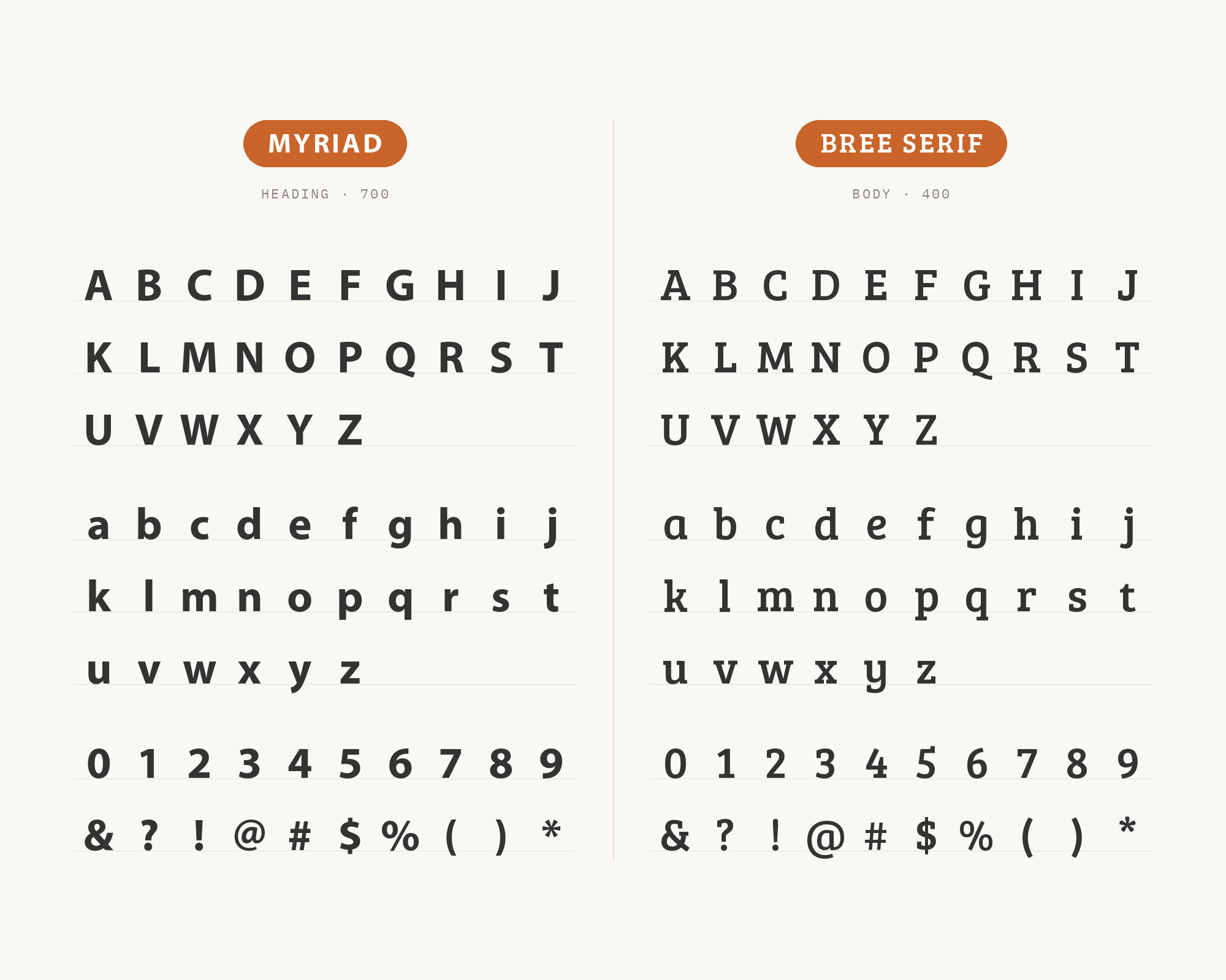
Bree Serif is TypeTogether’s friendly serif cousin to Bree, the informal sans Veronika Burian and José Scaglione released in 2008; the serif cousin followed and reached Google Fonts in 2011. Its chunky, rounded slabs and soft curves echo something specific in Myriad itself — Myriad’s own terminals are notably rounded and approachable for a sans built at corporate scale. The two typefaces come from entirely different foundries and design eras, yet the family resemblance in the curves makes the pairing read as coordinated rather than coincidental, which is useful for a brand that wants warmth without reaching for a formal old-style serif or a heavier slab. AEDAF’s publishing guide offers Bree Serif as an option for headings alongside Myriad Pro Semibold. It specifies Myriad Pro regular for body text. That is a useful way to try the pair: Bree Serif up top, with Myriad handling the reading.
6. Yeseva One
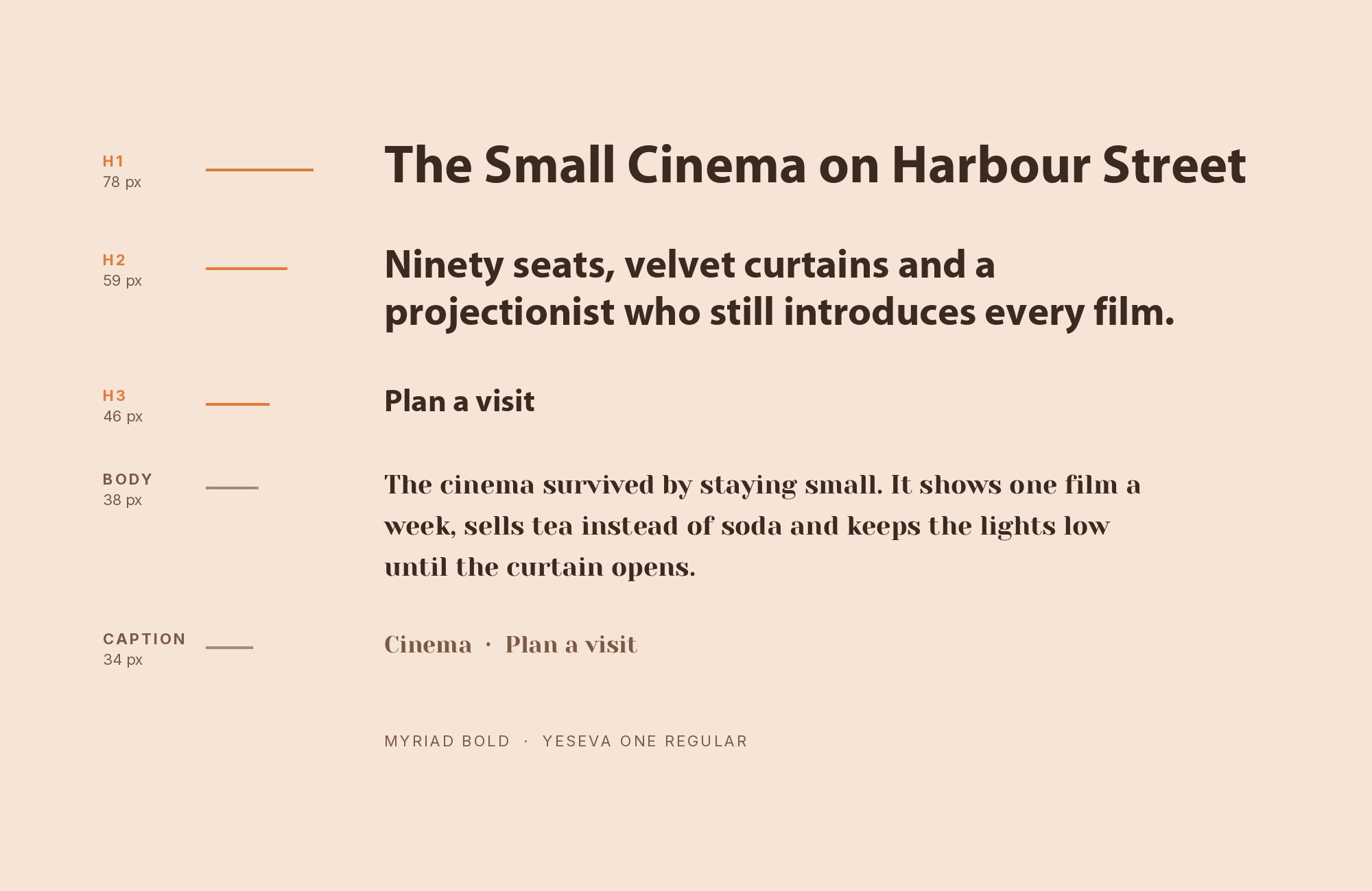
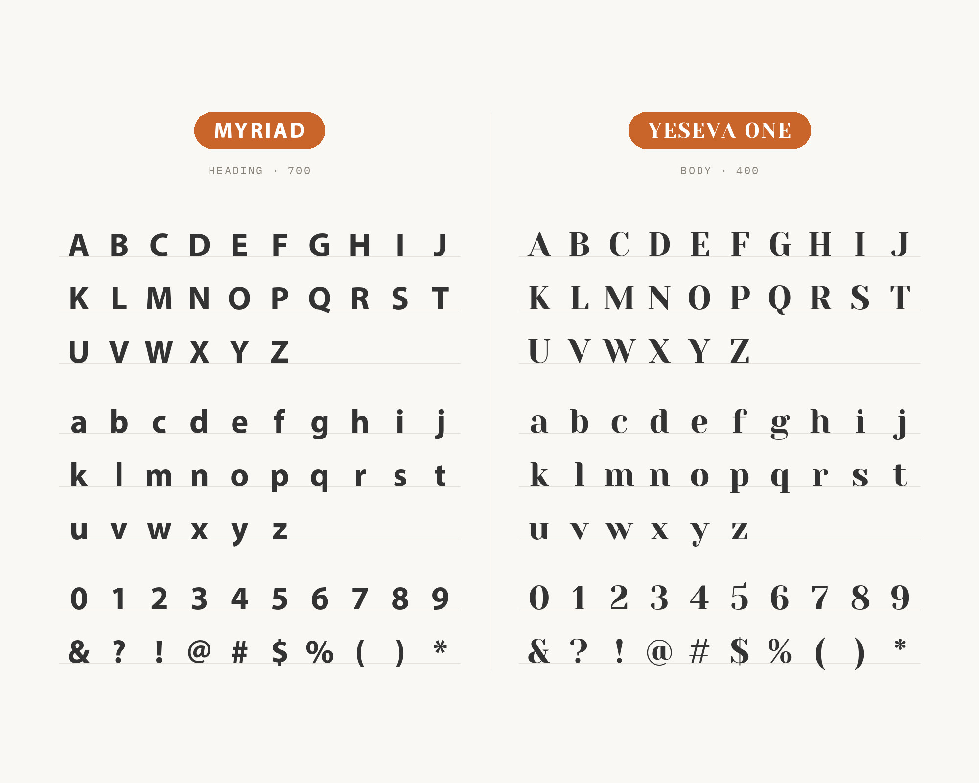
Yeseva One, Jovanny Lemonad’s display serif added to Google Fonts in 2011, is built for headline duty, with a bold voice that would overwhelm a paragraph but reads as confident, even theatrical, at large display sizes. That is precisely the register Myriad does not compete in — Myriad was drawn for clean, quiet text and interface chrome, not display drama — so the two can share a layout without stepping on each other’s territory. Set Yeseva One large for a title, a masthead, or a logotype, then drop straight into Myriad for every line of body copy, navigation, and caption beneath it, and the hierarchy needs no further explaining to a reader. It is the boldest personality on this list, so a little goes a long way — one headline or one wordmark per layout, not a repeating pattern.
Conclusion
Myriad has served many different kinds of identities. Its documented users include Rolls-Royce, Walmart, universities, the Beijing 2008 Olympics, and Kharkiv Metro signage. Apple also used it as a corporate typeface for more than a decade before San Francisco replaced it in 2015. That range is a reminder to judge a partner in the setting where it will actually appear.
Sabon and Adobe Garamond give Myriad a warm, old-style serif body copy partner; Helvetica Neue supplies contrast from inside the sans-serif family itself, through structure rather than style; Chaparral adds a texture Myriad was deliberately drawn to withhold. Yeseva One remains an editorial pick without a documented pairing found in this research. Set real copy at production sizes before committing to any of them, and judge the result by whether it still reads cleanly and quietly once the novelty of a new pairing wears off.
Sources
- Typ.io
- Typewolf
- AEDAF publication rules
- Fonts In Use
- Adobe Fonts
- Wikipedia
- MyFonts
- CreativePro
- Typographica
- ILoveTypography
- Smashing Magazine
- Vandelay Design
- Kittl × Monotype
- ManyPixels
- Insanity Works
- Pangram Pangram (2 posts)
- Stimulus Advertising
