Bitter pairs great with Montserrat, Open Sans and Work Sans. All 15 pairings are shown below in real rendered specimens, with the reason each one works.
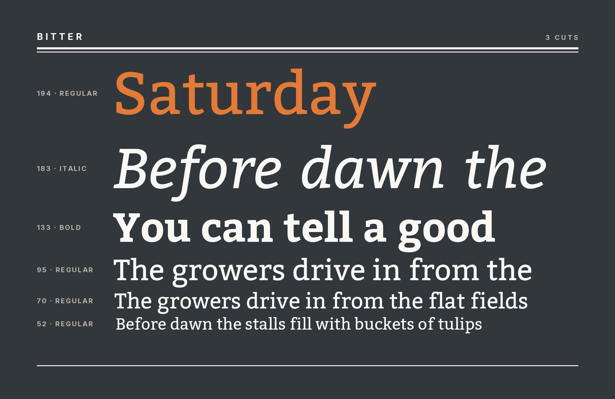
What fonts go with Bitter? Start by asking what kind of slab it actually is: not a poster face with shouting rectangular serifs, but a screen-tuned text slab whose square terminals were drawn to hold color in a paragraph — which is exactly the job a partner font has to leave alone or take over.
Sol Matas designed Bitter at the Argentine foundry Huerta Tipográfica as a contemporary slab for screens, building the letterforms first on a pixel grid and only later adding curve quality. The design combines the large x-height and legibility of the humanist tradition with little stroke contrast: serifs are as thick as the stems, terminals are square, and the Regular is deliberately darker than a print Regular so paragraphs keep intense color on a backlit display. That darker color is the personality. Everything else — the even weight, the rational spacing, the few kerning pairs — is there so the slabs can be read at length rather than merely displayed.
Because Bitter already supplies texture and color, most working partners are a neutral sans that recedes at interface and body sizes — Open Sans, Work Sans, Source Sans Pro, PT Sans, Roboto — while geometric display faces (Montserrat, Raleway, Poppins, Gotham) take the headline when Bitter itself is the reading voice. The rarer move is serif-on-serif: Crimson Pro’s old-style contrast against Bitter’s monoline slabs. The real decision is the role split, not the category. Here are 15 fonts that pair well with Bitter.
1. Montserrat

Julieta Ulanovsky designed Montserrat after the posters and painted signs of the Montserrat neighborhood in Buenos Aires and released it in 2011 as a geometric sans with a tall x-height, circular bowls and a wide weight range from Thin to Black. That large lowercase is the metric reason it sits next to Bitter: both faces were drawn so the x-height carries the reading, so a Montserrat headline and a Bitter paragraph land at the same apparent size without optical correction. Construction supplies the contrast. Montserrat’s compass-drawn o and even, serifless strokes are everything Bitter’s square, stem-thick slabs are not, which is why Typewolf names Montserrat as its suggested pairing and why published Google Fonts pairing examples list the same couple. Use Montserrat ExtraBold or Black for short display lines and logotype, and let Bitter Regular carry the paragraphs where its darker color and square terminals earn their keep. Reverse it for a slab masthead: Bitter Bold up top, Montserrat Regular for navigation.

Try Semrush free. No credit card.
Start on the $0 plan. Paid plans from $117/mo billed annually.
Try for free2. Open Sans

Open Sans is the humanist sans layer in several Bitter systems. Its large x-height and open apertures stay readable in interface text and paragraphs while Bitter contributes the darker slab texture. The Universities of Wisconsin brand guide allows Open Sans for body copy and permits both Open Sans and Bitter for headings, which makes the division flexible without making the faces interchangeable. Use Bitter for a short serif headline or subhead and Open Sans Regular for the reading layer; use Open Sans Semibold when the page needs a quieter secondary heading.

3. Work Sans

Wei Huang designed Work Sans as a grotesque optimized for on-screen text at middle sizes, based loosely on early grotesques such as those by Stephenson Blake, Miller & Richard and Bauerschen Giesserei. Open apertures and a comparable x-height keep the two optically level at matched sizes, while Work Sans’s plainer construction recedes against Bitter’s square, stem-thick slabs. Typ.io records the pair on a live site, and Fonts In Use documents both as the English text faces of Types of Type. Give Work Sans the functional load — navigation, captions, tables, form chrome — and let Bitter supply the editorial texture in headings or body. The pairing suits product sites, newsletters and any layout that needs a workhorse grotesque that will not duplicate Bitter’s already-dark color.

4. Source Sans Pro

Source Sans Pro brings Adobe’s humanist, screen-focused construction beside Bitter’s sturdy slab serifs. Its open apertures and modest contrast make it a practical body and interface face while Bitter carries the more editorial voice. HFMA’s corporate identity guidelines list Bitter and Source Sans Pro as free web fonts reserved for digital media, giving the pairing a documented screen role rather than a purely formal recommendation. Set Bitter on selected headlines, quotes or callouts and Source Sans Pro on paragraphs, labels and controls, where its weight range can build hierarchy without competing with the slab texture.

Unlimited fonts from $16.50/mo.
29 million fonts, templates and stock assets. One subscription, unlimited downloads.
See the plan5. Gotham

Tobias Frere-Jones, with Jesse Ragan, drew Gotham in 2000 for Hoefler & Frere-Jones from mid-century New York building lettering — wide, even-stroke geometric caps with open apertures and a sign-painted rather than compass-pure construction. Against Bitter, the contrast is structure, not temperature: both faces are sturdy, low-contrast and built to hold color, but Gotham has no slabs and Bitter has no geometric caps. Typ.io records the pair on a live site, which is co-usage rather than a foundry argument. Because Gotham is retail, this is the one pairing on the list that costs a second license; Montserrat or Poppins can stand in for the geometric headline if the budget stops at Google Fonts. Run Gotham for wordmarks, navigation and short display lines where its wide caps read as civic and confident, and let Bitter Regular do the reading. Reverse it only if the slab is the brand and Gotham Book can disappear into supporting text.

6. Raleway

Matt McInerney designed Raleway in 2010 as a single thin weight for The League of Moveable Type, and Pablo Impallari and Rodrigo Fuenzalida expanded it into a nine-weight family in 2012; the original voice is still that thin cut, whose hairline stems are the structural opposite of Bitter’s thick, square-serifed Regular. That weight gap is the pairing. Raleway Light or ExtraLight set large gives an airy, fashion-adjacent headline; Bitter Regular underneath supplies the darker, more tactile paragraph color the thin sans cannot. A Figma pairing page lists Bitter among Raleway’s partners, and a pairing generator surfaces the same couple on its own — two independent sources pointing at one split. Do not set Raleway Regular next to Bitter Regular at the same size: the two then compete as mid-weight sans and mid-weight slab. Keep the display cut thin and large, the slab at text size, and the hierarchy reads at a glance.

7. Poppins

The Indian Type Foundry developed Poppins with Jonny Pinhorn, building Latin and Devanagari from pure geometry — circular bowls, near-monoline strokes, optical corrections only at the joints. Pairing it with Bitter is a compass-versus-square argument: Poppins’s o is a circle, Bitter’s o is a humanist bowl wearing rectangular serifs as thick as the stem. A published Google Fonts pairing example names the combination explicitly. Use Poppins Bold or ExtraBold for friendly, geometric display lines and logotype, and let Bitter Regular carry the reading, where its darker color and square terminals keep the page from floating away on Poppins’s even geometry. The pairing suits consumer brands, education products and lifestyle sites that want a contemporary geometric masthead without giving up a serious text face. Do not run both at the same weight and size; the contrast is construction, and it needs a scale jump to register.

Don't start with a blank page. Shutterstock Unlimited: endless downloads of premium human-made assets plus powerful AI tools.
Sign Up8. Crimson Pro

Jacques Le Bailly drew Crimson Pro as a revival and expansion of Sebastian Kosch’s Crimson, an old-style serif with real stroke contrast, bracketed serifs and a literary, bookish rhythm. That is the one pairing on this list that stays inside the serif category, and it works because the two serifs do opposite jobs. Crimson Pro modulates: hairlines and thick stems, a written stress, classical proportions. Bitter refuses to modulate: little stroke contrast, serifs as thick as the stems, square terminals, a Regular darker than print. A published pairing example lists Bitter + Crimson Pro as a named combination. Use Crimson Pro for long-form literary body copy or for display lines that should feel editorial, and Bitter for the contemporary screen voice — callouts, interface-adjacent reading, or the reverse headline. Two serifs on one page need a decisive size or weight gap; treat them as different registers, not as interchangeable text faces.

9. PT Sans

Alexandra Korolkova, Olga Umpeleva and Vladimir Yefimov designed PT Sans at ParaType in 2009 as the sans half of Russia’s public-type system: a humanist sans with modest contrast, open forms and a practical x-height built for official documents as much as for screens. The sourced pairing is unusually specific — PT Sans italic against Bitter Regular — which is a smarter split than two romans at the same weight. The italic’s narrower, more written rhythm softens Bitter’s darker, square-terminal color without introducing a second family of serifs. A long-running Google Fonts pairing roundup records that exact combination. Use PT Sans italic for decks, pull quotes, captions and secondary headings, Bitter Regular for body or primary titles, and keep PT Sans roman in reserve for UI if the product needs a full sans. It is the most economical way on this list to get contrast from slope rather than from category.

10. Roboto

Christian Robertson designed Roboto in-house at Google and released it in 2011 as Android’s system font, a mechanical-skeleton sans with largely geometric forms, softened by friendly, open curves. Fonts In Use records Bitter with Roboto on the Neerlandistiek website as of 2026 — a live academic journal, not a mood board. That is the job split to copy: Bitter holds the editorial color of the reading, Roboto takes the chrome that has to recede at UI sizes. The x-heights are close enough that mixed settings need little optical correction; the contrast is construction, square slabs against a near-mechanical sans. Use Roboto for navigation, metadata and supporting lines, and keep Bitter on titles and body. Do not set them at the same weight and size or the difference collapses into an accidental font change.

11. Inter

Thoughtworks’ public brand page says it switched to Inter for body copy and added Bitter Bold for headlines, explicitly naming the two as its new open-source communication system. Inter supplies the neutral, digital-first reading layer; Bitter’s sturdy slab serifs create the contrasting headline voice. Use Bitter Bold for the main statement and Inter Regular or Medium for paragraphs, navigation and interface text. The source is a live corporate brand decision, so the role split is stronger than a generic font-pair suggestion.

12. Nunito Sans

The Breakthrough campaign guide assigns Nunito Sans Bold to short uppercase headlines and Bitter Regular to body copy. That gives Bitter the reading role and lets Nunito Sans provide a friendly, open sans headline without competing serif texture. Keep the campaign’s short headline rule: Nunito Sans handles the compact statement, while Bitter carries sentence-case paragraphs with its larger slab forms. The guide also identifies Filson Pro for the outlined logo and messaging artwork; that logo face is not part of this pair.

13. DM Sans

The University of Guelph’s typography guide names Bitter as its primary typeface and DM Sans as its secondary typeface, saying DM Sans complements Bitter and can be used with it in digital and print work. Bitter supplies the larger headline and brand presence; DM Sans provides the more versatile text and interface layer. This is a restrained slab-and-sans system: use Bitter for headlines and short callouts, then DM Sans for body copy, captions and controls where its clean sans rhythm is easier to sustain.

14. Bebas Neue

Typewolf documents Bebas Neue, Montserrat, and Bitter together on “The Beast is Back.” Bebas Neue adds a narrow, all-caps display voice that Bitter cannot imitate: its condensed glyphs create tall headline impact while Bitter’s wide lowercase and square slabs settle into a steadier reading texture. Keep Bebas Neue to short titles and labels, then give Bitter enough line height in paragraphs so the transition does not feel cramped. The pairing is especially effective for posters, campaigns, and editorial landing pages where space is tight and the hierarchy needs to announce itself before the reader reaches the first sentence.

15. Manrope

New Mexico Health’s brand guide specifies Bitter and Manrope as its typography pair. Manrope’s open geometric sans forms keep supporting text calm while Bitter supplies the recognizable slab-serif voice. Their x-heights are generous enough to sit at compatible apparent sizes, but the terminal contrast remains clear: clean cuts and open counters below square slabs and heavier joins. Use Bitter for titles or short editorial leads and Manrope for body copy, captions, and digital controls. This system suits health, education, and public-service work where the design needs character without sacrificing the plain reading rhythm of functional information.

Conclusion
Bitter is a screen slab whose personality is color: a thicker-than-print Regular, little stroke contrast, and square terminals as heavy as the stems. The pairings that keep showing up in the wild let that color do all the talking and put a quieter sans underneath it. Open Sans, Work Sans, Source Sans Pro, PT Sans and Roboto all recede at UI and body sizes; Montserrat, Raleway, Poppins and Gotham take the geometric headline when Bitter itself is the reading face.
The exception is Crimson Pro, which stays in the serif category and wins on contrast of modulation rather than of serif versus sans. Pick the role first — Bitter as headline or Bitter as body — then pick the partner that does the other job. Then prove it in place: type out the real copy at the size the page will ship at, and keep the pair only if those square terminals still sound like the voice you wanted with the second face beside them.
Sources
- Thoughtworks Our Brand
- Breakthrough Campaign Guide (Wayback copy; original now 404)
- University of Guelph Typography
- Universities of Wisconsin Typography
- HFMA Brand Identity Guidelines
- Typewolf
- Typ.io
- Fontpair
- Fonts In Use (typeface)
- Fonts In Use (Neerlandistiek)
- Fonts In Use (Types of Type)
- Jukebox
- Figma
- UtilityCove
- ReliablePSD
- pourpasunrond
- Google Fonts about
- New Mexico Health brand guide
