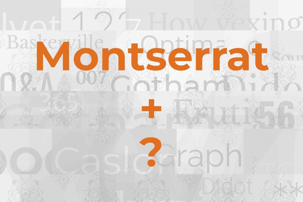
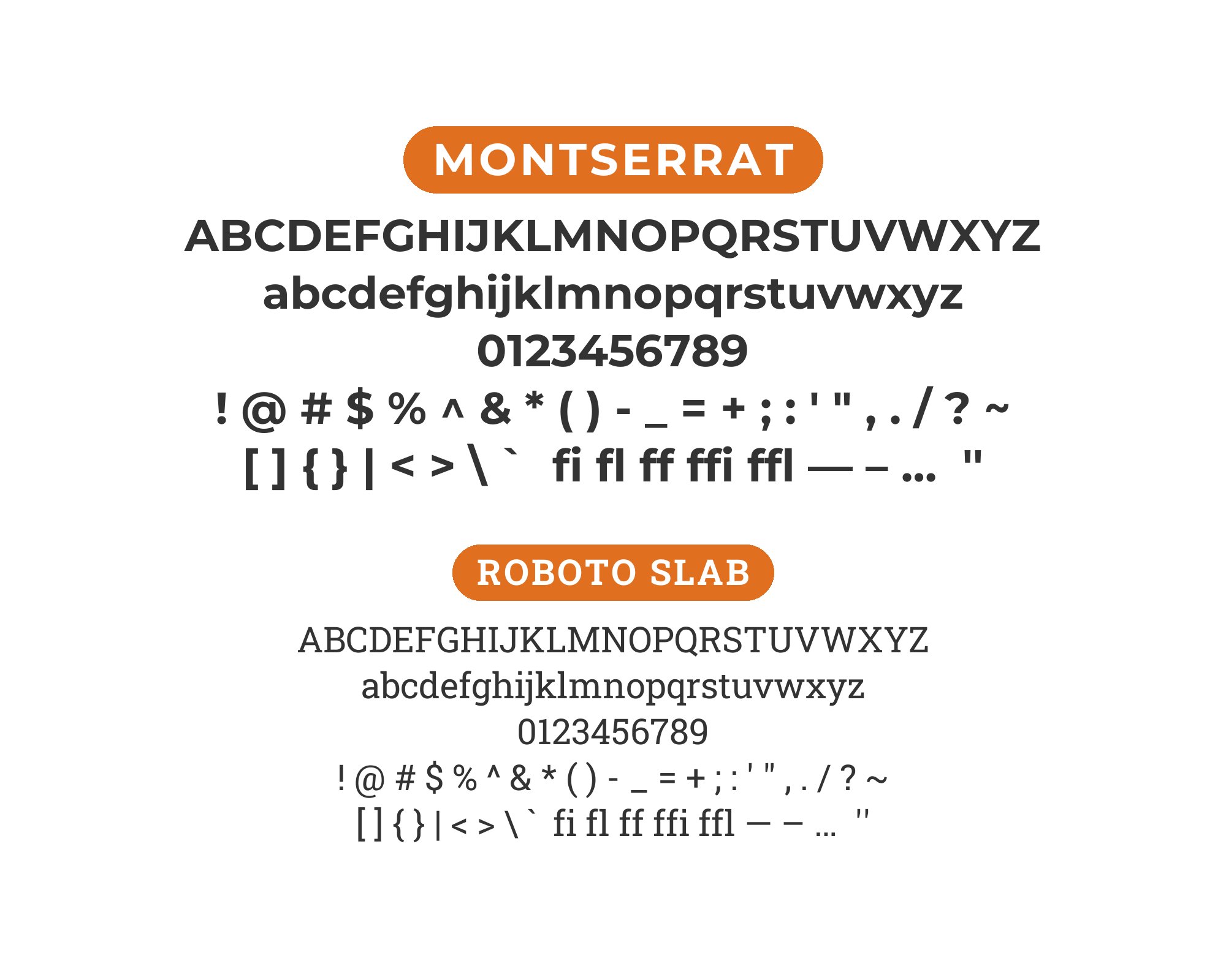
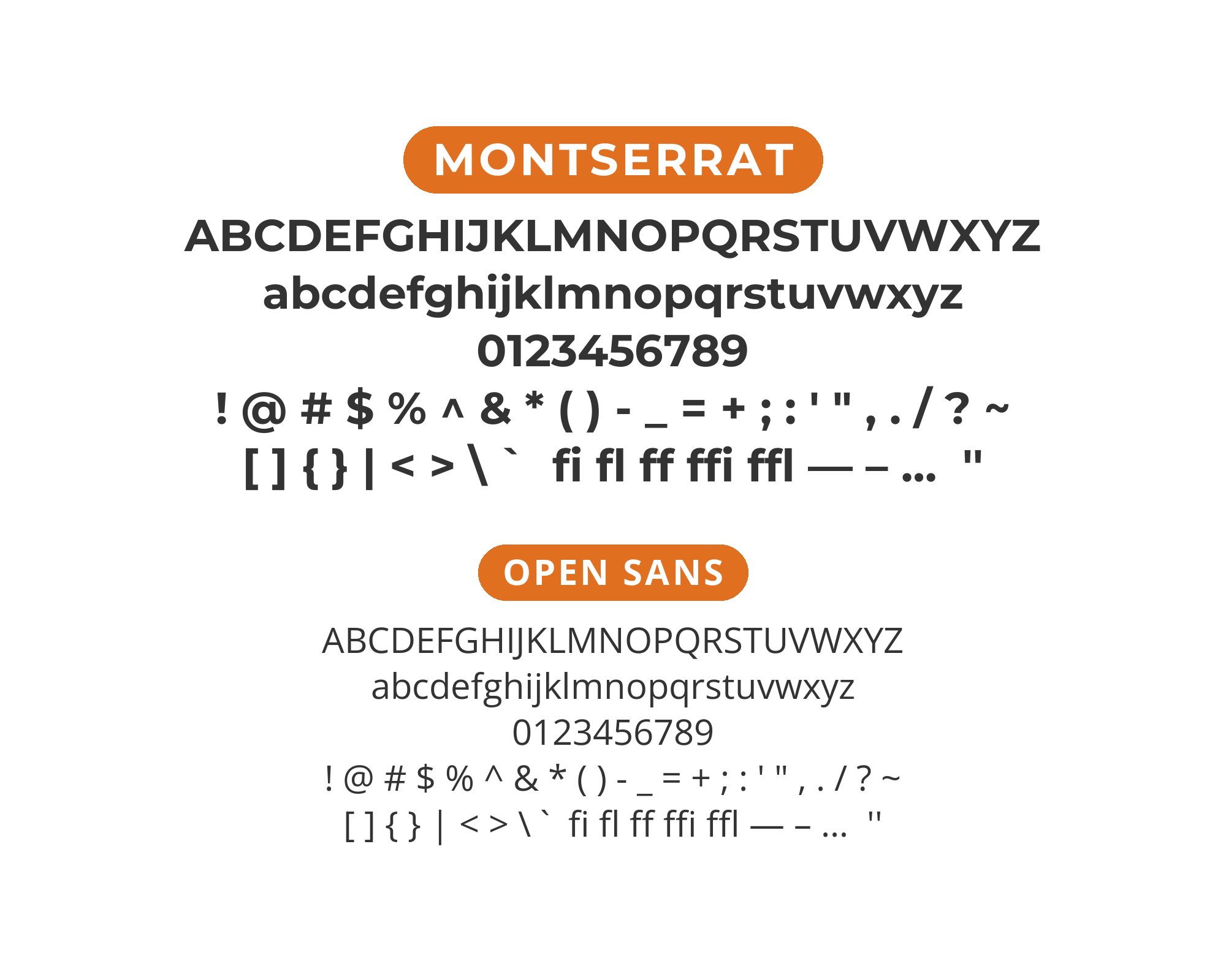
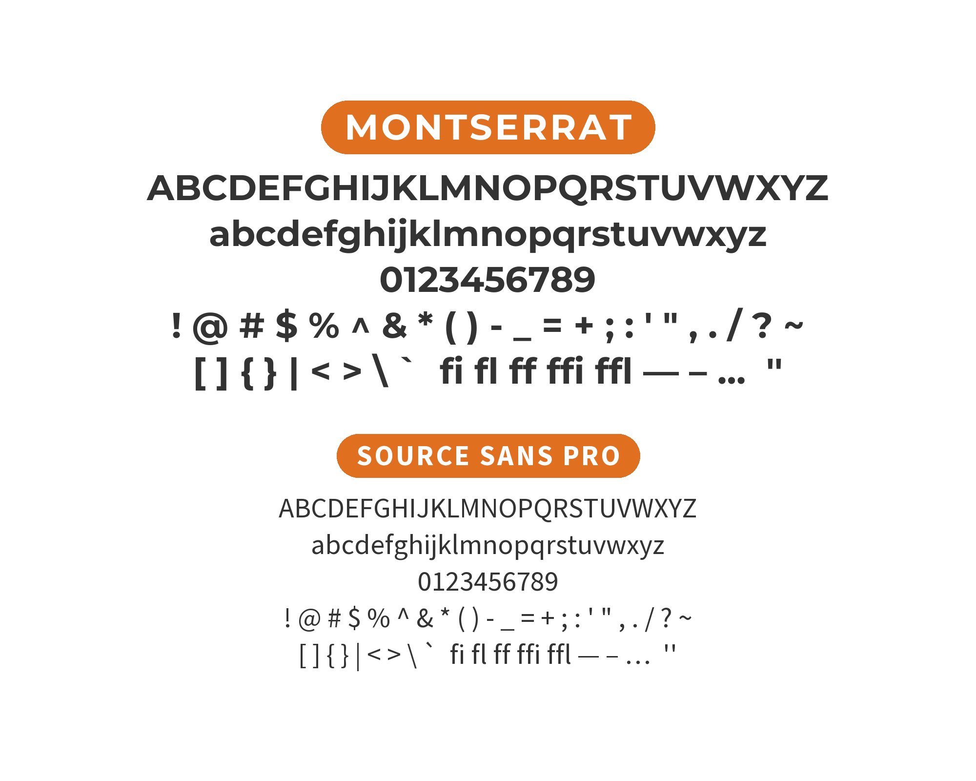
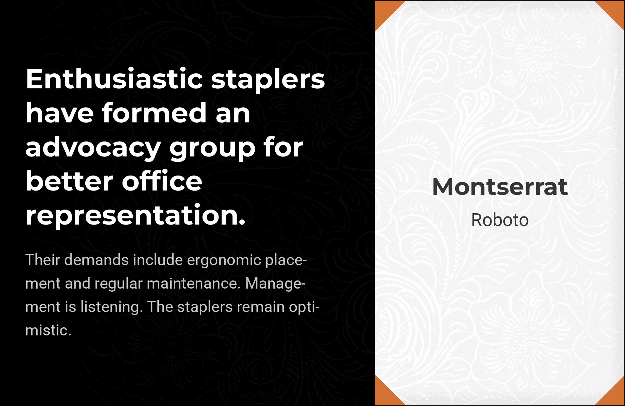
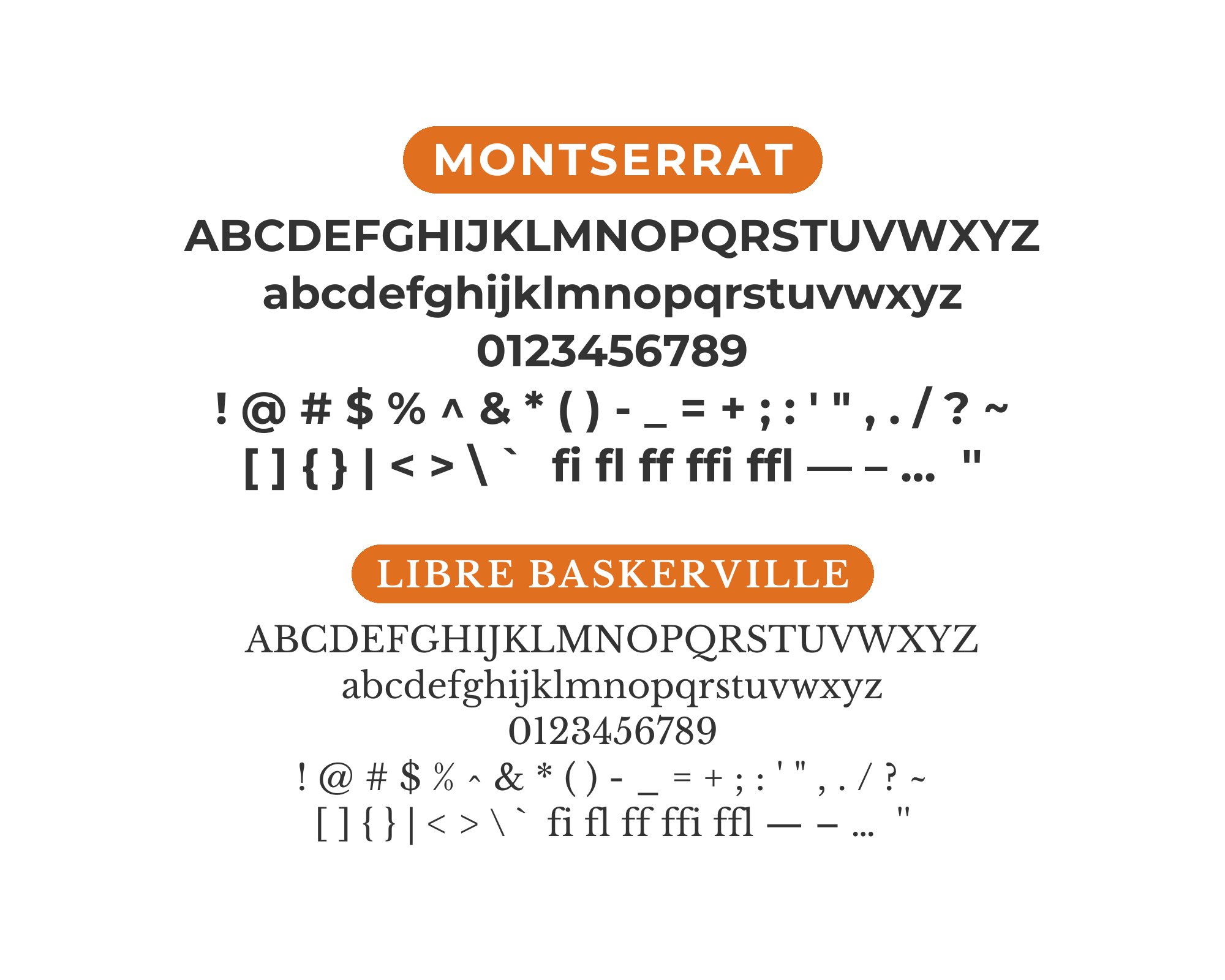
What fonts go with Montserrat? This geometric sans-serif inspired by urban signage has become one of the web’s most popular fonts, making thoughtful pairing crucial to avoid generic-looking results.
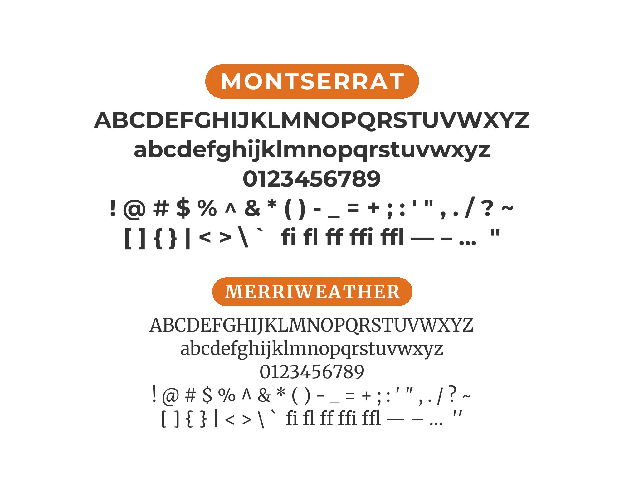
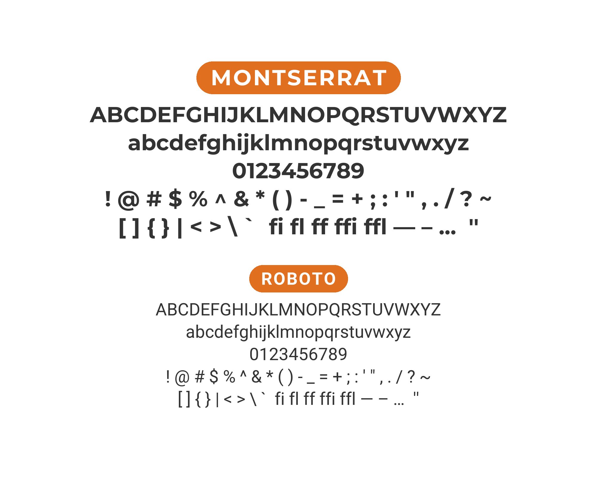
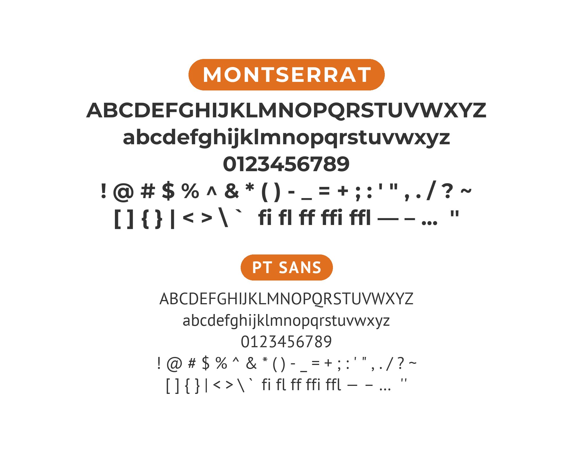
Montserrat began as a labor of love by Julieta Ulanovsky, who wanted to preserve the typographic heritage of the Buenos Aires neighborhood she grew up in. The old posters and signs of the Montserrat district featured bold geometric letters that inspired this contemporary interpretation. The typeface balances geometric purity with subtle optical refinements that keep it feeling warm rather than cold. Its extensive weight range, from Thin to Black in both roman and italic, has made it a go-to choice for designers seeking a clean, modern aesthetic.
The challenge with Montserrat is its popularity. Because it appears on countless websites, pairing choices significantly impact whether a design feels fresh or familiar. Generic combinations with equally popular sans-serifs can result in an unremarkable outcome. The key is finding partners that bring something unexpected, whether that’s a serif with distinctive character or a sans-serif with enough personality to create interest. Here are 15 fonts that pair well with Montserrat, chosen for their ability to create distinctive combinations with this ubiquitous favorite.
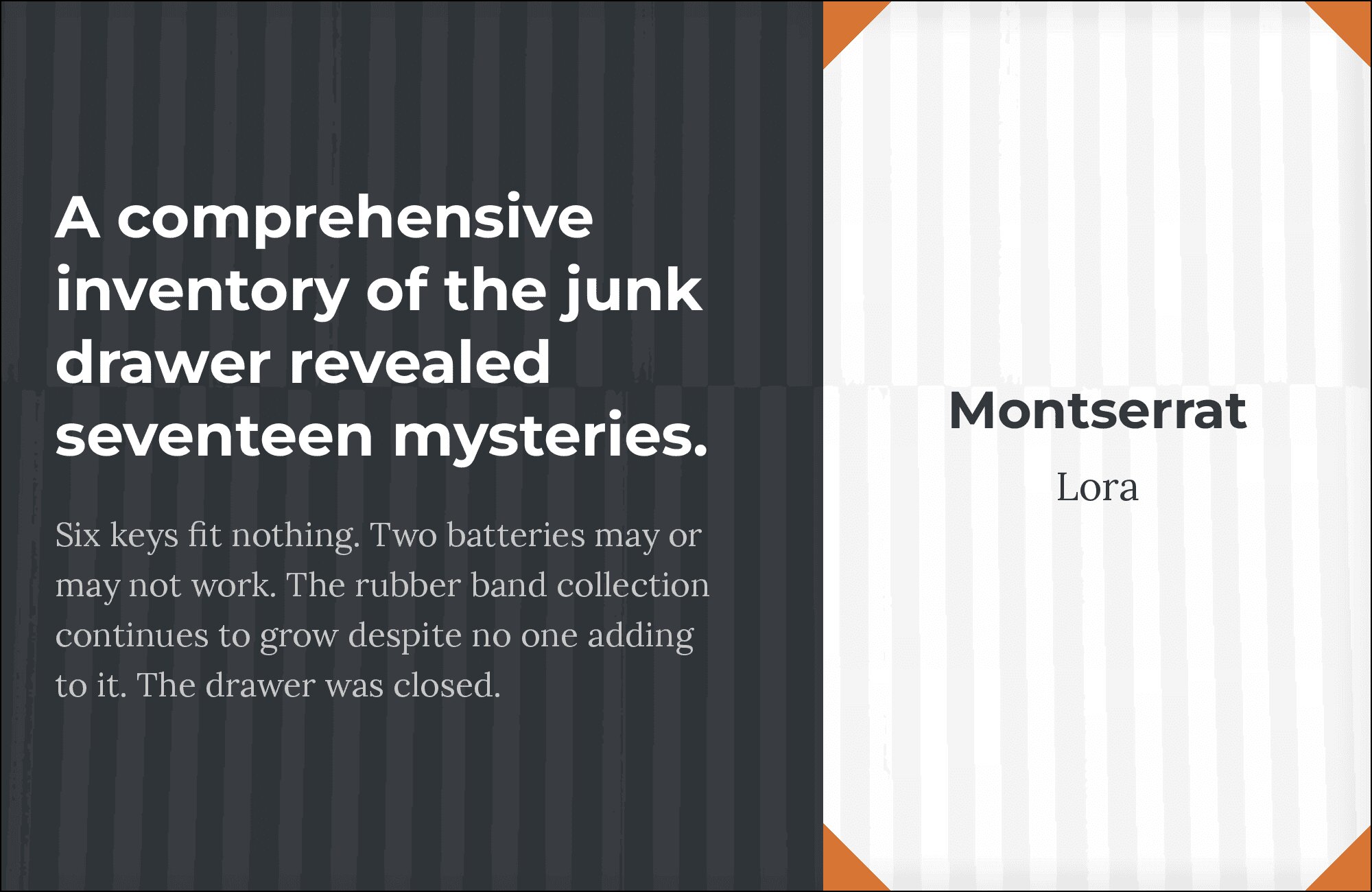
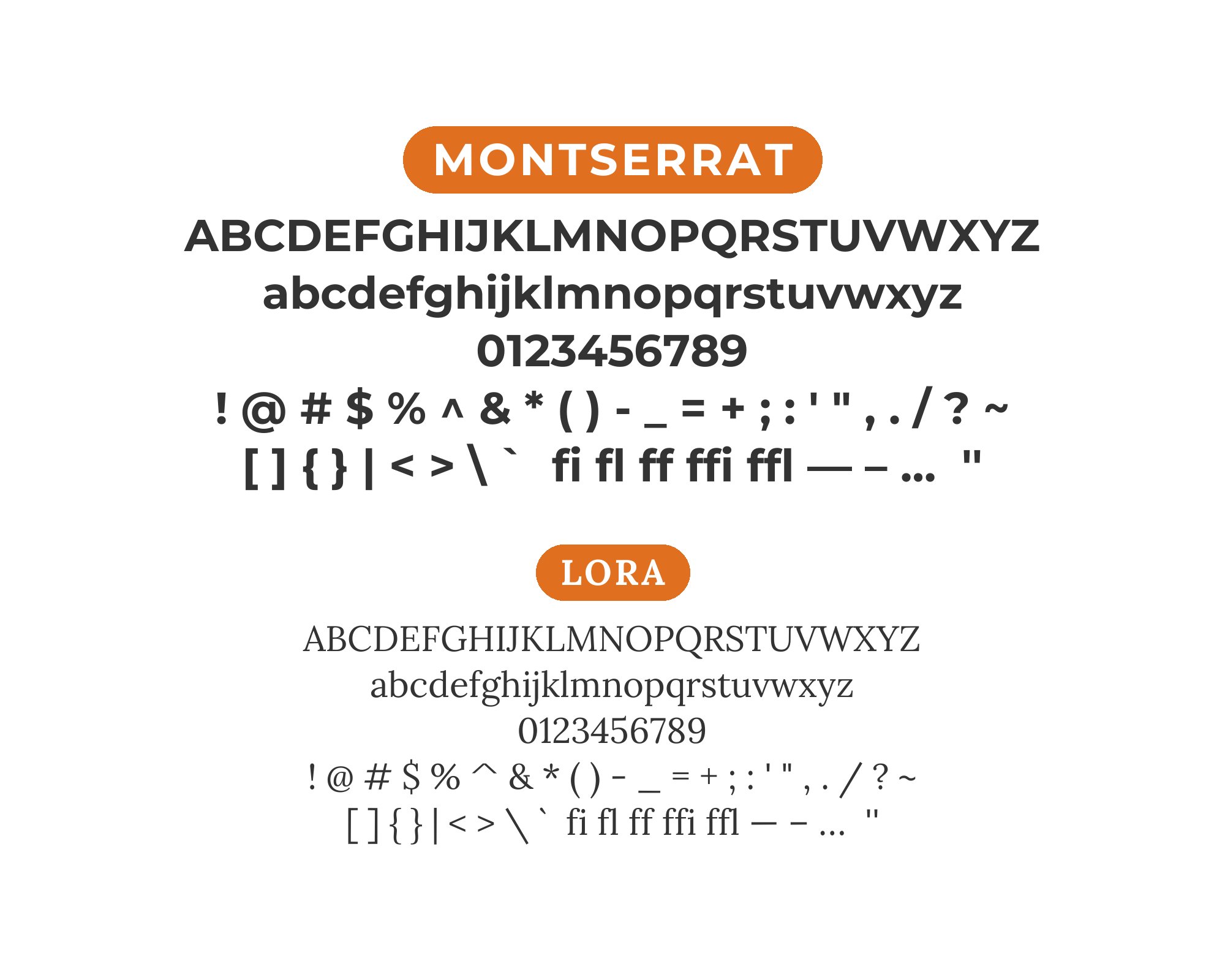
1. Lora
Montserrat’s crisp geometric letterforms find their perfect foil in Lora‘s brushed calligraphic curves. The sans-serif’s even stroke weight creates a clean canvas that lets Lora’s elegant ball terminals and flowing serifs sing. Their x-heights align beautifully, making transitions between headlines and body copy feel seamless. This pairing shines in editorial layouts, wedding invitations, and boutique branding where you want modern structure tempered with warmth. The contrast isn’t jarring; it’s a conversation between precision and artistry.
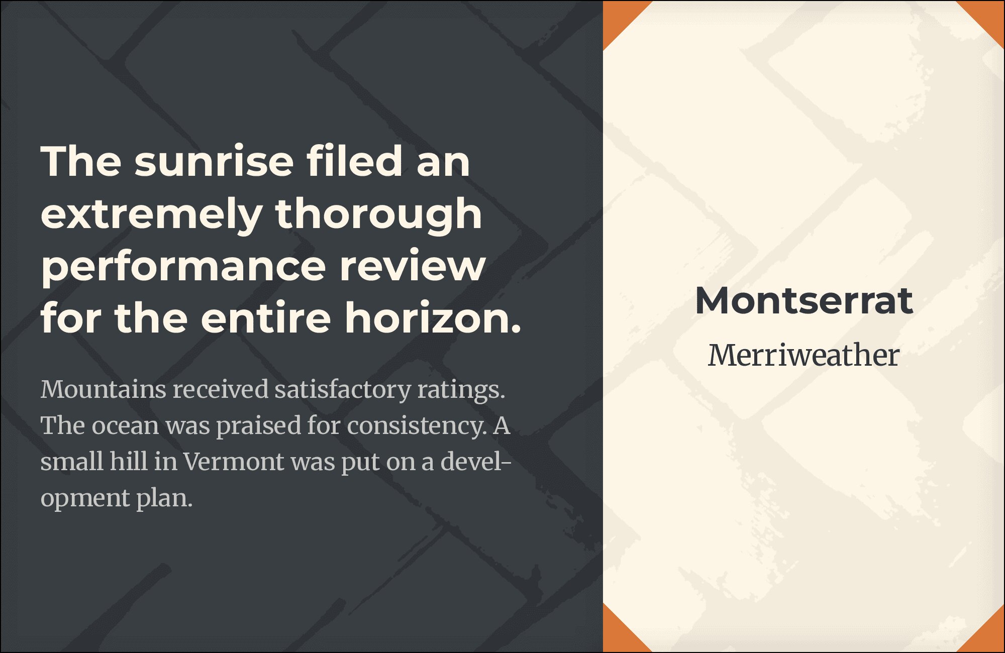
2. Merriweather
Both fonts share generous x-heights that make paragraphs scannable without squinting. Montserrat brings geometric confidence to headlines while Merriweather‘s sturdy serifs anchor body text with screen-optimized clarity. The combination feels trustworthy and accessible, ideal for long-form blogs, news sites, or educational content. Merriweather’s slightly condensed proportions complement Montserrat’s open counters, creating visual breathing room. This is a workhorse pairing that handles heavy reading loads without fatigue.
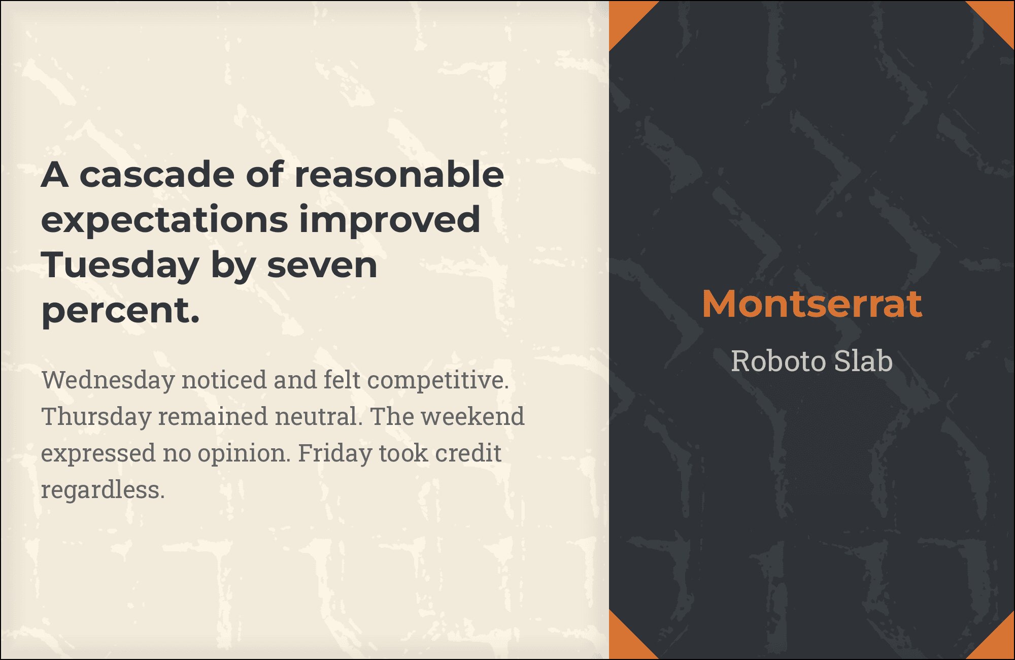
3. Roboto Slab
Slab serifs like Roboto Slab punch hard, and when paired with Montserrat’s geometric neutrality, you get unmistakable hierarchy without visual conflict. The slabs’ mechanical precision echoes Montserrat’s constructed feel, yet their bracketed serifs add enough personality to distinguish headings from body. Perfect for tech startups, architecture firms, or any brand that wants to feel engineered yet approachable. Weight variations in both families give you endless flexibility for info-heavy layouts.
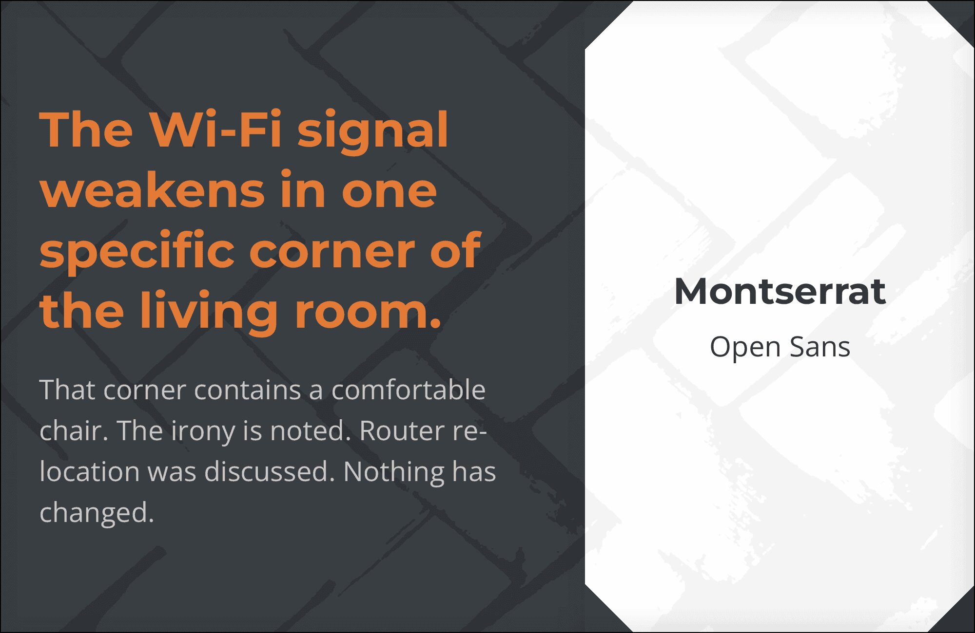
4. Open Sans
Two geometric sans-serifs might sound redundant, but Montserrat and Open Sans differentiate through weight and personality. Use Montserrat at bold weights for commanding headlines, then let Open Sans’s humanist warmth carry readers through paragraphs. Their similar proportions create visual cohesion while subtle differences in stroke terminals prevent monotony. This pairing dominates corporate sites and product interfaces where clarity trumps flair.
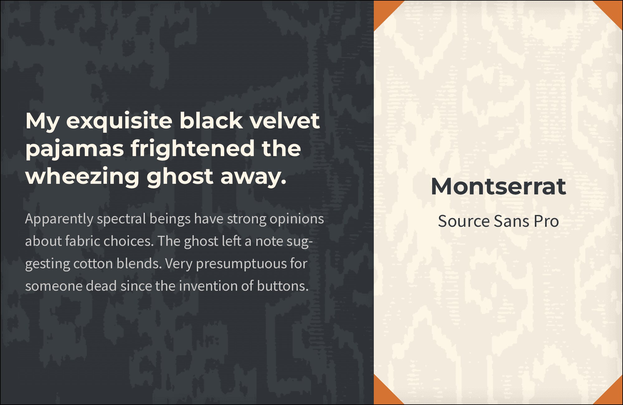
5. Source Sans Pro
Adobe’s first open-source typeface meets Montserrat for a timeless modern combination. Source Sans Pro‘s humanist details soften Montserrat’s geometric edges in body copy, while maintaining enough neutrality to keep the focus on content. The x-heights sync beautifully at typical web sizes. Think SaaS dashboards, technical documentation, or portfolio sites that need professionalism without sterility. Both fonts perform flawlessly across weights.
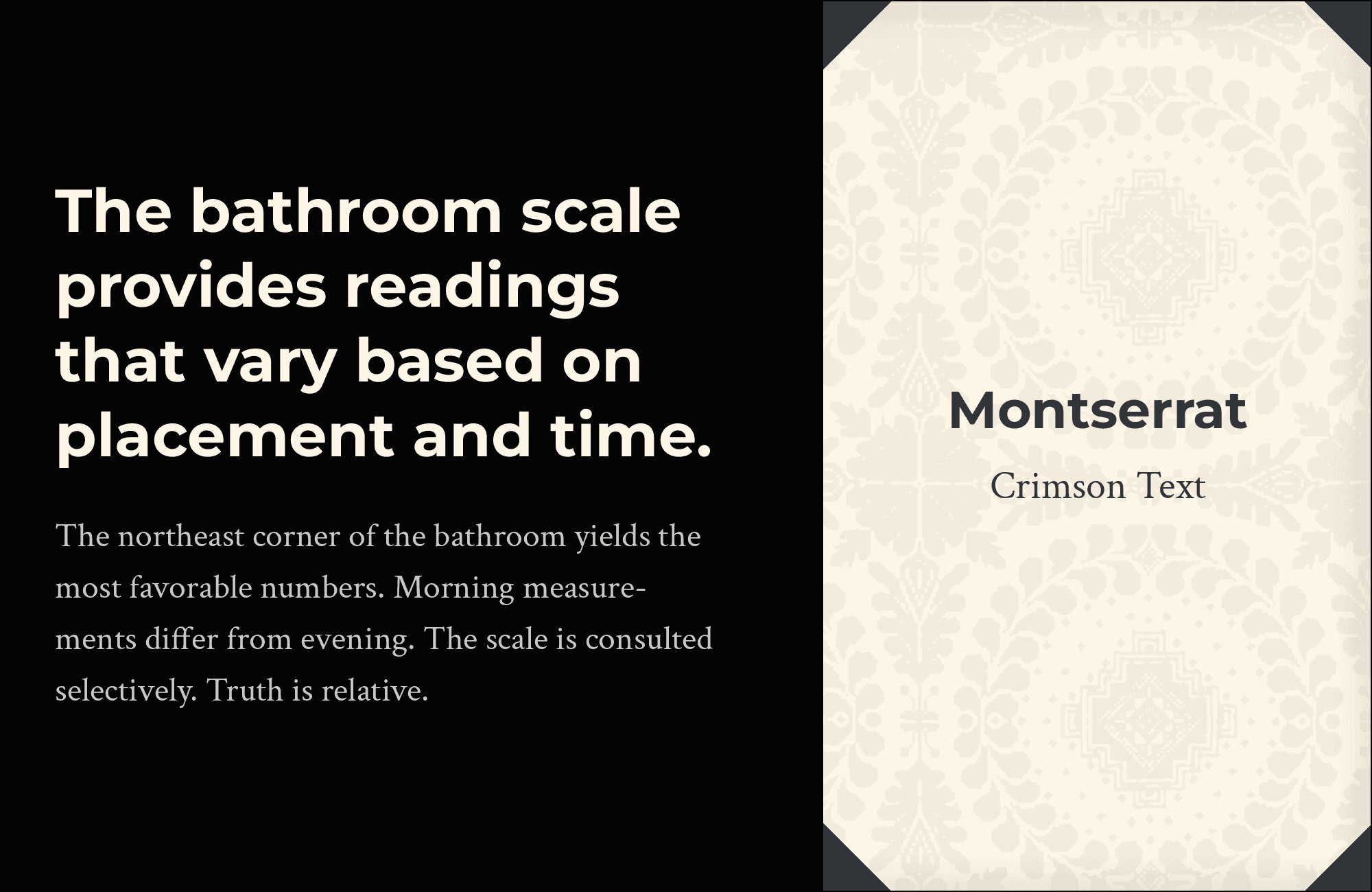
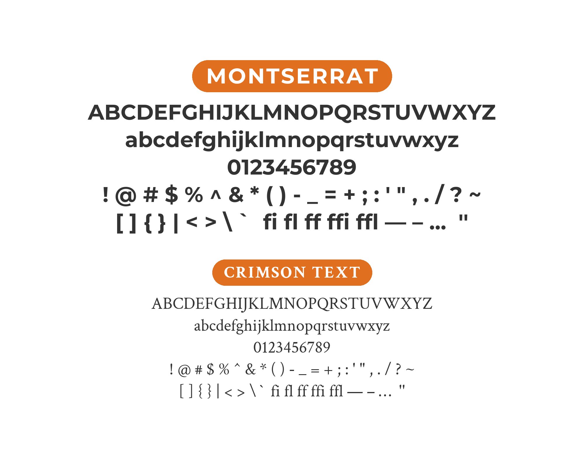
6. Crimson Text
Old-style elegance crashes into contemporary geometry when Crimson Text headlines sit above Montserrat body. Crimson’s Renaissance-era proportions and subtle bracketed serifs create dignified contrast without visual clutter. The pairing works beautifully for literary magazines, book covers, or brands wanting scholarly gravitas with modern accessibility. Crimson’s tall lowercase amplifies its presence in display use, while Montserrat keeps supporting text clean.

You'll love this article!
A visual guide for designers.
7. Roboto
Same geometric DNA, different personalities. Roboto‘s slightly mechanical feel contrasts with Montserrat’s Art Deco heritage, letting you differentiate through weight alone. Use Montserrat’s heavier cuts for headlines and Roboto for interface elements or body text. This combination dominates Android ecosystems and Material Design implementations. Both scale predictably from mobile to desktop without surprises.
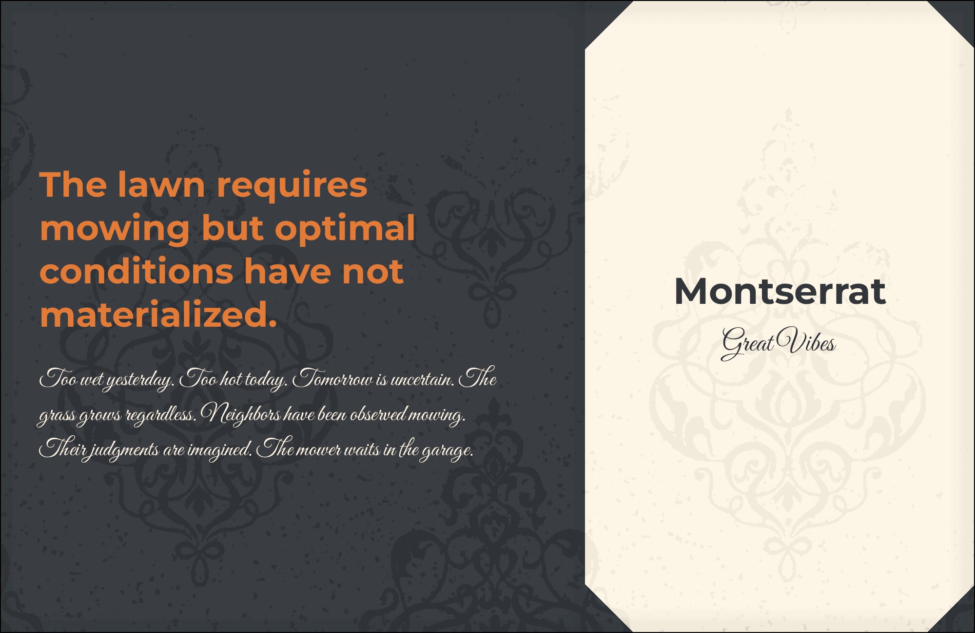
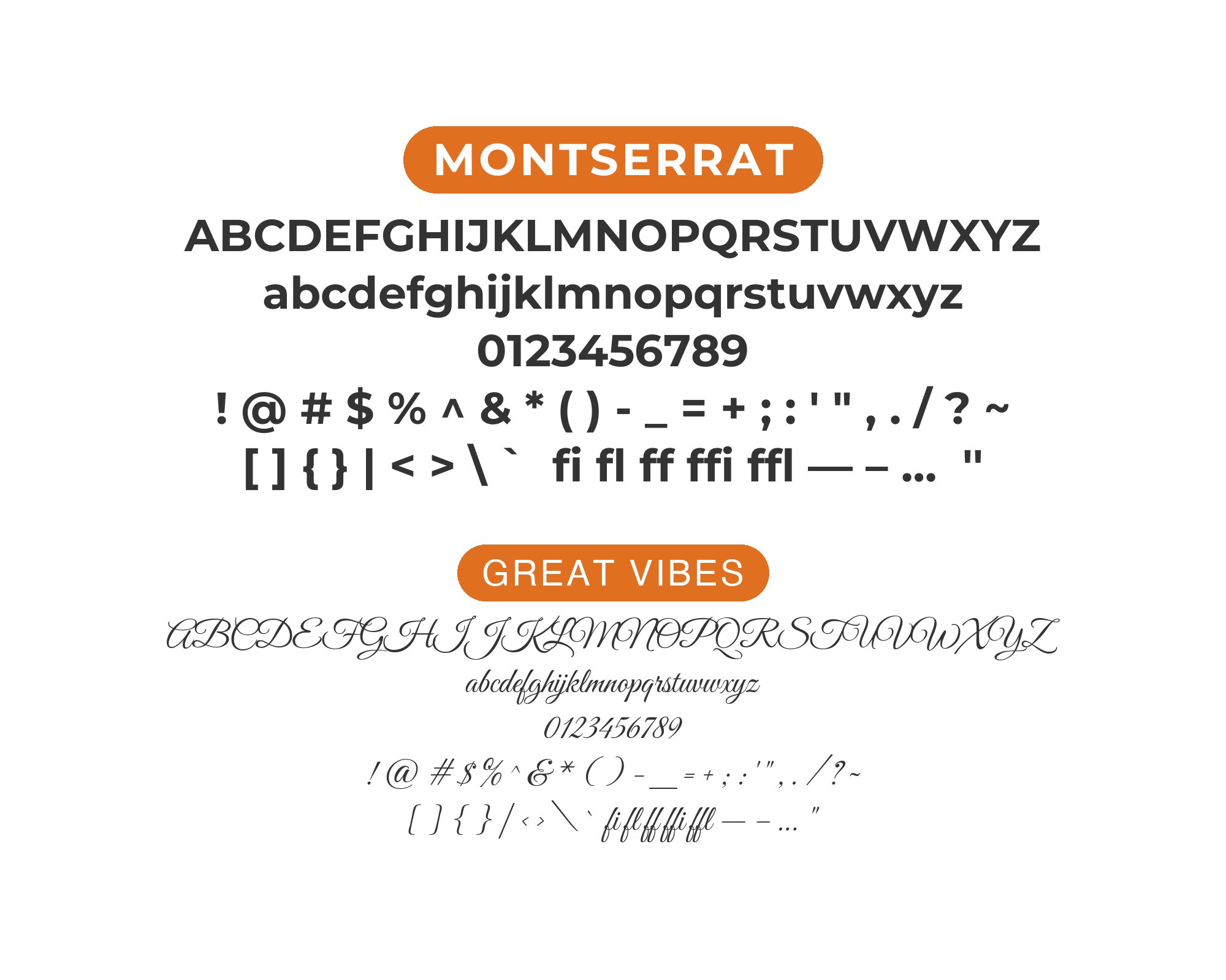
8. Great Vibes
Sometimes you need personality to break geometric monotony. Great Vibes‘ connected script adds flourish and warmth to Montserrat’s structured foundation, perfect for accent text, pull quotes, or decorative elements. The pairing excels in wedding stationery, restaurant menus, and boutique retail. Use Great Vibes sparingly as seasoning rather than the main course. Montserrat’s weight range gives you options for balancing the script’s visual energy.
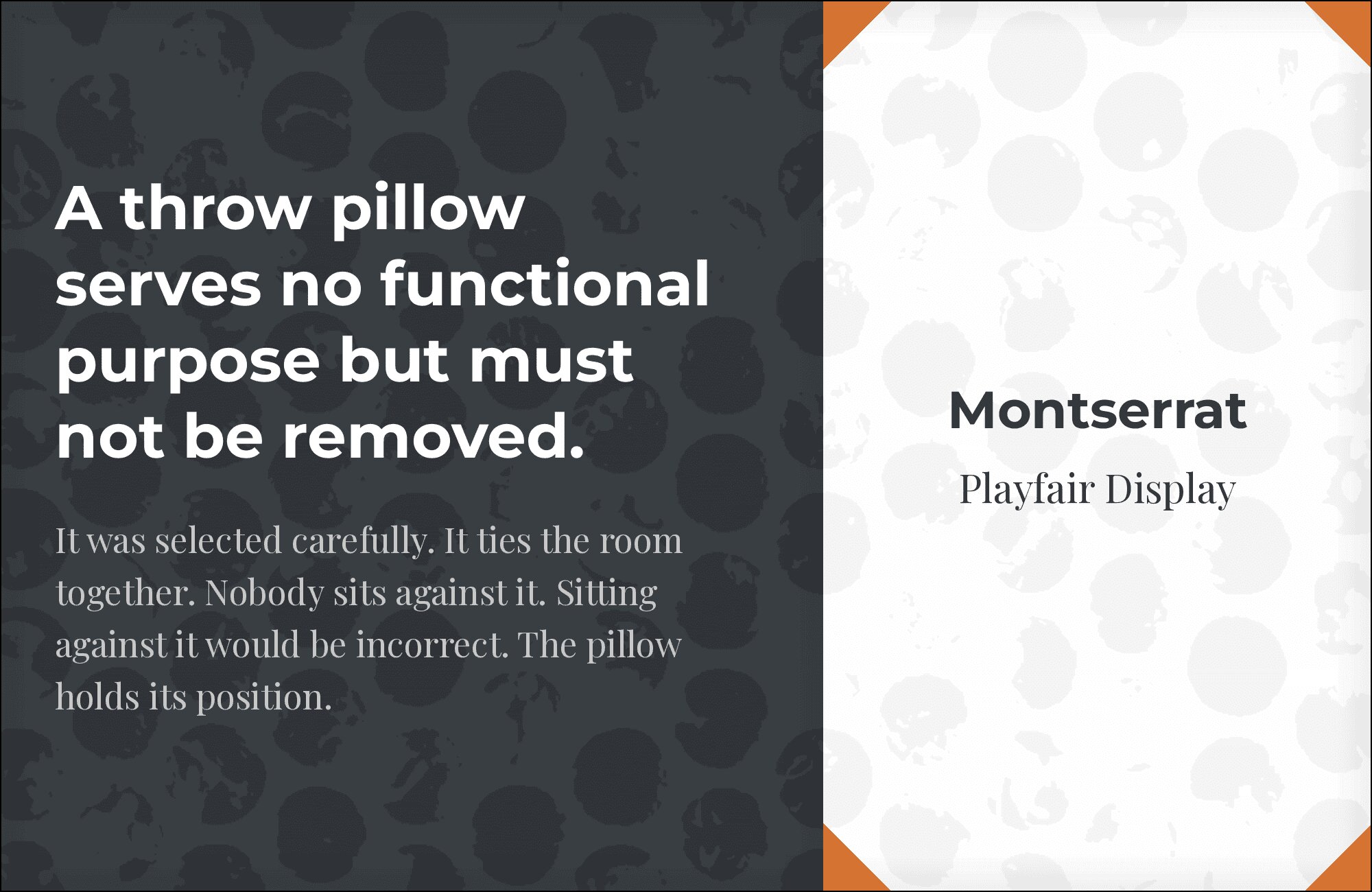
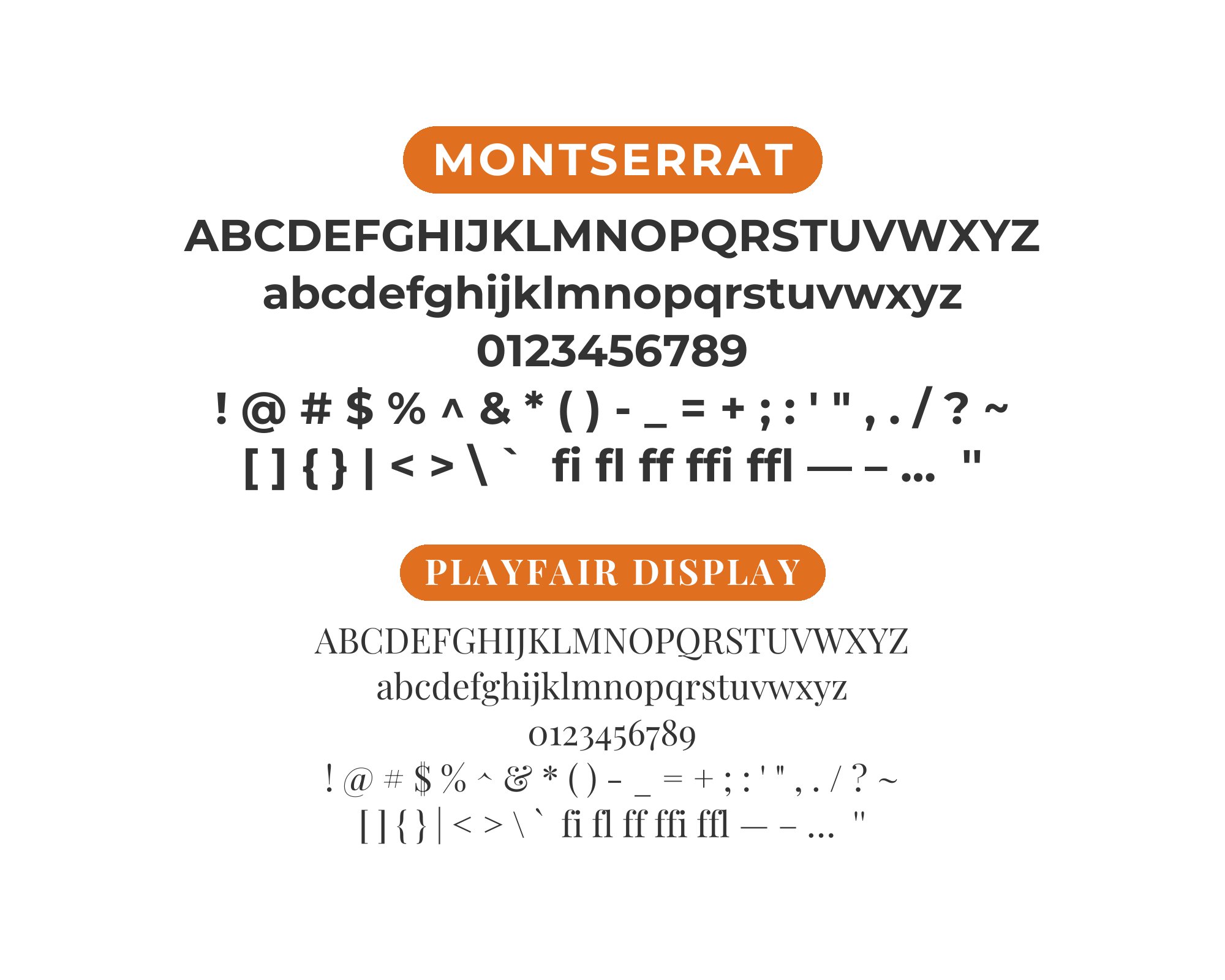
9. Playfair Display
High-contrast Didone elegance meets geometric precision. Playfair Display‘s dramatic thick-thin strokes and delicate hairlines create arresting headlines that Montserrat’s even weight anchors in body copy. The combination screams editorial luxury, fashion, and premium branding. Their x-height difference actually helps establish clear hierarchy. This is typography for mastheads, feature articles, and any layout that needs sophistication.
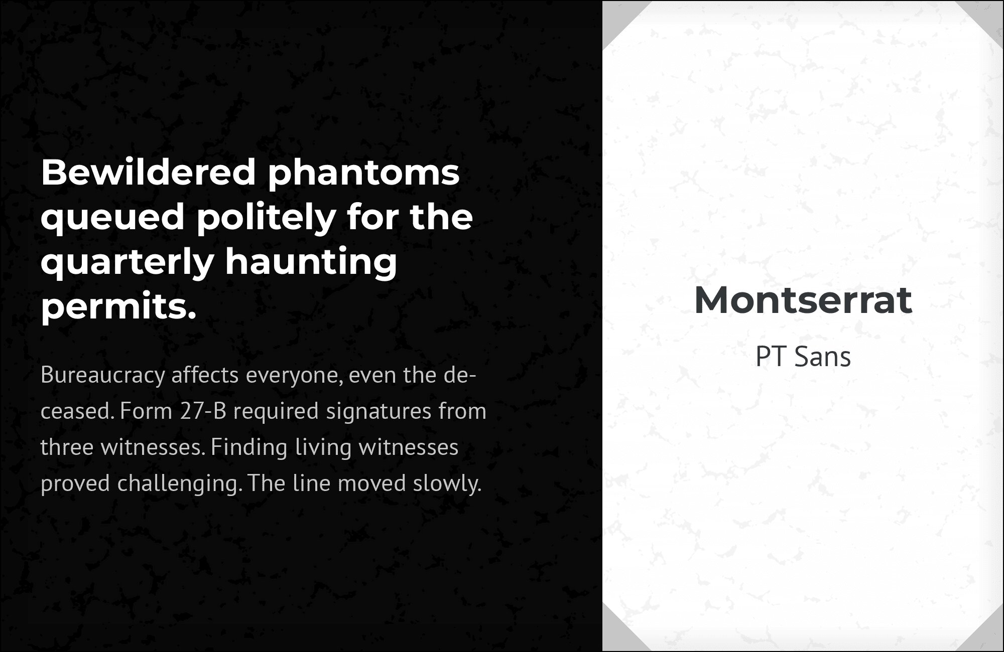
10. PT Sans
Both fonts share geometric foundations, but PT Sans‘s humanist inflections add warmth Montserrat lacks. The pairing creates cohesive designs where each font has a distinct role. PT Sans’s slightly softer terminals complement Montserrat’s crispness, working beautifully for government sites, educational platforms, or multilingual projects where both fonts’ extensive character sets prove invaluable. Clean, trustworthy, endlessly practical.
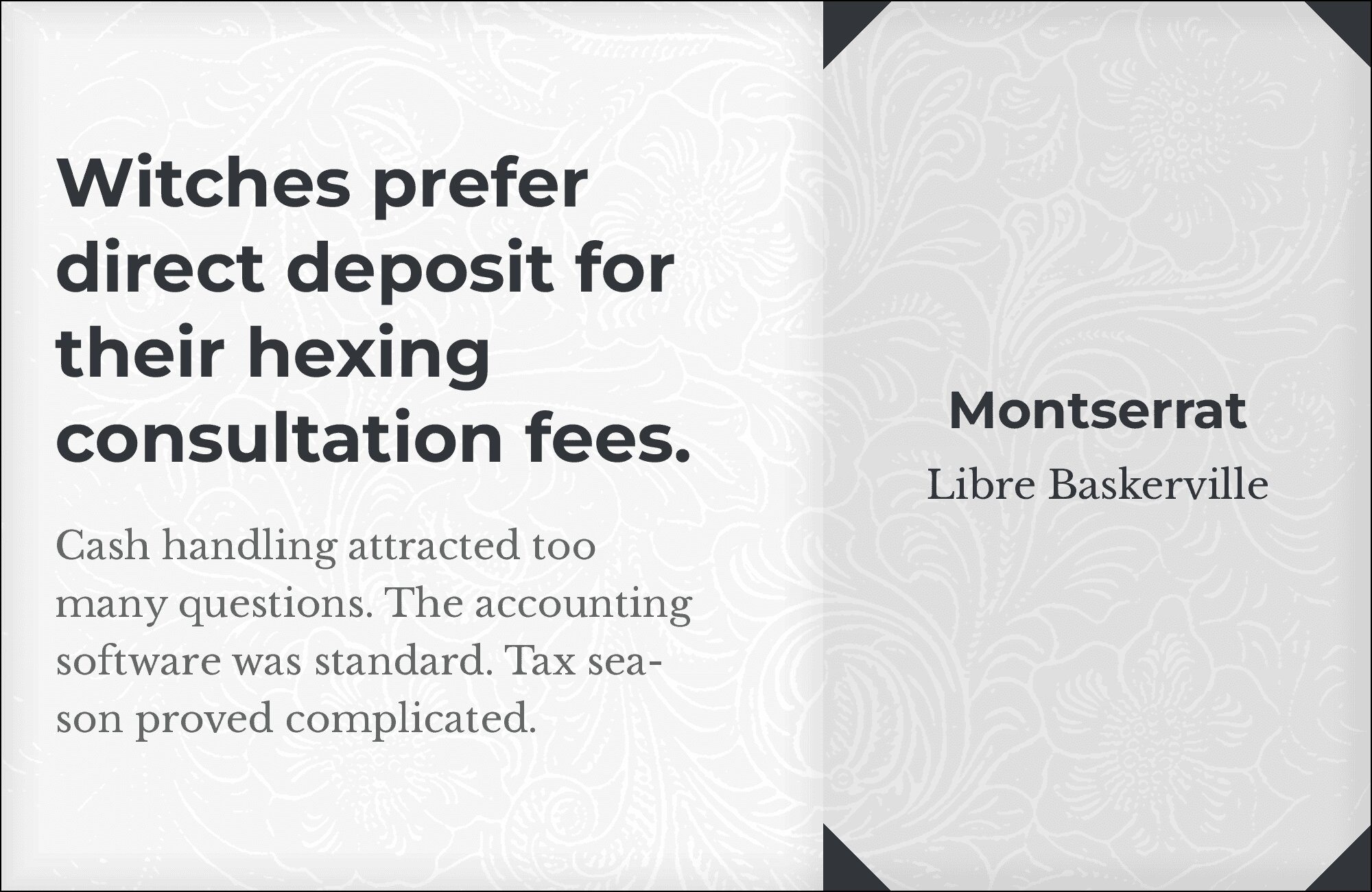
11. Libre Baskerville
Traditional Baskerville elegance in an open-source package pairs with Montserrat for classic meets contemporary. Libre Baskerville‘s sharp serifs and elegant proportions command attention in headlines while Montserrat maintains modern credibility in supporting text. The contrast works for law firms, literary publications, and academic institutions wanting heritage aesthetics with digital-native functionality. Both fonts render crisply at any size.
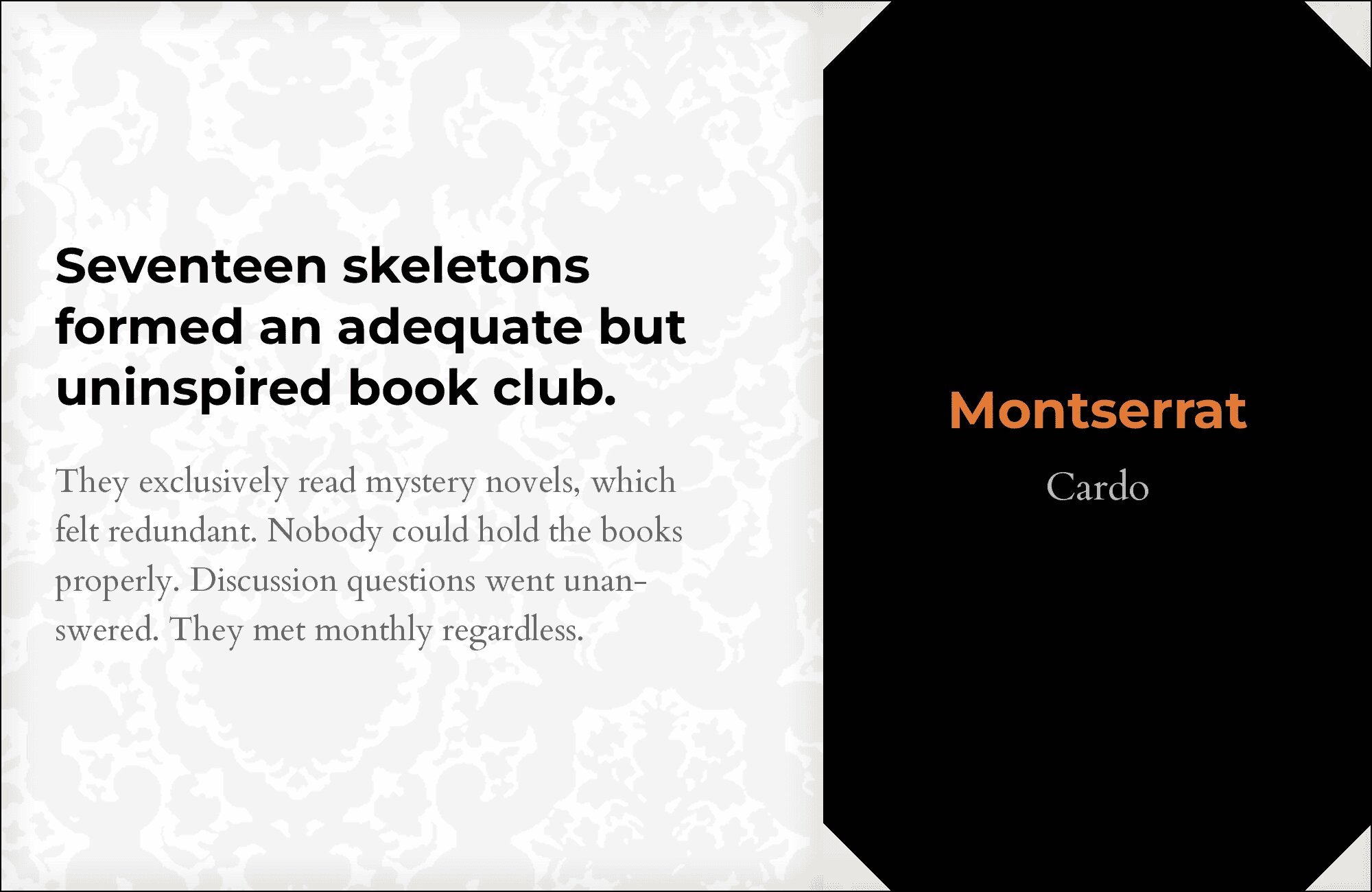
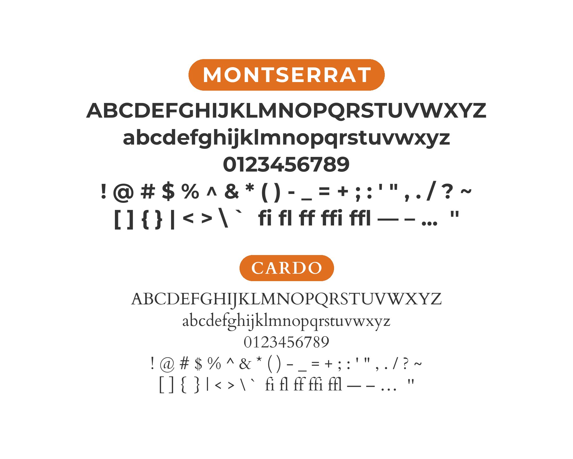
12. Cardo
Old-style serif scholarship meets geometric modernity. Cardo‘s origins in academic and classical text give it gravitas that elevates Montserrat’s contemporary neutrality. Use Cardo for display text or pull quotes when you want intellectual weight, then let Montserrat handle readable body paragraphs. Perfect for university publications, research journals, or cultural institutions bridging tradition and accessibility.
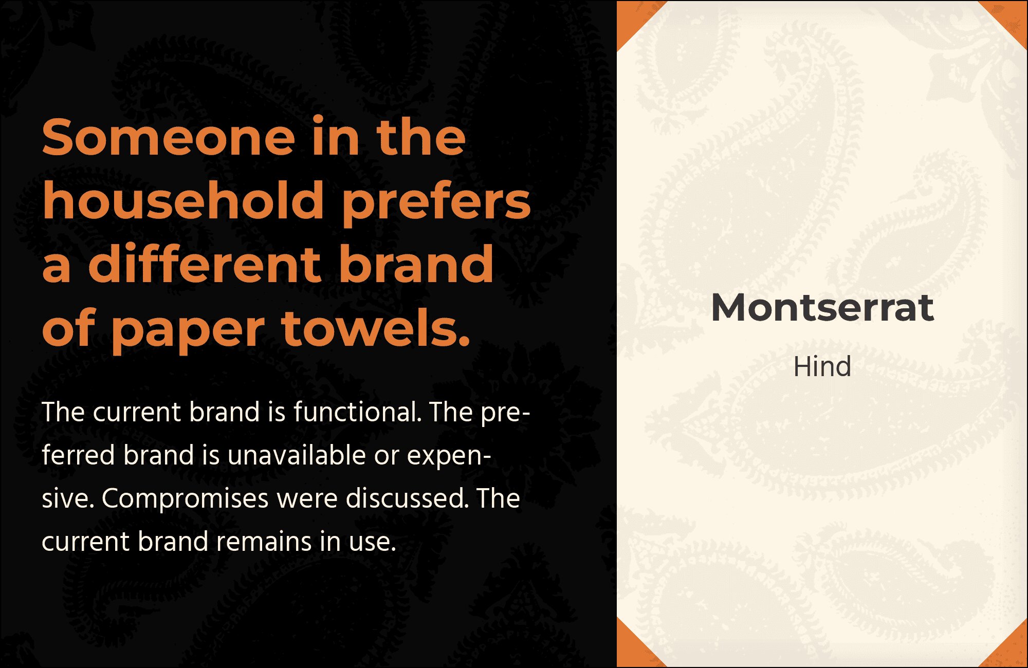
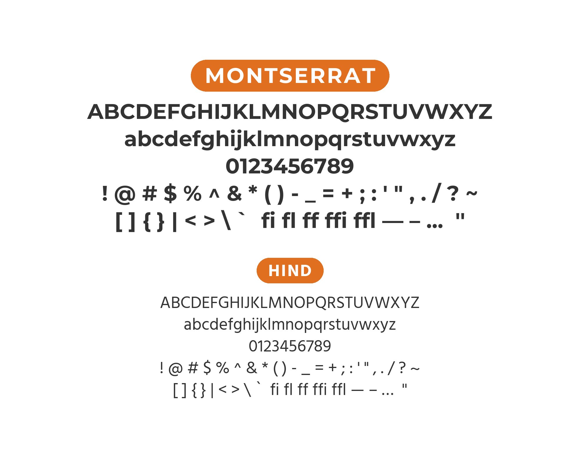
13. Hind
Hind‘s humanist warmth softens Montserrat’s geometric precision without sacrificing clarity. Originally designed for Devanagari script, Hind’s Latin characters bring unique proportions that complement rather than compete with Montserrat. The pairing works for multilingual projects, tech products targeting diverse audiences, or any brand wanting approachable professionalism. Both fonts handle small sizes gracefully.
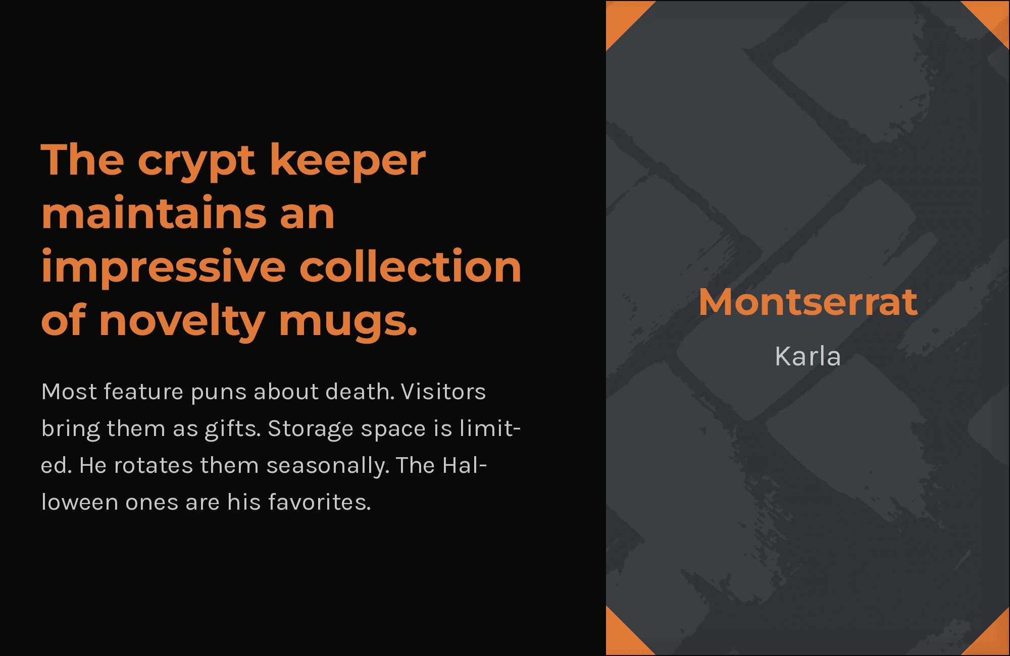
14. Karla
Karla‘s quirky grotesque character adds personality to Montserrat’s clean geometry. The subtle irregularities in Karla’s letterforms create visual interest in body text while Montserrat’s consistency anchors headlines. This pairing suits creative agencies, indie publications, and brands wanting to feel designed without being precious. Karla’s seven weights match Montserrat’s versatility.

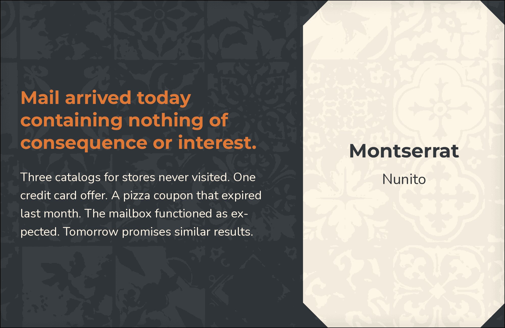
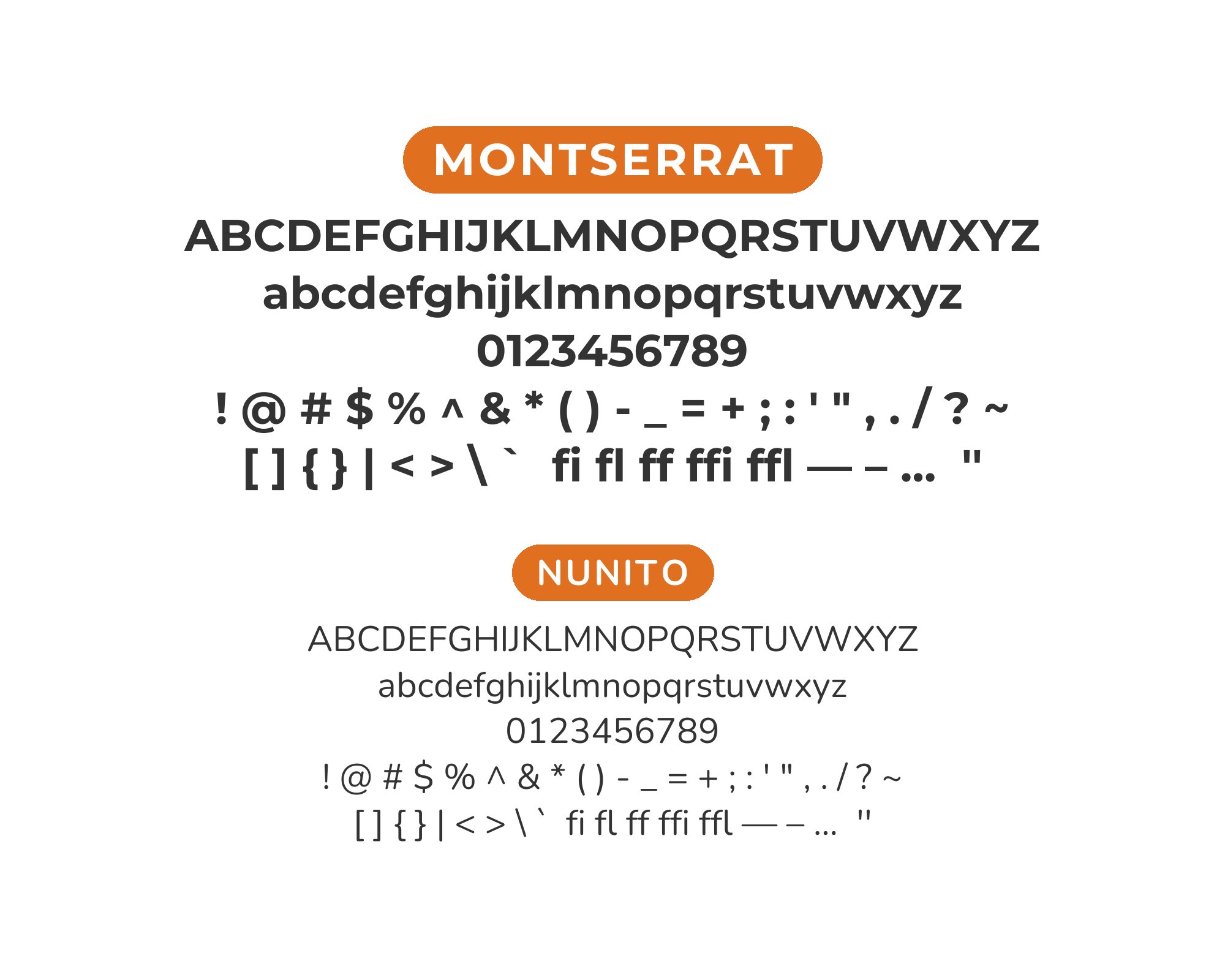
15. Nunito

Rounded terminals meet geometric structure. Nunito‘s soft edges take the clinical edge off Montserrat’s precision, creating friendly, approachable layouts. The pairing excels in children’s education, wellness brands, and consumer apps where warmth matters. Both fonts share similar x-heights and proportions, ensuring visual harmony. Use Nunito in body copy to soften Montserrat’s headline authority.
Conclusion
There are no absolute rules for font pairing, just principles to guide you. The key is contrast—in weight, in style (serif vs. sans-serif), or in personality. Montserrat is versatile enough to play well with many different typefaces.
Trust your eye, experiment freely, and remember that the best pairing is the one that serves your content and audience. Typography should enhance communication, not complicate it.