DM Serif Display pairs great with DM Sans, DM Serif Text and Archivo. All 10 pairings are shown below in real rendered specimens, with the reason each one works.

What fonts go with DM Serif Display? Start with its own family, honestly. DM Serif Display arrived with a matched sans, a matched text serif and later a matching mono, and those siblings are the safest partners you’ll find. But it’s a sharp, dramatic headline face, and plenty of other sans and serif companions can hold the reading layer underneath it just as well.
DM Serif Display was commissioned by Google from Colophon Foundry, with creative direction from MultiAdaptor and the DeepMind team. Google Fonts added it in 2019. Colophon describes it as a high-contrast transitional face with delicate serifs and fine detailing, shaped for use in super-sized poster settings. It didn’t start from a blank page. Colophon started from the Latin portion of Adobe Source Serif 4, by Frank Grießhammer, and pushed it toward display. So it has bones that go back to Fournier under a glossy, high-contrast surface. There’s one weight plus an italic, and that’s it. The thin hairlines look terrific at big headline sizes and start to break up at text sizes.
That’s the pairing brief in one line. DM Serif Display needs a partner that supplies what it can’t: text-size sturdiness and a real range of weights. Most good partners are low-contrast sans serifs that stay out of the way. A few are serifs built for reading, which quietly echo its transitional structure. Here are 10 fonts that pair with DM Serif Display.
1. DM Sans
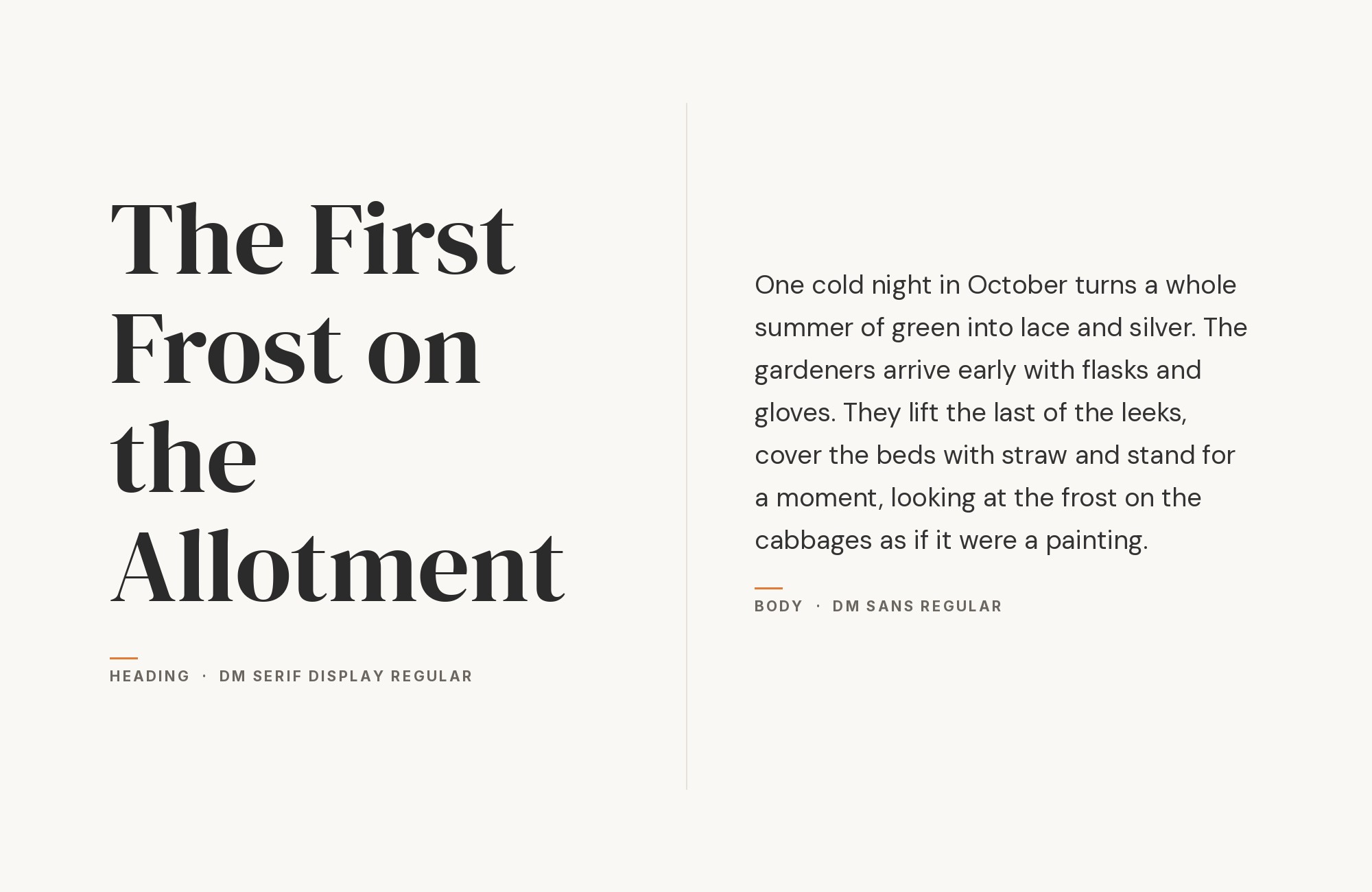
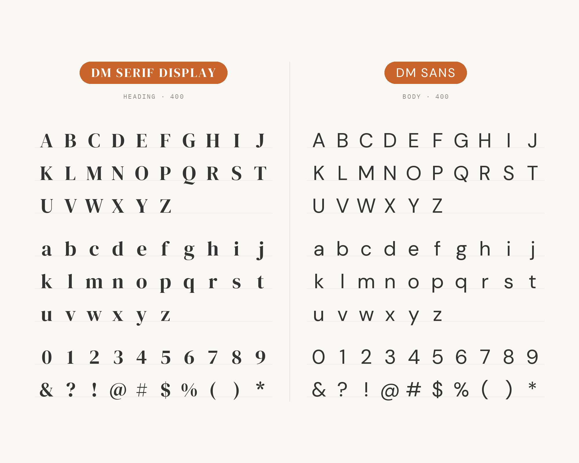
DM Sans is the built-in answer. Colophon Foundry drew it for the same DeepMind project as a low-contrast geometric sans serif, intended for use at smaller text sizes. Jukebox Print’s pairing page describes the two as faces from the same family system, with DM Serif Display handling editorial headlines and DM Sans settling into body copy. The Crit’s portfolio guide recommends it too, noting that the pair shares enough proportion and rhythm to feel related. It works because the contrast is all in one place. DM Serif Display has the drama, thin-to-thick strokes and sharp serifs; DM Sans has almost none of that, just even, round geometric shapes. Same family feel, opposite textures. If you’re unsure, this is the one.
“AI builds anything, so what do I sell?”
Taste is the answer. Own your stack and automate your own CMS.
Find Out How2. DM Serif Text
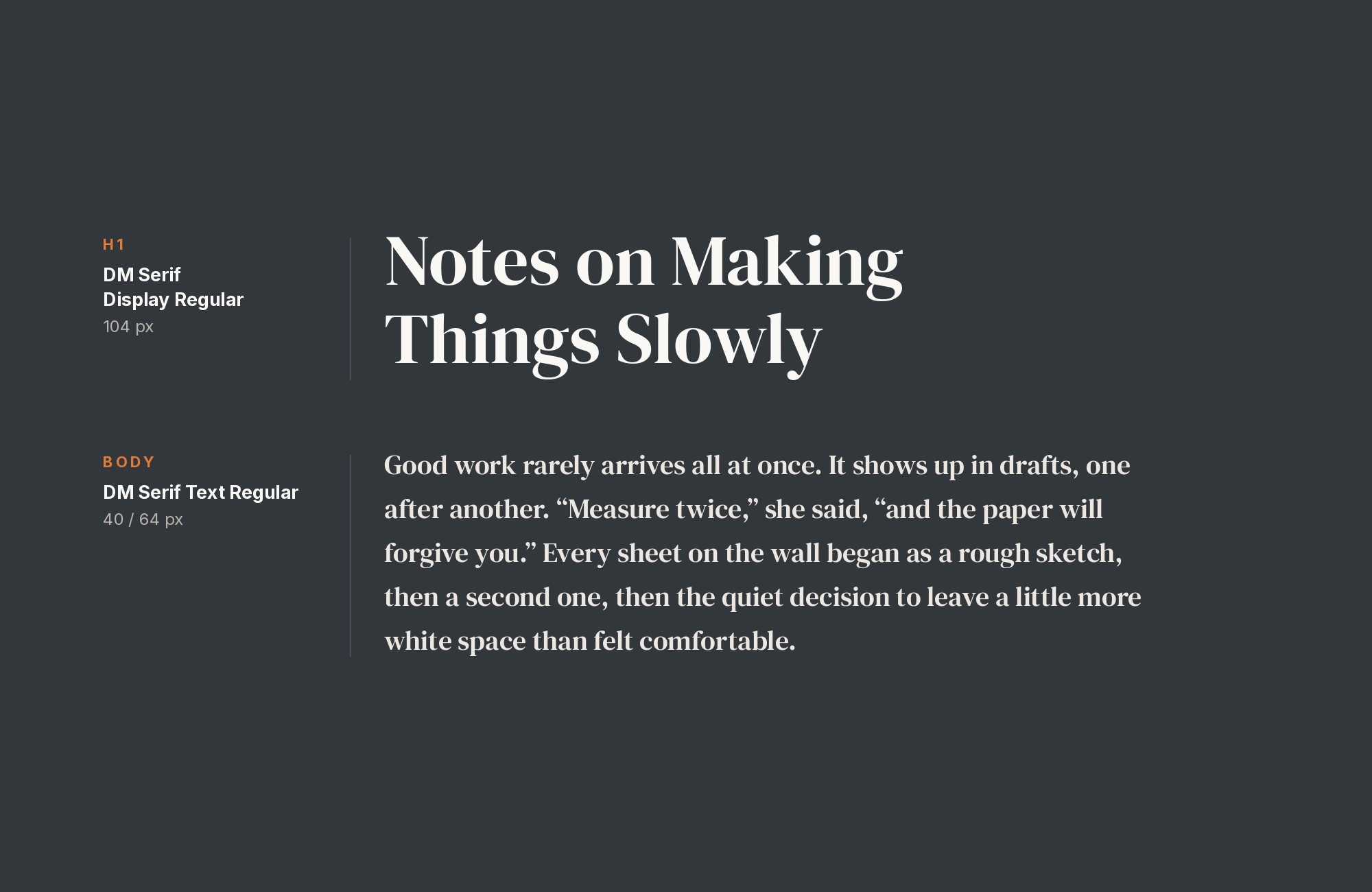
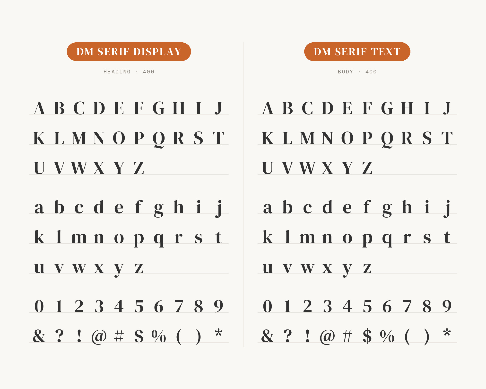
DM Serif Text is the lower-contrast counterpart to the high-contrast DM Serif Display, intended for smaller sub-headings and text sizes. Google Fonts’ own description of DM Serif Display says it is accompanied by DM Serif Text, for use in smaller point ranges. Fonts In Use documents both in Be Good Today packaging, where the secondary typeface was chosen to add a touch of elegance because of its delicate serifs and fine detailing. Think of it as the same voice at a different volume. Use Display for the big name on the pack or the headline, then drop to Text for subheads, pull quotes and short paragraphs. The shapes stay consistent, but Text’s sturdier hairlines survive small sizes and cheaper printing.
3. Archivo
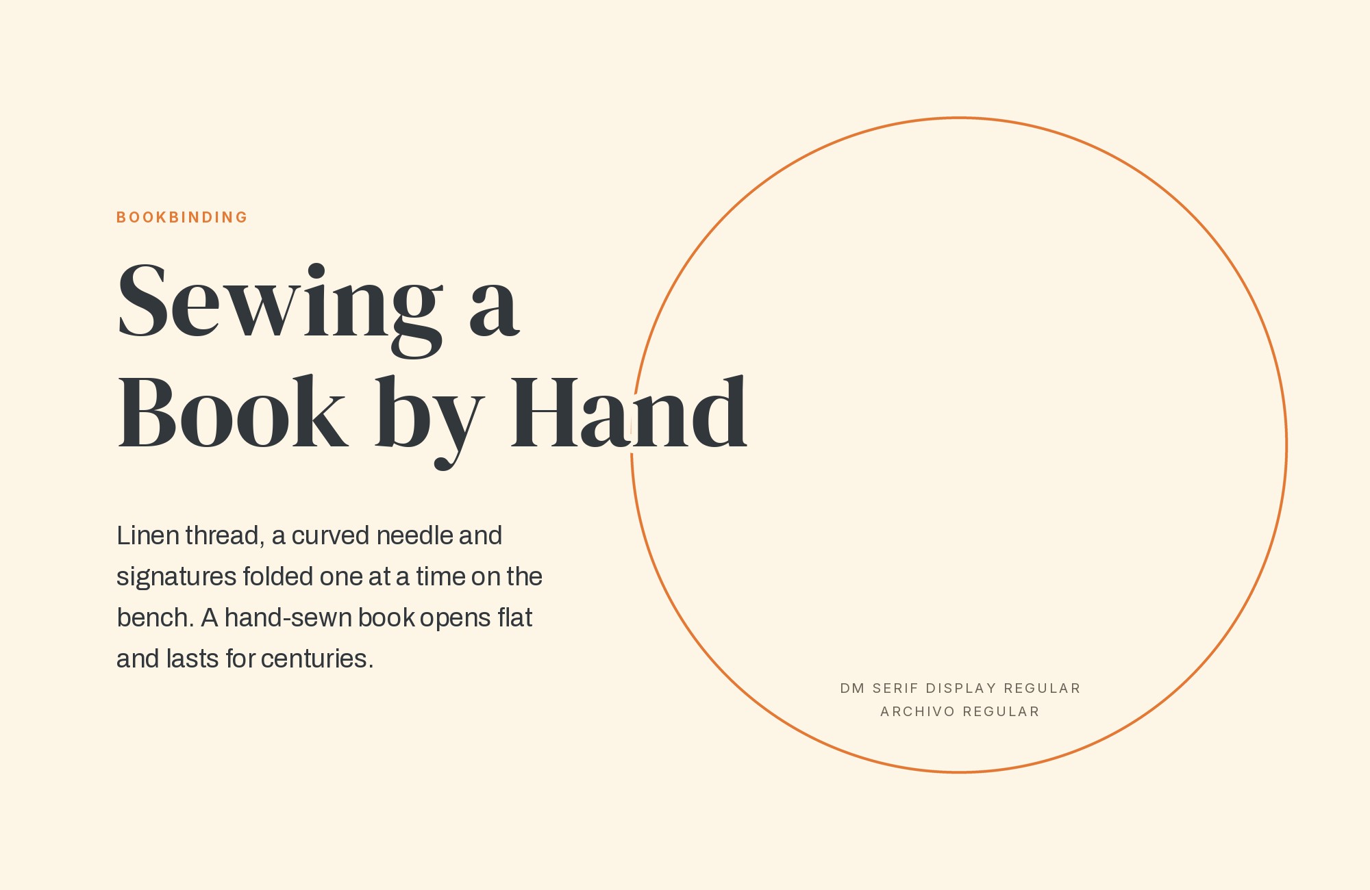
Fonts In Use documents the Kook Furniture website, an e-commerce site that uses Archivo with DM Serif Display. Archivo is a grotesque sans serif typeface family originally designed for highlights and headlines, reminiscent of late nineteenth century American typefaces, by Héctor Gatti and the Omnibus-Type team. That grotesque heritage gives it a slightly blunt, workmanlike tone next to DM Serif Display’s polish, and that’s a good thing. The contrast feels less “matched set” and more deliberate. Archivo’s variable width axis helps too. A wide, bold Archivo makes loud labels and prices; a normal-width regular carries body text. Let DM Serif Display take the big, italic-leaning headlines and keep Archivo for everything functional.
4. DM Mono
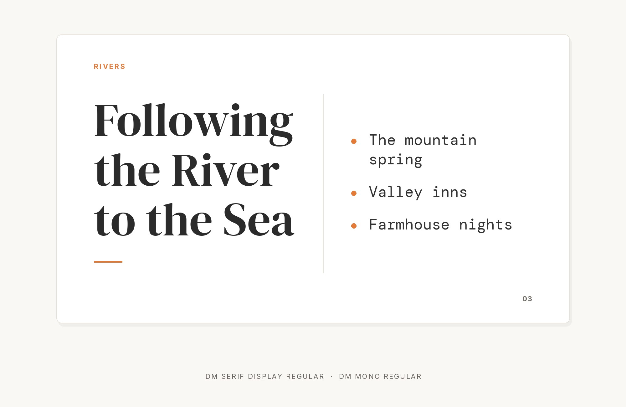
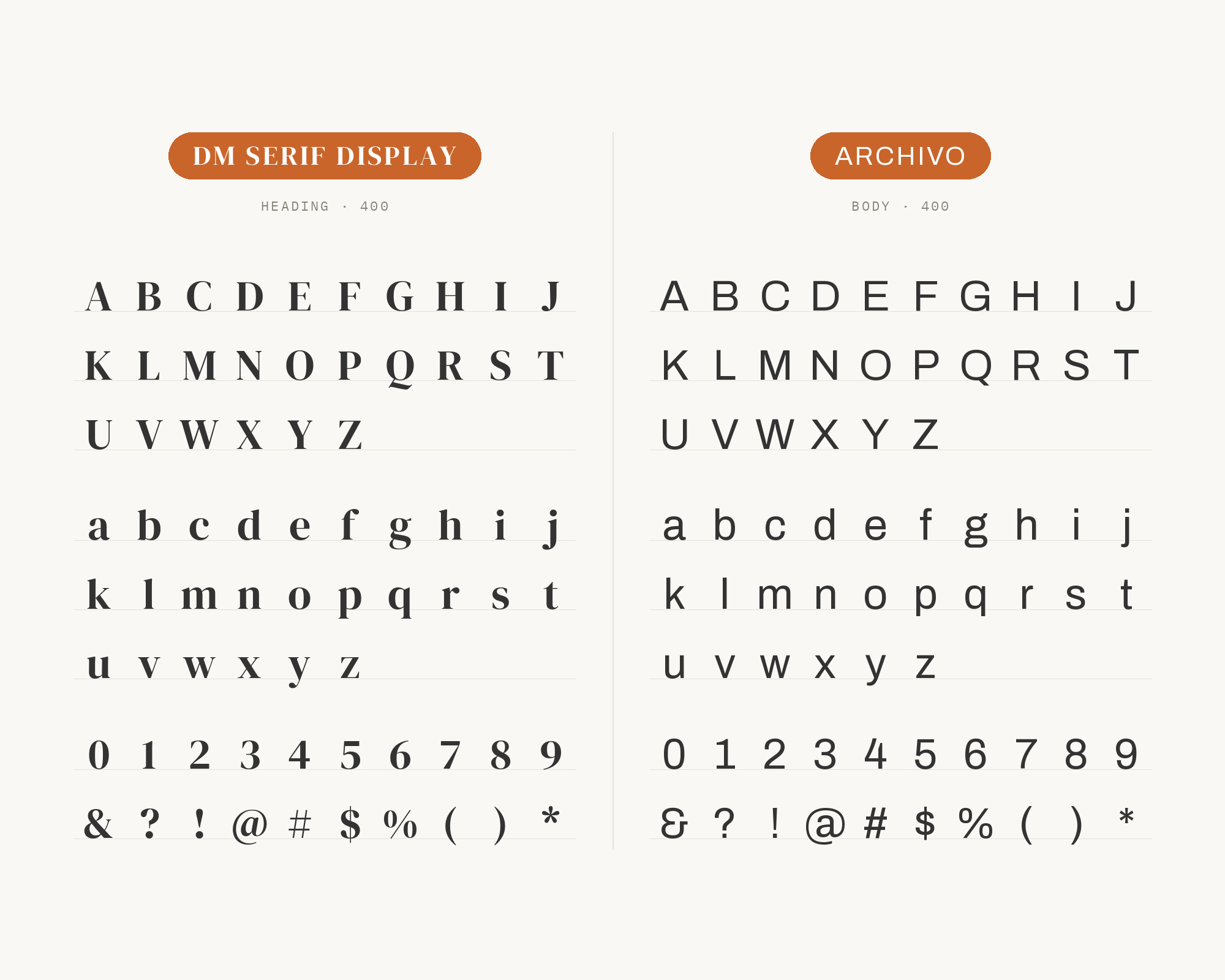
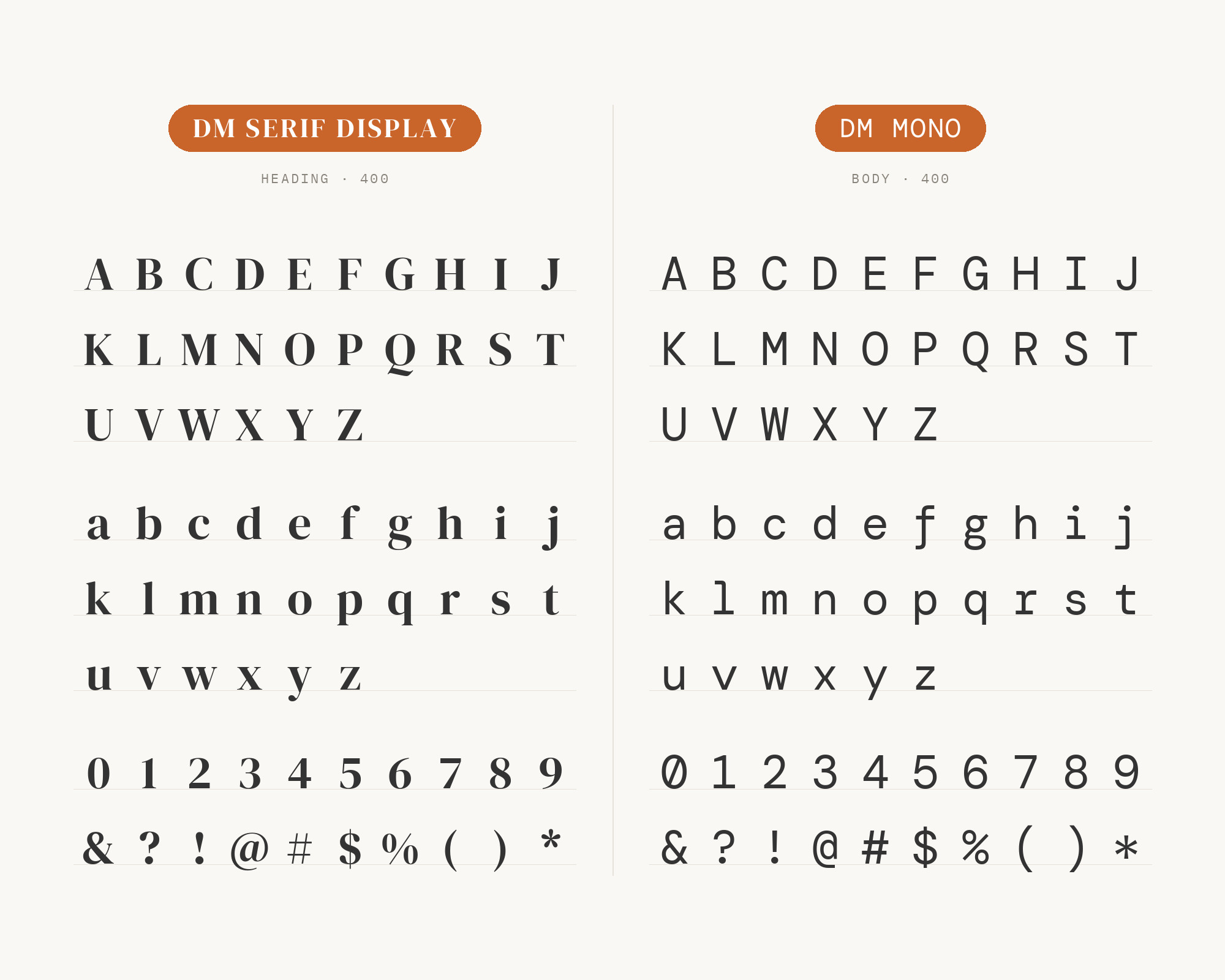
MaxiBestOf records the Robot Food website using DM Mono and DM Sans alongside DM Serif. DM Mono is a three weight, three style family designed for DeepMind, loosely based on DM Sans with a reduction in contrast and less geometric proportions. So it’s a true family member, but it plays a very different role. Monospaced letters give captions, dates, tags and numbers a technical, typewritten look that sets them apart from both the serif headline and the sans body. It’s a nice way to extend a DM Serif Display system without adding a stranger. Keep DM Mono small and sparse: metadata, labels, navigation. A whole paragraph in it will fight the headline for attention.
5. Nunito
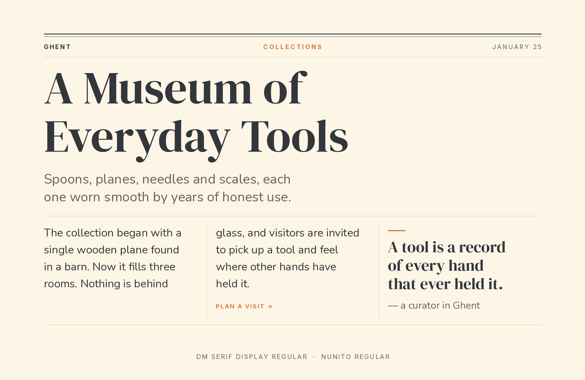
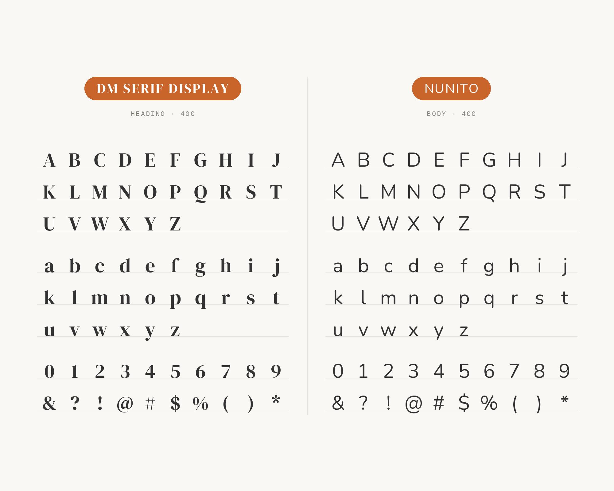
The Designed by Harj guide to Google font pairings sets DM Serif Display for headings and Nunito for body, calling it a romantic serif with an ultra-clean sans serif and recommending it for boutique or creative brands. Nunito was created by Vernon Adams as a rounded terminal sans serif for display typography, later extended to a full set of weights by Jacques Le Bailly. The rounded ends are the draw. They soften the page, so DM Serif Display’s sharp serifs read as elegant rather than severe. This one leans warm and friendly, good for small shops, wellness brands and personal sites. For a more editorial or corporate tone, choose DM Sans or Inter instead.
Unlimited fonts from $16.50/mo.
29 million fonts, templates and stock assets. One subscription, unlimited downloads.
See the plan6. Inter
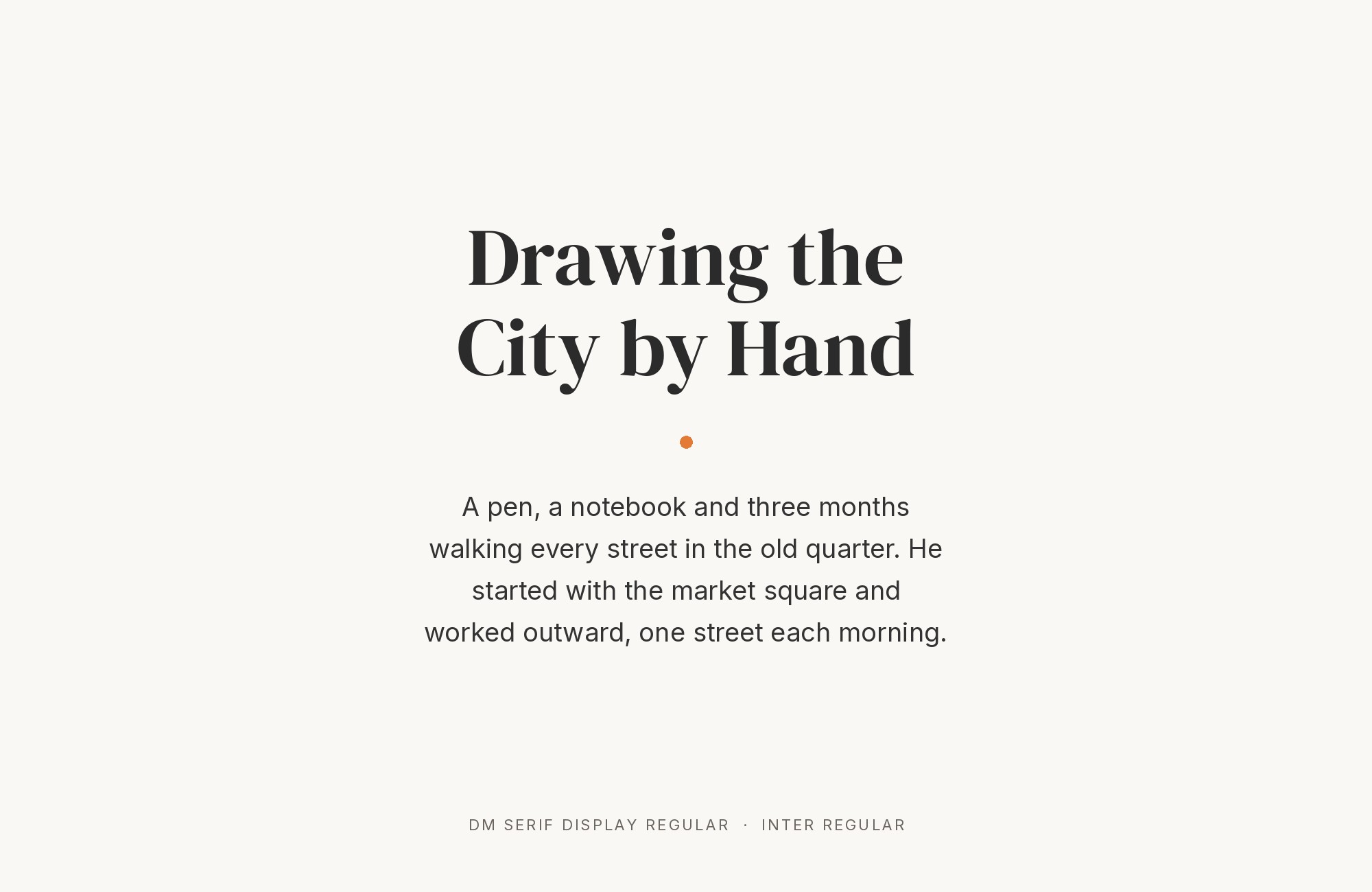
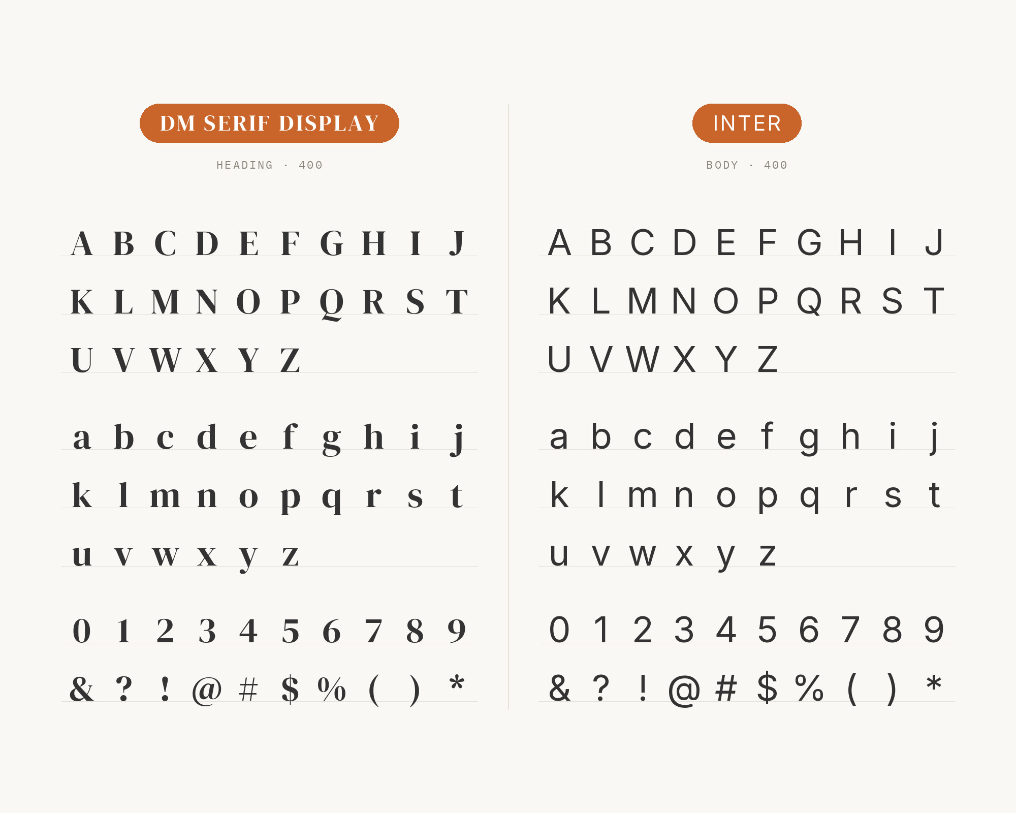
Jukebox Print’s DM Serif Display page says it pairs well with Inter, DM Sans or Work Sans, suggesting the sans for body copy, captions and UI text alongside DM Serif Display headlines. Inter was designed for computer screens, with a tall x-height to aid readability of mixed-case and lower-case text. Next to DM Serif Display, Inter nearly disappears, which is the point. It gives dashboards, product pages and long articles a neutral, highly legible text layer, while the serif carries all the personality in the headings. It’s also the most practical choice if your interface already runs on Inter and you just want a more editorial headline voice on top.
7. Work Sans
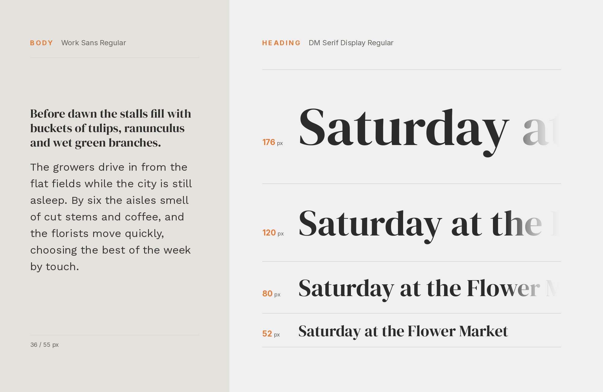
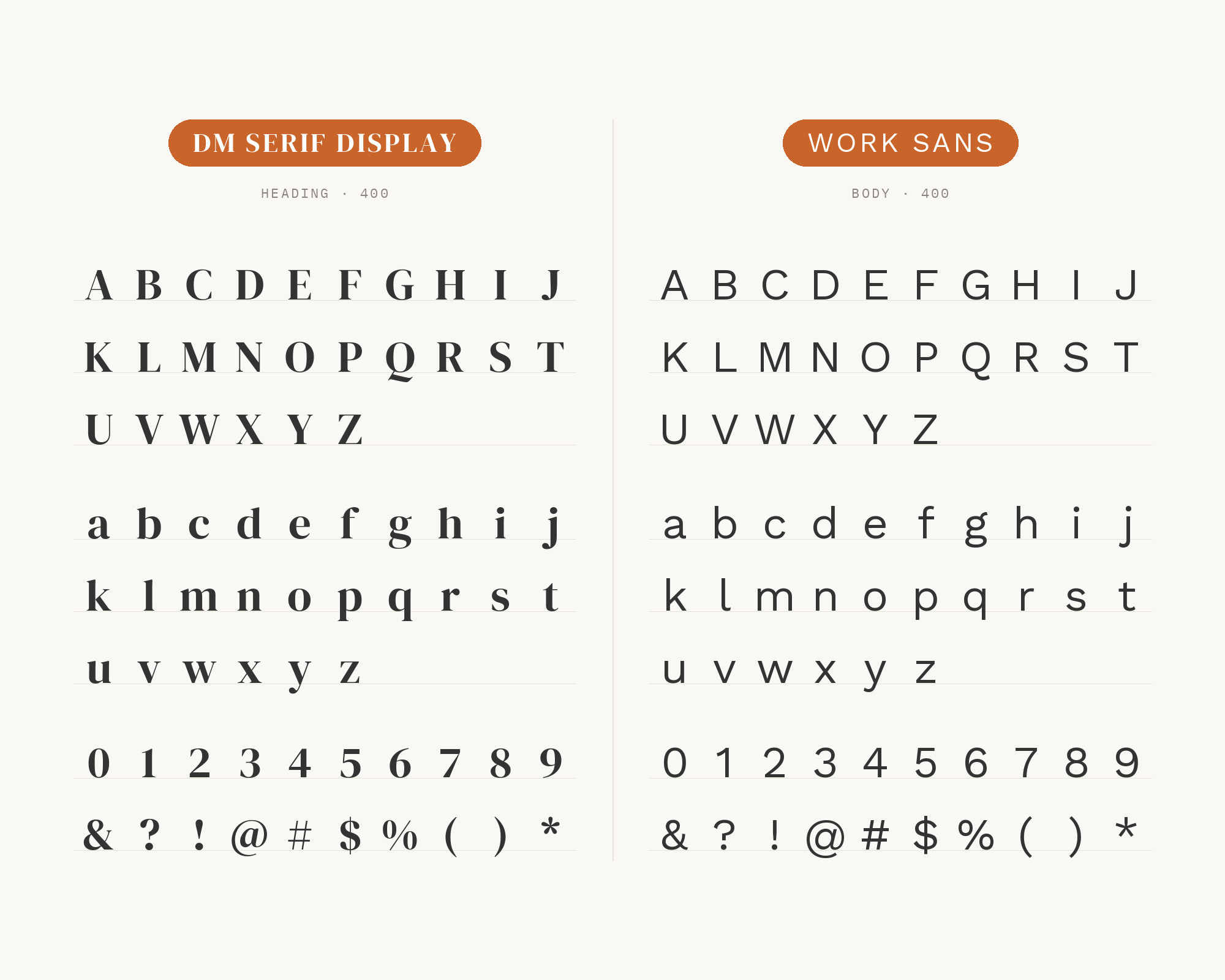
Work Sans is the third sans in that same Jukebox Print recommendation. Work Sans is based loosely on early Grotesques, such as those by Stephenson Blake, Miller & Richard and Bauerschen Giesserei, and the project is led by Wei Huang. That early-grotesque flavor is a little warmer and quirkier than Inter, with slightly wider letters and a friendly rhythm. Under DM Serif Display, it gives the page a hint of old print without looking retro. It’s a good fit for studios, cultural sites and editorial blogs. Try Work Sans in a light or regular weight for text and a semibold for small caps labels, and let the serif have the large sizes to itself.
8. Karla
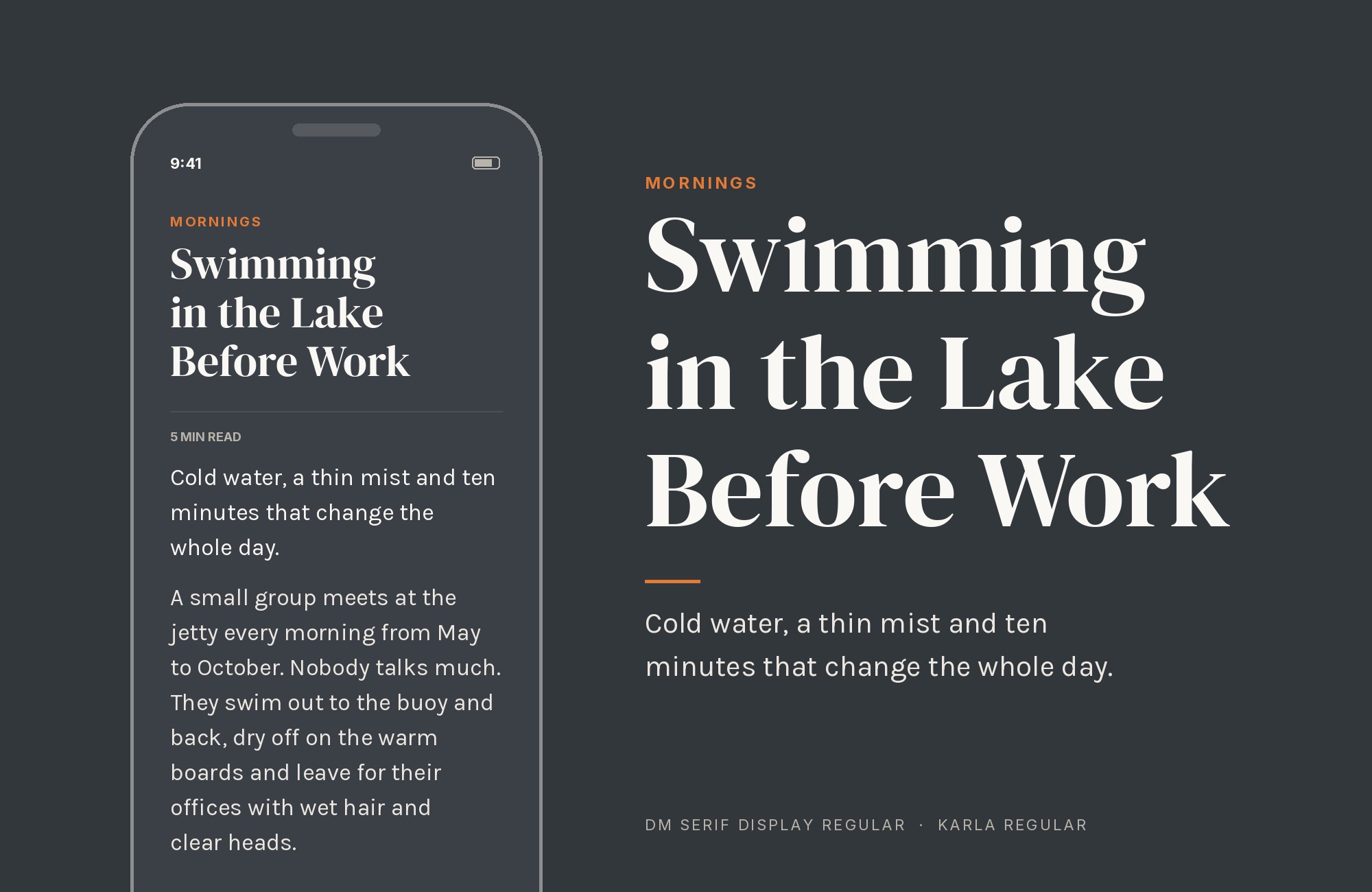
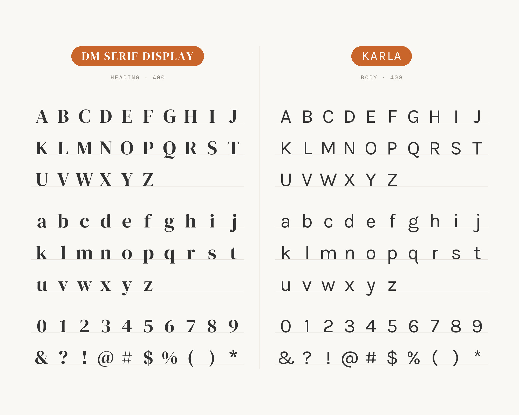
GetIllustrations’ font-pairing collection sets DM Serif Display as the heading and Karla as the body, suggesting it for fashion and lifestyle e-commerce. Karla is a grotesque sans serif family with a weight axis ranging from ExtraLight to ExtraBold. It has a slightly squared, quirky personality, so the pair feels less formal than DM Serif Display with DM Sans. The serif brings the polish, Karla keeps things approachable. Use it for product descriptions, newsletters and shop pages where the brand wants some fashion-magazine gloss without feeling cold. Keep Karla at comfortable body sizes; its narrow-ish letters want a little extra line height.
9. Source Serif Pro
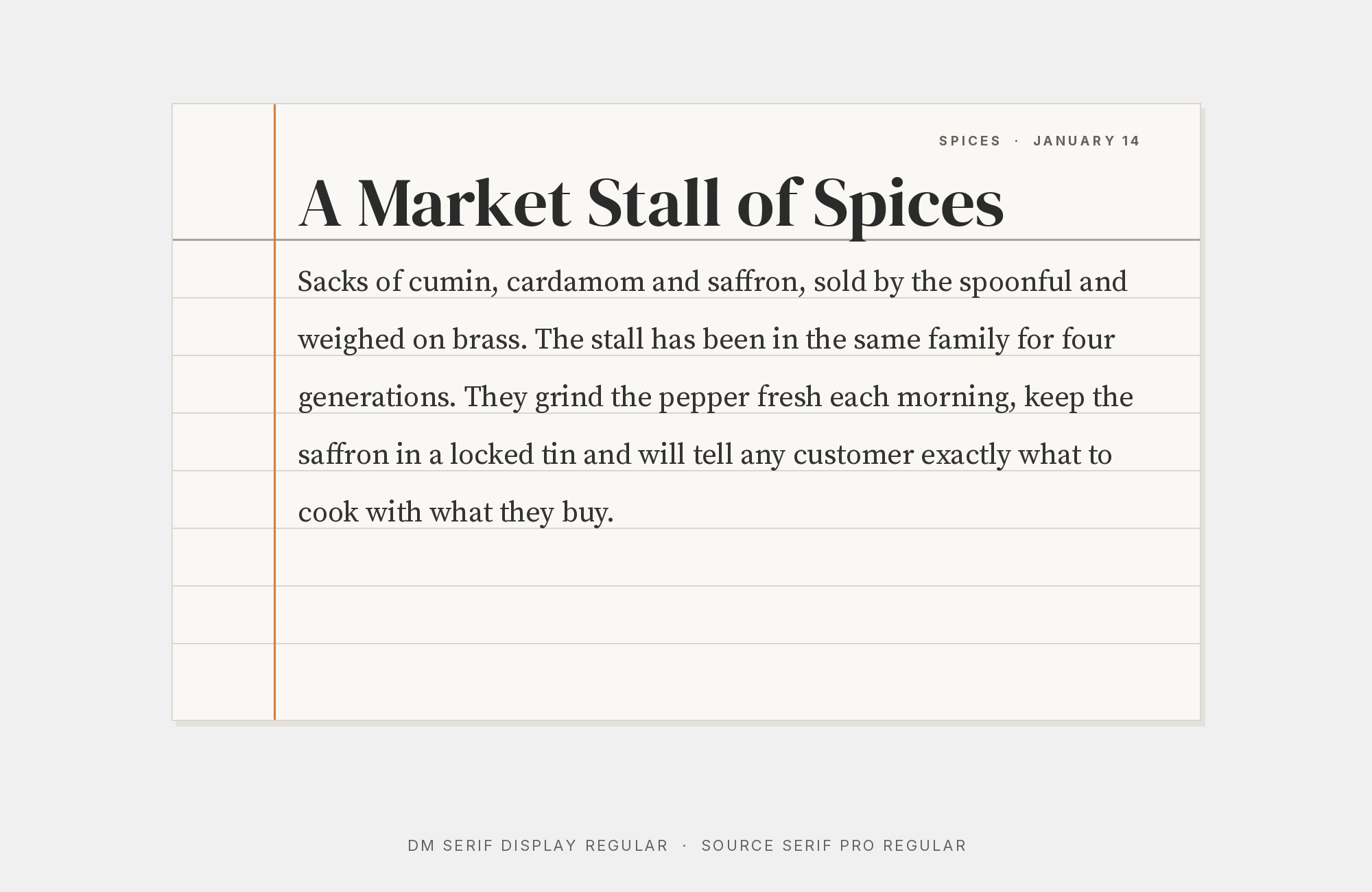
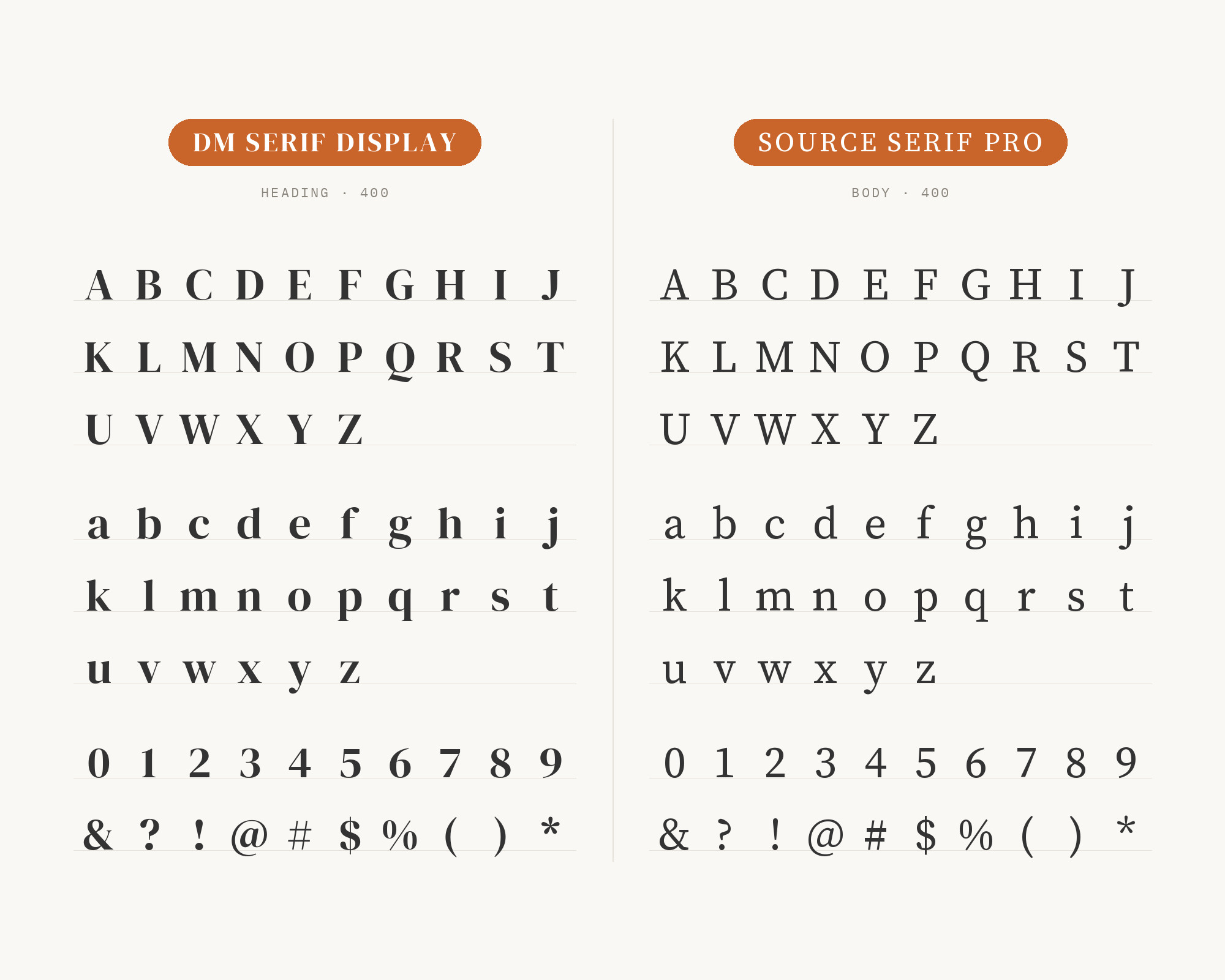
ForgeDock’s curated pairing tool lists DM Serif Display over Source Serif Pro as a heading and body combination. The link runs deeper than a list, though. Fonts In Use notes that DM Serif Display was derived from Source Serif by Frank Grießhammer. Source Serif itself is a transitional serif loosely based on the work of Pierre Simon Fournier. So this is a serif-on-serif pairing between a parent and a child: the same skeleton at two different contrast levels. Source Serif’s sturdier text drawing makes long reading easy, and DM Serif Display turns the same shapes into headline drama. It’s a cohesive choice for books, essays and long-form editorial pages.
10. Merriweather
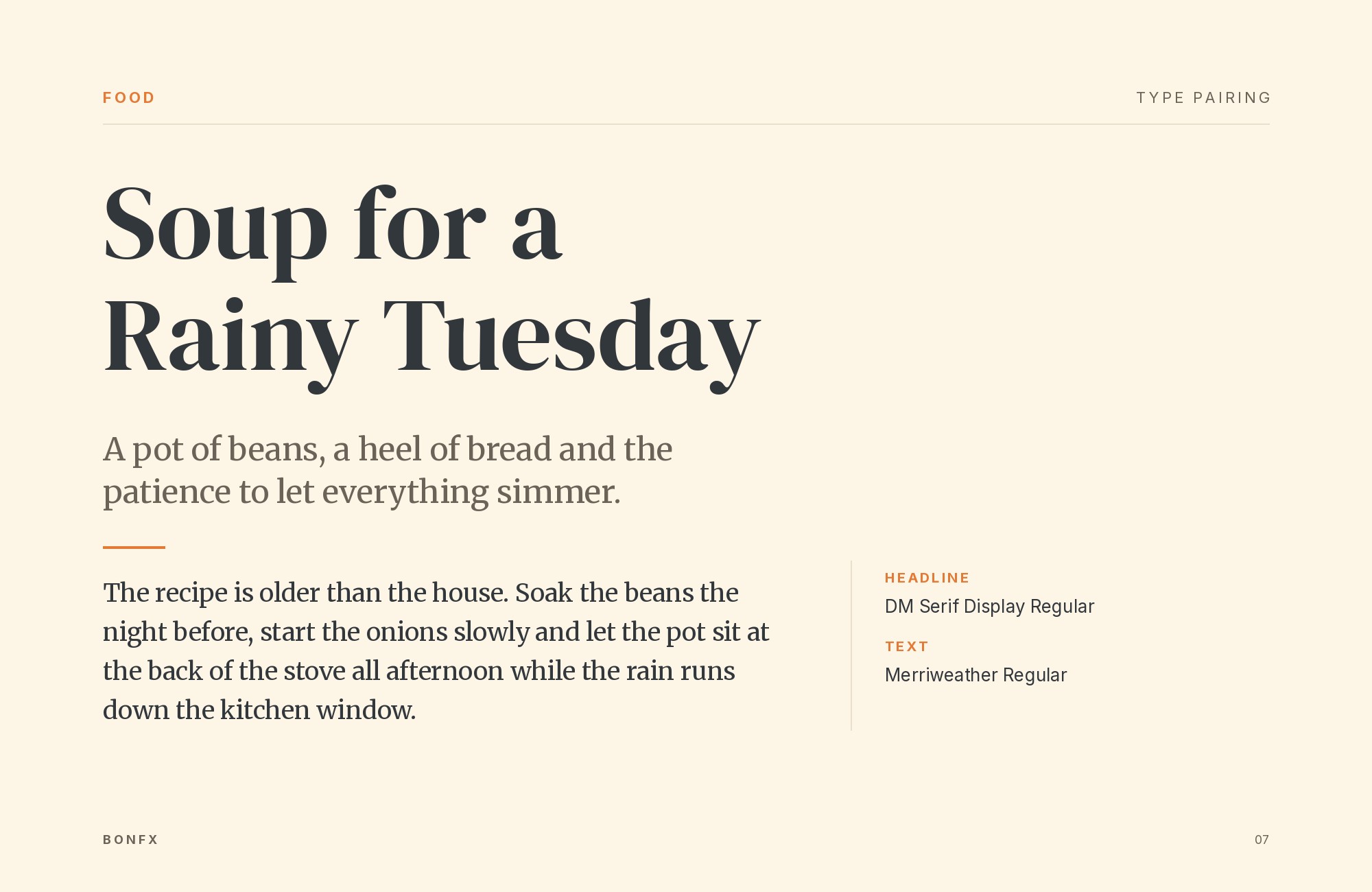
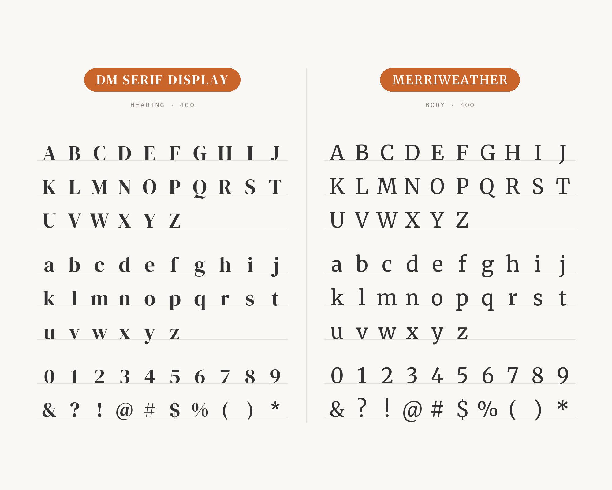
ForgeDock’s pairing tool also lists DM Serif Display with Merriweather as a heading and body combination. Merriweather was designed to be a text face that is pleasant to read on screens, with a very large x-height, sturdy serifs and open forms. That’s nearly the opposite of DM Serif Display’s delicate hairlines and small-at-heart proportions. A serif pairing like this only works when the roles are obvious, so keep the size jump big. DM Serif Display for large headlines, Merriweather for text and nothing in between that could confuse them. The result feels traditional and bookish, good for publishing sites, newsletters and blogs that want a classic serif look top to bottom.
Conclusion
DM Serif Display is a headline specialist, and every strong pairing treats it that way. The DM family is the obvious place to start: DM Sans for body, DM Serif Text for smaller serif sizes, DM Mono for labels. Real projects like the Kook Furniture website and Be Good Today packaging show those same roles in use, with Archivo and the DM siblings doing the steady work under the display serif.
Beyond the family, pick by tone. Inter for neutral product and interface work. Nunito or Karla for warmer, friendlier brands. Work Sans for a slightly older, print-flavored feel. Source Serif Pro or Merriweather when you want serifs top to bottom. Whatever you choose, keep DM Serif Display big, give its hairlines room, and let the partner handle the small type.
Sources
- Fonts In Use (DM Serif Display typeface page)
- Fonts In Use (Kook Furniture website)
- Fonts In Use (Be Good Today packaging)
- Jukebox Print (DM Sans & DM Serif Display pairing)
- Jukebox Print (DM Serif Display)
- The Crit (portfolio font pairings)
- Phoca Tools (DM Serif Display)
- nixglowstudio (Google fonts for graphic designers)
- TheGuideX (best fonts for WordPress)
- Designed by Harj (10 best Google font pairings)
- GetIllustrations (112 Google font pairings)
- ForgeDock (font pairing tool)
