Sora pairs great with Inter, Open Sans and Plus Jakarta Sans. All 12 pairings are shown below in real rendered specimens, with the reason each one works.

What fonts go with Sora? Sora looks technical, a little wide and very clear. It came out of a blockchain company, and it shows up most often in software, fintech and product brands. So the best partners are the ones that make a product page easier to read, not the ones that add decoration.
Sora, meaning sky in Japanese, is a typeface family commissioned for the Sora decentralized autonomous economy. Soramitsu, the developer of Sora, is a Japanese technology company specializing in blockchain development. Jonathan Barnbrook and Julián Moncada designed it, and Google Fonts added it in June 2020. The brief was a type family with cues of low-resolution aesthetics and early screen typography but without nostalgia. The result has a particularly big x-height and evidently generous counters, which the Google Fonts description says makes it a convenient tool for app and web interfaces. It comes in eight weights, from Thin to ExtraBold. Small serifs on the lowercase l and i remove ambiguities, a detail you notice in interface text.
The pairing question for Sora is mostly a question of role. Sora is strong in headings, and the brand guides that use it agree. Pendo and LinkUp both put Sora on top and a quieter sans underneath. But a type critic who reviewed it argues the other way: its strength is in functional or body text, because it is a bit wide for long headlines. Both views are useful. If Sora is the heading, choose a neutral text face. If Sora is the text, choose a display face with more character. Here are 12 fonts that pair well with Sora, each backed by a brand guide, a real project or a published recommendation.
1. Inter
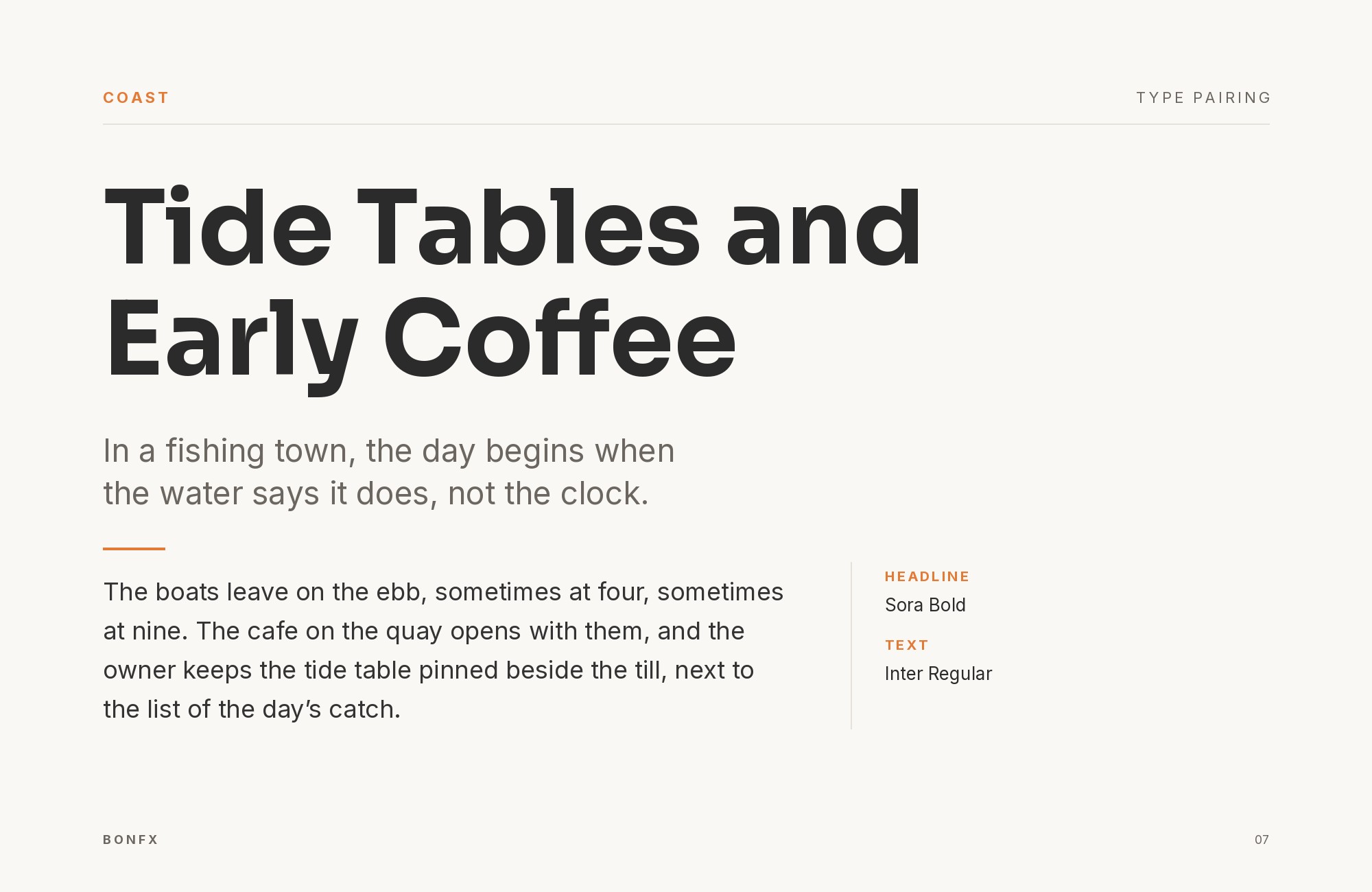
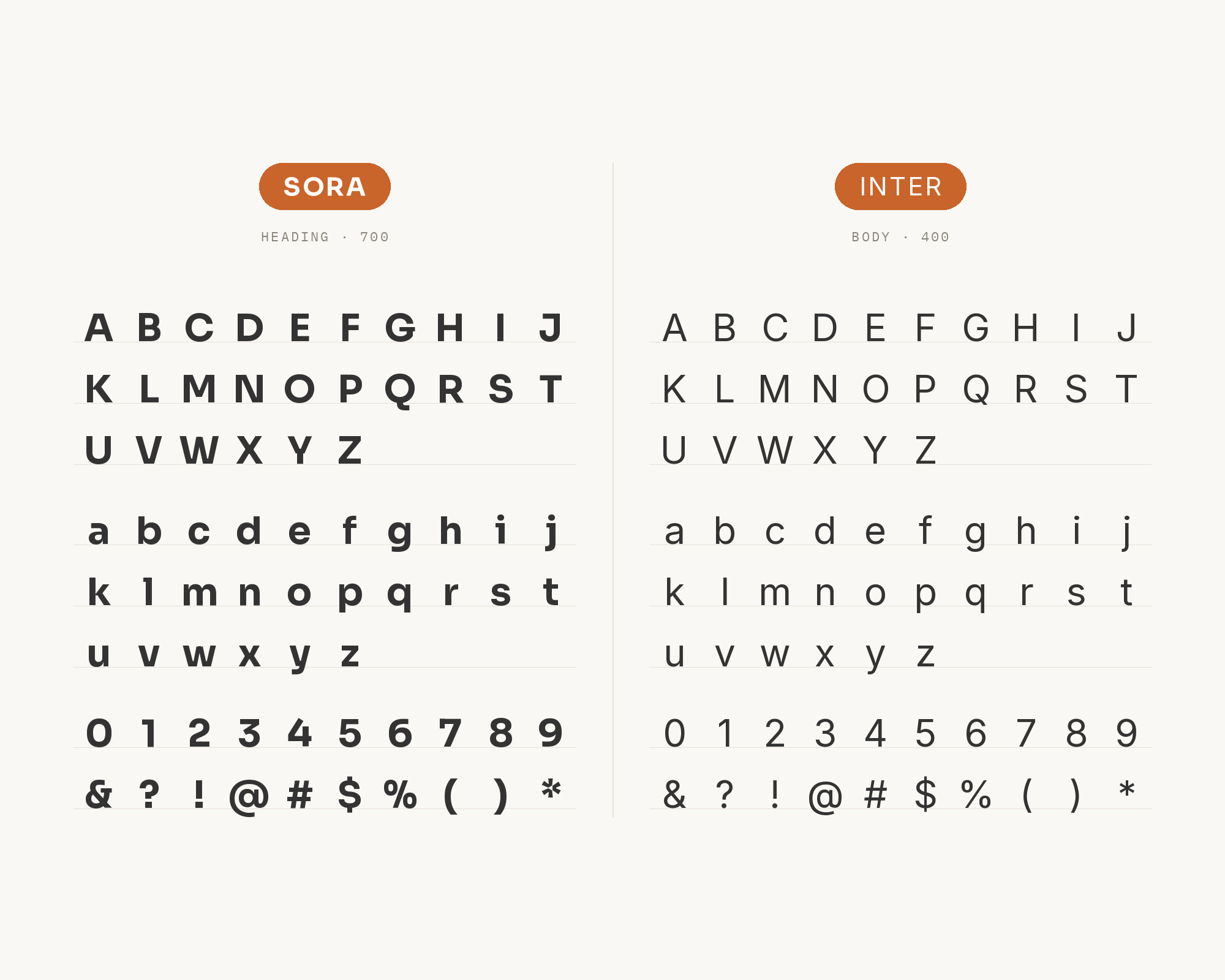
Pendo’s brand guide says it uses two sans serif typefaces for all Pendo brand and marketing materials: Sora and Inter. Sora is the Display font, for prominent headlines, short quotes and punchy callouts. Inter is the Workhorse font, for longer-form copy, small headlines and data. The guide sets Heading 1 in Sora bold at 68/68. Inter is a variable font family carefully crafted and designed for computer screens, with a tall x-height to aid readability. The two are close in spirit, so the split works through personality. Sora’s wider, more geometric capitals carry the brand. Inter’s plainer letters and tabular options carry tables, labels and paragraphs without drawing attention. Use Sora Bold or SemiBold for headings only, and set everything that people must read closely in Inter. It is a safe starting point for software products and SaaS sites.
Try Semrush free. No credit card.
Start on the $0 plan. Paid plans from $117/mo billed annually.
Try for free2. Open Sans
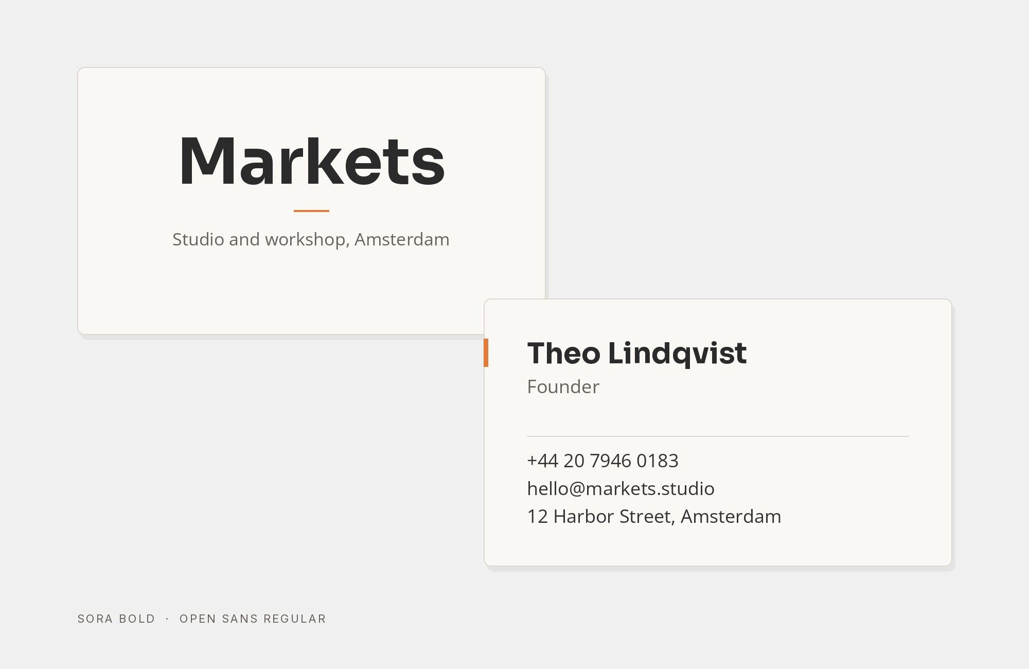
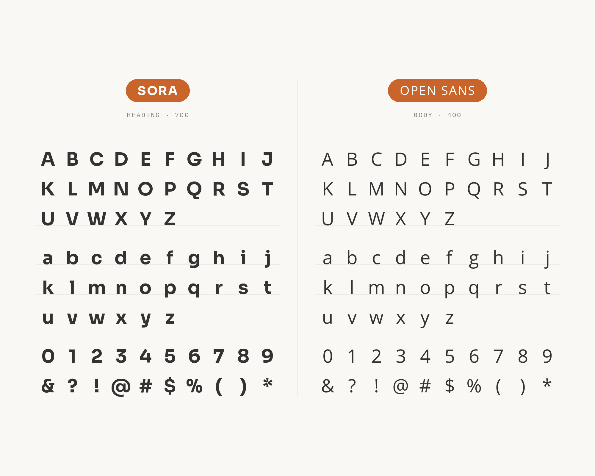
LinkUp’s 2023 brand guidelines, prepared by Breakout Studio, state that the primary typefaces for LinkUp are Sora and Open Sans. The guide sets headlines in Sora Semibold, eyebrows in Sora Bold all caps and body copy in Open Sans regular. Open Sans is a humanist sans serif typeface designed by Steve Matteson, with an upright stress, open forms and a neutral, yet friendly appearance. That humanist warmth is the reason it works under Sora. Sora is geometric and a little mechanical. Open Sans has softer curves and a more familiar texture in paragraphs. The guide also names fallbacks: Verdana where Sora is not available, and Arial in place of Open Sans. Use this pairing for marketing sites, sales decks and documents where the body text must feel easy, and let Sora give the headings their technical edge.
3. Plus Jakarta Sans
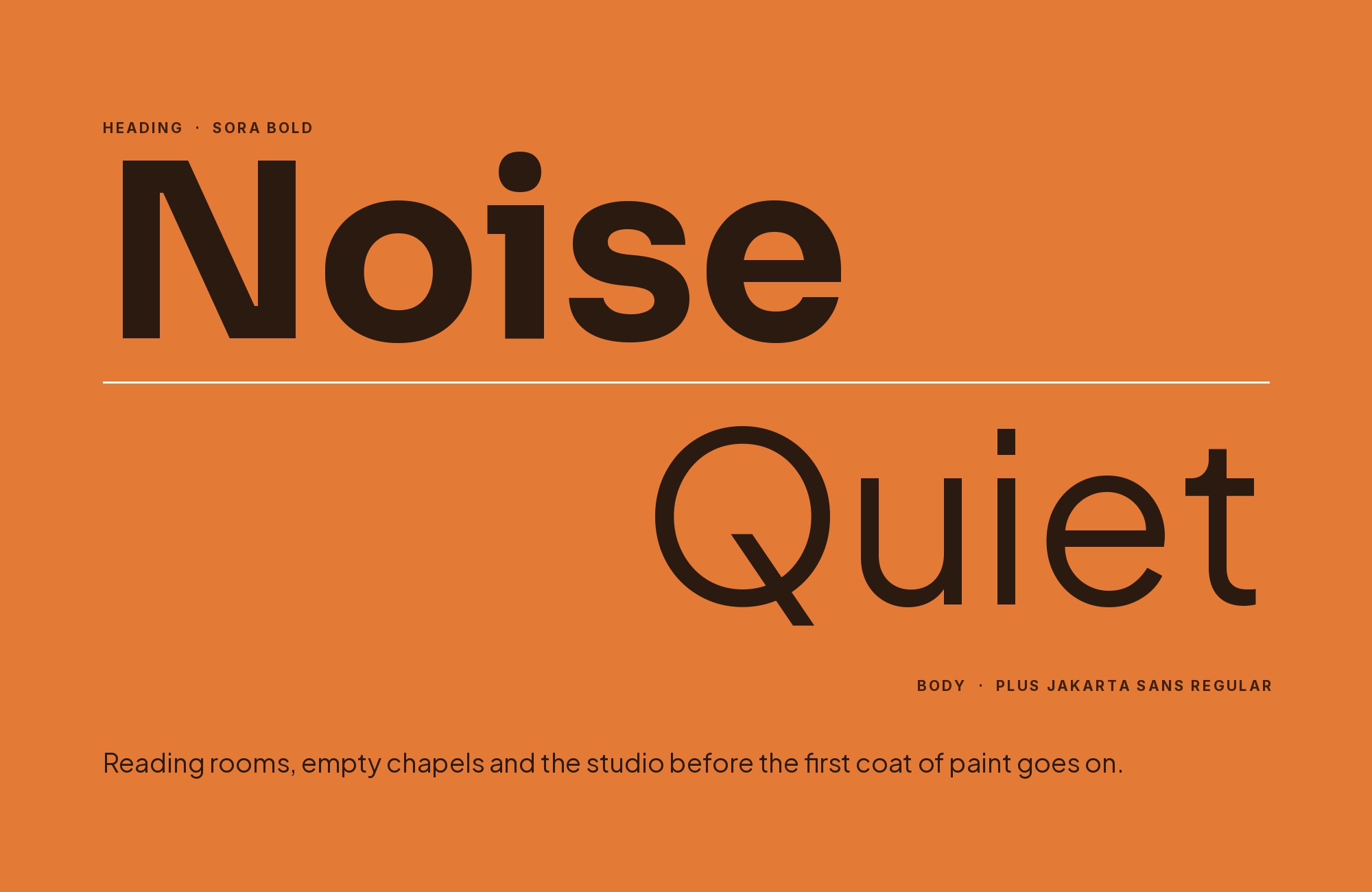
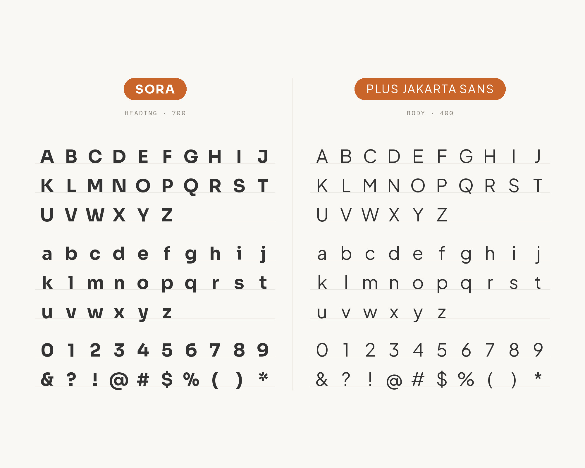
Fonts In Use documents the September 2025 rebrand of the École Nationale d’Ingénieurs de Metz, designed by the Metz studio steez. The tagline uses Sora, and additional typefaces in the identity include Cal Sans, Plus Jakarta Sans and Roboto Mono. Plus Jakarta Sans is a fresh take on geometric sans serif styles, designed by Gumpita Rahayu from Tokotype. The two faces are both geometric, but Plus Jakarta Sans is narrower and softer, with pointy curves and almost monolinear contrast. That makes it a good text and interface partner under Sora’s wider display voice. Give Sora the tagline, the campaign line or the big number. Give Plus Jakarta Sans the paragraphs, forms and navigation. Keep the weights apart, for example Sora SemiBold over Plus Jakarta Sans Regular, so the two geometric faces do not blur together.
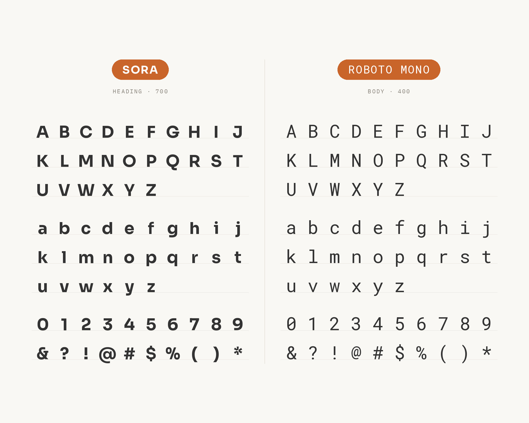
4. Roboto Mono
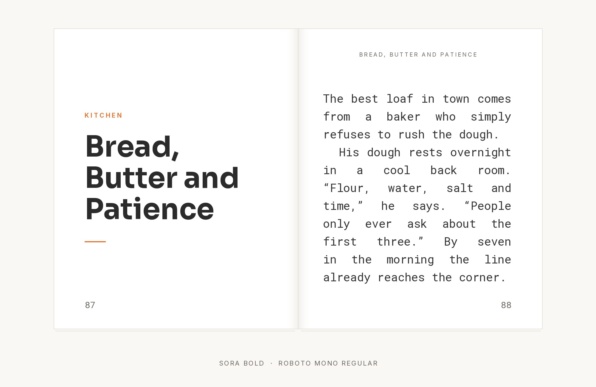
The same École Nationale d’Ingénieurs de Metz identity also uses Roboto Mono beside Sora. Roboto Mono is a monospaced addition to the Roboto type family, optimized for readability on screens. A monospace is a natural fit here. Sora’s design draws on early screen typography, so a code face next to it feels like part of the same world. Use Roboto Mono for small technical details: numbers, dates, codes, labels and captions. Keep Sora for headings and short statements. For an engineering school, the mono adds a clear signal of precision without competing with the display type. The same idea works for developer products, data dashboards and technical documentation. Do not set long paragraphs in the mono. Use it as an accent, not as the reading face.
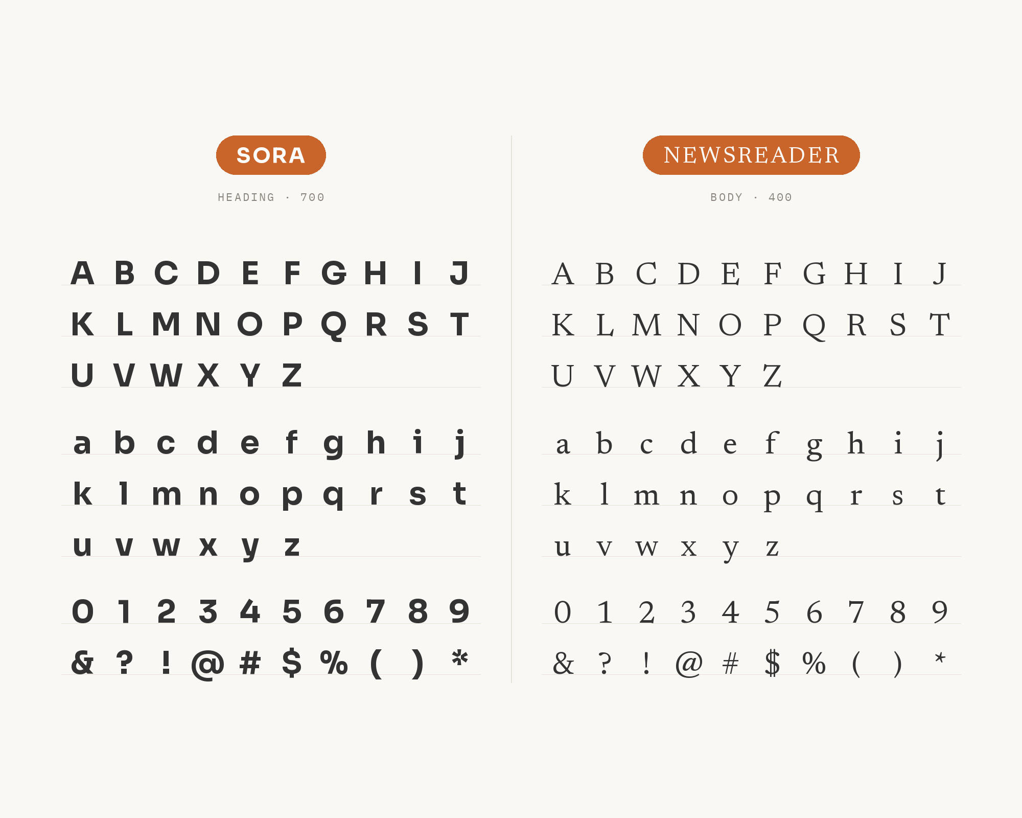
5. Newsreader
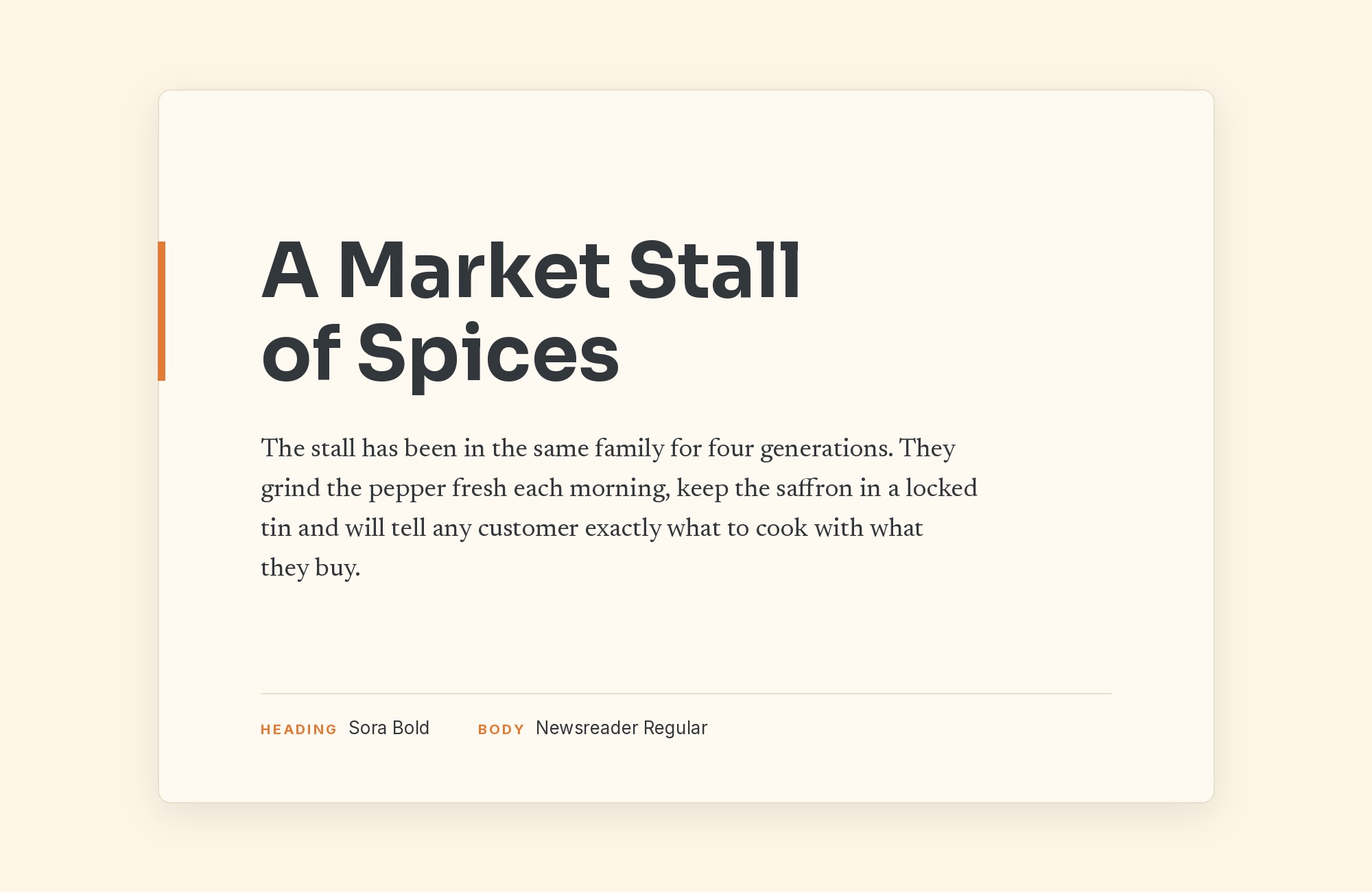
Oliver Schöndorfer reviewed Sora on Pimp my Type and answered a reader who asked what to pair with it. His advice: Newsreader would work for body text when Sora is set in a heading. Newsreader is an original typeface designed by Production Type, primarily intended for continuous on-screen reading in content-rich environments. This is the sans-over-serif answer, and it is the one to pick for editorial content. Sora’s wide, clear headings sit on top. Newsreader’s modulated strokes and serifs slow the eye down in a good way and make long articles comfortable. Use it for blogs, reports and newsletters from technical companies that want their writing to feel considered. Set the Sora headings in SemiBold rather than ExtraBold, so they do not overpower the finer serif below.
6. Nunito
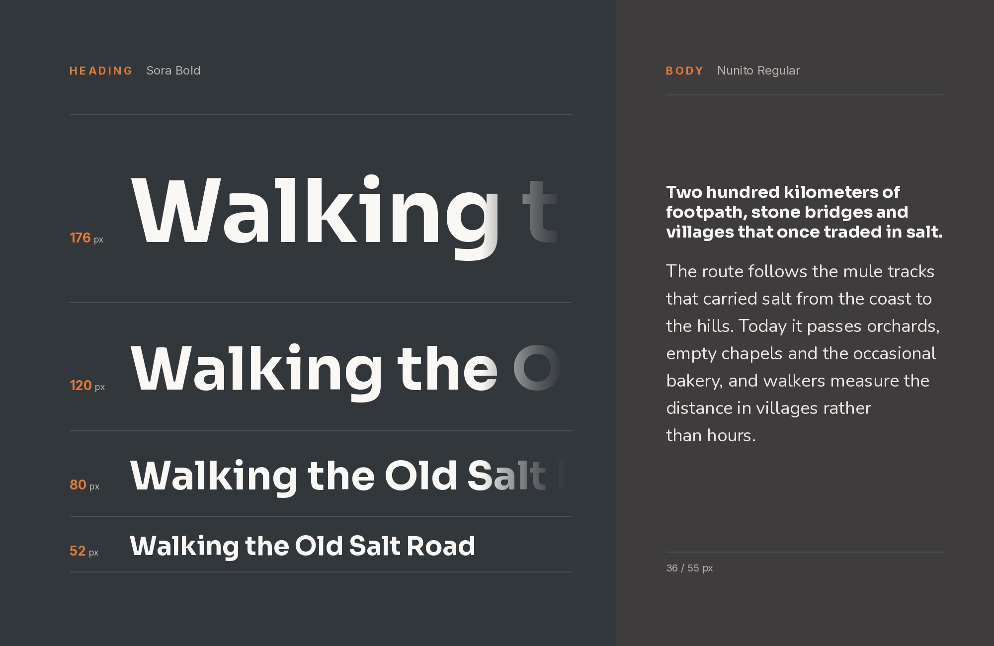
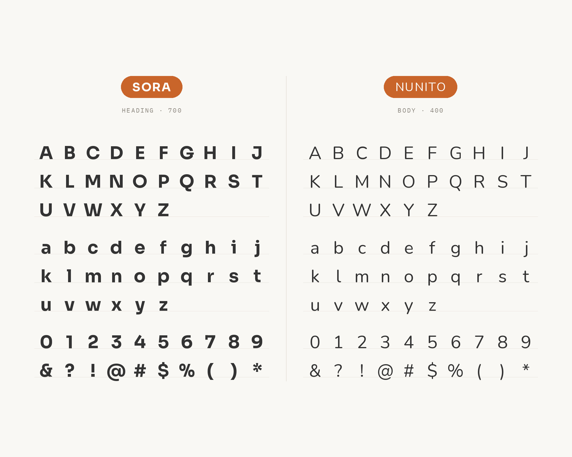
Curated pairing tools recommend Sora with Nunito. SlidesCarnival’s font pairing tool lists Sora and Nunito as one of its presets. Getillustrations’ pairing tool sets the heading in Sora and the body in Nunito, for consumer-facing apps and mobile-first products. Nunito was created by Vernon Adams as a rounded terminal sans serif for display typography, and Jacques Le Bailly extended it to a full set of weights. The rounded terminals are the contrast. Sora is crisp and slightly squared. Nunito is soft and friendly. Together they make a technical product feel approachable. Use Sora for headings and buttons, and Nunito for body copy and onboarding text. This works for consumer apps, education products and health tools where a warmer tone helps.
7. Raleway
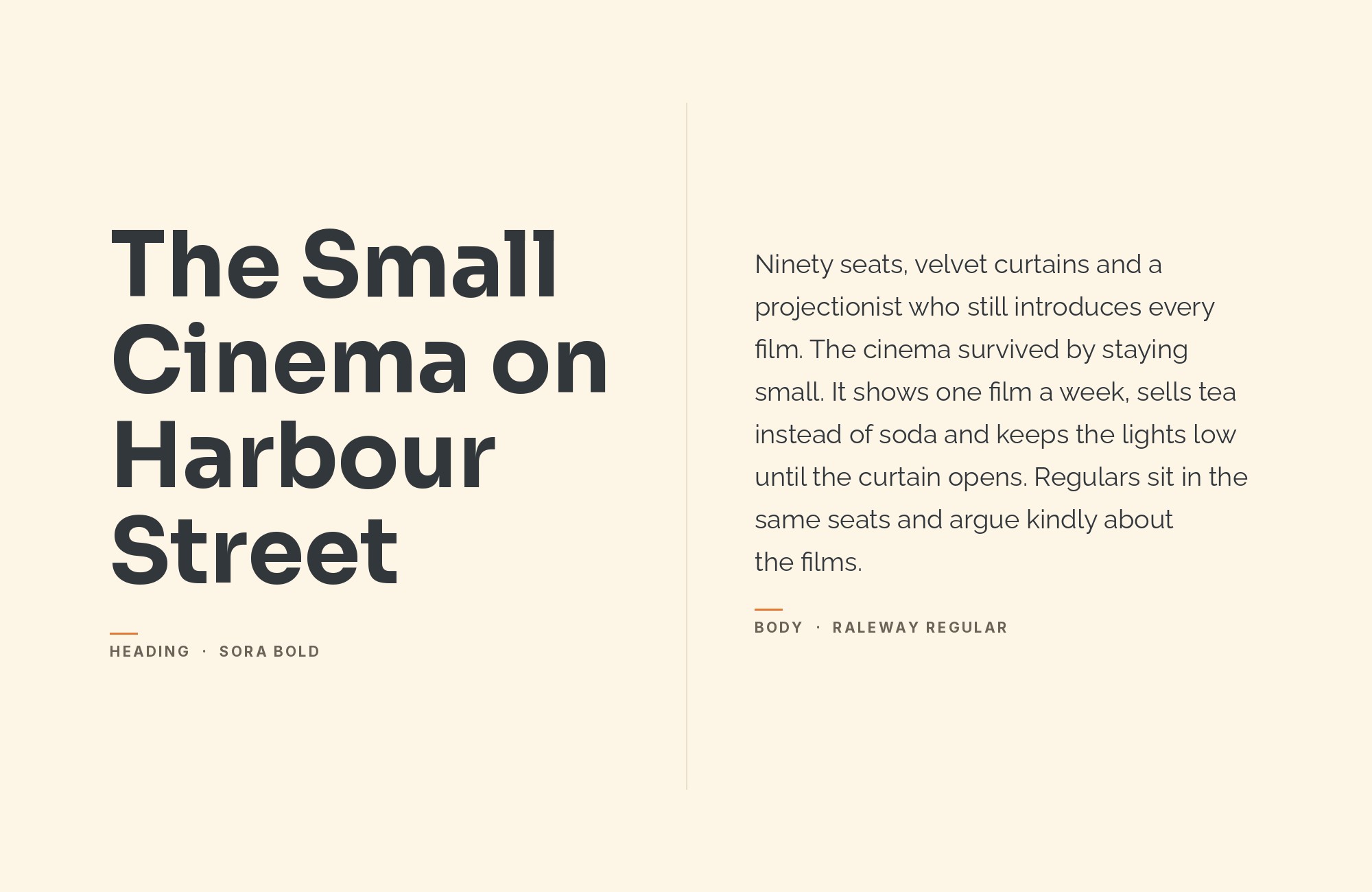
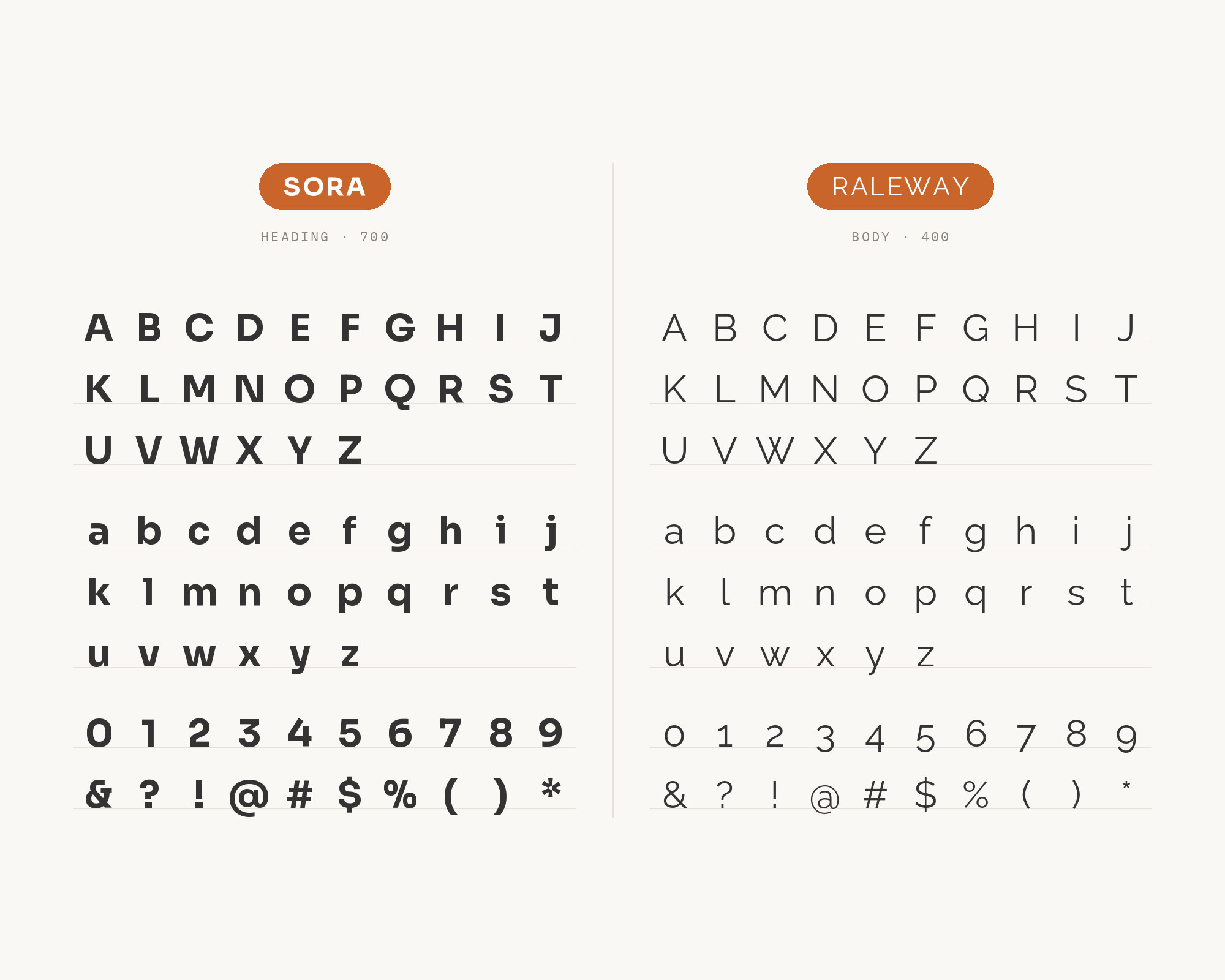
Fonts In Use documents Mifood Miraisin, a restaurant in Geneva, Switzerland. Nuances Extended is used as the brand typeface, and paired with Metropolis and Raleway. For social media, the brand uses Sora. Raleway is an elegant sans serif family, initially designed by Matt McInerney as a single thin weight and later expanded to nine weights. Next to Sora, Raleway brings more elegance and a lighter touch. Its thin and light weights are more delicate than anything in Sora’s texture. Use Raleway Light for large, airy titles and let Sora carry the practical text, such as hours, prices and captions. Or reverse it: Sora for a strong heading, and Raleway Regular for short supporting lines. It is a good pairing for hospitality and lifestyle brands.
8. Metropolis
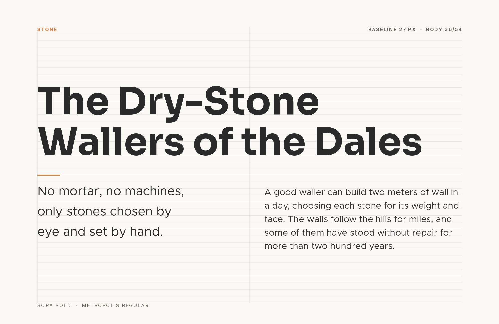
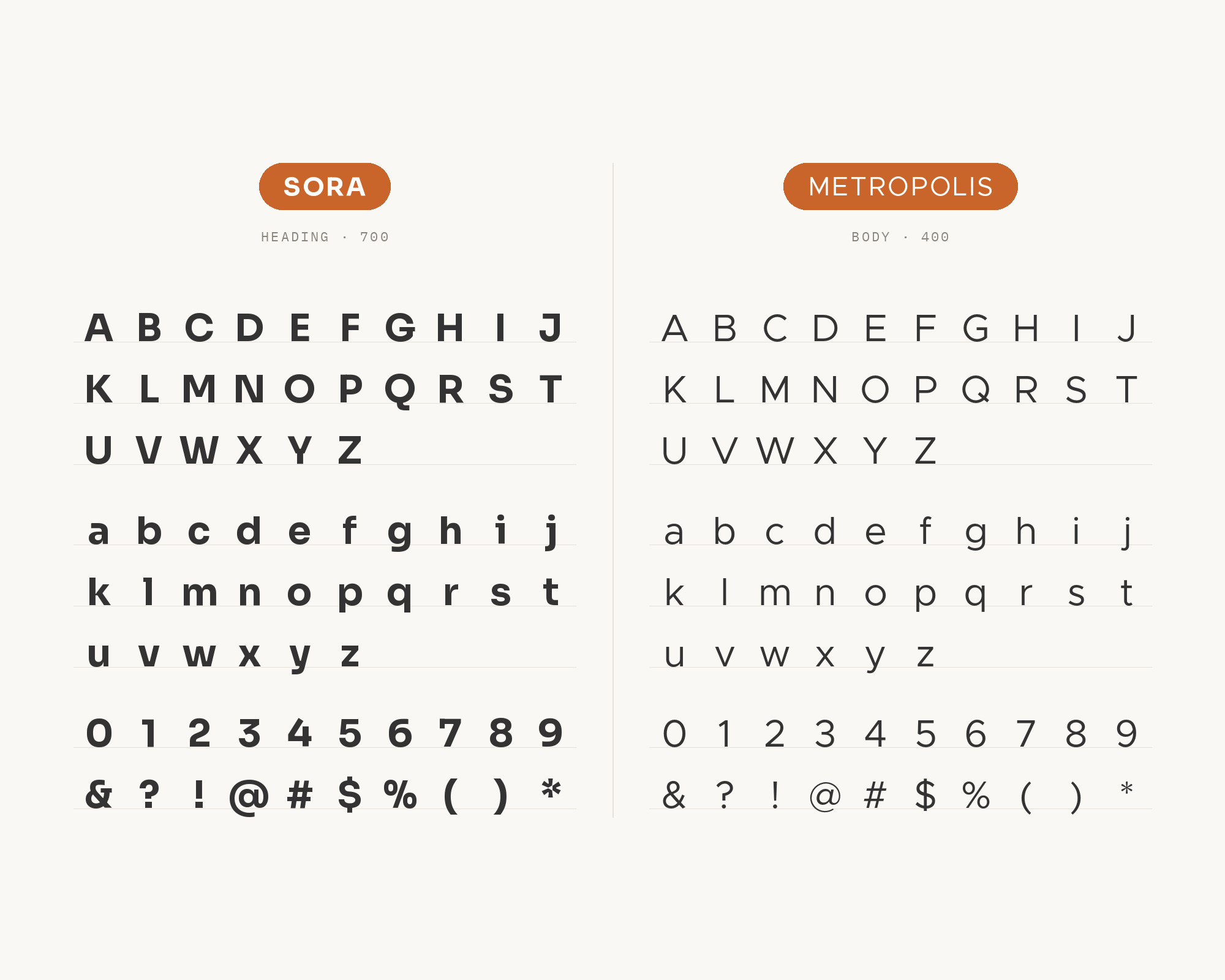
Metropolis is the other sans in the same Mifood Miraisin system, and Fonts In Use credits it as Metropolis (Chris Simpson). Metropolis is a geometric sans with a clean, restrained look. Next to Sora it is the calmer of the two. Sora’s big x-height and wide letters make it read as a statement. Metropolis is quieter and a little more classic. That lets Sora take the social media posts and promotions, while Metropolis holds signage, menus and website text. Because both are geometric sans serifs, keep a clear difference in size or weight between them. This pairing is useful when a brand needs one voice for fast digital content and another for its permanent materials.
9. Space Mono
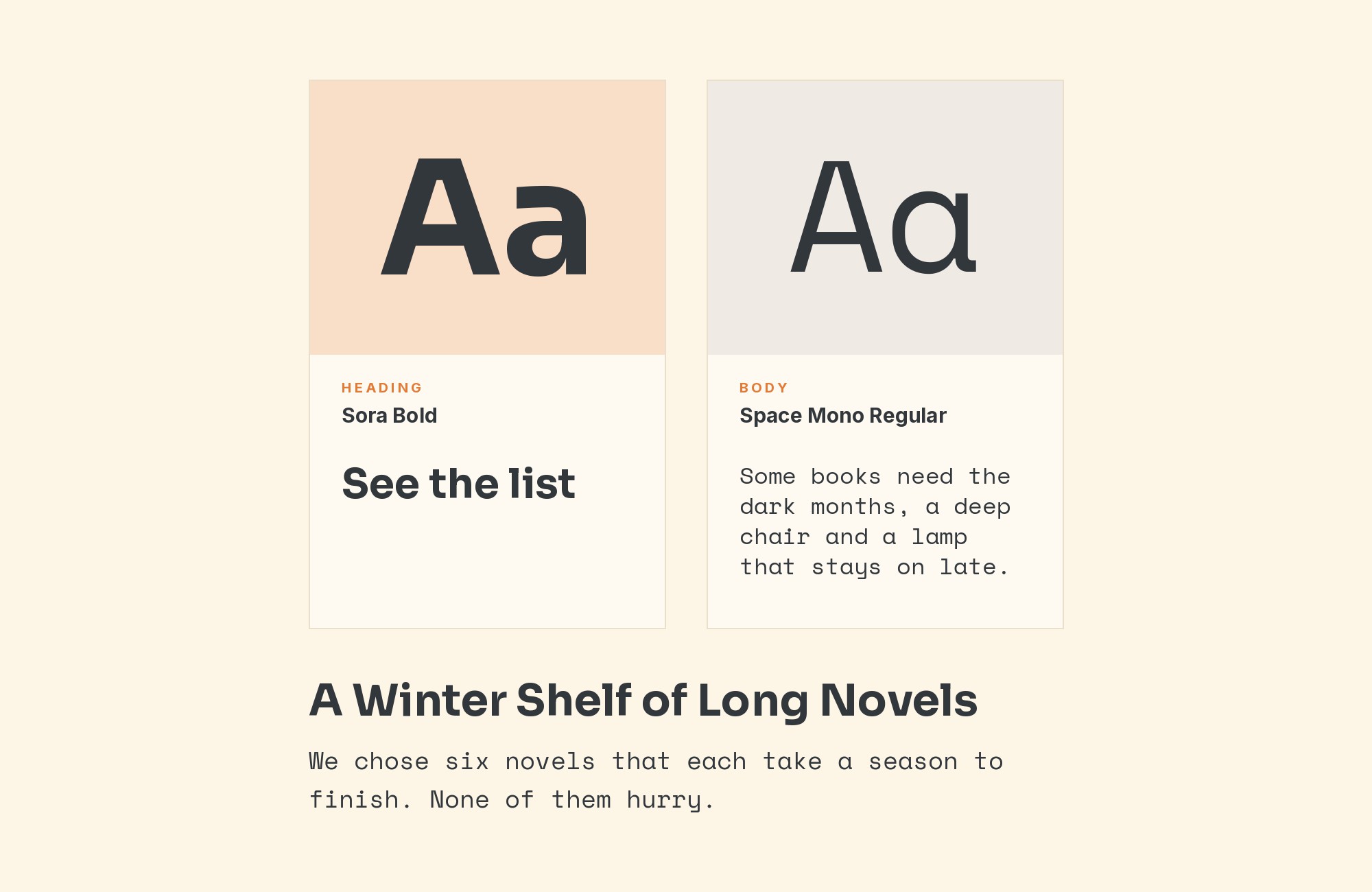
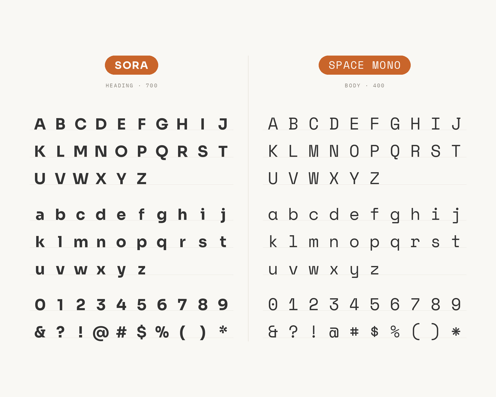
Matt Medley’s Bootcamp article on font pairings for UI design lists Sora with Space Mono, crisp and open for digital tools, with Space Mono bringing structure to supporting elements. Space Mono is an original fixed-width type family designed by Colophon Foundry for Google Design. Its letterforms draw on headline typefaces of the 1960s, so it has more personality than a plain code font. With Sora it gives a product page a clear technical flavor. Use Sora for headings and body text, and Space Mono for tags, metadata, small labels and code. Keep Space Mono small and occasional. Its wide fixed spacing looks strong in a label but tiring in a paragraph.
10. Heebo
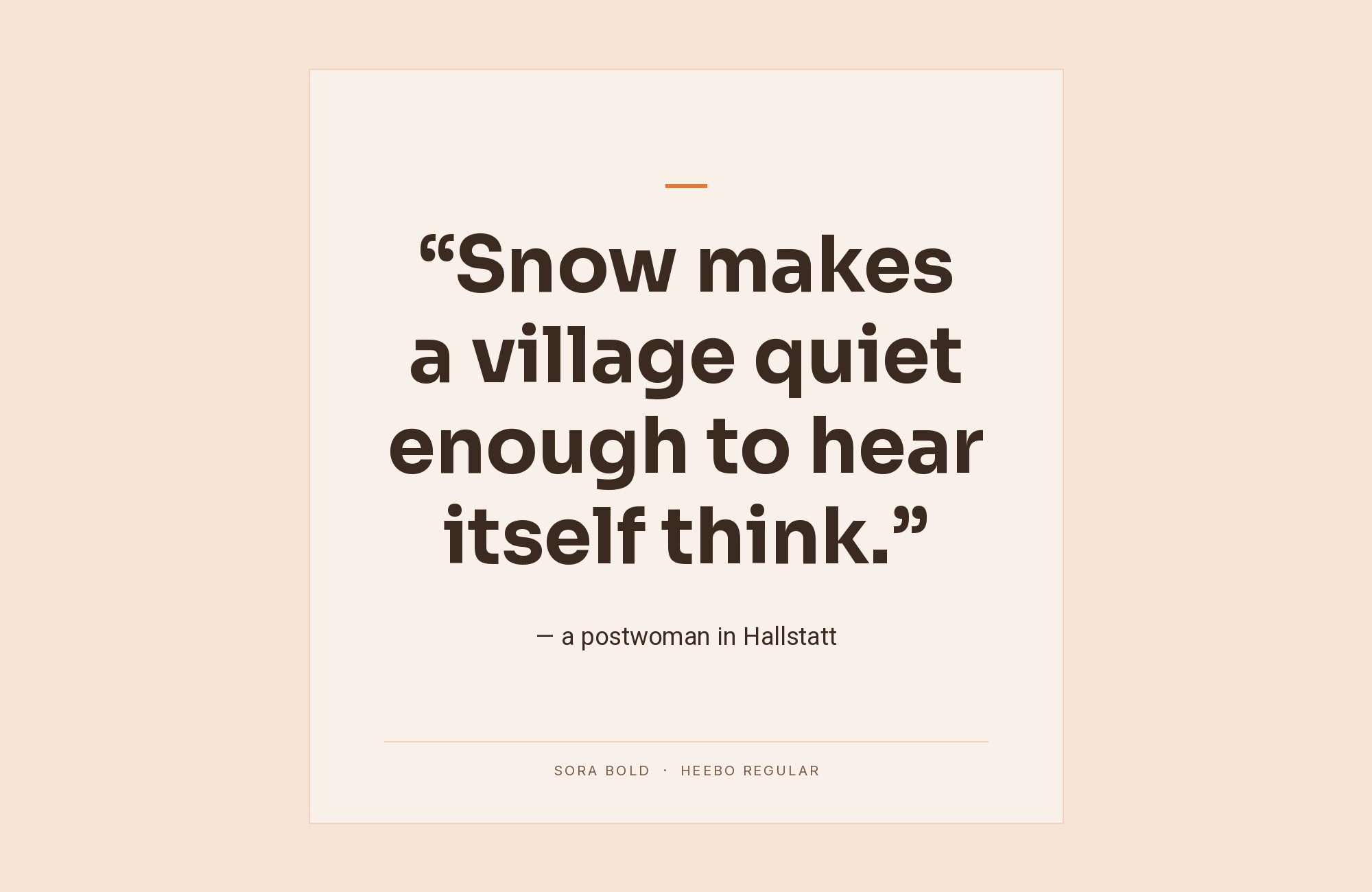
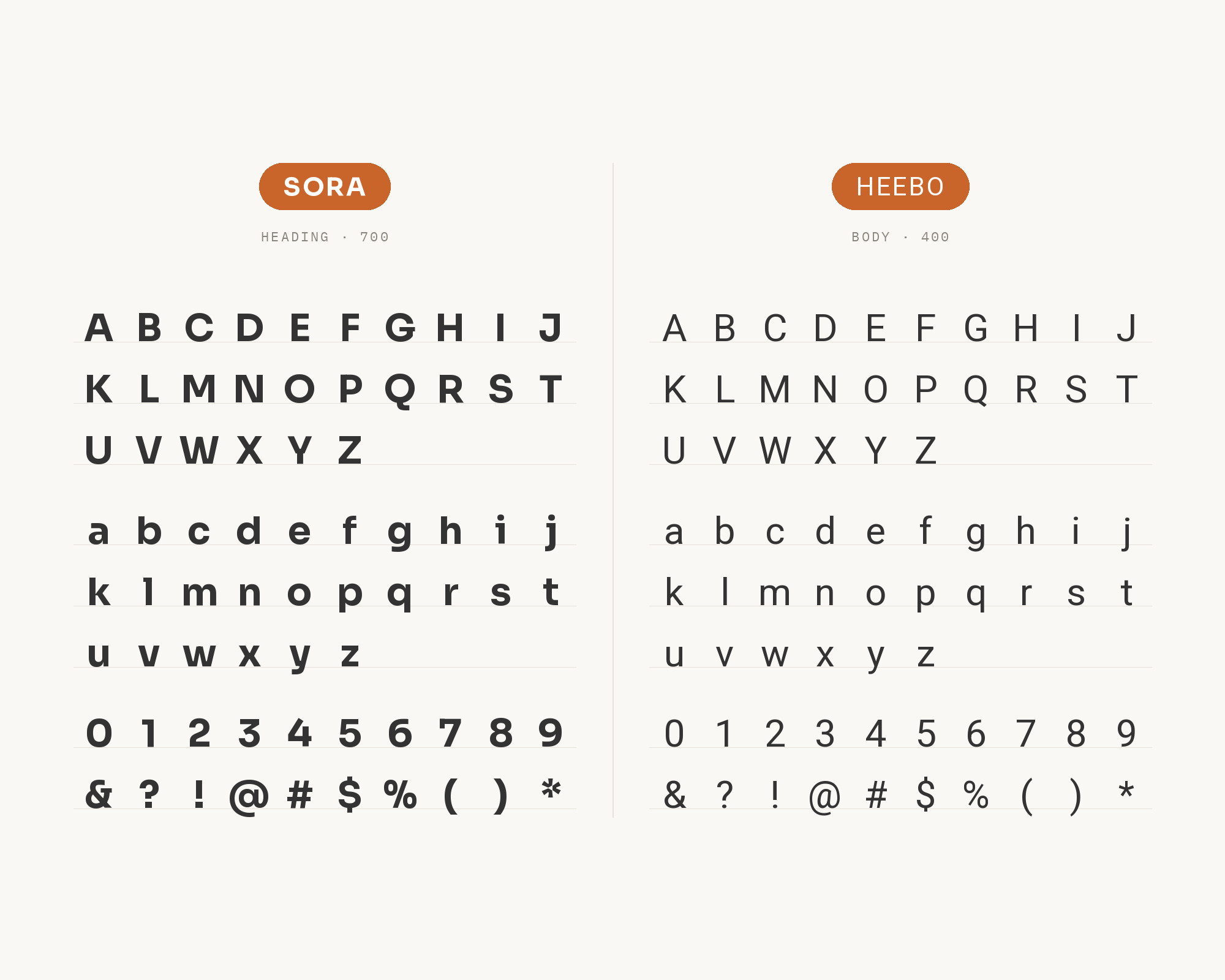
Rossul’s guide to Google Fonts pairing in 2024 recommends Sora for headings and Heebo for body text, for fintech startups, innovative business platforms and dynamic content websites. Heebo is a Hebrew and Latin typeface family that extends Roboto’s Latin to Hebrew. So in Latin text, Heebo is close to Roboto: neutral, even and familiar. That neutrality lets Sora’s more distinctive headings stand out. The Hebrew support is a real advantage for products that must work in both scripts. Use Sora SemiBold for headings and Heebo Regular for paragraphs, tables and interface text. If your product is only in English, the pairing still works, but Inter or Open Sans may do the same job with more documented use.
11. Sniglet
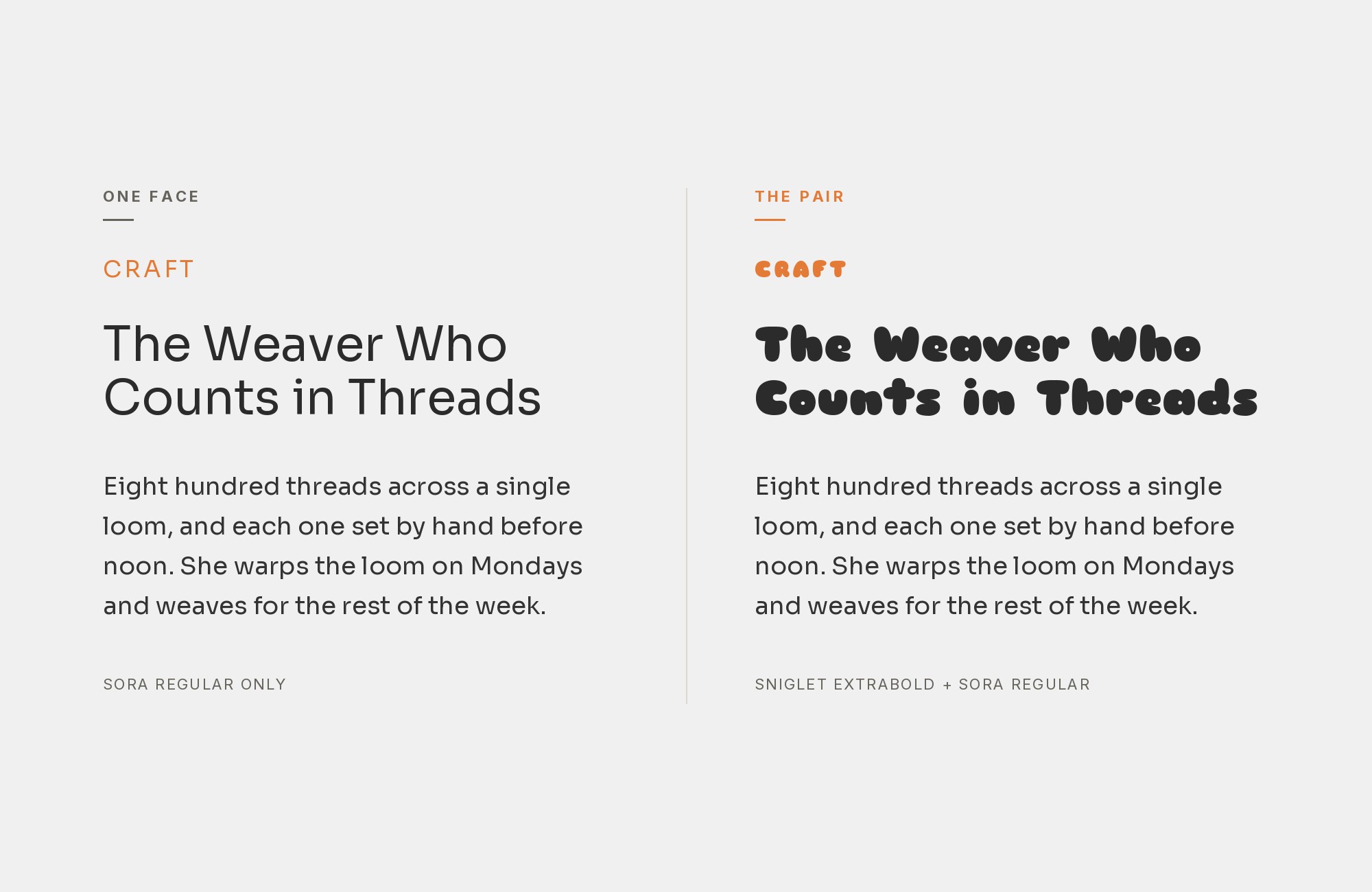
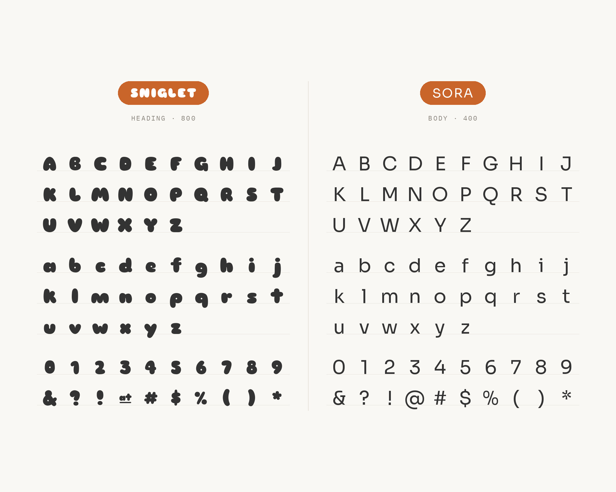
In the same Pimp my Type reply, Oliver Schöndorfer turns the roles around: if Sora is the body text, it would pair well with Sniglet for display text. Sniglet is a rounded display face that’s great for headlines, originally designed in 2008 by Haley Fiege in Extra-bold. This is the playful option. Sniglet’s fat, rounded letters give a title a friendly, almost cartoon voice. Sora then does what Schöndorfer thinks it does best: clear, functional text. Use Sniglet only for large titles and short phrases, never for paragraphs. It fits children’s products, games, events and informal brands. Keep the Sora text at a regular weight so the contrast between the soft display face and the crisp text face stays obvious.
12. Crimson Text
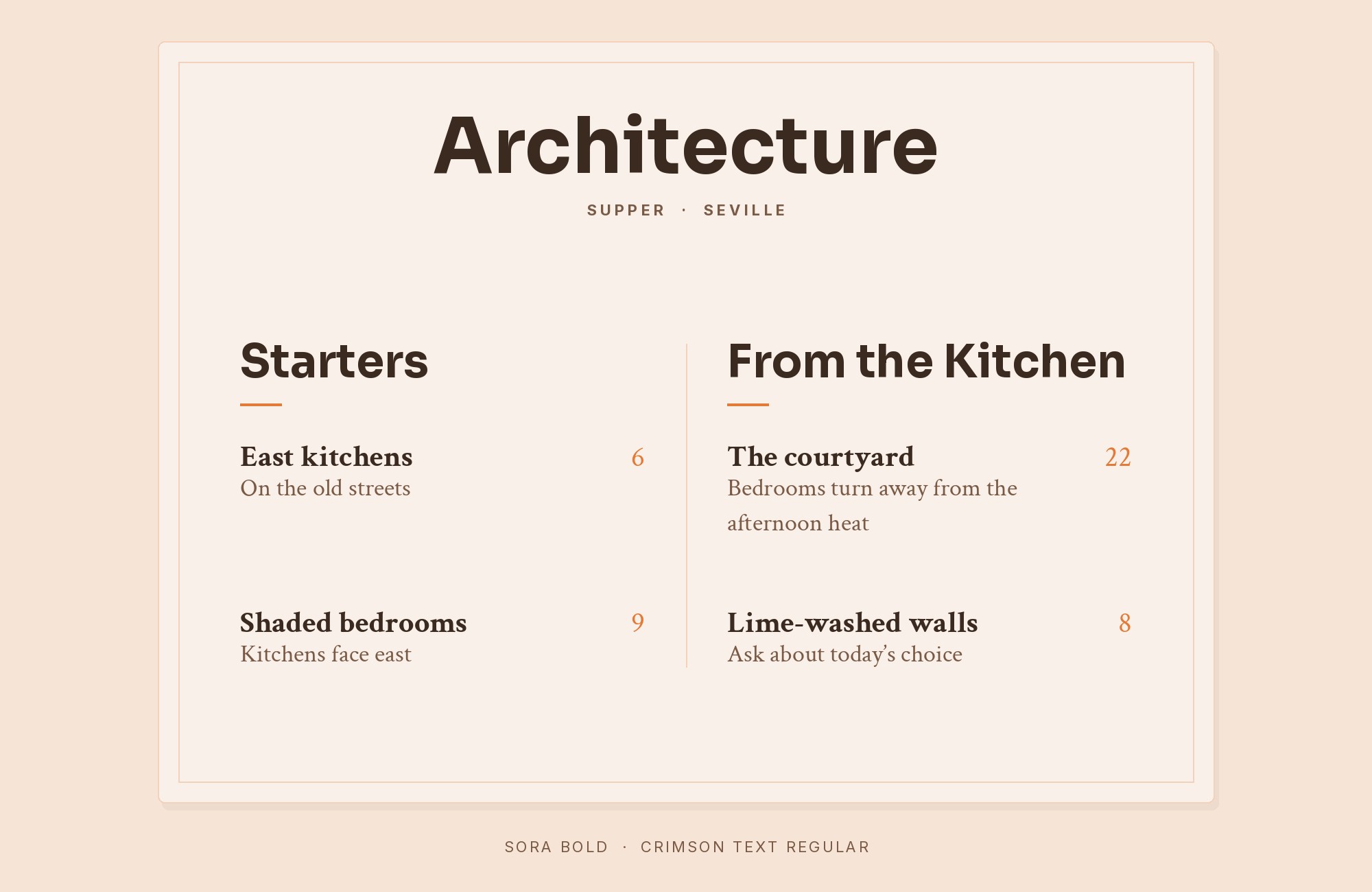
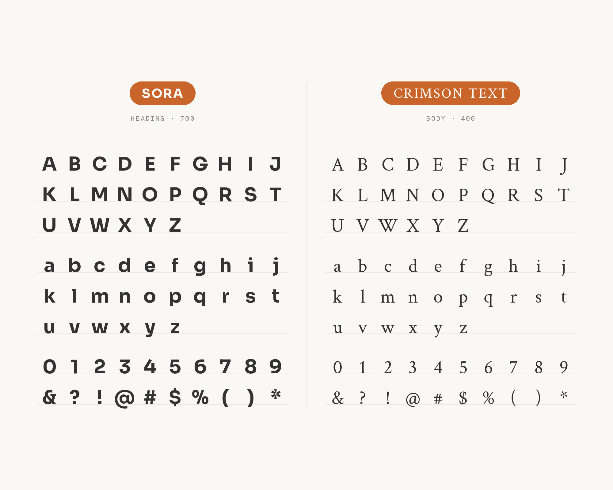
DiverseKit’s list of Google font pairings sets Sora with Crimson Text for fintech and professional services, noting that Sora’s distinctive letterforms signal modernity without losing trust. Crimson Text is a font family for book production in the tradition of beautiful oldstyle typefaces. This is the most traditional pairing on the list. Sora gives the page a modern, digital heading. Crimson Text gives the reading text the feel of a printed book. Use it for reports, long-form articles and professional services sites that want to look both current and reliable. Set Crimson Text a little larger than a sans at the same point size, because oldstyle faces tend to look smaller on screen.
Conclusion
Sora’s partners follow from its role. When Sora is the heading, as in the Pendo and LinkUp brand guides, the best partner is a calm text sans: Inter, Open Sans, Plus Jakarta Sans or Heebo. When the text needs more depth, a serif like Newsreader or Crimson Text gives it. When Sora is the text, a display face with character, like Sniglet, can take the title. A monospace such as Roboto Mono or Space Mono fits its early-screen roots.
If you want one answer, start with Inter for product work and Open Sans for marketing work. Both come from published brand guides that assign clear roles. Then test with real copy, and keep one clear job for each font.
