Cabin pairs great with Georgia, Raleway and Sabon. All 15 pairings are shown below in real rendered specimens, with the reason each one works. Every pairing below is checked against 16 published typography sources.
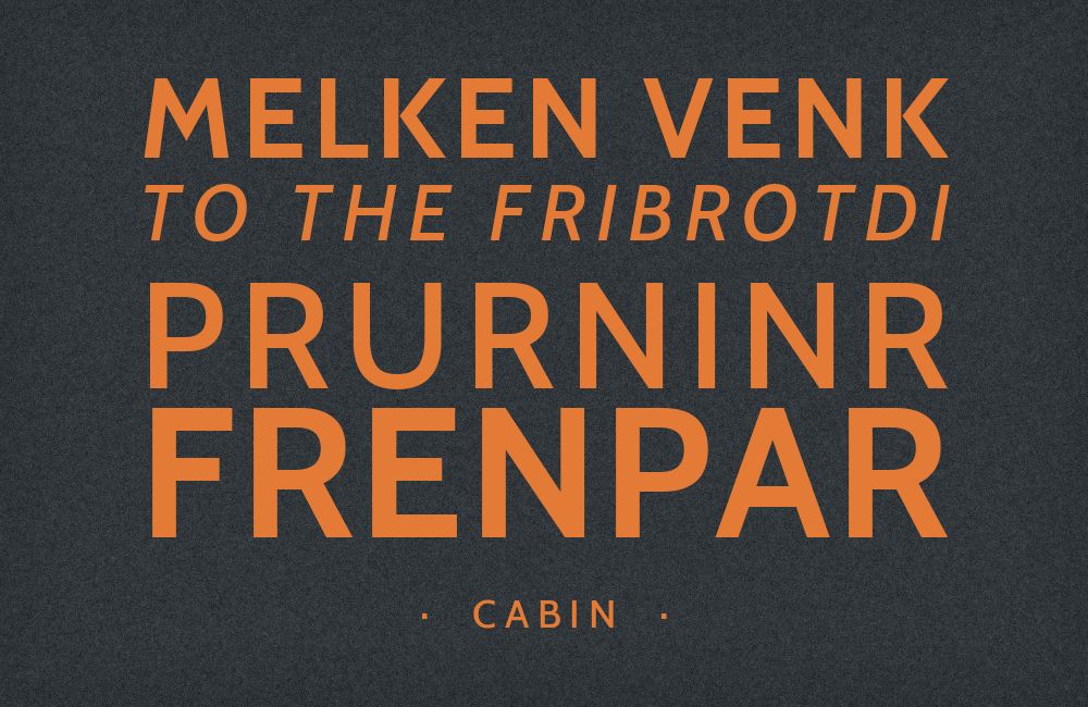
What fonts go with Cabin? Start with the role the font needs to play. Cabin is restrained enough for paragraphs but has enough humanist character to hold a heading, which means a partner can either supply a contrasting display voice or introduce a serif reading texture. Georgia and Sabon provide the clearest serif contrast; Raleway, Arvo, and Dancing Script move the emphasis toward a distinctive headline. The right choice depends on how much information the page contains and which part deserves attention first. Here are 15 fonts that pair well with Cabin, covering both approaches.
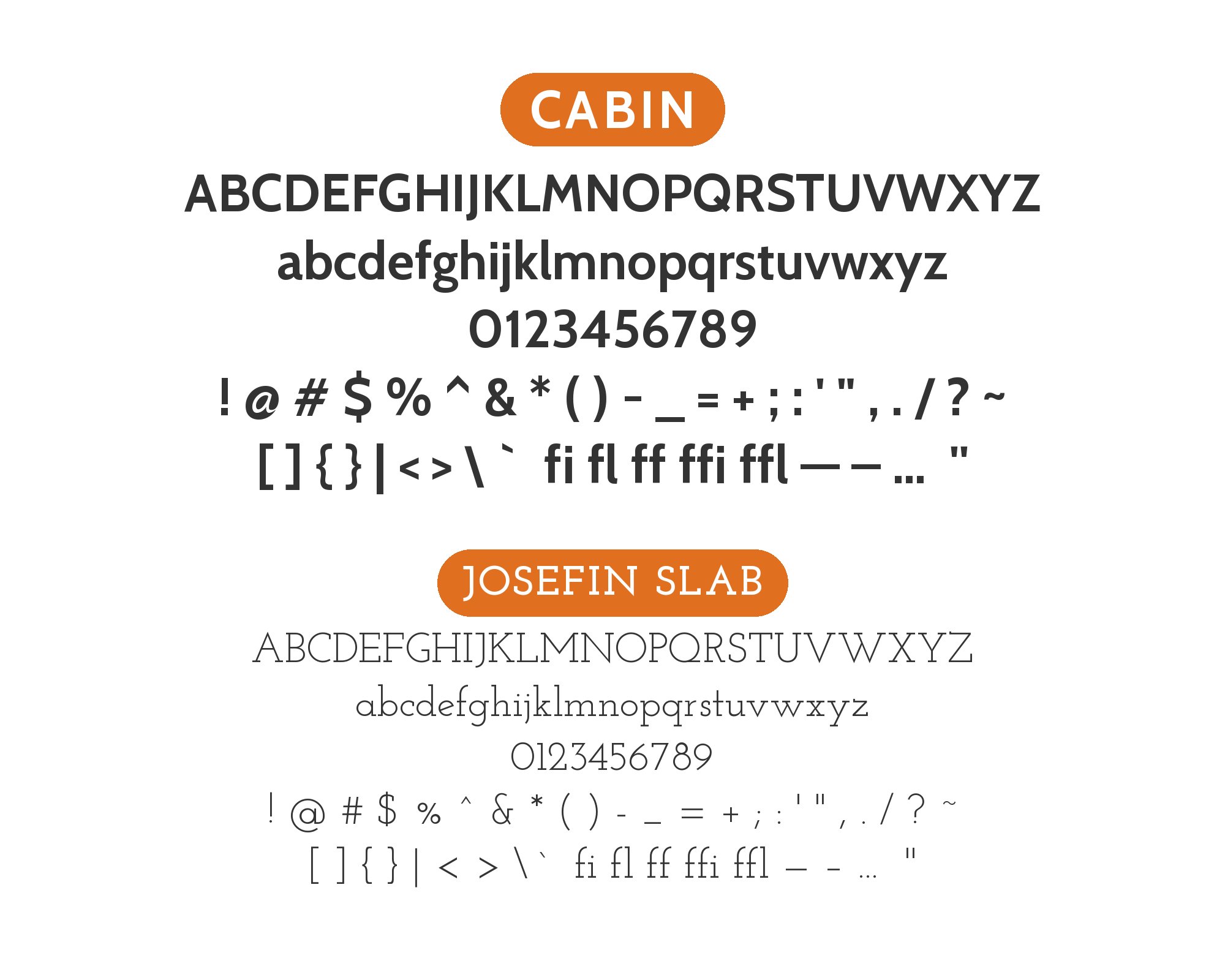
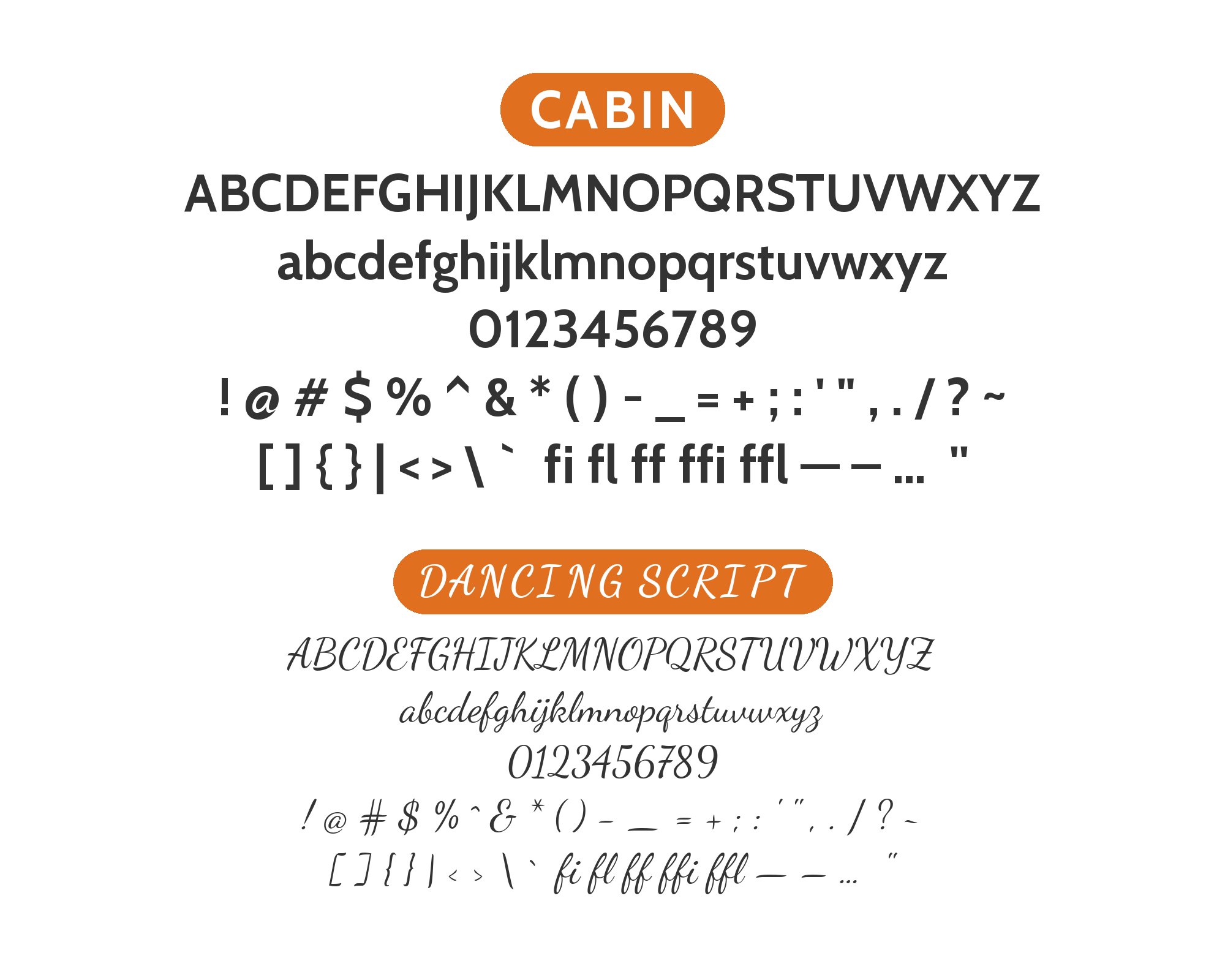
Pablo Impallari of Impallari Type designed Cabin and released the first version in December 2010 as a humanist sans influenced by the lettering of Edward Johnston and Eric Gill. Its almost monolinear strokes carry optical adjustments rather than mechanically identical thicknesses: the upper and lower parts of curves are slightly thinned, and the rounded counters of b, g, p and q keep the color even on the page. Google Fonts now serves variable roman and true italic designs with weight and width axes, so glyph width changes line length and page density independently of weight; a condensed setting is a different layout decision, not merely a smaller version of the same text.
The useful pairing principle is separation of roles. A serif or script announces its difference immediately, while a second sans needs a stronger distinction in size or function before the two read as a system. These fifteen combinations draw on published pairing suggestions and documented project co-usage; co-usage shows that fonts have appeared within a design system, rather than proving that every arrangement succeeds. Begin with two families, establish one headline voice and one reading voice, and judge them using actual copy at the sizes you intend to publish.
1. Georgia

Matthew Carter designed Georgia in 1993 for Microsoft, which released it in 1996 as a Scotch Roman serif tuned for screen reading, with bracketed serifs and a large x-height. That stroke contrast is what Cabin withholds: Cabin’s almost monolinear humanist sans sits beside Georgia’s pronounced thick-thin modulation as a heading, caption, and navigation voice, while Georgia carries the sustained paragraphs. Fonts In Use documents the two together on The Flour Pot Bakery website. Their x-heights will not land at the same apparent size at a shared point size, so set Georgia a step larger for body copy, keep Cabin firmer and shorter above it, and let Georgia’s italic handle emphasis inside the reading text, leaving Cabin free to organize the page without adding another display treatment.


2. Raleway

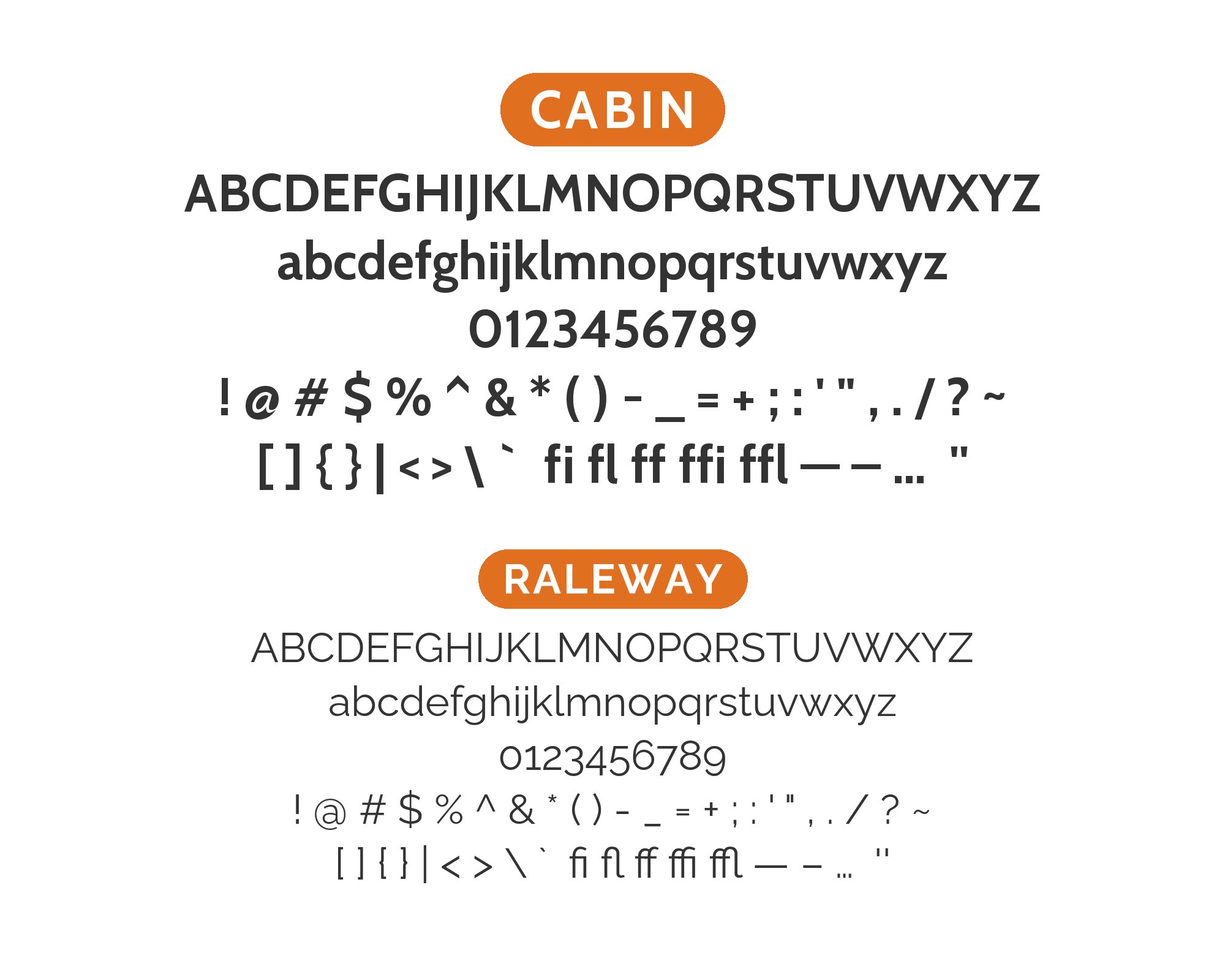
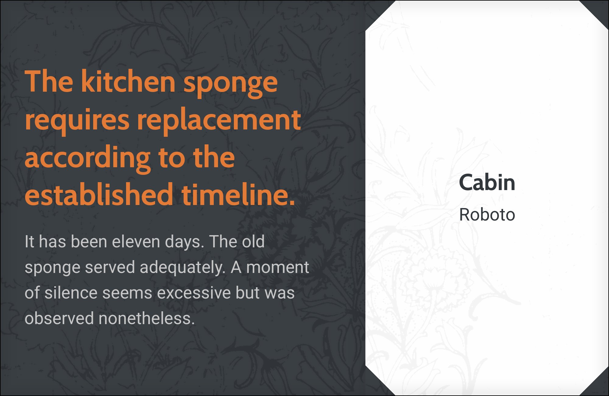
Matt McInerney designed Raleway as a single thin weight for The League of Moveable Type; Pablo Impallari and Rodrigo Fuenzalida expanded it to nine weights in 2012, and Google Fonts published the family as an elegant display sans. Raleway’s conspicuous, slightly geometric letterforms are the opposite of Cabin’s restrained humanist rhythm, which is why the pairing works when Raleway takes the short headline and Cabin takes the description underneath, where its less showy shapes can establish a consistent text color. Figma’s Google Font Pairings list includes the combination. A light display weight will vanish above Cabin’s darker paragraph color, so keep Raleway large enough for its apertures and width to register, and hold Cabin at a steady reading size rather than matching the two in neighboring medium weights.

3. Sabon
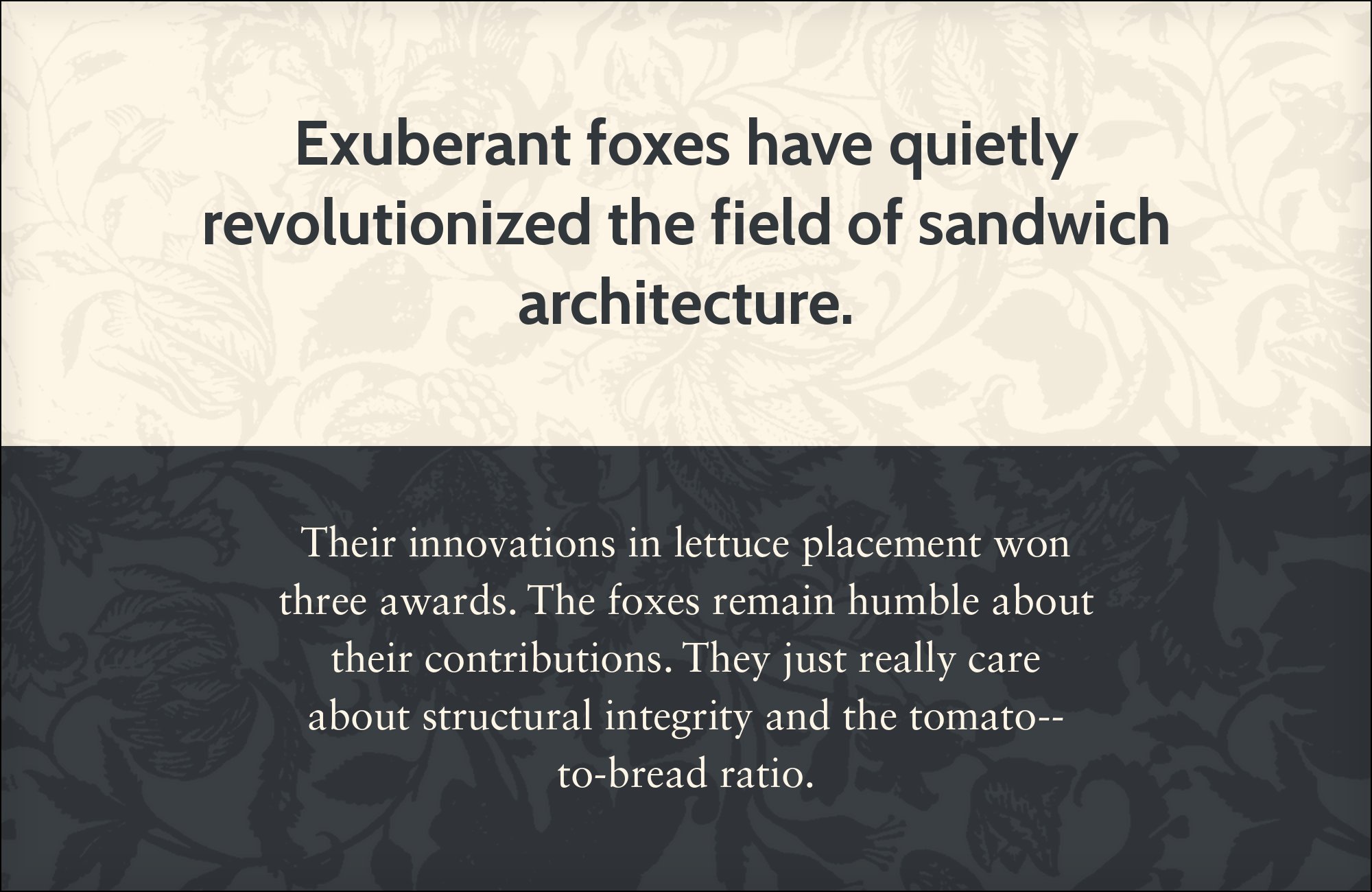
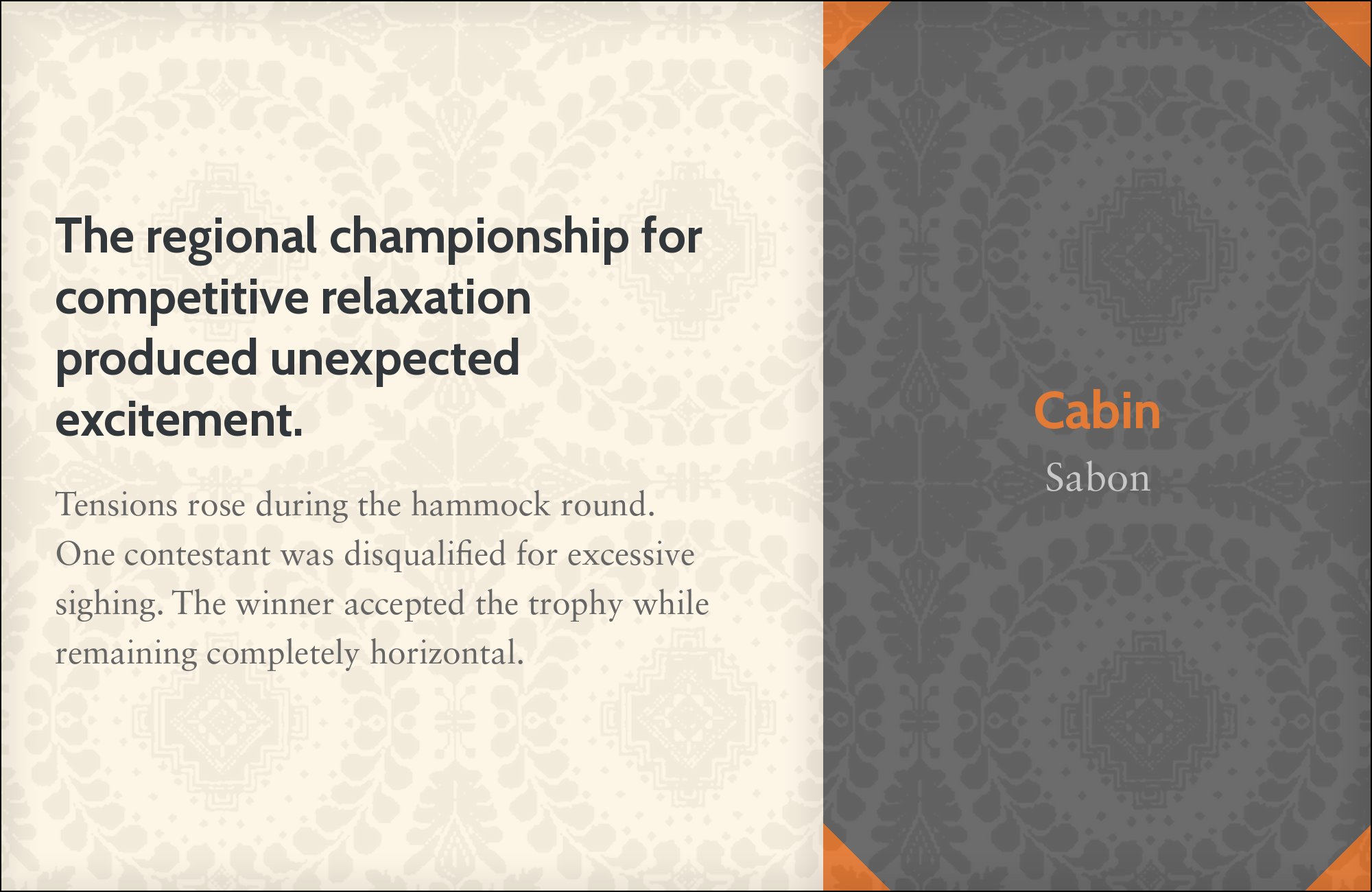
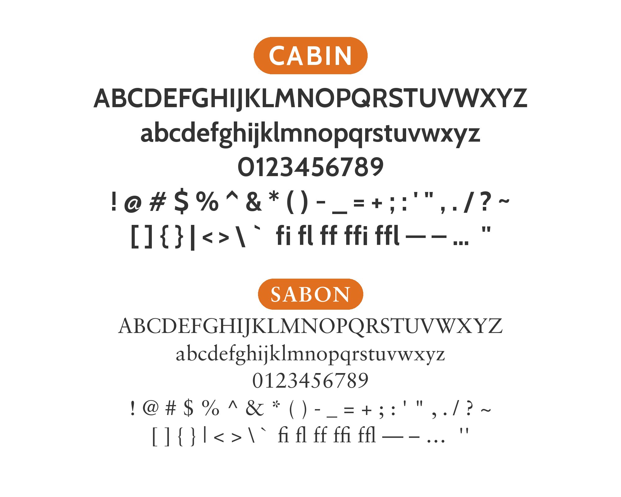
Jan Tschichold designed Sabon in 1964–1967, and Stempel, Linotype, and Monotype jointly released the old-style serif in 1967 as a Garamond revival with calligraphic stroke changes and a literary paragraph texture. Those modulated serifs are everything Cabin’s simpler, near-monoline construction is not, so the gap itself becomes the hierarchy: Sabon for sustained reading, Cabin for headings, running information, and navigation, with a visible difference in scale. Typewolf suggests the pairing directly. Sabon’s x-height sits in a different optical register from Cabin’s more compact sans lowercase, and Cabin’s strokes read darker at the same nominal size, so the two need independent sizes and a visible difference in weight before the page balances; Sabon’s italic can then mark quotations inside the serif text while Cabin stays upright and organizational.

4. Arvo
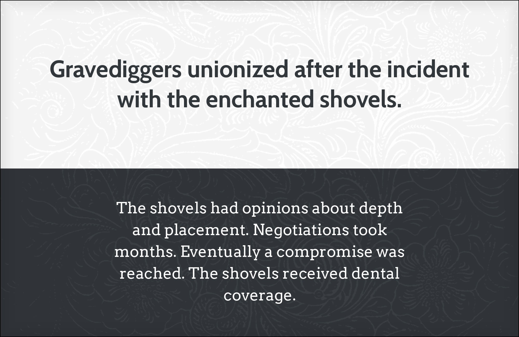
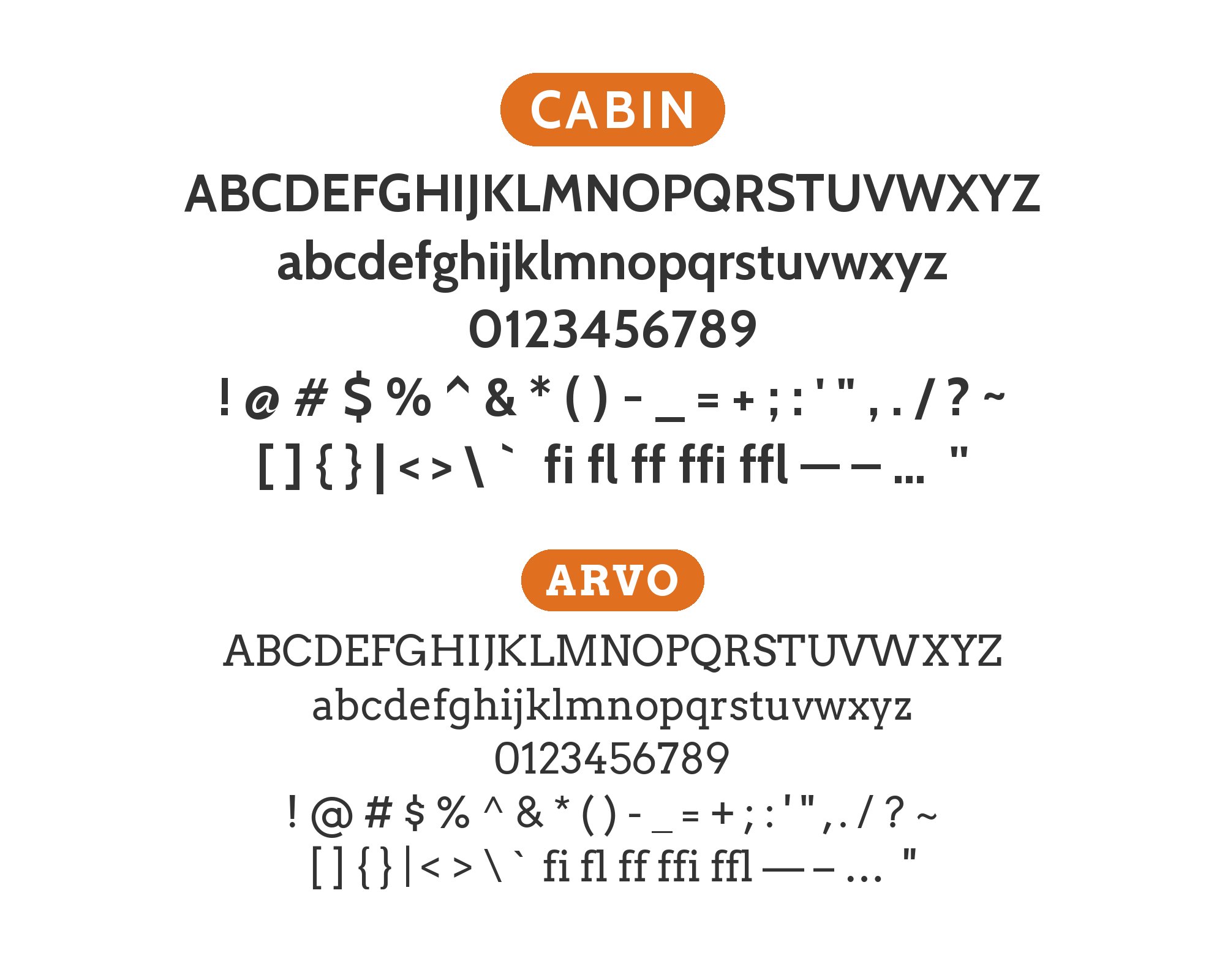
Anton Koovit designed Arvo and first published the geometric slab-serif family on Google Fonts in 2010, in roman, italic, bold, and bold italic cuts with nearly monolinear strokes and a slight remaining contrast. Square slab serifs make a firm architectural mark that Cabin’s softer humanist curves never attempt, which is the reason to give Arvo the headings and Cabin the body copy underneath. Typ.io records Cabin with Arvo. Arvo’s dark slab strokes can overwhelm the first paragraph if the heading sits too close or too heavy, so leave space around the title, keep Cabin at a readable text size rather than thickening the sans to compete, and check capital pairs and punctuation in the actual headline, where slab width shows more than it does in a sample word.

5. Josefin Slab

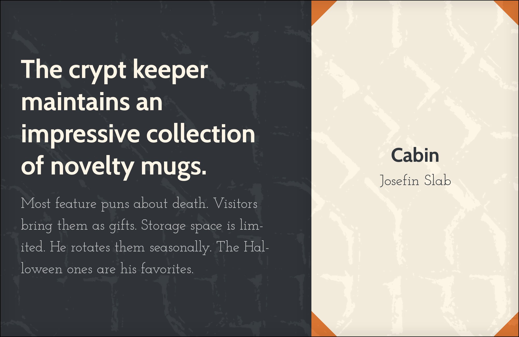
Santiago Orozco of Typemade designed Josefin Slab in 2010 as a geometric slab with typewriter-like details, published through Google Fonts as a sister to Josefin Sans. That display rhythm is more delicate than Cabin’s, while Cabin supplies a larger apparent lowercase and a steadier text color underneath — provided the slab is given enough size for its finer strokes to hold. Typ.io includes the combination among Cabin’s partners. A heading that looks elegant in a large preview will thin out in a narrow mobile title, so keep Josefin Slab at display size, let Cabin’s paragraphs establish the foundation without mimicking the slab’s delicacy, and watch the distance between heading and body: too much space disconnects them, too little turns the slab into an incidental label.
6. Source Sans Pro

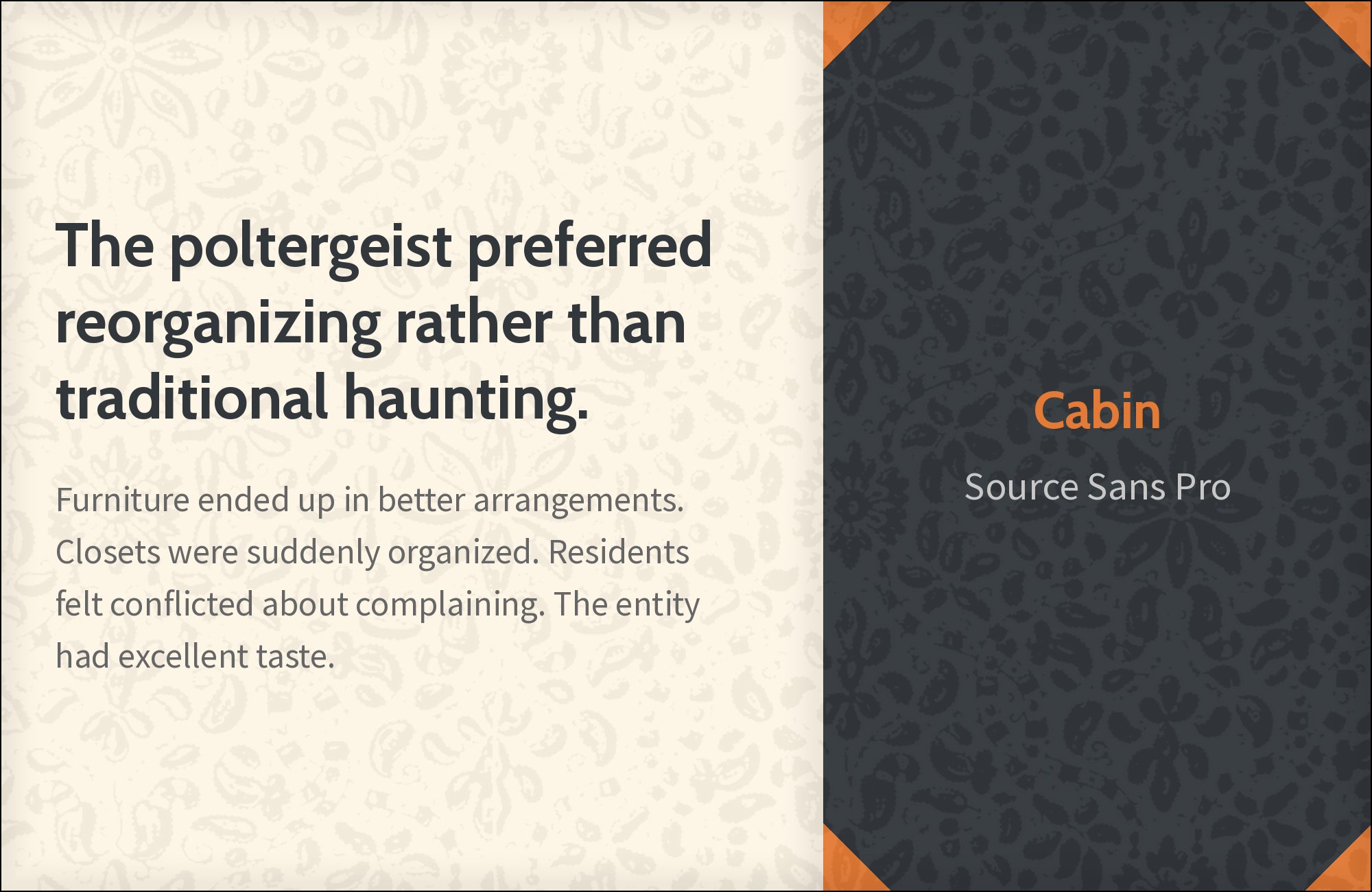
Paul D. Hunt designed Source Sans Pro for Adobe and released it in 2012 as Adobe’s first open-source family, a Benton-inspired gothic with a generous x-height and open apertures built for interface labels and longer on-screen reading. Next to Cabin’s more compact humanist character the contrast is subtle, so the pairing only earns its keep when each family has a persistent job: Cabin for titles and brand language, Source Sans Pro for the application interface, help text, and denser supporting information. Figma’s Google Font Pairings index names the two together. If the distinction disappears at ordinary viewing size, widen the gap in size or weight rather than mixing the families from one paragraph to the next, and test a heading, a paragraph, a form, and a row of navigation as a single block.

Free download
The Typography Primer.
Yours, right now.
Adobe's classic · PDF · free
The guide to type that everyone learned from. Subscribe and it is yours instantly. The BonFX Letter follows.
Free. One click to unsubscribe. No sharing, ever.
7. Dancing Script
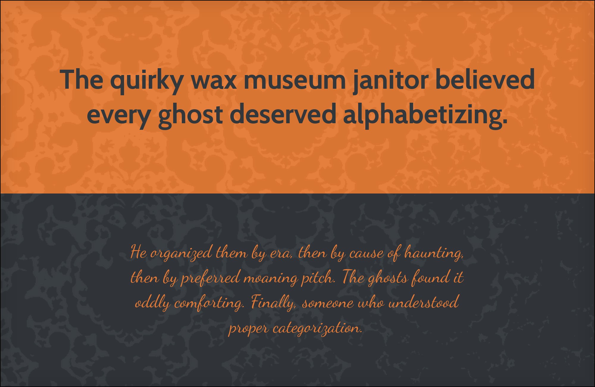
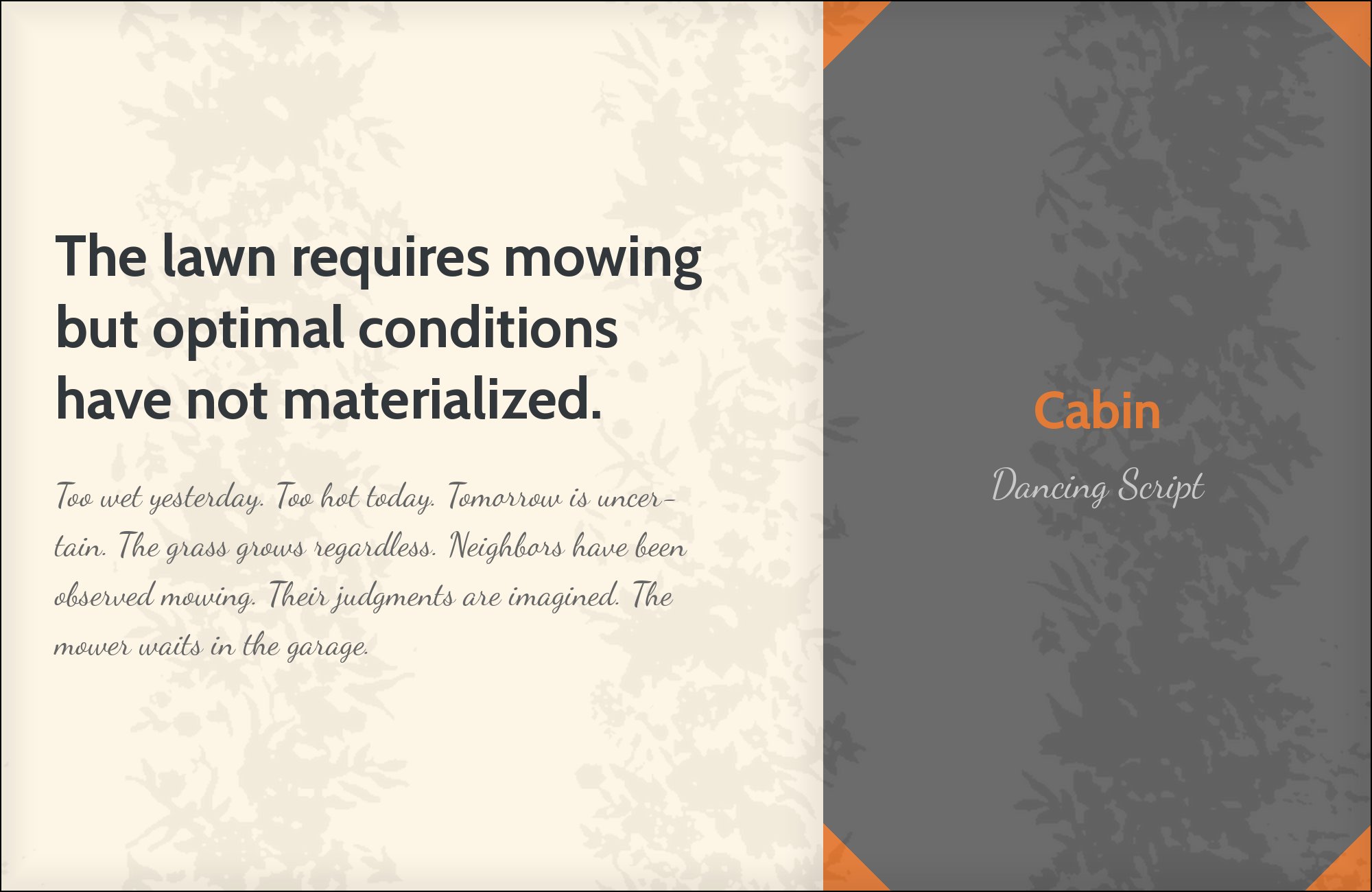
Pablo Impallari of Impallari Type designed Dancing Script and released it in January 2011 as a lively casual script whose connected, irregular strokes bounce and change size, with large capitals that drop below the baseline. That handwritten accent is the structural opposite of Cabin’s upright, even humanist construction, so the script belongs on a name or a short phrase and Cabin belongs on dates, directions, and anything that must be recognized at a glance. Typ.io includes Dancing Script among Cabin’s partners. Connected joins fall apart if the tracking used for uppercase labels is applied to the script, and long ascenders and descenders need room above and below the line rather than sharing Cabin’s text box; the exact words matter, because repeated letters change the shape of the line in a way a sample alphabet will not show.
8. Ubuntu

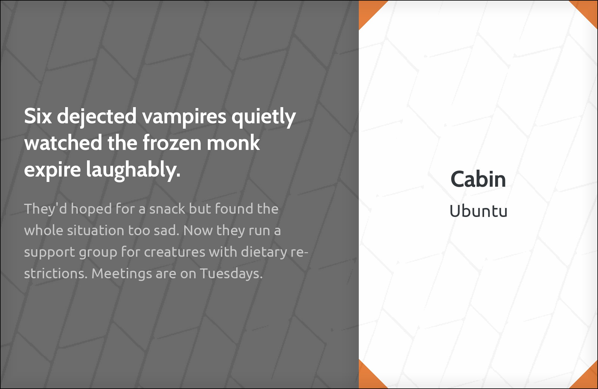
Dalton Maag designed Ubuntu for Canonical and released it in 2010 as the default interface typeface of Ubuntu 10.10, a humanist sans whose distinctive curves and terminals give short headings a flavor Cabin does not have. Cabin comes from Gill- and Johnston-influenced humanist forms, so the pairing depends on a clear size split rather than on a change of category: Ubuntu at display size, Cabin in quieter paragraphs, with enough scale difference to justify using two humanist sans families. Figma presents Ubuntu with Cabin. Their x-heights and stroke weights will compete if the two are set as neighboring text faces; a heading, an introductory sentence, and a short list will show whether the division still reads once numerals and punctuation enter the page, especially where prices or dates sit beside the title.

9. Helvetica Neue

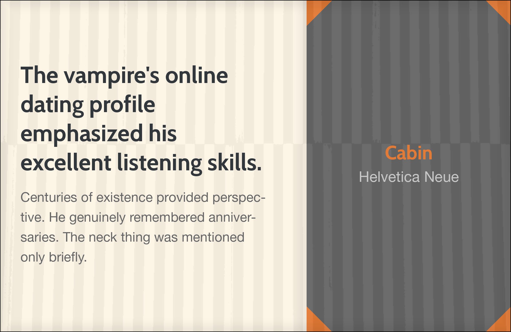
Linotype released Helvetica Neue in 1983 as a systematic redraw of Max Miedinger’s Helvetica, aligning cap height and x-height across a numbered series of weights and tightening the original’s grotesque texture. That tighter, more mechanical construction sits beside Cabin’s humanist apertures and softer terminals as a supporting layer rather than a second headline. Fonts In Use identifies Neue Helvetica with Cabin in the Hungry Harvest visual identity. Assign Helvetica Neue a defined job — product labels or navigation — and keep Cabin on headings and explanatory copy; at the same weight and size the difference is too quiet to read as a system. Short labels at the smallest intended size will show whether Helvetica Neue’s narrower apertures and more even width still separate from Cabin, or whether the two collapse into an accidental font change.

10. Arial

Robin Nicholas designed Arial at Monotype in 1982, later expanded into a full family with Patricia Saunders, originally for low-resolution laser printers before Microsoft licensed it for Windows 3.1 in 1992. Its familiar grotesque construction is not a dramatic counterpart to Cabin; it is a practical information layer under Cabin headings, relying on weight, scale, and consistent placement rather than structural contrast. Typ.io names Arial alongside Cabin. Cabin can keep the designed titles while Arial handles labels and paragraphs that must stay consistent with other materials, judged at the actual sizes the page will use, with lowercase size, line breaks, and paragraph darkness checked together so the supporting role is obvious. Neighboring controls should stay in one family unless the change of role is itself the point.


Still Googling UX terms?
Stop. They're all right here.
50 terms. Illustrated.
So simple your cat gets it.
Print & ePub on Amazon
11. Roboto
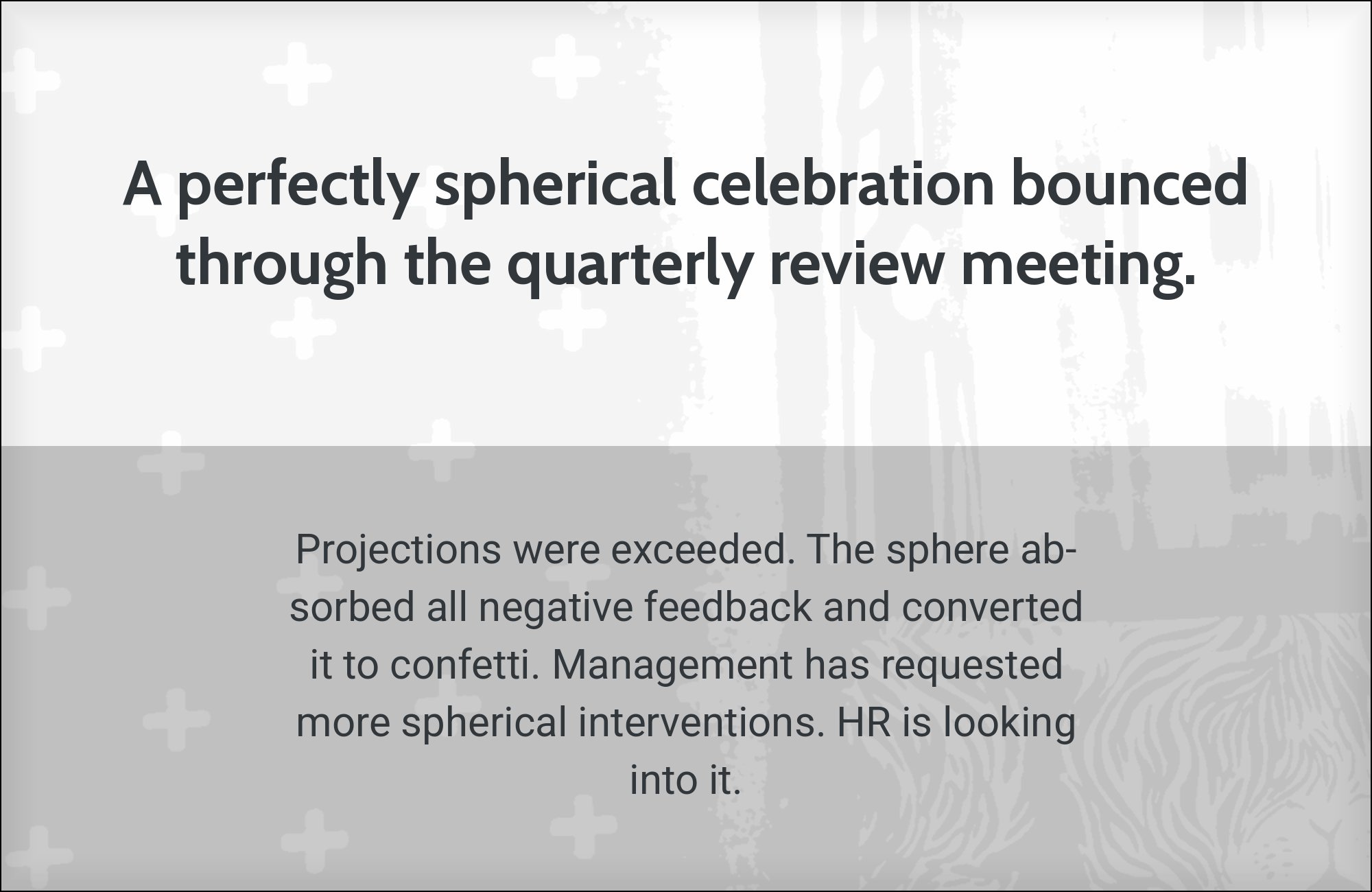
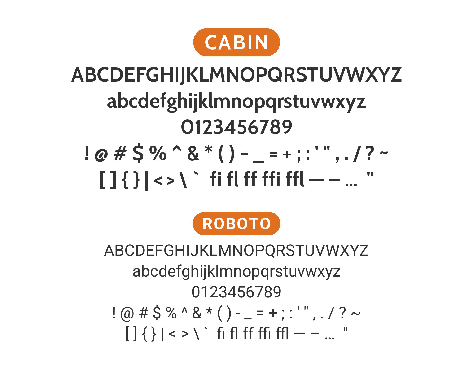
Christian Robertson designed Roboto in-house at Google and released it in 2011 as Android’s system font, a mechanical-skeleton grotesque softened by open, friction-free curves and a tall x-height. That even sans rhythm can carry supporting details while Cabin holds the more humanist title, provided each family keeps a distinct role — Cabin on the event name, Roboto on dates, locations, and explanatory lines. Fonts In Use documents both on the 2025 Orquesta Típica de la Ciudad de México concert posters. Numerals, lowercase, and line breaks at actual reading sizes decide whether the hierarchy holds, because schedule information often determines whether an event layout works at a glance. A clearer gap between headline and details does more than thickening every weight, and the pairing suits information-heavy material that has to survive at modest reproduction sizes.
12. Gabriola
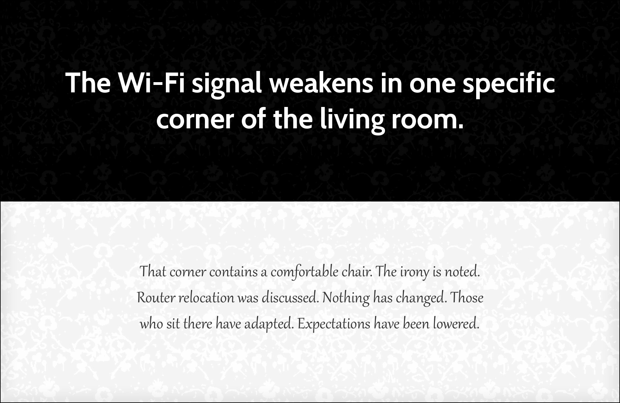
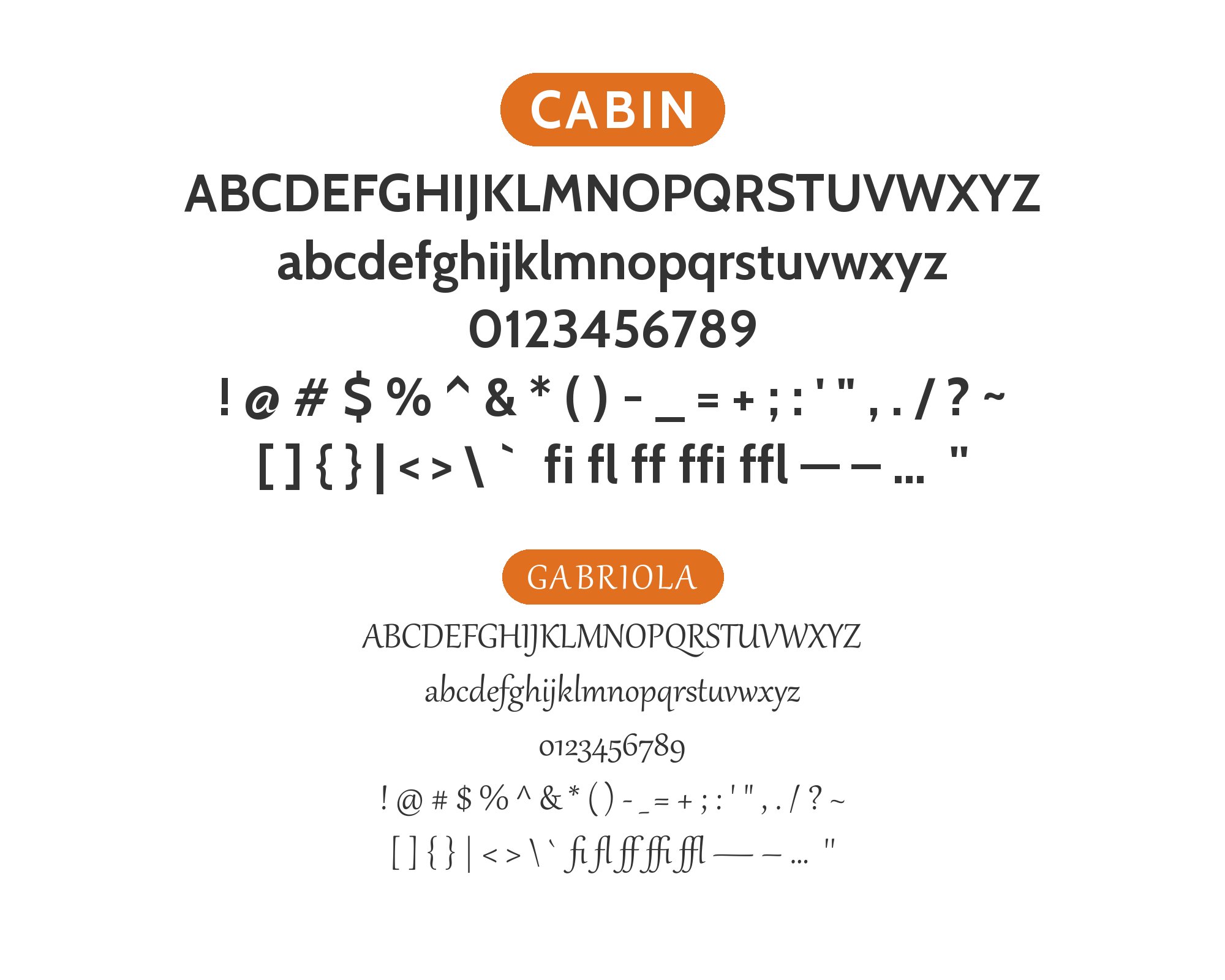
John Hudson of Tiro Typeworks designed Gabriola for Microsoft between 2005 and 2009, a calligraphic display face with optional flourishes, eight stylistic sets, and a 2008 copyright. Those ornamental strokes create the strongest contrast in this group against Cabin’s readable humanist framework: Gabriola for a brief title or formal accent, Cabin for the information around it. Fonts In Use lists both on the same 2025 concert-poster collection. Extended ascenders, descenders, and decorative extenders reach beyond the apparent letter body, so the display line needs extra space, a restrained stylistic set rather than flourish on every word, and a line box tall enough that a nearby rule does not clip the ornament. Feature support varies by software, so the chosen stylistic set should be tested in the application that will actually set the type.

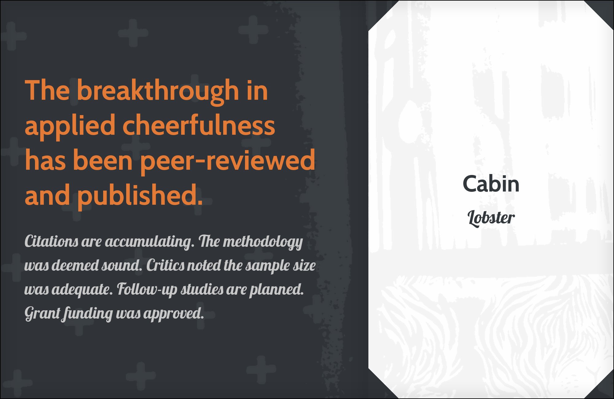
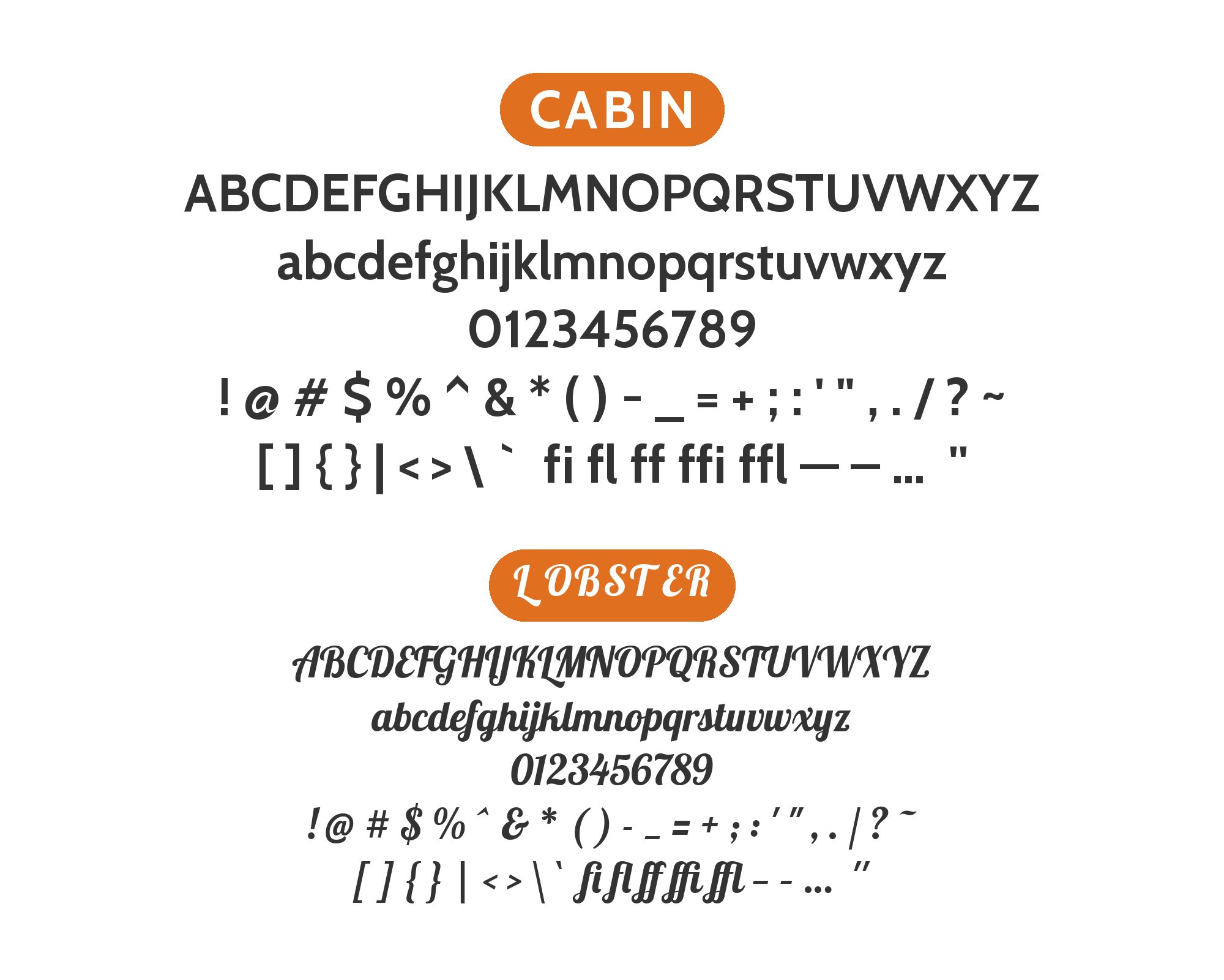
13. Lobster
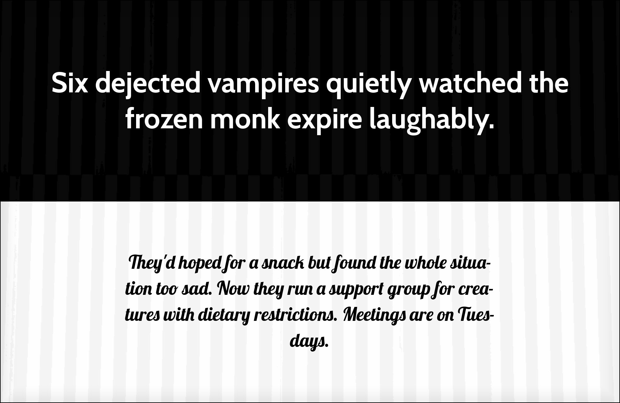
Jukebox Print’s dedicated specimen uses Lobster for the nameplate and Cabin for the working text of a hospitality system. The connected script brings a hand-lettered, social tone, while Cabin’s upright humanist forms keep menus, schedules, prices, and contact details easy to scan. Keep Lobster to a business name or a short invitation; its loops become dense when a sentence runs long. Cabin should occupy the repeated roles at regular or medium weight, with enough size contrast that the script reads as a mark rather than an alternate paragraph face. This combination works naturally for cafés, bakeries, small hotels, and food packaging where warmth matters but the supporting information still has to be dependable.
14. Noto Sans
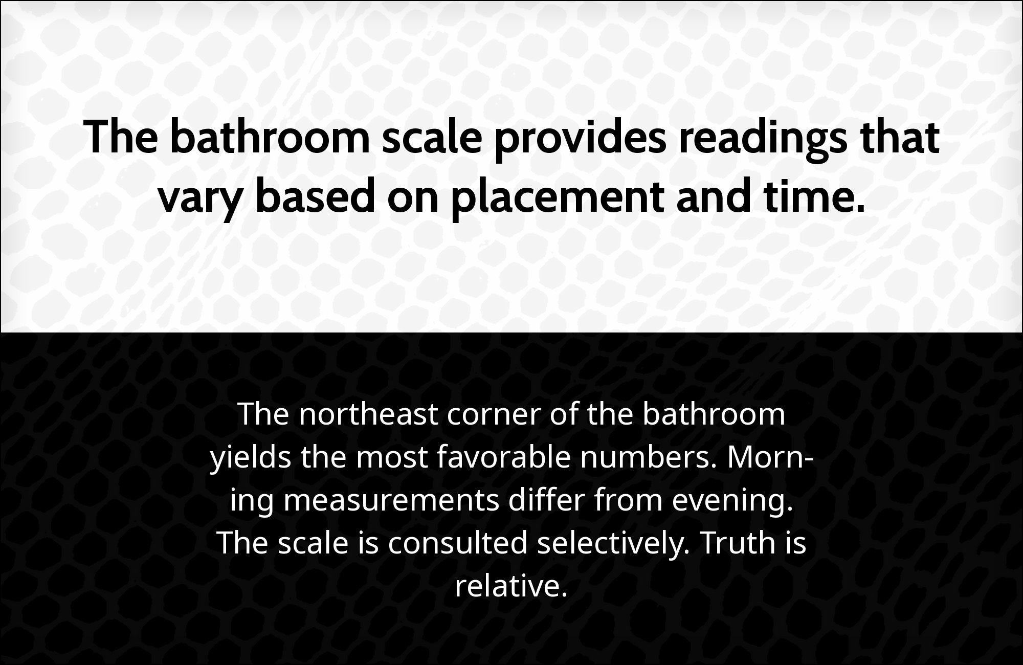
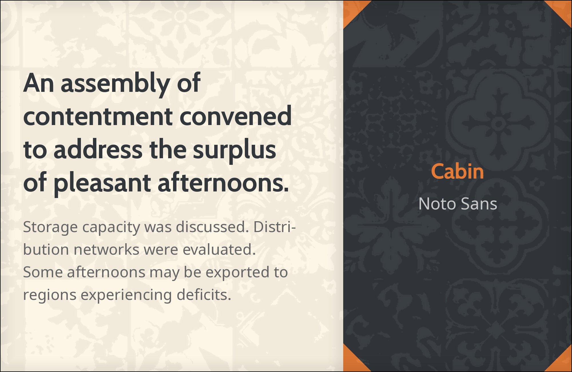
Outsystems’ brand guidelines assign Cabin to titles, slides, ads, and social assets, then use Noto Sans for long-format content. The pairing stays within the sans-serif category but separates tone from coverage: Cabin gives the top line its Gill-influenced humanist character, while Noto Sans produces a steadier, more neutral reading color through long paragraphs. Use Cabin at larger sizes and avoid bringing it down into the same weight and scale as the body. Noto Sans can carry documentation, reports, and multilingual support without competing with the title face. The combination is useful for global product brands and presentation systems that need a recognizable display voice plus a durable text family.

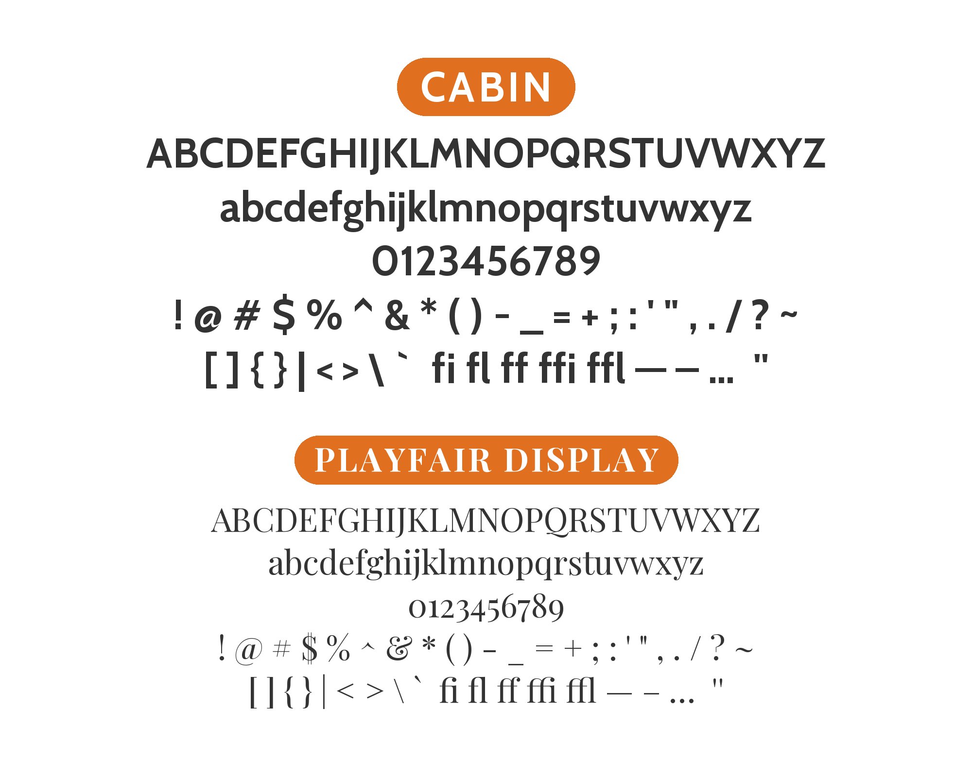
15. Playfair Display

The League Club’s brand guide explicitly pairs Playfair Display headlines with Cabin body copy. Playfair’s strong thick-thin contrast and fine serif details create a ceremonial top line; Cabin answers with a moderate, open humanist texture that feels practical rather than austere. Keep Playfair large enough for its hairlines to survive and give it only the headline or a short quotation. Cabin can then run the paragraph, caption, and navigation at normal reading sizes. The x-height difference is useful, but match apparent size by eye instead of sharing a point size. This pairing suits membership organizations, cultural events, invitations, and editorial landing pages where the headline should feel formal while the supporting copy remains warm and accessible.

Conclusion
Cabin pairs most clearly when the second family has a defined job. Georgia and Sabon add serif reading texture; Arvo and Josefin Slab change the character of the headline; Dancing Script and Gabriola introduce ornament that should remain brief. The sans-serif combinations — Source Sans Pro, Ubuntu, Helvetica Neue, Arial, Roboto, and Raleway — are quieter and depend on a persistent difference in size or function, with Cabin remaining the humanist voice and the companion contributing a visible, necessary difference.
Set a complete heading-and-paragraph block before adding another family. Check the smallest labels, long titles, and numerals, then look at the page as a whole to judge whether the intended reading order is obvious. For more exercises in balancing these relationships, see The Big Book of Font Combinations. The aim is a system in which Cabin’s humanist rhythm remains useful once the body text is in place.
Sources
- Typ.io
- Typewolf
- Fontpair public pairing dataset
- Fonts In Use search
- Fonts In Use project
- Fonts In Use project
- Fonts In Use project
- Fonts In Use project
- Fonts In Use project
- Fonts In Use project
- Figma Google Font Pairings
- Figma Ubuntu
- Figma Raleway
- Figma Source Sans Pro
- Google Fonts Cabin
- Google Fonts Cabin description
